Mattson Creative in GQ

We are thrilled and honored to be featured in the May 2017 issue of GQ Magazine! Check out the article and learn how our creative space inspires our creative work. On newsstands now!
- Ty
+ 4.27.17 | 7:20 pm
We are thrilled and honored to be featured in the May 2017 issue of GQ Magazine! Check out the article and learn how our creative space inspires our creative work. On newsstands now!

No company is more synonymous with creativity and imagination than Disney. With an unparalleled history of extraordinary family entertainment and an ever expanding cast of unforgettable characters, they are truly one of most admired and beloved brands the world over. Mattson Creative is thrilled to be working with Disney’s visionary consumer products department to connect the young and young-at-heart with their favorite stories and characters while bringing the magic of Disney to life for generations to come.

This year our Star Wars Modern poster series was recognized for excellence by both the One Show and Communication Arts. In May we were awarded the coveted One Show Pencil at the annual ceremony in New York City. A One Show Pencil is the highest honor in the field of advertising and design. This year there were over 20,000 entries from 65 different countries, so we were beyond thrilled to receive the award. The project was also selected for the Communication Arts Design Annual 57 which is the most exclusive major design competition in the world. Out of 4,228 entries only 161 projects were chosen for reproduction in the publication, which boasts the largest international circulation of any trade journal on visual communication. We are honored to be included in this year’s annual.
Limited edition posters are available here.

This year Star Trek celebrates it’s 50th anniversary. To commemorate the event, 50 artists from around the world were commissioned to create original artwork inspired by the iconic franchise. I was honored to be asked to participate in this global art exhibition. I created two different portraits of Mr. Spock. Both pieces are available as limited edition screen prints in the shop.


The entire Star Trek: 50 Artists – 50 Years Art Exhibit will open during SDCC at Michael J. Wolf Art Gallery in San Diego, before touring the country for the next year.
I will be signing at Comic-Con on Friday July 22nd from 10am-Noon at Acme Archive’s booth and from 1-2:30pm at Cartoon Network’s booth.

Earlier this year I had the opportunity to see Hamilton in New York. To say that it was inspiring would be an understatement. It was amazing. I feel incredibly lucky to have seen the Original Broadway cast perform, and as Lin-Manuel Miranda and others start to leave the show, I wanted to create a small tribute. So I got out the x-acto and spray paint and made this graphic. Not for sale, it’s just pure fan art and a thank you to Lin-Manuel for sharing his masterpiece with me (and the rest of the world).


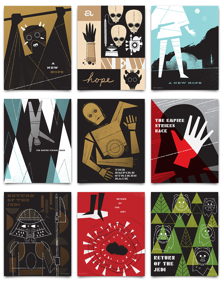
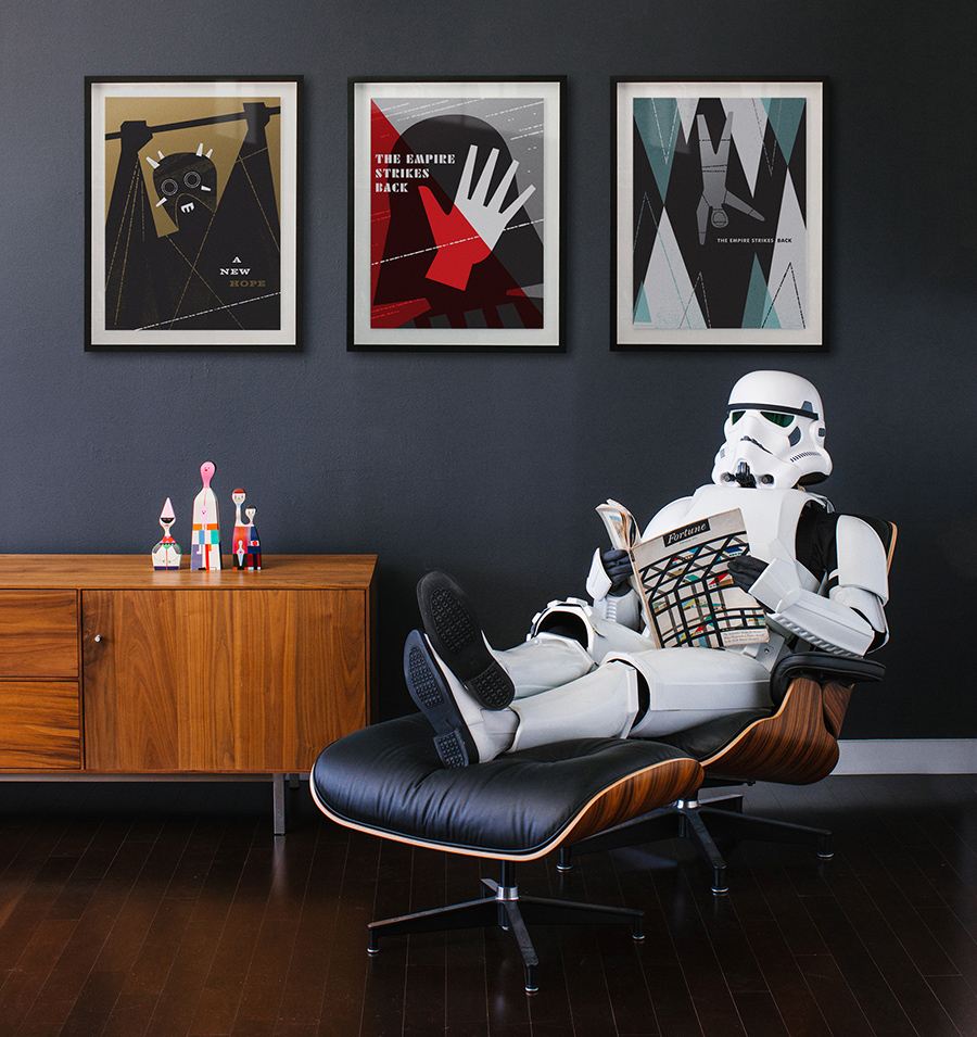
I’ve been a Star Wars fan my entire life. So I am beyond excited to reveal this series of Star Wars art prints I designed in collaboration with Lucasfilm! These silk screened posters are officially licensed and celebrate the original trilogy. They are available now in the shop!
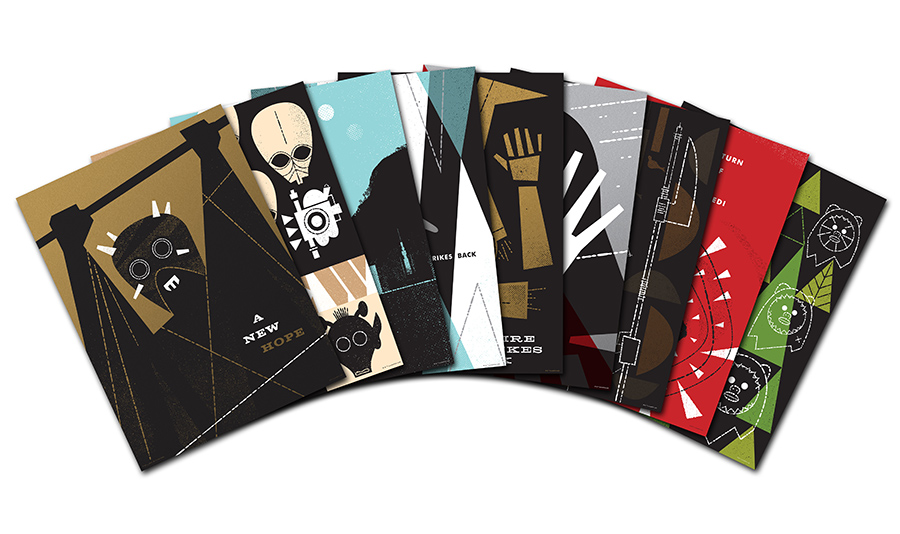
All of the posters are silk screened on 100lb. French Paper and are available in two sizes: individual 18×24” prints, and smaller 8×10” sets.
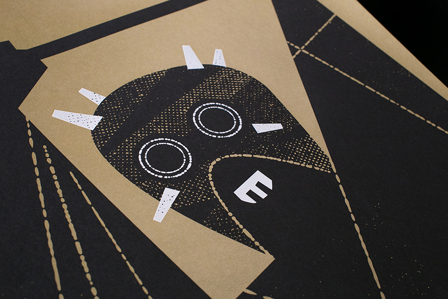
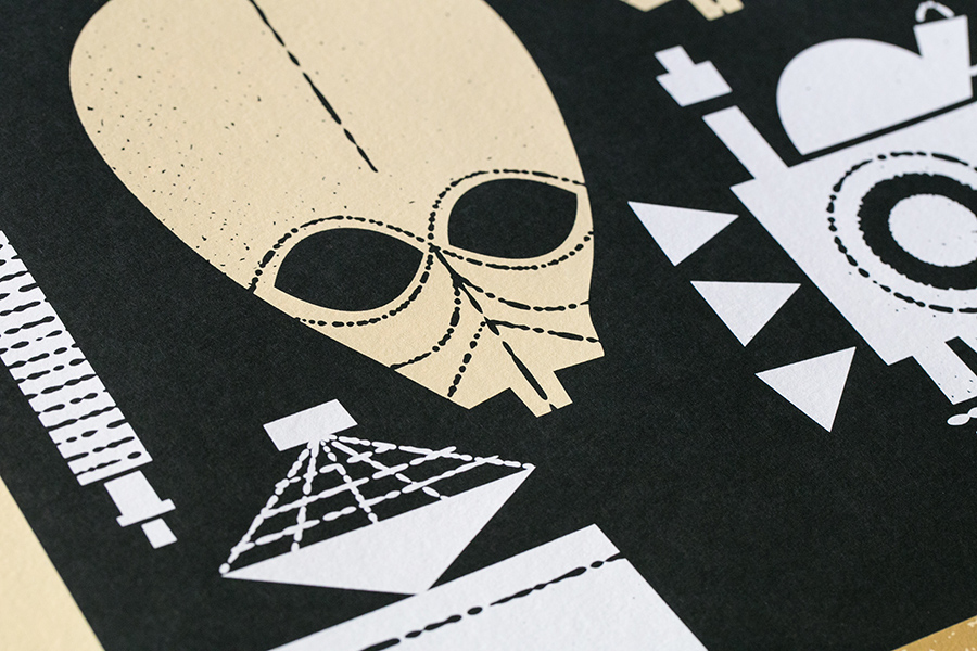
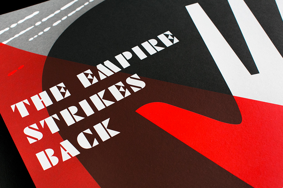
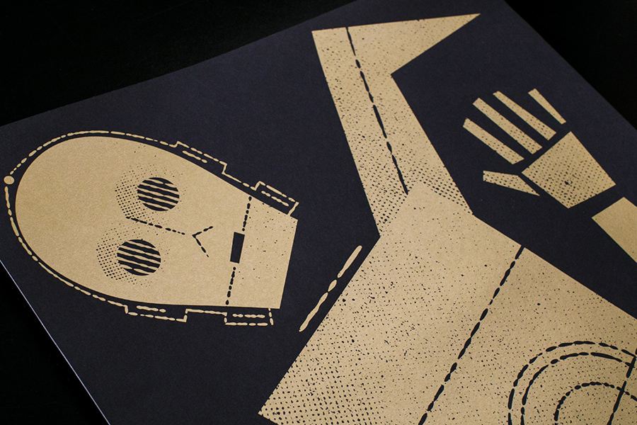
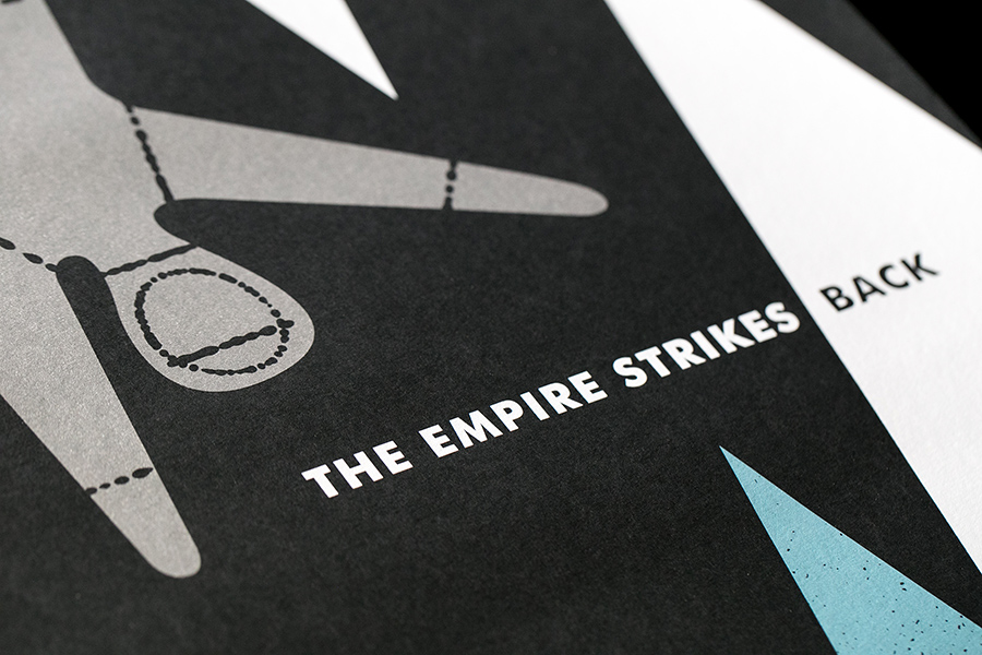
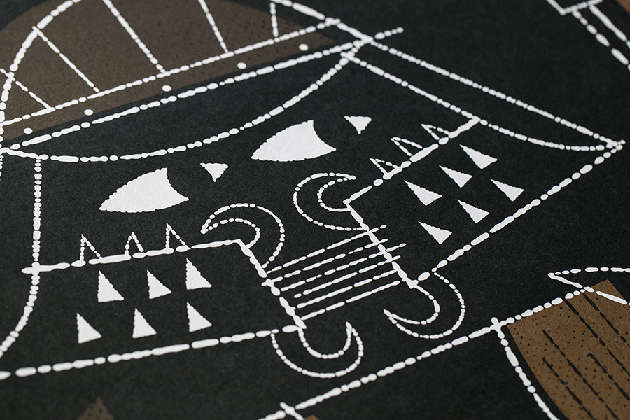
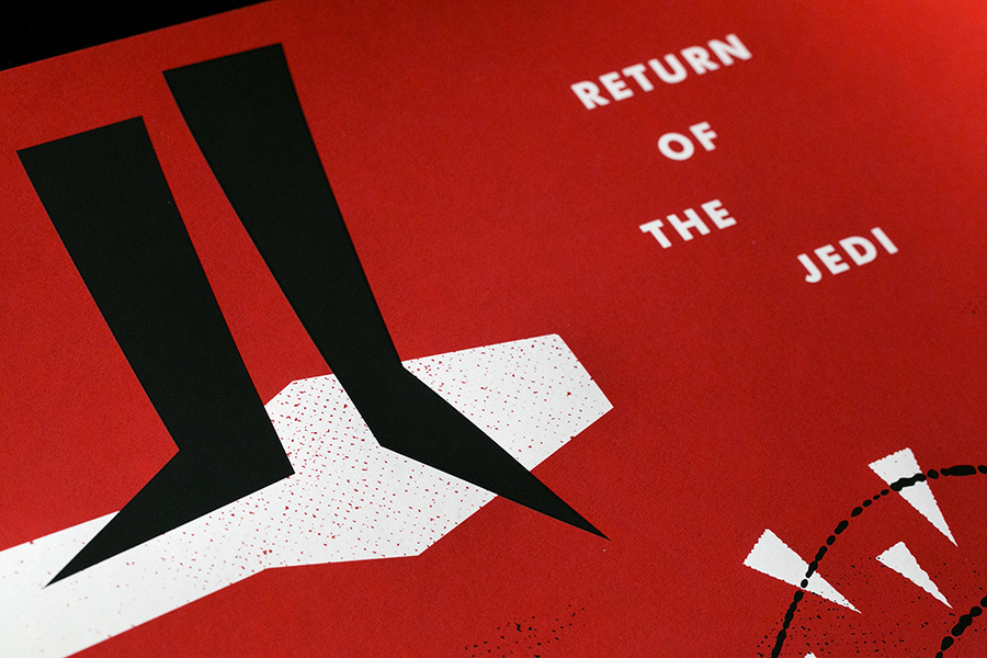
Vahalla Studios did all the screen printing and they turned out amazing! We printed everything on French paper. Most of them are on Black Licorice Pop-Tone and we used gold and silver metallic inks on a few. They really look great.
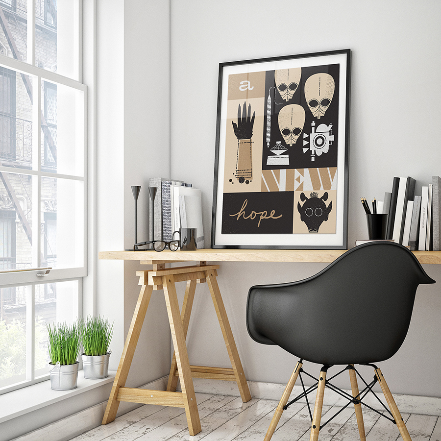
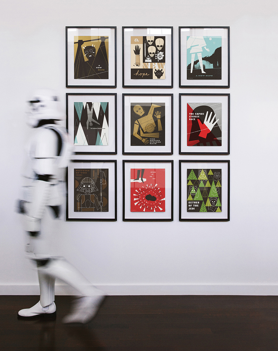
You can read the full story, see a gallery of my childhood Star Wars art and buy the prints here!
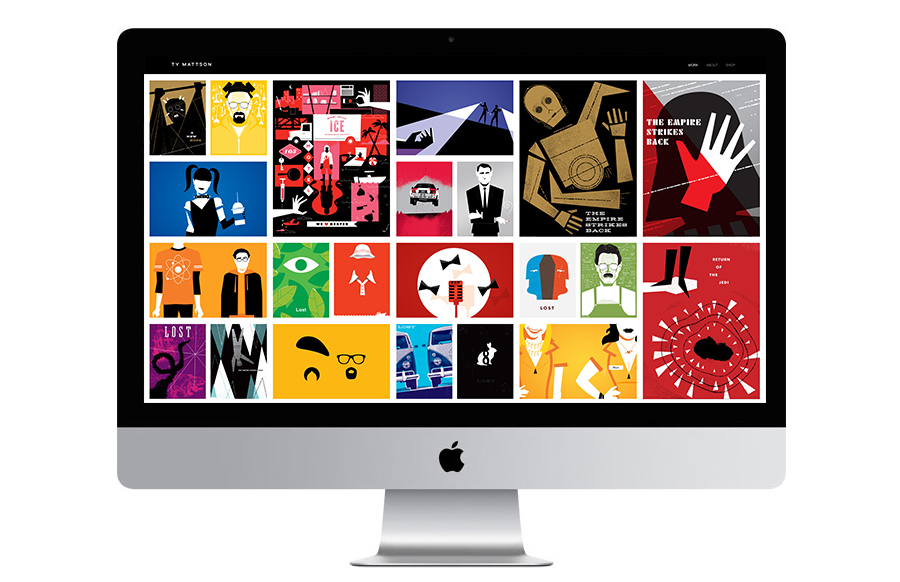
I’m very excited to launch a new website! I put all my illustration work over at TyMattson.com.
Take a look!
I am beyond excited to announce that I will be releasing a series of 9 Star Wars art prints this month! The poster series is officially licensed by Lucasfilm and will celebrate the original Star Wars trilogy. Each poster will be screen printed on French Paper and will available in two sizes: individual 18×24’s, and sets of 8×10’s. As a lifelong fan of Star Wars, it is a dream come true to be partnering with Lucasfilm to make this project a reality. Check back or follow me on Instagram (@tymattson) for more details and the announcement of the release date. The prints will be available for purchase at TyMattson.com
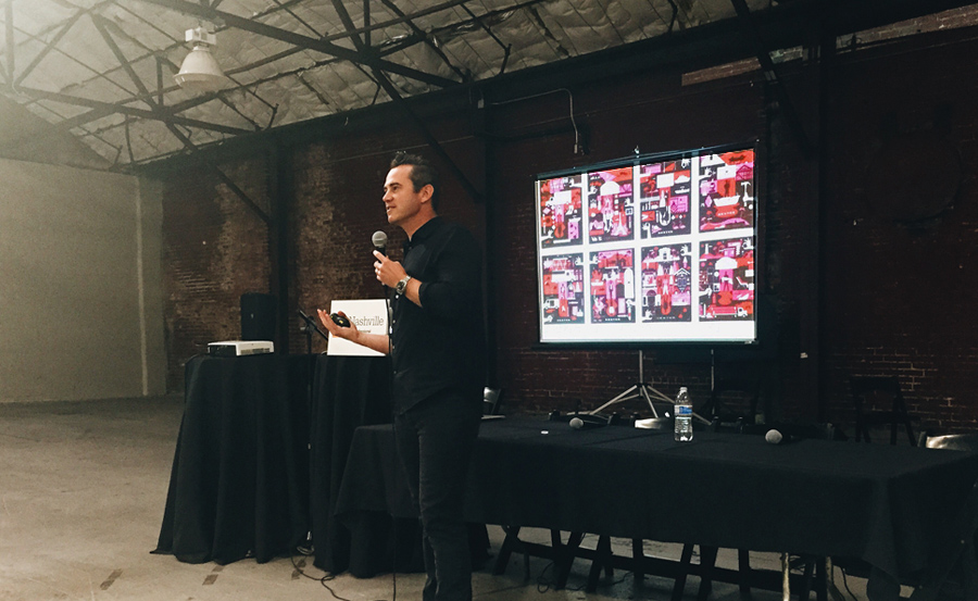
I was honored to be invited to Nashville this month as a keynote speaker at AIGA Think Tank 2015 – a one-day event that brings together thought leaders from across the design, creative, and experiential industries.
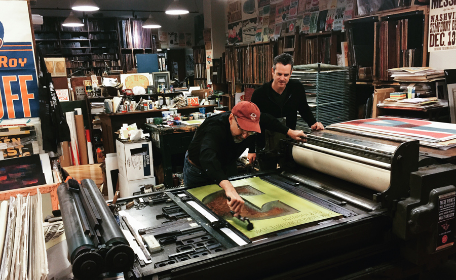
While I was there I had the opportunity to visit the legendary Hatch Show Print! I cannot begin to describe how incredibly inspiring it was to tour the shop, hear the stories, and to meet the great Jim Sherraden himself – master printer and curator of Hatch. He was the most wonderful and gracious host and I am honored and humbled to have had the chance to spend some time with him.
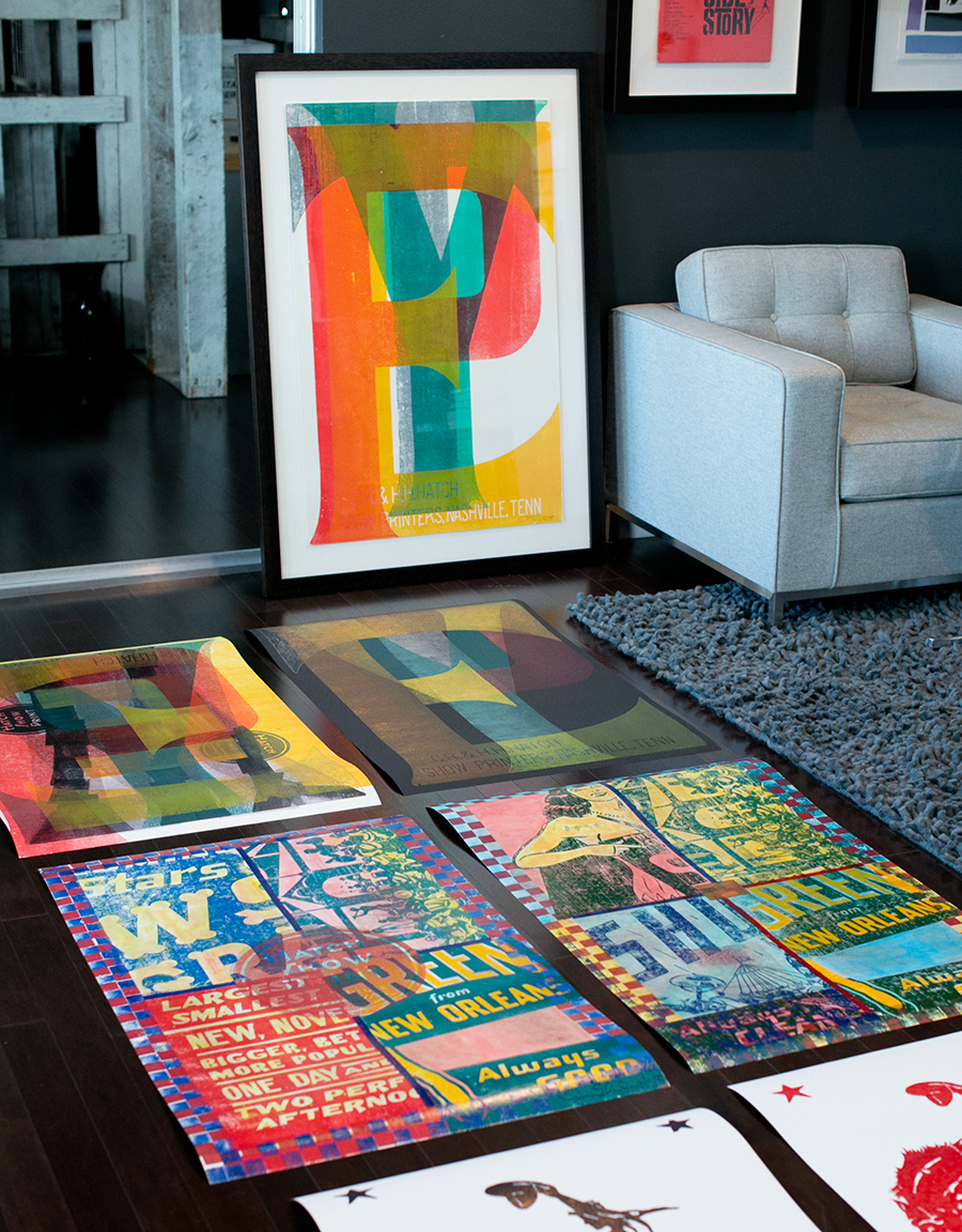
I was lucky enough to purchase several of his amazing monoprints. I’m so excited and honored to have some of his art in my studio and in my home! We may need more walls!
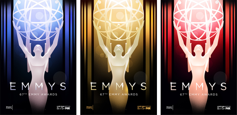
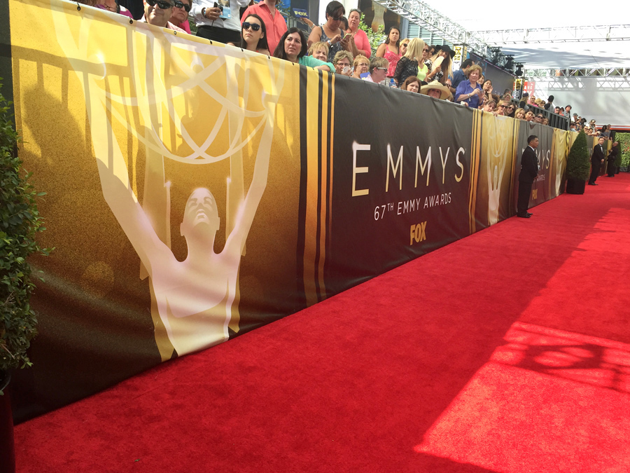
Last week our branding for the 67th Annual Emmy Awards was seen by millions of people all over the world. We are so honored to have been able to create this year’s key art and attend the event to see it for ourselves! What an amazing experience!
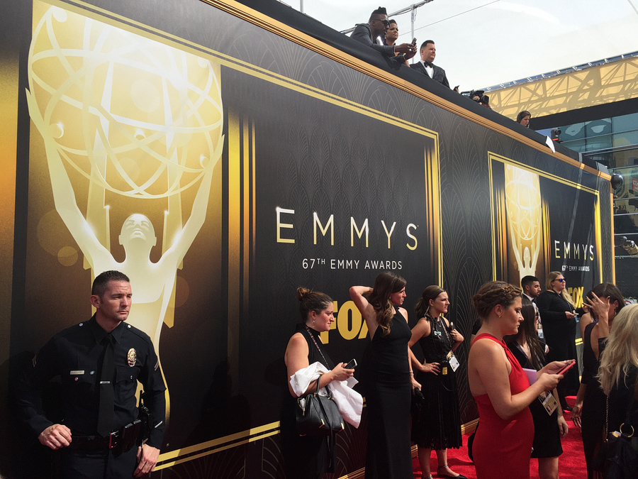
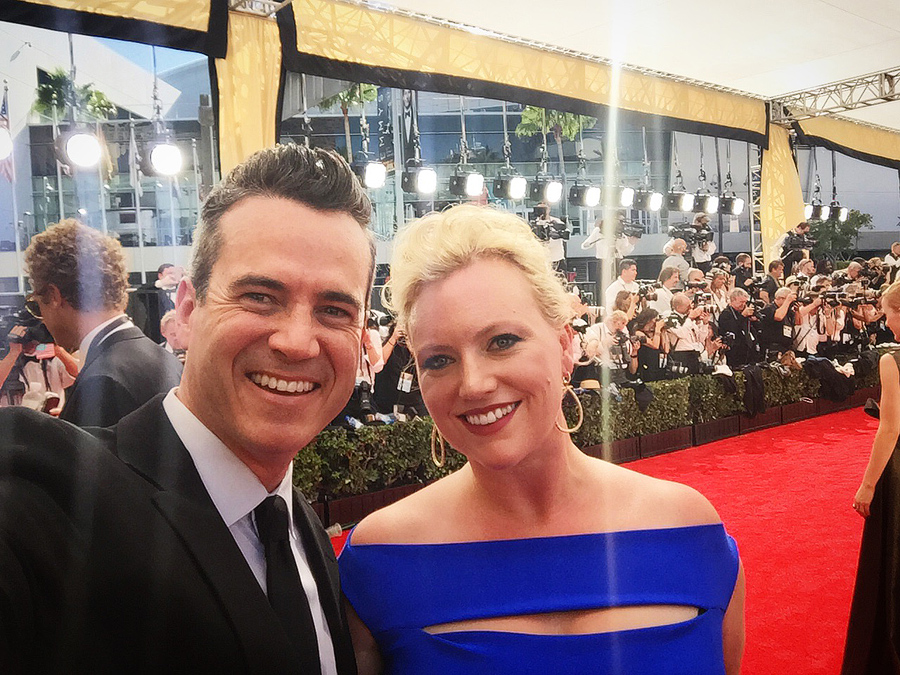
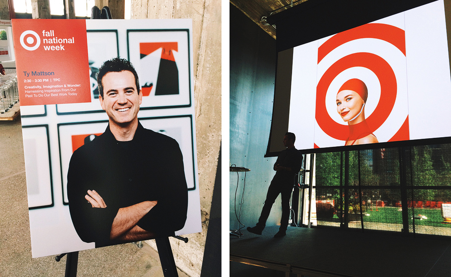
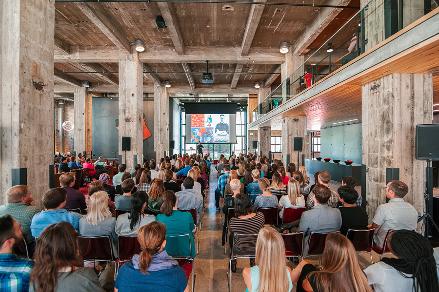
This month, I had the honor of returning to Target headquarters to speak during their Fall National Week about creativity, imagination and wonder. I had a great time sharing my story and some recent work with the attendees.
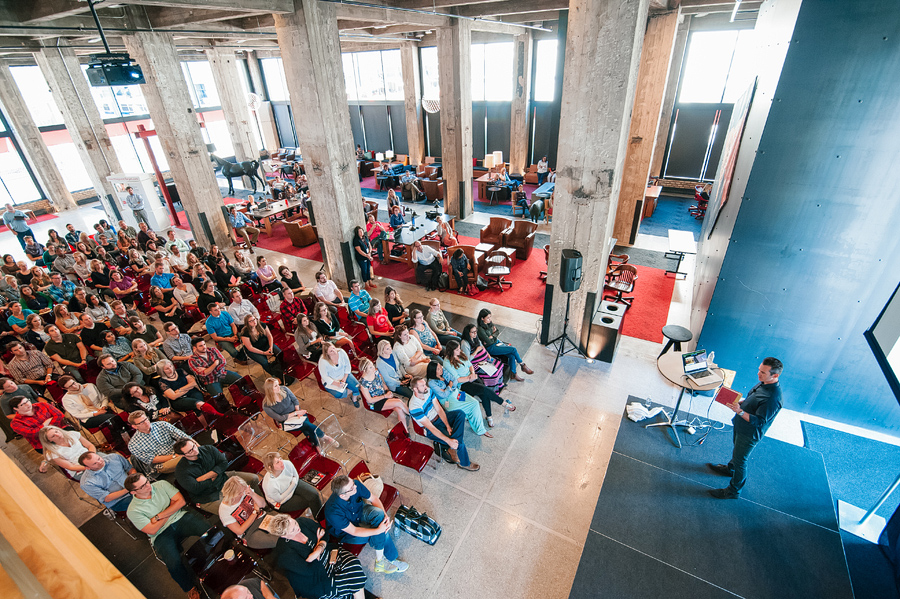
Photos by Steve Allen for Target.
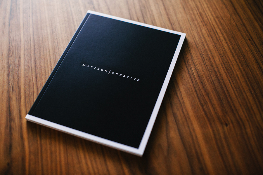
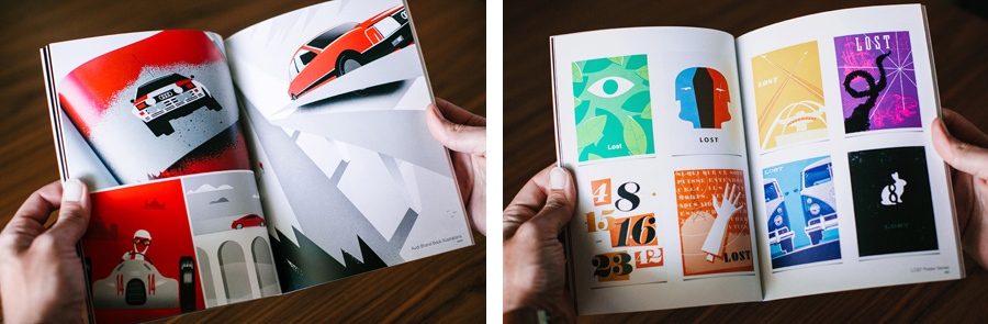
We receive a lot of requests for our this book, so we decided to make them available in our online shop. This 4-color, offset-printed, softcover portfolio book is 76 pages and features 40+ different graphic design projects for such clients as ABC, Coke, Audi, CBS, Discovery Channel, Dreamworks, Mattel, Nickelodeon, Showtime, Target, Universal and much more. This is the promo book that we give to our clients and prospects to share our body of work. Order your copy today.
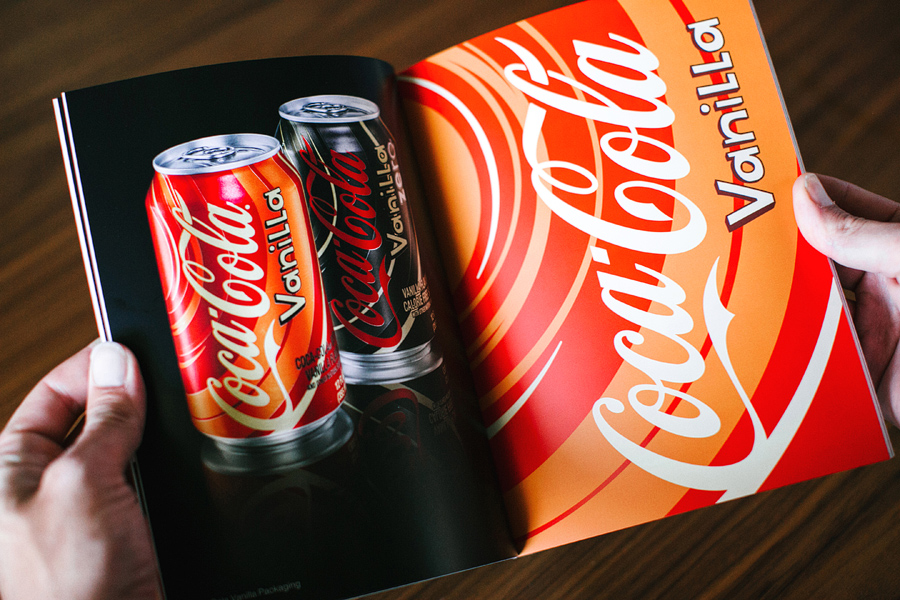
We love the embossed logo on the front cover.
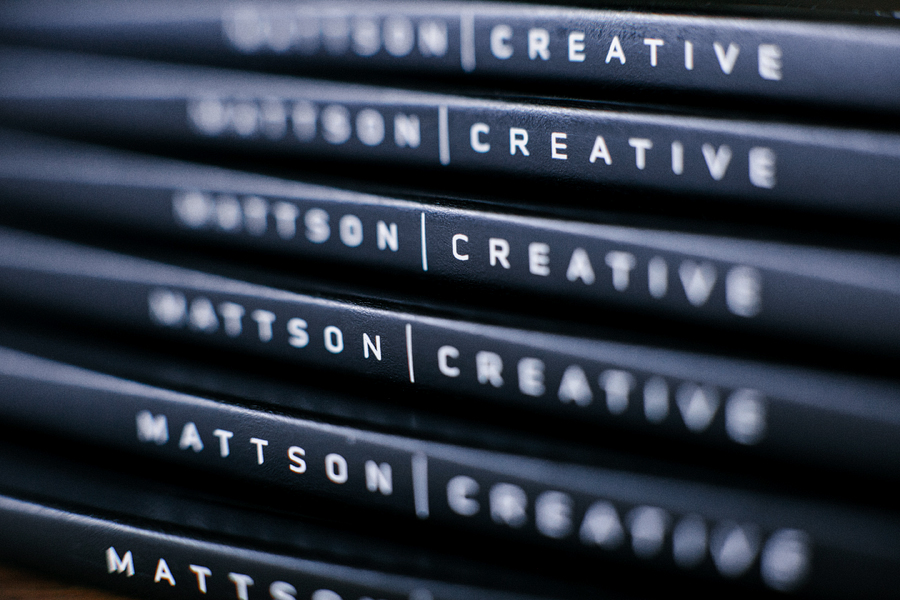
We are very excited to have these now available in our online shop for other designers & creatives to see what we’ve been working on.

For more than one hundred years, 20th Century Fox has been inspiring audiences around the world through film and television. We are very excited to be collaborating with this entertainment icon.
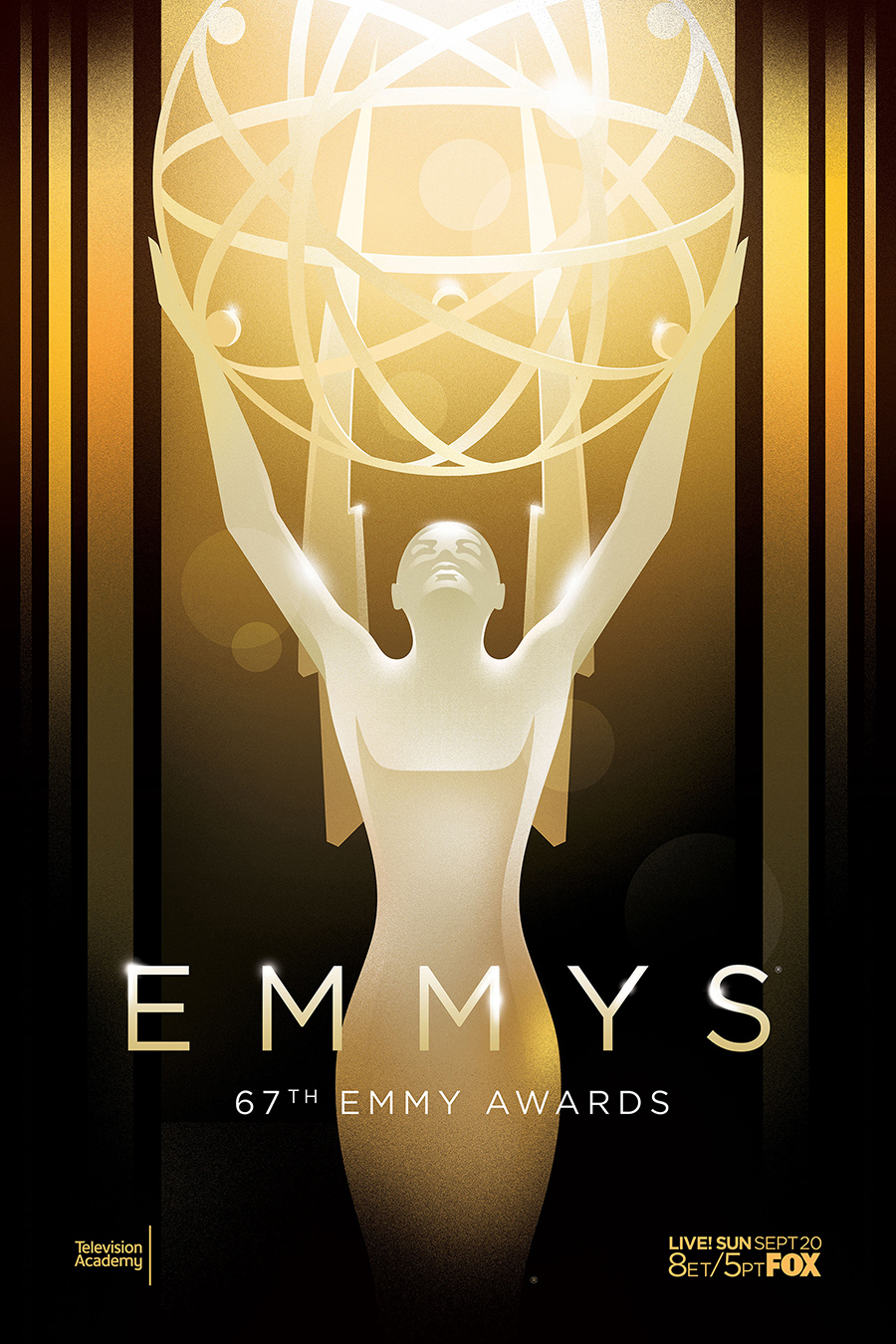
I’m honored and excited to share the key art we created for this year’s Emmy Awards! Full press release below:
TELEVISION ACADEMY UNVEILS KEY ART FOR THE 67TH EMMY® AWARDS
The Television Academy today unveiled a bold new design to be used for this year’s Emmy® Awards key art. Famed designer Ty Mattson, known for the stylish work he has done for television networks and various brands, was tapped to help design the key art for the 67th Emmy Awards.
“This year’s imagery represents the most dramatic departure for Emmy Awards key art in Academy history,” said Maury McIntyre, President and COO of the Television Academy.
“We broke with traditional, photo realistic designs of previous years,” said the Academy’s Senior Creative Director Scott Buford, “and collaborated with Mattson Creative to create a direction that was striking, simple and would reflect the Television Academy’s path of change and growth.”
The result is a black and gold “hero” or “goddess” image for Emmy, which has roots in timeless Art Deco, with rich color, bold shapes and assertive symmetry. She’s a rare departure from being portrayed in pure gold, yet still stands as a forward-thinking icon in television excellence. The new key art will be utilized across multiple platforms including the website, advertisements, collateral materials and motion graphics.
The 67th Primetime Emmy Awards, hosted by Andy Samberg, airs live Sunday, September 20 (8:00 PM ET / 5:00 PM PT) on FOX and will originate from the Nokia Theatre L.A. LIVE in Los Angeles.
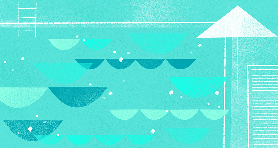
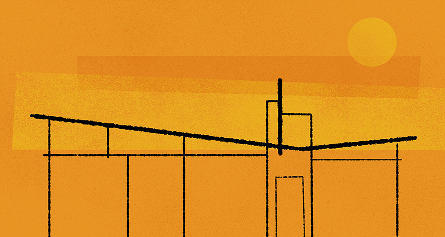
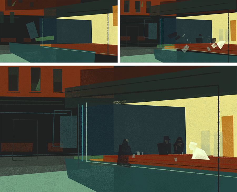
Recently we had the opportunity to collaborate with the San Francisco Ballet, creating illustrations that were animated and incorporated into Yuri Possokhov’s “The Swimmer”. Based on a John Cheever short story, the illustrations represent a very eclectic mix of American art, literature, film and architecture from the mid-20th Century, including an abstraction of Edward Hopper’s “Nighthawks”.

I’ve realized that over the last year I’ve published relatively few blog posts, but I’ve shared hundreds of pictures on Instagram. So if your interested in more frequent glimpses of the studio, our work and other real-time snapshots then follow me there: @tymattson
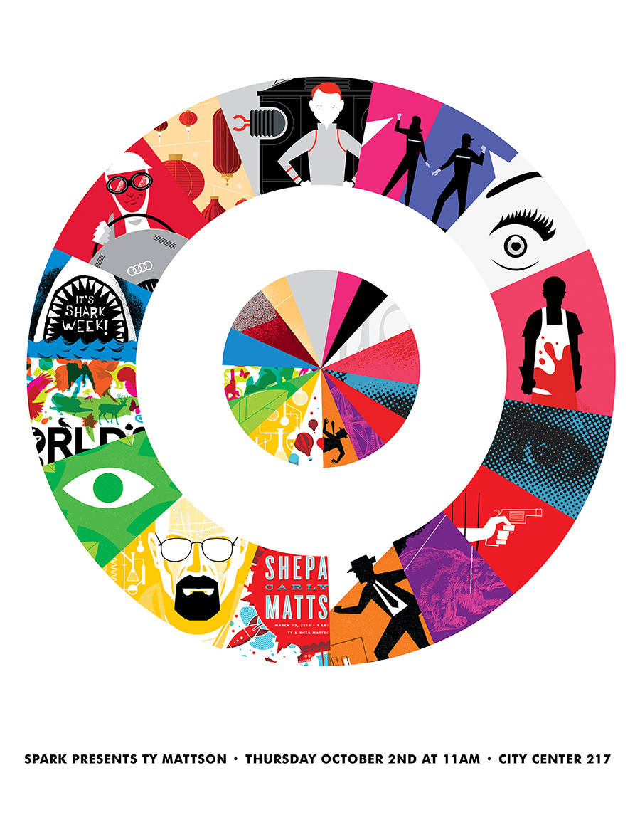
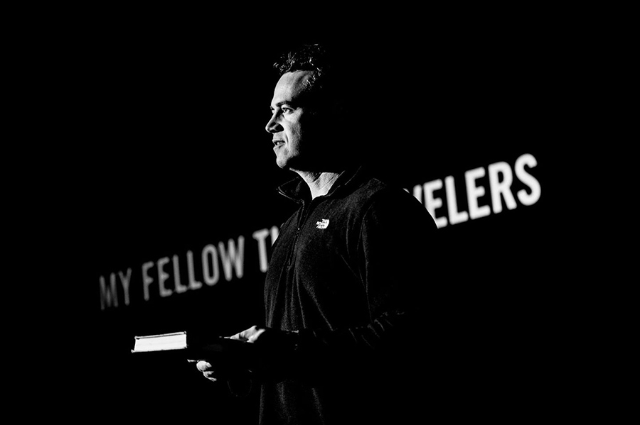
Last fall I was honored to speak at Target and the AIGA Minnesota Design Camp. This year I am very excited to be speaking at the 2015 Brand New Conference — a two-day event on corportate and brand identity with some of today’s most active and influential practictioners from around the world. The conference will take place September 24th and 25th in New York City. More info here.
We have been unbelievably busy over the last year and it’s been a while since we’ve had a chance to update our site or blog. But I just posted 6 new projects in the Work section of the site that I am excited to finally share! Below is a quick overview. You can click through to see more of each project.
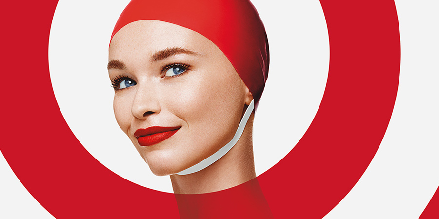
2015 Brand Campaign for Target
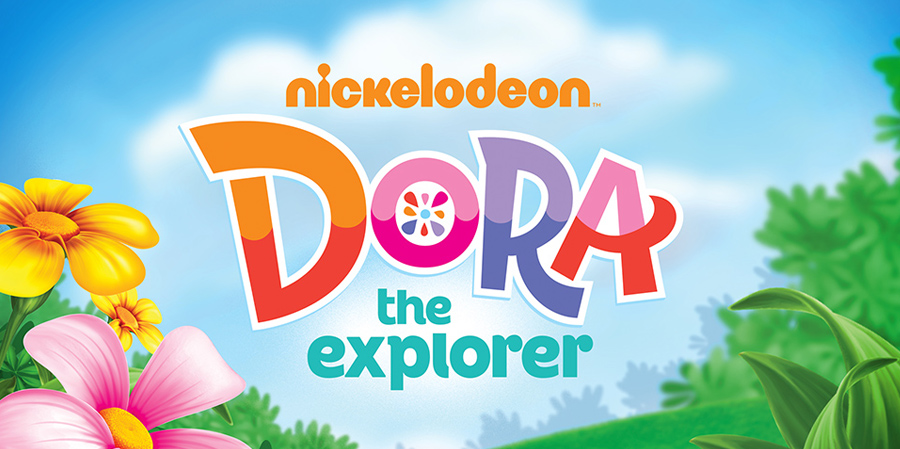
Dora the Explorer Style Guide for Nickelodeon
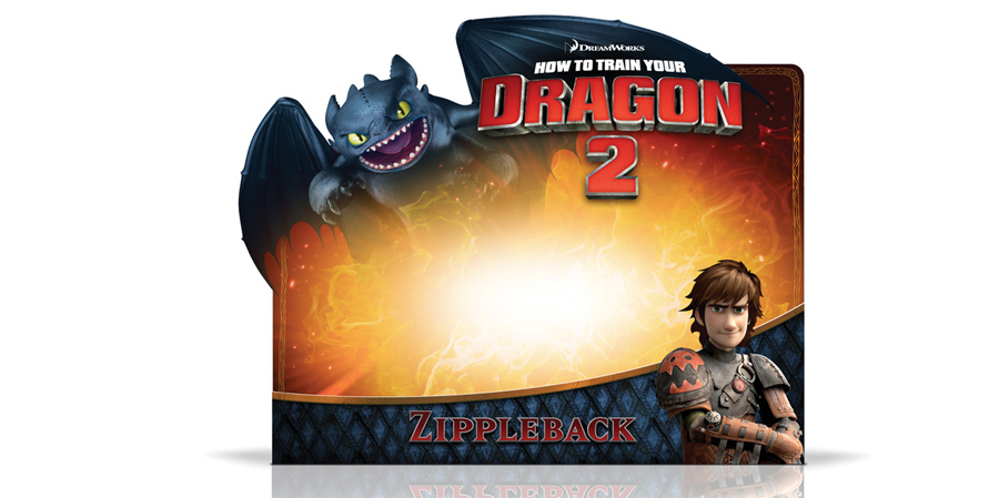
How to Train Your Dragon 2 Packaging for DreamWorks
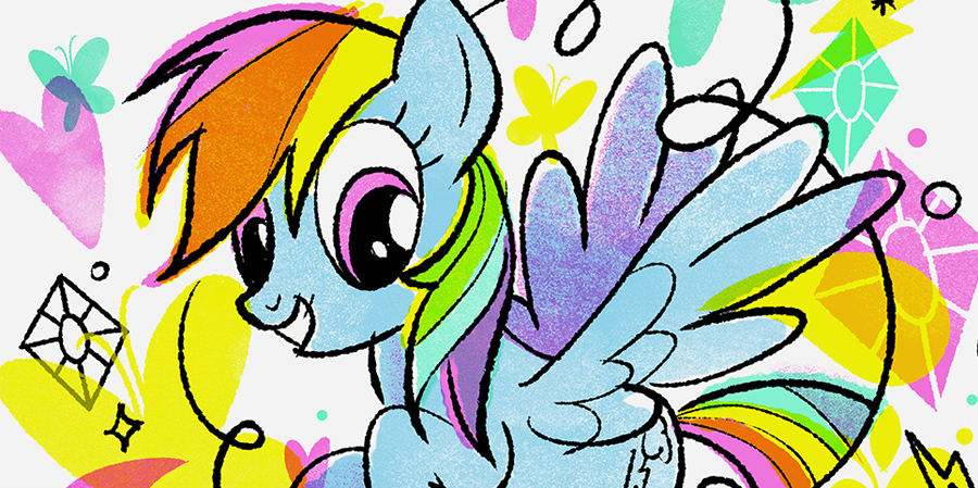
My Little Pony Style Guide for Hasbro
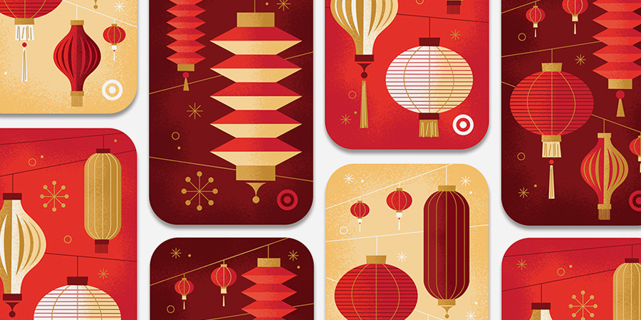
Lunar New Years gift cards for Target
Brighter Brand Identity Design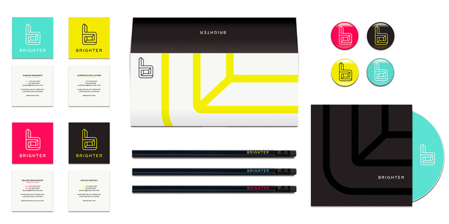

Very excited to be speaking at Connecting Things in Orange County on Wednesday, April 1st! Come hang out.
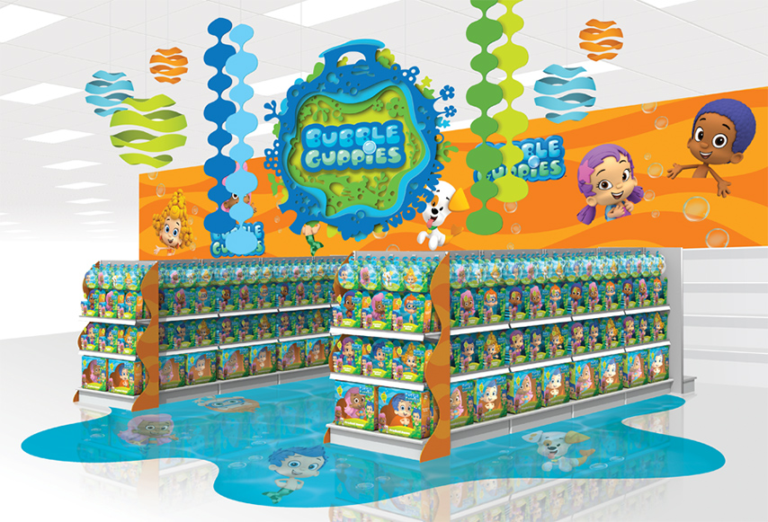
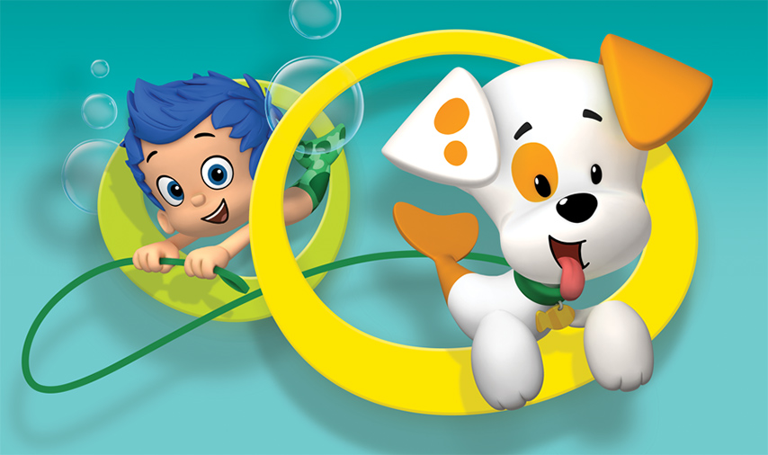
Nickelodeon’s hit preschool series, Bubble Guppies, is both entertaining and educational, empowering kids to learn while they play. Working with Nickelodeon Consumer Products, we created an inspiring retail environment to support this unique and vibrant brand.
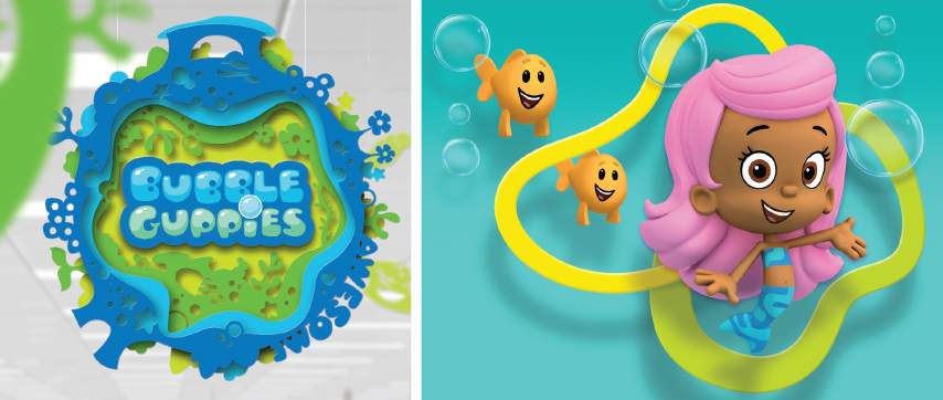
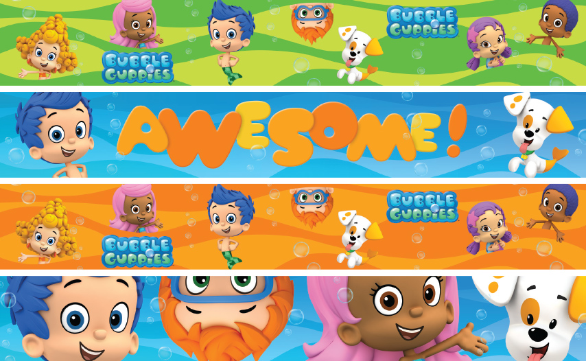
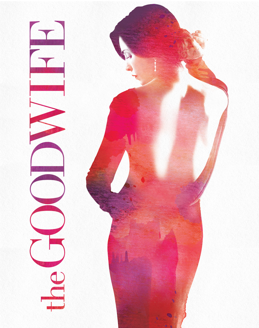
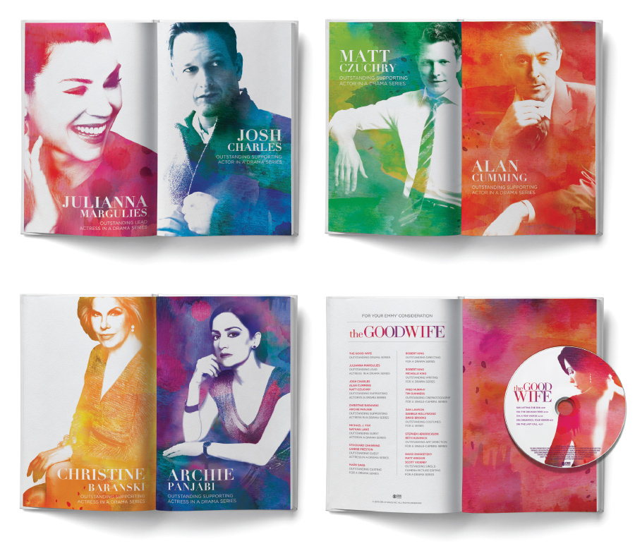
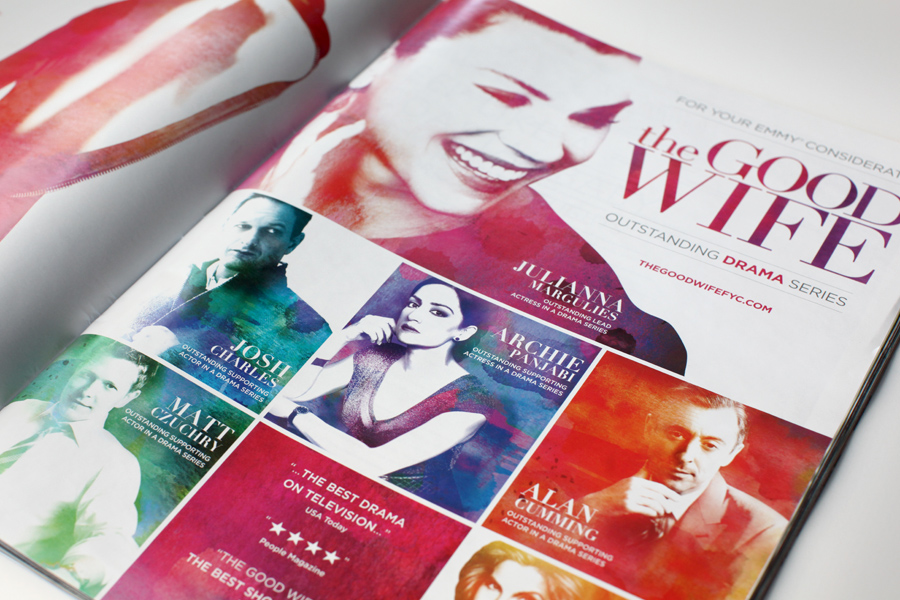
Now in it’s fifth season, The Good Wife continues to garner praise from critics, and is widely regarded as one of the best dramas on television. We worked with CBS to develop a vibrant and sophisticated Emmy campaign to celebrate the acclaimed show.
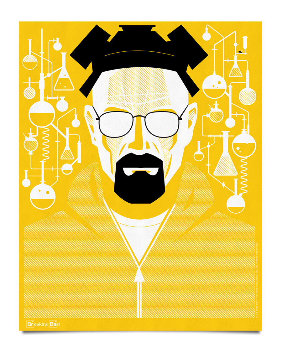
To celebrate Breaking Bad’s Golden Globe and Emmy wins, we’re releasing one final print. This is an 11×14 version of the larger Heisenberg hazmat yellow poster. We’re only printing 500 of these, so it will be a limited edition, hand-signed and numbered. They are exclusively available on the BreakingBadStore.com
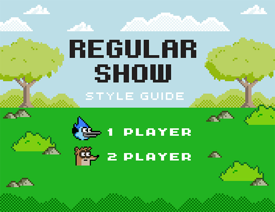
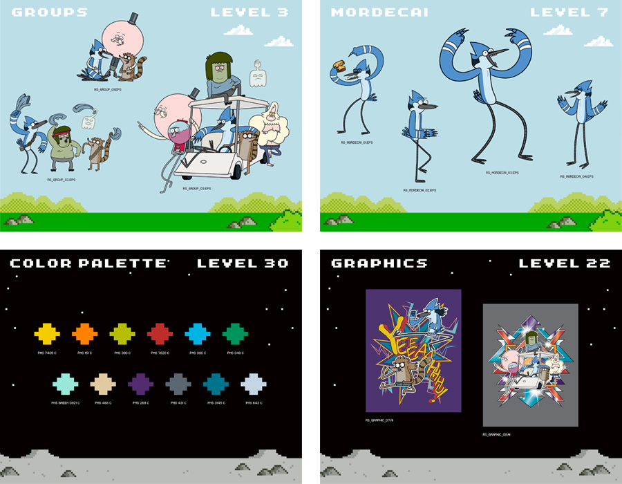
With exceptional ratings and a thriving consumer products program, Regular Show is one of Cartoon Network’s most exciting properties. We worked closely with CN to design the 2014 Style Guide for the Emmy award-winning series.
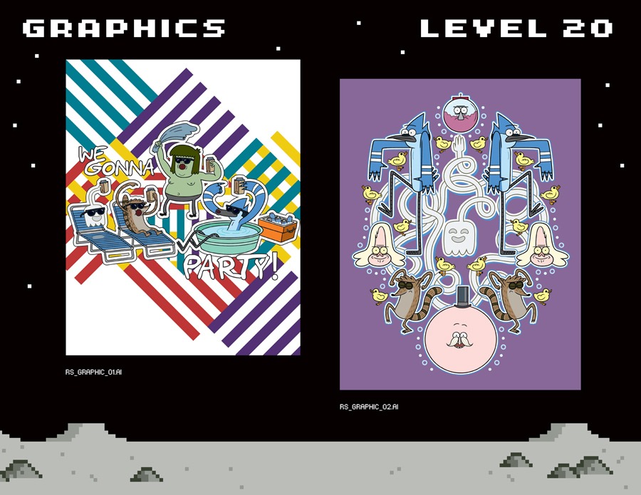
Inspired Mordecai and Rigby’s penchant for the video arcade, the style guide design is an 8-bit homage to old-school gaming.

We’re honored to have our office featured in the new book, “The Style of Coworking”. Our conference room is even on the cover! You can pick up the book here.
We are honored to be featured in the Communication Arts 2014 Typography Annual. Our Emmy Campaign for CBS was selected as a winning entry in the 4th annual competition. We’re very proud to be represented.


The SND CYN wall mural in our office lobby is also featured in the annual. Both projects were fantastic collaborations with our very talented friend, Mr. Erik Marinovich.
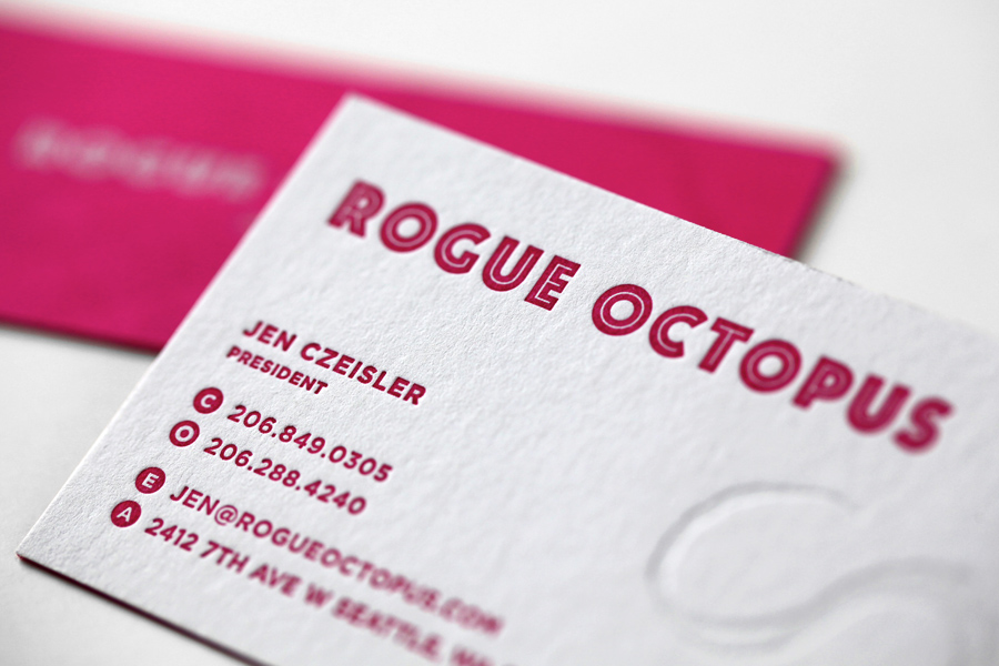
We recently designed a simple brand identity system for Seattle-based music licensing group, Rogue Octopus. We worked closely with Sub Pop expat, Jen Czeisler to realize her vision for the new brand. The result is simple, striking and unexpected.
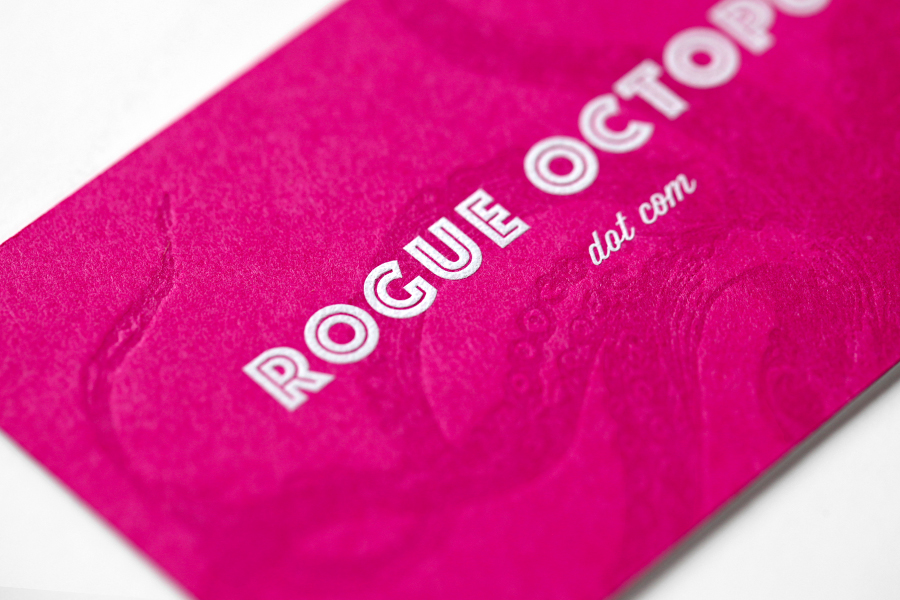
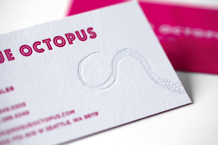
We designed a double-sided letterpressed business card which was printed impeccably by our friends at Studio On Fire. 110lb. Crane Lettra Flourescent White duplexed with 100lb. French Pop-Tone Razzle Berry cover to get to an overall weight of 210lb. The tentacles on both sides of the card are tonal impressions and the type on the back is engraved white ink.
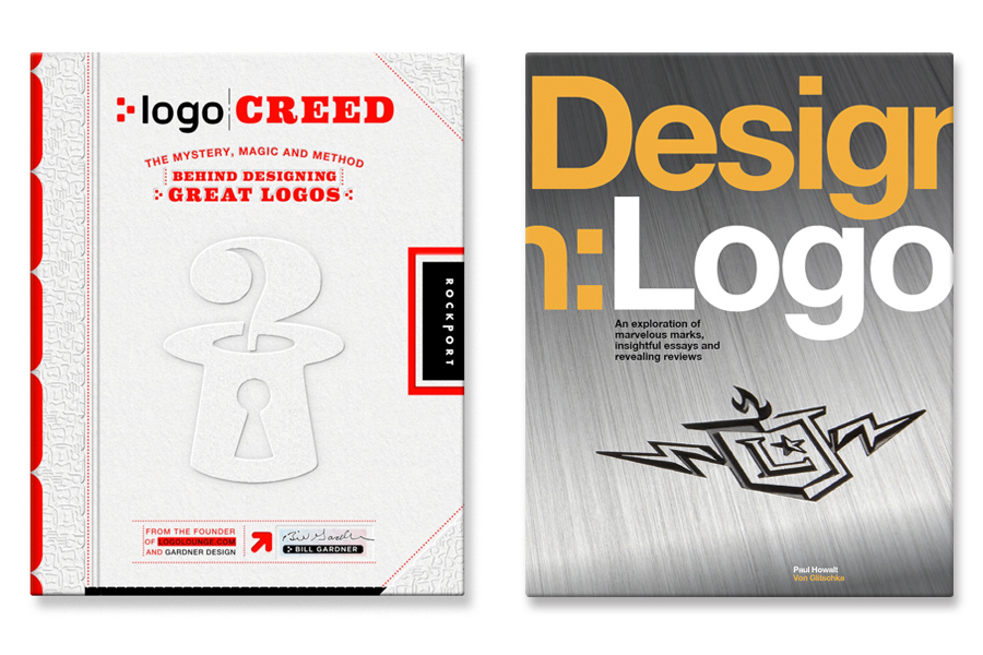
We’re honored to have several of our logos featured in two new books published by Rockport. Both available on Amazon.

Characterized by state-of-the-art technology, revolutionary engineering and progressive design, Audi is one of the most respected brand names in the world. Working closely with Audi’s advertising agency, VBP, I illustrated a 28-page book celebrating the legendary carmaker’s rich history of innovation.


Elena Damy is a premier floral and event designer who creates one-of-a-kind experiences for her clients all over the world. With a client list that includes Hollywood celebrities, global dignitaries as well as Fortune 500 companies, the Elena Damy brand needed to be unique, elegant and luxurious. We worked closely with Carlos and Elena Damy to design a completely new identity system, including a logo, business cards, and website.

We wanted to the business cards to feel incredibly special, so we designed them using wood instead of paper. Each card is laser engraved on quarter-inch thick walnut. The result is really amazing – each card is completely unique.


In July we started searching for a graphic designer to join our team. After reviewing more than 500 applicants, I’m very excited to announce the position has been filled by Kortney Greer. Kortney is an exceptionally talented creative who has worked on a wide range of brands including 20th Century Fox, DreamWorks, McDonalds, and Nickelodeon. We are very proud to have her on board.

For nearly a century, Universal Pictures has produced and distributed some of the most memorable entertainment in the world. We are proud to be working with this incredible brand.

Offscreen is a new periodical with an in-depth look at the life and work of digital creators. If you haven’t seen it yet, I’d highly recommend checking it out. Great content and beautifully designed. We’re honored to be included in their current issue. Our workspace is featured alongside Dropbox, VSCO and Google.

A year ago, Showtime asked me to create merchandise for their hit-series “Homeland”. I am a big fan of the show so it was an exciting project. The series is smart and sophisticated, so the challenge was to design something original and unexpected that would resonate with the “Homeland” audience. Playing off of the theme of jazz that appears in the storyline – particularly in the pilot episode – I designed 12 vintage record covers inspired by the show. I am very excited to announce that all of the designs are now on sale exclusively on the Showtime website.


The album covers are available individually as 12 x 12″ framed prints or combined into a single 24 x 34″ limited edition lithograph. There will only be 1,000 hand-signed and numbered prints. You can find them here.


Here are some actual photos of the Breaking Bad screen prints that I designed. They really turned out amazing. Our friends at Vahalla Studios killed it once again. Double hit of white + black on 4 different colors of 100lb. French Pop-Tone paper.


The first edition is sold out. We printed 1100 sets of three mini-prints, 700 yellow ones, 500 blue ones, 200 green ones and 200 orange ones. Each one was individually signed and numbered by me. There is a second edition available now on BreakingBadStore.com. The second edition is open and is not signed or numbered. The artwork has been changed very slightly as well. On the yellow and blue prints, the fly is in a different location. On the green print there is a number 2 in a circle in the bottom right corner, and on the orange print I added Walter White’s wedding ring around his neck.


We are honored to be featured in the Communication Arts 2013 Design Annual. Our series of posters for CBS were selected as winning entries in the 54th annual competition.


Communication Arts magazine, a professional journal for those involved in creativity in visual communications, has published the results of its 54th annual design competition, the most exclusive major design competition in the world. Of the 4,198 entries submitted to the 54th annual design competition, only 166 were selected by a jury of respected creative professionals, representing the work of 134 designers, design firms and in-house design departments.
I was a huge “LOST” fan. I loved “Dexter”. “Homeland” is incredible. But “Breaking Bad” is the greatest television show. Ever.
I am such a big fan of the show, that I designed a set of three posters to celebrate the Emmy-winning series. And now, I am very excited to announce that these prints are official “Breaking Bad” merchandise and will be exclusively available on the BreakingBadStore.com starting tomorrow (Tuesday September 24th) at 10AM PST/1PM EST.
The poster series illustrates the transformation of Bryan Cranston’s character, Walter White, over the course of the highly-acclaimed series.

Mr. White
This first print depicts the Walter White we met in the first season of “Breaking Bad” – the pitiful chemistry teacher, wearing only a green rubber apron and white cotton briefs, frantically cooking meth in the Albuquerque desert.

Heisenberg
The second print portrays Walter White as the crystal meth kingpin, “Heisenberg”. Rising to power and descending into chaos, Walter is encircled by the super-lab and a small, pesky intruder.

The final print represents the final incarnation of Walter White: Mr. Lambert. Armed and dangerous, bearded and beleaguered, Mr. Lambert has nothing left to lose!

The collector’s edition prints will be available as individual 18″x24″ posters, or as a set of 3 11″x14″ smaller prints. Each piece is a 2-color, hand-pulled silkscreen print on 100lb French Pop-Tone Paper and every poster is hand signed and numbered. There is also a Heisenberg variant on hazmat yellow, which will only be available in the 18″x24″ size.

All of the posters will be exclusively available on the BreakingBadStore.com starting tomorrow (Tuesday, September 24th) at 10AM PST/1PM EST.
The Breaking Bad series finale airs Sun., Sept. 29 at 9 p.m. ET on AMC.
If you’ve been reading the blog, you’ll know that for the last few years I’ve been designing posters for Showtime’s hit TV series, Dexter. Each silkscreened print commemorates a single season of the show, rebuilding the story graphically, through a collection of stylized icons and illustrations.
This project, which began as self-initiated fan-art, was embraced by Showtime and expanded into an array of official Dexter merchandise. The artwork was so well-received that I was even given a cameo role on the show!
Tonight marks the finale of the entire series. I can’t believe the show is over! This has been one of my all-time favorite projects. So in honor of the final season, here is my last Dexter poster.
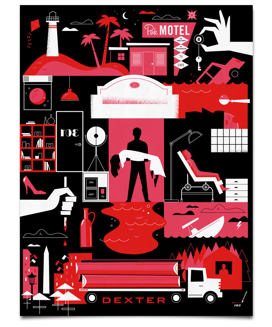
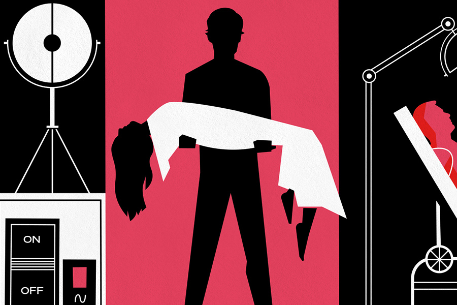
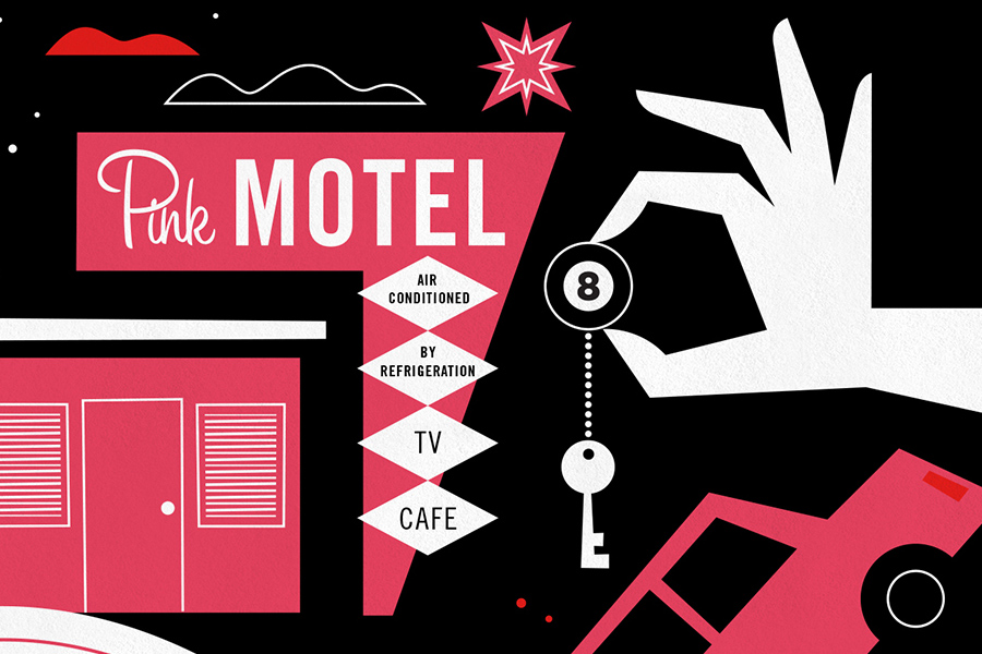
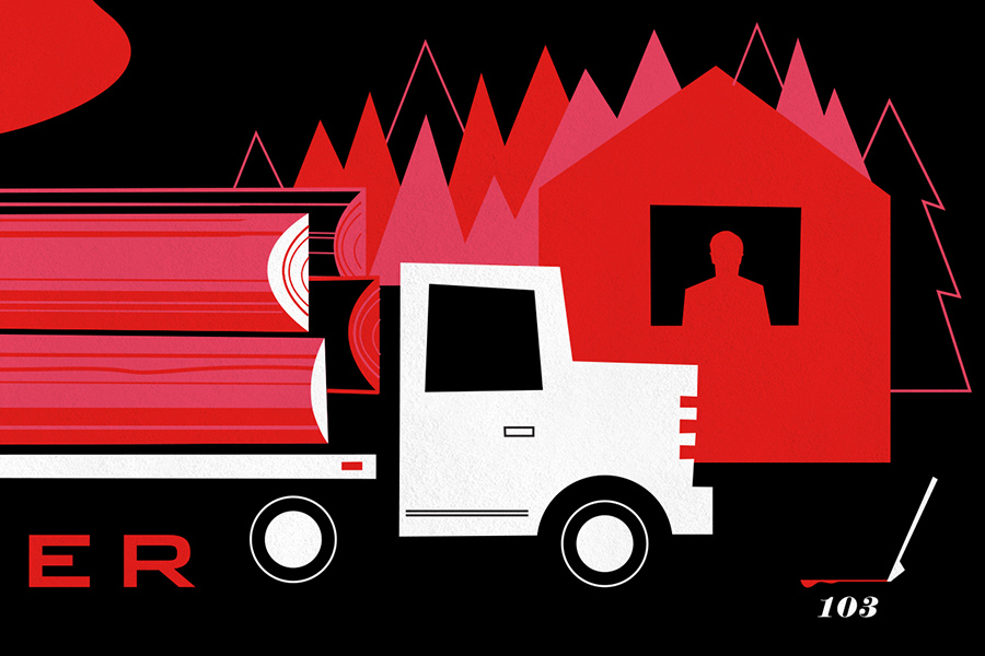
This final print will be available exclusively on Sho.com

We’re looking for an exceptionally talented graphic designer to join our team. Could it be you? Apply here.
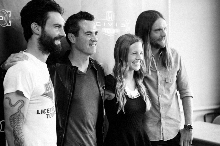
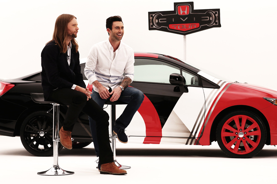
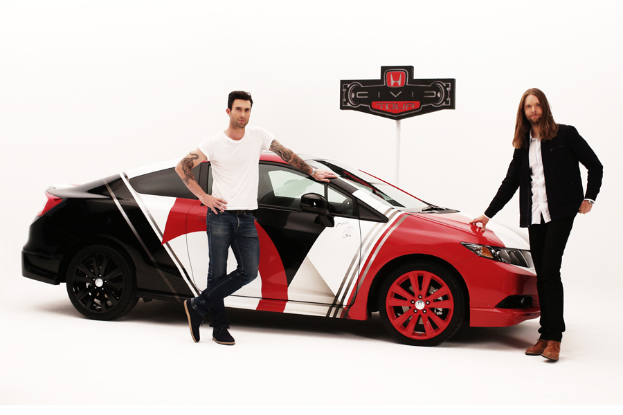
Here are a few shots from the unveiling of the custom Honda Civic we designed for Maroon 5 and the 2013 Honda Civic Tour.


Here is the exclusive CBS “Under the Dome” key art I designed for Comic-Con 2013. If you’re at SDCC this year be sure to pick one up! Cast members Dean Norris, Rachelle Lefevre and Mike Vogel, along with executive producers Neal Baer and Brian K. Vaughan, will be signing this poster for fans at the CBS interactive booth #4245 on Sunday, July 21 from 3:30-4:15PM.

The One Show Design Awards is the most prestigious worldwide competition celebrating the year’s best in design. This year there were 274 winners from 28 countries who emerged from a competitive pool of almost 4,000 submissions. We are extremely proud to have our poster series for CBS selected as a winning entry. This is our second consecutive year to be recognized by the One Show, and it’s always an honor.
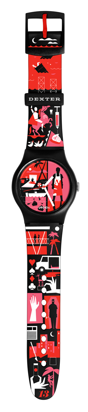
To commemorate the final season of Showtime’s hit-series, Dexter, we partnered with Vannen Watches to create a limited edition, art watch. Featuring artwork inspired by key moments from the show, the collectible timepiece is available for pre-sale exclusively on the Showtime website.

Few corporations have leveraged the power of design as well as Target. Every expression of the brand, from on-air advertising to in-store experience, underscores the retailer’s primary tenet: Design For All. We are extremely proud to be working with one of the most innovative companies in the world.
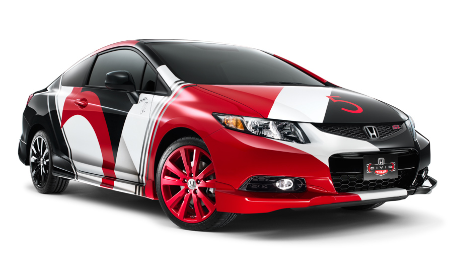 The Honda Civic Tour features the biggest names in music and draws hundreds of thousands of fans. Each year the headlining band creates a custom Civic that is featured at every show and ultimately won by a lucky fan. This summer Maroon 5 will headline the tour, and we worked closely with the band to create a truly one-of-a-kind 2013 Honda Civic Si Coupe.
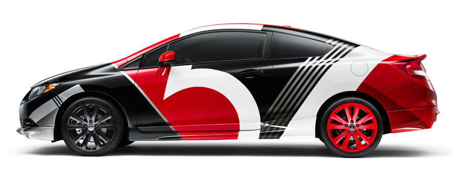
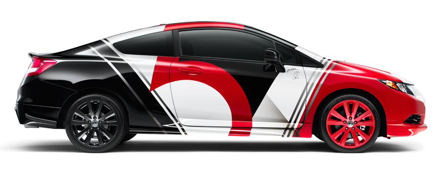
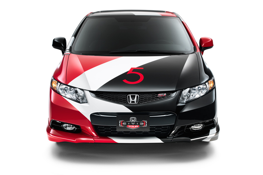
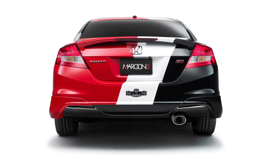
Here are some images from various stages of the design process. I worked closely with the band to capture their vision for the design. Then the car was custom-painted by hand.
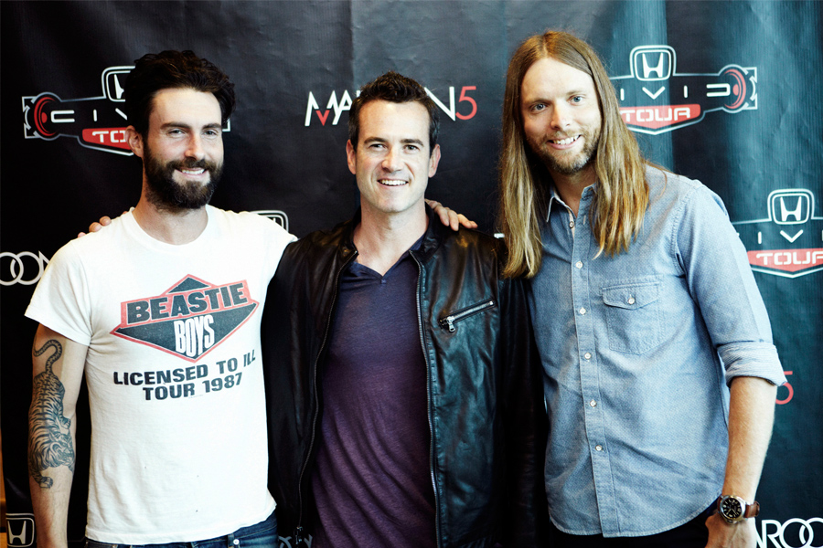
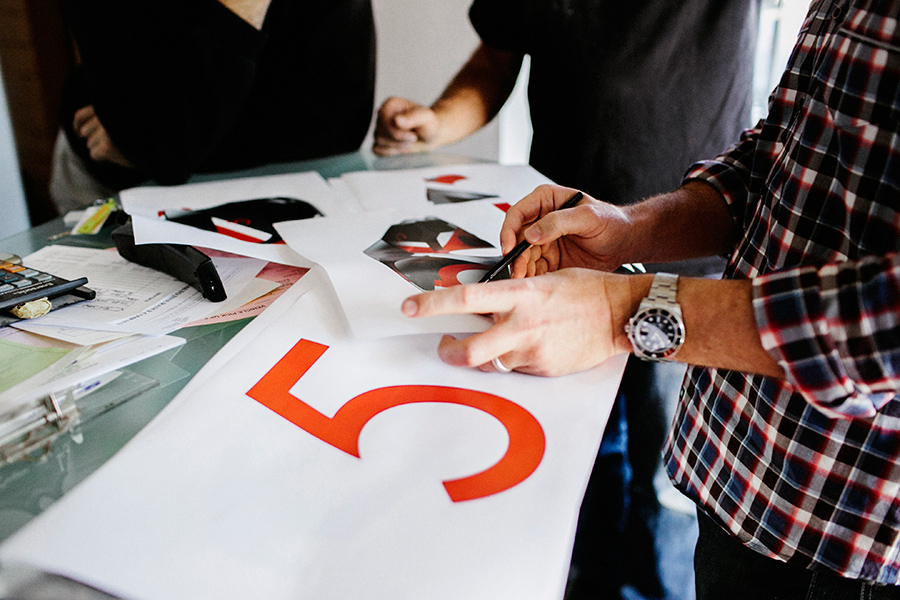
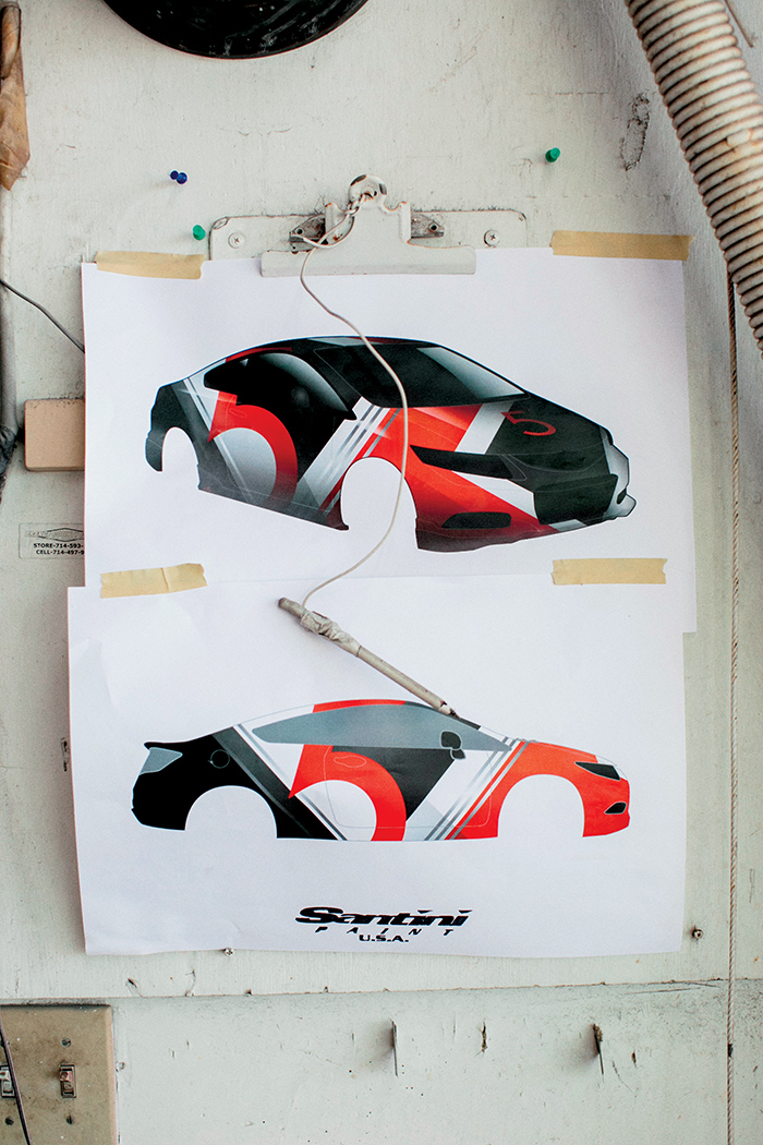
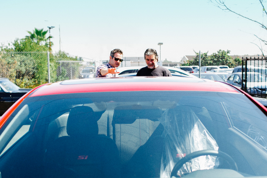
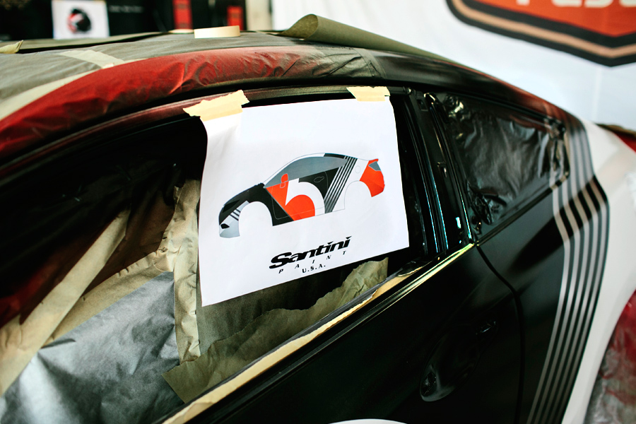
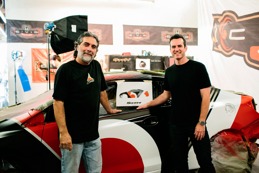
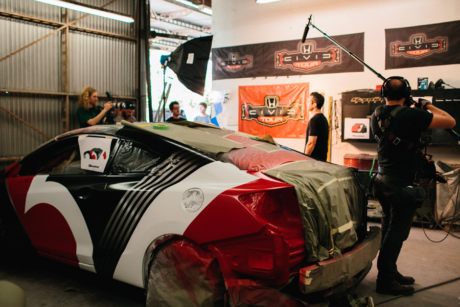
The car is autographed by the band and will be given away to a very lucky fan at the end of the tour. You can enter to win here.
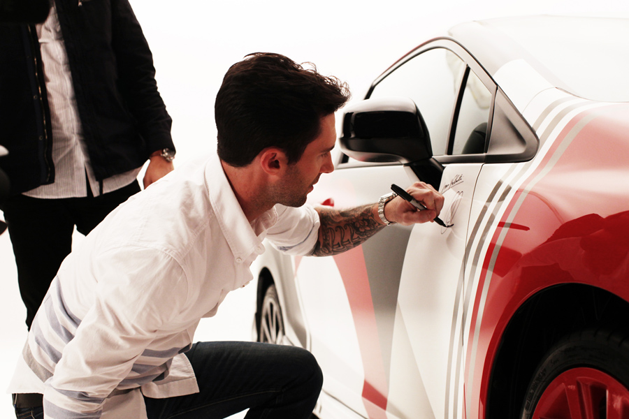
Be sure to catch Maroon 5 on the Honda Civic Tour this summer! Both the custom Civic and the motorcycle will be featured at every venue. Learn more at CivicTour.Honda.com
We recently completed the FYC Emmy Campaign for CBS. The ads, which ran in all of the major trade publications as well as The Los Angeles Times, feature custom typography swirling around the stars of CBS’s popular drama series, including The Good Wife, Elementary, Blue Bloods, CSI and NCIS. It’s always a joy to work with CBS and I think the campaign turned out beautifully.


Here are some new photos of our recently expanded office space.


Located in Old Town Irvine, Southern California, the warehouse was originally built in 1895 and used to process lima beans. Today it’s a collaborative office space that we’ve dubbed, SND CYN Studios. Learn more and see pictures from our Grand Opening Party and our InstaGallery at SNDCYN.com

The 30 Rock series finale aired tonight. Here’s a small tribute to one of the smartest comedies of all time.
We’re big Quentin Tarantino fans, so we were extremely excited to have an opportunity to work on the app for his latest movie, Django Unchained. Our friends over at Envoy asked us to design titles for the characters in the film. Super fun project. You can download the app now in the app store.


Last night was the finale of the second season of Homeland. To say that I am a huge fan would be an understatement! Inspired, I set out to create a series of designs to celebrate the award-winning show. Playing off of the subtle theme of jazz that appears the storyline, I designed 12 vintage record covers inspired by the TV series. Let me know what you think.


Another season of Dexter is complete and here is my Season 7 poster! The limited edition silkscreen print is available here on the Showtime website.

A few details below.


We have 6 logos featured in LogoLounge Volume 7! We’re honored to have these designs included in the best-selling series. Below are the winning entries.


Each year Print Magazine publishes their Regional Design Annual, showcasing the best graphic design in the country. Out of the 83 winning entries that represent the Far West—California, Oregon, Washington, Nevada, Colorado, Idaho, Utah, and Alaska—I am extremely proud to have three of our projects featured. The selected pieces are below: my Season 6 Dexter Poster, our brand identity for TV editor Natalie Ebnet, and the Dexter DVD Box Set packaging. This is our fourth consecutive year to be included in the annual, and it’s always an honor.


Our Dexter prints were featured today on Hulu’s exclusive show, “The Morning After”! The posters were featured as part of their pop culture holiday gift guide this year. I’m honored to be included! Check out the clip here.
All of the Dexter prints are available on the Showtime website at www.sho.com/tymattson

With a rich history of imagination and creativity The Jim Henson Company has remained an established leader in family entertainment for more than 50 years and is recognized worldwide as an innovator in puppetry, animatronics and digital animation. We are extremely proud to be working with their global consumer products division.
We’ve been working all summer on our newly expanded collaborative office space that we’ve dubbed, SND CYN Studios, and it’s finally finished! We celebrated with a grand opening party earlier this month. Here are some photos from the event.


If you missed the party, here is a cool time-lapse video of the gallery during the event.
You can learn more about our office and everyone who works here, at SNDCYN.com. By the way, we have an open studio…want to join us?

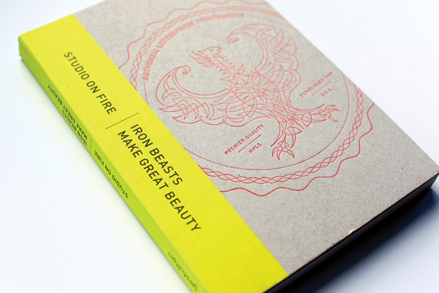

Our work has been featured in several publications over the last few months. I am very proud to be included in Studio on Fire‘s incredible book, Iron Beasts Make Great Beauty. Published by Gestalten, It’s a beautiful book featuring the Studio on Fire’s amazing letterpress work. They featured Shepard’s birth announcement and I am honored to be included.
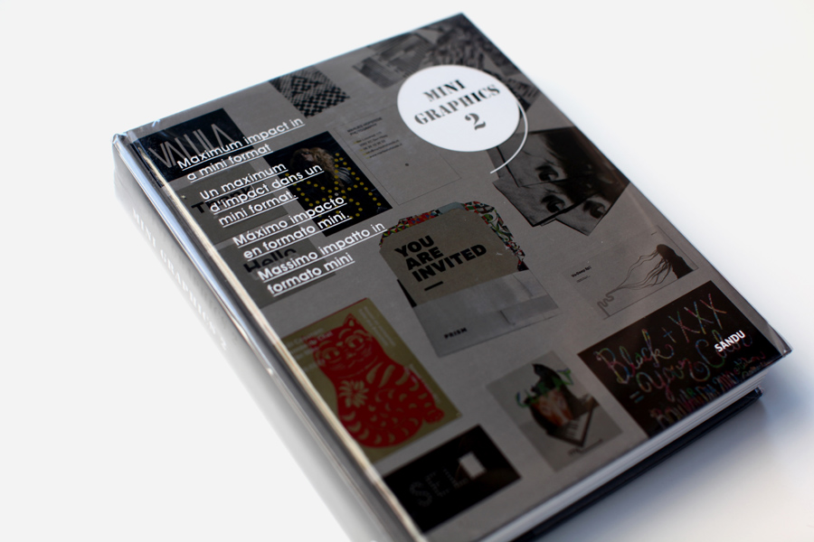
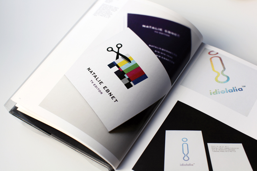
We’re also highlighted in Mini Graphics 2, published by Sandu. This book includes a large collection of small-scale projects with an emphasis on innovative printing techniques. Our logo and business cards for television editor, Natalie Ebnet are featured in the book.


The new Print Magazine Regional Design Annual is due to come out next month, so it’s almost too late to mention that we were featured in the 2011 Annual. Even though it’s been out a while, I’m still proud that our Dexter posters were recognized by one of the leading graphic design competitions in the country.
We’re very proud to have our work included in this month’s issue of HOW Magazine. Our on-air brand campaign for CBS is featured in the Behind the Design section. HOW is one of the leading graphic design publications so we’re honored to be featured.


Mattson Creative is a small design firm, by design. Our size is a competitive advantage. I can respond quickly to, and collaborate closely with clients. Being intentionally small also allows me to selective with clients, agile when it comes to change, and hands-on with design. As a small design studio, we’ve worked directly with some of the biggest brands in the world – Apple, Billabong, CBS, Coke, Dreamworks, Mattel, Hasbro, and Nickelodeon, to name a few. Small is the new big.
The only downside of running a boutique studio is that you really don’t need that much space to do it. I’ve always wanted to work in a big, ultra-creative office – an inspiring environment, teeming with interesting people, doing inspiring work. But I’ve never wanted to manage the number of employees that would necessitate a studio of that size. My passion is design, not management. I wanted the energy, community and culture of a large creative agency…I just didn’t want the agency.
So I set out to create the type of office that I wanted to work in, and I invited my friends and colleagues to join me. It turns out that they were looking for the same thing I was: a unique environment and a creative community. I decided to expand our existing space in Old Town Irvine into a collaborative workspace for creative professionals. We filled it quickly and now the space is home to artists, designers, photographers, producers and developers. And I get to go to work everyday with my friends. We call it SND CYN Studios – which is derived from our address on Sand Canyon Avenue.
All summer we’ve been working on the building– a 125 year-old former lima bean factory – reimagining and redesigning the interior into a one-of-a-kind creative workspace – and we’re almost finished. Stay tuned to my blog for more pictures as we finalize the studio. It’s exciting to see it coming together.


A while back I posted about the poster series that CBS commissioned me to do for their corporate office in LA. Well, the prints are now installed and they look great! Below are some images of the artwork on the walls.


It’s hard to get a sense of how big these are in person. All of the prints are silkscreened and several of them are 55″ x 40″. The Big Bang Theory poster is 100 inches long! Each piece is 3 colors – red, black and metallic silver – and represents a classic CBS television show. Below is the entire series.

Gilligan’s Island, I Love Lucy, The Twilight Zone, CSI:, Magnum P.I., Mary Tyler Moore, MASH, & Lost in Space.

Established in 2006, Beats Audio is the brainchild of Dr. Dre, legendary artist and producer, and Jimmy lovine, Chairman of Interscope Geffen A&M Records. Together, they set out to create the best end-to-end premium music experience for both fans and artists alike. Mattson Creative is proud to be partnering with this truly dynamic brand.

Capturing the imaginations of both children and adults, DreamWorks has created some of the most successful feature films of all time. We are thrilled to be working with their consumer products division.

Maroon 5 released their fourth studio album, Overexposed on June 26th, debuting at number two on the Billboard Top 200 chart. We designed merchandise to support the new record and a commemorative poster to celebrate the 10th anniversary of the band’s multi-platinum first album, Songs About Jane.

Nickelodeon is the number-one entertainment brand for kids. The company includes television programming and production in the United States and around the world, plus consumer products, online, recreation, books and feature films. Nickelodeon’s U.S. television network is seen in 100 million households and has been the number-one-rated basic cable network for 17 consecutive years.
I grew up watching Nickelodeon (Nick Rocks, You Can’t Do That on Television, Double Dare!!!), so it is a huge honor to be working with this incredible brand.
I’ve been working closely with CBS for the past few months and I’m extremely excited to finally be able to share what we’ve been doing. CBS commissioned me to develop a series of animated sequences based on their current hit shows. I designed graphic interpretations for 10 programs: Two and a Half Men, CSI:, The Big Bang Theory, Hawaii Five-O, The Good Wife, Person of Interest, 60 Minutes , Survivor, and NCIS. I created storyboards for each animation and created final artwork. The sequences were animated by The DMC Initiative. The individual spots are currently airing nationally and the complete 60 second piece, which features all of the shows, was used to open the CBS 2012 Upfront this month.
10 Second Person of Interest Spot
10 Second 60 Minutes Spot
10 Second Two and a Half Men Spot
10 Second Big Bang Theory Spot
10 Second NCIS Spot
Seeing my designs on national television is pretty incredible, but this project gets even better. After we completed the animated sequences for the current programs, CBS commissioned me to create an extremely limited edition poster series commemorating their classic television shows. These oversize 3 color silkscreen prints will be installed in CBS’s offices in Los Angeles.
 Lost in Space

Gilligan’s Island

The Mary Tyler Moore Show

CSI:

The Twilight Zone

M*A*S*H

and of course, I Love Lucy
“Payphone”, the first track off of Maroon 5’s new record “Overexposed” premieres today and it sounds great. I created this design to support the new single.


You can buy the single on iTunes and pick up the shirt on Maroon5.com

Introducing Mattson Creative’s first full-time employee: Jen Peters.
A graduate of Chapman University, Jen is a talented designer and has done amazing work for many of our clients including Billabong, Cartoon Network, Discovery Channel, and Maroon 5. Jen is incredibly creative and extremely versatile. She’s an invaluable member of our team. Below are a few samples of her work.


Jen loves owls. A lot. In 2011, she designed a new owl each day for an entire year. You can see all 365 illustrations from her project here: A Hoot a Day.
 With operations in virtually every field of media and entertainment, CBS is truly an iconic brand. We are incredibly excited to be collaborating with the renowned television network.

This week I will be speaking at Cal Baptist University in Riverside. The event is open to the public so feel free to come out.
This is cool. My friends at Vahalla Studios print all of the Dexter posters I make. This is what it looks like.
The Dexter Season Finale aired tonight, and here is my Season 6 poster! The limited first edition silkscreeen print is available here on the Showtime website.

Some details below.


A few pictures from the Mattson Creative Christmas party in Vegas. Merry Christmas!

With attention to detail and a commitment to sustainable practices, Pocono Modern is building homes in the Poconos with a fresh, modern twist. We’ve collaborated together for years now, and their logo is still one of my all time favorite projects. You can read about that brand identity development here.
Led by Kraig Kalashian, who might be the most creative person I know, Pocono Modern not only builds homes, they just released a new line of home goods on their website. We designed and built the online store and even created one of the first products: a limited edition silkscreened poster series.

The posters were printed by our friends at Vahalla Studios and there are three different color combinations. Each print is 18×24 and signed by me.


There are only 100 of each, so pick yours up today at Pocono Modern.
I was honored to be asked by HOW Magazine to judge their 2012 Poster Competition. I reviewed hundreds of entries and saw a lot of really great work. It was hard to just choose 10 entries, but the posters below are the best of the best. Congratulations to the winners.

The Old Spice series of posters immediately stood out as the best in show. In my opinion, the best posters are the ones that do the most with the least, and this is a great example of that. No copy and one color with simple, unexpected and intriguing visuals. This is simply a brilliant series.
Designers: Landor, Cincinnati: Gerhard Koenderink, Joe Napier, Jay Hoffman, Jeff Maurer, Barbara Carlotta, Jens Martesen, Stacey Dunaway

This series was striking; a fantastic illustration that is bold and balanced. I couldn’t look away.
Designer: Graham Erwin Design, Columbus, OH

I thought this was genius. I loved that the designer took the environment into consideration when creating this poster. This print challenges your conception of how to see and what to look at. The result is astounding. A smart solution, that smacks of Saagmeister. Bravo.
Designer: Boyce McClellan

This print immediately caught my attention. Bold overlapping color and the graphic hand and eyes are striking and seem to play perfectly off of the title, “Beast in a Neon Cage.” As with many posters, all of the type creates an unnecessary distraction, but I loved the vibrant nature of the poster overall.
Designer: Jon Wong, Hillsborough, CA

There isn’t anything I don’t love about this print. Great illustration. Incredible use of two-colors. Amazing texture. Beautiful type. Perfect.
Designers: Camp Firebelly: Alysha Balog, Annabelle Choi, Arjun Harrison-Mann, Colin Denney, Jince Kuruvilla, Lindsay Kaser, Mandi Smith, Monica Ray, Raphael Alexander Cala, Skye McNeill

A great poster will make you stop in your tracks. The combination of bright colors, bold illustration, and clever text make this poster a print a success. I’d hang this in my office.
Designers: FAME: Bruce Edwards, Eric Weiss, Chelsea Brink, Chris Yocum

Loved this self-promotional piece from FAME exploring the mechanics of creativity. It’s hard to be smart and funny. This concept is both humorous and well executed. I love compilation illustrations like this that invite a viewer to engage and explore all of the creative details of the print.
Designers: FAME: Bruce Edwards, Erik Herberg, Kara Connolly

This is another great example of a poster solution that forces the viewer to engage, look harder, and “discover” the concept. A strong idea that is as smart as it is simple.
Designers: FAME: Bruce Edwards, Erik Herberg

A perfect balance of simple and complex, this print is intriguing.
Designers: Kate Thomas & Dave Whitley
Bold and bright, this series is eye-catching and fun.
Designers: Johnny Two Tone Club: Marcus Taylor, Ben Hagley, Leah Dent, Duncan Roylance, Angela Mitchell, Michelle Leslie, Brendan Hibbert, Dan McKeating, Bec McKeating

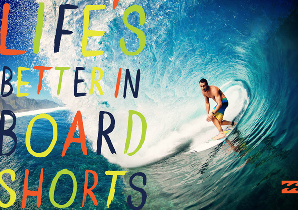


One of the leading manufacturers of surfing, skating and snowboarding apparel and accessories, Billabong is a name that’s recognized all over the world. We worked with the iconic surf brand to develop key art and graphics for their worldwide 2012 Spring campaign, Life’s Better in Board Shorts.
Last year I designed a poster series inspired by Dexter. My artwork was so well received, that Showtime invited me to make a guest appearance on the show! You can see me above, searching the crime scene with a flashlight.
I also walk behind Deb and Laguerta in the hallway of the police department. Don’t blink. It was such a fun experience to be a part of the show. When I designed the prints, I never imagined that they would land me a part on the program. So cool.
I even got to pal around with Dexter himself, aka Michael C. Hall – who was cool enough to customize my outgoing voicemail greeting. Which you can listen to below.

With offices in Berlin, London, New York and Tokyo, Gestalten is renowned for publishing more than 400 books that document and anticipate vital movements in design, illustration, architecture, and typography as well as urban and contemporary art. We’re excited that they asked us to be a part of their new book, Visual Storytelling: Inspiring a New Visual Language. We just received a copy in the mail and it is really an inspiring collection of work. We feel very honored to be included!

A quick description of the book: Visual Storytelling uses graphic design, infographics, illustration and photography to convey information in the most elegant, entertaining and informative way. Today, a new generation of designers, illustrators, data journalists and graphic editors is expanding the creative scope of existing visual storytelling techniques – meeting the formidable challenge of extracting valuable news, surprising findings and relevant stories from a daily flood of data head on.

We’re extremely proud to announce the launch of our brand new website. Featuring 30 recent projects, it’s the most comprehensive gallery of our work to date. Redesigned from the ground up, the new site is now accessible on iPhones and iPads so you can check it out from wherever you are. Let me know what you think.
The poster series that I created for Dexter was inspired by mid-century modern design and particularly the work of Saul Bass – who developed both static graphics as well as animated title sequences. I’ve always wanted to design a title sequence, so it seemed like this would be a good opportunity. I collaborated with my friends at Fashion Buddha to create an alternative title sequence for Dexter using the artwork that I developed for the posters. This is what I imagine the Dexter title sequence might look like if the show had aired in the 60’s.

You can buy the posters I designed here.
The winning entries have been announced and 6 of our logos will be featured in LogoLounge Volume 7! We’re honored to have these designs included in the best-selling series. The book will be out next year, but you can see the selected logos below.


Okay, this is awesome.
So, if you haven’t been following my blog, here is a quick recap: Last year, I created a poster series inspired by the Showtime television series, Dexter. Each print represented an entire season of the show, highlighting the iconic moments from each episode. I designed the artwork as a fan and posted them here on this blog.

The next day Showtime called, which was the beginning of an exciting series of events:
We wound up releasing limited editions of the prints through a dedicated section of the Showtime website…
I had the opportunity to meet the amazingly talented people who write, produce and star on the show…
Target featured the artwork in every copy of the Season 5 DVD…
They filmed an interview with me as a DVD bonus feature…
The posters have been recognized in several design annuals including Communication Arts and Print Magazine.
…but of all the amazing things that have happened because of the artwork, I think this is the coolest:
Showtime asked if I’d like to be on DEXTER.

So last week I actually got to go to the set and film an episode of the show! They let me play a detective, so you will see me briefly in the background towards the end of Season 6. The entire experience was really incredible. It was amazing to actually see everything that goes into creating each scene of every episode of the show. The cast, crew, producers and writers of the show are unbelievably creative and talented – it was such a honor to get to see them work and to be a part of the show!
I can’t begin to explain how surreal it is to suddenly find yourself on a show that you’re a fan of. When I designed the prints, I never imagined that they would land me a part on the program. So fun!

So what was the one question I asked Emmy-nominated actor and Executive Producer, Michael C. Hall?
“Will you record my voicemail greeting?”
His answer…
Lots of exciting news on the Dexter front! The 5th season of Dexter has just been released on DVD and the international version includes a bonus feature interview with me. Showtime came down and filmed the interview in my studio and we discussed the series of illustrations I created, that were inspired by the show. The whole thing was really fun and the piece turned out great. I’m honored to be featured on the DVD! Here are a couple still shots from the interview, below.

The interview is only featured on the international release, but domestically, another exciting announcement – Target is including a mini-art print that I designed in every copy of the Dexter Season 5 DVD. The print is a small version (about 5×7″) of the silkscreen Season 5 poster I created. You can see a large image of the print, and read about how I designed it here.


The mini-print is exclusively available at Target, when you buy the Season 5 DVD, but you can find the silkscreen version of the artwork, as well as other products that I’ve designed for Showtime in a dedicated section of their website: Sho.com/tymattson

The September issue of HOW features our studio in their Workspace column. We’re excited to be profiled in one of our favorite sections of the magazine, which is on newsstands now. You can see some more pictures of our office here and here.

A very special guest stopped by the studio today – Fabien Barral. On a US tour from France, Fabien is an incredible designer. See his work here. He also happens to run one of most incredible design blogs on the web, Graphic-Exchange.com which receives 160,000 visitors every month. Fabien and I have emailed over the years, and but it was great to meet him today in person.

And he came bearing gifts! Take a look at these beautiful letterpressed coasters and calendars! You can get yours if you donate to support the site here. Well worth it!


Maroon 5’s seductive soul-rock has won multiple Grammy awards and sold millions of records worldwide. From the very beginning, we’ve collaborated with the band to create distinctive designs including merchandise, apparel and their iconic logo. Below are some of the designs we created to support the band’s current world tour.


Zoobles emerged as the breakout girls’ toy brand of 2010, and these cute, quirky creatures continue to make gains in the small doll category at retailers nationwide. We worked closely with Cartoon Network to develop a comprehensive style guide for this exciting Spin Master brand.


Shark Week 2011 kicked off last night on the Discovery Channel and I couldn’t be more excited! Here is a design that I created for this year’s campaign. Posters, mugs and tees are available in the Discovery.com store. Happy Shark Week!
Usually when I’m working on a logo project I’ll do hundreds of sketches, explore a wide variety of executions, and then work through multiple rounds of revisions with the client to get to the best solution. But every once in a while I’ll have a project like this, where the logo almost designs itself.
I got a call from Natalie Ebnet, a talented editor who’s worked on shows for NBC, CBS, VH1, TLC, Discovery and others. She wanted to develop a brand identity and business cards. I had the idea for the logo while we were talking on the phone and showed her the concept the next day. She loved it, and that was it. One idea. No revisions. Done.
We applied the logo very simply to business cards. The cards are a 2.5″ square and are printed on 110lb. Crane Lettra Flo White which we duplexed to get to 220lbs, so they are extremely thick. Because the logo is so colorful, we used 4 color offset printing on the front and a printed a spot color on the back. We just got them back from the printer this week and they turned out great!


One of the leading manufacturers of surfing, skating and snowboarding apparel and accessories, Billabong is a name that’s recognized all over the world. We’re extremely excited to be collaborating with the iconic action-sports brand.
Last year when I toured the Dexter set, I had the opportunity to meet Manny Coto, who is one of the executive producers of the show. Manny introduced me to the Polish Poster Shop which is an incredible archive of European versions of American movies. It’s very interesting to see these radically different interpretations of films like The Big Lebowski, Gone with the Wind, and Crocodile Dundee 2. I was really inspired by these prints, so I decided to create a series of Polish posters for Dr. Giggles, the horror film that Manny wrote and directed.


Each year Graphic Design USA publishes the Logo Lounge Trend Report and we’re excited that one of our logo concepts for Discovery Channel was selected to appear in this year’s edition.
It’s always an honor to be recognized by Logo Lounge but to be included in the trend report is a special distinction, because the small selection of logos represents the most progressive and fresh identity work being done in the industry. This is our third year to appear in the annual report and we are very proud.
You can view the full report here.


Harvest is an annual summer event in Southern California. A modern incarnation of the old-time, big-tent spiritual revivals, the gathering attracts thousands of people each year. Traditionally the event is hosted at Angel Stadium, but this year, Harvest will also expand to Los Angeles for one night at Dodger Stadium. For this year’s campaign, I was asked to create a poster series that would celebrate both the Anaheim and the Los Angeles events.
This was a really fun project because I had designed the branding for their campaign back in 2001. I was fresh out of school and it was one of my very first projects. So it was neat for me to approach the same design challenge, ten years later.

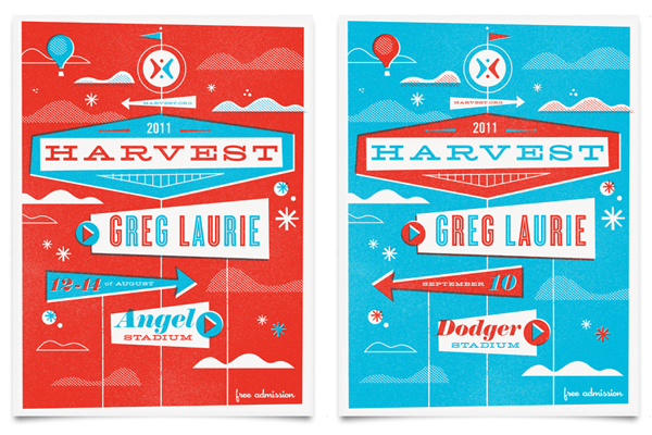


I am extremely honored to have my work featured in the Communication Arts 2011 Illustration Annual. My series of posters for Dexter were selected as winning entries in the 52nd annual competition. CommArts is the leading journal in the field of visual communication and the illustration competition is the most respected in the industry. Out of 4,055 submissions only 181 entries were selected to appear in the annual. I’m very proud to be one of them.


Just got these little beauties back from the printer and I love the way they turned out! We designed this logo and business card for Rogers Reel, a Southern California based film and video production company. The business cards are letterpressed on 200lb duplexed Wausau Eclipse Black paper. We printed with metallic silver ink on both sides and on all 4 edges. The cards are petite, 2×2″ which, along with the reflective ink, gives them a very special quality. Our friends at Studio On Fire printed the cards and we couldn’t be happier with the results.


This week I had the opportunity to speak at the School of Advertising and Art in Dayton, Ohio. I had a great time meeting the students and the staff and I was really impressed with their program. Thanks for having me, SAA!
I just finished designing some new merchandise for Discovery Channel including this Mythbusters poster. The design highlights 10 myths from the show that were either confirmed, busted or considered plausible. Super fun project and I loved the way it turned out. You can buy the poster here.


I thought that I would update the blog with some new pictures of the studio. Our office is in a 100 year-old converted lima bean processing warehouse, so we have a lot of vintage objects around the building. I took a few pictures of my favorites – my optometrist’s projector, water level meters, a school PA microphone (which works) and some other cameras and industrial pieces. As a designer, I always gravitate towards found objects with interesting type, so all of these items feature letters or numerals. I’m also a huge Superman fan, so we have a big mural of The Man of Steel right outside my door.


We recently completed a new iPhone app for our client, Brilliant Sky Toys & Books. Brilliant Sky is one of the fastest growing toy retailing concepts in the country. We’ve been working with them for the last few years and they are just an all around great client. We’ve collaborated together to revitalize their logo, redesign all of their marketing materials and rebuild their website. Our latest project was to develop a unique iPhone app that presents customers with a time-sensitive offer and encourages them to visit their local store. The app also allows users to find the nearest Brilliant Sky location and browse all the events going on at the store.
The app is currently available for free download in the iTunes App Store.
We recently collaborated with BLKBX Creative Group to design the key art for the new Angry Birds Rio game. The game is based on the incredibly popular original Angry Birds game, but will integrate characters from the upcoming animated film, Rio from Twentieth Century Fox. The game is currently available for download on smart phones and tablets world wide, including the iTunes app store and the Mac App store. Rio opens in theaters April 15th.


Here is a cool video of the press event where they announced the new game and unveiled the key art.

We’re very excited to announce our new client, Cartoon Network! Some very fun projects are in the works!
We just finished designing a logo for a new racing/lifestyle brand called Crazy Hare. This was a fun project and I liked a lot of the concepts that we developed so I thought I would share a few of our ideas. Ultimately the client went with the first design below, because the emphasis on speed and motion…but I really like how the last two concepts play off the the name from a conceptual standpoint.


We’re very proud to have two pieces selected by HOW Magazine for their 2011 International Design Awards Competition. Only 272 entries were featured in the annual, which catalogs the best projects in the graphic design industry. The Lost posters and Shepard’s birth announcement were selected as winners and published in the magazine which is on news stands this month. We’re honored to be included in this year’s issue!


Here are 5 new Dexter designs featuring characters from the show! Showtime is running a contest on Facebook right now, where you can vote for your favorite one. We will silkscreen the winning design and do a limited edition run of 11×14 prints.
Vote for your favorite one here.


We recently completed a brand identity development project and I think the logo turned out great. OnWords is a Washington DC based political organization that develops strategic messaging and specific language around progressive issues. We worked closely together to develop a name and visual identity that is simple, bold and sophisticated.

I think the best logos are the ones that communicate the “most with the least”. Below are two other logos I designed which I also think are successfully simple.

Most of the time, the trademark initials don’t compliment the mark, but in this case I used them to accentuate the intentionally incomplete type.

And I have always liked how this logotype integrates a “V”, the Roman numeral five, into the “M”.
I am very excited to finally release my Dexter Season 5 poster! A limited first-edition of 200 are now available on the Showtime website. Take it!

I thought that it would be cool to show the creative process on this project. So I documented the entire project from start to finish, so that you could see everything that goes into making the print. I actually recorded my screen while designing the poster, then time-lapsed it so you can see the artwork come to life!
This was the original rough sketch. After the finale, I went back and scanned through all of the episodes and made a list of the moments that I thought were iconic throughout the season. Then I tried to see how they might work together.

Once the design was finished I sent the art to Vahalla Studios. When it comes to screen printing, these guys are the best! The prints are 3 color on Super Thick French Black Licorice paper. Since we’re printing on black, we do a double hit of the white. Then the pink layer prints, and the red is last. Here are some photos of the posters being printed.


I was thrilled with the way it turned out. It’s not an easy piece to print, but it came out perfectly. Below are some detail images of the finished poster.


The poster is currently available on Sho.com. We also did a second edition of the Season 1-4 prints in case you missed those. The art is exactly the same. The only difference is that I changed the scalpel to a cleaver in the bottom right corner to indicate the second edition.

2010 has wrapped up and by every account it was an amazing year. So many incredible things happened over the last twelve months that I thought a recap might be in order.
It was definitely the best year on record for Mattson Creative. We added some fantastic new clients such as Apple, Hasbro and Mattel, while continuing our collaborations with Brilliant Sky Toys, Discovery Channel, Pocono Modern, Maroon 5, Sara Bareilles and many more.
Some of my favorite projects in 2010 began as personal initiatives. Exactly one year ago, I created 8 posters inspired by the television show, LOST.

I was a big fan of the show. But what I loved even more was the community that the show inspired. We invited a few people over to watch it together during Season 4. And each week more and more friends would come. People that we didn’t even know would show up at our door. Like this girl. I literally have no idea who she is. She just showed up one night. Dressed up. As The Island. Awesome.

We had a few traditions. The first was that before every show, I would introduce the program by saying, “22 Conyers Lane presents, LOST!” This odd custom of stating my address and formally introducing movies and TV programs dates back to college (where it began as subtle homage to the scene in Say Anything when Lloyd Dobler introduces Cocoon to the nursing home). So every week, without fail, I would introduce the show, “22 Conyers Lane presents, LOST!”
The second tradition was a weekly email that I would send out to our ever-expanding Lost group. The day of the show I would send out a quick invitation. Like this:

Or this…

or this…

or this one…

I wouldn’t spend more than 10 minutes on these. They were just fun, fast Photoshop invites. But last year, for the premiere of the final season of the show, I decided to spend a little more time and actually design a good invitation.
I’ve always admired the work of studios that designed silkscreen gig posters and I had always wanted to explore that visual language and style. At the same time I was looking at Taschen’s reprint of Arts & Architecture, and I was completely inspired by all of the incredible cover designs. Most of the LOST fan art that was being done in response to the show was very literal. I wanted to create something minimal and more abstract. My goal was to take the complex mythology and narrative structure of the show and distill it to simple, smart visual expressions.

I had so many ideas that I wound up creating 8 designs that day, and for fun, I posted them to my blog.
Then things got interesting.
I received an overwhelmingly positive response to the designs. Which led to some incredible opportunities and experiences over the next few months. ABC made the prints available online as official LOST merchandise…I was invited to visit Bad Robot and the Lost Writers’ Office on the Disney lot…I got to meet the writers, producers and even some of the show’s cast…I even got to see Saturday Night Live filmed in New York because one of the featured players is a huge LOST fan! Unreal!

But my favorite part of this whole story is that through the posters, I got in touch with Jorge Garcia – who played Hurley on LOST. He loves Lost fan-art and I sent him a few sets of the prints I designed. And in return he sent me this:
I can’t even describe how much cool it was to have Hurley introduce the show for our group of die-hard LOST fans! So much fun! And by the end of the season, we had two more celebrity intros.
The entire experience with the LOST-inspired art was so incredible, that I couldn’t help but to try and recreate maybe just a little bit of the magic with another one of my favorite shows…Dexter!

I started watching the show in 2010 and where LOST was very much a community event, I have to say, Dexter is more of a guilty pleasure. I had the idea to summarize the narrative of an entire season graphically in a single poster. During this time, I was inspired by Christoph Niemann’s illustration for MoMa which I saw in New York, and also really loved the silkscreen prints by the Little Friends of Printmaking. I was intrigued by the idea of creating a complex graphic illustration with a very limited color palette. I also liked the concept of “building” a visual story, like architecture, to create a single cohesive piece, comprised of many smaller icons. And of course Saul Bass has always been a big influence on all my work.

Once again, when I published these to my blog I received a really incredible response. Showtime was excited about the designs and made them available on their website…I was able to meet some of the amazingly talented people who write, produce and star in the show…and there is even a chance that I will actually be an extra in Season 6. Unbelievable!

So you would think that after all of these incredible experiences that I would be done with the recap…but the reality is, none of this compares to my number-one highlight of 2010…
Becoming a dad.
On March 13, 2010 my son, Shepard, was born. And words just could never describe the joy that he is, in my life. Of all the things I’ve ever created or designed, I will never do better than this.
Which is why 2010 is my favorite year.


Hasbro is one of the largest toy makers in the world. We are very excited to be collaborating with them!

Here is an illustration I designed for Jakob Dylan. T-shirts are available on his website. Definitely pick up his new album, Women & Country. Great record.
Yesterday I got to drop off some posters at Lost Executive Producer, Damon Lindelof’s office – which, by the way, is a treasure trove of sci-fi ephemera and Lost memorabilia. Such an amazing opportunity, but it made me miss the show!


I am adding “hatch coffee table” to my Christmas list.
The Lost Final Season prints that I designed arrived in the studio this week…and I have to say, they turned out awesome. Once again, Vahalla Studios did an incredible job printing these. We did a double hit on each print so the white really pops on the black paper. I took some pictures below so you could see the some of the details up close.
We wound up only making 100 prints, and most of them are gone. There are still a few left, so if you need to stuff the stocking of a Lost-fan, or you’re still mourning the show ending, you can pick one up here.


Inspired by the final season of Lost, I created a single icon for each episode after it aired. This poster features all of the designs together as a single piece. I am releasing a one-time only, limited edition run of this print today. We will only print 100 posters, and each will be hand signed and numbered by me. So if you’re looking for a one-of-a-kind Christmas gift for the Lost-nerd in your life (or your mirror), this is it. The prints are 18×24″, double hit of white on super thick 100lb. French Black Licorice paper.
They will be available for $39.99.
See more photos and buy the print here.

*This is a personal project and is in no way affiliated with ABC.
Print Magazine’s Regional Design Annual is one of the most respected design competitions in our industry. Each year this special issue celebrates the very best in American design. And this year I have three winning entries – graphics for Discovery Channel’s MythBusters and Deadliest Catch, and the poster series I designed to commemorate the ABC TV series Lost. These were great projects to work on and I am incredibly honored that they’ve been selected to appear in Print.


Three new Dexter prints that I designed are now available on the Showtime website. Each one is 11×14″, silkscreened on super thick 100# French Black Licorice paper. We’re only printing 50 of each, and every poster will be signed and numbered by me. The prints are $29.95 each, or $79.99 for all three. You can buy them here.


Below are some detail shots of the actual silkscreen prints.


We just got back from the most incredible weekend in New York City. It turns out that SNL cast-member Bobby Moynihan is a huge Lost fan. We got in touch a while back and I sent him a signed set of the Lost posters that I designed. He returned the favor by inviting us out to see Saturday Night Live! My wife and I are huge SNL fans so we were ecstatic to actually be a part of the studio audience. The show was amazing. Emma Stone hosted…Kings of Leon performed…It was unbelievable! After the show we toured the set and joined Bobby at the SNL after party. The entire night was an incredible experience and we’ll never forget it. Thanks, Bobby!


I even got a chance to practice my monologue walk-out.

Just found out the Dexter prints will go on sale at 12 noon PST/3pm EST today – Thursday 10/21! Good luck! Hope you get one! Here is the link to the Showtime website store:
http://showtime.seenon.com/index.php?v=showtime_shows_dexter_ty-mattson
The store will look empty until 12 noon pst.
Ok. This is just out-of-control! So the Dexter producers are big fans of the posters I designed. I put the artwork on my blog on a Thursday night, and on Friday morning I started getting calls from the show’s creators asking about the prints. I told them I’d be honored to give all the writers and producers complete sets of the posters. So today I went up to the studios where they film the show to deliver the artwork.
And who do I run into first…?


I seriously ran into Michael C. Hall as I was walking in. We took the elevator together. I’m not going to lie, I was a little uneasy riding alone in an elevator with Dexter Morgan. But I made it out alive…and it turns out that in real life, he is a very cool guy.

All of the producers on the show were really incredible. One even took the time to give me a tour of the set and I got to see where they actually film the show, including the infamous bathroom…

Miami Metro PD…

…and Dexter’s apartment!

The whole thing was just AMAZING! I am so honored that they invited me to come up. BIG thank you to Showtime and the Dexter folks for being so gracious and spending time with me today. What a cool experience!
Um…oh yeah…and the executive-producer offered me a walk-on role next season. No big deal.
UPDATE: THE DEXTER PRINTS WILL GO ON SALE ON 10/21 AT 12 NOON PST/3PM EST AT THIS LINK. GOOD LUCK!
Thanks for the overwhelming response to the Dexter posters I designed! I really appreciate all of the comments and emails…AND…Showtime has decided to make them official Dexter merchandise! They will be available for sale here at 12 noon PST/3pm EST on Thursday 10/21.
The posters printed over the weekend and arrived at my studio yesterday. I have to say, they look pretty awesome! The guys at Vahalla Studios did an amazing job. Each one is a 18×24, 3-color silkscreen on super thick 100# French Black Licorice paper. Limited edition – 103 each of the 4 designs. Every print is hand-signed and numbered by me. Below are some detail shots of the posters.
You have to admit, these will look great in your kill room.
Season One


Season Two


Season Three


Season Four


So…after Lost finished I started to get into Dexter…and I have to say, I’m a big fan! I was so inspired that I decided to create one poster design for each season – highlighting the iconic moments from the show. This idea took a little longer than I thought but I love how they turned out. Let me know what you think!
Leave a comment and let me know if you’d be interested in these prints. Thinking about doing a limited edition. Follow me on Twitter or check back to the blog and I will let you know when we make them available. Thanks!
UPDATE 10/8: THESE PRINTS WILL BE AVAILABLE SOON ON THE SHOWTIME WEBSITE!!! Details to come!


Rachel Nicole, just left a comment on this post mentioning the potential for this art as DVD packaging. I thought it was a great idea, so I mocked up this concept. How cool would this be as a collector’s edition?
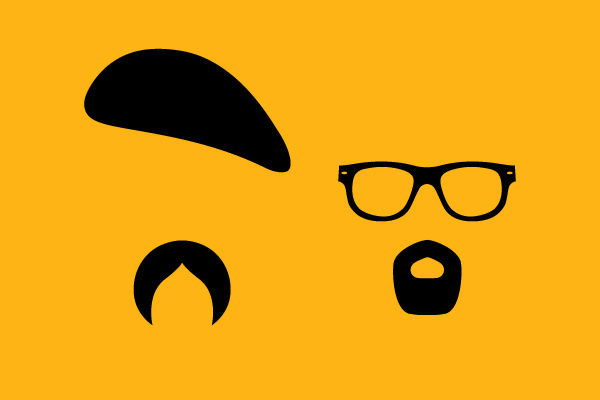
An all-new season of MythBusters starts tonight on Discovery Channel, so I thought I’d share one of the designs I created for the show. I’m a big MythBusters fan, and I love how this concept turned out.
I think this may be my favorite t-shirt design of all time. You can get this shirt in the Discovery Store. They also applied the design to a set of mugs. Fun!


Continuing our creative collaboration with Discovery Channel, we recently completed designs for their World’s Biggest Fan of the World brand campaign. We developed a series of logos, each comprised of multiple icons from the Discovery universe. The logos were applied to apparel, banners and products. This was such a fun project to work on and it turned out great!


The icons even found their way onto the table tops at the Discovery Times Square Exposition in New York. Cool!

This was a fun project for a great client. Lunar is an incredible multidisciplinary design firm with offices in California, Europe and Hong Kong. I worked with their San Francisco team to develop a brand campaign around a student competition that they held. At this year’s IDSA conference in Portland, Lunar challenged students to rethink the way we transport food by creating a container made from found objects. I developed the name and logo for the competition, and applied the identity to posters, t-shirts, tags and cards.


Since the theme of the conference was DIY, I proposed that they actually print the campaign internally instead of hiring it out. The Lunar team was so excited to experiment with screen printing, they wound up creating all of the pieces of the campaign themselves. So cool!
Sara Bareilles just released her second album, Kaleidoscope Heart, and it is amazing! Here are some designs I created to support her current tour. All of these tee’s are available on her site.


I actually did this last one for Sara a while back, but it’s still one of my all-time favorite designs.

The LOST posters I designed are featured in this month’s issue of HOW Magazine! They received an outstanding award in this year’s self-promo design competition. Thanks to my friends at HOW for the nice write up. I’m honored to be included in the annual.
Most days, being a graphic designer is fairly mundane. Long hours in front of a computer. Searching for just the right Pantone color. Deciding between 6pt. or 7pt. type. But every once in a while…if you’re lucky…you get to do 360’s in a Lamborghini at 200mph.
A while back I designed the brand identity for 360 Performance Driving Academy, an elite training program where pros teach clients high-speed driving techniques. The logo was a simple, type-based solution, but the applications were very cool.

I designed a metal business card, similar to mine – which is two color (black & white) printed on die-cut aluminum, with embossed elements. I wanted the visual system to convey speed and motion but also the idea of control. So I tried to balance these dynamic, diagonal shapes with very structured type encasements and containers.

The same visual language was applied to a simple website concept, as well as vehicles and merchandise below.


I had the opportunity to actually go to one of the 360 programs, where world-class drifting champion, Samuel Hubinette was instructing. Here are a couple pictures and videos from the academy.


Samuel is known as “The Crazy Swede”. Which makes sense after you watch the videos above. Here is a logo I designed for his brand, Toxic Drift. I loved how this little mascot turned out.


Discovery Kids started in 1996 as an extension of Discovery Channel but has since grown into an international retail and entertainment brand. We worked closely with Discovery Kids to align its new look with the Discovery Communications parent brand while still reflecting its unique character. The new identity encompasses a new logo, a packaging system, and a comprehensive style guide.


Mattel has been making some of America’s most beloved toys and games for over 50 years. You can imagine how excited we are to collaborate with the world’s largest toy company.
A little while back I had the opportunity to work on brand identity concepts for C.S. Lewis College, which is currently scheduled to commence instruction in Fall 2012 in Northfield, Massachusetts. I’m a big C.S. Lewis fan so this was a fun project. Ultimately they went with a typographic solution, but here are some studies that I thought were interesting.


I collaborated with my good friend and illustrator, Luke Daab, on these last two concepts. As a reference to Aslan from The Chronicles of Narnia books, we incorporated a secret lion into the illustration. Can you see it?
Shark Week is in full swing on Discovery Channel! Here are some graphics I created for them. You can see these designs and other products in the Discovery Store. Happy Shark Week!


When I found out that we were going to have a boy, I started to think about my own childhood and all of the things I loved when I was a kid. So I wanted to design an announcement that celebrated those things and captured that particular idea of boyhood wonder and adventure. I created this illustration and worked with the incredible team at Studio on Fire to have it letterpressed on 220lb. Lettra paper. They did a fantastic job on the printing. It really turned out great. I think it’s safe to say that this is my favorite project of all time. And definitely my favorite client.


 This my original rough sketch of the idea.

And this was the actual illustration. I couldn’t be happier with the way it turned out.
Here are some recently completed apparel designs we created for Barenaked Ladies, Dashboard Confessional and The Wallflowers.


This is just incredible. Some friends of mine wound up getting to meet Michael Emerson (aka Benjamin Linus) and watched the LOST series finale at his home! They presented him with a signed set of my posters as a gift. And here they are. Wow.
These prints are available on abc.com
As luck would have it, last week I had the unbelievable opportunity to fill in for DocArzt and TVOvermind on the Red Carpet at the LOST Live Event at UCLA! I got a chance to meet the cast and the producers of the show and was lucky enough to have them sign some of the Lost prints I designed. Needless to say, the whole thing was an incredible experience. You can hear more about it on DocArtz’s podcast and on TVOvermind.com. Below are some of the pictures I took.
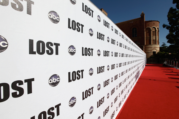
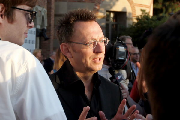
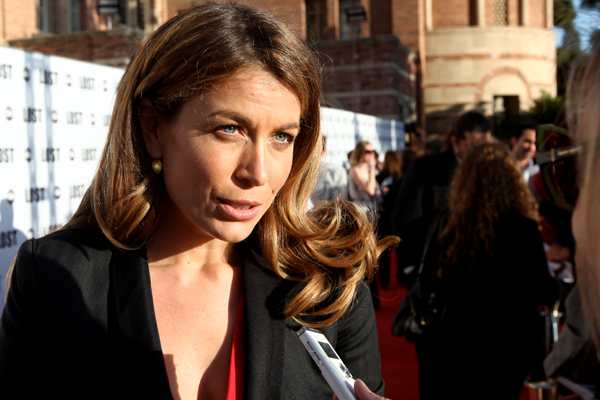
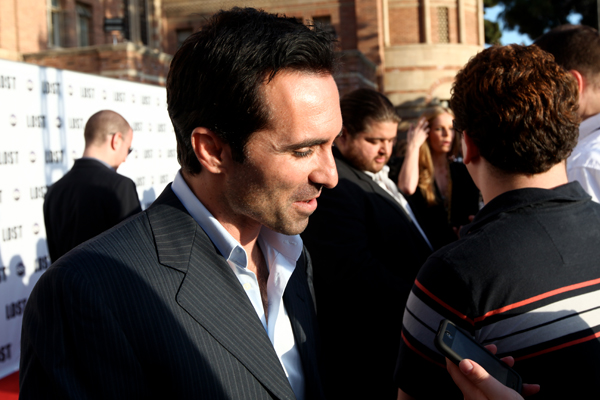
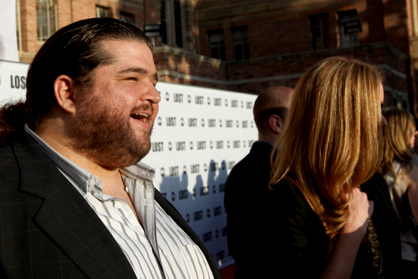
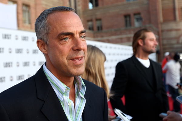
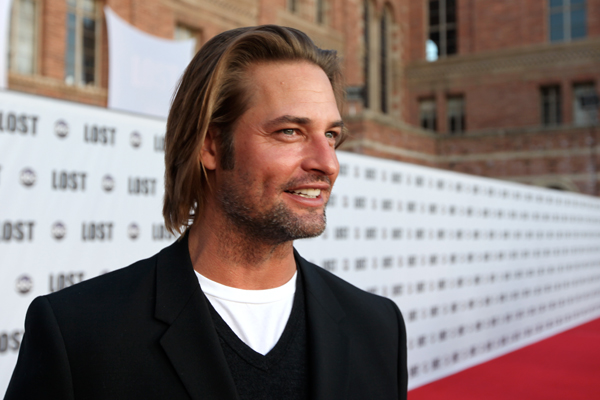
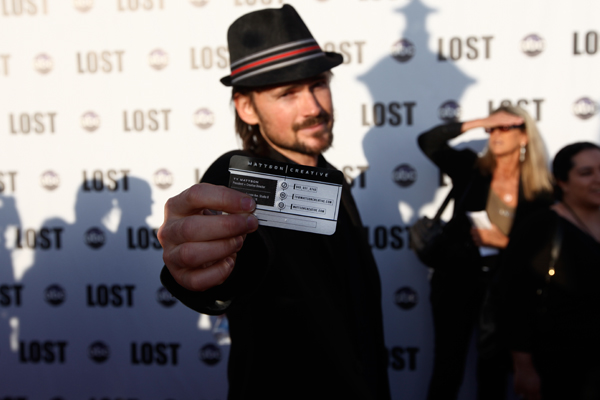
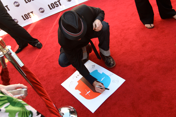
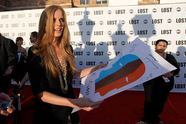
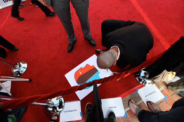
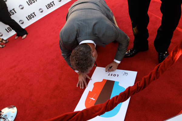
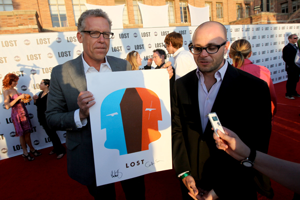
All of the Lost prints I designed and other merchandise are available at ABC.com…but I’m keeping this one.
I am so excited to announce that ALL of the LOST merchandise I designed is now available for purchase! Below are some images of the artwork.
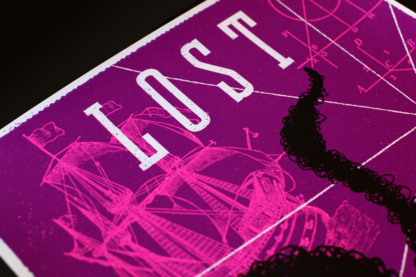
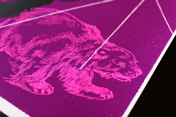
“Smoke Monster”
3-color silk-screen on 18×24 100lb. white cover.
BUY PRINT NOW

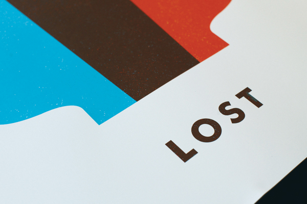
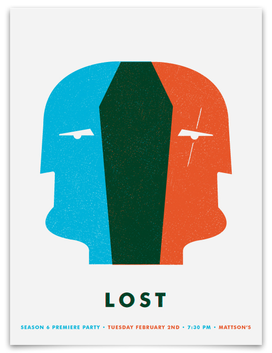
“Dual-Locke”
2-color silk-screen on 18×24 100lb. white cover.
BUY PRINT NOW


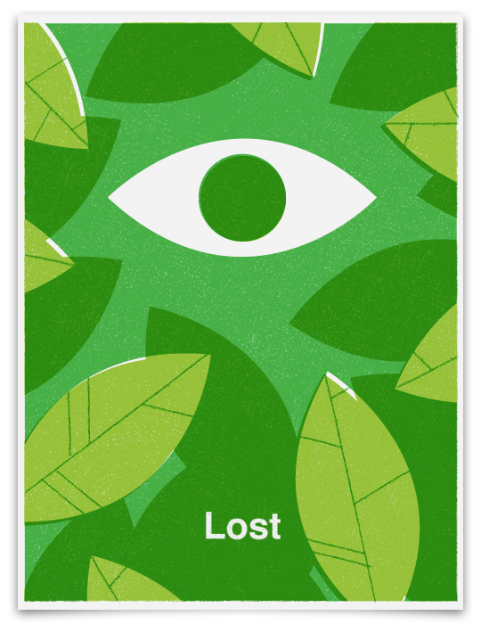
“The Eye”
2-color silk-screen on 18×24 100lb. white cover.
BUY PRINT NOW
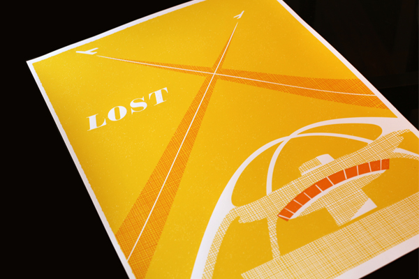
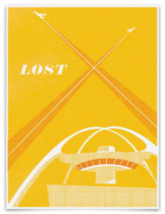
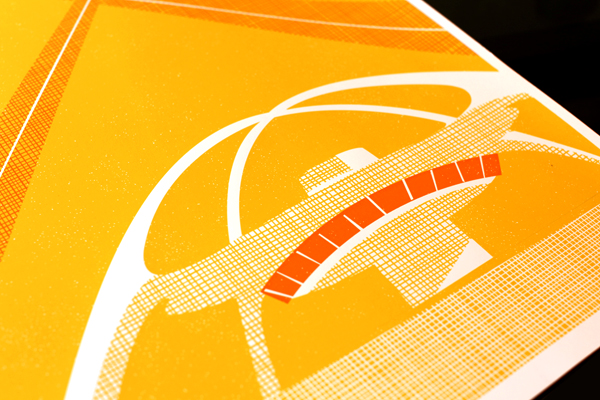 “LA X”
2-color silk-screen on 18×24 100lb. white cover.
BUY PRINT NOW
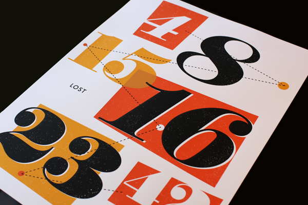
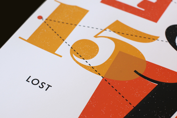
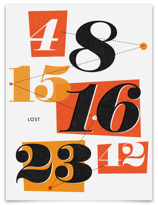
“The Numbers”
3-color silk-screen on 18×24 100lb. white cover.
BUY PRINT NOW
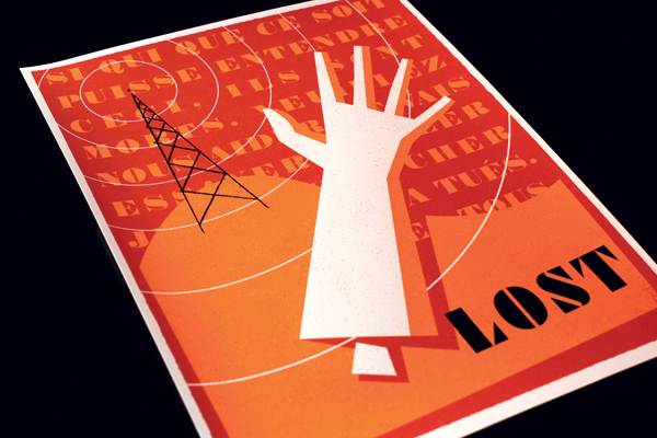
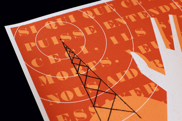 “Montand’s Arm”
3-color silk-screen on 18×24 100lb. white cover.
BUY PRINT NOW
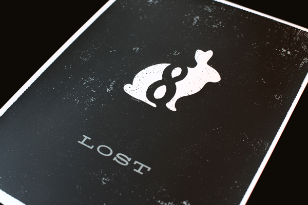
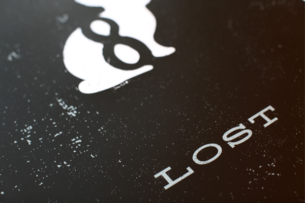
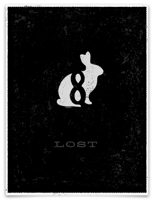
“Bunny”
2-color silk-screen on 18×24 100lb. white cover.
BUY PRINT NOW
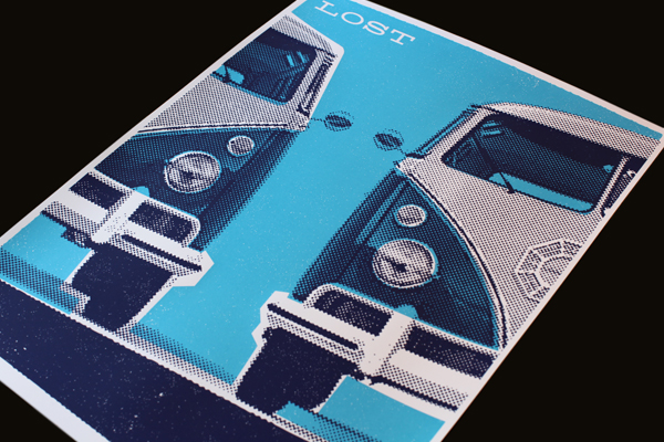
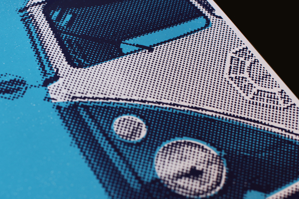
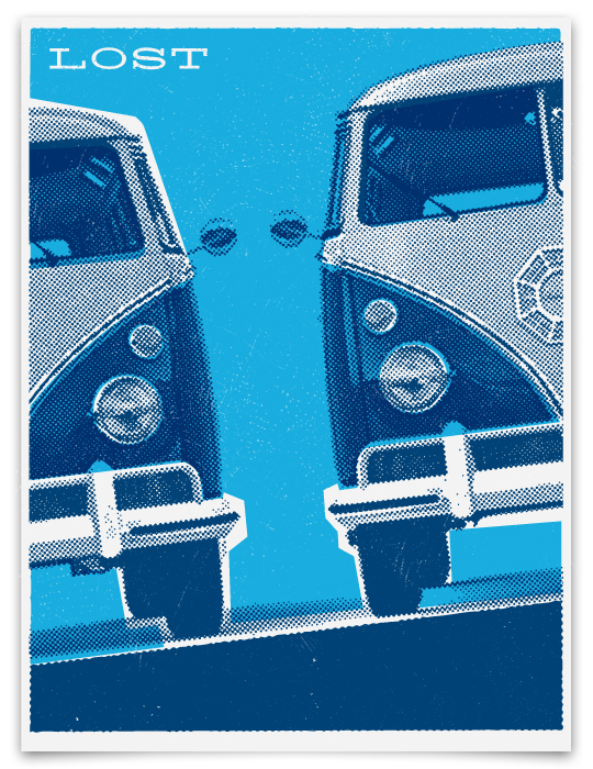
“Dharma Vans”
2-color silk-screen on 18×24 100lb. white cover.
AVAILABLE SOON HERE

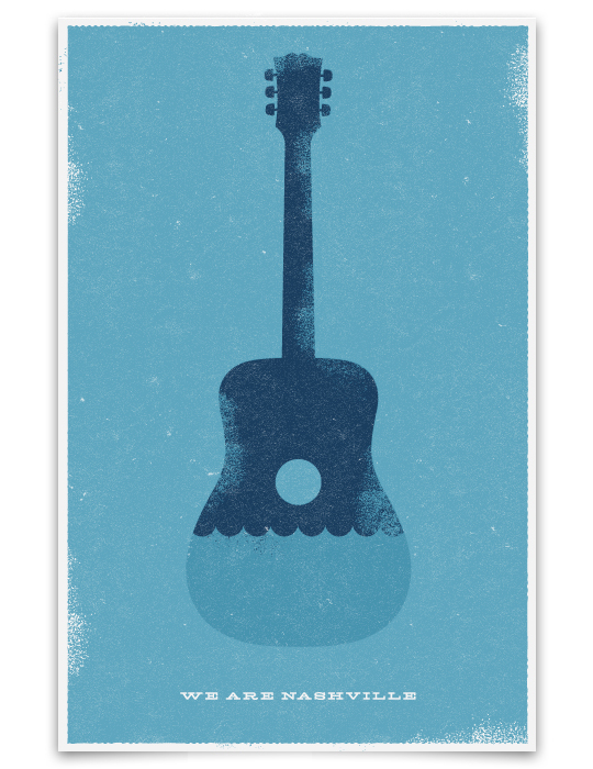
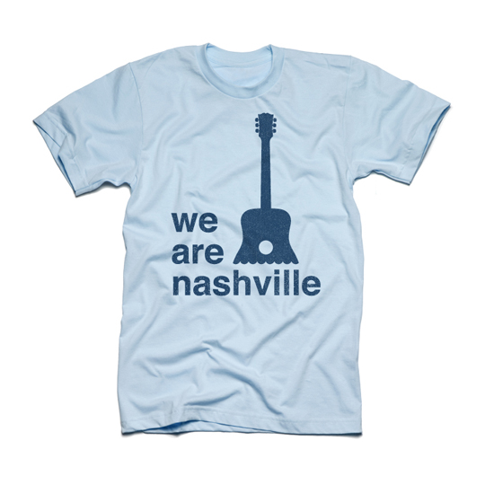
Quick poster design this morning for a benefit concert in Nashville.
[UPDATE]
Thanks to everyone who has commented or emailed. Originally I created this for a friend who was helping to promote a church benefit concert…but honestly I would love to for the art to be used to do as much good as possible, for as many people as possible. So let me look into it to see how we can do that. I will let you know.
[SECOND UPDATE – 5/10/10]
Okay! Again, thanks to everyone who has commented or emailed about this poster. Here’s what I’m going to do. I’d like to donate this art to help with flood relief in the broadest possible way. So instead of printing these myself, or working exclusively with one organization, what I’m going to do is give the art to anyone who wants to use it to raise money. You can create prints, stickers, t-shirts…anything and everything that you think will help.
The only thing that I would ask is that 100% of all proceeds to any of the following charities:
The Community Foundation of Middle Tennesee
Hands On Nashville
Nashville Red Cross
2nd Harvest Food Bank of Middle Tennessee
Samaritan’s Purse
ALL OF THE ART FILES CAN BE DOWNLOADED HERE.
I’ve added some new designs that incorporate the “We Are Nashville” slogan, and some t-shirt designs as well. Originally the design was created to promote a concert. I hope they still use it. I hope Cool People Care create shirts and stickers and sell them on their site. I would love it if Hatch Show Print created some one-of-a-kind posters! If you have a print shop, make posters. If you can make t-shirts, make t-shirts. Feel free to use the art however you want. Feel free to improve it or create different variations…it’s up to you. Just make sure all proceeds to go the charities above.
Nashville is home to some amazingly creative artists. My hope is that my art does the most good for the most people. I can’t wait to see what you do with it.
We Are Nashville,
Ty
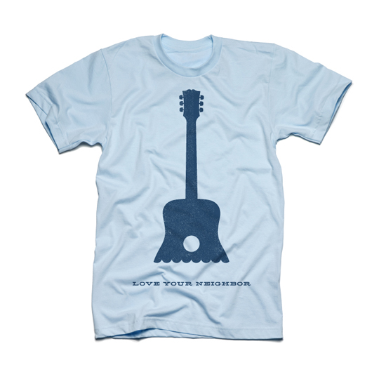
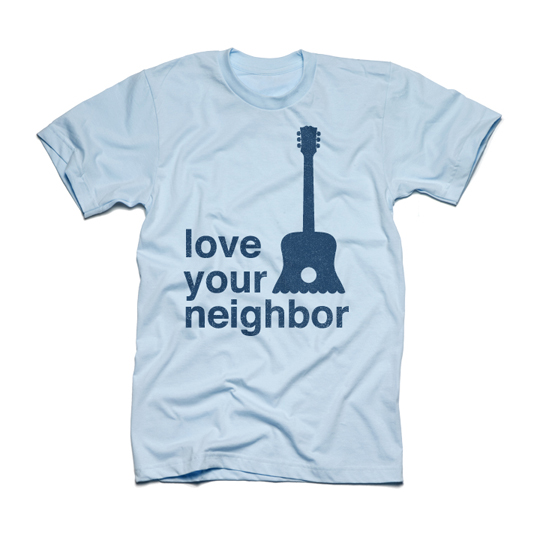
The winning entries have been announced and 14 of my logos will be featured in LogoLounge Volume 6! I’m honored to have so many designs included in the best-selling series. The book will be out in early 2011, but you can see the selected logos below.

I was completely blown away by the response to the first set of Lost-inspired designs I created. Thanks to everyone who left a comment or sent me an email. I tried to reply to each person individually, but if you didn’t hear from me – thank you for all the compliments. Since I got such a great feedback on the first batch of artwork (and as a huge fan of the show), I decided to create a another series. To commemorate the final season, I will create one design for each episode. I will add the new art to this post, after the show airs, so check back on Wednesdays to see the latest show-inspired design.
[ UPDATE 5/20: All of the original Lost-inspired designs I created as well as other merchandise will be available on ABC.com the day after the finale! ]
LA X
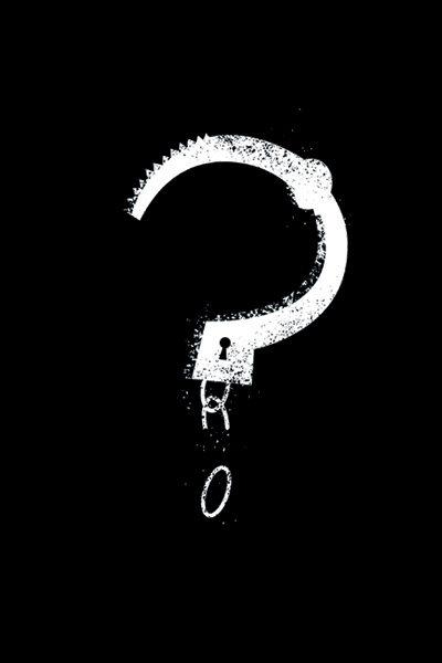
What Kate Does
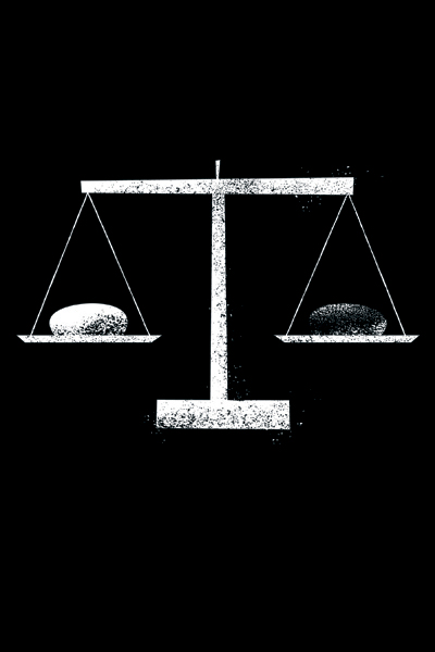
The Substitute

Lighthouse
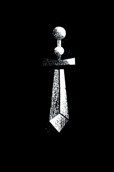
Sundown
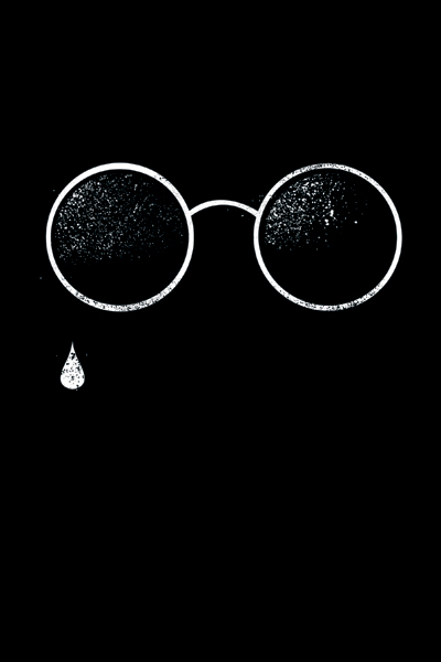
Dr. Linus
Recon
Ab Aeterno
The Package
Happily Ever After
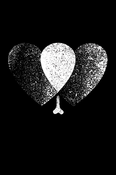
Everybody Loves Hugo
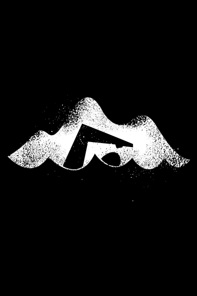
The Last Recruit
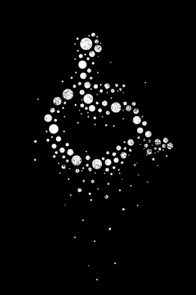
The Candidate
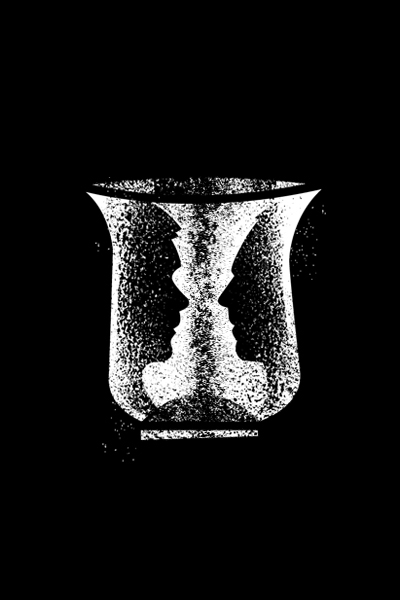
Across the Sea
What They Died For
The End
Here is a recent logo I created for Josh Elliott Photography. Loved the simplicity of this idea. Josh is a great photographer. Check out his new site here.
Here are some moments from the first 24 hours of my son’s life. Click on the image to watch the movie.
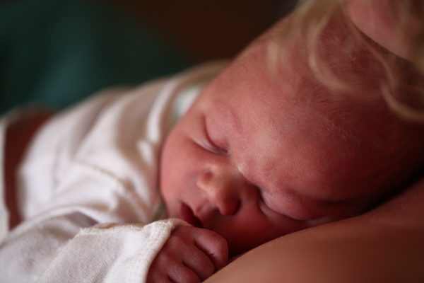
Shepard Carlyle Mattson
Born March 13th, 2010.
9lbs 21 inches.
Perfect.
Ok, so I am a huge LOST fan. For the past few seasons, we’ve had a ton of people over to watch the show each week. This weekend I sat down to design an invite for the season premiere, and had so many ideas that I wound up creating 8 different designs. The first three are my favorite. Let me know what you think.
[UPDATE: THESE PRINTS ARE NOW AVAILABLE IN THE LOST STORE ON ABC.COM!!]



Just got these custom metal tags back from the printer. They turned out great! I designed these for the new Pocono Modern furniture. Each piece in the line is custom-made and will feature these logo tags.


LogoLounge just put out a great new book and Mattson Creative is proud to be included! We have 5 logos featured in what is called the Master Library. We’re honored to have our work selected for this impressive collection.

I’ve created a lot of T-shirts for bands like Maroon 5, Lenny Kravitz, Chris Cornell, The Wallflowers etc. This was the first T-shirt I ever designed. I think I did this in 3rd or 4th grade for my school, Springhill Elementary. I won the contest to create an image of the mascot. On my original design, the spear was dripping with blood. At some point in process a PTA mom (clearly with no regard for artistic license or historical accuracy) removed the blood before the shirts were made. So at recess I set up shop on the playground and reapplied the missing gore to my fellow students’ shirts using Kristina Katopodis’ red fingernail polish.

Just got back from a great Thanksgiving weekend in Napa where we stayed at one my favorite hotels, The Carneros Inn.

One of the best things about the Carneros is the Boon Fly Cafe.

The brand identity for the cafe, as well as all the signage and wayfinding graphics at the hotel were created by Gensler.

The other thing we love about the Carneros Inn is that it is Jax-friendly.
The day after I send out an enewsletter featuring my recent projects is always encouraging. The next morning I usually have about a dozen emails from friends and colleagues responding positively to the work I’ve shown. As a designer you never get tired of receiving affirmation in relation to the work you create, and I always appreciate when someone takes the time to respond to something I’ve done.
This last week I got an email from my former art director at the first creative agency I worked for. It was just a short, simple note complimenting my work and congratulating my success. But it meant the world to me, because as an intern at Perich + Partners in Ann Arbor, Michigan — John Pappas was the person I looked up to the most. His work was distinct, compelling and smart. Unlike many of my instructors up until that point, he was actually practicing professionally – creating relevant work for real clients. And the amazing thing about the summer I spent working there is that he gave me the time of day at all.
In between my junior and senior year in college at U of M, I was completely unqualified and totally inexperienced. But Pappas gave me a shot. As he was designing ads and annual reports and brand campaigns he went out of his way to include me. Not a man of many words – all he’d say was, “Hey Ty, I think I’ve got something for ya.” They were small tasks and I am 100% sure that nothing I did was ever seen by a client, but I approached each one like it was the most significant project I had ever worked on (which was true at that point). Looking back, I don’t even remember what the projects were, only that I was on the team. That summer I gained the priceless experience of having worked alongside talented, creative professionals. And it shaped the rest of my career.
So this weekend I am thankful. Thankful for John Pappas, and for all of the people that helped me become a designer. As much as I’d like to think that I create work as an individual, the reality is that there are hundreds of contributors to everything I will ever design. And I am thankful for each of them.
Thankful for
… my parents who encouraged and supported me.
… my teachers and instructors who invested in me.
… my former employers who created the space and the environments where I worked and learned.
… my co-workers and colleagues who inspired me and raised the bar on excellence.
… all of the other designers and creatives who produce inspiring work that challenges me to make mine better.
… my clients who have trusted me with their brands and given me the opportunity to collaborate and create.
… my amazing wife who tolerates the consistently-chaotic schedule of a spouse in a creative field of work.
In many ways this has been a challenging year – but it has also been one of the most incredible. In the last 12 months, I feel like I’ve done some of the best work in my career. But I never could have done it alone.

We are thrilled to add Discovery to our list of clients. Comprised of a 100-plus worldwide networks, including Discovery Channel, TLC, Animal Planet, as well as leading consumer and educational products and services, Discovery Communications is the world’s number one nonfiction media company.

Mattson Creative is honored to be featured in the Communication Arts 2009 Design Annual. My logo for the Counting Crows/Maroon5 tour was selected as an outstanding trademark by the juried competition.

CommArts is the leading journal in the field of visual communication and the design competition is the most respected in the industry. Out of 2,700 submissions only 200 entries were selected to appear in the annual. I’m proud to be one of them.


Maroon 5 is currently on the road playing a limited number of shows at East Coast colleges. I designed new merch for their Fall tour. This design was my favorite. Check out and buy the new merch here.

Some new fun stuff for Pocono Modern this week. A simple, one-page catalog to promote the company’s new furniture line. They created these pieces from the extra materials after they built the Martindale home. Great example of reuse. Cool furniture.

My logo for Counting Crows/Maroon 5 is featured in this year’s Print Regional Design Annual! 10 years ago I saw the annual for the first time – and it had a huge impact on me as a young designer. I remember pouring over each page of amazing work, thinking, “THIS is what I want to do!” So, it’s definitely an honor to be included in this year’s edition. Thanks, Print!


A couple weeks ago I had the honor of speaking to the visual design program at CalBaptist University. I had a great time meeting the students and sharing some recent work and my thoughts on brand identity.
Mike Berger – my friend and former Art Director – is really building a great program over there. I was impressed. Looking forward to doing it again soon.

Last week I had the privilege of spending the day in Portland with the leadership team of New Hope Community Church. Last year we redesigned the New Hope brand identity and the church has since asked me to serve on their advisory board. We meet a few times a year to discuss vision, trends, technology, community and branding. It’s always an inspiring conversation and I love being involved.
Over the years, I’ve worked on branding projects for several faith-based groups. For me, the most exciting engagements have been with organizations who seek to transcend the typical or expected religious expressions. I love working with groups that interested in blurring the line between the secular and sacred.
New Hope is unique in that they’ve purposed to radically transform their church environment and their church experience in order to engage their local community. Through strategic partnerships they are in the process of a complete redevelopment of their land to realize a vision for a new, vibrant community gathering place that will be more accessible to the public.

Currently called Eagle Landing, the new development will be a mixed-use lifestyle center with retail, residential and hospitality components. The project will comprise 35 acres of new development containing 450,000 square feet of retail space, 750,000 square feet of office space, 700,000 square feet residential area—including a five-star hotel, lofts, senior active living and assisted living.

When complete, the center will offer an array of world-class restaurants, entertainment experiences, activities and community gathering areas.

What will differentiate this particular lifestyle center will be the integration of the church—the intentional fusion of a faith-community with a commercial environment. It’s a very exciting project for me to be a part of. I’ve worked with New Hope over the last year to help them redefine their brand as they redefine their environment. We started with a Brand Ideation engagement where we worked together to craft a verbal articulation of the New Hope brand. Then we addressed the brand identity.

This was the original logo. The mark was outdated and it did not represent the church’s new vision.

We looked at multiple concepts, but quickly gravitated toward the concept in the bottom left.

This is the final identity. Inspired by the colors of stained glass, the symbol is comprised of multiple overlapping quadrants. These forms converge to create both a cross – the central icon of the Christian faith – as well as an intersection, which represents the community it seeks to engage. We chose a lowercase, sans serif type to communicate modernity and approachability.
I also designed a new stationery system to show how the look-and-feel from the brand identity could extend into other applications.


We did an initial exploration of how the identity might look within the context of the new development – applying the mark to banners and posters. I really like how clean and vibrant the visual system is. It will be exciting to see the how the new identity continues to roll out for New Hope. They are heading in a very exciting direction and it’s been great working with them through the process.

Later this month I will be speaking on design at CalBaptist University. I was honored to be asked to share and I’m looking forward to meeting the students in the program. Hopefully I won’t be too boring. The plan is to keep it short, show lots of work and get to the Q & A. Should be fun. Go CBU! (What is the CBU mascot? I’m writing this on a plane so I can’t check. It’s a Christian school so I’m going to guess it’s an Eagle.)

I had the opportunity to spend the most of the day yesterday in Utah, at Daybreak. We’ve been working with Daybreak, developing their online brand, for the last few years, so I’ve seen photos and renderings of all of their new developments, but to actually see them in person was really incredible. They’ve integrated several new modern residential products that are very progressive…and an amazing mixed-use retail and commercial area. If you’re anywhere near South Jordan, Utah…you should definitely check it out. Here are several photos from yesterday’s tour.

These are some of the new modern products.


This is the North Shore Cottage which serves as the Village information center.


The community topographical map is in the floor, which is cool.


This striking environmental art piece — “High Wind Advisor” — presides over the SoDa Row area.

SoDa Row Village Center is defined by an eclectic mix of architecture that fuses traditional forms with modern materials to create a vibrant streetscape. Each of the 5 buildings in the 68,000 sq. ft center is built to the LEED® Gold standard.

Looking down Daybreak Parkway toward the Daybreak Corporate Center building. The center was awarded LEED® Platinum Certification by the U.S Green Building Council (USGBC) and is the first LEED Platinum building in Utah.

We’re having a baby! I just heard the heartbeat.
Amazing…

Pocono Modern is featured in the Summer issue of Atomic Ranch Magazine. Congratulations!

Our client, Daybreak, just unveiled the new solar-powered, Solaris Collection for the 2009 Parade of Homes event. Only 20 home sites for this collection will be available this year, and 13 have been reserved since the Parade started last week! Check out more images of these new modern homes.


Daybreak is a progressive community located in South Jordan, Utah. Master planned by Kennecott Land, the unique development is characterized by its eclectic architecture, walkable streets and an overall emphasis on sustainability.

Studio 1200, an architectural design firm, wanted a visual communication program that would accurately reflect their team’s versatility and personal, collaborative style. Mattson Creative worked with the firm’s principals to develop their vision of a vibrant and dynamic new brand. The following is an inside look at the creation of the new identity.
First, we engaged in a Brand Ideation project where we defined the unique personality and attributes of the Studio 1200 brand. This verbal articulation serves as a starting point for the visual exploration.

We reviewed the projects that Studio 1200 had completed for their clients and lots of great work they had on the boards. Images of their own office space also informed our identity development – especially the color palette.

Initial concepts sketches for the identity system.

The concepts above represent the initial presentation to the client. Because the name “Studio 1200” is unique, the logo exploration was more typographic than symbolic. The numerals are so interesting and expressive, they become the primary design elements.

After the initial presentation, we narrowed the selections and explored the three directions above. Ultimately we decided that the middle column was the most visually interesting. The conglomeration of multiple architectural elements to comprise a single logo was an exciting concept.

I got really interested in the idea that the logo could rearrange into different configurations using the same kit of parts. The concepts above show multiple arrangements of the same pieces to create unique versions of the mark. This direction had a real mid-century modern feel to it, which I liked a lot.

This was a rough animation concept of how the logo might dynamically reconfigure itself.

Ultimately, we decided to go with this logo. Although we liked the mid-century aesthetic, we felt this direction was bolder, more dimensional.

We kept the kit-of-parts concept and created multiple variations of the mark using the individual pieces that comprised the logo. We used these variations on different applications, so the logo is never exactly the same. On the website, the transitions are animated and you can see the pieces disassemble and then come back together to form a new version of the logo. You can view it here.

The Studio 1200 stationery system.

The business cards gave each employee multiple options for the color, configuration and pattern on their individual cards.

The cards were also designed to interconnect using four die-cut slots on each side. So the business cards themselves could be used as playful, structural tools to build and create.

Just received a copy of Drip. Dot. Swirl by my friend and fellow designer Von Glitschka. The book contains 94 visual patterns and a DVD. It’s a great resource, and I am proud to have my work included in it!

Here is the stationery system that is featured in the book. This was a brand identity design project for Sierra Properties, a community developer in Florida. I used one of Von’s patterns to create a subtle texture on the letterhead and business card.
Get the book here.

Last week I read an article on the FastCompany blog, wherein the author decries his eschewal of the business card in the name of efficiency and the environment. As a designer, I couldn’t disagree more.
You can read the post here. Basically, the writer describes an exchange where he is asked for a business card. In lieu of presenting one, he instead requests to collect his prospect’s contact information and writes it in his iPhone in order to follow up later via email. He then accepts praise for being cutting-edge and environmentally conscious.
But he’s missed the point.
If you see your business card as nothing more than a means to convey your employment data and contact information then it makes perfect sense to go without a card. Technology will continue to improve information exchange and make data transfer easier and more seamless. Right now you can download Bump, an app that allows users to trade their email, addresses and phone numbers simply by tapping their iPhones together. It’s remarkable. But a business card has the potential to convey so much more than your contact information. When creativity and design are employed, your business card becomes an unique, tangible expression of your brand. And every time you hand one out is an opportunity to make an inspiring impression on behalf of your product, service or organization.
Here are 100 examples of business cards that are creative, unique and completely unexpected.
There are far more creative and compelling ways to demonstrate your environmental consciousness than forgoing your business card all together. Alternative substrates, inks and environmentally-friendly printing techniques are all readily available. My business card is printed on recycled aluminum and it makes an incredible impact when I pass it out. I regularly get requests for extra cards because people want to share them with friends and colleagues.

Another example of business cards that exemplify eco-conscientious creativity are Breakfast Cereal Box Cards. These are randomly cut from recycled cereal boxes, then letterpressed on the opposite side.

Or this business card that is embedded with seeds and actually sprouts into a small house-plant when dipped in water.

Last month I met sustainability expert, Adam Werbach. I love how his business card communicates his mission and values simply by its size.
The author of the blog post describes the difficulty of graphic design and identifies hours spent agonizing over typefaces and paper stock. Here we would agree. The process of creating an inspiring and original identity system is not easy. It’s a challenging, time-consuming process that often requires a considerable amount of resources. However, this is exactly what talented, professional brand identity designers do. They will explore, experiment, refine and define a unique visual language, so that your brand (and your business cards) make an indelible impression with your audience.
So, although you may feel that ditching your business card is an impressive demonstration of your technological proficiency or your environmental consciousness, more than anything it communicates a lack of creative vision.

I just found out this morning that this logo was selected to appear in the Communication Arts 2009 Design Annual! This is such a huge honor for me and I am way beyond excited about it.
The logo was designed for the Counting Crows & Maroon 5 tour last year. The bands were co-headlining so I wanted to create a visual that would represent both groups but function as a single icon. I was a fan of both bands before they became clients, so it was a really fun project for me.
For the last 50 years, CommArts has published the best in visual communications from around the world. Their juried competition is the most prestigious in the industry. I have submitted work to CA in the past, but this will be the first time that I appear in the magazine. I am totally blown away and humbled to be included. The issue should hit stands in November/December.
I recently completed a logo design for Mottsy – an innovative, online printing company. The client was really interested in the creative process and asked me to record my screen during the development of the logo. This time-lapsed movie is the result. (Be sure to hit the expand button in the bottom right corner to view it full size.)
At first I was a little self-conscious recording my screen…it felt like someone was looking over my shoulder, watching me design the logo. But eventually I got used to it, and it was an fun experiment. I’m not sure how interesting it is to watch me look through hundreds of fonts, scan sketches, plot points, check email, change songs in iTunes, etc. Let me know what you think…it helps that we sped it up. And threw a little music in there. Thanks, Jeff.
The following logos and variations are what I presented to the client. They ultimately chose the first one which I actually didn’t capture on video. Oh well, still a fun look behind the scenes at the brand identity development process.


After we explored a lot of color variations, we ended up pretty close to the original concept.

This is the final logo. We developed the tagline and their brand positioning as well. Keep an eye on Mottsy.com – they should be launching their site in September. Should be pretty cool.

Just got back from press checking the Pocono Modern stationery. Turned out great. It’s always fun to see the design get printed and come to life. Here are a couple shots from the printing process.

Laser prints trying to find the perfect shade of rorange.

Pantone didn’t have a good enough match, so I had Toyo Inks create a custom color for the project.

Here is the big bad Komori that we used to print the project.

Make-ready test of the letterhead.

Final printed sheet of business cards. Kraig and Shawn each have their own color.

Back of the business cards. Each name has 4 different colored backs. The custom envelopes look great too. I’ll post some pictures once they come back from the converter. This is such a fun brand to work on.
This is a logo animation that I designed for The Collective identity. Originally it was created as part of the website experience, but it also works as a stand alone piece. I thought this turned out pretty cool.

With attention to detail and a commitment to sustainable practices, Pocono Modern is building homes in the Poconos with a fresh, modern twist. Here is an inside look into the creative process that went into designing the Pocono Modern brand identity.

This was the original logo that the client was using. It played off of the dynamic modern angles of the architecture and the topography of the Pocono Mountains which was interesting, but we decided that we wanted to explore how we could evolve the mark into more of a distinctive icon.

The aesthetic of The Martindale – one of the first Pocono Modern homes to be completed — inspired a lot of my initial concepts for the mark.

Like every project, I begin by sketching concepts. This process is very freeform. The drawings are quick and loose, and all over the page. I try to generate a lot of ideas quickly, exploring as many different visual concepts as I can. I will play with shapes and forms in multiple configurations until something interesting takes place, or another idea emerges. It’s a difficult process to describe, but I think this may be my favorite part of logo development.

After I create sketches, I evaluate the ideas and then start exploring more refined versions that integrate type and color. This next series represent the initial logo concepts that were presented to the client. This concept integrated the silhouette of The Martindale house with the mountain in more of a retro way.

I thought is concept could be interesting to explore as a seasonal mark that could have different colors to represent different seasons in the Poconos. Ultimately, these felt a little too kitchy.

This concept is a much more graphic abstraction of the landscape. We liked this direction, although we determined that it didn’t work well as a stand-alone logo. The idea of the triangle pattern made its way into the overall visual language of the brand as a supporting graphic element.

I really liked this concept. I loved the simplicity and the transparency. Maybe a little plain, but it has a very modern sensibility which we liked.

This idea was much more playful. The icon is comprised of different elements that combine to represent The Martindale, and the tagline type is vintage and fun. This was a little too whimsical, but we wound up using the wood texture in the final mark.

Another variation on the abstract mountain concept. I thought the relationship between the hand-drawn texture and the solid field behind it was interesting.

A different variation on some of the same themes. Mountains, seasons and amenities of the Poconos.

This was an interesting type treatment, but legibility was a concern — and overall, we felt like the identity needed an symbol element.

After the initial presentation, we decided that these three concepts were the strongest. Pocono Modern is the vision of Kraig Kalashian, who is a really incredible architect and designer, which makes all of our collaborations very creative. He has a great eye for design and we tend to gravitate towards the same aesthetic which is fun. Kraig wanted to integrate the idea of “homes” or “community” into the concept on the lower left.

This was a challenge until saw this incredible cover illustration for Fortune Magazine by Erik Nitche, which inspired the simple geometric style that I used below.

I really loved the way this logo design turned out. We had a hard time deciding between this idea and the one we eventually went with.

Along with the Nitche-inspired logo, I explored this stationery concept for the logo above. I introduced the abstract triangle pattern, which ultimately made us feel that this direction was stronger overall.

So here is where we ended up. The mountains are represented, but are abstracted into simple, strong shapes. There is some interesting positive/negative space created in the middle of the mark by the intersection of the angles. The wood texture evokes the organic nature of the Poconos and the color-fields represent the minimal, modern aspect of the brand.

After we finalized the logo, we applied the look and feel to an array of applications including packaging and stationery.


Currently, we’re working on the interior of the Pocono Modern corporate office and design studio in Jim Thorpe, PA. I will post some photos and updates on this project in the next few days.

Just got my copy of Logo Lounge 5. I am thrilled to be featured in the portrait section! It’s pretty incredible to be highlighted alongside firms like Lippincott, Chermayeff & Geismar, Interbrand, Landor, and Duffy — what a huge honor!

There are two full-length articles that profile Mattson Creative. One features the Grace Cathedral brand identity and the other profiles the logo I designed for The Collective.


These are the other logos I designed, that are also included in the book. It really is an honor for me to be included in this collection. The LogoLounge series is an incredible resource for designers and marketing directors who are interested in seeing the year’s best identity work. You can pick up a copy here.
Congratulations to some of my friends and colleagues who also have some fantastic work in volume 5: Paul Howalt , Von Glitschka , Sherwin Schwartzrock , Tim Frame, Jon Flaming, Luke Mysee, Craig Johnson, Shawn Hazen, Jason Pearson. Nice job!
Just launched the new site and this blog! Thanks to Normalcy and Angry Bear for making it happen. Lots of new work to see… Pocono Modern, The Refinery, Lenny Kravitz, The Lab. And lots more to come. Take a look around. Can’t wait to hear what you think!
This is an archive of our blog. It is no longer updated and comments are no longer accepted.