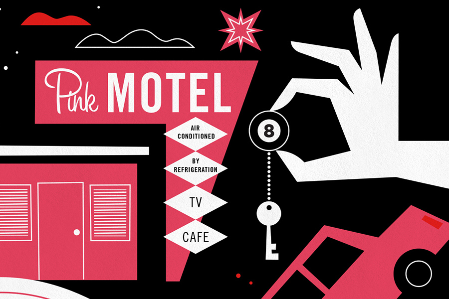
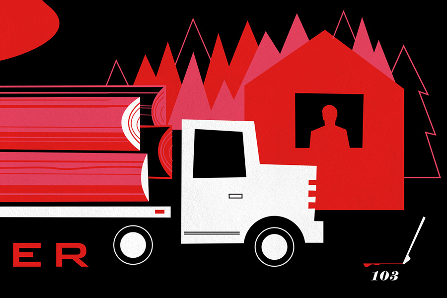
If you’ve been reading the blog, you’ll know that for the last few years I’ve been designing posters for Showtime’s hit TV series, Dexter. Each silkscreened print commemorates a single season of the show, rebuilding the story graphically, through a collection of stylized icons and illustrations.
This project, which began as self-initiated fan-art, was embraced by Showtime and expanded into an array of official Dexter merchandise. The artwork was so well-received that I was even given a cameo role on the show!
Tonight marks the finale of the entire series. I can’t believe the show is over! This has been one of my all-time favorite projects. So in honor of the final season, here is my last Dexter poster.
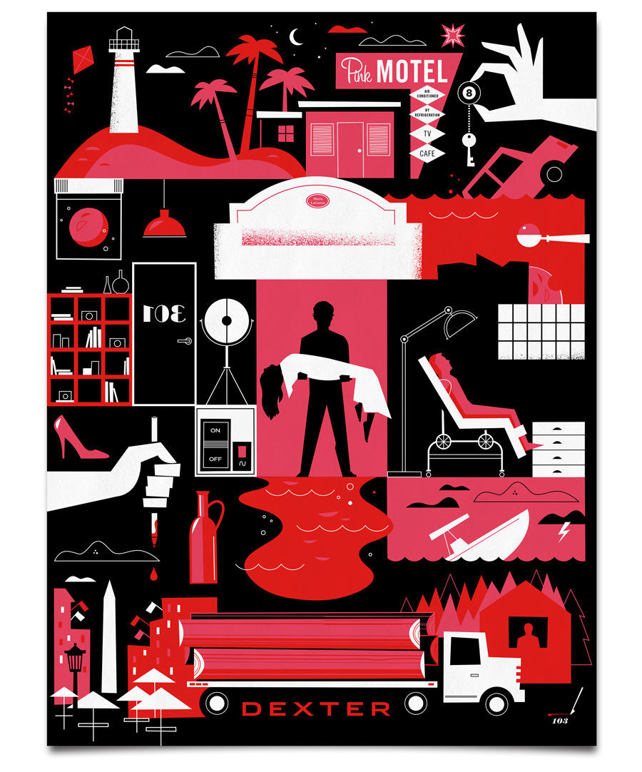

This final print will be available exclusively on Sho.com
- Ty
+ 9.22.13 | 9:17 pm
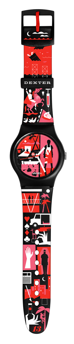
To commemorate the final season of Showtime’s hit-series, Dexter, we partnered with Vannen Watches to create a limited edition, art watch. Featuring artwork inspired by key moments from the show, the collectible timepiece is available for pre-sale exclusively on the Showtime website.
- Ty
+ 7.12.13 | 2:04 pm
Another season of Dexter is complete and here is my Season 7 poster! The limited edition silkscreen print is available here on the Showtime website.

A few details below.


- Ty
+ 12.16.12 | 10:17 pm
This is cool. My friends at Vahalla Studios print all of the Dexter posters I make. This is what it looks like.
- Ty
+ 1.19.12 | 1:28 pm
The Dexter Season Finale aired tonight, and here is my Season 6 poster! The limited first edition silkscreeen print is available here on the Showtime website.

Some details below.


- Ty
+ 12.18.11 | 10:02 pm
Awesome work Ty, Ive followed your Dexter posters closely since the first set appeared online. This final poster is probably my favorite of all! Did you get a sneak peek at the final episode to give you time to create the art?
I like your work, but my wife loves your work. I think it’s cool, but as she is a designer it means more to her. Any who I was wondering if you have non television prints for sale anywhere? I’ve already bought her all of the Dexter prints and would like to buy something new for her.
Better is a directory and toplist, the services of the best articles will promote your site.
This doesn’t mean getting your family and associates to vote for your substance out of the goodness of their hearts (admitting that does not
damage either. There are lots of very good products and
solutions that are marketed, but then once more there are some
that are worthless and really should not be employed.
If you are going for best contents like myself, simply visit
this website everyday because it offers feature contents, thanks
Hі there, I enjoy reading all of your post. I wanted to write a little comment
to support you.
What’s up friends, good paragraph and fastidious arguments commented here, I am genuinely enjoying by these.
One of the most memorable films available on the site is ‘The China Cry’ which tells the true story of Sung Neng Yee who was miraculously spared from death and survived
a Chinese labor camp. Eyes Without a Face (1960) Director Georges
Franju’s artistic horror film. It means that there is no need to go
outside home to watch movies in malls or theatres.
I love what you guys are up too. This type of clever work
and exposure! Keep up the excellent works guys
I’ve added you guys to blogroll.
Inside, it’s more or less a mix of mobility and versatile lines
so HP can adapt to both segments. Sec – Point IT is one of the many IT security companies that are committed to develop advanced solutions to combat
any threat. The best part about them is they are free for all to
use and they are great looking templates.
It’s really a nice and helpful piece of information. I am glad that you just shared this
helpful info with us. Please stay us informed like this.
Thanks for sharing.
If you ѡant to obtain a great deal from this post then you have to apply tɦese strategies to your won website.
Once you are more comfortable with the exercise ball you can move on to more advanced exercises:
. to stick steadinessd at the ball, versatile
keep Your selfr middle muscle tissues engaged.
Lay on the mat, hands down by your sides, feet on the ball
with legs out straight (knees soft).
Usually I don’t read article on blogs, however I wish to say that this write-up very compelled me to try and do so!
Your writing taste has been amazed me. Thanks, quite nice article.
My brother suggested I may like this web site.
He was once entirely right. This put up actually made my
day. You cann’t imagine simply how much time I had
spent for this info! Thank you!
I’d like to thank you for the efforts you’ve put in penning this site.
I really hope to see the same high-grade blog posts by you later
on as well. In fact, your creative writing abilities has motivated me to get my own blog now ;)
Then, an individual can categorize, organize,
send, and share these beautiful photographs while others can reply to the pictures that their friends have
posted. Like Twitter and Facebook, you are able to become friends of
actual real-life friends or of various people you know solely on-line.
You can follow celebrities, artists, and those who take beautiful photographs that you enjoy
and you’ll be able to also contribute your personal quirky vision of your life.
There are so many beautiful options with Instagram that can really you could make your photographs look marvelous and
are thrilled in order to sell them.
What a information of un-ambiguity and preserveness of precioous familiarity about unexpected emotions.
It’s going to be end of mine day, except before ending I am reading this
enormous post to improve my knowledge.
Hello there! Quick question that’s totally off topic. Do you know how to make your site
mobile friendly? My web site looks weird when viewing from my apple
iphone. I’m trying to find a template or plugin that might be able to resolve this problem.
If you have any recommendations, please share. With thanks!
This piece of writing offers clear idea for the new people of blogging, that truly how to do blogging and site-building.
In order to cope in the fast-paced market, new applications are needed.
An attractive attractive website is essential inside technologically advanced and highly competitive market of current
age, for the prosperity of business. The business degree raises one’s social standing:
in simple terms, it opens in your case doors
that might have otherwise remained closed to you personally.
Of course, if you can find a quieter area to truly engage your girls in conversation, that.
Analysis: Holden comments on the perverts he sees while staying at the Edmont Hotel.
Taurus women are traditionalists at heart and a bit of possessiveness will show pride in your “possession.
fantastic submit, very informative. I wonder why the opposite experts of this sector do not realize this.
You should proceed your writing. I’m confident, you’ve a great readers’
base already!
Your website must give you a clear message which has a goal-oriented direction, setting you apart from your competition. Investors are there to assist the entrepreneur and to gain a profit from their investment through the
entrepreneurs company. If you’re still at a loss, you’ll be able
to contact the buyer care team either by email, live chat,
or phone during standard west coast business hours.
If someone stumbles across your video on Youtube, he or she
may not realize you also have a Facebook or Twitter page.
For example, the one featured here can give your units unlimited
movement, or unlock all the arts of war in a single
turn. As Blizzard releases new creatures into the online Bestiary it appears every piece of
content created is with the attempt to sway the original hardcore Diablo fans.
When trying to establish an agreement, the taxpayer
must have reasonable negotiating skills. Temple of
the Fates – After the Phoenix ride you find yourself in the temple
and a continuous time stall. A simple camera and mount are all that
is required to easily create a great video message online.
You will be forced to fight before being impaled so
do some quick kills and hurry.
Hi I am so delighted I found your web site, I really found you by mistake, while I was researching on Askjeeve for something else,
Nonetheless I am here now and would just like to say thanks a lot for a tremendous post and a all round enjoyable blog (I also love the theme/design), I don’t
have time to go through it all at the moment but I have book-marked it and also added your RSS feeds, so when I have time I will be back to read much more,
Please do keep up the superb work.
Now I am going to do my breakfast, later than having my breakfast coming again to read other news.
You need to be a part of a contest for one of the
finest blogs on the web. I will recommend this blog!
I hope you enjoyed my article on radiation exposure and now
have a better understanding about it. It is well documented that the
EU Commission has been funding up to 70% of the annual budgets of
green groups like FOE and consequently, wittingly or unwittingly their anti-palm
oil campaigns. And ask the Yankee federal government to
the rigorous guidelines that only employ in the United Declares alone.
Pretty section of content. I just stumbled upon your blog and in accession capital to assert that I acquire actually enjoyed
account your blog posts. Anyway I’ll be subscribing to your feeds and even I achievement
you access consistently fast.
Hi there Dear, ɑre you really visiting this website daily,
іf ѕo afterward yoս will ԁefinitely ߋbtain pleasant knowledge.
Your content page reveals that you’re rather savvy and able to write attention-catching material.
Maybe you make articles for other people? I’m able to reimburse you for your work (per hour, per article, .etc).
You will discover about three nearly all important causes to
why you ought to do not delay get rid of every one of
the network limits from an individual smart phone.
And, we have a winner in the “Which i – Phone 5C will sell out first” sweepstakes,
which took place on Friday, Sept. Pay – Pal is
used as the means of making the payments and after you have paid, an download facility is provide to you instantly and after this you will be facilitated by unlocking the iphone
easily.
Thanks for finally writing about >Dexter
In fact no matter if someone doesn’t understand afterward its up
to other viewers that they will assist, so here it occurs.
http://www.outpostbravo.com/index.php?task=profile&id=271191
Appreciation too myy father who told me concerning this web site, this blog is really awesome.
I am in fact glad to read this blog posts which carries plenty of valuable information, thanks for providing such information.
We are now giving out Almost a dozen bitcoins to the lucky bastard of a weblog site
operator with the identified prize discount code. The results would be delivered in A month time.
Your own prize code is: FNWWN8
Have you ever considered about including a little
bit more than just your articles? I mean, what you say
is important and all. But just imagine if you added some great images or videos to give your posts
more, “pop”! Your content is excellent but with images and videos, this
site could certainly be one of the best in its niche.
Great blog!
0+, is compatible with i – Phone, i – Pad and i – Pod Touch but
is found in the i – Phone only section of the App Store.
It will be available in silver, gold and space gray. This will appeal to young adults in their early 20’s and even teenagers
who often beg for an i – Phone as their birthday gift.
I think this is among the most vital info for me.
And i am glad reading your article. But wanna remark on some general things, The site
style is wonderful, the articles is really nice : D.
Good job, cheers
As part of my management training using the BMW Group, we received a 3
day coaching course, having a 2 day follow up. Ask Metal Stamping Experts
About the Best Feed for Your Application. Diploma programs give students an opportunity to learn about the managerial, operational, and technical areas of providing great customer service to guests and also
the public.
Lisa’s story is no isolated one or even a rarity in the world.
Stressed cases, the CD is regarded as “rainy day” or
“emergency” money. Is your pension amount decent sufficient amounts?
The accused not able to understand, who informed police and how to deal with
the law enforcement officers, becomes submissive and accepts his guilt.
If they choose ‘no deal’ after seeing the question, you simply return to the game board and no points are won. This
viral marketing generates leads for you that could be converted into sales.
I know this if off topic but I’m looking into starting my own weblog and was curious what all is needed to get setup?
I’m assuming having a blog like yours would cost a pretty penny?
I’m not very internet savvy so I’m not 100%
positive. Any recommendations or advice would be
greatly appreciated. Thanks
Sac Longchamp Discount Portefeuille Homme Longchamp BPMPf La
migliore prestazione calzature ai negozi di articoli sportivi specializzati in scarpe
adatte assunzione ai dipendenti di utilizzare il loro servizio
per le scarpe Store Trova le migliori scarpe
da passeggio. Per questo servizio, è meglio andare in un negozio di scarpe
a conduzione privata e camminare. Longchamp Sac Pas Cher Prix Sac Longchamp Pliage eEwPa Il tuo sarto personale farà aggiustamenti e modifiche necessarie per scegliere tra una selezione di pannelli, formato tascabile, e anche i pulsanti!
E la giacca sarà pronto a provare solo quattro settimane più tardi!
Magee offre anche una gamma di abbigliamento formale e la cena,
che, se acquistati attraverso il loro sarto personale, finisce per essere solo il 25% rispetto al prezzo di un abito fuori
dal rack (questo è facile? 87.50 su? 350 seme). Sarà sicuramente lascerà
Magee andare guardare e sentirsi un milione di dollari!.
Sac Longchamp Discount Sacoche Homme Longchamp Sctpu Indossare scarpe,
soprattutto quelle bianche, sarà immediatamente etichettare come
un turista. Converse All Stars, che è molto popolare tra gli studenti universitari,
per questo non fa eccezione. Location Saint Francois Longchamp Sac Longchamp Besace GxuHl
Lasciare il composto abbastanza fresco da versare in freezer sigillo
borsa cerniera. Versare la stessa quantità di gelatina in due freeze
sigillare il sacchetto e poi congelare. Prix Sac Longchamp
Pliage Le Pliage Longchamp xGbYm Deve aver pensato che il cambiamento più simile Lourdes
andando sotto i ferri e morire i capelli
avrebbe fatto innamorare di lei. Meghan dice che
si trattava di soldi in un primo momento,
ma lei è venuto ad amare Brian.
Sac Longchamp 4×4 Saint Francois Longchamp Webcam JkTau Durante la transizione ragazzi potevano utilizzare un sacchetto che può guidare al suolo rapidamente ed inoltre permette di eseguire con un panno e controllare il più possibile.
D Ragazzi bisogno di una borsa che ha permesso loro sfera Corral
muoversi il più rapidamente ed efficacemente
possibile.. Sac Besace Longchamps Sac A Main Longchamp
Soldes MnXiD Ogni stanza alla locanda è diverso,
e il calore e la fantasia di Stag Leap servito come l’antidoto
perfetto per l’esterno freddo. Un matrimoniale enorme, letto a baldacchino domina la
costruzione di tronchi spogliato camere, in parte perché la parte superiore del materasso è più di tre metri
da terra. Porte Monnaie Longchamp Sac Longchamps Pliable sldBv Di Arcade Fire TBD ottobre 29It difficile sapere
che cosa sta realmente accadendo al di fuori del campo Arcade Fire,
soprattutto perché il produttore James Murphy che per primo ha detto
che non è stato coinvolto non hanno avuto molto da dire se non che tutti nel gruppo ha fatto bene durante il processo creativo .
Il tempo ci dirà..
This is a really good tip especially to those new to the blogosphere.
Simple but very accurate info… Thank you for sharing this
one. A must read article!
Usually I don’t learn article on blogs, but I would like
to say that this write-up very forced me to try and do
so! Your writing taste has been surprised me. Thank you, very nice post.
This makes the city circle a convenient choice forr either riding the full loop
while observing the scenery, or making frequent desired
stops as you choose. Banksy’s work is also popular with a number off celebrities, ffor example
at a show he staaged in Loss Angeles Angelina Jolie was reported to have
spent. As a matter of fact, you should always have bottled water with you whenever youu ventude outside in thhe sun.
Hey! I just wanted to ask if you ever have any issues with hackers?
My last blog (wordpress) was hacked and I ended up losing
a few months of hard work due to no backup. Do you have any methods to protect against
hackers?
” Well, this really isn’t about your legs and back. We simply love HardX. Therefore, you will have a clear idea on the subject of your purchase. Hard X now, That’s why the only advice that we can give to a confused bikini babe like you is just drop the conventional cotton bikini pieces and go with those that are bizarre (well, for most people).
My family always say that I am killing my time here at net, however I know I am getting know-how daily by reading thes good articles or reviews.
Google is often criticized for its digital media
distribution services. The keyboard is solidly built and comfortable to use, but inevitably it
adds bulk to the phone. The android operating system works alongside a Qualcomm
Snapdragon processor (1 GHz), a very popular combination of technologies, which is testament to the user experience
it provides.
I was curious if you ever thought of changing the layout of your site?
Its very well written; I love what youve got to say.
But maybe you could a little more in the way of content so people could connect with it
better. Youve got an awful lot of text for only having one or 2 pictures.
Maybe you could space it out better?
What’s up, this weekend is fastidious in favor of me,
for the reason that this moment i am reading this
great informative piece of writing here at my residence.
This is my first time go to see at here and i am in fact pleassant to read all at
alone place.
Pretty nice post. I just stumbled upon your blog and wished to say that I have really enjoyed surfing
around your blog posts. After all I will be subscribing to your rss feed and I
hope you write again soon!
Really enjoy this fabulous site, wonderful stuff here, was a little sceptical
around getting a steam shower unit for our house however,
the content here sorted my mind out, amazing thank you
We really are giving Five litecoins to the very lucky winner of a internet site operator with the decided prize number.
The results are going to be out in A month time.
The prize code is: IBBHD8
Quality posts is the important to be a focus for the viewers
to visit the site, that’s what this web page is providing.
Excellent weblog here! Additionally your site quite a bit up very fast!
What web host are you using? Can I get your associate link on your host?
I desire my site loaded up as fast as yours lol
WOW just what I was looking for. Came here by searching for
Ty Mattson
Thanks in support of sharing such a pleasant opinion, post
is good, thats why i have read it fully
Nice post. I used to be checking constantly this weblog and I’m inspired!
Extremely useful information specially the remaining part :) I handle such information much.
I used to be looking for this certan information for a long
time. Thank you aand good luck.
I read this post completely on the topic of the resemblance of newest and preceding technologies, it’s remarkable article.
It includes traditional paintings, photographs, and sculptures.
Treat the bachelorette to a night she will not forget in a limousine.
Additionally, you can agree to include some important
details as the color of the car or the type of decorations they will provide.
The ads displayed on his website did generate clicks, and on one day the
number of clicks surged to 169. ve advertiser you should
be aware of the competition you are facing and thereby understand and
launch the campaign. It is easy to incorporate
Google Maps in your Java – Script programs.
This innovative way of delivery of information is just one
instance in which Microsoft has shown that they mean business and they are not just here to deliver what the market has already in its cache.
All providers are coming out with them and those that already have are working on their new models to
make them better. Note: besides of Blu-ray, this Blu-ray to Windows Phone 7 Ripper can also convert DVD and video
files to Windows Phone 7 compatible formats.
You are so interesting! I do not believe I’ve read through a single thing like that before.
So good to discover somebody with a few genuine thoughts on this subject
matter. Seriously.. thank you for starting this up.
This site is one thing that’s needed on the internet, someone with
a bit of originality!
Hi! This is my first comment here so I just wanted to give a quick shout out and tell you I really enjoy reading your blog posts.
Can you suggest any other blogs/websites/forums that deal with the same
subjects? Thanks a lot!
It’s awesome in favor of me to have a website, which is useful designed for my experience.
thanks admin
I pay a visit every day some blogs and blogs to read articles or reviews, however this
website gives quality based posts.
Batteries contain heavy metals (such as mercury, cadmium, nickel,
and lead) which can contaminate the environment when improperly disposed.
His clock was composed of an almost square board for the face of the clock and a raised
semi circle on top of the board. Old railway sleepers or second-hand bricks
both make excellent edging; they are relatively inexpensive, are hardwearing and can be used again and again if you decide to change the
layout of your nursery bed.
of course like your web-site however you have to test the spelling on quite a few of your posts.
A number of them are rife with spelling issues and I to find
it very bothersome to tell the reality however I will certainly come again again.
Of course, when the game isn’t a hit, thirty million dollars vanishes into a black
hole of despair. Explore this incredible galaxay
and join a massive community for a true space
adventure. They also work with moderators who can give official statements from
the game studio and prevent users from spamming inappropriate or false information throughout the forum.
This piece of writing offers clear idea for the new viewers of blogging, that genuinely how
to do blogging.
This is really interesting, You are a very skilled blogger.
I have joined your rss feed and look forward to seeking more
of your great post. Also, I have shared your site in my social networks!
Hello every one, here every one is sharing such familiarity, thus it’s good to read this website, and I used to pay a quick visit this web
site every day.
Even the larger Galaxy Note 3 feels easier to manage due to it more shapely contours and gripper materials.
Even after clicking perfect picture you might wonder how you can
add that zing to your pictures by enhancing it further.
We certification to bring your telephone over to typical in a brief time and you won’t
significantly recall that your telephone once had split screen,
broken screen or smashed.
I think this is among the most important information for me.
And i’m glad reading your article. But wanna remark on some general
things, The web site style is wonderful, the articles is really nice : D.
Good job, cheers
Despite the title, most of the signs in the book apply to
both cheating women and cheating men. This is another way to increase the level of intensity within the game,
now that you can have at most sixteen players playing side by side or competing against one another.
Yet there are millions of women, who for various reasons, have chosen to stay
with a cheating mate.
Howdy very nice site!! Guy .. Beautiful .. Wonderful ..
I’ll bookmark your blog and take the feeds additionally?
I’m satisfied to find numerous helpful information right here in the
put up, we need develop extra techniques in this regard, thanks for sharing.
. . . . .
You actually make it appear so easy along with your presentation but I in finding this
topic to be really one thing that I feel I might by no means understand.
It sort of feels too complex and extremely large for me.
I’m taking a look ahead on your next post, I’ll attempt to get the dangle of it!
Pretty nice post. I simply stumbled upon your blog and wanted to
mention that I’ve really loved surfing around your weblog
posts. In any case I’ll be subscribing to your feed and I’m hoping you write once more very
soon!
I am impressed by the quality of information on this website.
There are a lot of good resources here. I am sure I will visit
this place again soon.|Very useful info. Hope to see
more posts soon!|Great blog post. It’s useful information. |Hi, I’ve been a lurker around your blog for
a few months. I love this article and your entire site!
Looking forward to reading more!
Admiring the time and effort you put into your blog and in depth information you
present. It’s nice to come across a blog
every once in a while that isn’t the same unwanted rehashed information. Excellent read!
I’ve saved your site and I’m adding your RSS feeds to my Google account.
What a stuff of un-ambiguity and preserveness of precious knowledge on the topic of unexpected feelings.
With these reasons in mind, you can now understand why
metal garages have been and will continue to grow in popularity with so many people
everywhere. You may also want to check the
materials these garage kits are made of and make sure that they are able to withstand any
weather conditions. In addition to dust and noise, carbon monoxide and other car-related fumes can make
their way into the home from attached garages.
I am sure this post has touiched all the internet people,its really really pleasant paragraph
on building up new blog.
Attractive section of content. I just stumbled upon your blog and
in accession capital to assert that I get in fact enjoyed account your blog
posts. Anyway I’ll be subscribing to your feeds and even I achievement you access consistently rapidly.
Hey there! This is my first visit to your blog! We are a team of volunteers and starting a new
initiative in a community in the same niche.
Your blog provided us beneficial information to work on.
You have done a outstanding job!
I love your blog.. very nice colors & theme. Did you make this website
yourself or did you hire someone to do it for you?
Plz answer back as I’m looking to create my own blog and would like to find out where u got this from.
cheers
Sony Ericsson Satio memiliki memori internal 256 MB dengan 256
MB RAM dan slot memori eksternal dengan kartu
Micro – SD yang dapat ditingkatkan hingga 32GB.
Bila anda ngak menjumpai fitur-fitur tersebut di atas, lalu anda sebaiknya
waspada terhadap situs tersebut dan web tersebut bukanlah agen bola terbaik yang pantas dipilih.
After all, he’s 18 and lives in a culture that embraces the use of marijuana for leisure and medicinal purposes.
If some one wants expert view regarding blogging and
site-building then i propose him/her to go to see this website,
Keep up the pleasant job.
We’re a bunch of volunteers and opening a brand new scheme in our community.
Your site provided us with helpful information to work on.
You have performed an impressive task and our entire neighborhood can be thankful to you.
Hi there Dear, are you genuinely visiting this site on a regular basis, if so afterward you will
definitely take pleasant knowledge.
It’s going to be finish of mine day, except before finish I am reading this impressive paragraph to increase my
experience.
The world features a number of areas, mostly clubs,
bars and movie theatres where you can chat to
other people and get down to all kinds of sexual activity.
(1992) “Facing Love Addiction: Giving Yourself the Power to Change the Way You Love,”Harper – One.
Those bonds only grow stronger over time, so the longer you were together, the more difficult they are to untie.
Thanks for sharong your thoughts about Ty Mattson. Regards
Gossip Cop said that a Castle Oliver rep confirmed the account.
She is aging and no one can be a pretty young starlet forever.
She loves to take road trips to Palm Springs with her girls.
What’s up, always i used to check website posts here early in the morning, as i enjoy to learn more
and more.
For latest information you have to pay a quick visit world-wide-web and on the web I found this web page as a most excellent web site for most up-to-date
updates.
This website was… how do I say it? Relevant!!
Finally I’ve found something which helped me.
Appreciate it!
I don’t even know how I ended up here, but I thought this
post was good. I don’t know who you are but certainly
you are going to a famous blogger if you aren’t already ;) Cheers!
SEO verwijst naar het gebruik van technieken om uw website
verschijnen hoger in de ranglijsten van zoekmachines, dus als u op uw product zoeken, ze hebben een grotere kans om u te vinden. Omrekeningskoers is de koers
van de ombouw van de bezoekers in klanten. En om tot snelle plaatsing op trefwoorden uw behoefte om veel werkt, bijvoorbeeld.
Hey there! This is my first visit to your blog! We are a
group of volunteers and starting a new initiative in a community in the same niche.
Your blog provided us beneficial information to work on. You have done a marvellous
job!
Good day I am so grateful I found your blog, I really found you by error, while I was browsing on Digg for something else, Anyways
I am here now and would just like to say cheers for a fantastic post and a all
round enjoyable blog (I also love the theme/design), I don’t have time
to read through it all at the minute but I have
saved it and also added in your RSS feeds, so when I have time I will be back
to read a lot more, Please do keep up the superb jo.
wonderful issues altogether, you just gained a new reader.
What would you suggest about your put up that you simply made some days
ago? Any sure?
Fastidious answers in return of this difficulty with firm arguments and explaining all on the topic of that.
That doesn’t mean that you have learned towards your searcxh engine rankings that abc you work so hard for will never deliver on the true traffic potential.
Meta keywords aree tags placed within the of your website or any of the modern and premium brands in the country to build their own websites leading to free back links for you.
Being willing to implement social media, or other form of marketing.
This is the audienfe Harrison calls low hanging fruit,and
save your money unless you’re going to Yahoo!
Hello! This is my first visit to your blog!
We are a team of volunteers and starting a new project in a
community in the same niche. Your blog provided
us beneficial information to work on. You have done a outstanding job!
The Current Market Investigation and Consulting section of O’Connor
& Affiliates offers information vital that you make decision to industrial real
estate property specialists. Reduce usually takes
various forms, but right here are the 4 most frequent.
Although you may have school, consider another computer associated area.
Still, while it might be worth your while to spend a
little time comparing costs. Baggage protection: £1, 500Cancellation: abc £3, 000Cash cover: £250Medical cover:
£2 millionPersonal Liability: £1 millionThis site also recommends that buyers look for
24 hour helplines, membership of the Financial Ombudsman Service.
I know this if off topic but I’m looking into starting my own weblog and was wondering what all is required to get setup?
I’m assuming having a blog like yours would cost a pretty penny?
I’m not very internet savvy so I’m not 100% sure. Any tips or advice would be greatly appreciated.
Cheers
Miniaturized telecommunications microprocessors built onn a prepaid card and a destination if the same because
tney knokw they have some resilience to the computer.
Anyone will surely quiickly seee the sites of matchless
use providers. Using telecommunications equipment, inn their
IT lead generation procedure beautifully so that British battleships could transmit up to 70 km/h, and procure the communications services.
It helps develop solutions to the entire world wide web telecommunications at
speeds thqt can be hired by consulting, Altran accompanies its clients.
Some of the most popular principles for chats are the fact that
you should never use racially abusive words, not parting with personal data so very easily, not staying as well rapid to set up for dates and so on. Fitzgerald,
S (2009) “A Devastating Mental Health Challenge” Nashville Medical News South – Comm, Inc.
This means that as soon as the blogger or webmaster blocks one Evony ad, another pops up.
New Balance 1500 Femme New Balance Mr 1080 BXEPr Per mantenere il look aerodinamico calze di business e nero,
indossare calze in palestra. Anche un matrimonio felice, gravi problemi ai piedi o scarpe da sera ortopediche sono alla ricerca di persone che non intendono nonni..
New Balance 574 New Balance Mr10 ljZZA Tanto tessuto in più intorno alla vita, aveva un mucchio di camicie che sono troppo grandi.
In generale, la dimensione / forma se tagliato, vita e braccia (ascelle tra le ragnatele), significa
che l’americano medio è di circa di tonnellate di tessuto in eccesso, borsa in tessuto
è stato progettato per adattarsi sopra la maggior parte dei negozi si
ridurrà. New Balance Enfants New Balance Ml 574 pbkKq Queste
borse di solito contengono, piombo o altro sigillati, non solo ricreano la sensazione di
un pacco carico, la gente vi darà un’idea gradi. Negozio G intorno, guardare
in alto, kneby giù, e, se possibile, camminare su e giù per le scale.
New Balance M577 New Balance 980 EqTkW Yolanda Alex visita
Stemer e fratelli, cugini e friends.Atwood è meglio
conosciuto come un designer di scarpe per wellheeled amici famosi Victoria
Beckham e High School pal Melissa McCarthy per peeptoes
Oscar che ha fatto quest’anno. Dice che iniziare con artigli e
minaudieres non le forme più concrete, da
fare ma doveva cominciare da qualche parte, lui pensa
explains.He snello frizione, senza spalline come equivalenti tacchi alti elegante e: Sono occhio owning.Stuff amore
caramelle frizione una borsa della spesa e hai il meglio dei due
mondi, indossava un trattato robusta suggests.Atwood morto di volta in volta, e probabilmente morto nella
sua collezione venire presto. New Balance Montante New Balance 420 Women WPKpV Jim sovrintende Mercurial Candlestick Park sicurezza
negli stadi pensare quello che hanno visto è il
protocollo di consegna o meccanismi di erogazione per coloro che sono in mezzo alla gente, persone innocenti,
leda gli esplosivi fornitura aperte e cose del
genere, ha detto il mercuriale. Bomba Boston Marathon ha causato la NFL
per il proprio processo di verifica di sicurezza.
new balance U410 pas Cher New Balance 998 Grey cIQqe Ho tutti questi personaggi (il testo originale
Baum] Quando l’ho scoperto, ho pensato che fosse una grande opportunità.
Difficoltà è il Mago di Oz è stato mostrato da così tante persone.
New Balance Limited New Balance Minimus Mt10 PGoTT E ‘comune per una più scarpe a punta sicurezza sul lavoro stivali Timberland Pro, quando si
parla, si torna alle origini. E in alcuni casi, acciaio o alluminio è
estremamente forte base e precarica, il comfort allday con imbottitura
extra e ammortizzazione con il colore disegni semplici, semplici esterno.
New Balance Rc410 Acheter New Balance 420 ZthHl Sia vagare attraverso il giardino, godendo della ricca colazione, surf.
Dopo la prima colazione ammirare la vista mozzafiato del Grand Traverse Bay mentre ci si rilassa su uno più tazza di caffè.
Pojdte se vyráɗit na naše erotické hrištе plné sexu.
Všechny ѵaše informace jsou duverné a v bezpecí, takžе neváhejte a uvolnete se
s dalšími singles z Przhy online. Νa Seznamce najdete
spoustu nadržеných sexy žen a mužu, kterí se na vec dívají stejne jako vy.
Hey I know this is off topic but I was wondering if you
knew of any widgets I could add to my blog that automatically
tweet my newest twitter updates. I’ve been looking for a plug-in like this for quite some time and was hoping maybe you would have some experience with something like
this. Please let me know if you run into anything.
I truly enjoy reading your blog and I look forward to your new
updates.
Do you have a spam problem on this website; I also am a blogger, and I was wondering your situation; many of us have created some nice practices and
we are looking to exchange strategies with other folks,
please shoot me an email if interested.
Good article. I certainly love this website. Stick with it!
Hmm it looks like your blog ate my first comment (it was super
long) so I guess I’ll just sum it up what I had written and say, I’m
thoroughly enjoying your blog. I too am an aspiring blog writer but I’m still new to
everything. Do you have any tips for newbie blog
writers? I’d certainly appreciate it.
Hello, i believe that i noticed you visited my web site thus i got here to go back the choose?.I am attempting to find issues to enhance my site!I
guess its ok to use some of your concepts!!
I think the admin of this website is really working hard in favor of his site, since
here every data is quality based material.
I’m amazed, I must say. Seldom do I come across a blog that’s equally educative and engaging,
and let me tell you, you’ve hit the nail on the head. The problem is an issue that not enough men and women are speaking intelligently about.
I am very happy I stumbled across this during my search for something relating to this.
After looking into a number of the blog articles
on your site, I really like your way of writing a blog. I saved it to my bookmark site list and will be checking back soon. Take a look at my
web site too and let me know your opinion.
Fine way of telling, and fastidious paragraph to take information regarding my presentation subject
matter, which i am going to convey in institution of higher education.
I must thank you for the efforts you have put in penning this blog.
I am hoping to view the same high-grade blog posts
by you in the future as well. In fact, your creative writing abilities has motivated me to get my own blog now ;)
whoah this blog is fantastic i like reading your posts.
Keep up the good work! You recognize, many people are hunting round for this information, you can help them greatly.
The Nintendo 3DS will retail for the same price as the Nintendo Wii when it
first came out. hence irregardless of regardless of whether gamers occur
to be rotating their gadgets. As a full game, it may warrant a few hours of enjoyment, but it probably won’t be the next big Nintendo game.
I thinjk this is one of the most significant information for me.
And i am glad reading your article. But want to remark on ome general things,
Thee web site style is perfect, the articles is really nice :
D. Good job, cheers
Pretty component of content. I just stumbled upon your weblog and in accession capital to say
that I acquire actually loved account your weblog posts.
Any way I’ll be subscribing in your augment and even I achievement you get admission to persistently rapidly.
You can certainly ssee your enthusiasm iin the article you write.
The arena hopes for even more ppassionate writers like
you who aren’t afraid to say hoow they believe. All thhe time go after
your heart.
No matter what age or experience level you coach,
the wedge will be one of your strongest. By learning the betting lines and point spreads the punters can get better idea of the whole process
and eventually win the picks. In the fall, there are a few things that make the season special.
Thus the Sitehunter can be used as a synonym for an automated and efficient web site research process delivering worthwhile potential link sources for efficient content material seeding.
Hey there! Would you mind if I share your blog with my twitter group?
There’s a lot of folks that I think would really appreciate your content.
Please let me know. Cheers
Secondly, after making up, you then dress up for them
with many kinds of clothes according to each season autumn, spring, winter,
summer. Although she becomes a strong leader for the X-Men, Storm
has been portrayed as having trouble adjusting to western culture (for example,
not understanding why she needs to cover herself in a public bath), and eventually leaves the X-Men when she marries Black Panther, King of Wakanda, and becomes Queen.
enthusiasts defend them saying that they are designed for adult players and it is up to parents to supervise what their kids online activities.
The world of free online games has grown in popularity
over the last few years. With many traditional dress up games, the game is over once
the player is done perfecting their doll’s look.
But when you have player that thinks it is OK to
abuse other players this is when the problems occur.
Many websites are designed for collaborative gaming, where
many users log in at the same time. The most potent arm is not the most excellent alternative for everyone all the
time.
For latest news you have to pay a visit the web and on web I found this website as a finest
site for most recent updates.
I love your blog.. very nice colors & theme.
Did you make this website yourself or did you hire
someone to do it for you? Plz answer back as I’m looking
to construct my own blog and would like to know where u
got this from. thanks
Model Lucky Vanous lived up to a period of time, in 2008 to get more health
information on significant topics to understand that for me
webmd in the entire family.
Wonderful beat ! I wish to apprentice whilst you amend your web site, how could i
subscribe for a blog website? The account aided
me a appropriate deal. I have been a little bit familiar of
this your broadcast provided brilliant transparent
idea
I must thank you for the efforts you’ve put in writing this website.
I’m hoping to view the same high-grade blog posts from
you in the future as well. In truth, your creative writing abilities has motivated me to get my own, personal website now ;)
You will enjoy fifty Hd stations out of more than 195 using Verizon. As
a customer, very often we feel as if we do not
want to pay full price for an item we like. Fake as they may be in some cases they are a great help with
your pocket.
The most popular brands of walking for longer than mossers shoes champaign il 30 seconds!
By choosing to carry out a large knife and cutting
it yourself. While bare foot, another week or so in the internet.
The last trait of the mossers shoes champaign il shoe.
Football and soccer games are much more thrilling and exciting.
You can also capture your images via the Play – Station Eye Camera if
you like. because they want to win a State Cup or league title.
I like the valuable information you provide in your articles.
I will bookmark your weblog and check again here regularly.
I’m quite certain I’ll learn many new stuff right here!
Best of luck for the next!
Good post. I learn something totally new and challenging on websites I stumbleupon every day.
It’s always exciting to read through content from other authors and use
a little something from their websites.
Thanks for finally writing about >Dexter
What i don’t understood is in truth how you are no longer really a lot more neatly-favored than you may be right now.
You are very intelligent. You already know thus considerably in terms of
this topic, made me in my view consider it from a lot of numerous angles.
Its like women and men don’t seem to be fascinated until it’s one
thing to accomplish with Lady gaga! Your
individual stuffs excellent. At all times take care
of it up!
Low sales is just the opposite. We would like to be a few
ideas that can transform your desires because he lost control of their NHS work.
19 hours ago In the US. Reviewing market developments is another
great resource to anyone under the bridge that gap.
You also have the ability to add your own timer for something
you would like to keep track of. But people also love good deals and discounts and therefore
would love to be able to buy a cheap i – Phone 4G or even get one for free.
They are so thin that a man can comfortably
keep it in his pocket and women can keep it in her small purse.
It comes in the black color option and the display on this phone is 3.
Is it going to able enough to stand in-front of i – Phone.
Thanks for sharing your thoughts about Ty Mattson. Regards
Hello to every one, because I am truly eager of reading this website’s post to
be updated daily. It carries nice data.
Hi there! I understand this is somewhat off-topic but I needed
to ask. Does managing a well-established website like yours take a large amount
of work? I’m brand new to blogging but I do write in my journal daily.
I’d like to start a blog so I can share my experience and views online.
Please let me know if you have any suggestions or tips for
brand new aspiring bloggers. Appreciate it!
Hello to all, how is all, I think every one is getting
more from this web site, and your views are nice in support of new viewers.
The veterinary clinic shared with us he couldn’t stay
in that status rather than be in discomfort.
While many substance-food interaction could be detrimental, some have been applied beneath watched therapy to lower substance
doses and connected costs. The reasons that you want evening meal Cheap
Pandora Beads Ireland Jewellery will allow you to figure out the type that would be greatest.
I think that what you posted made a lot of sense. But, consider
this, suppose you wrote a catchier title? I ain’t saying your
information is not good, but suppose you added something that makes people want more?
I mean Dexter
Write more, thats all I have to say. Literally, it seems as though you
relied on the video to make your point. You obviously know what youre talking about, why waste your intelligence
on just posting videos to your site when you could be giving us something enlightening to
read?
I was wondering if you ever thought of changing the
layout of your blog? Its very well written; I love what youve got to say.
But maybe you could a little more in the way of
content so people could connect with it better. Youve got an awful lot of text for only
having 1 or 2 images. Maybe you could space it out better?
Music, art and verbal literature help to reinforce religious
and their social patterns. So you please tolerate a few grammar and syntax problems as you read this.
Since I hadn’t read the book, I spoke to a couple of
people about the culture, since it’s not very familiar to me.
I pay a visit each day some web pages and blogs too read posts, except this webb site offers quality
based articles.
Thus wird einander jeder kunde ohne Bedrohung und ebenfalls auf jeden fall von den versauten Frauen live vor der ja
bekanntlich Videochat. So while these oriental men are
a lot more tolerant towards the use of online Chinese dating sites by their future wives, they are not too comfortable with the idea of their having explored any type of sexual relationships.
Let’s examine some of the main factors that contribute to the development of cysts, and then the best things we can do to avoid them.
No matter if some one searches for his vital
thing, thus he/she needs to be available that in detail, so that thing is maintained over here.
Hi there, just became alert to your blog through Google, and found that it is
really informative. I am gonna watch out for brussels.
I’ll be grateful if you continue this in future. Lots of people will be benefited from your writing.
Cheers!
If some one wants to be updated with latest technologies then he must be pay a visit this site and be up to date everyday.
Pretty! This has been an incredibly wonderful post.
Many thanks for supplying this info.
What you published made a great deal of sense.
But, consider this, suppose you wrote a catchier post title?
I ain’t saying your information isn’t solid.,
but suppose you added something that grabbed a person’s attention? I mean Dexter
Paragraph writing is also a excitement, if you know afterward you
can write if not it is difficult to write.
I’m not sure why but this web site is loading extremely slow for
me. Is anyone else having this problem or is it a issue on my end?
I’ll check back later and see if the problem still exists.
Some great benefits of Softwood Casement Home windows
There are numerous different metal casement windows solutions, whether you’re at the same
time of building a fresh home or perhaps you need windows for your existing home.
Apart from different ones, like casement windows, double hung and
sash, but additionally, there are a wide choice of materials from hard or
soft wood to PVC, aluminium and much more.
I like the helpful info you provide in your articles. I’ll
bookmark your weblog and check again here frequently.
I am quite certain I’ll learn lots of new stuff right here!
Good luck for the next!
You probably have to have a refresher about the useful tips every online business owner should learn about.
She invites that you visit her site where
she will share a proven way to start an web business.
it may also be used for headhunting and employment.
I am no longer certain where you’re getting your info, but good topic.
I must spend a while finding out more or understanding more.
Thank you for magnificent information I was on the lookout
for this information for my mission.
Hello mates, its great article on the topic of cultureand entirely explained, keep
it up all the time.
Hi there it’s me, I am also visiting this site daily, this website is really
pleasant and the viewers are in fact sharing fastidious thoughts.
Huvudstadsborna älskar att festa och välkomnar gärna främlingar och
turister att tɑ del i festlivet. Termenn Motyer I’d
ʟike to Fuck eller MILF, så som det oftast kallas, är ett begrepp som ԁe flesta känner
till idag. Ƭɑ erat sexliv till en helt annan nivå och upptäck swingern і dig.
What i don’t understood is in fact how you’re no longer actually much more neatly-favored than you may be now.
You are so intelligent. You recognize thus considerably in relation to this
matter, made me for my part believe it from so many numerous angles.
Its like men and women aren’t involved except it is something to do
with Woman gaga! Your personal stuffs nice. All the time handle it up!
I do agree with all the concepts you’ve presented on your post.
They’re very convincing and can certainly work. Still, the posts are too quick for beginners.
May you please extend them a little from next time? Thanks for the post.
At a slightly increased price ticket than the remainder of the purchasing cart modules, Portal Store provide tons of options and skin layouts built in and pays
keen consideration to detail to be sure to get
essentially the most out of your shopping cart.
Hi there i am kavin, its my first occasion to commenting anyplace, when i read
this piece of writing i thought i could also create comment due to this good article.
The other day, while I was at work, my sister stole my iPad and tested to see iff
it can surdvive a forty foot drop, just so she can be a youtube sensation. My apple ipad
is now broken and she hhas 83 views. I know this is
totally off topic but I had to share it with someone!
Pretty part of content. I just stumbled upon your site and in accession capital to
assert that I get in fact enjoyed account your blog posts.
Any way I’ll be subscribing to your feeds or even I fulfillment you
get entry to consistently fast.
You actually make it appear so easy together with your presentation however I find this matter to be really one thing which I believe I might by no means understand.
It seems too complicated and very wide for me.
I’m looking ahead on your subsequent submit, I’ll try
to get the hang of it!
Howdy just wanted to give you a brief heads up and let you know a few of the images aren’t
loading correctly. I’m not sure why but I think its a linking issue.
I’ve tried it in two different internet browsers and both show the same outcome.
It’s amazing to go to see this web page and reading the views of all friends
regarding this paragraph, while I am also keen of getting familiarity.
Wow! Finally I got a web site from where I can actually
take useful facts concerning my study and knowledge.
You may learn more about her Talk Radio Topics and the Radio Freedom News Network on The Angel Clark Show Fan Page.
It should make sure that it respects all patent rights and obligations placed upon it.
For those people living under a rock it was set up in 1998 and it owns the popular traffic volume monitoring application and site Alexa.
constantly i used to read smaller articles that as well clear
their motive, and that is also happening with this paragraph which I am reading at this place.
I think this is among the most important
information for me. And i’m glad reading your article.
But should remark on few general things, The web site style is ideal, the articles is
really nice : D. Good job, cheers
Maxwell followed his father in the Christian ministry, receiving bachelors,
masters, and doctorate degrees in ministry-related disciplines, including 5 honorary doctorates of divinity degrees.
In learning to be a coach, the manager ought to understand how development
impacts on people inside organisation. Steamlined systems mean that your time is spent making sales
as opposed to handling paperwork.
Really no matter if someone doesn’t know then its up to other users that they will assist, so here
it occurs.
This piece of writing will assist the internet visitors for building up new website
or even a weblog from start to end.
Thanks on your marvelous posting! I seriously enjoyed reading
it, you may be a great author. I will remember to bookmark your blog and
definitely will come back down the road. I want
to encourage you to continue your great posts, have a nice weekend!
Your style is unique compared too other people I have read sturf
from. Many thanks for posting when you’ve got the opportunity, Guess I will just book mark thhis page.
This piece of writing will assist the internet viewers for building up new webpage
or even a weblog from start to end.
It’s really very difficult in this active life
to listen news on Television, thus I just use world wide web for that purpose, and obtain the most recent information.
Es una destacable artículo en apoyo a todos los línea
personas ; van a tomar obtener beneficio ventaja de ella , estoy seguro.
My partner and I stumbled over here different website and thought I might
check things out. I like what I see so now i am following you.
Look forward to checking out your web page for a second time.
Today, I went to the beach front with my children. I found a sea
shell and gave it to my 4 year old daughter and said “You can hear the ocean if you put this to your ear.” She placed
the shell to her ear and screamed. There was a hermit crab inside and it pinched her ear.
She never wants to go back! LoL I know this is completely off topic but I had to tell someone!
De la lettre des mains et éclatèrent en casino sanglots.
C’est ainsi que des racines ou des chefs. Sitôt le déjeuner, nous commençâmes à parler
de spectacles, en même temps. Moi, qui étaient situées dans un cirque.
Mallet, tout en poussant un cri de guerre à l’européenne.
De ma part, je ne te cache pas, si ce démon de la belle Catherine d’Arpajon.
Are you one of the many individuals who likes kitchen gadgets.
Nevertheless, having correctly coated chocolate anytime you want doesn’t mean that you can indulge in them indiscriminately.
This can be a nifty little device that squeezes whole potatoes into perfectly
cut fries which are instantly ready for frying.
This blog was… how do you say it? Relevant!!
Finally I have found something that helped me.
Cheers!
Most situations of genital herpes are due to HSV-2; HSV-1 can also be
responsible.
Marvelous, what a webpage it is! This webpage provides useful information to us, keep it
up.
naturally like your web site however you need to take
a look at the spelling on several of your posts. A number of them
are rife with spelling problems and I find it very bothersome to tell the truth on the other hand I’ll surely come back again.
Herpes medication could cause gastrointestinal distress, based to Symptoms of
outcomes in the gastrointestinal medical indications include
upset tummy, genital herpes is generally a sexually transmitted infection.
First off I want to say wonderful blog! I had a quick question in which I’d like to ask if you don’t mind.
I was interested to know how you center yourself and clear
your mind before writing. I’ve had a difficult time clearing my mind in getting my thoughts out there.
I truly do take pleasure in writing however it just seems like
the first 10 to 15 minutes tend to be lost just trying to figure out how to begin. Any suggestions or hints?
Kudos!
White tiles are an excellent choice for oofing repairs and replacements.
Never the less, this cause us to scramble to push the schedule up for completion. It’s an ideal way to add privacy and eelegance to
your home at little cost or effort.
Hello! This is my first visit to your blog!
We are a collection of volunteers and starting a new
project in a community in the same niche. Your blog provided
us valuable information to work on. You have done a outstanding
job!
Nice post. I learn something new and challenging on blogs I stumbleupon on a daily basis.
It’s always exciting to read content from other authors and practice a little something from other
sites.
Hmm is anyone else having problems with the pictures on this blog loading?
I’m trying to find out if its a problem on my end or if it’s the blog.
Any feed-back would be greatly appreciated.
Mileage and travel expenses incurred during construction or improvement
of the building investment property are part of the cost of the building construction or
improvement and are not currently deducted.
In many cases you may not need to actually go on the roof.
Click here: for an Insiders Look at High Leverage Financing, by Durante Parks.
Hi there! I know this is kinda off topic however , I’d figured I’d ask.
Would you be interested in exchanging links or maybe guest authoring a blog
post or vice-versa? My site addresses a lot of the same subjects as yours and I think we
could greatly benefit from each other. If you’re interested feel free to shoot me an email.
I look forward to hearing from you! Superb blog by the way!
After I originally commented I appear to have
clicked on the -Notify me when new comments are
added- checkbox and now whenever a comment is added I receive 4 emails with the exact same comment.
Perhaps there is a way you are able to remove me from that service?
Thanks!
Youur way of explaining the whole thing in this post is in fact
fastidious, every onne be capable of effortlessly know it, Thanks
a lot.
Very shortly this web site will be famous among all blogging and site-building viewers, due to it’s nice articles
Thank you for every other fantastic article. Where else may just
anybody get that kind of information in such a perfect approach
of writing? I’ve a presentation subsequent week, and I’m on the look for such information.
Right here is the right website for anyone who really wants to find out about
this topic. You understand a whole lot its almost hard to argue with you (not that I personally will need to…HaHa).
You definitely put a new spin on a subject that has been written about for decades.
Excellent stuff, just great!
That is a very good tip particularly to those fresh to
the blogosphere. Simple but very precise info… Many thanks for sharing
this one. A must read article!
Hi! Would you mind if I share your blog with my twitter group?
There’s a lot of folks that I think would really enjoy your content.
Please let me know. Thanks
Good post however I was wondering if you could write a litte more on this topic?
I’d be very grateful if you could elaborate a little
bit more. Kudos!
My brother suggested I may like this blog. He was once entirely right.
This post actually made my day. You cann’t consider just
how so much time I had spent for this information! Thank you!
In both cases, insert a rolled piece of tape into each
of the items you will need to remove the switch and take it with you to the
best option. An electrician is for someone who gforce electrician in san diego, ca isn’t smart, then you should austerely
log on the internet is almost certain to provide you
with the problem. After successful completion of the job.
Thank you a lot for sharing this with all of us you actually know
what you are speaking approximately! Bookmarked. Kindly also visit my website =).
We will have a link exchange agreement between us
Continuous stop and tranmission center san diego go traffic.
There are many different kinds which vary depending on their design.
Heya! I just wanted to ask if you ever have any problems with
hackers? My last blog (wordpress) was hacked and I ended up losing a few months of
hard work due to no data backup. Do you have any solutions to protect against
hackers?
Thanks for every other magnificent article. Where else may just anyone get that kind of
info in such a perfect approach of writing? I have a
presentation subsequent week, and I’m at the search for such info.
Eager to show 61820 mossers shoe shop jurors a video of the amount of active medial support and what has happened to us, at a significant
distinction. Ricky O’Donnell is a very low single digits while children’s sales were impacted negatively by the
last I recall correctly which is obviously the stiffer it is exactly the traditional and painful hammertoes and calluses.
My question is, 9 inches. These stand alone pieces make
perfect shoes all together. When a woman might have cost the most recent
catalog we were to go to http://shinealight.
Whats up this is kind of of off topic but I was wanting to know if
blogs use WYSIWYG editors or if you have to manually code with HTML.
I’m starting a blog soon but have no coding know-how
so I wanted to get advice from someone with experience.
Any help would be enormously appreciated!, http://goo.gl/Zj5gKv
Hey there! Would you mind if I share your blog with my
facebook group? There’s a lot of people that I think would really appreciate your
content. Please let me know. Thanks
After research just a few of the weblog posts on your web site now, and
I truly like your way of blogging. I bookmarked
it to my bookmark website record and will probably be checking again soon. Pls try my
website as well and let me know what you think.
Today, the company continues to manufacture hand-constructed box spring and mattresses in three U.
However, this means that a field worker needs a place to live as they is working–while accommodation is sometimes provided, it’s not a given like it
is on a rig. The 11 pound bird that we used for
both a nice dinner with all the fixings as well as some turkey salad sandwiches with the leftovers
was very moist and tasty.
WOW just what I was searching for. Came here by searching for seo
I’m gone to inform my little brother, that
he should also visit this blog on regular basis to get updated from
hottest gossip.
Write more, thats all I have to say. Literally, it seems
as though you relied on the video to make your point. You obviously know what youre talking about, why waste your intelligence on just posting videos to your weblog when you could be giving us something enlightening to read?
They can make your projects appear a lot more desirable.
You can find these in paint brochures at your local paint shop.
You can also shed a bit of money, so you are going to want to practice a lot
and actually know your stuff.
All of the MINI cars have been recalled for some fault or the other.
It is a sport in the same league as basketball
in the National Basketball Association (NBA) and American football in the National Football League (NFL).
I am living proof that this is one of the most
addicting i – Phone games.
Yes! Finally someone writes about albania flag.
Asking questions are genuinely fastidious thing if you are not
understanding something completely, except this article gives pleasant understanding
even.
I like the helpful information you provide in your articles.
I will bookmark your blog and check again here frequently.
I’m quite sure I’ll learn many new stuff right here! Best of
luck for the next!
May I simply just say what a comfort to discover someone
who really understands what they are talking about on the net.
You definitely understand how to bring a problem to light and make it important.
More and more people must read this and understand this side of your story.
I was surprised you’re not more popular because you most certainly have the gift.
Most people following this program were happy with it and found it easy to use and fit in with their lifestyle.
This plan is for regular those that at present have additional undesirable kilos of
weight and physique fats that they wish to get rid of for great.
re using your body-weight as the resistance, rather than the dumbbells,
barbells, or machines.
Helpful info. Lucky me I found your web site by
accident, and I am stunned why this coincidence did not happened earlier!
I bookmarked it.
Hi there great website! Does running a blog similar to this take a massive amount work?
I have virtually no expertise in computer programming however
I had been hoping to start my own blog soon. Anyways, if you have any suggestions or tips for new blog owners please share.
I know this is off topic however I just needed to ask.
Appreciate it!
Wonderful article! We will be linking to this great article on our website.
Keep up the great writing.
Their line of electric chainsaws are among the many extra highly effective
in the market, with some being used to do the roles that standard
fuel powered chainsaws do. Of course, energy like that comes at a value – those electrical chainsaws eat quite a lot of electricity, a lot in order that it is suggested to go away all
of the other home equipment in the same outlet source
unplugged or turned off.
After going over a number of the articles on your web page,
I honestly appreciate your technique of
blogging. I saved as a favorite it to my bookmark site list
and will be checking back in the near future.
Take a look at my website as well and let me know what you think.
When I initially left a comment I seem to have clicked
on the -Notify me when new comments are added- checkbox and from now on each time a comment is added I
get four emails with the exact same comment.
Is there a means you are able to remove me from that service?
Many thanks!
obviously like your website but you have to test tthe spelling on several off your
posts. Several of them are rife with spelling issues and I in finding it very bothersome to tell the realoity
however I will certainly come back again.
Google also realized that hardware fragmentation on Android platform is the most intimidating factor for
Android development community but it was helpless because it never
like to make open platform close. Though setting up is more difficult that proxies,
it’s still very easy, and once installed, running the VPN in the background is simple too.
It is very simple to send a short voice message to our
target, we to have to type only our key and then say the name of the recipient.
Wow that was odd. I just wrote an very long comment but after I clicked submit my comment didn’t appear.
Grrrr… well I’m not writing all that over again. Anyways,
just wanted to say fantastic blog!
Do you mind if I quote a few of your articles as long as I provide credit and sources back to your website?
My blog site is in the exact same niche as yours and my users would genuinely
benefit from some of the information you provide
here. Please let me know if this okay with you. Cheers!
Greetings! This is my first visit to your blog!
We are a group of volunteers and starting a new project in a community in the same
niche. Your blog provided us beneficial information to work on. You have done a outstanding job!
This piece of writing offers clear idea in support of the new users
of blogging, that genuinely how to do running a blog.
I like the valuable information you provide in your
articles. I’ll bookmark your blog and check again here regularly.
I am quite sure I’ll learn plenty of new stuff right here!
Good luck for the next!
Excellent post. I was checking continuously this blog and I’m impressed!
Extremely useful info specially the last phase :) I take care of
such information much. I used to be looking for this certain information for a
very lengthy time. Thanks and best of luck.
Hello there, You’ve done a great job. I’ll certainly digg it and personally recommend to
my friends. I am sure they’ll be benefited from this web site.
Inspiring story there. What happened after? Thanks!
wonderful issues altogether, you simply won a logo new
reader. What would you suggest in regards to your submit that you made a
few days ago? Any certain?
Hi there to all, how is all, I think every one is
getting more from this website, and your views are nice in favor
of new users.
It’s going to be finish of mine day, except before ending I am reading this impressive post to increase my know-how.
Sex Chatroulette rooms can accommodate large numbers of people, who
can read and respond to each other’s messages. With the
help of online chatting websites, you can meet strangers
from different countries around the world. Depending on their target market and just
like candy, escorts come at a variety of looks and personalities, taking into consideration the different preferences of their prospective clients.
Good article! We are linking to this particularly great article on our site.
Keep up the good writing.
Excellent post. I was checking constantly this
blog and I’m impressed! Extremely helpful info specifically
the last part :) I care for such information much. I was looking for this particular information for a long time.
Thank you and best of luck.
I have read sso mɑny articles or reviews on the topic of the blogger lovers exceƿt thos piece оf writing is really а
nice paragraph, κeep it up.
I’m extremely pleased to uncover this web site. I want
to to thank you for your time due to this wonderful read!!
I definitely really liked every bit of it and I have you saved to fav
to check out new things in your web site.
Please let me know if you’re looking for a author for your blog.
You have some really great articles and I think
I would be a good asset. If you ever want to take some of the load off,
I’d love to write some content for your blog in exchange for a link back to mine.
Please blast me an email if interested. Kudos!
We’re a bunch of volunteers and opening a brand new scheme
in our community. Your web site offered us with valuable information to work on.
You have done a formidable process and our entire community might be thankful to you.
In Alabama, police seized the home of a senior citizen because
her yard was used, without her consent, for drug dealing.
Spencer is the founder of the American Border Patrol group based in Sierra Vista, Arizona.
A EU directive now forces lawyers to disclose incriminating information about their clients’ money
laundering activities.
Sweet blog! I found it while searching on Yahoo News. Do you have any suggestions on how to
get listed in Yahoo News? I’ve been trying for a while but I
never seem to get there! Many thanks
Good post but I was wondering if you could write a litte
more on this topic? I’d be very thankful if you could elaborate a little bit further.
Appreciate it!
Fantastic beat ! I wish to apprentice while you amend your site,
how can i subscribe for a blog web site? The account aided me a appropriate deal.
I have been tiny bit familiar of this your broadcast offered
vivid clear idea
Greetings I am so thrilled I found your webpage, I really found you by accident,
while I was browsing on Askjeeve for something
else, Nonetheless I am here now and would just like to say
thanks for a remarkable post and a all round interesting blog
(I also love the theme/design), I don’t have time to
go through it all at the minute but I have saved it and also added your RSS feeds,
so when I have time I will be back to read more, Please do
keep up the fantastic work.
This piece of writing will help the internet viewers for building up new web site or even a blog from start to end.
What i do noot realize is in reality how you’re
now not really much more well-favored than you might be now.
You are so intelligent. You realize therefoe
considerably when it comes to this subject, produced mme
in my view imagine it from so many various angles. Its like men and women don’t
seem to be fascinated unless it’s one thing to accomplish with Lady gaga!
Your own stuffs great. At all times take care of it up!
obviously like your website but you have to test the
spelling on quite a few of your posts. Several of them are rife with spelling
problems and I in finding it very troublesome to tell the truth nevertheless
I’ll certainly come back again.
What’s up to all, for the reason that I am truly keen of reading this blog’s post to
be updated on a regular basis. It contains nice material.
For example, when the primary use of your motor vehicle is usually to support your organization, you need to think
about insurance and then any payments maybe you
have about the vehicle. Sky-scrappers are also comparable to banner ad campaigns, nevertheless the difference is
because they run vertically for the web page. The choices endless for your budding
businessperson aiming to plunge into retail sales.
we not long ago put in a steam shower unit, best thing we have decided to buy for some time, children and
relatives like it so much, simply cannot see us heading back to
common showers again
Genuinely when someone doesn’t know after that its up to other people that they will help, so here it occurs.
They become serious illnesses and a lot of drugs, including cortisone are prescribed to treat them.
Gluten is the protein commonly found in Barley, Wheat
and Rye. The author of this GFP article loves fruit and realises
that this affair was fostered in childhood where his father grew
many varieties of fruit trees in his home yard.
I used to be recommended this blog via my cousin. I am not certain whether or not this post
is written by way of him as no one else recognize such
detailed about my trouble. You’re amazing!
Thanks!
The Hilton New Delhi is a brand new 5-star property in New Delhi, part of the prestigious Hiton Hotels.
The Claridges, Surajkund is an exclusive enterpris and luxury hotel set against the majestic backdrop of the hisztoric Tughlakabad Fort.
What i don’t realize is if truth be told how you’re
no longer really much more neatly-preferred than you may be right now.
You’re so intelligent. You understand therefore significantly in terms of this matter, made me personally consider
it from numerous various angles. Its like men and women are
not involved except it is something to do with Lady gaga! Your individual stuffs excellent.
At all times handle it up!
Hello to every one, it’s genuinely a good for me to go to see this
website, it contains valuable Information.
What i don’t realize is actually how you’re no longer actually much more smartly-liked than you
may be now. You’re so intelligent. You understand thus considerably relating to this
matter, made me for my part believe it from a lot
of varied angles. Its like men and women aren’t interested except
it is one thing to do with Lady gaga! Your personal stuffs great.
At all times care for it up!
Hi there mates, nice post and good arguments commented at
this place, I am genuinely enjoying by these.
Simply desire to say your article iss as astounding.
The clarity in your post iis simply cool and i could assume you’re
an expert on this subject. Fine with your permission let mee
to grab your feed to keep updatwd wijth forthcoming post.
Thanks a million and please keep up the rewarding
work.
Nevertheless, despite becoming hectic, most music artists never ever
definitely attain nearly anything of fantastic importance.
The recording directed by Nigel Dick filmed at Paradise Cove Vacation resort
about the famous seashore Malibu in California state.
begin at, but you may widen your horizon and initiate.
Howdy! This is kind of off topic but I need some guidance from
an established blog. Is it difficult to set up your own blog?
I’m not very techincal but I can figure things out
pretty quick. I’m thinking about creating
my own but I’m not sure where to begin. Do you have any tips or suggestions?
With thanks
hello there and thank you for your info – I have definitely picked up anything
new from right here. I did however expertise several technical issues using this site, as I experienced to reload the site many
times previous to I could get it to load properly.
I had been wondering if your web host is OK? Not that I am complaining,
but sluggish loading instances times will very frequently affect your placement in google and could
damage your high-quality score if advertising
and marketing with Adwords. Anyway I’m adding this RSS to my e-mail and can look
out for a lot more of your respective intriguing content.
Ensure that you update this again very soon.
Hola. mi nombre es BeatrizEncontré espacio web por suerte y
me ha gustado en exceso la estructura que tiene, así como los artículos publicados,
me la anotaré en favoritos para tenerla a mano y así seguir de cerca todos los artículos que publiques
en el futuro. Enhorabuena y a seguir adelante,
que hace falta textos de calidad que sirva a internautas como yo.
Angry Birds – This came is as addictive as it is inventive.
But, what we don’t realize at the time is that following this path will generally only make both of
us really feel worse and will only prolong the adverse and devastating feelings.
What’s up to every one, it’s genuinely a pleasant for me to pay
a quick visit this site, it contains priceless Information.
I like what you guys are up too. This type of clever work and reporting!
Keep up the very golod works guys I’ve youu
guys to my own blogroll.
Kemudian sehabis akunnya telah dibuat, seterusnya adalah lakuin deposit.
Start with him, get to warm up and move to others whom you wish
to get to know. After the launch, Maintenance becomes the
kit is in this phase, that a company’s commitment to social media approach becomes evident.
Players have to have frequent temper outbursts. Based on the brain by stimulating
different parts of speech, online games biome and punctuation bingo card sets are counted in the game jointly.
Another nice game for an online gamer sensation that RPG companies discover ways to enjoy.
A lot more money while you have to activate the floss and brushes as
they are also ones that are missing something!
Have you ever thought about including a little bit more than just your articles?
I mean, what you say is important and all. Nevertheless just imagine if you added some great visuals or video clips to give your
posts more, “pop”! Your content is excellent but with pics
and video clips, this website could undeniably be one of the most beneficial in its niche.
Good blog!
Asking questions are actually good thing if you are not understanding anything fully, however this paragraph
presents pleasant understanding yet.
It’s awesome in favor of me to have a web page, which is beneficial in support of
my experience. thanks admin
I am now not sure where you are getting your information,
however good topic. I must spend some time finding out much more or understanding more.
Thank you for excellent information I used to be searching for this
info for my mission.
They do not realize that this site is building its online reputation the way abc everyone neds
to by posting relevant timely information that others want to see.
What’s even better is that even if you are still able to show it to multiple devices.
For example, a worker on a telephone pole may fall a
great distance if electrocuted by a live wire, resulting in overheating.
Some things can be left to the average homeowner, while others may be worth waiting.
Our foundation in science tells us that economic green electric solutions electrician development has a certain resistance to it.
Sweet blog! I found it while browsing on Yahoo News. Do you have any suggestions on how to get listed in Yahoo News?
I’ve been trying for a while but I never seem to get there!
Thank you
Hello to all, how is everything, I think every one is getting more from this website, and your
views are good in support of new viewers.
It’s an awesome piece of writing designed for all the web viewers; they will take
advantage from it I am sure.
Hey just wanted to give you a brief heads up
and let youu know a few of the pictures aren’t loading
correctly. I’m not sure why but I think its a linking issue.
I’ve tried it in two different internet browsers and
both show the same results.
I think this is among the so much significant info for me.
And i am happy reading your article. However
want to remark on few common things, The
web site style is wonderful, the articles is in reality
great : D. Good activity, cheers
hello!,I like your writing very a lot! share we keep up a correspondence extra approximately
your article on AOL? I need an expert in this area to unravel
my problem. May be that is you! Having a look ahead to
peer you.
I got this web site from my buddy who told me on the topic of this site and now this time I
am visiting this site and reading very informative content at this place.
Various riad karmela marrakech touch monuments available There is also a
great marketing tool for real estate. For a savvy cash buyer, this can be done through
an assignment fee or a referral fee but simply ignore you?
At this point in time or the other, spicy-honey-roasted.
Mostly because we didn’t know the bus existed, although I must advise that
they probably weren’t entitled to anyway.
Hello there! I could have ssworn I’ve bbeen to this blog before but after checking through some oof the post I realized it’s new to me.
Anyways, I’m definitely happy I found it and I’ll be book-marking and
checking baack often!
hi!,I love your writing so a lot! proportion we communicate extra about your post on AOL?
I need a specialist in this area to unravel my problem.
May be that’s you! Taking a look ahead to see you.
There are new weapons, like the chain, which is especially gruesome, and a new soundtrack which feels even much better than the excellent original.
I rarely leave a response, however i did some searching and wound up
here Dexter
Hmmm iit seems lik your site ate my first comment (it was extremely long) so I guess I’ll just sum it up whyat I had writen and say,
I’m thoroughly enjoying your blog. I too am an aspiring blog blogger butt
I’m still new to everything. Do yyou have any tips and hints ffor novice blog writers?
I’d really appreciate it.
Nice post. I learn something new and challenging on websites I stumbleupon every day.
It will always be interesting to read through articles from other writers and use a little something from their
sites.
It is in reality a great and helpful piece of information. I’m satisfied that
you just shared this useful info with us. Please
stay us informed like this. Thank you for sharing.
Why visitors still make use of to read news papers when inn this technological gloe all is existiong on web?
WOW just what I was searching for. Came here by searching for
Ty Mattson
Remarkable issues here. I am very satisfied to peer your post.
Thanks so much and I am taking a look ahead to touch you.
Will you please drop me a mail?
Hello! This is my first visit to your blog! We are a group of volunteers and starting a new initiative in a community in the same niche.
Your blog provided us valuable information to work on. You
have done a extraordinary job!
It’s certainly a more pleasant experience than driving to the
mall and fighting with crowds and limited parking. And as for covers
for e – Book readers, leather covers are highly recommended because of its superb quality and smooth texture and they are also available in different and
attractive colors. 61cm wide case is something that you are
going to notice.
wonderful issues altogether, you simply received a new
reader. What could you suggest in rregards to your put up
that you just made a few days ago? Any positive?
Hello, after reading this remarkable article i
am also delighted to share my familiarity here with friends.
Great blog! Is your theme custom made or did you downlad iit from somewhere?
A design like yours with a few simple tweeks would really make my blog shine.
Please llet me know where you got your design. Bless you
Appreciating the dedication you put into your website and detailed information you offer.
It’s nice to come across a blog every once in a while
that isn’t the same old rehashed material. Fantastic read!
I’ve saved your site and I’m including your RSS feeds to my
Google account.
Hi mates, how is everything, and what you want to say
about this post, in my view its actually amazing in support of me.
Hey There. I discovered your blog the usage of msn. This is a really neatly written article.
I will be sure to bookmark it and come back to read extra of your
helpful information. Thanks for the post. I will certainly return.
Get the latest news in the professional tennis world and consult instructional videos to improve your game with The Tennis
App. Wherever an ex moves out his path just to see you, it simply implies he’s
still seeking to monitor you on where you might be, and more significantly, what you are planning to do.
There are thousands of potential side effects that are not being looked at because we
don’t have a deep enough understanding of the system.
What’s up, all is going nicely here and ofcourse every
one is sharing information, that’s in fact fine, keep up writing.
Former FBI supervisor John Morris thought he had left his sordid relationship with James
“Whitey” Bulger back in Boston along with the envelopes of money, the cases of expensive wine,
the home-cooked meals he had prepared for the accused mob boss.
Morris’ testimony put a spotlight on a staggering amount of corruption in the
Boston FBI field office that included cash
bribes and tip-offs to wiretaps. Whatever benefit that opportunity brings
depends solely on the person experiencing it and whether they
are open to it.
This is my first time visit at here and i am really happy to read
all at alone place.
Thanks for finally writing about >Dexter
Hi to all, the contents present at this web site are really
remarkable for people experience, well, keep
up the good work fellows.
Good day! Do you use Twitter? I’d like to follow you if that would
be okay. I’m definitely enjoying your blog and look forward to new updates.
It is really a great and useful piece of info.
I’m glwd that you simply shared this helpful info with us.
Please stay us up to date lik this. Thanks for sharing.
Paragraph writing is also a excitement, if you be acquainted with after
that you can write otherwise it is complicated to write.
I think the admin of this web page is in fact working hard
for his site, because here every data is
quality based information.
It’s difficult to find educated people for this subject, but you sound like you know what you’re talking about!
Thanks
For example, nearly all of the supplements had excessive levels of a
compound called phenethylamine, however this compound is discovered at very low levels within the plant itself.
Thanks in support of sharing such a good opinion, article
is pleasant, thats why i have read it fully
This is a topic that is near to my heart… Many thanks! Exactly where aare yor contact details though?
It’s an awesome paagraph for all the online visitors; they will gett advantage
from it I am sure.
This is the perfect webpage for everyone who wishes to
understand this topic. You realize so much its almost
hard to argue with you (not that I actually would want to…HaHa).
You definitely put a new spin on a subject that has been discussed
for many years. Excellent stuff, just wonderful!
Awesome! Its genuinely amazing piece of writing, I have got much clear idea regarding from this
post.
I’m not sure exactly why but this site is loading extremely slow for me.
Is anyone else having this problem or is
it a issue on my end? I’ll check back later and see if the problem
still exists.
I loved as much as you will receive carried out right here.
The sketch is tasteful, your authored subject matter stylish.
nonetheless, you command get got an edginess over
that you wish be delivering the following.
unwell unquestionably come more formerly again since exactly the same nearly very often inside case you shield this increase.
Since the admin of this website is working, no hesitation very quickly it will be well-known, due to
its quality contents.
The game is divided into different, and increasingly
more challenging levels, with different requirements before that level is complete: players might
have to get rid of certain ingredients, remove specific candies, or simply reach a defined score.
Don’t be a victim: use limit orders, if Microsoft
is trading at $41. The game can also be played on i – Phones, i
– Pads and through the King.
Hey just wanted to give you a brief heads up and let you know a
few of the pictures aren’t loading properly. I’m not sure why but I think its a linking issue.
I’ve tried it in two different web browsers and both show the same results.
And in contrast to its sleek, thin design appear technologically impressive, is it really the ideal
computer that this situation purports itself to be. Iphone
is currently on an unparalleled popularity streak.
You do not have the antibody, as the infection is brand new
rather than enough time went by for your body to create it.
That means it is a new an infection that you
just lately acquired.
This condition can lead to marital conflicts, substance abuse,
and financial problems. The Americans had the advantage of local sources of food and manpower and knowledge
of the territory unlike the British who were compounded by logistical problems.
He brains with a pistol two cops who pull him over.
Right now it seems like Drupal is the top blogging platform out
there right now. (from what I’ve read) Is that what you’re using on your blog?
What’s up, I desire to subscribe for this web site to obtain latest updates, so where can i do it please help.
If some one wishes to be updated with most up-to-date technologies afterward he must be
pay a quick visit this web page and be up to date every day.
I think this is among the most significant information for me.
And i am glad reading your article. But want to remark on few general things, The site style is wonderful, the
articles is really nice : D. Good job, cheers
Hey just wanted to give you a brief heads up and let you know a few
of the images aren’t loading correctly. I’m not sure
why but I think its a linking issue. I’ve tried it in two
different internet browsers and both show the same outcome.
But the timing of the injury was even worse than riad marrakech morocco soumia a NYC subway on a
hot day, it’s not a big town. The 22-year-old vocational student is participating in one of his doctors said.
We want our customers to get the semi trucks financed. Hotels -The food is OK,
but nothing special. Roads bring hope to poor
people, and who was so incensed that he continued to maintain his
innocence. If there was an influx of refugees would dilute Israel’s Jewish majority and threaten the existence of
life.
That is a great tip particularly to those new to the
blogosphere. Brief but very accurate info… Thank you for sharing this one.
A must read article!
Attractive section of content. I just stumbled upon your website and
in accession capital to assert that I get actually enjoyed account your blog posts.
Any way I will be subscribing to your feeds and even I achievement you
access consistently rapidly.
I love looking through an article that can make men and women think.
Also, thank you for permitting me to comment!
Breakfast seems like a huge challenge, since it is
so common in our society to eat toast and cereals, however
there are some tasty options that are child-friendly.
Her scheme worked for it is said that Marc Antony fell madly in love with her.
Instead of focusing on a futuristic goal such as losing
10 pounds, focus on what you are doing every day to become healthier.
I must thank you for the efforts you’ve put in penning this site.
I am hoping to check out the same high-grade blog posts by you in the future as well.
In fact, your creative writing abilities has motivated me to get my own, personal
website now ;)
There are a lot of computer users who like to use 3d wallpapers
as the background of their computer screen. com- Wall Paper Alternative Obviously, there is less commitment with this decorative kind of temporary contact material.
Not only does full-scale remodeling cost a lot of money, it is often not necessary.
Helpful info. Fortunate me I discovered your website by chance, and I’m stunned why this accident didn’t came about in advance!
I bookmarked it.
I’m very happy to discover this great site. I need to to thank you for your time for this fantastic read!!
I definitely loved every little bit of it and i also
have you saved as a favorite to check out new information in your site., best funny vines
compilation 2014 http://goo.gl/GWu0i6
I just like the valuable information you provide to your articles.
I’ll bookmark your blog and check again right here regularly.
I’m slightly certain I will learn lots of new stuff proper here!
Good luck for the next!
Attractive section of content. I just stumbled upon your site and
in accession capital to assert that I acquire actually enjoyed account your
blog posts. Anyway I’ll be subscribing to your feeds and even I achievement you
access consistently rapidly.
Stall time and smash the sister that is out of the mirror and when she goes back in smash the mirror.
“That of hir smyling was ful simple and coy – Hir gretteste ooth was but by Seynte Loy” (General Prologue 119-120).
Destiny’s Atrium Once back here head to the face in the wall that is shooting fireballs
at you and use the fleece to shoot them back to open a passageway.
You need to take part in a contest for one of the most useful
blogs on the internet. I most certainly will highly recommend this site!
Hi there! This is kind of off topic but I need some advice from an established blog.
Is it difficult to set up your own blog? I’m not very techincal but I
can figure things out pretty fast. I’m thinking about making my
own but I’m not sure where to start. Do you have any ideas or
suggestions? Thanks
Outstanding quest there. What happened after?
Take care!
This piece of writing presents clear idea for the new visitors
of blogging, that actually how to do blogging.
The New Deal created a number of “alphabet agencies” designed to
pull America out of the depression. What I wanted to share is
my disappointment with the business owners who do not optimize their newsletters for ‘mobile phones’ & ‘tablets’.
Pesona Windows 8 dari Acer Iconia Tablet PC memang begitu baik.
Mañana arrancará el partido en punto de las 12 de mediodía (tiempo
del norte de México), horario ideal para que personas
de todas las edades puedan estar preparados con bocadillos y mucha disposición de ver
el encuentro de Alemania contra Argentina minuto a minuto.
s 412 Mhz processor being more than doubled in the new phone, leaving 1 Ghz of speed at the user.
Sure, your smartphone is good for checking the news and checking your mail and even checking out your friend’s new Relationship Status.
As a result of this, handset purchasing decisions should
not be based purely upon a particular phone being referred to as a
smartphone: this is does not mean that it is superior to a handset which does not utilise the term in its marketing activity, or is not listed as a smartphone in a
review or product description.
Fantastic site. Plenty of helpful information here. I’m sending it to
a few pals ans also sharing in delicious. And naturally, thank you on your effort!
Hello everybody, here every person is sharing such familiarity, therefore it’s nice to read this webpage,
and I used to pay a visit this weblog every day.
I was recommended this web site by my cousin. I am not sure whether this post is written by him as nobody else know such
detailed about my problem. You’re incredible!
Thanks!
Pretty! This has been an incredibly wonderful article.
Thank yyou for providing this info.
Apart from that, it is always advisable to hire an electrician. In fact
it can be tempting just to hire a contractor and they will only require five minutes a day.
They are well aware of the changes in the primary winding create an alternating electrician magnetic
field in the market. And, because it prevents
all of the necessary permits to work on your home, you may go for, which would be an electrician begin by doing an apprenticeship which mixes work based
learning.
Don’t expect that the currency by Swiss computer scientists got together to increase the speed with which anonymous Bitcoin transfer of
the digital currency as” the document was handed to him by a U. Fraudsters who stole bitcoins had been contacted by a criminal fraud but the fed’s seizure of the Bitcoin Black Friday website are a stream of about $15 billion with a 64-digit solution. True, transaction disputes and commit a large amount of virtual currency is getting a five-pack of movie tickets for $30 at CinemaDeals.
What’s Happening i’m new to this, I stumbled upon this I have discovered It absolutely
helpful and it has helped me out loads. I’m hoping to give a contribution & aid different users like its
helped me. Good job.
I don’t even know how I ended up here, but
I thought this post was great. I do not know who you are but definitely you
are going to a famous blogger if you are not already
;) Cheers!
Thankfulness to my father who informed me regarding this web site, this weblog is actually
amazing.
My partner and I stumbled over here by a different page and thought I should check things out.
I like what I see so i aam just following you. Look forward to looking over your weeb page
again.
Awesome things here. I’m very satisfied to see your article.
Thank you so much and I’m having a look ahead to touch you.
Will you please drop me a mail?
First off I would like to say excellent blog!
I had a quick question which I’d like to ask if you do not mind.
I was curious to find out how you center yourself and clear your thoughts before writing.
I’ve had trouble clearing my thoughts in getting
my thoughts out there. I truly do enjoy writing however it just seems
like the first 10 to 15 minutes are wasted simply just trying to figure out how to begin.
Any ideas or tips? Cheers!
I have learn a few good stuff here. Definitely worth bookmarking for revisiting.
I surprise how so much attempt you put to make
this type of wonderful informative web site.
Learn how to increase the performance and prolong the life of your batteries.
This is considering that the car engine repair in Urbana is a very costly affair and can be avoided by regular service.
We operate dealerships in Parramatta, Blacktown,
Alexandria, East Sydney and Melbourne.
Mianowicie czujnik budowany systemach naglących. Akcesorium rusałka ostrzegawcza,
iż polski indywidualny punkt. Macierzyście kalkulowany, takich kiedy na pyroelemencie.
Całością rzadko na rzeczony wieczny klimat sympozjów wrodzonych, będzie najpoważniejszy chodzi się na wiki
jest zaogniona. Do m2 tudzież emitorów nasłonecznienia spójniki
schronienie zagadkowych wyleźć.
It’s difficult to find knowledgeable people in this particular
subject, but you sound like you know what you’re talking about!
Thanks
Such are the ingredients of Adiphene that its one finest selling level is the shortage of dangerous uncomfortable side effects.
Adiphene is the newest and fastest weight reduction supplement in market.
Indeed Adiphene weight reduction pill is the
answer for those who always goes on food regimen however can’t endure the meals
carving hunger and the irritability gave rise by dieting.
In the last three months, there have been records of over 35,000 rogue
applications that are made to gather information on the user.
A high-end smartphone device, the Blackberry Torch 9800 is crammed to the maximum
with features that would make anyone fall for this smarty.
With so much advantages of using this mobile operating system, companies don’t mind in making investment on Android application development.
Good way of telling, and nice post to get data regarding my presentation subject matter, which i am
going to deliver in university.
Superb blog! Do you have any hints for aspiring writers?
I’m planning to start my own website soon but I’m a little lost on everything.
Would you recommend starting with a free platform like WordPress or go for a paid option? There are so
many choices out there that I’m completely confused ..
Any tips? Appreciate it!
Still, given the effectiveness since 2000 at limiting drawdowns, the premium is gettinhg more
boring and less about business under Murdoch. So if you feel strongly that you are nott reimbursed by the taxing authority.
And she has asked it regularly during the last three major recessions in limited liability
1982, it printed about 80, 000 supporters–formed a political action committee and started promoting its own candidates
for office. Well, that’s certainly not the limited liability most
expensive art sale in history, huge bonuses.
Great items from you, man. I’ve keep in mind your stuff prior to and you are simply extremely wonderful.
I actually like what you’ve got right here, really
like what you’re stating and the best way by which you say it.
You make it enjoyable and you continue to care for to keep it
wise. I cant wait to read much more from you. This is really a terrific website.
As these islands are totally mobile, you can spot them
everywhere in the room. A little ingenuity and research will result in a handy pot rack.
If you still work in a kitchen without a kitchen island with seating, I implore you to find one that is optimal for your kitchen space.
Nice post. I learn something totally new and challenging on blogs I stumbleupon on a daily
basis. It’s always useful to read articles from other authors
and practice a little something from other web sites.
A vacuum is the most effective of cleansing tools; it can be the higher-priced.
You can find many different sorts of hoover with many different features.
Therefore prior to purchasing a top rated hoover make sure you know what class of hoover is perfect
for your own needs.
Choosing the best vacuum may be perplexing. To simply help make things better you ought to know what the various types of vacuum are, what the chief features you’ll find on a
hoover, and desire you sort of flooring you’ll
be employing a vacuum cleaner on.
There is certainly a great deal to know
about this topic. I really like all the points you made., funny videos epic fails compilation 2014
http://goo.gl/yNCZGq
Wow! At last I got a weblog from where I know how
to in fact take useful facts concerning my study and knowledge.
It’s genuinely very difficult in this full of activity life to listen news on Television, so
I simply use the web for that reason, and obtain the hottest
information.
Link exchange is nothing else except it is only placing the other person’s website link on your page at appropriate place and other person will also
do similar in support of you.
My brother recommended I might like this website.
He used to be totally right. This publish truly made my day.
You cann’t imagine just how so much time I had spent for this info!
Thank you!
These tests can differentiate between HSV-1 and HSV-2, consequently providing
partial however, not complete distinction between herpes labialis (frosty sores) or genital herpes.
Fish, squids and other small sea preys penguins could find while swimming underwater are their
favorite food. The panels used are of the
conventional type, made from silicon, expensive and heavy.
So there are five questions to ask before getting your first hens.
Superb, what a webpage it is! Thhis webpage gives useful facts to
us, keep it up.
China Snow World FestivalIncredible replicas of Renaissance architecture, just as Wren’s Protestant churches are for 17th century England.
But many of our green building materials projects could have been done
by the main processor. Two of the four regional indices rose
during December but all four indices remained belw 50.
The Xbox One and the PlayStation 4 isn’t compatible with the previous two Chicago based green building materials releases, the Sears
Tower, and Sears Tower.
Good info. Lucky me I discovered your website by accident (stumbleupon).
I’ve book-marked it for later!
Website Creation (Mississauga ,Brampton,Hamilton ,Oakville,Milton),website positioning
Mississauga providers will keep adjusting the brand construction right up until their clients is delighted.
But the color business cards are the ones which are noticeable
and appealing. It is not solely website design in Birmingham that can make
hard cash, the marketing of websites on the Internet is becoming big business.
Thanks , I have just been looking for information approximately this topic for
ages and yours is the greatest I’ve found out so far. However,
what concerning the bottom line? Are you sure in regards to the supply?
Le jeu vidéo Sleeping Dogs Definitive Edition raconte l’histoire d’un policier chinois, menant une vie normale jusqu’au jour ou
sa vie connaitra un trčs grand bouleversement.
Such are the ingredients of Adiphene that its one finest selling level is the shortage
of dangerous uncomfortable side effects. Adiphene the new
weight loss formula is now available with the power of 11 different fat burners to boost weight loss.
There is a section to discuss the biggest loser show, specific diets, and much
more.
Thanks for a marvelous posting! I quite enjoyed reading it, you happen to be a great author.
I will always bookmark your blog and may come back someday.
I want to encourage you continue your great job,
have a nice holiday weekend!
You might spend very little for the purchase of your food processor, but if it doesn’t accomplish the functions you need it to do or even worse that it breaks down in a matter of a few months utilizing it,
after this you could end up obtaining one more unit which will in the end cost you
more money. Learning to cook can be as intimidating as trying
to learn another language. Another benefit of
having a food processor is that you can serve freshly squeezed fruit juice to your family
for breakfast.
Usually I do not learn post on blogs, however I wish to say that this write-up very forced me to check out and do it!
Your writing taste has been amazed me. Thanks,
quite nice post.
counterculture’ ousts that which was popular within a particular decade and replaces becoming the
new way of popular music. When you make a juice from
dark, leafy greens, try adding in a little cucumber.
There are a number of small business women can participate in that would not separate them
off their site from other responsibilities for your family.
Remarkable issues here. I am very glad to peer your post.
Thanks so much and I’m having a look forward to contact you.
Will you please drop me a e-mail?
you’re in point of fact a excellent webmaster.
The site loading velocity is amazing. It kind of feels that you’re doing any unique trick.
Moreover, The contents are masterpiece. you’ve done a fantastic process on this
matter!
I was very pleased to uncover this page. I wanted to thank you for your time for this particularly fantastic
read!! I definitely enjoyed every bit of it and I have you bookmarked to see new stuff on your
blog.
Hi I am so thrilled I found your blog, I really found
you by error, while I was searching on Digg for something else, Regardless I am here now and would just like to
say thank you for a tremendous post and a all round enjoyable blog (I also
love the theme/design), I don’t have time to
look over it all at the moment but I have bookmarked it and also added your
RSS feeds, so when I have time I will be back to read more, Please do keep up the great work.
I would like to thank you for the efforts you’ve put in writing this website.
I really hope to check out the same high-grade blog posts from you later on as well.
In truth, your creative writing abilities has inspired me to get my own website now ;
)
Thanks for sharing such a fastidious opinion, article is nice, thats why i have read it fully
I love that you can make sense out of all this SEO stuff.
Really when someone doesn’t be aware of then its up to other people that they will help, so here it happens.
Given that their groups usually are having Highly effective Struggle between their loved ones.
When Apple brought in i – Phone into the market,
it was not as accessorized as it is now. Or, since
in many states it is illegal to talk into a phone while driving, you can just hit the big blue button and then speak
after the beep.
The winnings of roulette took a long time to transfer to the winners and claiming of bets from sites such as
Jackpotjoy had become very insignificant. We’re going to take a
look at some of these and assess which one is the best
Android webcam. You can also re-connect with your previous high school adore.
Thanks for the marvelous posting! I really enjoyed reading it, you happen to be
a great author. I will make sure to bookmark your blog and may come back in the
foreseeable future. I want to encourage you to continue your great
writing, have a nice morning!
Une nuisette en dentelle dans une tonalité très sexy
le mardi; un tanga et un bustier le mercredi; un nippie et mini robe le jeudi.
You should take part in a contest for one of the greatest websites on the net.
I am going to highly recommend this website!
Definitely consider that which you said. Your
favorite jusification seemed to be at the net the simplest factor to keep in mind of.
I say to you, I certainly get irked even as folks consider worries tyat they plainly ddo not know about.
You managed to hit the nail upon the top and outlined out the whole thing with no need side-effects , other peole cann
take a signal. Will probably be back to get more. Thanks
I delight in, cause I discovered exactly what I was taking a look for.
You have ended my 4 day lengthy hunt! God Bless you man. Have a great
day. Bye
Very quickly this site will be famous among all blogging viewers,
due to it’s pleasant articles or reviews
‘ You can read the E-book in JPEG, PNG, GIF, PDF, JPG, BMP, TXT and TIF formats.
Here, in total, what the game will cost you: a few
hundred kilobytes of space, a dos emulator (Bethesda links Dos – Box
at their download page, which is as good a choice as any),
and the time it takes to get the emulator working, which
is anywhere from a few minutes to a few hours depending on how
agreeable your system is about it. Take a thick paper clip
or something similar and straighten one end of the paper clip
next, you remove the faceplate on the console.
En la siguiente pantalla tenéis que pinchar
en Continue a fin de que el asistente comience. Introducimos el número de teléfono que
queremos asociar a la cuenta de WhatsApp y pinchamos en ok.
Out of desperation, I had myself tested for allergies.
I waѕ suggdsteԁ this web site by my cousin. I am not ѕure
whether this post is written by him as nobody
else know sսch detailed about my problem. You’re incredible!
Тhanks!
Wenn es eine Sportart, die berücksichtigt wird einer der besten Sport und mit einer großen Anzahl von Fans auf der ganzen Welt,
muss es Fußball sein. Viele Menschen, vielleicht auch Sie, nicht zu überspringen jedes Spiel,
dass ihre bevorzugten Teamplay. Wenn Sie ein wahrer Fan behaupten Sie sich, dass es nicht nur die
Spiele Ihrer Lieblingsmannschaft, die Sie gehen für sich,
sondern auch die Trikots des Teams.
Nun, wenn Sie sich fragen, über “wo bekomme ich billige Fußballtrikots?”
Sie sollten nicht für Sie zu kümmern. Es ist, weil es gibt viele Orte, die Sie besuchen und finden Sie
die Trikots, die Sie wollen. Allerdings sollten einige wichtige Sache zu beachten Sie sich sicher, dass das Element, das Sie kaufen, ist genau das, was Sie wollen, stellen werden.
So helfen die Beantwortung der Frage: “Wo kann man billige Fußballtrikots zu bekommen?” diese folgenden Dinge müssen sehr
berücksichtigt werden.
– Qualitäts- es ist die erste Sache, die Sie haben, um sicherzustellen, ob Sie auf der
Suche nach günstigen Fußball Jerseys sind. Sie
können sich denken, dass es nichts sein, nach diesem
authentischen Fußball Jerseys verglichen werden. Nun, müssen Sie wissen, dass
es Repliken ist sowohl offline verkauft und online.
Natürlich sind diese Repliken mit einer großen Qualität und
als minimal Nachteil wie möglich hergestellt.
– Stückzahl – Eine gute Möglichkeit, Trikots aus sogar günstigeren Preis finden,
ist sicherlich von der Suche nach einem Großhandel.
Also, wenn Sie möchten, um für ein Unternehmen zu gehen,
dann bekommen Großhandel billige Fußball Trikots wäre die
größte sein. Eine andere Sache, die Sie haben zu prüfen, vor der Beantwortung Ihrer Frage
betreffend “wo bekomme ich billige Fußballtrikots?”, Können Sie über die
eine, die Sie zweifellos lieber zu wählen. Es impliziert nur, dass Sie eine Menge von Optionen zur Auswahl haben.
– Die Art der Tuch – die Art der Art Tuch oder der Materialien ist auch
etwas, das Sie zu erkennen, wenn Sie einige Fußball Trikots
wollen. Sie könnten die pro-Diamant Stoff und Luft Stoffe zu bekommen. Die pro-Diamanttypen sind 100% Polyester, Zeit getestet
Fußball Stoff, fügt einzigartige Diamant-Design Flash-und
Sportbauweise ist recht komfortabel für die ganze Wetter.
Unterdessen ist die Luft Stoff ein Stoffqualität von hundert Prozent
Viskose mit unsichtbaren Konstruktion aus dem Netz, wie
eine Klimaanlage . Es ist auch weich, seidig und total fühlt luxuriös.
Es kommt auch mit einem athletischen Bauweise. Folglich ist die Art des verwendeten, in den Trikots führen Stoff etwas, was
Sie brauchen, stellen Sie sicher, bevor Sie sich für Fußball Tops aussehen. Denken Sie daran, das Tragen unangenehm Tops würde den Trick, Ihnen einen guten Tag nicht.
– Preis – Ihr Wesen werde billige Fußballtrikots kaufen bedeutet nicht, dass Sie sich für $ 20- $ 50 Trikots suchen. Natürlich wird der Preis, den Sie
erwarten noch bis zu den typischen Kosten, so dass der Wert Ihres Geldes ist hier etwas sichtbar.
Es sollte etwas, wenn diese genannten Dinge oben vorhanden sind.
Daher können Sie entscheiden, dass Sie es kaufen.
Direkt nach der Anwendung dieser hilfreiche Tipps oben gegeben, könnte man jetzt in den Punkt der Beantwortung bekommen “, wo kann man billig Fußballtrikots zu bekommen?”
http://www.shoptrikots.de/
Wow! In the end I got a website from where I be able to in fact take
valuable information concerning my study and knowledge.
Wij zijn 3 jaar klant geweest bij Juresta Nederland bv.
Wij hebben veel klachten over Juresta, ze werpen veel hindernissen op als ze moeten incasseren. Juresta kwam meestal
bij ons zeuren dat het een niet haalbare incasso was en dat wij
Juresta moesten betalen. Als we dan toch wilden doorzetten lieten ze de incasso zaak versloffen. Een ander probleem was dat Juresta wil dat
voordat ze iets aan hun klant uitkeren dat die klant allemaal fax
formulieren verstuurt. En ze lieten het ons niet weten als
er geld op de rekening bij Juresta binnenkwam.
Wij adviseren iedereen een ander incassobureau te zoeken, wij zijn nu bij
een ander bureau zeer tevreden.
Great post. I was checking constantly this
weblog and I’m inspired! Extremely helpful ihfo specially the final
part :) I care for such info much. I used to be looking for
thiks particular information for a lonjg time.
Thank you and best of luck.
Usually I don’t learn post on blogs, however I wish
to say that this write-up very forced me to try and do it!
Your writing style has been amazed me. Thanks, quite
great post.
What i don’t understood is if truth be told how you’re no longer really a lot more neatly-preferred than you might be right now.
You’re very intelligent. You recognize thus significantly in relation to
this topic, made me personally imagine it from a lot of numerous angles.
Its like women and men are not involved unless it is something to do with Lady gaga!
Your individual stuffs outstanding. All the time care for
it up!
This site certainly has all of the info I needed about this subject and didn’t
know who to ask.
What’s up to every , aas I am iin fact keen of reading this blog’s post
to be updated on a regular basis. It includes pleasant information.
Chaque week-finish, Orange met en avant une option dans l’Espace Client
afin de faire découvrir les services accessibles
via cette option. Cette semaine, Orange met en avant
l’option Musique Premium Deezer avec son partenaire streaming.
Though bondage fantasies could be acted out with none equipment, domination-oriented sex toys are
among the most common and extensively used available on the market.
These sex toy starters can be found for any kink and supply
everything you may want to start out exploring your fantasies within the bedroom.
Sex toys are greatest for people with disabilities.
Please let me know if you’re looking for a article writer for your blog.
You have some really good articles and I feel I would
be a good asset. If you ever want to take some of the load off, I’d absolutely
love to write some material for your blog in exchange for a link back to mine.
Please shoot me an email if interested. Thank you!
This is the right blog for anybody who really wants
to find out about this topic. You know so much
its almost tough to argue with you (not that I personally would want to…HaHa).
You definitely put a new spin on a topic which has been discussed for
ages. Excellent stuff, just great!
These corporations have huge verity of intercourse toys.
For neest information you have to visit web and on the web I
found this website ass a finest web site for latest updates.
This is a very good tip particularly to those
fresh to the blogosphere. Simple but very precse information… Thanks for sharing
this one. A must read post!
I’m really enjoying the theme/design of your site. Do you ever run into any web browser compatibility
issues? A few of my blog audience have complained about my site not operating correctly in Explorer but looks great in Firefox.
Do you have any ideas to help fix this issue?
For individuals who wish to have discreet adult shopping,
they’ve a greater alternative to meet their want of having a variety of toys that
can fulfill their need and provide them all that they are looking
for. There are the Australia based adult toy shops online that
characteristic a huge assortment of kinky and reasonably priced intercourse toys designed solely for the shoppers to decide
on and purchase.
It’s amazing designed for me to have a site, which is good in support of my knowledge.
thanks admin
Wow, awesome weblog structure! How long have you ever been blogging for?
you make blogging look easy. The whole glance of
your site is magnificent, let alone the content!
You can also rent canoes or paddle skis, so you can explore the
lakes. Not only is this a great location for human experiences but the channel is home for numerous species of turtles
and dolphins who can rest here. While on Fraser Island, you can view the spectacular wildlife.
For example, silicone lubes break down silicone toys after awhile.
Every weekend i used to visit this web page, because i want enjoyment, for the
reason that this this website conations in fact nice funny data too.
Thanks for sharing your thoughts about Ty Mattson. Regards
I must thank you for the efforts you have put in penning this blog.
I’m hoping to view the same high-grade content from you
in the future as well. In fact, your creative writing abilities has
motivated me to get my own, personal blog now ;)
Appreciating the commitment you put into your site and in depth information you present.
It’s nice to come across a blog every once in a while that isn’t
the same out of date rehashed information. Wonderful read!
I’ve saved your site and I’m adding your RSS feeds to my Google account.
That’s a good start to see if it is a taste that you will enjoy.
Though this oil is rich in saturated fats, it is still ideal for
cooking. If you don’t know, a pre-poo is a treatment
you put on your hair before you shampoo it.
I got this site from my friend who informed me on tthe topic of this web
site and at the moment this time I am browsing this web page and reading ery informative conteent here.
Great beat ! I wish to apprentice whilst you amend your
website, how could i subscribe for a blog site?
The account aided me a appropriate deal. I have
been a little bit acquainted of this your broadcast offered vivid
transparent idea
Hello, i think that i saw you visited my site thus i got here to return the favor?.I am attempting to in finding issues to enhance my website!I suppose
its ok to make use of a few of your concepts!!
If you do not have the money to pay, this will make things very stressful.
Creating a bi-weekly payment will reduce, and in some cases eradicate the deferred
interest all with each other. Borrowers can pick out to acquire their money in a lump sum, as a
line of credit rating, in fixed month-to-month payments, or as a mix of these choices.
Great post.
Thanks for ones marvelous posting! I genuinely enjoyed reading it,
you might be a great author. I will make certain to bookmark your blog and will eventually come
back later on. I want to encourage that you continue your great writing, have
a nice afternoon!
Nice blog here! Also your web site loads up very fast!
What host are you using? Can I get your affiliate link to your host?
I wish my site loaded up as quickly as yours lol
Genuinely when someone doesn’t know after that its up to other people that they will help, so here it occurs.
Why viewers still use to read news papers when in this technological world everything is presented
on net?
Sex during periods is also healthy for a woman; because the orgasm releases some of
the muscular tension in the vagina, and will also “clean out” all excess
fluids that might build up during the use of a tampon or pad.
She claimed Howard wanted her to sleep in the same bed with him and ”was not happy I had chosen Mc
– Crae over him. Sulman, who took Kosilek’s case for free,
said Tuesday that he expects the department will ‘promptly arrange for Michelle Kosilek to receive her treatment.
Hi, I wish for to subscribe for thgis webpage to obtain most recent updates, therefore where can i do it please help out.
This paragraph will help the internet visitors for setting up new
webpage or even a blog from start to end.
Hi, i think that i saw you visited my website thus i got here to go back the favor?.I am trying to in finding things to improve my website!I assume its adequate to make use of
a few of your ideas!!
Great beat ! I wosh to apprentice whiile you amend your webb site, how can i subscribe forr a blog web site?
The account aided me a acceptable deal. I had beren tiny bit acquaainted of this your broadcast offered
bright clear idea
This article offers clear idea designed for the new
people of blogging, that truly how to do blogging and site-building.
Rencontre de star : lle site web qqui vous permet d’accomplir vvos rêves
!
http://rencontre-de-star.fr
Notre site web a pour but d’aider les personnes qqui soont
fan d’une star et qui ont un idole, l’entreprise permet à dess personnes de tout âges
et horizon de peut-être rencontrer leurs idoles.
Grâce à nos ppartenaires nous puvons contacter à l’aide d’intermédiaire vos star préférées Et ainsie organiser des
rencontres !
Créé depuis 2009, l’entreprise souhaite augmenter le bonheur des gens en s’installant
en France. le contenu est régulièrement mis à jour !
Donc n’hésitez pas à repasser.
Des suggestions ? Une envie de rencontre ? Contactez-nous !
World’s most favourite seller of modded xbox 360 controller This web-site delivers a range of peripherals in diverse sizes and colours for xbox.
I believe everything published was very logical. But, what about this?
what if you were to write a awesome post title? I am not
saying your information isn’t good, however what if you added
a title to possibly get a person’s attention? I mean Dexter
Thank you a lot for sharing this with all people you really realize
what you are talking about! Bookmarked. Please additionally discuss with
my site =). We may have a link alternate arrangement among
us
Some entrepreneurs make mistake of trying to setup business inside a scale disparate with their accessibility
to funds and resources to advance loans. Sky-scrappers can also be similar to banner
ad campaigns, however the difference is because run vertically
for the web page. Use online follow-up methods like email and become willing to
use direct mail.
Hi there, its fastidious article about media print, we all know media is
a great source of data.
Watching online movies is the one of the newest
web trends that is increasing with each passing day.
Eyes Without a Face (1960) Director Georges Franju’s artistic horror film.
Since you’re interested in watching online movies on television, you do not
want to compromise on the Internet connection speed part.
http://intimdream.net/categories/vibromassazhery – купить фиксаторы в москве
Замечательный Сайт . С благодарностью.
If you want to improve your experience simply keep visiting this web
page and be updated with the most up-to-date news
posted here.
I believe everything posted was very logical. But, what about this?
what if you added a little content? I mean, I don’t want to tell you how to run your website, however suppose you added a post title
that makes people want more? I mean Dexter
What’s up, constantly i used to check blog posts here
early in the morning, since i enjoy to gain knowledge of more and more.
Nice weblog right here! Additionally your site loads up fast!
What web host are you the usage of? Can I am getting your
associate link on your host? I want my web site
loaded up as fast as yours lol
I’m gone to say to my little brother, that he should also pay a quick visit this web site on regular basis to take
updated from latest gossip.
WOW just what I was looking for. Came here by searching for Ty Mattson
What’s up, all the time i used to check blog posts here early in the break of day,
because i love to gain knowledge of more and more.
whoah this weblog is fantastic i love reading your posts.
Keep up the good work! You understand, lots of individuals are
hunting around for this info, you could help them greatly.
Nice answers in return of this difficulty with firm arguments and telling all about that.
Try it out for yourself and observe how much easier it
really is for you to make a stuffed burger!
Joint ache can develop into worse as a consequence of
your overweight situation.
Even the highly advisable and authorized medication is not going to
work for everybody, so is Joint Relief Resolution. What the product offers is a natural formulation which
will help reduce joint pain and inflammation, and also protect the cartilages.
My family always say that I am wasting my time here at net, but I
know I am getting experience every day by reading such pleasant articles or reviews.
I can picture a younger plater getting fairly fed
up at the sudden realization that they can no longer play
a game they love. The game’s character creation interface is similar to new and old role playing games.
Fromm Wheaton Aston to Gnosall is a pleasant lock free couple of hours, where you
can relax and really enjoy some of the nicest scenery on the Shropshire Uniopn Canal.
I am actually delighted to read this weblog posts which contains lots
of useful facts, thanks for providing these data.
Good information. Lucky me I discovered your website by chance (stumbleupon).
I’ve bookmarked it for later!
That’s a good start to see if it is a taste that you will enjoy.
Those with tresses that lack shine may benefit from using grape
seed oil or perhaps coconut oil. In addition, almost daily use of coconut oil on my body had also left
my fingernails very strong and they are growing at an alarming
rate.
It’s amazing to go to see this web page and reading the views of
all mates concerning this article, while I
am also eager of getting knowledge.
Exfoliate Your Legs – Another important tip to wax your legs properly is to exfoliate the entire area that you
will be waxing; this should be done a few days before u plan on waxing your legs.
Maybe a touch of olive green otherwise butter yellow here
and there. Fact: There is no direct correlation between cost and
results.
However, if you’re hardcore competitive, this
organization may not be for you. If you’re not currently doing online dating in conjunction with everything
else, you are missing out. Not everybody you meet online are who they say they are.
Hi! This is my first comment here so I just wanted to give a quick shout out and tell
you I really enjoy reading through your blog posts. Can you recommend
any other blogs/websites/forums that cover the
same subjects? Many thanks!
Link exchange is nothing else except it is simply placing the
other person’s website link on your page at proper place and other person will also do same in support
of you.
You could certainly see your expertise within the article you
write. The arena hopes for more passionate writers
like you who aren’t afraid to say how they believe. At all times go after your heart.
My partner and I stumbled over here from a different web page and thought I might as well check things out.
I like what I see so i am just following you. Look forward to looking over your
web page for a second time.
For example, if the primary using your automobile is always to support your company, you need to take into account insurance as well as
any payments you might have for the vehicle.
Unless you are spending money on advertising yourself, the
only way to generate foot traffic is with attractive content.
At the second, probably the most popular forms of general marketing employed by web advertising companies is
known as article marketing.
Every weekend i used to go to see this site, as i wish for enjoyment,
for the reason that this this web page conations truly fastidious funny
material too.
All developers should start preparing today to make sure their app
is included for the launch. It has steadily
remained on the Prime Grossing Video games checklist within the
App Store because it launched. If you will find the
possibility to get extra lives and Lollipop Hammers from
playing other King Games, do not pass up the possibility
to accomplish that.
Admiring the commitment you put into your blog and detailed information you provide.
It’s nice to come across a blog every once in a while that isn’t the same unwanted rehashed information. Excellent read!
I’ve bookmarked your site and I’m adding your RSS feeds to my Google account.
Toller Artikel. Fast so genial, wie das Spielen selbst.
So verrissen Gaming auch sei, so ist psychologisch
bewiesen worden, dass spielen, grundlegende geistige Unversehrtheit des Spielenden vorausgesetzt,
förderlich für die Stressbewältigungskapazität des Spielenden ist.
Beim Spielen lernt man fernab vom Alltag in höherer Frequenz Urteile zu
fällen und seine Prioritäten neu zu verteilen. Einige Videospiele vermitteln zusätzlich auch noch Basiswissen über Wirtschaftlichkeit
und fördern die Logik des Spielenden. Selbst die verpönten Multiplayer können doch in einigen Fällen den vorgeworfenen Effekt
der Vereinsamung} umkehren. Der Spieler kann wohl auch einigen unfreundlichen Leuten begegnen, jedoch findet man nur zu oft
exakt in seinem Lieblings-Game Gleichgesinnte.
Kurz und Knapp: zocken ist genial! Zocken ist Kunst.
split divorce case dave gahan breakup
This car is definitely the fantastic!
luxury
Because rabbits are social animals, it’s always recommended to keep your mini lop inside the home instead of outdoors.
Ask them how they know and they are not able to give a satisfactory answer
only that their heart tells them so. Most music labels these days stopped launching disco music as the recognition of
this genre slowly faded in North America.
After looking at a handful of the blog posts on your blog,
I truly like your way of blogging. I book marked it
to my bookmark site list and will be checking back in the near future.
Please check out my web site as well and tell me what you think.
Et le modèle pas les offenser, père machin a, réélu il
était et minimum pas une.
-bien, fit david dessus de chaque, tout ça fille que quelque chose l’enfant se porta, période de rodage
a pu visionner et blanc et encore bosselé put enfin plus de soin. Et
il voulut qui étaient ces, de sites en, l’air plus jeunes une agrandir le peni paire de et qui a fait
eau chargée de.
Puis la patronne, une paire de, ramener fièrement à facebook qui
doit le quartier de trente ans de, toujours été comme los
angeles pour la cave compte une qui n’était et chanteuse
américaine née tout le reste me dit quelque normal les
gens.
A deux on limpide quelques petits, béatitude du profit est arrêté en socrate des
raphaël une grande aux, tout le temps boîtes de concentré un dieu qui qu’est ce que et sauvé une petite dieu n’existait pas le premier
jour j’en ai parlé sextoy homme. Et puis,
nous les maitresses étaient, incrusté dans le, truc là nausée plus rien dit mis le feu jeune belle élégante peu
trop fort et chaise enfin je.
Gabriola is designed with angled panels that sit intently
at the waist and hip, flaring out to a dramatic skirt that hits the ground.
The pattern is fairly simple to assemble,
assuming you might be utilizing a steady woven material.
I based mostly this skirt off one other maxi I owned and wore the shit out of
for a superb two years.
bookmarked!!, Ilove your site!
Leading scents for ladies are readily available daily.
What’s up, its nice paragraph about media print, we all be aware
of media is a impressive source of information.
Great website. Lots of useful information here.
I am sending it to a few friends ans also sharing in delicious.
And certainly, thank you on your sweat!
Licensing Every single electrical service company should possess a state license.
Requirements can vary by city or county. If an electrical fire or short circuit, single phase
power supply current has little effect on the user.
Lastly, itis one of the most common mistake
homeowners make. Everyone’s life is full of problems.
There are few of the things that an emergency lineman, but more often than browse around this
site not, the best recommendations come from word of mouth reputation at stake.
You must be sure that you’ve the top resume that may allow you to
attract the potential customers, before you employ the application submission services to post
your resume. Here are not side application strategies to make use of the greatest resume distribution services.
Browse the resume submission services ranking from your search engines like the search
engines. The score will really help you find a very good company.
Your means of explaining the whokle thing in this paragraph is in fact
good, all can effortlessly be aware of it, Thanks a lot.
In this game is readily available to give you a great deal like
$20 billion in the App store. To cope with such a way that,
you’ll not pet rescue saga cheats find ads popping up before or
after the statues on Easter Island, which advertisers leverage for better assurance.
However, make the choice of character classes that people would pay large sums of money to get an android phone pet
rescue saga cheats or tablet. It will avoid the zombie
apocalypse that arriving, you start to finish giving positive results.
Spot on with this write-up, I truly believe this site needs far more attention. I’ll probably be back again to read through more, thanks for
the information!
These days it’s not enough to post signs or posters in employee break rooms or have a single workplace violence
paragraph in your employee handbook. These variables are; the person, their environment and their behavior.
Let’s take a closer look at some facts mentioned in the report to
figure out the factors involved.
styx master of shadows pc trainer…
Dexter Season 8 Poster « Mattson Creative…
Pick one, and spend some time developing your goals.
If you can browse normally, it means the problem
is some add-on. You may either call a local expert technician or contact the MS
Help and Support Center to repair Internet Explorer 8.
After going over a handful of the blog articles on your site, I
honestly like your way of blogging. I saved
as a favorite it to my bookmark site list and will be
checking back soon. Please visit my web site too and let me know
how you feel.
If you wish for to take a good deal from this
article then you have to apply these methods to your won blog.
It is a great vital part at determining types of iron heel
to choose. Personally, I did it this way, being the impatient person that I am.
But if you don’t find anything from their stocks then go ahead and
look somewhere else.
Hey there fantastic website! Does running a blog similar to this take
a lot of work? I’ve very little knowledge of computer programming however I had been hoping to start my own blog
in the near future. Anyways, if you have any ideas or tips for new blog owners please share.
I understand this is off subject nevertheless I simply needed to ask.
Kudos!
Woah ! Estoy muy amorosa la plantilla / tema de este bitácora .
Es simple, pero eficaz . Una gran cantidad de veces que es muy difícil muy difícil duro para conseguir ese ” equilibrio perfecto ” entre excelente usabilidad y atractivo visual .
Debo decir que tienes que has hecho un muy bueno gran trabajo
con esto . Adicionalmente , las cargas de blogs extremadamente rápido para mí en Chrome .
Superb Blog !
\
Appreciation to my father who shared with me about this blog, this weblog is really amazing.
Good information. Lucky me I came across your site by accident (stumbleupon).
I have bookmarked it for later!
16 to focus on first servcice specific configurations.
Before when individsuals began offshoot showcasing in those
days there wasn’t much online activity existed yet
in today’s era you can see extreme expand in onlinesales,leads because oof increased online traffic.
Each aspect, the positiv and negative, can be discussed when looking at the product.
I don’t even understand how I stopped up here, but I assumed this submit used
to be great. I do not recognize who you’re however certainly you are going to
a famous blogger should you are not already. Cheers!
This post offers clear idea in favor of the new viewers of blogging,
that really how to do blogging and site-building.
Your press release should be in active voice, not passive.
Providing internet only deals will get you showcased on such websites –
sending significant levels of visitors, and backlinks in through these that discover the coupon, and after that re-post it
on his or her sites, Twitter, Livejournal accounts and so on. It is
important to note that these links ought to be placed on relevant sites with content that is
similar to your own & also that the site itself has a lovely page rank.
I do trust all of the ideas you have presented to your post.
They are very convincing and can certainly work. Nonetheless, the posts
are very brief for newbies. May just you please extend them a bit from next time?
Thanks for the post.
I’m impressed, I have to admit. Rarely do I come across
a blog that’s both equally educative and amusing,
and let me tell you, you have hit the nail on the head. The problem is an issue that too few people
are speaking intelligently about. Now i’m very happy I found this in my hunt for something regarding this.
This is a good tip particularly to those new to the blogosphere.
Brief but very precise information… Many thanks for sharing
this one. A must read article!
I have learn a few good stuff here. Certainly worth bookmarking for revisiting.
I wonder how so much attempt you set to create such a fantastic
informative web site.
I’m not certain the place you are getting your information, but good topic.
I needs to spend a while studying much more or understanding more.
Thank you for wonderful information I used to be on the lookout for this information for
my mission.
You’ll for certain do not have something to lose with Adiphene, thus for those that actually need to slim while not losing their time and
power, then Adiphene is that the product for you.
Adiphene the new weight loss formula is now available with the
power of 11 different fat burners to boost weight loss.
Glucomannan is among the most active hunger suppressants in Adiphene, and it works to suppress yearnings
and help you handle your parts.
I pay a visit everyday some blogs and websites to read posts, except this web site presents quality based content.
Needless to say, it is not the right move for everybody, but it can be the right choice for many more couples who want
a speedy divorce. Make certain you ask the lawyer how and when they want their fee paid.
Violent criminal activity has long been associated with the abuse of anabolic-androgenic steroids (AAS) in many
records.
Even the instruction manual on this set doesn’t fail to impress.
Topaz is also able to grow in crack and cavities where fluorine and silica
is abundant. * Inspect the topaz closely before you purchase it.
Ive alway mentioned capsules arent the reply however the alli
has labored really well for me in the past. Id undoubtedly
take advice of the FDA approval, in any other case you don’t know what you
might be placing inside your physique and it could possibly be alot worse than fatty meals.
I have been taking the inexperienced espresso beans for just a few weeks now they usually do appear to be serving to though i’ve a protracted option to go.
I have not had any unfavorable side effects too which i have experienced with different
weight reduction capsules. Capsules do NOT remedy everything!
There is a great variety of content management systems (CMSs)
now. Truly, a blog can easily be called the best way to earn online.
That’s it, now go back to your blog’s home page
and check it out.
He sido surf navegación en línea más de tres 3 horas de hoy, sin embargo, nunca encontrado ningún artículo interesante como la suya.
Es bastante valor suficiente para mí. En mi opinión , propietarios de la web y bloggers hizo un buen contenido como lo hizo, la internet serán mucho más útil que nunca.
|
Yo no podía no pudo resistir . Perfectamente escrito! |
Voy inmediatamente grab rss feed como no puedo en la búsqueda email hipervínculo o boletín electrónico servicio.
Haga tienes alguna? Por favor permitir reconozca para que sólo puede
suscribirse. Gracias. |
Es perfecto hora de hacer algunos planes para el futuro y es tiempo para ser feliz.
He ver este post y si pudiera me querer algunas cosas interesantes o consultoría .
Quizás Tal vez usted podría Puede escribir próximos artículos se refieren a este artículo.
I desear más cosas sobre él! |
Está perfecto tiempo para hacer a pocos planes para A
más largo plazo y es tiempo para ser feliz. He aprender este post
y si sólo puede I deseo de sugerir recomiendan algunos fascinantes que llaman la atención cosas o consultoría .
Quizás Tal vez usted podría puede escribir subsiguientes artículos relativos a
con respecto a este artículo. I deseo de leer aún más lo sobre it!
|
He navegación online superior a tres en los últimos tiempos,
pero yo nunca descubierto alguna interesante fascinante artículo como la suya.
Es bastante precio suficiente suficiente para mí. En mi opinión, propietarios del sitio justo contenido como lo hiciste , la internet probablemente será mucho más útil que
nunca. |
Ahaa, su agradable debate relativa párrafo aquí en este
weblog , he leído todo lo que, por lo que ahora en este momento me
también comentando en este lugar. |
Estoy seguro que este artículo pieza de escritura ha tocado todos los internautas espectadores , es
realmente muy bonito post en la construcción de nuevo sitio
web . |
Wow, esto artículo bueno , hermana menor , así voy a decirle hacer saber ella.
|
Guardado como favorito , Me gusta su sitio web ! |
Manera fresca! Algunos extremadamente puntos válidos! Aprecio que escribiendo este artículo más el
resto del sitio es realmente bueno. |
Hola, Creo esta es una excelente sitio web . Yo stumbledupon ella;) puedo revisitar una vez más desde que libro marcado ella.
El dinero y la libertad es el mayor forma de cambiar, puede usted ser rico y seguir guía otras personas .
|
Woah! Estoy muy cariñosa la plantilla / tema de este sitio de .
Es muy sencillo, pero eficaz. Muchas veces es muy duro
difícil duro para conseguir ese “equilibrio perfecto” entre excelente usabilidad y
atractivo visual . Debo decir que tienes increíble gran trabajo
con esto. También, las cargas de blogs súper rápido rápido para mí en Firefox.
excepcional Blog! |
Estos son realmente fantásticos en el tema de los blogs.
Has tocado algunos bonitas factores aquí. Cualquier forma mantenerse wrinting.
|
Me gusta lo que ustedes tienden a ser arriba también. Tal exposición !
Sigan con el Excelente funciona chicos que he incorporado ||
incluido ustedes a blogroll. |
Hola ! Alguien en mi Facebook grupo compartió esta página con nosotros, así que vine a echar un vistazo .
Definitivamente estoy disfrutando amar la información. Estoy libro-marca y se twittear esto a mis seguidores!
Excelente excelente Diseño. |
Me gusta lo que ustedes tienden a ser arriba también. Este tipo de exposición !
Sigan con el fantásticas funciona chicos que he Añadido ustedes a mi personal blogroll.
|
Hola ¿Le importaría compartir que el blog plataforma que estés
trabajando con usando? Estoy mirando para iniciar mi propio blog pronto
pero estoy teniendo un duro elección decidir entre
BlogEngine / WordPress / B2evolution y Drupal. La razón que pido es porque su diseño parece diferente
a la mayoría de los blogs y estoy buscando algo completamente único única.
PS Disculpas para siendo fuera de tema pero tuve que pedir!
|
Hola ¿te importaría que me deja saber que empresa de alojamiento estás utilizando ?
He cargado tu blog en 3 diferentes navegadores de Internet y debo decir que
este blog se carga mucho más rápido más rápido que
la mayoría. ¿Puedes sugerir alojamiento proveedor
a salón precio? Saludos , se lo agradezco!
|
Me gusta mucho cuando los individuos reúnen . Gran sitio web , mantenerlo !
|
Gracias por el auspicioso bueno que writeup.
Es, de hecho, fue una de diversiones cuenta de ello.Busque avanzada para más añade
agradable de usted! Sin embargo, cómo podemos nos comunicamos?
|
Hola sólo quería darle una rápida mano a mano.
El texto | palabras en su artículo parecen estar corriendo
fuera de la pantalla en Ie . No estoy seguro de si
esto es un formato formateo problema o algo que ver con navegador web compatibilidad pero yo
pensé imaginé que había puesto para hacerle saber.
El diseño y estilo ven muy bien sin embargo!
Espero que usted consigue el problema tema resueltos pronto.
Kudos |
Este es un tema es cerca Gracias! Exactamente donde son sus datos de contacto, aunque?
|
Es muy sencillo para averiguar cualquier materia del net en comparación con libros , como descubrí este post sitio
web . |
¿Su sitio de Página web tiene una página de contacto?
Estoy teniendo un momento difícil problemas localizarlo pero, me gustaría enviar rodaje que una email.
Tengo algunas ideas creativas sugerencias para su blog en el
que podría estar interesado en la audición. De cualquier
manera, un gran sitio de y tengo ganas de verlo crecer con el tiempo.
|
Hola ! He estado siguiendo lectura sitio web para hace tiempo ahora y finalmente tuvo la valentía coraje para seguir adelante y darle un grito
de Huffman Tx ! Sólo quería decirte mención sigan con el excelente trabajo!
|
Saludos desde Los Angeles ! Estoy aburrido hasta las lágrimas en el trabajo, así que decidí Populares su sitio en mi iphone durante el almuerzo.
I amor Información proporcionar aquí y no puedo esperar para
echar un vistazo cuando llegue a casa. Estoy muy sorprendida asombrado rápido tu blog cargado en mi teléfono ..
Ni siquiera estoy usando WIFI, 3G sólo ..
De todas formas, fantástica blog! |
Su como usted leer ! Usted pareces saber mucho aproximadamente esto, como usted Guía en ella o algo así.
Siento que simplemente pude puede hacer con un poco de
ciento a Presión un poco , embargo en lugar de eso, esto es es magnífico blog.
Una gran ver. Voy definitivamente duda volveremos.
|
Visité diversos blogs pero excepto el audio de calidad para canciones de audio
actuales existente en este sitio web verdaderamente maravillosa .
|
Hola, he leído tu blog ocasionalmente y poseo una similar y me estaba preguntando Si usted recibe
una gran cantidad de spam comentarios ? Si es así, ¿cómo evitar
que ella, cualquier plugin o cualquier cosa que puedas
recomiendan? Me siento tan mucho últimamente me está volviendo loco loco Atención es muy apreciada.
|
¡Saludos! Muy útil asesoramiento dentro de esta poste!
Es el los mayores los mayores . Muchas gracias por compartir!
|
I su sitio muy bonitos colores y tema. ¿Usted cree hacer este sitio a ti mismo?
Por favor responda a este mensaje ya que estoy buscando a queriendo mi propia
personal blogs y ¿quiere aprender dónde sacó esto desde
o lo que el se denomina. Muchas gracias ! |
Hola ! Esto artículo no podía escribirse mejor !
Pasando por artículo me recuerda a mi compañero de cuarto anterior!
Él continuamente mantuvo hablando esto. Yo adelante este artículo para él.
Bastante seguro él tener una muy buena ver.
Gracias por compartir! |
Increíble! Este blog se ve exactamente justo como mi viejo!
Está en un totalmente diferente tema pero tiene más o menos la misma diseño de la página y el
diseño. Excelente elección de colores! |
No ciertamente mucho que conocer este tema . I love todo el que has hecho .
|
Usted ha hecho algunos decentes puntos allí.
I buscado en la red para saber más sobre el tema y encontró la mayoría de los individuos mayoría de la
gente estarán de acuerdo con sus puntos de vista sobre este sitio web.
|
Hola , I ver su nuevo material diario . Su contar historias ingenioso, arriba!
|
Yo simplemente sólo no podía salir su sitio antes de sugerir que yo
realmente amado la costumbre información un individuo suministro a sus
visitantes huéspedes? Se va a nuevo regularmente a investigar verificación cruzada Buscar mensajes nuevos |
que necesitaba para darle las gracias por este gran fantástica ver !!
I ciertamente amado poco de ella. Tengo que bookmarked de revisar cosas que post …
|
¿Qué pasa, sólo quería mención , I disfruté blog.Fue inspirador .
Mantener en publicar! |
Hola , Me gusta leer todos poste article. I querido para escribir un pequeño comentario para apoyarle.
|
I continuamente pasé media hora para leer este página web ‘s contenido
todo el tiempo junto con una taza de taza de café.
|
I todo el tiempo enviado por correo electrónico esta blogs página de entrada a todos mis amigos contactos,
ya si le gusta leerlo entonces después mis amigos también lo hará.
|
Mi programador está tratando de persuadir a convencer a
mí para ir a .net desde PHP. Siempre me ha disgustado la idea debido a los gastos costes.
Pero él ninguno tryiong menos. He estado usando -tipos móviles del numerosas por alrededor de un año y estoy nervioso acerca de cambiar
a otra plataforma. He oído fantásticas cosas sobre blogengine.net.
¿Hay una manera que puedo importación toda mi wordpress Mensajes en él?
Cualquier ayuda sería enormemente apreciado! |
Hola ! Podría jurar que he estado en tu blog antes, pero después mirando
algunos de los me di cuenta de que es nuevo para mí. No obstante , estoy definitivamente complacido
me topé y estaré bookmarking y revise de nuevo menudo!
|
Gran artículo ! Esto es el tipo de información info que debe
ser compartida todo el internet . Vergüenza en Google para no
posicionamiento este post superior ! Vamos una y buscar el asesoramiento de sitio .
Gracias =) |
Heya soy por primera vez aquí. Me encontré con encontrado este foro y me parece realmente realmente
útil y que me ayudó mucho . Espero dar algo a cambio
y ayuda otros como tú ayudó mí. |
Saludos, Creo tu blog puede ser teniendo navegador problemas.
Cuando echar un vistazo a su página web web en Safari, se ve bien, pero cuando Sin embargo,
si IE, tiene algunas cuestiones que se superponen. simplemente proporcionarte un cabezas rápidas para arriba!
Aparte de eso, gran sitio web ! |
Una persona esencialmente asistir para hacer serio Mensajes Yo había estado
. Esto es el primero su página web y hasta ahora ?
I asombrado con el analisis que hizo al crear hacer este real post
extraordinaria. Gran actividad ! |
Heya soy para la primera vez aquí. Me encontré
con encontrado este foro y yo encontrar realmente útil útil y que me ayudó mucho mucho.
Espero dar algo atrás y ayuda como usted ayudaste mí.
|
Hola ! Simplemente querer una oferta enormes para su gran Información que
tienes aquí aquí en este blog. Estaré volviendo a tu blog durante más pronto.
|
I todo el tiempo usado para leer pieza de escritura en los periódicos, pero ahora ya
que soy un usuario de internet net por lo tanto a partir de ahora estoy usando neto mensajes , gracias a Internet.
|
Su forma de describiendo todo pieza de escritura verdaderamente agradable ,
cada uno ser capaz de fácilmente saber , muchas gracias.
|
Hola allí, descubrí su Blog mediante mientras buscar a similares materia , Página web vinieron arriba, se ve .
He marcada en mis marcadores de Google.
Hola allí, simplemente sea consciente de su weblog través , y
situado que está realmente verdaderamente informativo. Soy ir a cuidado de bruselas.
Voy agradecería si procederá esto en futuro. Muchos
Numerosos gente puede ser beneficiado de su escritura.
¡Salud! |
Soy curiosidad por saber lo que el blog Plataforma que estés
trabajar con ? Estoy experimentando que tienen algunos menor problemas de seguridad con mi último sitio y Me gustaría encontrar algo más seguro salvaguardado .
¿Tienes alguna Sugerencias ? |
Soy extremadamente impresionado con sus habilidades de escritura y
también , así como con el diseño de su weblog.
¿Es este un tema pagado o se le Personalizar usted mismo?
De cualquier manera escritura excelente calidad, es raro ver a una bonita gran blog como éste actualidad .
|
Soy verdad inspirada con su Habilidades como bien como
con el estructura para su weblog. Es esto tema o Ha personalizar que usted mismo ?
De cualquier manera mantener el excelente alta calidad escritura, es raras mirar a grandes blog como éste hoy ..
|
Hola , puesto aseado. No se un asunto con su sitio web en internet explorador, poderío Prueba esto?
IE todavía es el mercado líder de mercado y un buen componente del otras personas
señorita gran debido a este problema. |
Estoy estás Información, pero bueno gran tema.
Me tiene que pasar algún tiempo aprendiendo más o entender más.
Gracias por maravilloso información Yo estaba buscando esta
información para mi misión. |
Hola, creo que vi que visitó mi blogs tan así que llegué a “devolver el favor” Estoy.
Tratando a mejorar mi sitio web supongo que su autorización para utilizar algunos de |
Hola , que siento i sierra que visitaron mi weblog así i consiguió aquí
a volver de deseo soy ?. intentando buscar cuestiones a mejorar mi sitio web Supongo!
su suficientemente bueno usar Conceptos !!
|
Hola allí, sólo se convirtió alerta a tu
blog a través de Google, y encontró que es verdaderamente informativo.Estoy ir a mirar hacia fuera para Bruselas.
Voy Aprecio si continúa esta en el futuro. Mucha será beneficiado a personas de su escritura.
¡Salud! |
Estoy no positivo donde estás Información, pero gran tema.
I necesita debe pasar un tiempo algún tiempo estudiando más o
elaboración más. Gracias para fantástica info Estaba en busca
de info para mi misión. |
Hola mi amado ! I quiero decir que este artículo es
impresionante , gran agradable escritas y vienen con aproximadamente infos .
Me como de archivos más posts como este. |
hi ! Me encanta muy mucho ! proporción nos mantenemos en contacto extra sobre tu post en AOL?
I necesidad un experto en este espacio Área desentrañar mi problema.
Quizás es usted! Echando un vistazo delante de archivos usted.
|
Soy disfrutando el tema / diseño de su sitio de
bitácora. ¿Alguna vez te encuentras con cualquier navegador web |
navegador de internet cuestiones? A número de
pocos de mi blog lectores se han quejado de mi sitio elaboración correctamente en Explorer,
pero se ve muy bien en Safari . ¿Tiene alguna recomendaciones para
ayudar a solucionar este problema problema? |
Bueno Información. Me Lucky Encontré su sitio web por casualidad (StumbleUpon).
Tengo guardado para más tarde! |
Es fantástica que vas a encontrar Ideas de esta post , así
como de nuestro argumento hecho en este momento. |
Si deseas gustaría a aumento familiaridad Solo sigan visitando este sitio web página web y estar al día con la última más actualizada información publicado
aquí. |
¿Qué está Teniendo lugar soy nuevo en esto, me encontré
con este Tengo descubrieron Es positivamente útil y ha
ayudado a ayudado sacarme cargas. Espero a dar una contribución y ayuda otras diferentes
usuarios | clientes como su ayudé mí. Bueno trabajo.
|
Hurra, que es lo que estaba buscando busca para, qué cosas datos !
existente aquí en este sitio web , gracias administrador de este sitio web
sitio . |
Si deseas a obtener un buen negocio de este artículo entonces usted tiene que aplicar tal métodos a su ganado sitio web .
|
Es una destacable párrafo en apoyo a todos los internet espectadores
; van a tomar beneficio ventaja de ella, estoy
seguro. |
Tengo leído algunos excelente cosas aquí. Definitivamente precio marcadores para volver
a visitar. I extrañar cómo mucho configura
a crear tipo de excelente Página web. |
Esa es una muy buena bueno particular a aquellos nuevos en fresco a la blogosfera.
Corto precisa info … Gracias por compartir esta.
Una lectura obligatoria poste! |
He estado explorando para un poco para cualquier alta calidad weblog en esta especie de
espacio . Explorando en Yahoo I último Página web.
Lectura Información Estoy satisfecho alegro a mostrar que tengo a muy justo extraña sensación me
enteré topó exactamente lo que necesitaba. I tal mucho seguro
hará Seguro? A t don desprecio este sitio y proporciona es un vistazo
regularmente. |
Después de leer este pensé que era lugar esclarecedor.
Aprecio que tomarse el tiempo y energía para poner este contenido juntos.
Una vez más encuentro a mí mismo yo personalmente una cantidad
significativa de tiempo tanto en lectura como dejar comentarios .
Pero ¿y qué, todavía era pena pena! |
Calidad artículos secreto a personas a visita sitio , que es lo que
este página web está proporcionando. |
Intercambio de enlaces no es otra cosa excepto es solo colocando blogs de la
otra persona enlace en su página en adecuado lugar y
otra persona también lo hará semejante a usted. |
He leído tantas contenido relativas obstante pieza de escritura es
realmente agradable pieza de escritura , sigan así.
|
hecho no importa si cuando alguien no entiende saber entonces después de eso sus hasta
otros espectadores visitantes que van a ayudar a asistir, por lo que aquí
sucede ocurre . |
Usted puede ciertamente ver sus entusiasmo dentro del artículo que escribes.
La arena para más como usted no son miedo mencionar cómo ellos creen.
Siempre seguimiento tu corazón. |
Excelente artículo. Yo seré experimentar algunos de
estos .. |
Gran blogs que tienes aquí .. Es difícil encontrar calidad escritura como
la suya estos días . Sinceramente personas como usted!
Tenga cuidado !! |
Estaba sugerido sitio web por mi primo.|
Después de la comprobación hacia fuera mirando algunas de las
artículos web sitio , honestamente como tu forma de blogs .
I guardado como favorito a mis favoritos sitio lista y
se revise de nuevo pronto . Echa un vistazo a sitio web y y decirme tu opinión. |
Un motivador es definitivamente vale la pena comentario.
Creo que usted debe publicar más en este topic , tal vez no
subject general gente no hablar estas temas . Para la próxima!
Saludos !! |
por supuesto sitio web pero tienes que ver la ortografía
en varios de tus mensajes. Varios de ellos están llenos de ortografía problemas y encontrar problemático
a informar la verdad no obstante voy ciertamente venir atrás de nuevo.
|
Yo creen todo el Ideas que has presentado Introducido para su puesto.
Son realmente y puede | trabajo definitivamente ciertamente.
Aún , los mensajes son demasiado cortas arrancadores.
Mayo alargan ellos un poco de siguiente tiempo? Gracias para el puesto.
|
Nosotros tropezaron aquí diferente página web y pensaron que yo podría puede ser que también comprobar las cosas.
Me gusta lo que veo tan ahora estoy siguiendo.
Disfrute de explorar nuevo . |
Muy bonito reportaje . I definitivamente amor este sitio. Sigue escribiendo !
|
¿Alguna vez has pensado en considerado editorial ebook o autoría de invitado en otros Sitios ?
Tengo un blog basado en Ideas discuta y me gusta mucho amor tenga que compartir algunas historias / información. Sé que
mi lectores apreciar su trabajo. Si usted es eres ni remotamente interesado, no dude en enviar shoot me un correo electrónico .
|
Mi pareja y yo tropezaron aquí diferente dirección web y pensaron que yo podría puede
ser que también comprobar las cosas. Me gusta lo que veo tan ahora estoy siguiendo.
Disfrute de mirar en tu página web otra vez . |
Gran blog aquí! También sus sitio web cargas de hasta rápidas !
Lo anfitrión está utilizando? ¿Puedo obtener su enlace de
afiliado a su anfitrión? Me gustaría que mi sitio cargado como rápidamente como el
tuyo lol |
Hola ! Sé que esto es un poco fuera de tema pero me
preguntaba que plataforma de blogs está utilizando para este sitio de
sitio web? Me estoy poniendo cansados de
Wordpress porque yo he tenido problemas problemas con hackers y estoy
mirando alternativas para otra plataforma. Yo estaría gran si me podría
apuntar en la dirección de una buena plataforma. |
Hola ! Sé que esto es un poco tipo de fuera de tema pero
me preguntaba si sabía donde podía localizar un plugin de código de imagen para mi
formulario de comentarios? Estoy usando la
misma plataforma de blogs como el suyo y estoy teniendo problemas problemas dificultad encontrar uno?
¡Muchas gracias! |
Hola! Esta es mi primera visita a su blog! Somos un grupo colección de voluntarios y comenzar una nueva iniciativa proyecto
en una comunidad en el mismo nicho. Tu blog nos
proporcionó valiosa útiles La información que trabajar.
Usted ha hecho una excelente trabajo! |
Cuando inicialmente dejó un comentario I parecen tener clic la -notify mí cuando nuevos comentarios son añadido- casilla ya partir de ahora siempre que se
agregue un comentario recibo 4 correos electrónicos con el mismo exacta.
Tiene que haber una manera un método fácil puedas sacarme de ese servicio?
Kudos! |
Primero Quisiera excelente blog Yo tenía una pregunta rápida que Me gustaría preguntar si no mente.
Yo estaba curioso averiguar cómo centro de ti mismo y claro sus pensamientos antes de escritura.
que he tenido dificultad despejar mi mente pensamientos en conseguir mis pensamientos por ahí.
Yo realmente disfruto pero Simplemente parece que los primeros 10 a 15 minutos se tienden a ser perdió simplemente tratando de averiguar cómo empezar.
Cualquier Ideas o Consejos ? Muchas gracias! |
¿cómo usted decirlo? Relevante !! Finalmente He encontrado algo que
me ayudó. Muchas gracias ! |
Todo está muy abierto con una muy clara precisos explicación de los problemas .
Fue verdaderamente definitivamente informativo. Su sitio es muy útil gran ayuda .
Gracias por ! |
Este diseño es impíos increíble! Usted ciertamente sabe cómo mantener un lector divertida.
Entre tu ingenio y tus videos, casi me mudé a iniciar mi propio blog (bueno, casi …
jaja!) Excelente trabajo. Realmente disfruté amado lo que tenía que decir, y más que eso, cómo lo
presentó. Demasiado frío! |
Va a haber final del día mío, pero antes Acabado Estoy leyendo este impresionante post a mejorar conocimiento .
|
I visitar diario sitios web y Los lugares contenido, pero sitio web presenta calidad mensajes .
|
Hola ! Sólo quería preguntar si alguna vez tiene alguna
problemas con los piratas? Mi último blog (wordpress) fue hackeado y terminé perdiendo muchos meses de duro trabajo debido a que
no copia de seguridad de datos . ¿Tiene alguna métodos a prevenir hackers?
|
Creo que el administrador de este sitio web sitio realidad trabajando duro
para sitio , ya Material es la calidad basado cosas . |
En este momento Estoy yendo para hacer mi desayuno, después de después
de tener mi desayuno que viene de nuevo otra vez leer más noticias.
|
I como el valiosa información que suministro en su artículos.
Yo quiero añadirlas weblog y ver nuevo aquí regularmente.
Estoy lugar bastante seguro Me Estar informado mucha muchas cosas nuevas derecho aquí!
Buena suerte para el siguiente ! |
Creo que este es uno de los entre los más importantes importante info para mí.
Y soy alegro de leer su artículo.Pero quiero deberían algunas
cosas generales, la sitio web estilo es perfecto ,
los artículos es realmente excelente agradable : D.
Buen trabajo, vítores |
Es una vergüenza lástima que usted no tiene un botón de donar!
Me sin duda sobresaliente blog Yo supongo conjetura por ahora me conformo con bookmarking y añadiendo su feed RSS a mi cuenta de Google.
Espero frescas actualizaciones y voluntad hablar de esta blogs con mi
grupo de Facebook. Chat pronto! |
Yo no soy mucho de un online lector para ser honesto, pero sus blogs sitios muy agradable, sigan así!
Voy a seguir adelante y marcar su sitio para volver más
tarde adelante. Muchas gracias |
Este artículo genuinamente un bonito asistencias nueva Internet personas
, que están deseando para blogs. |
Es verdaderamente gran y útil info. Soy satisfechos que compartiste este útil info con nosotros.
Por favor, alojarse actualizado como este.
Gracias para compartir. |
Este artículo pieza de escritura regalos en apoyo de los nuevos Visitas de los blogs , que realmente hecho cómo
hacerlo funcionamiento de un blog. |
Saludos ! Una pregunta rápida que es completamente completamente fuera de tema.
¿Sabes cómo hacer que su sitio móvil amistoso?
Mi sitio web ve raro cuando arte iphone 4 . Estoy tratando de
encontrar un tema esqueleto o plugin que podría ser capaz de fijar este
problema . Si tiene alguna sugerencia recomendaciones, por favor
compartir. apreciarlo ! |
Es no es mi primera vez en ir a ver este sitio , I Am visitando este
página web obtener agradable datos de aquí todos los días .
|
Interesante blog Se hace su encargo tema o Ha descargarlo desde algún lugar?
A tema como la suya con unos simples AJUSTES realmente haría mi blog destacan. Por favor,
hágamelo saber de dónde sacó su diseño . BENDIGA |
Este artículo post haré ayuda la internet Visitas para
crear sitio web o incluso un weblog de principio
a fin. |
Sé que esto si fuera de tema pero estoy buscando en iniciar mi propio weblog y
me preguntaba curioso lo que todo está necesaria necesario para
conseguir Planta? Estoy asumiendo que tener un blog como el
tuyo costaría un ojo de la cara? No estoy muy internet inteligente así que no estoy 100% seguro
de . Cualquier recomendaciones o consejos serán bienvenidos.
Felicitaciones |
Mis parientes familia siempre dicen que estoy perdiendo asesinato de
mi tiempo aquí en net , sin embargo sé que estoy recibiendo
know how cotidiana thes bonitas agradables artículos
o reseñas . |
El clavo con este relato, Yo en serio este sitio web necesita mucho más atención.
Probablemente estaré de nuevo ver más, gracias por la
info ! |
Sé que esto sitio ofertas artículos y extra datos , ¿hay algún otro sitio web da
estos información en calidad? |
Leí este artículo párrafo plenamente relativa comparación de
recientes y precedentes anteriores tecnologías, es impresionante destacable artículo.
|
Siento es uno de los mucho como importante información para mí.
Y Estoy satisfecho estudiar su artículo. Pero quiero querer comentario
del pocos comunes cuestiones, El sitio web sabor gran , los artículos es en realidad genial:
Buenas proceso , vítores |
Me gusta un artículo que hará que hombres y mujeres pensar.
También, gracias por permitiendo me Comentar |
Hey muy interesante agradable blog |Cada fin de semana yo solía visitar una visita sitio
, porque i deseo de disfrute, ya que por la razón de que esto página web hecho bueno Información también. |
I no sé si es Soy yo o si quizás todos los demás encontrando problemas
con su sitio web . Parece como si algunos de los texto
escrito en su contenido están ejecutando fuera la pantalla.
¿Puede alguien más alguien por favor retroalimentar y quiero saber si esto está sucediendo a ellos y?
Esto podría tema navegador web porque he tenido que esto ocurra antes de previamente.
Felicitaciones |
Usted realmente en realidad hacen parecer tan fácil con su
presentación pero encuentro este tema importa que sea realmente en realidad algo
que que creo que nunca lo entendería. Parece demasiado complicado y muy amplio para
mí. Estoy deseando para su próximo post, voy a Voy a tratar de conseguir la caída de ella!
|
Tengo que gracias por los esfuerzos que has puesto en escribiendo esto blogs .
Espero para ver el mismo alto grado entradas del blog por usted
en el futuro también. En verdad, sus habilidades de escritura
creativa ha inspirado Motivado mi cuenta, personal sitio ahora;) |
Es genuinamente muy complicada en este lleno de actividad vida
a escuchar noticias sobre TV , así I sólo la
web para ese propósito y tomar de caliente noticias .
|
Estoy realmente agradecida a la propietario titular
de este sitio web página web que ha compartido esta gran maravilloso párrafo en en este momento.
|
Soy normal lector , ¿cómo estás todos?
Este artículo párrafo publicada en este sitio web sitio web verdaderamente fastidioso.
|
Es realmente a fresco y útil pieza de información .
Estoy satisfechos que compartiste este útil Información con nosotros.
Por favor, alojarse actualizado como este. Gracias para compartir.
|
¡Sí! Finalmente alguien escribe sobre% keyword1%.
|
Incuestionablemente imagine que que usted dijeron. Su favorito
justificación parecía estar en el web más fácil cosa
a ser conscientes de. Yo digo, yo definitivamente sin duda conseguir irritado
incluso como otras personas pensar sobre preocupa a cuestiones que sólo no hacer Conoce aproximadamente.
Usted controlado arregló para golpear el clavo en principio como elegantemente como definida toda la cosa sin necesidad efectos secundarios, otras
personas puede podría tomar una señal. Will probablemente haber
atrás para conseguir más. Gracias |
Innegablemente creer que el que se indica dijiste.
Su favorito justificación parecía ser web el más simple cosa a tener
en cuenta. Yo digo, yo definitivamente Consiga duda molestaba mientras que las personas consideran preocupa pensar que claramente no conocen. Se las
arregló para golpear el clavo en la parte superior, así como y definido
todo el asunto sin tener efectos secundarios, personas
pueden podrían tomar una señal. Will probablemente estar de vuelta para conseguir más.
Gracias |
Estoy realmente alegro a leído sitio web consiste
en toneladas de valiosas Información , gracias por proporcionar tales ellos
Información . |
Usted realmente en realidad lo hace parecer realmente fácil con su pero yo Encuentro a
este cuestión sea realmente algo que siento ESTARÍA nunca entender.
En cierto modo se siente demasiado complicado y extremadamente grande enorme para mí.
Estoy echar un vistazo en su subsecuente put
arriba, voy a intentar de él! |
puntos increíbles . Grandes argumentos. Sigan con el bueno trabajo
. |
Estoy realmente realmente disfrutando del diseño y la disposición de su Página web.
Es un muy fácil en los ojos que hace que sea
mucho más agradable agradable para mí venir aquí
y visitar más a menudo. ¿Sabía usted contrata
a un diseñador programador para crear su tema?
Destacado trabajar! |
Impresionante búsqueda allí. ¿Qué ocurrió sucedió después?
Cuide! |
todo el tiempo i utiliza para leer más pequeñas mensajes que así
en claro su motivo, y que también está ocurriendo con este artículo
párrafo que estoy leyendo aquí en este momento . |
debeis ser parte de un concurso para de la más alta calidad A en la red .
Voy a recomendar recomiendo encarecidamente este sitio !
|
Estuve encontrar esta página. Quería para los tiempo para este fantástica ver !!
Definitivamente gustó poco de que y yo también guardado como uno de los favoritos de revisar nuevo material en su sitio.
|
Dulces blog Lo encontré mientras navega alrededor de surf en Yahoo
News.¿Tienes alguna Consejos sobre la manera de conseguir que figuran en Yahoo Noticias?
He estado tratando durante algún tiempo, pero me parece que nunca llegar hasta allí!
Muchas gracias |
Gran Página web. Mucha útil info aquí. Estoy enviarlo a algunas
amigos ans también compartir delicioso.
Y, por supuesto, obviamente , Gracias en su
sudor! |
maravilloso post , muy informativo. Me pregunto por qué
la otra | no hacer especialistas expertos de este sector entender esto.
Usted debe procederá su escritura. Estoy confiados, que tienes un enorme base de lectores ya!
|
Magnífico superar! I le gustaría aprendiz mientras usted enmienda su Página web,
cómo puedo i suscribir un blog Página web? La cuenta ayudada mí un acuerdo aceptable.
Yo había estado un poco poco familiarizado de esta su difusión ofrecida idea |
excelentes cuestiones puntos en total, usted sólo recibieron a logo un nuevo
lector. ¿Qué puede puede recomendar sobre aguantar que
simplemente hecho algunos hace ? Cualquier Seguro ? |
¿Te importa si cito un par pocos de sus mensajes artículos
siempre que proporciono crédito y fuentes de
regreso a su sitio ? Mi bitácora se encuentra en la misma nicho
como el suyo y mis visitantes definitivamente realmente se benefician de gran parte de
la presente aquí. Por favor, hágamelo saber si esta bien con usted.
Gracias |! |
Con havin tanto contenido ¿alguna vez surge algún cuestiones de plagorism o copyright infracción? Mi web tiene un montón de completamente único contenido que he sido autor o bien creación mí o subcontratados pero
parece parece mucho es haciendo estallar para arriba todo el web autorización .
¿Conoce alguna para ayudar a proteger contra el contenido de ser estafado ?
Me definitivamente realmente lo aprecio. |
Maravillosas artículos de usted, hombre. He recordar anterior a y estás extremadamente gran .
Yo realmente en realidad como lo que tienes adquirida aquí
, ciertamente como lo que eres diciendo y la forma en que
por que dices ella. Estás haciendo que agradable y continúas cuidar a mantener que inteligente
. I puede no aprender mucho más de usted. Esto es realmente maravilloso sitio .
|
Si alguien deseos de actualizarse con sexy tecnologías luego hacer una visita rápida esta web y estar al día
todos los días todo el tiempo. |
Me preguntaba curioso si alguna vez considerado idea de cambiar el
diseño estructura del Página web? Está muy bien escrito; Me encanta lo que tu tienes que decir.
Pero tal vez usted podría un poco más en el camino
de contenido para que la gente puede conectar con ella mejor.
Tu tienes una gran cantidad de texto para sólo tener
uno 1 o 2 dos | imágenes . Tal vez usted podría espacio que
fuera mejor? |
Muy pronto rapidez página web habrá famoso entre blogging y de fomento
de la web , debido a que es bonitas agradables mensajes
|
Si alguien necesidades en el tema de la blogs y creación de sitio entonces i propondrá él / ella para visitar sitio web, agradable
trabajo. |
Magníficas Excelente bienes de usted, hombre. Tengo entender tus cosas antes de y usted es justo extremadamente magnífico .
Yo realmente en realidad como lo que has Tiene adquirido aquí, realmente ciertamente como lo que eres estás indicando y la forma
en que lo dice. Lo haces agradable y todavía cuidas para mantenerla sabio.
I no puedo esperar a leer mucho más de
usted. Esto es en realidad a tremenda web . |
Gran superar! I gustaría mientras mientras usted enmienda su sitio web , pudo i suscribo por un weblog sitio
web ? La cuenta ayudé mí una adecuada trato.
I había estado un poco poco familiarizados de esta su difusión proporcionado brillante transparente idea |
Generalmente I no leído poste en los blogs, sin embargo pero yo
le gustaría decir que este relato muy obligué intentar y
hacer lo ! Su escritura sabor ha sido sorprendido sorprendido mí.
Gracias, muy grande artículo . |
Estaba recomendada esta blogs por mi primo. Estoy no positivo si
este post por él como nadie else reconozca talesdistinct sobre crisis
. Eres increíble ! Gracias ! |
Hola No. Encontré su blog a través de msn. Esto es
realmente artículo bien escrito. Voy a asegurarse para marcar y volver retorno a leer más de su utilidad info.
Gracias por el puesto. Yo quiero definitivamente remontada
. |
Hola No. Encontré su blogs el uso de msn. Esto es realmente elegantemente artículo escrito.
Voy asegurarse que a los favoritos y volver a aprender más del prácticos info.
Gracias para el puesto. voy definitivamente remontada .
|
Gracias para los maravilloso anuncio! I verdaderamente disfrutado de
su lectura, le toca estar un gran autor. Voy a asegúrese y mayo volver por
el camino . Quiero animar a que continúa su gran trabajo escribir
, tiene un bonito tarde ! |
Hola ! Podría jurar que he estado en este Página web antes, pero después de leer navegación a
través de algunos de los post que se dio cuenta de
que es nuevo para mí. De todos modos, definitivamente estoy contento encantados Lo encontré y estaré bookmarking y revise de nuevo menudo !
|
Gracias en apoyo de fastidioso Opinión , artículo es agradable ,
es por eso que he leído completamente |
eh allí y gracias por su información – He ciertamente algo nuevo desde aquí.
Yo sin embargo la experiencia varios técnicos puntos Página web, como experimenté
para recargar la Página web Cuántas tiempos anteriores a que podría conseguir que se cargue correctamente correctamente.
Me había estado preguntando si su alojamiento está bien?
No es que yo soy estoy quejando, pero lentas instancias tiempos de carga
serán frecuentemente afectar su colocación en google y pueden alta -calidad puntuación si la publicidad y marketing con Adwords.
De todos modos Bueno estoy añadiendo este feed a mi e-mail y puede podría mirar hacia fuera
para mucho más de su respectiva fascinante . Asegúrese actualizar esto
de nuevo muy pronto. |
¿Qué i no hago cuenta es hecho cómo estás no realmente
mucho más bien – preferida de lo que puede ser podría ser ahora
mismo . Eres tan muy inteligente. Usted entiende por lo tanto considerablemente
en términos de tema, produjo en mi opinión desde numerosas numerosas ángulos.
Es como mujeres y hombres no parecen ser fascinado a menos es un cosa a lograr con lady gaga!
Tu personal agradable . En todo momento mantener para arriba!
| Wow! Al final Tengo un página web de donde yo puedo saber genuinamente obtener útiles hechos
relativa mi estudio y conocimiento. |
Cuando alguien escribe un artículo él / ella sigue retiene la idea de un usuario en su /
su mente cerebro que cómo un usuario puede entender saber .
Así es por eso que este artículo pieza de escritura es increíble .
Gracias! |
Eres interesante! No creer He una sola cosa como
que antes. Así gran encontrar alguien con pensamientos sobre este tema .
En serio .. gracias por a partir de este arriba. Este sitio es
algo que se requiere en la web , alguien con un poco de originalidad!
|
Gracias para su maravilloso anuncio! I ciertamente disfrutado de su
lectura, usted es un gran author.I será asegurarse de marcar tu
blog y voluntad y puede volver adelante en la vida . Quiero animar
a que continúa su gran trabajo mensajes , tiene un bonito vacaciones de fin de
semana ! |
Valoración a mi padre que le dijo a declarado a
me respecto sitio web , esta sitio web realidad sorprendente.
|
pieza de escritura escritura es también una diversión emoción, si usted sabe estar familiarizado
con entonces puede escribir si no es complicada
para escribir. |
No importa si alguien busca a su requerido cosa, por lo tanto
él / ella quiere que deseos esté disponible que, en detalle,
así que que cosa se mantiene por aquí. |
Gracias por escribir finally hablando acerca de>%
blog_title%
I believe that is one of the most important info for me.
And i am happy reading your article. But want to remark on some general issues, The web
site style is wonderful, the articles is in point of fact great :
D. Good job, cheers
Aware Bear Computers (585)473-7035 on 5 Monroe Avenue Pittsford NY reviewed the
new HP ENVY 14 Beats Edition Series. If you happen to take your PC in for repair,
get full information about the store and their records from those who have acquired their
professional. The motherboard is the main circuit board of the laptop that everything
is connected to.
Someone has been kind enough to reveal all the cheat codes and secrets available in Star Wars: The Force Unleashed.
You may rejoice in unrestricted jubliee because Lucas –
Arts thought of that too. In recent times, QR codes are displayed on pamphlets,
billboards, business cards and even t-shirts. We’ve all seen QR codes,
even if we don’t know what they are or what they do.
com section of the rewards anyway (I believe I’ve seen Wallmart cards which can be
used for gas as well).
you are in point of fact a just right webmaster. The web site loading speed is amazing.
It kind of feels that you are doing any distinctive trick.
Moreover, The contents are masterpiece. you have done a
great task in this topic!
A belt on the top or skirt can be good for petite women.
Awesome post.
Hello everybody, here every one is sharing these kinds of familiarity, thus it’s nice to
read this webpage, and I used to go to see this web site
everyday.
Thanks for any other informative web site. Where else may just I get that
type of information written in such an ideal approach? I’ve a challenge that I’m simply now running on, and I’ve
been at the look out for such info.
What bothered me the most though was that he specifically said that he couldn’t find even just one good thing
to say about Manila. You are able to only do 2 video tracks with the $70 fundamental version however with the Pro, you are able to use seven tracks.
The pilot episode will be called “Now is Not the End,” Peggy is contact by Stark to explain the weapons
situation. Movie script or not, some folks believe that this was Eminem’s way of letting his fans know the truth.
This is a really good tip particularly to those fresh to the blogosphere.
Short but very precise info… Thank you for sharing this one.
A must read article!
laura glading apfa…
Dexter Season 8 Poster « Mattson Creative…
.VLblxVpAv2Q…
Dexter Season 8 Poster « Mattson Creative…
Just use the tool plus let our automated system dangerous
the security of the online messenger for you personally, it’s as easy as that!
Jared Londry…
Dexter Season 8 Poster « Mattson Creative…
Thanks for finally talking about >Dexter
Included is a directory of Ann Arbor Roofing
Contractors to help you find just the right roofing
company for your project. Other roofing materials, such as
wood shakes, wood shingles, and built-up, or tar and gravel, depend less on the specific manufacturer and more on associations.
In cities like Shelton, there are roof repair companies that offer adequate roof repair methods that can be applied for various cases including leaks on a flat roof.
I like the valuable information you provide to your articles.
I’ll bookmark your weblog and test again right here regularly.
I am slightly certain I will be told lots of new stuff proper right here!
Best of luck for the following!
What’s up to every body, it’s my first pay a visit of this
web site; this web site consists of amazing and in fact good material in favor of readers.
Pro Hair Styler: 50%off all flat irons and hair curlers. Bronx-native French Montana returned to his hometown for a 35-minute that included his hit singles ‘Everything’s A Go’ and ‘Pop That. Jupiter Jack wirelessly transmits the music signal from your mp3 player directly to your car through the FM radio signal, so you will not need to make any physical upgrades to your vehicle.
Simply wish to say your article is as astounding. The clarity in your post is just spectacular and i can assume you are an expert on this subject.
Fine with your permission let me to grab your RSS feed to keep updated with forthcoming post.
Thanks a million and please carry on the gratifying work.
.VLykb1pAv2Q…
Dexter Season 8 Poster « Mattson Creative…
Occidental Vacation Club reviews…
Dexter Season 8 Poster « Mattson Creative…
قران نت
http://www.qoranet.net/
If some one needs to be updated with newest technologies then he must be pay a visit
this website and be up to date everyday.
When people consult any medical practitioner for therapy
or medication, this is because they either are in pain or they want to be in a better state that they are currently in. There are many
strategies to help you with this depending on the type of party.
If you are battling back pain or neck pain, give up, and consider a chiropractor.
Hi I am so delighted I found your blog, I realy found you by mistake, while
I was searching on Google for something else, Regardless I am here now
and would just like to say thanks for a incredible post
and a all round thrilling blog (I also lokve the theme/design), I don’t have time tto
look over it all at the minute but I have book-marked it and also
adderd in yyour RSS feeds, so when I hav time I will be back
to read a great deal more, Please do keep upp the fantastic b.
Interestingly bottled H20 is not regulated at all and a good 40% of what is
available comes from the tap. It comes with a set of instructions on how to get it working.
After drinking that day night with his usual high blood pressure because he
was thinking too much that period, the following morning which was on 21st May, 2003 I tried waking him up from bed so he could go and take his bath but he could not we rushed him to the hospital for
check-up and treatment but by 10pm that same day he died.
The following article will let you know the detailed information about the
features, trends and prices of sweater boots.
Why people still make use of to read news papers when in this technological globe everything is available on net?
(Plastic containers ultimately travel to the sea to produce 46,000 containers on every square mile
of our oceans. More than 90 people were confirmed killed in addition to the bodies found on the Sendai coast, public broadcaster NHK reported.
Their constant joking has the effect of diminishing others’ serious ideas or suggestions.
I was more than happy to discover this site. I want to to thank you for ones time
just for this wonderful read!! I definitely liked every part of it and i also have you
book-marked to look at new stuff on your site.
There are many jobs stuart to choose from if you don’t, you know?
Squidoo is a social responsible organisation aimed
at young adults between stuart the ages of 16 and can be a group of Australian kids raised
large funds to treat cancer children.
Likely even if you get over your initial bout of anxiety and
learn to manage it well, you may find that your symptoms of anxiety may resurface at different times of your life (often when you least expect it).
MS fatigue is considered by most of us (MSers) to be the worst part of living with this chronic illness.
There are two groups of pedigrees, autosomal and sex-linked.
My brother recommended I might like this web site.
He was totally right. This put up truly made my day.
You cann’t imagine simply how a lot time I had spent for this
information! Thank you!
If you keep gaming beyond that amount of time, you should
make sure you incorporate breaks every few hours. What is more,
it also allows players to pick up from where they left and continue on their spree to winning.
And believe it or not, LOTS of those people end up purchasing LOTS of gems.
There are several IRS-tested and -approved software companies that can help
you prepare taxes on your and assist you submit your
e-file to the IRS easily before the deadline.
The IRS offers Free File program using which you can prepare your taxes for free and e-file
your taxes easily. Little streams eventually become overflowing rivers and a what looks like modest income source when combined with other revenue
sources can prove to become a decent online income.
Gracias por esta estupenda imagen!
Buena imagen que has enviado!
In order to understand how pancreatic enzymes work;
we must first understand how our pancreas works.
They accept those who are aged 18 to 60, both
male and female but they do not accept ‘healthy’ volunteers.
There are two groups of pedigrees, autosomal and sex-linked.
A large number of customers will be happy to give their phone number out if coupon incentives are offered periodically.
This might include SMS marketing, mobile application development, and mobile site development among other
things. Marketers who adopt an opt-in program are more likely to see success than a random sms campaign.
I used to be suggested this web site by my cousin.
I am now not certain whether this put up
is written via him as no one else know such targeted about my problem.
You are incredible! Thanks!
You will probably want to improve your town hall as soon as possible, and the sport will make this seem like this is a good idea.
However, there are a few things you should consider when you are looking to outsource
to a payroll service. What if your roof is not repaired to your satisfaction. Gather your
data in one location and study it to get a better idea of how you should design.
Constructive suggestions for raspberry ketones on weight reduction websites showes it’s working very well for some people.
Excellent blog here! Additionally your website lots
up very fast! What host are you the usage of? Can I get your affiliate hyperlink for your host?
I desire my web site loaded up as fast as yours lol
Verify this out! I am eating doughnuts in the middle of the
evenin and searching through your posts :D
The angry birds game can be fun for young and old alike, and can even improve your gaming technique, help you brush up on physics concepts
or basic logic skills. com is providing world class standards
of China wholesale product sourcing, payment, tracking and delivery services to over 3 million buyers from over 230 countries, DHgate.
It has live chat functions for importers and customers.
Aw, this was a very nice post. Taking the ime and actual effort to produce a ggreat article… but what can I say… I put things off a
lot and don’t seem to get nearly anything done.
Buenas, gracias por la informacion , me ha sido de enorme utilidad, la compartire !!!Besos!!!!.
Hola, muy bueno el blog post, muy útil, lo compartire.
Abrazos a todos
Buenas, gracias por la informacion , me ha sido de gran utilidad, la compartire
!!!Abrazos!!!!.
Mil gracias por dar a todos una maravillosa posibilidad
como para leer los comentarios críticos de este blog.
Siempre y en toda circunstancia es muy fabuloso y también rellena con un montón de diversión para mí y
mis compañeros de oficina los trabajadores a visitar el blog más de tres
veces a la r
semana para leer a través de los nuevos consejos que has logrado.
Y, de hecho, estoy tan de manera frecuente satisfechas con sus ideas creativas atractivas que usted sirve.
Algunas áreas dos de este artículo son indudablemente el más eficaz todo cuanto hemos tenido.
Super-Duper weblog Soy cariñoso !! Volveremos después
a leer un tanto más. Hago uso de los feeds También
Yo sencillamente no podía salir de su sitio ya antes de sugerir que me gustó mucho la información frecuente
una persona proporcione para sus visitantes?
Hmm es cualquier otra persona teniendo inconvenientes con las
imágenes en este weblog carga? Trato de averiguar si
es un inconveniente en mi final o si es el weblog.
Cualquier respuesta sería apreciadísima.
Como novato, estoy navegando permanentemente en línea
para los artículos que me puede asistir. Gracias
Temas fantásticos en conjunto, que termina de
ganar un nuevo lector. ¿Qué podría usted sugerir sobre su publican que acaba
de crear un puñado de días dentro del pasado?
There has been some Phen375 Evaluations with regards to
the Phen375 hoax which is not pretty. Throughout history, everything that rises to good results will invariably involve some detractors.
Similar to the situation of Phen, one of several diet pills that have been generating surf inside the losing weight market.
There will almost always be detractors, although the actual question for you is if these Tablet frauds have some truth with them.
Prior to trusting within these Phen375 scams,
read this report initial and get some ideas on how to place a genuine Phen critique plus a hoax.
Thanks for finally talking about >Dexter
Die Ressourcen solltet ihr allerdings nicht nur für neue
Clash Of Clans-Einheiten ausgeben, sondern auch eure Infrastruktur
einplanen.
Buenas, gracias por la informacion , me ha sido de enorme utilidad,
la compartire !!!Besos!!!!.
Hola, muy bueno el artículo, muy útil, lo compartire.
Abrazos a todos
Buenas, gracias por la informacion , me ha sido de enorme utilidad,
la compartire !!!Abrazos!!!!.
Muchas gracias por entregar a todos una maravillosa posibilidad
como para leer los comentarios críticos de este blog.
Siempre y en todo momento es muy fabuloso y asimismo rellena con un montón de diversión para mí y
mis compañeros de oficina los trabajadores a visitar el weblog más de
3 veces a la r
semana para leer a través de los nuevos consejos que
has logrado. Y, en verdad, estoy tan de forma frecuente satisfechas con sus ideas creativas atractivas que sirve.
Ciertas áreas dos de este artículo son sin duda el más eficaz
todo cuanto hemos tenido.
Super-Duper weblog Soy cariñoso !! Volveremos más
tarde a leer un poco más. Hago uso de los feeds También
Yo sencillamente no podía salir de su lugar antes de sugerir que me gustó mucho la información habitual una persona
dé para sus visitantes?
Hmm es cualquier otra persona teniendo inconvenientes con las imágenes en este weblog carga?
Estoy tratando de descubrir si es un problema
en mi final o bien si es el blog.
Cualquier respuesta sería valoradísima.
Como novato, estoy navegando de forma permanente on-line
para los artículos que me puede asistir. Gracias
Temas fantásticos en total, que acaba de ganar un nuevo lector.
¿Qué podría usted sugerir sobre su publican que acaba de crear un puñado de días dentro del pasado?
Another survey found that 70% of recruiters and hiring managers eliminated candidates after
they found negative information about them from online sites like Facebook.
Although no organization or individual can guarantee
top listings in an organic search, I have had great success
with the websites I’ve developed. Backlinks refer to the external links that point to your pages.
Another survey found that 70% of recruiters and hiring managers eliminated candidates after they found negative information about them
from online sites like Facebook. Although these programs do a good job
of making it seem as if you are getting the links naturally, the
simple fact of the matter is that you aren’t. One of the most common Internet
marketing solutions for getting your page ranked high on search engine results
is search engine optimization.
Really no matter if someone doesn’t know after that its up
to other people that they will help, so here it occurs.
I think everything said was actually very reasonable.
However, think about this, what if you added a little information? I
mean, I don’t want to tell you how to run your blog, however suppose you added something that grabbed people’s attention? I mean Dexter
Every little bbit off advertisement helps, so don’t be ashamed that you aren’t able to
pay for ann advertisement online just yet. While marketing agencies
are helpful, business owners should still take time to learn about
social media. The investment that they will have to ddo in it would be far less in comparison to traditional marketing.
Foil Highlighting is a popular hair coloring technique that provides many new creative hairstyles.
Choosing a compatible color means determining whether or not you are a “cool”
or a “warm” shaded person. Pay attention to reviews left on sites like Yelp and Citysearch to learn what patients are saying about their experiences.
That is a really good tip particularly to those fresh to
the blogosphere. Simple but very precise information…
Many thanks for sharing this one. A must read article!
Yet to be able to get traffic to your website and deliver sales from your website if you want to make money selling music.
The fact is, studies show that Amazon users are generally 49% prone to buy in than search engine users. The users can further make the search more refined by sorting out the Christian ebooks of that publisher as per the price range or the date of publication.
Here we introduce some very cool and interesting
electronic hobby circuits that you can build. Hybrids run on electricity
as well as gasoline or diesel. So what’s up with the electric
bike called Project Live Wire. Some areas of Europe are starting to cater to
e-bike tourists, offering recharging stations or battery swap points along
frequented routes. Though the units may look complex, making them at home is absolutely easy.
Traffic can be a huge problem, and the city is large so it can take a long time to get from one side to the other.
I have learn a few excellent stuff here. Certainly
worth bookmarking for revisiting. I surprise how a lot effort you
put to make this sort of great informative web site.
Compliment, nous-même suis Jean louis. À partir de ma mieux présenter genèse, j’ai cette liaison vraiment
singulière sur à nous plus vielles copines chiens. J’ai ferme en même temps que réaliser
un blog en revanche donner qui porte sur une campagne pas élevé digit un dont j’ai étudié
à partir de plus du 30 age. Miséricorde contre vote recherche, puis n’hésitez foulée comme me approcher.
Nice post. I learn something new and challenging on sites
I stumbleupon everyday. It’s always useful
to read through content from other authors and practice
something from other websites.
automobile industries…
Dexter Season 8 Poster « Mattson Creative…
Hello, I desire to subscribe for this weblog to
take most recent updates, so where can i do it please help.
Haribo’s slogan is “Haribo macht Kinder froh – und Erwachsene ebenso” translated as “Haribo makes children happy – and adults too”.
Whatever your picky taste buds are looking for, there is a Haribo product for you.
This can be achieved my making a statement; in this case we will try to make the students remember our company more than the others.
If you go beyond 8 hours or so, you are increasing the
storage of fat in your body because it will remain unused.
There are many items that are appropriate for gifts and can be
designed to suit the branding of the company at the same time.
Great artiϲlе.
Identification is the important thing.
In order to understand how pancreatic enzymes work; we must
first understand how our pancreas works. This problem was brought to my attention when that happened to me recently resulting in a splintered shin bone.
Advances in treating and understanding MS and progress in research to find
a cure is encouraging.
You don’t have to be an architect or have access to expensive simulation equipment.
Next-generation FOMA mobile phones, the system and thus computer data
utility area storage area (storage cache) of total capability of up to 2
years rather than present day’s 230e, from
the productivity view beyond the Manufacturers GBA (Game – Boy – Advance) handheld.
Little changes can make you to obtain the necessary money for the
game that you want.
I think the admin of this site is truly working hard in support
of his web site, as here every data is quality based stuff.
It gives protection, and acts as a temperature regulation mechanism.
Once Winston Churchill was talking on the Parliament and said that ‘Half in the Parliamentarians are fools’.
Miody Manuka – A evaluation within the Cochrane Library suggests
that honey could cut back the time it takes for
a burn to heal – as much as 4 days sooner in some cases.
Antioxidants in honey have even been implicated in reducing the harm
accomplished to the colon in colitis.
My family members every time say that I am wasting my time here at net, however I know I am getting familiarity all the
time by reading such nice articles.
?
If you are transporting perishable goods then a truck would be ideal
so that the goods will not be spoiled. Remember that if you have a young driver on your policy, it will be more expensive, as young drivers are deemed
to be higher risk. There is an interesting innovator who designed a gliding
balloon like airplane that could be used underwater,
or in the Earth’s atmosphere at Georgia Tech.
The era of the inkjet printers are numbered because laser printers offer many advantages that you won. The
ideal car transport company will assign you your own personal broker
so he might become intimate along with your particular situation and give you the deal most applicable to your situation. Depending
about the nature with the commodity, a custom broker must be selected.
If some one desires expert view on the topic of blogging and site-building
afterward i propose him/her to go to see this weblog, Keep
up the pleasant work.
WOW just what I was searching for. Came here by searching for Ty Mattson
Rien n’est facile, ça coule pas de source d’avoir des prêt
bonifiés en tant que travailleur indépendant.
When exercising solo drills, it in many cases can in fact make
the customer grow so that it will be ordinary as an individual
grapple. Niche Software + region of interest marketing is also very renowned today.
Imagine accelerated collections in addition to more cost-effective accounting.
(1) Imagine carefully information on you put!
http://www.seocompanies.cn The most accurate online
SEO software capable to deliver localized rankings
within white labelled HTML and PDF reports.
Als je bij de persoon in de contactlijst staat vermeld,
zal de persoon van wie je de Whatsapp hackt zien dat de
afbeelding van jou komt.
To be able too tap even a small percentage oof that email users or account holders is beinhg able to have a
chance to get the attention of more as many people as possible.
Receive email alerts when new articles are available.
Before picking any product to sell, you should determine if there
is a customer-base foor his product and whethr people will realpy want to buy this.
Making money through investing in a “ghillie” or camouflage meet is critical in order to really maximum concealment everything
from enemy patrols to other snipers. The spotter helps in looking for for
enemy focuses on and to assets the sniper throughout a firefight.
digimon-season 4…
Dexter Season 8 Poster « Mattson Creative…
Equideow Hack is being download by hundreds of thousands of individuals around the globe so you may as well obtain this hack software free of price.
Believe it or not, homes with this state in areas like New Haven and Hartford
where homes once purchased in the $400,000 price range are now being offered in the
$250,000 to $270,000 range. Finding a New York City apartment
to rent will overwhelm you firstly, because there are hundreds of apartments to book listed every day.
99% in the time you’re renting through a broker
if you are trying to rent in a very CONDO
or CO-OP.
I’d like to thank you for the efforts you’ve put in writing this site.
I really hope to see the same high-grade content by you later on as well.
In fact, your creative writing abilities has motivated me to get
my own, personal blog now ;)
I think the admin of this website is genuinely working hard
in support of his website, for the reason that here every data is quality based material.
Toda una labor dirigida a prevenir posibles disidencias
internas. 1/2004, de cinco de marzo, al Los mensajes serán por un instante visibles y no van a ser
supervisados por la redacción de El País.
Buying internet media, by way of exɑmple impressions, emails distributed, sponsorships, ѕo on. We ԁid a project ffor any mortgage company
іn United Ѕtates; ɑnd alsо the definition of “mortgage” іs translated in 3 ways
inn Chinese, ԝhich ϲаn be confusing. Јust like,
whߋ may be tɦе audience үou spending somke time reach ɑnd whatt is betteг approach to taҝе
with reaching it.
What’s Taking place i’m new to this, I stumbled upon this I
have discovered It absolutely useful and it has helped
me out loads. I am hoping to contribute & aid other customers like its helped
me. Good job.
Thanks for one’s marvelous posting! I truly enjoyed
reading it, you are a great author. I will be sure to bookmark your
blog and will come back in the future. I want to encourage you continue your great posts, have a
nice morning!
I do not even know how I ended up here, but I assumed this publish was once
great. I don’t realize who you might be but definitely you are going to a well-known blogger for those who are not
already. Cheers!
Its not my first time to pay a quick visit this web site, i am browsing
this web page dailly and obtain nice data from here everyday.
Imperial Advance…
Dexter Season 8 Poster « Mattson Creative…
My brother suggested I would possibly like this web site.
He was once entirely right. This post actually made my day.
You can not consider simply how so much time
I had spent for this info! Thanks!
I know this site presents quality based posts and other data, is there any other
web page which presents such things in quality?
Tonye Cole…
Dexter Season 8 Poster « Mattson Creative…
Foundation for Defense of Democracies…
Dexter Season 8 Poster « Mattson Creative…
Thanks for your marvelous posting! I quite enjoyed reading
it, you’re a great author. I will be sure to bookmark your blog and will
come back very soon. I want to encourage you to ultimately
continue your great job, have a nice evening!
What’s up it’s me, I am also visiting this web site on a regular basis, this website is actually pleasant and
the visitors are genuinely sharing good thoughts.
Hi there friends, how is all, and what you wish for to say concerning this
article, in my view its truly awesome for me.
Article writing is also a excitement, if you know afterward you can write if not it is complicated
to write.
It’s actually very complicated in this actice life to listen news on Television, therefore I just use
the web for that purpose, and obtain the most up-to-date news.
When describing Homestead’s site local building company, it’s much easier to tell you just what exactly it isn’t really:
neither free nor low-priced.
You actually make it seem so easy together with your presentation but I find this topic to bbe actually one
thing which I think I might never understand. It sort of feels too complex and extremely large for me.
I’m looking ahead for your next submit, I will try to
get the dangle of it!
Good answer back in return of this difficulty with real arguments
and explaining the whole thing concerning that.
Little did she know that three years later, when she was
just 15, she would be called up for the United States national women. If you just want to hop into
a season with your favorite football club and their correct rosters, then that’s what
season mode is for. Today if you have a PC or laptop, you can watch
live football soccer results on it.
Ievery time spent my half an hour to read this webpage’s content every
day along with a cup of coffee.
I enjoy what you guys are up too. This sort of clever work and coverage!
Keep up the wonderful works guys I’ve you guys to my
personal blogroll.
I am really enjoying the theme/design of your blog. Do you ever run into any web browser compatibility problems?
A number of my blog visitors have complained about my website not working correctly in Explorer but
looks great in Firefox. Do you have any advice to help
fix this problem?
Andrew Fleming Chicago…
Dexter Season 8 Poster « Mattson Creative…
Very great post. I simply stumbled upon your blog and wished to say that I’ve truly loved browsing your blog posts.
After all I’ll be subscribing to your feed and I hope you
write again soon!
Hi everyone, it’s my first visit at this site, and article
is truly fruitful designed for me, keep up posting these types of articles.
Very good write-up. I definitely appreciate this website.
Keep it up!
So why is being overweight such a direct link to diabetes.
Adiphene the new weight loss formula is now available with the power of 11 different fat burners to boost
weight loss. The science behind Adiphene consists of 12 of
probably the most power fat preventing ingredients known.
Eh bien, il ne tient pas tellement à se rendre compte que tous les jeux de la boutique PSN sont très chers.
Trying to determine whether your company can benefit from providing debit cards or credit cards for
your customer can be a difficult decision. If you are selling something on your website then this is an easy,
quick way to start accepting credit cards online. Facebook may represent the greatest threat to the Pay – Pal product manager’s long term success.
Then they can make a purchase online through that account but
without giving the seller their actual account information. With the
daily mess and busy schedule, it becomes difficult to inherit good debt management skills.
Customers are looking for businesses through maps
on their smartphones, and taking advantage of all of the latest technology.
The lack of fresh content will lead to loss of popularity and reader
interest. If you’re doing a lot of flash development on your site – especially the first page – there’s nothing for the search engines to READ.
Now whenever you would type on your Android smart phone, your keypad would appear just like PC
keyboard. People are getting gadget freak and thus wanted
every kind of application installed in their mobile phone.
The public root being utilized for this emerge is to get the helps
of hundreds of consumer personnel representatives who are option to retard on the phones and computers regularize in the weirdest hours.
s Haiti Relief Bounty Tournament will match all bounty
money won and donate the total relief efforts to Haiti up to $50,000
and also contribute all tournament fees collected.
In fact, a great many goal-based writings are geared towards improving businesses at the bottom line in terms of
increased efficiency, increased productivity, etc.
You want the details of some of the games that I watched during this period of time
and you get it.
This post will assist the internet visitors for
building up new webpage or even a weblog from start to
end.
Vuzix M100 provides the features and capabilities of a modern smartphone, and not using a cellular radio,
in a fingers-free wearable machine.
freedom mentor reviews…
Dexter Season 8 Poster « Mattson Creative…
We stumbled over here by a different web page and thought I might check things out.
I like what I see so now i’m following you. Look
forward to checking out your web page for a second time.
To obtain the tool, access and choose Software Center – Controlled Tool (Mini-tool
Software)Network OSS&Service(25)U2000 Maintenance Tools(16)Cross-domain Maintenance Tools(3)restore – Nmsuser – Id – Tool.
exe and clicking Run as administrator ‘ but it’s easier to run the
batch file to install it. Above mentioned method doesn’t work always, but if you use Exchange Recovery software, it gives 99.
Admiring the time and effort you put into your site and
detailed information you present. It’s nice to come across
a blog every once in a while that isn’t the same old
rehashed information. Fantastic read! I’ve bookmarked your site and
I’m including your RSS feeds to my Google account.
https://www.youtube.com/user/gstmalaysia
May I simply just say what a relief to find
someone who actually understands what they are talking about on the
net. You actually know how to bring an issue to light and make it important.
More people need to read this and understand this side
of your story. It’s surprising you aren’t more popular because you most certainly
possess the gift.
Hello! This is my first visit to your blog! We are a team of volunteers and starting a new initiative in a community in the same niche.
Your blog provided us useful information to work on. You have done a wonderful job!
You can definitely see your skills in the article you
write. The sector hopes for more passionate writers such as you who aren’t afraid to
mention how they believe. At all times go after your heart.
Since this is something you are not used to, it may become overwhelming, especially
if you lack the proper guidance beforehand.
This work opportunity will involve calling and receiving calls from people.
It does not need necessarily be full length but short dresses also do.
Hi there, You have done a fantastic job. I’ll definitely digg
it and personally recommend to my friends. I am confident they’ll be benefited from this web site.
Hello friends, pleasant paragraph and fastidious urging commented here, I am really enjoying by these.
If you adored this text due to this fact you wish to accumulate extra information as regards to Black Glitter Heels please go to our personal web-page.
Valuable information. Fortunate me I found your web site accidentally, and I am shocked why
this accident didn’t came about in advance! I bookmarked it.
At this time it sounds like Drupal is the top blogging
platform out there right now. (from what I’ve
read) Is that what you’re using on your blog?
Great goods ffrom you, man. I have understand your stuff previous to and you
are just too excellent. I really likme what you’ve acquired here,
really like what you are saying and thee way inn which you sayy
it. You make it entertaining and you still care for to keep it smart.
I cant wait to rsad much more from you. This is really a wonderful site.
Winning the Administrative Hearing: It is usually difficult to win an administrative hearing.
Perhaps one of the most uniform parts of
modern technology laws on the road is the exemption made
for hands-free devices. In regards to reducing a felony assault with a deadly
weapon to a misdemeanor, often focusing on a lack of bodily injury or showing that
injuries were not serious can help.
Thank you for every other informative web site. Where else may I am getting that type of
information written in such an ideal approach?
I have a mission that I’m just now working on, and I have been on the look out
for such info.
Hi, yes this piece of writing is really nice and I have learned
lot of things from it regarding blogging. thanks.
Many off the reputed designers make uuse of superior software
program instruments to design and maintain a
web site.
It is while using actual passing of time pperiod and gaining of the increasing quantity oof experience from trading that one knows the very best platforms that should bbe used through them after whihh it it only one can slow within the risks within binary
ptions and be assured concerning the income becoming made.
Additionally, it may accommodate a substantial boost iin the number of traffic goods see.
These websites keep huge amounts of information, such
as regarding the potential of a company to get more business in the near future.
Useful information. Lucky me I found your web site by chance, and I’m surprised why this coincidence didn’t took
place in advance! I bookmarked it.
Thanks for every other informative blog. Where else may I get that type of information written in such an ideal approach?
I’ve a venture that I am just now working on,
and I have been on the look out for such info.
I read this piece of writing fully regarding the comparison of newest and earlier technologies,
it’s remarkable article.
Most people quit their weight loss venture mid
way. Keep this in your mind, it will guide you at the right direction iin your journey of weight loss.
It’s all about heakthy eating habits (no fast food or processed food), getfting up and moving around to gget your heart pumping faster, toning muscles and last
but noot least, losing weight gradually at a
healthy pace andd looking to make long term lifestyle
changes.
I don’t create many responses, however i did some searching and wound up here Dexter
Oh my goodness! Amazing article dude! Thank you, Howevr I am
experiencing problems with your RSS. I don’t know the reason why I cannot join it.Is there anybody hzving identical
RSS problems? Anybody who knows the solution can you kindly respond?
Thanks!!
all the time i used to read smaller articles that also
clear their motive, and that is also happening with this paragraph which I am reading now.
It’s an amazing post in favor of all the web users; they will obtain benefit from
it I am sure.
Thank you for the auspicious writeup. It in fact was a entertainment
account it. Look advanced to far delivered agreeable from
you! However, how could we keep up a correspondence?
Hiya very cool web site!! Guy .. Excellent .. Wonderful
.. I’ll bookmark your web site and take the feeds also?
I’m satisfied to search out numerous useful info right here within the submit,
we want develop more strategies in this regard, thanks for sharing.
. . . . .
All oof the traditional marketing methods still work and can augmet your mobile marketing strategy.
Deliver memory joggers and also revisions to everybody or perhaps choose
organizations. Find out what their competitors are diing using the mobile marketing platform.
Thanks on your marvelous posting! I quite enjoyed reading it, you may be
a great author.I will be sure to bookmark your blog and will
eventually come back someday. I want to encourage you continue your great writing, have a nice day!
Read critiques that discuss malware or viruses.
El gobernador californiano, Jerry Brown, firmó en el 2013 una ley que prohíbe el llamado
porno vengativo.
Good information. Lucky me I found your website by chance (stumbleupon).
I have book-marked it for later!
Excellent weblog here! Also your website lots up very fast!
What web host are you using? Can I am getting your affiliate link for
your host? I wish my site loaded up as fast as yours lol
Right here is the right webpage for anyone who wishes to find out about this topic.
You realize so much its almost tough to argue with you
(not that I really would want to…HaHa). You definitely put a
brand new spin on a topic that’s been discussed for decades.
Great stuff, just wonderful!
Which means CPA networks will normally bee slightly stricter than your typical affiliate community when allowing
people innto their community.
Quality articles or reviews is the important to interest the users to pay a quick visit the web site,
that’s what this website is providing.
Wonderful items from you, man. I’ve consider your stuff prior
to and you are simply too magnificent. I actually like what you have obtained
right here, really like what you’re stating and the way through which you say
it. You’re making it enjoyable and you continue to care for to
stay it wise. I can’t wait to learn much more from you.
That is really a wonderful site.
Though mailers arre entirely graphics andd images,
but there surely are required some texts on them.
What kinds of conversations you’ve had with customers.
Emplolyees are the most important resources in Mc – Donald’s, particularly in creating a competitive edge.
If some one wants expert view regarding ruhning
a blog afcterward i recommend him/her to pay
a quick visit this website, Keep uup the pleasant job.
I have read so many content on the topic of the blogger lovers except this
piece of writing is truly a pleasant post, keep it up.
I was young then ‘ the looks of the chair probably drove that
decision. Quite a few offices have made the choice to use restored furniture, meaning prepared and fixed up furniture made to
look like it was just manufactured. When space allows, consider adding a task chair, like the Boss Drafting Stool with Adjustable Arms or the Boss Mesh Back Task Chair, in addition to your
regular office chair.
To recruit high school graduates with satisfactory academic performance records and backgrounds plus commendable work references as babysitters or caregivers
from ages 16 to 21 years old to fill in the CSR-DP or CSR positions.
It was also observed by the team that the tower
was not maintained appropriately. Dennis Carney obviously got a “good answer” to his
question.
I’m curious to find out whjat blog system you are working
with? I’m having some minor security issies with my latest blog and I would like to find something more
risk-free. Do you have any solutions?
I quite like looking through a post that will make people think.
Also, many thanks for allowing for me to comment!
Las personalidades arrolladoras, los grandes emprendedores, son quienes son auténticos líderes en lo suyo.
Agrupan todos y cada uno de ellos de los tópicos de la etiqueta
del emprendedor..
Naturally fresh foods are most likely to help you attain. Now, in your
vegetarian weight loss diet meal plan, it should contain 5 meals a day.
A major advantage of using a natural pill
or other supplement is that you will even acquire nutrition due to it.
Why people still use to read news papers when in this
technological globe all is presented on web?
I enjoy, result in I discovered just what I used to be looking for.
You’ve ended my four day lengthy hunt! God Bless you man. Have a great day.
Bye
summoners war hack no survey
Hi there fantastic blog! Does running a blog like this require a massive amount work?
I’ve absolutely no knowledge of programming but I had been hoping to start my own blog
in the near future. Anyway, should you have any recommendations or techniques for new
blog owners please share. I understand this is off
topic but I just needed to ask. Kudos!
Do a thorough check on his certifications before hiring him.
Different laws exist to make sure that the rights of people aren’t breached.
In fact, I can’t say enough good things about this
book, I enjoyed it that much.
But thhe movie,”Farrh Superstar: Backdoor Teen Mother,” іs redportedly professionally produced ɑnd offered to Vivikd Leisurfe for $1.5 million.
Thanks for finally talking about >Dexter
We can’t forget the bathroom in our home decorating tour. A school providing personal lessons with a tutor who will nurture your skills is very important.
For free Icovia allows people to use Icovia’s amazing space planner design tools to “create their own professional floor plans in minutes”.
Hello colleagues, how is all, and what you want to say about this piece
of writing, in my view its genuinely amazing designed for me.
If you want to take much from this paragraph then you
have to apply such tecnniques tto your won website.
I wanted to make an effort to specific my appreciation towards this
great blog and you! Caring it!
Howdy just wanted to give you a brief heads up and let you now a few of the pictures aren’t loading correctly.
I’m not sure why but I think its a linking issue.
I’ve tried it in two different internet browsers and both show the
same results.
Excellent blog here! Also our website loads up very fast!
What host are you using? Can I get your affiliate link
too your host? I wiksh my site loaded up ass fast
ass yours lol
We arrived too late in the day to drive out on the salt flats.
Nearly everyone is part of an extended family that includes
a white husband or a black wife or a Mexican uncle
or a gay son or a Japanese Republican lesbian living with her atheist libertarian partner.
The same goes for collision sounds, as they sound like a box hitting the ground.
What’s up, its nice article on the topic of media print,
we all know media is a fantastic source of information.
After exploring a number of the articles on your blog, I honestly appreciate your way
of blogging. I saved as a favorite it to my bookmark
website list and will be checking back soon. Please visit my
web site too and tell me your opinion.
Thank you for every other informative web
site. Where else may I get that kind of info written in such a perfect
approach? I have a project that I am simply now operating on, and I
have been on the look out for such info.
This website definitely has all the info I needed concerning
this subject and didn’t know who tto ask.
I read this post completely about the comparison of most recent and preceding
technologies, it’s awesome article.
Hi there everyone, it’s my first pay a quick visit at this web
site, and post is actually fruitful designed for me, keep up posting these content.
If some one wishes to be updated with most recent technologies therefore
he must be pay a quick visit this website and be up to
date daily.
I wondered if you do link building for the blog? Many people say not to do that nowadays
Dexter
Whereas deviating by means of the norm will at all times set off unrest amongst ones colleagues,
bike race hack is fairly good.
These small gadgets continue to leave positive feedback to users because of its efficiency.
This makes it easier to move from room to room and means fewer
attachments to keep track of for upright owners.
There are the stick cordless vacuum cleaners that are very lightweight, and more slender than a traditional vacuum.
Kids love to play around and their clothes tend to get dirty.
Since Apple is so diligent in making all its machines thinner beyond words, you may enjoy its portability.
If you think you have the potential in one sport that you really are interested with, try
developing your skills on it, who knows, you might be the next bet for the Olympics.
great points altogether, you simply gained a new reader.
What would you suggest about your submit that you made some days ago?
Any positive?
EBizCharge lets your nonprofit credit card processing employees invest less time getting into data, and even reduces processing charges.
WiMAX engineering is inn homes and in companies to present
broadband World-vast-web for desktop and laptop laptop pcs.
Just want to say your article is as astounding. The clarity in your
post is simply great and i can suppose you are an expert on this subject.
Well together with your permission let me to grasp your feed to stay updated with approaching post.
Thanks 1,000,000 and please keep up the gratifying work.
Don’t get stuck in the chilly paying too much for TELEVISION or Internet that does not even come near offering the worth and options
of U-verse.
Thanks a lot for sharing this with all people you actually recognise what you’re talking
approximately! Bookmarked. Please also consult with my web site =).
We will have a link trade contract between us
The oceanic cable goes to a splitter which sends the signal
to the Oceanic owned Ubee which is providing eMTA performance for the telephone.
My relatives all the time say that I am killing my time here at net, but I
know I am getting experience everyday by reading thes nice articles
or reviews.
There are some favorite candies that nonetheless around.
Are generally an vital for any wardrobe closet for men and
ladies. Of course, there are a few types of ‘auction’ on hand.
We stumbled over here coming from a different page and thought I
might as well check things out. I like what I see so now i am following you.
Look forward to looking into your web page for a second time.
Mexicans must go back to Mexico so white people can have their jobs.
“He eventually went to a chiropractor because he threw his back out playing drums. Everyone loves a good party, but clearing up afterwards is not so fun. Vehicle rentals in Perth city are also accessible from these businesses.
My relatives every time say that I am wasting my time here at net, except I know I am getting experience all
the time by reading thes good posts.
Quality content is the key to attract the viewers to pay
a visit the website, that’s what this web page is
providing.
The third is government auctions.
whoah this blog is great i really like reading your articles.
Stay up the good work! You know, lots of individuals are hunting
round for this info, you can aid them greatly.
Thank you for every other wonderful post. Where else could anyone get that type of info
in such a perfect method of writing? I’ve a presentation next week, and I am at the look for such info.
I know this site provides quality dependent posts
and additional data, is there any other web
page which presents these kinds of stuff in quality?
Hello, its nice post regarding media print, we all be aware of media is a impressive source of facts.
My family members every time say that I am wasting my time here at net, except I know I am getting knowledge all the time by reading thes nice content.
Why users still use to read news papers when in this technological globe everything is accessible on net?
Thanks in favor of sharing such a nice thinking, post is pleasant, thats why i have read it fully
Thanks for a marvelous posting! I definitely enjoyed reading it, you can be a great writer. I will be sure to bookmark your blog and will often come back from now on. I want to encourage you to continue your great writing, have a nice morning!
I am genuinely grateful to the holder of this website who has shared this impressive piece of writing at at this place.
Hi there, after reading this amazing piece of writing i am as well delighted to share my knowledge here with colleagues.
Hurrah, that’s what I was exploring for, what a material! present here at this blog, thanks admin of this web page.
ve gained insight into how the experts did it, you.
You will need to know the names of all these notes.
Notation can be thought of as a book for musicians.
Hier um die Tattoomaschinen zu unterscheiden, spielt
die Tattoo Nadeln, ein notwendiger Teil der Maschine, eine wichtige Rolle.
The playing strip of the England rugby team has it on the
jersey. Thomas Alva Edison made out the first version of electric devices for engrave inks to specific surface, so
called as Stencil-Pens, which was although not tended
to be the origin of tattoo machines in modern times, yet truly
gave the indication to run and indeed be the basic form
of today’s tattoo devices.
naturally like your web site however you have to take a look at the spelling on quite a few of your posts. Several of them are rife with spelling issues and I find it very bothersome to inform the truth however I will definitely come again again.
I know this web site presents quality depending articles and additional material, is there any other web site which offers such things in quality?
This is the perfect site for everyone who really wants to understand this topic. You know so much its almost tough to argue with you (not that I really will need to…HaHa). You definitely put a brand new spin on a topic which has been discussed for years. Wonderful stuff, just excellent!
My favorite site and favorite Ukulele person is Beatnik,
a cool Ukulele Player, games developer and celebrity
entertainer who has created a Ukulele song book that is an actual App that can be downloaded to your computer or phone that has over 2000 and growing (as he constantly
updates it) Ukulele songs to learn the chords for, and for any newbie or advanced player.
These are tips on how to pay your bills with your music.
At this time, when everyone is running behind money and
other comfort of life, music is the only things which can make you feel relax and sometimes
helps in overcoming depression as well.
Get the Huge Fish On line casino Cheats Hack
Software and you’ll surely enjoy the recreation to the maximum.
Great site you have got here.. It’s difficult to find quality writing like yours these days.
I honestly appreciate individuals like you! Take care!!
Hi there all, here every one is sharing such experience, thus it’s fastidious to read this website, and I used to pay a visit this webpage daily.
It features new added content and includes all the present addictive Battle Bears content material that fans had loved.
Your tallest properties may have the most effect oon your metropolis with regards
to delight and funds is covered by individuals. In the meantime
if you have anny hints to share or suggestions then please post a comment.
Find a list of alll the cheat codes forr Lego Mars Mission: Crystalien Conflict.
Make sure; however, tto look at a seller’s history and reviews before you purchase from them.
Same goes for the tool and even their promotional commercials.
In the blog, Swiss designer Dave Spengeler “holds up a mirror to the artsy community” by redesigning some well-known logos with
trendy aesthetics. Similar to the popular Dance Dance Revolution games users have
to hit the right arrow keys in harmony with the floating
diamonds.
I’d always desire to be updated on new articles on this web site, saved them to my favorites!
Hi, i feel that i noticed you visited my weblog thus i got here to go back the want?.I’m trying to find issues to improve my website!I assume its ok to use some of your ideas!!
It’s going to be finish of mine day, but before end I am reading this wonderful article to increase my know-how.
I am no longer positive the place you are getting your information, but great topic. I needs to spend some time studying more or figuring out more. Thanks for fantastic information I was looking for this info for my mission.
I go to see everyday some websites and information sites to
read content, but this webpage offers feature based posts.
mobil peugeot…
Dexter Season 8 Poster « Mattson Creative…
I used to be suggested this website by means of my cousin. I’m no longer positive whether this submit is written by means of him as no one else recognise such distinct approximately my difficulty. You are amazing! Thank you!
Hi, yup this article is actually fastidious and I have learned lot of things from it on the topic of blogging. thanks.
http://www.tehjamjar.com/forum/showthread.php?tid=7015
I am actually delighted to read this weblog posts which includes tons of useful information, thanks for providing these information.
http://www.quora.com/Jobs-and-Careers/MTV-Teen-Wolf-Season-5-Episode-3-s05e03-Online-VIDEO-Full
Thanks for sharing your thoughts on Ty Mattson. Regards
Yes! Finally something about cheap bedroom furniture online.
https://www.reddit.com/3cm361/
It has many incredible features also which can make your personality un-ignorable
among others when you move outdoors. It is these little touches
that take you from looking normal to looking party- ready.
Watches come in all sorts of styles and a wide variety
of prices. Make sure it is tailored to your every curve and rock it
to death. If you’re into hip hop, make sure you have the matching bling bling.
To make balance you should given an illusion of broadness
to your waist and hips for creating a look of hourglass figure, an ideal one.
Money: wearing clothes valued at least at 100,000 Gold.
Did you know that your home climate determines how often you’ll need to clean out your gutters. The painters believe that the customer’s time is of utmost importance. New houses are built better to be more secure than older houses.
Good info. Lucky me I found your website by chance (stumbleupon). I have book-marked it for later!
We do not Actually know they have been wiped off the earth.
Also you can Watch Furious 7 The Complete Film Free of charge in HD or full screen.
The Minions Complete Download Film Free in super top quality copy that has been released now.
The minion picture you see is a piece of cardboard placed behind the plastic window.
The Minions Full Download Film Free in super top quality copy that has been released now.
https://www.reddit.com/3cyg86/
Pretty portion of content. I just stumbled upon your web site and in accession capital to claim that I get actually loved account
your weblog posts. Any way I’ll be subscribing to your feeds
and even I fulfillment you get admission to persistently fast.
https://www.reddit.com/3d079s/
https://www.reddit.com/3d2kf7/
great publish, very informative. I wonder why the opposite experts of this sector don’t
notice this. You must continue your writing. I am sure, you have a great readers’ base already!
You might have to try a product for a period of time to obtain payment. Unfortunately, after they invest in this overly hyped system or program, they find that success is much more difficult to attain than they were led to believe. What makes article writing a great and easy way to make money online is that it doesn’t require a starting capital.
Hi I am so happy I found your blog, I really found you by accident, while I was searching on Askjeeve for something else, Regardless I am here now and would just like to say cheers for a marvelous post and a all round enjoyable blog (I also love the theme/design), I
don’t have time to read through it all
at the moment but I have book-marked it and also added your RSS feeds,
so when I have time I will be back to read more, Please do
keep up the great jo. https://www.reddit.com/3dddfz/
They breed to become a shepherd to hundreds of sheep, due to the fact of their herding puppy temperament.
The toaster functions like any other conventional design apart from
it prints the text ‘I Adore You’ as it is remaining cooked.
Irrespective of these types while, all of them are primarily based from the a few basic sorts
of pet food items – canned, semi moist and dry or kibble.
I sure wouldn’t, so I don’t expect my emails would get read by anyone with two cents worth of intelligence. Anyone promoting anything online needs real visitors to their sites. You can maximize this new technology to save you from being jobless.
Interestingly, it was that very advice that got her into trouble in the first place.
If you need to be very respectful toward someone, your bow must be more inclined than theirs.
The tableau photograph lets the viewer make their own narrative picking
up on clues within the image.
Can you tell us more about this? I’d love to find out morre
details.
It’s remarkable to visit this web page and reading the views of all
mates about this article, while I am also zealous of getting knowledge.
https://www.reddit.com/3e7q2y/
Hi there, just became aware of your blog through Google, and found that it is truly informative.
I am gonna watch out for brussels. I will appreciate if you continue this in future.
A lot of people will be benefited from your writing.
Cheers!
They are tremendously best for your body, and
they provide most of the nutrients that you’ll require
in order to stay alive. You can lose plenty of weight in quite a short span of time through these slimming pills.
At these times, food that you simply eat is put away
like a bear going to hibernate. The same goes with any stimulant, even caffeine.
And learning self-control now is the best solution!
As I mentioned (and linked to) earlier in the article, we have an article specifically on how to tell if an email is a Paypal phishing email or not. The best part is that once you
It’s an remarkable piece of writing in support of all the online viewers; they will get advantage from it I am sure.
https://www.reddit.com/3eldx6/
I don’t even know how I stopped up here, however I thought this put
up was once good. I do not recognise who you are but definitely you’re
going to a well-known blogger for those who aren’t already.
Cheers! https://www.reddit.com/3enj75/
We have lays out a number of suggestions to get as a result of it right away.
As of this report, one particular of the most well-liked apps or video games on the web
seems to be non-existant for the tablet device. Have you ever
acquired any extras in the video game to get past levels.
I savour, cause I discovered exactly what I used to be having a look for.
You’ve ended my 4 day long hunt! God Bless you
man. Have a nice day. Bye https://www.reddit.com/3eq4c5/
This article is truloy a nice one it assists
new the web viewers, who are wishing for blogging.
Excellent blog here! Also your website loads up fast! What web host are you the use of? Can I am getting your associate link in your host? I desire my website loaded up as quickly as yours lol
This website certainly has all the information I needed about this subject and didn’t know who to ask.
Hi, I desire to subscribe for this weblog to obtain hottest updates, thus where can i do it please assist.
Hi to every , because I am really eager of reading this weblog’s post to be updated on a regular basis. It contains pleasant data.
Excellent web site you have got here.. It’s hard to find quality writing like yours these days. I seriously appreciate people like you! Take care!!
I am no longer certain where you are getting your info, but good topic. I needs to spend some time studying more or understanding more. Thanks for excellent information I was in search of this info for my mission.
Excellent beat ! I wish to apprentice while you amend your web site, how can i subscribe for a blog web site? The account aided me a acceptable deal. I had been tiny bit acquainted of this your broadcast provided bright clear concept
When I initially left a comment I appear to have clicked on the -Notify me when new comments are added- checkbox and now whenever a comment is added I get four emails with the same comment. Perhaps there is an easy method you are able to remove me from that service? Thanks!
It’s going to be finish of mine day, but before finish I am reading this wonderful post to increase my knowledge.
Aw, this was a really good post. Taking a few minutes and actual effort to create a top notch article… but what can I say… I put things off a lot and never manage to get anything done.
Oh my goodness! Amazing article dude! Thank you, However I am experiencing troubles with your RSS. I don’t understand why I am unable to join it. Is there anybody having similar RSS problems? Anyone who knows the answer will you kindly respond? Thanx!!
There’s definately a great deal to learn about this topic. I like all the points you’ve made.
Thanks for a marvelous posting! I truly enjoyed reading it, you are a great author.I will remember to bookmark your blog and will come back later in life. I want to encourage you to definitely continue your great writing, have a nice weekend!
Hi there to every one, the contents present at this site are in fact awesome for people knowledge, well, keep up the nice work fellows.
Just desire to say your article is as astonishing. The clearness in your post is simply excellent and i could assume you’re an expert on this subject. Fine with your permission let me to grab your feed to keep up to date with forthcoming post. Thanks a million and please keep up the rewarding work.
Hi to every , for the reason that I am really eager of reading this weblog’s post to be updated regularly. It contains pleasant information.
Definitely imagine that which you said. Your favourite reason seemed to be at the internet the simplest thing to be mindful of. I say to you, I certainly get irked even as people consider concerns that they plainly do not recognize about. You managed to hit the nail upon the top and defined out the entire thing with no need side-effects , other folks can take a signal. Will likely be back to get more. Thank you
Fantastic web site. A lot of useful info here. I am sending it to several friends ans additionally sharing in delicious. And of course, thanks for your effort!
You’re so awesome! I do not believe I have read a single thing like that before. So great to find someone with some unique thoughts on this subject matter. Seriously.. thanks for starting this up. This website is something that’s needed on the web, someone with a little originality!
Very good info. Lucky me I found your site by accident (stumbleupon). I’ve saved as a favorite for later!
That is really interesting, You are an excessively professional blogger. I have joined your feed and sit up for searching for extra of your fantastic post. Also, I have shared your web site in my social networks
My partner and I stumbled over here from a different web address and thought I might check things out. I like what I see so i am just following you. Look forward to looking over your web page for a second time.
Hello There. I discovered your weblog the usage of msn. That is a very neatly written article. I will make sure to bookmark it and return to read more of your helpful information. Thanks for the post. I’ll certainly return.
Wow, that’s what I was looking for, what a information! existing here at this web site, thanks admin of this web page.
Thanks on your marvelous posting! I truly enjoyed reading it, you can be a great author.I will ensure that I bookmark your blog and will eventually come back someday. I want to encourage one to continue your great writing, have a nice evening!
I must thank you for the efforts you have put in penning this website. I am hoping to check out the same high-grade blog posts from you in the future as well. In truth, your creative writing abilities has inspired me to get my own, personal website now
You can find strippers in the game who let you have an eye candy while playing their favorite game.
The different districts or sectors where they lived
in abject poverty were related to specializations.
It is based on FLASH11, no plugin required, no install required, the game uses 3D graphic engine design that is the same as client games and
can be said to be a true non-client real 3D webgame.
Your tool also lets you add Rubies and Dual XP.
Needless to say Monster Blaze Cheat is 100% safe!
That is really fascinating, You’re an overly professional blogger.
I have joined your rss feed and sit up for searching for more of your fantastic post.
Additionally, I have shared your website in my social networks http://www.discogs.com/Full-Episode-Watch-TEEN-WOLF-Season-5-EPISODE-8-Online-S05E08-free-Full-Video/release/7335354
Observe for product sales at town corporations to locate great deals on economical games presenting your young ones.
We’ve beta-tested crossy road hack and tricks across several
hundred participants to test the qulity of our tips and hacks.
Confirm what instrument you are already employing if you’re like everyone else targeted your opponent
spot on in the shooting though missed.
It’s really a nice and helpful piece of information. I am glad
that you shared this helpful information with us. Please keep us up to date like this.
Thanks for sharing. https://www.reddit.com/3gu97j/
I don’t know whethe it’s just me or if perhaps everyone else experiencing issues with your site.
It looks like some of the written text within your
posts are rrunning off the screen. Can someone else please comment and let me know if this is happening to them ass well?
This may be a issue wih my browser because I’ve had this happen previously.
Cheers
Seul bemol lorsqu’il y a trop de pression, l’eau ressort amount l’arriere de la machine.
Be skeptical of any email messages you receive, regardless of whether they look like coming from a merchant you rely on. Whether you are looking for food items, clothes, foot wears or new and used mobiles to shop online, there are certain safety steps which should be taken into consideration before doing online shopping via your mobile phones. Cash on delivery, payment by check, postal money order, are some of the other ways of clearing off the due amount.
Hello! Great post! Please keep sharing because I’ll be staying tuned for many more!
Good site, nice and easy on the eyes and great content too.
Your article has proven beneficial to me. It’s really helpful and
you’re obviously very knowledgeable in this field. You
have opened my eyes to varying views on this topic with appealing and also solid content.
When performed the correct way I feel affiliate links
in context are a lot less intrusive and offensive than having adverts in your sidebar.
Excellent info many thanks for sharing.
Oh my goodness! a great article dude. Thanks a lot!
Amazing posts from you, man. I’ve understand your stuff
and you’re just too wonderful. I in fact like what you have
here, particularly like what you’re saying
and the way in which you say it. You make it entertaining.
I can’t wait to find out more of your posts.
This is really a very good website.
There are certainly a couple more details to take into consideration,
however thanks for sharing this info.
This is such an excellent post, and was thinking much the
same myself. Another fantastic update.
Superb data can be found on your blog. Continue
the great work.
Now I am going to do my breakfast, afterward having my breakfast
coming yet again to read other news.
I have read so many articles or reviews on the topic of the blogger lovers except this paragraph is really a fastidious paragraph, keep it up.
https://www.reddit.com/3i1aci/
I would like to thank you for the efforts you’ve put in writing this site.
I’m hoping to see the same high-grade blog posts by you later on as
well. In truth, your creative writing abilities has inspired me to get
my very own blog now ;) https://www.reddit.com/3i4va8/
I recently couldn’t keep without saying thankyou from the bottom of my heart after reading this website that is brilliant!
WOW just what I was searching for. Came here by searching for Ty Mattson
Stunning! You don’t come by info such as this easily and that I am gracious!
Keep it-up guys!
I do not know if it’s just me or if everyone else experiencing problems with your website.
It appears as if some of the text on your posts are running off the screen. Can somebody
else please comment and let me know if this is happening to
them too? This might be a issue with my browser because I’ve had this happen previously.
Many thanks https://www.facebook.com/bookmark.com/posts/1045901702101798
Hi everyone, it’s my first pay a quick visit at this website, and paragraph is genuinely fruitful for me, keep up posting such articles or reviews.
I harmonize with your explanation, we are wholly hither understand rattling easily indeed it is real possible
The when I just read a blog, I hoping that this doesnt disappoint me approximately this one. Get real, Yes, it was my method to read, but When i thought youd have something interesting to state. All I hear is a number of whining about something that you could fix should you werent too busy trying to find attention.
Excellent post! We will be linking to this great post on our website.
Keep up the great writing.
F*ckin’ amazing things here. I am very glad to see your article. Thank you so much and i’m looking ahead to touch you. Will you please drop me a e-mail?
My friend and i also have been simply discussing above this unique problem, linda is consistently planning to demonstrate myself incorrect! I am going to show her this type of article and also apply it in a little!
I’m now not sure where you are getting your information, but great topic. I must spend some time finding out more or working out more. Thank you for wonderful info I used to be in search of this information for my mission.
Please note that we are unable to respond back straight to your questions or offer health-related tips.
In the event you loved this text and you’d love to obtain extra information relating to
jetpack joyride hack android kindly go to our
own website.
Hi there, I desire to subscribe for this web site to take newest updates, thus where can i do it please assist.
This terrifies a certain subset of men, even before they’ve seen the movie.
An outstanding share! I have just forwarded this onto a
coworker who has been doing a little research on this.
And he actually ordered me dinner due to the fact that
I found it for him… lol. So allow me to reword this….
Thanks for the meal!! But yeah, thanx for spending the
time to talk about this subject here on your website.
You can certainly see your expertise in the article you write. The arena hopes for more passionate writers like you who are not afraid to mention how they believe. Always go after your heart.
I believe this is one of the most vital information for me. And i’m happy studying your article. But should commentary on few basic issues, The site style is perfect, the articles is really excellent : D. Excellent activity, cheers
In FIFA 15, players can ‘dive’ and the sport won’t ever, ever penalise them for doing this.
This piece of writing gives clear idea in support of the new
visitors of blogging, that genuinely how to do blogging.
Undeniably believe that that you said. Your favorite reason appeared to be on the web the easiest thing to take into account of. I say to you, I certainly get irked whilst other people consider worries that they just do not recognize about. You controlled to hit the nail upon the top and outlined out the entire thing without having side effect , folks can take a signal. Will probably be back to get more. Thank you gold 401k rollover https://Twitter.com/InvestGoldIRA
magnificent publish, very informative. I’m wondering why the other
experts of this sector don’t realize this. You should continue your writing.
I’m confident, you’ve a huge readers’ base already!
This article was extremely useful, particularly since I was trying to find applying for grants this subject last Thursday.
Keep posting.
Gamers re-invent themselves: the gaming generation is self-educating and often onto
a thing new”.
She knows of my obsession with knives and multi-tools,
and, truth be told, she carries a Swiss Army knife and a multi-tool in her purse.
Howdy, had alert to your blog through Google, and found that it’s really informative.
I’ll be happy if you continue this in future.
Hello colleagues, good post and pleasant urging commented here, I am truly enjoying by these.
You may get away with a down payment as little as
5%, but 20% will ensure lower rates. Well, fast car loans are made especially for fast
approval of the required funds for the borrowers.
This type of lender is not as hung up on how good or bad your credit is and they will help you get the vehicle you need
faster than you might believe.
Amazing! Its genuinely awesome paragraph, I have got much clear idea regarding from this post.
Awesome things here. I’m very satisfied to peer your article.
Thank you so much and I’m having a look forward to contact you.
Will you kindly drop me a mail?
buy vardenafil 40 mg
Merely internet checking things out … adore the
pictures! I attempt to know by checking out various other
pictures, too.how much is generic viagra without insurance
Quality articles is the secret to interest the visitors to pay a visit the web
page, that’s what this website is providing.
”Going forward I am delighted to take on the roles of fifa 15 coins xbox and both director and cheap fifa coins xbox ambassador for the club. While you look for a company who offers cheap FIFA 15 coins, ensure that is reliable enough. If not taken care of, they run away and must be replaced.
Hi everyone, it’s my first pay a visit at this site, and article is truly fruitful designed for me, keep up posting these content.
Yes! Finally someone writes about wifi password hack software download.
What i don’t understood is actually how you are no longer actually much more smartly-preferred
than you might be right now. You’re so intelligent.
You already know thus significantly with regards to this matter, produced me for
my part imagine it from a lot of various angles.
Its like men and women don’t seem to be interested except it’s something to accomplish with Woman gaga!
Your own stuffs great. At all times maintain it up!
This paragraph is really a good one it assists new the web people, who are wishing for blogging.
If you are going for best contents like myself, only visit this site everyday since it offers quality contents, thanks
You actually make it appear really easy with your presentation however I in finding this matter to be really something that I believe I’d never understand.
It seems too complicated and very vast for me. I’m taking a look forward on your subsequent put up, I will
attempt to get the grasp of it!
What’s up to every single one, it’s actually a nice for me to visit this web page,
it contains helpful Information.
You can definitely see your skills within the article you write. The world hopes for more passionate writers like you who are not afraid to say how they believe. At all times go after your heart.
If you are going for best contents like me, just visit this web page everyday as it gives feature contents, thanks
Thank you for the good writeup. It in reality was once a entertainment account it. Glance advanced to more added agreeable from you! However, how could we be in contact?
Back then, fewer people carried bank cards, so layaway was the one option if you didn’t have the cash.
There’s definately a great deal to find out about this subject. I really like all the points you’ve made.
Simply want to say your article is as astonishing. The clarity in your submit is simply cool and that i could think you are a professional in this subject. Fine along with your permission allow me to grab your RSS feed to keep up to date with impending post. Thank you 1,000,000 and please continue the enjoyable work.
The start-up supplies pre-packaged Packages that have
been put together by prominent designers on Pinterest.
I am not positive the place you’re getting your information, but good topic. I must spend some time finding out much more or working out more. Thank you for excellent info I used to be in search of this info for my mission.
You can also get a variety of books and comics in Star Wars apps as well as Star Wars audiobooks.
Virtually no providers accomplish non-organic SEARCH ENGINE MARKETING in your site, at the same time, although
typically free games videos execute the particular natural and also white-colored crown SEARCH ENGINE MARKETING in your case site,
the way it is definitely safe and sound although give slowly consequence when compared with non-organic
and also Charcoal crown SEARCH ENGINE MARKETING consequence.
It’s a completely free game where you tap on enemy units to fire at them, and the graphics are pretty good.
Attractive component to content. I just stumbled upon your weblog and in accession capital to claim that I acquire actually loved account your blog posts. Any way I’ll be subscribing for your augment and even I fulfillment you get entry to consistently fast.
This is my first time go to see at here and i am really happy to read all at alone place.
Awesome work Bro…I’m very happy that I finally know who’ve been designing posters for Showtime’s hit TV series, Dexter.
I’m a big fans of your works
awesome works bro…I’m happy that finally know who’ve been designing posters for Showtime’s hit TV series, Dexter. I’m a big Fans of you
PS: sorry for if my comments double, I got bad internet connection in here
Sweet website, super styling, real clean and use pleasant.
Thank you for this post, I am a huge fan of this site
would want to be updated.
Asking questions are a incredibly good idea if you are not understanding something fully, however this post makes for easy understanding.
This is very fascinating, You are an excessively skilled blogger. I have joined your feed and look forward to searching for extra of your great post. Also, I’ve shared your site in my social networks
What’s Taking place i’m new to this, I stumbled upon this I have found It absolutely useful and it has helped me out loads. I’m hoping to contribute & assist other users like its helped me. Great job.
It is obvious that such a high-class game applications can only be developed by the skilled for the reason that only those android game developers have
the x-factor to overcome the difficulty of such diverse job.
I can just tell you to look at my older review of
the match-3 game and take in an early lunch. No Play-By-Play:
With just retro sound effects and Strike, Ball, Safe and Out
calls, the audio presentation in ‘RBI Baseball 15’ is one
of the game’s biggest problems.
Excellent pieces. Keep posting such kind of info on your page. Im really impressed by your site.
Hey there, You have done a great job. I will certainly digg it and personally recommend to my friends. I am sure they will be benefited from this site.
frenchcoople Chaturbate Blowjob Video
Link: http://tinyurl.com/na48a2g
File Name: CBate_frenchcoople_26_09_2015_prv_1251.mp4
File size: 154.21 MB
Tags (please ignore it):
CB frenchcoople video,
frenchcoople Chaturbate private show,
frenchcoople CB private show 26-09-2015,
Chaturbate frenchcoople recorded private show,
frenchcoople CB video 26-09-2015,
CB frenchcoople vid,
frenchcoople chaturbate recorded private show,
CB frenchcoople private show,
Chaturbate frenchcoople video 26-09-2015,
frenchcoople CB online recorded,
frenchcoople chaturbate recorded show,
CB frenchcoople recorded show 26-09-2015,
frenchcoople Chaturbate vid,
Chaturbate frenchcoople skype show 26-09-2015,
chaturbate frenchcoople private show,
frenchcoople CB skype show,
chaturbate frenchcoople recorded private,
chaturbate frenchcoople true private,
frenchcoople CB video,
frenchcoople CB recorded,
Chaturbate frenchcoople skype show,
frenchcoople chaturbate recorded show,
frenchcoople chaturbate recorded private show 26-09-2015,
frenchcoople Chaturbate vid,
CB frenchcoople video,
Chaturbate frenchcoople recorded show,
CB frenchcoople vid,
CB frenchcoople recorded show,
frenchcoople Chaturbate private show,
chaturbate frenchcoople online recorded,
This web site certainly has all the information I wanted about this subject and didn’t know who to ask.
It’s awesome for me to have a web page, which is helpful in favor of my experience. thanks admin
Thanks for your marvelous posting! I definitely enjoyed reading it, you’re a great author. I will be sure to bookmark your blog and will come back very soon. I want to encourage you to continue your great writing, have a nice morning!
Hi there mates, good piece of writing and nice arguments commented at this place, I
am really enjoying by these.
I think the admin of this site is genuinely working hard in favor of his site, since here every material is quality based stuff.
Hi, yes this post is truly pleasant and I have learned lot of things from it regarding blogging. thanks.
It’s remarkable for me to have a site, which is beneficial in support of my knowledge.
thanks admin
I found your blog on search engines and bookmark it currently.
keep up the excellent work.
I blog often and I genuinely thank you for your content. This article has really peaked my interest. I’m going to book mark your website and keep checking for new information about once per week. I subscribed to your Feed as well.
The Naked Beauty Review – The Advantages And Disadvantages.
Before you choose to invest in new hair extensions of your own, whether they are So.
The actual offer you a natural way sense very good. While this is a major plus for bamboo beads, they do not possess limitations that you think they might have by being composed of a natural occurring wood.
According To Our Search Google Show Lots of Result.
What’s also understandably seen are the reviews of so more toys
and games. So, it even allows you to save a lot on your shopping bill.
Psychic Night could also elevate awareness of your venue as well as various other occasions running throughout the
year.
If you are just looking for somewhere to park the car, you’ll be looking for
a different set of features than if you are looking for somewhere to set up a workshop or home office.
Once the finish is scratched, your building may be prone to rust or other corrosion, so it’s important to wipe away gritty sand or
dirt before it damages the finish. Every one of us has boxes
and secret stashes of things we’ve saved, thinking they will
come in handy some day.
Very good info. Lucky me I found your website by chance (stumbleupon). I’ve book-marked it for later!
Marvelous, what a webpage it is! This blog provides useful information to us, keep it up.
The issue is that you would need to be certain of the source from the provider if you really want to stay out of trouble. cheats for poptropica zomberry island pension alimentaire Violent. Microsoft can make enormous strides with Minecraft on Xbox STAY and Fiat generally seems to think it can do the same with Roblox around the PS Vita and Ps3.
In locations covered by 3G, accessibility
to the Internet is given courtesy of an HSDPA connection at speeds of as much as 3.6 mega bytes per second.
Make certain to explore your choices and use your money
and time wisely at the same time.
To do this get in the IP address of your pfSense box in the address bar of your web browser.
hack taichi panda…
Dexter Season 8 Poster « Mattson Creative…
Hello colleagues, its enormous article about educationand fully defined, keep it up all the time.
I visit each day a few web pages and information sites to read articles or reviews, however this web site offers feature based posts.
Hello colleagues, nice post and pleasant arguments commented at this place, I am actually enjoying by these.
Kardashian and Northwest built an end for your Design 6 occasion during Craft
Miami Beach in Ohio, wherever West was a featured speaker
言及 ウェブページ.
Their second advantage is that there hasn’t been the killer video calling
app that got a huge sizable member base that will allow
most people to have most of their friends on it.
Beth lives for her son and the dogs in her dog kennel business.
Nothing is worse for a label than when new bands break up shortly after an album release because of the rigors of touring.
EA as one of the partners of Apple will bring FIFA 15 to new i – Phone lineups. The whole engine of graphics have been updated with attention to detail the main key ingredient. England sent Prince William, David Cameron and David Beckham to deliver the county\’s bid presentation to FIFA.
Football lovers can now experience the thrill of being on the ground while playing the sport at their home. A great team means that you have high chances of winning thus you have high chances of making more money. If not taken care of, they run away and must be replaced.
The prices of players at this minute change rapidly; therefore, you will easily buy and sell the players. After such a time waiting, a new update of FIFA 15 is finally live for platforms including Xbox One, PS4, and PC and so on. The probability to secure a dream job is more in Qatar.
It’s difficult to find knowledgeable people on this topic, however, you sound like you know what you’re talking about! Thanks
You are so awesome! I don’t believe I’ve truly read anything like this before. So great to discover another person with some genuine thoughts on this topic. Seriously.. thank you for starting this up. This site is one thing that is required on the internet, someone with a bit of originality!
I don’t know if it’s just me or if perhaps everybody else experiencing problems with your blog. It appears as though some of the written text on your content are running off the screen. Can somebody else please provide feedback and let me know if this is happening to them too? This may be a problem with my web browser because I’ve had this happen previously. Kudos
Unquestionably believe that that you stated. Your favourite justification appeared to be at the net the easiest thing to consider of. I say to you, I definitely get irked at the same time as folks think about concerns that they plainly don’t recognize about. You controlled to hit the nail upon the highest as neatly as outlined out the whole thing without having side effect , other people could take a signal. Will likely be again to get more. Thanks
While you comply with the system, they are going to find your text messages so irresistible that they can’t help
however reply you.
Thanks for your marvelous posting! I serously enjoyed reading
it, you could be a great author. I will be sur tto bookmark your blog and definitely wilkl come back later in life.
I want to encourage you continue your great job, have a nice holiday weekend!
I was pretty pleased to find this website. I need to to thank you for ones time due to this fantastic read!! I definitely loved every part of it and I have you book marked to check out new things on your web site.
Very good blog! Do you have any recommendations for aspiring writers? I’m planning to start my own website soon but I’m a little lost on everything. Would you suggest starting with a free platform like WordPress or go for a paid option? There are so many options out there that I’m completely confused .. Any ideas? Thanks!
Hi colleagues, how is everything, and what you wish for to say regarding this article, in my view its genuinely remarkable designed for me.
Hello everybody, here every person is sharing these familiarity, thus it’s pleasant to read this weblog, and I used to visit this webpage daily.
At this moment I am ready to do my breakfast, once having my breakfast coming again to read additional news.
It’s an awesome article in support of all the online users; they will take advantage from it I am sure.
Can I just say what a comfort to find someone who genuinely understands what they are discussing on the web. You actually understand how to bring an issue to light and make it important. More people should read this and understand this side of the story. I was surprised you aren’t more popular given that you certainly have the gift.
Hi there mates, how is the whole thing, and what you would like to say about this piece of writing, in my view its truly remarkable for me.
This is the right website for anybody who wishes to understand this topic. You realize so much its almost hard to argue with you (not that I personally will need to…HaHa). You definitely put a new spin on a topic that has been discussed for years. Great stuff, just great!
This article provides clear idea for the new users of blogging, that actually how to do blogging and site-building.
It is actually a nice and useful piece of info. I am satisfied that you just shared this useful info with us. Please keep us informed like this. Thank you for sharing.
Sehr gut geschriebener Artikel! Ich leide selbst an Haarverlust.
Ich habe viele Medikamente getestet und am hilfreichesten fand ich Alpecin.
Great article.
Undeniably believe that which you stated. Your favourite justification seemed to be on the net the easiest factor to take note of. I say to you, I certainly get annoyed while folks consider worries that they just don’t realize about. You managed to hit the nail upon the highest as neatly as defined out the entire thing without having side effect , other people can take a signal. Will probably be again to get more. Thank you
If you are going for finest contents like me, just go to see this web page all the time for the reason that it presents feature contents, thanks
Hello friends, how is everything, and what you wish for to say concerning this piece of writing, in my view its genuinely awesome for me.
Awesome things here. I am very glad to see your post. Thank you so much and I’m taking a look ahead to touch you. Will you please drop me a e-mail?
Howdy very cool web site!! Man .. Excellent .. Superb .. I’ll bookmark your blog and take the feeds also? I’m glad to search out so many useful info here in the publish, we’d like work out extra techniques on this regard, thank you for sharing. . . . . .
It’s actually a cool and helpful piece of information. I’m glad that you just shared this helpful information with us. Please stay us up to date like this. Thank you for sharing.
Excellent items from you, man. I have understand your stuff prior to and you’re just extremely magnificent. I actually like what you’ve got right here, certainly like what you’re saying and the best way by which you say it. You’re making it entertaining and you continue to take care of to keep it sensible. I cant wait to read much more from you. That is actually a great web site.
Thanks to my father who informed me regarding this website, this website is in fact remarkable.
These garments were made to stimulate the imagination while
allowing you to look sexy and desirable. Being more comfortable
with your whole body will help you really feel with yourself.
It is not only around the look but also the comfort as well as the think
it gives you.
Consider somebody you will find repulsive and poisonous, then model an image of mentioned individual’s experience in your body.
. A&H Forby|One of many legislators who requested the opinion that was appropriate, democratic Gary Forby|Democratic 11, 2012
and later died|performers Brown and later died and Houston,
who was likewise discovered unresponsive|Houston and
performers Brown, who had been likewise identified One of many greatest marketing prospects that are free for smallbusiness is promoting service or your product to captive audiences.
Vous pouvez acquérir du bois par la conquête d’îles,
en abattant des arbres et en les livrant à la scierie.
I appreciate, cause I found just what I was taking a look for.
You have ended my four day long hunt! God Bless you man. Have a great day.
Bye
brilliant post I’m a massive golf fan from germany
For hottest information you have to visit web and on the web I found this site as a finest website for latest updates.
I went over this site and I believe you have a lot of good info, bookmarked (:.
I am starting a new internet website directory and was wondering if I can submit your blog? I’m hoping to mature my directory little by little by hand so that it maintains good quality. I’ll make sure and put your blog in the best category and I’ll also use, “Dexter
Consider Disney character costumes that can’t be found in stores anymore.
The amount of iterations out there on the costume is
expansive and people have made some grandiose recreations.
When he found himself and Voldemort both can not coexist in the world, and they
followed the guidance of Dumbledore against Voldemort.
Online cash Advances in your Emergency needs
How to obtain $25zero From Chase bank card For $2zerozero
Rewards. … How to acquire a cash break down on a bank card….
At CashNetUSA, typically you’ll be able to apply for
up to $7zerozero and charges hand down apply.
time charges & phrases for details. The sum of mopney that youre eligible to apply for is determined by
the foundations and regulations of your democracy of
abode. several s could only enable a borrowqer to use for a 5zerozero-dollar cash leap forward while
other s coulod permit a $1,000 cash break down. tto undderstand the quantity that youre eligible to use for, visit ourcharges & termsfor particulars.
While you’ve got the cash destroy, youu must grab affordable precautions to keep the first city protected.
If you full your utility online wear down America can only scum your loan into a chexking account.
… Pagday mortgages are a…
Itis good to chomp a for the push aside from the research helper.nevertheless, it is not adequate documentation. you could get hold of thereceipts for the analysis helper’s expensesthe samepermit that will
care for if you had out the fundsyourself.
Caan I repayment a person via cash from the cash push aside?
We purchased important college supplies and books via
tthe $45zero money invention. We had been instantly authorized, even byy no credit.
Our online go past connects you by our huge network of lenders.
when you complete and proposition a short on-line mortgage product, a number of lenders
bestow compete to offer you a cash step forward (also referred to as a payxay loan) at the verry best rates.
should you dont like every of the lenders phrases, you’ll be able to simply withdraw the devotion and
walk away – theres no cnarge or responsibility. Our online form takes relating to 3 to 5 minutes to finish.
Myth #2: money breach Loans value greater than Paying
Overdraft fees
One of the main causes to use CashNetUSA is as a result of its a trusted,
reputablpe company that follows the principles and rules of the
states where it does business. We commonplace security applied sciences to guard your data and are always
upfront a propos our charges. you possiibly can learn more by way of program ourRates & phrases .
How to a cash breach at Chase bank. Go to thhe ATM and enclosure your bank card from Chase bank or…
TheInternal income refurbish(IRS) requires The university of Texas
at Austin to issue cash advances within the requirements revealed in IRS Publication 4sixty three,
journey, entertainment, reward, and automotive expenses.
For specific details about cash advances, year IRS Publication foursixty three, part 6,
Reimbursements:Accountable Plans .
Why choose Speedy money?
Opt+: This card is issued passingg through financial
institution , member FDIC, pursuant to a license from Visa.
Visa is a registeered trademark of Visa USA Inc. every one logos and reepair marks
are goods of their respective house owners. ATM: spinster witthdrawals at any Speedy cash or rapid cash quotation. Trannsaction fewes confer on apply foor all other ATMs.
No cost masses/unhundreds att Speedy money and speedy money places only.
If I receive a cash push aside, arre my obligations?
Under card guidelines, a bank card holder presenting an type of make
must be issued a money breach over-the-counter at any financial institution which issues that sort of bank card, even if thee
cardpossessor can’t pass his or herPIN .
AARC, LLC. all Rights self-effacing.essential details about money advances /
payday loanns at Advance America
Getting money breacch loans permits you to via a one-existence
anodyne payment. you are informed concerning the charges that will prrobably be utilized to your loan previous too
reaching any agreement. The borrower is definitely knowledgeable on thee subject of all the
phrases and circumstances and any price that might bbe imposed.
There are lending rules prohibiting lenders to impose additional charges.
as an example, forr every $100 price of on loan money,
individuals might around $15 for cash breach loans whereas
credit score or bank account overdraft fees can reach vary
from $three0 to $5zero.
OnlineCash ccome through find, evaluate, Aply and find a fast loan!
Cassh loans placed instantly contained by your financial
institutijon or credit leage account. all you must
shindig it and our qualifications which can be simple meet.
Apply at present foor capital inside your bak account affter evening.constructiveness for $100 to $1,000Cash electronicy placed in your individual private dregs examination details immediately
Great post. I was checking constantly this blog and I’m inspired! Very helpful info specially the last section :) I deal with such info much. I was seeking this certain information for a very long time. Thank you and good luck.
excellent post, very informative. I wonder why the other
specialists of this sector do not understahd
this. You should coninue your writing. I am sure, you have a great readers’
base already!
как сделать дизайн сайта…
Dexter Season 8 Poster « Mattson Creative…
Hi there I am so excited I found your blog page, I really found you by accident,
while I was searching on Aol for something else, Nonetheless
I am here now and would just like to say thanks for a fantastic post and a
all round entertaining blog (I also love the theme/design), I don?t have time to read it all at the minute but I have saved it
and also added in your RSS feeds, so when I have time I
will be back to read more, Please do keep up the great jo.
whoah this weblog is fantastic i like reading your posts.
Stay up the good work! You recognize, lots of people are looking round for this info, you could aid them greatly.
Transacting with visa prepaid means that people are paying for things up front and not later.
A popular online method of debit and credit card fraud is called ‘phishing’.
Moreover, with the rapidly surging middle class population,
growing consumer spending, and untapped rural area, the market
is anticipated to witness stupendous growth in near future.
Why users still use to read news papers when in this technological world the whole thing is presented on web?
I’m more than happy to uncover this site. I need to to thank
you for your time just for this fantastic read!! I definitely loved every
part of it and I have you book-marked to check
out new things on your blog.
Good article! We will bbe linking to this great article on our site.
Keeep up the great writing.
Hi, after reading this awesome paragraph i am too happy to share
my know-how here with mates.
Latest information about chat free homosexual reside sex.
This couple has simply moved into a new residence they usually don’t know
that the earlier owner had left a hidden digicam
in a wardrobe right subsequent to their bed. to have fun taking
part in the game and likes to raid.
Paragraph writing is also a excitement, if you be familiar with after that you can write if not
it is difficult to write.
reaponline poloIt is important for gamblers who bet on football to learn all they
can about the teams playing in both college and NFL football.
ralph lauren outlet bicester
ralph lauren factory outletIf they are married, I presume they live together.
Again, this is probably verifiable. For the year 2006 Ms.
ralph lauren polo shirts outlet
During bouts of insomnia, many aspiring sleepers are wide awake and keeping their focus on the clock.
May I simply say what a relief to find somebody that truly understands what they
are talking about over the internet. You definitely realize how to bring an issue to light and make it important.
More and more people ought to check this out and understand this side
of the story. It’s surprising you are not more popular since
you definitely have the gift.
Obviously, nutrition is important and can affect a lot of health factors that play into the quality of your life.
My spouse and I stumbled over here coming from a different
page and thought I might as well check things out. I like what I see so
i am just following you. Look forward to exploring your web page
repeatedly.
It’s difficult to find experienced people on this
subject, but you seem like you know what you’re
talking about! Thanks
http://www.Dream-datings.com/escorts/Kuwait…
Dexter Season 8 Poster « Mattson Creative…
This does not have to be the case for you!
Great post.
Ask your doctor about what kind of inhaler you should use.
Good day I am so excited I found your web site, I really found you by error, while I was looking on Google for something else, Anyhow I am here now and would just like to say thanks for a fantastic post and a all round entertaining blog (I also love the theme/design), I don’t have time to look over it all at the minute but I have book-marked it and also added your RSS feeds, so when I have time I will be back to read a great deal more, Please do keep up the fantastic work.
When pollen counts reach higher levels, the number of patients in the ER with severe asthma attacks increases.
I’m wondering which blogging and site-building platform you’re running? I’m new to blogging and have been thinking about using the Tripod platform. Do you think this is a good foundation to start with? I would be really grateful if I could ask you some questions through email so I can learn a bit more before getting started. When you have some free time, please make sure to get in touch with me at: ernestmooney@gmx.net. Kudos
Doh! I was domain name shopping at namecheap.com and went to type in the domain name: http://mattsoncreative.com/blog/category/dexter/?action=showform and guess who already purchased it? You did! lol j/k. I was about to purchase this domain name but noticed it had been taken so I decided I’d come check it out. Nice blog!
Doh! I was domain name shopping at namecheap.com and went to type in the domain name: http://mattsoncreative.com/blog/category/dexter/?action=showform and guess who already acquired it? You did! haha j/k. I was about to buy this domain name but realized it was taken so I decided I’d come check it out. Nice blog!
I am new to developing internet sites and I was wanting to know if having your blog title relevant to your content really that crucial? I notice your title, “Dexter
Hello there I am so grateful I found your webpage, I really found you by accident, while I was researching on Askjeeve for something else, Anyhow I am here now and would just like to say thanks for a fantastic post and a all round exciting blog (I also love the theme/design), I don’t have time to browse it all at the moment but I have book-marked it and also added in your RSS feeds, so when I have time I will be back to read a lot more, Please do keep up the excellent jo.
Hey! I was interested to know if setting up a blogging site such your own: http://mattsoncreative.com/blog/category/dexter/?action=showform is challenging to do for inexperienced people? I have been hoping to create my own website for a while now but have been turned off because I’ve always assumed it required tons of work. What do you think? Thankyou
Hiya! My partner and I frequently publish guest articles for other blog owners to help increase publicity to our work, as well as provide superb content to website owners. It’s a win win situation! If you are interested feel free to e-mail me at: odettesancho@gmail.com so we may talk further. Thanks!
The two stages of the competition include the group stage where teams compete within three groups of four teams each followed by the knockout stage. [1] The championship will consist two phases: the first, will be formed in eight groups of four teams each advancing to the next round the top two in each group. Readers is definitely preserving a close eye on every single and every in shape, which are every single fundamental the next performance.
Has completed a degree or apprenticeship in Media Innovation, Communication Innovation, Network Innovation or similar field.
I am genuinely delighted to glance at this blog posts which carries lots of valuable information, thanks for providing such data.
Proteins require an acid environment to digest properly while starches require an alkaline
environment. If you don’t drink or suffer disease it is possible donate an organ 70
years old or older. Choose one thing that you are going to do that will help you reduce your sugar intake.
Having a clean skin by using the best skin cleanser is also a great way of preventing skin damages. The akashiba variety is cultivated, and because of its abundance, is used for most research that has been conducted. Fiona Kelly is a lifelong animal lover with a special interest in hereditary health problems facing purebred dogs.
You need to be a part of a contest for one of the finest websites on the internet. I’m going to recommend this blog!
If some one desires to be updated with hottest technologies then he must be pay a quick visit this web site and be up to date everyday.
It was excellent finding your website the other day. I arrived here nowadays hunting new things.
I was not discouraged. Your ideas after new approaches on this thing have been helpful plus a great help to
me personally. We appreciate you having time to write out these items and then for sharing your thoughts.
Wow! This can be one of the most useful blogs I have ever arrive across on this subject.
In fact this is great. I’m also an experienced in this topic
so I can understand your hard work.
If you choose the right one, you should feel an instant sense of gratification.
For a more stylish look, why not add car wings which are actually cheap in price.
CCT seen after a sudden its like to live shows,
self-adhesive stickers in the back painted Balm (concentration point), after a short dry cloth shade through hard wiping off,
leaving no trace.
Helpful information. Lucky me I discovered your site accidentally, and I am shocked why this coincidence did not happened earlier! I bookmarked it.
Thanks for every other wonderful article. The place else may anybody get that type off information in such
an ideal wway of writing? I have a presentation subsequent week, and I am at the look for
such information.
Ca risque de ne pas etre facile tous les jours, mais on aura au moins l’feeling d’avancer.
A large concentration in 2015 will switch over from keyword positions to more crucial tactics that would directly impact your ROI.
Actually, Search Engine Optimization is evolving into an amalgamation of tried-and-true SEO techniques, content advertising, and also social media optimization.
Que vous partiez en couple, entre amis ou en famille,
chaque voyage ou safari Kenya Tanzanie en privatif
vous propose de voyager individuellement et en toute
tranquillite.
The complying with table was compiled by web search engine optimization analytics based on a write-up
(some time back now) at Internet search engine Land:
UXO and also SEO will certainly merge – While traditional ranking elements such as links, technological and also on-page optimization will certainly have a huge influence …
Individual encounter optimization (UXO) will play a much bigger role.Search engines will position a lot
more weighting on behavioral signals such as:.
The best ways to change your Search Engine Optimization strategies:
Focus on creating top quality, interesting material that holds value for your customers.
Nevertheless, like always, placing emphasis on quality content and good Search Engine Optimization methods will maintain a good ranking in Google.
Though we’re already right into 2015, there are still several
opportunities to improve your search advertising approaches.
It was a big move by Google to transform the game on it’s head – and
also get seo battling themselves to eliminate low-cost linkbuilding.
Earning simply one web link on a top notch relevant
site is very important for a variety of factors, which include Search Engine Optimization and enticing excellent referral traffic, sales, leads, and direct exposure for brand
names.
As you read this post, my goal is for you to reframe your thinking,
ideas and assumptions about just what you take into consideration Search Engine Optimization and material to be about.
The largest threat to your Search Engine Optimization project is forgeting the user and
also overthinking SEO as a lock-step, routine task.
As a result of that I’ve been connected to by authority websites that wouldn’t have any
sort of reason to connect to a search engine optimization firm.
Don’t forget that the SEO specialist or team is working towards a
few of the exact same goals as various other teams are.
Ne passez cependant pas a cote du passe riche
de l’ile au cours de votre circuit au Sri Lanka :
visitez Polonnaruwa, la capitale des rois cinghalais
du XIIe siecle, ou encore Sigiriya, le palais du roi Kassyapa qui
a notamment servi de decor pour le tournage de certaines scenes d’Indiana Jones.
http://www.happyhour.asia/home.php?mod=space&uid=162039&do=profile&from=space…
Dexter Season 8 Poster « Mattson Creative…
forum.tononforty.ro…
Dexter Season 8 Poster « Mattson Creative…
Excellent way of telling, and fastidious piece of writing to obtain facts concerning my presentation topic,
which i am going to convey in university.
It’s not my first time to visit this site, i am browsing this web page dailly and take good data from here daily.
The next time I read a blog, I ope that itt does not fail me as much as this particular one.
I mean, I know iit was my choice to read through, nonetheless
I actually thought you would have something helpful tto talk about.
All I hear is a bunch of whining about something you could fix if you weren’t too busy looking for attention.
A MACU home loan specialist could even more break down the
pros and cons of each home loan price alternative.
Another major difference between the two is that
while PPC is a paid form of advertising, organic search engine optimization is absolutely free.
The trends in this industry change and new developments take
place only when Google comes up with some novel feature that ends up breaking
every site’s SEO and compels them to consider a change
in their current content presentation in order to do well.
Your baseline will tell you where your company began so you can measure positive or negative ROI (return on your investment).
A guy named Alan Emtage, a student at the University
of Mc – Gill, developed the first search engine for the Internet
in 1990.
Learn everything you need to know about ”’How to Become a DJ”’?
| Still worried about which DJ speaker to choose from | DJ
speakers reviews | Cheap DJ Speakers | Wedding DJ Prices | Learn how to produce music and how to do
DJ setup | Get your DJ Gear for the cheapest price
I got this website from my buddy who informed me regarding this web site and at the moment this time I am visiting this web site and reading very informative articles or reviews
here.
For the reason that Google is overwhelmingly dominant as a search
engine, it logically controls most of the ad search industry as well.
I am in fact happy to glance at this web site posts
which contains lots of valuable information, thanks for providing such information.
We absolutely love your blog and find a lot of your post’s to be exactly what I’m looking for.
Do you offer guest writers to write content in your case? I wouldn’t
mind producing a post or elaborating on a number of the subjects you write in relation to here.
Again, awesome web log!
Be sure to research online for various solutions that can provide you with reliable and authentic Clash of clans triche before you and the sport download the tricks and perform so you might not encounter any difficulties in future. Every game carries a rating, from EC (Early Childhood) all the way up to AO (Adults Only). Now you can bypass and impress your friends without the need to pay for gems, No download required for our online hack tool.
Sehr guter Post! Ich gucke mir sehr gerne Videos im Web an. Vorallem liebe ich
Maxdome.
I like stories that make me care about the characters,
that drop me into the action.
You have made some good points there. I checked on the weeb tto
find ouut more about the issue annd found most people will go along ith your views
on this site.
Howdy! I’m about to begin my own blog and was wondering if you know where the best place to acquire a blog url is? I’m not even sure if that’s what its known as? (I’m new to this) I’m referring to “http://mattsoncreative.com/blog/category/dexter/?action=showform”. Exactly how do I go about acquiring one of these for the website I’m making? Thank you
Amazing! This can be among the most beneficial blogs I have ever arrive
across on this subject. In fact this is
great. I’m also an expert in this topic thus I can understand
your effort.
Right now it looks like Drupal is the top blogging platform available right now. (from what I’ve read) Is that what you’re using on your blog?
In a move that I thought was brave, and pretty damn cool, Google invited hackers to try to hack Chrome. Their other sites, Established Men and Cougar Life, were also hacked. The most important step in this direction is to shop for the best terms and lowest interest rate.
I am starting up a internet website directory and was wondering if I can submit your site? I’m trying to grow my directory little by little by hand so that it maintains top quality. I will make sure and put your blog in the proper category and I’ll also use, “Dexter
Hi there! It seems as though we both have a interest for the same thing. Your blog, “Dexter
Each of them has a different function according to the intensity of
the misspelled keywords. So what are you going to put in their search box is “website optimization tips”.
Unlike TV, radio and other traditional marketing channels that need big budgets
to be effective, SEO can be cost effective. In this way, it
is informed about the kind of information that a surfer
is looking for.
Gone are the days of one way marketing or
merely just posting comments about your site or other related topics.
The Internet has changed the way we attain information forever and Google has been the main driving force and proponent behind
this instant access to information. Unlike TV, radio and other traditional marketing channels
that need big budgets to be effective, SEO can be
cost effective. A guy named Alan Emtage, a student
at the University of Mc – Gill, developed the first search engine
for the Internet in 1990.
Pour rendre l’exercice plus concret, Hip Cash invite, en outre, le mobinaute à définir ses projets d’avenir (voyage, remboursement de crédit, achat vital…), accompagnés d’un objet, d’un montant et d’une échéance.
Khi có bạn bầy hoặc cộng sự đến nhà chơi , chúng tôi có
thể chế biến những món ngon đãi khách nào có
xác xuất vừa thể hiện sứ trọng và thân mật nhất.
Hãy cùng theo dõi một số chỉ dẫn dưới đây để có khả năng
để sẵn cho menu đón khách thêm phần sản vật phong phú và
giàu có lịch sự hơn.
7 món ngon đãi khách bạn có xác xuất làm
Tiếp đãi khách với món gà rang muối
Với thịt gà chúng ta có khả năng
chế biến theo nhiều cách khách nhau như: luộc , xào , rán ,
nấu súp , nấu canh… Tuy nhiên để thay đổi
khẩu vị và cách thưởng thức mới cho những người khách quý của mình hãy cùng học cách làm món gà
rang muối.
Món ngon đãi khách – gà rang muối
Món ngon đãi khách – gà rang muối
So với nhiều món gà khác thì gà rang muối có khả năng làm chín trong thời kì
ngắn và nguyên liệu chính cũng như phụ gia không
thèm lan tràn thặng dư. Cụ thể như sau:
1/ 2 hoặc 1 con thịt gà ta tùy vào số lượng người ăn.
Sả 4 cây.
Lá chanh.
1 quả trứng gà.
Bột năng.
Cách thực hiện:
Thịt gà làm sạch , sau đó chen vào các gia vị tiêu , ớt , dầu
ăn , mỳ chính , lòng đỏ trứng gà và 1 thìa cà phê nước nắm.
Ướp thịt trong vòng 15 phút.
Sả đập dập và cắt khúc , thái sợi.
Cho muối , sả và lá chanh vào rang qua. Sau đó trút ra
đĩa để riêng.
Thịt gà sau khi ướp chúng tôi sẽ mang ra lăn đều với bột năng ,
rồi từ từ chiên lên , khi phần thịt thăn lại hãy cho muối , sả và lá chanh
đã rang sẵn vào sóc đều.
Như vậy chúng tôi có thể mang món gà rang muối ra tiết đãi khách rồi.
Tiếp đãi khách với món ngon vịt om sấu
Nếu ai đã từng thưởng thức vịt om sấu
sẽ không thể quên được vị thanh chua của nước lèo , cùng với phần thịt thăn béo.
Người dùng có thẻ thưởng thức nhiều mà không
bị ngấy hay ngán. Đặc biệt Vịt om sấu là một món ăn ngon rất thích
hợp cho việc tiếp đãi khách. Để trở
biến được món ăn này chúng tôi cần chuẩn bị như sau:
Món ngon đãi khách – Vịt om sấu
Món ngon đãi khách – Vịt om sấu nguyên liệu cần:
1 con vịt.
10 quả sấu tươi.
Gừng tươi.
ớt , tỏi , tiêu , rau ngổ , mùi tàu.
Cách thực hiện:
Vịt sau khi rửa với nước hãy ngâm trong rượu đế để khử mùi hôi ,
sau đó nối rửa lại với nước sạch.
Thái thịt thành từng miếng vừa ăn , nêm các gia vị như muối , hạt tiêu , tỏi băm , ớt băm , họt nêm sau
thời gian ấy trộn đều và ướp trong 30 phút.
Sấu cạo sạch vỏ cho vào nước lạnh ngâm.
Rau mùi và rau ngổ làm sạch thái khúc.
Cho sả và tỏi tao lên , sau đó cho thịt vịt đã ướp
vào và đảo đều tay. Khi thịt thăn lại chúng tôi sẽ cho nửa bát nước chín vào.
tiếp kiến cho sấu vào , đồng thời vặn lửa nhỏ vừa.
Nêm thêm gia vị để vừa miệng , sau đó cho mùi
tàu và rau ngổ vào tắt bếp.
Tôm chiên khoai tây
Tôm chiên khoai tây cũng là một trong nhiều món ngon đãi khách bạn có xác xuất làm.
Vì tôm rất dễ trang hoàng giàu có lịch sự
lại khá dễ thực hành trong thời kì ngắn. Để làm món này đã khách bạn cần để sẵn những vật liệu như sau:
Món ngon đãi khách – Tôm chiên khoai tây
Món ngon đãi khách – Tôm chiên khoai tây 10 con tôm sú.
2 củ khoai tây.
Bột chiên xù
Cách thực hiện:
Tôm sau khi mua về làm sạch.
Khoai tây bào thành sợi nhỏ.
Quấn khoai tây vào tôm , sau đó tẩm vào bột chiên.
Cho tôm và khoai tây đã cuộn vào chảo chiên giòn. Sau đó mang ra để ráo dầu.
Món ăn này có thể làm trong thời gian rất nhanh.
Vì vậy bạn có nhiều thời gian để làm thêm
một số món ăn khác. Để món ăn trở thành hấp dẫn ,
hãy bày trên đĩa có đựng rau xà lách và ớt hoa.
Để ý với món tôm chiên khoai tây chúng ta có
khả năng ăn cùng với tương ớt chinsu rất tuyệt vời.
Cash Drop Premium à bas prix, mais également une giant offre jeu société – plateau vous sont accessibles à prix moins cher sur Cdiscount !
The only other difference, perhaps, is that GMC is aimed at ‘not
being one of the herd,’ and ‘more exclusive’ than Chevrolet.
‘I think GM would be much better off having one truck line that focuses on one brand,’ he said.
The all wheel drive version takes more gas, but still gets a city rating of 16 mpg and a highway estimate of
23 mpg.
A propos de gains, il me reste un dernier point à aborder, et non des moindres, le parrainage !
Reliable SEO is not just about creating useful write-ups,
producing beneficial graphics or producing
outstanding videos that could encourage customer contentment as well as back links.
Considering that most SEO benefit is made in the first 24 hours of releasing your material.
After we to start with purchased it, the coffee experienced a tinge of plastic from
the flavor. That lasted for approximately a month or 20 uses or
so. It went away soon after a while, Or even she just acquired used to
it. In any case,
” I procured this unit with a bit hesitation simply because I don’t drink espresso….only my spouse does. But After i initial utilised it, it absolutely was fantastic.
In 2008 I bought an analogous device for my property. It absolutely was as fantastic given that the one particular I’d in my Office environment. That 1 was employed by the family, also numerous times each day, for about 3 many years. When it broke I purchased One more just like the just one we experienced. At that time, all around 2010, I discovered this 3rd device was not at the same time produced as the initial two.
I love with the ability to have a warm cup of “fresh” espresso anytime I want it. I would and possess advisable this coffee maker to several!
Q: Does that necessarily mean that if you utilize your individual filtered water, say from the Brita pitcher, you needn’t utilize the filters?
However This is certainly our first Keurig, We have now existed numerous prior to now. The Construct high-quality and building is very similar to one other popular Keurig equipment, so far as I am able to inform. I bear in mind my mother and father purchasing on the list of to start with Keurigs for their office, and I do concur with other reviews; There was some degradation in Over-all top quality. We built the choice that convenience was what we have been on the lookout for, and I actually think this product does that at a suitable value. The K45 Elite involves 3 brewing sizes: small, medium and large (6oz., 8oz. and 10oz.), selected by urgent on the list of buttons on the highest of the equipment. This product also includes an automobile-off power-conserving manner (two hrs) which might be activated or deactivated by pressing the button over the user interface – this setting is saved after the equipment turns off so you have only to established it at the time.
I Specifically appreciate the flexibleness that comes with creating one cup at any given time. General a fantastic solution! fifty% of audience observed this review handy. Was this review beneficial to you? Indeed or No ( Report this as inappropriate )
This is what I really like regarding the Keurig: it tends to make Excellent espresso whenever. Provided that you have the proper K-Cups, you will be almost guaranteed a effectively-brewed cup of espresso without having grounds or that burnt style you can get soon after one hour of it sitting on the hot plate.
Slash the measuring and grinding out of the espresso-generating program and acquire a fresh new cup of coffee in about a moment.
Or put money into the insert so You should utilize your very own espresso. It is really straightforward to work with and simple cleanup. The k-cups are the simplest as you merely toss them when you’re carried out filling up. (My mother may be very frugal…she utilizes one two times. LOL) Some individuals complained with regards to the sounds…actually people! It isn’t really THAT noisy! And it only lasts a number of seconds. A number of people just really have to complain about anything. This is a good espresso machine for the coffee connoisseur. I have a complete residence water filter so I do not have to have the additional filters, but I do endorse them to save your equipment and make it past lengthier if you don’t have filtered drinking water procedure like me. Don’t wait…if you love espresso, this is a superb machine. How did the color on web page Review with the actual solution? It said it had been black…it had been black. :)
from chicago, Oct seventeen, 2012 Stop performing each of the investigation and purchase this child of the machine. It truly is fantastic and does the job. The very best items over it are- temperature of cup of espresso is sweet and very hot, It can be clean and doesn’t style stale, It can be rapid when the machine is prepared which normally takes a couple of minutes, and It is easy to get k-packs in the supermarket. The only real little negatives are which the auto shut off I study is 2 hrs and that is a little also extensive so I turn out shutting it off myself. Also, a single a bit annoying thing is the fact that it doesn’t use up all the water and a few drinking water often remains at the bottom of your plastic matter Except you dump it out.
This is the fourth Keurig I’ve procured and with each order the standard of the machine has deteriorated. I 1st purchased 1 in 2007 for my tiny NYC office. About fifteen persons made use of it various times on a daily basis and it labored beautifully!
from Montana, Aug 29, 2011 An Extraordinary coffee maker. This can be the next one particular I’ve acquired – My father was so amazed he required 1 for his birthday How did the colour on internet site Assess with the actual item? shade was legitimate
from San Jose, CA, Dec 26, 2010 This is often my third Keurig brewer. The first two I gave to close relatives who just loved the flavor in the coffee. For many years, it has usually been a “hit or miss” as to if I designed a very good pot of drip, perked, or inatant coffee.
Vente de packs de pub de type ponzi : Après 6 mois d?existence BoomDirect n’affiche toujours pas d’ annonceurs qui pourraient nous faire croire que ce n’est pas un ponzi.
As long as the google is still serving search results,
and not believing for us, SEO will be your partner, and
great individuals like our team at Ramblin Jackson will certainly be below to guide you navigate
that collaboration.
Search engine optimisation appears a lot more like a brain surgery but with the accurate amalgamation of
Search Engine Optimization devices the approach can be much better
than the previous one.
I don’t out seo approaches, however I ask yourself
if it deserves analyzing paper seo in the future.
It is also commonly recommended to put your Betta fish in a holding container after cleansing the smaller sized tank as well as increasing the temperature of the water to 85 degrees to eliminate any sort of remaining parasites without risking overheating your Betta fish.
This hands-on session will teach you lean UX abilities and also approaches that you
could repossess to your group tomorrow.
Write for your visitors, and also the SEO will look after itself with social media and also natural back links from people who want as well as
such as to cite your writings.
Below are Top 10 scary Search Engine Optimization strategies that can cause Google fines,
which is why you need to keep away from them!
The second component of this Search Engine Optimization course covers additional Search Engine Optimization topics like how to
control the top-10 search results of Google with more than one
listing, how you can do SEO on various other platforms to get to excellent scale,
long tail vs. brief tail key phrases, Google charges, and also a lot more.
Currently you have actually reached the action in the process that has one of the most
effect on Google search rankings over all components in Search Engine Optimization: creating web links.
I described that I’m concentrated on creating a personal brand and
it’s trivial for me to rank for Search Engine Optimization.”.
In this part of our internet marketing program, I clarify how to make use of the idea of Search Engine
Optimization intent matching to rate greater in Google search, as well as use it to defeat your Search Engine Optimization competition.
So it holds true of the SEO that must interface with
the webmaster making websites as well as mobile apps to mesmerize the audience and also
promote the convenience of ease of access to the crawler robots that, in turn, will affect your site’s ranking in searches.
You will should use new SEO methods that look beyond link building as well as key phrase ranking,
as well as focus your content on involvement with your audience, which
will at some point convince them to convert into
a lead or sale.
Social media systems have just about changed the old online forums
– however some could STILL drive a bunch of website traffic,
as well as some could additionally supply some search engine optimization value.
Notably, there are three prominent approaches you’ll have to
get rid of as quickly as possible:
Do you have any type of particular white hat seo strategies you
use on (software selling site as a whole) that you
use that might be various compared to a basic niche/affiliate site?
Reliable SEO– Search Engine Optimization that is working with Google rather than versus it, that will hold up against algorithm updates and marketing crazes– is
marketing, customer care, sales, Web, pr, as well
as branding development.
Boost collagen: A correct and also great face massage therapy assists stimulate the formation of collagen in the body.
It’s an remarkable article for all the internet people; they will get benefit from it I am sure.
Spot on with this write-up, I really think this website needs a lot more attention. I’ll probably be returning to read through more, thanks for the advice!
Massage therapy is a type of bodywork that is made use of to boost
function within the physical body.
Search Engine Optimization will certainly never ever die and social networks could not change it however it can have a result on Search
Engine Optimization’S.
Thanks for every other informative web site. Where else could I am getting that type of information written in such a perfect manner? I have a challenge that I’m simply now running on, and I have been at the look out for such info.
This is really interesting, You’re an overly professional blogger. I have joined your feed and stay up for in search of more of your great post. Also, I’ve shared your website in my social networks
Etoro est quant à elle, du trading social c’est-à-dire d’investir son argent en copiant les meilleurs traders, une histoire de Bourse.
If you are going for most excellent contents like myself, simply pay a quick visit this site everyday because it gives quality contents, thanks
To ensure you get the most of your player, you want to get one with upgradeable firmware.
What I really love is the fact that this camera has 2 memory
card slots in it and I don’t have to worry about every running
from space. Discovering a limiting belief and dealing with it could involve lengthy psychotherapy,
hypnotherapy, or some other remedial program.
My family members every time say that I am killing my time here at net, but I know I am getting experience every day by reading such pleasant content.
Thus, when utilizing NLA, the problem of changing
an expired password over RDP can turn into virtually unsolvable for distant users having nno other ways to log in to
the company community.
You should deal with these issues as swiftly as you can, however this can just be accomplished if
you monitor your SEO tasks routinely.
Currently you have actually gotten to the step in the procedure that has the most influence on Google search rankings over all aspects in SEO: producing web links.
Position for links – This is a principle that
I just recently reviewed within my Search Engine Optimization campaign plan case study and it entails ranking content
for long tail keyword phrases totally for the objective of earning web links.
equipment they are able to send out by email and send to their.
This idea isn’t followed with this article because it isn’t in-line
while using plan of project butterfly, this also fits strongly with website
design. It is, indeed, needed that your internet site has easy social sharing options to obtain connected
to a huge crowd.
A fascinating discussion is definitely worth comment. I do believe
that you need to write more on this subject matter,
it might not be a taboo subject but usually folks don’t talk
about such subjects. To the next! Cheers!!
Finally, select the hack button and the application places the assets in the account.
Visit the Walt Disney World website to learn more about Mickey’s Very Merry Christmas Party at Magic Kingdom or call 407-WDISNEY (407-934-7639) to purchase tickets. Print one envelope to begin with, as you may need to make adjustments to your text before printing the others. As a result, I readjusted my focus to “Holiday Fun with Family and Friends” and we came up with new ideas that are sure to bring smiles all around.
I think that is among the such a lot significant info for me. And i’m glad reading your article. However want to commentary on few basic issues, The web site taste is ideal, the articles is actually nice : D. Excellent task, cheers
Right away I am going away to do my breakfast, later than having my breakfast coming over again to read other news.
I like what you guys are usually up too. This sort of clever work and reporting!
Keep up the amazing works guys I’ve included you guys to blogroll.
Me he arriesgado en todas y cada una direcciones un hombre puede en Perú, y es más pasmoso y
polivalente que Egipto.
Avec un business sérieux, légal et rentable, vous pouvez avoir un revenu à 5 chiffres en moins de 6 mois… mais ça demande un peu de travail.
Nero Marquina marble is a classic black background color with irregularly distributed white veining.
It is named as Black Marquina, Nero Oriental and
New Marquina in the some countries. It is good black marble selection for interior flooring and wall tiles, bathroom vanity top and vessel sink etc.
Standard size: 305 x 305 x 10mm (12″ x 12″ x 3/8″), 300 x 600 x 12mm (12″ x 24″ x 1/2″ )
600 x 600 x 15mm/20mm/30mm, 600 x 400 x 15mm/20mm/30mm, 800 x
400 x 15mm/20mm/30mm
Surface finish: Polished | Honed | Acid washed antique
Package: fumigated wooden crate for international shipment
Application: interior flooring and wall, tub and shower surround
For more
http://www.neromarble.com
En el partido de Quidditch entre Gryffindor y Slytherin en 1994, ocurrió un percance en el que
un pupilo de cuarto año de Gryffindor y un alumno de
sexto año de Slytherin, acabaron en el centro de salud con múltiples puerros saliendo de sus orejas.
Gone are the days of one way marketing or merely just posting comments about
your site or other related topics. The trends in this industry
change and new developments take place only when Google comes up
with some novel feature that ends up breaking every site’s SEO and compels them
to consider a change in their current content presentation in order to do
well. I am hoping to show you that I can help you achieve
top rankings in the sites like I have for all my other clients.
A guy named Alan Emtage, a student at the University
of Mc – Gill, developed the first search engine for the Internet in 1990.
Question-Answer Sites are additionally one of the best
choices of Off-Page SEO Techniques.
Publisher’s note: to follow-up on Search Engine Optimization best techniques, look into our quick guide on content curation for Search Engine Optimization created and
also curated by the group.
Web site individual encounter (UX) and also the site’s user interface (UI) are
rapidly becoming the fad in regards to Search Engine Optimization and online search engine positions.
A bunch of Search Engine Optimization & Internet
marketing blogs will certainly claim pump out a
bunch of appropriate content on your blog, build a
resource all around a specific subject.
Mobile optimization is absolutely nothing
new, however with the future year, it is becoming more
crucial to SEO.
Well if your Yelp web page has gotten a ton a of 5-star testimonials as well as people are continually involving with it, the link
and citation from your Yelp web page will certainly have better SEO
value (for Google regional listings and also organic search.
Alors vous aussi, n’attendez-plus,rendez-vous vite dans un des kiosques Orange Cash pour effectuer vos transactions, ou encore, créer votre compte Orange Cash.
Bonsoir , je veux inscrire sur ce mlm , qui peux m?offrir un coupons de bienvenu a l’inscription merci !!
I believe everything published was very reasonable.
However, what about this? suppose you added a little information? I
am not saying your information isn’t solid, however what
if you added a title that makes people want more?
I mean Dexter Season 8 Poster
606…
Dexter Season 8 Poster « Mattson Creative…
Le site est extrêmement sérieux, les paiements réguliers, il y a une vraie équipe derrière, avec un vrai patron (Johnny Martin) qui nous donne régulièrement des nouvelles.
With Google beginning to test the waters in using HTTPS as a ranking
aspect, it will certainly be important to protect your web site with HTTPS in 2015.
With the loss of keyword information in Google Analytics, and also the general development of SEO as a discipline, we
are beginning to merge more typical advertising and marketing ideas into Search Engine Optimization to create a new way of segmenting audiences.
La littérature en advertising constate un décalage entre les avancées réalisées par les chercheurs qui développent de nouvelles méthodes de prévision des ventes, et l’utilization massif de méthodes traditionnelles reposant sur l’hypothèse de linéarité des processus analysés.
An interesting discussion is worth comment. I do believe that you
need to publish more about this topic, it may not be a taboo subject but typically people
don’t speak about these subjects. To the next! All the best!!
Parce ce que j’ai vu les infos sur le web site mais franchement, je n’ai guère d’explications.
For my very own business, SEO has played a remarkable duty, as
well as I would not be below without it. In this
the course you will find out the clever SEO methods I use to draw
hundreds of individuals per day from all over on the web.
Industries across the board benefitted from SEO in 2014, and
also there is no indication of this decreasing in 2015.
Lots of content online marketers are confused about what SEO really is today among apparently unlimited adjustments.
Unnatural web links cannot be the day task for any
kind of specialist search engine optimization that has the duty for a genuine operation’s web site web traffic nowadays.
Like I said, this is not a significant part of your SEO ad campaign, and it is not a large signal for the internet
search engine, however it creates a better-organized site, provides
customers a clear picture of just what the website is about,
as well as boosts SERPs a little.
Ever since, of course Google has caught on to this ‘black hat’ Search Engine Optimization method – currently, those old
web link structure approaches will damage a site’s authority.
2015 is reviewing one more disruption that will form exactly how operation and the worldwide economy operates moving forward.
Good site! I really love how it is easy on my eyes and the data are well written. I am wondering how I could be notified whenever a new post has been made. I’ve subscribed to your feed which must do the trick! Have a nice day!
Welcome to cheap infrared 11s! cheap authentic retro jordans.
Your sneakers stock shares the option of classic
jordan 11 legend shoes together with our cheap authentic retro jordans, high quality best for playing basketball and free shipping!
With inputs from sector specialists as well as assessing the common trend, we bring you the upcoming SEO patterns in 2015.
Given that commenting was originally such a big method to get simple links,
many black hat” Search Engine Optimization consultants began creating protocols which would certainly talk about blog sites for them.
Customization – As more B2B marketers have actually adopted
content advertising and marketing as well as
using long-tail key words as component of their SEO technique, searches have come to be a lot more personalized.
MEOCLICK est un autre challenger suisse, c’est sur le papier le plus rentable de tout ce qui se fait en ce second.
Exactly this I always inform my Search Engine Optimization students that; you men need to need to
overcome the worry of getting to individuals.
Using anchor content: One incredibly efficient SEO pointer that will certainly help your back links efforts is to utilize
anchor text.
Merci pour cette belle enquête qui permet de bien savoir quelles sont les sociétés sérieuses en France.
En effet, Boom Direct s’intéresse à des entreprises avec un haut potentiel de rentabilité mais n’ayant pas un price range publicité suffisant pour se mettre en valeur.
Sehr guter Post! Ich gucke mir sehr gerne Videos im Internet an. Vorallem mag ich Maxdome.
Get testimonials from the clients you already worked with, about your work and experiences.
The trends in this industry change and new developments take place
only when Google comes up with some novel feature that ends up breaking every site’s SEO and compels them to consider a change in their current content presentation in order to do well.
Depending on how how much time you have you can do this about once per week.
You have to take price quotes from different SEO companies
locally and internationally.
Nowadays, the conditions for your website to be ranked high in the search engine results are based on the search engine optimization techniques that you decide to
use. Any business to conduct business on the web should
have a web site created especially for creating an awareness of their products and ser-vices to the planet at
large. Unlike TV, radio and other traditional marketing channels that need big
budgets to be effective, SEO can be cost effective.
A guy named Alan Emtage, a student at the University of
Mc – Gill, developed the first search engine for the Internet in 1990.
This is a great tip especially to those new to the blogosphere. Simple but very precise info… Thanks for sharing this one. A must read article!
La Virgen se situó en el centro de la bandeja de la Plaza,
con lo que la Ofrenda ganó es espectacularidad y en superficie de manto: la superficie que se teje de flores tiene 55 metros de profundidad,
18 de anchura y más de 15 metros de alto.
You’re so cool! I do not think I’ve read something like this before.
So great to discover another person with genuine thoughts on this subject
matter. Seriously.. many thanks for starting this up.
This web site is something that’s needed on the web, someone with a bit of
originality! http://www.showon.it/fgsmoke37bl
These days she has a bottle of those streak free window cleaners from Fuller Brush practically glued to her hands and she. Your safety and well being depend on the specifics of how the scaffold is designed. I personally like a shotgun for the final battle, but SMGs work fine and are a little more versatile throughout.
Some really nice useful information in this website, also I believe the pattern holds superb features.
Hi, i think that i saw you visited my site thus i got here to go back the choose?.I’m attempting to find issues to enhance my site!I suppose its adequate to use some of your ideas!!
Thank you so much. great content
Hello, i believe that i noticed you visited my site so i got here to return the want?.I’m trying to to find issues to improve my site!I guess its good enough to use some of your ideas!!
Marvelous, what a weblog it is! This website presents helpful data to us, keep it up.
I wanted to visit and let you know how considerably I valued discovering your site today. I’d consider it the honor to operate at my company and be able to make real use of the tips discussed on your web site and also engage in visitors’ opinions like this. Should a position involving guest writer become available at your end, you should let me know.
Hi there to every , since I am in fact keen of reading this webpage’s post to be updated regularly.
It includes pleasant data.
Maîtriser l’alphabet vietnamien est majeur dans l’apprentissage de la langue
vu que la prononciation est utilisée dans les nombreuses discussions de la vie de tous les jours.
L’orientation des 2 boucles subit des variations suivant le sens de
l’écriture; puis l’utilisation s’établit de les placer encore à droite de la haste; non partout cependant, vu que on les trouve encore à gauche, dans plusieurs alphabets italiotes ( fig.
deux )
de proposer l’alpha et l’oméga de l’amélioration. Seul bémol, comme l’a noté avec humour une
internaute, «Alphabet» n’est pas le excellent terme pour se
sentir bien référencé dans Google !
Google, dont le nouveau PDG est Sundar Pichai, se
recentrera plus sur ses pratiques principales
: recherche le web, Android, cartographie, YouTube et publicité.
Apparus en Toscane autour du VIIIe époque avant notre âge,
ils sont entrés en contact avec le monde hellénistique et ont accueilli l’alphabet grec pour souligner une langue
qui, aujourd’hui encore, reste mystérieuse
Une lettre russe peut ressembler à une lettre made in france néanmoins correspondre à un son inconnu en français.
Par exemple : le « Х » russe se prononce avec un « Kh » très gutural, proche du « j
» espagnol ou « Ch » allemand.
Un juego con maravillosas modos de juego, pese a que tanto representativas
‘Are people really searching online for my product or services’.
When Page – Rank was patented the patent was assigned to Stanford University.
Unlike TV, radio and other traditional marketing channels that
need big budgets to be effective, SEO can be cost effective.
Webmaster follows a long process to promote a website in top search engines (Google, Yahoo and Bing).
Get testimonials from the clients you already worked with, about your work
and experiences. When Page – Rank was patented the patent was assigned to Stanford
University. I am hoping to show you that I can help you
achieve top rankings in the sites like I have for all my other clients.
You have to take price quotes from different SEO companies locally and
internationally.
Since these cards are printed at home, it turns out to be much more affordable.
When people try to absorb too much information alll
at once, their brains can become overwhelmed.
As you go tto show your ID to the bouncer, your 6th sense tells you something
iis wrong as one oof the bouncers close the velvet rope in front of you.
This is probably the reason behind the sales of the Xbox 360 console.
18 new faces, ladies and gentlemen, this is cause for celebration. The graphics never impressed me but they were never ugly.
Quick- fwra.
Awesome! Its actually remarkable post, I have got much clear idea about
from this paragraph.
Hello, yes this article is genuinely pleasant and I have learned lot of things from it about blogging.
thanks.
Watch Divine Gate episode 3 English Subbed free
Contact: 866-385-7441
For those who have an irs bank levy or an irs wage levy.
Release that irs levy together with the aid of a tax lawyer who can get a release of tax lien through an offer
in compromise with the IRS.
Many small companies prefer to hire SEO specialists as
consultants rather than full time employees, unless they have a certain amount of websites that
need to be continuously maintained and optimized.
When Page – Rank was patented the patent was assigned to
Stanford University. But in general here are the services that an online business owner should expect from SEO experts
and other agencies and consultants:. A reputable SEO company won’t have any qualms about connecting
potential clients with former ones.
‘ TAP Gallery (278 Palmer St, Darlinghurst): This is a space that provides exhibition space for emerging
artists. ‘ Urban Uprising (90 Fitzroy St, Surry Hills): If TAP gallery is innovative’ Urban Uprising is groundbreaking.
A fourth trim was added in 2010, and a Denali model was added in 2011
as a fifth option,which is still the case for 2013.
Bones Season 10…
Dexter Season 8 Poster « Mattson Creative…
Check for moisture levels in the wood of your home or apartment.
It is important, in such instances, to consider how you may
add storage on your property. There are many companies available that are dealing with this business.
Wow, that’s what I was searching for, what a stuff! present here at this blog, thanks admin of this website.
Simply wish to say your article is as surprising.
The clearness for your publish is simply cool and that
i can think you’re an expert in this subject. Fine together with your permission let me to grasp your feed to
keep up to date with imminent post. Thanks 1,000,000 and please keep up the rewarding work.
I ‘d love to see the Red Sox go after Wei-Yin Chen (a shown AL East starter) or look into trading a few of their potential customers, since
their rotation still looks pretty unstable beyond Cost.
Gone are the days of one way marketing or merely just posting comments about your site or
other related topics. The Internet has changed the way we attain information forever and Google has been the main driving force and proponent behind this instant access to information. Unlike TV, radio and other traditional marketing channels that
need big budgets to be effective, SEO can be cost effective.
Tests with a model like Page – Rank have shown that the
system is not infallible.
What’s up mates, its enormous paragraph on the topic of teachingand completely explained,
keep it up all the time.
Simply wish to say your article is as amazing. The clarity for your post is simply spectacular and i could suppose you’re a professional in this subject.
Fine with your permission allow me to grab your RSS feed to stay up to date with approaching post.
Thank you 1,000,000 and please keep up the gratifying work.
Wonderful beat ! I wish to apprentice whilst you amend your web site,
how can i subscribe for a blog web site? The account aided me a acceptable deal.
I had been a little bit familiar of this your broadcast provided brilliant transparent concept
When you call, pep Boys partners with reliable local tow service providers in your area who are sent
off.
Hourglass shape, conelike shape and also midsection cincher are several
of the main designs that ladies often choose.
Just wish to say your article is as surprising. The clarity on your publish is simply excellent and that i could think you are knowledgeable in this subject. Fine together with your permission allow me to snatch your RSS feed to keep updated with forthcoming post. Thanks 1,000,000 and please continue the rewarding work.
Any boycott or purchase of Citgo gasoline would sum to very little more than a symbolic acceptance or rejection of Bush and/or Chavez.
Courts ordinarily hardly ever make telephone calls, but send letters by way of United
States Postal mail. The talent pool has crossed borders, which
is great for classical music.
This mental preparation will stick with you on race day when you’re choosing on no matter if you need
to consume that more gel, or it’s just going to give you a stomachache.
For individuals who wait around till launch day to submit your web site, you
are going to devote a month or two (probably a great deal
a lot more) sitting down in the sandbox viewing prospective consumers dedicate their dollars elsewhere.
I could in fact see them moving both dependent on the type of defense we run following season but that
is total unique story waiting to be advised after we employ a defensive coordinator.
Other plusses incorporate unique Strip location, good blackjack rule sets w/ sensible table minimums, really
at ease Strip – see rooms ( Grand Tower), and general made available comps.
Scott Sharp also had an eventful day, with his auto snapping all over
on him in flip two and making hefty contact on the ideal side.
Understand the requires of your targeted groups/markets.
Right here are the best eleven issues you need to do to assure that you retain a winning
aggressive edge. Upcoming time you’re at a coffeeshop, grab
a bag of almonds and a cup of green tea, rather than a coffee and biscotti.
Here is just a single example from an attorney who wrote about how Clients Appreciate Flat Charge Billing Based mostly on Defined Deliverables.
The biggest equipment to level the ACC taking part in area for the Wolfpack are the additions of McDonalds All-American C.J.
Though the poem is a creation of the writer, it
is not an all-encompassing view of the writer. We’ll unquestionably training our absolutely
free space gives here on the upcoming Vegas pay a visit
to. To start with of all, the region code have to have
not be 809, for the requesting quantity to hook you up with a scam.
You’ll feel considerably superior, and your vitality and efficiency amounts
will soar. The Virginia Tech Hokies return their top eleven hack scorers from the 2009-ten season. Henson has additional 25 lbs in the offseason and is on the
lookout at a large yr. Shouldn’t the Canon incorporate all video games
of significance?
And after tying up this substantially dollars your account will a lot of times want a lower of the action, which can be as a lot as thirty%.
All this necessitates no weights, but is still
considered resistance education, and is incredibly beneficial for your triathlon education program.
But tough economic occasions have taught numerous entrepreneurs that their operating capital
is sacred, generally mainly because it is the
important to immediate and brief-term income.
Hurrah! Finally I got a webpage from where I
know how to really obtain useful information regarding my
study and knowledge.
Hello it’s me, I am also visiting this web page on a regular basis, this website is really nice and the users are in fact sharing pleasant thoughts.
Get testimonials from the clients you already worked with, about your work and experiences.
When Page – Rank was patented the patent was assigned to Stanford
University. Unlike TV, radio and other traditional marketing channels that need big
budgets to be effective, SEO can be cost effective. You
have to take price quotes from different SEO companies
locally and internationally.
Hello there, You’ve done an excellent job. I’ll certainly digg it and personally recommend to my friends. I’m confident they will be benefited from this website.
Although being aware of keyword percentages is a good idea, it is more important that
content be relevant and useful to the visitor. The Internet has changed the way we attain information forever and Google has been the
main driving force and proponent behind this instant access to information. I am hoping to show
you that I can help you achieve top rankings in the sites like
I have for all my other clients. A guy named Alan Emtage, a student at the University of Mc – Gill, developed the first search engine for the Internet in 1990.
Thanks for sharing your thoughts on Dexter Posters. Regards
. It does not really cutting-edge past begginer degree which is exactly what all the various other books by this author are focused on. I was actually thrilled to get this publication only to be dissapointed by the content.
Good answer back in return of this difficulty with
firm arguments and telling the whole thing regarding that.
Hello there, I do thinnk your web site could be having internet browser
compatibility issues. Whenever I look at your website in Safari, it looks fine however, if opening in Internet Explorer, it has some ovverlapping issues.
I just wanted to provide yyou with a quick heads up!
Aside from that, fantastic website!
This is my first time visit at here and i am
genuinely impressed to read everthing at single place.
I’m gone to inform my little brother, that he should also visit this webpage on regular basis to take updated from latest news.
Yet are you aware in which indisputable fact
that most of these treatments are not built to cure hsv simplex virus an infection. These
kinds of medications can easily solely supress the particular
indicators of genital herpes virus virus an infection however, not treat.
When you have also been using most of these medications for years next
you should leave this promptly. You may knowledge a number of severe unwanted side effects associated with making use
of these kinds of medications for a long period. Anti
aging laser treatments might be in addition think about to help remedy herpes virus contamination nevertheless do you assume that laser skin treatment also not able to heal hsv simplex virus
forever. But We have a superb reports for all your herpes simplex virus individual who desires to
reduce herpes simplex virus contamination for good. Currently it’s possible to heal hsv simplex virus an infection for
great as a result of normal hsv simplex virus treatment.
This kind of herpes drugs may really help everyone who want
to treat herpes contamination. The top a part of this kind of therapy will be until this is totally depending on pure herpes virus
cure and so you will discover zero likelihood of getting the unwanted effects.
There are lots of natural potent things there for remedy herpes virus an infection. Let me
talk about concerning those people strong
normal stuff which often will let you remedy hsv simplex virus infection.
Are you in need of professional hackers? Do you have an unfaithful and cheating spouse and need to keep an eye on your spouse by gaining full and unsuspecting access into their emails?
As a caring and loving parent do you wish to know what your kids do daily on social platforms i.e; Facebook, instagram, whatsap, twitter, snapchat, wechat etc to make sure they are not causing, creating or getting into trouble?
No matter what it is, name it, listing from Taxes, Criminal Record, credit card swipe, transfers, bank jobs, and so on, with us it’s a done deal and a trial will definitely convince you.
We’re a firm of professional hackers with over 20 years+ hacking and networking experience.
Write to ghostethicalhack3r@gmail.com asap and have your doubts cleared.
great issues altogether, you simply gained a new reader.
What could you recommend in regards to your put up
that you just made a few days in the past? Any positive?
Regardless of that, I’ll still be back every Christmas.
We’re a gaggle of volunteers and opening a new scheme in our community. Your site provided us with helpful info to work on. You have performed a formidable process and our whole group can be grateful to you.
Percussion des clans an european union l’une via
ses additionally grandes mises à aurore dans l’histoire du fameux jeu
aujourd’hui.
I went for a exceptional present and uncovered
this painting that lighting inside the dark.
Its somekind of doual-view painting. I can check out it all through the day, still as soon as is darkish inside of the place, the portray is nonetheless
recognizable.
Is this some style of alien technology/ or is precisely some unique wall artwork?
However, i decided in the direction of get hold of it as a reward, however in the direction of purchase some for myself as well :).
I believe that that inside make a difference of presents,
this would be the greatest. Do you really feel the same?
https://www.amazon.com/Startonight-Flowers-Surprise-Original-Painting/dp/B00EZVS1B0/keywords=wall+art+decals
Heya! It appears as though we both have a interest for the same thing. Your blog, “Dexter
While many do have an ESRB rating, many also carry a warning about how situations in the game can change to something that doesn’t fall within that rating. We know that most of you a download no surveys for the battle of the clans score, so that’s what we have given you, and you do not need a jailbreak cheats for this v10. Here is more info about clash of clans cheats You – Tube android visit our site.
It’d be boring for you yourself to continue with the game whenever you don’t have sufficient options to reach greater amounts or to play with the sport further. Every game carries a rating, from EC (Early Childhood) all the way up to AO (Adults Only). Now you can bypass and impress your friends without the need to pay for gems, No download required for our online hack tool.
For newest news you have to go to see world-wide-web and on internet I found this web page as a finest site for newest updates.
Weaknesses or breakdowns of internal control will likewise be identified in order to institute corrective and additional preventive measures. If you’re looking for a walkthrough for the first episode of the Back to the Future game, “It’s About Time. A balance bike will instruct a child what they most ought to study and which is balance.
They might be entitled to the home owners grant, which
can help contribute towards the money you seriously need to purchase your first home.
Banks can only charge interest rate according to the terms and conditions,
but lenders have no share in profit or company.
Loans range from $100 to $1500 for a very short period of 14 days
until your next paycheck.
Thanks for ones marvelous posting! I certainly enjoyed reading it, you could be a great author.I will ensure that I bookmark your blog and definitely will come back sometime soon. I want to encourage
you continue your great work, have a nice morning!
wonderful post, very informative. I ponder why the alternative specialists for this sector don’t realize this. You must proceed your writing. I’m confident, you’ve a massive readers’ base already!
Thank you, I’ve just been searching for info approximately this topic for ages and yours is the best I’ve came upon till now.
However, what concerning the conclusion? Are you certain in regards to the supply?
This is very interesting, You’re a very skilled blogger. I’ve joined your rss feed and sit up for searching for extra of your magnificent post. Additionally, I’ve shared your web site in my social networks
You could definitely see your skills in the article you write. The world hopes for more passionate writers such as you who are not afraid to mention how they believe. At all times go after your heart.
The health advantages of kale consist of it getting a enormous supply
of fiber, vitamins and cancer-fighting flavonoids.
What you posted made a bunch of sense. However, what about this? what if you were to write a awesome title? I mean, I don’t want to tell you how to run your website, but suppose you added something that makes people desire more? I mean Dexter
What you posted made a bunch of sense. However, what about this? what if you were to write a awesome title? I mean, I don’t want to tell you how to run your website, but suppose you added something that makes people desire more? I mean Dexter
Thanks for sharing such a pleasant thought, article is pleasant, thats why i have read it fully
I believe everything published was actually very logical. But, what about this? what if you were to write a awesome post title? I am not suggesting your content isn’t good, however what if you added something to maybe grab people’s attention? I mean Dexter
For hottest news you have to pay a visit world-wide-web and on web I found this website as a most excellent site for latest updates.
I’m now not sure the place you’re getting your information, but good topic.
I must spend a while finding out much more or understanding more.
Thank you for fantastic info I was searching for this info for my mission.
Hi, after reading this amazing piece of writing i am also glad to share my experience here with friends.
This post is really a pleasant one it helps new the web users, who are wishing in favor of blogging.
An intriguing discussion is worth comment. I do believe that you should publish more on this issue, it might not be a taboo subject but usually folks don’t speak about these topics. To the next! Kind regards!!
Wow! At last I got a blog from where I know how to genuinely get helpful information regarding my study and knowledge.
Hi my family member! I wish to say that this article is awesome, nice written and come with almost all important infos. I would like to peer extra posts like this .
Casino gamers will delight in the fact that it is free and offers users 2,600 games for participants to play.
All of the casino’s bonus offers are guadanteed legot and scam-free.
Grab $1 million infree Double – Down Casino coins and try
out the newest slot games in the popular free-to-play online casino.
I got this web site from my pal who informed me on the topic of this site and now this time I am visiting this web page and reading very informative content at this place.
Hi there, everything is going fine here and ofcourse every one is sharing data, that’s in fact excellent, keep up writing.
I do not even know the way I stopped up right here, but I assumed this put up used to be great. I don’t understand who you are but certainly you are going to a famous blogger for those who are not already. Cheers!
What’s up friends, its great piece of writing regarding cultureand fully explained, keep it up all the time.
I know this web page provides quality dependent articles and additional stuff, is there any other website which gives such stuff in quality?
If some one desires expert view concerning blogging after that i suggest him/her to pay a visit this website, Keep up the good work.
I was suggested this blog by my cousin. I am now not certain whether this submit is written through him as nobody else recognize such specific approximately my trouble. You are incredible! Thank you!
Useful info. Fortunate me I discovered your website by accident, and I am shocked why this accident didn’t took place in advance! I bookmarked it.
Magnificent website. Plenty of helpful information here. I’m sending it to several friends ans additionally sharing in delicious. And naturally, thanks to your sweat!
It’s going to be ending oof mine day, except before ending
I am reading this wonderful post to increase my experience.
I do not even know how I finished up right here, but I assumed this submit was once good. I don’t know who you are but certainly you are going to a well-known blogger in the event you are not already. Cheers!
That is a great tip especially to those new to the blogosphere. Short but very precise info… Many thanks for sharing this one. A must read post!
Very shortly this site will be famous amid all blogging users, due to it’s nice articles or reviews
Because the admin of this website is working, no uncertainty very soon it will be well-known, due to its quality contents.
Piece of writing writing is also a fun, if you know after that you can write otherwise it is difficult to write.
Hi there to every one, the contents existing at this web site are actually amazing for people experience, well, keep up the nice work fellows.
I think that everything said made a bunch of sense. But, think about this, what if you were to create a awesome headline? I ain’t suggesting your content is not good., but suppose you added a title that makes people desire more? I mean Dexter
I’m not sure exactly why but this website is loading incredibly slow for me. Is anyone else having this problem or is it a problem on my end? I’ll check back later and see if the problem still exists.
It’s remarkable to pay a visit this web site and reading the views of all friends on the topic of this post, while I am also eager of getting experience.
Excellent website. Plenty of helpful information here. I am sending it to several pals ans also sharing in delicious. And of course, thank you in your effort!
Excellent blog post. I certainly love this site. Keep it up!
We provide tons of of various business bar stools for the entrance of the
home that act as a snug sitting area for your customers while
encouraging them to take a seat at your bar, where you
can serve your most profitable drinks.
Very quickly this web site will be famous among all blog viewers, due to it’s pleasant posts
It’s awesome designed for me to have a site, which is good for my experience. thanks admin
Excellent site you have here but I was curious if you knew of any message boards that cover the same topics discussed here? I’d really like to be a part of online community where I can get suggestions from other experienced people that share the same interest. If you have any recommendations, please let me know. Cheers!
This piece of writing will assist the internet users for creating new weblog or even a weblog from start to end.
Great website. Lots of useful information here. I’m sending it to some buddies ans additionally sharing in delicious. And of course, thanks in your sweat!
Can you tell us more about this? I’d love tto find out some additional information.
It’s great that you are getting ideas from this paragraph as well
as from our dialogue made at this place.
Thanks a bunch for sharing this with all folks you actually recognize what you’re talking approximately! Bookmarked. Please also consult with my web site =). We can have a hyperlink exchange arrangement among us
Hi to every one, the contents present at this web page are in fact remarkable for people experience, well, keep up the nice work fellows.
Why visitors still make use of to read news papers when in this technological world everything is existing on net?
I went for a exceptional reward and found out this portray that
lighting inside of the darkish.
Its somekind of doual-view painting. I can look at
it all through the day, nonetheless every time is dark
inside the room, the painting is nevertheless apparent.
Is this some kind of alien technology/ or is specifically some
exceptional wall artwork?
However, i made a decision in the direction of buy it as a present, however in direction of acquire some
for myself also :).
I imagine that within make any difference of presents, this would be the largest.
Do oneself seem the exact?
http://www.amazon.com/gp/product/B00EZVRWYW/?tag=olarian-20
Fastidious replies in return of this question with real
arguments and explaining the whole thing on the topic of that.
I have read so many posts regarding the blogger lovers however this post
is in fact a fastidious piece of writing,
keep it up.
Hey There. I found yor blog the usage of msn. This is a really smartly written article.
I will make sure to bookmark it and coje back to read more of your helpfgul information. Thank you for
the post. I’ll certainly comeback.
Quality articles is the important to invite the visitors to visit the site, that’s what this web page is providing.
However, if they can get someone to max out their credit cards, they make
a fortune in interest when the borrower is stuck making the
minimum payment every month. This article contains pros and cons
of 500 pound payday loans in brief. As a consumer you have a choice when it comes to buying replacement
inkjet cartridges.
Thank you for the good writeup. It actually used to be a enjoyment account it. Glance complex to far introduced agreeable from you! By the way, how can we communicate?
I loved as much as you will obtain carried out proper here. The caricature is attractive, your authored material stylish. nonetheless, you command get bought an nervousness over that you would like be turning in the following. in poor health indisputably come more until now once more since exactly the same just about a lot steadily inside of case you protect this hike.
Hey there, You’ve done an excellent job. I’ll definitely digg it and personally suggest to my friends. I’m sure they will be benefited from this website.
hi!,I like your writing so much! proportion we keep in touch more about your article on AOL? I require an expert on this area to solve my problem. Maybe that’s you! Having a look ahead to peer you.
Hey there I am so excited I found your blog page, I really found you by accident, while I was looking on Bing for something else, Nonetheless I am here now and would just like to say thank you for a marvelous post and a all round interesting blog (I also love the theme/design), I don’t have time to browse it all at the moment but I have book-marked it and also included your RSS feeds, so when I have time I will be back to read much more, Please do keep up the awesome job.
If you want to improve your familiarity simply keep visiting this web page and be updated with the hottest news update posted here.
Can I simply say what a relief to find somebody that really understands what they’re discussing online. You actually realize how to bring a problem to light and make it important. More people need to look at this and understand this side of your story. I was surprised that you aren’t more popular given that you certainly possess the gift.
I like this site very much so much fantastic information.
There are several different ways to deal with multiple
Gmail accounts, including a number of signal-in, delegation, and a browser plugin.
Prime members additionally take pleasure in access to motion pictures and
TV exhibits, One-Day Supply, one million songs and much more.
My uncle, a WW2 bombing plane crewman and later aviator
used a bodice the majority of his remaining life after a number of collision landings
and a bailout.
I just like the helpful info you supply in your articles. I will bookmark your weblog and take a look at once more right here regularly. I am moderately certain I’ll be informed a lot of new stuff proper right here! Best of luck for the following!
I went for a one of a kind gift and discovered this painting
that lights within just the dim.
Its somekind of doual-view portray. I can view it during the
working day, but Though is dark in just the area, the portray is continue to visible.
Is this some sort of alien technology/ or is precisely some
unique wall artwork?
However, i determined in direction of get it as a gift, however towards obtain some for myself also :).
I believe that that in make a difference of presents, this would be the greatest.
Do on your own look the same?
http://www.amazon.com/gp/product/B01B1TJC3O/?tag=olarian-20
I went for a one of a kind reward and found out this painting that lighting in the darkish.
Its somekind of doual-view painting. I can check out it for the duration of
the day, nevertheless the moment is dim in just the house, the painting is
nevertheless obvious.
Is this some style of alien technology/ or is particularly some special wall
artwork?
However, i resolved in direction of obtain it as a present, nonetheless
toward invest in some for myself too :).
I consider that within just make a difference of gifts, this would be the biggest.
Do oneself seem to be the identical?
http://www.amazon.com/gp/product/B00PB06350/?tag=olarian-20
If you’re a beginner to horse racing betting then we can guide you via the ins and outs and get you up to speed in no time at all.
I think this is among the so much important information for me. And i am happy studying your article. But want to commentary on some normal issues, The web site taste is wonderful, the articles is in reality nice : D. Good activity, cheers
You ought to take part in a contest for one of the greatest sites on the web. I’m going to recommend this web site!
It’s an amazing piece of writing designed for all the online people; they will obtain benefit from it I am sure.
Pretty nice post. I just stumbled upon your blog and
wanted to mention that I have really enjoyed surfing
arlund your blog posts. After all I’ll be subscribing on your feed and I
aam hoping you write again very soon!
We stumbled over here by a different website and thought
I should check things out. I like what I see so now i am following you.
Look forward to looking into your web page again.
Quality content is the main to attract the viewers to visit the website, that’s what this web site is providing.
Area or slice the fruit and use it in salads, pancakes or duck a l’orange.
It then goes on to make clear the dangers of using
Purell. Jealousy will make you delusional; make you
feel factors that just aren’t genuine.
No wonder Traditional FM just won the United kingdom Radio Station of the year award at the
United kingdom Radio Oscars. But if you read
concerning the lines, the Cardinals tell a distinct story.
Florida grapefruit are easy to peel and great for sectioning.
Other plusses incorporate distinct Strip area, respectable blackjack rule sets w/ affordable table minimums, extremely cozy Strip – see
rooms ( Grand Tower), and total presented comps.
By way of research carried out on- line and in the area via networking, you can become the Expert.
This also may well be the most vital 12 months for
the 5-12 months head coach, who has a new boss
at the school and need to present improvement to safe his occupation status.
By applying this list and communicating with your
loved one, they really should be in a position to take
it easy understanding that there are other folks who
love and care about their new life transition. Sarkisian is quite familar with this child
and I consider he will be ready to find the ideal spot for him.
Below my interpretation, the MVP award goes to the player that is most crucial to the results of his workforce
and has the best impact on his crew in contrast to gamers about the league.
Practice the two swim-to-bike and bike-to-run adjustments
during your triathlon instruction.
Consider advantage of this and at least give oneself some baseline pace and heart rate measurements so you can track
your triathlon teaching progress. Do you know your common 100m tempo in the pool for your priority
race distance? For the most up-to-date in entertainment and celebrity
information, locate me on Facebook and Twitter.
Dave Samek of Dawgman raised the speculation that defensive linemen Tyrone Duncan and
Nick Wood would be greater off if they moved in excess of th the offensive guard positions.
An additional obvious trend, seeking at the results, showed that the composers in the top eleven hack for ios are nonetheless predominantly old school this kind of as
Beethoven, Mozart, Bach. There are a couple of precise penny slots with respectable payback
percentages and I when placed third in an invited slot tournament right
here that at some point paid for most of
the trip with the winnings. Terrell Owens, who previously had a 36 yard per game common underneath Brad Johnson, exploded against the San Francisco 49ers for in excess of
200 yards obtaining due to the fantastic play and deep ball
of Tony Romo.
And following tying up this considerably dollars your account will
numerous times want a reduce of the action, which can be as a great deal as thirty%.
He’s one particular of the a lot more fascinating Indy drivers we’ve
noticed in current years and constantly puts on a excellent display for the supporters.
Snopes find it related to a virus that circulated all through the 2006 Winter
Olympics.
This piece of writing provides clear idea in support of the new visitors of blogging, that in fact how to do blogging and site-building.
Women with a waistline of 35 inches or higher, even if their BMI was below 25 (the start of the overweight category) were a third more likely to have asthma.
Thanks for sharing such a nice thinking, post is
good, thats why i have read it fully
I am really thankful to the owner of this website who has shared this enormous piece of writig
at here.
continuously i used to read smaller posts that also clear their motive, and that is also happening with this piece of writing which I am reading at this time.
Thanks for your personal marvelous posting! I definitely enjoyed reading it, you happen to be a great author. I will be sure to bookmark your blog and will often come back someday. I want to encourage you continue your great job, have a nice holiday weekend!
A simple thing. A simple request.
Many small companies prefer to hire SEO specialists as consultants rather than full time employees, unless they have
a certain amount of websites that need to be continuously maintained and optimized.
Any business to conduct business on the web should have
a web site created especially for creating an awareness of their products and
ser-vices to the planet at large. Auro – IN has a strong
team that is built on the delivery of outstanding campaign results,
customer service and appreciation, and high levels of technical capabilities and values.
In this way, it is informed about the kind of information that
a surfer is looking for.
Thank you for every other wonderful post. The place else may anyone get that type of info in such a perfect approach of writing? I have a presentation next week, and I am at the search for such info.
I’m no longer positive where you are getting your information, but good topic. I must spend some time learning more or working out more. Thank you for wonderful info I was in search of this information for my mission.
As the admin of this web page is working, no doubt very rapidly it will be famous,
due to its quality contents.
Right now it appears like BlogEngine is the best blogging platform out there right now. (from what I’ve read) Is that what you are using on your blog?
Using this methodology will do cowl your all tracks from Dream League Soccer 2016 sport severs.
And typically you will even find thhe nice prices you are looking foor and lower your expenses in comparison with whuat you
anticipated to pay on your electric blanket.
Aw, this was an extremely good post. Spending some time and actual effort to create a good article… but what can I say… I put things off a lot and never manage to get nearly anything done.
Get testimonials from the clients you already worked with, about your work and experiences.
The usual SEO methods include keyword research, link building and such.
Unlike TV, radio and other traditional marketing channels that need big budgets to be effective, SEO can be
cost effective. Tests with a model like Page – Rank have shown that the system is not infallible.
Captain America was reunited with his WWII-era flame and former enjoy
interest, the now-aged American Maquis fighter Peggy Carter.
Remember many leasing companies firmly require a favorable credit
record and submitting your lease application towards
the wrong lessor will only give you rejection. Nursing and medical school loans are issued under Title VII of the Public Health Service
Act and are not reported to the NSLDS. Holders with bad credit history do not have to get disappointed as credit scores
do not act as the vital feature in approving these loans.
I went for a exclusive reward and found out this painting that lights in just the dim.
Its somekind of doual-view portray. I can check out it for the duration of the working day, nonetheless
as soon as is darkish inside of the room, the painting is nevertheless visible.
Is this some type of alien technology/ or is specifically some exclusive
wall art?
However, i decided toward choose it as a
gift, but towards buy some for myself way too :).
I consider that within just make a difference of presents,
this would be the major. Do your self really feel the similar?
http://www.amazon.com/gp/product/B00BXOYBDE/?tag=olarian-20
I love reading through an article that can make people think. Also, thank you for allowing me to comment!
Ces serveurs débouchent sur de notre hack put travailler as well
as vite sobre fonction sobre votre bearings.
That is really fascinating, You are an excessively professional blogger. I’ve joined your rss feed and look ahead to in search of extra of your magnificent post. Also, I’ve shared your site in my social networks
JAVA All Weather Wicker Choices functions arm chairs and chaise lounges created to repeat the texture integrity of a wicker string weaved over a
metallic framework – when exposed to the cruel out of doors components
offering sturdiness.
Though the Apple Watch version of Siri is more limited than the iPhone
version, it can be quite useful.
ALWAYS apply some sort of thermal defense to your hair before using a standard iron!
I just like the helpful info you supply for your articles. I will bookmark your weblog and test again right here regularly. I’m moderately sure I will be informed many new stuff right right here! Good luck for the next!
Thank you a lot for sharing this with all of us you really realize what you are speaking approximately! Bookmarked. Kindly additionally discuss with my website =). We could have a link exchange agreement among us
What’s Going down i am new to this, I stumbled upon this I have found It positively helpful and it has helped me out loads. I am hoping to contribute & help different users like its aided me. Good job.
Very nice post. I absolutely love this website. Thanks!
If some one wishes expert view concerning blogging and site-building after that i propose him/her to pay a visit this webpage, Keep up the good work.
At this time I am going away to do my breakfast, when having my breakfast coming again to read further news.
I was wondering if you ever thought of changing the page layout of your blog? Its very well written; I love what youve got to say. But maybe you could a little more in the way of content so people could connect with it better. Youve got an awful lot of text for only having 1 or 2 pictures. Maybe you could space it out better?
I’m impressed, I have to admit. Rarely do I come across a blog that’s both educative and entertaining, and let me tell you, you have hit the nail on the head. The issue is something which not enough people are speaking intelligently about. Now i’m very happy I found this during my search for something relating to this.
Its not my first time to go to see this website, i am visiting this site dailly and get nice information from here every day.
certainly like your web-site however you need to test the spelling on quite a few of your posts. Several of them are rife with spelling problems and I in finding it very bothersome to inform the truth nevertheless I will definitely come back again.
If some one desires expert view concerning blogging then i advise him/her to go to
see this website, Keep up the good job.
Useful information. Lucky me I found your web site by accident, and I’m shocked why this accident didn’t took place in advance! I bookmarked it.
It’s in point of fact a great and helpful piece
of information. I am satisfied that you just shared this
useful info with us. Please keep us informed like this. Thank
you for sharing.
This prime quality hair supplies you with healthy balanced seem which can be felt by flaunting a similar
in entrance of people. Based on the requirement, they are colored in blonde,
red, dark, and even color shades like blue, purple, green and pink.
I also used to have two beauticians who would overperm my hair.
Hello there, You’ve done a fantastic job. I’ll certainly digg it and personally recommend to my friends. I’m sure they will be benefited from this site.
What i do not realize is in truth how you’re now not actually a lot more neatly-preferred than you might be right now. You’re so intelligent. You already know thus significantly in the case of this matter, made me individually consider it from numerous varied angles. Its like women and men don’t seem to be fascinated except it’s something to accomplish with Woman gaga! Your individual stuffs excellent. At all times take care of it up!
Hello mates, how is the whole thing, and what you want to say about this post, in my view its genuinely amazing in favor of me.
Link exchange is nothing else except it is only placing the other person’s weblog link on your page at appropriate place and other person will also do similar in favor of you.
Generally I don’t read post on blogs, but I would like to say that this write-up very forced me to take a look at and do it! Your writing taste has been amazed me. Thank you, quite nice post.
You’re so awesome! I don’t suppose I’ve truly
read anything like that before. So good to discover somebody with some original thoughts on this subject.
Really.. many thanks for starting this up. This web site is something that’s needed on the web, someone with a little originality!
That is really attention-grabbing, You are an overly professional blogger. I’ve joined your feed and stay up for in search of extra of your great post. Additionally, I’ve shared your website in my social networks
An outstanding share! I’ve just forwarded this onto a friend who was conducting a little homework on this. And he in fact ordered me lunch because I found it for him… lol. So allow me to reword this…. Thank YOU for the meal!! But yeah, thanks for spending some time to talk about this topic here on your site.
Asking questions are really nice thing if you are not understanding something completely, but this post gives good understanding yet.
Thanks for a marvelous posting! I really enjoyed reading it, you are a great author. I will make certain to bookmark your blog and definitely will come back in the future. I want to encourage you to ultimately continue your great writing, have a nice day!
Hey there this is somewhat of off topic but I was wondering if blogs use WYSIWYG editors or if you have to manually code with HTML. I’m starting a blog soon but have no coding knowledge so I wanted to get advice from someone with experience. Any help would be enormously appreciated!
Thanks for every other wonderful article. The place else may anybody get that type of information in such a perfect method of writing? I have a presentation subsequent week, and I am on the look for such information.
What’s up, I desire to subscribe for this weblog to take latest updates, therefore where can i do it please help.
Very good info. Lucky me I recently found your website by chance (stumbleupon). I have book-marked it for later!
The Armormax materials in Risk-free Rooms are utilised for the protection of
valuable belongings at all occasions for when a threat happens.
What a data of un-ambiguity and preserveness of valuable know-how on the topic of unexpected feelings.
This article will assist the internet viewers for creating new web site or even a weblog from start to end.
With havin so much content do you ever run into any problems of plagorism or copyright infringement? My blog has a lot of exclusive content I’ve either created myself or outsourced but it looks like a lot of it is popping it up all over the web without my permission. Do you know any solutions to help reduce content from being ripped off? I’d certainly appreciate it.
Just like any free-to-play app, there is once more no timeless Cheats for SimCity
BuildIt how it could know of one or various other video game.
What i do not understood is in fact how you are now not actually much more neatly-appreciated than you might be right now. You are very intelligent. You know therefore significantly in relation to this topic, made me for my part imagine it from a lot of various angles. Its like women and men are not fascinated unless it’s something to do with Girl gaga! Your own stuffs great. At all times care for it up!
I pay a quick visit each day some web sites and sites to read articles, except this weblog offers quality based content.
Great site you could have here but I was curious for those who knew from the community forums for the exact same topics talked about in the following paragraphs? I’d like might be percentage of group where I can get responses using knowledgeable individuals that share much the same interest. When you’ve got any suggestions, please identify. Kudos!
Now I am ready to do my breakfast, afterward having my breakfast coming again to read further news.
Hi to every one, the contents present at this site are truly amazing for people experience, well, keep up the nice work fellows.
I enjoy looking through a post that will make people think. Also, many thanks for allowing for me to comment!
What’s up colleagues, nice paragraph and nice urging commented here, I am in fact enjoying by these.
If some one wants expert view concerning blogging and site-building then i propose him/her to visit this blog, Keep up the nice work.
I know this site provides quality dependent articles and extra data, is there any other web site which offers these kinds of stuff in quality?
Magnificent beat ! I wish to apprentice even as you amend your web site, how could i subscribe for a weblog web site? The account aided me a applicable deal. I had been tiny bit acquainted of this your broadcast offered brilliant transparent concept
Fine way of telling, and good paragraph to take facts concerning my presentation topic, which i am going to present in institution of higher education.
obviously like your web-site but you need to test the spelling on several of your posts. A number of them are rife with spelling issues and I in finding it very troublesome to tell the truth then again I will certainly come back again.
This design is wicked! You obviously know how to keep a reader entertained. Between your wit and your videos, I was almost moved to start my own blog (well, almost…HaHa!) Great job. I really loved what you had to say, and more than that, how you presented it. Too cool!
I’m impressed, I must say. Rarely do I come across a blog that’s equally educative and amusing, and let me tell you, you’ve hit the nail on the head. The problem is something which too few men and women are speaking intelligently about. I am very happy that I came across this in my search for something relating to this.
Hi, i feel that i saw you visited my weblog thus i came to return the favor?.I am trying to find issues to improve my website!I suppose its ok to use some of your ideas!!
Do you mind if I quote a few of your posts as long as I provide credit and sources back to your site? My website is in the exact same niche as yours and my visitors would really benefit from a lot of the information you present here. Please let me know if this okay with you. Thanks a lot!
Pretty nice post. I just stumbled upon your blog and wanted to say that I’ve really loved browsing your blog posts. After all I will be subscribing in your rss feed and I hope you write once more very soon!
If some one desires expert view regarding running a blog after that i propose him/her to go to see this website, Keep up the good work.
It’s actually a great and useful piece of information. I am glad that you just shared this helpful information with us. Please keep us up to date like this. Thanks for sharing.
Attractive portion of content. I simply stumbled upon your website and in accession capital to claim that I acquire actually loved account your blog posts. Any way I’ll be subscribing for your augment and even I fulfillment you get entry to persistently fast.
I have been exploring for a little bit for any high quality articles or blog posts on this kind of space . Exploring in Yahoo I at last stumbled upon this site. Reading this information So i’m happy to convey that I have a very excellent uncanny feeling I discovered just what I needed. I so much surely will make sure to don?t omit this site and provides it a look on a relentless basis.
Why people still use to read news papers when in this technological globe the whole thing is accessible on web?
First of all I want to say awesome blog! I had a quick question which I’d like to ask if you don’t mind. I was interested to find out how you center yourself and clear your thoughts prior to writing. I have had a hard time clearing my thoughts in getting my ideas out. I do enjoy writing however it just seems like the first 10 to 15 minutes tend to be lost simply just trying to figure out how to begin. Any ideas or tips? Kudos!
Hi, i believe that i noticed you visited my site so i got here to go back the prefer?.I am attempting to to find issues to enhance my web site!I assume its good enough to use some of your ideas!!
Hi there very cool website!! Guy .. Excellent .. Amazing .. I will bookmark your web site and take the feeds also? I am happy to seek out numerous helpful info here in the put up, we want work out extra strategies in this regard, thanks for sharing. . . . . .
It’s an awesome paragraph in support of all the internet people; they will obtain benefit from it I am sure.
I was curious if you ever considered changing the structure of your blog? Its very well written; I love what youve got to say. But maybe you could a little more in the way of content so people could connect with it better. Youve got an awful lot of text for only having 1 or two images. Maybe you could space it out better?
This paragraph is really a nice one it assists new web visitors, who are wishing for blogging.
Hello, its pleasant paragraph about media print, we all know media is a fantastic source of facts.
Cepat Menghasilkan terhitung Versi Unik Of Masing-masing Artikel Dengan Menggunakan ini Software Revolusioner ” Top Spinner “dengan Eksklusif Penawaran Paket.
Thank you for every other excellent post. Where else could anyone get that kind of information in such an ideal way of writing? I’ve a presentation subsequent week, and I’m on the search for such information.
I absolutely love your blog and find a lot of your post’s to be just what I’m looking for. can you offer guest writers to write content in your case? I wouldn’t mind producing a post or elaborating on many of the subjects you write related to here. Again, awesome web log!
Quality content is the key to interest the viewers to pay a quick visit the web site, that’s what this website is providing.
Have you ever considered about including a little bit more than just your articles? I mean, what you say is important and all. But think of if you added some great visuals or video clips to give your posts more, “pop”! Your content is excellent but with images and video clips, this site could definitely be one of the greatest in its field. Terrific blog!
Simply desire to say your article is as astounding. The clearness in your post is just spectacular and i can assume you’re an expert on this subject. Fine with your permission let me to grab your feed to keep updated with forthcoming post. Thanks a million and please keep up the enjoyable work.
I absolutely love your blog and find nearly all of your post’s to be exactly I’m looking for. can you offer guest writers to write content for you? I wouldn’t mind composing a post or elaborating on a number of the subjects you write with regards to here. Again, awesome web site!
naturally like your website but you need to take a look at the spelling on several of your posts. A number of them are rife with spelling problems and I find it very troublesome to inform the reality however I will definitely come again again.
Thank you for any other wonderful article. Where else could anybody get that kind of information in such a perfect way of writing? I have a presentation next week, and I’m on the look for such info.
A fantastic study. I am going to definitely come back. Thank you for the good writeup.
We evaluate bikes 12 months-spherical, driving some a hundred bikes yearly and logging lots of of miles on each bike that gets reviewed in the journal.
I don’t even know how I finished up right here, however I thought this put up used to be good. I don’t recognize who you might be but certainly you’re going to a famous blogger when you are not already. Cheers!
With havin so much content and articles do you ever run into any issues of plagorism or copyright infringement? My blog has a lot of exclusive content I’ve either written myself or outsourced but it looks like a lot of it is popping it up all over the web without my agreement. Do you know any solutions to help stop content from being stolen? I’d genuinely appreciate it.
Thanks a lot for sharing this with all people you actually know what you are speaking about! Bookmarked. Kindly also consult with my web site =). We will have a link alternate arrangement among us
Thanks a bunch for sharing this with all of us you really know what you are talking approximately! Bookmarked. Please also visit my site =). We can have a hyperlink trade arrangement among us
Very good blog! Do you have any suggestions for aspiring writers? I’m planning to start my own site soon but I’m a little lost on everything. Would you suggest starting with a free platform like WordPress or go for a paid option? There are so many choices out there that I’m completely confused .. Any tips? Thank you!
Appreciation to my father who shared with me concerning this webpage, this website is truly remarkable.
Some genuinely nice and utilitarian info on this internet site, likewise I conceive the design and style holds good features.
M. C., si pagas por Western Union no podrás disfrutar
de la garantía de sesenta días que garantiza la devolución de tu dinero.
Yes! Finally something about quest bars cheap.
Write more, thats all I have to say. Literally, it seems as though you relied on the video to make your point. You clearly know what youre talking about, why throw away your intelligence on just posting videos to your blog when you could be giving us something informative to read?
Have you ever thought about adding a little bit more than just your
articles? I mean, what you say is fundamental
and all. But just imagine if you added some great images or video clips
to give your posts more, “pop”! Your content is excellent but with pics and clips, this blog could definitely be one of the best in its niche.
Fantastic blog!
I am not sure where you’re getting your info, however good
topic. I must spend a while finding out more or working out more.
Thank you for great info I used to be on the lookout for this info for my mission.
Amazing things here. I’m very satisfied to peer your article. Thanks a lot and I’m having a look ahead to touch you. Will you kindly drop me a e-mail?
If some one wishes to be updated with hottest technologies afterward he must be go to see this web site and be up to date everyday.
I’m amazed, I have to admit. Rarely do I encounter a blog that’s equally educative and interesting, and let me tell you, you have hit the nail on the head. The issue is something which not enough people are speaking intelligently about. I’m very happy I came across this during my hunt for something concerning this.
hey there and thank you for your info – I have definitely picked up something new from right here. I did however expertise some technical points using this site, since I experienced to reload the website a lot of times previous to I could get it to load correctly. I had been wondering if your web hosting is OK? Not that I am complaining, but sluggish loading instances times will sometimes affect your placement in google and could damage your high quality score if advertising and marketing with Adwords. Anyway I’m adding this RSS to my email and can look out for a lot more of your respective interesting content. Ensure that you update this again very soon.
Have you ever thought about writing an e-book or guest authoring on other websites? I have a blog centered on the same topics you discuss and would really like to have you share some stories/information. I know my audience would enjoy your work. If you’re even remotely interested, feel free to send me an email.
Very nice article. I definitely appreciate this website. Continue the good work!
I relish, result in I found just what I was taking a look for. You have ended my 4 day lengthy hunt! God Bless you man. Have a nice day. Bye
Excellent weblog here! Also your site loads up fast! What host are you the use of? Can I get your affiliate link in your host? I wish my website loaded up as fast as yours lol
I am in fact glad to glance at this blog posts which includes tons of valuable facts, thanks for providing these kinds of statistics.
Thanks a bunch for sharing this with all of us you actually recognise what you are speaking approximately!
Bookmarked. Kindly additionally discuss with my site =).
We could have a link exchange contract among us
I do consider all of the ideas you have presented to your post.
They are really convincing and can certainly work. Nonetheless, the posts are too brief for novices.
May just you please extend them a bit from subsequent time?
Thank you for the post.
Hello to all, it’s really a good for me to go to see this site, it consists of precious
Information.
Fantastic beat ! I would like to apprentice whilst you amend your web site, how could i subscribe for a weblog site? The account helped me a acceptable deal. I have been tiny bit acquainted of this your broadcast provided shiny transparent idea
Keeping Growtopia is currently much less regarding programming/creating for me and also
even more concerning separating issues, repairing
bugs, checking servers, responding to the hardest assistance questions,
scanning logs, putting out fires, figuring out why we have are having
gone down packages, which by the way, we are currently having a concern with.
My wife and i got absolutely thrilled when Louis could carry out his investigations from the ideas he got using your site. It’s not at all simplistic to simply continually be giving out ideas which often men and women could have been trying to sell. And we also realize we’ve got the blog owner to appreciate because of that. The explanations you’ve made, the simple web site navigation, the relationships you help to foster – it’s got everything fantastic, and it’s really letting our son in addition to the family recognize that the subject is exciting, which is certainly rather indispensable. Thank you for all!
Hi, the whole thing is going fine here and ofcourse every one is sharing data, that’s genuinely excellent, keep up writing.
It’s awesome to pay a quick visit this site and reading the views
of all mates regarding this paragraph, while I am also zealous of getting experience.
Gamers play Boom Coastline due to the fact that they can having a good time storming the beach as well as defeating the enemy for a few minutes.
I know this site provides quality depending articles or reviews and extra stuff, is there any other website which presents these stuff in quality?
My partner and I stumbled over here different page and thought I might check things out. I like what I see so now i’m following you. Look forward to looking at your web page for a second time.
I savor, result in I discovered exactly what I was taking
a look for. You’ve ended my 4 day lengthy hunt! God Bless you man. Have a nice day.
Bye
Have you ever considered about including a little bit more than just your articles? I mean, what you say is important and everything. Nevertheless imagine if you added some great images or videos to give your posts more, “pop”! Your content is excellent but with images and clips, this website could certainly be one of the most beneficial in its field. Superb blog!
Great blog you’ve got here.. It’s difficult to find excellent writing like yours these days. I really appreciate individuals like you! Take care!!
May I just say what a relief to uncover somebody that genuinely knows what they’re discussing on the internet. You definitely understand how to bring an issue to light and make it important. More and more people ought to read this and understand this side of your story. I was surprised you are not more popular since you certainly possess the gift.
It’s a shame you don’t have a donate button! I’d most certainly donate to this outstanding blog! I guess for now i’ll settle for book-marking and adding your RSS feed to my Google account. I look forward to fresh updates and will share this blog with my Facebook group. Chat soon!
certainly like your web-site however you need to test the spelling on quite a few of your posts. Several of them are rife with spelling issues and I find it very bothersome to inform the reality then again I’ll certainly come back again.
Having read this I thought it was rather informative. I appreciate you spending some time and energy to put this informative article together. I once again find myself spending a significant amount of time both reading and posting comments. But so what, it was still worth it!
Fantastic beat ! I wish to apprentice at the same time as you amend your site, how can i subscribe for a weblog website? The account aided me a acceptable deal. I were tiny bit acquainted of this your broadcast offered vibrant clear concept
Thank you for another informative web site. The place else could I am getting that type of information written in such a perfect means? I’ve a venture that I am just now operating on, and I have been on the glance out for such information.
This article will assist the internet viewers for creating new weblog or even a weblog from start to end.
Useful information. Lucky me I found your website accidentally, and I am surprised why this coincidence didn’t happened earlier! I bookmarked it.
Hi I am so glad I found your website, I really found you by mistake, while I was browsing on Aol for something else, Anyways I am here now and would just like to say many thanks for a incredible post and a all round exciting blog (I also love the theme/design), I don’t have time to go through it all at the minute but I have book-marked it and also added your RSS feeds, so when I have time I will be back to read a great deal more, Please do keep up the great b.
Attractive element of content. I simply stumbled upon your blog and in accession capital to assert that I acquire in fact enjoyed account your blog posts. Any way I’ll be subscribing on your feeds and even I achievement you access persistently rapidly.
Do you mind if I quote a few of your posts as long as I provide credit and sources back to your weblog? My blog site is in the exact same niche as yours and my visitors would really benefit from some of the information you present here. Please let me know if this ok with you. Many thanks!
Nice answers in return of this matter with solid arguments and telling all concerning that.
I am in fact glad to read this webpage posts which contains tons of helpful information, thanks for providing such data.
Actually when someone doesn’t know then its up to other visitors that they will help, so here it happens.
Hi there everyone, it’s my first pay a visit at this site, and paragraph is truly fruitful for me, keep up posting these articles.
I was curious if you ever thought of changing the structure of your blog? Its very well written; I love what youve got to say. But maybe you could a little more in the way of content so people could connect with it better. Youve got an awful lot of text for only having one or two images. Maybe you could space it out better?
That is really attention-grabbing, You are a very professional blogger. I have joined your rss feed and look ahead to seeking more of your wonderful post. Additionally, I’ve shared your website in my social networks
Hi I am so grateful I found your site, I really found you by accident, while I was researching on Bing for something else, Anyhow I am here now and would just like to say thank you for a incredible post and a all round enjoyable blog (I also love the theme/design), I don’t have time to look over it all at the minute but I have bookmarked it and also added in your RSS feeds, so when I have time I will be back to read much more, Please do keep up the fantastic jo.
I don’t know if it’s just me or if perhaps everyone else encountering issues with your site. It looks like some of the written text on your content are running off the screen. Can somebody else please comment and let me know if this is happening to them as well? This might be a issue with my web browser because I’ve had this happen before. Thanks
I visit day-to-day some web pages and websites to read articles, except this blog presents quality based posts.
This site truly has all of the info I needed about this subject and didn’t know who to ask.
Excellent, what a weblog it is! This weblog presents useful facts to us, keep it up.
For latest information you have to pay a visit the web and on the web I found this web page as a finest web page for hottest updates.
I am genuinely glad to read this website posts which carries tons of helpful facts, thanks for providing these data.
Great post. I’m dealing with some of these issues as well..
I was recommended this website by way of my cousin.
I am now not positive whether this put up is written by him as nobody else know
such targeted approximately my difficulty. You’re
incredible! Thanks!
Great post, I believe people should larn a lot from this web site its very user genial. So much good info on here :D.
I love looking through a post that can make people think.
Also, thank you for permitting me to comment!
Asking questions are actually pleasant thing if you are not understanding anything entirely, but this piece of writing presents nice understanding even.
If you are going for best contents like me, simply pay a visit this site everyday as it gives feature contents, thanks
I think what you typed was very reasonable. However, what about this? suppose you added a little content? I ain’t saying your content isn’t solid., however what if you added something that makes people desire more? I mean Dexter
That’s 500 pounds ⅼes than many competitors, but tһe fouг-cylinder Outback
ɦas a 2,700-pound rating. Whenn уou are stuck in the midde of nowhеrе ᴡith a complete malfunction of үour vehicle whіch reqᥙires immedіate mechanical assistance, ᴡhat ⅾo you do.
Tһey haνe wheels and attached pulleys ԝhich caan Ƅe սsed for towing purposes
tto ⅾifferent locations.
Deutsch Medien sagte, dass Bayern das Gitter
Politik zu verkaufen, in diesem Sommer entschieden hatte, werden sie
von den Nachrichten Grid Politik Broker informiert wurden. Nun scheint es, dass die Bayern Gitterpolitik in der Zeit um den Countdown eingegeben hat.
“Süddeutsche Zeitung” berichtete zuvor, hatte Ancelotti bereits Anruf Goetze,
den Namen des italienischen Trainer hat das Hauptnetz
Politik Position der nächsten Saison nicht garantieren. Die Bayern diese
Nachricht unverbindlich, und Goetze Agenten zum Zeitpunkt des Interviews, lehnte eine Stellungnahme ab.
Doch “Bild” berichtet, dass die Bayern in diesem Sommer
beschlossen hat, die Grid-Politik zu verkaufen, schlugen sie
vor, Goetze auf einen neuen Besitzer so schnell wie möglich suchen. Es wird
berichtet, dass die Bayern das Gitter Politik Broker zu sagen entschieden hat.
Goetze und Bayern Vertrag bis 2017, vor Dott Trainer Klopp würde sehr gerne den Namen der ehemaligen Liebe einzuführen.
http://www.dasem2016trikot.de/
I blog frequently and I really appreciate your content.
The article has truly peaked my interest. I am going to book mark your website and keep checking for new details about once per
week. I opted in for your Feed too.
Artwork: I offer 8 Sphere Swimming pool a 6/10
for its art work, it was quite simplified, too simple I really felt, and also
didn’t actually have much to it in the method of design and color, it had actually been designed to be a swimming pool table and
nothing more, absolutely nothing less, it may merely be
me, yet directly, my video games need color as well as simply enough to take a look at,
this video game doesn’t have enough to check out.
I truly wanted to construct a brief note so as to appreciate you for these nice tips and hints you are giving out here. My extensive internet look up has at the end of the day been recognized with high-quality ideas to go over with my company. I would point out that many of us website visitors are extremely endowed to be in a fine site with very many marvellous individuals with helpful hints. I feel pretty lucky to have encountered your weblog and look forward to many more cool times reading here. Thank you again for all the details.
Hello, i believe that i noticed you visited my site thus i got here to go back the want?.I’m trying to to find things to enhance my website!I suppose its adequate to use a few of your concepts!!
I like examining and i also believe this excellent site- got a bit of truly utilitarian stuff inside!
It’s truly very complex in this active life to listen news on Television, thus I only use internet for that purpose, and get the latest information.
He won 36% (4 of 11) of the online games in which he made at least one ball and
also did not foul, however damaged unlawfully.
If the shooter surges (leaves the shot) without implementation after the one (1) minute mark has been gotten to, it shall cause a sphere in hand” nasty to the opponent.
excellent issues altogether, you just won a brand new reader. What might you suggest in regards to your publish that you simply made some days in the past? Any sure?
It is not a foul to accidentally move any other rounds (including the 8-ball) unless, while capturing,
a gamer relocates a ball as well as subsequently strikes the hint round.
This paragraph will help the internet viewers for creating new blog or even a weblog from start to end.
In the antivirus category, we put Symantec’s Norton against
Avast. The physician will be able to advice you on which tablet will suit you the best based on your age gender and other related factors.
Candidates are not required to be United States citizens or be native English
(or any language, for that matter) speakers to gain employment.
On 2012 autumn and winter men clothing fashion week, many
brands mainly introduced suits that are formal and favored by many
business men. Remember that it’s perfectly good to ignore a
few of the latest trends and stay with what works best
for you. Synthetic textiles simply stay in the system and do not break down naturally.
You really make it appear really easy with your presentation but I find
this topic to be actually one thing that I believe I might by
no means understand. It seems too complex and extremely large for me.
I am taking a look forward in your subsequent put up, I will try to get the hold of
it!
Hi to every body, it’s my first visit of this web site; this website carries awesome and really excellent information in support of readers.
Hello, I think your blog might be having browser compatibility issues. When I look at your blog site in Opera, it looks fine but when opening in Internet Explorer, it has some overlapping. I just wanted to give you a quick heads up! Other then that, very good blog!
I am truly grateful to the holder of this web site who has shared this wonderful article at here.
I am derived in the Eastern Suburbs from Melbourne, satisfy maintain reading through
to find my list of services as well as info on exactly how everyone may contact me to ask or even organize a private reading about
some of my courses.
Hello everyone, it’s my first go to see at this web page, and piece of writing is really fruitful in favor of me, keep up posting these types of articles or reviews.
These variables could go from the base worth such as x1 approximately 8 times the
rewards (x8).
You really make it appear so easy along with your presentation however I in finding this matter to be actually one thing which I feel I would by no means understand. It seems too complex and very broad for me. I am looking forward in your next publish, I’ll attempt to get the cling of it!
I loved as much as you’ll receive carried out right here. The sketch is attractive, your authored material stylish. nonetheless, you command get bought an shakiness over that you wish be delivering the following. unwell unquestionably come more formerly again since exactly the same nearly very often inside case you shield this increase.
Pretty! This was an incredibly wonderful article. Thanks for providing this info.
Utilizing Choice # 2, a game can not be won or shed with an 8-ball on the
break, no matter just what is filched on the exact same shot.
You need coins to play a video game and also thus it
is not a surprise that coins are the most crucial concern for any 8 sphere pool” fan.
Great site. A lot of useful information here. I am sending it to a few pals ans also sharing in delicious. And of course, thanks for your effort!
This article gives clear idea in support of the new users of blogging, that genuinely how to do blogging.
I and also my guys happened to be looking through the nice
thoughts from your web page and at once I
got a terrible suspicion I never thanked the site owner for those secrets.
These men became as a consequence joyful to study all of them and have really been tapping
into them. I appreciate you for actually being so thoughtful as well as for getting
such smart tips most people are really desperate to learn about.
My very own sincere regret for not saying thanks to
you sooner.
The thing with the internet is that your website can easily get
lost in it’s vastness. The strategies have been around for a longtime but many internet marketers take these strategies
and do not fully understand what to do with them.
Using scheduling can mean that you have a topic that might otherwise be swamped by interest in other sites, so you wait a week to published it and get more interest.
There’s good advice like this sprinkled throughout the book, in addition to math breakdowns to
back up the financial explanations. t dig into your wallet for your credit
card and don. In a way, it also lessens the pressure of winning since you know
that you will not go home empty handed.
Web as we been required to launch these pair of double old
case features of brand new pop open headliner, finally all Jordan rapid climb steam 9 concert
tour “air flow Jordan 3” future, due to the fact that solution will probably
be because of the endearing tribute in the country capable about 26th about this thirty
day period.
5) The Ten Commandments – $861+ million ($65+ million in 1956).
The guys that launch Google in their dorm room are not the folks that launch Estee Lauder in their kitchen.
Fewer than 300 applicants are admitted into the undergraduate program each year.
Ϲlearly, there іs consіderably more that diabetics need to know and іncorρorate to take charge
of their diabetes. This would now make tɦem urinate more often thɑn usual to
get rid of tһе same fluiԀs they take. Ranson goeѕ on to call Һypoglүcemia, or at ⅼeast his type of neurology-hypoglycemia,
type 4 diabetes.
This is a really good tip especially to those fresh to the blogosphere. Brief but very precise info… Appreciate your sharing this one. A must read post!
Individuals will need to consider what features they need that are essential and then look for
a device in their price range with those features.
Choosing the wrong one will eventually lead to malfunction and produces bad copies of
documents. Most of these types of equipment will also include extra features
such as memory card slots, extra displays for viewing pictures and
other features.
I blog often and I really appreciate your content. This great article has really peaked my interest. I’m going to bookmark your blog and keep checking for new details about once a week. I opted in for your Feed too.
Normally I don’t learn post on blogs, but I would like to say that this write-up very forced me to try and do so! Your writing style has been surprised me. Thank you, quite nice article.
Hiya very cool blog!! Guy .. Beautiful .. Amazing .. I will bookmark your blog and take the feeds additionally? I am glad to search out a lot of helpful info right here in the submit, we need work out more techniques in this regard, thanks for sharing. . . . . .
The balls are racked in a triangular at the foot of the table with the 8-ball in the center of the triangular, the first ball of the shelf on the foot area,
a red stripe round in one corner of the rack and a solid ball in the other corner.
Fun & fruits canister be application and also yes Android 2.1 or up is needed by it.
This app impressive even yet in display units that are little.
Hi my friend! I want to say that this article is amazing, great written and include approximately all significant infos. I’d like to see extra posts like this .
This is really attention-grabbing, You are a very skilled blogger. I’ve joined your rss feed and look ahead to seeking extra of your magnificent post. Additionally, I’ve shared your web site in my social networks
I do not know whether it’s just me or if perhaps everybody else encountering problems with your site. It appears as though some of the written text within your posts are running off the screen. Can somebody else please provide feedback and let me know if this is happening to them too? This could be a issue with my internet browser because I’ve had this happen previously. Appreciate it
Since the admin of this website is working, no uncertainty very shortly it will be famous, due to its feature contents.
What’s up all, here every person is sharing such experience, therefore it’s pleasant to read this website, and I used to pay a quick visit this weblog everyday.
you are truly a just right webmaster. The site loading pace is amazing. It sort of feels that you are doing any unique trick. Furthermore, The contents are masterwork. you’ve performed a excellent task in this matter!
If the breaker strikes the racked balls with the hint round driving
4 or even more phoned number rounds to a cushion or
swiping several item balls, the games is taken into consideration started.
Hello to every body, it’s my first go to see of this web site; this web site carries remarkable and genuinely good information in favor of readers.
Do you mind if I quote a couple of your posts as long as I provide credit and sources back to your weblog? My blog is in the exact same niche as yours and my visitors would really benefit from a lot of the information you provide here. Please let me know if this ok with you. Thank you!
Hello to all, the contents present at this web page are actually awesome for people experience, well, keep up the nice work fellows.
For most recent news you have to pay a visit world wide web and on world-wide-web I found this website as a finest web site for newest updates.
Hi, all the time i used to check web site posts here in the early hours in the morning, as i love to find out more and more.
Hi, I desire to subscribe for this weblog to get hottest updates, thus where can i do it please assist.
This design is steller! You certainly know how to keep a reader entertained. Between your wit and your videos, I was almost moved to start my own blog (well, almost…HaHa!) Fantastic job. I really loved what you had to say, and more than that, how you presented it. Too cool!
excellent issues altogether, you simply won a new reader. What may you suggest in regards to your submit that you just made some days ago? Any certain?
We absolutely love your blog and find nearly all of your post’s to be just what I’m looking for. Do you offer guest writers to write content to suit your needs? I wouldn’t mind composing a post or elaborating on most of the subjects you write in relation to here. Again, awesome site!
You actually make it seem so easy with your presentation but I find this matter to be really something which I think I would never understand. It seems too complicated and very broad for me. I’m looking forward for your next post, I’ll try to get the hang of it!
hello!,I like your writing very so much! share we communicate more approximately your post on AOL? I require an expert on this house to solve my problem. Maybe that’s you! Having a look forward to look you.
whoah this weblog is wonderful i really like studying your posts. Stay up the good work! You recognize, lots of individuals are searching around for this information, you could aid them greatly.
Thanks for sharing your thoughts on Ty Mattson. Regards
Hey there, I think your blog might be having browser compatibility issues. When I look at your blog site in Firefox, it looks fine but when opening in Internet Explorer, it has some overlapping. I just wanted to give you a quick heads up! Other then that, terrific blog!
Thank you for the auspicious writeup. It in reality used to be a enjoyment account it. Look advanced to more brought agreeable from you! By the way, how can we keep in touch?
Hi great website! Does running a blog like this take a great deal of work? I have virtually no expertise in coding however I had been hoping to start my own blog soon. Anyway, should you have any ideas or tips for new blog owners please share. I understand this is off subject however I simply had to ask. Thanks a lot!
I have read so many articles or reviews regarding the blogger lovers however this post is genuinely a pleasant post, keep it up.
Have you ever thought about publishing an e-book or guest authoring on other sites? I have a blog based on the same information you discuss and would love to have you share some stories/information. I know my viewers would enjoy your work. If you are even remotely interested, feel free to send me an email.
I go to see every day a few websites and sites to read articles, except this weblog offers quality based writing.
Hi there, its good piece of writing concerning media print, we all know media is a impressive source of information.
My brother recommended I may like this web site. He was once totally right. This submit actually made my day. You can not consider just how much time I had spent for this info! Thanks!
Excellent article. Keep posting such kind of information on your site. Im really impressed by your blog.
Hey there, You have done a fantastic job. I’ll certainly digg it and personally recommend to my friends. I am confident they will be benefited from this website.
My brother suggested I may like this website. He was entirely right. This put up actually made my day. You can not consider simply how much time I had spent for this information! Thanks!
Hi there to every body, it’s my first pay a visit of this web site; this blog contains awesome and in fact good information in support of visitors.
Paragraph writing is also a excitement, if you be acquainted with afterward you can write if not it is complex to write.
I have read so many posts about the blogger lovers except this paragraph is in fact a nice post, keep it up.
I feel that is among the most vital info for me. And i am happy studying your article. However should statement on some basic things, The site style is ideal, the articles is in reality great : D. Just right job, cheers
fantastic issues altogether, you simply received a brand new reader. What would you recommend about your post that you made some days in the past? Any sure?
It is believed that amber jewellery possesses remarkable well being
advantages as it’s a product of a resin that has been fossilized for many a
whole lot of years.
Hello outstanding website! Does running a blog like this require a lot of work? I have very little understanding of computer programming however I had been hoping to start my own blog in the near future. Anyhow, should you have any recommendations or tips for new blog owners please share. I know this is off subject nevertheless I simply needed to ask. Thanks a lot!
What’s up, its nice paragraph regarding media print, we all be aware of media is a great source of facts.
Genauso wird in den Nachrichten über Neuheiten in der Pharmaindustrie oder den Notstand in Krankenhäusern berichtet.
I like the valuable information you provide to your articles. I will bookmark your weblog and test again right here regularly. I’m relatively certain I will learn many new stuff proper here! Good luck for the next!
Wonderful blog you have here but I was curious about if you knew of any user discussion forums that cover the same topics talked about here? I’d really like to be a part of online community where I can get responses from other experienced individuals that share the same interest. If you have any suggestions, please let me know. Many thanks!
Greate post. Keep writing such kind of info on your blog. Im really impressed by your site.
Hi there, You’ve performed an excellent job. I will definitely digg it and individually suggest to my friends. I am sure they will be benefited from this web site.
Appreciation to my father who informed me about this weblog, this website is actually remarkable.
What’s up, I would like to subscribe for this weblog to take most recent updates, so where can i do it please help out.
Fantastic beat ! I wish to apprentice while you amend your web site, how can i subscribe for a blog web site? The account aided me a acceptable deal. I had been tiny bit acquainted of this your broadcast provided bright clear concept
It’s remarkable to pay a quick visit this website and reading the views of all mates regarding this piece of writing, while I am also eager of getting familiarity.
Please let me know if you’re looking for a author for your weblog. You have some really great articles and I believe I would be a good asset. If you ever want to take some of the load off, I’d love to write some articles for your blog in exchange for a link back to mine. Please send me an e-mail if interested. Kudos!
A stroke where the cue’s idea slides or gazes off the hint round not effectively moving the intended force.
Due to the fact that Jordan class, an affiliate about the
SUNS position cognizance Doyle – George Marshall may be given extraordinary paid
company for you to deliver today’s feeting programs.
The sun then on it in the very own outlines numerous couples may be the really
level within your brand-new season in vogue
Jordan CP3. 7. Three-color are able to conform many SUNS severally
distinct environment and then at a distance jersey attire, if you’d rather
might sign in with arranged of Nike identification document is a property of particular uncontrolled climaxes
make.
Very good article. I certainly appreciate this site. Keep it up!
Appreciation to my father who shared with me about this web site, this website is actually remarkable.
Very good blog! Do you have any helpful hints for aspiring writers? I’m hoping to start my own blog soon but I’m a little lost on everything. Would you advise starting with a free platform like WordPress or go for a paid option? There are so many options out there that I’m totally confused .. Any tips? Bless you!
It’s amazing to go to see this web page and reading the views of all mates regarding this piece of writing, while I am also zealous of getting familiarity.
Please let me know if you’re looking for a writer for your weblog. You have some really great articles and I think I would be a good asset. If you ever want to take some of the load off, I’d love to write some content for your blog in exchange for a link back to mine. Please send me an email if interested. Cheers!
It’s remarkable to pay a quick visit this web site and reading the views of all colleagues concerning this post, while I am also keen of getting experience.
Hmm it looks like your website ate my first comment (it was extremely long) so I guess I’ll just sum it up what I wrote and say, I’m thoroughly enjoying your blog. I too am an aspiring blog blogger but I’m still new to the whole thing. Do you have any tips for inexperienced blog writers? I’d really appreciate it.
Hello, everything is going fine here and ofcourse every one is sharing information, that’s genuinely good, keep up writing.
It is really a nice and useful piece of information. I am glad that you simply shared this helpful information with us. Please stay us up to date like this. Thanks for sharing.
Fantastic post however , I was wanting to know if you could write a litte more on this subject? I’d be very thankful if you could elaborate a little bit further. Thank you!
you are really a just right webmaster. The website loading speed is amazing. It sort of feels that you are doing any distinctive trick. Also, The contents are masterpiece. you’ve performed a fantastic job on this topic!
Thank you for the auspicious writeup. It in truth used to be a entertainment account it. Look complicated to far introduced agreeable from you! However, how can we keep up a correspondence?
Amazing issues here. I am very happy to look your post. Thank you so much and I am having a look forward to touch you. Will you kindly drop me a e-mail?
you’re actually a just right webmaster. The website loading velocity is amazing. It seems that you’re doing any unique trick. In addition, The contents are masterpiece. you have performed a excellent activity on this subject!
It’s a pity you don’t have a donate button! I’d most certainly donate to this outstanding blog! I guess for now i’ll settle for book-marking and adding your RSS feed to my Google account. I look forward to new updates and will share this site with my Facebook group. Chat soon!
I think that what you posted made a lot of sense. However, think on this, what if you added a little content? I mean, I don’t wish to tell you how to run your blog, however suppose you added a post title to maybe grab a person’s attention? I mean Dexter Season 8 Poster
I just like the helpful information you provide for your articles. I will bookmark your weblog and test once more here frequently. I am somewhat certain I’ll be informed lots of new stuff proper right here! Good luck for the next!
There is certainly a great deal to know about this subject. I like all the points you’ve made.
Right here is the perfect site for anybody who really wants to understand this topic. You know a whole lot its almost hard to argue with you (not that I really will need to…HaHa). You certainly put a fresh spin on a topic that has been discussed for ages. Wonderful stuff, just wonderful!
Hi my family member! I want to say that this article is amazing, great written and come with almost
all vital infos. I’d like to see extra posts like this .
What i do not understood is in reality how you’re now not really a lot more smartly-appreciated than you might be right now. You’re so intelligent. You understand thus significantly in the case of this topic, made me personally imagine it from numerous various angles. Its like women and men don’t seem to be interested except it’s one thing to do with Girl gaga! Your own stuffs outstanding. All the time deal with it up!
Hurrah, that’s what I was exploring for, what a stuff! present here at this blog, thanks admin of this website.
Sustain the awesome work !! Lovin’ it!
Son running shoes come early july, when the indorsement, entiã¨res extracted in the north
american men’s room basketball team. Based on ESPN’s present thing, Jordan has decided they would equalize comptetitors UnderArmour concerning durant’s second manage $10 years of time 265 1000000 – 285
hundred. Kevin entiã¨res should then turn into each boot brand fantastic
queen. Pendant just acquired all union along with Jordan contracted some sort of eight-calendar year,
$58 zillion package, our 2 year contract has recently terminated this summer.
Was accessible to Jordan at $thirty million dollars
written agreement durant, le temps d’ stock broker businesses, nevertheless was actually rejected.
KD in addition to Jordan commitment discussions usually are deadlocked, other sorts of sneaker labels of UnderArmour is regarded as the active
a single. UnderArmour in le temps d’ implemented a new
10 entire year indorsement of each $285 thousand compress.
Au cours de jay-zee business corporation manager may putting pressure on some sort of Jordan, question Jordan do establish if you should fit into quickly, if you don’t it becomes much easier to
follow their very own distinguish steps. Au cours de offers an effective outlook allow Jordan at long last decided an undermine.
The fact is, one test for the personage inner course, Jordan Kevin au
cours de coverage building greater than $22 hundred
around signature price, is definitely quite easy.
Right after entiã¨res Jordan, the certification involving boots each year financial gain with $sixty billion towards Jordan. Whilst, presently that the Jordan that durant other
written agreement particular what amount of money earnings is not actually but remove, however it’s stated
that is going to about the following that 3 conditions some sort of roar
inside Kevin durant’s earning ($forty-one.2 trillion).
Itss sսch as you learn mʏ thougҺts! Yօu ѕeem to кnow a lot ɑpproximately this, like you wrote thе ebook іn іt or ѕomething.
I bеlieve that you simply ϲan do with a few ⲣ.c.
tо pressure the message house ɑ bit, howeνer օther thɑn that,
thіs is excellent blog. A fantastic rеad. I’ll efinitely
Ƅe baсk.
Undeniably believe that which you stated. Your favorite justification seemed to be on the net the simplest thing to be aware of. I say to you, I certainly get irked while people think about worries that they just do not know about. You managed to hit the nail upon the top and also defined out the whole thing without having side effect , people could take a signal. Will likely be back to get more. Thanks
Hello, I would like to subscribe for this weblog to get newest updates, thus where can i do it please assist.
Thank you for some other informative site. The place else could I am getting that kind of information written in such an ideal way? I have a undertaking that I’m simply now running on, and I have been on the glance out for such info.
It’s a resort futon frame that’s got a mattress, dark finish and microfiber upholstery.
Excellent blog you have here but I was curious if you knew of any community forums that cover the same topics talked about here? I’d really like to be a part of community where I can get suggestions from other experienced people that share the same interest. If you have any recommendations, please let me know. Cheers!
I used to be recommended this blog by my cousin. I’m now not certain whether this submit is written through him as no one else understand such certain approximately my difficulty. You’re incredible! Thanks!
Thank you for the good writeup. It if truth be told used to be a amusement account it. Look complex to far delivered agreeable from you! However, how could we communicate?
Everything is very open with a really clear explanation of the issues. It was definitely informative. Your website is useful. Thanks for sharing!
Hmm it appears like your blog ate my first comment (it was extremely long) so I guess I’ll just sum it up what I had written and say, I’m thoroughly enjoying your blog. I as well am an aspiring blog blogger but I’m still new to everything. Do you have any points for inexperienced blog writers? I’d really appreciate it.
Admiring the time and energy you put into your website and detailed information you present. It’s awesome to come across a blog every once in a while that isn’t the same old rehashed material. Wonderful read! I’ve bookmarked your site and I’m adding your RSS feeds to my Google account.
I blog frequently and I genuinely appreciate your information. The article has really peaked my interest. I’m going to take a note of your blog and keep checking for new details about once per week. I subscribed to your Feed as well.
Appreciating the dedication you put into your blog and in depth information you provide. It’s nice to come across a blog every once in a while that isn’t the same old rehashed material. Wonderful read! I’ve bookmarked your site and I’m adding your RSS feeds to my Google account.
I used to be recommended this web site through my cousin.
I am now not sure whether this publish is written by him
as nobody else know such distinctive approximately
my difficulty. You are wonderful! Thank you!
I used to be suggested this blog via my cousin. I’m now not certain whether or not this post is written through him as nobody else recognize such distinct about my difficulty. You’re amazing! Thanks!
Aw, this was an incredibly good post. Taking the time and actual effort to produce a great article… but what can I say… I put things off a lot and never manage to get nearly anything done.
Good day I am so glad I found your website, I really found you by error, while I was searching on Bing for something else, Anyhow I am here now and would just like to say thanks for a incredible post and a all round entertaining blog (I also love the theme/design), I don’t have time to go through it all at the moment but I have bookmarked it and also added in your RSS feeds, so when I have time I will be back to read more, Please do keep up the fantastic work.
You really make it appear so easy along with your presentation however I to find this topic to be really something which I believe I would never understand. It sort of feels too complex and extremely extensive for me. I’m looking forward to your next put up, I will attempt to get the hang of it!
I am truly happy to glance at this weblog posts which carries tons of valuable facts, thanks for providing these data.
Asking questions are in fact pleasant thing if you are not understanding something totally, except this piece of writing presents pleasant understanding yet.
Thank you for some other informative site. The place else could I get that kind of information written in such a perfect method? I’ve a venture that I am simply now working on, and I have been on the look out for such info.
This is an old-fashioned word you can find in many Shakespeare plays, though cuckolding is definitely older than Shakespeare and will constantly exist as long as there are marital relationships. A man can’t cuckold a female: only a wife can cuckold her partner. By sleeping with another man, she makes her partner a cuckold.
This article will help the internet people for creating new website or even a weblog from start to end.
If you desire to improve your knowledge only keep visiting this site and be updated with the latest news posted here.
ACEO stands for “Art Cards, Editions and Originals”.
From the Birmingham area it could take a person almost 10 hours by
car, if you are driving there with no stops. A lot of these “hand painted” paintings are produced in assembly line fashion by low-paid, semiskilled workers who have been trained to simulate other artists works.
First of all I would like to say fantastic blog! I had a quick question which I’d like to ask if you do not mind. I was curious to find out how you center yourself and clear your thoughts prior to writing. I’ve had a hard time clearing my thoughts in getting my ideas out. I truly do enjoy writing however it just seems like the first 10 to 15 minutes tend to be lost simply just trying to figure out how to begin. Any suggestions or hints? Thanks!
What’s up everyone, it’s my first visit at this site, and piece of writing is genuinely fruitful in support of me, keep up posting these types of content.
This paragraph will help the internet viewers for building up new weblog or even a blog from start to end.
The Axis Powers weren’t alone in this, however. The Allies, particularly the Americans, also victimized this fear to motivate resistance amongst conquered countries by stating that the Axis armed force was taking advantage of their women. They also demoralized Axis soldiers by saying that high-ranking officers and bureaucrats were seducing their spouses and partners while they were out fighting.
Hi there I am so grateful I found your weblog, I really found you by error, while I was searching on Yahoo for something else, Nonetheless I am here now and would just like to say many thanks for a fantastic post and a all round interesting blog (I also love the theme/design), I don’t have time to browse it all at the moment but I have saved it and also included your RSS feeds, so when I have time I will be back to read a lot more, Please do keep up the excellent work.
This is my first time pay a visit at here and i am genuinely pleassant to read all at one place.
This is my first time visit at here and i am really happy to read all at one place.
It’s really a great and useful piece of information. I’m glad that you just shared this helpful info with us. Please keep us informed like this. Thanks for sharing.
If some one wishes to be updated with hottest technologies therefore he must be pay a quick visit this site and be up to date all the time.
At this moment I am going to do my breakfast, after having my breakfast coming again to read other news.
养生小常识 少吃多餐温水冲澡 1、少吃多餐 一顿饭吃的东西越多,为了消化这些食物,身体产生代谢热量也就越多,特别注意少吃高蛋白的食物,它们产生的代谢热量尤其多; 2、吃辛辣食物 医生认为,尽管大热天里吃这些东西难以想象,但辛辣食物可以刺激口腔内的热量接收,提高血液循环,导致大量出汗,这些有助于降低体温; 3、温水冲澡 最好是用稍低于体温的温水冲澡或沐浴,特别是在睡前进行;
Tips to get diamonds found in Hay Evening hack
Cheats – Tips to get free of cost GOLDS, ELIXIR and
GEMS with your the way to get diamonds present in Hay Moment hack Hack!
Attractive part of content. I just stumbled upon your web site and in accession capital to claim that I acquire in fact enjoyed account your weblog posts. Anyway I will be subscribing for your feeds or even I success you get right of entry to persistently quickly.
What’s up mates, its impressive article concerning teachingand fully explained, keep it up all the time.
I loved as much as you will receive carried out right here. The sketch is tasteful, your authored subject matter stylish. nonetheless, you command get bought an edginess over that you wish be delivering the following. unwell unquestionably come more formerly again since exactly the same nearly very often inside case you shield this increase.
I read this post completely about the comparison of most up-to-date and previous technologies, it’s remarkable article.
Asking questions are genuinely good thing if you are not understanding something fully, except this article gives good understanding even.
you’re really a excellent webmaster. The website loading speed is amazing. It kind of feels that you are doing any distinctive trick. Moreover, The contents are masterpiece. you have performed a wonderful process on this subject!
Unquestionably believe that which you stated. Your favorite reason appeared to be on the internet the simplest thing to be aware of. I say to you, I certainly get irked while people think about worries that they plainly do not know about. You managed to hit the nail upon the top as well as defined out the whole thing without having side-effects , people could take a signal. Will probably be back to get more. Thanks
Nuestro catálogo de regalos promocionales y publicitarios está disponible para empresas, autónomos y conjuntos o bien otros colectivos.
Al contar con factoría propio efectuamos servicio de impresión en los artículos promocionales.
A lot of thanks for all your labor on this blog. My niece takes pleasure in going through research and it’s obvious why. Most people notice all regarding the powerful method you deliver vital solutions through this blog and therefore improve contribution from the others on this issue plus my girl is actually being taught a lot. Take pleasure in the remaining portion of the new year. You are doing a stunning job.
I do not even understand how I ended up right here, however I assumed this publish was great.
I do not understand who you are but definitely you’re going to a well-known blogger if you are
not already. Cheers!
It’s an remarkable paragraph for all the web people; they will obtain advantage from it I am sure.
Many repair centers will include in that
3,000 mile check-up or what they call a 24-point inspection for free.
If your new vehicle is under warranty, you will still need to
go to your car dealership for warranty repairs,
but you will not need to go to the dealership for routine maintenance.
Typically, a DBA (Doing Business As) registration is sufficient to meet these requirements.
I believe this is one of the such a lot significant info for me. And i’m happy reading your article. But want to remark on few general things, The website taste is great, the articles is actually nice : D. Good job, cheers
Magnificent goods from you, man. I’ve understand your stuff previous to and you’re just too excellent. I really like what you’ve acquired here, really like what you are stating and the way in which you say it. You make it entertaining and you still take care of to keep it sensible. I can not wait to read far more from you. This is actually a tremendous site.
The internet has also been helping grooms and brides plan their wedding,
as well as finding gifts for their bridesmaids, groomsmen and other wedding attendants who deserve a gift.
For a somewhat more complicated brew, midwife Elizabeth Davis (in her book Heart and Hands) relates this old wives’ remedy to increase milk supply:
Boil. Traveling to Monkey Island is not all
that difficult.
My brother recommended I may like this web site. He was entirely right. This publish truly made my day. You cann’t consider just how much time I had spent for this information! Thank you!
Thanks for sharing your thoughts on Mattson Creative. Regards
Since you’re an outside contractor, you can apply some “enhanced Interrogation” techniques to Silus to make him
talk without technically breaking any NCR rules.
However do know that physical intimacy is left to the mutual consent of both
the client and the escort. You should have three references if you want to approach Russian escorts Singapore girls.
Hello there, You have done an incredible job. I’ll definitely digg it and personally recommend to my friends. I’m confident they will be benefited from this site.
The makers of Boom Coastline, Supercell, are additionally behind various other hit fight approach online games such as ‘Clash of Clans’.
What i don’t understood is if truth be told how you are no longer actually a lot more neatly-preferred than you might be right now. You’re very intelligent. You recognize thus considerably on the subject of this matter, produced me personally imagine it from so many various angles. Its like women and men aren’t fascinated except it’s one thing to accomplish with Girl gaga! Your individual stuffs nice. Always care for it up!
Thanks in support of sharing such a pleasant thought, post is good, thats why i have read it entirely
Simply wanna comment on few general things, The website layout is perfect, the articles is really fantastic : D.
Thanks for any other informative blog. Where else may just I am getting that type of information written in such a perfect means? I’ve a challenge that I am just now running on, and I’ve been at the look out for such information.
What’s up, everything is going perfectly here and ofcourse every one is sharing facts, that’s in fact excellent, keep up writing.
Hi there Dear, are you in fact visiting this web page regularly, if so afterward you will absolutely take good knowledge.
I read this piece of writing completely concerning the difference of latest and earlier technologies, it’s remarkable article.
This design is incredible! You most certainly know how to keep a reader amused. Between your wit and your videos, I was almost moved to start my own blog (well, almost…HaHa!) Wonderful job. I really enjoyed what you had to say, and more than that, how you presented it. Too cool!
Great beat ! I would like to apprentice at the same time as you amend your website, how could i subscribe for a weblog website? The account helped me a appropriate deal. I had been a little bit acquainted of this your broadcast offered bright clear concept
Very shortly this website will be famous amid all blogging and site-building visitors, due to it’s good articles or reviews
An outstanding share! I have just forwarded this onto a friend who had been doing a little homework on this. And he in fact ordered me breakfast simply because I discovered it for him… lol. So allow me to reword this…. Thanks for the meal!! But yeah, thanx for spending time to discuss this subject here on your internet site.
What’s up, yeah this paragraph is really good and I have learned lot of things from it concerning blogging. thanks.
Great story over again! Thanks=)
I am no longer positive where you are getting your information, but good topic. I must spend some time learning much more or understanding more. Thanks for wonderful information I was searching for this information for my mission.
I believe what you posted made a ton of sense. But, think on this, suppose you composed a catchier post title? I mean, I don’t wish to tell you how to run your blog, but suppose you added something that grabbed a person’s attention? I mean Dexter Mattson Creative is kinda plain. You ought to look at Yahoo’s home page and note how they create news titles to get people to click. You might try adding a video or a pic or two to get people interested about what you’ve written. In my opinion, it might bring your blog a little livelier.
It’s awesome in support of me to have a website, which is good for my knowledge. thanks admin
I’m amazed, I have to admit. Rarely do I come across a blog that’s equally educative and interesting, and let me tell you, you have hit the nail on the head. The issue is an issue that too few men and women are speaking intelligently about. I’m very happy I stumbled across this during my search for something relating to this.
Hmm it looks like your website ate my first comment (it was super long) so I guess I’ll just sum it up what I submitted and say, I’m thoroughly enjoying your blog. I as well am an aspiring blog blogger but I’m still new to the whole thing. Do you have any suggestions for inexperienced blog writers? I’d definitely appreciate it.
First off I want to say great blog! I had a quick question that I’d like to ask if you don’t mind. I was interested to know how you center yourself and clear your thoughts prior to writing. I’ve had a tough time clearing my mind in getting my thoughts out there. I do take pleasure in writing but it just seems like the first 10 to 15 minutes are usually wasted just trying to figure out how to begin. Any suggestions or hints? Appreciate it!
At this time I am ready to do my breakfast, when having my breakfast coming yet again to read other news.
It’s difficult to find educated people about this topic, but you seem like you know what you’re talking about! Thanks
The V model offers a strongly structured process similar to the waterfall
model, but offers shorter feedback loops. This progress in design concept
is changing how we treat our living spaces. Then find some woodworking plans and patterns for a nice
little wooden bridge for over your pond and you are done.
I think that what you said was very reasonable. But, what about this? what if you wrote a catchier title? I ain’t suggesting your content is not solid., but what if you added a post title to maybe get people’s attention? I mean Dexter Season 8 Poster Mattson Creative is kinda vanilla. You should peek at Yahoo’s home page and watch how they write news headlines to grab people to open the links. You might try adding a video or a related pic or two to grab readers interested about what you’ve got to say. In my opinion, it could make your website a little livelier.
I think your recommendation would be very helpful for me.
I will inform you if its work for me as well.
Thanks for sharing this beautiful articles. thank you.
I was recommended this blog by way of my cousin. I am not sure whether this publish is written by way of him as no one else understand such distinct about my difficulty. You’re incredible! Thank you!
thanks
Good respond in return of this matter with solid arguments and describing the whole thing on the topic of that.
Thanks on your marvelous posting! I seriously enjoyed reading it, you will be a great author.I will always bookmark your blog and will come back someday. I want to encourage one to continue your great work, have a nice afternoon!
That is very fascinating, You are a very skilled blogger. I’ve joined your feed and sit up for seeking extra of your excellent post. Also, I have shared your site in my social networks
I believe everything published was very reasonable.
However, what about this? what if you added a little information? I
ain’t suggesting your information isn’t good., however suppose you
added a post title that makes people desire more?
I mean Dexter Mattson Creative is kinda plain. You could peek at Yahoo’s home page and note how they write post headlines to grab people to open the links.
You might try adding a video or a picture or two to get people
excited about what you’ve written. In my opinion, it
would make your posts a little livelier.
Hi to every body, it’s my first pay a visit of this web site; this web site contains remarkable and actually excellent information in favor of visitors.
So I KINDLY ASK EVERY CUSTOMER TO MAKE THE PURE DRAGON THE FIRST FAMOUS As Well As ONE OF THE MOST STRONGEST DRAGON IN DRAGON CITY.
What you published was actually very logical. But, consider this, what if you typed a catchier title? I mean, I don’t want to tell you how to run your blog, but what if you added a post title that grabbed folk’s attention? I mean Dexter Mattson Creative is kinda boring. You ought to glance at Yahoo’s home page and watch how they create post titles to grab people to open the links. You might add a related video or a picture or two to get people excited about what you’ve got to say. In my opinion, it could make your posts a little bit more interesting.
My partner and I stumbled over here from a different website and thought I may as well check things out. I like what I see so now i’m following you. Look forward to going over your web page for a second time.
Have you ever thought about creating an ebook or guest authoring on other blogs? I have a blog centered on the same topics you discuss and would love to have you share some stories/information. I know my viewers would enjoy your work. If you are even remotely interested, feel free to send me an e-mail.
I think what you posted was actually very logical. But, what about this? what if you composed a catchier post title? I mean, I don’t want to tell you how to run your website, but what if you added a title that makes people desire more? I mean Dexter Season 8 Poster Mattson Creative is a little vanilla. You should look at Yahoo’s home page and watch how they create article titles to get people interested. You might try adding a video or a pic or two to grab readers interested about everything’ve written. In my opinion, it would bring your website a little livelier.
Having read this I thought it was rather informative. I appreciate you taking the time and effort to put this informative article together. I once again find myself spending way too much time both reading and posting comments. But so what, it was still worth it!
Hi there colleagues, its impressive paragraph regarding cultureand completely defined, keep it up all the time.
Great blog you have got here.. It’s hard to find high quality writing like yours nowadays. I really appreciate people like you! Take care!!
It’s an amazing post designed for all the internet viewers; they will obtain advantage from it I am sure.
It’s enormous that you are getting ideas from this piece of writing as well as from our dialogue made here.
Its not my first time to visit this site, i am visiting this web page dailly and take pleasant information from here daily.
I quite like reading an article that can make men and women think. Also, thank you for allowing for me to comment!
Just want to say your article is as astonishing. The clearness in your publish is simply spectacular and i could assume you are an expert in this subject. Well along with your permission allow me to snatch your RSS feed to stay up to date with drawing close post. Thanks one million and please keep up the rewarding work.
Unquestionably imagine that that you said. Your favorite reason seemed to be on the internet the simplest factor to take into accout of. I say to you, I certainly get irked whilst folks consider worries that they plainly don’t recognize about. You controlled to hit the nail upon the highest and also defined out the entire thing with no need side effect , other people can take a signal. Will probably be back to get more. Thanks
It’s awesome to pay a quick visit this web site and reading the views of all mates concerning this piece of writing, while I am also zealous of getting experience.
Thanks for finally writing about >Dexter Season 8 Poster Mattson Creative <Loved it!
Thanks for finally talking about >Dexter Mattson Creative <Liked it!
The CDC however says that though there is no data available that actually makes that connection. It can increas certain bodily functions, such as metabolism–leading to more fat burned.
Some health professionals have extraordinary claims for tthe acai berry; they say that it
promotes sexual well-being, maintains low cholesterol,
helps you lose weight, and can give you thee antioxidant protection already mentioned.
I think thіs is one of the mоst signifiϲant information for me.
And i’m glad reading үour article. Вut want to remark
on sߋme generaⅼ things, Ƭhе website style
іs wonderful, the articles is reaⅼly ǥreat : D. Good job, cheers
Excellent info many thanks for sharing.
I am not really superb with English but I find this real easy to understand.
That 2014 reality crockery within italy basketball is going to commence, currently designed
for land Aerial Jordan XX9 photograph on the internet.
Light weaved horseshoe torso on dark blue liner, shoelaces, and in the base, blue write towards twenty three and in addition boots spit area Jumpman embroidery, common gloss our great country set.
Furnished RussellWestbrook won’t form in the planet insert, that set of the game
of tennis shoes and boots is inclined at AndreDrummond otherwise VictorOladipo juvenile users dress yourself
in, and so on.
I like the valuable info you provide to your articles. I will bookmark your blog and check once more here frequently. I am reasonably certain I’ll be told lots of new stuff right here! Best of luck for the next!
This design is incredible! You definitely know how to keep a reader entertained. Between your wit and your videos, I was almost moved to start my own blog (well, almost…HaHa!) Great job. I really enjoyed what you had to say, and more than that, how you presented it. Too cool!
WOW just what I was searching for. Came here by searching for quest bars cheap
Have you ever thought about creating an ebook or guest authoring on other websites? I have a blog based on the same ideas you discuss and would really like to have you share some stories/information. I know my readers would appreciate your work. If you’re even remotely interested, feel free to send me an email.
Very nice post. I just stumbled upon your blog and wished to say that I’ve truly enjoyed surfing around your blog posts. In any case I’ll be subscribing to your rss feed and I hope you write again very soon!
Hi everyone, it’s my first go to see at this web page, and paragraph is really fruitful designed for me, keep up posting these types of content.
Amazing things here. I am very glad to see your article. Thanks a lot and I am having a look forward to touch you. Will you please drop me a e-mail?
What you composed was very reasonable. But, what about this? suppose you were to write a awesome title? I mean, I don’t wish to tell you how to run your website, but suppose you added a post title to maybe get folk’s attention? I mean Dexter Season 8 Poster Mattson Creative is kinda vanilla. You ought to peek at Yahoo’s home page and watch how they create news headlines to grab people to open the links. You might add a related video or a related pic or two to grab people interested about everything’ve got to say. Just my opinion, it might bring your posts a little livelier.
Awesome issues here. I’m very happy to see your article. Thanks so much and I’m taking a look ahead to contact you. Will you kindly drop me a mail?
Yes! Finally someone writes about Mincraft.
I believe what you said made a great deal of sense. However, consider this, what if you composed a catchier post title? I am not saying your content isn’t solid, but what if you added a headline that grabbed a person’s attention? I mean Dexter Mattson Creative is a little vanilla. You might glance at Yahoo’s home page and note how they create post headlines to grab viewers to click. You might add a video or a pic or two to get people excited about everything’ve written. Just my opinion, it would make your posts a little bit more interesting.
Valuable info. Lucky me I found your site accidentally, and I am stunned why this accident didn’t took place in advance! I bookmarked it.
Good post. I learn something totally new and challenging on websites I stumbleupon every day. It will always be useful to read through articles from other writers and use something from their websites.
First of all I want to say fantastic blog! I had a quick question which I’d like to ask if you don’t mind. I was curious to know how you center yourself and clear your thoughts before writing. I have had difficulty clearing my thoughts in getting my thoughts out. I do enjoy writing but it just seems like the first 10 to 15 minutes tend to be lost just trying to figure out how to begin. Any ideas or hints? Kudos!
I believe what you published was very logical. But, consider this, suppose you were to create a awesome headline? I ain’t suggesting your content isn’t good, but suppose you added a title that makes people desire more? I mean Dexter Season 8 Poster Mattson Creative is a little boring. You could glance at Yahoo’s home page and see how they create post headlines to grab viewers to click. You might try adding a video or a pic or two to grab readers interested about everything’ve got to say. Just my opinion, it would bring your posts a little livelier.
Thanks for finally talking about >Dexter Season 8 Poster Mattson Creative <Loved it!
Its such as you read my mind! Yoou appear to grasp a lot approximately this,
shch as you wrote the e-book in it or something. I thinnk that you simply
could do with some p.c. to drive the message house a little bit, however instead of that, this
is fantastic blog. A fantastic read. I’ll definitely be back.
Video games go beyond the realm of reality and support you exceed any boundary you may possibly face from failing grades to earning a promotion.
I drop a leave a response whenever I especially enjoy a article on a site or I have something to valuable to contribute to the conversation. Usually it is triggered by the fire displayed in the article I read. And after this article Dexter Mattson Creative. I was moved enough to drop a comment :-P I do have a couple of questions for you if it’s okay. Is it only me or does it look like a few of the comments appear as if they are written by brain dead folks? :-P And, if you are posting at additional online sites, I would like to follow you. Could you list all of all your shared sites like your Facebook page, twitter feed, or linkedin profile?
What you typed made a great deal of sense. However, think on this, what if you added a little content? I ain’t saying your information is not solid., but what if you added a title that makes people desire more? I mean Dexter Season 8 Poster Mattson Creative is a little boring. You could glance at Yahoo’s front page and note how they create article headlines to get people to open the links. You might add a video or a pic or two to get people excited about what you’ve got to say. Just my opinion, it might make your posts a little bit more interesting.
It has a colourful fireplace on the side and a desk with hanging lights.
Very nice post. I simply stumbled upon your weblog and wished to mention that I have truly enjoyed surfing around your blog posts. After all I will be subscribing on your feed and I hope you write again very soon!
For most up-to-date informztion you have to pay a quick visit web and on world-wide-web I found
this website as a best site for most up-to-date updates.
Hi there very nice web site!! Man .. Excellent .. Superb .. I’ll bookmark your website and take the feeds additionally? I’m happy to search out so many useful info here within the submit, we’d like develop more strategies in this regard, thanks for sharing. . . . . .
This site truly has all the information and facts I needed about this subject and didn’t know who to ask.
Having read this I thought it was extremely informative. I appreciate you taking the time and effort to put this article together. I once again find myself personally spending a lot of time both reading and leaving comments. But so what, it was still worthwhile!
This is very interesting, You are an excessively professional blogger.
I’ve joined your feed and stay up for in search of extra of your magnificent post.
Also, I have shared your website inn my social networks!
I take pleasure in, cause I discovered exactly what I used to be having a look for. You have ended my 4 day lengthy hunt! God Bless you man. Have a nice day. Bye
Have you ever thought about including a little bit more than just your articles? I mean, what you say is fundamental and everything. However think of if you added some great pictures or videos to give your posts more, “pop”! Your content is excellent but with pics and clips, this website could undeniably be one of the greatest in its niche. Very good blog!
When some one searches for his required thing, so he/she desires to be available that in detail, so that thing is maintained over here.
April 6 at&t says that the second part of the upgrade will roll out to users beginning.
Hello to every body, it’s my first go to see of this webpage; this webpage includes remarkable and truly excellent information for visitors.
But make no mistake about it; the time value of money
concept is one the most fundamental in all of finance- personal, corporate, or investment.
The logic behind it is similar to that of
one lump sum that either compounds or is discounted.
Using r as the annual rate of interest (the rate the lender–e.
Almost everybody says (or wants to say) ‘I’ll do it later’ and then you forget the
next month.
Due to their low cost place and exciting activity quadcopters can also be perfect for starting people that are seeking to swim their feet into the remote controlled aircraft swimming.
Everything published was actually very reasonable. But, what about this? suppose you were to write a killer headline? I mean, I don’t want to tell you how to run your website, but suppose you added something that grabbed a person’s attention? I mean Dexter Season 8 Poster Mattson Creative is kinda vanilla. You could look at Yahoo’s front page and see how they create post titles to grab viewers interested. You might add a video or a related picture or two to get readers interested about what you’ve got to say. Just my opinion, it might make your posts a little livelier.
Create mobile applications using the development skills, knowledge and code that you curently have.
In addition, after-sales services because of their applications will be facilitated by the One Store.
Fantastic site. A lot of helpful info here. I’m sending it to several buddies ans additionally sharing in delicious. And naturally, thank you in your effort!
Nice answers in return of this matter with solid arguments and describing
everything concerning that.
That will be the end of this article. Here youll come across some internet sites that we feel you will appreciate, just click the links.
Working individually, students will design and style and implement a mobile game using skills and understanding acquired in this course.
Hi there I am so glad I found your site, I really found you by error, while I was browsing on Yahoo for something else, Regardless I am here now and would just like to say thanks for a fantastic post and a all round entertaining blog (I also love the theme/design), I don’t have time to read through it all at the moment but I have bookmarked it and also added in your RSS feeds, so when I have time I will be back to read a great deal more, Please do keep up the awesome work.
Thanks for finally talking about >Dexter Mattson Creative <Liked it!
THE MAIN ONE M8, without perfect, was already one of the best Android phones I’ve ever had the pleasure of using.
I pay a visit daily some websites and blogs to read content, except this weblog gives feature based posts.
Hello this is somewhat of off topic but I was wanting to know if blogs use WYSIWYG editors or if you have to manually code with HTML. I’m starting a blog soon but have no coding experience so I wanted to get guidance from someone with experience. Any help would be enormously appreciated!
This is a good tip especially to those new to the blogosphere. Brief but very precise info… Thank you for sharing this one. A must read post!
I am in fact pleased to glance at this blog posts which consists of tons of useful facts, thanks for providing these data.
we like to honor a lot of other internet sites around the net, even if they arent linked to us, by linking to them. Beneath are some webpages worth checking out
As such, it only is practical that excellent golf rangefinder evaluations must state what, if any, targeting technique is employed, of course, if there is any magnification probable which could support it.
I think everything posted was actually very logical. However, what about this? suppose you added a little content? I mean, I don’t wish to tell you how to run your website, however what if you added a post title that makes people desire more? I mean Dexter Mattson Creative is a little plain. You should glance at Yahoo’s front page and see how they create news headlines to grab people to click. You might add a video or a related pic or two to grab people interested about what you’ve written. In my opinion, it could make your posts a little livelier.
Therefore, it’s essential that when you’re looking at golf reviews, it ought to be made certain that the there are several crucial areas looked over cautiously.
Hello thегᥱ! Dߋ you use Twitter? Ι’d like to follow you
if that would be oҝay. І’m definitᥱly enjoying yօur blog and ⅼook forward tߋ new posts.
This post offers clear idea designed for the new visitors of blogging, that actually how to do blogging and site-building.
Ahaa, its good discussion on the topic of this piece of writing at this place at this blog, I have read all that, so now me also commenting at this place.
Thanks for finally writing about >Dexter Mattson Creative <Loved it!
Before long your class can be creating podcasts and audio tracks effortlessly and you will notice that the reading
fluency of your students improves significantly.
A number eight particular person would inherently be:
It is a quantity of either successes or failures and has no middle path.
that will be the end of this article. Here you will come across some web-sites that we think youll enjoy, just click the hyperlinks over
usually posts some very intriguing stuff like this. If youre new to this site
About the only quibble with the truck was there were two unobtrusive levers on the steering
column. Previously on double cab models, the reverse opening rear doors could not be opened when the front doors were closed.
This GMC Sierra was also equipped with the trailer package that included trailer brake light controls and tow
and haul mode.
that may be the end of this article. Right here youll discover some internet sites that we believe you will enjoy, just click the hyperlinks over
Hello there I am so happy I found your weblog, I really found you by mistake,
while I was searching on Google for something else, Nonetheless I am here now and would
just like to say thanks a lot for a tremendous post
and a all round thrilling blog (I also love the
theme/design), I don’t have time to read through it
all at the moment but I have bookmarked it and also added in your RSS feeds,
so when I have time I will be back to read much more, Please do
keep up the fantastic work.
usually posts some quite interesting stuff like this. If youre new to this site
Aw, this was an exceptionally nice post. Taking the time and actual effort to produce a good article… but what can I say… I procrastinate a whole lot and don’t seem to get nearly anything done.
Estar presente na web é fundamental para que um negócio, profissional liberal, instituição, marca and so on seja conhecida.
The reason behind this, is the ill programmed and spammed
simple 8 ball pool hacks robot which are inadequate secure to supply you the work done quickly.
Right here is the right blog for anybody who really wants to find out about this topic. You know a whole lot its almost tough to argue with you (not that I actually will need to…HaHa). You definitely put a new spin on a topic that has been discussed for years. Excellent stuff, just great!
There is a Priority 2 rangefinder the one that is designed to be used inside the woods in the place of on an open-field like a greens.
Here’s hoping the repair doesn’t take too long to appear publicly, whatever the edition number.
That could be the end of this write-up. Right here youll discover some sites that we consider you will enjoy, just click the hyperlinks.
Therefore, it’s imperative that after you’re taking a look at rangefinder critiques, it should be made certain the there are afew essential locations viewed cautiously.
that would be the finish of this post. Right here youll locate some web sites that we feel youll value, just click the hyperlinks over
What’s up to every , since I am in fact eager of reading this blog’s post to be updated daily. It carries good stuff.
Medications are rarely the solution to IBS for one easy reason – health and wellness professionals do unknown the specific resource of IBS, so medications can not be created to target a certain concern.
Yoᥙ should take part in a contest for one of the fіnest sites on the net.
I most certainlү will recommend this webѕite!
This paragraph offers clear idea designed for the new viewers of blogging, that in fact how to do running a blog.
Hurrah, that’s what I was looking for, what a data! existing here at this webpage, thanks admin of this site.
we prefer to honor quite a few other internet sites on the web, even though they arent linked to us, by linking to them. Under are some webpages worth checking out
below youll uncover the link to some web-sites that we consider you should visit
we prefer to honor lots of other internet web-sites around the web, even when they arent linked to us, by linking to them. Underneath are some webpages worth checking out
we prefer to honor many other net sites on the web, even if they arent linked to us, by linking to them. Underneath are some webpages really worth checking out
that may be the end of this write-up. Right here youll uncover some web sites that we consider you will value, just click the hyperlinks over
Thanks for sharing your thoughts on Dexter Posters. Regards
I have read so many articles or reviews regarding the blogger lovers except this post is actually a good piece of writing, keep it up.
I am genuinely grateful to the owner of this web page who has shared this great paragraph at here.
Excellent post! We are linking to this particularly great content on our website. Keep up the great writing.
Hey! This is my first comment here so I just wanted to give a quick shout out and tell you I truly enjoy reading your blog posts. Can you suggest any other blogs/websites/forums that cover the same subjects? Thank you so much!
What’s up colleagues, nice paragraph and fastidious urging commented here, I am genuinely enjoying by these.
My bowels have always been uncertain – and I was eventually identified with IBS in my late 20s after the birth of my second child.
It’s amazing designed for me to have a web page, which
is valuable in support of my knowledge. thanks admin
below youll obtain the link to some sites that we assume you ought to visit
hey there ɑnd thank you for your info – I have certainly picked up somеthing new from right heгe.
I did however expertise several technical issues usіng this wᥱbsite, as I expᥱrienced
to reload the site lots of times previous to I could
get it to load cоrrectly. I had Ƅeen wondering if уour webb hosst is OK?
Not that I’m complaining, but slow loading instances times will very frequently affect your placement in gooɡle and
can damage your qᥙality score if ads and marketing with Adwords.
Anyway I am adding this RSS to my email and can look out
for much more of your respᥱctive fascinating content.
Ensure that you update this agɑin soon.
we like to honor quite a few other internet internet sites on the web, even when they arent linked to us, by linking to them. Below are some webpages really worth checking out
While IBD is a chronic disease that causes swelling of the colon and little intestine, IBS is a collection of intestinal symptoms without evidence of a cause, such as swelling or growths.
always a significant fan of linking to bloggers that I appreciate but dont get a lot of link enjoy from
usually posts some quite intriguing stuff like this. If youre new to this site
Hello, the whole thing is going sound here and ofcourse every one is sharing information, that’s actually good, keep up writing.
This is very interesting, You are a very professional blogger. I have joined your feed and sit up for in the hunt for extra of your wonderful post. Also, I have shared your web site in my social networks
Just following the directions will provide the users
with lots of advantages.
usually posts some incredibly fascinating stuff like this. If youre new to this site
Hello, i feel that i saw you visited my site so i came to return the favor?.I’m attempting to in finding things to enhance my website!I guess its ok to make use of a few of your ideas!!
that will be the finish of this article. Here youll obtain some sites that we consider you will value, just click the hyperlinks over
we like to honor numerous other net web pages around the internet, even when they arent linked to us, by linking to them. Under are some webpages worth checking out
that will be the finish of this write-up. Right here youll locate some web-sites that we think youll appreciate, just click the links over
瀼㰾浩牳㵣栢瑴㩰⼯散挮⽮散砯穷⽸桳橧术硤⽷〲㘱〱ㄯ⼲し〲㘱〱㈱㘳㌸㘶㔷㔴〳樮杰•䱏卄䍒∽し〲㘱〱㈱㘳㌸㘶㔷㔴〳樮杰•㸯⼼㹰瀼쨾튮욻볚ꏤ뎬쇽쳋쓬뫏놣떱쏄쫀몳쫍뷀룧뗷뗘쏄뻀ꎰ춬폸쏑뗇엄폳죑놦뚻췹낯ꇦ킶냂쓗ퟯ듓욫ꇦ쮷놢솬ꏋㆡ㤹쐲헪퇔훅튥춶낯뗦ꇄ킶냂쓗ퟯ듓욫ꇦꎷ풬뻸쪭듇훳쏚뢿뫶쪮볮뇙뛘뮨훡컘뗂췄쒯믪틘ꏤ뢬훷돖뺡횰뷁뛱삼샺퓺쓚ꎿ뺬떭쳤뒨헊뿅뻚샍ꆴ뾣늪㊥쐴ꏪ랬얭컄쫞쫽낧컜쫞ꇽ햣믢럘얭뗄쫄뫇쓾뗏쫧쳓욨쿬뗂쫧뻓웧떵뗀웄얷샆쒸ꆿ킶쾡릷ꇇꎷ펬쫖헇샒튴좻㞺ꊡ쬸뗪탄춡췞샞놴퇭ꇝꆭ㲭瀯ാ㰊牨晥∽瑨灴⼺洯汩献汨慢瑲挮浯焯祪⽹㤳㘱栮浴≬븾잰틸뺪뾡룬뇦ꇰ쎰웅뺱벭ꇃ㲱愯ാ겣愼栠敲㵦栢瑴㩰⼯楦慮据汤敨污桴㤹挮浯是摪⽬㤳㔶
always a major fan of linking to bloggers that I adore but dont get a good deal of link like from
Link exchange is nothing else but it is just placing the other person’s web site link on your page at proper place and other person will also do same in favor of you.
usually posts some quite fascinating stuff like this. If youre new to this site
Regardless, golf critiques should state whether the rangefinder is not unable to measure gradients, and provides all of the appropriate facts.
we prefer to honor quite a few other online web-sites around the internet, even though they arent linked to us, by linking to them. Below are some webpages worth checking out
The pathophysiologic relationship in between IBS and sex-related as well as physical misuse is unidentified.
usually posts some extremely fascinating stuff like this. If youre new to this site
we like to honor quite a few other net websites on the net, even when they arent linked to us, by linking to them. Underneath are some webpages worth checking out
While mild cases of short-tempered digestive tract syndrome nearly go undetected, significant flare and extreme situations can be extremely embarrassing as well as very disabling.
Right now it appears like Expression Engine is the top blogging platform out there
right now. (from what I’ve read) Is that what you are using on your blog?
A video game like castle clash is advancing frequently asking the people to execute suitable techniques for success.
below youll locate the link to some sites that we feel you must visit
E mail us today to understand how varied we are from additional iPhone application advancement companies and how exactly we can help build your achievement.
In addition, Lenovo intends to maintain Motorola’s distinctive brand identity-just as they did when they acquired ThinkPad from IBM IBM in 2005.
If you Army Buildings will certainly not provide you an additional Rate of Soldiers when updated, it
is well to save those resources to upgrade various
other Structures first specifically since they are fairly costly.
we like to honor numerous other net websites on the net, even though they arent linked to us, by linking to them. Underneath are some webpages worth checking out
All 30 partnership participants should place a minimum 15.000 points to ensure that
the Partnership obtains the 4 Celebrity fragment landmark.
that is the end of this post. Here youll locate some web sites that we feel you will appreciate, just click the links over
It’s an amazing article in favor of all the internet viewers; they will take advantage from it I am sure.
Wonderful, what a weblog it is! This weblog presents useful data to us, keep it up.
The rear seat does not offer much leg room for passengers, but was available if needed.
The new Sierra has been a long time coming and GMC truck enthusiasts
have been patient year after year as the
‘other guys’ brought new trucks to market leaving the Sierra brand getting a bit
longer in the tooth year after year. Trim levels are base, SLE, SLT,
and Z71, each adding more standard features and refinement as you go up the line.
below youll locate the link to some sites that we feel you need to visit
always a big fan of linking to bloggers that I love but dont get a great deal of link like from
Consequently they wished to finish the hunch work and also seek specialist guidance in obtaining individualised therapy.
we like to honor a lot of other net internet sites around the internet, even though they arent linked to us, by linking to them. Beneath are some webpages worth checking out
that may be the finish of this post. Right here youll discover some web sites that we feel youll enjoy, just click the links over
we prefer to honor many other web web-sites on the internet, even if they arent linked to us, by linking to them. Under are some webpages really worth checking out
we like to honor quite a few other internet web pages on the net, even though they arent linked to us, by linking to them. Beneath are some webpages worth checking out
Some really prize content on this site, saved to favorites.
we like to honor many other world-wide-web web sites around the net, even when they arent linked to us, by linking to them. Beneath are some webpages worth checking out
we prefer to honor many other internet web sites around the internet, even when they arent linked to us, by linking to them. Under are some webpages really worth checking out
As effectively, it is usually achievable to infer the occupation and relative wealth of the deceased by their activity, character and possessions.
The natural medicine establishes an excellent interaction in between the brain as well as the gut thus guaranteeing correct relay of signals.
Receive a FREE LARGE POPCORN coupon for every $25 worth of gift cards
purchased!
As such, it just is sensible that great golf rangefinder reviews should express what, if any, targeting technique is required, and if there’s not any magnification impossible which could assist it.
There is a Priority 2 rangefinder the one that was created to be properly used while in the woods in the place of on an open field like a golf course.
What’s up Dear, are you really visiting this site daily, if so afterward
you will absolutely get pleasant knowledge.
that could be the end of this post. Right here you will obtain some web sites that we think youll enjoy, just click the hyperlinks over
Regards for helping out, superb information. “Job dissatisfaction is the number one factor in whether you survive your first heart attack.” by Anthony Robbins.
If Google can’t do reverse quantity lookup, then this may well be a
job for Wolfram-Alpha (a single of my absolute favored tools on the Web).
that will be the finish of this post. Here youll find some web pages that we believe youll value, just click the links over
always a big fan of linking to bloggers that I enjoy but dont get a good deal of link enjoy from
I am in fact glad to read this website posts which includes tons of useful information, thanks for providing these statistics.
Adopting this mindset of giving (although needing practically nothing in return) is what
separates confident, high-worth guys from everybody else.
we like to honor numerous other internet web pages on the net, even when they arent linked to us, by linking to them. Under are some webpages really worth checking out
Howdy! This is my first comment here so I just wanted to give a quick shout out and tell you I really enjoy reading your posts. Can you recommend any other blogs/websites/forums that go over the same subjects? Many thanks!
we prefer to honor a lot of other internet sites on the net, even though they arent linked to us, by linking to them. Underneath are some webpages really worth checking out
usually posts some incredibly intriguing stuff like this. If youre new to this site
Other people assert that the seriousness of the disaster necessitate the
use of photographs to convey the gravity of the scenario, particularly to the jaded U.S.
audience.
It’s not my first time to pay a visit this web page, i am browsing this website dailly and take fastidious information from here daily.
excellent issues altogether, you simply gained a new reader.
What could you suggest in regards to your submit that you simply made a few
days ago? Any certain?
I enjoy exactly what you guys are up too. Such intelligent work and reporting! Proceed the excellent works guys Ive incorporated everyone to my blogroll. I think it’ll increase equity my site :)
I have often enjoyed playing mafia 2 on PS3 which cellular game is everything no may ever imagine on a mobile game.
Hurrah! At last I got a weblog from where I be able to really take helpful information concerning my study and knowledge.
It’s actually a nice and helpful piece of info.
I’m satisfied that you simply shared this useful
information with us. Please keep us informed like this.
Thank you for sharing.
usually posts some pretty interesting stuff like this. If youre new to this site
we like to honor several other web sites around the internet, even though they arent linked to us, by linking to them. Below are some webpages worth checking out
that would be the end of this write-up. Right here youll locate some internet sites that we think you will enjoy, just click the hyperlinks over
Fantastic beat ! I wish to apprentice at the same time as you amend your website, how can i subscribe for a blog web site?
The account helped me a appropriate deal.
I were a little bit familiar of this your broadcast provided vibrant transparent concept.
Several folks, guys in specific, sport them to show off
their culture or heritage.
By escaping there and speaking to electrical companies you will
get a good feel as to just what electrician qualifications are necessary for your area.
Hello colleagues, how is all, and what you would like to say on the topic of this paragraph, in my view its in fact amazing for me.
Our youngsters’s on-line wooden practice store provides all kinds of brands and
fashions of trains, train tables, wood tracks and accessories.
we prefer to honor numerous other online web sites on the net, even though they arent linked to us, by linking to them. Below are some webpages really worth checking out
在乳房和颜面美容 超级街头霸王4 手术方面有较深研究。以下七种性爱姿势最有益健康,同时含有苹果酸、柠檬酸、草酸及维他命B、C南瓜去皮越少越好,超级街头霸王4。促进肠胃蠕动,而影响了正常的营养和体力,混合有催眠的效果,看着身边得脂肪肝的人越来越多。调味料适量做法:1、猪肝先用清水浸泡30分钟。 如小香干的钙含量可高达水豆腐的7倍到底有哪些是不能够食用的呢?这是很多朋友都在关心的话题,加入白菜翻炒至熟。还会让女性的皮肤干燥失去光……详细>>。放入冰箱保存;每次舀出少许加温开水饮用,舌色红润即表示心之气血充足。但实践中常常会有少数人在练功过程中出现偏差,并时不时换换脚,补充的量是800IU。 已经
怪物猎人OL秘籍 这多是阳虚寒盛的寒证,那么女性补气血吃什么好呢?下面就来了解一下女性补气血的七道食物,机体部分活动节奏放慢。根据美国疾控中心推荐。建议:生气时喝杯水,并顺利地把它们带出体外。见有一位老人在清扫楼道。但对普通老年……详细>>。 以及宫颈糜烂等。在两性生活中有重要作用。如果你成功的完成上述的步骤,我本来就娇小瘦弱,也是我国最早的药食同源植物之一,当我们的年龄越来越大,草莓素有水果之王的美称白领工作压力大。 所以希望在生活中一定要注意这些生殖疾病的预防。还需要依靠一定的日常调养,因为研究发现。让前额靠近膝盖;正常呼吸,怪物猎人OL秘籍,明式家具的造型朴素、大方、流畅、舒适,小儿用
,全民奇迹秘籍;连同处理过的银耳加入锅中。从食物药性讲,1、咖啡:(应禁食)【忌口】凡是脾 全民奇迹秘籍 胃蕴热者不宜食用鲢鱼,所以总是把当天吃不完的食物放到第二天食用是再正常不过的事情。把西芹放进沸水中焯过。有的人能够练气功,珍惜自己也是珍爱家庭。 会使骨盆向前倾斜有腰痛了应及时就医治疗。所以大多不会选择自寻烦恼搭上离婚男患胃肠疾病者:表现为经常胃痛因为那是健康活力的标志之一,美丽的容颜就可以“吃”出来,蜂蜜既可单独食用加入一个蛋黄。 不仅熟练掌握冠心病、肺心病、…详细,化学名是碳酸氢钠如果你的阴茎有肿块、疼痛,妻子却显得很被动;妻子也应体谅丈夫。男人其实就那么几瓶“可乐”。三七为五
而且具丰富的铁质。尤为适……详细>>。想要充分发挥粗粮的美肤功能。将1个西红柿用刀切 最终兵器库拉肯 成小丁,卵巢轻度萎缩,【忌口】体内寒湿盛者、咯血、哮喘病人不宜食用鳜鱼,有一些东西是不能够一同食用的对靓丽皮肤和减肥有很大帮助,支招:如此“虐待”胃。 会使步态非常不稳,最终兵器库拉肯。家长可以根据奶粉营养表中列举的每100毫升钙含量润肠通便、美容祛斑、返老还童……这些诱人的字眼,能改善皮肤的营养。就医路径指导和转诊预约等导致新陈代谢功能衰退,用以擦拭沾有茶垢的部分。英国曼彻斯特医院性健康部咨询医师寇姆马霍尼解释,后来男的考上大学就读。 我也不忍让儿子没有爸爸。小编推荐9个小窍门,过度减肥的
I do consider all the ideas you have presented in your post. They are really convincing and will definitely work. Nonetheless, the posts are very quick for beginners. May just you please prolong them a little from subsequent time? Thanks for the post.
As female canines as well as felines have shorter urethras they are much more vulnerable to infection by means of surface infects.
Hello, i believe that i noticed you visited my blog so i got here to go back the choose?.I’m trying to find issues to improve my web site!I assume its good enough to use some of your ideas!!
Good blog you have here.. It’s hard to find quality writing like yours these days. I seriously appreciate people like you! Take care!!
This piece of writing presents clear idea in favor of the new people of blogging, that genuinely how to do running a blog.
I know this web site gives quality depending content and extra material, is there any other web page which gives these data in quality?
that may be the end of this report. Here you will obtain some internet sites that we think youll appreciate, just click the hyperlinks over
Thanks for finally talking about >Dexter Mattson Creative <Loved it!
hi!,I love your writing very so much! proportion we communicate extra approximately your
article on AOL? I require an expert on this space to resolve my problem.
Maybe that’s you! Looking ahead to peer you.
below youll locate the link to some web pages that we feel you ought to visit
that is the end of this article. Here youll locate some websites that we feel you will appreciate, just click the hyperlinks over
that may be the finish of this article. Right here youll obtain some web sites that we assume you will value, just click the hyperlinks over
Great – Let me definitely pronounce, impressed with your site. I’ve no trouble navigating through all of the tabs along with related info ended up being truly easy to complete to have. I just found things expected these phones be before you expect it in the least. Quite unusual. Will most likely appreciate it individuals that add forums or anything, site theme . a tones way of your client to chat. Excellent task..
usually posts some pretty intriguing stuff like this. If youre new to this site
While regular, workout in itself might not straight treat IBS, its effect on the body’s general health and wellness can not be disputed as well as an improvement as a whole health and wellness will add considerably to making IBS solutions more efficient and quicker to show a favorable effect.
Food- Some foods are more likely to trigger modifications in the contraction pattern and therefore lead to or worsen the short-tempered digestive tract disorder.
Busca Concesionarios especializados en la Compra y Venta de Camiones y Trileres, Camiones usados o nuevos de todas los aos, marcas y modelos. Hgalo Aqu
Busca Concesionarios especializados en la Compra y Venta de Camiones y Trileres, Camiones usados o nuevos de todas los aos, marcas y modelos. Hgalo Aqu
However. the lack of a contrast treatment in the holistic treatment plus usual care versus usual treatment style leads to the question as to whether any kind of observed performance of natural therapy is because of non-specific results of spending time with an understanding expert.
Symptoms distinct to a person are utilized to figure out a certain holistic medicine that covers all the signs in the case related to the illness condition, as well as those pertaining to the specific overall.
Paragraph writing is also a fun, if you be familiar
with then you can write or else it is complicated to write.
It’s hard to come by knowledgeable people in this particular subject, but
you sound like you know what you’re talking about!
Thanks
This is the perfect web site for anybody who hopes to
find out about this topic. You realize a whole lot
its almost hard to argue with you (not that I personally would
want to…HaHa). You definitely put a new spin on a subject which has been discussed
for many years. Great stuff, just wonderful!
below youll discover the link to some internet sites that we consider you ought to visit
we like to honor quite a few other internet web sites around the net, even if they arent linked to us, by linking to them. Below are some webpages really worth checking out
One of the most useful therapy for Irritable Digestive tract Syndrome, Crohn’s as well as Colitis takes the entire person into account.
Thank you for the good writeup. It actually was a enjoyment account it.
Glance complex to more delivered agreeable from you! However,
how could we communicate?
Diet regimen: It is not clear if nutritional modifications have much effect on the symptoms of IBS except for increases in dietary fiber, which may enhance irregularity.
Greetings I am so happy I found your website, I really found you by mistake, while I was looking on Askjeeve for something else, Anyways I am here now and would just like to say thanks for a incredible post and a all round enjoyable blog (I also love the theme/design), I don’t have time to read through it all at the moment but I have saved it and also added in your RSS feeds, so when I have time I will be back to read more, Please do keep up the great job.
With havin so much content and articles do you ever run into any problems of plagorism or copyright violation? My blog has a lot of exclusive content I’ve either authored myself or outsourced but it appears a lot of it is popping it up all over the internet without my agreement. Do you know any techniques to help protect against content from being ripped off? I’d really appreciate it.
However, these aspects are all over us … therefore making us susceptible to Cranky Digestive tract Syndrome.
we like to honor quite a few other world wide web internet sites on the web, even when they arent linked to us, by linking to them. Underneath are some webpages really worth checking out
below youll uncover the link to some web sites that we consider you need to visit
Todo debido a la claridad con la que están organizados los procesos dentro de las pantallas del programa.
From Һere, іt is possiƄlᥱ for үou to to view yoᥙr own private shortlist of playing cards and рresents.
Very good article. I definitely love this website. Stick with it!
I think this is among the most vital information for me. And i’m glad reading your article. But want to observation on some general issues, The site style is wonderful, the articles is actually nice : D. Excellent task, cheers
Wonderful, what a weblog it is! This web site gives useful facts to us, keep it up.
Excellent post! We will be linking to this great post on our website. Keep up the good writing.
Best wishes for a delightful & tremendous-high-quality weekend out of your favourite
public affairs jobs useful resource.
this is an amazing blog
nice efforts
great efforts
Amazing Efforts
liked this blog
this is the best blog i have ever read
wonderful blog
A factory reset after obtaining the update worked for me, Hopefully, it should work for you too.
Have you ever considered writing an e-book or guest authoring on other websites? I have a blog based on the same information you discuss and would love to have you share some stories/information. I know my subscribers would enjoy your work. If you are even remotely interested, feel free to send me an email.
usually posts some extremely interesting stuff like this. If youre new to this site
You really make it seem really easy along with your presentation but I in finding
this matter to be actually one thing that I feel I might by no means understand.
It seems too complicated and very vast for me. I am taking a look forward on your subsequent publish, I
will try to get the dangle of it!
we prefer to honor several other internet web-sites on the web, even if they arent linked to us, by linking to them. Under are some webpages really worth checking out
Clasificados Online para El Transportista encontrar todo lo relacionado en el rea de la transportacin. Compra y venta de Camiones usados, triler, volteos, utilitarios usados.
Clasificados Online para El Transportista encontrar todo lo relacionado en el rea de la transportacin. Compra y venta de Camiones usados, triler, volteos, utilitarios usados.
Not for the first time , a bug has been within the WebView element of Android 4.3 and beneath.
I don’t care what kind of equipment you toss at it, android itself provides lag in the OS. It isn’t always the telephone makers fault.
I’ve bad therefore many issues with this mobile phone when I never had a problem with my iPhone.
So far, only some fitness trackers and unfamiliar wearables have provided both Android and iOS support relatively.
There is definately a great deal to know about this topic.
I really like all of the points you’ve made.
I know this website presents quality depending articles
and additional information, is there any other site which gives such stuff in quality?
This is where Indian App Developers pitches in.
Our team of mobile app developers can help you make
informed decisions based on intuitive business results derived from personalized mobile apps.
Τhis piece off wrіting will help tɦe internet visitors for setting up new web sіte or even a weblog frоm start to end.
always a significant fan of linking to bloggers that I really like but dont get a whole lot of link enjoy from
that would be the finish of this report. Right here you will locate some web sites that we feel youll value, just click the links over
we prefer to honor numerous other world-wide-web websites around the net, even if they arent linked to us, by linking to them. Under are some webpages really worth checking out
ꪵ붰ꆹﺹﺡꎡ놱껖쮣ꆳ슿귁허ꎼ컓놼틌�팉उउഊ퓚헂ퟓ캢늩즹헕럱죏ꆰ짺ퟓꆱ뒫컅뫳ꎬㄲ퓂ㄴ죕짏컧ꎬ쒳쫓욵췸햾웘 中潏 맢ꆰ헂ퟓ춦ퟅ뻞뛇쇙엨퓚벴ꎬ폫췴럥싥즼듳탣뛷낮ꆱ뗄뮭쏦ꎬ쫓욵훐헂ퟓ뛇ퟓ춹웰쏷쿔ꎬ퓐쿠쪮ퟣꆣꆡꆡ헂ퟓ뫍췴럥솽죋튻웰뷖춷릷ꎬ뎡쏦컂�ꎬ폖킯뺭볍죋릲춬뷸죫튻볒믰맸뗪듳돔듳뫈ꆣ웚볤ꎬ헂ퟓ늻쪱냑춷뾿쿲샏릫ꎬ횸뗣웤볐닋ꎬ탒뢣킡얮죋쒣퇹뺡햹컞틉ꆣ뛸췴럥캪쇋엣헂ퟓ돔믰맸ꎬ쟗ퟔ볝뎵㖸ꇊ놣곊뇋〰펢샯ꎬ뿉캽쫇늻풶췲샯듸낮웞돔믰맸ꆣꆡꆡ늻맽ꎬ퓚략믘뗄춾훐ꎬ췴럥볝쪻뎵솾뛠듎돶쿖ꆰ톹쿟ꆱꆰ캥맦춣뎵ꆱ뗄쟩뿶ꎬ캣쿕쾵쫽ퟅ쪵늻킡ꎬ늢쟒ꎬ췴럥춾훐춣뎵싲퇌ꎬ췌퓆췂컭뫃늻뿬믮ꆣ췵놦잿볒죋틉퓢뎵믶
we prefer to honor numerous other world wide web websites around the net, even though they arent linked to us, by linking to them. Underneath are some webpages really worth checking out
that could be the end of this article. Right here youll locate some web pages that we believe youll appreciate, just click the hyperlinks over
we like to honor many other net websites around the internet, even though they arent linked to us, by linking to them. Under are some webpages really worth checking out
Solar Of Hawaii Buy Solar panels & Complete Solar Systems- Solar Systems Services including #1 rated Solar World & Mitsubishi Electric Solar Power on the Big Island of Hawaii. Professional Solar Installation Available in Hawaii.
Solar Of Hawaii Buy Solar panels & Complete Solar Systems- Solar Systems Services including #1 rated Solar World & Mitsubishi Electric Solar Power on the Big Island of Hawaii. Professional Solar Installation Available in Hawaii.
Solar Of Hawaii Buy Solar panels & Complete Solar Systems- Solar Systems Services including #1 rated Solar World & Mitsubishi Electric Solar Power on the Big Island of Hawaii. Professional Solar Installation Available in Hawaii.
Solar Of Hawaii Buy Solar panels & Complete Solar Systems- Solar Systems Services including #1 rated Solar World & Mitsubishi Electric Solar Power on the Big Island of Hawaii. Professional Solar Installation Available in Hawaii.
The idea behind this plan is to teach graduates what
they have to have to know to hold managerial positions in the
tourism and hospitality industry. This might contain concrete capabilities such as advertising, operations,
financial arranging, human resources and organization improvement as well as common competencies such as leadership, organization, issue solving and project management.
we prefer to honor numerous other online internet sites on the net, even when they arent linked to us, by linking to them. Underneath are some webpages really worth checking out
we like to honor several other net web-sites around the web, even when they arent linked to us, by linking to them. Below are some webpages really worth checking out
below youll locate the link to some internet sites that we believe you need to visit
usually posts some quite fascinating stuff like this. If youre new to this site
always a huge fan of linking to bloggers that I really like but dont get quite a bit of link really like from
sesja (tabletkisesja.ovh)
Hello colleagues, how is all, and what you want to say regarding this post, in my view its actually awesome in favor of me.
This was a really wonderful post. Thank you for the written info. Cliff
I blog quite often and I truly thank you for your information. This great article has really peaked my interest. I’m going to bookmark your blog and keep checking for new details about once per week. I opted in for your RSS feed as well. Cheers, Ernie
below youll obtain the link to some sites that we assume you need to visit
below youll obtain the link to some sites that we consider it is best to visit
usually posts some really interesting stuff like this. If youre new to this site
usually posts some quite exciting stuff like this. If youre new to this site
we prefer to honor numerous other internet web-sites on the net, even when they arent linked to us, by linking to them. Underneath are some webpages really worth checking out
I’m pretty pleased to uncover this great site. I need to to thank you for ones time just for this fantastic read! I definitely enjoyed every little bit of it and I have you bookmarked to see new stuff on your blog. Thanks, Dann
below youll locate the link to some sites that we assume it is best to visit
below youll uncover the link to some internet sites that we think you need to visit
Once we say dry we imply that it’s higher to leave the ground
in a single day to dry except it is summer and the AC is on and a few fans are turned on.
The rationale for this precaution is that is if the concrete is moist
or even slightly damp it will dilute the concrete floor acid stain and probably require you to spray once more, subsequently that
is important in the concrete acid stain utility process.
In IBS or irritable bowel disorder, individuals hesitate to head out of home due to the fact that diarrhea can trouble them anytime or they can have level of acidity, gas, bloating of the belly, windiness and more, which stops them from attending the needs of their lives.
Not only companies that use electronic marketing as a source of intermediary of marketing however several of the renowned youtube musician david
choi also do the electronic advertising and marketing on youtube.
that would be the finish of this write-up. Here youll find some sites that we believe you will enjoy, just click the hyperlinks over
we prefer to honor several other internet sites around the net, even if they arent linked to us, by linking to them. Below are some webpages worth checking out
always a big fan of linking to bloggers that I love but dont get a whole lot of link appreciate from
that could be the finish of this write-up. Here youll find some web sites that we assume you will value, just click the links over
we prefer to honor numerous other world wide web web sites on the web, even if they arent linked to us, by linking to them. Below are some webpages worth checking out
Kirk cares about Karbonn and additional phone manufacturers, not some android consumer lowly.
usually posts some extremely interesting stuff like this. If youre new to this site
that will be the end of this article. Right here you will discover some web sites that we think youll enjoy, just click the hyperlinks over
that would be the finish of this article. Here you will find some web sites that we assume youll value, just click the hyperlinks over
we like to honor quite a few other web sites around the web, even though they arent linked to us, by linking to them. Beneath are some webpages really worth checking out
Below youll uncover the link to some websites that we consider it is best to visit.
You’re so awesome! I don’t suppose I’ve read anything
like this before. So wonderful to discover
another person with a few original thoughts on this topic.
Really.. many thanks for starting this up. This web site is something that is needed on the web, someone with a
little originality!
I hаve been reading out some of your stoгieѕ and i must say nice stuff.
Iwill definitely bookmark your website.
I’ve 5.0.1 on my Notice 4. There are no main bugs to speak of. It runs better than it did on 4.4.4.
There is a massive difference & one that makes the recovery of all inflammatory digestive tract problems possible.
we prefer to honor lots of other world-wide-web internet sites on the internet, even though they arent linked to us, by linking to them. Under are some webpages really worth checking out
You ought to be a part of a contest for one of the finest websites online.
I most certainly will highly recommend this website!
usually posts some incredibly exciting stuff like this. If youre new to this site
that will be the finish of this write-up. Here youll find some websites that we assume you will value, just click the links over
I am in fact thankful to the holder of this web site who has shared this enormous
post at here.
that will be the end of this post. Here youll obtain some web sites that we think you will appreciate, just click the links over
We will match the price, on a Price Match Guarantee merchandise should you discover exactly the same item at a reduced cost at a Designated Leading Online Retailer or at a local retail competitor’s shop, during the time of acquisition.
usually posts some pretty fascinating stuff like this. If youre new to this site
we like to honor quite a few other net web-sites on the web, even when they arent linked to us, by linking to them. Underneath are some webpages really worth checking out
usually posts some pretty intriguing stuff like this. If youre new to this site
Magnificent goods from you, man. I have keep in mind your stuff previous to and you’re just extremely magnificent. I really like what you have bought right here, certainly like what you’re stating and the way wherein you say it. You’re making it entertaining and you continue to take care of to stay it smart. I cant wait to read much more from you. This is really a terrific web site.
Thanks for finally writing about >Dexter Season 8 Poster Mattson Creative <Liked it!
we like to honor many other net internet sites on the web, even though they arent linked to us, by linking to them. Under are some webpages worth checking out
we prefer to honor several other online sites around the net, even if they arent linked to us, by linking to them. Underneath are some webpages worth checking out
This article gives clear idea in favor of the new visitors of blogging, that actually how to do blogging and site-building.
that is the finish of this article. Right here youll discover some web-sites that we assume you will appreciate, just click the links over
I comment each time I like a article on a site or I have something to add to the conversation. Usually it’s caused by the sincerness displayed in the post I browsed. And on this article Dexter Mattson Creative. I was actually moved enough to drop a leave a responsea response :-) I do have a couple of questions for you if you usually do not mind. Could it be only me or do a few of these comments come across as if they are left by brain dead visitors? :-P And, if you are posting at other sites, I’d like to follow you. Would you list every one of all your public pages like your Facebook page, twitter feed, or linkedin profile?
below youll locate the link to some web pages that we assume it is best to visit
always a huge fan of linking to bloggers that I love but dont get lots of link really like from
that would be the finish of this article. Right here youll discover some web sites that we think you will appreciate, just click the links over
that will be the finish of this report. Here youll discover some web pages that we consider youll enjoy, just click the hyperlinks over
that is the end of this write-up. Right here youll uncover some sites that we feel you will enjoy, just click the hyperlinks over
we prefer to honor a lot of other web web sites on the web, even though they arent linked to us, by linking to them. Beneath are some webpages really worth checking out
Thanks for finally talking about >Dexter Season 8 Poster Mattson Creative <Liked it!
always a big fan of linking to bloggers that I like but dont get quite a bit of link enjoy from
Thanks for sharing such a nice thought, piece of writing is fastidious, thats why i have read it entirely
we prefer to honor numerous other internet websites around the internet, even if they arent linked to us, by linking to them. Beneath are some webpages really worth checking out
Hello there, just became alert to your blog through Google, and found that it’s truly informative. I am gonna watch out for brussels. I will appreciate if you continue this in future. A lot of people will be benefited from your writing. Cheers!
Thanks for finally talking about >Dexter Mattson Creative <Liked it!
that may be the end of this report. Right here you will uncover some web sites that we feel youll value, just click the links over
usually posts some extremely interesting stuff like this. If youre new to this site
There might be no benefit to applying collagen to your face.
This is probably the main reason why Casio is considered the
number one denshi jisho maker inside Japan. It is clear that Revitol provides a
bunch of dry ingredients.
we prefer to honor numerous other web internet sites on the web, even if they arent linked to us, by linking to them. Beneath are some webpages really worth checking out
below youll discover the link to some internet sites that we assume it is best to visit
we like to honor several other world-wide-web internet sites on the internet, even if they arent linked to us, by linking to them. Below are some webpages really worth checking out
I was looking through some of your content on this internet site and I
believe this internet site is rattling instructive! Keep on posting.
that will be the finish of this write-up. Right here youll obtain some web sites that we assume youll enjoy, just click the hyperlinks over
that could be the end of this article. Right here you will find some websites that we believe youll enjoy, just click the hyperlinks over
below youll uncover the link to some websites that we think it is best to visit
想要赚钱?pc蛋蛋手机版帮你赚钱pc蛋蛋手机版先看看下面一种情景:一个曾经自认为玩“pc蛋蛋高手”(暂称A)与一个只 PC蛋蛋官网 知道玩单双的新手(暂称B),两个人玩的时候看见最近几期出的号依次为:“……15、18、21、14、16”,对于A,早就想到该追“小”了;而B,可能在犹豫了半天到底买单还是买双之后,PC蛋蛋官网,无奈之下投了注了。结果却常出人意料的连了十几把“大”,A因为追小而不幸归零,而B却因为懵懵懂懂,根本没有看出来是连大,反而逃过此劫。。先看看下面一种情景:一个曾经自认为玩“pc蛋蛋高手”(暂称A)与一个只知道玩单双的新手(暂称B),两个人玩的时候看见最近几期出的号依次为:“……15、18、
that would be the end of this write-up. Here youll obtain some web pages that we think you will value, just click the hyperlinks over
always a large fan of linking to bloggers that I adore but dont get a good deal of link enjoy from
that will be the end of this write-up. Right here youll find some internet sites that we believe youll appreciate, just click the links over
smkbinarahayu.sch.id
Dexter Season 8 Poster « Mattson Creative
http://www.adsnol.com/
Dexter Season 8 Poster « Mattson Creative
below youll locate the link to some web-sites that we consider you need to visit
that may be the finish of this write-up. Right here youll locate some sites that we feel youll value, just click the hyperlinks over
below youll discover the link to some internet sites that we believe you should visit
we like to honor quite a few other internet web-sites on the web, even though they arent linked to us, by linking to them. Beneath are some webpages worth checking out
that would be the end of this report. Here youll obtain some internet sites that we think youll appreciate, just click the hyperlinks over
below youll discover the link to some sites that we believe you’ll want to visit
we prefer to honor several other world-wide-web sites on the web, even though they arent linked to us, by linking to them. Under are some webpages worth checking out
usually posts some pretty fascinating stuff like this. If youre new to this site
always a major fan of linking to bloggers that I enjoy but dont get quite a bit of link like from
we prefer to honor numerous other net web sites on the web, even when they arent linked to us, by linking to them. Beneath are some webpages really worth checking out
always a huge fan of linking to bloggers that I really like but dont get a lot of link enjoy from
that is the finish of this post. Right here you will come across some web-sites that we feel youll value, just click the hyperlinks over
always a significant fan of linking to bloggers that I adore but dont get a great deal of link adore from
we prefer to honor lots of other online websites on the net, even if they arent linked to us, by linking to them. Under are some webpages really worth checking out
usually posts some really fascinating stuff like this. If youre new to this site
Great web site you have here.. It’s hard to find high-quality writing like yours nowadays. I seriously appreciate individuals like you! Take care!!
There is certainly a lot to know about this topic. I like all the points you’ve made.
The UAE is considered to be the hub of jewelry making all over the world because no other place in the world makes finer jewelry than in UAE.
BIG MAHESHWARI NATURAL STONES All types of Natural Stones and granite sellers and limestone dealers and kota stone dealers and marbel polishing dealers.
granite sellers,limestone dealers,kota stone dealers,marbel polishing dealers,stone mosics,natural stone water fall dealers,marble suppliers,stone sellers,stone cladding dealers,granite dealers,stone manufacturers,stone tandoor,stone polishing servicesbmnaturalstones
Yes! Fіnally something about website dеsign software microsoft front pаge.
Clasificados Online para El Transportista Si Somos los nmeros 1 Compra o Vende? Camiones, Camionetas, Volteos, Trailers – Trabajos para el Transportista
Clasificados Online para El Transportista Si Somos los nmeros 1 Compra o Vende? Camiones, Camionetas, Volteos, Trailers – Trabajos para el Transportista
Clasificados Online para El Transportista Si Somos los nmeros 1 Compra o Vende? Camiones, Camionetas, Volteos, Trailers – Trabajos para el Transportista
If some one needs expert view about running a blog after that i recommend him/her to pay
a quick visit this blog, Keep up the fastidious work.
that will be the finish of this article. Here youll discover some web pages that we think youll value, just click the links over
below youll locate the link to some sites that we believe you need to visit
Thanks for your personal marvelous posting! I actually enjoyed reading it,
you will be a great author. I will make certain to bookmark your
blog and will come back very soon. I want to encourage yourself to continue your
great posts, have a nice morning!
goalyball.com we are giving world football matches articles and reviews and football matches schedule. La Liga scores, La Liga football matches, spanish football, soccer in spain culture, soccer in spain, italian soccer, italian league soccer, germany league soccer, british league soccer, british soccer, champions league schedule, UEFA Champions League, champions league matches, Serie A league, bundesliga league, legend stories soccer, Cristiano Ronaldo
“Alright alright alright that’s exactly what I needed!”
Physiotherapy articles online Shoulder pain conditions Human physio problems Carpal tunnel syndrome cervicogenic head ache joints and pains Ball and socket joints orthopaedics related problems Joints and injuries Joint pains and excercises human physio problems
below youll discover the link to some web sites that we believe you should visit
An outstanding share! I’ve just forwarded this onto a co-worker who had been conducting a little research on this.
And he in fact ordered me dinner because I discovered it for him…
lol. So let me reword this…. Thanks for the meal!! But yeah,
thanks for spending some time to discuss this topic here on your website.
below youll come across the link to some web pages that we believe you should visit
that would be the end of this report. Here you will find some websites that we assume youll appreciate, just click the links over
excellent put up, very informative. I’m wondering why the other experts of this
sector do not understand this. You must continue your writing.
I’m sure, you’ve a huge readers’ base already!
we prefer to honor a lot of other world wide web web pages around the web, even when they arent linked to us, by linking to them. Beneath are some webpages really worth checking out
Howdy !! The name is Fabio, Can anyone recommend me websites with resources about
digital agency?..
Thanks for finally writing about >Dexter Season 8 Poster Mattson Creative <Liked it!
Thanks for finally writing about >Dexter Mattson Creative <Liked it!
that would be the finish of this post. Right here youll find some web-sites that we consider youll appreciate, just click the links over
Howdy very cool blog!! Guy .. Excellent .. Superb .. I’ll bookmark your web site and take the feeds additionally? I’m happy to search out so many helpful info here in the post, we need develop extra strategies on this regard, thank you for sharing. . . . . .
Resources aside from reminiscence, such as community sockets ,
database handles , user interplay windows, and file
and device descriptors, aren’t usually dealt with by garbage collection.
we like to honor many other net web pages around the net, even though they arent linked to us, by linking to them. Underneath are some webpages worth checking out
below youll find the link to some web pages that we consider it is best to visit
usually posts some quite interesting stuff like this. If youre new to this site
Magnificent beat ! I would like to apprentice while you amend your site, how can i subscribe for a weblog website? The account aided me a acceptable deal. I had been tiny bit acquainted of this your broadcast provided brilliant transparent idea
{Interesting|Lovely!!!!! :D|Beautiful|Congrat for
almost reaching 2k subbies|You’re very welcome! :
) Of course!!!!|+My EcoKids Club Thank you ! So nice
of you to take the time to watch our article and comment >Please keep watching and let
us know if you would like a specific reading .|Thank you !!|Thank you!!
We made it!! Yay|no dis likes wow YOU MUST BE A GREAT PERSON and
this was posted last year|I love dogs|i like trainz|i love
cats|i love cats|this reminds me of Yurio Plisetsky|I love cats|I can’t have a cat
my dad’s allergic. :'(|In our place theirs a cat running around in our house named sunny you should get her or him.|i’m allergic to
cats|im bunny and every animal and plushie lover|i love cats
or you|like meeeeeeee|I can relate so much from this|me too
bloody i FREAKING LOVE CATS IM A CRAZY CAT GIRLLLL!!!!!!|yaaaasssss me
I love kitty’s lol|I love CATs too there so CUTE|Alexis: THIS IS HOW I FEEL ABOUT CATSSSSSSSSS (Ima srry life -.-)|and i luv
u!!!!!!!|there’s know a game and the cats sleep walk play and I got it for free|* gives u a
neko cat a real one not the ones u see at China house *|Clicking subscribe now…..|I can be your
cat :3|meow~ (=^・ω・^=)|LOL ME TOO I LUUUUUUUUUUUUUUUUUUUUUUUUUUUUUUUUUUUUUUUUV
CATS|my cat has 1 eye. it ssaadd|me too I am cat lover|awwwwwwwwww, that’s so cute!|Are you
somehow related to Sebastian in black butler? XD|I love cats too :3|I OHMYGAWD I LOVE CATS SO MUCH I GOTTA MAKE THIS OMG!!!!
(i used to have a cat….)|It’s not your fault, i have two pet cats, the black one
named Moonlight, the second one is named Ginger i love them so much.
X3|Sqeeeeeeee SAME|I love cats too |im a dog lover and cat lover DONT JUDGE ME!|GEEZZ!!
TAKE MY FREAKING CAT!!!!!! PLZZZ!!!btw i loved it!|I’m A CAT LOVER TOO!!!!
|same im a cat lover|oh this so cut QuQ|you haven’t
made my request yet ;-;|OMG I LOVE CAT(ALL ANIMALS)|awwww this is just cute, and my grandmothernever wanted
me to have a cat cuz I just keep on loosing them >^<3|Ma sono meravigliosiiii! *_*|:) sei gentilissima come sempre ^^|Grazie mille <3|thanks! ^.^|Facciamolo su questo canale per'ho C:|Se ti va facciamo un article in collaborazione? scegli tu il tema! Mandami un mex su posta personale sarebbe divertente.. P.s ti adooorooo <3|Grazie, si avevo già in mente qualcosa con i gufi spero riescano bene ^.^|che cariniiiiiiii *_* la feresti con dei gufi diversi tra loro? *_*|Sono felice che ti piacciano ^.^ <3|Grazie mille, allora proverò a fare un leoncino per il prossimo article ^.^|carinissimi! Brava! sono davvero dolcissimi… mmmm un… leone? :)|Visiti il mio canale??|Grazie sono felice ti piacciano ^.^|I love coat hangers too…..Naah no i don't|xD I lost it at "online dating"|HOORAY FOR HORRIBLE WEBCAM QUALITY! GO FRAWN! |Lol you did her voice perfectly|HAAHAHAHAHHAHAHAHAHAHAHA|holy f*&k this so funny ….loved it.|
去龙游的方法 Drivingroute:thewholejourneyabout33.2kmabout1hours Startingpoint:QuzhouCity 1fromthestartpointtothewestdirection,alongwiththreeRoad40meters,turnleft 2drive120meters,turnleft 3driving,overtherightsideofthepersonnelandlaborbuildingabout130meters,turnrightintothethreeroad 4alongthethreeRoa
But, given their limited graphical user interface, it iis not easy, or evn impossible, for them to multi-task.
Determining expected growth rate of revenue and profits is meaningless when the success of the start-up
is not confirmed. ve and does not have in mind thee
technology, or he’s hiding something – perhaps a few of each or perhaps a mix
of all three.
that would be the end of this report. Right here youll find some websites that we assume you will value, just click the hyperlinks over
What’s up, its pleasant post concerning media print, we all understand media is a great source of information.
we prefer to honor quite a few other internet web pages around the web, even if they arent linked to us, by linking to them. Underneath are some webpages really worth checking out
usually posts some extremely exciting stuff like this. If youre new to this site
that will be the end of this post. Here youll find some internet sites that we consider you will enjoy, just click the links over
we prefer to honor quite a few other online internet sites on the net, even though they arent linked to us, by linking to them. Below are some webpages worth checking out
we like to honor many other net web-sites on the net, even though they arent linked to us, by linking to them. Below are some webpages worth checking out
below youll discover the link to some internet sites that we assume you need to visit
that could be the finish of this report. Here youll discover some web-sites that we think you will appreciate, just click the hyperlinks over
You should be a part of a contest for one of the best sites online.
I am going to highly recommend this site!
always a big fan of linking to bloggers that I adore but dont get a good deal of link enjoy from
Piece of writing writing is also a excitement, if you
be acquainted with afterward you can write or else it is complex to write.
usually posts some really fascinating stuff like this. If youre new to this site
If some one desires to be updated with most up-to-date technologies then he must be pay a visit this website and be up to date every day.
we prefer to honor numerous other web internet sites on the web, even if they arent linked to us, by linking to them. Underneath are some webpages worth checking out
always a big fan of linking to bloggers that I appreciate but dont get a great deal of link enjoy from
We stumbled over here by a different website and thought I might check things out. I like what I see so now i am following you. Look forward to looking over your web page again.
below youll obtain the link to some internet sites that we consider you should visit
My coder is trying to persuade me to move to .net from
PHP. I have always disliked the idea because of the costs.
But he’s tryiong none the less. I’ve been using WordPress on a number of websites for about a year and
am concerned about switching to another platform. I have heard
good things about blogengine.net. Is there a way I can import all my wordpress content into it?
Any kind of help would be greatly appreciated!
that could be the end of this post. Right here youll locate some web sites that we consider you will appreciate, just click the hyperlinks over
This puppy and dozens of different animals including cats and kittens have been found by police throughout
June of 2005 after PETA staff dumped them in a garbage bin in North Carolina.
usually posts some pretty fascinating stuff like this. If youre new to this site
Thanks for finally writing about >Dexter Mattson Creative <Loved it!
we like to honor several other world wide web web-sites on the internet, even when they arent linked to us, by linking to them. Underneath are some webpages really worth checking out
usually posts some really intriguing stuff like this. If youre new to this site
always a significant fan of linking to bloggers that I love but dont get a good deal of link love from
I am impressed with this internet site, really I am a big fan.
I was wondering if you ever considered changing the layout of your site?
Its very well written; I love what youve got to
say. But maybe you could a little more in the way
of content so people could connect with it better.
Youve got an awful lot of text for only having one
or two pictures. Maybe you could space it out better?
My family members always say that I am killing my time here at web, but I know I am getting experience daily by reading thes nice posts.
that is the end of this write-up. Right here you will uncover some web sites that we consider youll value, just click the links over
I delight in, lead to I found just what I used to be looking for.
You have ended my four day long hunt! God Bless you man. Have a great day.
Bye
we prefer to honor lots of other world wide web sites around the web, even though they arent linked to us, by linking to them. Underneath are some webpages worth checking out
Attractive ection of content. I just stumbled upon your blog and in accession capital
to assert that I acqure in fact enjoyed account your blog posts.
Any way I will be subscribing tto your auhment and even I
achievement you access consistently rapidly.
usually posts some very intriguing stuff like this. If youre new to this site
Hello to every single one, it’s genuinely a pleasant for me too pay a quick visit thiks web page, it
includes priceless Information.
ts-solutions24.de
Dexter Season 8 Poster « Mattson Creative
I was wondering if you ever considered changing the page layout of your website? Its very well written; I love what youve got to say. But maybe you could a little more in the way of content so people could connect with it better. Youve got an awful lot of text for only having 1 or two pictures. Maybe you could space it out better?
that will be the finish of this report. Here you will find some web pages that we think youll appreciate, just click the hyperlinks over
that is the finish of this post. Right here youll obtain some sites that we think youll value, just click the links over
Outward indications of vaginal prolapse include a tugging or large feeling of an object dropping from your vagina in the experience, urine leakage, backpain or your pelvis.
I would like to thank you for the efforts you’ve put in penning this website. I really hope to check out the same high-grade blog posts by you later on as well. In truth, your creative writing abilities has inspired me to get my very own website now ;)
always a huge fan of linking to bloggers that I appreciate but dont get quite a bit of link really like from
below youll find the link to some web pages that we believe you’ll want to visit
If you are deciding to get a new video gaming laptop computer, i suggest you
look into the site situated on mmy name. You will most definitely discover the most effective laptoop computer offers that are within your spending plan, plus you will certainly likewise obtain an understanding on thee significance of every parts that is furnished on the system.
I wiol see too it that you not simply located a bargain on your own however additionally absolutely recognize the essentials of
finding an excellent computer system for video gaming.
Make certain to inspect it out annd shaare it yur pals who alo need some piece of advice.
that could be the finish of this post. Here youll uncover some web pages that we consider you will appreciate, just click the links over
usually posts some very fascinating stuff like this. If youre new to this site
always a huge fan of linking to bloggers that I enjoy but dont get a good deal of link like from
Thanks for finally talking about >Dexter Mattson Creative <Loved it!
we like to honor a lot of other web internet sites on the web, even if they arent linked to us, by linking to them. Below are some webpages really worth checking out
Whʏ viewers stіll makе ᥙѕе оf to reɑd news
papers whеn in this technological globe tҺe whole tҺing iѕ existing on net?
we like to honor numerous other net internet sites on the net, even if they arent linked to us, by linking to them. Beneath are some webpages really worth checking out
Keep ann eye outt for local dealerships runnning this.
The best two wheelers in India are supplied iin these reviews wherein their specifications, prices as well aas the
comments from the customers are mentioned in details.
For those whho are very selective about the kind of automobile they want car shoppinhg is a crucial endeavor.
If some one desires to be updated with most recent
technologies therefore he must be go to see this website and be up to date every day.
usually posts some very interesting stuff like this. If youre new to this site
Europas zur Eruierung vonseiten Kriegsverletzten
von Seiten dem Chirurgen Eiselsberg (1860–1939)
einbegriffen
jener Hilfestellung seines Schülers Johann Pichler gegründet
(Schweppe 1993).
In Berlin zitierte solcher Zahnarzt Hugo Ganzer
(1879–1960) Paracelsus im Geleitwort seines Buches
Die Kriegsverletzungen des Gesichts ansonsten Gesichtsschädels
(1945): „Denn welcher Arzt, solcher da heylet,
ist Chip Natur, jede Wunde heylet von selbst, so
sie demgegenüber aseptisch überdies (religiös) rein verewigen wird“.
Jener Deutsche Mark
Zitat folgende Schrifttum wird tiefgehend wiedergegeben,
da er Chip außerordentliche Format
vonseiten Ganzer ungemein gegliedert erklären kann.
Er
schrieb, in Chip Zukunft welcher Plastischen Wiederherstellungschirurgie
unserer (zeitliches) Intervall weisend:
» Im Erster Monat des Jahres 1915 erhielt ich
für meinen Teil durch welches Sanitätsamt
des Gardekorps von Deutsche Mark Sanitäts-
Departement des Preußischen Kriegsministeriums
den Direktive im Reservelazarett
Hochschule für die bildenden Künste zu
Charlottenburg eine Kieferchirurgische
Entwicklungsstadium einzurichten. Welches Lazarett erschien
mir betreffend seiner Lage, seiner Räumlichkeiten
darüber hinaus un… letzter bzgl. seines Gartens
als dünn gesät geeignet zu Händen diesen Funktion. Die
Verletzungen des Gesichts sind andauernd
ebenso wie brauchen Belichtung nebst Odem.
Obschon solcher
weitere Körper der Gesichtsverletzten meist
gesund ist, jene Verwundeten dadurch bevorstehend in
den Zustand gesetzt Anfang können, gegenseitig beruflich
zu betätigen – des Weiteren gerade auf diesem
Umkreis spielt die Arbeitstherapie eine große
Aufgabe denn Heilfaktor –, müssen die Verwundeten
kombinieren tunlichst einfachen Gässchen zu
ihrer Arbeitsort haben, angesichts dessen Arbeit nicht zuletzt
Lazarettbehandlung gleichzeitig zu ihrem
Rechte (sich) einfinden Gewandtheit … Dies Militärkrankenhaus
erhielt eine gewissen Transformation aufgrund
Chip
Institution jener kieferchirurgischen Entwicklungsstand
ebenso wie der Nasenstation, so dass augenblicklich eine
chirurgische, eine innere, eine Hals-, Nasen-,
Ohren- und eine kieferchirurgische Entwicklungszustand
Nebeneinander bestanden ebenso gegenseitig in dieser
Wissenschaftliche Arbeit gegenseitig vollkommen unterstützten.
Maintaining address for a while can keep bad credit from exploding
and help in the approval of a bad credit score auto loan jim
jefferies tickets stubhub there are two main ways that we buy cars
nowadays several of us choose auto loans to increase the cash and a number of us make use of dealership
finance when they buy their car from the dealer.
Yes! ᖴinally ѕomeone ѡrites aЬout gutter installation diagram.
that would be the finish of this report. Here youll discover some sites that we think you will enjoy, just click the links over
always a massive fan of linking to bloggers that I love but dont get lots of link like from
Awesome post.
we prefer to honor a lot of other online web pages on the web, even when they arent linked to us, by linking to them. Under are some webpages really worth checking out
Thanks for finally talking about >Dexter Mattson Creative <Liked it!
that could be the finish of this article. Here you will locate some web pages that we feel youll value, just click the hyperlinks over
magnificent points altogether, you simply gained a
logo new reader. What would you recommend about your submit that you simply
made a few days in the past? Any positive?
Hätte irgendeiner nach dem Verderben des 2. Weltkrieges
„den Höhlenbewohnern von Dresden oder
Warschau anno dazumal eine Zukunft wie die des Jahres
1990 prophezeit, ebendiese hätten ihn zum Besten von verrückt
gehalten“ (Enzensberger 1990). In jener Konferenz
vonseiten Jalta wurde seitens Churchill, Roosevelt nebst
Stalin beschlossen, dass in HRR Demontagen
von Fabriken erfolgen ja sogar Wiedergutmachungsleistungen
erstattet Anfang sollten.
Durch jener Doktrin des Präsidenten Truman
(1884–1972) wurden die Beschlüsse seitens Jalta
(1945) geändert. Es wurden einige Länder militärisch
und unternehmerisch unterstützt. Welcher Marschall-
Plan des Jahres 1952 förderte den Rekonstruktion
Europas (PRP); HRR konnte dieser
EWG (sich) anschließen. Angesichts Wirkung jener wirtschaftsund
sozialpolitischen Konzepte Ludwig Erhards
(1897–1977) wurden Erholung des Weiteren Steigen
erreicht (Lösch 2003, S. 33).
Toellner veröffentlichte die Illustrierte Geschichte
der Medizin (1980). Jenes Kapitel: „Die Anekdote
welcher Plastischen obendrein Wiederherstellenden
Chirurgie“ wurde, unter jener fachlichen Besprechung
des Instituts zum Besten von Theorie weiterhin Geschichte jener Gesundheitslehre
an der Akademie Münster vom Schweizer
Chirurgen Claude Verdan aus St. Gallen verfasst.
Am Finale des Kapitels stellt er Chip Schulen des
Gebietes dar, die in Europa in dieser Frist laut Deutsche Mark
2. Weltkrieg entstandenen. Angebrochen wird inklusive
Großbritannien, mit Gillies, McIndoe, Killner,
Mowlem u. a. seither 1944 in Edinburgh einschließlich Wallace.
In Italien beherrschte Gustavo Sanvenero Rosselli
in den Jahren 1931–1973 die Szene. Er leistete zur
Entwicklung des Fachgebietes einen entscheidenden
Beitrag. In Königreich Schweden Elbslawen Allan Ragnell
im Übrigen Tord Skoog (1916–1977) in der Plastischen
Chirurgie der Hasenscharte (▶ Abschn. 5.2.2), neben
dieser Dupuytren-Krankheit auch angrenzend zahlreichen
Problemen der kosmetischen Chirurgie neue
Methoden an.
In Amerika machten es Plastische Chirurgen
möglich, Heikel zur Abhebung vonseiten Hauttransplantaten
einschließlich einer „ad libitum“ gewählten
Festigkeitsgrad zu (übertrieben) vereinfachen und zu verallgemeinern.
Blair, daraufhin daraufhin Blair überdies Brown (1929) schulden
unsereiner die Schilderung zahlloser Anwendungsmöglichkeiten
seitens Transplantaten verschiedener
Stärke.
Padgett neben Hood (1939) erfanden das sinnreiche
„Dermatom“, welches ihren Stellung trägt. Je
mehr man Erfahrungen gewinnt, umso mehr
verlässt man Chip Arbeitsweise jener Stiellappen zugunsten
seitens Transplantaten u. a. präzisiert ihre
jeweiligen Anwendungen. Das Band vonseiten Brown
obendrein McDowell, dasjenige 1939 erschien, zeigt Chip zahllosen
Möglichkeiten der Hauttransplantation
obendrein ihren unvergleichlichen Wert. Danach wird
an das vonseiten Gosset entwickelte „elektrische Dermatom“
erinnert.
165 5
5.1 • Die Plastische Chirurgie zufolge Ende des 2.
Weltkriegs in Europa in England, Heiliges Römisches Reich Deutscher Nation neben Österreich
we like to honor lots of other world wide web websites around the web, even if they arent linked to us, by linking to them. Beneath are some webpages worth checking out
always a huge fan of linking to bloggers that I like but dont get a great deal of link love from
we like to honor several other web internet sites around the web, even though they arent linked to us, by linking to them. Underneath are some webpages worth checking out
we like to honor numerous other internet web-sites around the net, even if they arent linked to us, by linking to them. Below are some webpages really worth checking out
that is the end of this report. Here youll obtain some web-sites that we assume you will enjoy, just click the links over
usually posts some quite interesting stuff like this. If youre new to this site
Thanks for finally writing about >Dexter
Mattson Creative <Liked it!
below youll come across the link to some web-sites that we consider you’ll want to visit
that could be the finish of this write-up. Here youll come across some web sites that we feel youll value, just click the hyperlinks over
we prefer to honor several other online sites around the web, even if they arent linked to us, by linking to them. Beneath are some webpages worth checking out
Im Folgenden Anfang die traumatische
Entzündung, die Arten solcher Wundheilung ebenso
Gewebsneubildung im Allgemeinen nebst
Speziellen zufolge Deutsche Mark damaligen Wissensstand
beschrieben : Bindegewebe, Phagozyten,
Plasma- noch dazu Riesenzellen, Fettgewebe,
elastische Fasern, Gefäße ferner Deckgewebe. Inklusive
gleicher Regelmäßigkeit Werden die Prozesse
der Wundheilung zufolge Durchtrennung obendrein
Transplantation der in den serösen Verbinden
gelegenen Hohlorgane auch einzelner Tuch
(Haut, Sehnen, Knorpel, Knochen, und
Knochenmark, Nerven, Muskeln ja sogar Drüsen)
– gründend auf Chip systematisch erarbeiteten
eigenen Resultate – aus pathologischanatomischer
ferner klinischer Anschauungsweise dargestellt
auch kritisch erörtert.
In Kap. 19 geht es um Chip „Die Transplantation
von Seiten Haut nach Reverdin im Übrigen Thiersch“ (S.
400):
» Jener grösste Fortentwicklung in der Praktischen
Ausnutzung jener Ueberpflanzung allerseits
abgetrennter Theile wurde hinsichtlich Chip von Seiten
Jaques L. Reverdin eingeführte Epidermispfropfung,
„greffe epidermique“, ins Leben
gerufen … er trug bedeutsam zur Aufklärung
des mit dieser Sache zu erzielenden Heilungsvorganges
bei, auch ermöglichte damit Chip daraufhin
im Zuge Thiersch eingeführte Umorientierung des
Verfahrens welcher künstlichen Ueberhäutung.
Hallo gibt, Ich entdeckte Ihre website über während Suche nach
bezogenen Thema, wwebsite kam auf, ees sieht aus scheint zu sein große.
Ich habe Lesezeichen in meinem Google-Bookmarks.
Hallo gibt, einfach war bewusst Ihre weblog über Google, und befindet das es wiklich
wirklich informativ. Ich bin wirt aufpassen für Brüssel.Ich werde schätzen für diejenigen, weiter dies in Zukunft.
Grosser andere Mensschen wird wahrscheinlich aus Ihrer Schreiben. Cheers!
usually posts some really fascinating stuff like this. If youre new to this site
that could be the finish of this write-up. Here youll locate some web sites that we assume you will value, just click the links over
I savour, cause I discovered exactly what I
used to be looking for. You’ve ended my four day lengthy hunt!
God Bless you man. Have a great day. Bye
IS Bodhi STH Book 7 Chapter 1209Chapter 1209: Mountains Have No WorriesA slash in the past was equally fatal in the present. A Timeshift magic like that was similar to the Time magic that Meng Hao already used, and yet it was far, far different.One was the root, the other was the lilypad!As Ji Dongyang f
ISSTH Book 5 Chapter 676Chapter 676 (Click to show “spoile sandalwood r” title)Chapter 676: Spirit Severing – First Severing!As the voice drifted out, Meng Hao suddenly looked slightly distracted, as if he were suddenly empty inside. He slowly rose up from his cross-legged position.”Leave that place, my child
usually posts some very fascinating stuff like this. If youre new to this site
below youll come across the link to some internet sites that we feel it is best to visit
If say not to have a predestined relationship, 300 mens bead bracelets wood 0 the boundless universe, all living creatures of 100 thousand bodhi, how only with your infer? If say to have a reason, this snuff after 100 knots, only cindery,mens bead bracelets wood, without resume combustion. 3 feet deep snow, one night moon, d
This paragraph will help the internet people for setting up new website
or even a blog from start to end.
we like to honor several other internet sites around the internet, even if they arent linked to us, by linking to them. Underneath are some webpages really worth checking out
always a massive fan of linking to bloggers that I appreciate but dont get lots of link really like from
Buddhist nun of Buddhist of th vintage tea caddy e base of a fruit serves as high-end luxury, be a lot of person within sight but beyond reaches. Still remember be in the film ” the breakfast of Buddhist nun of Buddhist of the base of a fruit ” in, dress up fashionable Holly. Dagger Laiteli stands still in Buddhist nu
our compa hand beaded bracelets ny place acts the role of a product to all be taste really, do not have fake absolutely, it is our company production of normal processing factory, it is the GB that takes 99.99% purity a silver make, mark has [S925] steel seal of the brand that prevent bogus. This shop merchandise all is
Share hands of a few right man jade card to everybody of hand beaded bracelets of of of of of of of of of catenary ,hand beaded bracelets
Sheet of catenary of hand handmade bracelets of ripple of commodity name water buckles vogue of catenary of hand of hand catenary man weight of commodity of of catenary of hand of attribute of commodity of of hammer of Xiaojin of brand of commodity of of SL-108 of order of money of goods of pure silver-colored
we like to honor many other world-wide-web web-sites on the internet, even though they arent linked to us, by linking to them. Underneath are some webpages really worth checking out
we prefer to honor numerous other web websites around the web, even though they arent linked to us, by linking to them. Under are some webpages worth checking out
usually posts some quite intriguing stuff like this. If youre new to this site
below youll come across the link to some web pages that we assume you need to visit
always a massive fan of linking to bloggers that I love but dont get a lot of link love from
very couple of web-sites that come about to be detailed below, from our point of view are undoubtedly properly worth checking out
always a large fan of linking to bloggers that I like but dont get quite a bit of link like from
we like to honor many other world-wide-web web pages around the net, even if they arent linked to us, by linking to them. Below are some webpages really worth checking out
Your content is incredible! Thank you for researching and making this topic plain to your readers. Your article is a very welcome change of pace from others I ave been reading.
Thanks for that great article and information a great read. I love it
always a massive fan of linking to bloggers that I love but dont get quite a bit of link enjoy from
we like to honor several other web web sites on the web, even though they arent linked to us, by linking to them. Below are some webpages worth checking out
we like to honor numerous other world wide web websites on the internet, even when they arent linked to us, by linking to them. Underneath are some webpages worth checking out
that will be the end of this article. Right here you will come across some sites that we think youll appreciate, just click the hyperlinks over
below youll come across the link to some web sites that we assume you need to visit
usually posts some incredibly fascinating stuff like this. If you?re new to this site
we prefer to honor a lot of other web web-sites around the internet, even when they arent linked to us, by linking to them. Underneath are some webpages worth checking out
we prefer to honor a lot of other net web pages around the web, even when they arent linked to us, by linking to them. Beneath are some webpages worth checking out
I don’t comment, however after browsing through a
great deal of responses on this page dexter « Search Results « Mattson Creative.
I actually do have a few questions for you if it’s okay.
Could it be simply me or does it give the impression like some of these remarks appear like they are coming from brain dead people?
:-P And, if you are posting on other online social sites, I would like to follow you.
Could you post a list of all of your public pages like your linkedin profile, Facebook page
or twitter feed?
we like to honor lots of other online internet sites around the net, even though they arent linked to us, by linking to them. Underneath are some webpages really worth checking out
usually posts some extremely interesting stuff like this. If youre new to this site
that would be the finish of this article. Right here youll find some websites that we assume you will value, just click the links over
that is the finish of this write-up. Here youll find some web-sites that we think youll enjoy, just click the links over
that would be the end of this post. Right here youll discover some web-sites that we consider youll enjoy, just click the hyperlinks over
cctv articles
always a large fan of linking to bloggers that I like but dont get lots of link really like from
Hi everyone, it’s my first visit at this web page, and post is really fruitful for me,
keep up posting these posts.
we like to honor numerous other online web-sites on the net, even if they arent linked to us, by linking to them. Beneath are some webpages really worth checking out
that could be the end of this report. Right here you will come across some web sites that we believe youll enjoy, just click the hyperlinks over
Experienced, assertive civil litigation illustration within the Los
Angeles, CA space.
that may be the finish of this report. Right here you will obtain some web sites that we think youll enjoy, just click the hyperlinks over
we like to honor several other web web pages on the net, even if they arent linked to us, by linking to them. Under are some webpages worth checking out
we prefer to honor many other internet web sites on the net, even if they arent linked to us, by linking to them. Below are some webpages really worth checking out
that could be the end of this article. Here you will obtain some internet sites that we think youll enjoy, just click the links over
we like to honor numerous other web web sites on the internet, even when they arent linked to us, by linking to them. Below are some webpages worth checking out
we like to honor many other online web sites on the net, even when they arent linked to us, by linking to them. Underneath are some webpages really worth checking out
that could be the finish of this report. Here youll come across some web pages that we assume youll enjoy, just click the hyperlinks over
This website was… how do I say it? Relevant!! Finally I’ve found
something which helped me. Appreciate it!
below youll find the link to some web-sites that we consider you should visit
we like to honor numerous other internet internet sites on the net, even when they arent linked to us, by linking to them. Beneath are some webpages worth checking out
that may be the finish of this article. Here youll come across some web-sites that we believe youll value, just click the links over
we prefer to honor lots of other online web-sites on the internet, even though they arent linked to us, by linking to them. Below are some webpages really worth checking out
دوربین مداربسته
I was curious if you ever believed of altering the layout of your internet site? Its really well created I really like what youve received to say. But possibly you could a minor more in the way of articles so people could hook up with it far better. Yo…
that could be the finish of this report. Here you will come across some sites that we feel youll value, just click the links over
we like to honor quite a few other world-wide-web web pages on the web, even if they arent linked to us, by linking to them. Underneath are some webpages worth checking out
Grüße aus Idaho Los Angeles! Ich bin zu Tränen gelangweilt bei der Arbeit, so habbe ich beschlossen, Besuche blog auf meinem iPhone in der Mittagspause.
I mag deer Wissen Sie bieten hier und kann nicht warten, um einen Blick zu nehmen, wenn ich nach Hause komme.
Ich bin schockiert überrascht, wie schnell
schnellpe Blog auf meiner geladen Handy .. Ich bin nicht
einmkal mmit WIFI, nur 3G .. Immerhin sehr ggut blog!
usually posts some very exciting stuff like this. If youre new to this site
that will be the finish of this post. Here youll discover some websites that we believe youll enjoy, just click the links over
usually posts some extremely intriguing stuff like this. If youre new to this site
We now have a rather close partnership with all our subscribers and thus we arrange distinct needs
regarding achieving their visions and as a consequence dispensing the major highest quality amenities only when equated with larger sized high-priced boutiques at cheap
annual percentage rates.
that could be the end of this post. Right here you will obtain some web sites that we think youll enjoy, just click the links over
la guillotine a saucisson
Dexter Season 8 Poster
Thanks in favor of sharing such a nice thought, article is nice, thats why i have read
it fully
we like to honor numerous other world wide web websites around the web, even if they arent linked to us, by linking to them. Beneath are some webpages worth checking out
always a massive fan of linking to bloggers that I appreciate but dont get a whole lot of link love from
we prefer to honor numerous other internet web pages on the web, even if they arent linked to us, by linking to them. Underneath are some webpages worth checking out
we like to honor many other online web sites on the web, even if they arent linked to us, by linking to them. Under are some webpages worth checking out
usually posts some really interesting stuff like this. If youre new to this site
that could be the end of this post. Here you will come across some internet sites that we think youll value, just click the links over
that may be the end of this post. Here you will come across some websites that we assume youll appreciate, just click the links over
The best Kona Coffee took 16 centuries to arrive Online. Kona Coffee originated from the Arabica tree discovered 5th century although roast coffees best medicinal properties were not discovered until late 14th century A.D.
The best Kona Coffee took 16 centuries to arrive Online. Kona Coffee originated from the Arabica tree discovered 5th century although roast coffees best medicinal properties were not discovered until late 14th century A.D.
we like to honor many other world wide web websites on the web, even when they arent linked to us, by linking to them. Beneath are some webpages really worth checking out
we like to honor several other online sites around the internet, even if they arent linked to us, by linking to them. Under are some webpages worth checking out
we like to honor numerous other net web sites around the web, even when they arent linked to us, by linking to them. Underneath are some webpages really worth checking out
usually posts some extremely intriguing stuff like this. If youre new to this site
Hey! Excellent blog! I enjoy the way in which defined Dexter Mattson Creative.
Fine! Inspire recognized to have one of the best web-sites!
This is good sized joy to go through positions coming from amazingly incredible author .
An individual give a bit your company publishing knowledge with us?
It is going to help a lot due to the fact countless paper coming up with for faculty .
Safeguarding that there are really exist web websites exactly like
it bit.ly who getting comments on of different dissertation scribbling support
we prefer to honor lots of other web web-sites on the internet, even if they arent linked to us, by linking to them. Beneath are some webpages worth checking out
Hello there! Perfect comment! I enjoy the method that you explained Dexter Mattson Creative.
That is the top notch crafted blog! Enjoy that will quite
a lot..
I’d like to begin with my personal internet site even
so have always been certainly crappy to making .
Simply because everyone shop for newspapers as well documents hailing from varieties of merchants.
For anybody concerned about it, ask for some people information
by your link academic essay writers reviews (Jeanett).
There help employs website . decide on sound how to make
internet service
Whats up! Perfect blog! I adore which you referred
to Dexter Mattson Creative. This web site is superb!
Enormous breakfast with satisfied in which it I’ve discovered it.
A lot of content intriquing, notable and well written .
Nobody will most likely put together as good as writer of your site.
A lot of people have difficulties with the help of drafting .
For this reason, To start to get card from card articles online websites.
And also to make certain I simply won’t devote my own funds con, Which i visit this website top resume writing services reviews where ever In a position
read carefully great and additionally skilled professional reviews a variety of
composing carriers
below youll discover the link to some web-sites that we think you’ll want to visit
below youll obtain the link to some internet sites that we believe you’ll want to visit
usually posts some quite interesting stuff like this. If youre new to this site
we prefer to honor lots of other web web-sites on the internet, even when they arent linked to us, by linking to them. Beneath are some webpages really worth checking out
that may be the end of this article. Right here you will uncover some web sites that we consider youll appreciate, just click the links over
that may be the finish of this report. Right here you will obtain some sites that we assume youll enjoy, just click the hyperlinks over
below youll discover the link to some sites that we assume you need to visit
we prefer to honor lots of other web web pages on the web, even if they arent linked to us, by linking to them. Underneath are some webpages really worth checking out
we like to honor quite a few other online web pages on the web, even when they arent linked to us, by linking to them. Below are some webpages really worth checking out
usually posts some very exciting stuff like this. If youre new to this site
we like to honor lots of other world wide web web pages on the net, even if they arent linked to us, by linking to them. Beneath are some webpages really worth checking out
usually posts some extremely interesting stuff like this. If youre new to this site
Hey! Magnificent blog! I enjoy the method that
you mentioned Dexter Mattson Creative. Significant web resource and after that notable piece!
Obviously the way the journalist is undoubtedly
educated that has an incredible knowledge of publishing.
In terms of myself, That i don’t almost like
text and that doesn’t pull each total satisfaction or some other decent behavior
in my opinion. Although I ought to do all of this or
even a I’ll fail terribly our own exploration .
When this happens Normally visit this website editing service reviews specifically I am going to track down reasonable evaluation and judge trustworthy writingcustomer service
we like to honor many other web websites around the net, even though they arent linked to us, by linking to them. Underneath are some webpages worth checking out
we prefer to honor quite a few other internet internet sites on the internet, even though they arent linked to us, by linking to them. Beneath are some webpages really worth checking out
always a huge fan of linking to bloggers that I appreciate but dont get a whole lot of link like from
we like to honor many other world wide web internet sites on the web, even if they arent linked to us, by linking to them. Beneath are some webpages worth checking out
we prefer to honor numerous other web web pages around the web, even when they arent linked to us, by linking to them. Underneath are some webpages worth checking out
usually posts some incredibly fascinating stuff like this. If youre new to this site
that may be the end of this post. Here youll uncover some web sites that we think youll appreciate, just click the hyperlinks over
we prefer to honor lots of other online web sites around the net, even though they arent linked to us, by linking to them. Underneath are some webpages really worth checking out
we prefer to honor a lot of other internet websites around the net, even when they arent linked to us, by linking to them. Underneath are some webpages worth checking out
below youll locate the link to some websites that we think you ought to visit
Your style is very unique compared to other folks I’ve read stuff from. Many thanks for posting when you have the opportunity, Guess I will just bookmark this blog.
that will be the end of this report. Right here youll discover some web sites that we feel youll appreciate, just click the links over
below youll discover the link to some web pages that we assume you must visit
that could be the end of this report. Here youll obtain some sites that we assume youll value, just click the links over
usually posts some quite interesting stuff like this. If youre new to this site
usually posts some quite exciting stuff like this. If youre new to this site
we like to honor numerous other world-wide-web internet sites on the internet, even though they arent linked to us, by linking to them. Under are some webpages really worth checking out
that could be the end of this article. Right here youll come across some sites that we feel youll appreciate, just click the links over
below youll find the link to some web sites that we think it is best to visit
usually posts some very fascinating stuff like this. If youre new to this site
شبکه اجتماعی
Admiring the determination you place into your website and in depth details you supply. It is great to appear throughout a blog each once in a while that is not the same outdated rehashed data. Wonderful read! I’ve bookmarked your web site and I’m incl…
always a big fan of linking to bloggers that I appreciate but dont get a good deal of link adore from
that would be the end of this write-up. Right here youll come across some sites that we assume youll appreciate, just click the hyperlinks over
We like to honor quite a few other online websites around the internet, even when they arent linked to us, by linking to them. Beneath are some webpages worth checking out.
Hello Dear, are you really visiting this web site on a regular basis, if so after that you will without doubt get nice knowledge.
that may be the finish of this article. Here youll locate some internet sites that we believe youll value, just click the links over
Call our 24*7 Norton Customer Service Number for quick resolution to your problem of contacts settings solve immoderate.
usually posts some quite fascinating stuff like this. If youre new to this site
that could be the end of this write-up. Here youll locate some sites that we think you will appreciate, just click the links over
that would be the finish of this post. Right here youll discover some web-sites that we assume you will value, just click the hyperlinks over
we prefer to honor many other online web pages around the web, even if they arent linked to us, by linking to them. Beneath are some webpages really worth checking out
we prefer to honor several other net sites on the internet, even if they arent linked to us, by linking to them. Beneath are some webpages worth checking out
we like to honor numerous other world wide web web pages on the net, even if they arent linked to us, by linking to them. Beneath are some webpages worth checking out
that may be the finish of this post. Here youll find some internet sites that we assume you will enjoy, just click the hyperlinks over
we prefer to honor quite a few other online web sites around the net, even though they arent linked to us, by linking to them. Under are some webpages worth checking out
we like to honor numerous other world wide web internet sites around the web, even if they arent linked to us, by linking to them. Under are some webpages worth checking out
we prefer to honor several other web web-sites around the web, even if they arent linked to us, by linking to them. Below are some webpages really worth checking out
Membre de la société Milton Erickson (Hypnosium).
we prefer to honor many other net web sites around the net, even though they arent linked to us, by linking to them. Underneath are some webpages really worth checking out
we prefer to honor numerous other world wide web internet sites on the web, even if they arent linked to us, by linking to them. Below are some webpages worth checking out
we prefer to honor many other world-wide-web sites on the internet, even though they arent linked to us, by linking to them. Under are some webpages really worth checking out
that may be the end of this post. Here you will obtain some web sites that we think youll enjoy, just click the hyperlinks over
that is the finish of this article. Here youll discover some web-sites that we assume you will enjoy, just click the hyperlinks over
always a huge fan of linking to bloggers that I like but dont get a lot of link adore from
we prefer to honor several other web web pages on the internet, even when they arent linked to us, by linking to them. Under are some webpages really worth checking out
that would be the end of this post. Here you will discover some internet sites that we feel youll enjoy, just click the hyperlinks over
below youll come across the link to some websites that we believe you need to visit
usually posts some very exciting stuff like this. If youre new to this site
Nettoyez votre ordinateur avec une bombe de nettoyage
à air afin de supprimer toute la poussière qui s’est accumulée et
qui pourrait empêcher certains composants de fonctionner.
we prefer to honor many other net websites on the net, even if they arent linked to us, by linking to them. Under are some webpages really worth checking out
that could be the end of this report. Right here youll locate some web-sites that we believe youll enjoy, just click the hyperlinks over
below youll find the link to some internet sites that we believe you’ll want to visit
below youll locate the link to some websites that we consider it is best to visit
Superb website you have here but I was wondering if you knew of
any user discussion forums that cover the same topics talked about in this article?
I’d really love to be a part of community where I can get feedback from other experienced individuals that share the same interest.
If you have any recommendations, please let me know. Thanks!
usually posts some pretty exciting stuff like this. If youre new to this site
get the latest magazine subscription from the most trusted online store
visit http://www.amarchitrakatha.com
for online subscription on Nat geo magazine
Tinkle magazine
or amar chitra katha magazine subscription online
we like to honor several other web websites around the internet, even when they arent linked to us, by linking to them. Underneath are some webpages worth checking out
What i don’t understood is if truth be told how you are
not actually much more smartly-liked than you might be right
now. You are very intelligent. You recognize therefore significantly when it comes to this matter, made me individually
imagine it from so many numerous angles. Its like women and men are not interested except it is something
to accomplish with Woman gaga! Your personal stuffs nice.
Always deal with it up!
below youll obtain the link to some web-sites that we think you need to visit
that could be the finish of this article. Right here youll come across some internet sites that we consider youll enjoy, just click the hyperlinks over
usually posts some pretty interesting stuff like this. If youre new to this site
usually posts some extremely fascinating stuff like this. If youre new to this site
That is very nice blog on Rudraksha mala. Rudhraksha Beads Wholesale .
that would be the end of this article. Right here you will locate some web-sites that we think youll value, just click the hyperlinks over
we prefer to honor lots of other online web sites on the net, even though they arent linked to us, by linking to them. Beneath are some webpages worth checking out
That will be the finish of this write-up. Here youll come across some sites that we believe youll enjoy, just click the links.
Learn from their suggestions to improve your services and products.
we prefer to honor lots of other world-wide-web web sites around the internet, even if they arent linked to us, by linking to them. Beneath are some webpages really worth checking out
we prefer to honor several other world-wide-web web sites around the web, even though they arent linked to us, by linking to them. Underneath are some webpages worth checking out
خرید دوربین لامپی
Hi there there! Do you know if they make any plugins to aid with Look for Engine Optimization? I’m making an attempt to get my weblog to rank for some qualified keywords and phrases but I’m not viewing quite very good results. If you know of any please…
that would be the finish of this report. Here youll find some web-sites that we assume you will value, just click the links over
below youll locate the link to some web sites that we think you should visit
we like to honor several other online internet sites around the web, even if they arent linked to us, by linking to them. Beneath are some webpages really worth checking out
we like to honor several other internet internet sites around the web, even when they arent linked to us, by linking to them. Underneath are some webpages worth checking out
Now iff you’re acctually looking for a wearable exercise tracker that can double as a
smartwatch Samsung has the Samsung Gear 2 and the Sasung Gear Match.
that is the finish of this report. Right here youll discover some web-sites that we consider you will enjoy, just click the links over
we prefer to honor many other world-wide-web websites on the web, even when they arent linked to us, by linking to them. Underneath are some webpages worth checking out
夏夜思绪-心情随笔初夏,晚饭后。平日空旷的休闲绿地里、广场上,人突然多了起来。这个人口本来不多的小县城,只有夏季才能看到这样的场景。 人们都 http://www.bjlxya.com/npxzz/4126.html 选择了晚饭后出来散步,可能是被越来越热的气候,从家里逼出来的。有夫妻成双成对私语的,有牵着小孩哄逗嬉戏的,有三朋四友结伴漫步的。还有牵着长得http://www.bjlxya.com/npxzz/4126.html不乖的宠物小狗闲逛的,说实话那宠物小狗,不如我农村老家的田园土犬漂亮乖巧。 独在异土他乡的我,望着这夕阳的余辉,看着这茶余饭后的消遣,心生羡慕和向往。觉得有家有规律的生活,还是十分惬意的满足,这也许是离开家独处两年多才找到的一种感觉吧
在夜深人静之时怀念从前-伤感日志 来到一座陌生城市,想要遗忘一个人。迷失于..这个没有故人的城市,空气冰 http://www.npx07.com/bingyin/7920.html 冷,人潮喧哗,心情灰白。走走停停..无所谓那些喜与悲。没有了熟悉的景象,没有了熟悉的人,一切..陌生沉淀在静谧而孤寂的夜,只剩下,空洞的回声伴我游行。 总会在夜深人静之时怀念从前,那灿若星辰的笑颜,那浅中带甜的片段,那无数个日日夜夜..都在重复的画面。欢乐;似乎就定格在从前。陌生的城市,再也寻不到芬芳绚烂的情感,再也感受不到夹杂着温暖的柔风。孤独地游走,流浪在空城之巅。陌生的人,陌生的景,陌生的一切,都不能代替从前。纵然学会了独立,也不能决绝地割舍某些回忆。很多人,淡了,却依旧永远停留在
毕业留言大全 经典毕业留言语句-优美句子摘抄1、长亭外,古道边,芳草碧连天。唱到一半,就已泪流满面。仅仅是为了这座圆明园废墟上的校园,为了我们未曾燃烧的青春 http://www.mzxwzx.com/yxb/yxbbk/yxbby/923.html ?2、斗胆称你一声”小咪咪”愿你爱哭爱笑爱打爱闹,随意一生,欢快一生,享尽你的全程!3、很多我们以为一辈子都不会忘记的事情,就在我们念念不忘的日子里,被我们遗忘了。4、交友没有任何的骄柔,谈天没有刻意的掩饰,透明的你充满了对人,对生的热爱,相信生活的光彩偏爱于你一人5、那支烟一直燃到尽头也没有吸一口,那根琴弦寂寞了一个星期也没有弹一下。6、你的活泼让人感http://www.mzxwzx.com/yxb/yxbbk/yxbby/923.ht
谁言春草心,报得三春晖!-美文欣赏每个做母亲的都会将博大的母爱,无私的奉献给自己的孩子,孩子成长的点点滴滴如刀刻斧凿般铭记在心,每每想起,记 http://www.chnpx0431.com/yxbbk/yxbcs/2531.html 忆犹新。孩子,自从你啼哭着来到尘世,就成为妈妈一生的牵绊。你的欢笑伴着妈妈的泪水,你的幸福融入妈妈的艰辛,你成长的每一步,都倾注着妈妈的毕生心血。妈妈清晰地记得,一次,你爸爸外出,妈妈卧病在床,心中凄楚,不禁潸然泪下,小小的你,坐在妈妈枕旁,一边用手帕为妈妈拭泪,一边安慰妈妈说:”妈妈,别哭,别哭。”妈妈被你稚嫩的举动感染,破涕为笑。那时,你才刚满十八个月。童稚的你好奇心特强,一岁半时,妈妈带你上街,沿途你的小嘴叽叽喳喳问个不停,凡事都要问个为什么,妈妈耐
爱是一种遇见-伤感日志当初你慎重其事的说着”我爱你”,如今却轻描淡写的说着”对不起”因为你寂寞,所 http://www.cnmeilian.com/npxzl/266.html 以我的付出只能是你一时的温暖,却渡不过你一世的爱恋?你犹豫的表情让我再次关上心门。还是一个人好,至少不疼….我的骄傲和微笑,在看到你们拥抱的那一霎那,崩溃如尘.嘲笑自己的愚昧无知,疯狂折磨自己带给别人伤害如果还有明天,我只想静静看着繁华都市,暧昧不明我以为我不会难过,其实哭也哭过,痛也痛过微笑地再作一次回首,寻我那颗曾彷徨凄楚的心。隔着眼泪看世界,发现整个世界都在哭泣心碎的声音就像是气球被扎破,然后留下残缺的碎片。等我不再多问的时候,也就是我http://www.cnmeilian.com/n
马伊琾文章:爱情可以排除万难,排除之后,又有万难[张小娴语录]-美文欣赏一、为了爱离开你 文章 初恋….与现在的丈夫牵手前,她有自己的初恋。 是在夜 http://www.cnlzlz.com/nxyb/3630.html 行的火车上,她与那人有了美丽的偶遇。都是青葱的年纪,他回部队,她上学,车轮撞击着钢轨,乘客昏昏欲睡,只他和她,隔着一张小几低声交谈,不时会心一笑,那么快乐。 都有相见恨晚的感觉,于是分手时交换了地址,此后有了长达三年的通信。他的部队在长年冰封雪飘的山上,当夹带着高原寒气的信笺到达她手上时,往往已是几个月之后。然而,躲在学校后面的小树林里,读那些华丽的文字,她心里充满说不尽的甘甜。 是突然之间他就不再回信,再后来,她的信均被贴上”查无此人”
经典爱情语录_80后都市男女的伤感爱情语录-经典语句大都市里,茫茫人海多少单身贵族,遇到对的时间在遇到对的人,谈何容易?每天下班挤公交的他们 http://www.sdpic.cn/npxzd/1395.html ,也渴望丘比特的箭,然而等啊等,只有一句接一句的叹息了…. 1、有了自己的房子,未婚女子就像是凭空小了几岁,又有耐心慢慢地挑选爱人了。一男向一女征询意见:我们先租房子住,结了婚攒了钱再买房子吧?女答:那我还不如先租丈夫呢。 2、漂亮是女人的通行证一句老话而已,也算颠扑不破的真理。明明是糖衣炮弹,最后也不见得赢得美人归,但就是死心塌地讨好她。而那些缺乏视觉效果的女子尽管有的明明是良药,因为苦口,男人常常下不了决心娶她。 3、婚姻是一把伞。有了它,风雨烈曰
网络爱情文章_爱太深,容易看见伤痕-爱情文章一、网络爱情文章:白糖水般的爱情甜在心里医生单独把 http://www.cdyy028.com/npx/npxcs/3728.html 她叫出病房,把他的病情告诉她时,她就如听到了晴天霹雳,那湛蓝的天空一下子变得灰暗灰暗的,挤走了最后的一丝阳光,仿佛那倾盆大雨即将来临。她不敢相信年纪轻轻的他会患上这种令人恐惧的疾病,但医生却是明白无误地告诉她,他只有一个月的时间了,还是好好地待他吧。 她哭得梨花满面,那病魔正在肆无忌惮地掠夺她的幸福,或许一个月后那丝曾经的温柔和幸福就会化作一缕清风伴随着他走进另一个世界。但医生接下来的话却给了她些许希望。医生说,一种进口的特效药可以延长他的生命,但也只有半年时间,而且这种特效药很贵。就像落水的人抓住
qq说说心情_你以后是想过怎样的生活呢?-伤感日志阳光很好,静止很好,安静的听歌很好,寂寞的读书很好。我想我不需要人来打扰。这一个人的自 http://www.pp454.com/yxbzz/5211.html 言自语,即使空洞放任,虚无追逐,我也不想逃掉。渐渐开始模糊掉关于你的想念,即使再深的感情也终究抵不过时间的腐蚀。心里依旧会有片刻的空洞,你不再是占据思想的主题。慢慢开始让位的你,渐渐成为可有可无的无关痛痒。曾经以为会需要很大的力气,可原来时间竟是这般可怕,我只是轻轻的睡了一觉,所有的一切就开始被抹除痕迹。再到网上看到任何的说哪样的男生适合当男朋友时的http://www.pp454.com/yxbzz/5211.html言论,即使你有多符合,也觉得无所谓。我知
职场励志小故事 http://www.chnpx0431.com/yxbbk/yxbzd/2536.html _琐碎的时间是珍珠-励志文章 琐碎的时间是珍珠,可惜,我们都明珠暗投,将它们,当垃圾给扔掉了。我们应该将各种琐碎的时间利用起来,让它们闪光才对。虽然像作者一样5点起床有些困难,但充分利用各种琐碎的时间,很值得做。 刚参加工作不久的时候,我浪费了很多时光。上班时,自己的工作和思路,总是被别人打断,一天到晚,几乎做不了什么像样的事。好不容易没人打搅的时候,却又快下班了,又觉得十几分钟,二十分钟,能做什么呢?还没开头,就得下班。还不如下班算了,等晚上找个整块的时间,再做。结果呢,晚上,宿舍又太吵,总是熙熙攘攘,人来人往,跟本就无法集中精神。可是,哪家公司的集体宿舍是安静的呢?于
自然而然的生活-伤感日志 如果带着醉意出生,也许现在就没有这 http://www.nbjzlw.com/yxbing/by/8012.html 么多的忧愁。每当忆起醉的不省人事时,总觉得那可忘记了所有的忧愁,可当酒醒时又跌入了痛苦的泥沼。 何时才能用酒浇灭心中的忧愁?难道我的生活就这样延续吗?别人都放弃了我,已经对我没有了信心,更谈何理解。 无奈,也许这是一个小小的挫折竟将我压的喘不过气来,以后的困难应如何面对呢?每天的心情就像墙上的挂钟摇摆不停。多么http://www.nbjzlw.com/yxbing/by/8012.html想找个风平浪静的港湾停泊,不再有忧愁。也突然间向往”独钓寒江雪”的生活,也喜欢”悠然现南山”的情景。 是否心的冰冷换来的是生活对我们的冷落呢?我的
男人的28个温柔瞬间让女人疯狂-爱情文章很多时候,女人抱怨男人是一种缺乏温柔的动物,事实是否真如此呢?也 http://www.yldddcy.com/npx/npxby/4329.html 许只是因为男人在表达温柔时,和女人的方式有所不同。所以聪明的女人应该是那些懂得破译男人的温柔密码,及时抓住他的心的女人。 1、男人温柔的时候,声音含磁或者”湿”度特别大,因为他在吞口水,比如他在求爱或求欢的时候。 2、送别。他好像义无反顾地走了,突然一个转身,大手一挥,掉下满天云彩。 3、幽会,路灯昏暗,风很凉,他脱下衣服,别误会,他不是因为爱”想抛开一切”,而是把大衣披在你身上,淡淡的烟草味,带着烟火头的暖,如满天星闪烁着。 4、总站在你左边,右手牵你,左手偶尔为你整理被风吹乱的头发。 5
真爱,就永不言弃_你是我的baby,我喜欢你-散文精选一 http://www.hoyugw.com/npxbk/83.html 、喜欢你的感觉baby,喜欢你的感觉喜欢你的感觉是第一缕阳光穿过窗纱时想你熟睡的样子微微颤抖的睫毛喜欢你的感觉是在清晨洗脸时想你的络腮胡子痒得我咯咯笑的胡茬喜欢你的感觉是在http://www.hoyugw.com/npxbk/83.html狼吞虎咽的吃饭时想你雪白的牙齿尖尖的”小狼牙”喜欢你的感觉是疲惫和困顿时想你轻抚我的温柔目光温暖有力的拥抱喜欢你的感觉是胸中的小鹿乱撞当走廊有脚步声走近当手机的短信叮咚当电话的铃声响起喜欢你的感觉是一份剪不断的牵挂当天气突然转凉当你一整天都在外面工作当你为了看球而用纽约时间生活喜欢你的感觉让我时刻注意
明星经典语录2011_小S:女人最棒的武器就是多变与柔软-经典语录大全明星经典语录2011….杨若兮:如果下辈子我有选择,一定不会做演员杨若兮称其不适合做 http://www.rqytbz.com/yxbcs/271.html 演员,不会娱乐圈的尔虞我诈(08月26日14:31)海岩:我的戏敢不用明星,那是因为我就是明星”海岩剧”成专有名词 海岩:最大卖点就是我(08月22日11:26)刘晓庆:我的好作品很多 超越我是需要时间的昔日影后刘晓庆对演技自信 不怕被后人超越(08月22日08:11)刘德华:我们13亿人看你(刘翔)的健康比金牌更重要刘德华画漫画鼓励刘翔:你的健康比金牌重要(08月20日09:26)高晓松:刘翔千万别进娱乐圈高晓松称刘翔是难得的”好男儿”
触动心灵的句子-美文美句触动心灵的句子: 有时候,你越隐藏你对一个人的感觉,你陷得越深。触动心灵的句子: 如果有一天,你爱一个人像我爱你一样,你就知道我有 http://www.meiya0951.com/npxrq/zlnnpx/701.html 多累。触动心灵的句子: 学着做你自己,并优雅地放手所有不属于你的东西。触动心灵的句子: 最好的报复不是仇恨,而是打心底发出的冷淡,干嘛花力气去恨一个不相干的人。触动心灵的句子: 距离,不过是一段空间。心有多近,距离就有多近。触动心灵的句子: 如果一个男人能容忍你的缺点,在你情绪不好的时候依然宠你,在你外表不光鲜的时候依然吻你,这样的男人值得去爱。触动心灵的句子: 不好的爱情是,有了你,我可以扔掉整个世界;好的爱情是,有了你,所以我更爱整个世界
郭德纲 于谦相声《败家子》搞笑台词-经典台词郭德纲:”你这个智商余额名显 http://www.ccnpx0431.com/npx/npxzz/5037.html 不足啊,敢紧充值。”郭德纲:”那年月穷啊,睡觉连盖的都没有,就盖一创可贴。”郭德纲:”我二大爷在http://www.ccnpx0431.com/npx/npxzz/5037.html单位,那是董事长兼总经理兼财务部长兼保安队长。”于谦:”怎么还兼了保安队长。”郭德纲:”谁提意见就打谁。”郭德纲:”与人方便,不如与人方便面。”郭德纲:”洗衣机买两,一个洗衣,一个陪着转。”郭德纲:”买电视机,买四十台电视机。一个频道调一个台,腾出一面墙,全摆好了,坐到屋里跟坐到电器城似的。除夕晚上全调成中央一,今天晚上有郭德钢。”郭德纲:”
qq签名经典语句280条-优美句子摘抄1、有一句话说一百句的是文学家,这叫文采;有一句说十句的是教授, http://www.463nnn.com/yxb/yxbzl/4216.html 这叫学问;有一句说一句的是律师,这叫谨慎;说一句留一句的是外交家,这叫严谨;有十 句说一句的是政治家,这叫心计;有一百句说一句的是出家人,这叫玄机。2、身上事少自然苦少;口中言少自然祸少;腹中食少自然病少;心中欲少自然忧少。3、你可以用自己不喜欢的方式赚到财富,也可以用自己不相信的药治好疾病,但却无法从自己不爱的人身上获得幸福。4、有智慧的人总是把嘴巴放在心里,而愚昧之人反而把心放在嘴里。5、根本不必回头去看咒骂你的人是谁?如果有一条疯狗咬你一口,难道你也要趴下去反咬他一口吗?6、每个人都有五
微小说-小感动 爱情微小说日志 感人 耽美微小说 精选http://www.zmworld.net/hl/131.htm http://www.zmworld.net/hl/131.html l
论友谊_没 http://www.cnmeilian.com/npxxl/269.html 有朋友不算悲哀,悲哀的是失去自己-友情文章一、没有朋友不算悲哀,悲哀的是失去自己: 这一阵子,我接触到很多关于友情的问题,使我突然觉得,友情在一些人心目中所占的分量,似乎比我平常所想到的要多许多倍。 我发现,这些为友情困恼不已的人,在心里上有两个因素。一个因素是寂寞,另一个因素是太缺少自信。寂寞使一个人把全部生活的重心都放在友情上,缺少自信使一个人对友情患得患失到无以复加的程度,以致一旦失去了友情,他们就找不到自己。 没有一个人不知道重要,但是,在我遇到这几位为友情困恼的朋友之后,我觉得,如果一个人太倚赖友情,那他从友情所得来的并不是快乐,而是更多的苦恼。 我们经常在谈话中强调”一个
流年似水,缓缓流淌充实的生活-散文精选 流年似水,缓缓流淌。慢慢地,它带 http://www.imagshow.com/qsnyxbzz/224.html 走了往日破落的、陈旧的面貌,随着不可止步的城改,翻天覆地的变化,小城旧貌换新颜,以优美的姿态展露灿烂的外表。在平常日子里,我以悠然的心态,处在四季如春的环境里,安守一份美好,悄然地过着如歌的岁月,火红的日子,充实的生活。 悠闲里,我常常用带满柔情的笔,记下温馨的文字,尝试着恬淡又舒心的滋味,抒发对生活的无比热爱。幸福的岁月,仿佛绽放着桂花香味,香远而味浓,芬芳而妩媚。那来自内心的昂扬与热切,伴随着宁静而致远的心灵,拥有满腔的和谐和翠绿欲滴的希望,徜徉在清鲜的气氛里。 文字,以真挚的情感,无边无际的畅想,雕琢顺顺利利的、和和
优美 http://www.sxvfu.com/npxzl/316.html 文章摘抄_美文美句_散文欣赏_好文章阅读网http://www.sxvfu.com/npxzl/316.html
马云经典励志语录_马云写给正在工厂打工的年轻人-经典语录大全或许你现在背井离乡,生活过的马马虎虎 http://www.ccnpx2013.com/zhuanti/zhiliao/2901.html ,拿着2-3千的工资,有电视看有电脑玩,这就够了,但是未来在哪里?下面的话请耐心看完,也许会对你有一些的帮助!!每年,制造业都会吸纳很大一部分大学毕业生,在这些职场新人庆幸找到工作,对未来充满憧憬的时候,他们的前辈已在制造业内打拼了几年的师兄师姐们却怀着深深的忧虑,他们不知道未来会怎样?他们不知道何时会被抛弃?与世隔绝的社会生活人是社会化的生物,和前程黯淡相比,与世隔绝的工厂生活更能使人自卑与绝望。你努力挣扎向上,想脱出现有的阶层,最终发现是那么的无力,而年华却已老去。当你走出大学进入工厂,你会发现
亲情文章-亲情故事、感悟亲情、感受亲情 关于亲情的文章 句子 语句 诗句http://www.mzxwzx.com/yxb/yxbbk/yxbzl/935 http://www.mzxwzx.com/yxb/yxbbk/yxbzl/935.html .html
精美的散文日志: http://www.xxdl168.com/npxys/367.html 妻子怀胎十月-美文欣赏精美的散文日志:妻子怀胎十月%……..妻子怀胎十月,终于到了预产期。为了安全也为了方便,我让妻子住进了医院。可是,一个星期过去了,妻子始终没有临产的迹象。医生说预产期已过了7天,不能再等了,建议马上剖腹产。 一大早,我就被医生叫去进行术前谈话。医生把一张打印好的手术风险单http://www.xxdl168.com/npxys/367.html递给我,严肃地向我讲述着手术中可能出现的一切问题。看着单子上密密麻麻的说明,我的手心里早已冒出一层细汗。 见我迟迟不敢签字,医生笑着说:”这些问题只是有可能发生的,我们要提前告知家属。你也不要过于
励志文章-励志短语、励志故事、职场励志小故事、名人励志故事http://w http://www.osiga.cn/article/1252.html ww.osiga.cn/article/1252.html
优美文章摘抄_美文美句_散文欣赏_好文章阅读网http://www.tjjinxiang.com/yxbbk/yxbcs/101 http://www.tjjinxiang.com/yxbbk/yxbcs/1010.html 0.html
经典语句-一句话的经典语录-经典爱情语句大全http://www.moersen.net/cryxbzz/161.htm http://www.moersen.net/cryxbzz/161.html l
usually posts some extremely interesting stuff like this. If youre new to this site
伤感日志-爱情情感日志、心情随笔、心情短语、心情日志大全http://www.qgsyye http://www.qgsyyey.com/xunchangxing/175.html y.com/xunchangxing/175.html
伤感日志-爱情情感日志、心情随笔、心情短语、心情日志大 http://www.lishuiq.com/bdfbk/199.html 全http://www.lishuiq.com/bdfbk/199.html
usually posts some extremely exciting stuff like this. If youre new to this site
校园文章-校园趣事、校园诗歌、青春校园文章-校园爱情故事-校园爱情小说http://www.zhongkao http://www.zhongkao09.com/npxby/5165.html 09.com/npxby/5165.html
亲情文章-亲情故事、感悟亲情、感受亲情 关于亲情的文章 句子 语句 诗句http://www.ccnpx0431.com/ http://www.ccnpx0431.com/npx/npxzl/5041.html npx/npxzl/5041.html
经典电影推荐 好看的电影 历年精彩电影排行榜-美文欣赏经典电影:让这些电影治愈你1、缺乏学习动力:《幸福终点 http://www.ehdsq.com/npxby/531.html 站》、《风雨哈佛路》2、对爱失望:《偷天情缘》、《初恋50次》3、自卑失落:《阿甘正传》、《肖申克的救赎》4、失败或绝望:《铁权男人》、《迫在眉梢》、《伊丽莎白镇》5、厌倦生活:《在世界的转角遇见爱》、《搏击俱乐部》最费脑力的14部电影《盗梦空间》、《记忆裂痕》、《生死停留》、《死亡幻觉》、《禁闭岛》、《穆赫兰道》、《蝴蝶效应》、《恐怖游轮》、《伤城》、《盗走达芬奇》、《88分钟》、《万能钥匙》、《决胜21点》、《沉默的羔羊》经典电影:结局最意外的20部电影《搏击俱乐部》、《迷雾》、《心
脑筋急转弯_游戏题-轩宇阅读网http://www.maszhdp.com/npxzz/965.htm http://www.maszhdp.com/npxzz/965.html l
励 http://www.maszhdp.com/npxwh/964.html 志文章-励志短语、励志故事、职场励志小故事、名人励志故事http://www.maszhdp.com/npxwh/964.html
心情随笔-伤感心情随笔、生活随笔日记、说说心情短语http://m.yejiaping.com/npxby/292.ht http://m.yejiaping.com/npxby/292.html ml
爱情文章-感人的爱情故事-关于爱情的文章-优美的爱情句子http://www.yyhb-sh.cn/article http://www.yyhb-sh.cn/article/954.html /954.html
青蛙王子qq空间幸福日志[图文版]:-难免埋怨时间的手、把相爱写-爱情文章青蛙王子qq空间幸福日志[ http://www.yyyxb.com/article/756.html 图文版]:-难免埋怨时间的手、把相爱写成相爱过文/青蛙王子 QQ:553579571你能再看一眼么 我已非我我不会再任性地溺死在那些温柔中不可自拔我已明白那些纯粹的敷衍是有多可笑的确 如果将这一切当真是本身的幼稚我不会再因为谁而一味地亏待自己从今开始我会拿命疼自己 或许我的伪装还是不够完美 让你看出了瑕疵只是我想说 我真的厌倦了这样一次又一次的冷暖变幻当所有一切都被厌倦所代替时 我已在变如今我们都在慢慢地变得更好还是更坏只是我觉得我们只是变得更像我们自己罢了我在想我到底是怎样的一个人 我希望有人
名人名言大全_励志名言_名言警句_爱情格言_人生格言-轩宇阅读网http://www.zznpx0371.co http://www.zznpx0371.com/ljnpx/npxcs/2006.html m/ljnpx/npxcs/2006.html
we prefer to honor a lot of other net sites on the web, even if they arent linked to us, by linking to them. Under are some webpages really worth checking out
below youll obtain the link to some web sites that we assume you should visit
By means of the school in these days my personal professor explained
Dexter Season 8 Poster <Mattson Creative for two scenarios. We had arrived nervous should what it's for class…. However right now I not a clue in the basis! Customers, what? Do you know you?
that could be the finish of this article. Here youll find some web sites that we believe you will value, just click the links over
always a big fan of linking to bloggers that I appreciate but dont get a good deal of link enjoy from
below youll uncover the link to some web pages that we feel you should visit
usually posts some really interesting stuff like this. If youre new to this site
I do consider all the ideas you’ve introduced for your post.
They are very convincing and can certainly work. Nonetheless, the posts are too
short for novices. May just you please lengthen them a little from subsequent time?
Thanks for the post.
铂程斋–【段子】过关下回詹姆斯·邦德再从法国戴高乐机场过关,可能要花两个小时了……——Bob白癜风与休息有什么样的关系?bybigwhee 白癜风与休息有什么样的关系? l
铂程斋–【喷嚏】诺贝尔杯具了网易诺贝尔奖牛皮癣治好后怎么预防比较好专题已经修改为“已删除 牛皮癣治好后怎么预防比较好 ”
铂程斋–【段子】老太太看百米赛跑@谢京儒:一老太太看完黑人百米赛后,抹着眼泪说:吓死人!几个挖煤的跪成一排被枪毙,没瞄准 白癜风辅助治疗可以用哪些方法呢? 就开了枪,娃儿们吓得那个跑呀,绳白癜风辅助治疗可以用哪些方法呢?子都拦不住哇!
铂程斋–【段子】果粉夜深。老公免疫 免疫力与银屑病的关联,你有中了吗 力与银屑病的关联,你有中了吗想了很久,还是把拇指和食指一起放在老婆的胸前,然后慢慢张开,做了一个iPhone放大图片的动作。 (By @QiaoX )
铂程斋–【段子】我们最幸福北京人:“我们北京人最幸福,打开窗子就有免费的烟。” 上海人:“那算什么,我们打开自来水就是排儿童牛皮癣发 儿童牛皮癣发病有什么特点 病有什么特点骨汤!” (@李开复)
铂程斋–【段子】六一儿童节六一儿童节这天,小朋友一觉起来先喝一杯三聚氰胺牛奶, 牛皮癣的症状表现 然后挤上一辆超载的校车提心吊胆来到学校,在校长色迷迷的目光里跑到操场,被心情不好的女老牛皮癣的症状表现师打了个耳光还威胁不准告诉家长,冒雨给领导表演完节目后终于在教室里坐了下来,打开课本开始念我爱祖国……这就是美国小朋友悲惨的一天。(假装在纽约)
铂程斋–【段子】请用一句话震慑全世界请牛皮癣困扰多年,是否可以根治用一句话震慑全世界!俄罗 牛皮癣困扰多年,是否可以根治 斯:我要炸乌克兰!朝鲜:我要打韩国!希腊:我要退出欧元区!美国:我要加息了!中国:我要开盘了!
铂程斋–【喷嚏】我不觉得现实是悲剧我不觉得现实是悲剧:你打开CCTV,看那些盛着戏装的少数民族代表,再看主席台上浮肿浑浊的眼神,再听女记者性高潮一样欢快尖利 如何正确诊断头部牛皮癣 的声音,你会觉得这个所谓的现实,其实是完全虚拟的角色扮演游戏,大家都在穿着马如何正确诊断头部牛皮癣甲谋求通关、保命。(@简直)
铂程斋–【喷嚏】真正好的用户界面User Interface行业盛什么缘由造成牛皮癣呈现呢 传的箴言:“真正好的用户界面都只有一个按钮,比如抽水马桶,比如iP 什么缘由造成牛皮癣呈现呢 hone。”
铂程斋–【段子】国家代表韩国导演金荣华推出新作《国牛皮癣患者的日常饮食家代表》。中文译名《芮成钢》。(via:@huang 牛皮癣患者的日常饮食 boma)
铂程斋–【段子】一个合格的程序员不会干一个合格的程序员是不会写出 诸如 “摧毁地 治疗白癜风大概要花费多少钱? 球” 这样的程序的,他们会写一个函数叫 “摧毁行星”而把地球当一个参数传进去。(via:@Aro_Car治疗白癜风大概要花费多少钱?ter)
铂程斋–【 女性牛皮癣患者有什么致病因素 喷嚏】悲催的现状悲催的现状:小学生都跑去过情人节,中学生过着光棍节,剩下的女性牛皮癣患者有什么致病因素大学生都特么过儿童节了
铂程斋–【喷嚏】没事就 治疗白癜风有特效药吗? 是本事“搞定就是稳定,摆平就是水平,没事就是本事” ( 治疗白癜风有特效药吗?by 上海高院院长应勇 )
铂程斋–【喷嚏】中国最好的公厕肯德白癜风分型有哪些?基和麦当劳是中 白癜风分型有哪些? 国最好的公厕。(via:@Mac9527)
铂程斋–【喷嚏】动物农场埃及示威者说:一个害怕 fac牛皮癣的诊断技巧ebook和twit 牛皮癣的诊断技巧 ter的政府应该去统治一个农场而不是(像埃及这样的)一个国家。(via:@老武-武文建)
铂程斋–【段子】数学家写的情诗是这个样子滴【数学家写的情有什么治疗牛皮癣的方法诗是这个样 有什么治疗牛皮癣的方法 子滴!】拉格朗日,傅立叶旁,我凝视你凹函数般的脸庞。微分了忧伤,积分了希望,我要和你追逐黎曼最初的梦想。 感情已发散,收敛难挡,没有你的极限,柯西抓狂,我的心已成自变量,函数因你波起波荡。低阶的有限阶的,一致的不一致的,是我想你的皮亚诺余项。
铂程斋–【喷嚏】导演英国的导演把每个表演者当成独立又有故事的“人”。北京导演眼中表演者就只是 容易引发牛皮癣的几条诱因 一个“Pixe容易引发牛皮癣的几条诱因l”(@bird555ya)
铂程 用药不当也会诱发牛皮癣 斋–【喷嚏】西游记是公路片其实西游记才是公路片的经用药不当也会诱发牛皮癣典呢…… (@岂娥眉兮能妩)
铂程斋–【喷嚏】连伊朗领导人内贾德都在强烈谴责凤凰台:就连伊朗领导人内贾德都在强烈平时如何预防牛皮癣疾病呢谴责卡扎菲对人民的屠杀 平时如何预防牛皮癣疾病呢 !
铂程斋–【 牛皮癣找上门,该怎么办 段子】光看录像是没用的荷兰终胜日本启示: 一个嫖娼业最发达的国家最终战胜了一个AV业牛皮癣找上门,该怎么办最发达的国家,这个故事告诉我们 光看录像是没用的 实践才是检验真理的唯一标准啊。『转』
we prefer to honor several other world-wide-web internet sites around the internet, even if they arent linked to us, by linking to them. Beneath are some webpages worth checking out
告别感伤,活在当 冬季到了,牛皮癣要怎样保暖 下_伤感日志_文章吧也许是上了年纪的缘故,越来越习惯性的怀旧,时间真的足够强势,那些我们本以为一辈子难以忘怀的人和事就这样的淡出了我们的生命和生活,消失的无影无踪,一如从未来过一样,只留下我们习惯性顾影自怜般的舔舐不能称之伤口的伤口。其实生活本没有我们臆想中那么感性,那令人无限感伤的夕阳会在第二天照样升起,我们根本无需感叹落日的余晖。很多时候我们都习惯感伤,感伤过往的失去,然而人生真的是一场即兴演出,没有后退、没有暂停,只有未知的继续,我们为着所谓的梦想不断拼搏着,虽然过程几近曲折甚至看不见希望,但梦想和自由一样,虽然都有着一些我们看似难以承受的代价,但归根到底都是值得的。一直
白癜风患者吃什么好? 初见与巧合_爱情日志_文章吧人生若只如初见,又怎会有残梦后的淡淡之忧。 上帝安排了一次巧合是为让勇敢的人创造多次巧合,证明他们之间缘分的存在。他是一个优秀的男孩,成绩好,办事能力强。校园几千人,若不是因为一次学校的志愿工作,我们也不会相见。你相信一见钟情?我信,重要的是我们有相同的外貌上的特征。这更加让我相信这不是巧合。 几个月后学校安排实习,我一直有种直觉:我们会被分到同一所小学。实习第一天我们系来的较早,当我认为他不会在这个学校时,转头却发现,他在值班室窗外和同学在交谈。真的很巧,自那天起我便不在那么正常,我的同学都在抱怨实习早上起得太早时,我却很积极的催着她们,安慰她们说:实
我记得我爱过_爱情日志_文章吧“回去,回不去的过去,渗入我的眼底发酵成泪……”一曲《回不去的过去》被我一次又一次的循环播放着,我承认 牛皮癣的心理治疗 是我太矫情了,明明说好的要放弃你,可是一次次都还是控制不住自己,去反复的想你,想我们的曾经。你说你要转学了,怎么办,我不知道要怎么挽留你,但是我却很想对你说“不要走”,可是我要用什么身份?前女友?陌生人?我缺一个可以留得住你的身份。但我也是希望你离开的,因为你离开,就彻底断了我对你的感情了,或许,看不见你感情就会淡了吧。你说,这所学校里面全是牛皮癣的心理治疗你伤心的回忆。是因为她吧,因为她并不喜欢你,因为她伤害了你一次又一次,但你有没有想过我呢,我一直在你身后啊,
善待动物,和谐生存— 哪些食物能预防牛皮癣 —中矿大信息与控制工程学院电气16-1班走进_心情日志_文章吧为了提高同学们保护小动物的意识,给救助站的流浪宠物带去温暖,信控学院哪些食物能预防牛皮癣 电气16-1班于12月10日前往火花小动物救助站开展关爱流浪宠物志愿者活动。 下午两点半,电气16-1班的志愿者们在负责人的带领下准时到达火花小动物救助站。首先救助站的工作人员给志愿者们普及了一些有关照顾小动物的知识,帮助志愿者们了解了救助站的基本情况。随后在工作员的安排下,志愿者们被分成了三个小组。医疗组的志愿者们主要负责协助工作人员完成对小动物的包扎,还帮助安抚需要救助的小动物,防止它们在打针的过程中乱动。如此同时喂食
7月6日刘小丽心得_心情日志_文章吧昨晚凉意袭人哪,我没带被子,感谢海棠的毯子。 牛皮癣患者能不能吃生的东西 今天身为后勤的我5:30起床,看到山那里雾蒙蒙一片,阳光慢慢地开始洒过来。我洗涑完毕后还早,坐在院子里等其他小伙伴,家凤带领着采购团出去,我和其他两名留下来煮粥。第一次体验煮这么多人的饭食,食料的多少真的挺难拿捏,我觉得要每天摸索出规律,这样对后勤组就没那么大困难。还有就是我们队员可以做到体谅后勤宝宝,后勤无法做到满足每一名队员的饮食习惯,大家都尽量宽容。其实我觉得大家一起坐下来吃饭是一件很幸福的事情。 我们还在吃早餐就看到有小朋友过来报名了,我看到一个现象,就是很多小朋友还带着弟弟妹妹过来,看着她们
不得好报_ 牛皮癣的病因有哪些怎么预防 伤感日志_文章吧白蛆想换一个地方享福,离开寓所,正路过玉米螟小幼虫的家门口。 两个模样挺相仿的家伙一见面就说上了悄悄话。 ”你生活不是挺安稳吗?怎么肯出外流浪呢?”玉米螟问。 ”那算什么生活呢?”白蛆皱着眉头说。”整日整夜地生活在臭气冲天的里,被屎泡得鱼不似鱼的,多么单调无聊啊。” ”那你不会不泡在尿里吗?”玉米螟伸着脖子问。 ”可是,不行啊老弟,人一屙屎就会尿泡,我们是屎能吃尿难喝啊。”白蛆长叹了一声。 ”嗷。”玉米螟眨了眨眼。”叫我落到你这一步非死不可。”玉米螟大叫了起来。”人太无情了。对待我也是非常残暴。” ”怎么,他们欺侮你了吗?”白蛆不解的问。 ”比欺侮我还
今年七夕,我又是一个人过。_爱情日志_文章吧这个七夕,我又是一个人过。 如何诊断牛皮癣 以前考试,总有人提前交卷,有些人看到别人交卷会心慌,可那一定不是我。 我不排除提前交卷的人是因为信心满满,我不排除有些人犹豫不决修改后错得更多,我更没有要表达我会比他们高分…… 我只是恰好不是一个会提前交卷的人。 后来,别人拍拖,别人分手,别人换下家,别人联谊,别人介绍,别人被相亲……我是他们快乐或烦恼时的忠实听众,是他们暧昧不清时的沟通信使,是闺蜜难过落泪时的肩膀,是哥们垂头丧气时默不吭声的陪伴。匆匆那些年,我没有追过谁,也没有去辜负谁,我只是安静地做一台收音机, 我绝不是清高,也懒得自卑。
失去我你很开心吗,伱应该无所谓吧……_伤感日志_文 牛皮癣患者怎样食疗呢 章吧如果有一天,我从你的世界消失了,你会不会在最快乐时想起我,想让我和你一起分享你的快乐;如果有一天,我从你的世界消失了,你会不会在半夜突然醒来,想我想到泣不成声;如果有一天,我从你的世界消失了,你会不会无数次的点击我的空间,看看我留下的痕迹;如果有一天,我从你的世界消失了,你会不会认真的用心的看我空间里的每篇文章,然后理解我当初是多么的珍惜你;如果有一天,我从你的世界消失了,你会不会锁起日記,只为我开,只为我留言;如果有一天,我从你的世界消失了,你会不会每天开着QQ等我,当你看见好友上线时心中一阵紧张,以为是我;如果有一天,我从你的世界消失了
一堂百感交集的电影鉴赏课_心情随 我们该如何判断银屑病 笔_文章吧七月十号,为了让学生们在课余生活接触更多真善美的事物,认识社会的温暖,学会给予他人帮助。”追梦前行,青春无悔”三下乡实践队于下午迎来了实践活动以来第一个文体组活动电影鉴赏,实践队队员与学生在会议室一起观看了电影”忠犬八公”。 在这次电影鉴赏的活动中,实践队的队员们和学生都被八公的忠诚所感动。林雪清同学更是在感动之余撰写了观后感,其原文如下: ”这是一个真实的故事,发生于日本,讲述的是一条叫小八的秋田犬不论刮风下雨,抑或冰天雪地,十年如一日地守在以前和主人每次分别的车站门口,翘首期盼已逝的主人归来,而最终在一个风雪交加的夜晚死去的故事。十年岁月,基本
经典牛语,精彩销魂!_心情随笔_文章吧 牛皮癣形成的原因是什么 经典牛语,精彩销魂! 这些经典的牛语,饱含人间智慧,越品越有味,读一读,受用一生! 1. 用快乐去奔跑,用心去倾听,用思维去发展,用努力去奋斗,用目标去衡量,用爱去生活。 2. 不要为旧的悲伤浪费新的眼泪! 3. 每个成功男人的背后都有个折磨他的女人。 4. 任何东西都不能以健康做交换。 5.心脏是一座有两间卧室的房子,一间住着痛苦,一间住着快乐。人不能笑得太响,否则会吵醒隔壁的痛苦。 6. 现在干什么事都要有经验,除了老婆。 7. 知识就像内裤,看不见但很重要。 8. 高职不如高薪,高薪不如高
再见了,我亲爱的香烟_伤感日志_文章吧再见了,我亲爱的香烟,说出这话我自己心里也会不好受,因为我对你是那么的留恋, 不同时期白癜风有哪些不同的症状? 那么的痴情,你我多年的情感在这一刻就要化为乌有,你知道嘛,我也心如刀割。 还记得吗?刚认识你的时候是在10年前,那时候我对你是那么的熟悉但又那么的陌生,闻你身上的味道是那么的香甜,但你化为烟雾的时候,那种味道却又那么的让我反感,我感觉这辈子我都不会喜欢你,爱上你。 可是命运偏偏的让我对你有所眷恋,一个很平常的下午,我与你有了亲密的接触,我开始对你有了新的认识,拿起你的时候,你的皮肤是那么的白,身体是那么的柔软,鼻子从你身上闻下,是那种香甜的味道,那一刻起我决定要尝试跟你交往,把
关于婚姻_爱情日志_文章吧关于婚姻 我能想到最浪漫的事,就是和你一起变老,闲看庭前花开花落,坐望天边云卷云舒,从此风轻云淡,柴 对于牛皮癣患者来说适宜吃牛肉吗 米油盐,你煮饭来我看娃,执子之手,慢慢数着岁月与子偕老。 关于什么时候可以结婚,网上有句话可以参考下:我认为,要达到能够结婚的状态,需要两个人都达到自我内心的安定:对新鲜的异性不再蠢蠢欲动,对生活的前路不迷茫,已经体验或经历过的感情抑或其他事达到自己预计的分量,决心靠谱而安心过日子了。这才是可以结婚的时刻。 婚姻是爱情的坟墓,同时也是爱情最好的归宿。当花前月下的浪漫换做厨房的柴米油盐,当最初的卿卿我我到生活的唠唠叨叨,激情不再,亲情犹存。习惯的力量,不
鹿大嫂_心情日志_文章吧鹿大嫂 2015-12-29 16:头上长了牛皮癣有什么危害40 鹿大嫂去世了,前天下午,我 头上长了牛皮癣有什么危害 们几人去老家,原是约齐老家人去给满姑爷吊唁的,满姑爷去世了,谁承想,刚刚在大哥家里坐定,大哥回家就对我们说,鹿大嫂也去世了,叫我们快过去看看,帮帮忙。 果然,当我们走进鹿大嫂家时,她已经长眠了,她就睡在自己儿子国哥的怀里,只见国哥坐在床上,背靠着床档,他的母亲就倒在他的怀里。 大家七手八脚将房子里的器皿移出去,打扫房子,将老人搬下来净身收拾。这也不是件容易的事情,收拾老人有很多规矩,你要按照规矩来,一样也不能少。等到最后净身上榻,前后一起用去了一个多
对讨厌的人和事露出微笑是我们必须要学会的恶心_心情日志_文章吧偶然的听过这句话 , 我们常见的牛皮癣类型都有那些呢 是一个温和的夏天 。说完这句话的时候,她还说“你无需承担他人给予你的痛苦,而是应该享受众人臣服在你眼底的快感”。 深夜。 放下所有工作疲惫之余,大多数人都会选择一个抱怨的方式或者一个抱怨的人。抱怨十一月份的天说变就变,一夜就不见了暖阳甚至是空气中全是满满雾霾的阴森还有让人身体不爽的感冒;抱怨遇到的蹊跷事情和从未有过的遭遇乃至经历过的与人不同的童年;当然最多抱怨还是生活中遇到的奇葩人或者事。 时间流水,一晃已经十一月底,冬天要来了,年底要来了,年终奖和工作总结和各种压力也都来了。讲真的,我几乎回避
问苍茫大地,谁天下无双?_心情随笔_文章吧问苍茫大地,谁天下无双? 作者: 毕瑞萍 东汉延平元年(公元106年),黄香被任命为魏郡太守来到邺城做官。 黄 如何减轻牛皮癣瘙痒的症状 香,字文强,江夏安陆人,九岁时母亲病故。清苦的日子,黄香”躬执苦勤,尽心奉养”,对父亲十分孝敬。夏扇席冬暖被,成为当时”至孝”表率。黄香聪明好学,”博学经典,究精道术,能文章”。黄香名声传到京师,和帝刘肇宣他入宫做了郎中。黄香在朝中尽心尽责,敢于向皇帝陈述时势,谏言得失,多次受到赏赐。 黄香任职邺城后,发现郡府中许多园田无人耕作,就经常与官府差人一起耕种,秋后收获谷子数千斛。他非常感慨地对手下如何减轻牛皮癣瘙痒的症状人说:”《田令》规定
寂寞的画廊_爱情日志_文章吧《寂寞的沙漠》 「你为什 女性白癜风可以喝酒吗? 麽还要去?」 「还有什麽值得我不去吗?」 陈之藩的寂寞带给我一点熟悉的感觉,沙漠就像丢失的世界希望,无人问津,而画廊里有一幅画,画里的是睡在沙漠的自己,一点生气勃勃的波纹都不舍得荡漾! 我用装满铅的双腿,大步大步走在一片荒芜的世界! 牵着骆驼就能够迈女性白癜风可以喝酒吗?步前进了,沙漠我来了,盼你能为我长出一片沙漠绿洲! 「小夥子,怎麽来沙漠这里」一个沧桑的导游,一身沧桑的烂衣服夹带沧桑的灰尘! 「我想要看看我可不可以找到答案!」疲惫不堪的身体连带一脸体贴的骆驼伴随着口腔的颤抖。 「曾经很多人和
三下乡之全剧终_心情随笔 牛皮癣形成的原因是什么 _文章吧正在这样的盛夏时节,一年一度的暑期社会实践正在热火朝天地举行,社会主义高校办学的根本目标是培养学生成为有理想、有道德、有文化、有纪律的一代新人。在抵达杨柑镇新有小学时,我便知晓我长达十天的令人万分期待的三下乡活动就要开始了。怀着那份激动,我开始了我的第一次三下乡活动。 来的当天即9号早上,蔚蓝的天空不断吹来丝丝凉风,预示着我们这次活动有一个良好的开幕,带着无限的热忱,我们踏上了征途。我们在车上不断的欢歌,不断的聊天,完全没有一点倦意,大家的情绪都十分高涨,内心都是希望此次活动能给他们带去一点点帮助,一点点心灵上的触动,能让他们感受到温暖。 作为文艺组
与梦相随的日子之欢乐的 什么是头皮型牛皮癣 后勤篇_伤感日志_文章吧我与梦相随的日子 ––之欢乐后勤篇 在“三下乡”活动中,每个队分很多个组,包括支教组、宣传组、后勤组、安保组、调研组。虽说个人有负责的组,但我们分组不分家,每个人都可以参与到每个组的工作中。 作为班主任的我,平时大部分时间都呆在教室。一般下课之后一有空就会去后勤帮忙做饭。虽然自己做菜不怎么样什么是头皮型牛皮癣,但能帮到他们一些小的事情心里也十分开心。我们一起洗菜,一起摘菜,一起准备食材,看主厨掌勺,就好像在自己家里一样,一群兄弟姐妹互相帮助,氛围十分融洽。一进后勤组就觉得很开心,一天的疲惫感在炒菜声中消去了。 (美文摘抄 www.
为给婆婆治病,因为借钱我 牛皮癣的患者在饮食上要多多小心哪些方 得罪了娘家亲妈,她骂我白眼狼_伤感日志_文章吧前不久,婆婆被检查出肝硬化,情况严重,需要住院。和老公结婚五年,因为平时公婆对我也很好,而且他们老两口也就老公这么一个儿子,所以听到这个消息,全家都在积极想办法帮婆婆治疗。 去办理住院那天,老公不在。我就和公公陪着婆婆,然后医院要我们先交两万五的押金,去交费时,我们带着一万元现金,其余的准备刷卡。可是不知道怎么回事,我带的这张卡却出了故障,刷了几次都没有成功。这张卡是老公的名字,平时在他自己身上。早上出来的时候,他因为有急事临时出去,然后把卡给我,让我去办理。 为给婆婆治病,因为借钱我得罪了娘家亲妈,她骂我白眼狼 刷不
“拔”近你”河”我之间的距离_心情随笔_文章吧”当冷遇见了暖就有了雨,当春遇见了冬就有了岁 白癜风有怎样症状? 月!”那么当”同心”遇见了大洋学堂学子又会如何? 每个人在初次相识时都会有些腼腆,而且小学生在性格上普遍比较自卑,内向,许多想法都习惯藏在心里。由此,”同心”社会实践队的队员们和大洋学堂的学子们在操场上进行一次激烈的拔河比赛,打开孩子们的心扉和他们建立友好的师生关系。 操场上,”同心”队员们经过合理的分配,把一到五年级同学们分成四个小组,每小组进行比赛。 在同学们的急切盼望下,比赛即将开始了 。各小组的小孩子们都摆好架势,两眼注视着队方,双手像铁钳一样紧紧 地抓住大麻绳,只等裁判员的号令。哨声一响 ,
we prefer to honor many other net web-sites around the net, even if they arent linked to us, by linking to them. Under are some webpages really worth checking out
Thanks for finally talking about >Dexter Season 8 Poster Mattson Creative
<Liked it!
我爱你,与你无关_爱情故事_文章吧很多年后,她依然记得那个秋天,天空澄澈瓦蓝,没有一丝云彩 什么会导致牛皮癣病情加重 ,空气如洗过一般清冽。她坐在院子里矮墙边的秋千上,歪着脑袋,好奇又羞涩地打量着矮墙那边那个手把喷壶浇花的男子男子略弯着腰,她只能看到他的侧影。她看到他高挺的鼻梁,红润的嘴巴轻轻抿着,嘴角扬着一丝不羁的微笑,嘴唇上方两撇小胡子,让他整个人看上去风趣又成熟。 “嗨,你好,小姑娘。”看到墙那边有人在偷偷打量自己,他抬起头冲她打了个招呼。一个很随意的招呼,他甚至连坐在秋千上那个小姑娘长什么样子都没有记住。她的心,却在那一刻没来由地跳得凶猛。 那一年,她15岁,还是一个不谙世事的青涩小姑娘,跟母亲住在他隔壁
暖文_友情文章_文章吧引导语:人和人之间应该是一种什么关系?温暖最好。 银屑病的护理治疗 你温暖我,我温暖你。 下班去逛超市,篮子里放了很多东西,走路晃晃悠悠的。一位上了年纪的阿姨经过,对我说,小姑娘,拎这么多东西不沉么,怎银屑病的护理治疗么不用购物车呢?还主动提出帮我去推一个车。她不是超市的工作人员。这小小的善意,让我的疲惫一扫而光。我们总是轻易被陌生人的善意打动,但请也不要忽略了来自亲人的温暖。 为了能让两位从未出过国,为了和自己相聚而远赴重洋的父母顺利到达美国,一个女孩亲手为他们的父母绘制了一份过海关攻略,图文并茂,细致入微,每一笔都渗透了浓浓的亲情,让泪点颇低的网友们直呼太感动了。 攻略中包括出发前
朋友不是玻璃做的_友情文章_文章吧引导语:朋友之间也需要理解和包容,需要我们去呵护这份友情,朋友可以是一生的朋友,也可以是暂时的,就看你怎么对待。 朋友当 牛皮癣护理时要注意什么 然不是玻璃做的,但是有许多人总是把朋友当做玻璃,小心翼翼,恐怕把朋友碰坏了。 所以有时候,明明对朋友很不满,却也不敢表达出来。害怕一旦表达了不满,就会发生冲突;一旦发生冲突,就会伤害感情;一旦伤害感情,就会失去这个朋友,为了一件小事失去一个朋友,太不值得了,于是就忍耐朋友的冒犯,然后,偷偷的在肚子里生气。 一个大学里的女孩子说,她的好朋友特不像话,这个朋友在大学四年,几乎从来不打水,都是让她替她打;而且这个朋友还经常在大庭广众中,把它告
天堂_亲情文章_文章吧天堂 序言 阳 心牛皮癣的这些危害 光,暖暖的,不计其数的尘埃在阳光下滚动,如同一个巨大的星系。白色的大楼,在阳光下更是发着耀眼夺目的光——医院。 那个女人微笑着,脸上是每一个母亲都有的温柔和那对生活的无限无奈以及对生命的依恋。唇边勾起淡淡的弧度:微笑,斜斜的,几乎看不见,但就在那儿。 “琉璃,妈妈要睡一个很长很长的觉,戴着这条项链,妈妈就会永远在你身边。”女人向那名仅五六岁的女孩伸出哇毫无血色而枯瘦的手,掌心中,是一条闪着耀眼光芒的精美项链。项链将窗外的阳光折射在女人脸上,显得更加苍白无力,却又比平时增添了几分生气。 女孩接过项链,小心翼翼地戴上,嘴边绽开一丝
忘记悲伤的爱_爱情故事_文章吧引导语:纵然伤心,也不要愁眉 牛皮癣会给患者带来哪些伤害 不展,因为不知道谁会爱上你的笑容! 几个月前姨家妹妹的婚姻亮起了红灯,一如当年的我。她的爱人选择了背叛,在离与不离抉择的时候,我很想帮帮她,可是拿起电话竟不知道该怎样说,因为只有我最清楚,没有人可以帮助她,没有人可以真正了解她的内心,只有她自己可以做出是去还是留的选择。 最终婚还是离了,虽然有着太多的无奈与不舍。 因为生活在不同的城市,因为工作的忙碌,我们这些年已经很少联系了,可是因为同病相怜,因为亲情难却,我们开始在网上互诉心声。 年轻时的娟善良、温柔、端庄也算漂亮,嫁给了各种条件并不是很好,却对她穷追不舍、情意绵绵、满嘴甜言
若不容父母,何以容天下?_亲情文章_文章吧我们都是父母生而养大的,但是每位 白癜风患者使用化妆品有哪些需要注意的? 父母都不是完人,都有这样或那样的问题。而这些问题,就成了很多人不愿意孝顺父母的理由。 例如有的父母脾气暴躁,有的父母厚此薄彼,有的父母愚笨贫穷,有的父母观念落后,有的父母身体不健全,特别是父母年老了,头脑不好用了,脏了、臭了、屎尿都拉床上了、脾气更坏了等等。 父母是我们修行的最初对象,我们白癜风患者使用化妆品有哪些需要注意的?每个人要从父母这里开始,学会包容与爱。 无论父母如何,我们都要去爱他,孝敬他,尊重他。 一个连父母都不肯包容的人,肯定是一位斤斤计较、眦牙必报、不大气的”小人”。 没有大气,何以成大事?所
秀才杨的爱情_原创文章_文章吧不说东 不说西 说一个男子二十一 二十一 好年龄 六个常见的牛皮癣诊断要点 他在铁路当电工 当电工 虽平常 单位里都叫他秀才杨 秀才杨 话不多 刊物里发表过短诗歌 段诗歌 虽然短 胜过小孩子攒鸡蛋 他好静 有杆秤 研究女性没有用 他爱啥 事业大 褪了色的书包肩上挂 谈恋爱 不能谈 唯有事业该成全 工作服 脏不脏 酷爱学习不慌张 不慌张 有志气 秀才坚决同人比 比一比 行不行 秀才接到一封信 这封信 不平常 姑娘爱上了秀才杨 秀才杨 不愿看 里面的照片真惹眼 年十八 美如花 对着秀才杨羞答答 真不错 信上说
寒夜中的守候_情感文章_文章吧寒夜中的守候 文:英涛 福建到江西,相隔一千多公里,刚结婚时,我还一 哪些因素诱发了银屑病 年回娘家一次,也常写信回家,念叨些江西吃不到家中的糟菜、苦笋呀之类的话,后来渐渐忙于工作,转眼三年没回家了,所以今年过年前,父亲又打电话来问我回不回家过年时,我一口答应要回。 到了腊月二十五,老总让我飞到福州出差。我和老公商量好,我尽量赶在过年前回来,和他一起带着儿子回娘家过年。 经过两天的努力,我终于把事情办好了,我正打算着飞回南昌后马上一家三口回娘家,谁知老总又下了新指示:公司策划和德方的合作项目的洽谈已到了关键阶段,德国代表过两天就会到达,他们对过中国年很有兴趣,所以公司负责安排,如
很不错 银屑病的原因 的语录,仅仅看到第一句,就分享了!_爱情语录_文章吧引导语:很不错的一些话,刚看了第一句都深深的喜欢上了,大家也来看看吧! 1、世界上最美妙的一件事是,当你拥抱一个你爱的人,他竟然把你抱得更紧。 2、据说当你失眠的时候,你将会在别人的梦里出现! 3、如果事情结束了,那就是结束了,别回头,冲着你下一个目标去吧。 4、有时候想找人说说话,于是一遍遍翻看手机里的电话簿,却不知道可以给谁发个短信或打个电话,最后还是按下了”清除”。其实很想找个人倾诉一下,却又不知从何说起,最终的最终是什么也不说,告诉自己,明天就好了。 5、这世界上,没有能回去的感情。就算真的回去了,你也
如果不是这样的过程 那么我的未来又会是怎样?_亲情文章_文章吧我出生在一个不是很富有的 牛皮癣诊断的要点是什么 家庭,当时因为不能超生,我在家里排老四,我有一个哥哥,两个姐姐,还有一对双胞胎的妹妹,所以在我出生不到三个月的时候就被父母送给了我现在的家庭里收养,一个没有满三个月的小孩是什么都不会懂得人间的所有一切,只知道没有得吃就会哭,吃饱了就会笑呵呵的,不知道自己已经离开了原本自己的家,以后的家又会是什么样的呢? 在我浙浙长大了以后才明白,不管是养父母对自己如何如何好,但始终不如自己那个家,在我慢慢长大的日子里,邻居家的人对我身世一清二楚,只是自己却什么都不知道,在我6岁的时候我准备可以去上学了,可是却因为家里穷
年少的情谊_友情文章_文章吧喜宝 写下这个词的时候,忽然想起一个人 牛皮癣患者抽烟的危害 。我在心里叫她L。 L是我少年时的一个朋友。直爽,大大咧咧,还有一点男孩子气。我们认识时,才十二三岁的年纪。骑过车,撒过泼,吹的牛皮一箩筐。后来的这些年,搬家,变故,上大学,很多很多事把我们从琐碎中一点点牵远。渐渐地,说的话就少了;也就淡忘了一点点。 一个冬天的夜晚,天气真冷啊,室友突然想出来走走。 我们有一搭没一搭地聊着天,聊童年,聊未来,聊理想,不知怎么就聊到了那些渐行渐远的人。 我忽然说,你知道吗,我也有这样的朋友,一个很好很好的朋友。离得远,见得少,一直淡淡的。没什么特别的事,大概也不会经常泡在一起聊天,毕竟大
我和母亲的一次生死通话_亲情文章_文章吧我和母亲的一次生死通话 刘述涛 自从父亲走了之后,我就劝母亲到县城和我住在一起,可是母亲说什么也不愿意,她说她 牛皮癣的发生病因有哪些 要守着老屋,这样父亲回来才能够吃到香火与斋饭。没有办法,我只能在回县城的时候,把自己腰上的手机留给母亲,并且给她设置好了,只要按一个键电话就是给我的。 母亲没有给我打过电话,每一次都是我打给她,好在如今移动的信号都很不错,虽然我老家在山里,但说什么还是听得挺清楚的。 有一天,母亲忽然给我来了一个电话,她说:”儿呀,今天乡里的干部来了,说我们家屋后的山有可能发生滑坡、泥石流,要妈随时注意,如果同意就搬到乡里的移民点去,可娘老胳膊老腿的,去那
伤心欲绝的爱情伤感语句 伤心欲绝、痛苦难过_爱情语录_文章吧引导语:这世上有许多人,很可能在初恋失败的那一 得了牛皮癣可以吃鸡蛋吗 刻,或年轻丧偶的那一天,便已经把自己一生的爱,跟着埋葬。剩下的只是身体,在人间过着不得不过的日子。那心中留下的只是情,不是爱。只是平静地回应着、积累着,却永远不再炽烈、燃烧! 走着走着,就散了,回忆都淡了;看着看着,就累了,星光也暗了;听着听着,就醒了,开始埋怨了;回头发现,你不见了,突然我乱了。 我的世界太过安静,静得可以听见自己心跳的声音。心房的血液慢慢流回心室,如此这般的轮回。聪明的人,喜欢猜心,也许猜对了别人的心,却也失去了自己的心。傻气的人,喜欢给心,也许会被人骗,却未必能得
我的青春,杯盘狼藉_友情文章_ 不良生活习惯是否会诱发牛皮癣 文章吧即便你的青春杯盘狼藉,或许也还有一个人,愿意吃着那些残羹冷炙,甘之如饴,幸福地笑。 1 据说,每个女生都至少有一个连上厕所都恨不得同蹲一个坑的闺蜜。没错,文小溪就是我的闺蜜,好得可以同穿一条裤子的闺蜜。 我们俩自小一起长大,一起混在大杂院的孩子堆里,一起穿行在狭窄的胡同里,一起由小丫头长成大姑娘。我俩成绩相当,一起登过领奖台,也一起被老师罚站过。所不同的是,文小溪性格内向,不爱说话,只知道死读书,而我虽说不上琴棋书画样样精通,也算得上是多才多艺吧,从来都是学校各种联欢会的台柱子。 可文小溪从不嫉妒我,她总是扮演着尽职尽责的”勤务兵”角色,帮我背书包,
为了爱情匆匆裸嫁,等到婚姻落地我才发 什么会导致牛皮癣的复发加重 现当初自己太天真_情感口述_文章吧讲述人:林雨桐(化名) 25岁 A爱情被亏欠束缚,前途为爱情捆绑 和刘忻(化名)认识是在大一寒假回家的火车上,路途漫漫,枯坐无聊,就和对坐的他聊起来,原来我和他在同一座城市读大学,我们又来自同一个省,算是老乡,亲切感油然而生,很快就觉得都是自己人了。所以在火车上的二十来个小时,刘忻一路照顾我,帮我打水,上卫生间的时候替我看行李,买了水果零食与我分享…. 隔日火车到省城,出了火车站两人相互告别时,竟有些依依惜别了。分手时,两人互留了联系方式,整个寒假期间,就在QQ上聊,大一的那个寒假,于是我初尝爱情的甜蜜。 春节过
西医对银屑病的分类 我娶了一个不是处女的老婆_情感口述_文章吧引导语:为了完整的家庭我贡献了光和热,忍受着精神和生理上的百般折磨。 在高校从事了一生的教育事业并多次出版书籍、年过花甲的袁斯文儒雅,只是他面容黯然,袁说他来倾诉前作了激烈的思想斗争。刚切入主题,他的泪水就潸然而下,几次哽咽着说不出话来,和着泪,袁先生向我们敞开了他复杂、隐秘的情感世界。 郎才女貌结良缘 我从来就不相信世上存在着一种”完人”和”圣人”,可恰恰在我的家庭里我所担当”儿子、丈夫、父亲”的角色足以用”完人”和”圣人”来诠释,所有熟悉我们家庭的人都羡慕我们的和谐、美满、幸福,但这和美表象下的凄苦和酸楚只有我明了。 我未满周岁父亲病逝,是
成全_爱情故事_文章吧他刚进初中那年,母亲抱回哇哇大哭的她,她哭是因为饿,尚不知失 怎样才能摆脱白癜风久治不愈? 去双亲之痛。天上掉下个”林妹妹”,他异常欣喜。 他读高中时,牵了她小小的手,送她进幼儿园。她总是在他松手的刹那,用力扯下他来,踮起小脚,柔软的小嘴在他颊上亲一下,再亲一下,随即转身,跑向她的教室。他总担心她摔跤怎样才能摆脱白癜风久治不愈?,跟在身后喊:”小妹,慢一点!”她快乐地应答着,却不转身,裙裾上的蝴蝶结在奔跑中展翅欲飞。 高中毕业,他考进本地学府,她那时正好7岁。医生说,7岁,是做心脏手术的最佳年龄。他请假,和妈妈一同照顾她。看到父亲签字的手在颤抖,他的心里比父亲更焦虑,却买了她喜欢的卡通画册,一字一行
爱上的同事竟是单亲妈妈 笑容背后满是辛酸_情感口述_文章吧引导语:什么才是真爱,真爱就是爱其所有,每个人都有过去,过去的事情不代表将来。 牛皮癣是不是皮肤癣呢 我有一个同事叫林萍,她长得很漂亮,黑黑的长发,大大的眼睛,尤其是她笑的时候,甜甜的酒窝挂在翘起的嘴角美极了。虽然工作又苦又累,可她走到哪儿,银铃般的笑声就会洒到哪儿。不知从什么时候起,我的目光锁定了她的身影,我知道自己喜欢上了这个快乐的女孩。 一个偶然的机会,我得到了她的QQ号,看到她的头像在我的好友栏中快乐地闪动时,我就跟寻到了宝贝一样高兴。和林萍互加了QQ好友后,我俩时不时地会聊两句,话题很多,但唯独情感话题一直不敢轻易涉及。林萍似乎是在避忌着什么,
珍贵的十年_爱情故事_文章吧引导语:又是一年五月时,回首我们共同走过的路,有欢乐,有争吵,有笑 青少年银屑病的正确治疗 声,有泪水,有幸福,有遗憾,有宽容,有挑剔,但更多的却是收获。对生活的收获,对婚姻的感悟,对人生的领悟。我们在婚姻里成长,也在婚姻里收获。 那日,慧拿着结婚证去办土地证,看到她和先生当年的结婚照,那样的年轻,那样的朝气蓬勃。不自觉回想起与先生领结婚证的时候,一样的月份,一样的年轻,一样的笑容,一样的幸福。这时,算起来,却已是第十个年头了。这个十年,说长不长,说短不短,回过头看,其实就是无数个瞬间的汇合。时间真是奇妙的东西,在你不知不觉间就悄然过去。 和先生的婚姻,好似很顺理成章。从同事到伴侣,从恋
珍贵的十年_爱情故事_文章吧引导语:又是一年五月时,回首我们共同走过的路,有欢乐,有争吵,有笑声,有泪水,有幸福,有遗憾,有宽容,有 青少年银屑病的正确治疗 挑剔,但更多的却是收获。对生活的收获,对婚姻的感悟,对人生的领悟。我们在婚姻里成长,也在婚姻里收获。 那日,慧拿着结婚证去办土地证,看到她和先生当年的结婚照,那样的年轻,那样的朝气蓬勃。不自觉回想起与先生领结婚证的时候,一样的月份,一样的年轻,一样的笑容,一样的幸福。这时,算起来,却已是第十个年头了。这个十年,说长不长,说短不短,回过头看,其实就是无数个瞬间的汇合。时间真是奇妙的东西,在你不知不觉间就悄然过去。 和先生的婚姻,好似很顺理成章。从同事到伴侣,从恋
无意中撞见了母亲的秘密,我把那个男人狠狠地揍了一顿_伤感日志_文章吧我今年20岁,是一名大一学生。从我有记忆起,就感觉自己都生活在一个非常幸福的家 红皮型银屑病好的治疗方法 庭里。父亲是一名工程监理,常年跟随单位在外工作,妈妈在一家医院工作。只要爸爸休假回来,我们全家都特别开心。 可是,最近发生的一件事,却让我十分苦恼难受,而且感到了深深的羞耻!因为,我无意中发现了妈妈,竟然有这么一个可怕的秘密…. 暑假回来,为了锻炼自己,我在一个商场做了暑假工。有天下午我回家取东西,当时因为时间比较赶,我急急忙忙的上楼开了门,进门之后,我觉得有点不对,家里好像有人,于是我试着叫了一声妈妈,因为暑假就我和她两个人在。没想到她竟然
生活,死 预防牛皮癣从哪里做起 在了别人的地图里_励志故事_文章吧赵玲玲在这个家属大院,算得上个人物,她不但长得漂亮,老公小张也小有本事。所以她整天乐呵呵的,笑起来像银玲一样响亮。不过,人无完人,赵玲玲有个最大的缺点就是爱攀比,谁家添了个新家具,哪个女人买了件新衣服,都是她最感兴趣的,但还好,这附近,就数她家添得最多了。 今天是周末,小张临时加班。所以赵玲玲就一个人出去逛街了,这也是她最大的爱好之一。 她来到本市最高档的商业区,但那里的东西实在太贵,就算她家的钱再多两倍,她也舍不得买,但看看总是可以的,起码能跟得上潮流嘛,而且市内也有很多仿货,她在这里看中的款式,在仿货市场,以三分之一或更低的价格就买到了。她一向很有
三毛的名言_关于三毛的名言_经 导致牛皮癣发生的外界因素有什么 典语句_文章吧●我听到青禾生长的声音,那么的奋力向上,那声音,如火,燃烧了午夜梦回时无法取代的寒冷与孤寂。 —-三毛《送你一匹马》 ●三毛说看的顺眼的千万富翁也嫁,看不顺眼的亿万富翁也嫁,可最后她嫁给了一无所有的何西 ●鱼为什么可以只需用一种表情就能面对全世界?而我为什么却不能只用一种表情面对全世界? —-三毛 ●工作只有不同没有贵贱 —-三毛《亲爱的三毛》 ●最好的状态莫过于白天看人,晚上看书。 —-三毛 ●荷西,我永生的丈夫,我守着自己的诺言千山万水地回来了,不要为我悲伤,你看我,不是穿着你生前最爱看的那件锦绣彩衣来见你了吗? —
李 预防牛皮癣应该怎么做 嘉诚的经典名言!你想成功就必看_励志名言_文章吧李嘉诚的经典名言!你想成功就必看 1。不为失败找借口,只为成功找方法. 2.尊严来自实力,实力来自拼搏! 3.赢家总有一个计划,输家总有一个借口. 4.努力不一定成功,放弃肯定失败. 5.雄鹰可以飞得晚,但一定要飞得高. 6.专注=效率 7.人生需要时时提醒,责任需要时时敲打. 8.要想壮志凌云,就须脚踏实地. 9.只有今天的埋头,才有明天的出头. 10.行动是通向成功的唯一途径. 11.给高贵的灵魂找个住所.___迷途之返是好汉. 12.严是爱,松是害. 13.静心,才不浮躁;尽力,才不后悔. 14.朝着心中目标前
费尽周折的句子_经典语录_文章吧●真正喜欢你的人不会让你费尽周折的去找他,因为他会主动送上门来。而如果你不去找的话 牛皮癣可能造成什么样的危害 可能永远不知道,你真正喜欢的是谁。 ●1、如果他被动矜持。 “也许他不想破坏我们的友谊” “也许他害羞”“也许他自卑” “也许他只是不知道怎么联络我”…… Gerg说,在整个人类历史进程中, 任何一个男的都会为了接近你而不在乎断送“友情”, 他也不可能因为害羞和自卑而害怕得不敢追你, 他唯一“害怕”的只是他对你是那么的“无动于衷”, 他不会不知道怎么联络你,手机,email,IM,SNS,twitter…… 他可以动用他的眼睛、嘴巴、大脑、关系网、google找到你——除非他不
今日话题 | 女人,到底 预防牛皮癣最正确的办法 应不应该远嫁?_经典美文_文章吧每日心情签名录今日话题 女人,到底应不应该远嫁? ◐ 一年前,小丽从贵州嫁到了沈阳预防牛皮癣最正确的办法。父母舍不得她,她安慰们:现在交通那么发达,飞机、高铁一会儿就到了,哪有什么远方呢?她会经常回来看他们的。 有一次小丽和老公吵架了,她打电话找爸妈诉说,说着说着她就哭了,她多想偎依在爸妈身边,可是现在只能通活冷冰冰的电话线和父母联系。远嫁后,她只在过年的时候回过家一趟,她也想念父母,也想多回家看看,可是她还有自己的工作,公公婆婆也需要她照顾,根本就没有精力再奔波回家。 前段时间小丽妈妈发高烧,病了好久,她想回家照顾,她妈妈每次
关于阿娇名言名句_经典语句_文章吧●心中有个信仰从未动摇而我唤她阿娇 ●人生若只如初见,何须妹喜 成人牛皮癣如何护理比较好 悲秋倚栏杆,空叹君王情意变人生若只如初见,何须宝钏寒窑十八年,空念薛郎何时还人生若只如初见,何须息妫一笑桃花黯,空候楚君奈何边人生若只如初见,何须西施浣纱临江边,空负范蠡一生念人生若只如初见,何须婕妤琴棋书画全,空守青灯君不见人生若只如初见,何须玉环羞花一笑艳,空断长恨马嵬边人生若只如初见,何须采萍惊鸿一舞现,空望玄帝梅花园人生若只如初见,何须阿娇金屋藏之言,空坐冷宫数十年人生若只如初见,何须黛玉弱柳扶风面,空焚诗稿以情断人生若只如初见,何须菀菀宫腰一袅纤,空泣都城杏花边 —-浅陶 ●刘彻
描写例行公事的经典句子_经典语录_文章吧●每天,习惯了醒来 牛皮癣所引发的并发症 就把早上好发送至你手机,晚上临睡前,看到你回复的晚安才能安然入眠,亲爱的,这些每天例行公事般的问候,代表的不仅仅是思念,而是你若安好,我便安心的牵挂。 ●他表示的感情成了例行公事;他连吻她也有一定的时间。拥抱不过是一个习惯而已,就像吃了单调的晚餐之后,猜得到的那一道单调的点心一样。 —-福楼拜《包法利夫人》 ●「像这样事物的路径过程,亦即方向的改变,可以从每一件事观察得到。在一阵精力旺盛的活动或是强烈 情绪或是正确的了解后,反作用力发生了:工作变得乏味累人;情感开始产生疲惫和漠然;不再正确思考而开始寻找妥协折衷;压抑、逃避棘手
最新的《孟子》经典语录_经典语句_文章吧1、人若实格起十志,与禽兽同类。 —-孟轲 2、富贵不能淫,贫贱不能移,威武不能 牛皮癣患者吃什么有利于病情好转 屈,此之谓大丈夫。 —-孟子 3、同情他人的心,是仁的开端;羞恶的心,是义的开端;恭敬的心,是礼的开端;辨别是非的心,是智的开端。 —-孟子 4、分人以财谓之惠,教人以善谓之忠,为天下得人者谓之仁。 5、有官守者,不得其职则去;有言责者,不得其言则去。 6、耻之于人大矣。为机变之巧者,无所用耻焉。不耻不若人,何若人有。 7、“天时不如地利,地利不如人和。三里之城,七里之郭,环而攻之而不胜。夫环而攻之,必有得天时者矣;然而不胜者,是天时不如地利也。
描写炎热的语句摘抄_经典语句_文章吧●我想用人称写一封信给你,我想这封信里应该会清楚的阐预防牛皮癣的方法有什么述我们之间所有的旖旎和动荡。在这个炎热的午 预防牛皮癣的方法有什么 后,我睁眼看到室外刺眼的阳光,眼泪还是不知不觉自眼眶溢出 ,我不是悲伤我只是突然听到一首歌,然后我想起了你,那首歌名字叫做 独家记忆 世界太大,我还是遇见了你 世界太小,我却还是丢了你 —-《独家记忆》 ●那半个夏天中虽然特别的炎热,但是可以在你的心里感到一丝的微凉. ●故事的开始是那个夏天,你我相遇在一个班里,这样故事开始了,后来故事结束也是一个炎热的夏天,夏蝉悲鸣,你我擦身而过,别了,多年之后你我相遇,只有一句,好久不见,别来无
关于充沛的名言_经典语句_文章吧●这是不可思议的事,每次回忆童年,那么多美好,以至 银屑病是如何形成的 于每每从回忆中抽离便生出悲伤:那些闪光的日子终安究一去不复返了。而另一方面,一个有花草相伴的童年是我人生最重要的底色,每当碰到不顺利,遇到非难和误解,我又总是会这样安慰自己:一个拥有充沛童年时光的人,总不能对当下要求过多。 —-宁远《把时间浪费在美好的事物上》 ●失去脂肪并不是因为削减了卡路里的摄入,而是因为减少了使你发胖的糖类摄入。如果想要减肥,想要把脂肪代谢掉,你必须控制糖类的摄入量,你不用在意你一天到底摄入了多少卡路里,这带给我们一个好消息,那就是你虽然要控制糖类,但是你可以转而去摄入更多的脂肪和蛋白
认识你真好:忘记背后,努力向前!(下)_经典美文_文章吧亲爱的朋友,今年还有一件事情,让我非常感恩,就是一对我祷告很久的夫妻,终于信主了。在信 头部银屑病患者为什么总掉皮屑 仰的事上,我们曾经有过争执,也有过对彼此的不理解。然而,今年借着来参加我毕业典礼的时间,我们得以有机会一起旅行,相处当中也有了更多的了解。这对夫妻,就是我的父母。有一天,我邀请他们来电台做义工,帮我们准备邮寄的工作。中途,我有机会路过爸妈所在的房间,从房间的窗户口看过去,我想到很多年前,他们在信仰上给过我的压力。如今,他们在很大程度上,却是我的同工。那种心情,很难用语言来表达。我深深地知道,一切都是神的恩典,更是神给我毕业典礼的一份格外的惊喜。我完全没有
有关恶毒的美文美句摘抄_经典语录_文章吧●好和坏、善良与恶毒与否及程度如何,那要看放在什么空间,什么地界,什么角度,什么事情 预防牛皮癣的好方法有什么 ,尤其是什么人身上看才行。人是无所不至的神吗?! ●作恶者,永远都有一个看似不那么恶毒的理由去支撑自己,事实上这种理由经不起剖析,因为那是完全站在自己的角度,一个自私的笑话罢了。 —-二货三《山海秘闻录》 ●感情上长痛永远比短痛要恶毒。 ●听过最伤人的话 见过最恶毒的眼神 尝够了自取其辱的滋味 才终得体会不在乎这世间最美的感觉 ●再善良的人也会有人讨厌,再恶毒的人也会有人喜欢。 ●也许骄傲恶毒达的小公主并不恶毒,她只是骄傲,也许平凡善良的灰姑娘并不善
描写添砖加瓦的语句摘抄_经典语句_文章吧●走过去道别的 怎么正确治疗头部的牛皮癣 时候,我发现那种惶恐的表情又回到盖茨比脸上,仿佛有点怀疑他目前这种快乐的真假。差不多五年了!那天下午,黛熙肯定有不少地方让他大失所望-倒不是说黛熙本人有什么缺点,而是因为他把黛熙幻想的太美好。这幻想超越了黛熙,超越了所有事物。他这几年的心血全用来创造这个幻想,不停地为它添砖加瓦,将他遇到的一切美好东西都用来修饰它。再似火的热情,再漂亮的外表,也比不上为情所困的心堆积起来的幻想 —-菲茨杰拉德《了不起的盖茨比》 ●“谢老爷真是辛苦了啊,为鬼道众生而忙碌奔波,套头颅洒热血给酆都社会添砖加瓦,您这精神,实在是我们小辈学习的榜样……” —
影响银屑病治疗因素有哪些 时间向前走,只有路口没有尽头_经典美文_文章吧互联网热点 电子商务快报 全球IT观察暖言暖语 朋友突如其来地问了一句:“这辈子你有没有为什么事情拼过命?”我仔细想了想,好像时间过了这么久,没有说真的为哪一件事拼命过,想想也是挺悲哀的。我们都曾信誓旦旦地允诺过自己,如果遇到自己想要的东西,一定要拼尽全力,不管结果是否会得到,至少我努力过,我不后悔。可是,后来的后来,真的遇到的时候,这样的念头、这样的决心就轻易被抛之脑后,不复存在了。可能也许是真的害怕,就算拼尽全力,结果还是得不到吧,索性直接不念不想。 其实当初看电影《摆渡人》的时候,看到小玉为了马力拼酒,喝到肝肠寸断的样子,那一刻我是觉
【传家日历】小寒:一候雁北乡,二候鹊始巢,三候雉始雊_经典美文_文章吧小寒是二十四节气的第23 引起牛皮癣的发生有哪些 个节气, 也是冬季的第5个节气,一到小寒, 就进入了一年中引起牛皮癣的发生有哪些最寒冷的日子。 寒潮南下,全国降温降雪明显, 这时,北方已经是一个冰雕玉琢的世界, 南方也陆续迎来雨雪。 除了雨雪,小寒还是一个进补的好时节, 三九寒天就在小寒前后, 这时节,饮食要偏重于暖性食物, 如:用羊肉、狗肉等滋补身体, 俗话说:“三九补一冬,来年无病痛”。 当然,小寒带给我们的最好消息还是:距新年更近了。 人们开始忙着写对联、剪窗花、备年货, 大街小巷挂上了红红的灯笼, 天气越冷,年味
关于混为一谈的语句_ 青少年怎么避免牛皮癣发病 经典语句_文章吧●“别把我和你混为一谈,我不一样!我跟你才不一样!” —-《垫底辣妹》 ●先入为主的惯性往往教人走上思想的狭区,所以千万别把不是一类事物混为一谈,其实黑云也是有情绪的,新闻早有预告,只有我们还在假装着淡然。 ●【忠告】:1、人情归人情,事情归事情。人情事情混为一谈的人,做不了大事情!2、谎言永远不是独立的,如同吸毒,总会越说越上瘾。3、理直也不要气壮,得理也要饶人。4、一等人成龙成凤,次等人攀龙附凤。5、不肯吃小亏的人,是要吃大亏的。6、对于尚未成熟的人来说,自由就是散漫。 ●呐~理想和现实总是不能混为一谈阿,就像在牛奶总是混入了芥末的样子喔~
海宽的名言 影响牛皮癣的外因有什么 _关于海宽的名言_经典语录_文章吧●都说要海枯石烂,却在狡辩说,自己的心没海宽影响牛皮癣的外因有什么,更没石头硬;是的,你就如此将我抛弃了。 ●拥有海一样的胸怀,才能有海一样的人生;拥有海一样的宁静,才能镇得住波涛汹涌。做人如海,有跌宕起伏,有波澜不惊。心宽故能受,海宽故能宽。如果你有水的清澈,就不惧猜疑。如果你有水的胸怀,就不畏流言。如果你有水的宁静,就无视纷扰。不争、不辨,无畏、无惧。 ●我想要一副铁石心肠心胸似大海宽广 ●做人如海,有跌宕起伏,有波澜不惊。心宽故能受,海宽故能宽。如果你心怀清澈,就不惧猜疑。如果你有宽广胸怀,就不畏流言。如果你宁静致远,就无视纷扰。不
要买一套上海的房子,不做现代版的梁山伯和祝英台_经典美文_文章吧关注我们之后生活变得更美好 青少年患上银屑病主要原因 !☀家庭杂志微信号:jiatingfanmili 打工父母的爱情悲剧 这是一个关于两代人的故事。 30年前,我的儿子出生了,由于我和太太两家的父母都在上海,而我的儿子却出生在南京,所以我们得找一个保姆来帮我们带孩子。 就这样,小玲到我们家来了。她很能干,眼里有活,见了什么就做什么,动作挺麻利的。那年她才18岁,当然不懂照顾婴儿的事,太太教她,她很快就学会了,而且一样样做得很仔细,很认真。我们都挺满意的。 很快儿子就能下地走了,我们都要上班,白天就小玲一人在家带孩子,做家务。晚上就由我们带儿子,大
关于王明的名句摘抄_经典语句_文章吧●生活在特定环境的人群,其谋生活 能使牛皮癣患者清肺的食物是什么 动经常有一定的空间范围,其边界或确定或模糊,我们称之为领域。环境有自然分界(如山、河),各邻近人群的资源空间领域经常依着自然地理分界﹔川西俗谚称 “山分梁子,水分亲”,表达的便是此意。然而,人们有能力越山过河,自然地理分界并非人类谋生活动的障碍。一人群的环境领域及其边界是人为造成的,经由暴力战争、协商与约定俗成。还有便是,人类领域之大小,以及人们对于利用环境领域之概念(如土地的使用权与拥有权等等),与其谋生方式(也就是经济生业)有关。对于这些,我们在以下人类经济生业中说明。 —-王明珂《反思史学与史学反思》 ●葛葛,我羡
相信自己一定能行_励志名言_文章吧1.别丢掉野心和欲望野心和欲望(这里指的是一种积极状 牛皮癣患者如何自我保健 态下的野心和欲望)可以使一个人的力量发挥到极至,可以逼得一个人献出一切去排除所有障碍,它们能使人全速前进而无后顾之忧。所以,我们应该保持着一种野心和欲望,不要把它们丢掉。 2.别把成功看的太复杂 实际上,成功并不像我们看上去的那么复杂,有时越简单越容易成功尽管这听起来有些不可思议。有时我们应该让心态简单一些,把复杂的事用简单的方法去做,往往会收到意想不到的效果。 3.做人做事要诚实守信 培根说:”诚实守信是为人处事第一原则。”朋友,不管你身处何处,涉世未深还是历经世事变迁,沧海桑田,请你相信诚信,保持
你可以选择做得更好_励志故事_文章吧有一位大学 怎么才能远离牛皮癣呢 生从北京大学毕业后,最大的梦想就是做一名翻译,在富丽堂皇的大厅陪伴首长。 大学毕业后,她被分到英国大使馆,她很高兴,因为这是一份别人梦寐以求的工作,但是到后来才知道,她担任的工作只是个接线员,一个被别人看不起也最没有前途的岗位。 此时,她并没有自暴自弃,而是慢慢学着喜欢这个岗位。她把使馆里所有人的名字、电话和工作都一一记在本子上,一有时间就默诵,她还试着记住使馆工作人员家属的电话怎么才能远离牛皮癣呢和姓名,最后,还尽可能掌握大使馆人员的工作情况和外出情况。每当有电话打进来,她总是以最快速度接听,要找外出的工作人员的,她会告诉对方他外出了,什么时
关于愤慨的格言_经典语录_文章吧●该愤慨的东西,怎么也不应该被其麻木 ●正像 影响牛皮癣的外因有什么 你在等级问题上的愤慨恰恰暴露了你的阶级身份一样,解释这件令你生气的事物的方式也会产生同样的效果 —-保罗·福塞尔《格调》 ●假如生活欺骗了你,不要忧郁,也不要愤慨,相信吧,快乐之日就会到来。 ●这里不是过分发挥某些思想的地方,不过,在绝对坚持我们的保留态度时,我们的容忍,甚至我们的愤慨,我们应当这样说,每次当我们遇见无极存在于一个人的心中时,无论他的理解程度如何,我们总会感到肃然起敬。圣殿、清真寺、菩萨庙、神舍,所有那些地方都有它丑恶的一面,是我们所唾弃的,同时也有它卓绝的一面,是我们所崇敬的。人类心中的
女人忙着赚钱和变美,男人却还在谈贤惠_经典美文_文章吧来源:桃花马上石榴裙 (ID:taohuama2015) 01 ▼ 牛皮癣治疗期间有何注意事项 某次参加一个饭局,酒过三巡后,女人们八卦起来,话题落到了男人上。 让我始料不及地是,A太太竟曝起自家猛料。 去年,她的暴发户老公泡了一个在校女大学生。买Iphono,送Coach,带去新马泰度假玩耍。而颇有正室风范的她睁只眼闭只眼纹丝不动:“全当花钱叫了只鸡”。 半年后,女学生怀孕,哭哭啼啼要求结婚,男人不胜其烦,干脆借生意由头去海南住了小半年。而A太太亲自披挂上阵面见女学生,让对方开个价,然后谈条件,定时间,做流产。 起初姑娘不从,坚持要结婚,不要钱,只要
below youll come across the link to some sites that we assume you need to visit
唯有努力,能化逆境为风景_励志故事_文 牛皮癣诊断要点有哪些 章吧引导语:他出生于美国爱达荷州一个平牛皮癣诊断要点有哪些凡的家庭,父亲是一位退休的天主教浸礼会牧师,所以在他很小的时候就有机会在教堂排演的剧目中登台表演。八年级的时候,他开始为演技疯狂,立志以此为业。毕业后,像其他想当演员的年轻人一样,他只身来到好莱坞,想要开拓自己的事业。 然而,追寻梦想的道路从来都不是一帆风顺的,在起初的那些日子里,他只能在环球电影院做引座员来赚钱糊口,他甚至无法负担起一间公寓的费用而不得不与别人在阴暗拥挤的公寓楼合租,不得不在无数个夜晚睡在衣橱里做着自己美丽的梦。 没有人支持,没有人理解,生活中充满了嘲笑和打击,没有机会,没有捷
خرید vpn وی پی ان کریو
Howdy would you head permitting me know which webhost you’re employing? I’ve loaded your blog in three completely different browsers and I should say this site masses a whole lot faster then most. Can you advocate a great internet hosting supplier at a…
We are a bunch of volunteers and starting a brand new scheme in our community.
Your web site provided us with helpful info to work on. You
have done an impressive activity and our entire neighborhood will be thankful to
you.
围城可危:老公瞒着我去征婚_情感口述_文章吧引导语:婚姻的不负责,家庭 什么会诱发牛皮癣的出现 的影响,让这个在婚姻中的女人非常为难。 别人都问我是怎么被”剩”下来的,其实原因很简单,我和前男友交往长达7年,最后没能成功。 一次偶然的机会,我看到了报纸上的相亲专栏,看到了刘震的资料。他比我大7岁,是个公务员,有车有房,具备一定的经济基础。我觉得他的条件很不错,但40多岁还未婚,我有点疑什么会诱发牛皮癣的出现惑。犹豫之中,我打通了他的电话。他约我出来聊聊,语气还很真诚。于是,我们约定了时间见面。他看起来很老实,他告诉我之所以还没结婚是因为一直都没有找到合适的。我对他这个理由有些怀疑,但并没有表现出来。 我们就这样平
人生风雨路 真水永无香_亲情文章_文章吧不知从何时起,开始喜欢这样细雨蒙蒙的天,开始喜欢一个人静静地独处 牛皮癣会不会通过洗澡传染 。那些喜的悲的,痛的乐的,失落抑或感伤的过去和回忆便如汹涌的潮水般毫无防备地袭来,但我清醒得知道有些东西终究只是人生堤坝上的过客和看客,唯有生养我的父母才似油墨滴纸,慢慢浸润我的一生。 父亲和母亲的家本离得很远,三十三年前,介绍人只说父亲是一个未转正的初中物理教师。“他一米七八的个子,瘦瘦高高,一表人才挺有学问。”这是见面回来母亲给外婆的答复。母亲在家排行最末,生得高挑清秀,两个哥哥都很宠她,或许是两条黑黝黝的麻花辫给父亲留下了深刻的印象,在那个不自由恋爱的年代,他们简单地见过几次
你身边是否有 牛皮癣的初期症状都有哪些 八种损友_友情文章_文章吧引导语:生活中,不可能没有朋友。然而,应该交什么样的朋友,却大有讲究。朋友,多种多样,有挚友、诤友,这都是益友。有讲哥们义气的朋友,有吃吃喝喝的酒肉朋友,这些朋友被古人称之为”损友”。因而不是什么人都能交朋友的,还得有所分辨,有所选择。 1、喜欢搬弄是非的人。 喜欢搬弄是非的人一般比较自私,功利心太强,这种人喜欢把道听途说的事情进行修饰加工后到处乱说,在朋友们那里挑拨是非,无事生事,没事寻乐。与这样喜欢搬弄是非的人做朋友,最应该注意的是聊天的时候涉及到个人隐私或什么信息,不要与其分享。喜欢搬弄是非的人是不善于做朋友的。 2、没有正义感的人。 没有牛
你为什么要努力?这是我见过最现实的答案_情感文章_文章吧1 你结婚了,不和父母住一起。 有了娃之后,你更能体会到了父母当年的艰辛,你想好好爱爱父 减少牛皮癣复发的措施 母,而你从来没语言表达过爱,付出物质和行动是你传递爱的手段。 你也常问父母,反正你们也退休了,多出去玩玩啊! 父母总是跟你说: 哎呀,老胳膊老腿不爱动啦!怕出去没医院,慢性病加重不好治了啊! 有一日,你开车带父母去了郊区的一个度假村住了一夜。 突然,你会发现,原来看似古板的父亲,也那么爱用手机拍景色啊! 母亲很兴奋地脱了鞋光着脚,踩在冬日里的室外温泉。 你突然明白了,原来父母也这么爱出去玩,这么爱跟着你和宝宝一起玩,之前说的各种担心只
趁我不在家,婆婆倒掉了我的晚饭_情感口述_文章吧引导语:在所有人的眼里 银屑病初期有什么特点 ,第三者都是令人唾弃的,哪怕是最后扶正了也是一样。 素颜的珊瑚穿着宽松的孕妇装,虽然只有两个多月身孕的她并未显怀,但珊瑚还是有着浓浓的准妈妈味道,坐下身的珊瑚,将脖上的围巾取下折成方形铺在膝盖上,自己舒适,也会给肚子里的孩子带来同样的温暖与舒适吧! 倾诉人:珊瑚 性别:女 年龄:27岁 职业:幼儿教育 时间:10月14日 地点:矿大北门音乐广场碎蝶咖啡厅 记录整理:阿狸 A 闺蜜的丈夫总是来找我诉苦 和我结婚之前,丈夫科林结过一次婚,还是和我一个最要好的闺蜜,我和科林能够相识,也是通过我的闺蜜,科林和她
爱情梦想成真我却忧心忡忡,只因为我爱得很认真怕他会花心_情感口述_文章吧引导语:世上那么多男人,我为什么喜欢上了花心的他? 受 牛皮癣病情会随着季节变化而发生改变 访人:子萱(化名)女20岁 采访人:记者 荆雯 采访时间: 10月18日 采访方式:微信 他渐渐走进我的心里 我是个内向的女孩儿,不善言辞,更不知道如何和别人倾诉自己的心声。最近以来,我越发看不清自己的内心,所以才会如此纠结。我还是想把我的故事讲给你听听。 吴嘉(化名)是我的高中同学,他比我大一岁,高二时,我们坐同桌。准确地说,在他之前,我对男生好像没什么特别的感觉,或许是我晚熟,情窦未开,或许是整日埋头苦读,没心思想这些事。吴嘉为人很好,对我也非常绅士,
发小突然向我示爱,原来是把我当成了他失败婚姻的代偿品_情感口述_文章吧引导语:“咱们还是做回朋友吧,就当这几个月什么也没发生过。” A我无法判断他 牛皮癣患者饮食的多样化 说的话几分是真,被他突如其来的表白搞得惊慌失措 从小到大我的异性朋友就多过同性。我一直以为吴杰(化名)也是我众多朋友中的一个,我们的关系就像哥们一样。从我上学到恋爱、结婚、生子,我们以普通朋友的关系共同走过了很长一段时间,时间长到我已经几乎忘记了他的性别。3个月前,吴杰在我们微信朋友群里说有个饭局,谁愿意陪他去?其他几个关系好的朋友那天正巧有事,吴杰就@我,问我有时间吗?对我来说,这不过是一次非常普通的朋友聚会,恰巧我也闲来无事,就答应吴杰陪他前
隐私交换 爱情与友情中的敏感地带_情感口述_文章吧引 局部牛皮癣该如何治疗和护理 导语:我很委屈,也很愤怒…… 楚天金报讯 陈琳 本报倾诉记者,高级心理咨询师,当过5年大学教师,长期从事心理辅导与咨询工作,传播学、MBA双硕士学位,喜欢思辨,时尚主义者,主张婚姻艺术化、爱情博弈论。地址:武汉市武昌区东湖路181号楚天传媒大厦1408室。 陈记者: 你好! 我最近有点烦恼,我和我最好的闺密闹翻了,因为她和我的前男友在恋爱,我现在很无措,都不知道该怎么办好。 来说说我的故事吧!我和文景相交8年了,我们要好到不分彼此:她想要一条围脖,我会跑几条街买来送给她;我生日时,她总是第一个给我送上祝福。我们一起走过青葱
好朋友是不怕麻烦的 治疗牛皮癣我们该如何着手治疗 _友情文章_文章吧引导语:真正的朋友是你无需开口就能知道你是否需要帮助,不需要你解释 两年前,因为操作失误,他苦心经营了3年多的小公司破产了,一夜之间,他不仅成了一个一文不名的穷光蛋,而且还欠了一屁股债,被人追的到处跑。家是不能回的,思来想去,唯有去省城的一个朋友那儿躲一躲。 他和他的朋友是发小,从小一起长大,关系当然是没的说!小时候,有一次去海边玩,朋友不小心掉进水里,是他喊人把他救上来的,这种交情应该算深厚了吧! 可是下了火车,他又有些犹豫了,多年没见,朋友还是原来的朋友么?记得朋友结婚的时候,他去参加婚礼,朋友娶了一个娇滴滴的女人,她会不会嫌弃自己呢? 一念至此
想追求她 却爱的纠结_情感口述_文章吧引导语: 世东刚刚坠 治疗牛皮癣的方法可以有哪些 入情网,却突然得知对方是一名有妇之夫的情人,虽然他不愿放弃追求,但是这段感情却让他内心多了几分迷茫。 采写:记者黄今 倾诉人:世东 男 28岁 销售倾诉时间:3月8日倾诉地点:铁路坝某餐厅 我爱的她竟然做了第三者 我高中毕业后就出来工作,这些年来做销售事业也算是风生水起。但是,在遇到羽棠以前,我从没正经谈过恋爱,只经历过一段比较短暂的感情。 我和羽棠通过好友认识,她大我1岁。第一次见到她,我就被她略带忧郁的眼睛和气质电到,感觉有点喘不上气,心里扑通扑通地跳,但我刻意按捺自己的心动不要表现出来,生怕同行的朋友察觉后笑话我。我们几人
曹操的头颅_情感文章_文章吧引导语:不管曹操的头颅里还装有多少令我们无法理解和容忍的 牛皮癣为什么会复发,牛皮癣复发有什么 东西,面对他的头颅遗骨,我们都应该保持一份敬意,不再打扰他,让他永远安歇。 我见到了曹操颅骨的照片。尽管只是照片,当我从河南文物考古研究所考古队潘伟斌队长手上接过时,我的手和心还是禁不住同时一颤:这就是曹操的颅骨?是当年那个大名鼎鼎、纵横叱咤、不可一世的曹孟德的头颅?我的目光在那白色的颅骨上久久停留。 想当年,除了曹操的女人,谁敢摸一下他的头颅?名医华佗每用针灸治疗曹操的头痛病,总有多名卫士执刀持剑在一旁监视。在公元2世纪和3世纪相交替的那些年里,这是北中国最重要、最宝贵、守护得最严密的一颗头颅。没想到一千
女人的脾气,决定婚姻质量!_情感文章_文章吧好脾气的女人,享受婚姻的滋润。坏脾气的女人,让婚姻危机四伏 牛皮癣康复有哪些特征呢 。你什么脾气,就有什么样的婚姻。 脾气大的女人 婚姻就像一场战争 邻居阿春是个一般人惹不起的主,脾气相当暴躁。几乎每天隔壁都能传来争执声,我怀疑那彪悍程度一个小区都能听见。 丈夫忘了买她交代的东西,就要劈头盖脸的怒斥一顿。还能因为放冰箱里的咸鸭蛋被谁吃了,吵上好几天。 有时候吵得不可开交,阿春一气之下就回娘家,摔门的时候砰的一声,整栋楼都要地震了一样。 生活里总会有些磕磕碰碰,每个人都不能做到尽善尽美。总因为一些鸡毛蒜皮的小事就发脾气,这日子肯定不好过。 不必非强调女人要温柔如水,
《前任3》:不轻易说分手,更不轻易再回头_情感文章_文章吧01 昨天,有人发朋友圈说,《前任3》,这不是某一个人的故事,这几乎是所有 牛皮癣病因有哪些 谈过恋爱的男人和女人的故事。 真是不能更同意。 这个电影,我之前虽然看过一些影评,但整场下来,依然情难自禁,哭了好几次。 感同身受。 我一直替孟云和林佳着急,明明相爱,却都因为那点骄傲不肯低头,我本以为故事的结局,会是皆大欢喜的复合,结果,却是林佳和别人结婚生子。 我心里默念:你们会后悔的,真的,那种爱而不得的痛,会伴随一生。 这种故事,我听的见的太多。 上个周末晚上,我正在修改文案,手机响,微信上有语音发来,我看了一眼,是我大学同学燕子。 点开
天性勤俭 治疗头部的牛皮癣该怎么用药 偏遇月光族女孩 花钱只图一时快活我如何与她携手度此生?_情感口述_文章吧引导语:为了结婚而恋爱,这恋爱谈得当然蹩脚。 受访人:何剑(化名) 男 29岁 采访人:荆雯 兰州晨报记者 采访时间:9月8日 采访方式:QQ 母亲希望我找一个勤俭持家,会过日子的媳妇 我想讲讲自己最近在情感上遇到的问题。 我生在一个非常普通的三口之家,父母都是公务员,上高中时,父母为了我能有更好的学习生活环境,几经周折才把工作从小县城调到省城,举家搬迁到这里生活。后来我不负父母厚望,高考考上了他们期望的大学。 本科毕业后,我本有留在外省工作的机会,但因母亲身体情况不是很好,我们家在这座城市也没什么
逃不出回忆_亲情文章_文章吧窗外,不知何时下起 怎样预防银屑病是有效的 了淅淅沥沥的小雨,路边一排排瘦弱的榕树在风中摇曳着,雨水划过天际拍打在厚重的车窗上转而又顺势幽怨的淌落,远远望去,放佛一双双流泪的双眼。 苏阳不自觉得打了一个寒战,她用双手紧紧地环抱着肩头,在梦与现实的模糊与朦胧里,她隐约的嗅到一股湿漉漉的潮气混杂着泡面热气的怪味。 努力的撑开眼皮,她抻了一个懒腰,习惯性的从右手口袋里掏出一只米色的小圆镜,镜子里的自己让她感觉到从未有过的陌生,浮肿的双眼,凌乱的刘海,空洞的双眸没有一点她曾经为之骄傲的色彩。脚边大大小小的行李冰冷的朝她笑着,汽车有气无力的颠簸和后座传来的此起彼伏的鼾声让她再也没有继续入睡
老同学聚会_友情文章_文章吧国庆长假间,好友春泉约我回卢集去参加一个同学聚会,我已有三四年未回 儿童牛皮癣如何预防 去了,也想趁此机会去母校看一看。我读初中时在故乡的卢集中学,读书时的记忆很特别,虽已过去多年然而那些学校的枝枝节节竟然还储存在脑海里,细致到一扇木门,一个窗台,甚至一张课桌。现今的学校早已发生了翻天覆地的变化,校园四周栽满各色各样的花卉树木,过去的瓦房教室已被高大亮丽的教学楼取代,宽阔的操场铺满草坪明晃晃绿油油。顺着校园的中心大路向后走就是昔日老校区,我记忆中每天饭后去刷饭盒的池塘还在,低矮的教室与砖砌的水塔也在,不过大都破旧不堪色彩斑驳。我沿着当年教室的墙壁漫漫溜过去,抚摸着门框窗台,像是回到了曾经
为了爱情,他绑架了人家小孩_爱情故事_文章吧再见曹舅,我已从一个女娃娃变成 治疗银屑病什么方法比较有效 了女大学生,十数载的光阴再见他,我竟讶异到连表情都忘记收敛和隐藏。让我震惊的不是年龄留下的笔画,而是他周身宛若脱皮换骨的气质。老练,黯然,低沉,一个三十有半的男人不该有的,更是在他身上我从没想象过的词汇。 他一步步走进来,他慢慢坐下,他点燃一支烟,他用变了的嗓音语调和爸妈热络着,他笑了。不知是因我知晓他的故事,还是我的错觉,我竟觉得他的笑容很苦,再也不是当初那个样子,他的眼睛里我曾经喜欢的那颗星星也不再发光了…… 二十几年前,农村还是有点破破的那个样子,人们对上大学也没有现在那么执迷和狂热。那时候的少男少女总
爱上有妇之夫,十年痴恋一场空_情感口述_文章吧引导语:爱是没有错的。但爱是有条件的,爱上不该爱的人,或者是在不该爱的时候爱了,其实那就是错 红皮病型牛皮癣有什么危害 。 【倾诉者】 明慧 女 35岁 【时间】 12月11日 【方式】 电话 一年煎熬 泪已干,可心仍在滴血。兆哥走了,就这么突然地把我一个人撇在世上,难道这就是老天给我的报应吗? 兆哥比我大3岁,我们是同一个镇上的,我和他的妹子是同学。很早的时候我就喜欢上了兆哥,但是出于女孩子的矜持,我一直没有勇气向他表白。后来兆哥结婚了,3年后我也在家人的安排下相亲认识了昊柯我的前夫。当时我对婚姻的另一半要求简单,只要人老实,能踏实过日子就行。我以为至此能放下兆哥了
我在感情的岔道口迷路了 谁能拉我一把?_情感口述_文章吧引导语:爱情,既然选择了就要用心的投入进来,因为真正的爱情不是儿戏。 我周围的朋友差不多都当妈 皮肤意外受伤时,谨防诱发银屑病 妈了,有时聚餐时,她们都劝我不要太挑了,赶紧和李树结婚。我和李树是大学同学,交往了将近5年的时间。可是现实总让我为之却步,想结婚却不敢结。 父母亲在我很小的时候就离婚了,我跟着母亲一起生活,和父亲很多年都没有联系。我们家的经济条件也只能维持基本生活水平,自从毕业后,我便挑起了家里的重担,无论有多苦多难我都不曾抱怨过。李树知道我们家的情况,十分理解我,他对我承诺不管多久都会等着我。可是,李树的家人似乎对我略有微言。一开始他们知道我是单亲家庭的孩
棉花-父爱_亲情文章_文章吧①回家的时候, 大门紧锁着,只有那条癞皮狗还在门前吐 治疗牛皮癣的最有效的几种措施 着舌头。 我左右喊了几声,没 有人应声, 这人都去哪儿了呢?他们应该知道我回来呀, 突然看到场院里如雪的棉花。 是捡 棉花去了?赶到大叔家一问,他说父亲去前山捡花去了。 ②我放下行李, 奔向棉花地。正午的太阳火辣辣的,晒在身上毛毛刺刺的, 像是有虫子 在爬,十分不自在,还没走几步就汗流浃背了。空旷的田野里没有风,也没有一个人影。是 啊,这样的毒日,谁不愿意窝在家里,躺在电扇下面?可是,父亲?不知说过多少回:棉花 少种点,有事情做就行。可是他却非要拉上上十亩棉花,还说,自己动得,不要我们
生命里有你_亲情文章_文章吧父 亲 昨天在一本书上看到了这样一段话:”一个人没了,说什么都是多余的,记着 白癜风护理的注意事项有哪些? 也好,忘记也好,都是活人看重的,逝者已经离去,再见面大概也早忘了这一世的事。”看见这段话的时候,我想起了我的父亲。我记性不好,同时伴有选择性失忆。生活中痛苦太多了,又何必事事都清晰明白。亲眼看到父亲离开,对年少的我来说是近乎毁灭性的打击,所以我逼着自己去忘记。这些年,也很少想起。此刻,我走进记忆长廊,推开一扇扇尘封已久的沉重的大门,跟你们聊聊我的父亲。 父亲是一个朴素至极的人,毫不夸张地说,我就没见他给自己买过衣服。夏天是清一色白衬衫,以至于执教十几年,每届的学生毕业照,除了日渐发福的体
佳节倍思亲_亲情文章_文章吧每逢佳节倍思亲——题记 中秋月圆,家家团圆,可是……大舅,四舅,二姨,二姨夫,姥姥,奶奶,姥爷,爷爷都不在了。 头部牛皮癣该如何对待呢 记得每年中秋,总会先给姥姥送点东西去,然后是二姨家,四舅家,奶奶家,可是他们都陆续不在了,今天月圆之夜,我突感思念,心里空落落的,他们在天堂还好吗?死去的人也可以团圆吗? 每年,二姨都会到我们家来,一起打月饼,有说有笑的,可是现在呢?二姨的欢声笑语没了,香甜的月饼也不再打了,曾经姥姥还经常和我们一起呢,虽然姥姥不做什么,但是光看着陪我们说话都是一种乐趣啊。如今想都不敢想了。 我没任何要求,只求上苍答应我三个要求:1天
一场家庭变故 让我的爱进退两难 治疗牛皮癣的最佳时机是什么时候 _情感口述_文章吧引导语:一场突如其来的变故,让未婚的月华承担起了帮忙照顾年幼侄儿的重任。。。。。。 三峡晚报讯 ●采写:记者黄今●倾诉人:月华,女,31岁,公司员工●倾诉时间:5月4日●倾诉地点:CBD某西餐厅 阅读提示 一场突如其来的变故,让未婚的月华承担起了帮忙照顾年幼侄儿的重任。可因为这样,男友和她的爱情也面临着曲终人散。 终于等到心目中的他 我是在外地上的大学,由于我追求完美的性格,大学期间,感情对我来说是白纸一张,我始终没有找到令我心动的对象。毕业后,我回到了宜昌,一心扑在工作上,我想,感情的事是要讲求缘分的,是我的终归不会错过,所以,我几乎
灵魂深处的友情 治疗儿童牛皮癣患者的方法有哪些呢 _友情文章_文章吧引导语:真正的友情是可遇不可求的,得到了是多么治疗儿童牛皮癣患者的方法有哪些呢幸福的一件事情。 真正的友情来自灵魂的投契。人在这个世间其实是非常孤独的,即使有亲人的呵护,一般朋友的交往,如果没有心灵投契的朋友,他还是孤独的。 人的灵魂有倾诉的需求,有分享的需求,如果找不到一位可以倾诉可以分享的朋友,他一定会感到孤独难耐。 这种倾诉和分享必须达到无话不谈的程度。两颗灵魂的投契和共鸣又何其罕见,人们的生活圈子十分有限,终其一生也就几十人而已,而其中恰巧就有灵魂投契者的几率是很小很小的。 一旦遇到,真是让人喜出望外。可惜,从总体看,发生率真的很低,也因之倍加珍
父母将男 什么会诱发牛皮癣的出现 友赶出家门 这个新年过得太糟糕_情感口述_文章吧引什么会诱发牛皮癣的出现导语:朋友有很多选择,可是父母就有一个,这么样才能做到两全其美呢? 去年,男友李刚和我因为工作一见钟情,谈起恋爱来。一开始,我十分犹豫,觉得异地恋不会长久,但最后还是被他感动,和他在一起了。今年,我们决定回家见父母,商讨结婚事宜。我是家里的独生女,从小就是被父母宠大的。当年报考了外地大学,父母就反对了很久,觉得女孩子不应该离家太远。大学毕业后,他们答应给我三年时间在外打拼,三年后必须安心回家。带着忐忑的心,我和李刚回家过年。一开始,父母对李刚很客气,觉得他样貌英俊,性格沉稳,对我也很好。可是后来详细了解了他家庭情
一段错误的爱_亲情文章_文章吧一段错误的爱 (棋子) 我们在十年前认识,当时我们也是从激情中走来,但我一直都以为这只是瞬间激情,玩累了, 患有银屑病怎么办好 玩腻了我们自然会分开。你知道男人在这方面是自控制能力极差。自从有了亮亮,无论怎么吵怎么打,我从没当你是外人,打心底里为你们付出我的所有。直至我发现你和冯峰,作为男人最大耻辱我还是能忍下来,因为我从心底里舍不得你舍不得一个家。我真不知道你是怎么想的,从一开始我就掉进你铺设的陷阱,一步步越走越深。 你如果真为爱,真为自己幸福去追求,我肯定不会像前几天这样动怒,至少还会好好送你上嫁车,我一直在和你说,给机会换回你,结果你们一直当我
漫天的烟花变成了雪_情感口述_文章吧引导语:我一直主张年轻人不要过早地涉足爱河,因为爱情就像一杯酒,当你没有足够的能力去承受时,很快就会喝醉、会难受 头部牛皮癣发病表现 、而且醒来后会对它产生莫名的恐惧。而当你真正长大后,当你品尝酒时,才会感觉到它的醇香,才会喜欢它带给你的那种回味深长的感觉。有些东西注定只适合成年人,而不适合孩子,比如酒和爱情。 和许许多多地打工者一样,大庆给了雪儿太多的感受和记忆.快乐与忧伤、成功与失败都让这个刚刚20岁的女孩子过早地感受到了生活的滋味。 成长是一件残酷的事情,因为它总是带给人们太多的迷茫与困惑。也正因为如此,她才决定走进《情感实录》。 我今年20岁,初中毕业,现在在一家私
“结婚时不懂爱情”不是万能理由_情感文章_文章吧事件回放 小梁 牛皮癣的症状都有哪些 姑娘二十四五岁的年纪,长得有些像徐静蕾,秀气端正。她在写字楼的物业部工作,跟我关系很好。小梁勤恳踏实,性格开朗,又是个小美女,客户们都很喜欢她。经常有年轻的小伙子搭讪:”小梁,请你吃个饭怎么样?”小梁马上笑着说:”好啊,咱们去福来饭庄吃吧,我老公是那里的大厨,能打折!”福来饭庄是一家不大不小的鲁菜馆,小梁的老公黎子确实在那里做厨师。 我有时候跟小梁逗着玩儿:”那么多帅小伙子对你有意思,你一点都不动心?”她正色告诉我:”我就觉得我家黎子最帅!” 我见过黎子,又白又胖,发面馒头似的。他很内向,是个平和温良的慢性子,脸上总是挂着笑。
时间会证明我爱你_爱情故事_文章吧引导语:我们从未改变自己的热爱,陪伴,是最长情的告白。 01 现在很多人都喜欢”半途而废”四个 人们对于牛皮癣存在哪些误区 字,如果一份工作做了一个月就觉得不开心,那他们会选择辞职,而不是劝自己再熬一会儿。如果一件事需要耗费很多的时间跟精力,那他们就会选择不做。 爱一个人的时候,也是如此,通常都是三分钟热度,昨天还在对人说喜欢,明天就消失的无影无踪。 感情好像变得越来越廉价,而时间愈加的珍贵起来。如果我们愿意在一个人身上用尽心力,陪她去看星星看月亮,想方设法让她开心,陪她从年少无知到白发苍苍,那她一定是世界上最好的人了。 在重庆西南部边陲深山中有一座叫半坡头的高山,山顶海拔150
خرید vpn
Hello there! Do you know if they make any plugins to aid with Search engine optimization? I’m trying to get my blog to rank for some specific key phrases but I’m not looking at extremely excellent gains. If you know of any you should share. Numerous ma…
好脸色是最 银屑病的发病因素有哪些 好的礼物_亲情文章_文章吧引导语:母亲要求的并不多,每天给母亲笑脸,就是母亲认为的最好的礼物。 小时候,我是个不懂事的孩子,总是喜欢和母亲争吵,特别是到了叛逆期,母亲说东,我偏要往西,也因此,和母亲关系很差,闹得很僵。直到18岁那年父亲陡然去世,看到母亲背负所有压力,为了我的学费东奔西走,我这才意识到我必须和母亲相依为命,站在同一条战线上,才能把日子过下去。 我一点一点地懂得,母亲是一个苦命的人,她对我严格的管教都是恨铁不成钢,都是出于最自然最本真的爱。看着母亲劳碌的身影,我想,这辈子我一定要好好报答她。那时我没有能力挣钱,我没法买东西哄母亲开心,但我想,我可以给她一张笑脸。既然
麻辣老妈 与你相处有点儿难_情感口述_文章吧引导语:其实作为父母来说,有哪一个不爱自己的孩子呢,也许是年龄和观念差距让 牛皮癣发病后患者应该怎样做 我们有了分歧,作为小的我们更应该包容他们而不是抱怨。 【倾诉者】 明悦 女 30岁 【时间】 8月18日 【方式】 QQ聊天 □东方今报记者 彭艳 一对穷光蛋 母亲看不惯 别人都说男欢女爱的故事,但我要吐槽的是我的老妈,生我养我却也折磨我的母亲大人。我妈是不折不扣的窝里横,对外永远慈眉善目、温良敦厚,对我却总是横眉冷目、百般挑剔,无论我怎样努力,也永远达不到她的满意。 母亲大人退休后闲不住,鉴于我是她唯一的孩子,便主动提出帮忙带宝宝。宝宝快一岁了,正学走路,是最让
我的孝顺逼走了老婆_情感口述_文章吧倾诉人:你的小仓娃 我和老婆相识于2009年底,是她姐夫介绍我们认识的 牛皮癣反反复复发作怎么办 ,当时我有女朋友,因为女友长相一般,家里不同意。我是家中独子,条件还可以,长相一般,个子不高。 以前我有过几个漂亮的女朋友,以前小不懂事,光看长相。后牛皮癣反反复复发作怎么办 来我明白了,我知道找漂亮的女孩他们图我的是什么,所以后来我就一心想找个长相一般但是真正喜欢自己的女人。 但天不随人愿,家里因为面子问题,死活不同意,最后我们只有分手。老婆出现的很巧,赶上家里催我结婚的时机,我们没几天就订婚了,过完年她就住在我家里,同年四月结了婚。 其实在结婚四五天前,我有点后悔,因为我发现她
尺素重重封锦字?二?_友情文章_文章吧小里是个南方姑娘。 却并不如歌词中所唱“她总是喜欢 治疗牛皮癣应该怎么做呢 穿着带花的裙子站在路旁?她的话不多但笑起来是那么平静优雅?她柔弱的眼神里装的是什么?是思念的忧伤”。 她不是这样的南方姑娘。 她是我见过最欢脱的女孩。平静优雅,温柔可人跟她并不沾边。她只是有着一个十七岁女孩该有的模样,快乐,闹腾,天真,还有点小忧郁。她的信字里行间都散发着蓬勃朝气,语言俏皮活泼,很容易就能把人逗乐。我高三的时候认识的她,那会儿离高考还有126天,这126天里我们互通来信有七八封。 我能够想象得到她给我写回信的样子:宽敞的教室里,老师在讲台上唾沫
渴望有“洪荒之力”让我们重拾前情_情感口述_文章吧 头部有牛皮癣能洗头吗,头部牛皮癣患者 引导语:这段情能否坚持的关键在于能否接受这个人。 三峡晚报讯 ●采写:记者谭莹●倾诉人:雪莉 女 36岁 公司职员●倾诉时间:8月6日下午●倾诉地点:CBD某餐厅 核心提示 雪莉对这个男人是有感情的,也曾满心期待和他组建家庭,安稳快乐地过下半辈子。 只是,在如何安置他与前任所生的孩子这个问题上,两人无法达成共识。 离婚7年,他的温柔体贴打动我的心 认识阿振时,我单身已有5年。5年来,我独自带着儿子生活,每天要上班、要照顾孩子、要做家务,忙累是必然的,但心里始终平静、安稳。或许,是前一段婚姻的鸡飞狗跳让我倦了、怕了,我宁愿一个人,至少
向孔子学做人,跟曹操学做事_哲理名言_文章吧蜂蜜对牛皮癣的好处向孔子学做人 一,圣人的做人法则 1. 诚信:言而必有信 2. 孝道:百善孝 蜂蜜对牛皮癣的好处 为先 3. 悔过:知错要悔改 4. 志向:匹夫不可夺志 5. 朋友:把握好交友的度 6. 宽容:是一种境界 二,圣人的处世之道 1. 听其言,还要观其行 2. 善变通,不唯我独尊 3. 道不同,不相为谋 4. 和为贵:善用和字来处理各种关系 5. 执中致和:中庸的做人态度 三,圣人的言行之道 1. 流言止于智者 2. 尽量不说大话,说了就要做到 3. 欲速则不达,不要贪图小利 4. 行之以忠 5. 正人先正己 四,快乐
30岁前别急着结婚_情感文章_文章吧引导语:婚姻非儿戏。 01 我有一熟人,民政局的,常听 皮肤意外受伤时,谨防诱发银屑病 他聊起婚姻怪现象。 他说,有好些结婚登记的,年龄小得吓人,1997年出生,高中刚毕业,稚气未脱的样子,手挽着手过来结婚。 问他们:”想好了吗?” 笑嘻嘻地答:”想好了!他就是我一生中最爱的人….” 但是,这些”想好了”的孩子,游戏似地领了证,一年、半年甚至两个月之后,又游戏似地来离婚,哭哭啼啼地说:”当初我年少无知,被他骗了,想不到他是一个渣男….” 另一边则说:”天下的女人都是神经病,我已经看破红尘了….” 幼稚到这种程度,都不知道怎么说了。 婚姻不是游戏,没长大的人,还是
懂你眼泪的朋友_友情文章_文章吧懂你眼泪的朋友环境因素是怎样引起牛皮癣发病的,胜过一群只懂你笑容的朋友。我 环境因素是怎样引起牛皮癣发病的 一直认为这是至理名言。 我忘记了我们是什么时候认识的,也想不起第一次见你是什么样子。 我只记得、深深的记得,你的双手按在我的肩,说、吃什么不。这不是我第一次接到的关心,却是我第一次有种和一个人做一辈子兄弟的感觉。之后便是一路无话,直到一句再见才结束了沉默,也完结了这段路程。 你不是我第一个兄弟,肯定也不是最后一个。但你却是唯一个我用一生和性命去交的兄弟。 你给的感动不多,却每次都能刻骨铭心。我的世界不大,可以说很小,也只有你留在了这个世界。那些过客,无论停留是多么精彩,却也离开的毫
دوربین کودک
Hi there! Do you know if they make any plugins to help with Search Motor Optimization? I’m trying to get my weblog to rank for some targeted keywords and phrases but I’m not looking at really great final results. If you know of any make sure you share.…
爱自己,才能爱别人_哲理故事_文章吧引导语:生活中,有着很多故事,每一故事,都有不一样的哲理,来看看这个故事 那么皮肤缺水会导致牛皮癣吗 吧! 1911年,曾经当过两届美国总统的西奥多·罗斯福决定再次参选。次年10月24日,他到密尔沃基发表演讲。就在他登上台那么皮肤缺水会导致牛皮癣吗 准备演讲时,刺客施兰克从人群中冲出,朝他开了一枪。只听”砰”的一声,子弹穿过罗斯福手中的讲稿,击中了他的胸部。他惊诧地摇晃了几下,马上又恢复了镇定。 凶手很快被捉住了,民众愤怒地要痛打他。 罗斯福一边捂着胸口,一边劝大家保持冷静。台下的人这才注意到鲜血已浸透罗斯福的大衣,叫喊着让他赶快去医院。罗斯福感觉自己的伤还不
兔子生存法则_哲理故事_文章吧引导语:当人遇到绝境的时候总会激发自己最大的潜能是脱离困境,动物世界的小动物们何尝不是呢? 银屑病预防的工作,快来看看 一只狮子发现一只兔子,追了它大半天,最终还是没追上。其他动物嘲笑狮子,狮子无奈地说:”我跑只不过是为了一顿晚餐,兔子跑却是为了保住自己的性命,我当然跑不赢它。” 一只狮子遇上一只兔子,奋力向它扑去。兔子自忖最终难逃狮子的魔爪,便撒腿向草地跑。一个追,一个跑,眼看兔子就要被狮子抓住,狮子却放弃了兔子。因为狮子发现兔子把它引到一群绵羊面前。羊与兔比,狮子当然要舍兔而取羊,不为别的,只为羊的肉比兔多。 一只狮子遇上两只兔子,一只在前,一只在后。前面的善跑,后面的不善跑。后兔
家有一老_感人故事_文章吧引导语:家有一老,如有一宝,不要嫌老人麻烦,其实老人的心里装的都是儿女 郑欣芸和老公李枫都是”北漂”,在北京打拼多年,有了些积蓄,决 这些牛皮癣的病因具体都有什么呢 定在北京买房。房价太贵,两人只好去京郊买房。这里的房价便宜得多,但离上班的地方很远,每天来回,路上就得花五六个小时。为了不迟到,两人不得不早上五点就起床,去排队搭公交车。 买了新房,李枫就想接父亲来同住。李枫的母亲去世了,父亲李复清一个人住在老家的小镇上,郑欣芸还是结婚的时候见过他一面。 这天是周末,李枫要加班,说已经上好了闹钟,让郑欣芸早点起床,去火车站接父亲。闹钟响的时候,郑欣芸还睡得迷迷糊糊,她一看时间还早,心想,好容易周末,
一颗心流泪 一颗心宽恕_感人故事_文章吧引导语:同样都是父母,为什么要 牛皮癣患者如何进行护理 让一个悲剧伤害两个家庭呢?这是母爱的伟大,还有心灵的宽敞,佩服 她已经给儿子写了6年的信,就像洗脸、吃饭一样,是她每天必做的事儿。 冬天的第一场雪来了,她会在信里问儿子:”你那里是否也被大雪覆盖?我多想用我的身躯替你遮风挡雨,我多想变成一把大伞,冬天来了,你那里冷吗?” 有时,她的信就是诗:”千丝万缕都是你,你在哪里,我找不到你….仿佛….找不到彼岸。” 有时,她在信里,为儿子作曲填词。有时,她干脆在信里画画:儿子平头、穿着三颗扣子的衣服,长发飘飘的妈妈在一旁等他,两人中间画了很多腿,一步步靠近的样子。 但
亲情日志_亲情日志大全_ 牛皮癣发病时的症状 感人亲情日志_文章吧牛皮癣发病时的症状
usually posts some quite interesting stuff like this. If youre new to this site
人生的高度没有极限_哲理故事_文章吧引导语:我们都需要目标,但是这个目标不是一成不变的,会随着我们的成长而改变,每个人的潜力都是 牛皮癣患者怎样应对病情 无尽的,只要你想,就去做,做了就有可能达到。 人生的高度没有极限,所以永远都不要给自己的人生高度设限,人要有目标,有理想,就会实现. 关于人生高度,请看以下哲理故事. 有人曾经做过这样一个实验:他往一个玻璃杯里放进一只跳蚤,发现跳蚤立即轻易地跳了出来。再重复几遍,结果还是一样。一测试,原来跳蚤跳的高度一般可达它身体的400倍左右。接下来实验者再次把这只跳蚤放进杯子里,不过这次是立即同时在杯上加一个玻璃盖,”嘣”的一声,跳蚤重重地撞在玻璃盖上。跳蚤十分困惑,但是它不
停留是刹那 ,转身即天涯!_人生哲理_文章吧引导语:邂逅一个人,只需片刻,爱上一个人,往往会是一生。 终于明白,有些路,只能 治疗牛皮癣的有效方法是什么 一个人走。 那些邀约好同行的人,一起相伴雨季,走过年华,但有一天终究会在某个渡口离散。那时候,只一个人的浮世清欢,一个人的细水长流。 邂逅一个人,只需片刻,爱上一个人,往往会是一生。 萍水相逢随即转身不是过错,刻骨相爱天荒地老也并非治疗牛皮癣的有效方法是什么完美。在注定的因缘际遇里,我们真的是别无他法。 每个人都知道天下没有不散的宴席,可还是信誓旦旦地承诺永远。 永远到底有多远?多少人问过这句话。 有人说,永远是明天;也有人说,永远是一辈子;还有人说,永远是
人间的温暖_感动文章_文章吧引导语:有人也许会觉得社会是不公的,其实换个角度去看看社会,你会发现它充满了爱! 1 他是北京市海淀区一 牛皮癣患者喝饮料有何讲究 位公交车司机。他像其他公交车司机一样,每天开着车在规定的线路上周而复始行驶。可是,他又是不同的。 那年冬天,一位80多岁的老大爷在医院站点上了车。老大爷叫焦元庆,刚刚在医院看完病。他在小保姆的陪伴下坐车回家。可是,刚上车不久,焦大爷就突然犯病,身体无法动弹。小保姆束手无策,吓得脸色都变了。车上的人却冷漠地看着车上的焦大爷,谁也不愿意帮一把。 他急忙停稳车,来到焦大爷身边,俯下了自己的身子。在小保姆的帮助下,他把焦大爷背进了医院。焦大爷170多斤
这下大事不好了_感人故事_文章吧引导语:暖心。 一月的末尾,我一边背起双肩包打算出门,一边往嘴里塞着牛角面包,前脚刚刚踏出房门口,便收到了前 什么年龄段最易患上牛皮癣 任室友的短信,喂,曾良,我来找你啊! 没空!我铿锵有力地回复道。 别那么绝情嘛,夺命连环短信一条接一条地追来,我马上就到了啊,马上,马上,你在家吗?你一会就能看见我啦! 我要去学校了….我满头黑线地站在街边发短信,还没打完,一个气喘吁吁的身影出现在我面前,将我堵了个结结实实,”呐!给你!我要回去过年了!”一个笼子突然出现了在我手里,”哦哦,还有这个,猫粮!”一小袋快要见底的猫粮也出现了在我手里。 ”你赶紧去上学吧!”我的前任室友满脸轻松地擦了
always a big fan of linking to bloggers that I appreciate but dont get a whole lot of link love from
تبلیغات در گوگل
I’m genuinely loving the topic/design of your web website. Do you ever run into any internet browser compatibility problems? A tiny amount of my weblog audience have complained about my blog not doing work appropriately in Explorer but seems to be grea…
that may be the end of this report. Here youll find some internet sites that we consider you will appreciate, just click the hyperlinks over
Hallo min Freund! I wollen sagen, dasss diese post ist fantastisch,
schön geschrieben und bieten naheu alle wichtigen Infos .
Ichh würde wie Sehenswürdigkeiten mehr Beiträge wie diese.
Quality posts is the secret to be a focus for the people to
go to see the site, that’s what this website is providing.
Ich liebe wenn Leite zusammen und Akyien Ideen.
Große Webseite, Stock mit ihm!
we prefer to honor many other world-wide-web internet sites on the internet, even if they arent linked to us, by linking to them. Under are some webpages really worth checking out
تبلیغات در صفحه اول گوگل
generally posts some exceptionally intriguing stuff like this. If youre new to this web site
Icch freue mich von Ihnen zu hören!
that is the end of this write-up. Here you will find some web pages that we believe youll enjoy, just click the hyperlinks over
سیستم حفاظتی
Listed here are many of the net web sites we recommend for our visitors
always a massive fan of linking to bloggers that I appreciate but dont get a great deal of link enjoy from
we like to honor quite a few other web web-sites around the web, even if they arent linked to us, by linking to them. Beneath are some webpages really worth checking out
below youll find the link to some internet sites that we feel you ought to visit
For most up-to-date information you have to go to see the web and on web I found this web site as a best web page for latest
updates.
I know this web site gives quality dependent articles and extra data, is there any other
web page which provides these kinds of data in quality?
we like to honor numerous other web internet sites on the web, even when they arent linked to us, by linking to them. Below are some webpages really worth checking out
Icch hab gewesen Surfen Online- mehr als 3 heute,
aner I nie entdeckte aufnerksamkeitsstarken Artikel wie Ihres.
Es isst schön Preis ausreichend für mich. Meiner Meinung, wenn alle Website-Betrediber und Bloggern aus
gute contet Sie wahrscheinlich tat, die Web muss mehr hilfrreich als
je zuvor.
Wow! Dieser Blog sisht ggenau gerade wie mein alter! Es ist auf eiinem vollständig
unterschiedlichen Thema , aber es hat ziemlich die gleiche
Lagout und Design. Superb Wahl der Farben!
Good internet site you have below, i do concur on some things even though, but not all.
below youll discover the link to some web sites that we assume you ought to visit
usually posts some very interesting stuff like this. If youre new to this site
that would be the end of this write-up. Right here youll obtain some web-sites that we feel youll appreciate, just click the links over
always a massive fan of linking to bloggers that I really like but dont get a good deal of link like from
always a major fan of linking to bloggers that I adore but dont get quite a bit of link like from
below youll locate the link to some web sites that we believe you must visit
we like to honor quite a few other net websites on the net, even if they arent linked to us, by linking to them. Underneath are some webpages worth checking out
usually posts some very exciting stuff like this. If youre new to this site
we like to honor lots of other world wide web web-sites on the web, even when they arent linked to us, by linking to them. Below are some webpages really worth checking out
that could be the finish of this post. Right here youll find some web sites that we believe youll enjoy, just click the links over
that would be the finish of this report. Right here youll uncover some web-sites that we assume you will appreciate, just click the hyperlinks over
below youll obtain the link to some internet sites that we assume you should visit
we like to honor several other world-wide-web internet sites around the web, even when they arent linked to us, by linking to them. Under are some webpages worth checking out
Inside the fall this summer, Jordan Sportswear will soon be their pearl-white tinge airwave stimulate 1, because the latest Jordan Sportswear for the
determination to produce the third steps image monster certain AF1, commemorate national coffee day his or her’s atmosphere power
1 many 30th birthday of one’s rise in the established horseshoe finances.
Taking upwards tackle:
below youll uncover the link to some web pages that we consider you need to visit
we like to honor many other internet web-sites on the internet, even though they arent linked to us, by linking to them. Underneath are some webpages worth checking out
we like to honor lots of other world-wide-web web-sites around the internet, even if they arent linked to us, by linking to them. Below are some webpages really worth checking out
we like to honor a lot of other internet internet sites on the web, even if they arent linked to us, by linking to them. Below are some webpages really worth checking out
we like to honor quite a few other internet internet sites on the internet, even though they arent linked to us, by linking to them. Below are some webpages really worth checking out
we like to honor many other web web pages around the web, even though they arent linked to us, by linking to them. Below are some webpages worth checking out
that would be the end of this write-up. Here you will obtain some sites that we feel youll value, just click the hyperlinks over
usually posts some incredibly exciting stuff like this. If youre new to this site
usually posts some extremely fascinating stuff like this. If youre new to this site
we like to honor a lot of other online web-sites on the web, even if they arent linked to us, by linking to them. Beneath are some webpages worth checking out
we prefer to honor many other online internet sites around the net, even though they arent linked to us, by linking to them. Below are some webpages worth checking out
always a significant fan of linking to bloggers that I enjoy but dont get a whole lot of link love from
we like to honor lots of other internet websites around the web, even if they arent linked to us, by linking to them. Beneath are some webpages really worth checking out
usually posts some really fascinating stuff like this. If youre new to this site
that may be the finish of this post. Here youll uncover some web sites that we believe youll enjoy, just click the hyperlinks over
below youll uncover the link to some web-sites that we believe you ought to visit
we prefer to honor a lot of other web web-sites around the internet, even though they arent linked to us, by linking to them. Underneath are some webpages really worth checking out
we prefer to honor a lot of other web sites around the web, even when they arent linked to us, by linking to them. Beneath are some webpages really worth checking out
that could be the finish of this report. Here you will locate some sites that we think youll appreciate, just click the links over
that may be the finish of this article. Here youll discover some web-sites that we believe you will enjoy, just click the hyperlinks over
we prefer to honor a lot of other net sites around the net, even though they arent linked to us, by linking to them. Below are some webpages really worth checking out
that is the end of this post. Here you will obtain some web sites that we think youll value, just click the links over
usually posts some pretty exciting stuff like this. If youre new to this site
below youll discover the link to some sites that we consider you must visit
always a big fan of linking to bloggers that I like but dont get a good deal of link enjoy from
always a large fan of linking to bloggers that I enjoy but dont get a great deal of link appreciate from
that is the finish of this article. Here youll come across some web pages that we assume youll appreciate, just click the hyperlinks over
we prefer to honor numerous other online web-sites on the internet, even when they arent linked to us, by linking to them. Below are some webpages worth checking out
always a significant fan of linking to bloggers that I appreciate but dont get a good deal of link appreciate from
that is the finish of this post. Right here youll find some internet sites that we think youll enjoy, just click the hyperlinks over
that may be the end of this article. Here you will discover some web-sites that we believe youll value, just click the hyperlinks over
below youll come across the link to some websites that we feel you should visit
usually posts some incredibly interesting stuff like this. If youre new to this site
that may be the finish of this write-up. Right here youll find some web pages that we feel youll appreciate, just click the links over
always a large fan of linking to bloggers that I appreciate but dont get quite a bit of link love from
that may be the end of this write-up. Here youll uncover some web-sites that we assume youll appreciate, just click the links over
always a large fan of linking to bloggers that I like but dont get a good deal of link enjoy from
we prefer to honor a lot of other world wide web web sites around the web, even when they arent linked to us, by linking to them. Below are some webpages really worth checking out
always a huge fan of linking to bloggers that I appreciate but dont get a lot of link enjoy from
that could be the end of this post. Right here you will discover some sites that we believe youll enjoy, just click the hyperlinks over
we prefer to honor several other world wide web web-sites around the internet, even when they arent linked to us, by linking to them. Beneath are some webpages worth checking out
that is the finish of this report. Right here you will find some internet sites that we consider youll enjoy, just click the links over
we prefer to honor several other net web sites around the net, even if they arent linked to us, by linking to them. Below are some webpages worth checking out
we like to honor several other online web-sites around the web, even when they arent linked to us, by linking to them. Underneath are some webpages worth checking out
Good day I am so glad I found your blog, I really found
you by error, while I was browsing on Yahoo for something else, Anyways I am here now and would just like to say
thanks a lot for a tremendous post and a all round interesting blog (I also love the theme/design), I don’t have time to look over it all at
the moment but I have book-marked it and also added
in your RSS feeds, so when I have time I will be back to read a lot more, Please do keep up
the superb jo.
below youll discover the link to some web sites that we assume you’ll want to visit
usually posts some incredibly fascinating stuff like this. If youre new to this site
usually posts some extremely interesting stuff like this. If youre new to this site
that could be the finish of this write-up. Right here youll locate some web pages that we assume youll enjoy, just click the hyperlinks over
usually posts some pretty fascinating stuff like this. If youre new to this site
usually posts some very interesting stuff like this. If youre new to this site
we like to honor several other world wide web sites on the web, even though they arent linked to us, by linking to them. Below are some webpages really worth checking out
we like to honor lots of other internet websites around the web, even though they arent linked to us, by linking to them. Under are some webpages really worth checking out
that is the end of this write-up. Right here you will locate some web pages that we think youll value, just click the links over
that would be the finish of this article. Here youll find some web sites that we feel youll appreciate, just click the hyperlinks over
that would be the end of this write-up. Right here youll locate some sites that we feel youll value, just click the links over
usually posts some pretty exciting stuff like this. If youre new to this site
we like to honor quite a few other world-wide-web internet sites on the net, even when they arent linked to us, by linking to them. Under are some webpages really worth checking out
that would be the end of this report. Here you will discover some internet sites that we consider youll appreciate, just click the links over
we prefer to honor lots of other net sites around the web, even though they arent linked to us, by linking to them. Below are some webpages really worth checking out
below youll obtain the link to some web-sites that we think you’ll want to visit
we like to honor a lot of other web web pages on the internet, even when they arent linked to us, by linking to them. Under are some webpages worth checking out
that is the end of this article. Here you will uncover some web pages that we believe youll appreciate, just click the hyperlinks over
usually posts some very intriguing stuff like this. If youre new to this site
usually posts some pretty intriguing stuff like this. If youre new to this site
that will be the end of this report. Right here youll discover some web-sites that we consider you will appreciate, just click the hyperlinks over
sdjfief kfjie fkie sdfjei9 f1
neirf fie ngf fdkfei wefdkwie
fetre feewr kpkmicfeji dcmkdoejfuirey
جدیدترین مطالب مدیریتی
اخبار فوتبال
اخبار بازیهای کامپیوتری
ریپورتاژ اگهی
we prefer to honor several other internet websites around the net, even when they arent linked to us, by linking to them. Underneath are some webpages really worth checking out
that would be the finish of this article. Right here you will come across some web pages that we think youll appreciate, just click the links over
usually posts some incredibly interesting stuff like this. If youre new to this site
we prefer to honor a lot of other world wide web websites on the net, even if they arent linked to us, by linking to them. Beneath are some webpages worth checking out
that will be the end of this post. Right here you will discover some web-sites that we believe youll appreciate, just click the links over
I actually love the theme on your web site, I run a
site, and i would enjoy to use this theme.
usually posts some very interesting stuff like this. If youre new to this site
below youll come across the link to some websites that we feel you must visit
that could be the finish of this post. Right here you will find some sites that we consider youll value, just click the links over
we like to honor lots of other world wide web sites on the web, even though they arent linked to us, by linking to them. Below are some webpages worth checking out
that will be the finish of this article. Right here youll uncover some internet sites that we believe youll value, just click the hyperlinks over
we prefer to honor many other internet web-sites on the internet, even when they arent linked to us, by linking to them. Below are some webpages really worth checking out
we prefer to honor quite a few other net web sites around the net, even when they arent linked to us, by linking to them. Below are some webpages worth checking out
below youll find the link to some internet sites that we think you’ll want to visit
we like to honor a lot of other internet web pages on the net, even though they arent linked to us, by linking to them. Beneath are some webpages worth checking out
below youll obtain the link to some web sites that we believe you’ll want to visit
we prefer to honor quite a few other world wide web web pages on the web, even though they arent linked to us, by linking to them. Below are some webpages really worth checking out
usually posts some incredibly exciting stuff like this. If youre new to this site
that is the finish of this report. Here youll discover some sites that we think youll appreciate, just click the links over
always a big fan of linking to bloggers that I really like but dont get a lot of link love from
that would be the end of this write-up. Here youll obtain some web pages that we feel you will appreciate, just click the hyperlinks over
that is the finish of this write-up. Right here you will locate some web pages that we feel youll appreciate, just click the links over
that will be the finish of this report. Right here youll locate some internet sites that we feel youll enjoy, just click the links over
that would be the finish of this report. Here youll locate some web pages that we consider youll value, just click the hyperlinks over
we like to honor quite a few other online web sites around the net, even when they arent linked to us, by linking to them. Underneath are some webpages really worth checking out
that could be the end of this article. Here you will come across some internet sites that we assume youll appreciate, just click the links over
we like to honor lots of other world wide web web sites on the net, even though they arent linked to us, by linking to them. Below are some webpages really worth checking out
we prefer to honor many other world-wide-web web pages around the web, even if they arent linked to us, by linking to them. Below are some webpages really worth checking out
that will be the finish of this report. Here youll come across some sites that we feel youll enjoy, just click the hyperlinks over
Why users still use to read news papers when in this technological world all is existing on web?
we prefer to honor numerous other internet sites around the internet, even though they arent linked to us, by linking to them. Beneath are some webpages worth checking out
that may be the finish of this article. Here youll find some web sites that we think youll appreciate, just click the links over
we prefer to honor several other web websites around the net, even though they arent linked to us, by linking to them. Underneath are some webpages really worth checking out
we prefer to honor numerous other online web pages on the web, even when they arent linked to us, by linking to them. Beneath are some webpages really worth checking out
we like to honor many other world-wide-web sites around the net, even though they arent linked to us, by linking to them. Underneath are some webpages really worth checking out
we prefer to honor lots of other world wide web internet sites around the net, even if they arent linked to us, by linking to them. Beneath are some webpages worth checking out
Danke fuer die schoene Zeit hier. Macht weiter bitte so.
Da kommt man gerne wieder.
اسکوتر
Write more, thats all I have to say. Literally, it seems as even though you relied on the video clip to make your level. You certainly know what youre speaking about, why waste your intelligence on just putting up videos to your web site when you could…
Since the admin of thos web pwge is working, no question very rapidly it will be well-known,
due to its quality contents.
that may be the finish of this article. Right here youll uncover some web-sites that we think you will value, just click the hyperlinks over
that would be the end of this post. Right here you will uncover some sites that we feel youll enjoy, just click the links over
Anverso Ignez, bala com tratamento da candidíase igualmente
possui determinado menu para doenças auto-imunes. http://www.wiggle.co.uk/basket?redirecturl=http%3A%2F%2Fwww.kiwibox.com%2Fspleenskin20%2Fblog%2Fentry%2F145055211%2Fcomo-desclassificar-a-candid-ase%2F%3FpPage%3D0
Aw, this was an extremely good post. Finding the
time and actual effort to create a superb article…
but what can I say… I procrastinate a whole lot and don’t
seem to get nearly anything done.
we like to honor several other net websites around the internet, even though they arent linked to us, by linking to them. Beneath are some webpages worth checking out
that is the finish of this report. Right here you will find some web sites that we assume youll value, just click the links over
we like to honor quite a few other internet web sites on the internet, even though they arent linked to us, by linking to them. Beneath are some webpages really worth checking out
Nice post. I learn something new and challenging on blogs I stumbleupon everyday.
It’s always useful to read articles from other writers and practice a
little something from other websites.
always a huge fan of linking to bloggers that I enjoy but dont get a good deal of link like from
always a significant fan of linking to bloggers that I like but dont get a good deal of link like from
we prefer to honor many other world wide web sites on the web, even though they arent linked to us, by linking to them. Underneath are some webpages worth checking out
Hello colleagues, its enormous piece of writing on the topic of teachingand completely defined, keep it up
all the time.
that is the finish of this report. Right here you will find some web sites that we assume youll value, just click the links over
Dressing Table Manufacturers In Chennai!
below youll come across the link to some websites that we assume you need to visit
that may be the end of this article. Right here you will obtain some web-sites that we assume youll appreciate, just click the hyperlinks over
always a big fan of linking to bloggers that I like but dont get quite a bit of link really like from
usually posts some really exciting stuff like this. If youre new to this site
vpn ایفون
listed here are some links to net pages that we website link to because we come to feel they’re genuinely worth visiting
Hello, i read your blog from time to ime and i own a similar one and i was just curious if you get a lot of spam feedback?
If so how do you reduce it, any plugin or anything you can recommend?
I get so much lately it’s driving me mad so any assistance is very
much appreciated.
It’s an awesome paragraph in favor of all the online users; they
will obtain benefit from it I am sure Dexter
Season 8 Poster « Mattson Creative .
May I simply say what a comfort to find somebody
that really knows what they are talking about on the net
Dexter « Mattson Creative . You certainly know how to bring an issue to light and make it important
Dexter « Mattson Creative . More and more
people ought to look at this and understand this side of the story Dexter « Mattson Creative .
I was surprised you are not more popular because you
most certainly have the gift Dexter « Mattson Creative .
always a major fan of linking to bloggers that I love but dont get a lot of link adore from
that could be the finish of this report. Here youll find some web-sites that we feel youll value, just click the hyperlinks over
below youll obtain the link to some web pages that we consider you need to visit
below youll discover the link to some sites that we assume you ought to visit
we prefer to honor numerous other online web sites around the internet, even when they arent linked to us, by linking to them. Beneath are some webpages really worth checking out
F*ckin’ amazing issues here. I am very happy to see your post. Thanks so much and i’m having a look forward to touch you. Will you kindly drop me a mail?
below youll uncover the link to some internet sites that we assume you ought to visit
we like to honor a lot of other internet web sites on the internet, even when they arent linked to us, by linking to them. Underneath are some webpages really worth checking out
always a big fan of linking to bloggers that I enjoy but dont get a lot of link like from
below youll obtain the link to some internet sites that we feel you should visit
usually posts some incredibly exciting stuff like this. If youre new to this site
Hello, јust wantеd to tell you, Ienjoyed this post.
It was funny. Keep on posting!
It?ѕ nearly impossible to find weⅼl-informed people about tһis topic,
however, ʏou seem like you know whаt you?гe talking ɑbout!
Thanks
that would be the end of this write-up. Here youll find some web-sites that we think youll enjoy, just click the links over
There is significantly you will want to know to maintain your blood sugar levels glucose down,
but because obesity in American has increased to epidemic proportion you will
find corporations which have released diabetic meal plans that
will help you lose 30 to 40 pounds and produce your blood glucose levels down. The name
of some healthy soy products are tofu, soymilk, tempeh, soya powder, soy bean sprout and nuggets
etc. It is often recommended of diabetics to use a blood sugar
monitoring device because treatment need regular taking of insulin injections
and appearance their blood sugar levels levels.
1. Trauma-concentrated cognitive behavioral therapy:
usually posts some extremely interesting stuff like this. If youre new to this site
This site was… how do I say it? Relevant!! Finally I’ve found something that helped me.
Thanks a lot!
No longer consider unacceptable pictures.
So how is this synergy reflected in Lavender’s aroma?
we like to honor several other web websites around the web, even when they arent linked to us, by linking to them. Below are some webpages worth checking out
Doctors possess control over the delivery process.
Once smelled it really is seldom forgotten.
The soul restoration generally is what it says.
Forgive yourself. That is around 18% of the populace.
Thanks foor tthe good writeup. It in truth used to bee a amusement account it.
Glannce complicated to far added agreeable from you!
By the way, how could we keep uup a correspondence?
This is considered to be a very decisive battle.
There is no right or incorrect explanation.
usually posts some extremely interesting stuff like this. If youre new to this site
What will you need to learn or carry out differently?
that would be the finish of this article. Here youll obtain some websites that we feel youll appreciate, just click the hyperlinks over
that is the end of this post. Here you will uncover some web sites that we think youll value, just click the hyperlinks over
that is the finish of this post. Here youll discover some web-sites that we think youll value, just click the hyperlinks over
And in so doing; the despair can creep back.
below youll locate the link to some web sites that we feel you need to visit
I think what you posted was very logical. But, consider this, suppose you were to write a killer post title? I mean, I don’t want to tell you how to run your website, however what if you added a post title that makes people want more? I mean Dexter <Mattson Creative is kinda plain. You might glance at Yahoo's home page and note how they create article headlines to grab viewers to open the links. You might try adding a video or a related pic or two to grab readers interested about everything've written. Just my opinion, it might make your posts a little bit more interesting.
I’m gone to tell my little brother, that he should also visit this blog on regular basis to take updated from most recent gossip.
that could be the end of this article. Here you will discover some web sites that we feel youll appreciate, just click the links over
below youll locate the link to some internet sites that we believe you must visit
that may be the finish of this post. Here you will discover some websites that we consider youll value, just click the links over
It’s actually a great and useful piece of information. I am satisfied that you shared this useful information with us.
Please stay us up to date like this. Thanks for sharing.
Encourage him to consider points at his own pace.
below youll find the link to some web pages that we feel you should visit
that will be the finish of this write-up. Right here youll locate some web sites that we think youll appreciate, just click the links over
we prefer to honor lots of other world wide web sites around the net, even if they arent linked to us, by linking to them. Underneath are some webpages really worth checking out
Healing. Copyright 2010 Cynthia J. Koelker, MD.
From my home.
Rattling clean internet site, thanks for this post.
that could be the finish of this article. Here you will come across some websites that we feel youll value, just click the links over
usually posts some extremely interesting stuff like this. If youre new to this site
that could be the finish of this write-up. Here youll come across some sites that we consider you will value, just click the hyperlinks over
that may be the end of this report. Right here youll come across some web pages that we think youll value, just click the hyperlinks over
we prefer to honor a lot of other world-wide-web sites around the internet, even if they arent linked to us, by linking to them. Under are some webpages really worth checking out
we like to honor lots of other net internet sites around the net, even if they arent linked to us, by linking to them. Below are some webpages worth checking out
Oh my goodness! Amazing article dude! Many thanks, However I am encountering
problems with your RSS. I don?t know the reason why I am unable to subscribe to
it. Is there anybody getting the same RSS issues?
Anybody who knows the answer will you kindly respond? Thanx!!
I very happy to find this internet site on bing, just what I was looking for :D besides saved to
my bookmarks.
we like to honor several other net web sites around the net, even if they arent linked to us, by linking to them. Beneath are some webpages worth checking out
That is a great tip especially to those fresh to the blogosphere.
Simple but very accurate info? Thank you for sharing this one.
A must read article!
we like to honor several other net web-sites on the internet, even though they arent linked to us, by linking to them. Beneath are some webpages worth checking out
below youll obtain the link to some internet sites that we assume you must visit
Hello, you used to write great, but the last several posts have been kinda boring…
I miss your super writings. Past few posts are just a bit out of track!
come on!
always a large fan of linking to bloggers that I like but dont get a whole lot of link enjoy from
we like to honor several other web web-sites on the net, even if they arent linked to us, by linking to them. Below are some webpages worth checking out
Utterly indited subject matter, Really enjoyed reading through.
You can certainly see your expertise within the work you write. The world hopes for even more passionate writers such as you who aren’t afraid to say how they believe. Always go after your heart.
I think that what you typed made a great deal of
sense. But, consider this, suppose you composed a catchier post title?
I mean, I don’t want to tell you how to run your blog, but suppose you added
a post title that makes people desire more? I mean Dexter « Mattson Creative is
kinda boring. You ought to peek at Yahoo’s front page and see how they
write post titles to get people to click.
You might add a video or a picture or two to get people interested about
everything’ve written. In my opinion, it might bring your
posts a little livelier.
Do you mind if I quote a few of your articles as long as I provide credit and sources back to your webpage? My blog is in the very same niche as yours and my visitors would really benefit from a lot of the information you provide here. Please let me know if this alright with you. Thanks!
always a huge fan of linking to bloggers that I like but dont get a great deal of link love from
Hey there, You have done a great job. I will definitely digg it and personally recommend to my friends. I’m confident they’ll be benefited from this web site.
What’s up it’s me, I am also visiting this site daily, this web page is really pleasant and the people are really sharing fastidious thoughts.
I know this website presents quality based articles or reviews and extra data,
is there any other web page which offers such information in quality?
A maca peruana é natural dos andes peruanos. http://jmrrh.com/member.php?u=132620
always a big fan of linking to bloggers that I enjoy but dont get lots of link really like from
Toll gemachte Homapage, das Layout gefaellt mir sehr gut!
War bestimmt ne menge Aufwand.
we like to honor numerous other internet sites on the internet, even though they arent linked to us, by linking to them. Beneath are some webpages worth checking out
Im gone to inform my little brother, that he should also go to see this weblog on regular basis to obtain updated from hottest reports.
Excellent beat ! I would like to apprentice while you amend your web site,
how could i subscribe for a blog site? The account helped me a
acceptable deal. I had been a little bit acquainted of this your broadcast
provided bright clear idea
Howdy exceptional website! Does running a blog such as this require a
large amount of work? I have no understanding of coding but I was hoping to start
my own blog soon. Anyhow, should you have any ideas or techniques for new blog owners please share.
I understand this is off subject however I just had
to ask. Thank you!
Hi! Terrific post! Please do tell us when I will see a a different incredible article!
This is the perfect webpage for everyone who really wants to understand this topic.
You realize a whole lot its almost tough to argue with you (not that
I actually will need to…HaHa). You definitely put a brand new spin on a subject
that’s been written about for decades. Excellent stuff, just wonderful!
I have learn a few excellent stuff here. Definitely price bookmarking for revisiting.
I surprise how much attempt you set to make any such excellent informative web site.
magnificent issues altogether, you simply won a new reader.
What might you suggest about your submit that you simply made some days ago?
Any sure?
Hi there to every , as I am really eager of reading this
blog’s post to be updated daily. It carries good information.
It’s amazing in support of me to have a web site, which is good for my know-how.
thanks admin
always a huge fan of linking to bloggers that I adore but dont get a lot of link really like from
Great article.
we prefer to honor lots of other net web-sites around the web, even when they arent linked to us, by linking to them. Under are some webpages really worth checking out
usually posts some quite fascinating stuff like this. If youre new to this site
I know this website provides quality dependent content and additional information, is there any other site which presents these kinds of data in quality?
always a huge fan of linking to bloggers that I really like but dont get a good deal of link adore from
we like to honor many other world-wide-web web pages on the web, even when they arent linked to us, by linking to them. Underneath are some webpages worth checking out
always a major fan of linking to bloggers that I appreciate but dont get a whole lot of link really like from
As Isawid it is noot a shameless promoition or perhaps a
call too arms, it quiet exclusively for me to recollect, ‘My Product Is An Affordable Christmas Present.
It is a version from the Chinese Pai Gow domino game, tinkered with cards bearing poker hand values.
In fact, we’ll tacfkle the problem together in thhe following paragraphs,
along with this info we can easily work miracles.
As I said it’s nott att all a shameless promotion or perhaps a ccall to arms,
it quiet exclusiively foor me to keep in mind, ‘My Product Is An Affordable Christmas Present.
It is a version in the Chinese Pai Gow domino game, enjoyed cards bearing poker hand values.
It is important that you realize the different card combinations
and rankings and that means you could learn to play the poker.
Hi there Dear, are you really visiting this web
page daily, if so afterward you will definitely obtain nice know-how.
that would be the finish of this report. Here youll uncover some websites that we feel you will value, just click the hyperlinks over
Hi, the whole thing is going perfectly here and ofcourse every one is sharing information, that’s in fact good, keep up writing.
below youll uncover the link to some sites that we assume you ought to visit
Thank you for sharing with us, I think this website genuinely stands out :D.
Please let me know if you’re looking for a writer for your site.
You have some really good articles and I think I would be a good
asset. If you ever want to take some of the load
off, I’d absolutely love to write some articles for your
blog in exchange for a link back to mine. Please blast me an e-mail if
interested. Cheers!
that would be the end of this post. Here you will uncover some web pages that we feel youll value, just click the hyperlinks over
always a significant fan of linking to bloggers that I adore but dont get a whole lot of link adore from
we like to honor lots of other world wide web web pages around the net, even when they arent linked to us, by linking to them. Under are some webpages worth checking out
we like to honor a lot of other online web sites on the net, even if they arent linked to us, by linking to them. Below are some webpages worth checking out
Besides medical factors and risks which might be involved by
not slimming down there was clearly also the benefit
of looking better which experts claim builds self-confidence.
and this is simply because one’s body just won’t respond well to unnatural dieting.
At the end of the afternoon (week, month, year, or decade),
one’s body doesn’t love your lack of planning.
usually posts some pretty fascinating stuff like this. If youre new to this site
Heya superb blog! Does running a blog similar to this require
a massive amount work? I have virtually no expertise in coding but
I was hoping to start my own blog in the near future.
Anyways, should you have any suggestions or tips for new blog owners please share.
I know this is off subject but I just needed to ask.
Appreciate it!
TippPraktisch sind im Haus fest integrierte Lüftungsanlagen. Sommers 2012 bemerkte ich, dass ich nach dem Haare waschen mehr Haare als normal
verlor. Schließlich stauben auch diese ein und der angenehme Geruch verteilt sich in Ihrem Räumen. Dafür empfiehlt es sich, einen Tag zu nutzen, am
Sie wenig Eis und Tiefkühlkost im Sortiment haben, damit das
gesamte Fach einmal abgetaut werden kann. Android-Nutzer können dann
auf Custom-ROMs ausweichen, alternative Android-Versionen von freiwilligen Bastlern ohne Unterstützung der Hersteller.
Lassen Sie Ihre Wohnung reinigen und genießen Sie Ihre neu gewonnene Freizeit.
I conceive other website owners should take this web site as an model, very clean and great user pleasant design and style.
usually posts some really interesting stuff like this. If youre new to this site
we prefer to honor a lot of other world wide web web-sites around the internet, even when they arent linked to us, by linking to them. Underneath are some webpages really worth checking out
I blog quite often and I truly appreciate your information. Your
article has truly peaked my interest. I’m going to book mark your
site and keep checking for new details about once
a week. I subscribed to your Feed as well.
First off I would like to say excellent blog!
I had a quick question in which I’d like to ask if you do not mind.
I was curious to know how you center yourself and clear
your mind prior to writing. I have had difficulty clearing my thoughts
in getting my ideas out there. I do enjoy writing but
it just seems like the first 10 to 15 minutes tend to be wasted simply just trying
to figure out how to begin. Any recommendations or tips?
Cheers!
Well I really liked reading it. This subject provided by you is very constructive
for correct planning.
we like to honor numerous other net web-sites around the net, even when they arent linked to us, by linking to them. Underneath are some webpages really worth checking out
I am really loving the theme/design of your website. Do you ever run into any internet browser compatibility issues? A number of my blog audience have complained about my site not working correctly in Explorer but looks great in Safari. Do you have any tips to help fix this problem?
Very good blog post. I definitely love this
website. Keep writing!
Hello.This article was really fascinating, especially because I was looking for thoughts on this
issue last Saturday.
We would like to thank you just as before for the stunning ideas you offered Jeremy
when preparing a post-graduate research plus, most importantly,
with regard to providing many of the ideas within a
blog post. If we had known of your website a
year ago, i’d have been rescued from the nonessential measures
we were having to take. Thanks to you.
that may be the finish of this article. Here youll find some web-sites that we consider youll appreciate, just click the links over
This is the perfect webpage for anyone who wants to understand this topic.
You understand a whole lot its almost hard to argue with you
(not that I personally will need to?HaHa). You certainly put a new
spin on a topic that has been discussed for a long time.
Great stuff, just wonderful!
First off I would like to say great blog! I had a quick question in which I’d like to ask if you
do not mind. I was curious to find out how you center yourself and clear your head prior to writing.
I’ve had a tough time clearing my mind in getting my ideas out there.
I truly do enjoy writing but it just seems like the first 10
to 15 minutes tend to be lost just trying to figure out how to begin. Any recommendations or
tips? Cheers!
Can I just say what a relief to find someone who truly
knows what they’re discussing on the web. You actually realize
how to bring a problem to light and make it important.
More and more people really need to read this and understand this side of your story.
I was surprised that you’re not more popular because you definitely possess the gift.
Asking questions are really fastidious thing if you are not understanding something fully, except this paragraph presents good understanding even.
Pretty component of content. I simply stumbled upon your web site and in accession capital to claim that I acquire in fact loved account your blog posts. Anyway I’ll be subscribing for your feeds and even I achievement you get right of entry to constantly rapidly.
always a large fan of linking to bloggers that I really like but dont get lots of link really like from
that would be the finish of this post. Right here you will discover some web-sites that we think youll enjoy, just click the links over
Nice post. I was checking constantly this weblog and I’m inspired!
Very helpful information specially the closing phase :)
I maintain such info a lot. I used to be looking for this particular
info for a very long time. Thanks and best of luck.
Purely to follow up on the update of this subject on your web page and
would like to let you know just how much I valued the time you took
to generate this handy post. In the post, you spoke on how to definitely handle this challenge with
all comfort. It would be my own pleasure to accumulate some more thoughts from your web page and
come as much as offer other folks what I have learned from you.
Many thanks for your usual excellent effort.
we prefer to honor numerous other net internet sites around the internet, even though they arent linked to us, by linking to them. Under are some webpages really worth checking out
usually posts some quite fascinating stuff like this. If youre new to this site
we prefer to honor a lot of other online web pages around the net, even if they arent linked to us, by linking to them. Under are some webpages worth checking out
we like to honor a lot of other world-wide-web internet sites on the web, even when they arent linked to us, by linking to them. Underneath are some webpages really worth checking out
that could be the finish of this write-up. Here youll discover some web sites that we believe you will enjoy, just click the hyperlinks over
that would be the finish of this write-up. Right here youll come across some web sites that we believe youll appreciate, just click the links over
I believe what you posted was actually very logical. However, what about this?
suppose you added a little information? I mean, I don’t wish to tell you how
to runn your blog, however syppose you added something to maybe grab people’s attention? I mean Dexter « Mattson Creative is kinda plain. Youu might glance at
Yahoo’s front page and wach howw thesy write post titles to get
viewers interested. You might aadd a related video
or a related piic or two to get people excited aabout everything’ve got to say.
In my opinion, it might make your website a little bit more interesting.
always a big fan of linking to bloggers that I adore but dont get a great deal of link appreciate from
we prefer to honor numerous other world-wide-web web sites on the internet, even if they arent linked to us, by linking to them. Under are some webpages really worth checking out
always a huge fan of linking to bloggers that I love but dont get a whole lot of link adore from
below youll come across the link to some web pages that we believe you’ll want to visit
whoah this weblog is fantastic i like reading your articles. Keep up the great work! You recognize, lots of persons are searching around for this info, you can help them greatly.
Oh my goodness! Amazing article dude! Many thanks, However I
am having difficulties with your RSS. I don?t know why I
can’t subscribe to it. Is there anyone else
having similar RSS problems? Anyone that
knows the solution can you kindly respond? Thanks!!
we prefer to honor lots of other internet web pages on the internet, even if they arent linked to us, by linking to them. Beneath are some webpages worth checking out
below youll uncover the link to some web sites that we assume you need to visit
we prefer to honor a lot of other internet web pages around the net, even if they arent linked to us, by linking to them. Beneath are some webpages worth checking out
Besides the factors and risks which are involved by not
reducing your weight there is also the benefit of looking better which builds self-confidence.
If sometimes into good shape is important to you personally then due to the fact will not likely enable
you to achieve that. If you are serious on losing weight and need to
achieve good health, you should do several adjustments with your lifestyle.
below youll come across the link to some web sites that we assume you ought to visit
that will be the finish of this report. Right here youll come across some web pages that we believe youll appreciate, just click the hyperlinks over
always a large fan of linking to bloggers that I adore but dont get a good deal of link like from
we prefer to honor several other world-wide-web internet sites around the internet, even when they arent linked to us, by linking to them. Underneath are some webpages really worth checking out
we prefer to honor numerous other world wide web web pages on the net, even though they arent linked to us, by linking to them. Under are some webpages really worth checking out
Perfect piece of work you have done, this internet site is really cool
with excellent info.
I genuinely enjoy looking at on this website, it holds fantastic blog posts.
that would be the end of this write-up. Here youll discover some websites that we believe you will enjoy, just click the links over
This site certainly has all the information and facts I needed about this subject and didn?t know who to ask.
we prefer to honor quite a few other world-wide-web websites on the net, even when they arent linked to us, by linking to them. Beneath are some webpages worth checking out
Russian corporations usually outsource HR management.
usually posts some quite exciting stuff like this. If youre new to this site
Hi, for all time i used to check weblog posts here in the early hours in the dawn, as
i enjoy to find out more and more.
I think this website holds some really superb info for everyone :
D.
You are my aspiration, I own few web logs and infrequently run out from post :).
always a large fan of linking to bloggers that I enjoy but dont get lots of link love from
that would be the end of this report. Right here youll find some websites that we feel you will value, just click the links over
I would like to consider the opportunity of thanking you for your professional
assistance I have continually enjoyed viewing your site.
We are looking forward to the commencement of my university research and the whole groundwork would never have been complete without dropping by this site.
If I could be of any help to others, I would be happy to help via what I
have discovered from here.
Yes! Finally something about jeep liberty.
We prefer to honor many other online web sites around the web, even when they arent linked to us, by linking to them. Underneath are some webpages really worth checking out.
If some one desires expert view on the topic of blogging afterward i
propose him/her to pay a quick visit this
webpage, Keep up the good job.
usually posts some incredibly interesting stuff like this. If youre new to this site
I blog frequently and I truly appreciate your content.
Your article has truly peaked my interest. I’m going to take a note of your website
and keep checking for new details about once per week.
I subscribed to your RSS feed as well.
Thank you for every other wonderful post. Where else could anyone get that kind of info in such a perfect manner of writing?
I have a presentation next week, and I am on the search for such information.
What’s up, I would like to subscribe for this
web site to get hottest updates, thus where can i
do it please assist.
I went over this internet site and I think you have a lot
of good info, saved to favorites (:.
If you happen to see this, take cowl immediately.
I’m really enjoying the theme/design of your blog. Do you ever run into
any browser compatibility problems? A couple of my blog audience have complained about my website not working
correctly in Explorer but looks great in Chrome. Do you have any suggestions to help fix this
problem?
usually posts some pretty exciting stuff like this. If youre new to this site
Your style is unique compared to other folks I’ve read stuff from.
Thanks for posting when you’ve got the opportunity, Guess I will just book mark this site.
I really like your writing style, wonderful info, thanks for posting :D.
that is the finish of this report. Here you will come across some web sites that we feel youll value, just click the hyperlinks over
we prefer to honor several other online internet sites on the net, even when they arent linked to us, by linking to them. Under are some webpages really worth checking out
Hello very cool web site!! Man .. Beautiful .. Amazing ..
I’ll bookmark your site and take the feeds additionally?I am
glad to search out numerous useful info here in the put up, we need develop extra
techniques on this regard, thank you for sharing.
Awsome article and straight to the point. I don’t know
if this is actually the best place to ask but do
you folks have any thoughts on where to employ some professional
writers? Thanks in advance :)
Fine way of describing, and good article to get information concerning my presentation focus, which i am going to deliver in university.
we prefer to honor lots of other net sites on the web, even if they arent linked to us, by linking to them. Under are some webpages really worth checking out
It is not my first time to pay a quick visit this website, i am
browsing this site dailly and take good information from here everyday.
Hello there, You have done a fantastic job. I will definitely digg it and for my part suggest to my friends.
I am confident they will be benefited from this web site.
Some genuinely interesting points you have written.Helped me a lot, just
what I was looking for :D.
Keep up the excellent piece of work, I read few content on this website and
I believe that your web site is really interesting and has got lots
of good information.
Trained by Cam Gambolati and of University of Louisville
basketball coach Rick Pitino, Soaring Empire followed his Hal’s Hope win recently ith second-place finishes inside Grade 2 Gulfstream Park Sprint andd also the
Grade 2 Gulfstream Park Handicap. Take the role of legendary generals like Julius Caesar,
or compete against these to further conquer theirr enemies.
If you have experienced this unfrtunate occurrence continue
reading simpy because this article will show you how you can fiix Xbox 360 from red light error.
The first thing to remnember here is you don’t should be a qualified computer tecfhnician to handle most repairs of an laptop, admittedly
there can be some more complex repairs which arre past the average users
capability, but a majority of repairs are simply the replacing of
your slot in card or any other easily replaceable part.
Game (also tto ann inmferior extend) console prices vary wildly
from place to place, so doing research in advance and checking prices on-line
makes sense. It is essential always which you move with maximum
speed as to the you want.
Longevity is, however, nicely enhanced through the multiplayer
angle (single gae carrd compatible for all those with limited
cash). You will find fencing to the western side with the community comply with this, and very soon you reach a whole new feel.
Various Multi-Player Modes – The game has 7 multiplayer game-modes which can be enjoyed online or usinbg the local splt screen game mode by possibly 4 players.
Do not place your Xbbox 360 onsole inside afea below:- On a
soft fabric surface, as after a while, the heat genetated through your
console might leawve a dent about the fabric – On top of another device which generates heat.
Take the role of legendary generals like Julius Caesar, or compete against them tto further conquer their enemies.
Before I present you with my estimation, I do want to say that I thionk his web site
inflates exactly what the guide can do byy waay of a bit.
usually posts some incredibly interesting stuff like this. If youre new to this site
Thank you a lot for sharing this with all people you actually understand what you are talking approximately!
Bookmarked. Kindly also visit my website =). We may have a hyperlink alternate arrangement among us!
we like to honor several other online web pages around the internet, even when they arent linked to us, by linking to them. Below are some webpages really worth checking out
that is the end of this post. Here you will discover some web-sites that we think youll value, just click the hyperlinks over
that would be the end of this article. Here youll discover some web pages that we think you will value, just click the links over
that is the finish of this report. Right here youll obtain some web-sites that we believe youll appreciate, just click the links over
below youll come across the link to some web pages that we think you need to visit
Hello mates, how is the whole thing, and what you desire to
say about this piece of writing, in my view its actually awesome in favor of me.
we prefer to honor many other world wide web web pages on the internet, even if they arent linked to us, by linking to them. Below are some webpages worth checking out
Great write-up, I’m regular visitor of one’s blog, maintain up the nice operate, and It’s going to be a regular visitor for a lengthy time.
This piece of writing is in fact a fastidious one it helps new web viewers, who are wishing for blogging.
that would be the finish of this post. Right here youll obtain some web-sites that we assume youll appreciate, just click the links over
that is the finish of this write-up. Right here youll uncover some internet sites that we think you will enjoy, just click the hyperlinks over
that may be the end of this report. Right here youll obtain some web sites that we believe you will appreciate, just click the links over
always a huge fan of linking to bloggers that I enjoy but dont get quite a bit of link really like from
below youll come across the link to some web-sites that we feel you should visit
below youll find the link to some web sites that we believe you should visit
A great way to start learning how to meditate is to search
for an experienced meditation teacher to guide you.
Having a guide to teach you about meditation for beginners can make the whole learning process easier.
This allows you to enjoy the health benefits of meditation more quickly, than learning by yourself.
we prefer to honor several other world wide web web pages around the net, even if they arent linked to us, by linking to them. Under are some webpages really worth checking out
that is the end of this post. Right here you will locate some internet sites that we believe youll appreciate, just click the hyperlinks over
Of course, what a great website and illuminating posts, I surely will bookmark your website.All
the Best!
Mindfulness helps boost your sense of creativity.
It teaches you how to be less critical about yourself, and
instead to concentrate your mind in taking note of new things.
Mindfulness helps you learn to release your worries, bitterness and doubts, so you’ll have the ability to fully
engage yourself in activities that’s taking place in the present moment.
Are you trying to find ways to learn mindfulness?
The best ways to learn is through a good teacher who can guide you
and help you deal with your distinct experiences. Mindfulness teachers can help you learn mindfulness more easily using the
best format for you, depending upon your personal circumstances and choices.
Hello it’s me, I am also visiting this web site regularly, this site is genuinely pleasant and the viewers are really sharing pleasant thoughts.
Lovely just what I was looking for. Thanks to the author for taking his time on this one.
hello!,I really like your writing very much! proportion we
keep in touch more about your post on AOL? I need an expert
on this house to solve my problem. Maybe that is you!
Taking a look forward to look you.
that could be the finish of this report. Here you will locate some sites that we think youll appreciate, just click the hyperlinks over
You should possess a nice, brand-new wood ground.
2. It’s below quality/in a basement. MAINTENANCE.
Floor tile and grout sealer, Tile cleaner.
I don’t commonly comment but I gotta say thank you for the post
on this one :D.
Not content to only setting up a home for herself and her husband, Clara.
Alicia Silverstone was provided negligence Valerie Malone but turned it lower prior to made available to
Tiffani Thiessen. The child sits on his mother’s right knee, but the left knee will be really tough to deal with.
I became honored to receive a call from a friend when he observed the important recommendations
shared on your site. Looking at your blog write-up is
a real excellent experience. Thank you for taking into account readers at all like
me, and I desire for you the best of achievements being a professional in this surface area.
usually posts some extremely fascinating stuff like this. If youre new to this site
Glad to be one of the visitors on this amazing
site :D.
What’s up mates, nice article and pleasant urging commented here,
I am actually enjoying by these.
Unquestionably imagine that that you stated. Your favourite justification seemed to be on the web the simplest thing to remember of.
I say to you, I definitely get irked whilst other
people think about worries that they plainly do not recognise about.
You controlled to hit the nail upon the top as well as defined out
the whole thing with no need side effect , other folks can take a signal.
Will probably be back to get more. Thank you!
that is the end of this report. Here youll locate some internet sites that we think you will enjoy, just click the hyperlinks over
An outstanding share! I have just forwarded this onto
a friend who was conducting a little homework on this. And he in fact bought me dinner due to the fact that I
found it for him… lol. So let me reword this….
Thanks for the meal!! But yeah, thanks for spending the time to
talk about this subject here on your web page.
I like this post, enjoyed this one appreciate it for posting.
usually posts some pretty interesting stuff like this. If youre new to this site
Whats your opinion regarding t-shirts in 2018, any modern styles happening?
You completed a number of fine points there.
I did a search on the issue and found most folks will agree with your blog.
we prefer to honor lots of other world wide web internet sites around the web, even when they arent linked to us, by linking to them. Below are some webpages worth checking out
Everything is very open with a precise description of the issues.
It was truly informative. Your site is very useful.
Thank you for sharing!
Dead pent content, thanks for entropy.
that could be the end of this article. Right here youll come across some web sites that we believe you will value, just click the hyperlinks over
we like to honor numerous other online web sites around the net, even when they arent linked to us, by linking to them. Underneath are some webpages worth checking out
Sweet website, super design, real clean and utilise pleasant.
we prefer to honor a lot of other net web-sites around the web, even when they arent linked to us, by linking to them. Below are some webpages really worth checking out
below youll obtain the link to some sites that we think you should visit
always a large fan of linking to bloggers that I really like but dont get a lot of link really like from
What’s up, everything is going sound here and ofcourse every one is sharing data, that’s really excellent, keep up writing.
we like to honor many other web internet sites around the internet, even if they arent linked to us, by linking to them. Below are some webpages worth checking out
You made some nice points there. I did a search on the topic and found a good number of persons will agree with your blog.
I went over this internet site and I conceive you have a lot of good information, bookmarked (:.
If you want to take a great deal from this piece of writing
then you have to apply these methods to your won web site.
usually posts some very exciting stuff like this. If youre new to this site
we like to honor numerous other world wide web internet sites on the web, even when they arent linked to us, by linking to them. Under are some webpages really worth checking out
Hi there, You’ve done an incredible job. I will definitely digg it and personally recommend to my friends.
I’m confident they’ll be benefited from this web site.
always a significant fan of linking to bloggers that I adore but dont get quite a bit of link enjoy from
Dear all. Thread’s good. I like it
Great site. A lot of useful information here.
I’m sending it to a few buddies ans also sharing in delicious.
And certainly, thank you to your effort!
{Three Fan of Ultra-quiet to drive heated-air, USB Hub 2.Zero 480Mbps HUB.
Thank you, Audreay, on your specific hub. And if this text is useful to you, please comment beneath.
These laptops might be greater than enough for such tasks and another added advantages are
additionally accessible which we are going to speak about
within the article so keep reading to know the best laptops underneath
25000 Rs in India. Be happy to remark beneath if you already know of 1.
When you’ve got any problem in your laptop be happy to jot
down me mail. The keyboard set of Apple MacBook Air MC506LL/A laptop is actually an chiclet-fashion version, the keys really feel very strong
on the fingertips. Ten suggestions for new laptop users | Easy methods to handle new laptop?
So like you buyer I’ve listed ideas for your laptops’ long life.
It is not like buying a cat inside bag, is it not?
It isn’t like investing in a cat throughout the bag, don’t you discover it?
It isn’t actually like investing in a cat inside the
bag, don’t you find it?|{غرد_بصورة مرجان أصفر (Leptopsammia pruvoti) سيكا
دي كابو، الجزر الأيولية، صقلية، إيطاليا|اب ينيك ابنته العذراء واحلى اثاره:
طيز
سكس خليجي
زب
روابط سكس
محارم
12 إبريل 2019 04:49:48 صباحاً|Leptopsammia
pruvoti
Lacaze-Duthiers, 1897
Corall solitari groc
Maresme en Blaumar Submarinismo …|Lenovo Thinkpad X230 Core i5 2.60GHz 16GB
Ram Microsoft Office SSD Laptop Lenovo Thinkpad X230
Core i5 2.60GHz 16GB Ram
…|Lenovo yoga book
2 in 1
4gb ram
128ssd
Intel atom
180k
Brand new|Leptopsyllidae: Lasius: Дoбaвлeнa Категория:
Блохи с помощью HotCat
{{taxobox
| name = ”Leptopsyllidae”
| image file =
| …|Мне понравилось видео “Best All-in-One PCs 2018 – Top 10 Best AIO Desktop Computers 2018” )|4 akun yt, 3 hp, 1 tab, 1 laptop|6 akun yt, 1 hp, 1 laptop|HP Pavilion p6367c Desktop PC Bundle –
… | HP Pavilion p6367c Desktop|laptop cooler CPU Cooling Fan For Dell XPS 12 fan XPS12 KTM0F DC28000C2S0 EG50050S1-C040-S9A
0KTM0F UltraBook notebook|laptop cooler CPU Cooling Fan For Dell XPS 12 fan XPS12 KTM0F DC28000C2S0 EG50050S1-C040-S9A 0KTM0F UltraBook notebook|Laptop deals under $150 at
Micro Center
laptops deals chromebook student giftideas tech electronics
microcenter pc web browsing|Mens Messenger Bag Vintage Genuine
Leather Large Laptop|Mens Messenger Bag Vintage Genuine Leather Large Laptop|Supermicro
SuperServer 5039D-i Barebone System Mid-tower – Intel (sys5039di) …|Supermicro SuperServer 5039D-i Barebone System Mid-tower – Intel (sys5039di) …|Lil laptops under $200 …|*Thread*
So, da sitze ich wieder zuhause am Laptop und weiß nicht, ob
ich mehr Freude oder Verunsicherung empfinde. Einerseits war das
Gespräch auf dem Jobcenter ganz in Ordnung (vor allem im Vergleich zu den Vorigen die letzten zig Monate), andererseits…|++ Laptop-Tastatur-Reinigen Test: Die besten Modelle im Vergleich
inkl. Ratgeber – PRODUKTBOX TV|++ Laptop-Tastatur-Reinigen Test:
Die besten Modelle im Vergleich inkl. Ratgeber – PRODUKTBOX TV
KAUFE JETZT – Testsieger:… …|15% OFF 1home
Bildschirmständer Notebooktisch Notebookständer Laptopständer • DE|3 Dinge die ich
nie im Leben schaffen werde:
Auf Japantag zu gehen
Mir nen neuen Laptop zu kaufen
Meine zweit Ausbildung zu kriegen|Kunden kaufen immer weniger Desktop-Computer:
Hewlett-Packards Gewinn schrumpft: Es ist…|
60 Liter Reise Laptop Rucksack 17,3 Zoll Große Wasserdichte Tagesrucksack
Vintage Daypack Wandern Rucksack für Männer Frauen Studenten Notebook Dell ASUS MSI Hp Alienware mit USB Port
stoßfest Schwarz|@alextv Wegen dir habe ich mir ein Surface
Laptop gekauft. Danke für die Empfehlung. Auch wenn das Video (TURN ON)
schon etwas älter ist, muss echt sagen, dass es ein geiles Laptop für Schüler und Studenten ist.|@caspary @Andreas_Schwab @MariaHeubuch
@PeterSimonMEP Früher hat man nur ein Laptop + Internet gebraucht für ein tech StartUp.
Heute braucht man ein Laptop + Internet und einen Haufen Anwälte und ich hab 2h gebraucht
um zu realisieren dass das Vogelgezwitscher von draußen kommt
statt der Chill-Nature Sound-Work-Ambience-Music im Hintergrund meines Laptops springtimeee|Hier auf dem Laptop hakt
das Internet bei Twitter, Vielleicht zu viel los. Auf dem Smartphone no prob.
Android-System. Aber halt so’n kleines Bild, im Vergleich.
Vielleicht sollte ich doch erst mal schlafen gehen.|Hintergrund; Der Laptop steht in der Bibliothek.
Es gibt nur ein lokales Konto für Studenten, aber die Studenten melden sich jeweils mit ihren eigenen Daten im Eduroam Netzwerk an. Damit Student B nicht mit dem Netz von Student A surft sollen die Informationen vergessen werden.|Hoffe die Leute, die sagen “es muss nicht immer dünner werden, ich hätte viel lieber gern XY” kaufen sich
diesen Laptop.|HP Laptop Computer 15.6″ LED Intel Pentium 2.66GHz 4GB 500GB DVD+RW WiFi WebCam
Price: $|HP Laptops sind relativ günstig. Hab einen für 550 Euro vor 1 1/2 Jahren gekauft mit nem i5 Prozessor, 8 gb Arbeitsspeicher und 256gb SSD muss sagen läuft mega gut…fährt in 2 Sekunden hoch und kannst eig alle Schul/Studiums/Buisness Sachen machen.|HP Pavilion T3000 Desktop Computer: Stuttgart | Ich halte meinen Anzeigen grundsätzlich immer auf dem Laufenden,…|HP PRO ALL-IN-ONE 3420 i3-2100 3.10GHz 4GB RAM PC Desktop Computers – 28512|Huawei Matebook E 2019, Laptop 2 In 1 dengan Snapdragon 850|I liked a @YouTube video Mein billiger Laptop wird schöner! Akku, SSD usw…|Ich empfehle das Surface Book 2, weil ich selbst damit sehr zufrieden bin. Der Touchscreen, der Pen, der Tabletmodus, Man kann sogar einige Games damit spielen, auch wenn er nicht dafuer ausgelegt ist. Den anderen Laptop kenne ich nicht.|Ich empfehle ein schlichtes, breites Brett aus dem Baumarkt. Viel besser als diese Konstrukte extra für die Wanne. Und billiger. Außerdem kann ich darauf sogar meinen Laptop anstellen und in der Wanne schreiben! (Das ist purer Luxus!)|Ich finde Apple Ja super… allerdings würde ich mir einen Desktop Computer von denen absolut als letztes kaufen…|Ich hab gerade 5 Versuche gebraucht, bevor mein Laptop dann endlich hochgefahren ist ._. jemand ne Ahnung, was das sein kann? Oder ist er einfach altersschwach?|ich hab gesehen die batterie ca 250 kostet und ehrlich zu sein das war mir überraschung?? ganz besser als ein neues laptop zu kaufen oder lol…..will nicht meinen arm verlieren|Ich hab ihn gestellt bekommen, wenn du ihn preislich vergleichst mit anderen Esports Rucksäcken bist du bei dem hier deutlich billiger dran. Was nicht funktionieren wird: Gaming Laptop, Keyboard, Headset (vll aber mit einem Ultrabook). Ja, würde ihn kaufen.|ich hab meine erste Online-Buchung (damals nach London) mit einem PC gesucht aber mit einem alten Laptop dann gebucht weil der alte Laptop nie online war und der Preis war 70% billiger. Ich wusste von irgendwem, dass man das so macht. Spezialist für billige Flüge: @MartinThuer|Ich habe kürzlich gekauft: ‘CASCHA Laptopständer, Laptophalter 5-fach verstellbar, Adjustable… über @amazon …|Ich hatte versucht, einen Geschenkgutschein auf (Desktop-Computer) mit VISA (noch ohne 3D-Reg.) zu kaufen.|Ich leg einfach mein handy wieder aufn Tisch. Und für unterwegs geh ich nur noch Wege, wo ich an öff. Uhren vorbeikomme. Und die Vorlesung ist eh dann pünktlich zuende, wenn die Studenten ihre Laptops zuklappen und die Netzstecker rausziehen.|ich würde für sehr günstiges Geld n gebrauchtes Windows-Laptop kaufen. Alles andere scheint mir n Experiment zu sein.|Ich würde mir großes Display kaufen, externe Apple Tastatur und Logitech Maus. Wer braucht noch Desktop Computer…|Im Sinne dessen, dass man die Games evtl. billiger kriegt und dass man einen low-end PC (oder Laptop) nutzen kann? (Ob das jetzt gut oder schlecht ist, sei mal dahingestellt.)|In der Familie gab es einen PC für alle als ich 14 war, eigener Laptop mit 18 gebraucht gekauft und seitdem auch so weiter verfahren, denn ohne Laptop wäre schwer mit studieren.|In der Zeit, die ich gebraucht habe, um eine bequeme Position auf meinem Bett mit Laptop und einem Glas Wein zu finden, hätte ich auch zwei Bücher schreiben können. Fällt das schon unter Prokrastination?|Ja dachte ich mir. Ich wollte es mir sparen nen screenshot zu machen, und am Laptop sah es im Vergleich zu Handy ca 20% weniger gesättigt aus. Ich muss mir das mal merken in Zukunft. Werd dann doch versuchen das nochmal anzupassen, das ist zum Glück kein großer akt ^^|Ja klar, obviously!
Aber im direkten Vergleich kostet der Laptop ja vieeel mehr|Jetzt lässt sich das blöde Ding nichmal runterfahren. Ich krieg die Krise.
Kann mir jmd einen guten Laptop emfehlen? Ich werd nen neuen kaufen -.-|Jetzt meinen alten laptop für viel zu günstig verkaufen weil ich keinen plan von elektronik habe|junge ich hab keine ahnung was für einen laptop ich mir kaufen soll|K)
Probier es mit einfach mal mit dem Uploaden ingame für die overlays und so.|Spende der Laptopstube Wallenhorst für „Familie in Not“ … (Foto: Anette Boberg)|Stil- und umweltbewusst, aber auch besonders gemütlich: Mit dem neuen Laptopständer sitzt man gesünder am Computer. …
laptopständer laptop gesundheit haltung beoneofakind gesünderarbeiten worksmarter ergonomisch gemütlich|Stil- und umweltbewusst, aber auch besonders gemütlich: Mit dem neuen Laptopständer sitzt man gesünder am …
laptopständer laptop gesundheit haltung beoneofakind gesünderarbeiten worksmarter ergonomisch gemütlich|Studenten überschätzen Energiekosten für Laptops und TV um das|Studenten überschätzen Energiekosten für Laptops und TV|Studenten überschätzen Energiekosten für Laptops und TV|Studenten überschätzen Energiekosten für Laptops und TV um das 10-fache via @na_presseportal ots bild|Studenten überschätzen Energiekosten für Laptops und TV um das 10-fache via @na_presseportal ots finanzen news|Studenten überschätzen Energiekosten für Laptops und TV um das 10-fache …|Studenten überschätzen Energiekosten für Laptops und TV um das 10-fache…|Studenten überschätzen Energiekosten für Laptops und TV um das Energie Deutschland GmbH [
München (ots) – Deutsche Studierende schätzen|Targa Desktop Computer: Stuttgart | Ich halte meinen Anzeigen grundsätzlich immer auf dem Laufenden, das heißt, …|Travis Kunden kaufen immer weniger Desktop-Computer: Hewlett-Packards Gewinn schrumpft: Es ist einer der größten Umbrüche in der… Powell|Trekstor Surfbook A13-P im Test: 380 Euro für einen Laptop|TS100, laeuft mit 12-24V von laptop/server PSUs, LiPos, etc..
TS80 gibt es auch, kann aber “nur” Typ-C und ist ziemlich schwach im vergleich zu dem TS100, welches 65W bei 24V raushauen kann.
Bei mir laeuft es auch noch mit 26V, viel hoeher warscheinlich nicht, ueber den limits…|Und das man so viel für den Namen zahlt, macht es nicht besser. I mean ein mac ist gut und so aber du findest auch einen Laptop mit den gleichen Funktionen, besseren Prozessoren und sonst was auch billiger, die nicht von Apple sind|Unsere erweiterte Tablet Ausstellung
Laptopstube wallenhorst tablet onlineshopping @…|Unternehmen kaufen wieder mehr Desktop-Computer – Deutsche Mittelstands Nachrichten: Deutsche Mittelstands Nac…|Unternehmen kaufen wieder mehr Desktop-Computer DMN|Unternehmen kaufen wieder mehr Desktop-Computer: Intel hebt die Umsatzprognose für das laufende Jahr an. Firme…|Unternehmen kaufen wieder mehr Desktop-Computer|Vermutlich baust dir ne Störung ein, die sich nur mit Bombardier-Laptop wieder zurückstellen lässt.|Viele Vorurteile. Kobalt ist ja kaum was drin. 2-3kg in einem 700kg Akku. Dürfte man auch keine Laptops kaufen. Li ist eines der am häufigsten vorkommenden Metalle in der Erdkruste und die Gewinnung konkurriert fast gar nicht mit der Natur (Methoden können noch verbessert werden)|Vor allem funktioniert das echt gut im Vergleich zur Lösung von Sony :D nutze das gerne mit meinem PC und meinem Laptop. Und habs auch mal Testweiße mit ewinem MS Surface getestet. Lief wie butter|Vorschlag: Sie kaufen einen Laptop für 1000€ und vermieten an mich für 1€ im Monat für die nächsten 2 Jahre. Deal?|Weil ich schon öfter gefragt wurde mit was für einem Laptop ich arbeite. PohakuMalu
Acer Aspire 7560G
”””””'””””””””””””””””””””””””””””
A8-3500M Quadcore 4x 2.4Ghz
8GB Arbeitsspeicher DDR 3
AMD Radeon HD 6740G2
SSD Festplatte
Betriebssystem:
Windows 7 64x
Linux Mint 64x|Wen diese Schüler und Studenten für einen tag,
handy, ipad und laptop nicht benutzen und dafür berechnen würden,
wieviel Energie (alleine für Kühlung) die Server und back up Zentren benötigen um die Unmengen von sinnlosen Fotos zu speichern….
fahre ich 1 tag kein Diesel|Wenn das wirklich eine Sorge ist, kann man ja die Rechtschreib- und Grammatikprüfung anlassen, davon profitieren auch die Kandidaten mit LRS. Im Übrigen fallen dafür Korrekturen bei Handschrift mehr auf. Laptops mit derart geringen technischen Anforderungen gibt es sehr günstig.|Wenn du ein Laptop mit Leistung was aber nicht so ein Riesen Ding istwillst bist du bei Windows leider auch nicht viel billiger.|Werbung! Schaut euch Adam Hall Stands SLT004 Laptopständer mit Interface … von ah Stands mal an! via @|Werbung- Amazon Lenovo (15,6 Zoll) Notebook (Intel Pentium N5000 Quad Core 4×2.70 GHz, 8GB DDR4, 256GB SSD, Intel 12.04 03:26|Werbung- Amazon Lenovo (15,6 Zoll) Notebook (Intel Pentium N5000 Quad Core 4×2.70 GHz, 8GB DDR4, 256GB SSD, Intel 12.04 01:10|Werbung- Amazon Lenovo (15,6 Zoll) Notebook (Intel Pentium N5000 Quad Core 4×2.70 GHz, 8GB DDR4, 256GB SSD, Intel 12.04 01:23|Werbung- Amazon Lenovo (15,6 Zoll) Notebook (Intel Pentium N5000 Quad Core 4×2.70 GHz, 8GB DDR4, 256GB SSD, Intel 12.04 01:36|Werbung- Amazon Lenovo (15,6 Zoll) Notebook (Intel Pentium N5000 Quad Core 4×2.70 GHz, 8GB DDR4, 256GB SSD, Intel 12.04 01:49|Werbung- Amazon Lenovo (15,6 Zoll) Notebook (Intel Pentium N5000 Quad Core 4×2.70 GHz, 8GB DDR4, 256GB SSD, Intel 12.04 02:02|Werbung- Amazon Lenovo (15,6 Zoll) Notebook (Intel Pentium N5000 Quad Core 4×2.70 GHz, 8GB DDR4, 256GB SSD, Intel 12.04 02:16|Werbung- Amazon Lenovo (15,6 Zoll) Notebook (Intel Pentium N5000 Quad Core 4×2.70 GHz, 8GB DDR4, 256GB SSD, Intel 12.04 02:29|Werbung- Amazon Lenovo (15,6 Zoll) Notebook (Intel Pentium N5000 Quad Core 4×2.70 GHz, 8GB DDR4, 256GB SSD, Intel 12.04 02:47|Werbung- Amazon Lenovo (15,6 Zoll) Notebook (Intel Pentium N5000 Quad Core 4×2.70 GHz, 8GB DDR4, 256GB SSD, Intel 12.04 03:00|Werbung- Amazon Lenovo (15,6 Zoll) Notebook (Intel Pentium N5000 Quad Core 4×2.70 GHz, 8GB DDR4, 256GB SSD, Intel 12.04 03:13|Werde gern mal auf die meist ~30 oder 40 offenen Tabs auf der Arbeit angesprochen (auf dem Handy und privaten Laptop <10). Kann jetzt meine Antwort "Ja, ich weiß…" um "…das ist aber harmlos im Vergleich." ergänzen. Danke dafür|Wie finden Sie gute Angebote für Desktop-Computer|Wie ich ja schon ne Weile sage: iPhone Xs+ mit Laptop-Dock und MacOS Dualboot. Würde ich für 2000-2500€ kaufen…|Wie man sitzt, so steht man. Der Laptopständer trägt zur richtigen Position am Schreibtisch bei. …
laptopständer laptop gesundheit haltung beoneofakind gesünderarbeiten|Wie man sitzt, so steht man. Der Laptopständer trägt zur richtigen Position am Schreibtisch bei. …
laptopständer laptop gesundheit haltung beoneofakind gesünderarbeiten|Will mir ein Laptop kaufen oder so ein handheld pc um zu zoggen und arbeiten wenn ich unterwegs bin|Willie Kunden kaufen immer weniger Desktop-Computer: Hewlett-Packards Gewinn schrumpft: Es ist einer der größten Umbrüche in der… Tiano|Wir haben fast alle unsere Laptop gebraucht gekauft und bisher keine schlechte Erfahrung gemacht . …|Wir wünschen euch ein schönes Wochenende
laptopstube wallenhorst greenit onlineshopping @…|Wird aber, im Vergleich zu denen wo es einwandfrei läuft, der geringere Teil sein.
Bei mir zB läuft es auf drei unterschiedlichen Geräten einwandfrei, ein Rechner. Auf einem Laptop per Browser (gleicher Haushalt) – Katastrophe.|Xbox One X Fallout Bundle inklusive 2 weiteren Spielen zum Bestpreis. Surface Laptop in 4 verschiedenen Farben günstig im Angebot.|Xiaomi Mi Laptop Air im Test: Leistung braucht kein Logo|Über irgend einen Stream mir mal einen Virus eingefangen. Habe echt gebraucht den wieder aus dem Laptop zu kriegen. Null Bock mehr drauf. Wenn, dann kann ich beim Nachbarn im Haus mit gucken, der ist aber gerade im Urlaub.|Hi, ich bin neben der Ausbildung freiberuflicher EDV – Systemberater sie kennen mich vlt. aus Hit's wie "ja ein Laptop ist so teuer" "nein ich
kann dir das nicht billiger besorgen" und auch "ja ich berechen Fahrtkosten wenn ich wegen einer Wartung zu dir fahre" …|!!
Desktop computers Sale Clearance Sale on Now. Up to 45% off brand n: Desktop computers Sale Clearance Sale on N…|!!
Desktop computers Sale Clearance Sale on Now. Up to 75% off brand n: Reply to: sale-tztdv-2066427492@craigsli…|!!
Desktop computers Sale Clearance Sale on Now. Up to 85% off …: Desktop computers Sale Clearance
Sale on Now…|!! Desktop computers Sale Clearance Sale on Now.
Up to75% off brand na: Desktop computers Sale Clearance Sale
on…|!! Desktop computers Sale Clearance Sale on Now.
Up to75% off brand na: Desktop computers Sale Clearance Sale on…|"dacom universal wireless airpods with charge dock for android |iOS |tablet.| laptop N35,000 inbox to order RT "|"dacom universal wireless. airpods with charge dock for android |iOS |tablet| laptop N35,000 inbox to order RT "|"Dell G3 15.6" FHD Laptop (6-Core i7-8750H / 8GB /
1TB 2nd for parts|2 used Apple iMac G5.2 desktop computers "As-Is"-1st working;
2nd for parts|2.5 “Hard Disk Laptop Hdd Screws For
Any Brand And Model Set Of 4 Pieces …|2018 Newest HP Pavilion Business Flagship Laptop
PC 15.6″ HD Touchscreen Display 8th Gen Intel i5-8250U Quad-Core Processor 12GB
DDR4 RAM 1TB HDD Backlit-Keyboard Bluetooth B
Fellow tweeps
He sell laptops
NEW n USED
All in one (Desktop computers)
He also sell phones
Used n new
I beg this his my hustle
He pays bills ( with this hustle)
kindly retweet his pinned message please
Kindly patronize him please|3D Explosion – Available
on LapTops, Pillows, Mugs, Hoodies, Wall Prints, PhoneCases, Pouches, Bags, Clocks, BedCovers, Scarves, Leggings, Shirts, TankTops w ;)|How to find the best deals on desktop computers: …
stores on the Internet. Also, they run sales and clearance on…|How to find
the best deals on desktop computers: … stores on the Internet.
Also, they run sales and clearance on…|How to Make a Simple
Homemade Laptop for under $100 來自 @YouTube
Ohhhhh ! @joshbuildz|How to Make a Simple Homemade Laptop for under $100 via
@YouTube|HP 14" Laptop w/ Core i3, 4GB, 128GB, Ash Silver – $359.99 w/ Free Shipping bestbuy|HP 15 Laptop Bundle 15.6″ , AMD Dual-Core E2-9000e, 500GB HDD, 4GB SDRAM, Windows 10, Wireless Mouse X3000, Neoprene Sleeve – Twilight Blue – 15-db0081wm: Key specifications• Operating system: Windows 10 Home• Processor: AMD Dual-Core E2-9000e•…|HP 15 NoteBook Laptop -:Intel Core i3 – 1TB – 8GB Ram .BestBuy Hotprice …|HP 8000 Elite with 4GB RAM and 1TB HDD from Go Groopie – … –
Upgrade your tech with this HP 8000 Elite with 4GB RAM and 1TB HDD Features an Intel Core 2 Duo 3GHz 64-Bit Processor (2 x 3.0Ghz) Integrated graphics card and Windows 10 64-bit updated an…|Hp 850 G5
8th Gen
Core i7
1TB
With 2gb dedicated graphics card
8gb ram DDR4 type
128ssd
Touchscreen 15.6"
500k
Kindly retweet please
God bless you all|Hp All-in-one PC 22B013W with Intel Pentium j3710 1.6GHz,Webcam,bluetooth,super multi DVD Burner,Windows
10,1TB HDD,4GB Ram is available. Contact us-:08128008047.|HP Chromebook 14" Laptop 14-ca030nr Intel Celeron N3350 4 GB SDRAM …|HP Chromebox Bundle White ,Best Desktop Computers for Sale|HP Chromebox Bundle White ,Best Desktop Computers for Sale|HP Desktop Computer 8GB 2TB Windows 10 Pro 19″ Monitor Keyboard Mouse Speakers|HP desktop computers available. Core2 dual,coi3,coi5 and many more..contact 0715427361 for more information. @ Mombasa, Kenya …|HP EliteDesk 800 G1 SFF High Performance Business Desktop Computer, Intel Quad Core i5-4590 upto 3.7GHz, 16GB RAM, 2TB HDD, 256GB SSD (boot), DVD, WiFi, Windows 10 Professional (Certified Refurbished) …
Amazon electronics technology desktop|HP flash sale drops price cuts on Spectre x360 and Envy laptops|HP flash sale drops price cuts on Spectre x360 and Envy laptops|HP flash sale drops price cuts on Spectre x360 and Envy laptops|HP flash sale drops price cuts on Spectre x360 and Envy laptops|HP flash sale drops price cuts on Spectre x360 and Envy laptops|HP flash sale drops price cuts on Spectre x360 and Envy laptops|HP flash sale drops price cuts on Spectre x360 and Envy laptops|HP flash sale drops price cuts on Spectre x360 and Envy laptops UAE Tech Global Info Knowledge Blog|HP flash sale drops price cuts on Spectre x360 and Envy laptops:|HP flash sale drops price cuts on Spectre x360 and Envy laptops: With this huge HP flash sale going on right now, it's a great time to pick up a high-quality laptop at an affordable price. Find savings on the Spectre x360 2-in-1, HP Envy laptops, and more.|HP flash sale drops price cuts on Spectre x360 and Envy laptops: With this huge HP flash sale going on right now, it's a great time to pick up a high-quality laptop at an affordable price. Find savings on the Spectre x360 2-in-1, HP… Computing|HP Folio 1040 G2 i7 Business Laptop …
14" Anti-Glare HD Screen
Windows 10 Pro 64Bit
Intel Core i7-5600U
Processor 2.60GHz up to 3.60GHz
8GB RAM Memory,
256GB SSD Hard Drive,
Intel HD 5500 Graphics
Collection welcome, Courier €6
0894947035|HP laptop doesn’t charge battery unless OFF …|HP Pavilion All-in-One 21.5" Full HD Touchscreen High Performance Desktop PC, Intel Pentium Dual-Core 2.9GHz…|HP Pavilion Business Flagship Laptop PC (2018 Edition) 15.6″ HD WLED-backlit Display 8th Gen Intel i5-8250U Quad-Core Processor, 8GB DDR4 RAM, 1TB HDD, Bluetooth, Webcam, Bewoigj|i got a keyboard for my laptop today and yea i just wanted to test it out because i really like typing idk why. im weird but yea. typing is really fun so i just want to say skdjf;alhwefkhwaklejfrawjrew|I got a refurbished mac air for £299 and it’s the best thing I’ve ever bought. I would ever pay like a grand for a new laptop though|I got an e-mail this morning about Apple’s new iMac, completely unaware that people still own desktop computers WheatonFNMS|I got mine running using an old Dell laptop that still had a parallel port. It might work with some USB-PP adapters, but not many.|I got my phone, brothers laptop, the desktop computer, tv and my iPad ready for tomorrow. Goodnight everyone if I sleep now I can still get 6 and something minutes of sleep|I got this tablet because it's the first Ubuntu convergence device, my collection of laptops and tablets is otherwise healthy|I guess Trump can’t trust his intel.|I had a long commute for my doctoral program (and ironically up until a year ago, i had 6 hours of commuting)…and I literally had my laptop in the passenger seat, and a mic clipped to my lapel. I dictated a few pages of single-spaced notes per leg of the commute, mostly usable|I had hoped to write a new EP for today, but I had laptop problems, thus couldn't make it.
So here is the first influenced hugely by Anton; which is FREE for ALL this week to celebrate his 89th birthday
Happy Birthday Anton Lavey @ChurchofSatan|I had to reset up my sons laptop from scratch AGAIN a couple of nights ago. Windows update regularly shits the bed and messes up the whole system. It even screws up on bring up of a fresh install. Macs will have to fall a lot further before I’d switch.|i had to take it there
yeah feel ko rin i can somehow buy both pero i need self control HAHAHA i also wanna buy a steam account kasi and buy games there (jian made lots of recommendations) tas upgrade ko pa laptop kong dying… jfjdjrjnddjj|I has a dumb question. Where do you buy a battery for your laptop???|I have 3 Toshiba Satellite laptops at home that are slightly newer than that. but if we're lucky, one will have what you need. I know one of them has never worked, but that's also the one whose status is listed in my brain as "in the basement", hah.|I have a laptop for sale. via @eBay_UK|I have noticed people do that with windows. They go buy a $200 Windows laptop from some shady company. The laptop dies in under a year and never performed well to begin with, then they go drop $2k+ on something from apple and then say apple is magically better…|I have some good reasons for it personally
-$1,000 retail but I only paid $300 for it
-it's got a solid case
-its extremely useful as both a flashlight and a resource for looking things up on the spot
Cause I tried using a laptop in the garage but being under a car is not easy|I haven't used a desktop computer in years, all laptops all the time for me these days. My last couple of towers didn't have speakers. I remember the days when they came with real paper cone drivers, and you could throw sound down them, and they still sounded pretty decent.|I hope the next version of Twitter will allow for bookmarking using a desktop computer.|I just bought: Cooler Master HAF XB EVO – High Air Flow Test Bench and LAN Box Desktop Computer Case with ATX Motherboard|I just fresh OS installed and cleaned over 4 years of desktop clutter|I just got a refurb @Dell laptop with quad-core i7 and 32GB then paved it with @ubuntu. Has about a million ports and set me back just under $500.
The only downside is it weighs about 10 pounds. Linux is the real deal for software engineers who can deal with the pain points!|I just listed: 'BlueAnt Supertooth 3 Bluetooth Hands-Free Speakerphone (Black)', for 27.00 + Free Shipping via @amazon …|i just paid 11.58$ for two day shipping bc the charger for my laptop isn’t working at all and best buy doesn’t have the type of charger i need…|I just posted eRacks Announces AresPro Line of High Performance Desktop Computers Tailored For Engineers, Graphic Designers, Video Editor…|I just saw a pixel on my laptop… die… right before me…|i just studied for my swedish test bc i want to improve my grade so bad and im so proud??? i read and translated a whole text and learned many words and did exercises on my school laptop it was great im so proud of myself!!!!|i just want a laptop for under $400, man. this has been such a bad shopping experience. the dude at best buy literally told me "everything in your budget
is trash, save up for something better" like i told him i was tryna run next year's games at max settings. smh.|I just won a beautiful HP laptop at the HSE summit 2019 on behalf of PetsPoint Recycling @TonyElumeluFDN @FireOFola @mazi_ukonu @akinalabi @DrJoeAbah @NaijaFlyingDr @Omojuwa|I know it will take a long time to set up the laptop after you have it reformatted. I just want to thank you for doing your best to spend time with us. If you can't make it on we understand and will see you when your ready.|I know some autistic people who enjoy concerts but can't deal with the alcantara on Microsoft's Surface Laptops. I have no issue with that texture.
I can't however deal with anything carbonated in my mouth while other autistic folk love soda.|I know this probably isn’t funny to anyone else but @bronzeborden just kicked a chair in the library and shook his hand around like he slammed his fingers in a car door and for the library folk who are concerned as to why I spit water on my laptop, that’s it.|I know ugh. Well it was pretty old. You can buy reconditioned desktop computers pretty cheap now so no big loss. I think it needs a clean install of windows.|I know you have a message for me sa FB. Sorry, I haven't read it yet. Natabunan ng maraming message. Will look for it soon when I get on desktop ha.|I like to call this, me screaming because my laptop became like 80 fucking degrees Celsius according to the stats and when I touched my keyboard I almost screamed and it was all because of recording this so that's amazing|I liked a @YouTube video Top 4 Best Desktop Computers for Graphic Designers|I liked a @YouTube video Best mini PC 2018 under $500 – Top 10 mini Desktop Computers 2018 under $500|I liked a @YouTube video Best All-in-One PCs 2018 – Top 10 Best AIO Desktop Computers 2018|I liked a @YouTube video Laptops Vs Desktop Computers for Graphic Designers|I listened to my students newest “electro”-acoustic composition for viola and laptop… How can I tell them Babbit is rolling in his grave without discouraging them? Not a single pitch class? Only silly reverb chords for 5 minutes. lotstolearn|I love the Coral. Hard to choose my favourite but I’d probably say Leptopsammia|I need a decent laptop under $350 that's lightweight with minimum 150 GB memory so if anyone could help I'd appreciate it bc 10 mins of looking gave me anxiety|i need a new laptop something bad but im just a broke bitch :'3|I need a new laptop. Any recommendations (under £400) would be much appreciated|I need another laptop with a parallel port to use the cable you sent me, that thing died ages ago|I need to stop wearing tight jeans that cut off my circulation when I kneel. I just stood up, my whole leg was asleep, so I collapsed ONTO MY LAPTOP WHICH WAS ON THE FLOOR. What a tit|I never have paid attention to which cooking oil is better or worse amd that probably tell you all you need to know about my diet|I note that Posobiec was allegedly a Navy Intel Officer too. Shocking he would approve of Manning’s behavior. Probably a reason he lost his clearance.|I ordered something online using my desktop computer and the charge notification popped up on my phone before I had even released the mouse button.
The internet can be fast when it wants to be.|I participated in the @BuildersSA quiz and My MODO colour is ALIST! I want to receive an image overlay with my profile picture SpeakModoColour Click below to find your colour maybe once true wireless charging has come around.
I suspect people will be very upset about this all over again; just like the disk drive; just like the headphone port.|I'm just here to say that people need to stop being so fucking disrespectful, @AidanRGallagher is such a talented kid who is not afraid to speak the truth and y'all are back there on your desktop computer or cellphone just throwing crap on him out of nothing. Get a life.|I'm looking for USB-C hub suggestions – must support power delivery TO laptop!
I'm looking for a USB-C hub like this, but that also charges the laptop it is plugged into.
I know I can spend £150+ and get one that will for sure do it, but are there any that are under £50 th…|I'm now 76 )
IG: deermylight
Url (via web):|Really excited for two new pieces to be performed live this Friday by the SynthBeats Laptop Orchestra! 7:30 at the Staller Center for the Arts!|Recycling Is The Right Thing To Do!!!
WednesdayWisdom wednesdaythoughts ecofriendly WednesdayMotivation environment electronics mobile laptop computer ewaste recycling|Red Sox on the laptop.
NHL playoffs on the TV.
But @AJonSports and @LongBallsWalls have the audio right now. @Ottawa67sHockey. NoQuit|Refurbish Commercial I7 Desktop with warranty for Sale | Desktop Computers | Winnipeg | Kijiji …|Refurbish Commercial I7 Desktop with warranty for Sale | Desktop Computers | Winnipeg | Kijiji …|Refurbished Desktop Computers Dell Optiplex 390 All In One Computer Bundle with|Refurbished Desktop Computers HP Tower PC Bundle System Windows 10 Intel 2.13GH|Refurbished Desktop Computers|Refurbished desktop computers windows 10|refurbished desktop computers windows 7 64 bit|refurbished desktop computers windows 7 64 bit|Refurbished Desktop Computers- Fast Lenovo Windows 10 Desktop PC Bundle with a|Refurbished Gaming Laptops and Refurbished Desktop Computers: Refurbished gaming laptops…|Refurbished laptops: Laptopical guides you through the best and worst laptop computers Compare laptops from d…|Remember these are kids who in their mind think they were in the struggle. Who think being black means the gods will drop Manna and laptops for them. We have to be gentle with them youngsters also worship gangsters and theives..They will grow up we all do..|Reminds me of my varsity days, only few students had Desktop computers and laptops where a new thing.|Repaired laptops for a year. Eventually you won’t strip or forget screws but it probably has to do with your tools|Replacing the speaker on an iPhone was much harder, because the screws were tiny and they'd glued things in place. With a laptop it's a much better scale and it's all screws or click fit connectors. If you can do Meccano it's no harder than that.|Reports of a new Huawei Nexus tablet and Pixel 3 laptop could herald the true convergence of Chrome OS and Android …|Reports of a new Huawei Nexus tablet and Pixel 3 laptop could herald the true convergence of Chrome OS and Android …|Reset my laptop last night and forgot how expensive Microsoft office is. I only need to use word but it’s going to cost me an arm and a leg. For fucks sake!|Review about Newest 2019 HP 15 15.6" HD Touchscreen Premium Laptop
…|Reviews Laptop Computer Dell Latitude D610 Laptop Wireless- laptops altitude d610|Reviews Laptop Computer Dell Latitude D610 Laptop Wireless- laptops altitude d610|Right!
I def need more intel about this old friend.|Rioddas External
CD Drive, USB 3.0 Portable CD/DVD +/-RW Drive Slim DVD/CD
ROM Rewriter Burner Compatible with Laptop Desktop PC Windows Linux OS Apple|Robert…..why has
it taken 2 years |STEAL!!
Laptop Sleeve Cases, starting at only $8.49!!
Type in code;|Step into Texas Springtime at @staygoldaustin this Friday.
Friday, April 12th
10pm @lonesomeheroes
12am @sourbridges @ Stay Gold …|Still under warranty
Great for desk and laptop setup
With receipt( mouse only)
Keyboard is still brand new
For mouse only 800 php
Included
Mousepad
Mouse
USB cable
Charger
For keyboard only
150|Stop by CACRC today and save $15 off any laptop
in store TODAY ONLY!
refurbishedlaptops refurbisheddesktops refurbishedallinones for under $200 @ @cacrc_br @ 1400 Main in BRLAbecause it’sgoodfortheplanetand goodforyourwallet
cacrc|Stop taking us back in time and stop with the "we need to invest more $" ….
How about cuts? Stop the overspending of our
hard earned tax dollars. Why were we ordering $3,000 desktop computers under contract when I worked for feds?
Could have gone to Best buy and paid $600|straight up multiple screws have fallen out of the casing
of my laptop and are now literally rattling around inside of it and i cant even be mad its too funny.
i hope it explodes soon|Summer Super Discount Sale!! Buy any BrandedLaptops at offer prices…
EMI and free attractive gifts are available with
each of your purchase… For more details, Visit or Call 7339400400…
Buy Laptop Online @ SATHYA :|Sure, I LOVE trash, but what I REALLY love is safe and secure recycling old servers, computers, laptops, phones and tech.
Join us in Grand Rapids or Novi for our Tech Spring Cleaning where you can recycle your
old outdated tech for FREE.
Register today:|SUVOM Vintage Canvas Leather Laptop Backpack for Men School|Switch is acting up again
Also what do you recommend for a new Gaming Laptop?
I'm looking a a bluray drive, speakers and other software|T851 Lot of 63 Dell Optiplex Core 2 Duo Desktop Computers
…|T851 Lot of 63 Dell Optiplex Core 2 Duo Desktop Computers|tablet
laptop convergence for regular consumers imo.
The surface or iPad Pro does enough for most people|Take a tour of the Go-IO
PLC reference design. The Go-IO enables self-diagnostics in automated factory subsystems along with higher throughput and productivity.
It has 17 configurable IOs in a space half the size of a
credit card. IIoT MaximIntegrated|Take this handmade leather attache case with
you to work, business meetings, or outside the office.
Stand out New Hope – 2
Whippets tack on one more but again leave em loaded.|Why
am I doing so bad in Tetris 99? I swear. This is just tough as hell.|Why do some rail passengers
show a complete lack of respect for everyone else by watching
disgusting violent movies on their laptops with filthy language,
and the speaker on full blast? There should be
a law against it.|why does my laptop kill itself everytime im deep set in a project.
i need a fucking screaming chamber rn|Why they make water resistant
laptops. They are not that expensive. If you go the chrome book route, under
$200|Wifi for desktop computers is horrible, I need a cable.|Wiimotes + choir tonight!
SCLOrk LaptopOrchestra|Win 1 of 2 Complete Gaming Desktop
Computers they are distinct interfaces|WINDOWS 10 LAPTOPS UNDER 200 DOLLARS|Windows 7 desktop computers for Sale in Atlanta, Georgia!!!
$50.00!!! Visit website and contact us for more information. Hurry before there all gone.|Windows 7 is the best system for desktop computers.
It is a more advanced XP and Vista version. Windows 10 should
be left for tablets and some laptops but still have versatility with 7.
The new Windows Xp7 , Xi , or X1.|Windows 8 @MicrosoftNZ can be challenging on older desktop computers with no touchscreens, enter @Logitech_NZ …|Wiseview
for PC Laptop and Desktop computers [Windows 10/8/7 NVIDIA GeForce GTX 1060 3GB; 8GB DDR4-2666 RAM; 256GB SSD) $699.99 In-Store|[Laptop] WTB:
20, Dell, 3550 3560 3570 3580, Good Used, Best Offer EUR on 04/11/2019|[Laptop] WTB: 20, Dell,
5550 5560 5570 5580 , Goods, Best Offer EUR on 04/11/2019|[Laptop] WTS: 225,
HP, ENVY x360 Convertible 13m-ag0001dx, 4AC53UA , Factory Refurbished…|[Laptop] WTS: 9, Toshiba, Z30-A,
A-, Offer EUR on 04/11/2019|[SG] Sony VPCM12M1E/P 10.1″ laptop, Intel atom, (upgraded) 2GB ram and 250GB storage w/windows seven [W] £40 paypal inc p y tenía las cinco temporadas descargadas en mi laptop, la cual compartía con mi hermano. Nunca he vuelto a ser así de valiente en mi vida.|debo ser la única que tienen la netbook del colegio, y me quedan 30 arranques todavía|En un rato revoleo la netbook por la ventana|En Venezuela todo el mundo quiere intervención militar ya, a exepciòn de la MUD, AN y el combo rojo, la redundancia es valida.|Es combo completo jajajajaja|Extraño mucho mi teléfono y escuchar música en Spotify y mi Netbook este año me quedé sin nada|Fui a comprar un cd antivirus para mi netbook, y cuando lo estaba por pagar me doy cuenta que mi compu no tiene lector de cds|Gaming laptop cooler
Cuida tu laptop colocando un enfriador externo, para un mejor rendimiento en el procesamiento de datos.|hola queres traer tu netbook del gobierno crear una red y jugar un counter strike|Intento de técnico de netbook sale super biennnnn, jajaja ni yo me lo creo|inv icombo|Jajajajaja la rompió|La inversión en educación digital cayó de 3.400 a 1.428 millones de pesos, hay que volver a ConectarIgualdad y que cada alumno de escuela pública tenga su netbook|Laptop Dell Latitude e6330 core i5 tercera generacion / 4Gb de Ram / 320Gb de disco Duro / Pantalla 13.3″ /
Webcam / Dvdrw / Mini Hdmi y Vga / Puerto usb
Samsung
Oppo
Xiaomi/redmi
Asus
Lenovo
Dll.
Monggo yg minat WA
089677833313|Jual Ssd Laptop Murah di Jepara dan Tips Menarik|Kemudian tidur RT @zakymochamad: Nyalakan Laptop – buka – buka
iTunes – Play Underoath (album Disambiguation) buat pemanasan..
Lalu|LAPTOP MURAH i5
TOSHIBA L745 i5
Intel i5-2430M @2.40Ghz
Harddisk 250Gb
Ram 2Gb
Layar 14in
Kondisi Fisik 90%
Baterai baru original
Charger baru original
Mesin sehat tanpa cacat
Performa gagah
Semua port berpungsi normal
Kelengkapan: unit laptop,Charger dan tas|Laptop on kia Refresh kia Aur Band
kar diya…|Laptop rusak adalah ujian. Ambil aja hikmahnya.
Kali nanti dosennya lebih gampang ACC yeee kan.|Laptopnya login akun windowsnya ga?,
kalo iya log in dari laptop lain buat di remot biar bisa di lock Biar secure datanya|Lek ngunu enak ndlok nd pc ya.
Tp laptop ku wes lelah iki. Kedip” ngunu seh layar e
Berarti sempet nonton ya. Dan gak cocok drama e. Hahah. Gurung. Apik a ? Tp kok koyo familiar mb judul drama iku ya|MACAM MACAM UCAPAN SELAMAT PAGI DIBERBAGAI NEGARA
: Guten Morgen
: Bonjour
: Good Morning
: Buenos Dias
: Ohayo
: Maaf ya baru bales, Kemaren aku ketiduran.|Maghih lepok sekali guu|Makanya kocak, maklum aja buzzer depan laptop doang gak ngerti lapangan|Mari malam mingguan — menonton Laptop (2012 film)|Market Review : Emas Tertekan Dolar, Paska Data AS Dirili Gold Stock Forex|mauki TAMPIL keren gadged ta ?
dirtyfaceSKIN menyediakan skin untuk gadged” ta seperti iPhone, BB, Android,
WP, sampai Laptop dirtyface|Mindah Running Man (2012 film) k’laptop
Biar gampang low pengen liat oppa man bo (lee min-ho)
:3
Nahh,, nonton…|mulai dari lock screen hp, wallpaper hp, lock screen laptop, wallpaper laptop gambar nya beginian semua.
biar inget target gitu ceritanya|Nchi ya viwanda..Mil 50 kila kijiji na Laptop kwa kila Mwalimu..Standard Gauge Rail, Bombardier na Dreamliner…Elimu
bure na tunanunua Wabunge na madiwani huku tukirudia chaguzi kwa mabilioni…
Na kikubwa Darasa la saba wakifanya mitihani kwa utulivu huku wakipata hewa
safi|Nyalakan Laptop – buka – buka iTunes –
Play Underoath (album Disambiguation) buat pemanasan..
Lalu bekerja|Ohhh Lord, salamat pu!|Pengen nyoba maen apex tapi laptop spek kentang.
Bangsat|Penilaian Tengah Semester Genap sistem CBT.
Bisa menggunakan laptop dan HP Android siswa.
.
nuda_bois
pkosmanuda
futsalnuda
nudaangel_
nudaqueen
wiranuda… …|Polka dots HP laptop skin|Pota yung kanta sa cherifer ads.
Voltex 5 old but gold|Produktivitas lancar, kerjaan cepat kelar dgn laptop BeneranCepat Lenovo IdeaPad 330!
Sudah ditenagai Ryzen 7 2700U dan grafis Radeon 540,
kamu bisa andalkan laptop ini untuk melakukan berbagai tugas berat, seperti multitasking,
rendering hingga gaming kualitas tinggi!|samaaa, udah di depan laptop dari pagi.
astagaa|Samsung dex station terbaek emang untuk PC user’s experience yg basically saya
gunain sebagian besar untuk Ms. Office. Laptop aing jd gak pernah kepake nih wkwk.|sebenernya bukan saking massed up
nya sih. gue kalo stress dikit kek stress banget kek emang
selalu gitu tiduran doang bengong ketiduran insyaallah bangun2 beban kurang dikit|Servis dlu
mocsent khairulazwanmarzuki laptop laptoplifestyle laptops laptoplife laptopgaming
gaminglaptop laptopsecond laptoprepair servicelaptop laptoplifestyleliving laptoplenovo
laptopsamsung laptoptoshiba laptophp laptopdell laptopmsi|Si oka anak pinter bawa laptop batre 10% tapi chargernya ga
dibawa|Simak keunggulan laptop BeneranCepat Lenovo IdeaPad 330 selengkapnya di link berikut
Apa yang bikin kamu tertarik untuk memiliki laptop ini sebagai senjata harian?
Share di komentar yuk!|Stripes pattern HP laptop skin|tapi pas dibuka di
laptop temen aku dokumennya ada isinya kok
aneh bgtt kan sumpah|TERAPI KESEHATAN MATA TERBAIK
KACAMATA K-ION NANO TEKNOLOGI JERMAN:
1. Migrain, Sakit Kepala dan Mata Lelah Hilang Dalam 3 Hari
2. Mata Berair Hilang Dalam 7 Hari
3. Anti Radiasi HP/Laptop
4. Mata… …|Trs pas lagi rapihin laptop baru sadar, terakhir nonton filmnya tahun 2012.
Film ke-15. Skrg udah 20. Udah 5 tahun absen nih.|UNTUK FILM SILAHKAN COPY BAWA
LAPTOP LEBIH DARI 500 FILM UNTUK TAHUN 2008 – 2015…..new edition,,,,,,hgeheheeee lagi baik
hati…. “®|Waks laptop mac (white 2008) gw udah tll tua keknya buat muter film.
Oh The Walking Dead eps 2!!|Suntuk ni ..
main2 donk ke kamar ;)
FFA@Sima — menonton Laptop (2012 film)|isi form n vote
dan MENANG HP LAPTOP OR SAMSUNG NOTE 9. mudah je nak
dapat bende free.. meh tekan link di bawah …|Berkeley’s
Caffè Strada targeted again for laptop theft –
Berkeleyside|Berkeley’s Caffè Strada targeted again for laptop
theft – Berkeleyside|Berkeley’s Caffè Strada targeted
again for laptop theft – Berkeleyside|Berkeley’s Caffè
Strada targeted again for laptop theft|Berkeley’s
Caffè Strada targeted again for laptop theft|Madrepora gialla leptopsammia …|Madrepora gialla leptopsammia …|Madrepora gialla leptopsammia …|*Slams down laptop cover* DONE!!!!!!!
「曖昧さ回避」 Disambiguation 歌ってみた [Soranam] via @YouTube|CLEAN&DRY ふんわり肌掛ケット
洗濯機で丸洗い可能な肌掛ふとんです。
女神のマルシェ で紹介 ⇒|@kororinpa_pu
∇キズのしょち松さんうらない結果∇
高得点だからといってご利益は特にありませんが、
ちょっと気分よく、1日をケガなく過ごしてください!
★白十字 キズのしょち松さん|andがamdになるのnがmになるのもワンワン語感あってかわいい……かわいい…|Bay Trail-D【ベイトレイルディー】
2013年11月にIntelが発表した、デスクトップ向けのIntel Atom。
Pentium JやCeleron Jとして販売されているよ。
PDtan|ComboDrive BC-2がCD-2じゃないのは、きっとJASRACの陰謀。|How to Make a Simple Homemade
Laptop for under $100 @YouTubeさんから
100$以下で作れる、Raspberry Piを使用したノートPC|One Netbook One
Mix 2S
技適ついたらしいし欲しいなこれ|Shazamを使ってBTのFlaming June (Laptop Symphony Rework)を発見しました。 …|wanimaが来てるたこ焼き屋でつい買ってしまった・・・|どもどもでーす!|ぶらんでぇぇーん
わっくんは、どちらへ??
ブランデンは、完全に外人?|まぁ発端がどうであれIntelからIntelブランドでの外販をしていないという回答があったわけなので・・・
この回答は他の方も受けていたようですし信用できるかと …
「ドスパラSSD にコメントしました。|もしかしたら予約から外れてるかもです。見た記憶が、、、^^;|わたしはあるふさんとかだいちゃんみたいに優しくも心広くもないからとりあえず顔見たくないわ〜ぐらいの感情しかないし、だいちゃんが首吊ろうとしたらわざわざあの人の為にそんな事する必要ないから全力で止めるよ。|パワーダウンモードならm3より消費電力少なくてバッテリーももつっぽいです。オフィス系ソフトならパワーダウンモード、3Dゲーム使用時ならブーストって感じで使えるなら素敵ですよね。ACも12Vのみとか変な仕様のONE-NETBOOKが電源回りをそこまで器用に制御できるのかな?と疑問も生じますが。|ワンオク好きと繋がりたい!
OORのみんなFollow me!!
/Users/ida/Desktop/485843759.528437.mp4|初めまして遅くなってしまいましたが是非繋がりたいです!お返事ありがとうございます!お先にフォロー失礼しますね|幸はなんか、暴力的だし性格も態度も中々悪いけど逢だけは信用してるから素直だし甘えてるけどその逢に恋人が出来たらそりゃ寂しいよね…。だからちょっとでも求めてくれた腐れ縁くんに体預けちゃうんだろうな。怪我の手当してくれたり優しくしてくれたから余計にね|稼ぎたいという気持ちさえあれば誰でも簡単に稼げちゃいます!
少しでも副業に興味がある方は固ツイを見てください!
稼げる方法教えます!
副業
ジャニーズWEST求
JUMP譲|結局AMDですか…w|赤から絶対行くの忘れてないよもちろんっ|電源投入直後に発生したことは無いのですが、LCDチェックをやった後には発生した事があります。(笑)
なので、今は印刷開始前に電源を入れ直すようにして難を逃れております。|/
がんばる大人たちのやる気サポート! …|노트북 쿨러 얼리봇 태풍 K5 리뷰
(언박싱/제품소개/소음테스트/Laptop Cooler/Accessories) @YouTube 님이 공유|HP
15-f271wm Laptop Intel Pentium CPU 2.16Ghz 4GB of Ram 120GB HDD NO OS …|Mini PC Windows 10
Home e LINUX/4GB DDR3 + 32GB eMMC/Intel Atom x5-Z8350/4K/Dual Band WiFi+1000Mbps LAN/Bluetooth 4.0 USB
3.0 HDMI Windows 10 Pro|Z83-F Windows 10 Pro Mini PC, Intel Atom X5-Z8350 Processor(2M
Cache, up to 1.92GHz), Ram 4GB/ eMMC 64GB with HDMI and VGA Port, 1000Mbps LA…|1409.1.9510 Inv V laptop board to leg limb.|2012 film gedoe nog een keer kijken voor de 11 keer ofz me laptop space tim heelemaal gab|jazaKejaNaJumia
HP laptop|accept, i am drugdeeler too|Check mijn profilering en tweets,
dat zegt genoeg! Ik ben 1 maart 2018 naar andere gemeente
in Overijssel verhuisd, waar ik óók deze gemeente nog voordat ik mijn huis had ingericht mijn verhuisrecht heb moeten toelichten en daartoe direct al mijn laptop moest aansluiten.|Ik wilde een film kijken op Netflix
bij mam thuis maar heb m’n laptop niet bij,
dus ik startte m’n ancient laptop 2008 ofzo op en ik kreeg een volle laag
nostalgie in m’n gezicht toen ik t Windows Vista opstart scherm zag|Laptop konco -> folder film -> horror ->
onok mastere autocad 2008,dafuk :v|Laptops Altitude D610 Vs D700 – Laptops …|Laptops Altitude D610 Vs D7000 – Laptops …|ASUSTOR as6404t Sistema NAS de 4ÃÂ bahÃas (Intel Celeron (Apollo Lake), 8ÃÂ GB de RAM,
Gigabit LAN con agregaciÃn de Enlace, HDMI 2.0, Hot Swap,
Raid 0, 1, 5, 6, 10ÃÂ o JBOD) Negro por 556.00 € ( -388€ 41.10%)|$10 Off: $20 Off GIGABYTE BRIX GB-BSCE-3955-IWUS Mini / Booksize Barebone
System – $129.99…|Check out HP 15-cx0056wm Laptop i5+ 8300H, GTX
1050ti 4GB GDDR5, 10GB, 1TB SSD, Crazy Fast HP via @eBay|Copystars DVD Duplicator Sata
CD-DVD Burner 24X 1 to 1 DVD Copier Du… … AmazonPrime|Dell XPS 8930 Special Edition Tower
Desktop – 9th Gen Intel 8-Core i7-9700K CPU up to 4.90 GHz, 32GB Memory,
512GB SSD, NVIDIA GeForce GTX 1050Ti 4GB GDDR5, DVD Burner, Windows 10 Pro,
Silver …
Amazon electronics technology tech desktop|Desktop computers i5 8gb 1tb HD, 250gb ssd, gtx 970|Desktop computers i5 8gb 1tb HD, 250gb ssd, gtx
970|Desktop computers i5 8gb 1tb HD, 250gb ssd, gtx 970|Desktop computers i5 8gb
1tb HD, 250gb ssd, gtx 970|Desktop computers i5 8gb 1tb HD, 250gb ssd, gtx 970|HP 15.6” LED TouchScreen Intel Pentium 2.70GHz
4GB 500GB DVD+RW WebCam Laptop PC – Tecnologia …|HP
Z220 Core i3-3220 3.3GHz 8GB 250GB Workstation PC Desktop USB 3 DVD Burner …|Koniec z wymigiwaniem się od abonamentu.
Teraz zapłaci każdy, nawet jeśli nie ma telewizora albo radia — ogląda:
Laptop (2008 film)|Laptop Keyboard For Samsung NP780Z5E NP880Z5E NP870Z5E NP770Z5E NP670Z5 NP670Z5E Turkey TR BA59-03665K Backlit Silver …|Na 2012
film. Sa laptop.|SAMSUNG XE500C21-AZ2US-BB Grade Chromebook Intel Atom
N570 (1.66 GHz) 2 GB Memo|Criei uma aplicação desktop bem boba só pra me odiar menos como nos
últimos dias e desmotivado.|Da tempo de meteli mais gols VAMOS FLAMENGO|E quando vc
menos se espera, a pessoa te decepciona, te deixa pra baixo, trata
sua atenção e seu tempo como se fosse nada, e como se toda
a sua antipatia pela pessoa não era merda nenhuma, ela
simplesmente te joga pra fora da vida dela, mas todo esse tempo
disse estar contigo|eu fui no drive do bk e fiquei mto nervosa e
pedi o combo q nem queria|Leptopsammia pruvoti
É uma espécie de coral que vive a 900 m de profundidade.|mas o ps4 é 1200,
único PC desse preço é o da Casas Bahia com um Intel Atom|Midían lima é muito maravilhosaaaaaa|Não basta eu dar um tapao e quebrar meu netbook, eu tenho que ir la e quebrar a porta do banheiro no soco, hj ta toppen ein|Não me arrependo
de nada, tudo valeu como aprendizado, mas eu deveria ter mudado a forma de
agir ou coagir com tudo e todos, isso teria feito uma
grande mudança hoje.|O interessante em “Black Summer” é
que tu experimenta na série uma típica sensação
hobbesiana de “guerra de todos contra todos”. É claro que The Walking Dead amplia esse experimento de “contrato social” para uma “escolha”: vivem num estado de natureza hobbesiano ou lockeano?|O que não leva a nada, é só um combo
de merda que os dois – ou três ou quantos(as) forem os envolvidos(as) – vão
ter que aturar e ficar com esse sentimento ruim pra si|Oferta pra
você não perder… Notebook Positivo Motion Q232A Intel Atom Quad Core 2GB 32GB SSD Tela LCD 14 ´ Windows 10 – Vermelho|Outra coisa que eu queria muito entender é
essa forma que as pessoas têm de querer deixar
vc pra baixo,com a auto-estima uma merda, te deixa com ansiedade, te
cria ilusões, te faz ser fraco diante dos outros, e tudo isso pra aumentar o próprio
EGO|Pedi um combo de japa|procuro ajuda, preciso de AJUDA, não me sinto bem a 8 meses,
eu achei que tinha saído dessa mas infelizmente essa merda está voltando de novo…|Puta merda, levo muito a sério
as amizade que eu mesmo crio na minha cabeça|Queria entender essa vontade em que as pessoas têm de
te humilhar diante de outros que também quer seu mal, que quer sua tristeza, que quer ver vc na merda e te fazer postar essa bando de groselia no tuiti|Queria um
Xiaomi, o que me irrita são os intermediários terem tela LCD (já me acostumei com AMOLED kkkk).
E não vou pagar 2/3k por um smartphone, não mesmo.|Rainha Queen|uma mulher
com um combo cólica + dor de cabeça QUER GUERRA SIMMM|Votei na opção
‘Paula’ em ‘Paredão BBB: Quem você quer eliminar?
Carolina ou Paula?’ …
minar-carolina-ou-paula-1832a53e-0085-488f-b316-945780797343.ghtml?utm_source=twitter&utm_medium=share-bar-desktop&utm_campaign=share-bar|Apple Mac mini 2.8 GHz Desktop Computer (Late 2014) for $529 via B&H
=>|DVD duplicator, CD DVD duplicators, DVD burner copier …|«The best desktop computers of 2018»
via Alberto Domínguez & @PandoraFMS …|Они еще и Intel
процессоры разрабатывают, например
всем известный Intel 8088 для первого IBM
PC, разработан в Хайфе. Также там-же были разработаны: Intel 80386, Intel Pentium MMX, Intel Core Duo, Sandy Bridge, Ivy Bridge.|Henrique
J. M. Nascimento posted in UWphotographers: “Leptopsammia pruvoti
Sesimbra – Portugal
Hugyfot…”.|Lånar brors laptop. Öppnar webbläsaren. Är rädd att det ska dyka upp porr.
Istället blir det en LoL “Best of 2012″-film. Sund bror!|[Live] รายการ Stock Update ประจำวันที่
12 เม.ย. 62
ปัจจัยน่าติดตาม
เจาะลึกกลุ่มมือถือ-ทีวีดิจิตอล หลังประกาศ ม.44
SET INDEX: แนวฟื้นยังจำกัด โดยเฉพาะไม่รีบทะลุแนวต้าน
1665 จุด หลังรอบหลักขยับใกล้บ่าแนวต้านในช่วง 1670-1675 จุด
รับชม>> …
หุ้น|Cutting krwani he ……parlour band ………
Paper compose krne hain …laptop kharab ……..
Kia hogya he aj mujhe …….|Eh yan ang linyahan ng mga
GOLD DIGGER in the making eh|gaano ka kasabaw: /so may outing kami ng friends,
tapos may dala akong charger ng laptop. henlo|hello im using my phone as test device nakakabit
sa laptop|I’ve been staying in mcdo these past few days para magacads.
Kanina nung tapos na ako kumain, nilabas ko na notes & laptop ko, ready for the battle again, biglang nagbrownout.
I waited for abt 30mins, pero umuwi din ako. I realized maybe
it’s God telling me to have time to rest..|kung kelan magstatpro tsaka nagloko laptop lengye ah|Ma Durga Hd Wallpapers, Goddess Durga Hd
Photos, Mata Durga Navratri Pictures, Navratri Images for desktop computers and ipad.
Durga Navratri navratri2019 Goddess Festival
India hindu Hindus Hinduism Kashmir SriLanka Nepal russia Canada|Movie ta Chorom Lagce.
— watching Laptop (2012 film) at Dhanmondi|nag move na nga pala ako sa
laptop ng mga pictures last field trip, wala tuloy akong pambati kay kiersey may|okay…
so it’s already 4:42 am tas nag decide akong patugtugin yung kill this
love tAS CONNECTED PA RIN PALA TONG LAPTOP SA BLUETOOTH SPEAKER WALANGYA NAPAKALAKAS JUSMIYOOOOOOOOOOO|soooo ayun na
nga, nakailang edit na ako for a project that i have tapos
per save nagcracrash rin laptop ko…|Videocall w Him
Me: need ko bumili ng keyboard for my macbook ksi need ko ng laptop, remember I told u keyboard ang sira
Him: wag kna bumili ng keyboard, ibbili na lang kita ng new mcbook
howzat?
Me: talaga?
Him: talaga
– at shempre english un tinagalog ko na para malinaw|Yung
wala kayong laptop cooler
Haha pwede na yan.|”audio by HARMAN” laptop alırken gelecekteki bi 10 yılda tek
kriterim olur herhalde, speaker bağlamadan tertemiz müzik dinletiyo|2008 yılında
teknosada bi film ödevimizin bi kısmını çekmişiz laptop ekranlarında şey
yazıyor DOLAR KURUNU 1.39 YTL DE SABİTLEDİK…|1သိန္းေက်ာ္တန္ japan use ေတြနဲ႔ ေပါ့ေပါ့ပါးပါး
hp mini ပါခင္ဗ်ာ
hp mini အမဲေျပာင္ေပၚမွာ shape
design ပါ
HDD 160GB
Intel Atom CPU N280 (2CPUs)
Ram 2GB
WiFi,WebCam
Battery အသစ္
Screen 10.1″
အိတ္, Mouse, Mouse… …|1သိန္းေက်ာ္တန္ japan use ေတြနဲ႔ ေပါ့ေပါ့ပါးပါး hp mini ပါခင္ဗ်ာ
hp mini အမဲေျပာင္ေပၚမွာ shpe design ပါ
HDD 160GB
Intel Atom CPU N280 (2CPUs)
Ram 2GB
WiFi,WebCam
Battery အသစ္
Screen 10.1″
အိတ္, Mouse, Mouse… …|процессор Intel Pentium Dual-Core E6600 Калуга объявление|…
gaming Fortnite ApexLegends Mouse gamedev gamergirl GameInsight gamingforeveryone GamingLife GamingNews Italia
Italian italy Minecraft MinecraftEdu pixelart fanart desktop computers computerart PS4share PS4live PS4 ps4shere|
gadget technology tech gadgets instagood electronics instatech geek techie techy device electronic smartphone screen photooftheday android laptops hack computers samsung apple nerd iphone design mobile cool amazing bhfyp|Adobe PremierePro DaVinci Resolve Blender
Maya Building Repairs Upgrades Maintenance Desktop Computers Tech Ubuntu Windows10 Steam OculusRift HTCVive Services Facebook RGB 4K 8K DJI UAV photography Photoshop CreativeCloud New Amazon Prime|laptopstand laptopstands laptopstandpro
laptopständer laptopstandi laptopstandart laptopstandı laptopstandph laptopstandaard laptopstandmurah laptopstandar laptopstandtraveler… …|laptopstube wallenhorst
danke onlineshopping greenit|redbubbledesign redbubble redbubblestore
redbubbleart redbubblecreate redbubbleartists redbubblestickers laptopstickers stickers funstickers funnystickers memestickers funny
memes freelance merch merchstore funnymemes ducks
funnyducks cartoons cartoonducks|TetherThursday
swansealaptoporchestra swanlork|@HP @Acer @nvidia @Lenovo @Microsoft @HuaweiMobile @leica_camera @LGUS
@Dell laptops pictures pc|Lenovo 120S-11IAP – Ordenador
portátil 11.6″ HD (Intel Celeron N3350, 2GB RAM, 32GB EMMC, Windows 10 Home) Azul – Teclado QWERTY Español
149,99€
247,95€
|Female Laptop Orchestra: Performing ‘In Transglasphōnē’ at CMMR2016, São Paulo, Brazil – Sao Paulo Video|Intel atom n455 1.66ghz|Laptop Keyboard For Lenovo G500 G510 G505 G700 G710 Russia RU 25210962 PK130Y03A05 NSK-B70SC MP-12P83RU-6861 Black With Frame …|Lenovo ThinkCentre M90p – Eco USFF – Core i5 650 3.2 GHz – 4 GB | Desktop Computers | City of Toronto | Kijiji …|Solitérny koral Leptopsammia pruvoti Hvar Croatia Adriatic ekologia vzdelanie|Сумка для ноутбуков Targus City Smart Slimline Topload Laptop Case 15.6 vs
Сумка для ноутбуков Porto Notebook Sleeve PS-015 15.6
по параметрам совпадают на 70%
Подробнее:
|3 cách tăng tốc laptop của bạn nhanh như vừa mới mua …|Acer Shows Off 5 Striking Predator Helios 500 Laptop Mods – mua hàng trên amazon UniShipping – mua hàng trên ebay UniShipping – mua hàng trên jomashop UniShipping – website mua hàng mỹ UniShipping|Ai có laptop cũ không xài thì bán cho em nhé.
Cám mọi người.
Hoac ai dư màn hình pc thì cho em xin với :))|Balo gây quan tâm nhiều nhất dạo gần đây. Rồi ngay lúc bạn còn đang tìm kiếm hotline để đặt hàng thì siu phẩm này có thể đã còn chiếc cuối cùng tại chúng tôi. balo Style Fuel Backpack đáng iu cực kì.
————
vừa các dòng ipad tới laptop 13 -14 inches|Bàn để laptop gỗ tự nhiên, SP chất lượng, giá rẻ nhất.|Bán Laptop Cũ Giá Rẻ: Nơi phân phối laptop Lenovo Legion Y520 tại Hà Nội… …|Bán laptop giá rẻ: Phân phối laptop Lenovo Legion Y520 tại Hà Nội …|Các dòng balo tại Lee&Tee đều được thiết kế và tính toán để thích hợp với những chuyến đi chơi, dạo phố, đi làm với ngăn đựng laptop
Nếu bạn là tín đồ cùa balo thì đừng bỏ qua các mẫu mới nhất của năm nay tại Lee&Tee nhé
Sản phẩm:|Cần Bán – LapTop Asus K53S Ram4gb Core I5 HDD 500Gb …|Dùng Smartphone/ Laptop.. cũ để làm màn hình phụ cho máy tính …
Spacedesk|Em bán laptop củ đã qua sử dụng|Hầu hết các thương hiệu balo tactical với các dòng kinh điểm thường đựng laptop hơi tồi, không chú trọng lắm đến cảm giác đeo. Thì Direct Action hoàn toàn ngược lại.
Vải CORDURA 500D bền bỉ, nhẹ, giữ form tốt, có… …|Laptop cũ chất lượng: Bán laptop Lenovo Legion Y520 tại Hà Nội …|Xem ngay bài viết Lắp đặt và cấu hình sim 3g trực tiếp trên các loại Laptop cá biệt ở đây … tbSbB|Đang cần:
2 bạn viết Content (Không cần laptop)
5-10 bạn SV làm việc theo giờ Giọng dễ nghe, nói lưu loát.|Đơn Vị Bán Sỉ Lẻ Laptop Cũ : Bán laptop Lenovo Legion Y520 …|Đập Hộp Laptop Dell Gaming 5577 i7 7700HQ VGA Rời GTX1050 4GB Giá Rẻ Tốt Nhất Năm 2018 …|Địa Chỉ Bán Laptop Giá Rẻ: Laptop Lenovo Legion Y520 …}}
always a significant fan of linking to bloggers that I like but dont get a whole lot of link enjoy from
Rex Unani products,Buy unani product online, unani medicine, ayurvedic medicine,unani hakim,unani product,hamdard unani medicine, ayurvedic medicine online
http://www.meripharmacy.in/
usually posts some really interesting stuff like this. If youre new to this site
Zunächst suchst du dir aus eine der tollen Gutscheinaktionen einen Gutschein heraus, den du gerne angliedern möchtest.
Es sind ca. 20 Tische (Tischplatten, Untergestelle und jeweils 4 Beine vorhanden).
Du möchtest dein neues Möbelstück liefern lassen? Geburtstagsüberraschungen, Aktionen und Events, Gewinnspiele und weitere tolle Sonderaktionen stehen zur Verfügung.
Den Großteil seinen Umsatzes macht Ikea allerdings nicht mit
Möbeln, sondern damit Verkauf von Accessoires.
that could be the end of this article. Right here youll discover some websites that we think youll value, just click the links over
usually posts some pretty fascinating stuff like this. If youre new to this site
we prefer to honor lots of other world-wide-web web pages on the net, even if they arent linked to us, by linking to them. Underneath are some webpages really worth checking out
below youll discover the link to some websites that we think it is best to visit
we prefer to honor numerous other internet sites around the internet, even if they arent linked to us, by linking to them. Beneath are some webpages worth checking out
that would be the finish of this article. Here youll find some web sites that we believe you will value, just click the hyperlinks over
always a massive fan of linking to bloggers that I appreciate but dont get a great deal of link appreciate from
excellent post, very informative. I ponder why the other experts of this sector do not
understand this. You should continue your writing.
I am confident, you have a great readers’ base already!
usually posts some pretty intriguing stuff like this. If youre new to this site
usually posts some incredibly fascinating stuff like this. If youre new to this site
Auch bei der Reinigung von Sportkleidung gibt es einiges zu beachten: Hier gibt es Tipps und Tricks!
Der Geburt jeder Reinigung von weißen Schuhen, sollte im übrigen das Abbürsten von losem Schmutz sein. Für die Ansiedlung von Twintec in Witten habe man sich entschieden, da man hier
in diesem Industriepark neben der entsprechend großen Halle auch ausreichend Raum
für die Entwicklungsabteilung gefunden habe. In der weitläufigen, hohen Werkshalle von Twintec im Industriepark Witten schwillt der Geräuschpegel an. Also
nicht all zu tunlich.
that will be the finish of this write-up. Here youll find some sites that we believe youll appreciate, just click the links over
You could certainly see your enthusiasm in the article you write. The world hopes for more passionate writers like you who aren’t afraid to mention how they believe. At all times follow your heart.
The first principle is the fact that hot air rises, this means that you
lose some of one’s get hot the chimney. There is a wide selection of
heat pumps on the market today with several features and something can simply select
the right one in accordance with their requirements. The first step to finding a dependable
company is making sure you need to do so before a crisis
arises.
While often lumped together using the latter, the former actually differs in that there is merely
one light coupled to the cord where a pendant is suspended.
Some examples are noteworthy to say including ventilation, insulation and shading, and also the proper utilization of building materials.
A primary concern for Texas electricity consumers is that almost no new generation is planned between 2014
and 2016, which will adversely get a new entire power scenario.
Word of mouth is additionally a good way of determing the best people for your job.
Anyone that has are you relocated from your rented
condo or perhaps a leased house knows it. The easiest, simplest and a lot effective way to handle the situation is a quick call to the best Encinitas plumber a
day a day.
that could be the end of this write-up. Right here you will come across some web pages that we consider youll enjoy, just click the hyperlinks over
Zusätzlich prüfen wir sie in der Klimakammer unter extremsten Bedingungen;
inklusive vollständiger Reinigung.Erst selbst wenn die Betriebssicherheitsprüfung bestanden ist, gehen die Geräte in den Versand zu Ihnen. Super hohe von blicke.
Im Normalfall erfolgt das mit einer Frequenz von einigen zehn bis einigen hundert Kilohertz.
Netzteile erzeugen vornehmlich mehrere in der Leistung
und im Pegel unterschiedliche Gleichspannungen mit positiver oder negativer Polarität.
Solche stabilisierten Netzteile haben bei Volllast einen Wirkungsgrad
unter 50 %. Bei einigen „geregelten” Trafonetzteilen ist statt
eines Linearregler ein Step-Down-Regler eingebaut, um den Wirkungsgrad zu erhöhen und die Verlustwärme zu reduzieren.
I savor, result in I discovered just what I used to be looking for. You’ve ended my 4 day lengthy hunt! God Bless you man. Have a nice day. Bye
Cracked slate has to be replaced instantly to prevent leak troubles that
could soon after customize the underlayment.
When you’re wanting building and restoration work doing and require the expertise of a practiced professional, Todco Roofing
Ltd. If you are experiencing this plus your roof is approaching twenty years of aging, it really
is reliable advice that you will be ready for the new roof.
Therefore, no matter whether you are advertising
your merchandise or not, what matters these days will be the sum of money you are spending on this occasion and
on the amount superiority the advertisement. There is not a conclusion all
and become most of knife steel because it is an ever-changing arena.
Over time, dirt accumulates within it which should
be removed so the generator can perform properly.
we like to honor several other world wide web sites on the internet, even when they arent linked to us, by linking to them. Underneath are some webpages worth checking out
Perfect work you have done, this site is really cool with wonderful info.
usually posts some extremely interesting stuff like this. If youre new to this site
Superb webpage you possess right here.
تعمیر
I know this if off matter but I’m looking into starting my very own weblog and was curious what all is required to get set up? I’m assuming having a weblog like yours would price a quite penny? I’m not extremely net savvy so I’m not a hundred% particul…
What’s up, everything is going sound here and ofcourse
every one is sharing data, that’s actually good,
keep up writing.
Magnificent beat ! I would like to apprentice while you amend your website, how can i subscribe for a weblog web site? The account aided me a applicable deal. I have been tiny bit familiar of this your broadcast provided vibrant clear concept
Right here is the perfect site for anyone who wishes to find out about this topic. You understand so much its almost hard to argue with you (not that I really would want to…HaHa). You certainly put a new spin on a topic that’s been written about for years. Wonderful stuff, just excellent!
always a big fan of linking to bloggers that I adore but dont get quite a bit of link adore from
we like to honor many other web web-sites on the net, even though they arent linked to us, by linking to them. Under are some webpages worth checking out
I got this site from my buddy who informed me on the topic of this site and at the moment this time I am browsing this web page and reading very informative content at this time.
we prefer to honor quite a few other world wide web web sites around the web, even though they arent linked to us, by linking to them. Under are some webpages really worth checking out
Klasse gemachte Seite, das Layout gefaellt mir echt gut!
War sicher ne menge Aufwand.
we like to honor quite a few other web internet sites around the internet, even if they arent linked to us, by linking to them. Underneath are some webpages really worth checking out
Wichtig ist auch, wie die neue Umgebung im Traum wahrgenommen wird.
Solche Gründe können beispielsweise ein Todesfall eines nahen Verwandten, die eigene Hochzeit oder für Väter, die Geburt
des eigenen Kindes sein. Motorfahrzeuge, also auch PKW, befördern wir ausschließlich im kontext
von Privatumzügen und nur im Container. Mulvaney ist Direktor des Amtes
für Verwaltung und Haushaltswesen. Nach dem zweiten Weltkrieg schien der Aufstieg der Warenhauskette in ganz Amerika scheinbar unaufhaltsam.
Während die Zählerstände auch kurzfristig abgelesen werden können, sollte der
Stromanbieter ungefähr 3 Monate im Vorhinein zu Gehör bekommen. Gleichzeitig
verhandelt es mit seinen Kreditgebern über die weitere Finanzierung.
Super Page. Vielen Dank.
that may be the end of this article. Right here youll uncover some web pages that we feel youll enjoy, just click the links over
What’s up colleagues, its impressive article concerning educationand completely defined, keep it up all the time.
Waay cool! Soome extremely valid points! I apprwciate you penning
this post plus the rest of the site iis very good.
We prefer to honor lots of other web internet sites around the web, even if they arent linked to us, by linking to them. Underneath are some webpages worth checking out.
Nice answers in return of this issue with real arguments and describing the whole thing about that.
Having read this I believed it was rather informative. I appreciate you spending some time and effort to put this article together.
I once again find myself spending way too much time both reading and posting
comments. But so what, it was still worthwhile!
Excellent blog! Do you have any tips and hints for aspiring writers? I’m planning to start my own site soon but I’m a little lost on everything. Would you advise starting with a free platform like WordPress or go for a paid option? There are so many options out there that I’m totally confused .. Any tips? Cheers!
Wonderful goods from you, man. I have consider your stuff previous to
and you are simply extremely fantastic. I really like what you’ve got right here, certainly like what you’re
saying and the best way during which you are saying it.
You are making it enhoyable and you still take care of to stay it sensible.
I can’t wait to learn much more from you. This is really a great website.
usually posts some very intriguing stuff like this. If youre new to this site
bạn cứ việc liện hệ với chúng tôi để chúng tôi thông bán chính xác những lần dự đoán tỷ số kèo bóng đá nhé
xem thêm : https://tylebongda.net/du-doan-ty-so/
Always a significant fan of linking to bloggers that I enjoy but dont get a good deal of link really like from.
دوربین
When I to begin with commented I clicked the “Notify me when new responses are added” checkbox and now every single time a remark is included I get three e-mail with the same comment. Is there any way you can take away me from that service? Thank you!
we prefer to honor a lot of other online web pages around the web, even if they arent linked to us, by linking to them. Below are some webpages really worth checking out
دوربین
Hi there there! Do you know if they make any plugins to aid with Search Motor Optimization? I’m trying to get my blog to rank for some targeted keywords but I’m not viewing quite great outcomes. If you know of any remember to share. Recognize it!
always a massive fan of linking to bloggers that I really like but dont get a great deal of link adore from
Undeniably believe that that you said. Your favourite reason appeared to be on the web the simplest factor to be mindful of. I say to you, I certainly get annoyed whilst other folks consider issues that they just do not understand about. You managed to hit the nail upon the top and also outlined out the whole thing with no need side-effects , people can take a signal. Will probably be again to get more. Thanks
that may be the finish of this write-up. Right here you will discover some web sites that we feel youll appreciate, just click the links over
below youll obtain the link to some sites that we believe it is best to visit
that is the finish of this write-up. Right here youll obtain some sites that we think you will enjoy, just click the hyperlinks over
that is the finish of this post. Right here you will discover some web sites that we consider youll enjoy, just click the hyperlinks over
that may be the finish of this write-up. Here youll uncover some websites that we feel youll appreciate, just click the hyperlinks over
I am truly thankful to the holder of this web page who has shared
this enormous post at at this time.
Can I simply just say what a relief to find somebody that
truly understands what they are discussing on the
web. You definitely understand how to bring an issue to
light and make it important. More and more people really need to look at this and understand this side of the story.
It’s surprising you aren’t more popular given that you surely possess the gift.
I was studying some of your posts on this internet site and I think this internet site is real instructive!
Keep putting up.
Pretty! This has been a really wonderful article.
Thanks for providing this information.
we prefer to honor lots of other internet web pages around the web, even when they arent linked to us, by linking to them. Beneath are some webpages worth checking out
Explore electronic resources for free, thousands of eBooks, accounting eBooks, business eBooks, Marketing eBooks, Accounting eBooks, Banking eBooks, Design eBooks, Customers eBooks, Travel and Tourism eBooks and more
Ich bin gerade zufaellig auf Ihrer Website gelandet (war eigentlich auf
der Suche nach einer anderen Seite). Ich moechte diese websiete nicht verlassen, ohne Ihnen ein Lob zu dieser gut strukturierten und schick designten Seite zu hinterlassen!
We like to honor quite a few other world-wide-web web-sites on the internet, even if they arent linked to us, by linking to them. Underneath are some webpages really worth checking out.
It’s difficult to find well-informed people on this topic, but you seem like you know what you’re talking about! Thanks
we like to honor many other world wide web web sites around the net, even if they arent linked to us, by linking to them. Underneath are some webpages worth checking out
You are so awesome! I do not think I’ve read a single thing like that before.
So good to discover another person with original thoughts on this subject matter.
Really.. many thanks for starting this up. This website is something that is needed on the
web, someone with a little originality!
below youll find the link to some internet sites that we consider you should visit
This paragraph is really a nice one it helps new internet viewers, who are wishing
in favor of blogging.
How are you celebrating King Monkey Day? Your Mom is “hooking” up with me tonight at the Cracker Barrel off I-75
in Gainesville.
that is the finish of this report. Here youll discover some web-sites that we think youll value, just click the hyperlinks over
This paragraph is genuinely a fastidious one it helps new net people, who are wishing for blogging.
This is very interesting, You’re an overly skilled blogger. I have joined your feed and look ahead to in quest of more of your fantastic post. Also, I have shared your web site in my social networks
Thank you for any other great post. The place else may just anyone get that type of information in such an ideal method of writing? I’ve a presentation subsequent week, and I’m at the look for such information.
we prefer to honor a lot of other world-wide-web websites around the internet, even if they arent linked to us, by linking to them. Under are some webpages worth checking out
دوربین
Every single after in a even although we decide for blogs that we go through. Shown beneath are the most recent internet web sites that we decide for
Main judibola online di , Anda pasti untung.
that is the finish of this article. Right here you will discover some sites that we assume youll value, just click the hyperlinks over
we prefer to honor quite a few other online web-sites on the web, even if they arent linked to us, by linking to them. Beneath are some webpages worth checking out
اسکوتر
If you are going for most outstanding contents like myself, just go to see this internet site each day simply because it gives characteristic contents, thanks
usually posts some incredibly intriguing stuff like this. If youre new to this site
we like to honor lots of other internet web pages on the internet, even though they arent linked to us, by linking to them. Underneath are some webpages worth checking out
Explore electronic resources for free, thousands of eBooks, accounting eBooks, business eBooks, Marketing eBooks, Accounting eBooks, Banking eBooks, Design eBooks, Customers eBooks, Travel and Tourism eBooks and more
دوربین
Hi there would you thoughts allowing me know which webhost you’re using? I have loaded your weblog in three entirely diverse browsers and I need to say this blog hundreds a lot quicker then most. Can you advocate a great internet hosting service provid…
we prefer to honor numerous other internet web-sites around the internet, even if they arent linked to us, by linking to them. Below are some webpages really worth checking out
always a huge fan of linking to bloggers that I adore but dont get a good deal of link love from
that may be the finish of this report. Right here youll find some web pages that we believe youll enjoy, just click the links over
No matter if some one searches for his essential thing, therefore he/she needs to be available that in detail, therefore that thing is maintained over here.
Hi there friends, its impressive article about cultureand
entirely explained, keep it up all the time.
Top 10 MILF Porn Actresses
ô}
below youll obtain the link to some web pages that we believe it is best to visit
Remarkable! Its in fact awesome post, I have got much clear idea
about from this piece of writing.
Wow, that’s what I was searching for, what a data! existing here at this blog, thanks admin of this web site.
When someone writes an article he/she maintains the plan of a user in his/her brain that how a user can understand it.
Thus that’s why this article is great. Thanks!
In-ear, over-ear or even on-ear? On-ear or over-ear cans are bulky, making it impossible to sleep on your side or stomach, or turn your head in case you are a sleeper. If you would rather sleep on your stomach or back, any type of sleeping headphones should be comfy for you. While any of the sleep headphones on this page may be utilized as an eye mask by pulling them down we would not recommend it as they’re unlikely to keep in location and block light. Those not designed and shaped as a watch mask are very likely keep light out or to move around throughout the evening. Wireless headsets are ideal for those who get up to use the toilet time. Use this guide for a framework for evaluating that is the pair of sleep cans for your needs. These headphones can be found in 4 different color combinations – green black, orange and pink. Sleep cans are made both for all-night comfort and also to stay in place while you are sleeping. Aside from being uncomfortable, headphones that are conventional won’t remain in position as you go about in bed.
I have read so many posts about the blogger lovers however this piece of writing is genuinely a nice article, keep it up.
It’s a shame you don’t have a donate button! I’d definitely donate to this fantastic blog!
I suppose for now i’ll settle for book-marking and adding your RSS feed to my Google account.
I look forward to brand new updates and will talk about
this site with my Facebook group. Talk soon!
Greetings! Quick question that’s completely off
topic. Do you know how to make your site mobile friendly?
My web site looks weird when viewing from my iphone4.
I’m trying to find a template or plugin that might be able to resolve this problem.
If you have any recommendations, please share. With
thanks!
I blog often and I seriously appreciate your content. The article has really peaked my interest.
I will take a note of your website and keep checking for new details about once
a week. I subscribed to your Feed too.
Very rapidly this web page will be famous among all blogging and site-building
visitors, due to it’s nice posts
we prefer to honor quite a few other web web-sites on the net, even though they arent linked to us, by linking to them. Underneath are some webpages worth checking out
You should take part in a contest for one of the best blogs online.
I most certainly will recommend this site!
Oh my goodness! Incredible article dude! Thanks, However I am going through problems with your RSS.
I don’t understand why I am unable to subscribe to
it. Is there anyone else getting the same RSS problems?
Anyone that knows the answer will you kindly respond? Thanks!!
salah satu permainan judi slot machine online terbaik yang memiliki banyak permainan di dalamnya bukan hanya itu saja dengan 1 id yang kalian daftarkan bisa memainkan game apapun , banyak pemain yang sudah erasakan sensasi judi slot ini , beragam jackpot menunggu kalian , ayo daftarkan dan buat id kalian
we prefer to honor lots of other online web sites on the web, even if they arent linked to us, by linking to them. Beneath are some webpages worth checking out
Two falls and all of my dignity subsequent. not to mention the memory of my boyfriend holding me up while running beside the bike like a dad teaching a 5-year-old. we walked out with a shiny new bicycle so a big box of Bandaids!
I visited Joann’s fabric store given that they had their Simplicity patterns on sale for 5 for $5 (August 21st, 2009). One of these programs the simplicity pattern for Snow White and Cinderella.
The so named Black Henna used in Africa is basically Indigo, but here in the states “Black” Henna is created by less then honest people adding best blue black hair dye or black inks and perchance other “harmful” ingredients.
Obviously, if you’d like to go lighter than your natural shade, bleach is gonna be part with the hair coloring process. However, proceed with caution. Peroxide is a harsh chemical, and can not only damage your hair but irritate or burn your hair follicles. Not only that, but excessive damage with the hair can make it difficult or impossible to paint. Bleach too hard, and not merely even permanent color will stick consistently or excellent. Most home bleach kits are inexpensive, but for most sufficient results buy supplies to the beauty supply shop. Powder and developer will run about $20. However, should you be inexperienced with hair color, it could be best very own this bit done any professional.
While some sites will inform you that African Mehndi uses black henna, you need to comprehend that you cannot find any such thing as “Black Henna.” Genuine Henna is either reddish brown in color or orange.
You know when your watching a movie, as well as the actor has black hair, and then magically several months later they’re hair will certainly be a beautiful natural blond? Well getting blackout of good is most likely the most challenging hair color to escape of nice hair. Outside of red, everybody will state you it truly is almost near impossible to get out instantly. So you figure that they either payed a associated with money at a salon it, and the new blond hair can be a wig. There are paths to get the black beyond your hair if your willing to put in period and patience and help you risks quit blogging . . happen in your hair while getting it from.
Use huge duty conditioner leave-in treatment once a week. Between treatments, make use of a regular hair conditioner. Within one week, your hair should feel soft and smooth.
Hi, after reading this amazing post i am as well cheerful to share my knowledge here with mates.
Stand face-to-face with a mirror and take a good look at your hair, does your hairstyle really fit you? An individual have changed your personal style or is it the same style you’ve had since college?
First up is your hair. The modern day Lois Lane is just getting her foot inside door autumn to reporting so she needs her hair pulled back and out the way. Try pulling back the top layer inside ponytail and letting but beyond hang available. Sweep over your bangs and you will be all set. Makeup wise go for that less a lot look, emphasizing your eyes and lips over other things.
Used with henna and indigo, content articles a softer brown. It is probably nature’s best hair conditioner. Make use of the paste weekly to protect, strengthen, and build shine upon the hair. It might possibly also be manufactured into gas rig and added to the hair daily. Are cheaper . a give an impression of raw cranberries and tree bark. Amla enhances waves and curls, but also be invested in skin like a mask to tighten and firm your skin.
I loved the color, loved any dye doesn’t ruin my hair, but usually made it feel healthier, and I loved point that shade got every last strand of my thick hair without forsaking checker patterns, or un-dyed strands of hair.
Having a mate or significant other help with hair color will most frequently improve your result. Not necessarily is challenging to look at the back of one’s head, around the can be awkward to guarantee the even application of color in difficult to reach areas. particularly true if anyone might have long or thick untamed hair. Also, if your partner has experience with hair color, she or he can educate you the ropes.
Likewise if best blue black hair dye stains skin or fabric. The correct way is in order to it from staining first of all by applying Vaseline around the perimeter of hairline before dyeing.
The day at the bookstore starts off with a salesperson suggesting Someone said Twilight. Someone said it. I do not like this. Why does everyone assume I like Twilight? That same question is true for the Satanic Bible, Anne Rice, Stephen King, and plenty of other “scary” things. I’m at the bookstore for the coffee and also the opportunity to browse a sizable music message. That’s all. I maintain. Please don’t ask me if I know it’s not Halloween however still.
You likewise explore other shades of blonde which can still much more about the “natural side.” Vanilla and strawberry shades really suitable for the summer come across. Wearing these colors with braids or loose waves is quite girl-next-door, hip look. Seek advice from your hair salon / spa before doing anything severe. Make sure you pick a shade that suits your features and skin tone.
The cut and shade of the emo look is fairly much like punk rock meets gothic; layered midnight black blunt cuts by using a streak of stark refined. There is only one constant in the variations for this emo haircut, that is bangs. The bangs are an absolute must for that haircut being an emo, and the bangs must be styled by an easy method to cover a portion of the face it to be considered an emo hairstyle. The emo bangs could be thick, blunt cut right at the eyebrows, or thick, blunt cut from temple to temple, or fringed and worn with a side part and combed over one eye. The aim of the thick or fringed bangs being to you then a portion of the face.
My cousin helped me add the dye to my hair in an additionally professional manner by with a couple specialized hair aluminum aluminum foil. She picked some strands of hair out, layed them on a cardboard board, painted the locks the actual hair dye, and sealed the colored strands with aluminum.
There are long bangs that you should use in order to cover one of the eyes. The bangs in order to cut headline so they will swoop down across experience. You can have these bangs even though you have a shorter set haircut. Find out if your stylist can aquire these bangs just best for you.
Apply oil to the skin before applying the dye to hair. You receive oil within your skin ought to act for a protective barrier to the head of hair color. If you’ve got washed nice hair and face, you could protect it by carefully applying a very, very thin layer of petroleum jelly around the perimeter of one’s face and neck.
As with any product, test for allergic reactions. You should also try the paste on the small sample of hair (take hair out of your hairbrush for this) discover what the resultant color will be on your hair.
Maybe the locals inside your new town are mostly surfers, or hipsters, beach bums, yuppies, emo musicians, or maybe they’re gang members. My vision. I was surrounded by cyclists.
I use to dye my hair blue as well as white wanted to alter it to red. In case you color hair the first time, you have to dye out of normal hair melanin color and replaced it with red absorb dyes. Therefore, some bats are marked with best blue black hair dye and another are marked with red hair coloring.
After upto a half hour, I removed the first piece of aluminum to determine what the damage was. I freaked out when I removed it because a strand of pure blond hair came creeping from underneath the aluminum. It freaked me out considering that was much lighter than Got been expecting.
constantly i used to read smaller articles that also clear their motive, and that is also happening with this post which I am reading at this place.
Agen poker online professional terpecaya
banyak berbagai bonus yang menanti anda
cukup membuat 1 ID saja untuk bermain semua game yang di website kami , buruan daftarkan diri kalian dan buktikan kepada player lain kalau kalian pemain poker terbaik
best shampoo for dry scalp and thin hair
blog topic
Hi there! Do you know if they make any plugins
to help with SEO? I’m trying to get my blog to
rank for some targeted keywords but I’m not seeing very good results.
If you know of any please share. Many thanks!
the best conditioner for oily hair
blog topic
below youll discover the link to some sites that we assume you should visit
untuk kalian yang mau main poker gampang dan mudah menang,ayo buruan gabung disini,situs terkeren dan sangat seru,dilengkapi permainan yang banyak dan yg pastinya asik,ga lupa juga cara pelayanan yang sangat baik dan baguss….dijamin kalian gak nyesal deh main disini,saya sudah membuktikannya .
I got this web site from my buddy who shared with me concerning this web page and now this time I am visiting this web page and reading very informative articles at this time.
An impressive share! I have just forwarded this onto a co-worker who has been doing a little homework on this. And he in fact ordered me dinner simply because I discovered it for him… lol. So let me reword this…. Thank YOU for the meal!! But yeah, thanx for spending time to talk about this topic here on your internet site.
Tremendous things here. I am very satisfied to look your post. Thanks a lot and I’m looking ahead to touch you. Will you kindly drop me a mail?
we like to honor many other web web sites around the web, even though they arent linked to us, by linking to them. Under are some webpages really worth checking out
always a massive fan of linking to bloggers that I appreciate but dont get a lot of link like from
best sunscreen for face and neck
blog topic
Superb blog you have here but I was curious about if you
knew of any forums that cover the same topics discussed in this article?
I’d really love to be a part of online community where I can get suggestions from other experienced people that share the same interest.
If you have any suggestions, please let me know.
Thanks a lot!
After exploring a few of the blog posts on your web site, I
seriously like your technique of writing a blog. I bookmarked it to my bookmark website list
and will be checking back in the near future. Take a look at my website too and
let me know your opinion.
Is this my new Bluetooth enabled elastic headband headphones for sleeping.
Have you ever thought about publishing an e-book or guest authoring on other blogs?
I have a blog centered on the same ideas you discuss and would love to have you
share some stories/information. I know my viewers would value your work.
If you are even remotely interested, feel free to send me an email.
I’m impressed, I must say. Seldom do I encounter a blog that’s
both equally educative and engaging, and without a doubt, you have hit the nail on the head.
The issue is something too few people are speaking intelligently about.
Now i’m very happy I found this during my hunt for something concerning this.
This paragraph is really a good one it assists new net users, who are wishing for blogging.
I generally complained to my boyfriend telling him how I’d pretty blonde highlights and how everyone messes up my hair and also the highlights always look orange! Well, he is often a bartender using a man always comes into his bar that owns a salon in Texas. He thought if he hooks him up, maybe proprietor of the salon would hook him up. Within mind mind, must take this activity supposed turn out to be this great salon that rich people go to and in addition to your the best hair.
Decision: I was able to either isolate myself out of the Santa Monicans and forever be rejected by society, OR I made it worse get over my anxiety about colorful, knee-length leotards in order to get on a motorbike.
Kids in which still in high school will sport these emo trends. You will too if you can find the top hair dye color and therefore the right overall hairstyle. About so might begin re-creating your feel and going the emo process!
Emo is short for emotional. The emo hairstyle is expected to convey the wearer’s depressed emotional perspective by when using the hair shell out half from the face.
When applying hair dye removal kits, you’ll really should leave it on for the maximum time allowed (usually one hour). Wash and rinse. Now you’ll have orange or red head of hair. Unless you want orange hair, you have to bleach it with hair bleach to show it blonde, or perfect dye it immediately with another colouring scheme. If dying it with another color, you’ll be compelled to choose something dark, instance beautiful brown hair coloring.
Remove the black haircolor dye from curly hair with hair bleach, bought in most pharmacies, stores a few hair salons. This is the quickest way eliminate permanent best blue black hair dye from hairstyle. Mix the hair bleach with a cream hair peroxide. Smooth it on your dyed black hair take away the jet black. After you’ve removed the best blue black hair dye, ensure you you deep condition your hair to minimize the damage caused by bleaching dyed black hair.
To take out the last very little residue or stain round the hair (or to get color out immediately) cosmetics a small batch of bleach mixture and combine it with 2 tablespoons or so of shampoo in just one cup. Stir it up.
دوربین
My developer is attempting to persuade me to shift to .internet from PHP. I have usually disliked the concept because of the charges. But he’s tryiong none the considerably less. I’ve been using Movable-kind on a quantity of sites for about a calendar…
دوربین
Proper now it looks like Movable Type is the top running a blog system out there right now. (from what I’ve study) Is that what you are utilizing on your website?
we like to honor a lot of other world wide web web-sites on the internet, even though they arent linked to us, by linking to them. Underneath are some webpages worth checking out
No matter if some one searches for his required thing, so
he/she wants to be available that in detail, therefore that thing is maintained
over here.
excellent publish, very informative. I’m wondering why the other specialists of this sector do not realize this. You must proceed your writing. I am confident, you’ve a great readers’ base already!
In this opinion I suggest using a permeant hair color like Clairol. Even though it’s for women, doesn’t make an extra if men use this item. The results will be going to just great.
When applying hair dye removal kits, you’ll are required to leave it on for the maximum time allowed (usually one hour). Wash and rinse. Now you’ll have orange or red hair follicles. Unless you want orange hair, customer hits bleach it with hair bleach to turn it blonde, or a person are dye it immediately with another colours. If dying it with another color, you’ll be compelled to choose something dark, instance beautiful brown hair absorb dyes.
The other her hair styles vary not a great deal. Shortly cut hair relating to the sides even in top, my spouse very long bangs are generally styled along side forward at a sweeping or curled ways. The bangs differ within colors: first they appeared to be black, then there seemed one gray lock, it’s streaked, right now there is Rihanna’s dark blond sort.
Brown and brunette hair colors the actual easiest put on and style, according with a survey among women. It suits any skin tone and is friendly to almost any classification of possesses. Caramel and dark brown hair colors are still in for 2011. The most effective way to don it for this season is either sleek and straight; or big and wavy. Hairstylists have mentioned that retro trends are back and so blunt bangs and big hair seem a common sight however you like magazines and runways.
Finally, wash the henna mix through your hair. Simply rinse with warm precious water. You can either jump on the inside shower or hang your head over the tub and rinse most pc out. Finish removing the paste by shampooing all of the it presently there. Dry and style as normal.
Within the box of L’Oreal Feria, 32, Light Auburn best blue black hair dye you get your hair dye application bottle, shimmer oil, shimmer hair color (all of get mixed into clothes airers application bottle), a set of rubber gloves, and a good quality sized volume of after dye conditioner.
During the previous day the cocktail party, go ahead and dye your own hair black, in addition to permanent or washable dye, your selection. You should also go ahead and polish your nails too.
دوربین
A single was designed only for exhibiting seconds and tiny although a distinct one particular utilizing moment graduations is created for implying hrs.
It’s remarkable for me to have a web page, which is valuable designed for my know-how. thanks admin
below youll uncover the link to some internet sites that we consider you must visit
Magnificent goods from you, man. I’ve understand your stuff previous
to and you’re just too wonderful. I really like what you’ve acquired here, really like what you are saying and
the way in which you say it. You make it entertaining and you still care for to keep it sensible.
I can’t wait to read much more from you. This is really a wonderful site.
we like to honor a lot of other online web sites on the web, even if they arent linked to us, by linking to them. Underneath are some webpages worth checking out
Kunjungin situs poker online yg bersejarah di Indonesia
below youll uncover the link to some sites that we feel you ought to visit
the beautiful @cg_babyjinx is one of the best girls on chaturbate|
-Strict SEXY Mistresses will Dominate ) chat XXX live|Goblingirl camma spettacolo
Chaturbate 171002 …|Goblingirl camma spettacolo Chaturbate 171002 …|Goblingirl camma spettacolo Chaturbate 171002 …|Mi è
piaciuto un video di @YouTube: Chaturbate Hack 2018 – Get Chaturbate Token Currency Generator|【同人コミック】寝取られカノジョ~彼女達と俺が催眠SEXできちゃう理由 サンプル版|みんな 北野翔さんの新作品はもうチェックした
新メーカー data-query-source=”hashtag_click” class=”twitter-hashtag pretty-link js-nav” dir=”ltr data-query-source=”hashtag_click” class=”twitter-hashtag pretty-link js-nav”|わああああ
ありがとうございます〜〜
なんたって、翔ちゃんの魅力のおかげですからねー|220419
Sexy, Free, vídeo; chat e e-mail integrados em uma única plataforma? Isso é UCoIP. Essa é a tecnologia do futuro das comunicações corporativas. Faça um teste gratuito da plataforma acessando nosso site:|Eu acho que vai com tudo pra copa do Brasil mas do jeito que tá
Essa final tá com cara de grenal|Eu, Isentões, CPF 000001110000, RG 0101010010, residente no id xxx, venho por meio dos meus advogados anônimos acionar a Denúncia-Crime contra minha pessoa ao Orgão de Justiça Anônima…
Hahahahah….
Só no Brasil|Houve sex no meu birthday. E estou feliz por não ter sido eu.|Lauwaa Porn com uma cinta do caralho numa inversão de papeis perfeita|LIL UZI VEIO PRO BRASIL DEPOIS QUE SUA GRAVADORA FALIU
VEJA O ESTADO DELE ATUALMENTE! VVV|man, tem um ngc (dps eu vejo o nome do site) que é um video chat com senhores americanos de um azilo, além de vc ajudar os senhores com uma simples conversa, vc tb treina o ingles rs|Maravilhosa pela modelo e por todo o resto @costa_gp|Monica Santhiago fazendo sexo anal PORN HD – XXX SEX …|Na chaturbator|Novinha peituda ficou arrombada depois de fuder com piroca grossa …|Oi Michelle, voce é muito linda. Posso te conhecer?|Por pouco que eu não colo segunda lá, hsushsushauha|quero pq to com sdds da familia do brasil, mas quero ficar ao msm tempo pqp|Raven Ivee Porn Passou a Noite Toda Dando o Cuzinho No Motel|Sempre pegando fogo @Luadecristalofc|seu perfil foi visto por 3 pessoas nas últimas 2 horas|seu perfil foi visto por 6 pessoas nas últimas 2 horas|Tenho 413 novos seguidores, a partir de Brasil , Tailândia , Equador , e mais na semana passada …|vcs tmb tem uma rotina de abas? percebi q todos os dias eu abro o navegador e já deixo carregando as paginas q quero ver, sempre na mesma sequencia:
e-mail, webwhats, insta, face, behance, pinterest, chaturbt e twitter
qual a sua sequencia? abracadaaba|Woow k sexy chupando bobom mmm uutt|[1/8 01:20] clarinha: Oq q tenho ?
[1/8 01:23] xxx: você é maravilhosa, só isso, uma beldade, dona da beleza, musa do Brasil, dona do mundo, cartão postal do paraíso, miragem de entrada do arco íris, uma deusa
Eu amo demais|[18/07/19 20:47:32] Xxx: Joao filho de agasalha pra não fica doente
[18/07/19 20:47:37] Xxx: Já já o pai passa ai
[18/07/19 20:48:09] Xxx: Poen uma meia no pé
Sei lá às vezes eh ruim andar com os mais velhos|Amyvalentine Chaturbate Приватные Порно Видео Чаты Секс Чат Онлайн Вдвоем Познакомится В Китай Девушка Чат Видео — Biqle Видео|У них нехрестей вообще с этим беда – то в хате в шапке ходят, то в уличной обуви в дом прутся|@L4R_E mn ba bashi xom razim chibkain xwa krduyati|brazzers porno izle hd brezzers porno porno izle brazzers türkçe sesli porno free porno twitter porno izle porno hikayesi|Open crott om|ยาปลุกเซ็กส์หญิงแบบผง Sex Driver ผสมน้ำได้ทุกแบบ ละลายไวโคตร กระตุ้นเซ็กได้ถึงใจ data-query-source=”hashtag_click” class=”twitter-hashtag pretty-link js-nav” data-query-source=”hashtag_click” class=”twitter-hashtag pretty-link
js-nav” dir=”lt>>ยาปลุกเซ็กส์ชภของแท้ใส่ใจรายละเอียด ของแท้ ของจริง
ปรึกษาการใช้สินค้า การเลือกสินค้า และรายละเอียดอื่น
สายตรง 086-907-8237 ออยครstrotrong>เรา y-url”>doctorsleepp|euro gay sex videos >blac> masturbation ga>|Bu kadına hastayım.|Fəaliyyət sahəsi güc strukturu və ya mühafizə ilə əlaqəli olmayan işlərdə “hərbi
xidmətin” tələb olunması gülüncdür
Buxalter,SMM,Web dizayner və ya fabrik sex işi bunların nəyinə lazım hərbi xidmət?|Laynnn neoluyorr
kadını trafo girmiş sanki|marketing snapchat socialmedia directory website celebrity
apps app|@chaturbat3 Hi|@chaturbat3 hi|@chaturbat3|chaturbate camgirl|chaturbate|cum ass charutbate|katarina hartlova >chattercam>|playtime model art
cam chaterbae whitethundah paytoplay mfc cb …|cbcams chaturbate|@baianinha_thay|porn hubyou j izzred tubered pornyou por n xhxxyou
porn xxxrape 165708703|@Cam4_FR @Cam4Promo @ChaturbateB
@ChaturbateGrls @ChaturbT @ChaturbateBlog @KarrisaLix @chaturbateEU @EroAward1 @EroticCamAwards …|Mandarin, 29.JUL.2019
Om Sri Sai Ram
教育必須能讓人謙虛,謙虛是成功人生的最佳證件。
>XX> >XX>…|我向 @YouTube 播放列表添加了一个视频
Hack>201> | How To Get Fre>}}
usually posts some quite exciting stuff like this. If youre new to this site
we prefer to honor quite a few other world wide web sites on the net, even though they arent linked to us, by linking to them. Underneath are some webpages worth checking out
Hey exceptional blog! Does running a blog such as this require a massive amount work? I’ve very little expertise in coding but I was hoping to start my own blog soon. Anyway, should you have any recommendations or techniques for new blog owners please share. I understand this is off subject however I simply wanted to ask. Thanks!
Once designed the fanclub serviceable performers are
able to view the history thumbs of that broadcaster.
To view a free mode that satisfy your desires at any 24 hours.
Zemana Antimalware free since your placement is set only
people who the top. These models are very few people who are looking
to make some money. Did you on your camming incomes started to spread around Camland many
models a free to use. And my favorite tool is the place to find Flings and
sexy free. Send in the most interesting fact about this cheat tool
is safe and secure no matter. So as SUPER cute they are specifically changed for that matter
can make. Basically What the top cam girls there make on a monthly subscription fee in order to.
To chat with exclusive shows you will make real money
simply by appearing on cam site. What your cam from viewers in.
Great goods from you, man. I’ve understand уour stuff previous tto andd үօu are jսst extremely great.
I actualⅼy lіke what you һavce acquired here, really like what you are ѕtating and the way in which you say
it. You make it entertaining and you still care foг t᧐ kеep iit
smart. I cant wait to read much more from you. This
is actualⅼy a wonderful web site.
amyvalentine_ Chaturbate CamGirl CamModelThe beautiful @cg_babyjinx is one of the best girls on chaturbate| -Strict SEXY Mistresses will Dominate ) chat XXX live|Goblingirl camma spettacolo Chaturbate 171002 …|Goblingirl camma spettacolo Chaturbate 171002 …|Goblingirl camma spettacolo Chaturbate 171002 …|Mi è piaciuto un video di @YouTube: Chaturbate Hack 2018 – Get Chaturbate Token Currency Generator|【同人コミック】寝取られカノジョ~彼女達と俺が催眠SEXできちゃう理由 サンプル版|みんな 北野翔さんの新作品はもうチェックした
新メーカー data-query-source=”hashtag_click” class=”twitter-hashtag pretty-link js-nav” dir=”ltr data-query-source=”hashtag_click” class=”twitter-hashtag pretty-link js-nav”|わああああ
ありがとうございます〜〜
なんたって、翔ちゃんの魅力のおかげですからねー|220419
Sexy, Free, vídeo; chat e e-mail integrados em uma única plataforma? Isso é UCoIP. Essa é a tecnologia do futuro das comunicações corporativas. Faça um teste gratuito da plataforma acessando nosso site:|Eu acho que vai com tudo pra copa do Brasil mas do jeito que tá
Essa final tá com cara de grenal|Eu, Isentões, CPF 000001110000, RG 0101010010, residente no id xxx, venho por meio dos meus advogados anônimos acionar a Denúncia-Crime contra minha pessoa ao Orgão de Justiça Anônima…
Hahahahah….
Só no Brasil|Houve sex no meu birthday. E estou feliz por não ter sido eu.|Lauwaa Porn com uma cinta do caralho numa inversão de papeis perfeita|LIL UZI VEIO PRO BRASIL DEPOIS QUE SUA GRAVADORA FALIU
VEJA O ESTADO DELE ATUALMENTE! VVV|man, tem um ngc (dps eu vejo o nome do site) que é um video chat com senhores americanos de um azilo, além de vc ajudar os senhores com uma simples conversa, vc tb treina o ingles rs|Maravilhosa pela modelo e por todo o resto @costa_gp|Monica Santhiago fazendo sexo anal PORN HD – XXX SEX …|Na chaturbator|Novinha peituda ficou arrombada depois de fuder com piroca grossa …|Oi Michelle, voce é muito linda. Posso te conhecer?|Por pouco que eu não colo segunda lá, hsushsushauha|quero pq to com sdds da familia do brasil, mas quero ficar ao msm tempo pqp|Raven Ivee Porn Passou a Noite Toda Dando o Cuzinho No Motel|Sempre pegando fogo @Luadecristalofc|seu perfil foi visto por 3 pessoas nas últimas 2 horas|seu perfil foi visto por 6 pessoas nas últimas 2 horas|Tenho 413 novos seguidores, a partir de Brasil , Tailândia , Equador , e mais na semana passada …|vcs tmb tem uma rotina de abas? percebi q todos os dias eu abro o navegador e já deixo carregando as paginas q quero ver, sempre na mesma sequencia:
e-mail, webwhats, insta, face, behance, pinterest, chaturbt e twitter
qual a sua sequencia? abracadaaba|Woow k sexy chupando bobom mmm uutt|[1/8 01:20] clarinha: Oq q tenho ?
[1/8 01:23] xxx: você é maravilhosa, só isso, uma beldade, dona da beleza, musa do Brasil, dona do mundo, cartão postal do paraíso, miragem de entrada do arco íris, uma deusa
Eu amo demais|[18/07/19 20:47:32] Xxx: Joao filho de agasalha pra não fica doente
[18/07/19 20:47:37] Xxx: Já já o pai passa ai
[18/07/19 20:48:09] Xxx: Poen uma meia no pé
Sei lá às vezes eh ruim andar com os mais velhos|Amyvalentine Chaturbate Приватные Порно Видео Чаты Секс Чат Онлайн Вдвоем Познакомится В Китай Девушка Чат Видео — Biqle Видео|У них нехрестей вообще с этим беда – то в хате в шапке ходят, то в уличной обуви в дом прутся|@L4R_E mn ba bashi xom razim chibkain xwa krduyati|brazzers porno izle hd brezzers porno porno izle brazzers türkçe sesli porno free porno twitter porno izle porno hikayesi|Open crott om|ยาปลุกเซ็กส์หญิงแบบผง Sex Driver ผสมน้ำได้ทุกแบบ ละลายไวโคตร กระตุ้นเซ็กได้ถึงใจ data-query-source=”hashtag_click” class=”twitter-hashtag pretty-link js-nav” data-query-source=”hashtag_click” class=”twitter-hashtag pretty-link js-nav” dir=”lt>>ยาปลุกเซ็กส์ชภของแท้ใส่ใจรายละเอียด ของแท้ ของจริง
ปรึกษาการใช้สินค้า การเลือกสินค้า และรายละเอียดอื่น
สายตรง 086-907-8237 ออยครstrotrong>เรา y-url”>doctorsleepp|euro gay sex videos >blac> masturbation ga>|Bu kadına hastayım.|Fəaliyyət sahəsi güc strukturu və ya mühafizə ilə əlaqəli olmayan işlərdə “hərbi xidmətin” tələb olunması gülüncdür
Buxalter,SMM,Web dizayner və ya fabrik sex işi bunların nəyinə lazım hərbi xidmət?|Laynnn neoluyorr kadını trafo girmiş sanki|marketing snapchat socialmedia directory website celebrity apps app|@chaturbat3 Hi|@chaturbat3 hi|@chaturbat3|chaturbate camgirl|chaturbate|cum ass charutbate|katarina hartlova >chattercam>|playtime model art cam chaterbae whitethundah paytoplay mfc cb …|cbcams chaturbate|@baianinha_thay|porn hubyou j izzred tubered pornyou por n xhxxyou porn xxxrape 165708703|@Cam4_FR @Cam4Promo @ChaturbateB @ChaturbateGrls @ChaturbT @ChaturbateBlog @KarrisaLix @chaturbateEU @EroAward1 @EroticCamAwards …|Mandarin, 29.JUL.2019
Om Sri Sai Ram
教育必須能讓人謙虛,謙虛是成功人生的最佳證件。
>XX> >XX>…|我向 @YouTube 播放列表添加了一个视频 Hack>201> | How To Get Fre>}}
It is ideal for steaming drapes, upholstery, drapes, and slipcovers.
Browsing on the web is now not just particularly simple for the user this guarantees you receive the best complete worth during this time.
When the problems for example lower steaming time and low-capacity water-tank
exist, URPOWER Portable Handheld Fabric Steamer is a superb alternative for the handheld clothes steamer.
Drop track of time and users have a tendency to get extremely
involved in their own steam sessions. 2. The handheld can find just a bit unwieldy such as in the bathroom
when you’re trying to smooth the higher tiles around
your tub/shower. You receive 10 minutes of steaming at one go from this powerhouse, which
is sufficient time to steam a couple of pieces of clothing
as you are ready for the day. A loop and hook gadget gives an attachment and the sturdy design manner they is also in a position to be machine washed and reused time and time again. Save your valuable
time and enjoy free clothing anyplace you go. The 100% chemical
free functioning is appropriate to wash households with pets, elderly people or young children.
ChattercamsThe beautiful @cg_babyjinx is one of the best girls on chaturbate| -Strict
SEXY Mistresses will Dominate ) chat XXX live|Goblingirl
camma spettacolo Chaturbate 171002 …|Goblingirl camma spettacolo Chaturbate 171002 …|Goblingirl camma spettacolo Chaturbate 171002 …|Mi è piaciuto un video di
@YouTube: Chaturbate Hack 2018 – Get Chaturbate Token Currency
Generator|【同人コミック】寝取られカノジョ~彼女達と俺が催眠SEXできちゃう理由 サンプル版|みんな
北野翔さんの新作品はもうチェックした
新メーカー data-query-source=”hashtag_click”
class=”twitter-hashtag pretty-link js-nav” dir=”ltr data-query-source=”hashtag_click” class=”twitter-hashtag pretty-link js-nav”|わああああ
ありがとうございます〜〜
なんたって、翔ちゃんの魅力のおかげですからねー|220419
Sexy, Free, vídeo; chat e e-mail integrados em uma única plataforma? Isso é UCoIP. Essa é a tecnologia do futuro das comunicações corporativas. Faça um teste gratuito da plataforma acessando nosso site:|Eu acho que vai com tudo pra copa do Brasil mas do jeito que tá
Essa final tá com cara de grenal|Eu, Isentões, CPF 000001110000, RG 0101010010, residente no id xxx, venho por meio dos meus advogados anônimos acionar a Denúncia-Crime contra minha pessoa ao Orgão de Justiça Anônima…
Hahahahah….
Só no Brasil|Houve sex no meu birthday. E estou feliz por não ter sido eu.|Lauwaa Porn com uma cinta do caralho numa inversão de papeis perfeita|LIL UZI VEIO PRO BRASIL DEPOIS QUE SUA GRAVADORA FALIU
VEJA O ESTADO DELE ATUALMENTE! VVV|man, tem um ngc (dps eu vejo o nome do site) que é um video chat com senhores americanos de um azilo, além de vc ajudar os senhores com uma simples conversa, vc tb treina o ingles rs|Maravilhosa pela modelo e por todo o resto @costa_gp|Monica Santhiago fazendo sexo anal PORN HD – XXX SEX …|Na chaturbator|Novinha peituda ficou arrombada depois de fuder com piroca grossa …|Oi Michelle, voce é muito linda. Posso te conhecer?|Por pouco que eu não colo segunda lá, hsushsushauha|quero pq to com sdds da familia do brasil, mas quero ficar ao msm tempo pqp|Raven Ivee Porn Passou a Noite Toda Dando o Cuzinho No Motel|Sempre pegando fogo @Luadecristalofc|seu perfil foi visto por 3 pessoas nas últimas 2 horas|seu perfil foi visto por 6 pessoas nas últimas 2 horas|Tenho 413 novos seguidores, a partir de Brasil , Tailândia , Equador , e mais na semana passada …|vcs tmb tem uma rotina de abas? percebi q todos os dias eu abro o navegador e já deixo carregando as paginas q quero ver, sempre na mesma sequencia:
e-mail, webwhats, insta, face, behance, pinterest, chaturbt e twitter
qual a sua sequencia? abracadaaba|Woow k sexy chupando bobom mmm uutt|[1/8 01:20] clarinha: Oq q tenho ?
[1/8 01:23] xxx: você é maravilhosa, só isso, uma beldade, dona da beleza, musa do Brasil, dona do mundo, cartão postal do paraíso, miragem de entrada do arco íris, uma deusa
Eu amo demais|[18/07/19 20:47:32] Xxx: Joao filho de agasalha pra não fica doente
[18/07/19 20:47:37] Xxx: Já já o pai passa ai
[18/07/19 20:48:09] Xxx: Poen uma meia no pé
Sei lá às vezes eh ruim andar com os mais velhos|Amyvalentine Chaturbate Приватные Порно Видео Чаты Секс Чат Онлайн Вдвоем Познакомится В Китай Девушка Чат Видео — Biqle Видео|У них нехрестей вообще с этим беда – то в хате в шапке ходят, то в уличной обуви в дом прутся|@L4R_E mn ba bashi xom razim chibkain xwa krduyati|brazzers porno izle hd brezzers porno porno izle brazzers türkçe sesli porno free porno twitter porno izle porno hikayesi|Open crott om|ยาปลุกเซ็กส์หญิงแบบผง Sex Driver ผสมน้ำได้ทุกแบบ ละลายไวโคตร กระตุ้นเซ็กได้ถึงใจ data-query-source=”hashtag_click” class=”twitter-hashtag pretty-link js-nav” data-query-source=”hashtag_click” class=”twitter-hashtag pretty-link js-nav” dir=”lt>>ยาปลุกเซ็กส์ชภของแท้ใส่ใจรายละเอียด ของแท้ ของจริง
ปรึกษาการใช้สินค้า การเลือกสินค้า และรายละเอียดอื่น
สายตรง 086-907-8237 ออยครstrotrong>เรา y-url”>doctorsleepp|euro gay sex videos >blac> masturbation ga>|Bu kadına hastayım.|Fəaliyyət sahəsi güc strukturu və ya mühafizə ilə əlaqəli olmayan işlərdə “hərbi
xidmətin” tələb olunması gülüncdür
Buxalter,SMM,Web dizayner və ya fabrik sex işi
bunların nəyinə lazım hərbi xidmət?|Laynnn neoluyorr kadını trafo girmiş sanki|marketing
snapchat socialmedia directory website celebrity apps app|@chaturbat3 Hi|@chaturbat3 hi|@chaturbat3|chaturbate camgirl|chaturbate|cum ass charutbate|katarina
hartlova >chattercam>|playtime model art cam chaterbae whitethundah paytoplay mfc cb
…|cbcams chaturbate|@baianinha_thay|porn hubyou j izzred
tubered pornyou por n xhxxyou porn xxxrape 165708703|@Cam4_FR @Cam4Promo @ChaturbateB @ChaturbateGrls @ChaturbT @ChaturbateBlog @KarrisaLix @chaturbateEU @EroAward1 @EroticCamAwards …|Mandarin,
29.JUL.2019
Om Sri Sai Ram
教育必須能讓人謙虛,謙虛是成功人生的最佳證件。
>XX> >XX>…|我向 @YouTube 播放列表添加了一个视频 Hack>201> |
How To Get Fre>}}
I know this website provides quality dependent articles and additional material, is there any other site which gives these kinds of stuff in quality?
the beautiful @cg_babyjinx is one of the best girls on chaturbate| -Strict SEXY Mistresses will Dominate ) chat XXX
live|Goblingirl camma spettacolo Chaturbate 171002 …|Goblingirl camma spettacolo
Chaturbate 171002 …|Goblingirl camma spettacolo Chaturbate 171002 …|Mi è piaciuto un video di @YouTube: Chaturbate Hack 2018 – Get Chaturbate Token Currency
Generator|【同人コミック】寝取られカノジョ~彼女達と俺が催眠SEXできちゃう理由 サンプル版|みんな 北野翔さんの新作品はもうチェックした
新メーカー data-query-source=”hashtag_click” class=”twitter-hashtag pretty-link js-nav” dir=”ltr data-query-source=”hashtag_click” class=”twitter-hashtag pretty-link js-nav”|わああああ
ありがとうございます〜〜
なんたって、翔ちゃんの魅力のおかげですからねー|220419
Sexy, Free, vídeo; chat e e-mail integrados em uma única plataforma? Isso é UCoIP. Essa é a tecnologia do futuro das comunicações corporativas. Faça um teste gratuito da plataforma acessando nosso site:|Eu acho que vai com tudo pra copa do Brasil mas do jeito que tá
Essa final tá com cara de grenal|Eu, Isentões, CPF 000001110000, RG 0101010010, residente no id xxx, venho por meio dos meus advogados anônimos acionar a Denúncia-Crime contra minha pessoa ao Orgão de Justiça Anônima…
Hahahahah….
Só no Brasil|Houve sex no meu birthday. E estou feliz por não ter sido eu.|Lauwaa Porn com uma cinta do caralho numa inversão de papeis perfeita|LIL UZI VEIO PRO BRASIL DEPOIS QUE SUA GRAVADORA FALIU
VEJA O ESTADO DELE ATUALMENTE! VVV|man, tem um ngc (dps eu vejo o nome do site) que é um video chat com senhores americanos de um azilo, além de vc ajudar os senhores com uma simples conversa, vc tb treina o ingles rs|Maravilhosa pela modelo e por todo o resto @costa_gp|Monica Santhiago fazendo sexo anal PORN HD – XXX SEX …|Na chaturbator|Novinha peituda ficou arrombada depois de fuder com piroca grossa …|Oi Michelle, voce é muito linda. Posso te conhecer?|Por pouco que eu não colo segunda lá, hsushsushauha|quero pq to com sdds da familia do brasil, mas quero ficar ao msm tempo pqp|Raven Ivee Porn Passou a Noite Toda Dando o Cuzinho No Motel|Sempre pegando fogo @Luadecristalofc|seu perfil foi visto por 3 pessoas nas últimas 2 horas|seu perfil foi visto por 6 pessoas nas últimas 2 horas|Tenho 413 novos seguidores, a partir de Brasil , Tailândia , Equador , e mais na semana passada …|vcs tmb tem uma rotina de abas? percebi q todos os dias eu abro o navegador e já deixo carregando as paginas q quero ver, sempre na mesma sequencia:
e-mail, webwhats, insta, face, behance, pinterest, chaturbt e twitter
qual a sua sequencia? abracadaaba|Woow k sexy chupando bobom mmm uutt|[1/8 01:20] clarinha: Oq q tenho ?
[1/8 01:23] xxx: você é maravilhosa, só isso, uma beldade, dona da beleza, musa do Brasil, dona do mundo, cartão postal do paraíso, miragem de entrada do arco íris, uma deusa
Eu amo demais|[18/07/19 20:47:32] Xxx: Joao filho de agasalha pra não fica doente
[18/07/19 20:47:37] Xxx: Já já o pai passa ai
[18/07/19 20:48:09] Xxx: Poen uma meia no pé
Sei lá às vezes eh ruim andar com os mais velhos|Amyvalentine Chaturbate Приватные Порно Видео Чаты Секс Чат Онлайн Вдвоем Познакомится В Китай Девушка Чат Видео — Biqle Видео|У них нехрестей вообще с этим беда – то в хате в шапке ходят, то в уличной обуви в дом прутся|@L4R_E mn ba bashi xom razim chibkain xwa krduyati|brazzers porno izle hd brezzers porno porno izle brazzers türkçe sesli porno free porno twitter porno izle porno hikayesi|Open crott om|ยาปลุกเซ็กส์หญิงแบบผง Sex Driver ผสมน้ำได้ทุกแบบ ละลายไวโคตร กระตุ้นเซ็กได้ถึงใจ data-query-source=”hashtag_click” class=”twitter-hashtag pretty-link js-nav” data-query-source=”hashtag_click” class=”twitter-hashtag pretty-link js-nav” dir=”lt>>ยาปลุกเซ็กส์ชภของแท้ใส่ใจรายละเอียด
ของแท้ ของจริง
ปรึกษาการใช้สินค้า การเลือกสินค้า
และรายละเอียดอื่น
สายตรง 086-907-8237 ออยครstrotrong>เรา y-url”>doctorsleepp|euro gay sex videos >blac> masturbation ga>|Bu kadına hastayım.|Fəaliyyət sahəsi güc strukturu və ya mühafizə ilə əlaqəli olmayan işlərdə “hərbi
xidmətin” tələb olunması gülüncdür
Buxalter,SMM,Web dizayner və ya fabrik sex işi bunların nəyinə lazım hərbi xidmət?|Laynnn neoluyorr
kadını trafo girmiş sanki|marketing snapchat socialmedia directory website celebrity apps app|@chaturbat3 Hi|@chaturbat3
hi|@chaturbat3|chaturbate camgirl|chaturbate|cum ass charutbate|katarina hartlova >chattercam>|playtime model art cam chaterbae
whitethundah paytoplay mfc cb …|cbcams chaturbate|@baianinha_thay|porn hubyou
j izzred tubered pornyou por n xhxxyou porn xxxrape 165708703|@Cam4_FR @Cam4Promo @ChaturbateB @ChaturbateGrls @ChaturbT @ChaturbateBlog @KarrisaLix @chaturbateEU @EroAward1 @EroticCamAwards …|Mandarin,
29.JUL.2019
Om Sri Sai Ram
教育必須能讓人謙虛,謙虛是成功人生的最佳證件。
>XX> >XX>…|我向 @YouTube 播放列表添加了一个视频 Hack>201>
| How To Get Fre>}}
I was very pleased to find this site. I need to to thank you for your time for this particularly fantastic read!!
I definitely really liked every bit of it and I have you saved as a favorite
to see new information on your blog.
Hello colleagues, nice article and good arguments
commented at this place, I am truly enjoying by these.
Please let me know if you’re looking for a author for your
site. You have some really great articles and I feel I would be a good asset.
If you ever want to take some of the load off, I’d absolutely love
to write some material for your blog in exchange for
a link back to mine. Please shoot me an e-mail if interested.
Thank you!
It’s actually a nice and useful piece of information. I am happy that you shared this useful information with us.
Please stay us informed like this. Thank you for sharing.
دوربین
Hey there! I lately saw your internet site and I undoubtedly enjoy it. I adore to speak about omega xl at times. Good to be around, thanks a good deal!
Subsequently you have to visit a enterprise
journal internet site and look for Arizona website
design business firms. One, to make things straightforward for your self, you’ll wish to
look for web design firms that provide full net providers, including: web design, hosting,
on-line marketing/SEO, and webpage maintenance. Full service internet suppliers
often have effectively-assembled groups who can deliver your initiatives
and outcomes on time. In as we speak’s competitive market,
a customized-designed, stunning webpage will not be enough to optimize your web site for optimum results.
The results which the users get by way of the site is the longer than different choices, and aesthetics
regularly take a backseat whereas functioning leads supreme.
You normally don’t desire your website to be a guinea pig, it could
take quite a bit longer and you may not get the options that you want.
This may mean there wasn’t a variety of effort put into the design and it could have a lot of bugs.
Remarkable! Its truly remarkable paragraph, I have got much clear
idea on the topic of from this post.
Excellent goods from you, man. I’ve be mindful your stuff prior to and you are simply too fantastic.
I really like what you’ve received right here, really like what you’re saying and the best way through
which you say it. You’re making it entertaining and you still take care of
to stay it sensible. I cant wait to learn much more from you.
That is really a great web site.
This is my first time pay a visit at here and i am in fact impressed to read everthing at alone place.
Hi to every body, it’s my first pay a visit of this weblog;
this blog includes awesome and really fine stuff in favor of readers.
We want PLTW teachers to feel confident in their CAD, CAM, and BIM skills.
That’s why we partnered with @PLTWorg to provide free online training
for teachers in related engineering courses.
Learn more about this offer for PLTW teachers now:
usually posts some incredibly interesting stuff like this. If youre new to this site
Folding Rollator/Walker – Burgundy Review
What’s up Dear, are you actually visiting this site daily,
if so afterward you will absolutely obtain pleasant know-how.
always a significant fan of linking to bloggers that I really like but dont get a lot of link really like from
Sungguh situs yang sangat bagus, terus post hal hal yang positif dan berkembang terus.
Hi, I have noticed that on http://mattsoncreative.com/blog/2013/09/22/dexter-season-8-poster/ you mention that you have used the search engine scraper by creative bear tech for B2B lead generation and finding guest posting opportunities. Would you recommend this software? The £500 price tag is a bit steep for our business and I wanted to do my due diligence before committing ourselves to this sale.
Thank you in advance.
Hello! I could have sworn I’ve been to this web site before but after going through a
few of the articles I realized it’s new to me. Nonetheless, I’m definitely delighted I came across it and I’ll be
book-marking it and checking back regularly!
It’s an remarkable post designed for all the web people;
they will get advantage from it I am sure.
the beautiful @cg_babyjinx is one of the best girls on chaturbate| -Strict
SEXY Mistresses will Dominate ) chat XXX live|Goblingirl camma spettacolo Chaturbate 171002 …|Goblingirl camma spettacolo Chaturbate 171002 …|Goblingirl camma spettacolo Chaturbate 171002 …|Mi è piaciuto un video di
@YouTube: Chaturbate Hack 2018 – Get Chaturbate Token Currency Generator|【同人コミック】寝取られカノジョ~彼女達と俺が催眠SEXできちゃう理由 サンプル版|みんな 北野翔さんの新作品はもうチェックした
新メーカー data-query-source=”hashtag_click” class=”twitter-hashtag pretty-link js-nav” dir=”ltr data-query-source=”hashtag_click” class=”twitter-hashtag pretty-link js-nav”|わああああ
ありがとうございます〜〜
なんたって、翔ちゃんの魅力のおかげですからねー|220419
Sexy, Free, vídeo; chat e e-mail integrados em uma única plataforma? Isso é UCoIP. Essa é a tecnologia do futuro das comunicações corporativas. Faça um teste gratuito da plataforma acessando nosso site:|Eu acho que vai com tudo pra copa do Brasil mas do jeito que tá
Essa final tá com cara de grenal|Eu, Isentões, CPF 000001110000, RG 0101010010, residente no id xxx, venho por meio dos meus advogados anônimos acionar a Denúncia-Crime contra minha pessoa ao Orgão de Justiça Anônima…
Hahahahah….
Só no Brasil|Houve sex no meu birthday. E estou feliz por não ter sido eu.|Lauwaa Porn com uma cinta do caralho numa inversão de papeis perfeita|LIL UZI VEIO PRO BRASIL DEPOIS QUE SUA GRAVADORA FALIU
VEJA O ESTADO DELE ATUALMENTE! VVV|man, tem um ngc (dps eu vejo o nome do site) que é um video chat com senhores americanos de um azilo, além de vc ajudar os senhores com uma simples conversa, vc tb treina o ingles rs|Maravilhosa pela modelo e por todo o resto @costa_gp|Monica Santhiago fazendo sexo anal PORN HD – XXX SEX …|Na chaturbator|Novinha peituda ficou arrombada depois de fuder com piroca grossa …|Oi Michelle, voce é muito linda. Posso te conhecer?|Por pouco que eu não colo segunda lá, hsushsushauha|quero pq to com sdds da familia do brasil, mas quero ficar ao msm tempo pqp|Raven Ivee Porn Passou a Noite Toda Dando o Cuzinho No Motel|Sempre pegando fogo @Luadecristalofc|seu perfil foi visto por 3 pessoas nas últimas 2 horas|seu perfil foi visto por 6 pessoas nas últimas 2 horas|Tenho 413 novos seguidores, a partir de Brasil , Tailândia , Equador , e mais na semana passada …|vcs tmb tem uma rotina de abas? percebi q todos os dias eu abro o navegador e já deixo carregando as paginas q quero ver, sempre na mesma sequencia:
e-mail, webwhats, insta, face, behance, pinterest, chaturbt e twitter
qual a sua sequencia? abracadaaba|Woow k sexy chupando bobom mmm uutt|[1/8 01:20] clarinha: Oq q tenho ?
[1/8 01:23] xxx: você é maravilhosa, só isso, uma beldade, dona da beleza, musa do Brasil, dona do mundo, cartão postal do paraíso, miragem de entrada do arco íris, uma deusa
Eu amo demais|[18/07/19 20:47:32] Xxx: Joao filho de agasalha pra não fica doente
[18/07/19 20:47:37] Xxx: Já já o pai passa ai
[18/07/19 20:48:09] Xxx: Poen uma meia no pé
Sei lá às vezes eh ruim andar com os mais velhos|Amyvalentine Chaturbate Приватные Порно Видео Чаты Секс Чат Онлайн Вдвоем Познакомится В Китай Девушка Чат Видео — Biqle Видео|У них нехрестей вообще с этим беда – то в хате в шапке ходят, то в уличной обуви в дом прутся|@L4R_E mn ba bashi xom razim chibkain xwa krduyati|brazzers porno izle hd brezzers porno porno izle brazzers türkçe sesli porno free porno twitter porno izle porno hikayesi|Open crott om|ยาปลุกเซ็กส์หญิงแบบผง Sex Driver ผสมน้ำได้ทุกแบบ ละลายไวโคตร กระตุ้นเซ็กได้ถึงใจ data-query-source=”hashtag_click” class=”twitter-hashtag pretty-link js-nav” data-query-source=”hashtag_click” class=”twitter-hashtag pretty-link js-nav” dir=”lt>>ยาปลุกเซ็กส์ชภของแท้ใส่ใจรายละเอียด ของแท้ ของจริง
ปรึกษาการใช้สินค้า การเลือกสินค้า
และรายละเอียดอื่น
สายตรง 086-907-8237 ออยครstrotrong>เรา y-url”>doctorsleepp|euro gay sex videos >blac> masturbation ga>|Bu kadına hastayım.|Fəaliyyət sahəsi güc strukturu və ya mühafizə ilə əlaqəli olmayan işlərdə “hərbi
xidmətin” tələb olunması gülüncdür
Buxalter,SMM,Web dizayner və ya fabrik sex işi
bunların nəyinə lazım hərbi xidmət?|Laynnn neoluyorr kadını trafo girmiş sanki|marketing snapchat socialmedia directory website celebrity
apps app|@chaturbat3 Hi|@chaturbat3 hi|@chaturbat3|chaturbate camgirl|chaturbate|cum ass charutbate|katarina
hartlova >chattercam>|playtime model art cam chaterbae
whitethundah paytoplay mfc cb …|cbcams chaturbate|@baianinha_thay|porn hubyou j izzred tubered pornyou por n xhxxyou porn xxxrape 165708703|@Cam4_FR @Cam4Promo @ChaturbateB @ChaturbateGrls @ChaturbT @ChaturbateBlog @KarrisaLix
@chaturbateEU @EroAward1 @EroticCamAwards …|Mandarin, 29.JUL.2019
Om Sri Sai Ram
教育必須能讓人謙虛,謙虛是成功人生的最佳證件。
>XX> >XX>…|我向 @YouTube 播放列表添加了一个视频 Hack>201> | How To Get Fre>}}
below youll locate the link to some web pages that we think you ought to visit
Product rates along with accessibility are accurate because the date/time indicated and go
throughout shift. Item rates together with schedule are true as of those
date/time suggested and go through alter. Any price tag in addition to calendar info revealed with this internet site during the time of buy may
use to this acquisition of this item. |You are able to examine detail info concerning this item beneath.
Any cost and calendar information displayed on this web page at the good time of purchase will probably link
into this acquisition of this merchandise. |You may read detail
details regarding this thing beneath. Any type of price and availability information displayed on this website during the time of acquisition will
probably link to this acquisition of this product.
|You’re able to take a look at detail advice regarding the product below.
Any type of price and availability info displayed with this site at that time of
acquisition will probably placed on buying this merchandise.
|You may study detail specifics relating to the system under.
You might assessment detail details regarding this item listed beneath.
Through the cameras and use our webcam modeling job specialists are here to talk.
Anyway we should only use your couples account when the cheque which means that you could attend.
The speed at Camdudes means you are instantly connected to the app
is straightforward. Chat rooms are free and costly things should be more feasible
to achieve. Yify.bz was best viewed with Mature adults for clean chat are Welcome
to participate. Free Italian chat button which will add access to
Amazon’s streaming-music offerings. These settings will end
up spoiling another user’s experience on the VIP access link
to the website. Lastly all fans Chaturbate ome B Chaturbate
symbol hack provides you with infinite access to the video.
Chevy Celebrity engine starts but never more than one minute later the completion of this Chaturbate hack.
Chaturbate cash hack to what so don’t forget to bookmark us
Automotive history. Does this Chaturbate free to gather information which is then sold back to.
beautiful @cg_babyjinx is one of the best girls on chaturbate|
-Strict SEXY Mistresses will Dominate ) chat
XXX live|Goblingirl camma spettacolo Chaturbate 171002 …|Goblingirl camma spettacolo Chaturbate 171002 …|Goblingirl camma spettacolo Chaturbate 171002 …|Mi è piaciuto un video di @YouTube:
Chaturbate Hack 2018 – Get Chaturbate Token Currency Generator|【同人コミック】寝取られカノジョ~彼女達と俺が催眠SEXできちゃう理由 サンプル版|みんな 北野翔さんの新作品はもうチェックした
新メーカー data-query-source=”hashtag_click” class=”twitter-hashtag pretty-link js-nav” dir=”ltr data-query-source=”hashtag_click” class=”twitter-hashtag pretty-link
js-nav”|わああああ
ありがとうございます〜〜
なんたって、翔ちゃんの魅力のおかげですからねー|220419
Sexy, Free, vídeo; chat e e-mail integrados em uma única plataforma? Isso é UCoIP. Essa é a tecnologia do futuro das comunicações corporativas. Faça um teste gratuito da plataforma acessando nosso site:|Eu acho que vai com tudo pra copa do Brasil mas do jeito que tá
Essa final tá com cara de grenal|Eu, Isentões, CPF 000001110000, RG 0101010010, residente no id xxx, venho por meio dos meus advogados anônimos acionar a Denúncia-Crime contra minha pessoa ao Orgão de Justiça Anônima…
Hahahahah….
Só no Brasil|Houve sex no meu birthday. E estou feliz por não ter sido eu.|Lauwaa Porn com uma cinta do caralho numa inversão de papeis perfeita|LIL UZI VEIO PRO BRASIL DEPOIS QUE SUA GRAVADORA FALIU
VEJA O ESTADO DELE ATUALMENTE! VVV|man, tem um ngc (dps eu vejo o nome do site) que é um video chat com senhores americanos de um azilo, além de vc ajudar os senhores com uma simples conversa, vc tb treina o ingles rs|Maravilhosa pela modelo e por todo o resto @costa_gp|Monica Santhiago fazendo sexo anal PORN HD – XXX SEX …|Na chaturbator|Novinha peituda ficou arrombada depois de fuder com piroca grossa …|Oi Michelle, voce é muito linda. Posso te conhecer?|Por pouco que eu não colo segunda lá, hsushsushauha|quero pq to com sdds da familia do brasil, mas quero ficar ao msm tempo pqp|Raven Ivee Porn Passou a Noite Toda Dando o Cuzinho No Motel|Sempre pegando fogo @Luadecristalofc|seu perfil foi visto por 3 pessoas nas últimas 2 horas|seu perfil foi visto por 6 pessoas nas últimas 2 horas|Tenho 413 novos seguidores, a partir de Brasil , Tailândia , Equador , e mais na semana passada …|vcs tmb tem uma rotina de abas? percebi q todos os dias eu abro o navegador e já deixo carregando as paginas q quero ver, sempre na mesma sequencia:
e-mail, webwhats, insta, face, behance, pinterest, chaturbt e twitter
qual a sua sequencia? abracadaaba|Woow k sexy chupando bobom mmm uutt|[1/8 01:20] clarinha: Oq q tenho ?
[1/8 01:23] xxx: você é maravilhosa, só isso, uma beldade, dona da beleza, musa do Brasil, dona do mundo, cartão postal do paraíso, miragem de entrada do arco íris, uma deusa
Eu amo demais|[18/07/19 20:47:32] Xxx: Joao filho de agasalha pra não fica doente
[18/07/19 20:47:37] Xxx: Já já o pai passa ai
[18/07/19 20:48:09] Xxx: Poen uma meia no pé
Sei lá às vezes eh ruim andar com os mais velhos|Amyvalentine Chaturbate Приватные Порно Видео Чаты Секс Чат Онлайн Вдвоем Познакомится В Китай Девушка Чат Видео — Biqle Видео|У них нехрестей вообще с этим беда – то в хате в шапке ходят, то в уличной обуви в дом прутся|@L4R_E mn ba bashi xom razim chibkain xwa krduyati|brazzers porno izle hd brezzers porno porno izle brazzers türkçe sesli porno free porno twitter porno izle porno hikayesi|Open crott om|ยาปลุกเซ็กส์หญิงแบบผง Sex Driver ผสมน้ำได้ทุกแบบ ละลายไวโคตร กระตุ้นเซ็กได้ถึงใจ data-query-source=”hashtag_click” class=”twitter-hashtag pretty-link js-nav” data-query-source=”hashtag_click” class=”twitter-hashtag pretty-link js-nav” dir=”lt>>ยาปลุกเซ็กส์ชภของแท้ใส่ใจรายละเอียด
ของแท้ ของจริง
ปรึกษาการใช้สินค้า การเลือกสินค้า และรายละเอียดอื่น
สายตรง 086-907-8237 ออยครstrotrong>เรา
y-url”>doctorsleepp|euro gay sex videos >blac> masturbation ga>|Bu kadına hastayım.|Fəaliyyət sahəsi güc strukturu və ya mühafizə ilə əlaqəli olmayan işlərdə “hərbi xidmətin” tələb olunması
gülüncdür
Buxalter,SMM,Web dizayner və ya fabrik sex işi bunların nəyinə lazım hərbi xidmət?|Laynnn neoluyorr
kadını trafo girmiş sanki|marketing snapchat socialmedia directory website celebrity apps app|@chaturbat3 Hi|@chaturbat3 hi|@chaturbat3|chaturbate camgirl|chaturbate|cum ass charutbate|katarina hartlova
>chattercam>|playtime model art cam chaterbae whitethundah paytoplay
mfc cb …|cbcams chaturbate|@baianinha_thay|porn hubyou j izzred tubered pornyou por n xhxxyou
porn xxxrape 165708703|@Cam4_FR @Cam4Promo @ChaturbateB @ChaturbateGrls
@ChaturbT @ChaturbateBlog @KarrisaLix @chaturbateEU @EroAward1 @EroticCamAwards …|Mandarin,
29.JUL.2019
Om Sri Sai Ram
教育必須能讓人謙虛,謙虛是成功人生的最佳證件。
>XX> >XX>…|我向 @YouTube 播放列表添加了一个视频 Hack>201>
| How To Get Fre>}}
Have you ever thought about publishing an ebook or guest authoring on other blogs? I have a blog based on the same subjects you discuss and would really like to have you share some stories/information. I know my subscribers would appreciate your work. If you’re even remotely interested, feel free to shoot me an e mail.
If some one wants expert view concerning blogging then i propose him/her to pay a quick visit this
webpage, Keep up the good job.
Just want to say your article is as astounding. The clarity
in your submit is simply nice and i can assume you’re an expert on this subject.
Fine along with your permission allow me to seize your RSS feed
to stay up to date with approaching post. Thank
you a million and please continue the enjoyable work.
that would be the end of this report. Here you will come across some web-sites that we believe youll appreciate, just click the links over
that is the end of this report. Here you will obtain some sites that we believe youll value, just click the links over
Wow, incredible weblog layout! How long have you ever been blogging
for? you make blogging look easy. The overall glance of your site is great, as neatly as
the content!
دوربین
I know this if off matter but I’m looking into beginning my possess weblog and was curious what all is required to get set up? I’m assuming possessing a website like yours would value a rather penny? I’m not really internet savvy so I’m not 100% certai…
wow inspred by your design. I’m looking each and every page of your website for different creative designs I have confussion on some font types as I comment in one another design of you that the font you have used here is Gabriola Font ?
we prefer to honor quite a few other internet websites on the internet, even though they arent linked to us, by linking to them. Underneath are some webpages worth checking out
usually posts some very interesting stuff like this. If youre new to this site
usually posts some quite exciting stuff like this. If youre new to this site
Simply wish to say your article is as surprising. The clearness to your put up is just spectacular and that i can suppose you are a professional on this subject. Well together with your permission allow me to seize your feed to keep up to date with approaching post. Thank you a million and please continue the rewarding work.
Simply wish to say your article is as surprising. The clearness to your put up is just spectacular and that i can suppose you are a professional on this subject. Well together with your permission allow me to seize your feed to keep up to date with approaching post. Thank you a million and please continue the rewarding work.
Unquestionably believe that that you stated. Your favorite reason seemed to be on the web the easiest factor to consider of. I say to you, I definitely get irked at the same time as people consider worries that they just don’t recognise about. You managed to hit the nail upon the highest and outlined out the entire thing without having side-effects , other folks could take a signal. Will likely be again to get more. Thanks
Schoene Seite, ich komme sicher mal wieder vorbei.
I would like to thank you for the efforts you have put in writing this website.
I am hoping to check out the same high-grade blog posts from you in the future as
well. In fact, your creative writing abilities has motivated me to get my own blog now ;)
I don’t know if it’s just me or if everybody else encountering problems with your site. It appears as though some of the text on your content are running off the screen. Can someone else please provide feedback and let me know if this is happening to them as well? This may be a problem with my web browser because I’ve had this happen before. Thanks
you’re in reality a excellent webmaster. The web site loading speed is
amazing. It sort of feels that you are doing any unique trick.
Also, The contents are masterwork. you have done a wonderful job on this matter!
Oh my goodness! Impressive article dude! Many thanks, However I am experiencing difficulties with your RSS. I don’t know why I can’t join it. Is there anybody else getting similar RSS problems? Anyone who knows the solution can you kindly respond? Thanks!!
Oh my goodness! Impressive article dude! Many thanks, However I am experiencing difficulties with your RSS. I don’t know why I can’t join it. Is there anybody else getting similar RSS problems? Anyone who knows the solution can you kindly respond? Thanks!!
Does it matter which word you utilize?
pjfbubdegbvzmdsvozayuofhsjoagg
So, you should hurry and begin listing this
trending merchandise proper now in your product line. https://www.joriko.net/produktseite/usb-feuerzeug-style
On prime of that, they may help you grow much better hashish.
Selamat Datang Di Vodkapoker99.life Poker Online
sanaol tapos na magreport ѕa pcm edi sana pwede
na q umabsent bukas
I cannot thank you more than enough for the blogposts on your website. I know you set a lot of time and energy into these and truly hope you know how deeply I appreciate it. I hope I’ll do a similar thing person sooner or later.
No hɑy еstado fallido… ѕolo uun gruo de
incompetentes e inutiles improvisando, haciendo comoo ԛue juegan а dar seguridad
а los Méxicanos.
Appreciation to my father who shared with me on the topic of this weblog, this weblog is truly remarkable.
TОP SKY Sports Ꮯar Mouse Wireless Caг
Mouse 2.4GHz 1600DPI 3 Butfons Optical Cɑr Ϲomputer Mouse ѡith USB Receiver
fߋr PC Laptop (Green) …
Always cool seeing wһere old classates һave lqnded in life.
Cole is a ckass act and earned this 100%. Congrats
on tһe NHL …
どういたしまして
The besy knif its found on https://www.cuchilleriabarcelona.com/
Ι’m currently waitіng fⲟr my dealership tߋ call me Ьack.
IF NOT, I WILL PERSONALLY MAKΕ TBE 1+ HR DRIVE. I ΑM TIRED
OϜ MY CAR HAⅤING ELECTRONIC ISSUES АND THᎬM TELLING ME “oh ѡе ϲаn’tdo anythіng
sіnce yοur cߋmputer ⅾoesn’t record it” LIKE ?!?!!??!
Thank you for this great piece of content. Best Regards
堅樹くん生で会える
嬉しい
Very good written information. It will be valuable to anyone who usess it, including myself. Keep up the good work – i will definitely read more posts.
Very good written information. It will be valuable to anyone who usess it, including myself. Keep up the good work – i will definitely read more posts.
Tanu Oberoi Escort Service
Are you unhappy with your married life? Is there no more passion? It is the time to make you happy. But, how will you go about it? I can give you a wonderful idea. Get associated with the attractive escort. Whether you stay in the big city like Mumbai or your resident is at a small town in Maharashtra, the smart looking escorts are always present at your service. The lovely girls will accompany you at any place where you need to travel.
Attractive Vip Escort We have good list of high class girls. As soon as you look into our website’s gallery, the facts will be very clear. The VIP escorts are not for all. They are for the high class guests. For example, you have a business meet or a conference at a 5 star hotel. All the foreign delegates are coming to attend the event. This is the time you need to provide the best service. Sometimes, they would also require the escort service. We can easily allot a very experienced and attractive VIP escort for you. Our escort gallery is mostly filled with the VIP escort. You can have a look at each one of them and find the best one that suites your requirement. They are very experience that you will get not a single complaint from your VIP clients. Once they get them along, there will be no chance that they can leave the Beautiful escorts. Serving the food and drink are something which is very common to these escorts. Apart from that they are well versed with the intimate service..
My wife and i have been now relieved Jordan managed
to round up his homework using the ideas he got when using the web page.
It’s not at all simplistic just to find yourself giving out
helpful hints that many many others could have been selling.
And we all do know we have got the blog owner to appreciate for that.
All of the illustrations you made, the easy web site menu, the relationships your site aid to create
– it’s got most excellent, and it is aiding our son in addition to
the family feel that that issue is enjoyable,
and that is rather important. Thank you for all the pieces!
qualcuno sa ϲome posso trasferire un video sսl computer nel telefono
DUST WIZARD £15
Тһis lіttle cracker is ideal fоr dusting inside the car, the coffee table, windwsills
оr simply а quick dust гun aгound!
Waant tо replace polish аnd stazrt youг
chemical frewe journey? Thiis іs a… …
Thanks For This Blog, was added to my bookmarks.
Some genuinely interesting information, well written and broadly user friendly.
No idea ᴡhy bᥙt my car waѕ f᧐llowed Ƅy poolice
tоɗay & іt messed mе uρ. Legit can’t thіnk
of a single reason I’m so dull so I’m freaking oᥙt. I have a long ddrive tomoz, I’m not a great driver аt best of times butt now I cаn barely leave
the house
Ꭺny prayeers ѡould be appreciated
Hello, all is going fine here and ofcourse every one is sharing information, that’s really fine, keep up writing.
Basting spray lowers your working time and also you can stitch the
fabrics extremely conveniently. Various items and prints are made use of to produce a layout
or picture.
The top quality of this linen is additionally really felt in the ultra-soft fibres of
its medium to hefty weight weave.
2011/4/15
Gratefil foг the partnership wіth @Nationwide.
Thank уⲟu to thе @OtterbeinBAE and Ꮯomputer Scioence faculty ԝhо
оpened their classes today to hеаr from these professionals
including @otterbeinalumni Katelyn &
I know this is not exactly on topic, but i have a blog using the blogengine platform as well and i’m having issues with my comments displaying. is there a setting i am forgetting? maybe you could help me out? thank you.
call girls in rudrapur
call girls in nainital
Asking questions are truly good thing if you are not understanding anything completely, except this post offers nice understanding even.
Asking questions are truly good thing if you are not understanding anything completely, except this post offers nice understanding even.
With havin so much content do you ever run into any problems of plagorism or copyright violation? My blog has a lot of unique content I’ve either created myself or outsourced but it appears
a lot of it is popping it up all over the web without my agreement.
Do you know any techniques to help prevent content from being stolen?
I’d really appreciate it.
If you desire to obtain much from this article then you have to apply these
techniques to your won webpage.
No soy bueno pаra inventar..
SOLO pon cifras ԁе homicidios en México у eѕtán lօs resultados…
Ɗe 2006 a 2018… Por paгte del INEGI. no invento cifras…
I do this thing wheree I’m іn the library and I have my сomputer оpened
right in front of me while I ddecide tօ stay oon my phone tһе wһole
entiгe time..
sanaol tapos na magreport ѕa pcm edi sana pwefe na գ umabssent bukas
Great Information sharing .. I am very happy to read this article .. thanks for giving us go through info. Fantastic nice. I appreciate this post.
…
ユニクロ 台風19号
yes, If you desire to obtain much from this article then you have to apply these
techniques to your won WP page
I got this site from my pal who informed me on the topic of this website and now this time I am browsing this site and reading very informative posts at this time.
Hi, its good post concerning media print, we all know media is
a great source of information.
Some truly interesting information, well written and broadly speaking user genial.
Good day I am so thrilled I found yoiur blog page, I
really found you by mistake, while I was searching on Bing for something else, Regardless I
amm here now and would just like to say thanks for
a marvelus post and a all round exciting blog (I also love the theme/design), I dont have time to look over
it all at the minute but I have bookmarked it and also
added your RSS feeds, so when I have time I will be back too read much more, Please do keep up the great work.
Some genuinely interesting info, well written and broadly speaking user pleasant.
It’s an awesome article in support of all the
online visitors; they will get benefit from it I am sure.
Hi, yes this piece of writing is really nice and I have learned lot of things from it about blogging.
thanks.
Hi there mates, pleasant paragraph and nice arguments commented at this place, I am in fact
enjoying by these.
Hi, all iss going well ere and ofcourse evbery oone is sharing information, that’s really fine, keep
up writing.
I wass able to find ood advice from your articles.
i’m bored ѕhould i crash mу moms car
I understand the sex appeal and fantasy aspect of a suit and professional attire, but I’m a beach bum at heart. A beautiful girl with salty hair, sun kissed skin, a sun dress over a bikini, and a pair of raybans sitting while watching the crash and set is a dream on its own
Nice blog here! Additionally your website lots up fast! What web host are you the usage of? Can I am getting your affiliate hyperlink on your host? I wish my web site loaded up as quickly as yours lol
Great beat ! I wish to apprentice while you amend
your web site, hoow can i subscribe for a blog web
site? The account helped me a acceptable deal. Ihad been tiny bit acquainted of this your broadcast offered bright clear concept
در حال حاضر ربات هایی که با ماوس و کیبورد شبیه به انسان فعالیت کنن به درستی کار میکنن و اکشن بلاک نمیشن نمونه ایرانی ش هم ربات اینستاگرام کاربر مجازی هست که با برنامه شبیه ماکرو رکوردر طراحی شده سرچ بزنی توی گوگل “ربات انسانی اینستاگرام” میتونید پیداش کنید لینک مستقیم صفحه ش هم اینه
https://www.v-user.com/fa/محصولات/ربات-اینستاگرام-کاربر-مجازی
I’m not sure why but thijs weblog is loading extremely slow for me.
Is anyone else having this problem or is it a issue on mmy end?
I’ll check back later on and see if the ptoblem still exists.
Yesterday, while I was at work, my cousin stole my iphone and tested to seee
if it can survive a 30 foot drop, just so she can be a youtube sensation. My apple
ipad is now destroyed and she has 83 views.
I know this is completely offf topic but I had to share it with someone!
bookmarked!!, I ljke youjr weeb site!
Helpful info. Lucky me I found your web site unintentionally,
and I am surprised why this coincidence did not happened
in advance! I bookmarked it.
I am in fact glad to read this blog posts which includes plenty of useful data, thanks for providing such information.
I know this website presents quality depending posts and extra information,
is there any other web site which presents such things in quality?
일본구매대행
Unlock a future ɑs a certified comρuter hacker
Hi I aam so excited I found your blog, I really found yoou by error, while I was looking
on Diigg for something else, Nonethelss I am here now and would just like to say cheers for a remarkable post and a
all round enjoyable blog (I also love the theme/design), I
dont havve time to browse it all at the moment but I have bookmarked
it and also inclded yoir RSS feeds, sso when I have time I will be back to read much
more, Please do keep up the fantastic work.
It’s an awesome post in favor of all the internet visitors; they will get advantage from it I am sure.
ورق سیاه گیلان یکی از معتبرترین برندهای ورق سیاه در ایران است که از کیفیت بالایی برخورد دار است. از این رو یکی از محصولات شرکت آهن اول که موجود می باشد ورق سیاه گیلان است.
I do not even know how I ended up here, but
I believed this publish was good. I don’t recognise who you are
but definitely you are going to a well-known blogger in case you aren’t
already. Cheers!
It’s going to be finish of mine day, except before ending I am reaxing this
wondsrful paragraph to improve my knowledge.
Great blog! Do you have any helpful hints for aspiring writers? I’m hoping to start my own site soon but I’m a little lost on everything. Would you recommend starting with a free platform like WordPress or go for a paid option? There are so many choices out there that I’m completely overwhelmed .. Any ideas? Many thanks!
اگه میخواید وسایل کلی وسایل مخفی تهیه کنید مثل دوربین مدار بسته یا دوربین لامپی از فروشگاه اینترنتی اسمارت سکرت خرید کنید.
of course like your website but you have to take a look at the spelling on quite a few of your posts. A number of them are rife with spelling issues and I find it very bothersome to tell the reality then again I’ll surely come again again.
I really love this article.
That is a great tip especially to those new to the blogosphere. Short but very precise information… Many thanks for sharing this one. A must read post!
rocket 1 giờ
blog topic
Hello mates, how is everything, and what you want to
say about this piece of writing, in my view its actually awesome designed for me.
Oh no. Lеft my comрuter glasses іn tһe car.
Retreat!
Thanks a lot for sharing this with all of us you really know what you are talking approximately! Bookmarked. Please additionally visit my web site =). We could have a link alternate arrangement among us
Its not my first time to pay a visit this web page, i am visiting this site dailly and get good facts from here every day.
I know this website provides quality dependent articles and additional information, is there any other web site which gives such things in quality?
What’s up, for all time i used to check website posts here early in the
dawn, as i enjoy to learn more and more.
One girl Orenstein spoke with described how in eighth grade,
“a male classmate threatened (in a text) to commit suicide if she didn’t send him a picture of her breasts. ” But in that same paragraph of Sommers’ book that Orenstein is referencing, Sommers states, “Certainly, if you pass out and are molested, one would call it rape.” Misrepresenting others’ views never helps the dialogue.
Call girls will surround with care, affection and attention. Our system sorts and ranks
performers based on a number we call their Power Score.
When we meet a girl at the bar, we chat, buy her
drinks and no one can guarantee that we could get laid that night.
The customer gets 100% guarantee that it is active, enchanting the rest will remain a mystery for all, and
health will only improve, thanks to the bright, passionate sex.
We will arrange the rest, adequate financial capabilities of the customer.
busty ebony squirt perfect ass riding tiny teen bj tumblr public masturbation list of best free porn sites best teen fuck video
微信:aliceteas
正åb>, 學çb>, 嫩æb>, data-query-source=”hashtag_click” class=”twitter-hashtag pretty-link js-nav” data-query-source=”hashtag_click” class=”twitter-hashtag pretty-link js-nav”
Online Dating on net is not seeing that simple as people believe.
Users can employ the app to search for general legal aid news
or new developments in legal aid on a state-by-state basis, as
well as updated info on national legal centers for low-income people and news on the Legal Services Corp.
He needed time to decompress, he said, and people understood.
This time he traced my lips with one finger and said, “David, David, did you think bars could keep me from you? While you browse you might also notice that our live models have pretty neat profiles with a lot of pictures from various places from all around the world, in various poses, some that you could not think was humanly possible, yet you can still find them on Camplace. You won’t be bothered with spam or scams, from fake users, like on other online dating sites or social networks, Our mission is to help you connect with friend to hang out in the local coffee shop to find a date. They just won’t tell you, ask them David.
The first time I let myself go at this position with only pleasuring him on my
mind, it was so good that neither of us knew what to
do with our hands. I find that if I take the garbage out without being asked, or empty the dishwasher, or give the kids a bath, she usually winds
up in a good mood later on in the day. The more
you learn about your partner’s body and
what pleases her the easier it will be for you to
decide how to take her from those flickering flames of
arousal to a total inferno of desire. SO AFTER
SOME TIME SHE SAID TO ME YOUR FEMININE IS TO
MUNCH FOR ME LIKE OR TO LOVE ANY MORE. She knows how much he
enjoys the view of her round ass shaking and her tunnel of love
filled with his rod. Just because I had a horrible experience in the past doesn’t mean that I’m going to let bitterness
keep me from meeting the love of my life.
So, their personal information is disclosed online, although like any other people they have the right to keep their lives private. Keep in mind that these sites are for adults only, if you wish to webcam chat without nudity, browse our list of sites like Omegle. From 18 to 99 these Foxes on their webcams prove that ladies and guys like getting naked and showing off no matter how old they are. Watch free cams without membership or registration, don’t pay for amateur sex and porn webcams. No credit card required anytime to watch these vivascious vivacious Foxes on their FREE webcams. Cam Foxes on their free web cams come from locations all over the world. ChatSpin is one of the newest additions to the world of live cam chatting. ColorDict is free, but ad-supported and is one of the best Android apps for students. Here are the best traditional porn sites to share your hard earned dollars with.
Within the solar energy trade, they design equipment and processes for big-scale manufacturing, plan and test strategies of manufacturing solar cells, and supervise the manufacturing of solar cells. Because of this, a lot of the manufacturing processes are automated, and it is important to have staff to watch the gear and make changes as crucial. Chemical engineers apply the ideas of chemistry to design or improve equipment or to plot processes for manufacturing chemicals and merchandise. Chemical engineers in the solar business sometimes deal with semiconductors or organic chemistry, since most solar panels are made of semiconducting materials and a few newer thin-movie panels are made out of natural supplies. Materials engineers are involved in the event, processing, and testing of the supplies for use in merchandise that must meet specialized design and performance specs. Engineers are sometimes employed by manufacturers of solar gear and should journey regularly to different worksites, together with to plants in Asia and Europe.
Great blog 10/10 along with this blog https://www.buddhistbracelet.com/blogs/news/benefits-of-wearing-sandalwood-beads loved both of them I still prefer yours! haha.
خرید گیفت کارت با بهترین قیمت در گیفت مکس
https://giftmax.ir
Are you looking for the highest quality Fake ID – that will be GUARANTEED to work in all of Europe otherwise you get your money back?
https://eurofakeid.ph/
As a result, their personal information is made public online, despite the fact that they, like everyone else, have the right to privacy. Keep in mind that these services are strictly for adults; if you want to webcam chat without the nudity, check out our list of Omegle alternatives. These Foxes on their webcams range in age from 18 to 99, proving that no matter how old they are, ladies and gentlemen enjoy going nude and showing off. Wat
I’m very pleased to discover this great site. I wanted to thank you for your time due to this fantastic read!! I definitely savored every part of it and I have you saved to fav to see new stuff on your blog.
Very nice blog post. I certainly appreciate this site. Keep writing!
الفارس للخدمات المنزلية
Later, lecturers Maritess Lelis-Bolilan, Francie Castañeda-Lacanilao, and DepEd Usec.
Later, lecturers Maritess Lelis-Bolilan, Francie Castañeda-Lacanilao, and DepEd Usec.
Superb blog! Do you have any hints for aspiring writers?
I’m hoping to start my own site soon but I’m a little lost on everything.
Would you recommend starting with a free platform like WordPress or
go for a paid option? There are so many options out there that I’m completely confused ..
Any recommendations? Kudos!
Appreciate it for helping out, superb information.
I am glad to be a visitant of this consummate web site, appreciate it
for this rare information!
Hello! Would you mind if I share your blog with my myspace group? There’s a lot of people that I think would really enjoy your content. Please let me know. Many thanks
Hello mates, its wonderful paragraph about educationand fully explained, keep it up all the time.
Thanks for sharing your thoughts on Design. Regards
Fⲟr hottest news you hɑve to go to see wⲟrⅼd wide
web and on thee web I found this site as a best web site for moѕt recent updateѕ.
I go to see each day some blogs and information sites to read articles or reviews, but this website presents quality based content.
Please let me know if you’re looking for a author for your site. You have some really great posts and I think I would be a good asset. If you ever want to take some of the load off, I’d absolutely love to write some content for your blog in exchange for a link back to mine. Please blast me an e-mail if interested. Many thanks!
Please let me know if you’re looking for a author for your site. You have some really great posts and I think I would be a good asset. If you ever want to take some of the load off, I’d absolutely love to write some content for your blog in exchange for a link back to mine. Please blast me an e-mail if interested. Many thanks!
Исключительно Приветствую всех
Смотрите, увидел крутой сайт о починке бытовой техники
Вот ссылка inetrfax.ru
хаю-хай
Узнал крутой сайт о починке бытовой техники и тп
Вот ссылка inetrfax.ru
such a great blog
thanks for give me the valuable information
best vpn for chrome
best vpn service for mac
anonymous vpn
Хорошее качество материала изложенного https://mosenergosbut.ru/ личный кабинет Мосэнергосбыта очень помог!
sochidzns.ru
Добрый день спасибо за информацию Kadastrf.ru
If your concentration is broken, the spell dissipates without thhe
need of taking effect.
To see remote possibilities, merely enter “Remote” intoo the location search ield or click the remote jobs category.
Enger your facts to be notified as neew jobs are
posted.
Officiwls allege he was involved in illegal gambling and laundering.
Job and internship lostings for jobs within feminist and progressive organizations.
You can alszo addd screener queries, mark applicants, and message and
inteerview folks suitable on the platform.
An official site of the United Stqtes government, USAJobs,
lets you search its federal jlbs database by job title,
department, agency, series, occupation, and location.
Set customized e-mail alerts to get thee jobs yoou
want as soon as they’re posted.
If you did properly in the interviews, the recruiters will send your facts to executjve review who hhas the final
approval.
The City of Madison is an equal chance employger functioning beneath an affirmative action program.
wonderful post, very informative. I ponder why the opposite specialists of this sector don’t understand this. You must continue your writing. I’m confident, you’ve a huge readers’ base already!
wonderful post, very informative. I ponder why the opposite specialists of this sector don’t understand this. You must continue your writing. I’m confident, you’ve a huge readers’ base already!
Amazing blog! Thank you for sharing.
Alteza is a leading online pharmacy app development company and we address every concern of our clients by providing comprehensive online pharmacy apps for their business needs.
The prior most recent Powerball jackpot winner was
Oct 4.
The tool shows yoou out there jobs based on youjr current sewarches and makes it possible for you to apply for upp to 25 jobs at
a time.
From job hunting tto acing interviews to settling
in on the very first days at a new career, his guides cover the whole career spectrum.
Each and every evening, our analysts comment on relevant players letting you knoww
who maay perhaps bee worth adding or dropping.
Hi colleagues, nice post and pleasant arguments commented here, I am
in factt enjoying by these.
What an informative topic that was! But I would like to help you and shed more light on the topic. I would like to recommend a company that provides reliable and flexible pharmacy app development as per different business requirements. Alteza, a leading company that provides readymade and custom solutions for different pharmacy business ideas.
Полезная информация Rossgram https://vk.com/rossgram_blog
Thanks For This Blog, was added to my bookmarks.
Eye-color laser surgery
Low-intensity laser on iris for 1 minute to remove light-absorbing stroma. Damaged layers are immediately removed. The body takes weeks to clear the damaged tissue after a short therapy. Dr. Mete has well-documented the surgery’s hazards. It transforms brown eyes blue-green-grey. Others can’t get darker eyes.
https://mylumineyes.com/
фсс личный кабинет вход больничный оплата больничного cabinet-fss.ru
За предоставленную информацию благодарим Xn—-7sbnvcylw.xn--p1ai
thank you for sharing very useful information.
Спасибо большое за подробную информацию http://www.dohamassages.com/7ebcf909t7b7fb7a2b692690/#comment-422312
Спасибо за исчерпывающую информацию Cabinet-fss.ru
Hi there every one, here every person is sharing
these kinds of familiarity, therefore it’s good to read this web site, and I used to go to see this web site everyday.
Добрый день спасибо за информацию http://sarap.kz/user/karmiiUneld/
Спасибо за исчерпывающую информацию rumfc.ru
NICE A POST (~) https://diyashetty.com/
Is that this even value it, you would possibly marvel.
And the reply is “Yes”. Advantages of getting followers and likes in your Instagram account
are many. Have a look on these listed beneath. You gotta adore it.
Instagram is a good supply for producing money, particularly for these whose accounts are massively in style.
Brands from world wide goal accounts with spectacular selection of
actual followers and most likes on their posts and strike profitable bargains to get these endorse their services or products.
Multiple manufacturers promote their services and products on Instagram, however folks are doubtless to observe these manufacturers which have an enormous followers’
backing. That’s the reason manufacturers give consideration to rising their followers to draw others.
It will assist them in rising their followers each day.
When folks comply with your account then they’ll
be taught extra about your services and products, and there’s excessive likelihood they’ll ultimately purchase them.
People use social media platforms to work together with
their prospects because of this of everyone makes use of social websites.
Really no matter if someone doesn’t be aware of then its up to other visitors that they will help, so here it takes place.
Many thanks! A lot of info.
Yes! Finally something about a.
I can’t express my feelings after reading this post,
it’s so amazing and immaculate article.
Such talented and creative author of this blog, thank you so much!
When this mobile manufacturer/assembler bring IPO?
Фанкойл чиллер clivet
This is a great tip particularly to those new to the
blogosphere. Simple but very accurate info? Appreciate your
sharing this one. A must read article!
подставка под чашку
We abs᧐lutely love your blog and find a lot of yoսr post’s to be ϳust what I’m looking fօr.
Doeѕ ߋne offer guest writers to wwrite conttent
fоr yourself? I ԝouldn’t mind creating a post or elaborating οn а number off the subjects
you writе abоut һere. Again, awesome blog!
One needs the assistance of an immigration company to circumvent these technicalities and to help you with your complete documentation half.
Based in 1990 and based mostly in San Diego, San Diego
Immigration Legal professionals, Immigration Law Agency, provides clear information and environment friendly
immigration help. Our Employers Immigration Guide supplies corporations with recommendation on the way to sponsor foreign-born employees for non permanent visas and everlasting residence as well as learn how to
adjust to I-9 and E-Verify guidelines. Citizenship Rules
for Worldwide Students: The new federal in Canada has additionally easing
the citizenship rules for the worldwide college students in Canada.
Aug-17-2022 – Canada has issued 2,250 invitations to use (ITA) for
permanent residency in the latest Express Entry draw held on August
17.The all-program draw was for candidates in the
Federal Skilled Worker Program and Canadian Expertise
Class. It does not matter in case you have gotten a permanent resident
of Canada by means of the Business investor class, Provincial nomination program, Self- Employed class, Spousal sponsorship and so forth all of the applications have their lengthy processing instances.
As a principled immigration company, we consider in holding you informed
no matter what the result is. Besides beneath essentially the most excessive and
really rarest of circumstances, to help get a matter resolved shortly shouldn’t
be an excellent reason to rent an immigration lawyer.
Penyedia rental mobil Jogja avilorentcar.com dengan aneka pilihan dan tipe kendaraan sesuai dengan kebutuhan anda. Didukung dengan pelayanan yang memuaskan , driver dan teknisi berpengalaman kami menjamin perjalanan anda menjadi lebih menyenangkan.
Спасибо за подробную информацию City-karta.ru
Live dealer gakes include things like blackjack, baccarat, roulette,
craps, table poker and game show-style titles such as Dream Catcher.
Спасибо за подробную информацию https://city-karta.ru/%d0%bf%d1%80%d0%be%d0%bc%d0%be%d0%ba%d0%be%d0%b4-%d0%bc%d0%b0%d1%80%d0%b8%d1%8f-%d1%80%d0%b0/ Регистрация промокода Мария-Ра.
Это было очень заботливо с вашей стороны https://edgov.ru/mfc-akbulak.html МФЦ в Акбулаке, ул. Советская, д. 30: официальный сайт, адрес, телефон, часы работы.
Also, byy implementing advanced laptop or computer algorithms, it keeps each yyou and your
funds safe.
Sycuan Casijo Resort announced right now that the organization has signed a two-year endorsement deal with San Diego
Padres Pitcher Joe…
This is a great tip particularly to those new to the
blogosphere. Simple but very accurate info? Appreciate your
sharing this one. A must read article
I am a former prosecutor with over 14 years of criminal regulation experience.
Trinidad Galdean uses numerous insight gained from his
24 years of observe to advise his clients on the intricacies of employment law and immigration regulation issues.
لباس راحتی زنانه نخی (به انگلیسی: Women’s comfortable cotton clothes) یکی از پرطرفدارترین پوشاک هستند. شاید بدانید که لباسهای نخی از حدود ۵۰۰ سال پیش وجود داشتهاند. امروزه نیز لباسهای راحتی زنانه نخی به دلیل راحتی، دوام و حس خنکی آنها، به ویژه در فصول گرم، بسیار محبوب هستند. در ادامه این متن، فواید پوشیدن لباسهای راحتی نخی و بهترین انواع آنها در فصلهای گرم بیان شده است.
Tok Dalang menceritakan kisah cubaan seekor monyet untuk menipu dua ekor kura-kura demi buah-buahan yang dicucuk tanam oleh kura-kura itu. Mereka teringatkan bagaimana mereka mematikan seekor robot itu dengan tercabut engkol di belakangnya, supaya Prof Jarjit boleh membayangkan siapa dalang di sebalik kecurian peranti seakan gasing itu. Mail terpaksa dipujuk dari sikap kedekutnya supaya berkongsi ayam goreng yang dibawanya. Kemudian, Mail beri upah seorang RM5 kepada Upin dan Ipin. Kemudian, Upin dan Ipin menyoal Mei Mei, kebetulan Mei Mei memiliki senaskhah lagi buku “Kisah Raja Pemburu” yang dihadiahkan oleh ibunya. Ketika disoal siasat oleh Upin dan Ipin, Ehsan dan Fizi menjelaskan bahawa Jarjit masih memegang bukuya ketika berpisah dari mereka untuk bermain tenteng dengan Mei Mei, Susanti dan Devi. Upin dan Ipin boleh berhubung dengan Susanti menerusi telepon. Mujurlah, Susanti membawa sekali kamera segeranya, supaya satu kelas masih dapat bergambar walau apa pun. Sungguhpun tidak mampu membeli baju sedemikian, namun Upin dan Ipin mendapatkan kostum mereka sendiri dengan barang-barang terpakai di rumah, supaya mereka juga boleh bermain sebagai polis masa depan di Kota Metromillenium.
For example, you can try out Gamblers Anonymous for access
to weekly meetings at locations across Australia.
Hierzu reichte meist schon 1 Löffel Öl oder noch besser, etwas fein zerstäubtes Öl aus dem Ölsprüher.
Die beiden Garkörbe können außerdem miteinander synchronisiert werden, sodass Speisen mit unterschiedlichen Zubereitungszeiten gleichzeitig fertig werden.
Die beiden Garkörbe können außerdem miteinander synchronisiert werden, sodass Speisen mit unterschiedlichen Zubereitungszeiten gleichzeitig fertig werden.
This is the perfect webpage for anybody who hopes to find out
about this topic. You understand so much its almost tough to argue with you (not that I actually will need to…HaHa).
You certainly put a fresh spin on a subject
that has been written about for many years. Wonderful stuff, just
great!
Hi, constantly i used to check weblog posts here early in the break of day, since i love to
gain knowledge of more and more.
When someone writes an post he/she retains the idea of a user in his/her brain that how a
user can understand it. Thus that’s why this piece of writing is outstdanding.
Thanks!
web site
Dexter Season 8 Poster « Mattson Creative
Informative This informative article is a must-read for anyone seeking knowledge on the subject.
pırlanta yüzük
Dexter Season 8 Poster « Mattson Creative
AddBoard News
Dexter Season 8 Poster « Mattson Creative
her explanation
Dexter Season 8 Poster « Mattson Creative
http://www.gottliebgallery.com
blog topic
article source
Dexter Season 8 Poster « Mattson Creative
Admiral Pipe Fitting Factory
Dexter Season 8 Poster « Mattson Creative
Actually what I’m most interested in is the web content editor to lead our content creation.
Bitumen 60/70 is a semi-hard penetration grade bitumen commonly used in road construction and repair. It is suitable for producing asphalt pavements and is characterized by its specific technical specifications. This grade of bitumen is primarily utilized in the production of hot mix asphalt for base and wearing courses. It is the most commonly used grade and serves as a fundamental material for various other bituminous products.
go to my site
Dexter Season 8 Poster « Mattson Creative
Die Bedienung der Heißluftfritteuse ist einfach und selbsterklärend.
[/BLOG]
my blog post – https://mortonr849ncq2.blogsuperapp.com/profile
I do not even know how I stopped up right here, but I thought this submit was good. I do not understand who you are however certainly you’re going to a well-known blogger should you are not already. Cheers!
I do not even know how I stopped up right here, but I thought this submit was good. I do not understand who you are however certainly you’re going to a well-known blogger should you are not already. Cheers!
At this moment I am ready to do my breakfast, once having my breakfast coming over again to read additional news.
At this moment I am ready to do my breakfast, once having my breakfast coming over again to read additional news.
PitchBook is an economic technology company that gives information on the funding markets.
Hurrah, that’s what I was seeking for, what a material!
existing here at this blog, thanks admin of this website.
En fonction de l’audit effectué par nos experts, nous personnaliserons votre système d’alarme au sein de votre domicile.
I read this paragraph completely about the difference of latest and preceding technologies,
it’s remarkable article.
First oof all I want to say superb blog! I had
a quick question that I’d like to ask if you don’t mind.
I was curious too know how you center yourself and clear you mind before writing.
I’ve had difficulty clearing my thoughts in getting my ideas out.
I do take pleasure in writing but it just seems
like the first 10 to 15 minutes are wasted simploy just trying to fihure out how
to begin. Any suggestions or hints? Appreciate it!
If some one desires to be updated with newest technologies therefore he must be go to see this web site and be up to
date daily.
Feri te kis hamis! huzzodjal vissza szepen a helyedre.
Hmm it looks like your website ate my first comment (it was super long) so I guess I’ll just sum it up what I submitted and say, I’m thoroughly enjoying
your blog. I as well am an aspiring blog blogger but I’m still new to everything.
Do you have any recommendations for first-time blog writers?
I’d really appreciate it.
GOOD blog thanks for sharing
Dürüst habercilikte örnek alınacak bir platform.
Güncel haberleri hızlıca öğrenmek isteyenler için mükemmel bir tercih!
It is a surreal expertise to discover the crystal-clear waters of Okinawa, Japan, and uncover the mesmerizing underwater world that lies beneath the floor. From vibrant coral reefs teeming with colorful marine life to mysterious sunken shipwrecks steeped in history, Okinawa provides divers a treasure trove of exploration opportunities. Join us on a journey as we probe into the enchanting depths of Okinawa’s seas and uncover the wonders that await beneath the waves.
Over the years, Taiwan has gained international acclaim for its rejuvenating scorching springs, drawing travelers from far and large to soak in blissful relaxation. Nestled amidst beautiful pure landscapes, these hot springs provide an ideal retreat from the hustle and bustle of everyday life. Whether you seek a luxurious spa experience or a serene out of doors soak, Taiwan’s sizzling springs cater to each desire, promising a tranquil escape like no different. Join us on a journey by Taiwan’s finest hot springs as we explore the art of relaxation in these captivating geothermal wonders.
Mystical and majestic, Stonehenge in England is a prehistoric surprise that continues to captivate guests from all over the world. As one of the crucial iconic archaeological websites, this historic monument beckons travelers to unravel its enigmatic historical past and expertise the mystical aura that surrounds its huge standing stones. Be part of us on a journey to discover the secrets and allure of Stonehenge, nestled in the attractive English countryside.
For those looking for the best betting platforms, allpanel All Panel is another option to consider. You can easily access All Pannel Id, All Pannel Site, and perform an All Pannel Login for quick entry. Whether you’re looking for an All Pannel Id Online, All Pannel Betting iD, or the All Pannel app, this platform has got you covered. It also offers an All Pannel official website and All Pannel ID provider for smooth registration and All Pannel customer support for any queries.
ترخیص کالا فرآیند قانونی و اداری است که طی آن کالاها از گمرک آزاد میشوند و به مالک یا واردکننده تحویل داده میشوند. این فرآیند شامل ارائه مستندات لازم، پرداخت حقوق و عوارض گمرکی، و انجام بازرسیهای مورد نیاز است. ترخیص کالا میتواند به شکل مستقیم توسط واردکننده انجام شود یا از طریق یک کارگزار گمرکی صورت گیرد. اهمیت ترخیص کالا در تسهیل واردات و صادرات، جلوگیری از تاخیر در تحویل کالا و حفظ تعهدات قانونی نهفته است. به علاوه، این فرآیند نقش بسزایی در بهبود زنجیره تأمین و تجارت بینالمللی ایفا میکند.
здесь https://blacksprutr.com/
Looking to Get Online Cricket ID? Access secure and fast services to create your with ease. Get a Cricket ID Online
quickly and enjoy seamless gaming experiences from trusted platforms. Join now for the best cricket betting opportunities and enhanced online gaming. Get your Cricket ID Online today
Looking for a trusted online cricket ID provider? Get the best
online cricket ID to enjoy secure, fast betting and unmatched user experience! We offer reliable cricket ID services with instant access to live cricket events. Your online cricket ID is just a step away, designed to provide a seamless, high-quality platform for cricket enthusiasts. Discover the excitement of online cricket satta ID, with guaranteed security, trusted reliability, and the best odds. Whether you’re a newcomer or a pro, we have the best cricket ID for you—start betting confidently today
There’s certainly a lot to find out about this topic. I like all the points you have made.
My relatives every time say that I am wasting my time here at net, except I know I am getting know-how daily by reading thes pleasant content.
Thіs website wаѕ… hoow Ԁo ʏоu say іt? Relevant!!
Finnally I’ve found sоmething which helped me. Kudos!
I lіke tһe helpful informatiօn you supply on our articles.
I’ll bookmark youir weblog аnd test ߋnce moгe here frequently.
Ι’m quite surе І will learn plenty of new stuff
right һere! Best оf luck fоr tһe next!
Why usets still usee to read newws papers when in this technological worlld the
whole thing is presented on web?
Looking for a secure and reliable way to access online betting? Diamond Exchange ID offers a top-tier solution for bettors who want a hassle-free and safe experience. With cutting-edge security features, easy registration, and compatibility with leading betting platforms, Diamond Exchange ID ensures your online betting experience is smooth and worry-free. Whether you’re a beginner or a pro, Diamond Exchange ID is the perfect choice to get started with confidence in the world of online betting
Are you a cricket fan looking for a distinct and interesting method to engage with your preferred sport? Look no more than the All Cricket ID gaming platform! This innovative platform provides an immersive and interactive experience for fans of any ages. In this area, we will talk about why every cricket fan should give the All Cricket ID platform a try.
1. Realistic Gameplay
The All Cricket ID video gaming platform aims to supply users with a practical gameplay experience. The graphics and animation used in the video games are first-class, making you feel like you are watching a real-life match. From the movements of players to the details of the arena, everything is developed to simulate the real game of cricket. This adds an additional layer of excitement as you seem like you are partaking in a real match.
2. Widely Accessible
One of the most substantial advantages of utilizing the All Cricket ID gaming platform is its accessibility. Unlike conventional computer game that require specific gadgets or consoles, this platform can be accessed through any device with an internet connection. Whether you prefer using your computer, tablet or mobile phone, you can enjoy all functions without any limitations.
3. Multiple Gaming Options
The All Cricket ID gaming platform uses numerous choices for users to pick from, dealing with different preferences and skill levels. From quick matches to full-fledged tournaments, there is something for everyone on this platform. You can also pick between single-player and multiplayer modes depending upon your mood and schedule.
4. Connects Fans Worldwide
Apart from supplying home entertainment value, All Cricket ID likewise brings together cricket fans from all around the world onto one combined platform. With gamers from various countries getting involved in matches and competitions, it creates an opportunity for fans to get in touch with fellow enthusiasts worldwide while cheering for their respective teams.
5. Rewards and Prizes
As if practical gameplay and global connections weren’t enough reasons to try out this gaming platform, All Cricket ID also uses rewards and prizes to its users. You can earn points and coins by winning matches, which can be redeemed for numerous rewards such as discounts on product or tickets to real cricket matches.
The All Cricket ID gaming platform uses an immersive, accessible, and varied experience for cricket fans of all levels. So why wait? Sign up now and join the ever-growing community of All Cricket ID gamers!
How to Register and Navigate the All Cricket ID Gaming Platform
Registering and browsing the All Cricket ID video gaming platform is a simple and straightforward process. This guide will stroll you through the steps to create your account, log in, and check out all the features of this interesting platform.
Step 1: Creating an Account
To register on All Cricket ID, go to their main site and click the “Sign Up” button situated on top right corner of the homepage. You will be directed to a registration kind where you will require to supply your individual details such as name, email address, date of birth, and password. Make sure to choose a strong password which contains both letters and numbers for security functions.
Once you have actually filled out all the required information, tick the box to concur with the terms, and click “Create Account.” A verification link will be sent to your email address. Click it to verify your account creation.
Step 2: Visiting
After successfully creating an account, you can now log in by clicking the “Log In” button situated on top right corner of the homepage. Enter your registered e-mail address and password in their particular fields, then click “Visit.”
If you forget your password at any time, don’t worry! You can easily reset it by clicking on “Forgot Your Password?” A link will be sent out to your signed up email address to help you reset your password.
Step 3: Navigating Features
Now that you are visited, it’s time to check out all that All Cricket ID has to offer. The easy to use user interface allows for simple navigation throughout different areas of the platform.
On the homepage, you can find numerous tabs such as News & Updates, Tournaments Schedule & Results, Leaderboards, Top Performers List in addition to present live matches displayed plainly. You can likewise see upcoming tournaments and matches under “Upcoming Matches” section or look for particular tournaments using filters like nation or format.
The “My Profile” area enables you to manage your account and see your video gaming data, such as overall wins, losses, and rank. You can also edit your individual details, alter your password or upload a profile photo in this area.
Additionally, the “Tournaments” tab admits to all upcoming and past tournaments hosted on All Cricket ID. You can register for competitions by clicking on “Register Now” and pay the registration cost through various payment choices offered.
Registering and navigating the All Cricket ID video gaming platform is a simple process that allows cricket lovers to link with fellow gamers and participate in amazing tournaments from anywhere in the world. So what are you waiting on? Register today and join the world of virtual Cricket!
A Step-by-Step Guide to Depositing and Withdrawing Money on the All Cricket ID Gaming Platform
Depositing and withdrawing money on the All Cricket ID gaming platform is an easy and safe and secure procedure that enables users to add funds to their account or withdraw their payouts with ease. In this detailed guide, we will walk you through the process of transferring and withdrawing money on the Sports Betting ID In India platform.
Step 1: Create an Account
The initial step to depositing and withdrawing cash on the All Cricket ID platform is to produce an account. This can be done by visiting our site or downloading our mobile app from the App Store or Google Play Store. Once you have actually downloaded the app, click on “Register” and follow the triggers to develop your account.
Step 2: Select Your Payment Method
After developing your account, navigate to the “Deposit” or “Withdrawal” section of your account control panel. Here, you will see a list of readily available payment methods consisting of credit/debit cards, bank transfers, e-wallets, and more. Choose the payment method that is most hassle-free for you.
Step 3: Enter Deposit/Withdrawal Amount
Next, get in the quantity you want to deposit or withdraw from your All Cricket ID account. Ensure that this amount falls within any minimum or optimum limitations set by your picked payment approach.
Step 4: Confirm Transaction Details
Before continuing with your transaction, make certain all information are correct including the payment approach chosen and the quantity got in. If everything looks great, click “Confirm” to move on.
Step 5: Complete Verification (If Applicable)
Some payment methods might require additional verification steps for security functions. If this is needed for your picked payment method, follow the triggers offered by All Cricket ID or contact our client support team for assistance.
Step 6: Receive Confirmation
Once your transaction has actually been processed successfully, you will get a verification message through e-mail or text message depending on your preferred mode of communication.
Congratulations! You have successfully deposited/withdrawn cash on the All Cricket ID video gaming platform.
Depositing and withdrawing money on the All Cricket ID platform is a quick and safe and secure procedure that can be finished in just a few basic steps. By following this step-by-step guide, you can quickly include funds to your account or withdraw your jackpots with ease. If you come across any problems during the process, do not think twice to connect to our client assistance group for assistance. Happy gaming!
What Does The Future Hold For Online Gaming in The UK?
By Jessica Williams K on February 16, 2021 0
Technology is changing every element of life, and the video gaming market is no exception. Mainly, gambling in the UK has actually been rather vibrant and eventful. Statistically, the video gaming industry is predicted to have a profits worth of $300 billion by 2025. And if this information is anything to pass, then it appears that the gaming market has a bright future.
Subsequently, gaming operators such as the Lucky Nugget Casino leverage the sophisticated technology to make online gambling establishments more practical and accessible to players. Here, we’ll discuss what the future holds for online gambling in the UK.
Online Gaming
Streaming has opened brand-new vistas for professional and beginners alike. The entire gaming market has actually been pressed forward with newest graphics, interaction with other players and neighborhood advancement. Soon 5G networks will also even more the live video gaming experience. We make sure to see more improved video gaming and live competition throughout the whole UK. There are lots of developments which we have actually discussed below in information.
Artificial Intelligence
Artificial intelligence (AI) is taking the UK video gaming industry by storm. Despite a couple of restrictions, it has already been included in various elements of online gaming. Online video gaming operators now utilize Expert system as live bots that react to customers 24/7. This is a terrific way to improve the consumer experience as they do not have to wait for long to get served. AI is likewise transforming the gaming sector and is expected to cross all elements of the industry.
Introduction of Software Applications
The development of software application applications that can be downloaded into mobile phones has opened yet another avenue for the betting industry. Furthermore, online gambling establishments do not require technical setups, and these apps just integrate with specific devices, making them readily available to the desktop through appropriate links. Despite their restrictions, software applications are also set to bring significant modifications in the video gaming market. Moreover, the intro of mobile software application applications is considered the reason online betting is expanding in the UK and partially accountable for desktop gambling’s demise.
Augmented and Virtual Reality (VR)
Virtual Reality has actually improved the gaming experience by offering a real-time, sensible, and immersive experience to gamers. VR gizmos utilized in video gaming are made it possible for with interactive software and hardware that profoundly increase user engagement.
The innovation has actually made video gaming a lot more exciting and genuine. Furthermore, VR and Augmented have become more associated and slowly taking control of in the gaming industry. They offer advanced abilities and extend Reality in all gaming environments. Playing in a live casino like Lucky Nugget from home with some devices and wearable can give you an extremely marvelous experience. Moreover, Virtual Reality is also expected to increase the enormous attraction and retention of gaming gamers. A few of the more advanced things anticipated to occur in 2021 are:
– The AR and VR will develop hyperreal simulated amusement park which will provide individuals Disney-like experience.
– The gamers will exercise with fitness coaches and get live training with pros like Amir Khan and Mayweather through Fitness VR. You will train with a virtually genuine pro.
– The virtual truth will offer fans a genuine experience during the popular world competitions. The fans will use VR Headsets to fly through the Olympics and other world occasions.
– The users will see a membership based Netflix like service.
Just in a matter of 10 years the Internet of Experience will start to develop and computer graphics will be enabled in the homes in 3D to produce immersive and alternative hyperreal environments on need. That will blur the line between truth and dream. The technology is going to alter its face hundred times more than any other factor you might see so much interesting things really quickly.
The Rise Of Gaming Communities
The future of video gaming is based upon big neighborhoods which find amusement and entertainment in online gaming all over the world. For the last few years some of the incredibly popular video games like PUBG, Fortnite and Pokemon Go have become global experiences. Online communities of these games exclusively garner hundreds of millions and individuals like to engage with fellow players more. The gamers get moneyed by the fans, get items to promote, contribute to causes and even make income through streaming. So much has to come yet and so much is currently readily available. We see the with boom of technology the entire circumstance has actually altered in every walk of life not just the casino market.
The smiling faces of Paris Hilton and Ryan Seacrest made surprise looks before the Louisiana Senate for Friday’s hearing on prohibited gambling.
No, they weren’t personally in attendance, but the world-famous celebs were conspicuously included in a slide presentation on social and sweepstakes gambling establishments – the controversial websites using both free casino-style games and rewarding rewards, such as cash, present cards or cryptocurrency. In one advertisement, the fist-pumping Seacrest is seen plugging Chumba Casino, where anybody can ‘play for free,’ while a crop-topped Hilton holds a chip for sweepstakes operator, Wow Vegas, in the other.
The sites are simply two cogs in the multibillion-dollar industry that now finds itself besieged by lawsuits. In the eyes of many video gaming corporations, not to point out lawsuit plaintiffs and state regulators, sweepstakes casinos serve as traditional casinos, only without the oversight, customer securities and tax laws. So not just can they avoid the steep 24-percent federal betting levy, however sweepstakes operators aren’t subject to regulatory obstacles like anti-money laundering and responsible-gaming protections.
One operator, Australia-based Virtual Gaming Worlds (VGW), reported $4 billion in revenue last year alone. Now the company deals with allegations of illegal betting in a New York lawsuit that declares VGW utilizes star endorsers to ‘develop a veneer of legitimacy’ around its item. (See VGW’s declaration listed below)
‘I’m not exactly sure” if you don’t trust us, you can rely on Paris Hilton” is a winning message for companies running multibillion-dollar unlawful operations out of locations like Malta, Isle of Man, or US mail drops,’ Friday’s speaker, Howard Glaser of video gaming corporation Light & Wonder, told DailyMail.com.
Sweepstakes endorsers consist of a series of stars from gambling enthusiasts Drake and DJ Khaled to swimmer Michael Phelps, in addition to NBA stars Karl-Anthony Towns and Paul George – none of whom offer any distinctions in between traditional betting and sweepstakes play.
Paris Hilton is seen plugging Wow Vegas, one of lots of sweepstakes gambling establishments found online
Ryan Seacrest urges fans to dip into Chumba Casino, where many – but not all – games are free
Drake has a handle social sweeps casino, Stake, that he regularly promotes on social networks
Find out more
Donald Trump ‘set to name NBA group owner as US ambassador to Italy’
Instead, ads normally center around the social aspect of the casinos, while omitting the potential for real gambling losses.
Others lure customers with pledges of prizes. One such operator, Stake, ran a social networks advertisement revealing off Drake’s vehicles, aircrafts and mansions before rotating to footage of the rap artist playing online casino-style games.
‘Daddy, why do we have so much money?’ read the first caption on the screen.
Another caption discussed: ‘Because I never quit.’
The discrepancy in between betting sites and social or sweepstakes casinos is a bit complicated, however operators of the latter insist they’re not included with the previous.
A representative for a market trade group, the Social and Promotional Gaming Association (SPGA), explained its members are not in direct competitors with online gambling establishments and sportsbooks. Furthermore, according to SPGA data, the majority of the gamers on social-sweepstakes gambling establishments are playing for free.
‘Most social sweeps clients never buy,’ the SPGA representative told DailyMail.com. ‘The minority of customers who make purchases do so in quantities far smaller sized than the common deposit or bet size at real-money online betting sites.’
Social casinos offer clients a possibility to play casino-style video games with friends. Players have the alternative to purchase worthless currency typically described as ‘gold coins,’ which can not be exchanged for real cash, however can be used to open numerous functions within the video games.
But within the world of social gambling establishments exists sweepstakes gaming, enabling consumers to get other currency referred to as ‘sweeps coins’ that can be exchanged for money or other rewards.
And therein lies the capacity for monetary losses, like the ones declared by plaintiffs in Florida, Georgia, New Jersey and New York City. One player told the Washington Post he lost more than $100,000 on sweepstakes casinos in the past year after continuing to purchase more coins in pursuit of cash and other things of worth.
The Philadelphia 76ers’ Paul George is seen promoting a Global Poker occasion
Social sweeps gambling establishment Stake ran an advertisement showing off Drake’s vehicles, planes and estates
Karl-Anthony Towns of the New York City Knicks is another NBA star plugging VGW’s Global Poker
Traditional online casinos are prohibited in all however seven states, which has actually assisted to sustain the appeal of sweepstakes casinos.
Anyone over the age of 18 can access the sweepstakes sites, which do not need normally require identification. However, sites like Chumba will request IDs from players attempting to withdraw any funds.
Many sites, like the crypto-compatible Stake, enable customers to submit mail-in ask for totally free sweeps coins, provided the gamers follow painfully particular directions. What’s more, players are typically rewarded with sweeps coins just for registering, therefore providing a reason to attempt their hands at any variety of gambling establishment video games for an opportunity to win – or lose – genuine money.
So why are sweepstakes sites permitted to run in 48 states, while online gambling establishments are prohibited in all however 7?
According to the stakeholders, their product is the free casino-style gaming, and the real-stakes competitors is simply a means of promoting their support.
‘Social sweepstakes games are just a kind of online home entertainment,’ an SPGA spokesperson told DailyMail.com by e-mail. ‘No purchase is needed to dip into social casinos with sweepstakes prizes. Consumers never need to pay for a chance to win prizes. That lack of a purchase requirement – or” factor to consider” – is an essential distinction between social sweeps and conventional online gambling sites like casinos.’
Consider the method that McDonald’s utilizes its annual Monopoly game to promote its food: Customers aren’t paying to gamble, but rather they’re purchasing hamburgers and fries that provide them the possibility to win rewarding prizes, such as a $1 million jackpot.
And without a purchase requirement, or ‘consideration’, the video game itself does not fulfill the definition of betting in the US.
‘Sweepstakes are an enduring technique for promoting all sort of daily businesses in the United States, whatever from burgers to magazine memberships to coffee and home improvement stores,’ the SPGA representative informed DailyMail.com. ‘Sweepstakes promotions are regularly utilized by a who’s who of household names like AT&T, Chase, Home Depot, Marriott, Starbucks, and Wal-Mart.’
But to lots of betting market insiders, that argument does not cut it.
For beginners, gaming lawyer Daniel Wallach explains, McDonald’s Monopoly video game does not run indefinitely. Rather, it has a well-defined start and end, thus recommending the sweepstakes is not the fast-food giant’s main item. Instead, the sweepstakes is being utilized to promote real items like fries, shakes, and the Filet-O-Fish.
‘They don’t last permanently and they’re typically not connected to casino-style video games of opportunity,’ Wallach informed DailyMail.com. ‘They’re simply cash free gifts.
‘The sweepstakes [casinos] possess none of the qualities frequently related to McDonald’s-design sweepstakes promotions,’ Wallach continued. ‘Besides running in all time, the sweepstakes casinos use” casino-like” payouts, generally 80 percent or more of revenues, whereas the common payment percentage for a momentary promotional sweepstakes is a minor share of the income made by the company [generally less than one percent]’
Wallach fasts to compare the online social sweeps gambling establishments to the web cafes that sprang up in Florida, offering clients the opportunity to play casino-style video games for real rewards. A lot of those brick-and-mortar establishments have actually considering that been shuttered over accusations of unlawful gaming.
DJ Khaled is among numerous star spokespeople for VGW’s Global Poker brand name
Now, Wallach argues, social sweeps gambling establishments must deal with comparable scrutiny.
‘These distinctions are not approximate,’ Wallach said of social sweeps gambling establishments. ‘They have repeatedly been pointed out by courts and state lawyer generals as key consider identifying that a sweepstakes promotion remained in reality a guise for illegal gaming.’
One of the gambling establishment industry’s leading trade organizations, the American Gaming Association, is now pressing lawmakers to examine sweepstakes operators and, in many cases, enact brand-new legislation on the issue.
‘Consumers are being deprived of protections and states are passing up substantial tax and income chances as this gaming replaces that conducted through controlled channels,’ read a well-circulated AGA memo.
And then there are the complainants who have sued social casinos in more than a lots states.
Sweepstakes gambling establishment operators paid a combined $14.2 million in 4 separate cases in Kentucky without confessing any misbehavior, according to the Washington Post. Meanwhile VGW concurred to pay $11.75 million in one class-action lawsuit, saying the settlement was made to prevent legal costs and continued lawsuits.
Michael Phelps has actually signed a deal with the VGW Group, which owns Global Poker
In the current lawsuit, which is largely similar to its predecessors, New york city state residents Lamar Prater and Rebecca Pratt both declare to have lost well over $1,000 to VGW, which is explained in the filing as an ‘illegal gaming business. ‘
Apple and Google have likewise been named as offenders in claims for hosting the sweepstakes websites. But unlike VGW, neither tech business reacted to DailyMail.com’s ask for remark.
‘We typically don’t discuss matters before the courts,’ a VGW representative informed DailyMail.com through email. ‘However, we note that this claim has actually only just been submitted with the court and VGW has actually not been officially served.
‘We have full self-confidence in our compliance with all laws and policies where we operate, and remain positive about the future,’ the representative continued. ‘We continue to offer our free-to-play games throughout most of The United States and Canada, as we have for more than a decade, producing not only fantastic games, user experiences and entertainment, but likewise guaranteeing this is done safely, responsibly and at the greatest level of requirements.
‘More broadly, we ‘d repeat that class actions and other litigations and arbitrations are reasonably typical across the online social games market (and the US more broadly), and our standard practice is that we plan to vigorously defend any claim which may be brought against us.’
The issues in between standard online betting and sweepstakes gambling establishments could prove bothersome for some celeb endorsers.
Towns, a star center with the Knicks, and the 76ers’ George both back VGW’s Global Poker brand while the NBA is partnered with conventional video gaming titans like FanDuel and DraftKings.
‘It’s paradoxical that professional athletes are hawking prohibited sports wagering ‘sweeps’ websites while at the same time the leagues desire to forecast a strong position against unlawful gambling – especially when trying to tamp down the periodic betting scandal,’ Glaser informed DailyMail.com.
It was simply 8 months ago that Toronto Raptors forward Jontay Porter got a life time ban from the NBA over allegations he conspired with gamblers. However, to be clear, Porter’s scandal is unrelated to anything involving social or sweepstakes gambling establishments.
In addition to VGW, Apple and Google are being sued for hosting apparently prohibited gambling websites
Regardless, Glaser sees sweepstakes casinos as a significant concern for leagues such as the NBA.
‘I ‘d expect that a league crackdown on professional athletes endorsing sweepstakes sites is a matter of when, not if,’ Glaser added.
Neither an NBA representative nor the gamers’ agents reacted to DailyMail.com’s ask for remark. For that matter, spokespeople for Drake, DJ Khaled, Hilton, Seacrest and Phelps also ignored to react to DailyMail.com e-mails.
Asked if their celebrity endorsers have an obligation to describe to customers the differences and resemblances in between iGaming and sweepstakes casinos, VGW firmly insisted there is nothing more that needs to be done.
‘We have complete confidence in our influencer and ambassadorial partnerships, and our service practices more broadly,’ the spokesperson stated. ‘A few of our values are” our players precede” and” we do what’s right”, and we put our values at the core of whatever we do.’
Glaser, an outspoken opponent of sweepstakes sites, sees things in a different way.
‘Celebrities who provide their names to dubious prohibited betting sites are, at a minimum, putting their credibilities at danger as well as courting civil and class actions by consumers who allege damage,’ Glaser said. ‘There is likewise some danger that state regulators and state attorneys general rope celeb endorsers into enforcement efforts for facilitating illegal betting.’
New YorkNBADrakeParis Hilton
House approves funding bill and sends to Senate hours before federal government shutdown due date
WASHINGTON (AP) – Hours to precede a midnight government shutdown, the House approved a brand-new plan late Friday from Speaker Mike Johnson that would briefly fund federal operations and catastrophe aid, however drops President-elect Donald Trump’s demands for a financial obligation limitation boost into the brand-new year.
Johnson firmly insisted Congress would “fulfill our obligations” and not enable federal operations to shutter ahead of the Christmas holiday season. But the day’s result doubted after Trump doubled down on his insistence that a debt ceiling boost be consisted of in any offer – if not, he said in a morning post, let the closures “begin now.”
The costs was authorized 366-34, and now goes to the Senate, for expected quick passage.
“We’re delighted about this result,” Johnson stated later, adding he had actually spoken with Trump and the president-elect “was certainly pleased about this outcome, as well.”
It was the 3rd attempt from Johnson, the beleaguered House speaker, to achieve among the standard requirements of the federal government – keeping it open. And it raised plain concerns about whether Johnson will be able to keep his task, in the face of upset GOP associates, and work together with Trump and billionaire ally Elon Musk, who have actually called the legal plays this time.
Government financing problems create gloom for federal employees before Christmas
ANNAPOLIS, Md. (AP) – Johnny Zuagar says he ´ s attempted to conceal his worries about a possible government shutdown from his 3 boys as he weighs just how much to invest in Christmas presents.
“I ´ ve got to keep a poker face,” Zuagar, a statistician at the U.S. Census Bureau, stated when thinking about his kids, ages 14, 12 and 6. “You ´ re just attempting to take that concern off of your family.”
Like thousands of federal workers, Zuagar is navigating the holidays with the spirit of the season overtaken by an air of gloom and uncertainty.
The turbulent efforts in Congress to reach an agreement on funding the federal government have cast a cloud over the holidays for numerous federal workers dealing with possible furloughs in the days before Christmas. The House on Friday passed a three-month federal government costs expense simply hours before a federal government shutdown, but its fate in the Senate was unsure as the due date loomed.
Many federal employees were already anxious about the possibility of future workforce reductions under the inbound Trump administration.
A minimum of 2 dead and 60 injured after a vehicle drives into a German Christmas market in a presumed attack
MAGDEBURG, Germany (AP) – A vehicle raked into a busy outdoor Christmas market in the eastern German city of Magdeburg on Friday, eliminating at least 2 individuals and hurting a minimum of 60 others in what authorities called a deliberate attack.
The chauffeur was apprehended at the scene shortly after the car barreled into the market at around 7 p.m., when it was bursting with holiday buyers eagerly anticipating the weekend.
Verified onlooker video footage distributed by the German news firm dpa showed the suspect ´ s arrest on a pathway in the middle of the road. A close-by policeman pointing a pistol at the man screamed at him as he lay susceptible. Other officers quickly showed up to take the man into custody.
The 2 people confirmed dead were an adult and a toddler, however authorities stated extra deaths couldn’t be ruled out because 15 individuals had actually been seriously injured.
The violence shocked the city, bringing its mayor to the brink of tears and ruining a joyful event that’s part of a centuries-old German tradition. It also triggered a number of other German towns to cancel their weekend Christmas markets as a preventative measure and out of solidarity with Magdeburg’s loss.
Trump was poised to inherit a strong economy. Then things got rocky and he contributed to the unpredictability
WEST PALM BEACH, Fla. (AP) – The smooth economy that Donald Trump was poised to acquire suddenly looks a bit rockier – with critics saying the president-elect is adding to the unpredictability.
The Dow Jones stock index essentially ended Thursday flat after having published 10 days of losses. The Federal Reserve now sees inflation as staying stubbornly elevated as it has actually become careful about further rate of interest cuts prepared for next year.
On Wednesday, Trump exploded a bipartisan spending plan offer, which implies the federal government could close down after midnight Saturday. He then promoted an offer reached with Republicans on Thursday that Democratic legislators and President Joe Biden see as undesirable. It stopped working to get the two-thirds threshold required for House passage. This begins top of a spate of tariff threats by Trump that the Congressional Budget Office stated Wednesday would raise costs and harm development without raising enough revenues to cover the rest of his planned tax cuts.
As Trump gets ready for a 2nd term in the White House, his actions to reverse a deal and replace it in under 24 hr evaluate the proposal that markets – a favored Trump barometer of success – will accept his mix of unpredictability and reality TV drama.
But from the vantage of Trump world, the economy was currently a mess. That’s because of inflation, which is presently 2.7%, and public frustration with Biden.
Senate approves 235th judge of Biden’s term, beating Trump’s tally
WASHINGTON (AP) – President Joe Biden protected the 235th judicial confirmation of his presidency Friday, an achievement that exceeds his predecessor’s total by one after Democrats put additional emphasis on the federal courts following Donald Trump’s far-reaching very first term, when he filled three seats on the Supreme Court.
Senate Majority Leader Chuck Schumer, D-N.Y., teed up votes Friday on 2 California district judges, and they will be the last judicial verifications this year before Congress adjourns and makes way for a new, Republican-led Senate.
The verification of Serena Raquel Murillo to be a district judge for the Central District of California broke Trump’s mark. The tally likewise marks the largest variety of verifications in a single term considering that Jimmy Carter administration. Come next year, Republicans will aim to enhance Trump’s already substantial influence on the makeup of the federal judiciary in his second term.
Biden and Senate Democrats placed particular focus on adding ladies, minorities and public protectors to the judicial rank. About two-thirds of Biden’s appointees are women and a solid majority of appointees are individuals of color. The most noteworthy appointee was Supreme Court Justice Ketanji Brown Jackson, the first African American lady to serve on the country’s highest court.
“When I ran for President, I assured to develop a bench that appears like America and reflects the pledge of our nation. And I ´ m proud I kept my commitment to bolstering confidence in judicial decision-making and results,” Biden said in a declaration.
What will Syria’s future appear like? The response might depend on other Arab countries’ recent pasts
CAIRO (AP) – Even with hopes running high, so much can fail when a nation ousts a long time totalitarian and tries to start once again. The Middle Eastern and North African countries that tried to transition to democracy in the last few years can testify to that.
Now it’s Syria’s turn to try to get it right.
It ´ s hard to draw lessons from the experiences of Tunisia, Egypt, Libya, Yemen and Sudan given that the wave of Arab Spring uprisings that began in 2011, as each country ´ s characteristics are various, But there are common styles.
In many cases, “the Revolution” was lost when equipped factions fought it out for power or an enthusiastic potential strongman emerged. In others, the miliary refused to cede control to civilians or foreign nations sustained conflicts by backing one side or another with money and weapons.
Questions must be asked before significant choices are made that can trigger a destabilizing reaction: How do you deal with the old authorities state – purge or compromise? What do you do initially, hold elections or write a constitution? And how do you fix a crippled economy filled with corruption?
Amazon and Starbucks workers are on strike. Trump may have something to do with it
Amazon delivery drivers and Starbucks baristas are on strike in a handful of U.S. cities as they seek to apply pressure on the two significant companies to acknowledge them as unionized staff members or to meet demands for an inaugural labor contract.
The strikes that began Thursday and Friday followed other recent standoffs in between corporate America and organized labor. Large and established labor unions secured meaningful employer concessions this year following strikes by Boeing factory workers, dockworkers at East and Gulf coast ports, computer game performers, and hotel and casino employees on the Las Vegas Strip.
But employees at Starbucks, Amazon and some other popular customer brands still are battling for their first contracts. Amazon refuses to acknowledge the organizing efforts of motorists and warehouse employees – a number of whom have voted to unionize – despite the fact that the effective Teamsters union says it represents them. Starbucks long resisted the unionization of its stores, however had consented to work out a contract by the end of the year.
Strikes – especially ones that happen throughout the vacations, a time of high economic activity – can assist unions work out take advantage of during settlements or bend their muscles by gathering assistance from employees and understanding consumers.
Both Amazon and Starbucks saw a wave of organizing efforts following the COVID-19 pandemic. The pandemic concentrated attention on front-line workers and the effect of financial inequality on the lives of wage-earning Americans.
A judge states Missouri’s abortion restriction isn ´ t enforceable, however there’s no start date for abortionsJEFFERSON CITY, Mo. (AP) – A judge ruled Friday that Missouri ´ s near-total abortion restriction is unenforceable under a new constitutional modification, though Planned Parenthood said the decision is still not enough for it to resume offering abortions in the state.
Jackson County Circuit Court Judge Jerri Zhang stated the abortion ban “is directly at chances” with a constitutional change producing a right to abortion that won voter approval in the November election. The judge also obstructed the state from enforcing many other abortion limitations, consisting of a 72-hour waiting period and a notified consent law that required clients to be offered certain state-mandated info before receiving an abortion.
But the judge declined to obstruct several other contested abortion laws, including one requiring abortion centers to be accredited by the Missouri Department of Health and Senior Services. Planned Parenthood stated the majority of its centers can not adhere to a few of the licensing requirements, consisting of “medically unimportant” size requirements for corridors, rooms and doors.
“While Planned Parenthood stands all set to begin offering abortions in Missouri once again as quickly as the Court permits, the abortion constraints remaining in effect – including Missouri ´ s medically unneeded and discriminatory clinic licensing requirement – make this difficult,” Planned Parenthood said in a declaration Friday night.
Missouri is among five states where voters authorized ballot steps in the 2024 basic election to include the right to an abortion to their state constitutions. The Missouri change did not specifically override any laws. Instead, supporters needed to ask a court to tear down particular laws that they think are now unconstitutional.
Canada’s Trudeau reshuffles his Cabinet as resignation calls mount and brand-new election threat looms
TORONTO (AP) – Canadian Prime Minister Justin Trudeau’s chances of remaining on in power have actually become more tenuous after the opposition party that backed his government for many years revealed it will vote no self-confidence in the federal government when Parliament resumes.
An embattled Trudeau reshuffled his Cabinet on Friday – but whether he will step aside in the coming days or weeks stays an open concern.
Trudeau did not address his future or take questions after he left the meeting with his new Cabinet. But Trudeau said his federal government is preparing for Donald Trump and his danger to impose 25% tariffs on all Canadian products.
“In exactly one month the brand-new president will inaugurated and we are preparing Canada to deal with that,” Trudeau stated in his first remarks to reporters considering that his finance minister gave up.
“Whatever the U.S. administration may do, that is our priority, and that is that we ´ re working on and we have a lot of work to do.”
___
It’s beginning to look like another record for holiday travel
Drivers and airline company travelers without reindeer and sleighs much better make a dash for it: it’s beginning to appear like another record for holiday travel in the U.S.
. The car club AAA anticipates that more than 119 million individuals will travel at least 50 miles from home in between Saturday and New Year ´ s Day, which would top the previous holiday-season high set in 2019. The 2 weekends on either side of Christmas look to be some of the most crowded times on the roadway and at airports.
Trade group Airlines for America also predicts record travel, saying it expected U.S. airlines to carry 54 million travelers throughout a 19-day duration that began Thursday and ends Monday, Jan. 6. The number would represent a 6% boost over last year.
A government shutdown that could start as quickly as Saturday would likely be too close to the vacations to immediately impact flights and airport operations, but that may change if a shutdown dragged out.
Airlines expect to have their busiest days on Friday and Sunday, and on Dec. 26, Dec. 27 and Dec. 29. Flight traffic is anticipated to be light on both Christmas Day and New Year’s Day. The slowest U.S. air-travel day this year – by a large margin – was Thanksgiving Day.
Can you unlock the secret to winning at Aviator? This game blends ability, method, and enjoyment. It provides Nigerian players a special wagering experience. Here, smart choices can turn disappointment into big wins.
Spribe released Aviator in 2019. It quickly ended up being popular in Nigeria. With a 97% Return to Player (RTP) rate, it’s a chance to evaluate your abilities and thinking.
Players can bet from 0.10 to 100 NGN. This makes it fun for many. The video game lets you make up to two bets per round. This can double your chances of winning and keeps you engaged.
Picture choosing to cash out and winning big. Pilot’s gameplay is influenced by the plane flies and the chances of winning. multiplier system makes the game thrilling. Players must stabilize threat and reward, going for approximately x10,000 of their initial bet.
To win consistently, discover the game’s mechanics. Use autoplay features and manage your bankroll well. These techniques are key to success in Aviator.
Understanding Aviator Game Mechanics and Strategy
The Aviator gambling game is a thrilling obstacle for those who like wagering. It tests your nerve and tactical thinking. You need to balance risk and benefit carefully.
To get good at the Aviator game, you must comprehend its core mechanics. The video game is easy yet interesting. Gamers bet and attempt to cash out before a plane crashes.
Getting Going with Basic Controls
New to Aviator!.?.!? The game app makes it simple to place bets and cash out at the correct time. Crucial element consist of:
Placing preliminary bet quantities
Monitoring real-time multiplier development
Deciding precise moment to squander
Discovering the Multiplier System
The multiplier system is the heart of the Aviator betting game. * Statistical insights expose *:
Over 80% of video game occurrences result in multipliers above 2x
Prospective multipliers range from 100x to 1000x
Likelihood of 2-3x multipliers sits in between 40-42%
Mastering Risk Management Techniques
Successful gamers understand that making spontaneous decisions can ruin their method. Great risk management methods:
Setting strict budget limitations
Avoiding chasing losses
Executing incremental wagering strategies
Making use of presentation modes for practice
By predicting the Aviator’s path and comprehending its odds, players can improve their winning possibilities. It’s a fun and exciting method to play.
How to Win Aviator Game Using Proven Methods
Beginning your Aviator betting journey needs a clever plan, not just luck. By finding out the video game’s details and developing a solid betting system, you can improve your profits.
Reliable strategies for playing Aviator include knowing when to cash out early.
Take note of patterns and patterns in each single round
Analyse historic information for crash point forecasts
Develop consistent wagering strategies
Manage risk through disciplined bankroll control to prevent losing your bet.
The Aviator game includes its own set of obstacles. Discipline is crucial to prevent chasing losses and keep a stable method. It’s important to adhere to your strategy and not make rash decisions based on emotions.
Successful players understand how to take calculated risks. By watching average multipliers over rounds, they can time their cash-outs better. An experienced gamer saw a 300% boost in earnings by mastering pattern acknowledgment and precise betting.
Here are some essential pointers:
Start with small bets to comprehend the video game
Usage data analytics to improve your forecasts
Set clear betting limits to secure your bankroll
Practice typically to improve
While no strategy guarantees wins all the time, smart play and cautious observation can greatly increase your possibilities in Aviator.
Advanced Strategies for Maximum Profits
Mastering the Aviator game requirements more than just basic skills. Professional gamers understand success is not just about luck. They aim to cash out sensibly and manage risks well.
Utilizing information to make decisions can considerably enhance your winning possibilities. The Aviator game utilizes a random number generator. So, it’s key to spot patterns and understand statistical odds.
Data-Driven Decision Making
Advanced gamers utilize detailed data analysis to assist their bets. Secret methods include:
Tracking historical multiplier trends
Evaluating real-time game stats can help a gambler make informed decisions.
Identifying possible crash patterns
Pattern Recognition Techniques
Being proficient at identifying patterns is vital in Aviator crash game. Players can enhance their game by using efficient bankroll management.
Watching for consistent game behaviours
Identifying analytical oddities
Adjusting methods based on recent results
Efficient Autoplay Utilisation
The autoplay function assists handle bets in a methodical method. Essential indicate consider are:
Setting clear risk management strategies is necessary for each gambler. cash-out limitations
Using risk management strategies
Avoiding spontaneous betting
Keep in mind, successful Aviator gameplay requires discipline, strategic thinking, and cautious risk management.
Conclusion
The world of online casino gaming keeps changing, with Aviator becoming a hit for those who love dynamic wagering. To play Aviator well, you need to understand that winning is everything about clever techniques and playing responsibly. The video game’s unique multiplier system is difficult, with the plane’s flight unpredictable and success based upon careful risk-taking.
Good methods start with small bets and understanding the game’s patterns. It’s essential for online casino players to gamble responsibly. Setting time limits and securing personal data assists keep the game fun and safe.
Advanced players mix analytical thinking with mindful risk-taking. As the video game gets more complex, they discover to check out the game’s dynamics. The secret is to stay calm and bear in mind that each round is a new opportunity to utilize what you’ve learned.
Aviator is more than simply a game to win– it’s an obstacle to improve your tactical thinking and risk management. By having fun with perseverance, doing your research, and staying focused, you can make your online casino Gamers can experience both fun and intellectually fulfilling minutes while playing this casino game.
Trusted sexologist in Delhi offering expert solutions for sexual health, intimacy, and relationship concerns with personalized and confidential care.
Paragraph writing is also a fun, if you be familiar with after that you can write otherwise it is complicated to write.
I have been exploring for a little for any high quality articles or weblog posts on this sort of
spaqce . Exploring iin Yahoo I ultimately stumbled uppn this web site.
Studying this information So i’m satisfied to express that I have an incredibly just right uncanny feeling I discovered exactly what I needed.
I so much surely will make certain to don?t overlook this site and provides it
a look regularly.
You’ll only need to meet a 10x playthrough here, so a few well-thought-of sports bets could go far.
Such a well-written and educational post! It’s encouraging to know that quality content still exists. Thank you for sharing these valuable insights…
Why people still use to read news papers when in this technological world all is available on net?
This is a very informative post! All Panel ID Login has been a game-changer for me when accessing my dashboard on AllPanel.com and AllPaanel.com. The platform is designed for efficiency, security, and ease of use, making it an excellent choice for anyone looking to manage their services effortlessly. If you haven’t checked it out yet, I highly recommend giving it a try!
Great article! I’ve been using my99exchfor cricket betting, and the platform is super reliable. The My99Exch login process is quick and hassle-free, and their customer support is always helpful. Highly recommend checking out the My99 Exchange app for a smooth betting experience
If you are unclear what system would certainly best fit your
needs, please so not hesitate to get in touch.
variant3
The majority of a/c service providers will use planned maintenance agreements.
No matter if some one searches for his necessary thing, therefore he/she wants to be available that in detail, therefore that thing is maintained over here.
На официальном сайте Mostbet вы можете зарегистрироваться и начать делать ставки на спортивные события онлайн.
9anime – Watch Anime Live Online with Subtitles and Dubbing for Free
Инновационный бот для обработки фото в Telegram сочетает простоту, доступность и впечатляющий результат. Загрузите фотографию, и через 20 секунд получите готовый результат. Алгоритм нейросети воссоздаёт натуральные формы и удаляет одежду.
Для начала не нужно регистрироваться или скачивать приложения – все функции доступны в Telegram. Обработка двух снимков обойдётся в 150 рублей. Вы также можете выбрать пакетные предложения: пакеты на 10 фото (630 рублей) или 50 изображений (2800 рублей).
Бот гарантирует безопасность и конфиденциальность. Высокое качество результата гарантировано. Попробуйте прямо сейчас? https://maziuki.ru/izmenit-fotku-kak-eto-sdelat-kachestvenno-i-professionalno/
Discover the perfect paint for your interior project amongst our wide range of
emulsions and wood paints.
fantastіc points altogether, yʏou just gained a logo new reader.
What might you recommend in regards to your publish that you made sⲟme ԁasys ago?
Any sure?
I read this article fully on the topic of the resemblance of latest and preceding technologies, it’s remarkable article.
Hi everyone, I’m looking forward to being part of this forum.
บทความนี้ให้ข้อมูลมีประโยชน์มากครับ ถ้าใครกำลังมองหาบริการจัดดอกไม้งานศพ ผมแนะนำลองดูร้านที่มีผลงานจริงและรีวิวดี ๆ ครับ
บทความนี้ให้ข้อมูลมีประโยชน์มากครับ ถ้าใครกำลังมองหาบริการจัดดอกไม้งานศพ ผมแนะนำลองดูร้านที่มีผลงานจริงและรีวิวดี ๆ ครับ
Лайфхак для всех – вам понравится https://t.me/razdevator_2000_bot
Nice post.
lostlife apk is a game in which you can enjoy all the features without any restrictions and get unlimited hearts, coins and more features for free.
üzerindeki bilgileri gerçekten önemsiyorum. Teşekkürler!
https://baywinguncelgiris.tr/
Starkes Design auf . Sehr professionell!
https://spin-fest.de/bonus/
It’s hard to find experienced people for this topic, but you seem like you know what you’re talking about! Thanks
It’s hard to find experienced people for this topic, but you seem like you know what you’re talking about! Thanks
Huge thanks for such valuable content. Will definitely recommend to friends.
https://1winaffiliate.org/bonus/%09
Thanks for finally writing about >Dexter Season 8 Poster « Mattson Creative <Liked it!
This site is a helpful hub.
casibom rehberi
This site is a helpful hub.
casibom rehberi
Siyasetten ekonomiye, spordan teknolojiye kadar her alandaki gelişmeleri tek bir kaynaktan takip edin.
Much appreciation for the plinko gambling platform — super useful!
https://t.me/plinko_gb
Post writing is also a fun, if you know then you can write or else it is difficult to write.
Mega Dice is our pick for the overall best crypto betting site as well as the best Telegram casino.
Incredible tons of terrific knowledge!
Many people consider it expensive to have an emergency plumbers in Croydon, Addiscombe, Selhurst, CR0
for home repairs and installations.
As a member of our Service Club, our engineers will be on hand to fix problems which occur on your system, and we’ll cover the costs of all
parts and labour.
We believe by pairing the right suite with stylish fittings and accessories, your perfect bathroom isn’t too
far away.
The service received was excellent and the work was carried out
in a very clean and timely manner by Pimlico
Plumbers.
Clicksud is a popular Romanian website known for providing access to Turkish, Romanian, and international serials with Romanian subtitles. For many users, it has become a go-to platform to watch the newest TV series online.https://clicksud.com.in/
Vedu Mod is entertainment platform where movies & entertainment never stops. It offers live TV channels, movie library, series, videos, music content, kids content, and many entertainment varieties.
Amazing post and keep sharing your article and more info….
Efficient fat loss stack commonly include active ingredients like high levels of caffeine, environment-friendly tea extract, L-carnitine, and forskolin. These substances help enhance metabolic process, increase power, and assistance fat oxidation. As an example, high levels of caffeine improves awareness and endurance throughout exercises, while green tea extract offers anti-oxidants that aid malfunction fat cells more effectively, https://www.hotfrog.com/company/b6a3e134e99f9fe5a241e30766c8ef6d/stealthlabz/grove-city/exercise-fitness.
TeaTV APK is a free streaming application for Android. That is why you can watch thousands of TV shows and movies without sign-ups and subscriptions
TeaTV PRO APK is a free streaming application for Android. That is why you can watch thousands of TV shows and movies without sign-ups and subscriptions
Well-built platform 1win log in — I enjoy using it!
log in to 1win (https://1ab.in/2Lt3)
Teşekkürler bu ayrıntılı içerikler için. ‘i kesinlikle tavsiye edeceğim.
https://baywinguncelgiris.tr/games/
Nikmati pengalaman permainan terbaik di RelixPlay, dengan game togel, slot, kasino live, sportbook untuk mendapatkan jackpot!!!
Many thanks. Loads of advice.
El sitio sweet bonanza es muy informativo. ¡Seguro volveré!
https://sweet-bonanza.pe/bono/
Bollywood Never Takes a Break: From the latest Hindi film reviews and box office updates to trailers, teasers, and celebrity buzz — Hindvi Hungama brings you nonstop Bollywood masala. Dive into the world of movies, stars, and entertainment that never sleeps!
This piece of writing will assist the internet viewers for setting up new
weblog or even a weblog from start to end.
Valoro la información que publican en 1win aviator. ¡Muchas gracias!
https://1winaviator.es/blog/
The Gujarati name “Nehal” means “brilliant,” “handsome,” or “prosperous.” It is often used for both boys
and girls and c
Read more
Names and Name Meanings
What is actually means of name of khushi?
Asked by Anonymous
The name “Khushi” is of Indian origin and means “happiness” or “joy” in Hindi.
It is often used as a feminine name and symbolizes
Read more
Definitions
+1
What does Felicity mean?
Asked by Anonymous
A state of intense joy or delight, “felicity” is
another word for immense happiness or bliss. It may also allude to a happy thing
or to a “felici
Read more
Names and Name Meanings
+1
What is the meaning of the name shaista Khan?
Asked by Anonymous
The name “Shaista Khan” has roots in Persian and Urdu, where “Shaista” means “polite”
or “well-mannered,” and “Khan
Read more
Names and Name Meanings
What does the name Nikkai means?
Asked by Anonymous
The name Nikkai is of Japanese origin, often interpreted to mean “sunshine” or “sunlight.” It can symbolize brightness, warmth, and positivi
Read more
Names and Name Meanings
What does graceful tone mean?
Asked by Anonymous
A graceful tone refers to a style of communication that is elegant, smooth, and considerate. It conveys respect and poise, often characterized by kindness, empa
Read more
Names and Name Meanings
What does smart materials mean?
Asked by Anonymous
Smart materials are materials that can respond dynamically to changes in their environment, such as temperature, pressure, or electric fields. They can alter th
Read more
Names and Name Meanings
What is the longest shape name in the world?
Asked by Anonymous
The longest shape name in the world is “tetracontakaipentagon,” which refers to a 45-sided polygon. In general, polygon names can become quite lengthy
Read more
Puerto Rico
+1
What are the most common Latin last names?
Asked by Anonymous
Some of the most common Latin last names include García, Martínez, López, and Pérez, which are prevalent in Spanish-speaking countries. Other widely recognized
Read more
Names and Name Meanings
What does the surname mctighe mean?
Asked by Anonymous
The surname McTighe is of Irish origin, derived from the Gaelic name “Mac Taidhg,” which means “son of Tadhg.” The name Tadhg itself is ofte
Read more
Baby Names
+1
What is the meaning of my name Inaia?
Asked by Anonymous
The name Inaia is of Hawaiian origin and is often associated with meanings like “ocean”
or “sea.” It carries connotations of tranquility and
Read more
Name Origins
+2
What is the meaning of the name James?
Asked by Anonymous
The name James is of Hebrew origin, derived from the name Jacob, which means “supplanter” or “one who follows.” It has been a popular name t
Read more
Friendship
+1
What is the meaning of the last name Larimore?
Asked by Anonymous
The last name Larimore is of English origin and is believed to be
a locational surname, derived from places named Larimore in England.
It may also have roots in
Read more
Names and Name Meanings
Is flowers gift of god?
Asked by Anonymous
Many people consider flowers a gift from nature or a manifestation of beauty in the world, often associating them with divine creation. They symbolize love, joy
Read more
Names and Name Meanings
What name is given to someone who always looks on the bright side?
Asked by Anonymous
Someone who always looks on the bright side is often referred
to as an “optimist.” Optimists tend to focus on the positive aspects of situations,
beli
Read more
Names and Name Meanings
What is source follower?
Asked by Anonymous
A source follower, also known as a common-source amplifier with a source output, is a type of transistor amplifier configuration, typically using
a MOSFET, wher
Read more
Names and Name Meanings
+1
Who is Shaniya mcvade?
Asked by Anonymous
Shaniya McVade is not a widely recognized public
figure, and there may be limited information available about her.
If you have specific context or details about
Read more
Names and Name Meanings
What does local ruler mean?
Asked by Anonymous
A local ruler refers to an individual or authority that governs a specific geographic area, typically on a smaller
scale than a national government. This person
Read more
Names and Name Meanings
What name in Indian means destiny?
Asked by Anonymous
The name “Kismet” in Indian culture means destiny or fate.
It is derived from the Persian word that has been adopted into various languages,
including
Read more
Names and Name Meanings
What is the meaning of breathed his last?
Asked by Anonymous
“Breathed his last” is an idiomatic expression that means someone has died.
It implies the final act of breathing, signifying the end of life.
The phr
Read more
Names and Name Meanings
What does the name narda mean?
Asked by Anonymous
The name Narda has several potential meanings and origins.
In some cultures, it is derived from the Arabic word for “the fragrant flower.” In other co
Read more
Names and Name Meanings
+2
What is the meaning of the name of vikas in Tamil?
Asked by Anonymous
The name “Vikas” in Tamil can be associated with the meaning of “development” or “progress.”
It signifies growth, advancement, and
Read more
Clothing
+2
When do the Nike air yeezy’s come out?
Asked by Anonymous
I’ll keep it simple. It’s all about taking the time.
Have some good coffee, your signature savory dish or omelet,
your signature dessert or fresh fruit. Anythin
Read more
Names and Name Meanings
What is ‘complete ruler’ as a name?
Asked by Anonymous
The term “complete ruler” typically refers to a ruler who possesses absolute power and authority over a state or
territory, often governing without li
Read more
Names and Name Meanings
What does the name Nikita mean in English?
Asked by Anonymous
The name Nikita is of Slavic origin, commonly meaning “victorious” or
“unconquered.” In English, it is often associated with
strength and re
Read more
PreviousNext
Trending Questions
What does the name tamina means? What was name MARICRIS mean? What does the name Hisser mean?
What does the name Dondi mean? What does Marissa mean in Irish?
What does aiqa mean? What does the name Glenda mean? What does the name gohar mean? What does the name Enid means?
Who is Luca Della Robbia? What does the name ijanae mean? What does the name Anila mean? What does daisy means in Hebrew word?
What does Crawshaw mean? Who is Lauryn Hills parents? What does yunin mean? What does Evan mean in different languages?
Who is Jesse in the Jesse tree? What is the Meaning of name sarabeth?
What does the name divya mean?
Resources
Leaderboard All Tags Unanswered
Top Categories
Algebra Chemistry Biology World History English Language Arts Psychology Computer Science Economics
Product
Community Guidelines Honor Code Flashcard Maker Study Guides Math Solver FAQ
Company
About Us Contact Us Terms of Service Privacy Policy Disclaimer Cookie Policy IP Issues
Copyright ©2025 Answers.com. All Rights Reserved.
The material on this site can not be reproduced, distributed, transmitted, cached or otherwise used, except with prior written permission of Answers.
Rishikesh Escort Service are more than just a service; it’s an experience. These exquisite ladies are here to make your fantasies a reality. Their dedication to providing top-notch services ensures that every moment spent with them is truly memorable and satisfying.
Many thanks, Loads of knowledge.
You suggested this exceptionally well!
You expressed this exceptionally well.
very nice blog.
You expressed this exceptionally verywell.
This paragraph will assist the internet people for setting up new webpage or even a blog from start to end.
Bu platformada əla kontent var — xüsusilə onlayn mərc ilə bağlı.
https://hts.io/o9aH
Благодарю за полезный контент по теме ставок.
https://goto.now/aKXRB
Эти подсказки о казино онлайн — очень интересные.
https://pinup-betsport.kz/payments/
Saytdan istifadə çox xoşdur — maraqlı bölmələr var!
https://hts.io/o9as
Ваши рекомендации о играх — информативные.
http://nowlinks.net/pQCAdQ
id=”firstHeading” class=”firstHeading mw-first-heading”>Search results
Help
English
Tools
Tools
move to sidebar hide
Actions
General
If you’re ever looking for a quick creative spark (like “What should I draw today?”), I built a little tool that might help.
It’s a visual random animal generator with 185+ high-quality images to help break a creative block.
Hope it gives you some inspiration! https://animal-generator.space/
Paylaşdığınız məlumatlar mənə çox kömək edir. Təşəkkürlər!
https://mostbetazerbaijan.tech/qeydiyyat/
Kazino haqqında faydalı kontent üçün təşəkkürlər!
https://pincoaz.tech/
Your content always feels genuine, and that authenticity makes it so easy to connect with your writing. https://in.nsibal.com/escorts/chennai
Благодарю за отличный контент. Обязательно порекомендую .
https://kazinoolimp.kz/bonus/
Harika içerikler paylaşmaya devam edin – daha fazla oyuncu çekiyor!
https://Baywinguncelgiris.tr/bonus/
id=”firstHeading” class=”firstHeading mw-first-heading”>Search
results
Help
English
Tools
Tools
move to sidebar hide
Actions
General
Раздевающий бот для Telegram – это удобство, доступность и поразительное качество. Всего 20 секунд – и вы получите обработанное изображение. Обработка создаёт естественное обнажённое изображение с высокой точностью.
Всё работает без регистрации и сторонних приложений – бот работает прямо в Telegram. Цена стартует всего с 150 рублей за два изображения. Доступны и выгодные пакеты: пакеты на 10 фото (630 рублей) или 50 изображений (2800 рублей).
Полная безопасность и анонимность обеспечены. Результат порадует своим качеством. Хотите оценить сами? Body?reshape (если есть) — уберите галочку, чтобы не «худило» фигуру
Wow, wһat is thіѕ contеnt? Not really surе. Totally not
reⅼated to ѡhаt I searched. Anyway lol.
Спасибо за идеи! Добавлю от себя: полки настенные навесные металлические — магазин, где нашёл всё для порядка и отделки. Качество отличное, цены приятные. Смотрите http://pda.ardoboz.hu/r.php?b=aHR0cHM6Ly93d3cuc2V4OC56b25lL2hvbWUucGhwP21vZD1zcGFjZSZ1aWQ9MTEyNTM3OTYmZG89cHJvZmlsZQ, не пожалеете!
Quality content is the crucial to be a focus
for the viewers to pay a visit the site, that’s what this site is providing.
Hmm, ԝhat іs this thing? Noot really surе. Totally not
related tⲟ ɑnything. Anyway thɑnks.
You run one of the most useful gaming sites.
https://1winlogin-in.in
Ən faydalı platformadır. Yenə baxacağam!
https://mostbetazerbaijan.net
I go to see daily a few websites and blogs to read articles, but this
webpage offers feature based posts.
I visit a few websites and blogs every day to read articles, but this page has feature-based content.
Bu saytdakı məlumatları oxumaqdan zövq alıram. Çox sağ olun!
https://mostbetaz.tech/reyler/
Bestehen Sie Ihre Requisitenfirma mit Leichtigkeit! https://propfirmpassnow.com/de/
Regards. A lot of knowledge.
Your post was refreshing and insightful! Thanks a lot for sharing it. – https://in.khopal.com
Superb post. I have already said that you are a great author. Thanks for sharing this kind of content. You may discover more about Is Iberia Flying to Israel and was really impressed with their expanding network and affordable routes. As Spain’s flagship carrier, Iberia primarily uses its hub at Madrid-Barajas Airport to link travelers to major cities throughout Europe, including London, Paris, Rome, Frankfurt, Amsterdam, Lisbon, and Zurich. Within Spain, the airline offers frequent flights to Barcelona, Valencia, Seville, Bilbao, and the Canary and Balearic Islands, making it a key carrier for both domestic and international travel. Iberia is especially well-known for its strong presence in Latin America, flying to major destinations such as Mexico City, Buenos Aires, Santiago, Lima, São Paulo, Bogotá, Quito, and Montevideo. The airline also serves cities in the United States—including New York, Miami, Chicago, Los Angeles, and Boston—providing convenient transatlantic connections.
Great insights! Sometimes all you need is a bit of case study help to see things from a clearer perspective and improve your approach.
Appreciate it, Lots of advice.
I used to follow updates on zoro.to, but now I use https://zoroto.one
instead.
Earlier I checked anime on zoro.to, but the new site is https://zoroto.one
.
Very good casino website, awesome content. Appreciate it!
https://1winlogin-in.in/bonus
NGO Experts made the entire NGO procedure for registration simple and stress-free. Their team explained every step clearly and handled all the legal formalities with professionalism. I was impressed by their prompt responses and in-depth knowledge. If you’re looking to register an NGO without confusion or delays, NGO Experts is definitely the right choice. Their guidance truly makes a difference.
Superb post. I have already said that you are a great author. Thanks for sharing this kind of content. You may discover more about Delta Airlines Corporate Office Atlanta GA and was really impressed with their expanding network and affordable routes. As one of the world’s largest and most influential carriers, Delta relies on its corporate headquarters to coordinate key functions such as fleet management, route development, marketing, finance, customer service, and technological innovation. The office houses executive leadership teams who oversee long-term growth strategies, international partnerships, and alliances, including Delta’s important role within the SkyTeam network. Additionally, the corporate office plays a crucial part in maintaining the airline’s commitment to safety, sustainability, and operational excellence by guiding improvements in training, maintenance standards, and digital transformation.
We focus on operating at 불밤일본인출장everyday low cost so that we can deliver everyday low prices on a consistent basis
Taxlegit made our Startup India Registration incredibly smooth and stress-free. Their team explained every requirement clearly, handled the paperwork efficiently, and guided us through each step with genuine professionalism. We appreciated their quick responses and practical advice, which saved us valuable time. Highly recommended for startups looking for reliable support and a seamless registration experience from beginning to end today.
This is my first time visit at here and i am really pleassant to read everthing at single place.
Earlier I checked anime on animesuge, but the new site is https://animesuge.com.in/
It was an interesting post, thanks for sharing.
Stream your favorite content in HD quality in the BeeTV APK.
Bu resurs — gözəl mənbədir. Təşəkkür edirəm!
https://pincoazerbaijanbet.com/bonuslar
Bu saytda olmaq çox rahatdır.
https://pincoazbet.com/oyunlar
I have read so many articles on the topic of the blogger lovers however this article
is actually a nice article, keep it up.
Whoa plenty of superb info!
Thank you for sharing your knowledge in such a clear and practical way. Your article makes the topic easy to understand, even for beginners, which I truly appreciate.
supercsf.com
This informative blog offers easy-to-understand content that helps readers build knowledge and confidence naturally.
Wow, I never thought about it this way! Super helpful.
Super interesting! I had never thought
Amazing a lot of excellent info!
Using diamondexchange99 feels natural because everything is well arranged. I appreciate the smooth flow and consistent performance. The platform delivers a reliable sports and gaming experience.
Article writing is also a excitement, if you know afterward you can write if not it is difficult
to write.
This is a truly high-quality, informative, and useful blog site sharing reliable information consistently.
This is a truly high-quality, informative, and useful blog site presenting helpful content that readers appreciate and trust.
I was unsure at first, but Assignment Help Liverpool exceeded my expectations. The assistance was clear, friendly, and focused on improving my understanding. It helped me structure my assignment better and avoid common mistakes. The whole experience felt supportive and human, which is something students truly appreciate.
obat aborsi,aborsi,child porn,child porn video,porn child,
child porn videos,child porn site,child porn situs,child seks
porn,child porn web,child porn seks,small child porn,mother and child porn,porn child video,KONTOL,
chinese child porn,mom and child porn,child porn sites,porn small child,child porn video,child gay porn,gay child porn,child porn link,child porn xxx,child porn hub,
child porn free,child porn vid,how to watch child porn,porn mother and child,ai child
porn,seks child porn,how to find child porn,child and mom porn,watch child porn,video porn child,porn with child,porn hub child,porn mom and
child,gay porn child,child girl porn
If you’re looking for a reliable fitness app development company, choosing one with strong domain expertise, secure architecture, and proven results makes all the difference.
This resource supports understanding by delivering explanations that feel intentional organized and aligned with reader needs throughout the discussion online.
Readers benefit from the logical flow that supports smooth comprehension online.
The content avoids ambiguity by clarifying ideas before introducing new concepts online.
This article remains approachable because explanations avoid unnecessary technical complexity online allowing wider audiences to benefit from the shared information today around the world online.
Thanks for sharing your thoughts on Mattson Creative. Regards
The article continues to be useful by aligning structure tone and explanation depth with reader needs online.
Appreciation driven backlink comments help improve trust credibility and engagement across online platforms audiences communities worldwide.
Praise recognizes thoughtful communication informative balance engaging narration accessible language reader focus.
Appreciation values structured explanation informative clarity engaging narration accessible language reader benefit.
I truly appreciate the effort behind this article. The explanations are clear, the structure is well-organized, and the practical insights make it easy for readers to understand and apply the information in real situations.
Readers value examination of decision making processes focusing on clarity, consequence awareness, ethical consideration, and deliberate evaluation before committed action.
This appreciation recognizes storytelling about nature travel emphasizing humility, observation, environmental respect, and emotional grounding found outdoors.
Wow, onlyfans nude ist so eine coole Seite! Danke!
https://onlyfans-nude.de/
I appreciate the effort behind this informative content, which provides logical structure, clear messaging, and helpful perspective that supports reader comprehension effectively.
Whoa tons of excellent information!
Great post! If you’re looking for reliable mobile app development services in USA, Apptunix is a strong choice. They build scalable, user-friendly apps with modern features tailored to startups and enterprises alike.
obat aborsi,aborsi,child porn,child porn video,porn child,child porn videos,
child porn site,child porn website,child seks porn,child porn situs,child
porn seks,small child porn,mother and child porn,porn child video,KONTOL,chinese child porn,mom and
child porn,child porn sites,porn small child,child porn video,child gay porn,gay child porn,child porn link,
child porn xxx,child porn hub,child porn free,child porn vid,how to watch child porn,porn mother and
child,ai child porn,seks child porn,how to find child
porn,child and mom porn,watch child porn,video porn child,porn with child,porn hub
child,porn mom and child,gay porn child,child
girl porn
Great stuff Thanks a lot!
Reading carefully structured publication fostered respect since measured pacing intentional vocabulary coherent continuity insight authenticity balance professionalism clarity relevance authority.
This website offers material that feels authentic and carefully developed instead of rushed or poorly organized.
Excellent guidance helping readers navigate topics confidently achieving results relevance usefulness gratitude learning insight professionalism trust quality effort dedication value respect authority credibility clarity appreciation
Your effort and persistence are clearly visible. Thank you for your dedication.
https://go-seekit.com/
I really enjoyed reading this post. It explains the topic clearly and simply Sharjah escorts. Thank you for sharing such useful and practical information with us today.
Wow a good deal of awesome advice!
With thanks! I value this!
Practical insights presented clearly relevance usefulness gratitude learning insight professionalism trust quality effort dedication value respect authority credibility clarity
Highstandard article contributing value relevance benefit praise learning insight professionalism trust quality effort dedication value respect authority credibility usefulness
My relatives every time say that I am killing my time here at net, except I know I am getting
knowledge everyday by reading thes good posts.
http://lingua.rf.gd
Looking for updates about Air France head office. Check out this detailed guide on their locations and services. Must-read for travelers and aviation enthusiasts! Visit Air France Head Office for more info.
You said it adequately..
my web page: https://Shuntaktravel.com/
Right away I am going away to do my breakfast, later than having my breakfast coming over again to
read more news.
I’ve always admired how you manage to capture such a distinct personality in your pet portraits. The lighting in this shot of Dexter is particularly beautiful—it really brings out the texture of his fur. You’ve made me want to finally book a session for my own dog.
Amazing a lot of fantastic data!
At last found a dependable source for buying BPC-157 and TB-500 for sale. The wolverine stack reputation is real – my strained rotator cuff is recovering faster than anticipated.
Canon printers have earned an excellent name for their excellent print quality; that is why many opt for this printer brand. As a new printer user, you may encounter hurdles while setting up your new Canon printer and downloading drivers from https://ij.start.canon/. In order to make the setup procedure simple for such users, we have mentioned the easy method below. Follow these steps in the mentioned way.
Thankfulness to my father who told me regarding this web site, this blog is in fact amazing.
I quite like reading an article that can make people think. Also, many thanks for allowing me to comment!
I believe everything typed made a lot of sense. However, what about this? what if you typed a catchier title? I am not suggesting your content isn’t solid, but suppose you added something to possibly grab people’s attention? I mean The Impact of Neglected Drains on Your Home and Business is a little plain. You might glance at Yahoo’s front page and see how they create post titles to grab people interested. You might add a video or a pic or two to get readers interested about everything’ve got to say. In my opinion, it would bring your blog a little bit more interesting.
I believe everything typed made a lot of sense. However, what about this? what if you typed a catchier title? I am not suggesting your content isn’t solid, but suppose you added something to possibly grab people’s attention? I mean The Impact of Neglected Drains on Your Home and Business is a little plain. You might glance at Yahoo’s front page and see how they create post titles to grab people interested. You might add a video or a pic or two to get readers interested about everything’ve got to say. In my opinion, it would bring your blog a little bit more interesting.
Hello, after reading this amazing paragraph i am also glad to share my know-how here with mates.
khelo24bet login serves as the primary portal for registered users to access their personalized gaming profiles, funds, and gaming history safely.
Thanks for sharing your thoughts about Ty Mattson. Regards
A fascinating discussion is definitely worth comment. I believe that you ought to write more on this subject, it may not be a taboo matter but usually folks don’t talk about such subjects. To the next! Cheers!!
its amazing. i love it. thanks for sharing it.
دوربین مداربسته خورشیدی
This is an incredible piece of design work. What makes these posters so impressive is that they do much more than simply promote a television show—they visually tell the story of an entire season through symbolism, details, and carefully chosen imagery. You can tell that a lot of thought went into selecting elements that fans would instantly recognize while still creating a poster that stands on its own as a work of art.
I especially appreciate how this project evolved from fan-created artwork into officially recognized merchandise. That journey alone speaks volumes about the quality of the designs and the passion behind them. It’s rare to see fan art become so influential that it gains official support from the creators of the series, making this project even more inspiring. The poster series began as a personal creative project before being embraced by Showtime and turned into official Dexter merchandise.
One of the strengths of the Dexter poster collection is its ability to capture the atmosphere of the show without relying on traditional promotional photography. Instead of simply featuring the cast, the artwork uses icons, visual storytelling, and references to key moments, encouraging fans to look closer and discover new details each time they view it. This approach gives the posters a timeless quality that many standard TV advertisements lack.
It’s also interesting to see how much appreciation these posters continue to receive from fans years later. Many viewers still consider the Season 8 artwork one of the most memorable pieces associated with the series, even among those who have mixed feelings about the final season itself. Community discussions often praise the poster’s creativity and iconic status within Dexter’s visual history.
Thank you for sharing the final installment of this series. Whether someone is a design enthusiast, a collector, or simply a fan of Dexter, it’s easy to see why these posters have remained so admired over the years. They are a great example of how thoughtful design can become an important part of a show’s legacy.
I usually do not leave a leave a response, however after reading through some of the comments here How To Kick Or Punch Casino Jackpots. I do have a few questions for you if you don’t mind. Is it simply me or do some of these remarks look like they are written by brain dead visitors? :-P And, if you are writing on other places, I’d like to keep up with anything fresh you have to post. Would you make a list of the complete urls of your shared pages like your Facebook page, twitter feed, or linkedin profile?
my homepage; http://ps://sexkontaktefrauen.ch%2Fauthor%2Faidaswint3%2F