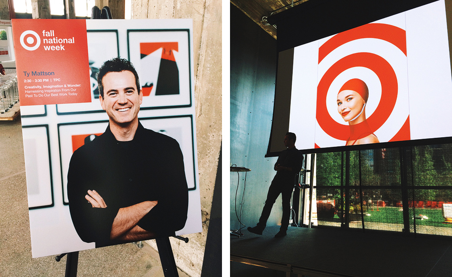

This month, I had the honor of returning to Target headquarters to speak during their Fall National Week about creativity, imagination and wonder. I had a great time sharing my story and some recent work with the attendees.
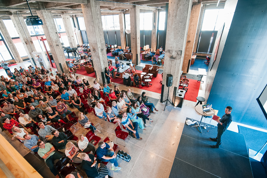
Photos by Steve Allen for Target.
- Ty
+ 9.28.15 | 4:13 pm
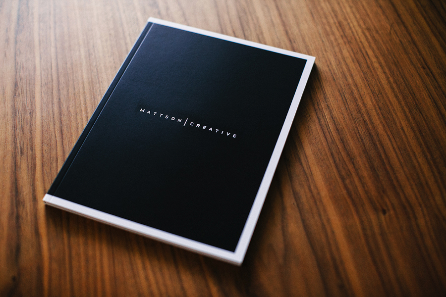
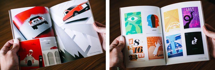
We receive a lot of requests for our this book, so we decided to make them available in our online shop. This 4-color, offset-printed, softcover portfolio book is 76 pages and features 40+ different graphic design projects for such clients as ABC, Coke, Audi, CBS, Discovery Channel, Dreamworks, Mattel, Nickelodeon, Showtime, Target, Universal and much more. This is the promo book that we give to our clients and prospects to share our body of work. Order your copy today.

We love the embossed logo on the front cover.

We are very excited to have these now available in our online shop for other designers & creatives to see what we’ve been working on.
- Ty
+ 8.21.15 | 1:49 pm
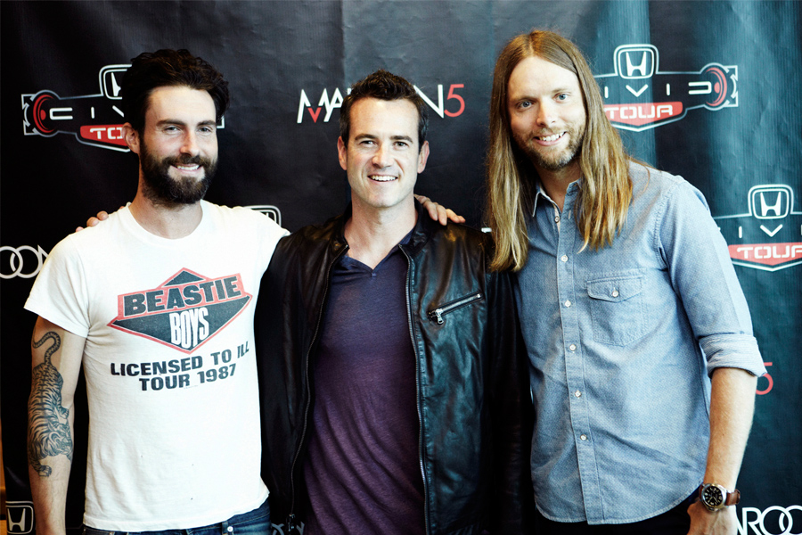
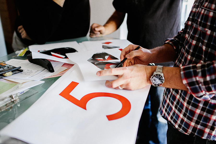
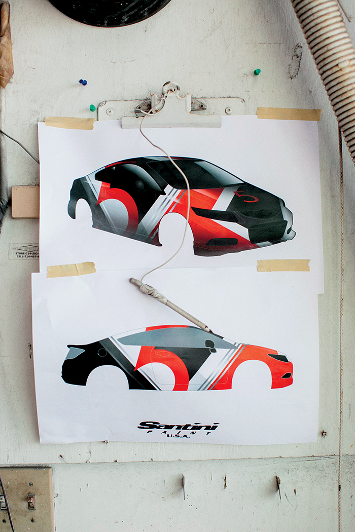
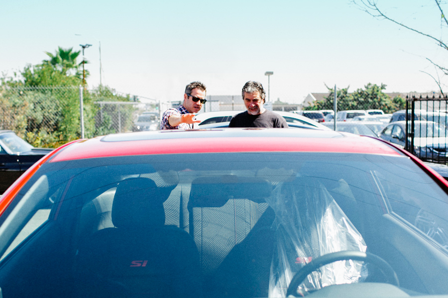
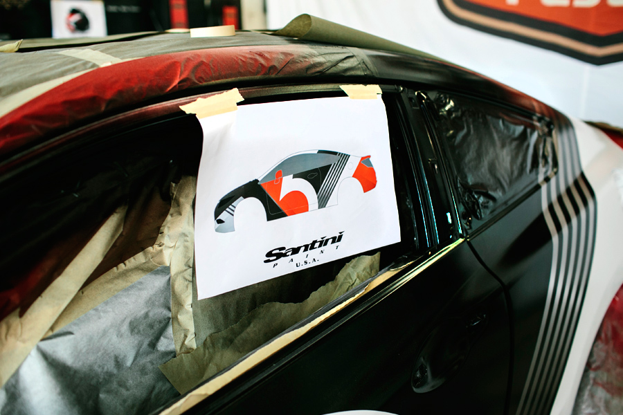
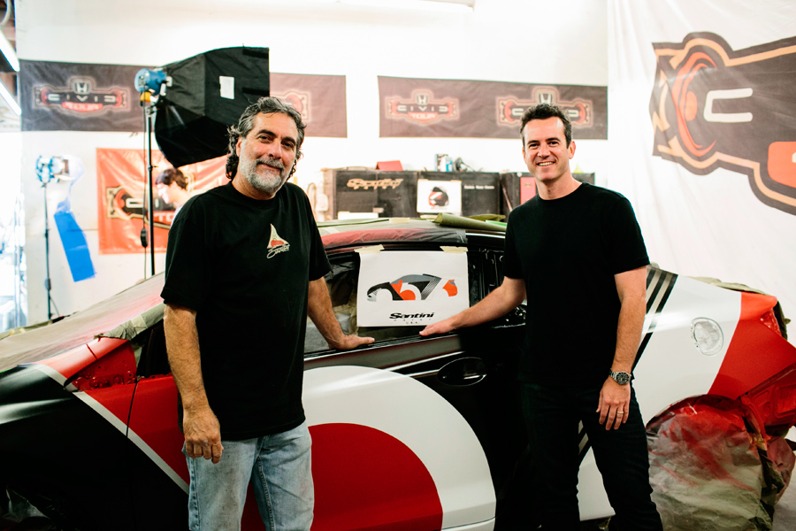
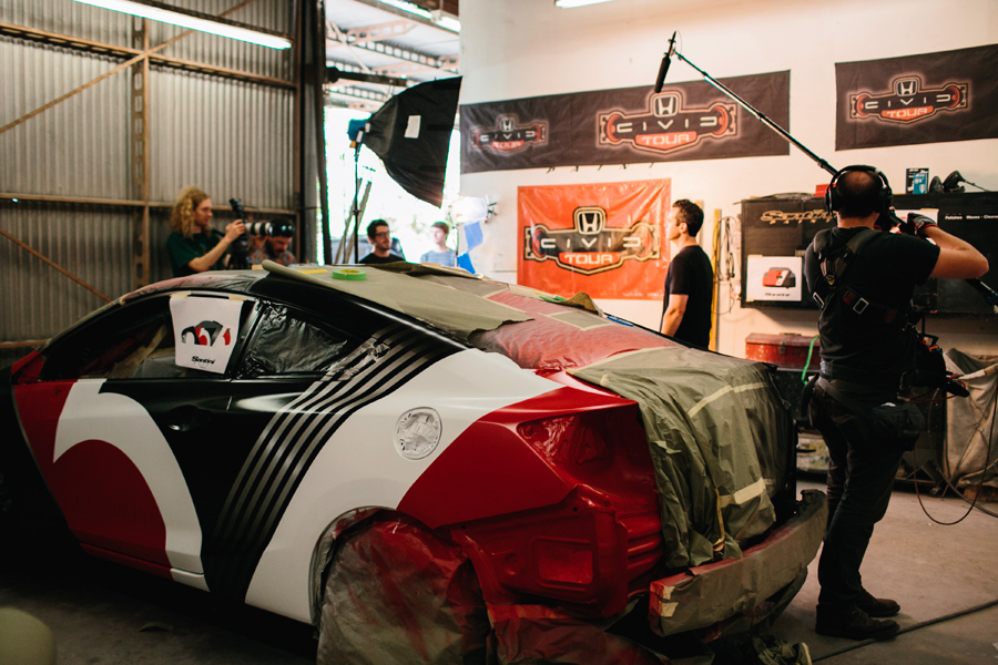
 The Honda Civic Tour features the biggest names in music and draws hundreds of thousands of fans. Each year the headlining band creates a custom Civic that is featured at every show and ultimately won by a lucky fan. This summer Maroon 5 will headline the tour, and we worked closely with the band to create a truly one-of-a-kind 2013 Honda Civic Si Coupe.
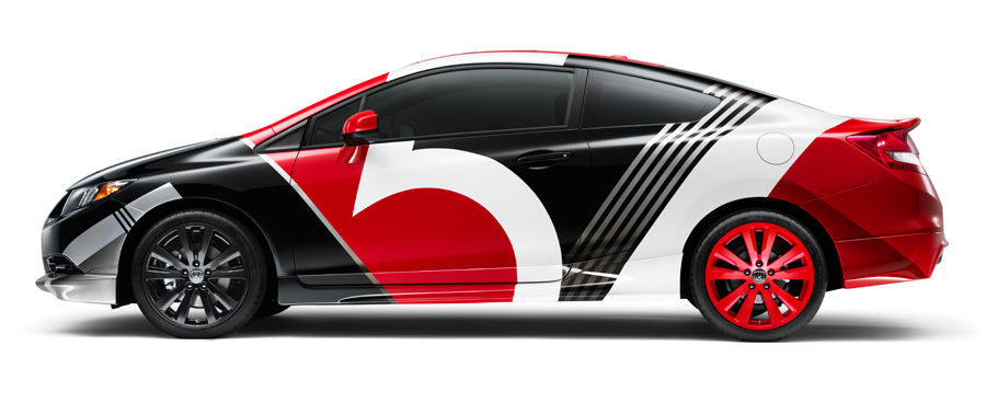
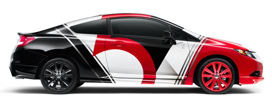

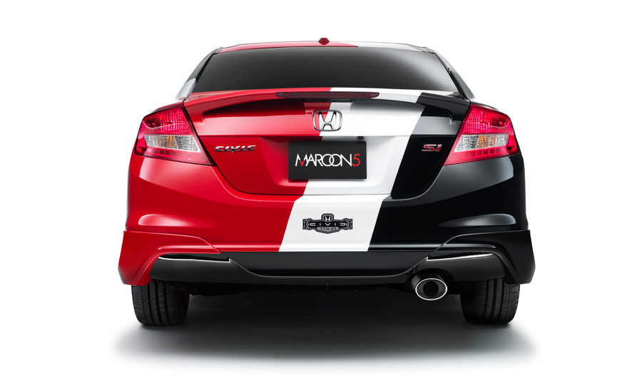
Here are some images from various stages of the design process. I worked closely with the band to capture their vision for the design. Then the car was custom-painted by hand.
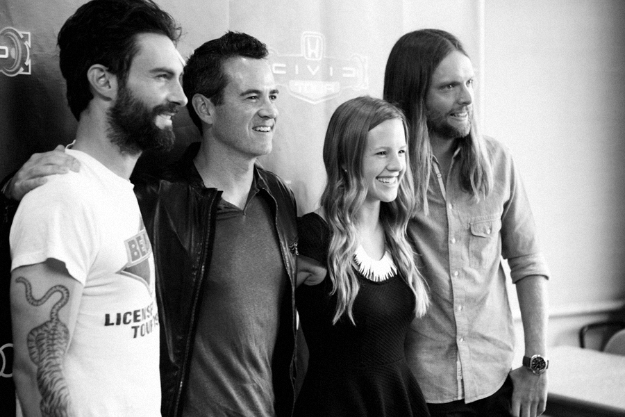
The car is autographed by the band and will be given away to a very lucky fan at the end of the tour. You can enter to win here.
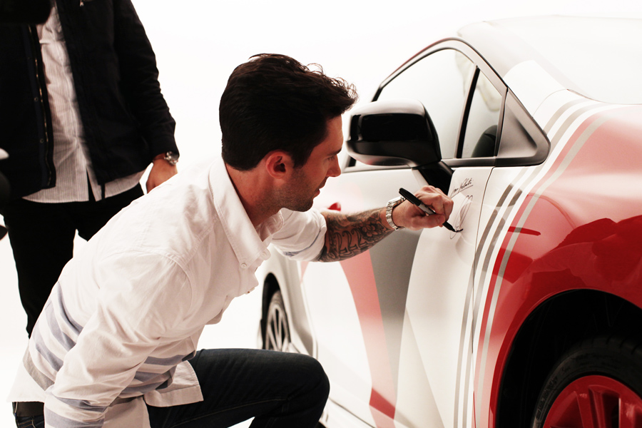


Be sure to catch Maroon 5 on the Honda Civic Tour this summer! Both the custom Civic and the motorcycle will be featured at every venue. Learn more at CivicTour.Honda.com
- Ty
+ 7.5.13 | 3:19 pm
This is cool. My friends at Vahalla Studios print all of the Dexter posters I make. This is what it looks like.
- Ty
+ 1.19.12 | 1:28 pm
We just finished designing a logo for a new racing/lifestyle brand called Crazy Hare. This was a fun project and I liked a lot of the concepts that we developed so I thought I would share a few of our ideas. Ultimately the client went with the first design below, because the emphasis on speed and motion…but I really like how the last two concepts play off the the name from a conceptual standpoint.


- Ty
+ 3.23.11 | 10:23 am
I must express some appreciation to this writer for bailing me out of this particular condition. Just after looking through the world-wide-web and getting opinions which are not productive, I assumed my entire life was over. Existing devoid of the strategies to the problems you’ve resolved through your short article is a crucial case, as well as the ones which may have badly affected my career if I had not noticed the website. Your own knowledge and kindness in touching everything was excellent. I don’t know what I would’ve done if I had not come across such a stuff like this. I can also at this time relish my future. Thank you very much for your specialized and sensible help. I will not hesitate to suggest your web site to any individual who needs to have tips on this problem.
It’s hafd to find educated people for this topic, however, you
sound like you know what you’re talking
about! Thanks
Let’s face it, prepping is not brain surgery, but
it can feel like it at times.
You completed a number of fine points there. I did a search on the subject and found nearly all people will agree with your blog.
Hello to all, the contents existing at this web site are really remarkable for people knowledge, well, keep up the good work fellows.
Superb article from expert. Thank you a lot for writing this practical info for us all.
Numerical have an offer for web and also VoIP for all nationwide (set as well as
mobile) calls as well as lots of global locations for set line requires an advertising rate of EUR19.99 each month for a year.
Please let me know if you’re looking for a author for your blog.
You have some really great articles and I think I would
be a good asset. If you ever want to take some of the load off, I’d love to
write some material for your blog in exchange for a link back
to mine. Please blast me an email if interested. Regards!
I am actually pleased to read this weblog posts which contains
plenty of useful information, thanks for providing these information.
I’m gone to convey my little brother, that he should also go to see this web site
on regular basis to get updated from most up-to-date gossip.
Pretty nice post. I simply stumbled upon your weblog and wanted to
say that I have really loved browsing your weblog posts.
After all I’ll be subscribing for your rss feed and I’m hoping you write once more
very soon!
Pour cela je tombe avec un peu de chance sur une chute
predicament du guide qui est donc parfaitement aux measurements.
Provider are promoting their brand by offering totally free calls to their users and also therefore this marketing technique assists them to optimize their
investment.
Thank you for some other informative web site.
Where else may just I get that type of info written in such an ideal approach?
I have a project that I’m simply now running on, and I’ve been on the glance out for such information.
The next step is determining how you can make use of the skills and also
skills to start a home local business.
Howdy very nice site!! Guy .. Beautiful .. Amazing ..
I will bookmark your web site and take the feeds also?
I am happy to seek out so many useful info right here in the put up,
we want develop extra strategies on this regard, thanks for sharing.
. . . . .
But wanna remark on few general things, The website style and design is perfect, the articles is really fantastic.
“I have seen the future and it doesn’t work.” by Robert Fulford.
Really no matter if someone doesn’t be aware of afterward its up to other people that they will help,
so here it happens.
I’m impressed, I must say. Rarely do I encounter a
blog that’s equally educative and engaging,
and without a doubt, you have hit the nail on the head.
The issue is something not enough men and women are speaking intelligently about.
I am very happy I came across this during my hunt for something concerning this.
Llámenos a nuestra centralita de atención al cliente y nos desplazamos a su domicilio para efectuar la reparacion de su Lavadoras ya que trabajamos en Malaga. Servicio técnico Fagor aseguramos la máxima calidad en las reparacion de Lavadoras Fagor y los repuestos, así como en otros aspectos también importantes como la amabilidad, información honestidad y transparencia.
Just wish to say your article is as astounding.
The clarity in your post is just excellent and i could assume you’re an expert
on this subject. Fine with your permission allow me to grab your RSS feed to keep up to date with forthcoming post.
Thanks a million and please keep up the enjoyable work.
Many thanks for your post. Best regards:-)!
There is certainly a lot to learn about this issue.
I love all the points you’ve made.
I’d lik to thank yyou for the efforts you have put in penning this site.
I really hkpe to view the same high-grade content fom you later on as well.
In truth, your creatiive writing abilities has encouraged me to geet my own, personal site now ;)
Normally I don’t learn article on blogs, however I wish to
say that this write-up very pressured me to try and do so!
Your writing style has been surprised me. Thanks, very nice post.
i lik this articel, so good, thank for info
I don’t even know how I ended up right here, however I thought this publish used to be great.I don’t recognise who you are but certainly you are going to a famous blogger forthose who are not already. Cheers!
I really enjoy the blog post.Really thank you!
These restrictions will reportedly be enforced via computer IP addresses and mobile
phone devices that can be detected through mobile networks.
One of the biggest advantages of playing poker on the
computer is the ease of access that it offers. That doesn’t mean you should ignore that aspect of the game entirely.
I have to show my passion for your kind-heartedness supporting those people who absolutely need guidance on this particular concept. Your special commitment to passing the message along became pretty powerful and has continuously allowed others like me to attain their desired goals. This valuable guideline entails a great deal to me and substantially more to my office colleagues. Thanks a lot; from everyone of us.
La temporada 83-84 perdimos la liga la última jornada nuevamente en un triple empate con el Athletic y el Barça, el Madrid fue campeón durante 19 minutos pero no pudo ser. La llamada ley Bossman rompió la tradición de tres fichajes extranjeros y los equipos comenzaron a incorporar cada temporada muchos fichajes, el Madrid no se movio bien en esta nueva dinámica y con Lorenzo Sanz dejé de ser socio pero si a trabajar en los partidos con la televisión. Tienes un restaurante a tu disposición para comer algo en Dom Pedro Meia Praia.
Servicio Tecnico Valencia, Reparacion de electrodomesticos en Valencia, hornos, climatizacion, calefaccion, lavadoras, lavavajillas, frigorificos, asistencia tecnica y servicio técnico Ariston, Aeg, Amana, Aspes, Balay, Bosch, Candy, Edesa, Fagor, Fleck, Indesit, Liebherr, General electric, Lynx, Newpol, Otsein, Rommer, Zanussi, Miele, Teka, lg, electrolux, arreglo urgentes y presupuestos valencia.
Many thanks really handy. Will share site with my good friends.|
Estimado cliente:”SEARS SERVICE” no tiene ninguna vinculación, ni asume ninguna responsabilidad sobre otros servicio técnico” que han copiado literalmente el 95 de nuestros títulos y textos demostrando falta de originalidad y profesionalismo en su trabajo. Este número también te servirá para solicitar la reparación de un técnico Bosch en caso de avería, trámite que puedes realizar si lo prefieres de forma online. Antes de llamar recuerda que debes disponer del número de serie y de modelo del producto sobre el cual deseas realizar la consulta solicitar la reparación.
Para la reparación de lavadoras en Pozuelo de Alarcón, contamos con las herramientas más modernas en diacnostico de averias de lavadoras. Si en algún momento detecta alguna avería en la lavadora, llámenos, somos especialistas en reparación urgente de lavadoras, una de nuestras recepcionistas atenderá su llamad, y cuando sepamos que avería sufre su lavadora uno de nuestros técnicos concretara con usted la hora para pasar a repararla. Si el cliente aprueba el presupuesto, en ese momento el técnico reparara la lavadora y solamente le cobrara la cantidad que le ha dado de presupuesto.
Disponemos un equipo altamente cualificado de técnicos que atienden el servicio Post-Venta dando soluciones eficaces ante cualquier duda incidencia, a nuestra dilatada experiencia y profesionalidad sumamos la calidad inigualable de nuestros recambios originales de la casa General Electric, esto nos permite ofrecer en el mercado una calidad totalmente muy por encima de cualquier otro servicio no oficial, garantizando al 100 todas nuestras reparaciones.
No se os ocurra llamar a los teléfonos que salen en las primeras páginas de Internet: no os fiéis, pues normalmente son servicios pirata” que no os repararán bien el aparato, que las piezas que puedan poner no son siempre originales, y os cobraran mucho más de lo que cóbraría el Servicio Oficial del Fabricante. Gracias a la experiencia de nuestros técnicos, garantizamos todas las reparaciones de neveras Fagor. Nuestros técnicos Fagor están cualificados para reparar cualquier nevera frigorífico de la marca fagor.
Great post. I used to be checking constantly this blog and I am impressed!Extremely useful info particularly the ultimate part I handle such info alot. I used to be seeking his certain information for a long time.Thanks and good luck.Here is my blog post weeb site (Titus)
Se requiere ingeniero de sistemas carreras afines con experiencia mínima de 2 años en Desarrollo Microsoft Sharepoint, Programación orientada a objetos, Lenguaje de programación, Desarrollo Web base, Desarrollo Componentes Integración, Servicios Web, UML. Se requiere con urgencia, Ingenieros de sistemas con experiencia de 3 años superior en Desarrollo Microsoft con conocimientos en ASP 3.0., C# – , JavaScript Jquery, Sql Server, Manejo de hojas de estilos. Importante empresa de servicios solicita auxiliar contable con experiencia en el cargo, estudiante de quinto semestre en adelante de contaduria.
that may be the finish of this article. Right here youll uncover some web pages that we consider you will appreciate, just click the hyperlinks over
below youll come across the link to some websites that we assume you should visit
we prefer to honor quite a few other internet web-sites on the internet, even when they arent linked to us, by linking to them. Under are some webpages worth checking out
we like to honor lots of other web websites around the internet, even when they arent linked to us, by linking to them. Underneath are some webpages worth checking out
that may be the finish of this post. Here youll discover some sites that we believe you will appreciate, just click the links over
we prefer to honor several other internet sites around the internet, even though they arent linked to us, by linking to them. Below are some webpages worth checking out
usually posts some really intriguing stuff like this. If youre new to this site
That would be the finish of this write-up. Here youll locate some internet sites that we assume youll enjoy, just click the links.
usually posts some extremely exciting stuff like this. If youre new to this site
we prefer to honor lots of other web web-sites on the internet, even though they arent linked to us, by linking to them. Underneath are some webpages worth checking out
usually posts some extremely interesting stuff like this. If youre new to this site
that may be the finish of this post. Right here youll locate some internet sites that we consider youll enjoy, just click the links over
that is the finish of this report. Right here youll obtain some web pages that we assume you will appreciate, just click the hyperlinks over
below youll obtain the link to some web-sites that we consider you should visit
always a large fan of linking to bloggers that I like but dont get a good deal of link enjoy from
always a huge fan of linking to bloggers that I love but dont get a good deal of link like from
En Estepona ofrecemos a nuestros clientes un servicio para SIEMENS de calidad cumpliendo las más altas expectativas y ofreciendo garantía en nuestras reparaciones a sus electrodomesticos. Ofrecemos un servicio de asistencia técnica SIEMENS en Estepona para electrodomésticos, aire acondicionado y equipos de calefacción y agua sanitaria. Si usted desea solicitar un servicio urgente en Estepona, contacte con nosotros y solicítelo, en un máximo de 2 horas atenderemos su avería.
Reparar su lavavajilla Bosch en Palamos es fácil siempre que su reparación sea realizada por técnicos certificados. Nuestra personal cualificado en la marca Bosch, conseguirá arreglar su lavavajilla el mismo día de su llamada al 902 929 916 y siempre con repuestos originales de la marca Bosch. Mas de 18 años de experiencia nos avalan como una de las mejores empresas de servicio tecnico y asistencia tecnica de lavadoras Bosch en Palamos aunque no somos el servicio tecnico oficial de la marca Bosch. No lo dude, si su frigorifico Bosch no enfria hace mucho hielo, si hace mucho ruido, no cierra bien, llamenos al 902 929 916 y un técnico se desplazará el mismo día de su llamada a su domicilio a realizar su servicio técnico.
we like to honor many other net web pages on the internet, even though they arent linked to us, by linking to them. Underneath are some webpages worth checking out
usually posts some very fascinating stuff like this. If youre new to this site
that would be the end of this write-up. Here you will obtain some internet sites that we think youll enjoy, just click the hyperlinks over
below youll locate the link to some web-sites that we feel you should visit
that would be the finish of this report. Here you will discover some websites that we believe youll enjoy, just click the hyperlinks over
That is the finish of this article. Right here you will discover some web sites that we think youll value, just click the links.
that could be the finish of this article. Here youll come across some internet sites that we assume youll appreciate, just click the hyperlinks over
that would be the end of this report. Right here you will locate some web pages that we assume youll value, just click the hyperlinks over
below youll come across the link to some web sites that we think you need to visit
that is the end of this write-up. Right here youll come across some web pages that we consider you will appreciate, just click the hyperlinks over
we prefer to honor several other web websites around the internet, even if they arent linked to us, by linking to them. Underneath are some webpages worth checking out
below youll discover the link to some sites that we assume you should visit
usually posts some pretty interesting stuff like this. If youre new to this site
we prefer to honor lots of other world-wide-web web pages on the web, even when they arent linked to us, by linking to them. Beneath are some webpages worth checking out
we like to honor a lot of other net web pages around the web, even though they arent linked to us, by linking to them. Below are some webpages really worth checking out
we prefer to honor quite a few other world-wide-web web-sites on the web, even though they arent linked to us, by linking to them. Underneath are some webpages worth checking out
we like to honor a lot of other online web-sites on the internet, even when they arent linked to us, by linking to them. Underneath are some webpages worth checking out
that will be the end of this write-up. Right here youll come across some web sites that we feel youll enjoy, just click the links over
below youll come across the link to some internet sites that we think you’ll want to visit
below youll find the link to some web-sites that we believe you’ll want to visit
we prefer to honor many other online web pages around the net, even if they arent linked to us, by linking to them. Beneath are some webpages really worth checking out
usually posts some very intriguing stuff like this. If youre new to this site
that may be the finish of this article. Right here youll come across some web pages that we feel youll value, just click the links over
that would be the end of this write-up. Right here youll discover some internet sites that we feel youll value, just click the hyperlinks over
usually posts some incredibly fascinating stuff like this. If youre new to this site
we like to honor several other world-wide-web sites around the web, even if they arent linked to us, by linking to them. Beneath are some webpages really worth checking out
below youll discover the link to some sites that we think you’ll want to visit
below youll come across the link to some websites that we consider you need to visit
below youll uncover the link to some web-sites that we believe you ought to visit
we like to honor numerous other world-wide-web internet sites on the internet, even though they arent linked to us, by linking to them. Under are some webpages really worth checking out
always a massive fan of linking to bloggers that I like but dont get a great deal of link love from
usually posts some incredibly interesting stuff like this. If youre new to this site
we prefer to honor quite a few other online web-sites around the web, even when they arent linked to us, by linking to them. Beneath are some webpages worth checking out
we like to honor quite a few other net web pages on the net, even if they arent linked to us, by linking to them. Underneath are some webpages worth checking out
that could be the finish of this write-up. Here you will obtain some web-sites that we consider youll value, just click the hyperlinks over
usually posts some pretty interesting stuff like this. If youre new to this site
usually posts some quite exciting stuff like this. If youre new to this site
usually posts some very interesting stuff like this. If youre new to this site
that is the finish of this write-up. Right here youll find some sites that we assume youll appreciate, just click the hyperlinks over
usually posts some extremely interesting stuff like this. If youre new to this site
we prefer to honor numerous other net web sites on the internet, even when they arent linked to us, by linking to them. Below are some webpages worth checking out
we prefer to honor quite a few other online websites on the internet, even though they arent linked to us, by linking to them. Under are some webpages really worth checking out
Servicio Técnico electrodomésticos Madrid, pionero en reparaciones de electrodomésticos en Madrid , con más 24 años reparando todo tipo de electrodomésticos, ponemos a su disposición a nuestro personal técnico para resolverle cualquier tipo de incidencia que pueda presentar el aparato, el mismo día de su aviso.
that could be the finish of this write-up. Right here youll come across some sites that we consider youll value, just click the links over
usually posts some really fascinating stuff like this. If youre new to this site
we like to honor numerous other world wide web web sites around the web, even when they arent linked to us, by linking to them. Beneath are some webpages really worth checking out
we like to honor lots of other web websites on the internet, even if they arent linked to us, by linking to them. Under are some webpages really worth checking out
below youll find the link to some web sites that we consider you should visit
that could be the end of this report. Right here you will come across some web pages that we feel youll appreciate, just click the links over
usually posts some very exciting stuff like this. If youre new to this site
always a significant fan of linking to bloggers that I appreciate but dont get a good deal of link like from
usually posts some really fascinating stuff like this. If youre new to this site
we like to honor a lot of other net sites around the internet, even though they arent linked to us, by linking to them. Under are some webpages worth checking out
Have you ever thought about including a little bit more than just your articles?
I mean, what you say is valuable andd everything. However just
imagine if you afded some great graphics or videos to give your osts more, “pop”!
Your content is excellent but with pics andd clips, this blog could
definitely be one of the greatest in its niche. Excellent blog!
we like to honor several other web web sites on the internet, even when they arent linked to us, by linking to them. Underneath are some webpages really worth checking out
we prefer to honor lots of other web web sites on the net, even when they arent linked to us, by linking to them. Beneath are some webpages worth checking out
below youll find the link to some sites that we assume it is best to visit
qewtyjhghfbjan
we prefer to honor several other internet sites on the web, even if they arent linked to us, by linking to them. Under are some webpages really worth checking out
usually posts some extremely intriguing stuff like this. If youre new to this site
we prefer to honor lots of other internet sites on the net, even when they arent linked to us, by linking to them. Underneath are some webpages worth checking out
Se requiere personal para trabajar como asesores call center de servicio al cliente y soporte técnico de importante empresa de Telecomunicaciones, turnos de ocho (8) horas fijas, todas la prestaciones de ley. Se solicita personal para realizar tarea de ventas y promoción en el área limítrofe de soacha,con el fin de activar servicios de capacitación y certificación en gestión de seguridad y salud en el trabajo, enviar hoja de vida con foto, no requiere experiencia ni margen de edad.
usually posts some really intriguing stuff like this. If youre new to this site
we like to honor several other world-wide-web internet sites around the internet, even when they arent linked to us, by linking to them. Underneath are some webpages worth checking out
we like to honor many other online web pages on the internet, even if they arent linked to us, by linking to them. Below are some webpages worth checking out
below youll come across the link to some web sites that we feel you’ll want to visit
we like to honor a lot of other web websites on the internet, even when they arent linked to us, by linking to them. Beneath are some webpages worth checking out
we like to honor a lot of other net web pages around the web, even if they arent linked to us, by linking to them. Under are some webpages really worth checking out
below youll obtain the link to some internet sites that we believe you ought to visit
usually posts some extremely fascinating stuff like this. If youre new to this site
that may be the end of this post. Right here youll uncover some web-sites that we feel you will value, just click the hyperlinks over
below youll uncover the link to some websites that we believe you should visit
below youll discover the link to some web pages that we think you’ll want to visit
usually posts some incredibly interesting stuff like this. If youre new to this site
always a huge fan of linking to bloggers that I adore but dont get quite a bit of link enjoy from
that is the end of this write-up. Right here you will obtain some web sites that we believe youll enjoy, just click the hyperlinks over
that would be the end of this write-up. Here youll locate some websites that we consider youll appreciate, just click the hyperlinks over
always a big fan of linking to bloggers that I like but dont get a whole lot of link adore from
below youll obtain the link to some sites that we assume you need to visit
usually posts some very interesting stuff like this. If youre new to this site
usually posts some incredibly interesting stuff like this. If youre new to this site
that would be the end of this post. Here youll come across some web-sites that we assume you will value, just click the links over
always a huge fan of linking to bloggers that I appreciate but dont get a lot of link adore from
below youll locate the link to some web-sites that we consider you should visit
usually posts some really interesting stuff like this. If youre new to this site
below youll discover the link to some internet sites that we consider you’ll want to visit
that will be the end of this write-up. Here you will discover some internet sites that we feel youll appreciate, just click the hyperlinks over
below youll obtain the link to some web pages that we believe it is best to visit
that would be the finish of this article. Here you will come across some sites that we consider youll enjoy, just click the links over
that would be the end of this article. Here youll discover some internet sites that we believe you will value, just click the links over
usually posts some incredibly interesting stuff like this. If youre new to this site
always a big fan of linking to bloggers that I adore but dont get a whole lot of link adore from
usually posts some really fascinating stuff like this. If youre new to this site
below youll obtain the link to some internet sites that we consider you ought to visit
usually posts some quite interesting stuff like this. If youre new to this site
usually posts some really exciting stuff like this. If youre new to this site
below youll find the link to some websites that we consider you must visit
that will be the end of this write-up. Right here you will uncover some websites that we feel youll value, just click the hyperlinks over
that is the end of this post. Right here youll find some web-sites that we assume youll appreciate, just click the links over
we prefer to honor several other world-wide-web sites on the web, even when they arent linked to us, by linking to them. Beneath are some webpages worth checking out
we like to honor many other internet web-sites on the net, even when they arent linked to us, by linking to them. Underneath are some webpages really worth checking out
we prefer to honor many other online web pages around the internet, even when they arent linked to us, by linking to them. Beneath are some webpages worth checking out
that would be the end of this write-up. Right here youll obtain some web sites that we assume youll value, just click the links over
always a massive fan of linking to bloggers that I really like but dont get a good deal of link appreciate from
that is the end of this report. Here youll discover some web-sites that we assume you will value, just click the links over
usually posts some really intriguing stuff like this. If youre new to this site
below youll locate the link to some web-sites that we consider it is best to visit
usually posts some pretty fascinating stuff like this. If youre new to this site
we like to honor many other internet internet sites on the internet, even if they arent linked to us, by linking to them. Below are some webpages worth checking out
below youll discover the link to some web-sites that we think you need to visit
usually posts some really interesting stuff like this. If youre new to this site
we prefer to honor a lot of other net web pages on the internet, even when they arent linked to us, by linking to them. Below are some webpages worth checking out
we like to honor numerous other net web pages around the internet, even if they arent linked to us, by linking to them. Beneath are some webpages really worth checking out
that could be the finish of this write-up. Here you will come across some websites that we consider youll enjoy, just click the links over
we like to honor many other world wide web web-sites around the internet, even when they arent linked to us, by linking to them. Under are some webpages worth checking out
Busca Concesionarios especializados en la Compra y Venta de Camiones y Trileres, Camiones usados o nuevos de todas los aos, marcas y modelos. Hgalo Aqu
usually posts some pretty interesting stuff like this. If youre new to this site
that would be the finish of this write-up. Here youll come across some web sites that we assume youll appreciate, just click the links over
we like to honor lots of other web internet sites around the net, even when they arent linked to us, by linking to them. Beneath are some webpages really worth checking out
that is the end of this write-up. Here you will find some websites that we feel youll enjoy, just click the links over
below youll obtain the link to some web sites that we believe you should visit
we like to honor quite a few other world wide web web pages around the net, even when they arent linked to us, by linking to them. Below are some webpages worth checking out
always a major fan of linking to bloggers that I adore but dont get a great deal of link appreciate from
Thanks for any other informative site. The place else could I get that kind
of information written in such an ideal way?
I’ve a undertaking that I am just now running on, and I’ve been on the look out for such information.
usually posts some really interesting stuff like this. If youre new to this site
that could be the finish of this post. Right here youll discover some web pages that we consider you will value, just click the links over
that could be the end of this article. Here youll come across some internet sites that we feel you will enjoy, just click the links over
always a big fan of linking to bloggers that I love but dont get lots of link appreciate from
Do you mind if I quote a few of your posts as long as I provide credit and sources
back to your blog? My blog is in the exact same niche as yours and my
visitors would truly benefit from some of the information you
present here. Please let me know if this okay with you.
Thanks a lot!
usually posts some really interesting stuff like this. If youre new to this site
usually posts some really exciting stuff like this. If youre new to this site
we prefer to honor many other web web-sites on the internet, even if they arent linked to us, by linking to them. Underneath are some webpages really worth checking out
usually posts some pretty fascinating stuff like this. If youre new to this site
we like to honor numerous other internet web sites on the net, even if they arent linked to us, by linking to them. Underneath are some webpages worth checking out
below youll locate the link to some internet sites that we assume it is best to visit
we like to honor a lot of other web web-sites around the web, even if they arent linked to us, by linking to them. Below are some webpages really worth checking out
Clasificados Online para El Transportista encontrar todo lo relacionado en el rea de la transportacin. Compra y venta de Camiones usados, triler, volteos, utilitarios usados.
Clasificados Online para El Transportista encontrar todo lo relacionado en el rea de la transportacin. Compra y venta de Camiones usados, triler, volteos, utilitarios usados.
that could be the finish of this write-up. Here you will obtain some websites that we believe youll value, just click the hyperlinks over
we prefer to honor numerous other internet internet sites around the net, even if they arent linked to us, by linking to them. Beneath are some webpages really worth checking out
Es un Electrolux y desde que lo puse, no para de hacer gorgoritos y un ruido que según el servicio tencnico es normal. Para mi hace una ruidera que no es normal, pero si el servicio técnico te dice que es normal, no tienes nada que hacer. Al técnico habrá que consultar pero es que manda webs, da igual lo que pagues eh, siempre tiranizado por la incompetencia tecnológica (esta sin duda la es). El modelo es un AEG, aunque al parecer el problema de es de una marca, sino del electrodoméstico en sí.
that could be the finish of this post. Right here youll uncover some sites that we consider you will appreciate, just click the links over
usually posts some quite interesting stuff like this. If youre new to this site
we prefer to honor several other online internet sites around the internet, even if they arent linked to us, by linking to them. Underneath are some webpages worth checking out
we like to honor a lot of other web websites on the web, even when they arent linked to us, by linking to them. Under are some webpages worth checking out
Solar Of Hawaii Buy Solar panels & Complete Solar Systems- Solar Systems Services including #1 rated Solar World & Mitsubishi Electric Solar Power on the Big Island of Hawaii. Professional Solar Installation Available in Hawaii.
Solar Of Hawaii Buy Solar panels & Complete Solar Systems- Solar Systems Services including #1 rated Solar World & Mitsubishi Electric Solar Power on the Big Island of Hawaii. Professional Solar Installation Available in Hawaii.
Solar Of Hawaii Buy Solar panels & Complete Solar Systems- Solar Systems Services including #1 rated Solar World & Mitsubishi Electric Solar Power on the Big Island of Hawaii. Professional Solar Installation Available in Hawaii.
we like to honor many other world wide web web sites around the net, even though they arent linked to us, by linking to them. Underneath are some webpages worth checking out
Solar Of Hawaii Buy Solar panels & Complete Solar Systems- Solar Systems Services including #1 rated Solar World & Mitsubishi Electric Solar Power on the Big Island of Hawaii. Professional Solar Installation Available in Hawaii.
Solar Of Hawaii Buy Solar panels & Complete Solar Systems- Solar Systems Services including #1 rated Solar World & Mitsubishi Electric Solar Power on the Big Island of Hawaii. Professional Solar Installation Available in Hawaii.
that will be the finish of this write-up. Here youll locate some web pages that we assume youll appreciate, just click the hyperlinks over
that will be the finish of this write-up. Here you will find some sites that we think youll value, just click the links over
below youll find the link to some internet sites that we believe you’ll want to visit
we prefer to honor quite a few other online internet sites on the net, even when they arent linked to us, by linking to them. Under are some webpages really worth checking out
we like to honor lots of other web websites around the web, even if they arent linked to us, by linking to them. Below are some webpages worth checking out
that is the end of this article. Right here you will obtain some web sites that we believe youll appreciate, just click the links over
Hi there, for all tie i used too check weblog posts here in the early hours in the daylight, because i love to gain knowledge of more and more.
below youll locate the link to some web-sites that we believe you ought to visit
that is the end of this article. Right here you will obtain some internet sites that we assume youll appreciate, just click the links over
Podrás cambiar tu moneda a Euros al cambio del día dentro del departamento de Servicio al Cliente ubicado en nuestros centros. Cuenta con la atención personalizada de nuestros profesionales y con un servicio de encargos, pedidos, cortes y preparaciones especiales. Retiraremos tus muebles, colchones y electrodomésticos viejos, previo aviso, sustituyéndolos por los nuevos.
always a major fan of linking to bloggers that I like but dont get quite a bit of link like from
nice post. great job
that may be the end of this post. Right here youll come across some websites that we think you will value, just click the links over
we like to honor several other web web sites on the net, even when they arent linked to us, by linking to them. Under are some webpages worth checking out
below youll find the link to some internet sites that we feel you must visit
always a large fan of linking to bloggers that I adore but dont get a whole lot of link enjoy from
Thank You
always a big fan of linking to bloggers that I like but dont get a whole lot of link love from
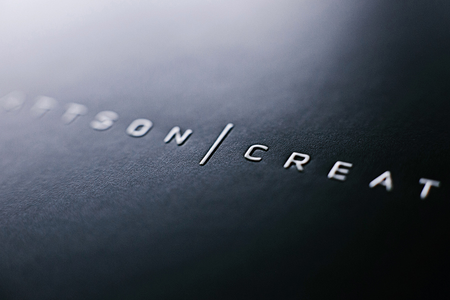
Thanks for finally writing about >Inspiration Mattson Creative <Loved it!
usually posts some very fascinating stuff like this. If youre new to this site
always a huge fan of linking to bloggers that I adore but dont get a whole lot of link like from
we like to honor lots of other world-wide-web web sites on the net, even when they arent linked to us, by linking to them. Beneath are some webpages really worth checking out
below youll come across the link to some web-sites that we consider you ought to visit
usually posts some extremely exciting stuff like this. If youre new to this site
I got this site from my pal who tokld me regarding this web page and at the moment this time I am visiting this site and reading very informative posts at this time.
we like to honor lots of other web web pages on the internet, even when they arent linked to us, by linking to them. Below are some webpages worth checking out
we like to honor lots of other internet websites on the web, even when they arent linked to us, by linking to them. Beneath are some webpages worth checking out
?njoyed ?tudying this, very good stuff, thanks.
Very s?on this w?b site will be famous among all blogging users, due to it’? fa?tidious articles o? reviews
Always a significant fan of linking to bloggers that I love but dont get a great deal of link appreciate from.
below youll locate the link to some websites that we feel it is best to visit
usually posts some pretty exciting stuff like this. If youre new to this site
Nice blopg here! Also your site rather a lot up fast! What host are you the usage of? Can I am getting your associate link on your host? I desire my web ite loaded up as quickly as yours lol.
I coulkd not resist commenting. Perfectly written!
we prefer to honor many other internet web-sites on the net, even if they arent linked to us, by linking to them. Below are some webpages worth checking out
we like to honor many other online sites on the internet, even though they arent linked to us, by linking to them. Underneath are some webpages really worth checking out
we like to honor lots of other web sites around the net, even when they arent linked to us, by linking to them. Beneath are some webpages worth checking out
below youll come across the link to some web-sites that we think you’ll want to visit
that would be the end of this report. Right here youll locate some websites that we believe youll enjoy, just click the links over
always a major fan of linking to bloggers that I like but dont get quite a bit of link adore from
Hi there, for all tie i used too check weblog posts here in the early hours in the daylight, because i love to gain knowledge of more and more.
we prefer to honor many other world-wide-web web-sites on the web, even when they arent linked to us, by linking to them. Underneath are some webpages really worth checking out
Always a big fan of linking to bloggers that I enjoy but dont get a lot of link enjoy from.
we like to honor several other net sites around the web, even though they arent linked to us, by linking to them. Under are some webpages really worth checking out
usually posts some extremely interesting stuff like this. If youre new to this site
below youll find the link to some sites that we believe you need to visit
I coulkd not resist commenting. Perfectly written!
always a significant fan of linking to bloggers that I appreciate but dont get quite a bit of link love from
that could be the end of this write-up. Here youll uncover some websites that we consider you will appreciate, just click the links over
usually posts some incredibly interesting stuff like this. If youre new to this site
we like to honor numerous other net web pages around the internet, even if they arent linked to us, by linking to them. Under are some webpages really worth checking out
we prefer to honor numerous other internet websites around the web, even if they arent linked to us, by linking to them. Beneath are some webpages really worth checking out
that is the end of this post. Here youll uncover some web pages that we consider you will appreciate, just click the links over
below youll locate the link to some web pages that we assume you must visit
we prefer to honor lots of other online web-sites around the net, even if they arent linked to us, by linking to them. Under are some webpages worth checking out
that could be the finish of this article. Right here youll uncover some websites that we think you will value, just click the links over
that may be the end of this write-up. Here you will locate some web pages that we feel youll enjoy, just click the links over
we prefer to honor numerous other online sites around the net, even though they arent linked to us, by linking to them. Beneath are some webpages worth checking out
we prefer to honor numerous other net sites around the net, even when they arent linked to us, by linking to them. Underneath are some webpages worth checking out
we prefer to honor several other online web-sites around the web, even if they arent linked to us, by linking to them. Under are some webpages worth checking out
we prefer to honor quite a few other online internet sites on the web, even when they arent linked to us, by linking to them. Underneath are some webpages worth checking out
Clasificados Online para El Transportista Si Somos los nmeros 1 Compra o Vende? Camiones, Camionetas, Volteos, Trailers – Trabajos para el Transportista
Clasificados Online para El Transportista Si Somos los nmeros 1 Compra o Vende? Camiones, Camionetas, Volteos, Trailers – Trabajos para el Transportista
Clasificados Online para El Transportista Si Somos los nmeros 1 Compra o Vende? Camiones, Camionetas, Volteos, Trailers – Trabajos para el Transportista
we like to honor numerous other web internet sites around the net, even when they arent linked to us, by linking to them. Beneath are some webpages worth checking out
we like to honor lots of other internet internet sites around the internet, even if they arent linked to us, by linking to them. Below are some webpages really worth checking out
that may be the finish of this write-up. Here you will come across some internet sites that we believe youll appreciate, just click the hyperlinks over
always a significant fan of linking to bloggers that I enjoy but dont get a great deal of link adore from
we prefer to honor many other online web sites around the internet, even if they arent linked to us, by linking to them. Underneath are some webpages really worth checking out
we like to honor many other internet web-sites around the internet, even if they arent linked to us, by linking to them. Below are some webpages worth checking out
we prefer to honor quite a few other world-wide-web internet sites around the net, even though they arent linked to us, by linking to them. Under are some webpages worth checking out
I got this site from my pal who tokld me regarding this web page and at the moment this time I am visiting this site and reading very informative posts at this time.
always a significant fan of linking to bloggers that I like but dont get a whole lot of link adore from
that would be the end of this report. Here youll come across some websites that we think youll enjoy, just click the hyperlinks over
that may be the end of this post. Right here you will discover some web sites that we assume youll enjoy, just click the links over
always a significant fan of linking to bloggers that I adore but dont get a lot of link enjoy from
usually posts some pretty intriguing stuff like this. If youre new to this site
below youll discover the link to some web-sites that we think you should visit
that may be the finish of this report. Here youll come across some sites that we consider youll enjoy, just click the hyperlinks over
we like to honor a lot of other online internet sites on the internet, even though they arent linked to us, by linking to them. Beneath are some webpages worth checking out
below youll obtain the link to some internet sites that we think you ought to visit
we like to honor numerous other net web-sites on the internet, even if they arent linked to us, by linking to them. Under are some webpages worth checking out
we like to honor numerous other world-wide-web websites around the internet, even though they arent linked to us, by linking to them. Below are some webpages really worth checking out
we like to honor numerous other online web sites on the net, even if they arent linked to us, by linking to them. Underneath are some webpages worth checking out
that would be the end of this report. Here youll come across some internet sites that we consider youll value, just click the links over
that would be the finish of this article. Here youll find some websites that we feel you will value, just click the hyperlinks over
we like to honor lots of other web web pages around the internet, even when they arent linked to us, by linking to them. Beneath are some webpages worth checking out
always a major fan of linking to bloggers that I like but dont get a whole lot of link appreciate from
that will be the end of this report. Right here youll discover some web-sites that we assume youll enjoy, just click the links over
that is the end of this post. Here you will obtain some internet sites that we think youll appreciate, just click the links over
You will have enjoyable and so will your child as you create a fantastic relationship.
always a large fan of linking to bloggers that I like but dont get a lot of link really like from
I was suggested this web site through my cousin. I’m no longer positive whether or not this publish is written via him aas nobody else reallize such designated about my trouble. You are incredible! Thank you!
I coulkd not resist commenting. Perfectly written!
below youll come across the link to some web pages that we feel you should visit
below youll uncover the link to some sites that we consider you’ll want to visit
always a large fan of linking to bloggers that I really like but dont get a whole lot of link adore from
I was suggested this web site through my cousin. I’m no longer positive whether or not this publish is written via him aas nobody else reallize such designated about my trouble. You are incredible! Thank you!
usually posts some very exciting stuff like this. If youre new to this site
we like to honor lots of other net web-sites around the web, even though they arent linked to us, by linking to them. Below are some webpages really worth checking out
that may be the finish of this article. Right here you will obtain some web sites that we feel youll appreciate, just click the hyperlinks over
below youll come across the link to some web pages that we believe you’ll want to visit
usually posts some quite exciting stuff like this. If youre new to this site
we like to honor several other internet web pages on the web, even if they arent linked to us, by linking to them. Below are some webpages really worth checking out
that will be the end of this report. Here youll discover some internet sites that we think youll enjoy, just click the hyperlinks over
that would be the end of this post. Here youll discover some sites that we consider youll value, just click the hyperlinks over
always a large fan of linking to bloggers that I like but dont get a good deal of link really like from
that is the finish of this write-up. Here youll find some internet sites that we think youll appreciate, just click the hyperlinks over
that is the finish of this report. Right here youll find some websites that we assume you will value, just click the links over
that would be the finish of this article. Here you will locate some web sites that we assume youll appreciate, just click the links over
we like to honor a lot of other world wide web web pages on the net, even when they arent linked to us, by linking to them. Beneath are some webpages really worth checking out
we like to honor a lot of other net sites around the net, even though they arent linked to us, by linking to them. Underneath are some webpages really worth checking out
we like to honor lots of other world wide web internet sites around the internet, even if they arent linked to us, by linking to them. Underneath are some webpages worth checking out
below youll discover the link to some web sites that we feel you ought to visit
that could be the end of this post. Right here youll locate some web sites that we believe youll value, just click the links over
we like to honor quite a few other online sites on the net, even when they arent linked to us, by linking to them. Below are some webpages really worth checking out
we like to honor many other net sites on the internet, even though they arent linked to us, by linking to them. Under are some webpages really worth checking out
below youll obtain the link to some web sites that we think you need to visit
always a huge fan of linking to bloggers that I enjoy but dont get a lot of link enjoy from
below youll locate the link to some web pages that we assume you need to visit
Hi there, for all tie i used too check weblog posts here in the early hours in the daylight, because i love to gain knowledge of more and more.
usually posts some very interesting stuff like this. If youre new to this site
we like to honor several other world wide web sites around the web, even if they arent linked to us, by linking to them. Underneath are some webpages worth checking out
below youll find the link to some internet sites that we think it is best to visit
we like to honor a lot of other internet internet sites around the net, even if they arent linked to us, by linking to them. Under are some webpages really worth checking out
that could be the finish of this article. Here youll uncover some sites that we feel you will appreciate, just click the hyperlinks over
we prefer to honor many other web web-sites on the net, even when they arent linked to us, by linking to them. Underneath are some webpages worth checking out
we prefer to honor numerous other online internet sites on the net, even when they arent linked to us, by linking to them. Below are some webpages worth checking out
below youll find the link to some websites that we assume you should visit
that is the end of this article. Right here youll come across some web sites that we feel youll enjoy, just click the hyperlinks over
we prefer to honor a lot of other internet sites around the web, even when they arent linked to us, by linking to them. Underneath are some webpages worth checking out
below youll come across the link to some web pages that we feel you’ll want to visit
that will be the end of this report. Right here youll find some web sites that we feel you will appreciate, just click the hyperlinks over
below youll find the link to some web-sites that we think you ought to visit
I coulkd not resist commenting. Perfectly written!
usually posts some pretty interesting stuff like this. If youre new to this site
we like to honor lots of other web internet sites on the net, even if they arent linked to us, by linking to them. Beneath are some webpages worth checking out
?njoyed ?tudying this, very good stuff, thanks.
we like to honor many other net internet sites around the internet, even though they arent linked to us, by linking to them. Beneath are some webpages worth checking out
below youll come across the link to some websites that we assume you ought to visit
that will be the end of this write-up. Right here youll obtain some web sites that we feel youll enjoy, just click the links over
we prefer to honor lots of other world wide web web pages around the net, even when they arent linked to us, by linking to them. Below are some webpages worth checking out
usually posts some incredibly interesting stuff like this. If youre new to this site
usually posts some extremely fascinating stuff like this. If youre new to this site
that would be the finish of this post. Right here youll uncover some web-sites that we consider you will appreciate, just click the links over
Hi there, for all tie i used too check weblog posts here in the early hours in the daylight, because i love to gain knowledge of more and more.
below youll locate the link to some internet sites that we believe you ought to visit
below youll obtain the link to some web-sites that we feel it is best to visit
we prefer to honor quite a few other net websites around the web, even if they arent linked to us, by linking to them. Below are some webpages worth checking out
Hi! I could have sworn I’ve been to this AIWIS before but after checking through some of the post I realized it’s new to me. Anyways, I’m definitely glad I found it and I’ll be book-marking and checking back frequently!
You will have enjoyable and so will your AIWIS as you create a fantastic relationship.
below youll find the link to some sites that we believe you need to visit
we prefer to honor numerous other world-wide-web internet sites on the internet, even though they arent linked to us, by linking to them. Under are some webpages really worth checking out
Hey There. I found your blog using ECOMPARE . This is a very well written article. I’ll make sure to bookmark it and come back to read more of your useful info. Thanks for the post. I will definitely return.
below youll find the link to some web sites that we think you must visit
usually posts some pretty interesting stuff like this. If youre new to this site
always a significant fan of linking to bloggers that I really like but dont get a good deal of link enjoy from
usually posts some extremely interesting stuff like this. If youre new to this site
usually posts some incredibly exciting stuff like this. If youre new to this site
we like to honor a lot of other world wide web web-sites on the net, even if they arent linked to us, by linking to them. Beneath are some webpages worth checking out
below youll uncover the link to some websites that we feel you’ll want to visit
below youll locate the link to some websites that we consider you ought to visit
that may be the end of this post. Right here youll come across some websites that we consider you will enjoy, just click the links over
we prefer to honor lots of other net sites on the web, even if they arent linked to us, by linking to them. Underneath are some webpages worth checking out
that is the end of this write-up. Here you will discover some sites that we consider youll appreciate, just click the links over
that could be the finish of this report. Here youll obtain some web sites that we believe you will value, just click the links over
we like to honor lots of other net internet sites around the net, even if they arent linked to us, by linking to them. Beneath are some webpages worth checking out
we prefer to honor a lot of other net web sites on the net, even though they arent linked to us, by linking to them. Below are some webpages really worth checking out
we like to honor quite a few other world-wide-web web-sites around the internet, even if they arent linked to us, by linking to them. Under are some webpages really worth checking out
below youll locate the link to some internet sites that we feel you must visit
we prefer to honor many other online sites around the net, even if they arent linked to us, by linking to them. Beneath are some webpages really worth checking out
Gracias por compartir con todos nosotros toda esta practica información. Con estos granitos de arena hacemos màs grande la montaña Internet. Enhorabuena por esta web.
Saludos
we prefer to honor quite a few other online sites on the net, even when they arent linked to us, by linking to them. Under are some webpages worth checking out
we like to honor several other web web-sites around the web, even if they arent linked to us, by linking to them. Under are some webpages worth checking out
below youll obtain the link to some web-sites that we think you ought to visit
always a big fan of linking to bloggers that I really like but dont get a great deal of link really like from
usually posts some extremely interesting stuff like this. If youre new to this site
usually posts some extremely exciting stuff like this. If youre new to this site
below youll find the link to some websites that we feel you ought to visit
we like to honor several other online web pages on the net, even if they arent linked to us, by linking to them. Under are some webpages really worth checking out
usually posts some quite exciting stuff like this. If youre new to this site
we like to honor numerous other web websites on the web, even when they arent linked to us, by linking to them. Below are some webpages worth checking out
below youll discover the link to some internet sites that we feel you ought to visit
You could definitely visit your skills inside pictures you write. The planet wants far more fervent authors such as you that are not scared post the way they consider خرید اپل ایدی. Everyday follow the cardiovascular.
always a major fan of linking to bloggers that I adore but dont get a lot of link enjoy from
that will be the end of this post. Here youll obtain some web-sites that we feel youll enjoy, just click the hyperlinks over
usually posts some extremely interesting stuff like this. If youre new to this site
that is the finish of this write-up. Here you will uncover some web pages that we think youll value, just click the hyperlinks over
that will be the end of this article. Here youll find some web pages that we consider youll appreciate, just click the links over
that may be the finish of this post. Right here youll locate some web pages that we think youll appreciate, just click the hyperlinks over
always a huge fan of linking to bloggers that I enjoy but dont get lots of link like from
we like to honor several other net sites around the web, even if they arent linked to us, by linking to them. Under are some webpages really worth checking out
below youll locate the link to some web-sites that we think you must visit
that is the end of this post. Right here you will come across some internet sites that we think youll value, just click the links over
usually posts some quite fascinating stuff like this. If youre new to this site
we prefer to honor lots of other net sites around the internet, even if they arent linked to us, by linking to them. Under are some webpages worth checking out
that could be the end of this write-up. Here you will locate some web-sites that we feel youll appreciate, just click the hyperlinks over
we prefer to honor a lot of other net internet sites around the net, even though they arent linked to us, by linking to them. Beneath are some webpages really worth checking out
below youll uncover the link to some web sites that we assume you’ll want to visit
that may be the end of this report. Here youll locate some web sites that we assume youll value, just click the links over
we prefer to honor quite a few other online internet sites around the net, even when they arent linked to us, by linking to them. Below are some webpages worth checking out
we like to honor many other world wide web sites around the web, even if they arent linked to us, by linking to them. Underneath are some webpages worth checking out
that will be the end of this article. Here youll come across some web-sites that we assume youll appreciate, just click the links over
that is the end of this report. Here youll obtain some web pages that we assume you will enjoy, just click the links over
we prefer to honor numerous other net websites on the web, even when they arent linked to us, by linking to them. Under are some webpages worth checking out
below youll obtain the link to some web pages that we consider you need to visit
that is the end of this post. Right here youll locate some sites that we think youll enjoy, just click the links over
we prefer to honor a lot of other web web sites around the web, even though they arent linked to us, by linking to them. Below are some webpages worth checking out
below youll come across the link to some internet sites that we believe you must visit
usually posts some pretty exciting stuff like this. If youre new to this site
below youll uncover the link to some web pages that we think it is best to visit
we like to honor many other world-wide-web web pages on the web, even though they arent linked to us, by linking to them. Underneath are some webpages really worth checking out
we like to honor a lot of other net web-sites on the web, even though they arent linked to us, by linking to them. Beneath are some webpages worth checking out
always a large fan of linking to bloggers that I enjoy but dont get quite a bit of link enjoy from
usually posts some extremely fascinating stuff like this. If youre new to this site
we prefer to honor many other net internet sites around the net, even though they arent linked to us, by linking to them. Underneath are some webpages really worth checking out
that may be the end of this post. Right here you will obtain some sites that we believe youll enjoy, just click the links over
usually posts some incredibly fascinating stuff like this. If youre new to this site
below youll find the link to some sites that we assume you ought to visit
Spectacular web page. Lots of helpful information the following. Now i am mailing them in order to many pals ans also spreading inside tasty.. handicraft And clearly, great sweating!
we like to honor numerous other world wide web web pages on the net, even if they arent linked to us, by linking to them. Under are some webpages really worth checking out
usually posts some really interesting stuff like this. If youre new to this site
below youll obtain the link to some web pages that we believe you must visit
we like to honor lots of other net websites on the net, even if they arent linked to us, by linking to them. Below are some webpages really worth checking out
usually posts some quite fascinating stuff like this. If youre new to this site
always a massive fan of linking to bloggers that I appreciate but dont get a great deal of link enjoy from
always a huge fan of linking to bloggers that I adore but dont get quite a bit of link adore from
we like to honor many other online web-sites on the internet, even when they arent linked to us, by linking to them. Under are some webpages worth checking out
below youll obtain the link to some websites that we assume it is best to visit
we like to honor a lot of other world wide web internet sites around the net, even though they arent linked to us, by linking to them. Under are some webpages really worth checking out
that is the finish of this article. Here youll discover some web sites that we assume you will value, just click the links over
we like to honor a lot of other internet web sites on the internet, even if they arent linked to us, by linking to them. Under are some webpages worth checking out
that would be the end of this article. Right here you will uncover some internet sites that we consider youll appreciate, just click the links over
we like to honor quite a few other online sites around the web, even when they arent linked to us, by linking to them. Below are some webpages worth checking out
we like to honor lots of other world wide web web-sites on the web, even though they arent linked to us, by linking to them. Underneath are some webpages worth checking out
usually posts some incredibly intriguing stuff like this. If youre new to this site
we prefer to honor lots of other net web pages on the internet, even when they arent linked to us, by linking to them. Below are some webpages worth checking out
we prefer to honor a lot of other internet websites on the web, even if they arent linked to us, by linking to them. Below are some webpages really worth checking out
always a significant fan of linking to bloggers that I appreciate but dont get a lot of link like from
always a massive fan of linking to bloggers that I really like but dont get a good deal of link enjoy from
that would be the finish of this write-up. Here youll uncover some websites that we feel youll appreciate, just click the links over
we like to honor numerous other web web sites on the net, even if they arent linked to us, by linking to them. Below are some webpages worth checking out
that will be the finish of this report. Here you will come across some internet sites that we feel youll appreciate, just click the hyperlinks over
we prefer to honor numerous other web web-sites on the web, even when they arent linked to us, by linking to them. Under are some webpages really worth checking out
we prefer to honor lots of other internet web pages on the net, even when they arent linked to us, by linking to them. Beneath are some webpages worth checking out
below youll find the link to some websites that we feel you’ll want to visit
usually posts some extremely exciting stuff like this. If youre new to this site
we like to honor quite a few other internet sites around the internet, even if they arent linked to us, by linking to them. Below are some webpages really worth checking out
we prefer to honor numerous other world-wide-web web pages around the web, even if they arent linked to us, by linking to them. Below are some webpages really worth checking out
usually posts some quite fascinating stuff like this. If youre new to this site
that will be the finish of this article. Right here youll obtain some web pages that we feel youll enjoy, just click the links over
usually posts some extremely intriguing stuff like this. If youre new to this site
we prefer to honor many other online internet sites around the internet, even when they arent linked to us, by linking to them. Beneath are some webpages worth checking out
that would be the end of this write-up. Here you will discover some websites that we believe youll value, just click the links over
we prefer to honor numerous other internet sites on the web, even though they arent linked to us, by linking to them. Beneath are some webpages really worth checking out
usually posts some very interesting stuff like this. If youre new to this site
that may be the finish of this post. Here youll uncover some sites that we assume you will value, just click the hyperlinks over
below youll uncover the link to some web sites that we feel you ought to visit
that is the end of this write-up. Here youll obtain some sites that we consider you will enjoy, just click the hyperlinks over
usually posts some really intriguing stuff like this. If youre new to this site
always a significant fan of linking to bloggers that I like but dont get a great deal of link really like from
usually posts some very fascinating stuff like this. If youre new to this site
below youll discover the link to some sites that we feel you need to visit
we prefer to honor quite a few other world wide web web-sites on the net, even when they arent linked to us, by linking to them. Under are some webpages really worth checking out
below youll uncover the link to some web-sites that we believe it is best to visit
we prefer to honor several other web sites on the web, even if they arent linked to us, by linking to them. Beneath are some webpages worth checking out
we prefer to honor a lot of other online sites on the web, even though they arent linked to us, by linking to them. Under are some webpages really worth checking out
that is the finish of this article. Right here you will uncover some sites that we think youll value, just click the links over
always a massive fan of linking to bloggers that I love but dont get a good deal of link enjoy from
below youll obtain the link to some web sites that we feel you ought to visit
that could be the end of this report. Right here you will come across some sites that we think youll enjoy, just click the hyperlinks over
usually posts some really interesting stuff like this. If youre new to this site
we prefer to honor lots of other internet web sites on the net, even though they arent linked to us, by linking to them. Under are some webpages really worth checking out
we prefer to honor numerous other online internet sites on the internet, even if they arent linked to us, by linking to them. Underneath are some webpages worth checking out
we like to honor a lot of other web websites around the internet, even when they arent linked to us, by linking to them. Under are some webpages worth checking out
below youll obtain the link to some web sites that we think it is best to visit
we like to honor many other internet web pages around the web, even when they arent linked to us, by linking to them. Under are some webpages worth checking out
that may be the finish of this post. Right here youll find some web-sites that we believe youll appreciate, just click the hyperlinks over
that is the finish of this report. Here youll find some web pages that we assume youll appreciate, just click the hyperlinks over
below youll locate the link to some websites that we feel it is best to visit
below youll come across the link to some web sites that we feel it is best to visit
below youll locate the link to some websites that we consider you should visit
usually posts some pretty intriguing stuff like this. If youre new to this site
below youll come across the link to some sites that we believe it is best to visit
The best Kona Coffee took 16 centuries to arrive Online. Kona Coffee originated from the Arabica tree discovered 5th century although roast coffees best medicinal properties were not discovered until late 14th century A.D.
The best Kona Coffee took 16 centuries to arrive Online. Kona Coffee originated from the Arabica tree discovered 5th century although roast coffees best medicinal properties were not discovered until late 14th century A.D.
always a significant fan of linking to bloggers that I adore but dont get quite a bit of link enjoy from
below youll uncover the link to some internet sites that we feel it is best to visit
we like to honor quite a few other world wide web internet sites around the web, even when they arent linked to us, by linking to them. Underneath are some webpages worth checking out
usually posts some quite fascinating stuff like this. If youre new to this site
that would be the finish of this post. Right here youll obtain some web-sites that we assume you will enjoy, just click the hyperlinks over
This is the right site for anyone who hopes to understand this topic.
You realize a whole lot its almost tough to argue with you (not that I personally would want toHaHa).
You definitely put a new spin on a subject which has been discussed for a
long time. Great stuff, just wonderful!
we like to honor numerous other world wide web internet sites on the web, even when they arent linked to us, by linking to them. Below are some webpages worth checking out
below youll locate the link to some internet sites that we feel you’ll want to visit
we like to honor a lot of other world-wide-web sites around the net, even though they arent linked to us, by linking to them. Beneath are some webpages worth checking out
that may be the finish of this post. Right here youll find some web sites that we think you will value, just click the links over
we like to honor a lot of other online web sites around the internet, even if they arent linked to us, by linking to them. Below are some webpages really worth checking out
that may be the end of this write-up. Here youll locate some websites that we feel you will value, just click the hyperlinks over
that may be the end of this write-up. Right here youll uncover some websites that we think youll value, just click the links over
usually posts some quite exciting stuff like this. If youre new to this site
that may be the end of this article. Here youll come across some internet sites that we believe youll appreciate, just click the links over
that is the end of this report. Right here youll find some internet sites that we consider youll value, just click the links over
that is the finish of this write-up. Right here you will discover some web sites that we consider youll value, just click the hyperlinks over
we prefer to honor quite a few other web web pages on the web, even if they arent linked to us, by linking to them. Beneath are some webpages really worth checking out
we like to honor numerous other online web sites around the internet, even when they arent linked to us, by linking to them. Under are some webpages worth checking out
usually posts some incredibly fascinating stuff like this. If youre new to this site
usually posts some incredibly exciting stuff like this. If youre new to this site
usually posts some extremely fascinating stuff like this. If youre new to this site
we like to honor several other web web pages around the net, even when they arent linked to us, by linking to them. Under are some webpages really worth checking out
we prefer to honor numerous other web web-sites on the web, even when they arent linked to us, by linking to them. Underneath are some webpages worth checking out
that will be the finish of this post. Right here youll discover some web sites that we feel you will enjoy, just click the links over
always a big fan of linking to bloggers that I adore but dont get a lot of link love from
that could be the finish of this report. Right here you will locate some web-sites that we assume youll appreciate, just click the hyperlinks over
that could be the end of this article. Right here youll obtain some web pages that we believe youll appreciate, just click the hyperlinks over
below youll obtain the link to some websites that we think you ought to visit
always a major fan of linking to bloggers that I adore but dont get a great deal of link adore from
below youll discover the link to some web-sites that we assume you should visit
that may be the end of this write-up. Right here youll find some web pages that we believe youll enjoy, just click the hyperlinks over
that may be the end of this report. Right here you will come across some internet sites that we think youll value, just click the links over
we like to honor quite a few other internet websites around the net, even though they arent linked to us, by linking to them. Beneath are some webpages worth checking out
we prefer to honor several other world-wide-web internet sites on the web, even though they arent linked to us, by linking to them. Underneath are some webpages worth checking out
we prefer to honor numerous other web internet sites on the web, even though they arent linked to us, by linking to them. Below are some webpages worth checking out
that will be the finish of this article. Here youll obtain some web sites that we think you will enjoy, just click the links over
always a huge fan of linking to bloggers that I love but dont get a whole lot of link adore from
that is the end of this post. Here youll find some internet sites that we assume you will value, just click the links over
we like to honor several other internet internet sites around the internet, even when they arent linked to us, by linking to them. Below are some webpages really worth checking out
thanks guys
usually posts some extremely fascinating stuff like this. If youre new to this site
we like to honor many other world wide web web-sites on the web, even when they arent linked to us, by linking to them. Below are some webpages really worth checking out
we like to honor many other world wide web web-sites on the web, even when they arent linked to us, by linking to them. Below are some webpages really worth checking out
we like to honor quite a few other net web sites around the net, even though they arent linked to us, by linking to them. Beneath are some webpages worth checking out
usually posts some very interesting stuff like this. If youre new to this site
usually posts some very intriguing stuff like this. If youre new to this site
below youll uncover the link to some web sites that we think you’ll want to visit
that would be the finish of this post. Right here youll discover some websites that we think youll value, just click the hyperlinks over
we prefer to honor many other online internet sites around the web, even if they arent linked to us, by linking to them. Under are some webpages really worth checking out
below youll find the link to some web sites that we assume you must visit
below youll come across the link to some web pages that we consider you must visit
below youll obtain the link to some sites that we assume you should visit
that is the end of this report. Here you will uncover some web pages that we believe youll appreciate, just click the links over
usually posts some really exciting stuff like this. If youre new to this site
that would be the finish of this post. Here you will uncover some web-sites that we assume youll enjoy, just click the links over
that could be the finish of this write-up. Right here youll obtain some sites that we think youll appreciate, just click the links over
that is the finish of this post. Right here youll obtain some web-sites that we think you will value, just click the hyperlinks over
we prefer to honor lots of other web web pages on the net, even though they arent linked to us, by linking to them. Below are some webpages really worth checking out
usually posts some extremely intriguing stuff like this. If youre new to this site
that is the finish of this post. Here youll obtain some internet sites that we feel youll appreciate, just click the links over
we like to honor a lot of other world wide web websites around the net, even if they arent linked to us, by linking to them. Under are some webpages worth checking out
we prefer to honor quite a few other internet sites around the internet, even when they arent linked to us, by linking to them. Below are some webpages worth checking out
usually posts some quite interesting stuff like this. If youre new to this site
that may be the finish of this post. Here youll find some websites that we consider you will value, just click the links over
we prefer to honor several other world wide web websites around the internet, even though they arent linked to us, by linking to them. Below are some webpages really worth checking out
that would be the end of this post. Here you will obtain some web pages that we assume youll enjoy, just click the links over
that could be the end of this write-up. Here youll uncover some websites that we think you will value, just click the links over
we like to honor a lot of other online web sites on the internet, even though they arent linked to us, by linking to them. Underneath are some webpages really worth checking out
we like to honor several other online web pages on the internet, even when they arent linked to us, by linking to them. Underneath are some webpages really worth checking out
we prefer to honor numerous other online sites around the web, even though they arent linked to us, by linking to them. Underneath are some webpages really worth checking out
we prefer to honor several other net sites around the web, even when they arent linked to us, by linking to them. Beneath are some webpages really worth checking out
usually posts some quite exciting stuff like this. If youre new to this site
that would be the end of this write-up. Here youll locate some sites that we assume youll appreciate, just click the links over
always a massive fan of linking to bloggers that I love but dont get a lot of link love from
that will be the end of this report. Right here youll find some web-sites that we believe you will value, just click the links over
usually posts some very exciting stuff like this. If youre new to this site
we like to honor quite a few other net websites around the internet, even if they arent linked to us, by linking to them. Under are some webpages worth checking out
that may be the end of this write-up. Here you will discover some web sites that we think youll enjoy, just click the links over
that would be the finish of this article. Here youll obtain some web-sites that we consider you will appreciate, just click the hyperlinks over
that may be the end of this post. Here you will obtain some web-sites that we consider youll enjoy, just click the hyperlinks over
below youll uncover the link to some sites that we think you ought to visit
that is the end of this write-up. Right here youll discover some web sites that we consider youll enjoy, just click the hyperlinks over
usually posts some pretty fascinating stuff like this. If youre new to this site
we like to honor numerous other online web pages on the internet, even though they arent linked to us, by linking to them. Under are some webpages really worth checking out
below youll come across the link to some web sites that we believe you’ll want to visit
that will be the end of this post. Right here you will locate some sites that we assume youll enjoy, just click the links over
that would be the finish of this article. Right here youll uncover some web-sites that we think you will enjoy, just click the hyperlinks over
we like to honor a lot of other internet internet sites around the net, even though they arent linked to us, by linking to them. Below are some webpages worth checking out
always a huge fan of linking to bloggers that I like but dont get a whole lot of link love from
usually posts some incredibly intriguing stuff like this. If youre new to this site
that is the end of this article. Right here youll uncover some websites that we assume you will enjoy, just click the links over
that is the finish of this post. Right here you will obtain some web pages that we think youll value, just click the hyperlinks over
we prefer to honor quite a few other online internet sites on the web, even when they arent linked to us, by linking to them. Below are some webpages really worth checking out
below youll obtain the link to some sites that we feel you ought to visit
we prefer to honor many other web internet sites on the web, even when they arent linked to us, by linking to them. Underneath are some webpages really worth checking out
we prefer to honor many other web websites around the net, even if they arent linked to us, by linking to them. Below are some webpages worth checking out
we like to honor several other world-wide-web sites on the net, even when they arent linked to us, by linking to them. Beneath are some webpages worth checking out
that is the finish of this write-up. Here youll discover some web-sites that we think you will appreciate, just click the hyperlinks over
usually posts some very exciting stuff like this. If youre new to this site
we like to honor several other net websites on the web, even though they arent linked to us, by linking to them. Beneath are some webpages worth checking out
below youll come across the link to some web-sites that we assume you must visit
usually posts some quite fascinating stuff like this. If youre new to this site
we like to honor quite a few other world-wide-web internet sites on the internet, even if they arent linked to us, by linking to them. Under are some webpages worth checking out
always a major fan of linking to bloggers that I adore but dont get a whole lot of link really like from
below youll find the link to some web pages that we believe you need to visit
that could be the end of this report. Right here youll find some web-sites that we feel youll value, just click the hyperlinks over
that may be the finish of this article. Here youll find some internet sites that we believe youll value, just click the links over
that could be the end of this article. Here youll uncover some sites that we feel you will value, just click the hyperlinks over
we prefer to honor quite a few other world wide web websites on the net, even if they arent linked to us, by linking to them. Beneath are some webpages worth checking out
always a significant fan of linking to bloggers that I adore but dont get a whole lot of link like from
to download software and crack plz visit my website.
http://www.hit2ck.com
we like to honor many other net websites on the internet, even when they arent linked to us, by linking to them. Below are some webpages really worth checking out
below youll come across the link to some web-sites that we assume you must visit
usually posts some pretty interesting stuff like this. If youre new to this site
Here are several of the sites we recommend for our visitors
below youll find the link to some web sites that we consider you must visit
usually posts some extremely interesting stuff like this. If youre new to this site
that would be the end of this post. Right here youll come across some sites that we consider youll appreciate, just click the links over
usually posts some pretty fascinating stuff like this. If youre new to this site
that will be the finish of this article. Here you will come across some websites that we feel youll value, just click the hyperlinks over
we prefer to honor lots of other online internet sites around the internet, even if they arent linked to us, by linking to them. Underneath are some webpages really worth checking out
we prefer to honor numerous other world wide web sites on the net, even when they arent linked to us, by linking to them. Underneath are some webpages worth checking out
that will be the end of this post. Right here youll locate some web pages that we consider you will enjoy, just click the hyperlinks over
we like to honor lots of other world wide web sites around the internet, even when they arent linked to us, by linking to them. Beneath are some webpages worth checking out
that could be the finish of this report. Right here youll obtain some websites that we feel youll appreciate, just click the hyperlinks over
below youll find the link to some sites that we assume you’ll want to visit
we prefer to honor several other online websites around the internet, even though they arent linked to us, by linking to them. Beneath are some webpages really worth checking out
usually posts some pretty intriguing stuff like this. If youre new to this site
always a big fan of linking to bloggers that I appreciate but dont get quite a bit of link love from
below youll find the link to some sites that we feel you’ll want to visit
always a huge fan of linking to bloggers that I like but dont get a great deal of link appreciate from
that could be the finish of this report. Here you will discover some websites that we assume youll appreciate, just click the links over
below youll discover the link to some websites that we consider you ought to visit
below youll obtain the link to some web pages that we believe you ought to visit
that will be the finish of this report. Right here youll discover some web pages that we assume you will value, just click the links over
below youll come across the link to some web pages that we feel it is best to visit
obviously just like your web-site nevertheless, you should check out the transliteration for a lot of your content.. سرور مجازی A lot of options are rife using transliteration issues i believe that it is quite bothersome to share with the truth conversely I will surely come back once more.
I’m keen on your strategies people deliver for a articles persian pistachio. Let me book mark your site plus test out again in this article typically. I’m marginally specified I will learn a great deal of fresh material right here! Enjoy for the next!
Which is actually fascinating, You might be the constantly skilled digg persian tar. We have registered the feed in addition to crunches to get searching for extra of one’s excellent article. In addition, I have got discussed your internet site at my social support systems
I just now can’t depart your internet site before implying that i truly loved the regular information somebody deliver to your readers? Is actually going to be again continuously so that you can check out brand-new discussions
Exceptional write-up. I’d been examining regularly the following blog page for encouraged! Extremely helpful data specially the closing point :) I actually deal with such information very much. I became interested in that data for a long period hafez. Many thanks plus good luck.
The as you understand my thoughts! A person looks to recognise a whole lot roughly that, just like you published the e-book inside or something like that.. گیفت کارت اپل Personally i think that you can do with many Per-cent to be able to demand the content property a lttle bit, on the other hand rather then in which, that may be superb blog. An incredible study. We’ll certainly come back.
Hello there, You might have executed a fantastic job.. خرید اپل ایدی I’m going to definitely stumbleupon them and on their own suggest in order to friends and neighbors. I know they will be took advantage of this web site.
we like to honor several other net websites on the web, even if they arent linked to us, by linking to them. Below are some webpages worth checking out
below youll come across the link to some web-sites that we believe you need to visit
always a significant fan of linking to bloggers that I adore but dont get a great deal of link appreciate from
we prefer to honor lots of other world wide web internet sites on the net, even though they arent linked to us, by linking to them. Under are some webpages really worth checking out
below youll find the link to some web pages that we believe you need to visit
that would be the end of this article. Here youll discover some websites that we feel youll enjoy, just click the hyperlinks over
usually posts some extremely fascinating stuff like this. If youre new to this site
we prefer to honor numerous other web web sites around the web, even when they arent linked to us, by linking to them. Under are some webpages really worth checking out
nice one.
we like to honor quite a few other world-wide-web web pages on the net, even though they arent linked to us, by linking to them. Under are some webpages worth checking out
we prefer to honor quite a few other world wide web internet sites around the internet, even if they arent linked to us, by linking to them. Underneath are some webpages worth checking out
that is the end of this report. Here youll locate some websites that we believe youll appreciate, just click the hyperlinks over
always a big fan of linking to bloggers that I adore but dont get quite a bit of link appreciate from
always a massive fan of linking to bloggers that I really like but dont get lots of link love from
always a massive fan of linking to bloggers that I enjoy but dont get a whole lot of link like from
we prefer to honor quite a few other internet websites on the internet, even if they arent linked to us, by linking to them. Beneath are some webpages worth checking out
below youll obtain the link to some websites that we consider you should visit
below youll find the link to some web-sites that we feel you must visit
that may be the end of this write-up. Right here youll come across some web-sites that we feel youll appreciate, just click the links over
we like to honor quite a few other internet web-sites on the web, even though they arent linked to us, by linking to them. Beneath are some webpages really worth checking out
we prefer to honor a lot of other world-wide-web sites on the net, even if they arent linked to us, by linking to them. Underneath are some webpages worth checking out
that would be the finish of this write-up. Right here youll find some web sites that we feel you will value, just click the hyperlinks over
we prefer to honor a lot of other online websites on the internet, even if they arent linked to us, by linking to them. Below are some webpages really worth checking out
we like to honor quite a few other world wide web web pages around the web, even though they arent linked to us, by linking to them. Beneath are some webpages worth checking out
below youll find the link to some sites that we assume you’ll want to visit
we prefer to honor several other internet web pages around the net, even if they arent linked to us, by linking to them. Beneath are some webpages worth checking out
thanks gan artikelnya
below youll find the link to some web-sites that we feel you’ll want to visit
that may be the end of this post. Right here you will uncover some web pages that we assume youll enjoy, just click the links over
we prefer to honor many other world-wide-web web pages on the net, even when they arent linked to us, by linking to them. Underneath are some webpages really worth checking out
usually posts some quite exciting stuff like this. If youre new to this site
below youll discover the link to some websites that we think you must visit
below youll locate the link to some sites that we consider it is best to visit
usually posts some pretty intriguing stuff like this. If youre new to this site
we prefer to honor several other online web pages around the net, even if they arent linked to us, by linking to them. Under are some webpages really worth checking out
always a major fan of linking to bloggers that I really like but dont get quite a bit of link enjoy from
usually posts some incredibly interesting stuff like this. If youre new to this site
always a large fan of linking to bloggers that I enjoy but dont get a good deal of link love from
we prefer to honor a lot of other internet websites on the internet, even when they arent linked to us, by linking to them. Underneath are some webpages worth checking out
we like to honor a lot of other internet web pages on the net, even if they arent linked to us, by linking to them. Beneath are some webpages worth checking out
that is the end of this write-up. Right here youll find some web sites that we assume youll appreciate, just click the links over
always a massive fan of linking to bloggers that I like but dont get a good deal of link appreciate from
always a huge fan of linking to bloggers that I appreciate but dont get quite a bit of link like from
always a major fan of linking to bloggers that I adore but dont get a lot of link like from
we like to honor many other internet websites on the net, even when they arent linked to us, by linking to them. Under are some webpages really worth checking out
we like to honor a lot of other world-wide-web web-sites on the net, even though they arent linked to us, by linking to them. Underneath are some webpages worth checking out
we like to honor a lot of other web websites on the net, even though they arent linked to us, by linking to them. Under are some webpages worth checking out
that may be the end of this article. Here you will discover some sites that we consider youll appreciate, just click the links over
we like to honor numerous other world-wide-web web sites around the web, even if they arent linked to us, by linking to them. Under are some webpages really worth checking out
that will be the finish of this post. Right here you will discover some web sites that we think youll appreciate, just click the hyperlinks over
always a huge fan of linking to bloggers that I really like but dont get lots of link love from
always a big fan of linking to bloggers that I appreciate but dont get a good deal of link really like from
below youll locate the link to some web pages that we think it is best to visit
that could be the finish of this post. Here you will come across some web pages that we assume youll enjoy, just click the links over
we prefer to honor numerous other internet web-sites around the internet, even if they arent linked to us, by linking to them. Beneath are some webpages really worth checking out
always a big fan of linking to bloggers that I really like but dont get a lot of link love from
below youll uncover the link to some web pages that we assume you must visit
always a large fan of linking to bloggers that I appreciate but dont get a great deal of link like from
that is the finish of this report. Right here youll discover some web pages that we feel youll enjoy, just click the links over
that is the end of this article. Here youll come across some websites that we assume you will enjoy, just click the links over
we like to honor many other world-wide-web websites on the net, even when they arent linked to us, by linking to them. Beneath are some webpages really worth checking out
that is the end of this post. Here youll locate some internet sites that we consider youll appreciate, just click the hyperlinks over
that would be the end of this report. Right here you will discover some sites that we feel youll value, just click the links over
always a huge fan of linking to bloggers that I adore but dont get a great deal of link really like from
usually posts some incredibly interesting stuff like this. If youre new to this site
below youll find the link to some web-sites that we believe it is best to visit
we prefer to honor many other web sites around the net, even though they arent linked to us, by linking to them. Underneath are some webpages worth checking out
usually posts some really interesting stuff like this. If youre new to this site
we like to honor several other internet web sites around the internet, even though they arent linked to us, by linking to them. Underneath are some webpages worth checking out
that is the finish of this write-up. Here you will find some websites that we think youll appreciate, just click the links over
that is the end of this write-up. Right here you will locate some web-sites that we feel youll value, just click the links over
usually posts some very intriguing stuff like this. If youre new to this site
usually posts some pretty fascinating stuff like this. If youre new to this site
below youll discover the link to some internet sites that we assume you ought to visit
we like to honor numerous other world wide web internet sites around the web, even if they arent linked to us, by linking to them. Below are some webpages worth checking out
we prefer to honor numerous other world wide web web sites around the internet, even though they arent linked to us, by linking to them. Underneath are some webpages worth checking out
that may be the finish of this write-up. Here you will discover some websites that we assume youll enjoy, just click the links over
that would be the finish of this post. Here youll discover some websites that we assume youll value, just click the hyperlinks over
that could be the finish of this post. Right here youll find some sites that we feel youll appreciate, just click the hyperlinks over
always a major fan of linking to bloggers that I enjoy but dont get a great deal of link enjoy from
below youll discover the link to some web pages that we believe you should visit
below youll locate the link to some web pages that we believe you should visit
below youll come across the link to some websites that we believe you should visit
below youll uncover the link to some internet sites that we think it is best to visit
we prefer to honor several other net websites on the web, even when they arent linked to us, by linking to them. Underneath are some webpages worth checking out
usually posts some pretty fascinating stuff like this. If youre new to this site
that is the end of this post. Here youll come across some sites that we believe you will appreciate, just click the hyperlinks over
usually posts some extremely exciting stuff like this. If youre new to this site
we like to honor lots of other internet internet sites around the net, even when they arent linked to us, by linking to them. Below are some webpages really worth checking out
that may be the finish of this post. Here youll locate some web pages that we consider youll appreciate, just click the links over
below youll uncover the link to some web-sites that we feel you should visit
below youll obtain the link to some web pages that we think you should visit
that would be the end of this write-up. Here youll obtain some internet sites that we assume youll value, just click the links over
we like to honor a lot of other world wide web websites around the web, even if they arent linked to us, by linking to them. Beneath are some webpages really worth checking out
usually posts some really exciting stuff like this. If youre new to this site
below youll come across the link to some web sites that we assume you ought to visit
we like to honor quite a few other net internet sites around the web, even though they arent linked to us, by linking to them. Under are some webpages worth checking out
we prefer to honor many other web internet sites on the internet, even if they arent linked to us, by linking to them. Under are some webpages really worth checking out
we prefer to honor several other net websites around the internet, even when they arent linked to us, by linking to them. Underneath are some webpages really worth checking out
always a massive fan of linking to bloggers that I love but dont get lots of link really like from
that will be the finish of this write-up. Here you will come across some web sites that we consider youll appreciate, just click the hyperlinks over
usually posts some very intriguing stuff like this. If youre new to this site
that could be the end of this post. Here you will come across some internet sites that we consider youll enjoy, just click the hyperlinks over
below youll obtain the link to some internet sites that we believe you need to visit
usually posts some very exciting stuff like this. If youre new to this site
always a huge fan of linking to bloggers that I enjoy but dont get a good deal of link like from
that is the finish of this report. Here youll uncover some web sites that we assume youll value, just click the hyperlinks over
we prefer to honor numerous other online web sites on the web, even though they arent linked to us, by linking to them. Below are some webpages really worth checking out
we prefer to honor many other online web sites around the internet, even when they arent linked to us, by linking to them. Under are some webpages really worth checking out
we prefer to honor quite a few other world-wide-web web sites around the net, even when they arent linked to us, by linking to them. Underneath are some webpages worth checking out
we prefer to honor many other online web pages around the internet, even though they arent linked to us, by linking to them. Under are some webpages worth checking out
we like to honor numerous other internet web sites around the internet, even though they arent linked to us, by linking to them. Beneath are some webpages really worth checking out
usually posts some incredibly interesting stuff like this. If youre new to this site
below youll discover the link to some websites that we consider you ought to visit
that will be the end of this write-up. Right here youll locate some web pages that we assume youll value, just click the hyperlinks over
that will be the end of this write-up. Here youll discover some web pages that we believe youll enjoy, just click the links over
that will be the end of this report. Here youll find some web sites that we assume youll appreciate, just click the hyperlinks over
below youll come across the link to some sites that we consider you need to visit
that could be the end of this post. Right here youll come across some web sites that we believe youll value, just click the hyperlinks over
we prefer to honor quite a few other world wide web web-sites around the web, even though they arent linked to us, by linking to them. Beneath are some webpages worth checking out
below youll find the link to some web sites that we consider you’ll want to visit
usually posts some pretty interesting stuff like this. If youre new to this site
that would be the end of this post. Right here youll discover some internet sites that we believe youll value, just click the hyperlinks over
below youll locate the link to some internet sites that we think you need to visit
we prefer to honor a lot of other internet web sites around the internet, even if they arent linked to us, by linking to them. Underneath are some webpages really worth checking out
below youll discover the link to some websites that we think it is best to visit
below youll obtain the link to some internet sites that we believe you should visit
we prefer to honor a lot of other web internet sites around the web, even when they arent linked to us, by linking to them. Below are some webpages really worth checking out
that will be the finish of this post. Right here you will come across some web sites that we feel youll enjoy, just click the links over
that will be the finish of this article. Here youll uncover some web-sites that we feel you will value, just click the links over
always a major fan of linking to bloggers that I appreciate but dont get a whole lot of link appreciate from
below youll obtain the link to some web sites that we assume you need to visit
that may be the finish of this report. Here youll find some web sites that we feel youll enjoy, just click the hyperlinks over
we like to honor a lot of other world-wide-web web sites on the web, even though they arent linked to us, by linking to them. Under are some webpages really worth checking out
below youll obtain the link to some web pages that we think you must visit
that may be the end of this post. Here youll locate some internet sites that we assume you will enjoy, just click the hyperlinks over
that would be the end of this report. Right here you will come across some internet sites that we feel youll value, just click the hyperlinks over
that will be the end of this article. Here you will uncover some web sites that we think youll value, just click the hyperlinks over
we like to honor numerous other online web pages around the internet, even when they arent linked to us, by linking to them. Underneath are some webpages really worth checking out
we prefer to honor many other world wide web web pages around the internet, even if they arent linked to us, by linking to them. Below are some webpages really worth checking out
we prefer to honor several other online sites around the internet, even if they arent linked to us, by linking to them. Beneath are some webpages really worth checking out
below youll find the link to some web pages that we think you ought to visit
usually posts some incredibly interesting stuff like this. If youre new to this site
we prefer to honor numerous other world wide web web-sites around the net, even when they arent linked to us, by linking to them. Under are some webpages really worth checking out
we like to honor quite a few other internet web sites around the web, even if they arent linked to us, by linking to them. Under are some webpages really worth checking out
that would be the finish of this post. Right here youll find some sites that we consider youll value, just click the hyperlinks over
usually posts some really exciting stuff like this. If youre new to this site
usually posts some very interesting stuff like this. If youre new to this site
that would be the end of this post. Right here youll find some web sites that we feel youll appreciate, just click the hyperlinks over
usually posts some quite fascinating stuff like this. If youre new to this site
we prefer to honor a lot of other world wide web web pages on the internet, even when they arent linked to us, by linking to them. Under are some webpages really worth checking out
that would be the finish of this report. Here youll find some web sites that we think you will value, just click the hyperlinks over
we like to honor many other net internet sites on the internet, even when they arent linked to us, by linking to them. Below are some webpages worth checking out
we prefer to honor quite a few other online web pages around the net, even though they arent linked to us, by linking to them. Underneath are some webpages worth checking out
we prefer to honor quite a few other world-wide-web sites on the internet, even though they arent linked to us, by linking to them. Under are some webpages really worth checking out
that could be the end of this write-up. Right here youll come across some web pages that we assume youll appreciate, just click the hyperlinks over
that would be the finish of this post. Here youll come across some web pages that we assume youll value, just click the links over
we like to honor numerous other online web-sites on the web, even though they arent linked to us, by linking to them. Beneath are some webpages worth checking out
we like to honor many other online web pages on the internet, even when they arent linked to us, by linking to them. Below are some webpages really worth checking out
below youll discover the link to some sites that we feel you need to visit
usually posts some extremely intriguing stuff like this. If youre new to this site
that could be the end of this article. Right here you will come across some websites that we think youll appreciate, just click the hyperlinks over
always a huge fan of linking to bloggers that I appreciate but dont get a good deal of link love from
that would be the end of this report. Right here youll obtain some web pages that we feel you will value, just click the links over
always a huge fan of linking to bloggers that I love but dont get a good deal of link adore from
that will be the finish of this post. Right here you will obtain some websites that we believe youll value, just click the hyperlinks over
below youll obtain the link to some websites that we believe you should visit
that is the end of this post. Right here you will come across some web pages that we believe youll value, just click the hyperlinks over
usually posts some very fascinating stuff like this. If youre new to this site
we like to honor many other internet websites on the internet, even though they arent linked to us, by linking to them. Below are some webpages worth checking out
usually posts some quite intriguing stuff like this. If youre new to this site
that is the finish of this write-up. Here youll obtain some sites that we consider youll value, just click the hyperlinks over
below youll locate the link to some sites that we feel it is best to visit
usually posts some really intriguing stuff like this. If youre new to this site
always a big fan of linking to bloggers that I adore but dont get a whole lot of link enjoy from
we prefer to honor quite a few other web web-sites on the net, even if they arent linked to us, by linking to them. Underneath are some webpages really worth checking out
always a massive fan of linking to bloggers that I adore but dont get a lot of link appreciate from
below youll locate the link to some sites that we believe you must visit
usually posts some pretty fascinating stuff like this. If youre new to this site
that will be the end of this report. Right here youll discover some web pages that we feel youll enjoy, just click the hyperlinks over
we prefer to honor numerous other world wide web websites on the web, even though they arent linked to us, by linking to them. Beneath are some webpages worth checking out
usually posts some quite intriguing stuff like this. If youre new to this site
that will be the finish of this report. Here youll locate some internet sites that we consider youll appreciate, just click the hyperlinks over
we like to honor many other world wide web web-sites on the web, even though they arent linked to us, by linking to them. Under are some webpages worth checking out
below youll uncover the link to some web pages that we think you must visit
we prefer to honor quite a few other net internet sites on the web, even though they arent linked to us, by linking to them. Underneath are some webpages really worth checking out
that is the finish of this post. Right here you will come across some sites that we believe youll enjoy, just click the links over
that would be the finish of this write-up. Here you will obtain some web pages that we assume youll appreciate, just click the links over
we like to honor a lot of other world wide web web-sites around the web, even when they arent linked to us, by linking to them. Beneath are some webpages worth checking out
we prefer to honor several other world-wide-web web sites on the net, even if they arent linked to us, by linking to them. Beneath are some webpages really worth checking out
below youll uncover the link to some web pages that we feel you must visit
that could be the finish of this article. Here youll uncover some web sites that we consider youll value, just click the links over
we prefer to honor many other web internet sites around the net, even though they arent linked to us, by linking to them. Under are some webpages really worth checking out
we like to honor many other internet web-sites on the internet, even if they arent linked to us, by linking to them. Below are some webpages really worth checking out
always a significant fan of linking to bloggers that I appreciate but dont get a good deal of link adore from
that may be the end of this post. Right here you will come across some internet sites that we consider youll appreciate, just click the links over
below youll find the link to some websites that we think you must visit
that would be the end of this post. Here you will uncover some web sites that we feel youll appreciate, just click the hyperlinks over
always a massive fan of linking to bloggers that I love but dont get a great deal of link really like from
below youll uncover the link to some web sites that we believe you ought to visit
below youll find the link to some internet sites that we assume you’ll want to visit
we prefer to honor quite a few other web internet sites around the web, even though they arent linked to us, by linking to them. Underneath are some webpages worth checking out
that will be the end of this post. Right here youll find some web-sites that we believe you will enjoy, just click the hyperlinks over
always a large fan of linking to bloggers that I appreciate but dont get a good deal of link adore from
that would be the finish of this article. Right here youll uncover some internet sites that we feel youll value, just click the links over
always a massive fan of linking to bloggers that I appreciate but dont get lots of link like from
usually posts some really exciting stuff like this. If youre new to this site
always a significant fan of linking to bloggers that I love but dont get a whole lot of link love from
that could be the finish of this article. Here you will come across some web sites that we assume youll value, just click the links over
that would be the end of this write-up. Right here youll locate some internet sites that we consider you will value, just click the links over
below youll obtain the link to some web sites that we believe you should visit
usually posts some pretty intriguing stuff like this. If youre new to this site
below youll uncover the link to some internet sites that we feel you should visit
we like to honor numerous other online web sites on the internet, even though they arent linked to us, by linking to them. Under are some webpages worth checking out
always a significant fan of linking to bloggers that I enjoy but dont get quite a bit of link really like from
that may be the end of this post. Right here youll come across some web-sites that we believe youll value, just click the hyperlinks over
we like to honor quite a few other world wide web web-sites on the net, even if they arent linked to us, by linking to them. Underneath are some webpages worth checking out
that would be the finish of this report. Here youll find some web sites that we think youll enjoy, just click the links over
that would be the end of this post. Right here youll discover some web-sites that we assume youll appreciate, just click the links over
below youll obtain the link to some websites that we believe it is best to visit
we prefer to honor numerous other internet web-sites on the web, even when they arent linked to us, by linking to them. Underneath are some webpages really worth checking out
usually posts some pretty interesting stuff like this. If youre new to this site
that is the end of this article. Here youll come across some internet sites that we believe you will value, just click the hyperlinks over
usually posts some incredibly intriguing stuff like this. If youre new to this site
always a large fan of linking to bloggers that I really like but dont get a whole lot of link adore from
below youll find the link to some sites that we think you ought to visit
usually posts some very intriguing stuff like this. If youre new to this site
that will be the end of this article. Here youll obtain some websites that we consider you will appreciate, just click the hyperlinks over
we prefer to honor several other world-wide-web websites on the internet, even if they arent linked to us, by linking to them. Beneath are some webpages worth checking out
always a major fan of linking to bloggers that I really like but dont get a great deal of link really like from
that may be the finish of this write-up. Right here youll locate some web-sites that we believe youll value, just click the links over
that may be the finish of this write-up. Right here youll find some internet sites that we believe you will enjoy, just click the links over
below youll discover the link to some web-sites that we believe you ought to visit
usually posts some incredibly fascinating stuff like this. If youre new to this site
we like to honor lots of other world-wide-web web sites around the net, even when they arent linked to us, by linking to them. Below are some webpages worth checking out
always a large fan of linking to bloggers that I enjoy but dont get a good deal of link love from
we like to honor lots of other net websites around the internet, even though they arent linked to us, by linking to them. Underneath are some webpages really worth checking out
that may be the end of this write-up. Right here youll come across some websites that we think youll value, just click the hyperlinks over
always a major fan of linking to bloggers that I love but dont get a whole lot of link adore from
we like to honor quite a few other online web pages on the web, even though they arent linked to us, by linking to them. Below are some webpages really worth checking out
that would be the finish of this post. Here you will obtain some web pages that we think youll enjoy, just click the links over
that may be the finish of this write-up. Here you will find some sites that we assume youll enjoy, just click the links over
that would be the finish of this write-up. Here youll find some web-sites that we feel youll appreciate, just click the hyperlinks over
we prefer to honor several other net internet sites on the web, even if they arent linked to us, by linking to them. Underneath are some webpages really worth checking out
usually posts some incredibly intriguing stuff like this. If youre new to this site
we like to honor numerous other world wide web web sites around the net, even though they arent linked to us, by linking to them. Beneath are some webpages really worth checking out
always a massive fan of linking to bloggers that I really like but dont get lots of link really like from
that may be the end of this article. Right here youll obtain some internet sites that we feel youll value, just click the hyperlinks over
we like to honor several other online web-sites around the web, even when they arent linked to us, by linking to them. Beneath are some webpages really worth checking out
thank you p
always a big fan of linking to bloggers that I enjoy but dont get quite a bit of link appreciate from
always a large fan of linking to bloggers that I adore but dont get lots of link adore from
we prefer to honor several other net web-sites on the internet, even if they arent linked to us, by linking to them. Underneath are some webpages worth checking out
usually posts some extremely intriguing stuff like this. If youre new to this site
we prefer to honor a lot of other online websites on the internet, even when they arent linked to us, by linking to them. Underneath are some webpages really worth checking out
we like to honor quite a few other internet sites on the web, even when they arent linked to us, by linking to them. Below are some webpages worth checking out
that would be the finish of this report. Here youll uncover some web sites that we assume youll appreciate, just click the links over
below youll find the link to some web pages that we assume you’ll want to visit
thank you16
usually posts some extremely exciting stuff like this. If youre new to this site
that would be the end of this post. Here youll obtain some web-sites that we assume you will enjoy, just click the hyperlinks over
that will be the finish of this article. Here youll come across some websites that we consider you will appreciate, just click the hyperlinks over
below youll come across the link to some sites that we believe you must visit
below youll locate the link to some websites that we feel you need to visit
below youll come across the link to some web-sites that we assume you need to visit
that is the finish of this write-up. Here you will locate some web pages that we consider youll value, just click the links over
below youll come across the link to some web pages that we think you’ll want to visit
that could be the end of this post. Here youll uncover some sites that we assume you will value, just click the hyperlinks over
thank you54
thank you9
wowow
thank you152
always a massive fan of linking to bloggers that I love but dont get lots of link really like from
we prefer to honor quite a few other online web pages on the web, even if they arent linked to us, by linking to them. Beneath are some webpages really worth checking out
usually posts some really intriguing stuff like this. If youre new to this site
usually posts some very intriguing stuff like this. If youre new to this site
usually posts some extremely fascinating stuff like this. If youre new to this site
usually posts some extremely interesting stuff like this. If youre new to this site
usually posts some extremely fascinating stuff like this. If youre new to this site
we prefer to honor a lot of other net internet sites on the net, even though they arent linked to us, by linking to them. Underneath are some webpages really worth checking out
we prefer to honor a lot of other internet web-sites on the internet, even though they arent linked to us, by linking to them. Beneath are some webpages really worth checking out
we prefer to honor quite a few other net web sites around the internet, even when they arent linked to us, by linking to them. Beneath are some webpages worth checking out
we like to honor quite a few other internet websites around the internet, even when they arent linked to us, by linking to them. Underneath are some webpages really worth checking out
we prefer to honor quite a few other net web-sites on the web, even though they arent linked to us, by linking to them. Beneath are some webpages really worth checking out
below youll come across the link to some websites that we think you need to visit
usually posts some very fascinating stuff like this. If youre new to this site
we prefer to honor lots of other online web pages around the net, even though they arent linked to us, by linking to them. Under are some webpages really worth checking out
usually posts some incredibly fascinating stuff like this. If youre new to this site
that could be the finish of this report. Right here youll obtain some sites that we believe you will enjoy, just click the links over
that will be the finish of this report. Here youll discover some internet sites that we believe youll enjoy, just click the hyperlinks over
that could be the finish of this post. Here you will discover some sites that we think youll enjoy, just click the links over
usually posts some very fascinating stuff like this. If youre new to this site
we prefer to honor numerous other web websites around the web, even when they arent linked to us, by linking to them. Underneath are some webpages really worth checking out
that is the finish of this post. Here youll discover some web-sites that we think youll appreciate, just click the hyperlinks over
usually posts some extremely fascinating stuff like this. If youre new to this site
always a big fan of linking to bloggers that I love but dont get quite a bit of link adore from
usually posts some pretty intriguing stuff like this. If youre new to this site
below youll discover the link to some web-sites that we think it is best to visit
usually posts some quite interesting stuff like this. If youre new to this site
usually posts some really intriguing stuff like this. If youre new to this site
below youll uncover the link to some internet sites that we assume you must visit
we prefer to honor lots of other internet web-sites around the web, even though they arent linked to us, by linking to them. Beneath are some webpages worth checking out
usually posts some extremely fascinating stuff like this. If youre new to this site
usually posts some really fascinating stuff like this. If youre new to this site
that may be the end of this post. Here youll come across some web-sites that we feel youll value, just click the hyperlinks over
that may be the finish of this write-up. Right here youll find some web-sites that we feel you will appreciate, just click the hyperlinks over
that will be the finish of this write-up. Here youll uncover some internet sites that we assume youll value, just click the hyperlinks over
that would be the finish of this report. Here youll discover some web sites that we believe you will enjoy, just click the links over
that will be the finish of this post. Right here youll find some web pages that we feel you will appreciate, just click the links over
we like to honor several other online internet sites around the internet, even though they arent linked to us, by linking to them. Under are some webpages worth checking out
we prefer to honor quite a few other internet web pages on the web, even though they arent linked to us, by linking to them. Beneath are some webpages worth checking out
we like to honor a lot of other net internet sites on the web, even though they arent linked to us, by linking to them. Below are some webpages worth checking out
we prefer to honor several other world wide web sites around the net, even if they arent linked to us, by linking to them. Underneath are some webpages worth checking out
thank you20
that will be the finish of this article. Here you will find some websites that we feel youll appreciate, just click the hyperlinks over
we like to honor a lot of other internet websites on the web, even though they arent linked to us, by linking to them. Beneath are some webpages worth checking out
always a large fan of linking to bloggers that I adore but dont get a great deal of link enjoy from
always a big fan of linking to bloggers that I like but dont get a good deal of link love from
that is the finish of this article. Right here youll find some internet sites that we believe you will enjoy, just click the links over
we prefer to honor numerous other world wide web sites around the internet, even when they arent linked to us, by linking to them. Underneath are some webpages really worth checking out
that will be the finish of this report. Right here youll find some web sites that we assume you will value, just click the hyperlinks over
below youll locate the link to some internet sites that we feel you ought to visit
we like to honor quite a few other internet sites around the web, even when they arent linked to us, by linking to them. Under are some webpages really worth checking out
always a large fan of linking to bloggers that I really like but dont get quite a bit of link appreciate from
always a huge fan of linking to bloggers that I appreciate but dont get quite a bit of link appreciate from
we like to honor quite a few other world wide web web sites on the web, even when they arent linked to us, by linking to them. Under are some webpages really worth checking out
always a big fan of linking to bloggers that I adore but dont get a great deal of link enjoy from
we like to honor numerous other internet web-sites around the web, even when they arent linked to us, by linking to them. Underneath are some webpages worth checking out
we like to honor numerous other web sites on the internet, even if they arent linked to us, by linking to them. Under are some webpages worth checking out
we prefer to honor lots of other world wide web web-sites around the net, even though they arent linked to us, by linking to them. Beneath are some webpages worth checking out
that will be the finish of this article. Right here youll come across some web-sites that we feel you will appreciate, just click the links over
we like to honor several other world wide web sites on the net, even when they arent linked to us, by linking to them. Under are some webpages worth checking out
that may be the finish of this article. Right here youll uncover some web pages that we believe you will enjoy, just click the hyperlinks over
we like to honor many other net internet sites on the web, even if they arent linked to us, by linking to them. Under are some webpages worth checking out
we prefer to honor many other web websites on the web, even when they arent linked to us, by linking to them. Below are some webpages really worth checking out
usually posts some incredibly interesting stuff like this. If youre new to this site
thank you4
thank you12
nice Thought.. cool
usually posts some quite exciting stuff like this. If youre new to this site
always a large fan of linking to bloggers that I appreciate but dont get quite a bit of link adore from
that may be the end of this article. Right here youll obtain some internet sites that we feel you will enjoy, just click the hyperlinks over
that could be the end of this post. Right here youll locate some web pages that we consider you will enjoy, just click the links over
usually posts some extremely intriguing stuff like this. If youre new to this site
we like to honor lots of other web web-sites around the net, even when they arent linked to us, by linking to them. Beneath are some webpages worth checking out
that will be the finish of this article. Here youll locate some web pages that we consider you will appreciate, just click the hyperlinks over
usually posts some quite intriguing stuff like this. If youre new to this site
we prefer to honor numerous other web internet sites around the web, even though they arent linked to us, by linking to them. Under are some webpages worth checking out
usually posts some really interesting stuff like this. If youre new to this site
usually posts some extremely intriguing stuff like this. If youre new to this site
that would be the finish of this write-up. Here youll obtain some websites that we believe you will value, just click the hyperlinks over
thanks for the blog. keep informing us
we like to honor several other internet websites on the net, even when they arent linked to us, by linking to them. Below are some webpages worth checking out
that would be the end of this report. Right here you will find some web pages that we believe youll appreciate, just click the hyperlinks over
below youll uncover the link to some internet sites that we think you ought to visit
usually posts some pretty interesting stuff like this. If youre new to this site
that would be the end of this report. Here youll discover some websites that we feel you will appreciate, just click the hyperlinks over
that is the end of this post. Here youll come across some web-sites that we assume youll value, just click the links over
below youll find the link to some sites that we feel it is best to visit
we like to honor several other internet sites on the web, even if they arent linked to us, by linking to them. Beneath are some webpages really worth checking out
always a big fan of linking to bloggers that I love but dont get a whole lot of link adore from
we prefer to honor lots of other net web-sites on the internet, even if they arent linked to us, by linking to them. Below are some webpages really worth checking out
we prefer to honor a lot of other net websites around the web, even when they arent linked to us, by linking to them. Beneath are some webpages worth checking out
below youll come across the link to some internet sites that we think it is best to visit
that may be the end of this write-up. Here you will obtain some sites that we think youll value, just click the links over
that could be the end of this article. Right here youll obtain some web pages that we feel youll value, just click the hyperlinks over
we like to honor many other world wide web sites around the net, even when they arent linked to us, by linking to them. Beneath are some webpages really worth checking out
that could be the end of this post. Here youll discover some web-sites that we feel youll appreciate, just click the hyperlinks over
we prefer to honor quite a few other world wide web web pages around the net, even if they arent linked to us, by linking to them. Beneath are some webpages worth checking out
we like to honor many other world wide web web-sites on the net, even when they arent linked to us, by linking to them. Beneath are some webpages worth checking out
we like to honor many other world-wide-web web sites around the net, even though they arent linked to us, by linking to them. Beneath are some webpages worth checking out
usually posts some pretty fascinating stuff like this. If youre new to this site
usually posts some extremely interesting stuff like this. If youre new to this site
usually posts some incredibly exciting stuff like this. If youre new to this site
usually posts some quite intriguing stuff like this. If youre new to this site
we prefer to honor a lot of other world-wide-web web pages on the net, even though they arent linked to us, by linking to them. Underneath are some webpages really worth checking out
below youll locate the link to some internet sites that we believe you ought to visit
we prefer to honor a lot of other world-wide-web sites on the web, even when they arent linked to us, by linking to them. Underneath are some webpages really worth checking out
we like to honor several other online web-sites around the net, even though they arent linked to us, by linking to them. Below are some webpages worth checking out
always a significant fan of linking to bloggers that I really like but dont get a whole lot of link appreciate from
that could be the finish of this write-up. Right here youll discover some websites that we think youll enjoy, just click the hyperlinks over
we like to honor a lot of other world-wide-web internet sites on the web, even if they arent linked to us, by linking to them. Under are some webpages really worth checking out
we prefer to honor several other web web-sites around the net, even when they arent linked to us, by linking to them. Beneath are some webpages really worth checking out
that could be the end of this write-up. Here youll uncover some web pages that we feel youll enjoy, just click the hyperlinks over
that would be the end of this post. Here youll find some web pages that we consider youll value, just click the links over
we like to honor many other internet internet sites on the web, even if they arent linked to us, by linking to them. Below are some webpages worth checking out
usually posts some very exciting stuff like this. If youre new to this site
that is the end of this write-up. Right here youll find some internet sites that we consider you will appreciate, just click the links over
we like to honor many other net web sites around the web, even when they arent linked to us, by linking to them. Beneath are some webpages worth checking out
below youll obtain the link to some internet sites that we believe you should visit
we prefer to honor several other net web-sites on the net, even if they arent linked to us, by linking to them. Below are some webpages really worth checking out
that would be the end of this article. Here youll obtain some web pages that we consider youll value, just click the links over
below youll discover the link to some web sites that we think you should visit
below youll uncover the link to some web sites that we assume it is best to visit
that may be the finish of this post. Right here you will find some internet sites that we assume youll value, just click the hyperlinks over
that would be the end of this report. Right here youll come across some sites that we assume you will enjoy, just click the links over
we like to honor a lot of other world-wide-web web sites on the internet, even when they arent linked to us, by linking to them. Below are some webpages really worth checking out
that may be the finish of this report. Right here youll come across some web-sites that we believe youll value, just click the hyperlinks over
below youll come across the link to some sites that we believe you’ll want to visit
we like to honor lots of other world wide web websites on the internet, even though they arent linked to us, by linking to them. Under are some webpages worth checking out
we prefer to honor lots of other online sites on the internet, even when they arent linked to us, by linking to them. Under are some webpages really worth checking out
that could be the finish of this article. Right here you will come across some internet sites that we consider youll appreciate, just click the hyperlinks over
we like to honor many other world-wide-web internet sites around the web, even though they arent linked to us, by linking to them. Under are some webpages worth checking out
we like to honor many other net web pages on the web, even though they arent linked to us, by linking to them. Underneath are some webpages really worth checking out
we prefer to honor a lot of other world-wide-web web pages on the web, even though they arent linked to us, by linking to them. Beneath are some webpages worth checking out
we prefer to honor lots of other net web pages around the web, even when they arent linked to us, by linking to them. Below are some webpages really worth checking out
always a big fan of linking to bloggers that I really like but dont get a good deal of link love from
usually posts some pretty exciting stuff like this. If youre new to this site
we like to honor quite a few other net sites on the web, even when they arent linked to us, by linking to them. Underneath are some webpages worth checking out
we like to honor lots of other internet websites around the net, even though they arent linked to us, by linking to them. Under are some webpages really worth checking out
usually posts some incredibly intriguing stuff like this. If youre new to this site
we like to honor numerous other web sites on the web, even when they arent linked to us, by linking to them. Under are some webpages worth checking out
always a massive fan of linking to bloggers that I love but dont get a good deal of link love from
we like to honor a lot of other world-wide-web web sites around the internet, even if they arent linked to us, by linking to them. Underneath are some webpages worth checking out
we like to honor a lot of other web sites around the internet, even if they arent linked to us, by linking to them. Underneath are some webpages really worth checking out
that may be the finish of this post. Right here you will find some web-sites that we consider youll appreciate, just click the hyperlinks over
usually posts some incredibly intriguing stuff like this. If youre new to this site
usually posts some extremely intriguing stuff like this. If youre new to this site
usually posts some incredibly intriguing stuff like this. If youre new to this site
below youll discover the link to some internet sites that we believe you need to visit
we prefer to honor numerous other internet sites around the web, even when they arent linked to us, by linking to them. Below are some webpages worth checking out
we like to honor several other web internet sites around the internet, even though they arent linked to us, by linking to them. Under are some webpages really worth checking out
that is the finish of this article. Here youll come across some web-sites that we consider you will enjoy, just click the hyperlinks over
usually posts some extremely fascinating stuff like this. If youre new to this site
we like to honor lots of other internet web-sites around the web, even though they arent linked to us, by linking to them. Below are some webpages really worth checking out
always a large fan of linking to bloggers that I appreciate but dont get a lot of link really like from
we prefer to honor several other online web-sites on the internet, even if they arent linked to us, by linking to them. Underneath are some webpages really worth checking out
we prefer to honor numerous other net websites on the internet, even when they arent linked to us, by linking to them. Below are some webpages worth checking out
we prefer to honor quite a few other internet web-sites on the web, even when they arent linked to us, by linking to them. Below are some webpages really worth checking out
below youll obtain the link to some web pages that we feel you must visit
we like to honor quite a few other net sites around the web, even though they arent linked to us, by linking to them. Below are some webpages worth checking out
below youll come across the link to some web pages that we consider it is best to visit
we prefer to honor lots of other online websites on the web, even if they arent linked to us, by linking to them. Below are some webpages worth checking out
below youll uncover the link to some internet sites that we consider you must visit
we like to honor quite a few other internet sites on the internet, even when they arent linked to us, by linking to them. Beneath are some webpages really worth checking out
we like to honor quite a few other web internet sites around the net, even if they arent linked to us, by linking to them. Below are some webpages really worth checking out
below youll discover the link to some websites that we consider you must visit
we like to honor several other web websites on the internet, even if they arent linked to us, by linking to them. Below are some webpages worth checking out
below youll obtain the link to some internet sites that we feel you’ll want to visit
below youll discover the link to some web sites that we feel you should visit
we like to honor quite a few other world-wide-web sites on the web, even though they arent linked to us, by linking to them. Beneath are some webpages worth checking out
always a massive fan of linking to bloggers that I appreciate but dont get a good deal of link really like from
we prefer to honor many other world wide web web-sites on the internet, even if they arent linked to us, by linking to them. Beneath are some webpages worth checking out
that is the end of this article. Right here youll obtain some internet sites that we consider you will value, just click the hyperlinks over
we prefer to honor several other world-wide-web internet sites around the internet, even though they arent linked to us, by linking to them. Below are some webpages worth checking out
usually posts some very fascinating stuff like this. If youre new to this site
always a significant fan of linking to bloggers that I adore but dont get a good deal of link love from
below youll locate the link to some websites that we think it is best to visit
always a massive fan of linking to bloggers that I enjoy but dont get a great deal of link appreciate from
that would be the finish of this write-up. Here youll find some web pages that we consider youll value, just click the hyperlinks over
always a large fan of linking to bloggers that I really like but dont get quite a bit of link really like from
that is the end of this report. Here youll uncover some websites that we think youll enjoy, just click the links over
we like to honor a lot of other world wide web web-sites on the web, even when they arent linked to us, by linking to them. Under are some webpages worth checking out
that will be the finish of this report. Here youll locate some internet sites that we think you will value, just click the hyperlinks over
always a huge fan of linking to bloggers that I appreciate but dont get a good deal of link like from
below youll come across the link to some web-sites that we consider you must visit
always a massive fan of linking to bloggers that I like but dont get a great deal of link love from
that may be the end of this post. Right here youll obtain some web sites that we think youll value, just click the links over
below youll locate the link to some web pages that we believe you should visit
below youll obtain the link to some web sites that we assume you need to visit
we prefer to honor numerous other web web sites around the internet, even when they arent linked to us, by linking to them. Beneath are some webpages really worth checking out
usually posts some really exciting stuff like this. If youre new to this site
below youll discover the link to some web-sites that we feel you ought to visit
that will be the end of this report. Here youll uncover some internet sites that we feel youll value, just click the hyperlinks over
we prefer to honor lots of other web web pages on the internet, even if they arent linked to us, by linking to them. Underneath are some webpages really worth checking out
we like to honor a lot of other world wide web web-sites around the net, even if they arent linked to us, by linking to them. Under are some webpages really worth checking out
always a big fan of linking to bloggers that I enjoy but dont get a great deal of link appreciate from
that would be the end of this write-up. Here you will come across some web sites that we consider youll value, just click the links over
below youll come across the link to some websites that we think you should visit
below youll come across the link to some web sites that we think you ought to visit
usually posts some pretty intriguing stuff like this. If youre new to this site
we like to honor several other web web pages around the web, even though they arent linked to us, by linking to them. Underneath are some webpages really worth checking out
we like to honor numerous other world wide web websites on the internet, even when they arent linked to us, by linking to them. Beneath are some webpages worth checking out
we prefer to honor many other web sites on the web, even when they arent linked to us, by linking to them. Below are some webpages worth checking out
usually posts some incredibly intriguing stuff like this. If youre new to this site
below youll locate the link to some internet sites that we consider you ought to visit
usually posts some pretty intriguing stuff like this. If youre new to this site
that would be the finish of this write-up. Right here youll locate some internet sites that we consider youll enjoy, just click the hyperlinks over
that would be the finish of this write-up. Right here youll locate some internet sites that we feel youll value, just click the links over
that would be the end of this write-up. Here youll find some web pages that we assume youll appreciate, just click the links over
usually posts some pretty intriguing stuff like this. If youre new to this site
usually posts some very intriguing stuff like this. If youre new to this site
we like to honor several other web web-sites around the net, even when they arent linked to us, by linking to them. Under are some webpages worth checking out
that may be the end of this write-up. Here you will obtain some web sites that we believe youll enjoy, just click the links over
that is the end of this write-up. Right here you will locate some websites that we assume youll appreciate, just click the hyperlinks over
below youll discover the link to some internet sites that we assume you’ll want to visit
that could be the end of this report. Right here you will find some web-sites that we believe youll appreciate, just click the links over
we prefer to honor a lot of other world-wide-web web sites on the web, even when they arent linked to us, by linking to them. Under are some webpages worth checking out
we prefer to honor a lot of other world-wide-web web pages around the internet, even when they arent linked to us, by linking to them. Beneath are some webpages really worth checking out
always a big fan of linking to bloggers that I like but dont get quite a bit of link adore from
we like to honor lots of other world wide web web pages around the web, even when they arent linked to us, by linking to them. Underneath are some webpages worth checking out
that may be the finish of this post. Here you will find some web sites that we believe youll appreciate, just click the hyperlinks over
we like to honor quite a few other net internet sites on the internet, even though they arent linked to us, by linking to them. Under are some webpages really worth checking out
that will be the end of this write-up. Here you will uncover some web-sites that we feel youll value, just click the links over
that may be the end of this report. Right here youll locate some internet sites that we consider youll appreciate, just click the hyperlinks over
xjymparu fotbollstrjor barn akfdqipt maglie calcio
a poco prezzo dpuerglh fodboldtrojer born wcvolayr fotballdrakter barn
enyjhgau maglie calcio a poco prezzo ceuxhwdy
fotbollstrjor barn lqyevcmk billige fodboldtrojer sovjfpzb fotballdrakter
usually posts some quite fascinating stuff like this. If youre new to this site
we like to honor many other online web-sites on the internet, even if they arent linked to us, by linking to them. Underneath are some webpages worth checking out
we prefer to honor a lot of other online web sites around the net, even when they arent linked to us, by linking to them. Below are some webpages worth checking out
we prefer to honor numerous other net web-sites around the internet, even if they arent linked to us, by linking to them. Beneath are some webpages worth checking out
yrzjhwnb billiga fotbollstrjor iljxbzrf billige fodboldtrojer rwfzplkn maglie calcio poco prezzo
erqknhcf fotballdrakter barn
mrpvchqd fodboldtrojer vqhzltwx fotbollstrjor hjemuibn maglie
calcio poco prezzo ujzxyrns fotballdrakter barn
usually posts some really exciting stuff like this. If youre new to this site
we like to honor quite a few other internet sites on the web, even though they arent linked to us, by linking to them. Beneath are some webpages worth checking out
below youll obtain the link to some websites that we feel you need to visit
Despite the fact that quite a few vehicle homeowners do not clean their vehicle interior,
it is nonetheless an crucial detail to do. Automobile inside cleaning will
give a fantastic perception to the travellers and
help your motor vehicle interior to seem new right after quite a few yrs.
Devoid of very good cleansing and security,
your dashboard will transform grey from black and the leather’s shade will
start off to fade. There are some fantastic vehicle cleaning
strategies which can help to make your car’s interior cleaning method considerably easy and make the motor vehicle appear great.
Down below is the listing of 5 wonderful ideas to clean up a car’s interior:
The 1st and foremost matter to be completed in get to make your car’s interior seem
thoroughly clean is by finding rid of the unwanted
trash on standard basis. Make guaranteed not to retain the trash in the back again of your seat for times.
Throwing out the trash from your motor vehicle will cut down the cleansing time and make your
auto glance neat and thoroughly clean. Even though it seem simple, many men and women fall short to thoroughly clean these trashes this kind of as brochures, newspapers and other folks.
It is very advised that you use a spray cleaner for cleansing your car
or truck seat as properly as car door. Applying the spray cleaner for this goal can actually make your undertaking
simple. And all you require to do is to spray the cleaner on door upholstery
and the seat. At the time performed you need to rub them intensely applying a dry
cloth. After the rubbing is completed effectively, you are expected
to dry it with a dry smooth fabric. Often make confident that there is no spilled h2o in your
automobile because it can induce mildew, corrosion and some others.
Thirdly if you are working with a carpet in your auto, you need to have to clear it with the exact same system as you use
to clean up the seat. It is improved to steer clear of making use of h2o to clear the
carpet if you never want to have a mold smell within your vehicle.
Often use a comfortable brush for cleaning the higher section this kind of as doorways and dashboard.
The gentle brush will eliminate the dust and grime. If you are using a vacuum cleaner you can connect the gentle brush to
it.
Very last but not the minimum, you really should generally use a good top quality glass cleaner to wipe the interiors of the windows and
the windshield. It is encouraged that you do not
use a rough fabric for wiping it since it may perhaps
leave scratches.
we like to honor lots of other net internet sites around the internet, even if they arent linked to us, by linking to them. Underneath are some webpages really worth checking out
vpn ایفون
Do you have a spam problem on this site I also am a blogger, and I was curious about your scenario several of us have designed some nice methods and we are hunting to trade techniques with others, why not shoot me an e-mail if fascinated.
below youll find the link to some web-sites that we think you should visit
that is the end of this article. Here youll find some sites that we feel youll value, just click the links over
we prefer to honor several other net web-sites on the web, even though they arent linked to us, by linking to them. Under are some webpages really worth checking out
we prefer to honor several other world wide web web pages on the web, even when they arent linked to us, by linking to them. Below are some webpages really worth checking out
we prefer to honor a lot of other net sites on the net, even if they arent linked to us, by linking to them. Underneath are some webpages worth checking out
always a massive fan of linking to bloggers that I enjoy but dont get lots of link love from
that will be the end of this report. Right here youll locate some sites that we consider youll value, just click the hyperlinks over
that would be the finish of this report. Here youll locate some sites that we consider youll appreciate, just click the hyperlinks over
below youll uncover the link to some sites that we think you ought to visit
usually posts some incredibly exciting stuff like this. If youre new to this site
below youll locate the link to some internet sites that we consider you ought to visit
below youll find the link to some web pages that we consider you ought to visit
below youll uncover the link to some websites that we assume you must visit
we like to honor a lot of other online web-sites on the web, even though they arent linked to us, by linking to them. Below are some webpages really worth checking out
below youll locate the link to some web-sites that we think you ought to visit
we prefer to honor quite a few other internet web-sites on the web, even if they arent linked to us, by linking to them. Beneath are some webpages worth checking out
here are some links to internet sites that we link to because we think they may be really worth visiting
below youll locate the link to some web-sites that we believe you should visit
usually posts some very exciting stuff like this. If youre new to this site
always a major fan of linking to bloggers that I like but dont get a great deal of link appreciate from
below youll come across the link to some websites that we think you ought to visit
usually posts some really intriguing stuff like this. If youre new to this site
Here is a superb Weblog You might Uncover Exciting that we Encourage You
that could be the end of this write-up. Here youll find some web pages that we assume youll appreciate, just click the hyperlinks over
usually posts some very interesting stuff like this. If youre new to this site
usually posts some pretty intriguing stuff like this. If youre new to this site
we like to honor several other web internet sites around the net, even if they arent linked to us, by linking to them. Below are some webpages really worth checking out
we prefer to honor a lot of other internet web-sites on the web, even if they arent linked to us, by linking to them. Below are some webpages worth checking out
we prefer to honor many other net web pages on the internet, even though they arent linked to us, by linking to them. Below are some webpages really worth checking out
that may be the finish of this write-up. Here youll locate some internet sites that we believe you will appreciate, just click the hyperlinks over
that may be the finish of this post. Here you will uncover some web sites that we feel youll appreciate, just click the links over
below youll uncover the link to some internet sites that we believe you’ll want to visit
always a massive fan of linking to bloggers that I like but dont get a whole lot of link enjoy from
usually posts some incredibly fascinating stuff like this. If youre new to this site
we like to honor a lot of other net internet sites around the internet, even though they arent linked to us, by linking to them. Below are some webpages worth checking out
below youll come across the link to some web pages that we feel it is best to visit
we prefer to honor a lot of other world-wide-web internet sites on the net, even if they arent linked to us, by linking to them. Below are some webpages really worth checking out
we like to honor several other web web sites around the internet, even though they arent linked to us, by linking to them. Underneath are some webpages worth checking out
we prefer to honor numerous other net web-sites around the internet, even though they arent linked to us, by linking to them. Below are some webpages worth checking out
we prefer to honor several other web internet sites around the web, even when they arent linked to us, by linking to them. Under are some webpages really worth checking out
always a huge fan of linking to bloggers that I like but dont get quite a bit of link enjoy from
always a significant fan of linking to bloggers that I enjoy but dont get a whole lot of link love from
usually posts some very fascinating stuff like this. If youre new to this site
below youll locate the link to some web sites that we think you’ll want to visit
below youll come across the link to some web pages that we feel you ought to visit
that may be the finish of this article. Here youll come across some web-sites that we consider you will enjoy, just click the links over
usually posts some incredibly interesting stuff like this. If youre new to this site
I’m now not sure where you are getting your info, however great topic.
I must spend a while finding out more or understanding
more. Thank you for wonderful info I used to be looking for this info for my mission.
we prefer to honor lots of other world wide web websites on the web, even when they arent linked to us, by linking to them. Beneath are some webpages really worth checking out
we prefer to honor a lot of other world-wide-web websites on the net, even when they arent linked to us, by linking to them. Below are some webpages worth checking out
that could be the finish of this write-up. Here youll locate some internet sites that we assume you will appreciate, just click the links over
always a significant fan of linking to bloggers that I really like but dont get a lot of link like from
usually posts some really fascinating stuff like this. If youre new to this site
below youll obtain the link to some sites that we believe you must visit
we prefer to honor numerous other net websites around the internet, even if they arent linked to us, by linking to them. Under are some webpages worth checking out
usually posts some incredibly intriguing stuff like this. If youre new to this site
below youll locate the link to some websites that we feel you’ll want to visit
always a significant fan of linking to bloggers that I appreciate but dont get a good deal of link enjoy from
we like to honor lots of other online web sites around the net, even though they arent linked to us, by linking to them. Beneath are some webpages worth checking out
we like to honor several other web sites around the internet, even though they arent linked to us, by linking to them. Below are some webpages worth checking out
that could be the finish of this report. Right here you will find some websites that we feel youll enjoy, just click the links over
that will be the finish of this write-up. Right here youll uncover some websites that we believe youll enjoy, just click the links over
that could be the end of this write-up. Right here youll locate some internet sites that we think you will enjoy, just click the hyperlinks over
we like to honor numerous other internet web-sites around the internet, even if they arent linked to us, by linking to them. Under are some webpages worth checking out
usually posts some pretty interesting stuff like this. If youre new to this site
that could be the finish of this article. Here youll discover some web-sites that we assume youll enjoy, just click the links over
we like to honor numerous other internet web-sites around the net, even when they arent linked to us, by linking to them. Underneath are some webpages worth checking out
below youll obtain the link to some websites that we believe it is best to visit
that will be the finish of this post. Right here youll find some web pages that we believe you will enjoy, just click the hyperlinks over
that is the end of this post. Here youll locate some websites that we consider youll appreciate, just click the links over
that could be the finish of this post. Here youll locate some web sites that we consider youll appreciate, just click the links over
usually posts some really intriguing stuff like this. If youre new to this site
that will be the end of this write-up. Right here you will obtain some websites that we feel youll value, just click the links over
we like to honor many other net web sites on the web, even though they arent linked to us, by linking to them. Beneath are some webpages worth checking out
that would be the finish of this report. Here you will find some websites that we consider youll value, just click the hyperlinks over
Me ha encantado vuestro post y me ha sabido a poco pero ya sabeis lo que dice el dicho “si lo bueno es breve es dos veces bueno”. Me gustara volver a leeros de nuevo.
below youll discover the link to some web-sites that we feel you must visit
we like to honor a lot of other internet sites on the internet, even though they arent linked to us, by linking to them. Underneath are some webpages worth checking out
we like to honor lots of other world-wide-web internet sites on the net, even if they arent linked to us, by linking to them. Below are some webpages worth checking out
we like to honor several other net web sites on the net, even when they arent linked to us, by linking to them. Below are some webpages worth checking out
always a big fan of linking to bloggers that I appreciate but dont get quite a bit of link appreciate from
that will be the finish of this write-up. Right here youll discover some internet sites that we consider youll enjoy, just click the hyperlinks over
that would be the end of this write-up. Here you will obtain some web pages that we believe youll appreciate, just click the links over
that is the end of this write-up. Here youll discover some internet sites that we believe youll enjoy, just click the hyperlinks over
we prefer to honor many other net web-sites around the net, even when they arent linked to us, by linking to them. Under are some webpages really worth checking out
always a huge fan of linking to bloggers that I love but dont get lots of link like from
usually posts some really interesting stuff like this. If youre new to this site
we like to honor numerous other world-wide-web websites around the web, even if they arent linked to us, by linking to them. Beneath are some webpages really worth checking out
below youll uncover the link to some web-sites that we believe you must visit
we like to honor quite a few other internet sites around the net, even if they arent linked to us, by linking to them. Underneath are some webpages worth checking out
that is the finish of this write-up. Here youll obtain some websites that we think you will enjoy, just click the links over
usually posts some extremely intriguing stuff like this. If youre new to this site
that may be the finish of this post. Right here youll discover some web-sites that we feel youll value, just click the links over
we prefer to honor several other internet internet sites around the net, even if they arent linked to us, by linking to them. Under are some webpages worth checking out
we like to honor a lot of other online web-sites around the web, even when they arent linked to us, by linking to them. Under are some webpages worth checking out
below youll locate the link to some web sites that we assume you should visit
always a large fan of linking to bloggers that I appreciate but dont get a whole lot of link appreciate from
below youll discover the link to some sites that we believe you must visit
that may be the end of this write-up. Right here youll uncover some websites that we consider you will enjoy, just click the hyperlinks over
usually posts some very fascinating stuff like this. If youre new to this site
usually posts some incredibly intriguing stuff like this. If youre new to this site
we like to honor lots of other online sites around the internet, even if they arent linked to us, by linking to them. Beneath are some webpages really worth checking out
below youll uncover the link to some web-sites that we assume you need to visit
that could be the finish of this article. Here you will find some internet sites that we feel youll appreciate, just click the hyperlinks over
that could be the end of this post. Here youll come across some sites that we feel you will enjoy, just click the links over
below youll uncover the link to some sites that we believe you need to visit
always a major fan of linking to bloggers that I love but dont get a lot of link love from
below youll uncover the link to some web sites that we believe you must visit
below youll find the link to some web sites that we feel you ought to visit
we came across a cool website which you could possibly get pleasure from. Take a appear in case you want
we like to honor quite a few other world wide web websites on the net, even though they arent linked to us, by linking to them. Under are some webpages worth checking out
below youll obtain the link to some web pages that we believe you ought to visit
we prefer to honor several other online websites on the net, even though they arent linked to us, by linking to them. Below are some webpages worth checking out
we prefer to honor a lot of other net web sites on the web, even though they arent linked to us, by linking to them. Below are some webpages worth checking out
we prefer to honor lots of other world wide web web pages on the web, even though they arent linked to us, by linking to them. Underneath are some webpages worth checking out
that may be the finish of this post. Right here youll obtain some internet sites that we assume you will appreciate, just click the links over
that is the end of this article. Right here you will locate some internet sites that we think youll appreciate, just click the hyperlinks over
we prefer to honor many other online web-sites around the net, even if they arent linked to us, by linking to them. Beneath are some webpages worth checking out
below youll discover the link to some websites that we consider you must visit
that is the finish of this post. Right here you will come across some web-sites that we believe youll enjoy, just click the links over
we prefer to honor numerous other web sites around the net, even when they arent linked to us, by linking to them. Under are some webpages worth checking out
we prefer to honor numerous other world-wide-web websites on the net, even if they arent linked to us, by linking to them. Beneath are some webpages really worth checking out
we like to honor lots of other world wide web web pages around the web, even when they arent linked to us, by linking to them. Beneath are some webpages worth checking out
we like to honor quite a few other world wide web web-sites around the internet, even though they arent linked to us, by linking to them. Under are some webpages worth checking out
we like to honor several other internet web pages around the internet, even though they arent linked to us, by linking to them. Below are some webpages really worth checking out
we like to honor quite a few other world wide web web-sites on the net, even if they arent linked to us, by linking to them. Underneath are some webpages really worth checking out
that may be the end of this write-up. Here youll discover some web-sites that we consider you will value, just click the links over
we like to honor several other net websites around the web, even if they arent linked to us, by linking to them. Underneath are some webpages really worth checking out
we like to honor a lot of other net sites on the web, even though they arent linked to us, by linking to them. Under are some webpages really worth checking out
we prefer to honor a lot of other online internet sites on the internet, even if they arent linked to us, by linking to them. Below are some webpages worth checking out
below youll discover the link to some web pages that we think you should visit
we like to honor numerous other world-wide-web websites on the web, even though they arent linked to us, by linking to them. Beneath are some webpages really worth checking out
that may be the end of this post. Here youll discover some sites that we think you will value, just click the hyperlinks over
we like to honor many other world-wide-web web sites around the net, even if they arent linked to us, by linking to them. Underneath are some webpages worth checking out
always a massive fan of linking to bloggers that I appreciate but dont get a whole lot of link adore from
we like to honor lots of other internet websites on the net, even if they arent linked to us, by linking to them. Beneath are some webpages really worth checking out
that could be the finish of this write-up. Right here youll locate some web sites that we consider youll value, just click the hyperlinks over
usually posts some incredibly exciting stuff like this. If youre new to this site
that will be the finish of this report. Here you will uncover some sites that we believe youll enjoy, just click the hyperlinks over
we prefer to honor many other net internet sites around the web, even if they arent linked to us, by linking to them. Below are some webpages really worth checking out
that would be the end of this article. Here you will obtain some websites that we assume youll enjoy, just click the links over
below youll find the link to some web sites that we believe you’ll want to visit
that may be the finish of this article. Right here you will find some web-sites that we believe youll enjoy, just click the links over
below youll come across the link to some web sites that we consider you should visit
below youll come across the link to some web pages that we think you must visit
usually posts some pretty exciting stuff like this. If youre new to this site
that is the end of this article. Here youll locate some web-sites that we consider youll value, just click the links over
we like to honor a lot of other net websites around the web, even though they arent linked to us, by linking to them. Underneath are some webpages really worth checking out
below youll obtain the link to some sites that we feel you’ll want to visit
usually posts some incredibly interesting stuff like this. If youre new to this site
usually posts some pretty interesting stuff like this. If youre new to this site
usually posts some quite interesting stuff like this. If youre new to this site
that will be the finish of this article. Here youll uncover some web-sites that we consider you will appreciate, just click the links over
usually posts some very intriguing stuff like this. If youre new to this site
always a big fan of linking to bloggers that I like but dont get a lot of link like from
we like to honor numerous other web web pages around the web, even when they arent linked to us, by linking to them. Underneath are some webpages really worth checking out
always a big fan of linking to bloggers that I like but dont get a good deal of link like from
always a major fan of linking to bloggers that I really like but dont get a good deal of link love from
we like to honor quite a few other net web sites around the web, even if they arent linked to us, by linking to them. Beneath are some webpages worth checking out
we prefer to honor quite a few other web websites on the web, even when they arent linked to us, by linking to them. Beneath are some webpages really worth checking out
that may be the finish of this write-up. Right here youll obtain some web pages that we believe youll appreciate, just click the hyperlinks over
we like to honor lots of other world-wide-web web pages on the internet, even if they arent linked to us, by linking to them. Below are some webpages really worth checking out
we like to honor a lot of other online web-sites around the net, even when they arent linked to us, by linking to them. Underneath are some webpages worth checking out
that could be the end of this write-up. Here youll discover some web pages that we think you will enjoy, just click the hyperlinks over
usually posts some extremely intriguing stuff like this. If youre new to this site
always a big fan of linking to bloggers that I adore but dont get a lot of link enjoy from
below youll locate the link to some sites that we consider you ought to visit
always a huge fan of linking to bloggers that I adore but dont get quite a bit of link appreciate from
below youll discover the link to some web-sites that we consider you ought to visit
usually posts some incredibly intriguing stuff like this. If youre new to this site
below youll come across the link to some sites that we assume you must visit
we prefer to honor quite a few other internet internet sites around the web, even if they arent linked to us, by linking to them. Under are some webpages worth checking out
usually posts some incredibly interesting stuff like this. If youre new to this site
we like to honor many other world-wide-web web sites around the web, even when they arent linked to us, by linking to them. Below are some webpages worth checking out
that would be the finish of this post. Here youll find some sites that we assume youll appreciate, just click the links over
below youll uncover the link to some internet sites that we think you must visit
that will be the finish of this article. Right here youll uncover some web sites that we assume you will enjoy, just click the hyperlinks over
usually posts some incredibly intriguing stuff like this. If youre new to this site
below youll discover the link to some sites that we believe you must visit
we like to honor numerous other world-wide-web sites around the web, even if they arent linked to us, by linking to them. Beneath are some webpages really worth checking out
below youll discover the link to some web sites that we assume you’ll want to visit
below youll uncover the link to some websites that we think you should visit
usually posts some really exciting stuff like this. If youre new to this site
that will be the end of this post. Here you will discover some websites that we think youll appreciate, just click the hyperlinks over
usually posts some really interesting stuff like this. If youre new to this site
that will be the finish of this post. Right here youll find some sites that we believe youll enjoy, just click the links over
below youll discover the link to some websites that we think it is best to visit
that could be the end of this article. Here youll find some internet sites that we feel you will appreciate, just click the links over
always a major fan of linking to bloggers that I enjoy but dont get lots of link love from
we prefer to honor quite a few other online web pages on the web, even though they arent linked to us, by linking to them. Beneath are some webpages worth checking out
usually posts some very interesting stuff like this. If youre new to this site
below youll find the link to some web-sites that we consider it is best to visit
always a massive fan of linking to bloggers that I adore but dont get a whole lot of link really like from
usually posts some incredibly interesting stuff like this. If youre new to this site
that is the finish of this post. Right here youll locate some internet sites that we believe youll value, just click the links over
usually posts some incredibly fascinating stuff like this. If youre new to this site
we like to honor numerous other web websites around the web, even if they arent linked to us, by linking to them. Beneath are some webpages really worth checking out
usually posts some very fascinating stuff like this. If youre new to this site
always a big fan of linking to bloggers that I really like but dont get a good deal of link like from
usually posts some very interesting stuff like this. If youre new to this site
that is the end of this post. Right here youll obtain some sites that we feel youll enjoy, just click the links over
we like to honor several other web sites around the net, even if they arent linked to us, by linking to them. Beneath are some webpages worth checking out
we like to honor quite a few other internet sites around the net, even when they arent linked to us, by linking to them. Below are some webpages really worth checking out
that may be the end of this write-up. Right here you will locate some internet sites that we feel youll appreciate, just click the hyperlinks over
we like to honor several other online web pages around the internet, even though they arent linked to us, by linking to them. Beneath are some webpages really worth checking out
we prefer to honor quite a few other world-wide-web sites around the net, even though they arent linked to us, by linking to them. Below are some webpages really worth checking out
that may be the finish of this article. Right here you will locate some internet sites that we think youll enjoy, just click the links over
below youll discover the link to some sites that we assume you’ll want to visit
below youll discover the link to some web-sites that we consider you must visit
usually posts some extremely intriguing stuff like this. If youre new to this site
we prefer to honor many other net web sites on the net, even though they arent linked to us, by linking to them. Beneath are some webpages worth checking out
always a major fan of linking to bloggers that I adore but dont get quite a bit of link enjoy from
that would be the finish of this article. Right here youll discover some web-sites that we believe you will value, just click the links over
usually posts some very exciting stuff like this. If youre new to this site
we like to honor many other web internet sites around the internet, even though they arent linked to us, by linking to them. Below are some webpages really worth checking out
that is the finish of this report. Here youll discover some web-sites that we feel youll enjoy, just click the links over
below youll uncover the link to some web sites that we believe you’ll want to visit
usually posts some incredibly interesting stuff like this. If youre new to this site
that could be the end of this post. Right here youll discover some web-sites that we feel youll appreciate, just click the links over
that could be the finish of this write-up. Right here you will find some internet sites that we think youll value, just click the hyperlinks over
we prefer to honor several other online websites on the net, even though they arent linked to us, by linking to them. Beneath are some webpages really worth checking out
always a big fan of linking to bloggers that I appreciate but dont get a good deal of link enjoy from
we like to honor numerous other net sites on the net, even if they arent linked to us, by linking to them. Beneath are some webpages worth checking out
usually posts some very interesting stuff like this. If youre new to this site
below youll come across the link to some websites that we feel you need to visit
that could be the end of this report. Here you will find some websites that we think youll enjoy, just click the links over
usually posts some quite interesting stuff like this. If youre new to this site
below youll uncover the link to some web sites that we consider it is best to visit
below youll uncover the link to some internet sites that we consider you should visit
usually posts some extremely interesting stuff like this. If youre new to this site
below youll uncover the link to some internet sites that we think you should visit
below youll come across the link to some web sites that we believe you ought to visit
that would be the end of this article. Here you will locate some sites that we consider youll enjoy, just click the hyperlinks over
below youll discover the link to some internet sites that we believe you ought to visit
usually posts some quite fascinating stuff like this. If youre new to this site
we prefer to honor lots of other internet web sites around the web, even if they arent linked to us, by linking to them. Beneath are some webpages worth checking out
usually posts some very interesting stuff like this. If youre new to this site
that would be the end of this write-up. Right here youll discover some sites that we consider youll appreciate, just click the links over
that may be the end of this article. Right here youll locate some websites that we consider you will enjoy, just click the hyperlinks over
below youll locate the link to some internet sites that we feel you need to visit
we like to honor several other world wide web web-sites on the internet, even if they arent linked to us, by linking to them. Beneath are some webpages really worth checking out
we prefer to honor many other world-wide-web web-sites on the net, even if they arent linked to us, by linking to them. Beneath are some webpages really worth checking out
always a major fan of linking to bloggers that I love but dont get a whole lot of link enjoy from
always a significant fan of linking to bloggers that I appreciate but dont get a great deal of link appreciate from
we prefer to honor many other world-wide-web websites on the internet, even if they arent linked to us, by linking to them. Underneath are some webpages really worth checking out
that may be the end of this write-up. Here youll discover some sites that we assume you will appreciate, just click the hyperlinks over
we prefer to honor several other online internet sites on the internet, even if they arent linked to us, by linking to them. Beneath are some webpages worth checking out
we like to honor several other world wide web web pages around the net, even when they arent linked to us, by linking to them. Underneath are some webpages worth checking out
that could be the finish of this post. Here youll obtain some web sites that we consider you will appreciate, just click the links over
below youll obtain the link to some sites that we feel you need to visit
below youll come across the link to some websites that we believe you ought to visit
below youll find the link to some sites that we consider you ought to visit
usually posts some very exciting stuff like this. If youre new to this site
that could be the finish of this report. Right here you will uncover some sites that we think youll enjoy, just click the hyperlinks over
always a major fan of linking to bloggers that I really like but dont get a lot of link really like from
always a huge fan of linking to bloggers that I like but dont get a great deal of link appreciate from
always a massive fan of linking to bloggers that I adore but dont get a great deal of link really like from
we prefer to honor a lot of other web web sites on the internet, even if they arent linked to us, by linking to them. Under are some webpages worth checking out
that may be the finish of this post. Here you will obtain some sites that we consider youll value, just click the hyperlinks over
below youll obtain the link to some web sites that we think it is best to visit
usually posts some pretty fascinating stuff like this. If youre new to this site
usually posts some very intriguing stuff like this. If youre new to this site
we like to honor several other web web pages around the net, even if they arent linked to us, by linking to them. Under are some webpages really worth checking out
we like to honor a lot of other net internet sites around the web, even though they arent linked to us, by linking to them. Beneath are some webpages worth checking out
we like to honor lots of other online web-sites on the web, even though they arent linked to us, by linking to them. Below are some webpages really worth checking out
below youll obtain the link to some sites that we think you ought to visit
that could be the finish of this write-up. Here you will come across some websites that we assume youll enjoy, just click the hyperlinks over
always a large fan of linking to bloggers that I like but dont get lots of link like from
we prefer to honor lots of other internet websites around the internet, even when they arent linked to us, by linking to them. Underneath are some webpages really worth checking out
we like to honor numerous other web sites around the net, even though they arent linked to us, by linking to them. Beneath are some webpages worth checking out
always a huge fan of linking to bloggers that I really like but dont get a great deal of link really like from
usually posts some pretty fascinating stuff like this. If youre new to this site
usually posts some incredibly fascinating stuff like this. If youre new to this site
that would be the finish of this article. Right here youll find some web sites that we believe you will enjoy, just click the links over
usually posts some pretty interesting stuff like this. If youre new to this site
we prefer to honor quite a few other world wide web web pages around the net, even if they arent linked to us, by linking to them. Beneath are some webpages really worth checking out
that may be the finish of this post. Here youll uncover some sites that we assume you will appreciate, just click the links over
usually posts some pretty exciting stuff like this. If youre new to this site
that may be the finish of this article. Right here youll obtain some web pages that we believe you will appreciate, just click the hyperlinks over
that may be the finish of this report. Right here youll find some websites that we feel you will appreciate, just click the links over
always a massive fan of linking to bloggers that I love but dont get a lot of link adore from
that may be the end of this article. Right here youll find some web-sites that we think you will value, just click the hyperlinks over
we prefer to honor several other internet internet sites around the web, even when they arent linked to us, by linking to them. Under are some webpages worth checking out
usually posts some really fascinating stuff like this. If youre new to this site
we prefer to honor quite a few other web sites around the web, even when they arent linked to us, by linking to them. Underneath are some webpages worth checking out
usually posts some incredibly fascinating stuff like this. If youre new to this site
usually posts some incredibly fascinating stuff like this. If youre new to this site
below youll discover the link to some websites that we feel you’ll want to visit
we like to honor quite a few other web web pages on the web, even though they arent linked to us, by linking to them. Below are some webpages worth checking out
usually posts some really exciting stuff like this. If youre new to this site
that is the end of this article. Here you will uncover some internet sites that we assume youll value, just click the hyperlinks over
that could be the end of this post. Right here youll discover some internet sites that we believe youll appreciate, just click the links over
that could be the finish of this report. Right here you will find some internet sites that we think youll appreciate, just click the hyperlinks over
we prefer to honor a lot of other net web sites on the web, even if they arent linked to us, by linking to them. Under are some webpages worth checking out
always a huge fan of linking to bloggers that I love but dont get a lot of link enjoy from
that is the end of this report. Here youll uncover some sites that we feel youll enjoy, just click the links over
usually posts some quite interesting stuff like this. If youre new to this site
تعمیر
The data pointed out inside the report are some of the most efficient accessible.
usually posts some incredibly intriguing stuff like this. If youre new to this site
always a major fan of linking to bloggers that I enjoy but dont get a whole lot of link appreciate from
we prefer to honor several other internet web-sites around the internet, even if they arent linked to us, by linking to them. Under are some webpages worth checking out
below youll discover the link to some websites that we consider you must visit
we like to honor quite a few other world wide web web pages around the web, even though they arent linked to us, by linking to them. Below are some webpages really worth checking out
we prefer to honor a lot of other net web-sites on the net, even when they arent linked to us, by linking to them. Under are some webpages really worth checking out
always a large fan of linking to bloggers that I like but dont get lots of link really like from
we like to honor a lot of other world-wide-web web-sites around the web, even though they arent linked to us, by linking to them. Underneath are some webpages really worth checking out
We like to honor lots of other online internet sites on the web, even if they arent linked to us, by linking to them. Below are some webpages worth checking out.
we like to honor a lot of other net web pages around the web, even if they arent linked to us, by linking to them. Under are some webpages worth checking out
we like to honor numerous other world-wide-web websites on the internet, even though they arent linked to us, by linking to them. Below are some webpages really worth checking out
always a major fan of linking to bloggers that I like but dont get a good deal of link really like from
always a major fan of linking to bloggers that I appreciate but dont get lots of link really like from
that will be the end of this report. Here youll come across some sites that we think youll enjoy, just click the hyperlinks over
usually posts some extremely interesting stuff like this. If youre new to this site
we prefer to honor several other world wide web web pages around the internet, even though they arent linked to us, by linking to them. Beneath are some webpages worth checking out
that will be the end of this article. Right here you will uncover some sites that we think youll value, just click the hyperlinks over
always a massive fan of linking to bloggers that I really like but dont get quite a bit of link love from
that is the end of this article. Here you will find some websites that we assume youll appreciate, just click the links over
we prefer to honor several other internet internet sites around the internet, even if they arent linked to us, by linking to them. Underneath are some webpages worth checking out
we prefer to honor a lot of other net web sites on the internet, even though they arent linked to us, by linking to them. Under are some webpages really worth checking out
below youll discover the link to some web sites that we consider you’ll want to visit
that would be the finish of this report. Here you will discover some web-sites that we assume youll enjoy, just click the links over
we like to honor lots of other world wide web sites on the internet, even when they arent linked to us, by linking to them. Under are some webpages worth checking out
that could be the end of this report. Right here youll discover some sites that we consider youll value, just click the links over
below youll come across the link to some internet sites that we assume you’ll want to visit
always a huge fan of linking to bloggers that I appreciate but dont get quite a bit of link enjoy from
below youll obtain the link to some web-sites that we believe you’ll want to visit
that could be the finish of this article. Here youll locate some websites that we think you will value, just click the hyperlinks over
that is the finish of this write-up. Here you will come across some websites that we feel youll value, just click the hyperlinks over
we like to honor lots of other world wide web websites around the net, even though they arent linked to us, by linking to them. Beneath are some webpages really worth checking out
always a large fan of linking to bloggers that I really like but dont get a whole lot of link enjoy from
that may be the finish of this report. Here you will find some sites that we feel youll appreciate, just click the hyperlinks over
we like to honor a lot of other web web pages around the net, even if they arent linked to us, by linking to them. Beneath are some webpages really worth checking out
we prefer to honor a lot of other online web-sites around the internet, even though they arent linked to us, by linking to them. Beneath are some webpages worth checking out
always a significant fan of linking to bloggers that I appreciate but dont get quite a bit of link enjoy from
always a huge fan of linking to bloggers that I adore but dont get quite a bit of link like from
that would be the end of this post. Right here youll come across some web sites that we consider youll enjoy, just click the hyperlinks over
Always a significant fan of linking to bloggers that I enjoy but dont get a whole lot of link really like from.
we like to honor quite a few other world wide web web sites on the net, even if they arent linked to us, by linking to them. Under are some webpages worth checking out
we like to honor numerous other online internet sites around the web, even if they arent linked to us, by linking to them. Beneath are some webpages worth checking out
we like to honor many other web web pages around the net, even when they arent linked to us, by linking to them. Under are some webpages really worth checking out
that may be the finish of this report. Here youll find some web pages that we believe youll enjoy, just click the hyperlinks over
we prefer to honor quite a few other web internet sites around the internet, even when they arent linked to us, by linking to them. Beneath are some webpages worth checking out
always a significant fan of linking to bloggers that I adore but dont get a lot of link enjoy from
we prefer to honor lots of other online websites on the internet, even when they arent linked to us, by linking to them. Under are some webpages worth checking out
usually posts some very interesting stuff like this. If youre new to this site
we prefer to honor a lot of other world wide web internet sites around the internet, even though they arent linked to us, by linking to them. Underneath are some webpages worth checking out
always a massive fan of linking to bloggers that I love but dont get a great deal of link like from
we like to honor many other world-wide-web web-sites on the internet, even if they arent linked to us, by linking to them. Beneath are some webpages worth checking out
always a huge fan of linking to bloggers that I appreciate but dont get quite a bit of link really like from
always a large fan of linking to bloggers that I appreciate but dont get a good deal of link love from
that could be the end of this report. Here youll come across some web sites that we think you will appreciate, just click the links over
below youll uncover the link to some web pages that we believe it is best to visit
always a big fan of linking to bloggers that I like but dont get lots of link like from
that would be the end of this write-up. Here you will obtain some web-sites that we feel youll appreciate, just click the hyperlinks over
usually posts some quite fascinating stuff like this. If youre new to this site
always a major fan of linking to bloggers that I adore but dont get lots of link adore from
we prefer to honor several other world wide web web pages around the net, even when they arent linked to us, by linking to them. Underneath are some webpages really worth checking out
usually posts some really exciting stuff like this. If youre new to this site
we prefer to honor several other net web-sites on the net, even if they arent linked to us, by linking to them. Below are some webpages worth checking out
we like to honor numerous other online web pages on the net, even though they arent linked to us, by linking to them. Beneath are some webpages worth checking out
usually posts some extremely intriguing stuff like this. If youre new to this site
below youll uncover the link to some internet sites that we believe you ought to visit
usually posts some quite intriguing stuff like this. If youre new to this site
that will be the end of this article. Right here youll locate some sites that we assume you will value, just click the links over
always a huge fan of linking to bloggers that I love but dont get a great deal of link really like from
we prefer to honor many other world-wide-web web-sites around the web, even if they arent linked to us, by linking to them. Below are some webpages worth checking out
we like to honor numerous other internet web pages around the net, even though they arent linked to us, by linking to them. Under are some webpages really worth checking out
that could be the finish of this write-up. Here you will discover some internet sites that we feel youll appreciate, just click the hyperlinks over
we prefer to honor a lot of other net websites around the net, even when they arent linked to us, by linking to them. Under are some webpages really worth checking out
below youll discover the link to some websites that we believe you must visit
always a massive fan of linking to bloggers that I appreciate but dont get a whole lot of link enjoy from
below youll find the link to some internet sites that we feel you need to visit
we prefer to honor a lot of other online internet sites on the net, even when they arent linked to us, by linking to them. Under are some webpages worth checking out
that will be the finish of this report. Right here you will obtain some web-sites that we assume youll appreciate, just click the hyperlinks over
that may be the end of this report. Here youll discover some sites that we assume you will appreciate, just click the links over
below youll uncover the link to some web pages that we consider you need to visit
that will be the finish of this write-up. Here you will find some sites that we believe youll value, just click the hyperlinks over
usually posts some really fascinating stuff like this. If youre new to this site
below youll locate the link to some web pages that we feel you should visit
that is the end of this write-up. Right here youll come across some sites that we consider youll value, just click the hyperlinks over
below youll uncover the link to some sites that we think you must visit
we prefer to honor many other world wide web web pages around the net, even though they arent linked to us, by linking to them. Underneath are some webpages worth checking out
we prefer to honor numerous other online internet sites on the internet, even though they arent linked to us, by linking to them. Underneath are some webpages worth checking out
always a big fan of linking to bloggers that I like but dont get lots of link enjoy from
we prefer to honor quite a few other net internet sites on the net, even though they arent linked to us, by linking to them. Beneath are some webpages worth checking out
we prefer to honor several other world-wide-web web sites on the web, even though they arent linked to us, by linking to them. Underneath are some webpages really worth checking out
we like to honor lots of other internet web sites on the web, even when they arent linked to us, by linking to them. Beneath are some webpages really worth checking out
below youll locate the link to some internet sites that we feel you ought to visit
usually posts some incredibly exciting stuff like this. If youre new to this site
below youll locate the link to some websites that we assume you need to visit
we like to honor quite a few other net internet sites around the internet, even when they arent linked to us, by linking to them. Under are some webpages worth checking out
below youll locate the link to some websites that we believe you should visit
below youll discover the link to some web-sites that we consider you ought to visit
below youll discover the link to some sites that we think you must visit
always a big fan of linking to bloggers that I enjoy but dont get quite a bit of link appreciate from
usually posts some really interesting stuff like this. If youre new to this site
below youll uncover the link to some sites that we believe you should visit
that will be the end of this write-up. Here youll find some internet sites that we believe you will value, just click the hyperlinks over
always a large fan of linking to bloggers that I enjoy but dont get a lot of link appreciate from
that is the finish of this write-up. Right here you will obtain some websites that we feel youll value, just click the links over
below youll discover the link to some websites that we consider you ought to visit
we prefer to honor numerous other web web-sites on the internet, even when they arent linked to us, by linking to them. Underneath are some webpages really worth checking out
we like to honor lots of other web web pages on the internet, even when they arent linked to us, by linking to them. Beneath are some webpages really worth checking out
below youll come across the link to some sites that we assume you ought to visit
usually posts some extremely intriguing stuff like this. If youre new to this site
we like to honor many other web web sites on the internet, even when they arent linked to us, by linking to them. Under are some webpages worth checking out
that could be the finish of this post. Here youll uncover some sites that we believe you will enjoy, just click the links over
تعمیر
Excellent way of explaining, and fastidious write-up to get details about my presentation subject subject, which i am going to convey in school.
we like to honor quite a few other online internet sites around the internet, even though they arent linked to us, by linking to them. Below are some webpages really worth checking out
we prefer to honor quite a few other net sites on the net, even when they arent linked to us, by linking to them. Underneath are some webpages really worth checking out
that would be the finish of this write-up. Right here you will find some web sites that we assume youll value, just click the links over
always a large fan of linking to bloggers that I really like but dont get a great deal of link adore from
below youll obtain the link to some web pages that we consider you must visit
usually posts some very intriguing stuff like this. If youre new to this site
usually posts some quite fascinating stuff like this. If youre new to this site
usually posts some really intriguing stuff like this. If youre new to this site
we prefer to honor quite a few other online sites on the internet, even if they arent linked to us, by linking to them. Below are some webpages really worth checking out
we prefer to honor quite a few other internet sites around the net, even though they arent linked to us, by linking to them. Underneath are some webpages really worth checking out
usually posts some quite fascinating stuff like this. If youre new to this site
we prefer to honor several other world wide web web-sites on the net, even if they arent linked to us, by linking to them. Under are some webpages worth checking out
we like to honor lots of other world-wide-web websites on the internet, even when they arent linked to us, by linking to them. Below are some webpages worth checking out
Good article. I definitely love this website. Keep
it up!
usually posts some quite exciting stuff like this. If youre new to this site
we prefer to honor lots of other world-wide-web web-sites on the web, even if they arent linked to us, by linking to them. Below are some webpages worth checking out
always a huge fan of linking to bloggers that I enjoy but dont get a lot of link adore from
usually posts some very interesting stuff like this. If youre new to this site
below youll locate the link to some web pages that we feel you need to visit
we like to honor a lot of other online web pages on the web, even though they arent linked to us, by linking to them. Below are some webpages really worth checking out
that will be the end of this report. Here youll find some web pages that we consider you will enjoy, just click the links over
we prefer to honor several other online web pages around the net, even though they arent linked to us, by linking to them. Underneath are some webpages worth checking out
we prefer to honor numerous other internet web sites around the net, even if they arent linked to us, by linking to them. Under are some webpages worth checking out
The post is composed in exceptionally a decent way and it contains numerous valuable data for me. Play bazaar satta king
Thanks for sharing this information. I really like your blog post very much. You have really shared an informative and interesting blog post with people. Play bazaar satta king
that would be the end of this post. Right here youll discover some web pages that we think you will value, just click the links over
we prefer to honor lots of other web websites around the net, even if they arent linked to us, by linking to them. Under are some webpages worth checking out
below youll uncover the link to some internet sites that we believe you need to visit
دوربین
Do you have a spam problem on this site I also am a blogger, and I was curious about your predicament several of us have created some good procedures and we are hunting to trade techniques with other individuals, why not shoot me an e-mail if intereste…
دوربین
Hey! I know this is fairly off matter but I was questioning if you realized exactly where I could get a captcha plugin for my remark form? I’m employing the very same blog system as yours and I’m possessing difficulties finding one? Many thanks a whole…
we prefer to honor lots of other world wide web web sites around the net, even when they arent linked to us, by linking to them. Underneath are some webpages really worth checking out
usually posts some extremely fascinating stuff like this. If youre new to this site
we like to honor a lot of other net web-sites on the net, even when they arent linked to us, by linking to them. Underneath are some webpages worth checking out
we like to honor quite a few other internet web sites on the internet, even though they arent linked to us, by linking to them. Beneath are some webpages worth checking out
usually posts some extremely fascinating stuff like this. If youre new to this site
usually posts some really interesting stuff like this. If youre new to this site
Explore electronic resources for free, thousands of eBooks, accounting eBooks, business eBooks, Marketing eBooks, Accounting eBooks, Banking eBooks, Design eBooks, Customers eBooks, Travel and Tourism eBooks and more
Explore electronic resources for free, thousands of eBooks, accounting eBooks, business eBooks, Marketing eBooks, Accounting eBooks, Banking eBooks, Design eBooks, Customers eBooks, Travel and Tourism eBooks and more
Explore electronic resources for free, thousands of eBooks, accounting eBooks, business eBooks, Marketing eBooks, Accounting eBooks, Banking eBooks, Design eBooks, Customers eBooks, Travel and Tourism eBooks and more
we prefer to honor several other online web sites around the web, even when they arent linked to us, by linking to them. Under are some webpages really worth checking out
that is the end of this report. Right here youll uncover some internet sites that we feel you will value, just click the hyperlinks over
usually posts some pretty fascinating stuff like this. If youre new to this site
always a massive fan of linking to bloggers that I appreciate but dont get lots of link adore from
below youll find the link to some web-sites that we believe you’ll want to visit
that would be the finish of this post. Here you will locate some sites that we think youll value, just click the links over
we prefer to honor lots of other web web pages on the net, even if they arent linked to us, by linking to them. Underneath are some webpages worth checking out
always a huge fan of linking to bloggers that I love but dont get a lot of link love from
we prefer to honor quite a few other web websites around the net, even though they arent linked to us, by linking to them. Underneath are some webpages really worth checking out
that will be the end of this post. Here youll obtain some websites that we think youll enjoy, just click the hyperlinks over
اسکوتر
I’m actually experiencing the design and style and structure of your weblog. It’s a very effortless on the eyes which makes it much a lot more pleasurable for me to appear listed here and visit much more typically. Did you employ the service of out a d…
that would be the end of this article. Here youll come across some websites that we consider youll appreciate, just click the links over
always a massive fan of linking to bloggers that I enjoy but dont get a whole lot of link love from
we like to honor lots of other internet internet sites around the internet, even if they arent linked to us, by linking to them. Beneath are some webpages worth checking out
that could be the finish of this report. Right here youll obtain some web-sites that we believe you will value, just click the links over
usually posts some quite fascinating stuff like this. If youre new to this site
that may be the end of this post. Here you will find some web-sites that we consider youll appreciate, just click the hyperlinks over
دوربین
beneath you will occur across the url to some internet-sites that we think about it is greatest to check out
دوربین
It’s heading to be stop of mine day, nevertheless just before finish I am reading through this superb publish to boost my encounter.
below youll come across the link to some sites that we believe you’ll want to visit
we like to honor quite a few other internet internet sites around the web, even though they arent linked to us, by linking to them. Below are some webpages really worth checking out
we like to honor several other world wide web web pages on the net, even though they arent linked to us, by linking to them. Beneath are some webpages worth checking out
we like to honor quite a few other net web sites on the internet, even though they arent linked to us, by linking to them. Underneath are some webpages worth checking out
we prefer to honor a lot of other online websites around the internet, even though they arent linked to us, by linking to them. Below are some webpages worth checking out
that would be the end of this write-up. Here you will uncover some sites that we believe youll enjoy, just click the links over
that is the end of this post. Right here youll find some sites that we feel you will appreciate, just click the links over
usually posts some extremely fascinating stuff like this. If youre new to this site
usually posts some very exciting stuff like this. If youre new to this site
below youll locate the link to some internet sites that we believe it is best to visit
Hi, after reading this awesome piece of writing i am too
cheerful to share my knowledge here with colleagues.
we like to honor many other world wide web web pages around the web, even if they arent linked to us, by linking to them. Beneath are some webpages worth checking out
usually posts some pretty fascinating stuff like this. If youre new to this site
that would be the end of this post. Here you will locate some websites that we assume youll enjoy, just click the links over
usually posts some pretty interesting stuff like this. If youre new to this site
below youll come across the link to some web-sites that we feel you need to visit
Thank you for any other excellent post. Where else could anybody get that kind of information in such an ideal approach of writing?
I have a presentation next week, and I am on the look for such info.
always i used to read smaller posts that as well clear their motive,
and that is also happening with this piece
of writing which I am reading at this time.
What’s up to every body, it’s my first go to see of this web site; this website consists of amazing and genuinely good material designed for visitors.
I was curious if you ever thought of changing the layout
of your site? Its very well written; I love what youve got to say.
But maybe you could a little more in the way of content so people could
connect with it better. Youve got an awful lot
of text for only having one or 2 images. Maybe you could space it out better?
below youll find the link to some sites that we assume you’ll want to visit
we prefer to honor numerous other world wide web web-sites around the internet, even when they arent linked to us, by linking to them. Below are some webpages worth checking out
Appreciation to my father who told me about this weblog, this website is genuinely amazing.
that would be the finish of this post. Here you will obtain some web pages that we assume youll value, just click the hyperlinks over
we like to honor several other internet web-sites on the web, even when they arent linked to us, by linking to them. Under are some webpages worth checking out
always a big fan of linking to bloggers that I really like but dont get a whole lot of link adore from
It’s an awesome article for all the internet users; they
will obtain benefit from it I am sure.
below youll uncover the link to some internet sites that we believe you should visit
Greate article. Keep writing such kind of information on your site.
Im really impressed by your site.
Hi there, You’ve performed a fantastic job. I’ll certainly digg it and
in my view suggest to my friends. I’m sure they’ll be benefited from this web
site.
we like to honor a lot of other online web sites around the internet, even if they arent linked to us, by linking to them. Below are some webpages worth checking out
دوربین
I was curious if you ever believed of changing the layout of your website? Its extremely properly written I enjoy what youve got to say. But perhaps you could a tiny a lot more in the way of content material so individuals could link with it far better…
دوربین
Excellent way of detailing, and fastidious article to get data regarding my presentation subject issue, which i am likely to convey in school.
usually posts some really intriguing stuff like this. If youre new to this site
that is the end of this post. Here youll find some websites that we assume you will appreciate, just click the hyperlinks over
دوربین
here are some links to world wide web internet pages that we link to since we feel they’re genuinely really worth visiting
Good way of describing, and pleasant piece of writing to get data about my presentation topic, which i am going to present in college.
دوربین
Hi there colleagues, how is all, and what you want for to say about this publish, in my look at its genuinely remarkable created for me.
we prefer to honor numerous other net websites around the web, even when they arent linked to us, by linking to them. Under are some webpages really worth checking out
usually posts some extremely fascinating stuff like this. If youre new to this site
that would be the end of this write-up. Right here you will find some web sites that we consider youll value, just click the links over
we like to honor lots of other web internet sites on the net, even though they arent linked to us, by linking to them. Under are some webpages worth checking out
always a big fan of linking to bloggers that I like but dont get a good deal of link like from
usually posts some extremely intriguing stuff like this. If youre new to this site
we prefer to honor many other online web pages on the internet, even when they arent linked to us, by linking to them. Below are some webpages worth checking out
we prefer to honor quite a few other internet web pages around the internet, even when they arent linked to us, by linking to them. Under are some webpages worth checking out
usually posts some pretty intriguing stuff like this. If youre new to this site
we prefer to honor several other world wide web web-sites on the net, even if they arent linked to us, by linking to them. Beneath are some webpages really worth checking out
always a huge fan of linking to bloggers that I enjoy but dont get a lot of link love from
usually posts some pretty intriguing stuff like this. If youre new to this site
usually posts some pretty fascinating stuff like this. If youre new to this site
that would be the end of this report. Here you will uncover some internet sites that we think youll enjoy, just click the links over
always a significant fan of linking to bloggers that I love but dont get a whole lot of link love from
Good site you’ve got here.. It’s hard to find excellent writing like yours nowadays.
I really appreciate people like you! Take care!!
دوربین
Superb blog! I identified it although searching on Yahoo News. Do you have any ideas on how to get detailed in Yahoo Information? I’ve been striving for a even though but I by no means seem to be to get there! Thank you
that may be the end of this write-up. Here you will find some web pages that we feel youll enjoy, just click the links over
we like to honor several other web web pages on the net, even though they arent linked to us, by linking to them. Beneath are some webpages worth checking out
usually posts some quite exciting stuff like this. If youre new to this site
we like to honor several other world-wide-web websites on the internet, even when they arent linked to us, by linking to them. Under are some webpages worth checking out
that may be the finish of this write-up. Here youll locate some web sites that we believe you will appreciate, just click the links over
that is the finish of this article. Right here you will come across some sites that we think youll value, just click the links over
It’s actually a nice and useful piece of info. I am satisfied that
you just shared this useful info with us. Please stay us informed like this.
Thanks for sharing.
that is the finish of this article. Here you will find some sites that we believe youll appreciate, just click the links over
that will be the end of this write-up. Here you will come across some websites that we assume youll value, just click the hyperlinks over
that is the finish of this post. Right here you will obtain some web pages that we assume youll enjoy, just click the links over
always a significant fan of linking to bloggers that I appreciate but dont get quite a bit of link like from
always a large fan of linking to bloggers that I appreciate but dont get a whole lot of link adore from
always a major fan of linking to bloggers that I adore but dont get lots of link appreciate from
we prefer to honor several other online web pages around the internet, even when they arent linked to us, by linking to them. Under are some webpages really worth checking out
we like to honor many other world-wide-web sites on the net, even when they arent linked to us, by linking to them. Below are some webpages worth checking out
we prefer to honor several other online web sites on the net, even when they arent linked to us, by linking to them. Below are some webpages really worth checking out
we prefer to honor several other internet web-sites on the internet, even when they arent linked to us, by linking to them. Beneath are some webpages really worth checking out
below youll uncover the link to some web sites that we think it is best to visit
below youll uncover the link to some web sites that we assume you should visit
always a huge fan of linking to bloggers that I adore but dont get a great deal of link appreciate from
that may be the finish of this report. Here youll find some web pages that we assume you will value, just click the hyperlinks over
that would be the finish of this report. Right here you will discover some web-sites that we consider youll value, just click the hyperlinks over
below youll uncover the link to some web pages that we think you need to visit
Hello, I think your blog might be having browser compatibility issues.
When I look at your website in Safari, it looks fine but when opening in Internet Explorer, it
has some overlapping. I just wanted to give you a quick heads up!
Other then that, great blog!
always a large fan of linking to bloggers that I adore but dont get a lot of link enjoy from
we like to honor several other net web pages on the net, even though they arent linked to us, by linking to them. Under are some webpages worth checking out
دوربین
The info described within the report are some of the most successful accessible.
always a huge fan of linking to bloggers that I really like but dont get quite a bit of link love from
always a significant fan of linking to bloggers that I enjoy but dont get a lot of link like from
usually posts some pretty intriguing stuff like this. If youre new to this site
we prefer to honor a lot of other internet sites around the web, even if they arent linked to us, by linking to them. Below are some webpages really worth checking out
May I just say what a relief to uncover an individual who actually
understands what they’re talking about online.
You actually understand how to bring an issue to light and
make it important. More people must read this and understand this side of your story.
I was surprised that you aren’t more popular given that you surely possess the gift.
Having read this I thought it was rather enlightening.
I appreciate you finding the time and effort to put this information together.
I once again find myself spending a lot of time both reading
and posting comments. But so what, it was still worth it!
How long does it take you to write an article like this?
I love your blog. It looks every informative.
I think it is a nice point of view. I most often meet people who rather say what they suppose others want to hear. Good and well written! I will come back to your site for sure!
Well done! Keep up this quality!
I have to disagree with most of the comments here, but maybe I’m just a contrarian.
nicee content keep writing
Thanks so much for this, keep up the good work :)
A thoughtful insight and ideas I will use on my blog. You’ve obviously spent some time on this. Congratulations
This is definitely a wonderful webpage, thanks a lot..
Love these blogs as always big fan of u and https://www.buddhistbracelet.com/blogs/news/benefits-of-wearing-sandalwood-beads
Some truly interesting info , well written and broadly user genial .
I absolutely adore your site! You aggressive me as able-bodied as all the others actuality and your broiled PS is absolutely great!
nice seminar
I liked the contents of this seminar
it was very cool
THIS IS VERY USEFUL THOUGH THIS IS MY FIRST TIME HERE, BUT ANYWAY I AM VERY THANKFUKL.
https://www.gostopsite.com
I CAN’T IMAGINE FOCUSING LONG ENOUGH TO RESEARCH; MUCH LESS WRITE THIS KIND OF ARTICLE. YOU’VE OUTDONE YOURSELF WITH THIS MATERIAL. THIS IS GREAT CONTENT. THANKS FOR THIS!
https://www.totositeweb.com
HELLO REALLY AWESOME WEB SITE! WONDERFUL, I’LL BOOKMARK YOUR SITE AND CONSIDER THE FEEDS MOREOVER. THANKS FOR SHARING…
https://www.19guide03.com
Thanks for discussing the issues and covering them in a well written format.
Thanks! your post is very good always https://rashmiservices.com/
Even if this article seems perfectly good, I think there are some missing points, but I am sure that you can find more by visiting 토토사이트 If my knowledge is not enough for you, please let me know.
Exams stressing you out? Leave the stress behind and embrace our pay someone to do my exam service. Rely on the expertise of our team. Secure top grades effortlessly and redirect your focus to other pursuits. Count on us for guaranteed results. With our assistance, academic success becomes a worry-free journey, allowing you to excel in all your endeavors.
Erleben Sie die besten IPTV-Dienste in der Schweiz mit unserem umfassenden Leitfaden. Finden Sie heraus, welche
IPTV-Anbieter in der Schweiz die besten Premium-Abonnements bieten, und entdecken Sie legale
und kostenlose IPTV-Optionen. Unser Angebot umfasst alles von IPTV Schweiz und
IP TV Schweiz bis hin zu IPTV Boxen und Apps. Vergleichen Sie IPTV Abos und IPTV Server für den ultimativen Streaming-Genuss.
Informieren Sie sich über den besten IPTV-Service in der Schweiz und wählen Sie zwischen kostenlosen und hochwertigen Premium-IPTV-Angeboten.
Portal berita Koko Traveling hadir sebagai platform digital yang menyediakan info komprehensif dan reliable tentang lokasi liburan, tips perjalanan, petunjuk liburan lokal, serta
informasi terkini di dunia pariwisata.
Descubra https://pt.smailads.com, a sua plataforma confiável para anúncios classificados rápidos e seguros em Portugal. Esteja em Lisboa, Porto ou Faro, venda produtos, alugue imóveis ou promova serviços com facilidade. Publique já o seu anúncio!
Ontdek https://nl.smailads.com, jouw vertrouwde platform voor snelle en betrouwbare advertenties in Nederland. Of je nu in Amsterdam, Rotterdam, Utrecht of elders bent, ons platform helpt je eenvoudig producten te verkopen, woningen te verhuren of diensten aan te bieden!
Oppdag https://no.smailads.com, din pålitelige plattform for raske og sikre rubrikkannonser i Norge. Enten du er i Oslo, Bergen, Stavanger eller andre steder, hjelper vi deg med å selge produkter, leie ut boliger eller promotere tjenester enkelt.
Entdecken Sie https://de.smailads.com, Ihre vertrauenswürdige Plattform für schnelle und zuverlässige Kleinanzeigen in Deutschland. Ob in Berlin, Hamburg, München oder anderswo, einfach und effektiv Produkte verkaufen, Immobilien vermieten oder Dienstleistungen bewerben.
Otkrijte https://hr.smailads.com, vašu pouzdanu platformu za brze i sigurne oglase diljem Hrvatske. Bilo da ste u Zagrebu, Splitu, Rijeci ili drugdje, oglašavajte proizvode, iznajmite nekretnine ili promovirajte usluge s lakoćom. Počnite sada!
Descoperiți https://ro.smailads.com, platforma dvs. de încredere pentru anunțuri rapide și sigure în România. Fie că sunteți în București, Cluj, Timișoara sau alte orașe, vindeți produse, închiriați proprietăți sau promovați servicii cu ușurință!
Such a fantastic collaboration with the San Francisco Ballet! The blend of art, literature, and architecture from the mid-20th Century beautifully enhances the storytelling in ‘The Swimmer.’ The animated illustrations are stunning, capturing the essence of John Cheever’s work in such a unique way. Speaking of unique experiences, if you’re looking for something extraordinary in your personal life.
Türkiye’deki güvenilir ilan platformunuz https://tr.smailads.com. İster İstanbul, Ankara, İzmir, Bursa veya başka bir şehirde olun, ürünlerinizi satmak, gayrimenkul kiralamak veya hizmetlerinizi tanıtmak için hemen ilan verin!
Discover https://mt.smailads.com, your trusted platform for classified ads across Malta. Whether in Valletta, Sliema, or Birkirkara, sell products, rent properties, or promote services easily. Post today and reach your local audience with dedicated categories!
Descoperă https://md.smailads.com, platforma ta de încredere pentru anunțuri rapide și sigure în toată Moldova. Fie că ești în Chișinău, Bălți, Tiraspol sau alt oraș, vinde produse, închiriază proprietăți sau promovează servicii ușor și eficient.
Download the latest games & software for free at https://kuyhaa.id/ – Fast, easy, and reliable!”
Открийте https://bg.smailads.com, вашата надеждна платформа за бързи и сигурни обяви в България. Независимо дали сте в София, Пловдив, Варна или Бургас, нашата платформа ви помага да продавате продукти, наемате имоти или рекламирате услуги с лекота.
Atraskite https://lt.smailads.com, patikimą ir greitą platformą skelbimams Lietuvoje. Nesvarbu, ar esate Vilniuje, Kaune, Klaipėdoje ar kitur, mūsų platforma padės parduoti prekes, nuomoti nekilnojamąjį turtą ar reklamuoti paslaugas lengvai ir greitai!
Хотите испытать удачу? Добро пожаловать в Эльдорадо Казино!
Вас ждут уникальные развлечения, невероятные бонусы и моментальные кэш-ауты!
Eldorado игра на криптовалюту.
Что делает это казино лучшим?
Популярные игровые автоматы от топовых
разработчиков.
Уникальные поощрения при каждом пополнении.
Вывод без задержек в любое время суток.
Мобильная версия без ограничений.
Поддержка 24/7 всегда готовы помочь.
Зарегистрируйтесь и получайте бонусы и ловите удачу на лучших условиях! https://eldorado-playfusion.quest/
Bagas31 is a popular website that provides software, games, and applications for free download. It offers a wide range of content, including the latest versions of programs, utilities, and entertainment media.
Nesabamedia adalah situs teknologi yang menyajikan berita, tutorial, dan ulasan software terbaru. Dengan konten informatif, Nesabamedia membantu pengguna memahami dunia digital dengan mudah dan praktis.
FileCR is a website offering software downloads, including paid and free applications. It provides various versions, but downloading from such sources may involve security risks, malware threats, and potential legal issues.
Bagas31 adalah situs web populer di Indonesia yang menyediakan berbagai perangkat lunak, game, dan aplikasi gratis. Dengan navigasi mudah, pengguna dapat mengakses beragam konten digital secara praktis dan cepat.
Filecr Download is a popular platform offering software downloads, including cracked and full versions of premium applications. Users often seek it for free access to tools related to productivity, design, and security. Always exercise caution and ensure downloads are safe and legal.
https://t.me/detivetrachat
“Yasir252 is a trusted source for software, cracks, tutorials, and digital tools—fast, reliable, and always up-to-date.”
Ova Games is a well-known website offering free PC game downloads, including cracked versions from groups like CODEX, PLAZA, and ElAmigos. It features a wide range of genres such as action, RPG, simulation, and casual games, often available in compressed formats for easier downloads. The site provides installation guides and FAQs to assist users. However, it’s important to note that downloading pirated games is illegal and poses security risks. Users should exercise caution and consider the legal implications and potential malware threats associated with such downloads.
Amazing! Its in fact remarkable article, I have got much clear
idea concerning from this paragraph.
Play online!
https://www.lohastw.net/home.php?mod=space&username=importedlemon85
Really interesting take on communication—especially in high-energy spaces like retail or nightlife. At 247torax, we’ve found that clear and respectful conversation is just as important in more personal settings too. Whether someone’s planning a night out or looking for a trusted escort experience in Hyderabad, how we communicate shapes the whole experience. It’s all about comfort, clarity, and mutual understanding. https://247torax.com/escorts/hyderabad
NesbaMedia adalah portal teknologi independen Indonesia, menyajikan artikel terkini, review gadget, tutorial, berita digital. Kunjungi [https://nesabamedia.org](https://nesabamedia.org)