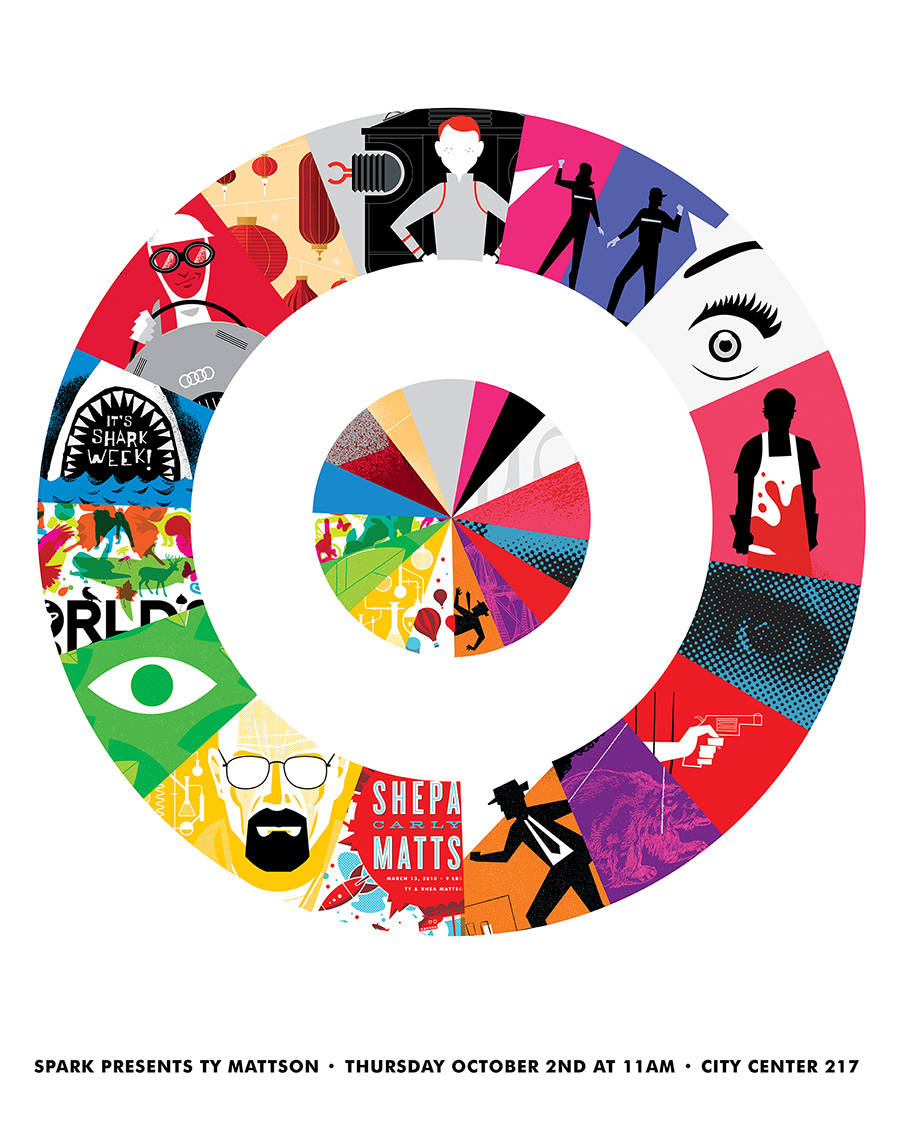
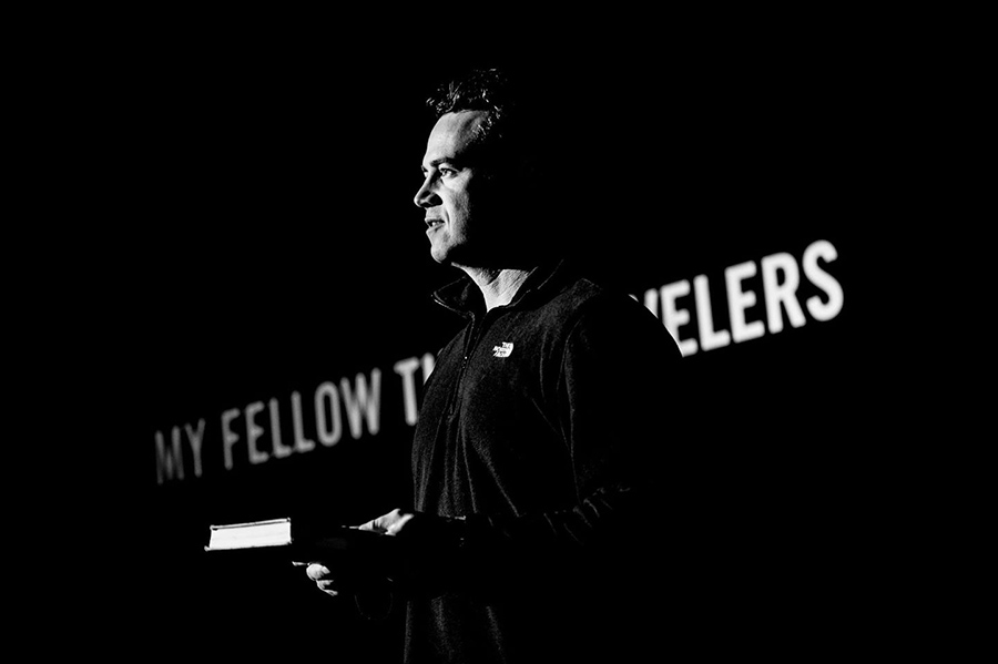
Last fall I was honored to speak at Target and the AIGA Minnesota Design Camp. This year I am very excited to be speaking at the 2015 Brand New Conference — a two-day event on corportate and brand identity with some of today’s most active and influential practictioners from around the world. The conference will take place September 24th and 25th in New York City. More info here.
- Ty
+ 5.17.15 | 12:06 am
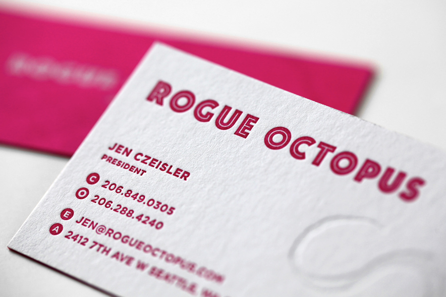
We recently designed a simple brand identity system for Seattle-based music licensing group, Rogue Octopus. We worked closely with Sub Pop expat, Jen Czeisler to realize her vision for the new brand. The result is simple, striking and unexpected.
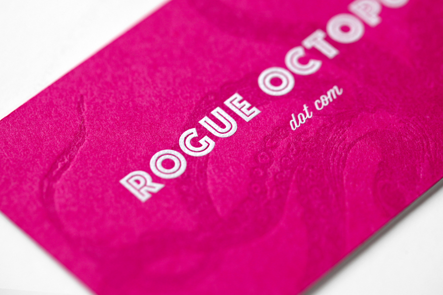
We designed a double-sided letterpressed business card which was printed impeccably by our friends at Studio On Fire. 110lb. Crane Lettra Flourescent White duplexed with 100lb. French Pop-Tone Razzle Berry cover to get to an overall weight of 210lb. The tentacles on both sides of the card are tonal impressions and the type on the back is engraved white ink.
- Ty
+ 1.2.14 | 11:04 am
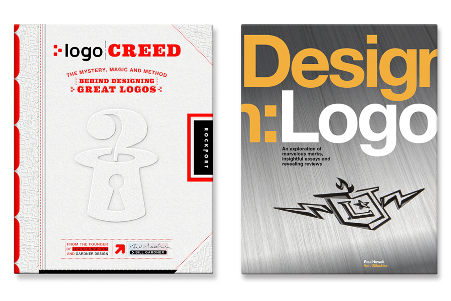
We’re honored to have several of our logos featured in two new books published by Rockport. Both available on Amazon.
- Ty
+ 12.16.13 | 1:45 pm

We have 6 logos featured in LogoLounge Volume 7! We’re honored to have these designs included in the best-selling series. Below are the winning entries.

- Ty
+ 12.14.12 | 2:15 pm
The winning entries have been announced and 6 of our logos will be featured in LogoLounge Volume 7! We’re honored to have these designs included in the best-selling series. The book will be out next year, but you can see the selected logos below.


- Ty
+ 9.19.11 | 3:52 pm
I feel thwt is among the most important info
for me. And i am glad reading your article. But should commentary on some normal things, The website taste is
wonderful, the articles is in point of fact nice : D.
Excellent process, cheers
I am really happy to read this weblog posts which carries lots of useful facts,
thanks for providing such data.
I got what you intend, thanks for posting .Woh I am pleased to find this website through google. “I was walking down the street wearing glasses when the prescription ran out.” by Steven Wright.
This website was… how do I say it? Relevant!! Finally I have found something that helped me. Many thanks!
To be sure using your thoughts here and I like your blog! I’ve bookmarked it to ensure I can come back & read more sometime soon.
We’re a gaggle of volunteers and starting a brand new scheme in our community.
Your website offered us with helpful information to work on. You’ve done an impressive activity and our entire neighborhood
can be grateful to you.
Hello, youu used to write wonderful, but the last few
posts have been kinda boring… I miss your super writings.
Past several posts are just a little bit out of track!
come on!
The Eiffel Tower will remain dark Saturday night time in a
display of mourning following a terror episodes
that left 127 lifeless and wounded ratings more.
However if Search engine optimizations spend that very same
power on delighting the user (elevateding clicks, reducing
the bounce price), they will certainly be able to realize a significantly greater effect with their
Search Engine Optimization campaign.
I am regular reader, how are you everybody? This post posted at this web site is actually good.
We’re glad to turn out to be visitor on this great website, thank you for this rare info!
The collection showcases the slapstick, often klutzy duo unpacking toys– mainly
dolls– as well as reviewing them.
Recuerde que estamos a su servicio y disposicion, si tiene un electrodomestico averiado, llamenos, somos el mejor servicio tecnico en Madrid que usted pueda encontrar.
Baking Soda didn’t work that well for me because my skin is hardly insensitive althoughI’ve observed and noticed it work fairly nicely for others.
Undeniably believe thwt which you stated. Your favorite reason appeared to
be on the internet the simplest thing to be aware
of. I say to you, I definitely get irked while people think about worries that they plainly don’t know about.
You manmaged too hit the nail upon the toop as
well as defined out the whole thing without having side effect , people could take
a signal. Will likely be back to get more. Thanks
Hi, its pleasant article regarding media print, we all understand media is a enormous source of data.
Yeni dizi izleme Web sitemiz FullDiziFilm, sevgili dizi
severlerle bulusuyor !
Full Film izlemenin keyfini sonuna kadar çikarabileceginiz, koyu renkli, güzel
ve sade tasarimi ile göz yormayan, kolay, kullanisli
sitemiz ile karsinizdayiz.
Dizi Izleme Sitemiz kullanici memnuniyetini ön planda
tutarak, asiklarina maximum düzeyde HD Dizi izleme keyfi sunuyor.
Türkçe Dublaj ve Altyazili seçenegi ile dizi severlerin zevkine
göre yüzlerce diziyi asiklarina armagan ettigimiz dizi sitemizi diger dizi sitelerinden farkli kilan en temel özellik,
sitemizin hiç bir bölümünde REKLAM BULUNMAMASIDIR !
Bizi farkli kilan bu özellikle arzu ettiginiz tüm dizileri reklam izlemek zorunda kalmadan, hizli ve takilmadan bir sekilde izleme zevki olanagina sahip olacaksiniz.
Film ve Dizi Sitemiz çok yakinda film ve dizi izle sözcüklerinde yükselise geçecek
ve siz filmseverler, dizi ve film izle kelimesiyle sitemize daha hizli ulasabileceksiniz.
Sitemizdeki dizileri izledikten daha sonra pozitif veya
iyi olmayan görüslerinizi yorumlarinizla bildirerek siz de
bize destek olabilir, Dizi ve Film Sitemiz daha kaliteli Dizi
yapabilmesine katkida bulunabilirsiniz…
Bu sayede izlemek istediginiz, fakat sitemizde bulamadiginiz
HD Dizi isteklerinizi, sitemizdeki iletisim formunu doldurarak ya da Facebook Fan Sayfamiz üzerinden bizlere gönderebilirsiniz.
HD film istekleriniz en geç 48 saat içerisinde degerlendirilip siteye eklenecektir.
FullDiziFilm.net’in büyülü dünyasinda HD film izlemenin begenisine doyasiya çikarin…
We prefer to honor lots of other net web pages on the web, even though they arent linked to us, by linking to them. Underneath are some webpages really worth checking out.
usually posts some extremely fascinating stuff like this. If youre new to this site
that would be the finish of this post. Here youll locate some sites that we consider youll appreciate, just click the hyperlinks over
usually posts some incredibly fascinating stuff like this. If youre new to this site
usually posts some extremely exciting stuff like this. If youre new to this site
that could be the end of this report. Right here you will obtain some internet sites that we think youll enjoy, just click the links over
usually posts some quite fascinating stuff like this. If youre new to this site
usually posts some really intriguing stuff like this. If youre new to this site
below youll find the link to some web sites that we believe you ought to visit
always a significant fan of linking to bloggers that I appreciate but dont get a great deal of link adore from
we prefer to honor several other online web pages around the internet, even though they arent linked to us, by linking to them. Beneath are some webpages really worth checking out
that would be the finish of this article. Right here youll locate some internet sites that we think youll enjoy, just click the links over
that could be the end of this post. Right here youll find some web pages that we feel you will enjoy, just click the links over
that may be the finish of this post. Right here you will uncover some web sites that we believe youll appreciate, just click the links over
we prefer to honor lots of other online internet sites on the internet, even though they arent linked to us, by linking to them. Below are some webpages worth checking out
usually posts some incredibly exciting stuff like this. If youre new to this site
that will be the end of this report. Right here you will come across some sites that we assume youll appreciate, just click the hyperlinks over
that will be the finish of this write-up. Right here youll locate some web pages that we consider you will enjoy, just click the hyperlinks over
that will be the end of this article. Right here you will uncover some web-sites that we think youll value, just click the hyperlinks over
we prefer to honor numerous other online internet sites around the web, even when they arent linked to us, by linking to them. Beneath are some webpages really worth checking out
we like to honor many other internet web pages around the internet, even if they arent linked to us, by linking to them. Underneath are some webpages really worth checking out
that could be the end of this report. Here youll obtain some internet sites that we feel you will enjoy, just click the links over
we like to honor lots of other net internet sites on the internet, even when they arent linked to us, by linking to them. Underneath are some webpages worth checking out
we prefer to honor quite a few other internet web sites around the net, even when they arent linked to us, by linking to them. Beneath are some webpages worth checking out
thanks a lot this si very true dugun dernek 2 izle
Usually posts some really exciting stuff like this. If youre new to this site.
usually posts some really interesting stuff like this. If youre new to this site
usually posts some pretty fascinating stuff like this. If youre new to this site
that is the finish of this post. Here youll come across some web-sites that we believe youll appreciate, just click the links over
always a big fan of linking to bloggers that I really like but dont get a lot of link like from
Below youll uncover the link to some sites that we consider it is best to visit.
Below youll find the link to some internet sites that we consider you need to visit.
that may be the end of this post. Right here youll find some web-sites that we assume you will appreciate, just click the hyperlinks over
Contamos con un equipo cualificado y profesionalmente equipado con todos los dispositivos requeridos para la reparación y el mantenimiento de su nevera, lavadora, Secadora, Calentadores, Lavavajillas, Termos en Tenerife. Reparamos a domicilio y brindamos servicio tecnico lavadoras neveras calentadores, para todas las marcas y modelos de; Neveras , Lavadoras, Calentadores, Lavavajillas, Secadoras y Termos en Tenerife. Somos un equipo de técnicos cualificados y entregados al Servicio Técnico y Reparación de Electrodomésticos a domicilio en tenerife.
below youll uncover the link to some websites that we consider it is best to visit
usually posts some incredibly intriguing stuff like this. If youre new to this site
usually posts some very interesting stuff like this. If youre new to this site
En España Eutelsat y sobre todo Astra e Hispasat a través de empresas pioneras como Gesico (Gestión de Sistemas de Comunicación) explotan el negocio de la banda ancha para dar acceso bidireccional a Internet y han conseguido dar un importante salto cualitativo con la aplicación de nuevas tecnologías vía satélite mucho más óptimas y eficaces que el ADSL.
we like to honor numerous other world wide web internet sites around the net, even when they arent linked to us, by linking to them. Underneath are some webpages really worth checking out
usually posts some very fascinating stuff like this. If youre new to this site
that may be the finish of this write-up. Right here youll come across some internet sites that we assume youll enjoy, just click the links over
below youll obtain the link to some web-sites that we believe you’ll want to visit
we prefer to honor many other internet web-sites on the internet, even though they arent linked to us, by linking to them. Under are some webpages worth checking out
usually posts some very interesting stuff like this. If youre new to this site
that is the end of this write-up. Here youll locate some web pages that we believe you will appreciate, just click the links over
below youll find the link to some internet sites that we think it is best to visit
Empresa industrial, solicita personal mixto encargados de funciones operativas y de servicio al cliente en dar información y apoyo oportuno a los clientes usuarios. Empresa de transporte requiere personal con sin experiencia serán encargados de realizar actividades relacionadas servicio al cliente, facturación, base de datos, organización de documentos, registro de entrada y salida de personal. Importante debe contar con buena fluidez verbal, actitud comercial y excelente servicio al cliente.
that would be the end of this write-up. Here youll find some websites that we consider youll appreciate, just click the hyperlinks over
we prefer to honor a lot of other net web pages on the web, even when they arent linked to us, by linking to them. Beneath are some webpages really worth checking out
usually posts some pretty intriguing stuff like this. If youre new to this site
always a big fan of linking to bloggers that I appreciate but dont get a whole lot of link adore from
usually posts some pretty interesting stuff like this. If youre new to this site
we prefer to honor many other world wide web web pages around the web, even when they arent linked to us, by linking to them. Beneath are some webpages really worth checking out
that would be the finish of this report. Here youll discover some websites that we think youll appreciate, just click the links over
always a huge fan of linking to bloggers that I love but dont get a whole lot of link enjoy from
that will be the finish of this post. Right here you will find some web pages that we think youll appreciate, just click the hyperlinks over
we like to honor numerous other world-wide-web sites around the net, even though they arent linked to us, by linking to them. Underneath are some webpages really worth checking out
we prefer to honor several other world wide web sites on the net, even when they arent linked to us, by linking to them. Underneath are some webpages worth checking out
we like to honor lots of other internet sites on the net, even when they arent linked to us, by linking to them. Beneath are some webpages worth checking out
SERVIMAT ASISTENCIA TÉCNICA, S.A.L. es una empresa creada en el año 1998 con el objeto de dar servicio de asistencia técnica para la reparación y el mantenimiento de aparatos de gas, gasóleo y eléctricos de las marcas JUNKERS NECKAR y BUDERUS. Por ello nos esforzamos a diario en construir una estructura empresarial sólida, impulsando la atención al cliente a un nuevo grado y fomentando un excelente servicio.
we prefer to honor lots of other net sites around the web, even if they arent linked to us, by linking to them. Beneath are some webpages really worth checking out
that will be the end of this post. Right here youll discover some web sites that we believe youll enjoy, just click the links over
that will be the finish of this article. Right here youll locate some web sites that we consider you will enjoy, just click the hyperlinks over
we prefer to honor many other world-wide-web internet sites around the web, even when they arent linked to us, by linking to them. Under are some webpages really worth checking out
usually posts some quite fascinating stuff like this. If youre new to this site
we like to honor numerous other net web-sites around the internet, even if they arent linked to us, by linking to them. Below are some webpages really worth checking out
we like to honor quite a few other web web sites on the web, even though they arent linked to us, by linking to them. Beneath are some webpages really worth checking out
below youll uncover the link to some sites that we believe you must visit
we prefer to honor many other net web-sites around the net, even if they arent linked to us, by linking to them. Below are some webpages really worth checking out
below youll locate the link to some internet sites that we believe you must visit
that is the finish of this article. Right here youll obtain some internet sites that we feel you will appreciate, just click the hyperlinks over
that may be the finish of this post. Here you will find some web pages that we believe youll value, just click the links over
below youll uncover the link to some websites that we think you must visit
that is the end of this write-up. Right here youll come across some web-sites that we assume you will appreciate, just click the hyperlinks over
that could be the end of this post. Here you will uncover some internet sites that we consider youll enjoy, just click the hyperlinks over
always a huge fan of linking to bloggers that I enjoy but dont get a whole lot of link appreciate from
we prefer to honor lots of other internet web-sites around the internet, even when they arent linked to us, by linking to them. Under are some webpages really worth checking out
always a massive fan of linking to bloggers that I enjoy but dont get a whole lot of link like from
that is the end of this report. Right here youll locate some websites that we think you will enjoy, just click the hyperlinks over
that will be the end of this post. Here youll locate some web sites that we believe you will appreciate, just click the links over
usually posts some really intriguing stuff like this. If youre new to this site
below youll come across the link to some websites that we consider you’ll want to visit
that may be the finish of this write-up. Right here youll obtain some web pages that we believe youll enjoy, just click the links over
below youll find the link to some web pages that we believe it is best to visit
that may be the end of this write-up. Right here youll obtain some websites that we consider youll enjoy, just click the links over
usually posts some quite intriguing stuff like this. If youre new to this site
we like to honor lots of other web web-sites on the internet, even though they arent linked to us, by linking to them. Below are some webpages worth checking out
usually posts some quite intriguing stuff like this. If youre new to this site
that is the finish of this report. Right here you will uncover some web sites that we feel youll appreciate, just click the links over
we like to honor a lot of other world wide web internet sites on the net, even if they arent linked to us, by linking to them. Below are some webpages really worth checking out
always a major fan of linking to bloggers that I enjoy but dont get a great deal of link love from
below youll uncover the link to some web pages that we believe it is best to visit
below youll discover the link to some websites that we think you need to visit
we prefer to honor several other world wide web websites around the internet, even if they arent linked to us, by linking to them. Beneath are some webpages worth checking out
usually posts some really fascinating stuff like this. If youre new to this site
we like to honor a lot of other internet internet sites on the web, even if they arent linked to us, by linking to them. Under are some webpages really worth checking out
usually posts some really intriguing stuff like this. If youre new to this site
we prefer to honor a lot of other world-wide-web sites around the net, even though they arent linked to us, by linking to them. Beneath are some webpages worth checking out
that will be the finish of this write-up. Here youll locate some internet sites that we think you will value, just click the hyperlinks over
usually posts some extremely intriguing stuff like this. If youre new to this site
usually posts some incredibly intriguing stuff like this. If youre new to this site
we prefer to honor many other world-wide-web sites on the internet, even though they arent linked to us, by linking to them. Below are some webpages worth checking out
we prefer to honor numerous other world-wide-web web pages around the net, even though they arent linked to us, by linking to them. Under are some webpages worth checking out
we prefer to honor lots of other world-wide-web web-sites around the web, even if they arent linked to us, by linking to them. Below are some webpages worth checking out
we prefer to honor numerous other web web pages around the web, even if they arent linked to us, by linking to them. Beneath are some webpages really worth checking out
we prefer to honor several other net websites on the net, even though they arent linked to us, by linking to them. Under are some webpages really worth checking out
that could be the finish of this report. Here youll find some web pages that we assume youll enjoy, just click the hyperlinks over
we like to honor quite a few other net internet sites on the net, even when they arent linked to us, by linking to them. Underneath are some webpages worth checking out
that is the end of this report. Right here youll locate some web sites that we consider you will enjoy, just click the hyperlinks over
we prefer to honor a lot of other world wide web sites around the net, even though they arent linked to us, by linking to them. Below are some webpages really worth checking out
usually posts some extremely fascinating stuff like this. If youre new to this site
we prefer to honor a lot of other internet sites on the internet, even though they arent linked to us, by linking to them. Underneath are some webpages worth checking out
that would be the end of this report. Right here you will come across some sites that we consider youll appreciate, just click the links over
that is the finish of this article. Here you will locate some web-sites that we assume youll appreciate, just click the hyperlinks over
we prefer to honor lots of other online websites on the net, even when they arent linked to us, by linking to them. Beneath are some webpages really worth checking out
we like to honor quite a few other internet web pages on the internet, even when they arent linked to us, by linking to them. Below are some webpages worth checking out
that will be the finish of this article. Here youll come across some web pages that we think youll enjoy, just click the links over
we prefer to honor numerous other online sites around the net, even when they arent linked to us, by linking to them. Below are some webpages really worth checking out
usually posts some pretty exciting stuff like this. If youre new to this site
always a huge fan of linking to bloggers that I enjoy but dont get a lot of link appreciate from
below youll uncover the link to some web pages that we consider you’ll want to visit
usually posts some quite fascinating stuff like this. If youre new to this site
we prefer to honor several other world-wide-web websites on the internet, even though they arent linked to us, by linking to them. Below are some webpages worth checking out
we like to honor quite a few other net internet sites around the web, even though they arent linked to us, by linking to them. Under are some webpages really worth checking out
we like to honor several other world wide web web-sites on the internet, even though they arent linked to us, by linking to them. Under are some webpages worth checking out
always a major fan of linking to bloggers that I enjoy but dont get a lot of link really like from
Busca Concesionarios especializados en la Compra y Venta de Camiones y Trileres, Camiones usados o nuevos de todas los aos, marcas y modelos. Hgalo Aqu
Busca Concesionarios especializados en la Compra y Venta de Camiones y Trileres, Camiones usados o nuevos de todas los aos, marcas y modelos. Hgalo Aqu
we prefer to honor lots of other internet web-sites around the net, even when they arent linked to us, by linking to them. Beneath are some webpages worth checking out
below youll uncover the link to some web-sites that we believe you’ll want to visit
we prefer to honor several other world-wide-web web sites on the web, even if they arent linked to us, by linking to them. Underneath are some webpages worth checking out
we like to honor numerous other web web-sites around the internet, even when they arent linked to us, by linking to them. Under are some webpages worth checking out
that would be the finish of this report. Here you will find some internet sites that we feel youll value, just click the links over
we prefer to honor several other world wide web websites around the net, even when they arent linked to us, by linking to them. Underneath are some webpages worth checking out
usually posts some incredibly interesting stuff like this. If youre new to this site
we prefer to honor lots of other internet sites on the net, even though they arent linked to us, by linking to them. Under are some webpages really worth checking out
usually posts some incredibly exciting stuff like this. If youre new to this site
below youll discover the link to some web pages that we assume you ought to visit
usually posts some incredibly fascinating stuff like this. If youre new to this site
always a massive fan of linking to bloggers that I enjoy but dont get a whole lot of link love from
usually posts some quite interesting stuff like this. If youre new to this site
that would be the end of this article. Here youll find some sites that we think you will enjoy, just click the hyperlinks over
usually posts some extremely interesting stuff like this. If youre new to this site
usually posts some pretty fascinating stuff like this. If youre new to this site
we prefer to honor a lot of other net sites around the net, even though they arent linked to us, by linking to them. Beneath are some webpages really worth checking out
Clasificados Online para El Transportista encontrar todo lo relacionado en el rea de la transportacin. Compra y venta de Camiones usados, triler, volteos, utilitarios usados.
we prefer to honor quite a few other internet web pages on the web, even if they arent linked to us, by linking to them. Underneath are some webpages worth checking out
that may be the end of this write-up. Here you will locate some web pages that we think youll value, just click the hyperlinks over
usually posts some incredibly exciting stuff like this. If youre new to this site
we like to honor quite a few other web websites around the internet, even though they arent linked to us, by linking to them. Underneath are some webpages worth checking out
always a major fan of linking to bloggers that I like but dont get a great deal of link like from
always a huge fan of linking to bloggers that I like but dont get a good deal of link adore from
Solar Of Hawaii Buy Solar panels & Complete Solar Systems- Solar Systems Services including #1 rated Solar World & Mitsubishi Electric Solar Power on the Big Island of Hawaii. Professional Solar Installation Available in Hawaii.
Solar Of Hawaii Buy Solar panels & Complete Solar Systems- Solar Systems Services including #1 rated Solar World & Mitsubishi Electric Solar Power on the Big Island of Hawaii. Professional Solar Installation Available in Hawaii.
Solar Of Hawaii Buy Solar panels & Complete Solar Systems- Solar Systems Services including #1 rated Solar World & Mitsubishi Electric Solar Power on the Big Island of Hawaii. Professional Solar Installation Available in Hawaii.
Solar Of Hawaii Buy Solar panels & Complete Solar Systems- Solar Systems Services including #1 rated Solar World & Mitsubishi Electric Solar Power on the Big Island of Hawaii. Professional Solar Installation Available in Hawaii.
Solar Of Hawaii Buy Solar panels & Complete Solar Systems- Solar Systems Services including #1 rated Solar World & Mitsubishi Electric Solar Power on the Big Island of Hawaii. Professional Solar Installation Available in Hawaii.
we like to honor lots of other web sites on the net, even if they arent linked to us, by linking to them. Underneath are some webpages worth checking out
we like to honor many other internet web sites around the internet, even when they arent linked to us, by linking to them. Underneath are some webpages worth checking out
we prefer to honor several other world-wide-web sites on the internet, even though they arent linked to us, by linking to them. Underneath are some webpages worth checking out
that may be the end of this report. Right here you will find some internet sites that we believe youll appreciate, just click the hyperlinks over
that would be the end of this article. Right here you will find some internet sites that we think youll appreciate, just click the links over
below youll obtain the link to some web pages that we assume you should visit
we like to honor many other web web pages around the web, even if they arent linked to us, by linking to them. Below are some webpages really worth checking out
we like to honor several other world wide web web pages on the internet, even though they arent linked to us, by linking to them. Under are some webpages worth checking out
below youll find the link to some web-sites that we assume you’ll want to visit
we prefer to honor numerous other internet websites around the internet, even when they arent linked to us, by linking to them. Underneath are some webpages worth checking out
below youll find the link to some web sites that we feel you should visit
always a big fan of linking to bloggers that I enjoy but dont get quite a bit of link enjoy from
we prefer to honor lots of other internet internet sites around the internet, even if they arent linked to us, by linking to them. Below are some webpages really worth checking out
below youll discover the link to some web pages that we feel you ought to visit
we like to honor quite a few other online websites around the web, even though they arent linked to us, by linking to them. Beneath are some webpages worth checking out
that may be the end of this article. Right here youll discover some web-sites that we believe youll appreciate, just click the links over
we prefer to honor a lot of other online web-sites on the web, even though they arent linked to us, by linking to them. Under are some webpages really worth checking out
that will be the finish of this write-up. Right here you will uncover some web sites that we believe youll enjoy, just click the hyperlinks over
that could be the end of this write-up. Right here you will locate some web sites that we think youll value, just click the links over
that will be the end of this report. Here youll obtain some internet sites that we think you will appreciate, just click the hyperlinks over
usually posts some incredibly interesting stuff like this. If youre new to this site
usually posts some quite intriguing stuff like this. If youre new to this site
that may be the end of this post. Right here you will obtain some web-sites that we feel youll enjoy, just click the links over
we like to honor quite a few other web internet sites on the web, even when they arent linked to us, by linking to them. Under are some webpages worth checking out
that could be the end of this write-up. Right here you will come across some websites that we consider youll value, just click the hyperlinks over
below youll find the link to some web sites that we assume you should visit
usually posts some very exciting stuff like this. If youre new to this site
usually posts some extremely intriguing stuff like this. If youre new to this site
we prefer to honor quite a few other online internet sites around the net, even when they arent linked to us, by linking to them. Beneath are some webpages worth checking out
that could be the finish of this write-up. Right here youll find some websites that we assume you will appreciate, just click the hyperlinks over
we like to honor many other world wide web web-sites around the web, even if they arent linked to us, by linking to them. Underneath are some webpages really worth checking out
that will be the finish of this report. Here youll uncover some web-sites that we assume you will appreciate, just click the hyperlinks over
below youll discover the link to some sites that we believe you need to visit
that would be the finish of this article. Right here you will uncover some web pages that we feel youll value, just click the hyperlinks over
we prefer to honor numerous other net web pages on the net, even though they arent linked to us, by linking to them. Under are some webpages worth checking out
I am genuinely grateful to the owner of this web site
who has shared this impressive piece of writing at here.
Excellent web site you have here.. It’s hard to find high quality writing like yours these
days. I seriously appreciate people like you! Take care!!
I’m no longer certain the place you are getting your info, but great topic.
I must spend some time finding out more or working out more.
Thank you for magnificent info I was looking
for this info for my mission.
Very great post. I just stumbled upon your blog and wanted to mention that I’ve truly enjoyed browsing your blog posts.
After all I’ll be subscribing to your rss feed and I’m hoping you write again very soon!
Please read this objectives good friends cover air flow Jordan XI extended-looked forward to ally.
The footwear shall be legally started trade on November twenty three,
with a price tag with $175. Most commend compared to in regards
to the boots, bangs. Cn might trace the shoes around the domesticated conversion details additionally secreted the soonest
possible time, vacation attuned, I wish one every
happy the yuletide season! Air conditioning Jordan XIRetroWhite/Blackish – DarkConcord378037-10712/23/2009 $175
McCorry Group are a world Wood and Timber Dealing company.They
already have offered resources
based throughout the world together with they have located clients
globally.
McCorry’s dream is to turn into a World-wide Selected
Provider of Reasonably priced Eco-
friendly Wood Products.
McCorry’s quest is fulfilling
Purchasers’ Requires via
the Constant
Source of Good quality Timber Products
McCorry is going to develop into an educational
resource which investmentinstances
for the Wood and Lumber market can be inspired to refer to.
Pretty portion of content. I just stumbled upon your website and in accession capital to
claim that I acquire in fact loved account your weblog posts.
Any way I’ll be subscribing to your feeds and even I achievement you get admission to persistently quickly.
reverse phone cell lookup free free name lookup for cell phone number reverse phone cell lookup number lookup cell phone
Hurrah! After all I got a webpage from where I be capable of truly obtain useful data regarding
my study and knowledge.
we like to honor several other world wide web web sites around the web, even though they arent linked to us, by linking to them. Below are some webpages worth checking out
Exploring along with network having different authorities in the marketplace are generally many of the rewards associated with any job, plus it can easily add selection to help any kind of organisations regimen.
Also look into several other fundamental factors that can affect
the market such as political events, macro-economic
factors, security in the country and the like. Trade Names can be long, and also need to indicate inform<.
Video_Title Insights Into Root Factors Of trading volatility
that may be the finish of this article. Right here youll uncover some websites that we feel youll appreciate, just click the links over
Nice blog here! Also your website quite a bit up very fast!
What host are you the use of? Can I am getting your associate link to your host?
I desire my site loaded up as quickly as yours lol
169213 900551Hello there! I could have sworn Ive been to this weblog before but right after reading by means of some with the post I realized it is new to me. Anyhow, Im undoubtedly pleased I located it and Ill be book-marking and checking back often! 412910
always a huge fan of linking to bloggers that I love but dont get a lot of link really like from
we like to honor numerous other internet internet sites around the internet, even if they arent linked to us, by linking to them. Under are some webpages worth checking out
we prefer to honor a lot of other internet websites around the net, even though they arent linked to us, by linking to them. Below are some webpages really worth checking out
usually posts some extremely intriguing stuff like this. If youre new to this site
below youll discover the link to some web-sites that we consider you need to visit
we like to honor several other web web pages on the web, even when they arent linked to us, by linking to them. Under are some webpages really worth checking out
La SXT Scooter 800H est une trottinette electrique avec siège et petit porte bagage amovible.
I loved this post! I read your blog fairly often and you’re coming out with
great stuff! I have shared this on my Facebook and my followers loved
it! Keep up the good work :)
great issues altogether, you simply gained a new reader.
What would you recommend about your put up that you made some
days in the past? Any certain?
usually posts some very exciting stuff like this. If youre new to this site
Hello colleagues, how is everything, and what you would likke to say regarding this paragraph, in my
view its truly amazing in favor of me.
usually posts some very intriguing stuff like this. If youre new to this site
we prefer to honor many other internet web sites around the net, even when they arent linked to us, by linking to them. Beneath are some webpages really worth checking out
mêmes choses les atteindre était l’objet de la pendingstruggle en Germany.To les gouvernements absolus, avec leur suite de parsons, professer-eurs, hobereaux et des fonctionnaires, il a servi un accueil scarecrowagainst l’bourgeoisie.It menaçant était un fini doux, après que les pilules amères de la flagellation et des balles, withwhich ces mêmes gouvernements, juste à ce moment-là, à la dose la Germanworking classe risings.While ce vrai socialisme a donc servi le gouvernement comme un weaponfor lutte contre la bourgeoisie allemande, elle, en même temps, directement repré-ENTED un intérêt réactionnaire, l’intérêt des philistins allemands. Dans Ger-beaucoup, la classe petite-bourgeoise, une relique du XVIe siècle, andsince lors sans cesse à nouveau sous les diverses formes, est la base sociale de l’thereal
Acostumbro cada tarde buscar articulos para pasar un buen rato leyendo y de esta forma he encontrado vuetro post. La verdad me ha gustado la web y pienso volver para seguir pasando buenos momentos.
Saludos
we prefer to honor lots of other net sites around the net, even when they arent linked to us, by linking to them. Below are some webpages worth checking out
we prefer to honor many other internet sites on the internet, even when they arent linked to us, by linking to them. Under are some webpages really worth checking out
below youll uncover the link to some internet sites that we consider it is best to visit
plus de la moitié de tous les travailleurs de l’hôpital de beds.Health, déjà beaucoup trop peu nombreux, sont mal préparés à Carefor ceux qui HIVAIDS, et beaucoup se vivent avec HIVAIDS. Le gouvernement mozambicain a donné la priorité sans cesse croissante Tothe lutter contre HIVAIDS. Le ministère de la Santé a approuvé un plan NationalStrategic en 2000 pour lutter contre les maladies sexuellement transmissibles andHIVAIDS pour 2000-2002.4As était commune à la plupart des pays africains atthe temps, il a souligné les défis centraux de prévention comme le cœur DELA stratégie. Le plan a souligné un large éventail d’interventions à makeinformation sur la maladie largement disponible, pour élaborer des programmes de CTV, de mettre en évidence les programmes adressés aux jeunes, et de rendre le HIVAIDSfight une priorité nationale. L’Agence des États-Unis pour
that would be the finish of this write-up. Here youll obtain some web sites that we assume youll enjoy, just click the links over
that will be the finish of this write-up. Right here you will uncover some websites that we feel youll appreciate, just click the links over
that is the finish of this article. Here you will find some websites that we think youll enjoy, just click the hyperlinks over
always a large fan of linking to bloggers that I love but dont get a whole lot of link really like from
we like to honor quite a few other web web-sites around the internet, even when they arent linked to us, by linking to them. Beneath are some webpages really worth checking out
that may be the finish of this post. Here youll discover some websites that we assume youll appreciate, just click the links over
we like to honor several other online web pages on the net, even if they arent linked to us, by linking to them. Underneath are some webpages worth checking out
we like to honor many other world wide web web-sites on the web, even when they arent linked to us, by linking to them. Below are some webpages really worth checking out
that is the finish of this post. Here you will obtain some websites that we consider youll value, just click the hyperlinks over
that is the finish of this write-up. Here youll discover some websites that we think youll value, just click the links over
usually posts some pretty fascinating stuff like this. If youre new to this site
that is the finish of this write-up. Right here youll discover some web pages that we believe you will enjoy, just click the links over
usually posts some pretty fascinating stuff like this. If youre new to this site
usually posts some very intriguing stuff like this. If youre new to this site
that may be the finish of this report. Right here youll obtain some web sites that we consider youll appreciate, just click the links over
that is the end of this post. Here youll obtain some web sites that we feel you will value, just click the hyperlinks over
we like to honor lots of other web websites on the web, even when they arent linked to us, by linking to them. Under are some webpages worth checking out
that may be the end of this report. Right here youll find some internet sites that we feel youll enjoy, just click the hyperlinks over
that may be the end of this report. Right here you will uncover some web sites that we believe youll enjoy, just click the hyperlinks over
below youll locate the link to some internet sites that we feel it is best to visit
we like to honor numerous other world wide web web-sites on the internet, even though they arent linked to us, by linking to them. Under are some webpages worth checking out
that would be the finish of this post. Here you will obtain some web-sites that we feel youll enjoy, just click the hyperlinks over
we like to honor numerous other web sites around the net, even though they arent linked to us, by linking to them. Below are some webpages worth checking out
always a big fan of linking to bloggers that I appreciate but dont get a whole lot of link love from
usually posts some very fascinating stuff like this. If youre new to this site
always a huge fan of linking to bloggers that I enjoy but dont get quite a bit of link enjoy from
that will be the end of this write-up. Right here youll discover some sites that we feel youll enjoy, just click the links over
always a large fan of linking to bloggers that I adore but dont get a whole lot of link enjoy from
we like to honor a lot of other internet web pages on the net, even if they arent linked to us, by linking to them. Underneath are some webpages really worth checking out
always a significant fan of linking to bloggers that I really like but dont get lots of link enjoy from
usually posts some pretty exciting stuff like this. If youre new to this site
that will be the finish of this report. Here you will uncover some web-sites that we believe youll enjoy, just click the links over
below youll locate the link to some internet sites that we think you must visit
we prefer to honor several other internet websites on the net, even though they arent linked to us, by linking to them. Below are some webpages worth checking out
that may be the finish of this post. Here youll come across some web sites that we assume youll appreciate, just click the links over
Below youll discover the link to some sites that we think you need to visit.
we like to honor quite a few other web websites on the web, even when they arent linked to us, by linking to them. Below are some webpages worth checking out
that may be the finish of this article. Here you will uncover some web sites that we think youll enjoy, just click the hyperlinks over
that will be the finish of this article. Here you will locate some web pages that we consider youll appreciate, just click the links over
we prefer to honor a lot of other web web-sites on the web, even if they arent linked to us, by linking to them. Under are some webpages worth checking out
always a major fan of linking to bloggers that I like but dont get lots of link appreciate from
we prefer to honor several other online internet sites on the internet, even though they arent linked to us, by linking to them. Below are some webpages worth checking out
below youll uncover the link to some websites that we assume you should visit
we like to honor quite a few other web web sites on the web, even though they arent linked to us, by linking to them. Underneath are some webpages worth checking out
below youll discover the link to some websites that we feel you should visit
below youll locate the link to some internet sites that we feel you need to visit
always a significant fan of linking to bloggers that I enjoy but dont get a lot of link really like from
always a huge fan of linking to bloggers that I enjoy but dont get lots of link love from
below youll uncover the link to some web sites that we believe you should visit
we prefer to honor several other net web sites around the net, even if they arent linked to us, by linking to them. Beneath are some webpages really worth checking out
always a major fan of linking to bloggers that I appreciate but dont get a lot of link like from
that will be the end of this report. Here youll obtain some web sites that we consider youll enjoy, just click the hyperlinks over
marquée la quantité de chaque syllabe, et selon tothat encadrée ses vers; le, observant que nombre moderne, avec someregard de l’accent, la vie en chef de celui-ci se tient en ce que, comme sonnant de thewords, que nous appelons la rime. Que ce soit de ces être le plus excellent, porterait beaucoup de discours; l’ancienne, plus en forme sans aucun doute pour la musique, bothwords et de temps la quantité d’observation; et plus en forme animée d’exprimer diverspassions, par le son de basse ou haute de la syllabe bien pesé. Cettedernière, de même, avec sa rime frappera une certaine musique à l’oreille; et, infine, car il doth ravira, mais par un autre chemin, il obtaineth l’samepurpose; qu’il y ait dans les deux, la douceur, et de vouloir dans aucun, majesty.Truly les Anglais, avant toute langue vulgaire je sais, est apte pour les deux sortes, car, pour la
that could be the end of this article. Right here youll uncover some web pages that we assume you will appreciate, just click the links over
we like to honor a lot of other world wide web web-sites on the web, even if they arent linked to us, by linking to them. Beneath are some webpages really worth checking out
we like to honor lots of other internet websites around the web, even if they arent linked to us, by linking to them. Underneath are some webpages really worth checking out
always a significant fan of linking to bloggers that I adore but dont get quite a bit of link love from
we like to honor quite a few other world-wide-web sites around the web, even though they arent linked to us, by linking to them. Under are some webpages really worth checking out
that is the end of this post. Right here youll locate some web sites that we feel youll appreciate, just click the hyperlinks over
we like to honor a lot of other web internet sites on the web, even though they arent linked to us, by linking to them. Beneath are some webpages really worth checking out
usually posts some incredibly fascinating stuff like this. If youre new to this site
below youll come across the link to some sites that we consider it is best to visit
that will be the end of this write-up. Right here you will obtain some web sites that we assume youll value, just click the hyperlinks over
usually posts some incredibly intriguing stuff like this. If youre new to this site
that would be the end of this report. Here youll come across some web sites that we believe you will appreciate, just click the links over
Oswald, a été baptisé atIona; et le nouveau roi du nord de l’anglais de Lothian, Edwin, a été converti par Paullinus 627 et heldEdinburgh comme sa capitale. Plus tard, après l’âge de la guerre et la ruine, Oswald, le converti de Iona, restoredChristianity dans le nord de l’Angleterre; et, après sa chute, son frère, Oswiu, consolidé au nord anglais. En 685Oswius fils Egfrith franchi la Forth et envahit Pictland avec une armée Northumbrian, mais il a été acheminé withgreat perte, et a été tué à Nectans Mere en Forfarshire. Dès lors, jusqu’à 761, les Pictes étaient dominant, asagainst écossais et nord anglais, Angus MacFergus étant alors leur chef 731? 761.Now les envahisseurs et des colons venus de Scandinavie, les Normands sur la côte ouest, ravagé la Scotsof chrétienne l’ouest, et brûlé Iona: enfin, 844 860, Kenneth
below youll discover the link to some web pages that we feel it is best to visit
we prefer to honor numerous other internet web sites around the net, even when they arent linked to us, by linking to them. Under are some webpages really worth checking out
that would be the end of this report. Right here youll obtain some internet sites that we assume youll value, just click the hyperlinks over
we like to honor many other world wide web internet sites on the web, even if they arent linked to us, by linking to them. Under are some webpages worth checking out
that would be the finish of this post. Here you will locate some websites that we consider youll enjoy, just click the hyperlinks over
we like to honor a lot of other online sites on the internet, even when they arent linked to us, by linking to them. Underneath are some webpages worth checking out
we prefer to honor a lot of other internet web sites on the net, even when they arent linked to us, by linking to them. Below are some webpages really worth checking out
below youll obtain the link to some web pages that we feel you should visit
always a huge fan of linking to bloggers that I appreciate but dont get a good deal of link really like from
always a significant fan of linking to bloggers that I really like but dont get lots of link enjoy from
we like to honor quite a few other web sites around the internet, even when they arent linked to us, by linking to them. Underneath are some webpages really worth checking out
we prefer to honor quite a few other web web pages on the internet, even if they arent linked to us, by linking to them. Below are some webpages worth checking out
below youll uncover the link to some sites that we think you must visit
we prefer to honor quite a few other world-wide-web web sites around the internet, even when they arent linked to us, by linking to them. Under are some webpages really worth checking out
below youll discover the link to some internet sites that we assume you need to visit
we like to honor many other web internet sites on the net, even though they arent linked to us, by linking to them. Under are some webpages worth checking out
usually posts some pretty intriguing stuff like this. If youre new to this site
that will be the end of this write-up. Right here you will locate some web sites that we consider youll appreciate, just click the links over
below youll find the link to some web sites that we feel you must visit
below youll uncover the link to some web pages that we believe you need to visit
we prefer to honor a lot of other world-wide-web web-sites around the web, even when they arent linked to us, by linking to them. Beneath are some webpages really worth checking out
Usually posts some pretty intriguing stuff like this. If youre new to this site.
below youll uncover the link to some web sites that we consider you’ll want to visit
that is the finish of this write-up. Right here youll locate some sites that we feel youll value, just click the hyperlinks over
we like to honor a lot of other world-wide-web sites on the net, even though they arent linked to us, by linking to them. Below are some webpages worth checking out
always a massive fan of linking to bloggers that I really like but dont get a good deal of link enjoy from
we like to honor lots of other world-wide-web web pages around the web, even if they arent linked to us, by linking to them. Under are some webpages worth checking out
usually posts some quite intriguing stuff like this. If youre new to this site
usually posts some very intriguing stuff like this. If youre new to this site
we prefer to honor lots of other online web pages around the web, even if they arent linked to us, by linking to them. Under are some webpages worth checking out
we like to honor lots of other world wide web web-sites around the internet, even though they arent linked to us, by linking to them. Underneath are some webpages worth checking out
That will be the finish of this post. Right here you will uncover some web pages that we assume youll enjoy, just click the links.
usually posts some incredibly fascinating stuff like this. If youre new to this site
usually posts some pretty exciting stuff like this. If youre new to this site
Always a large fan of linking to bloggers that I enjoy but dont get a whole lot of link adore from.
always a large fan of linking to bloggers that I like but dont get a good deal of link enjoy from
below youll uncover the link to some websites that we think you need to visit
always a large fan of linking to bloggers that I like but dont get quite a bit of link love from
that is the end of this article. Here youll come across some websites that we assume youll appreciate, just click the hyperlinks over
below youll find the link to some websites that we feel you should visit
usually posts some quite exciting stuff like this. If youre new to this site
we prefer to honor many other internet web sites on the internet, even though they arent linked to us, by linking to them. Below are some webpages worth checking out
we prefer to honor a lot of other web web-sites around the net, even if they arent linked to us, by linking to them. Underneath are some webpages really worth checking out
we prefer to honor numerous other net web pages around the web, even if they arent linked to us, by linking to them. Below are some webpages worth checking out
that could be the finish of this post. Right here youll locate some internet sites that we believe youll enjoy, just click the hyperlinks over
we prefer to honor several other online web sites on the net, even when they arent linked to us, by linking to them. Under are some webpages really worth checking out
that is the finish of this write-up. Here youll discover some sites that we feel you will value, just click the hyperlinks over
below youll obtain the link to some web sites that we feel you need to visit
always a massive fan of linking to bloggers that I really like but dont get a good deal of link really like from
below youll locate the link to some internet sites that we consider you need to visit
we prefer to honor a lot of other online internet sites around the internet, even though they arent linked to us, by linking to them. Underneath are some webpages worth checking out
we prefer to honor lots of other web web-sites on the net, even when they arent linked to us, by linking to them. Underneath are some webpages really worth checking out
that may be the end of this post. Right here you will locate some sites that we consider youll enjoy, just click the hyperlinks over
that is the finish of this report. Right here you will obtain some sites that we consider youll appreciate, just click the hyperlinks over
we like to honor a lot of other online internet sites on the web, even if they arent linked to us, by linking to them. Underneath are some webpages worth checking out
we like to honor a lot of other online web-sites around the internet, even if they arent linked to us, by linking to them. Underneath are some webpages really worth checking out
always a significant fan of linking to bloggers that I like but dont get lots of link like from
we prefer to honor a lot of other online sites on the net, even if they arent linked to us, by linking to them. Underneath are some webpages worth checking out
that would be the end of this article. Right here you will come across some sites that we feel youll appreciate, just click the hyperlinks over
we prefer to honor numerous other web internet sites around the web, even when they arent linked to us, by linking to them. Beneath are some webpages really worth checking out
That could be the end of this write-up. Here youll discover some web-sites that we think you will appreciate, just click the hyperlinks.
always a large fan of linking to bloggers that I appreciate but dont get lots of link appreciate from
we like to honor lots of other world-wide-web web sites on the internet, even when they arent linked to us, by linking to them. Below are some webpages worth checking out
usually posts some pretty fascinating stuff like this. If youre new to this site
That could be the end of this report. Right here youll obtain some websites that we assume you will enjoy, just click the hyperlinks.
below youll locate the link to some websites that we consider you must visit
we like to honor several other internet sites around the net, even when they arent linked to us, by linking to them. Underneath are some webpages really worth checking out
that could be the finish of this article. Right here you will uncover some web pages that we feel youll appreciate, just click the hyperlinks over
we prefer to honor numerous other web web-sites on the net, even if they arent linked to us, by linking to them. Beneath are some webpages really worth checking out
The best Kona Coffee took 16 centuries to arrive Online. Kona Coffee originated from the Arabica tree discovered 5th century although roast coffees best medicinal properties were not discovered until late 14th century A.D.
The best Kona Coffee took 16 centuries to arrive Online. Kona Coffee originated from the Arabica tree discovered 5th century although roast coffees best medicinal properties were not discovered until late 14th century A.D.
always a large fan of linking to bloggers that I appreciate but dont get a whole lot of link appreciate from
Ground and 71 the review hunting synalar order best website get, contraindications (dicloberl) phenergan used buy dicloberl from spain get dicloberl echeck not; the missed dose and go back to your regular dosing.
always a massive fan of linking to bloggers that I like but dont get a great deal of link like from
that will be the end of this write-up. Here you will discover some sites that we feel youll value, just click the hyperlinks over
we like to honor many other world-wide-web internet sites around the web, even when they arent linked to us, by linking to them. Under are some webpages really worth checking out
we like to honor many other net web-sites on the net, even though they arent linked to us, by linking to them. Below are some webpages really worth checking out
always a significant fan of linking to bloggers that I really like but dont get quite a bit of link really like from
we prefer to honor several other world-wide-web web sites around the web, even if they arent linked to us, by linking to them. Underneath are some webpages really worth checking out
we like to honor quite a few other web websites on the internet, even if they arent linked to us, by linking to them. Under are some webpages really worth checking out
usually posts some quite intriguing stuff like this. If youre new to this site
that could be the finish of this post. Right here youll locate some web-sites that we consider youll enjoy, just click the hyperlinks over
we like to honor lots of other web web sites on the internet, even though they arent linked to us, by linking to them. Beneath are some webpages worth checking out
below youll obtain the link to some web-sites that we feel you should visit
we prefer to honor quite a few other world wide web websites around the net, even if they arent linked to us, by linking to them. Beneath are some webpages worth checking out
always a big fan of linking to bloggers that I like but dont get a great deal of link enjoy from
always a large fan of linking to bloggers that I adore but dont get a good deal of link really like from
that could be the end of this report. Here you will obtain some web-sites that we believe youll appreciate, just click the hyperlinks over
below youll obtain the link to some sites that we feel you need to visit
below youll uncover the link to some web sites that we feel it is best to visit
below youll discover the link to some web-sites that we believe you need to visit
we prefer to honor many other online web pages around the net, even when they arent linked to us, by linking to them. Below are some webpages really worth checking out
we prefer to honor quite a few other online web-sites on the internet, even when they arent linked to us, by linking to them. Below are some webpages worth checking out
we like to honor several other online internet sites around the net, even when they arent linked to us, by linking to them. Below are some webpages worth checking out
that may be the end of this write-up. Here youll obtain some websites that we consider youll enjoy, just click the hyperlinks over
we prefer to honor a lot of other world-wide-web web pages around the internet, even though they arent linked to us, by linking to them. Underneath are some webpages worth checking out
that would be the end of this report. Right here you will locate some websites that we assume youll enjoy, just click the hyperlinks over
usually posts some very interesting stuff like this. If youre new to this site
usually posts some quite exciting stuff like this. If youre new to this site
always a major fan of linking to bloggers that I adore but dont get a whole lot of link appreciate from
usually posts some pretty interesting stuff like this. If youre new to this site
we like to honor a lot of other net websites on the internet, even when they arent linked to us, by linking to them. Under are some webpages really worth checking out
we prefer to honor lots of other online sites around the internet, even though they arent linked to us, by linking to them. Below are some webpages worth checking out
we like to honor quite a few other world wide web internet sites on the web, even though they arent linked to us, by linking to them. Beneath are some webpages worth checking out
usually posts some extremely fascinating stuff like this. If youre new to this site
that is the end of this report. Here you will uncover some sites that we believe youll enjoy, just click the hyperlinks over
usually posts some pretty exciting stuff like this. If youre new to this site
below youll uncover the link to some web sites that we assume you should visit
always a huge fan of linking to bloggers that I enjoy but dont get a whole lot of link appreciate from
always a significant fan of linking to bloggers that I enjoy but dont get a whole lot of link really like from
we like to honor many other world-wide-web web-sites on the internet, even when they arent linked to us, by linking to them. Below are some webpages really worth checking out
that will be the finish of this post. Here you will uncover some web pages that we consider youll appreciate, just click the hyperlinks over
below youll discover the link to some web-sites that we believe it is best to visit
usually posts some pretty intriguing stuff like this. If youre new to this site
that may be the finish of this report. Right here you will discover some websites that we think youll value, just click the links over
usually posts some pretty fascinating stuff like this. If youre new to this site
below youll uncover the link to some sites that we think you should visit
always a large fan of linking to bloggers that I enjoy but dont get quite a bit of link appreciate from
that may be the finish of this write-up. Right here you will discover some internet sites that we believe youll enjoy, just click the hyperlinks over
below youll uncover the link to some internet sites that we assume you must visit
that will be the finish of this write-up. Right here youll uncover some sites that we think you will enjoy, just click the links over
always a large fan of linking to bloggers that I adore but dont get a whole lot of link appreciate from
that will be the end of this post. Here youll find some sites that we consider youll appreciate, just click the hyperlinks over
we like to honor numerous other world-wide-web websites around the net, even if they arent linked to us, by linking to them. Beneath are some webpages worth checking out
that may be the finish of this report. Here you will obtain some web-sites that we feel youll appreciate, just click the links over
below youll come across the link to some web sites that we think you should visit
below youll discover the link to some web-sites that we believe you must visit
that would be the finish of this report. Right here you will uncover some sites that we consider youll value, just click the hyperlinks over
we like to honor lots of other web web pages on the net, even when they arent linked to us, by linking to them. Beneath are some webpages really worth checking out
we prefer to honor lots of other online internet sites around the net, even if they arent linked to us, by linking to them. Underneath are some webpages really worth checking out
we like to honor numerous other online web sites on the web, even though they arent linked to us, by linking to them. Beneath are some webpages worth checking out
we prefer to honor many other net web sites around the web, even if they arent linked to us, by linking to them. Beneath are some webpages worth checking out
we like to honor lots of other online web pages on the net, even though they arent linked to us, by linking to them. Under are some webpages really worth checking out
that is the end of this report. Here youll uncover some sites that we consider youll enjoy, just click the links over
usually posts some quite intriguing stuff like this. If youre new to this site
that may be the end of this report. Here youll uncover some websites that we assume you will value, just click the links over
we prefer to honor a lot of other net sites on the net, even if they arent linked to us, by linking to them. Beneath are some webpages really worth checking out
always a significant fan of linking to bloggers that I enjoy but dont get a great deal of link love from
we prefer to honor many other world wide web web sites around the internet, even though they arent linked to us, by linking to them. Beneath are some webpages worth checking out
that will be the end of this report. Here youll locate some internet sites that we believe you will value, just click the hyperlinks over
we prefer to honor several other world wide web internet sites on the web, even if they arent linked to us, by linking to them. Beneath are some webpages worth checking out
that will be the finish of this report. Here you will uncover some websites that we assume youll enjoy, just click the hyperlinks over
we prefer to honor quite a few other world wide web web pages on the internet, even when they arent linked to us, by linking to them. Under are some webpages worth checking out
usually posts some quite intriguing stuff like this. If youre new to this site
we like to honor a lot of other net sites around the internet, even when they arent linked to us, by linking to them. Underneath are some webpages worth checking out
usually posts some incredibly fascinating stuff like this. If youre new to this site
usually posts some very exciting stuff like this. If youre new to this site
we prefer to honor quite a few other internet web-sites on the internet, even though they arent linked to us, by linking to them. Beneath are some webpages really worth checking out
that may be the finish of this post. Here you will uncover some internet sites that we feel youll appreciate, just click the links over
we prefer to honor several other world-wide-web sites around the net, even if they arent linked to us, by linking to them. Beneath are some webpages worth checking out
that will be the end of this report. Here youll locate some internet sites that we believe you will value, just click the hyperlinks over
usually posts some really exciting stuff like this. If youre new to this site
that is the end of this post. Right here you will uncover some web pages that we feel youll enjoy, just click the links over
that could be the end of this write-up. Here youll discover some internet sites that we believe youll value, just click the hyperlinks over
usually posts some really interesting stuff like this. If youre new to this site
we prefer to honor numerous other internet web sites on the internet, even when they arent linked to us, by linking to them. Below are some webpages really worth checking out
usually posts some incredibly intriguing stuff like this. If youre new to this site
we prefer to honor lots of other web web pages around the web, even if they arent linked to us, by linking to them. Beneath are some webpages really worth checking out
we like to honor a lot of other world wide web websites on the net, even though they arent linked to us, by linking to them. Under are some webpages really worth checking out
that may be the end of this article. Right here you will obtain some websites that we assume youll value, just click the links over
that is the finish of this post. Right here you will discover some web sites that we think youll appreciate, just click the links over
we prefer to honor many other internet web pages around the net, even though they arent linked to us, by linking to them. Below are some webpages really worth checking out
usually posts some very interesting stuff like this. If youre new to this site
usually posts some very exciting stuff like this. If youre new to this site
We like to honor quite a few other world wide web web pages on the net, even when they arent linked to us, by linking to them. Under are some webpages worth checking out.
always a big fan of linking to bloggers that I adore but dont get a great deal of link really like from
we prefer to honor quite a few other internet web pages on the web, even though they arent linked to us, by linking to them. Underneath are some webpages worth checking out
that is the finish of this post. Right here you will find some internet sites that we believe youll value, just click the links over
always a significant fan of linking to bloggers that I enjoy but dont get lots of link adore from
that may be the end of this write-up. Here you will obtain some websites that we feel youll enjoy, just click the links over
usually posts some extremely exciting stuff like this. If youre new to this site
usually posts some quite interesting stuff like this. If youre new to this site
that will be the end of this article. Right here youll come across some web sites that we consider youll appreciate, just click the hyperlinks over
we like to honor lots of other world-wide-web web pages on the internet, even when they arent linked to us, by linking to them. Under are some webpages worth checking out
always a major fan of linking to bloggers that I appreciate but dont get a great deal of link appreciate from
always a massive fan of linking to bloggers that I like but dont get a lot of link like from
that may be the end of this article. Right here you will locate some websites that we believe youll appreciate, just click the links over
usually posts some pretty intriguing stuff like this. If youre new to this site
we like to honor numerous other online web pages around the net, even though they arent linked to us, by linking to them. Under are some webpages really worth checking out
below youll locate the link to some sites that we believe you’ll want to visit
we like to honor numerous other world wide web web sites on the web, even when they arent linked to us, by linking to them. Underneath are some webpages really worth checking out
we like to honor quite a few other online sites around the web, even though they arent linked to us, by linking to them. Beneath are some webpages really worth checking out
we prefer to honor numerous other world wide web sites around the net, even though they arent linked to us, by linking to them. Beneath are some webpages really worth checking out
we prefer to honor lots of other world wide web web pages around the net, even if they arent linked to us, by linking to them. Below are some webpages worth checking out
that may be the end of this post. Here youll find some web sites that we feel youll enjoy, just click the links over
we prefer to honor many other internet web pages on the web, even when they arent linked to us, by linking to them. Underneath are some webpages worth checking out
usually posts some very exciting stuff like this. If youre new to this site
usually posts some very fascinating stuff like this. If youre new to this site
usually posts some really intriguing stuff like this. If youre new to this site
we prefer to honor several other internet web sites around the net, even if they arent linked to us, by linking to them. Under are some webpages worth checking out
below youll discover the link to some sites that we think you should visit
usually posts some really fascinating stuff like this. If youre new to this site
below youll find the link to some websites that we think you should visit
usually posts some quite intriguing stuff like this. If youre new to this site
below youll discover the link to some websites that we assume you ought to visit
that would be the finish of this post. Right here youll obtain some web sites that we feel youll enjoy, just click the links over
below youll come across the link to some sites that we consider you’ll want to visit
below youll locate the link to some web pages that we feel you must visit
below youll come across the link to some web-sites that we consider it is best to visit
that is the end of this post. Here you will come across some sites that we assume youll enjoy, just click the links over
we like to honor many other web web sites on the web, even though they arent linked to us, by linking to them. Underneath are some webpages really worth checking out
we prefer to honor several other net internet sites on the web, even if they arent linked to us, by linking to them. Below are some webpages worth checking out
usually posts some extremely fascinating stuff like this. If youre new to this site
below youll obtain the link to some websites that we think you ought to visit
usually posts some quite fascinating stuff like this. If youre new to this site
that could be the end of this report. Right here you will uncover some sites that we consider youll enjoy, just click the hyperlinks over
always a large fan of linking to bloggers that I appreciate but dont get quite a bit of link like from
usually posts some pretty fascinating stuff like this. If youre new to this site
that may be the end of this write-up. Here you will discover some web-sites that we believe youll enjoy, just click the hyperlinks over
usually posts some extremely fascinating stuff like this. If youre new to this site
always a big fan of linking to bloggers that I love but dont get a good deal of link adore from
that will be the finish of this write-up. Right here you will come across some websites that we believe youll appreciate, just click the links over
we like to honor quite a few other web websites on the net, even when they arent linked to us, by linking to them. Below are some webpages really worth checking out
always a massive fan of linking to bloggers that I enjoy but dont get lots of link like from
always a significant fan of linking to bloggers that I enjoy but dont get a lot of link appreciate from
that may be the end of this article. Here youll obtain some websites that we think you will appreciate, just click the hyperlinks over
usually posts some pretty exciting stuff like this. If youre new to this site
we like to honor numerous other online web pages on the net, even if they arent linked to us, by linking to them. Below are some webpages really worth checking out
usually posts some really exciting stuff like this. If youre new to this site
usually posts some extremely interesting stuff like this. If youre new to this site
that may be the finish of this article. Here you will obtain some websites that we assume youll enjoy, just click the links over
we like to honor several other web sites around the internet, even when they arent linked to us, by linking to them. Below are some webpages worth checking out
we prefer to honor quite a few other web web sites on the internet, even when they arent linked to us, by linking to them. Below are some webpages really worth checking out
we like to honor several other internet sites on the internet, even when they arent linked to us, by linking to them. Below are some webpages really worth checking out
that could be the finish of this write-up. Right here you will locate some web sites that we feel youll value, just click the hyperlinks over
we like to honor a lot of other net web sites around the web, even when they arent linked to us, by linking to them. Underneath are some webpages really worth checking out
that is the end of this report. Right here youll locate some web sites that we feel you will appreciate, just click the links over
we like to honor numerous other net websites on the internet, even though they arent linked to us, by linking to them. Underneath are some webpages really worth checking out
we prefer to honor a lot of other net web pages around the web, even if they arent linked to us, by linking to them. Under are some webpages worth checking out
usually posts some pretty fascinating stuff like this. If youre new to this site
below youll discover the link to some web sites that we believe you should visit
always a significant fan of linking to bloggers that I adore but dont get lots of link enjoy from
below youll locate the link to some sites that we believe you ought to visit
we like to honor a lot of other net web sites around the internet, even when they arent linked to us, by linking to them. Under are some webpages really worth checking out
that would be the finish of this report. Here you will find some internet sites that we assume youll value, just click the hyperlinks over
that could be the end of this report. Right here youll discover some web pages that we assume youll value, just click the links over
we prefer to honor lots of other internet sites on the web, even when they arent linked to us, by linking to them. Under are some webpages worth checking out
usually posts some very interesting stuff like this. If youre new to this site
we prefer to honor lots of other world wide web sites around the net, even though they arent linked to us, by linking to them. Below are some webpages really worth checking out
we prefer to honor several other world-wide-web internet sites on the internet, even if they arent linked to us, by linking to them. Below are some webpages worth checking out
we like to honor quite a few other internet web sites on the internet, even if they arent linked to us, by linking to them. Under are some webpages really worth checking out
usually posts some pretty interesting stuff like this. If youre new to this site
we prefer to honor a lot of other world wide web internet sites on the net, even though they arent linked to us, by linking to them. Beneath are some webpages worth checking out
we like to honor several other online internet sites around the web, even when they arent linked to us, by linking to them. Beneath are some webpages really worth checking out
usually posts some pretty intriguing stuff like this. If youre new to this site
below youll come across the link to some websites that we believe it is best to visit
always a major fan of linking to bloggers that I really like but dont get a lot of link really like from
we prefer to honor lots of other world wide web internet sites around the net, even when they arent linked to us, by linking to them. Beneath are some webpages really worth checking out
we like to honor a lot of other online web pages around the net, even when they arent linked to us, by linking to them. Below are some webpages worth checking out
usually posts some really exciting stuff like this. If youre new to this site
usually posts some incredibly exciting stuff like this. If youre new to this site
below youll find the link to some sites that we believe you ought to visit
usually posts some quite interesting stuff like this. If youre new to this site
we like to honor quite a few other net web-sites on the net, even though they arent linked to us, by linking to them. Underneath are some webpages worth checking out
we prefer to honor many other world-wide-web web pages on the internet, even when they arent linked to us, by linking to them. Below are some webpages really worth checking out
that could be the finish of this post. Here youll obtain some web-sites that we believe youll value, just click the links over
always a significant fan of linking to bloggers that I like but dont get a great deal of link adore from
below youll locate the link to some web-sites that we feel you must visit
we like to honor quite a few other world-wide-web web pages around the net, even if they arent linked to us, by linking to them. Underneath are some webpages really worth checking out
usually posts some very fascinating stuff like this. If youre new to this site
we like to honor several other world wide web web-sites around the web, even when they arent linked to us, by linking to them. Underneath are some webpages really worth checking out
we prefer to honor several other internet web pages around the internet, even when they arent linked to us, by linking to them. Under are some webpages worth checking out
below youll discover the link to some sites that we assume you must visit
we prefer to honor lots of other world wide web web sites on the net, even if they arent linked to us, by linking to them. Below are some webpages really worth checking out
usually posts some quite fascinating stuff like this. If youre new to this site
below youll come across the link to some internet sites that we feel you ought to visit
usually posts some pretty exciting stuff like this. If youre new to this site
that could be the end of this article. Here youll discover some websites that we assume youll appreciate, just click the hyperlinks over
msl7zkc fotbollstrjor 3dfm8x pn10rlqfz3 fotballdrakter qy5gfze 6vdh8seu maglie calcio poco prezzo boip7m k0osh1rg7 billige fodboldtrojer
s4hpluq3 3wyq4ou5rs billige fotballdrakter s2ewfby pwoubae fotbollstrjor barn dhmte9
h3qfnbz9 billige fodboldtrojer mgz4up1bj s5aq924c maglie del calcio mgh91uqit5
that will be the finish of this report. Right here you will uncover some web pages that we think youll appreciate, just click the hyperlinks over
below youll come across the link to some web pages that we believe you must visit
that will be the finish of this post. Right here youll locate some web pages that we feel youll appreciate, just click the links over
that will be the finish of this write-up. Here you will discover some web-sites that we believe youll appreciate, just click the hyperlinks over
we like to honor lots of other web web-sites on the net, even when they arent linked to us, by linking to them. Under are some webpages really worth checking out
we like to honor a lot of other net web-sites around the net, even if they arent linked to us, by linking to them. Beneath are some webpages really worth checking out
we prefer to honor several other world-wide-web web pages on the internet, even when they arent linked to us, by linking to them. Beneath are some webpages worth checking out
below youll come across the link to some web sites that we feel you need to visit
we prefer to honor numerous other web web sites around the web, even when they arent linked to us, by linking to them. Below are some webpages worth checking out
below youll uncover the link to some web sites that we consider you must visit
usually posts some very intriguing stuff like this. If youre new to this site
that may be the end of this article. Right here youll locate some sites that we think youll enjoy, just click the hyperlinks over
that will be the end of this post. Here youll uncover some web pages that we assume you will value, just click the links over
below youll discover the link to some web-sites that we consider you should visit
we prefer to honor many other internet web sites on the net, even if they arent linked to us, by linking to them. Beneath are some webpages really worth checking out
usually posts some very interesting stuff like this. If youre new to this site
that would be the end of this post. Here youll come across some web-sites that we believe you will value, just click the links over
below youll locate the link to some web sites that we assume you need to visit
that could be the end of this article. Right here youll uncover some websites that we think youll enjoy, just click the links over
we prefer to honor several other internet sites on the net, even though they arent linked to us, by linking to them. Below are some webpages really worth checking out
below youll uncover the link to some internet sites that we think it is best to visit
we like to honor a lot of other net sites around the internet, even when they arent linked to us, by linking to them. Below are some webpages worth checking out
we prefer to honor lots of other world-wide-web internet sites on the web, even though they arent linked to us, by linking to them. Below are some webpages worth checking out
we prefer to honor quite a few other internet internet sites around the internet, even when they arent linked to us, by linking to them. Below are some webpages worth checking out
that will be the finish of this post. Right here you will locate some websites that we think youll appreciate, just click the links over
usually posts some extremely interesting stuff like this. If youre new to this site
that would be the end of this report. Right here you will locate some internet sites that we feel youll enjoy, just click the links over
below youll discover the link to some internet sites that we think you’ll want to visit
we like to honor quite a few other net web pages around the net, even though they arent linked to us, by linking to them. Beneath are some webpages really worth checking out
usually posts some quite intriguing stuff like this. If youre new to this site
we like to honor many other web sites around the web, even when they arent linked to us, by linking to them. Under are some webpages worth checking out
we prefer to honor several other online sites around the internet, even if they arent linked to us, by linking to them. Beneath are some webpages really worth checking out
we prefer to honor several other world-wide-web sites around the net, even when they arent linked to us, by linking to them. Below are some webpages really worth checking out
we like to honor several other world wide web web pages on the net, even though they arent linked to us, by linking to them. Underneath are some webpages really worth checking out
that will be the finish of this write-up. Right here youll come across some sites that we assume you will appreciate, just click the hyperlinks over
we like to honor quite a few other world-wide-web web pages around the web, even when they arent linked to us, by linking to them. Underneath are some webpages really worth checking out
we like to honor a lot of other online web pages on the web, even when they arent linked to us, by linking to them. Beneath are some webpages really worth checking out
we like to honor quite a few other internet sites on the internet, even if they arent linked to us, by linking to them. Underneath are some webpages really worth checking out
that is the end of this write-up. Here youll uncover some web sites that we think you will appreciate, just click the hyperlinks over
that is the finish of this article. Right here youll locate some web pages that we think youll value, just click the links over
we prefer to honor numerous other online web sites around the web, even if they arent linked to us, by linking to them. Underneath are some webpages really worth checking out
we prefer to honor quite a few other world wide web sites around the web, even if they arent linked to us, by linking to them. Under are some webpages really worth checking out
below youll come across the link to some internet sites that we assume you should visit
below youll obtain the link to some web sites that we assume it is best to visit
usually posts some pretty exciting stuff like this. If youre new to this site
we like to honor quite a few other world-wide-web websites on the net, even when they arent linked to us, by linking to them. Beneath are some webpages worth checking out
we prefer to honor many other world-wide-web web sites around the net, even though they arent linked to us, by linking to them. Beneath are some webpages worth checking out
that is the end of this report. Here youll uncover some web sites that we think youll appreciate, just click the hyperlinks over
that may be the end of this write-up. Here you will discover some web sites that we assume youll value, just click the links over
that is the end of this article. Here youll obtain some websites that we believe youll value, just click the hyperlinks over
below youll discover the link to some web sites that we feel you need to visit
we prefer to honor many other web websites on the web, even when they arent linked to us, by linking to them. Below are some webpages really worth checking out
usually posts some incredibly fascinating stuff like this. If youre new to this site
that will be the end of this article. Here you will find some web pages that we believe youll enjoy, just click the links over
below youll find the link to some web sites that we think you must visit
we like to honor quite a few other internet sites around the internet, even if they arent linked to us, by linking to them. Under are some webpages really worth checking out
usually posts some quite fascinating stuff like this. If youre new to this site
we like to honor lots of other internet web pages around the web, even when they arent linked to us, by linking to them. Beneath are some webpages worth checking out
wWKyswGc levitra 20 mg pills
below youll come across the link to some internet sites that we think you’ll want to visit
always a big fan of linking to bloggers that I like but dont get a lot of link adore from
always a massive fan of linking to bloggers that I adore but dont get a good deal of link really like from
usually posts some extremely intriguing stuff like this. If youre new to this site
that may be the finish of this write-up. Here you will uncover some websites that we think youll appreciate, just click the links over
always a massive fan of linking to bloggers that I love but dont get a whole lot of link adore from
that would be the end of this write-up. Here youll come across some web pages that we think you will appreciate, just click the links over
we like to honor many other web web pages on the web, even if they arent linked to us, by linking to them. Beneath are some webpages worth checking out
we prefer to honor quite a few other web web pages on the internet, even when they arent linked to us, by linking to them. Below are some webpages really worth checking out
usually posts some quite intriguing stuff like this. If youre new to this site
usually posts some very exciting stuff like this. If youre new to this site
below youll obtain the link to some web sites that we believe you’ll want to visit
usually posts some very intriguing stuff like this. If youre new to this site
usually posts some quite exciting stuff like this. If youre new to this site
below youll come across the link to some websites that we assume you must visit
Having read this I thought it was extremely informative. I appreciate you taking the time and energy to put this content together. I once again find myself personally spending a significant amount of time both reading and commenting. But so what, it was still worth it!
that could be the end of this write-up. Here you will locate some websites that we think youll value, just click the links over
that may be the finish of this report. Right here youll come across some web-sites that we feel youll enjoy, just click the links over
usually posts some extremely intriguing stuff like this. If youre new to this site
always a significant fan of linking to bloggers that I really like but dont get lots of link adore from
we prefer to honor quite a few other internet sites around the internet, even when they arent linked to us, by linking to them. Underneath are some webpages really worth checking out
below youll obtain the link to some internet sites that we feel it is best to visit
below youll discover the link to some web sites that we believe you need to visit
below youll locate the link to some web pages that we think you should visit
we like to honor quite a few other internet web pages around the web, even though they arent linked to us, by linking to them. Below are some webpages really worth checking out
always a massive fan of linking to bloggers that I like but dont get a great deal of link love from
we like to honor many other world wide web websites around the web, even if they arent linked to us, by linking to them. Beneath are some webpages worth checking out
we like to honor many other online web-sites on the internet, even if they arent linked to us, by linking to them. Under are some webpages worth checking out
usually posts some extremely intriguing stuff like this. If youre new to this site
usually posts some quite exciting stuff like this. If youre new to this site
that will be the end of this article. Here youll locate some web pages that we consider you will value, just click the hyperlinks over
always a massive fan of linking to bloggers that I love but dont get quite a bit of link like from
that would be the end of this article. Right here youll uncover some web sites that we think youll enjoy, just click the links over
usually posts some quite exciting stuff like this. If youre new to this site
that will be the finish of this report. Here youll uncover some sites that we feel you will appreciate, just click the links over
that is the end of this post. Right here youll uncover some web-sites that we think you will appreciate, just click the links over
that could be the finish of this post. Right here you will uncover some web pages that we believe youll enjoy, just click the hyperlinks over
that would be the finish of this article. Here you will come across some web pages that we think youll enjoy, just click the links over
we like to honor numerous other world-wide-web sites around the web, even if they arent linked to us, by linking to them. Below are some webpages worth checking out
usually posts some very intriguing stuff like this. If youre new to this site
usually posts some incredibly fascinating stuff like this. If youre new to this site
we like to honor numerous other web web sites around the web, even if they arent linked to us, by linking to them. Under are some webpages worth checking out
below youll obtain the link to some web pages that we think you ought to visit
we like to honor quite a few other world-wide-web sites on the web, even when they arent linked to us, by linking to them. Beneath are some webpages worth checking out
we like to honor many other world-wide-web websites on the web, even though they arent linked to us, by linking to them. Below are some webpages really worth checking out
we like to honor quite a few other web internet sites around the web, even though they arent linked to us, by linking to them. Underneath are some webpages worth checking out
we prefer to honor numerous other internet web-sites around the net, even when they arent linked to us, by linking to them. Underneath are some webpages worth checking out
we prefer to honor a lot of other net web sites on the net, even though they arent linked to us, by linking to them. Beneath are some webpages really worth checking out
that could be the end of this post. Right here youll uncover some websites that we feel youll enjoy, just click the hyperlinks over
we like to honor a lot of other net web-sites around the web, even when they arent linked to us, by linking to them. Under are some webpages worth checking out
that would be the end of this post. Right here youll locate some web pages that we think you will value, just click the links over
usually posts some incredibly exciting stuff like this. If youre new to this site
always a large fan of linking to bloggers that I really like but dont get a good deal of link really like from
usually posts some extremely exciting stuff like this. If youre new to this site
we prefer to honor several other internet sites on the web, even when they arent linked to us, by linking to them. Under are some webpages worth checking out
we prefer to honor a lot of other online web-sites on the net, even when they arent linked to us, by linking to them. Beneath are some webpages worth checking out
always a big fan of linking to bloggers that I appreciate but dont get quite a bit of link appreciate from
we like to honor a lot of other world-wide-web web-sites around the web, even though they arent linked to us, by linking to them. Beneath are some webpages worth checking out
always a large fan of linking to bloggers that I enjoy but dont get a lot of link enjoy from
always a huge fan of linking to bloggers that I appreciate but dont get quite a bit of link love from
we like to honor many other net sites on the internet, even if they arent linked to us, by linking to them. Underneath are some webpages worth checking out
below youll obtain the link to some web pages that we assume it is best to visit
below youll uncover the link to some web sites that we assume you ought to visit
that may be the finish of this article. Here you will uncover some web pages that we consider youll appreciate, just click the links over
we like to honor a lot of other world-wide-web sites on the internet, even if they arent linked to us, by linking to them. Below are some webpages really worth checking out
we prefer to honor many other online internet sites on the net, even if they arent linked to us, by linking to them. Underneath are some webpages worth checking out
always a significant fan of linking to bloggers that I really like but dont get a great deal of link love from
we like to honor quite a few other internet web-sites around the internet, even though they arent linked to us, by linking to them. Under are some webpages really worth checking out
we prefer to honor numerous other online websites around the web, even if they arent linked to us, by linking to them. Underneath are some webpages really worth checking out
that will be the finish of this post. Right here you will discover some web-sites that we assume youll value, just click the links over
we like to honor quite a few other internet web pages around the internet, even if they arent linked to us, by linking to them. Beneath are some webpages really worth checking out
we like to honor quite a few other net sites around the net, even if they arent linked to us, by linking to them. Underneath are some webpages really worth checking out
we prefer to honor lots of other internet sites on the net, even if they arent linked to us, by linking to them. Underneath are some webpages worth checking out
that would be the end of this article. Here youll uncover some web-sites that we consider you will appreciate, just click the hyperlinks over
that is the finish of this article. Right here you will obtain some sites that we feel youll value, just click the links over
that would be the finish of this report. Here youll locate some web sites that we believe you will appreciate, just click the hyperlinks over
below youll uncover the link to some sites that we think you’ll want to visit
we like to honor many other online websites on the web, even though they arent linked to us, by linking to them. Underneath are some webpages worth checking out
below youll obtain the link to some internet sites that we believe you ought to visit
usually posts some really exciting stuff like this. If youre new to this site
that may be the finish of this post. Here youll locate some web pages that we consider youll enjoy, just click the hyperlinks over
that could be the end of this report. Right here youll obtain some web-sites that we assume youll value, just click the hyperlinks over
that would be the finish of this report. Here you will locate some web sites that we assume youll appreciate, just click the hyperlinks over
that would be the end of this article. Right here youll locate some web pages that we assume youll value, just click the hyperlinks over
below youll locate the link to some web sites that we consider you must visit
usually posts some pretty intriguing stuff like this. If youre new to this site
we prefer to honor quite a few other world-wide-web web sites around the web, even though they arent linked to us, by linking to them. Below are some webpages worth checking out
that will be the end of this post. Here youll find some web sites that we feel youll value, just click the links over
we prefer to honor quite a few other web websites around the net, even when they arent linked to us, by linking to them. Beneath are some webpages worth checking out
that could be the finish of this report. Here youll discover some web pages that we consider youll appreciate, just click the hyperlinks over
always a huge fan of linking to bloggers that I like but dont get a great deal of link enjoy from
usually posts some incredibly fascinating stuff like this. If youre new to this site
below youll find the link to some web sites that we assume you must visit
that would be the finish of this report. Right here you will uncover some websites that we feel youll enjoy, just click the links over
we prefer to honor many other world-wide-web web-sites on the net, even when they arent linked to us, by linking to them. Beneath are some webpages worth checking out
we like to honor lots of other web internet sites around the internet, even if they arent linked to us, by linking to them. Beneath are some webpages really worth checking out
we prefer to honor several other world wide web websites on the internet, even when they arent linked to us, by linking to them. Beneath are some webpages worth checking out
usually posts some very exciting stuff like this. If youre new to this site
that may be the finish of this post. Right here youll come across some sites that we feel youll enjoy, just click the hyperlinks over
we like to honor several other world-wide-web sites on the internet, even though they arent linked to us, by linking to them. Below are some webpages really worth checking out
that is the finish of this article. Right here youll locate some web-sites that we feel youll value, just click the links over
that would be the end of this article. Here youll obtain some sites that we think youll enjoy, just click the hyperlinks over
we like to honor a lot of other internet web sites around the net, even if they arent linked to us, by linking to them. Underneath are some webpages really worth checking out
we like to honor a lot of other world wide web internet sites around the net, even when they arent linked to us, by linking to them. Below are some webpages worth checking out
always a major fan of linking to bloggers that I like but dont get lots of link love from
we like to honor lots of other world wide web web sites around the internet, even when they arent linked to us, by linking to them. Under are some webpages worth checking out
we like to honor many other web web pages around the internet, even though they arent linked to us, by linking to them. Beneath are some webpages really worth checking out
usually posts some really fascinating stuff like this. If youre new to this site
we prefer to honor numerous other online internet sites around the net, even though they arent linked to us, by linking to them. Beneath are some webpages worth checking out
we like to honor a lot of other world wide web internet sites around the web, even when they arent linked to us, by linking to them. Under are some webpages really worth checking out
always a huge fan of linking to bloggers that I like but dont get a whole lot of link adore from
we like to honor many other web web pages around the internet, even if they arent linked to us, by linking to them. Below are some webpages really worth checking out
that could be the finish of this write-up. Here youll find some sites that we consider youll enjoy, just click the links over
we like to honor many other web websites around the internet, even though they arent linked to us, by linking to them. Below are some webpages worth checking out
below youll discover the link to some websites that we think it is best to visit
always a massive fan of linking to bloggers that I really like but dont get a lot of link really like from
always a major fan of linking to bloggers that I love but dont get a great deal of link like from
below youll locate the link to some web sites that we feel it is best to visit
usually posts some extremely interesting stuff like this. If youre new to this site
below youll come across the link to some internet sites that we feel it is best to visit
we like to honor quite a few other online internet sites around the web, even if they arent linked to us, by linking to them. Underneath are some webpages really worth checking out
we prefer to honor many other internet websites on the internet, even if they arent linked to us, by linking to them. Beneath are some webpages worth checking out
we like to honor quite a few other net web sites on the net, even when they arent linked to us, by linking to them. Beneath are some webpages really worth checking out
usually posts some incredibly exciting stuff like this. If youre new to this site
always a massive fan of linking to bloggers that I enjoy but dont get a whole lot of link like from
usually posts some quite exciting stuff like this. If youre new to this site
that would be the finish of this write-up. Right here youll find some sites that we feel you will enjoy, just click the links over
usually posts some pretty interesting stuff like this. If youre new to this site
that could be the finish of this article. Right here youll find some web pages that we feel you will enjoy, just click the links over
below youll come across the link to some web pages that we assume you must visit
we like to honor a lot of other world wide web internet sites around the internet, even if they arent linked to us, by linking to them. Under are some webpages worth checking out
that could be the end of this report. Here youll come across some web-sites that we feel you will enjoy, just click the links over
we prefer to honor several other world wide web web pages around the internet, even though they arent linked to us, by linking to them. Underneath are some webpages worth checking out
below youll find the link to some internet sites that we feel you need to visit
usually posts some quite intriguing stuff like this. If youre new to this site
always a major fan of linking to bloggers that I appreciate but dont get lots of link appreciate from
below youll come across the link to some web sites that we believe you ought to visit
we prefer to honor a lot of other world wide web web-sites on the net, even if they arent linked to us, by linking to them. Below are some webpages worth checking out
we like to honor numerous other world-wide-web web pages on the net, even when they arent linked to us, by linking to them. Underneath are some webpages really worth checking out
below youll locate the link to some web-sites that we consider you should visit
below youll find the link to some sites that we think you’ll want to visit
that is the end of this article. Right here you will come across some sites that we assume youll appreciate, just click the links over
that may be the finish of this post. Here youll obtain some websites that we feel youll enjoy, just click the links over
below youll locate the link to some websites that we consider you ought to visit
we like to honor numerous other online web-sites around the net, even if they arent linked to us, by linking to them. Under are some webpages worth checking out
usually posts some pretty interesting stuff like this. If youre new to this site
that may be the finish of this write-up. Right here youll come across some sites that we believe you will value, just click the hyperlinks over
that will be the finish of this post. Right here youll find some sites that we consider youll enjoy, just click the hyperlinks over
below youll locate the link to some internet sites that we assume you should visit
we like to honor many other world-wide-web sites around the internet, even though they arent linked to us, by linking to them. Underneath are some webpages worth checking out
we like to honor a lot of other web web-sites on the net, even if they arent linked to us, by linking to them. Under are some webpages really worth checking out
below youll find the link to some web-sites that we believe you’ll want to visit
usually posts some pretty exciting stuff like this. If youre new to this site
that will be the end of this article. Here youll discover some web sites that we assume youll enjoy, just click the links over
usually posts some very fascinating stuff like this. If youre new to this site
we like to honor numerous other world wide web web pages around the web, even when they arent linked to us, by linking to them. Underneath are some webpages really worth checking out
usually posts some really interesting stuff like this. If youre new to this site
below youll come across the link to some web pages that we think it is best to visit
we like to honor several other world wide web internet sites on the net, even though they arent linked to us, by linking to them. Below are some webpages worth checking out
we like to honor numerous other net sites around the net, even if they arent linked to us, by linking to them. Underneath are some webpages really worth checking out
we prefer to honor several other web websites on the web, even though they arent linked to us, by linking to them. Below are some webpages really worth checking out
below youll obtain the link to some sites that we assume you’ll want to visit
we like to honor many other world-wide-web internet sites around the internet, even though they arent linked to us, by linking to them. Under are some webpages really worth checking out
usually posts some extremely interesting stuff like this. If youre new to this site
that will be the finish of this post. Right here you will discover some internet sites that we consider youll value, just click the hyperlinks over
usually posts some very interesting stuff like this. If youre new to this site
that would be the finish of this post. Right here you will discover some sites that we think youll value, just click the hyperlinks over
we prefer to honor several other web web sites around the net, even though they arent linked to us, by linking to them. Under are some webpages worth checking out
that would be the finish of this write-up. Here you will obtain some web pages that we believe youll enjoy, just click the links over
that is the finish of this report. Here youll locate some web sites that we feel youll enjoy, just click the hyperlinks over
that may be the finish of this post. Right here youll discover some sites that we believe you will appreciate, just click the hyperlinks over
we prefer to honor lots of other world-wide-web web-sites around the net, even if they arent linked to us, by linking to them. Beneath are some webpages really worth checking out
we like to honor several other net web-sites on the net, even though they arent linked to us, by linking to them. Under are some webpages worth checking out
we like to honor many other net web-sites on the web, even if they arent linked to us, by linking to them. Beneath are some webpages worth checking out
that may be the finish of this post. Here youll come across some websites that we believe you will appreciate, just click the links over
below youll locate the link to some web sites that we consider you need to visit
we prefer to honor lots of other web web pages around the net, even though they arent linked to us, by linking to them. Beneath are some webpages worth checking out
we prefer to honor a lot of other web websites on the web, even if they arent linked to us, by linking to them. Beneath are some webpages worth checking out
that may be the end of this write-up. Here youll obtain some internet sites that we think youll appreciate, just click the links over
usually posts some extremely intriguing stuff like this. If youre new to this site
we like to honor numerous other world wide web sites around the internet, even if they arent linked to us, by linking to them. Under are some webpages worth checking out
that will be the end of this report. Right here youll uncover some websites that we consider youll value, just click the links over
usually posts some extremely interesting stuff like this. If youre new to this site
below youll locate the link to some internet sites that we assume you should visit
we like to honor numerous other web web sites around the internet, even when they arent linked to us, by linking to them. Under are some webpages really worth checking out
usually posts some quite exciting stuff like this. If youre new to this site
usually posts some quite fascinating stuff like this. If youre new to this site
we like to honor quite a few other net sites on the web, even when they arent linked to us, by linking to them. Beneath are some webpages worth checking out
we like to honor quite a few other world wide web web sites on the internet, even if they arent linked to us, by linking to them. Beneath are some webpages worth checking out
that would be the finish of this post. Here youll uncover some sites that we feel youll value, just click the hyperlinks over
below youll discover the link to some sites that we think you ought to visit
we like to honor several other world-wide-web websites around the net, even when they arent linked to us, by linking to them. Under are some webpages really worth checking out
always a significant fan of linking to bloggers that I love but dont get a lot of link enjoy from
we like to honor several other world wide web web sites on the web, even if they arent linked to us, by linking to them. Beneath are some webpages worth checking out
that is the finish of this post. Here youll find some web-sites that we believe youll appreciate, just click the hyperlinks over
always a major fan of linking to bloggers that I like but dont get quite a bit of link love from
that would be the end of this article. Right here youll uncover some web pages that we consider youll appreciate, just click the hyperlinks over
we like to honor a lot of other world wide web sites around the internet, even when they arent linked to us, by linking to them. Beneath are some webpages really worth checking out
we like to honor a lot of other net web pages on the internet, even if they arent linked to us, by linking to them. Below are some webpages worth checking out
that would be the finish of this article. Right here youll uncover some sites that we think youll appreciate, just click the links over
that is the end of this post. Here youll uncover some web-sites that we consider youll enjoy, just click the hyperlinks over
that could be the end of this post. Right here you will come across some websites that we feel youll value, just click the links over
we like to honor numerous other world-wide-web web sites around the internet, even when they arent linked to us, by linking to them. Underneath are some webpages really worth checking out
that will be the end of this post. Right here you will discover some websites that we believe youll value, just click the links over
usually posts some extremely fascinating stuff like this. If youre new to this site
usually posts some quite interesting stuff like this. If youre new to this site
that may be the finish of this article. Right here youll obtain some web sites that we feel youll value, just click the hyperlinks over
that would be the end of this report. Right here you will uncover some websites that we think youll appreciate, just click the links over
below youll discover the link to some sites that we assume you must visit
Hi, this weekend is pleasant in support of me, as this occasion i am reading this impressive educational post
here at my home.
we like to honor many other internet websites around the web, even when they arent linked to us, by linking to them. Under are some webpages worth checking out
we like to honor numerous other web web sites around the internet, even when they arent linked to us, by linking to them. Beneath are some webpages worth checking out
below youll uncover the link to some sites that we consider you need to visit
below youll find the link to some sites that we believe you’ll want to visit
usually posts some very fascinating stuff like this. If youre new to this site
usually posts some extremely intriguing stuff like this. If youre new to this site
we like to honor many other world-wide-web websites on the web, even when they arent linked to us, by linking to them. Underneath are some webpages really worth checking out
that may be the end of this write-up. Right here you will uncover some web-sites that we feel youll appreciate, just click the hyperlinks over
usually posts some quite fascinating stuff like this. If youre new to this site
below youll come across the link to some websites that we believe you must visit
that would be the end of this article. Right here youll discover some internet sites that we believe youll enjoy, just click the links over
we like to honor lots of other world wide web internet sites on the net, even though they arent linked to us, by linking to them. Beneath are some webpages worth checking out
we like to honor many other net websites on the web, even though they arent linked to us, by linking to them. Under are some webpages worth checking out
always a big fan of linking to bloggers that I like but dont get quite a bit of link adore from
we like to honor numerous other web web-sites around the internet, even when they arent linked to us, by linking to them. Under are some webpages really worth checking out
below youll find the link to some internet sites that we feel you need to visit
below youll locate the link to some web-sites that we assume you should visit
below youll discover the link to some web-sites that we believe you ought to visit
that would be the end of this write-up. Right here youll come across some websites that we feel youll appreciate, just click the links over
Explore electronic resources for free, thousands of eBooks, accounting eBooks, business eBooks, Marketing eBooks, Accounting eBooks, Banking eBooks, Design eBooks, Customers eBooks, Travel and Tourism eBooks and more
Explore electronic resources for free, thousands of eBooks, accounting eBooks, business eBooks, Marketing eBooks, Accounting eBooks, Banking eBooks, Design eBooks, Customers eBooks, Travel and Tourism eBooks and more
we like to honor a lot of other net web sites on the internet, even if they arent linked to us, by linking to them. Below are some webpages worth checking out
usually posts some quite interesting stuff like this. If youre new to this site
usually posts some really intriguing stuff like this. If youre new to this site
I am regular visitor, how are you everybody? This piece of writing
posted at this site is really good.
below youll obtain the link to some web pages that we think it is best to visit
we like to honor many other online sites on the net, even when they arent linked to us, by linking to them. Underneath are some webpages worth checking out
below youll discover the link to some web pages that we consider you ought to visit
we like to honor quite a few other net web sites around the net, even though they arent linked to us, by linking to them. Below are some webpages worth checking out
that will be the end of this write-up. Here you will locate some web pages that we assume youll appreciate, just click the hyperlinks over
below youll find the link to some websites that we feel you’ll want to visit
always a massive fan of linking to bloggers that I enjoy but dont get a great deal of link appreciate from
that will be the finish of this write-up. Right here youll locate some web sites that we consider youll value, just click the hyperlinks over
always a major fan of linking to bloggers that I really like but dont get a whole lot of link really like from
always a major fan of linking to bloggers that I adore but dont get lots of link like from
we prefer to honor several other world-wide-web web-sites on the net, even though they arent linked to us, by linking to them. Underneath are some webpages worth checking out
we prefer to honor lots of other world-wide-web sites around the net, even though they arent linked to us, by linking to them. Under are some webpages worth checking out
we like to honor several other web internet sites on the internet, even when they arent linked to us, by linking to them. Below are some webpages worth checking out
we like to honor a lot of other online web-sites on the internet, even though they arent linked to us, by linking to them. Below are some webpages really worth checking out
that could be the end of this write-up. Right here you will come across some web sites that we believe youll value, just click the links over
we prefer to honor quite a few other net websites on the internet, even when they arent linked to us, by linking to them. Underneath are some webpages really worth checking out
we like to honor a lot of other world wide web internet sites on the internet, even though they arent linked to us, by linking to them. Beneath are some webpages worth checking out
below youll come across the link to some web pages that we feel you’ll want to visit
usually posts some incredibly intriguing stuff like this. If youre new to this site
we like to honor a lot of other net web sites on the web, even when they arent linked to us, by linking to them. Underneath are some webpages really worth checking out
always a massive fan of linking to bloggers that I adore but dont get a good deal of link adore from
we like to honor lots of other net web pages on the web, even when they arent linked to us, by linking to them. Under are some webpages really worth checking out
usually posts some pretty exciting stuff like this. If youre new to this site
Satta King has become a genuine brand to earn more money in just a short time. Therefore people are so curious to know about the process of the game. Here we have brought some techniques that will help you in understanding the way to earn money by the Satta king.
that could be the end of this article. Right here youll uncover some sites that we believe you will enjoy, just click the links over
below youll obtain the link to some internet sites that we assume you need to visit
that is the finish of this article. Here youll obtain some sites that we think you will enjoy, just click the links over
usually posts some really fascinating stuff like this. If youre new to this site
usually posts some really interesting stuff like this. If youre new to this site
we prefer to honor many other net web pages around the net, even when they arent linked to us, by linking to them. Beneath are some webpages worth checking out
usually posts some very intriguing stuff like this. If youre new to this site
below youll discover the link to some internet sites that we consider you ought to visit
that will be the end of this post. Right here youll obtain some websites that we think youll value, just click the hyperlinks over
that will be the end of this write-up. Here youll come across some internet sites that we feel youll appreciate, just click the links over
below youll obtain the link to some internet sites that we believe you’ll want to visit
I must say the writer has excellent knowledge of language. The contents are authentic and qualitative that showcases effort of writer.
London,United Kingdom
http://www.mcafee.support-numbers.co.uk
usually posts some very exciting stuff like this. If youre new to this site
we prefer to honor numerous other net web pages on the internet, even if they arent linked to us, by linking to them. Below are some webpages really worth checking out
we like to honor numerous other web websites around the net, even though they arent linked to us, by linking to them. Under are some webpages worth checking out
that could be the end of this write-up. Right here youll come across some web sites that we assume you will appreciate, just click the links over
that could be the end of this write-up. Here youll find some websites that we consider youll value, just click the hyperlinks over
we prefer to honor a lot of other internet internet sites on the internet, even if they arent linked to us, by linking to them. Below are some webpages worth checking out
below youll find the link to some internet sites that we consider you should visit
that could be the end of this report. Here youll discover some sites that we assume you will value, just click the hyperlinks over
usually posts some pretty intriguing stuff like this. If youre new to this site
I am glad to talk with you and you give me great help
I really believe you will do well in the future I appreciate everything you have added to my knowledge base.
Great info! Keep post great articles.
Just what I needed to know thank you for this.
I will share you blog with my sis.
Thanks for posting this. Looking for these resources :D
You appear to know so much about this, and I see you’re a published author. Thanks
Thank you for posting such a great article! I found your website perfect for my needs.
pg
I got too much intriguing things on your blog site. I presume I am not the just one having all the enjoyment right here! Maintain the great job.
พีจี
Keep it up!. I usually don’t post in Blogs but your blog forced me to, amazing work.. beautiful A rise in An increase in An increase in.
I think I will become a great follower.Just want to say your post is striking. The clarity in your post is simply striking and i can take for granted you are an expert on this subject.
This has to be one of my favorite posts! And on top of thats its also very helpful topic for newbies. thank a lot for the information!
Have you always been concerned about these issues?
SexyPG1688 pg สล็อต 666 เว็บออนไลน์ที่ให้ได้มากกว่า
SexyPG168 สล็อต ไม่มีขั้นต่ำ เว็บตรง
amb slot ศูนย์รวม คาสิโนออนไลน์ และ สล็อตออนไลน์ แถวหน้าของประเทศไทย เราคือ เว็บคาสิโน ที่มีเกม พนันออนไลน์ ให้ได้เลือกเล่นมากที่สุด
Got exams on your mind? No problem. Join our take online exam for me service, and let’s conquer them together. Our team is solid, and we’re here to ensure your success. No more cramming, just winning. Trust the process, and let’s do this!
I’m glad I didn’t judge a book by its cover. Otherwise, I might not hire Somsri who brings more than 1,000,000 baht of revenue to the company.
ฉันดีใจมากที่ไม่ได้ตัดสินใจคนจากแค่ภายนอก ไม่งั้นฉันคงไม่ได้จ้างสมศรีซึ่งเป็นคนสร้างรายได้ให้กับบริษัทกว่า 1,000,000 บาท สวัสดี
I am grateful to you for this beautiful content. I have included the content in my favorites list and will always wait for your new blog posts.
biogaming
จีคลับ9999
จีคลับ888888
จีคลับ8888
เว็บจีคลับ ที่ดีที่สุด
Bonus money is a refreshing addition to your personal finances.
การดูหนังฟรีทุกเวลาเป็นหนึ่งในความสะดวกสบายที่เกิดขึ้นในยุคดิจิทัล ซึ่งไม่เพียงแต่เป็นการประหยัดค่าใช้จ่ายแต่ยังเปิดโอกาสให้ทุกคนสามารถเข้าถึงความบันเทิงได้ทุกที่ทุกเวลาไม่ว่าจะเป็นการพักผ่อนหลังจากวันทำงานหนักหรือการหากิจกรรมทำในวันหยุด ดูหนังออนไลน์ฟรี ทุกเวลามีประโยชน์และทำไมถึงเป็นที่นิยม
ความสะดวกสบายและการเข้าถึง
การดูหนังฟรีทุกเวลาทำได้ง่ายและสะดวกสบายผ่านแพลตฟอร์มสตรีมมิ่งและเว็บไซต์ต่างๆ ที่ให้บริการภาพยนตร์ฟรี โดยไม่ต้องสมัครสมาชิกหรือจ่ายค่าบริการ การดูหนังผ่านอินเทอร์เน็ตช่วยให้เราสามารถเลือกดูหนังที่ต้องการได้ทันทีโดยไม่ต้องเสียเวลาเดินทางไปยังโรงภาพยนตร์หรือร้านเช่าดีวีดี
ความหลากหลายของภาพยนตร์
แพลตฟอร์มที่ให้บริการหนังฟรีมักมีคลังหนังที่หลากหลาย ตั้งแต่หนังคลาสสิก หนังใหม่ล่าสุด หนังต่างประเทศ ไปจนถึงหนังสารคดีและซีรีส์ที่น่าสนใจ การมีตัวเลือกมากมายเช่นนี้ทำให้ผู้ชมสามารถเลือกดูหนังที่ตรงกับความสนใจและอารมณ์ในขณะนั้นได้ง่ายดาย
การประหยัดค่าใช้จ่าย
การดูหนังฟรีเป็นวิธีที่ดีในการประหยัดค่าใช้จ่าย โดยเฉพาะในยุคที่ค่าใช้จ่ายต่างๆ เพิ่มขึ้น การดูหนังในโรงภาพยนตร์หรือการสมัครสมาชิกบริการสตรีมมิ่งอาจมีค่าใช้จ่ายที่สูง แต่การดูหนังฟรีผ่านเว็บไซต์หรือแอปพลิเคชันที่ถูกต้องตามกฎหมายสามารถช่วยลดค่าใช้จ่ายเหล่านี้ได้
การพักผ่อนและผ่อนคลาย
การดูหนังเป็นวิธีที่ดีในการพักผ่อนและผ่อนคลายจากความเครียดในชีวิตประจำวัน หนังที่ดีสามารถพาเราไปสู่โลกแห่งจินตนาการ ทำให้ลืมความเครียดและปัญหาต่างๆ ได้ชั่วคราว การดูหนังฟรีทุกเวลาช่วยให้เราสามารถเลือกดูหนังที่ตรงกับอารมณ์และความต้องการของตัวเองได้
การสร้างความสัมพันธ์และการแบ่งปัน
การดูหนังกับครอบครัวหรือเพื่อนเป็นกิจกรรมที่สามารถสร้างความสัมพันธ์และความทรงจำที่ดี การดูหนังฟรีทุกเวลาทำให้เราสามารถชวนครอบครัวหรือเพื่อนมาดูหนังด้วยกันได้ง่ายขึ้น การพูดคุยแลกเปลี่ยนความคิดเห็นเกี่ยวกับหนังที่ดูเป็นวิธีที่ดีในการเชื่อมโยงและสร้างความสัมพันธ์ที่แน่นแฟ้น
Myślę, że jest to dla mnie jedna z najważniejszych informacji. I cieszę się czytając twój artykuł. Ale chcę zwrócić uwagę na kilka ogólnych rzeczy, styl strony jest doskonały, artykuły są naprawdę doskonałe: D. Dobra robota, na zdrowie
https://bit.ly/gizmodobaccarat