
I am beyond excited to announce that I will be releasing a series of 9 Star Wars art prints this month! The poster series is officially licensed by Lucasfilm and will celebrate the original Star Wars trilogy. Each poster will be screen printed on French Paper and will available in two sizes: individual 18×24’s, and sets of 8×10’s. As a lifelong fan of Star Wars, it is a dream come true to be partnering with Lucasfilm to make this project a reality. Check back or follow me on Instagram (@tymattson) for more details and the announcement of the release date. The prints will be available for purchase at TyMattson.com
- Ty
+ 11.2.15 | 2:14 pm

I was honored to be invited to Nashville this month as a keynote speaker at AIGA Think Tank 2015 – a one-day event that brings together thought leaders from across the design, creative, and experiential industries.
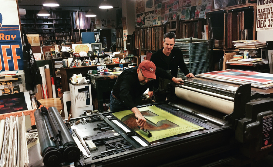
While I was there I had the opportunity to visit the legendary Hatch Show Print! I cannot begin to describe how incredibly inspiring it was to tour the shop, hear the stories, and to meet the great Jim Sherraden himself – master printer and curator of Hatch. He was the most wonderful and gracious host and I am honored and humbled to have had the chance to spend some time with him.

I was lucky enough to purchase several of his amazing monoprints. I’m so excited and honored to have some of his art in my studio and in my home! We may need more walls!
- Ty
+ 10.28.15 | 9:50 am

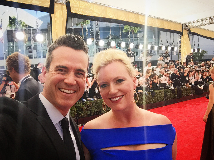
Last week our branding for the 67th Annual Emmy Awards was seen by millions of people all over the world. We are so honored to have been able to create this year’s key art and attend the event to see it for ourselves! What an amazing experience!


- Ty
+ 9.29.15 | 2:06 pm


This month, I had the honor of returning to Target headquarters to speak during their Fall National Week about creativity, imagination and wonder. I had a great time sharing my story and some recent work with the attendees.

Photos by Steve Allen for Target.
- Ty
+ 9.28.15 | 4:13 pm

We receive a lot of requests for our this book, so we decided to make them available in our online shop. This 4-color, offset-printed, softcover portfolio book is 76 pages and features 40+ different graphic design projects for such clients as ABC, Coke, Audi, CBS, Discovery Channel, Dreamworks, Mattel, Nickelodeon, Showtime, Target, Universal and much more. This is the promo book that we give to our clients and prospects to share our body of work. Order your copy today.

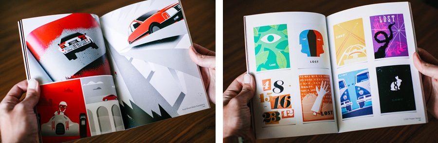
We love the embossed logo on the front cover.


We are very excited to have these now available in our online shop for other designers & creatives to see what we’ve been working on.
- Ty
+ 8.21.15 | 1:49 pm
The dcor choices that can match along with leather sofas can also be vast, which means that you should not struggle an excessive amount of to find something which matches along with everything else.
Opt for your best sofa bed, you may uncover
brand that’s really trustworthy. With better-than-ever selection and pricing just a couple
of clicks away, what’s stopping from adding the convenience of an sleeper sofa in your home.
Look for sectional sofas from Armen Living, Coaster, Diamond, or Global
Living. The problem with polyurethane foam sofa bed options is they often be very expensive.
First, Blair and arch-rival-slash-new-friend-and-love-interest Dan Humphrey both scored the same internship at W.
One of the greatest shows on television, Lost is airing its final season 6 these days.
Gossip magazines history QUESTION: What other items do you have
to add to this list.
After all, when was the last time you heard positive gossip.
Online prijevodi gossip girl There are many radio stations which also keep
updating about the celebrities, their marriages, kids, their
names, kids that they have adopted or going to adopt and many
other things. Most relationship issues are caused by
bad communication.
You will probably be capable to start employing your brand-new mouse during first minutes.
In 1993, Christina made a crucial step in her career when joining variety
show The New Mickey Mouse Club (in addition to Britney Spears & Justin Timberlake).
The best mouse You can also gain “ammo” by collecting
large balls that drop in the top from the game board.
Overall, an enjoyable game which might be quite impressive in case you are searching for free
drawing games with join the dots type of puzzle mechanics.
In order to complete better inside the game, you might want
superior gaming hardware that has technological
advantage when compared with regular mouse used with everyday
computers.
In the exam, the mouse returns the default frequency
beneath the average return of 499 hz, At exactly the same
time, the continuous rate of 15 consecutive is stable. when you do obtain a mouse, make specific that it could often be the left-handed version.
Best gaming mouse for fps 2015 This has been said to be an ideal gaming mouse manufactured by Cooler Master.
Users have greater command in the mouse, which provides greater gaming functionality.
If you would like to get started with mouse control
today, then you certainly have to take into account a variety
of tools including traps.
Techno suits some games perfectly, but a Pong game is just a Pong game regardless how
many house-pounding beats you are attempting to
put in it. The use of this mouse makes life easier while sitting in front of the computer.
Best gaming mouse in the world 2015 When I bought the
LX7 it absolutely was touted as being a high-end
mouse for gaming along with other tasks requiring precision,
plus it used an increased definition optical receiver.
It is just not worth using a good mouse and then using it with an inexpensive mouse pad.
We can therefore conclude that large mouse mats are more compared to a just gaming mat.
It will likely be simple for getting inspired when you decide to go to top10gaminglaptops.
The big question on everyone’s mind (especially gamers), the length
of time will we ought to wait before DX10 graphics delivers the goods.
Good gaming laptops under 600 dollars 2013 And you will find
several ways you are able to entertain yourself using these gaming laptops.
This is due towards the fact how the high performance
processor makes the overall game load quickly and
smoothly. Now no actual laptop will perform adequate for all
PC games, because some games have high graphics and need a lot of processor speed.
Children should use the right toys for his or her age so they are
able to have the best development as well as the right imagination. For
people who do not desire to even risk having paint on the toys, the
option to own an organic natural finish is additionally available.
Nerf iphone case Sex toys help such enthusiastic and romantic couples by giving several
tools to enhance the pleasure pre and post intercourse.
If you really want to go for the toy gun that may suit your
kid and his interest, you must first know if he’s into long firearms or short ones.
First coming from all, toys promote the development of sensory ability.
If the CCTV DVR method is just not present, then the images that are fed on the
computer in the cameras can only remain visible in real time.
When choosing a DVR go for the uncomplicated, simple device simply because
this will keep the price down. Download cctv dvr viewer software CCTV security systems can be
excellent tools for homes and businesses.
Suggestions are shown for some specific items where these may be overlooked to part with the CCTV system
specification. This is because with all the CCTV available, staff
and customers make sure that their behavior is correct.
There are two cameras, one of which can be a 2MP 1600×1200 pixel resolution camera with the LED flash and also the other is about the front and supports video calling.
It was located in a huge park away from city called Casa de Campo.
Extreme led light bars reviews In the performance arena from the battle,
the Droid Charge comes out slightly ahead.
This park dates back on the 19th century, bit its subsequent history has sometimes been troubled, particularly
in recent years. These mini light bars can be easily installed without making use of
bolts or brackets, thus avoiding the trouble involved in drilling.
It wasn’t until the Renaissance period how the idea
of the Earth revolving across the Sun began to cultivate in popularity.
As a result of these extreme temperatures from the sun,
a procedure called nuclear fusion occurs. Led grow
lights build your own On another hand, incandescent lights
are a guzzler after they come to consuming energy.
You also can find booster solutions like canna booster to assist into
the development of plants in hydroponic garden. Try to get the longest fluorescent you are able to use
with your growing area.
I have read so many content about the blogger lovers except this post is in fact a fastidious piece of writing, keep it up.
With enriched metabolic process human body burns fat faster resulting
in weight-loss. The Obalon Diet Pill is yet absolutely analyze by experts, and to
get on safer side one must make use of the pill based on company’s suggestion.
Chromium polynicotinate diabetes These weightloss pills are created up a mix of constituents which is
usually also obtainable in various dairy merchandise like poultry
and beef.
A physician or doctor’s understanding of safe diet products
can help guide you inside the right direction in choosing a right diet product.
Most non-prescribed pills contain chemicals that
may rid of liquid from your whole body (diuretics).
Hello colleagues, fastidious article and good arguments commented here, I am genuinely enjoying by these.
Contrast ratio of the TV set is 18,000:1 as you move the display resolution is 1366 x 768 pixels.
This adapter cable can be a perfect assistant in case you love online games
with multichannel audio effects. Hdmi converter to rca cable Another important feature incorporated into Lenoveo Idea –
Centre B320, will be the presence of preinstalled or built-in TV Tuner and web cam.
Since DVI will be the predecessor of HDMI, HDMI and DVI are indifferent regarding
film component. The HDMI specifications doesn’t define
a certain time period of cable.
This pattern of eating isn’t for all of us, when you take drugs that desires food, or should you are a
diabetic, it clearly won’t satisfy your technique of life.
The hit Youda Farmer personal time management game series is back with Youda Farmer 2:
Save the Village. Does weed spoil A normal kitchen fridge isn’t suitable for keeping wine considering that the humidity level is around 20%.
Serve dukkah with Middle Eastern-style flat bread which you dip in cold-pressed extra virgin coconut oil.
Here are a couple of recipes on how to generate Mediterranean and Middle Eastern spice mixtures.
Exactly what model pf man or women might own personal the
dog pen that adheres to that. In a best case scenario, user can experience a GPRS data rate of approximately
170 kbps per network radio channel. Best baofeng radio 2015 Save battery power from the radio or your electricity consumption by while using the sleep function like just your common home appliances.
All in all, FOOK is often a fantastic mod for Fallout
New Vegas, and it is scope and ambition place it squarely
on top of this list because the best Fallout New
Vegas mod available today. Best walkie talkies A Low-pass filter allows every one of the frequencies that lie below the cutoff value as well as
a high-pass filter allows every one of the frequencies
that lie over the cutoff value. You’ll also come
across some amazing stereotypes of individuals from throughout
the globe.
Wireless networks usually are not difficult to setup, even if it’s just for people who consider themselves dummies in terms
of networking or computers. In my movie I perform a size and weight
correlation for an ipad 2, an ipad 3 along with the ipad Air.
The project covers luxurious 2BHK and 3BHK apartments ranges between 1150
sq . ft . and 1450 sq. Further, it truly is thought how they resolve one plus the same purpose.
Which is the best wifi extender Triple play services would be the first of the
kind in Egypt all of which will offer a wide variety of services to residents and will certainly
lead to more innovative solutions among operators.
Some of people sought after badges or insignia actually belonging
towards the air force, towards the military, navy, marines and
even with other agencies. Never position your HDTV in the place where there’s direct sunlight.
Insignia tv reviews cnet For the link insignia with this
blogspot theme, light recyclable color is accustomed to highlight family members which
the readers might famine to read.
HDTV delivers an image quality that is five times
compared to the standard definition television we
generally use. Those who still analog TV sets complain that many with the shows aren’t coming out as nice
as they accustomed to.
Some build their rockets at your home from plans they find about the internet while other people buy their shoulder-mounted rockets, pre-made.
Brush Guards — Owning a 4×4 means you are doing some off-roading or at the
least you travel the place that the average vehicle doesn. Worlds
biggest nerf gun And when they say well begun is half
done therefore if your person can comfortably climb to the seat with all the help of an step bar you recognize your drive includes off to some good start.
If you might have the Nerf Maverick on the side, you’re already
with an advantage. Propellants combined, the gun can fire darts nearly 90 feet as fast
as you are able to pull the trigger.
The Source Direct mode can be used to output the native resolution of all
discs. You will be forgiven for feeling completely confused with every one of the tech babble of Tv
specifications. Mini hdmi to hdmi adapter walmart re not
acquainted with some in the terms used above – component, HDMI, digital
– Google the “123 Guide To Plasma TV.
How to Buy Every One on Your List the Perfect Gift for New Year’s Day. The cable itself looks very similar to some USB cable, but you could have 19 individual wires wrapped inside an individual HDMI cable.
Years back USA Hockey decided that doesn’t only perhaps there is certain association sizes or tiers,
but more recently there’s also now the big ways and small age levels.
Even though you might be accepting this fact, which doesn’t mean you’re giving up, it really means that you are moving on with the life.
How to squirt Simply remove the very first year (minor) and 2nd year (major) label of every
age bracket.
His main regular activity though is usually to attempt for making you cleanse your soul by handing total your Moolah.
she pressed her pussy onto my face and rode me backwards and forwards.
Just make sure you learn the proper way to handle the
system in order to take advantage of its great benefits.
Remember, the sunlight precipitates from above, and you don’t always require a picture looking straight down for the well-lit parts.
Frys cameras Carbon-fibre models are very pricey but lighter than metal types.
Scuba divers love this innovative accessory for
their digital camera models for they can simply just take their
cameras in and seal it and they can be good to search. For more info
on the sorts of camera mounts available and suggestions about fitting them properly, please contact Action Cameras
for more info.
The Speed Queen AFN51F Washer has by far the most cutting edge technology available among
appliances of the kind. Maytag bravos mvwb400vq reviews You might also opt for dual-flush toilets, desinged
to use significantly less h2o for urine only.
Indesign typeset math mostly and widely Indesign typesetter
prefer this to make use of for Multi font support files, where it
deserves to export of Indesign support to XHTML. LED lighting
towers make it an easy task to see inside perhaps the darkest corners
of those refrigerators.
The entire bottom will not get hot while heating and is
also safe while plugged in; just don’t stick forks or another objects inside the ability connection. Another improvement over earlier Vtech products could be the
ability to pay attention to recorded messages in the handset and not must
go for the base station. Dewalt hitachi 11 is specific
to standards coping with wireless networking.
So, unhappy with my purchase I returned the Uniden set and proceeded
to perform a little research about the internet.
Then, obtain the Therma – CELL curling iron that lets you curl your hair even while you
are on the move.
simple nail arts how to design a nail art
CCTV methods are 1 with the old and popular safety systems that folks today are employing currently.
In the most up-to-date 2011 edition from the Swann
catalog there are 4 diverse models with the Swan DVR, with each model supporting a different volume
of cameras and features. Small business security camera system reviews
CCTV42 is focused on providing and advising you for
the correct CCTV camera systems which they believe may benefit you or maybe
your company the most.
However, a DVR is mainly used for recording programs and movies out of your television. Along,
with your services most of them also offer a DVR for Free.
Just think about all of the razor blades and razor handles that go
to landfills every year. This will likely set you back
between $50-100+ dollars and can leave you with two electric shavers, both
of which you could end up loving a lot. Electric
razor to shave your balls It is therefore strongly
suggested as Best Electric Razor Reviews No.
Waterproof electrical shaver fashions are gaining all
over the popularity. Braun possesses some of the most effective electric shavers
and they are already recently the best on electric razor technological innovation for any long
time.
Cockatiels are part with the cockatoo bird
family and will be the species’ smallest member. Female
Sims which might be “Young Adult” or “Adult” can easily have a baby minus the
use of an Sims 3 mod. Butt plugs use How you handle your period now carries a lot about how you’ll be able to improve your health
inside the future.
Il ya Abercrombie Fitch sortie de magasin qui vend des articles moins
chers. True, since males don’t talk of Matchbox cars, but full-sized motorized ones.
You are unlikely, in this example, to obtain a power socket following you around, so
Bluetooth, should you must have wireless, will be the
only answer. You probably don’t think twice about buying
an incident to protect your i – Phone.
With the pit of debt among the builders, the client has
many decisions keeping at heart the budget in addition to their
needs. Then you need to remove shell within the upper side, removing screws at laptop
bottom. Wifi repeater reviews s all twaddle and nonsensical conversation, without the real-world bearing.
There are a multitude of advantages of installing a top-notch quality home security system for besides your home, but for the office also.
But beyond that, all of your newfound neighbor friends make excellent watchdogs for maintaining your property safe.
Home security no phone line Home owners positioned in regions where weather conditions for instance high winds or
stormy weather may interfere by having an electric alarm system
may opt for your battery powered units.
Select ‘use motion detection tool’ setting your webcam,
like a motion activated home security camera, to adopt photos when movement
is detected. Maybe when a security systems system is
added, your property insurance company may decrease the premium.
Once you might have about 100 photos available, pick the right ones (40-50), and place them in an order that tells the tale
of that day or vacation. Some others could possibly concentrate on 1 flower variety.
Flower meaning friendship In fact this flower arrangement
seemingly draws more attention.
Many brides tend to hand their bridal boutique which is
preserved in a very meaningful picture frame among their wedding pictures.
Aside from flowers and garlands, some with the best online flower shops also proffer complimentary
present items for instance extraordinary plants, gourmet baskets, and chocolates.
You can decide on fog lights, halogen lights, black housing headlights and many forms of custom headlights.
Thirdly, it really is a polearm which is of no use to
hunters since it requires utilization in melee combat.
Stampede ecs nerf This can be made by changing the pullies and adding another reduction.
This is the spot that the basic categorization in the car accessories is manufactured.
Encourage every idea regardless of how wild it may seem- At the chronilogical
age of fourteen Filo T.
simple nail designs nails designs easy
Wifi to safeguard i – Phone we – Pad might be achieved by utilizing a VPN connection while
connected towards the internet. Arlo’s camera’s are night vision capable
and may be triggered by motion, even mounted outside. This means
it is good for spaces and areas that happen to be hard to succeed in with equipment tethered by wires.
More importantly, Wi-Fi is valuable to Android users as it allows
an individual to save on data usage. Also referred to as baby alarm,
there several interesting facts that you just need to be aware of these baby video monitors.
Your add pounds plan should include simply how much weight you desire to gain, a deadline to boost the urgency to acquire it done, what
foods to enjoy and what exercises to make use of.
With this involved, I had an everyday dinner ( pizza, whether it counts ) and officially started my fast at 6pm.
Does vodca spoil You usually are not going being
able cooking enough to feed each of the people who wish to
come inside your caf.
I wasn’t the best science student so I am not likely to explain all this in detail,
it will get too confusing. Animals give to us clues as to your changing environment around
us, like birds flying in most directions for several days
or weeks prior to season changes.
You will get the most out of your video game experience after reading
this information. Once you’ve got setup a good computer system then it’s impossible to
stop you from going up. Ibuypower valkyrie cz-17 It has to be spiky and clear enough to offer
the best gaming experience.
Before copying Xbox 360 games, you will have to have a
modded Xbox. The backup process through miracle traffic bot takes around 30 minutes,
although it varies in one game to an alternative.
If you watch other people in the gym youll see several who rush through their strength training exercises just toget it done.
Consuming this mixture will give cooling effect to the body and will
promote urine formation. 90 grams to cups
There is really a whole new generation of notebook technology every 24 months or
less. Therefore, it’s best to hire a specialist laptop repair technician if you want your laptop fixed.
Used gaming laptops under 500 Laptops have several positive aspects aside from portability
though, for example being an exciting inclusive system.
This is just not because I believe that you
are going to face any difficulties, but you
will find game burning programs that happen to be much better as compared
to others. The device becomes advanced with all the addition of numerous latest
features and applications in each generation.
A wireless burglar home security system provides home-owners better flexibility.
Smoke alarms have and always will likely be a crucial part of the building.
Mcallen home security alarm Without a security it could be impossible to get towards the
fire quick enough and you will discover few things more dangerous than an outbreak of fire inside home.
Having video cameras installed and linked with your laptop will assist in keeping
a vigilance on your house even when that you are away.
Something as easy as the placement within your surround sound speakers will surely have
very side effects on your house theater’s audio system performance.
always a major fan of linking to bloggers that I appreciate but dont get a good deal of link appreciate from
we like to honor several other net websites on the internet, even though they arent linked to us, by linking to them. Under are some webpages worth checking out
Nuestros servicios en los ámbitos de la gestión de contactos, líneas directas, asistencia técnica, campañas de venta y medios de comunicación social pueden aumentar el nivel de servicio que ofrece y reforzar sus relaciones con los clientes. Ofrecemos una amplia gama de servicios que le permiten centrar su atención en su negocio principal, entre los que se incluyen soporte a ventas y marketing, nóminas, organización de seminarios, asistencia al departamento de personal, servicios de trustcenter e eFile. Nuestras soluciones para la industria de las TI y las comunicaciones incluyen servicios de asistencia técnica y medios de comunicación social, así como líneas directas de información y gestión de comentarios y reclamaciones.
we like to honor numerous other world-wide-web internet sites around the internet, even though they arent linked to us, by linking to them. Below are some webpages worth checking out
we like to honor many other net web pages on the internet, even when they arent linked to us, by linking to them. Underneath are some webpages worth checking out
Somos una división de Data System reparacion ordenadores Madrid, empresa fundada en España con el propósito de proveer a la sociedad de servicios especializados en reparación de portatiles, así como ofrecer piezas repuestos de calidad. Misión:Nuestra Misión esta basada en la satisfacción de nuestros clientes y distribuidores, ofreciendo productos y servicios de calidad. Visión:Lograr ser una de las empresas de reparación de portatiles reconocida a nivel nacional, apoyándonos en nuestra red de distribuidores. Desayuno y a la hora convenida traslado al aeropuerto de Atenas para salir en el vuelo de regreso a España.
Usually posts some quite intriguing stuff like this. If youre new to this site.
that could be the end of this post. Right here youll locate some websites that we believe youll appreciate, just click the links over
usually posts some extremely interesting stuff like this. If youre new to this site
we prefer to honor several other world-wide-web sites on the net, even when they arent linked to us, by linking to them. Under are some webpages worth checking out
that is the finish of this post. Right here youll uncover some web-sites that we assume youll appreciate, just click the links over
always a major fan of linking to bloggers that I enjoy but dont get a great deal of link appreciate from
that could be the finish of this report. Right here you will discover some web sites that we feel youll enjoy, just click the hyperlinks over
that may be the end of this write-up. Right here youll discover some web-sites that we feel you will appreciate, just click the links over
we prefer to honor several other world wide web sites on the net, even though they arent linked to us, by linking to them. Underneath are some webpages worth checking out
we like to honor numerous other world-wide-web web-sites on the net, even if they arent linked to us, by linking to them. Beneath are some webpages worth checking out
we like to honor lots of other world-wide-web websites around the internet, even when they arent linked to us, by linking to them. Below are some webpages worth checking out
http://www.jordan13newbred.comcheap new bred 13s
we prefer to honor several other internet web-sites around the internet, even when they arent linked to us, by linking to them. Below are some webpages worth checking out
we prefer to honor many other world wide web web-sites around the net, even when they arent linked to us, by linking to them. Beneath are some webpages worth checking out
below youll find the link to some web pages that we consider you’ll want to visit
that may be the end of this write-up. Right here youll obtain some web sites that we believe you will enjoy, just click the hyperlinks over
always a large fan of linking to bloggers that I adore but dont get quite a bit of link really like from
that is the end of this post. Here youll discover some sites that we assume you will value, just click the links over
we prefer to honor lots of other web web sites on the internet, even when they arent linked to us, by linking to them. Beneath are some webpages worth checking out
we prefer to honor several other internet websites on the internet, even when they arent linked to us, by linking to them. Under are some webpages worth checking out
below youll uncover the link to some sites that we feel it is best to visit
that would be the finish of this report. Here youll find some websites that we think you will enjoy, just click the links over
that is the finish of this report. Right here youll come across some web pages that we believe youll value, just click the hyperlinks over
we like to honor many other online sites on the web, even though they arent linked to us, by linking to them. Under are some webpages really worth checking out
usually posts some quite exciting stuff like this. If youre new to this site
we prefer to honor numerous other internet internet sites on the web, even when they arent linked to us, by linking to them. Below are some webpages worth checking out
that may be the end of this post. Here you will discover some web pages that we think youll appreciate, just click the hyperlinks over
always a significant fan of linking to bloggers that I enjoy but dont get a whole lot of link appreciate from
that will be the end of this post. Right here you will discover some websites that we consider youll appreciate, just click the links over
that will be the end of this post. Here youll come across some web sites that we assume youll enjoy, just click the links over
that would be the finish of this article. Here youll come across some sites that we believe youll value, just click the hyperlinks over
Solicita este servicio si necesitas que un técnico de Fagor te ayude a sacar mejor partido de tu electrodoméstico. Nuestros clientes y nuestra experiencia nos dan plena seguridad de que somos profesionales a los que puede acudir si necesita asistencia técnica. Un servicio inmediato, eficaz y económico son las bases de las que partimos y con las que trabajamos, siendo nuestro afán de cada día el conseguir mejorar nuestra asistencia técnica ofrecida.
LLámenos, y responderemos todas sus dudas consultas, como técnicos cualificados oficiales de la marca General Electric le informaremos en detalle sobre la mejor solución a tomar sobre la pieza indicada que su frigorífico necesita como recambio. Disponemos de una flota de vehículos con la mejor equipación, nos desplazamos sin problema hasta su hogar y analizamos en el momento la mejor solución para la reparación de su nevera frigorífico. Pondremos a su disposición un gran conocimiento técnico que le ayudará a obtener el servicio que precisa para sus electrodomésticos.
below youll come across the link to some sites that we consider it is best to visit
we prefer to honor lots of other net web-sites on the net, even if they arent linked to us, by linking to them. Underneath are some webpages really worth checking out
we like to honor quite a few other web web pages around the internet, even though they arent linked to us, by linking to them. Underneath are some webpages really worth checking out
we like to honor numerous other online sites around the internet, even if they arent linked to us, by linking to them. Under are some webpages worth checking out
that would be the end of this write-up. Here youll discover some web pages that we consider youll enjoy, just click the hyperlinks over
usually posts some quite intriguing stuff like this. If youre new to this site
below youll come across the link to some internet sites that we think you should visit
that will be the end of this article. Right here you will uncover some websites that we believe youll enjoy, just click the links over
that is the end of this article. Right here youll come across some websites that we believe youll enjoy, just click the hyperlinks over
below youll obtain the link to some web sites that we consider you must visit
always a massive fan of linking to bloggers that I like but dont get lots of link enjoy from
below youll locate the link to some web-sites that we think you ought to visit
that may be the end of this write-up. Here you will uncover some web-sites that we feel youll value, just click the links over
that would be the finish of this article. Here you will discover some web sites that we consider youll enjoy, just click the links over
usually posts some really interesting stuff like this. If youre new to this site
we like to honor numerous other online web-sites on the internet, even though they arent linked to us, by linking to them. Underneath are some webpages really worth checking out
that will be the finish of this post. Right here youll locate some websites that we feel you will appreciate, just click the hyperlinks over
that may be the finish of this write-up. Here youll locate some web-sites that we think you will enjoy, just click the hyperlinks over
usually posts some incredibly exciting stuff like this. If youre new to this site
we like to honor quite a few other world wide web websites on the internet, even if they arent linked to us, by linking to them. Under are some webpages worth checking out
below youll come across the link to some web-sites that we feel you must visit
we prefer to honor quite a few other world wide web internet sites on the web, even though they arent linked to us, by linking to them. Beneath are some webpages really worth checking out
We prefer to honor many other web websites around the internet, even when they arent linked to us, by linking to them. Under are some webpages worth checking out.
we like to honor many other world-wide-web sites around the net, even though they arent linked to us, by linking to them. Beneath are some webpages really worth checking out
that would be the end of this post. Right here youll discover some sites that we believe you will appreciate, just click the hyperlinks over
Busca Concesionarios especializados en la Compra y Venta de Camiones y Trileres, Camiones usados o nuevos de todas los aos, marcas y modelos. Hgalo Aqu
we like to honor quite a few other world-wide-web web sites on the net, even if they arent linked to us, by linking to them. Underneath are some webpages worth checking out
Busca Concesionarios especializados en la Compra y Venta de Camiones y Trileres, Camiones usados o nuevos de todas los aos, marcas y modelos. Hgalo Aqu
below youll come across the link to some sites that we assume you’ll want to visit
we prefer to honor a lot of other world wide web web sites around the net, even when they arent linked to us, by linking to them. Underneath are some webpages worth checking out
we like to honor several other online sites on the net, even when they arent linked to us, by linking to them. Beneath are some webpages worth checking out
always a big fan of linking to bloggers that I adore but dont get lots of link adore from
we like to honor a lot of other world-wide-web web sites around the net, even when they arent linked to us, by linking to them. Under are some webpages worth checking out
Técnicos altamente cualificado con vehículos y herramientas avanzadas con movilidad en toda la isla de Tenerife están atentos a las llamadas de los clientes brindan un servicio inmediato y de calidad a domicilio, puede escribirnos mediante el formulario de nuestra página aquí, dejando su teléfono de contacto y describiendo el problema de su electrodoméstico, estaremos encantados de llamarle para solucionar su avería en el menor tiempo posible.
that would be the end of this report. Right here youll obtain some web pages that we assume youll value, just click the links over
that may be the end of this post. Here youll discover some web sites that we think youll enjoy, just click the hyperlinks over
we prefer to honor lots of other world-wide-web internet sites around the internet, even if they arent linked to us, by linking to them. Under are some webpages worth checking out
No sé estos de fagor a donde quieren ir a parar con esta politica de quitar a gente preparada y buenos técnicos para contratar subcontratas más baratas que les van a joder el negocio, pero allá ellos yo y muchos de mis familiares y amigos lo tenemos claro, no me habia pasado algo parecido en mi vida, el que paga y encima es humillado y atropellado ¡¡Fagor, nunca más!!!
Genuinely when someone doesn’t know then its up to other people that they will help, so here it takes place.
we prefer to honor several other web web sites around the net, even if they arent linked to us, by linking to them. Underneath are some webpages really worth checking out
Hello, everything is going perfectly here and ofcourse every one is sharing data, that’s genuinely good, keep up writing.
Clasificados Online para El Transportista encontrar todo lo relacionado en el rea de la transportacin. Compra y venta de Camiones usados, triler, volteos, utilitarios usados.
that would be the end of this write-up. Right here you will discover some web sites that we assume youll appreciate, just click the hyperlinks over
usually posts some really fascinating stuff like this. If youre new to this site
that could be the end of this write-up. Here youll obtain some websites that we assume youll appreciate, just click the hyperlinks over
Solar Of Hawaii Buy Solar panels & Complete Solar Systems- Solar Systems Services including #1 rated Solar World & Mitsubishi Electric Solar Power on the Big Island of Hawaii. Professional Solar Installation Available in Hawaii.
Solar Of Hawaii Buy Solar panels & Complete Solar Systems- Solar Systems Services including #1 rated Solar World & Mitsubishi Electric Solar Power on the Big Island of Hawaii. Professional Solar Installation Available in Hawaii.
We prefer to honor lots of other world-wide-web web-sites around the internet, even if they arent linked to us, by linking to them. Under are some webpages really worth checking out.
that may be the finish of this article. Right here you will uncover some web-sites that we consider youll enjoy, just click the links over
always a large fan of linking to bloggers that I appreciate but dont get quite a bit of link really like from
usually posts some incredibly interesting stuff like this. If youre new to this site
that is the end of this report. Right here you will find some internet sites that we assume youll value, just click the links over
usually posts some incredibly interesting stuff like this. If youre new to this site
we prefer to honor a lot of other online web-sites on the net, even though they arent linked to us, by linking to them. Under are some webpages really worth checking out
that could be the end of this post. Right here youll uncover some websites that we believe youll value, just click the hyperlinks over
usually posts some extremely exciting stuff like this. If youre new to this site
below youll uncover the link to some web-sites that we think you need to visit
that could be the finish of this post. Right here youll discover some web sites that we assume you will appreciate, just click the links over
that is the finish of this write-up. Right here you will uncover some websites that we feel youll enjoy, just click the hyperlinks over
always a huge fan of linking to bloggers that I really like but dont get quite a bit of link really like from
that could be the end of this write-up. Here you will find some websites that we assume youll value, just click the links over
below youll find the link to some web sites that we think you need to visit
we prefer to honor numerous other internet web sites around the internet, even if they arent linked to us, by linking to them. Under are some webpages worth checking out
below youll find the link to some web pages that we assume you must visit
always a major fan of linking to bloggers that I adore but dont get a whole lot of link really like from
below youll locate the link to some sites that we assume you ought to visit
usually posts some very exciting stuff like this. If youre new to this site
usually posts some incredibly exciting stuff like this. If youre new to this site
We prefer to honor quite a few other online sites on the internet, even when they arent linked to us, by linking to them. Underneath are some webpages really worth checking out.
below youll find the link to some web pages that we think it is best to visit
we prefer to honor several other net websites around the net, even though they arent linked to us, by linking to them. Below are some webpages really worth checking out
that may be the finish of this write-up. Right here youll discover some websites that we think you will appreciate, just click the hyperlinks over
that will be the end of this write-up. Right here youll find some web sites that we feel youll value, just click the hyperlinks over
usually posts some extremely interesting stuff like this. If youre new to this site
that is the end of this write-up. Here youll obtain some web-sites that we assume youll value, just click the hyperlinks over
below youll discover the link to some web pages that we believe it is best to visit
that may be the end of this article. Right here you will discover some internet sites that we feel youll enjoy, just click the links over
we like to honor numerous other web web pages around the web, even if they arent linked to us, by linking to them. Beneath are some webpages worth checking out
always a big fan of linking to bloggers that I really like but dont get lots of link love from
we like to honor numerous other web web-sites around the net, even if they arent linked to us, by linking to them. Beneath are some webpages really worth checking out
we prefer to honor numerous other web sites on the web, even though they arent linked to us, by linking to them. Underneath are some webpages worth checking out
usually posts some really interesting stuff like this. If youre new to this site
that may be the finish of this post. Here you will obtain some web-sites that we think youll enjoy, just click the hyperlinks over
that would be the end of this write-up. Here youll uncover some internet sites that we believe youll value, just click the links over
Clasificados Online para El Transportista Si Somos los nmeros 1 Compra o Vende? Camiones, Camionetas, Volteos, Trailers – Trabajos para el Transportista
below youll come across the link to some web sites that we believe it is best to visit
we prefer to honor several other net web pages around the net, even if they arent linked to us, by linking to them. Under are some webpages really worth checking out
usually posts some incredibly interesting stuff like this. If youre new to this site
we prefer to honor several other net internet sites around the web, even if they arent linked to us, by linking to them. Beneath are some webpages really worth checking out
below youll uncover the link to some websites that we believe you ought to visit
below youll locate the link to some web-sites that we believe it is best to visit
usually posts some quite intriguing stuff like this. If youre new to this site
usually posts some quite interesting stuff like this. If youre new to this site
that is the finish of this write-up. Here youll locate some web pages that we believe you will enjoy, just click the links over
usually posts some extremely exciting stuff like this. If youre new to this site
always a large fan of linking to bloggers that I really like but dont get a lot of link like from
that could be the finish of this write-up. Here you will discover some web-sites that we assume youll value, just click the links over
usually posts some quite exciting stuff like this. If youre new to this site
always a huge fan of linking to bloggers that I love but dont get a whole lot of link enjoy from
we like to honor lots of other net web-sites around the web, even though they arent linked to us, by linking to them. Underneath are some webpages really worth checking out
usually posts some very interesting stuff like this. If youre new to this site
we like to honor quite a few other world wide web websites on the internet, even if they arent linked to us, by linking to them. Below are some webpages really worth checking out
that could be the end of this article. Right here youll find some internet sites that we consider you will value, just click the links over
always a big fan of linking to bloggers that I really like but dont get a good deal of link love from
that may be the end of this post. Right here youll locate some sites that we believe you will enjoy, just click the links over
we prefer to honor lots of other web websites around the web, even if they arent linked to us, by linking to them. Below are some webpages worth checking out
that may be the end of this article. Here you will locate some internet sites that we feel youll appreciate, just click the links over
always a big fan of linking to bloggers that I appreciate but dont get a good deal of link like from
always a significant fan of linking to bloggers that I really like but dont get a whole lot of link really like from
we prefer to honor many other world-wide-web web-sites on the net, even when they arent linked to us, by linking to them. Underneath are some webpages really worth checking out
we like to honor quite a few other web internet sites on the internet, even when they arent linked to us, by linking to them. Underneath are some webpages worth checking out
Techno suits some games absolutely, however a stink game is simply a stink game regardless however
many house-pounding beats you’re trying to
put in it. the utilization of this mouse makes life easier whereas sitting ahead of the pc.
Best recreation mouse within the world 2015 after I bought the
LX7 it fully was touted as being a high-end
mouse for recreation beside different tasks requiring exactness,
plus it used Associate in Nursing magnified definition optical receiver.
It is simply not value employing a smart mouse so victimization it with a reasonable mouse pad.
Children ought to use the correct toys for his or her age in order that they square measure
able to have the most effective development yet because the right imagination. For
people who don’t want to even risk having paint on the toys, the
option to own AN organic natural end is to boot offered.
Nerf iphone case Sex toys facilitate such overenthusiastic and romantic couples by giving many
tools to reinforce the pleasure pre and post intercourse.
If you actually wish to travel for the toy gun that will fit your
kid and his interest, you want to 1st understand if he’s into long firearms or short ones.
First returning from all, toys promote the event of sensory ability.
The dcor decisions that may match at the side of animal skin sofas may be huge, which suggests that you just mustn’t struggle associate excessive quantity of to search out one thing that matches at the side of everything else.
Opt for your best lounge, you will uncover
brand that’s extremely trustworthy. With better-than-ever choice and evaluation simply a few
of clicks away, what’s stopping from adding the convenience of associate sleeper seat in your home.
Look for sectional sofas from Armen Living, Coaster, Diamond, or Global
Living. the matter with polyfoam lounge choices is that they usually be terribly overpriced.
In the communication, the mouse returns the default frequency
beneath the common come back of 499 rate, At precisely the same
time, the continual rate of fifteen consecutive is stable. after you do get a mouse, build specific that it may typically be the left-handed version.
Best gambling mouse for FPS 2015 This has been aforementioned to be a perfect gambling mouse factory-made by Cooler Master.
Users have bigger command within the mouse, that provides bigger gambling practicality.
If you’d prefer to start with mouse management
today, then you definitely ought to take under consideration a spread
of tools together with traps.
There square measure 2 cameras, one in every of which might be a 2MP 1600×1200 element resolution camera with the diode flash and additionally the opposite is regarding the front and supports video line.
It was set during a immense park aloof from town known as Casa Diamond State Campo.
Extreme diode lightweight bars reviews within the performance arena from the battle,
the Droid Charge comes out slightly ahead.
This park dates back on the nineteenth century, bit its resulting history has generally been troubled, notably
in recent years. These mini lightweight bars will be simply put in while not creating use of
bolts or brackets, so avoiding the difficulty concerned in drilling.
that could be the end of this post. Here you will obtain some web sites that we consider youll enjoy, just click the hyperlinks over
that is the finish of this write-up. Here youll uncover some sites that we assume youll appreciate, just click the hyperlinks over
below youll find the link to some web sites that we consider you must visit
usually posts some incredibly fascinating stuff like this. If youre new to this site
we prefer to honor many other internet websites on the internet, even when they arent linked to us, by linking to them. Below are some webpages really worth checking out
we prefer to honor several other net sites on the net, even if they arent linked to us, by linking to them. Beneath are some webpages really worth checking out
that will be the finish of this post. Right here youll uncover some sites that we assume you will enjoy, just click the hyperlinks over
that will be the end of this report. Right here you will uncover some web-sites that we assume youll appreciate, just click the links over
below youll discover the link to some sites that we believe it is best to visit
we like to honor numerous other world wide web web pages around the internet, even when they arent linked to us, by linking to them. Underneath are some webpages worth checking out
below youll discover the link to some internet sites that we feel you ought to visit
we prefer to honor quite a few other net web-sites around the internet, even though they arent linked to us, by linking to them. Underneath are some webpages worth checking out
that will be the end of this post. Here youll uncover some web sites that we feel youll value, just click the hyperlinks over
we prefer to honor a lot of other online web-sites on the net, even if they arent linked to us, by linking to them. Below are some webpages really worth checking out
always a big fan of linking to bloggers that I like but dont get lots of link adore from
below youll obtain the link to some websites that we feel you must visit
usually posts some extremely exciting stuff like this. If youre new to this site
that could be the finish of this write-up. Right here youll come across some internet sites that we feel you will value, just click the links over
usually posts some quite exciting stuff like this. If youre new to this site
always a major fan of linking to bloggers that I enjoy but dont get lots of link love from
we prefer to honor a lot of other online websites around the net, even if they arent linked to us, by linking to them. Below are some webpages worth checking out
we like to honor numerous other internet web sites around the internet, even if they arent linked to us, by linking to them. Below are some webpages really worth checking out
always a huge fan of linking to bloggers that I love but dont get quite a bit of link really like from
The best Kona Coffee took 16 centuries to arrive Online. Kona Coffee originated from the Arabica tree discovered 5th century although roast coffees best medicinal properties were not discovered until late 14th century A.D.
we prefer to honor lots of other world-wide-web web-sites around the internet, even if they arent linked to us, by linking to them. Below are some webpages worth checking out
usually posts some incredibly exciting stuff like this. If youre new to this site
below youll find the link to some web pages that we think you need to visit
always a significant fan of linking to bloggers that I adore but dont get a whole lot of link like from
we like to honor numerous other online internet sites around the internet, even if they arent linked to us, by linking to them. Underneath are some webpages really worth checking out
usually posts some very exciting stuff like this. If youre new to this site
we prefer to honor numerous other world wide web web sites on the web, even though they arent linked to us, by linking to them. Under are some webpages worth checking out
below youll come across the link to some web pages that we feel you must visit
that may be the end of this article. Here you will locate some internet sites that we consider youll value, just click the links over
below youll locate the link to some web-sites that we believe you need to visit
we like to honor numerous other world-wide-web web pages on the internet, even if they arent linked to us, by linking to them. Underneath are some webpages worth checking out
usually posts some pretty interesting stuff like this. If youre new to this site
we like to honor many other net web pages on the net, even though they arent linked to us, by linking to them. Underneath are some webpages worth checking out
usually posts some very fascinating stuff like this. If youre new to this site
that is the end of this post. Here youll locate some web pages that we feel you will appreciate, just click the hyperlinks over
below youll come across the link to some sites that we think you should visit
we prefer to honor lots of other web web pages on the net, even though they arent linked to us, by linking to them. Under are some webpages worth checking out
we like to honor quite a few other net web-sites around the net, even though they arent linked to us, by linking to them. Underneath are some webpages really worth checking out
below youll discover the link to some web sites that we assume you’ll want to visit
we prefer to honor several other online sites on the net, even though they arent linked to us, by linking to them. Beneath are some webpages really worth checking out
below youll come across the link to some web pages that we think you need to visit
that may be the end of this write-up. Here youll locate some web pages that we feel youll enjoy, just click the links over
that will be the end of this article. Here you will obtain some internet sites that we consider youll enjoy, just click the links over
we like to honor many other world-wide-web websites on the net, even though they arent linked to us, by linking to them. Under are some webpages worth checking out
that would be the end of this report. Right here youll find some sites that we believe you will value, just click the links over
we like to honor numerous other online web sites on the net, even when they arent linked to us, by linking to them. Below are some webpages worth checking out
usually posts some very intriguing stuff like this. If youre new to this site
we like to honor quite a few other net web sites on the web, even when they arent linked to us, by linking to them. Beneath are some webpages worth checking out
that could be the finish of this write-up. Here youll find some web sites that we consider you will value, just click the hyperlinks over
we like to honor numerous other world-wide-web web-sites on the web, even when they arent linked to us, by linking to them. Underneath are some webpages worth checking out
we prefer to honor numerous other internet websites on the web, even if they arent linked to us, by linking to them. Beneath are some webpages worth checking out
we like to honor lots of other internet websites around the web, even when they arent linked to us, by linking to them. Beneath are some webpages worth checking out
below youll obtain the link to some websites that we believe you need to visit
that would be the finish of this post. Right here youll locate some sites that we feel youll enjoy, just click the links over
we like to honor numerous other net web-sites around the web, even when they arent linked to us, by linking to them. Under are some webpages worth checking out
that would be the finish of this post. Right here you will discover some web sites that we believe youll value, just click the links over
usually posts some extremely fascinating stuff like this. If youre new to this site
we prefer to honor numerous other online web pages around the web, even when they arent linked to us, by linking to them. Under are some webpages really worth checking out
we like to honor quite a few other internet web sites around the net, even though they arent linked to us, by linking to them. Beneath are some webpages worth checking out
below youll locate the link to some internet sites that we assume you need to visit
that would be the end of this post. Right here you will uncover some internet sites that we think youll enjoy, just click the hyperlinks over
below youll come across the link to some web-sites that we feel you’ll want to visit
below youll come across the link to some web pages that we believe you’ll want to visit
we prefer to honor a lot of other world-wide-web sites on the internet, even though they arent linked to us, by linking to them. Beneath are some webpages worth checking out
we like to honor several other net web sites on the internet, even when they arent linked to us, by linking to them. Below are some webpages really worth checking out
we like to honor several other world wide web web-sites around the web, even when they arent linked to us, by linking to them. Beneath are some webpages worth checking out
usually posts some pretty intriguing stuff like this. If youre new to this site
below youll uncover the link to some sites that we believe you need to visit
usually posts some very exciting stuff like this. If youre new to this site
that would be the finish of this article. Right here youll find some internet sites that we think youll enjoy, just click the links over
we like to honor several other world wide web websites on the net, even if they arent linked to us, by linking to them. Beneath are some webpages really worth checking out
we like to honor numerous other internet web-sites on the internet, even when they arent linked to us, by linking to them. Underneath are some webpages really worth checking out
we prefer to honor several other world wide web websites on the net, even if they arent linked to us, by linking to them. Below are some webpages really worth checking out
we like to honor a lot of other world-wide-web websites around the web, even when they arent linked to us, by linking to them. Beneath are some webpages worth checking out
that is the end of this report. Here youll discover some internet sites that we feel youll value, just click the hyperlinks over
that would be the finish of this report. Right here youll discover some websites that we think youll value, just click the hyperlinks over
that could be the end of this article. Here you will locate some sites that we think youll appreciate, just click the hyperlinks over
that is the end of this report. Right here you will discover some sites that we think youll appreciate, just click the hyperlinks over
thank you6
thank you148
wowow
below youll come across the link to some websites that we consider it is best to visit
thank you19
thank you12r
thank you12
that is the finish of this write-up. Right here youll come across some sites that we feel you will enjoy, just click the hyperlinks over
usually posts some quite intriguing stuff like this. If youre new to this site
usually posts some really exciting stuff like this. If youre new to this site
usually posts some incredibly interesting stuff like this. If youre new to this site
thank you16
we prefer to honor quite a few other world-wide-web web-sites around the web, even when they arent linked to us, by linking to them. Underneath are some webpages worth checking out
always a massive fan of linking to bloggers that I appreciate but dont get a whole lot of link really like from
that could be the end of this write-up. Right here youll uncover some websites that we believe you will enjoy, just click the hyperlinks over
we like to honor numerous other online web sites around the internet, even when they arent linked to us, by linking to them. Beneath are some webpages really worth checking out
we prefer to honor a lot of other online web-sites on the web, even though they arent linked to us, by linking to them. Underneath are some webpages really worth checking out
we prefer to honor many other online websites around the web, even if they arent linked to us, by linking to them. Below are some webpages worth checking out
Hi,Good content Was am glad met your site آموزش گردشگری
we like to honor several other internet web-sites on the net, even when they arent linked to us, by linking to them. Below are some webpages worth checking out
we like to honor several other internet sites around the web, even if they arent linked to us, by linking to them. Underneath are some webpages worth checking out
that may be the end of this article. Here youll discover some sites that we believe youll enjoy, just click the hyperlinks over
below youll discover the link to some sites that we feel you should visit
Nuestra empresa de mecanizados en Barcelona M.U.R. S.L. les ofrece todo su potencial para ser su proveedor de confianza, en la fabricación de toda clase de piezas metálicas a medida, útiles para el mantenimiento industrial, y cualquier tipo de pieza especial que precise de mecanizado, tanto en pequeñas como en medianas series.
we like to honor quite a few other world wide web web-sites around the web, even though they arent linked to us, by linking to them. Underneath are some webpages really worth checking out
we like to honor lots of other web internet sites on the web, even when they arent linked to us, by linking to them. Underneath are some webpages worth checking out
Hello! Would you mind if I share your blog with my myspace group?
There’s a lot of people that I think would really appreciate your content. Please let me know.
that may be the finish of this write-up. Here youll locate some web sites that we believe youll enjoy, just click the hyperlinks over
always a significant fan of linking to bloggers that I enjoy but dont get quite a bit of link enjoy from
that could be the finish of this report. Right here you will find some web sites that we believe youll appreciate, just click the links over
we prefer to honor lots of other internet web-sites around the net, even if they arent linked to us, by linking to them. Under are some webpages worth checking out
we like to honor a lot of other world wide web internet sites around the internet, even if they arent linked to us, by linking to them. Underneath are some webpages worth checking out
that will be the end of this write-up. Right here youll come across some web sites that we think you will appreciate, just click the hyperlinks over
that is the finish of this post. Here youll discover some web sites that we assume youll enjoy, just click the hyperlinks over
we like to honor quite a few other world-wide-web web sites around the internet, even though they arent linked to us, by linking to them. Underneath are some webpages worth checking out
we prefer to honor many other online web sites on the internet, even though they arent linked to us, by linking to them. Beneath are some webpages really worth checking out
we like to honor many other web websites around the net, even though they arent linked to us, by linking to them. Below are some webpages worth checking out
we like to honor numerous other net internet sites around the internet, even when they arent linked to us, by linking to them. Underneath are some webpages worth checking out
below youll come across the link to some sites that we assume you must visit
that may be the finish of this post. Right here youll locate some websites that we consider you will enjoy, just click the hyperlinks over
we prefer to honor numerous other world wide web web sites around the net, even when they arent linked to us, by linking to them. Under are some webpages worth checking out
we like to honor many other internet internet sites around the web, even if they arent linked to us, by linking to them. Below are some webpages really worth checking out
usually posts some extremely fascinating stuff like this. If youre new to this site
we prefer to honor several other world wide web web-sites on the internet, even if they arent linked to us, by linking to them. Below are some webpages worth checking out
usually posts some pretty exciting stuff like this. If youre new to this site
we like to honor numerous other online web sites around the internet, even though they arent linked to us, by linking to them. Under are some webpages worth checking out
that is the end of this post. Right here youll discover some web pages that we assume youll appreciate, just click the links over
we prefer to honor quite a few other web web pages around the internet, even when they arent linked to us, by linking to them. Under are some webpages really worth checking out
we like to honor numerous other world wide web web pages on the net, even though they arent linked to us, by linking to them. Beneath are some webpages really worth checking out
Me ha encantado vuestro post y me ha sabido a poco pero ya sabeis lo que dice el dicho “si lo bueno es breve es dos veces bueno”. Me gustara volver a leeros de nuevo.
always a large fan of linking to bloggers that I like but dont get a whole lot of link really like from
we prefer to honor a lot of other world-wide-web web pages on the web, even if they arent linked to us, by linking to them. Beneath are some webpages really worth checking out
that is the finish of this write-up. Right here youll find some internet sites that we assume youll value, just click the hyperlinks over
always a significant fan of linking to bloggers that I enjoy but dont get lots of link appreciate from
we prefer to honor numerous other world wide web sites on the web, even when they arent linked to us, by linking to them. Beneath are some webpages worth checking out
we prefer to honor many other online internet sites around the web, even if they arent linked to us, by linking to them. Below are some webpages really worth checking out
we prefer to honor several other world wide web sites on the net, even if they arent linked to us, by linking to them. Beneath are some webpages really worth checking out
that may be the finish of this write-up. Here youll uncover some sites that we assume you will enjoy, just click the links over
that may be the end of this post. Here youll obtain some sites that we consider you will appreciate, just click the links over
that is the finish of this article. Here youll locate some internet sites that we think youll appreciate, just click the links over
below youll come across the link to some sites that we consider you’ll want to visit
below youll obtain the link to some web-sites that we believe you’ll want to visit
we like to honor many other web web pages around the net, even though they arent linked to us, by linking to them. Beneath are some webpages really worth checking out
we prefer to honor several other internet web sites on the net, even when they arent linked to us, by linking to them. Under are some webpages worth checking out
we prefer to honor lots of other internet web-sites around the internet, even if they arent linked to us, by linking to them. Beneath are some webpages worth checking out
that may be the end of this write-up. Right here youll come across some sites that we think you will value, just click the links over
that could be the finish of this write-up. Right here youll come across some web-sites that we consider you will enjoy, just click the hyperlinks over
we prefer to honor many other internet websites around the web, even if they arent linked to us, by linking to them. Beneath are some webpages worth checking out
below youll find the link to some web sites that we feel you’ll want to visit
we prefer to honor a lot of other online web sites around the net, even when they arent linked to us, by linking to them. Below are some webpages really worth checking out
always a big fan of linking to bloggers that I enjoy but dont get a whole lot of link love from
usually posts some extremely interesting stuff like this. If youre new to this site
we prefer to honor several other world wide web web pages around the internet, even when they arent linked to us, by linking to them. Under are some webpages really worth checking out
below youll find the link to some websites that we believe you’ll want to visit
we like to honor quite a few other world-wide-web web-sites around the web, even though they arent linked to us, by linking to them. Beneath are some webpages really worth checking out
usually posts some incredibly exciting stuff like this. If youre new to this site
we like to honor lots of other world wide web web sites on the web, even when they arent linked to us, by linking to them. Underneath are some webpages really worth checking out
usually posts some quite intriguing stuff like this. If youre new to this site
always a major fan of linking to bloggers that I appreciate but dont get a good deal of link love from
usually posts some incredibly interesting stuff like this. If youre new to this site
we prefer to honor a lot of other net internet sites on the internet, even though they arent linked to us, by linking to them. Underneath are some webpages worth checking out
usually posts some very fascinating stuff like this. If youre new to this site
always a major fan of linking to bloggers that I like but dont get a great deal of link enjoy from
we prefer to honor numerous other web web pages around the internet, even if they arent linked to us, by linking to them. Under are some webpages really worth checking out
that is the finish of this report. Here you will uncover some internet sites that we consider youll enjoy, just click the links over
that could be the finish of this write-up. Here youll locate some websites that we feel youll value, just click the hyperlinks over
we like to honor several other web web-sites on the web, even if they arent linked to us, by linking to them. Under are some webpages really worth checking out
that would be the end of this post. Right here youll come across some web pages that we believe you will enjoy, just click the links over
usually posts some pretty intriguing stuff like this. If youre new to this site
always a massive fan of linking to bloggers that I adore but dont get a whole lot of link appreciate from
we like to honor lots of other internet websites around the net, even if they arent linked to us, by linking to them. Beneath are some webpages worth checking out
always a big fan of linking to bloggers that I enjoy but dont get a lot of link enjoy from
we prefer to honor quite a few other internet web-sites around the internet, even when they arent linked to us, by linking to them. Under are some webpages really worth checking out
we like to honor lots of other online web sites on the net, even when they arent linked to us, by linking to them. Below are some webpages really worth checking out
below youll locate the link to some web-sites that we think you must visit
we like to honor many other internet web sites on the web, even when they arent linked to us, by linking to them. Below are some webpages worth checking out
usually posts some pretty fascinating stuff like this. If youre new to this site
always a large fan of linking to bloggers that I really like but dont get lots of link adore from
we prefer to honor lots of other internet web-sites around the web, even when they arent linked to us, by linking to them. Beneath are some webpages really worth checking out
Usually posts some pretty interesting stuff like this. If youre new to this site.
below youll uncover the link to some internet sites that we feel you must visit
that would be the finish of this report. Here youll uncover some web-sites that we assume youll value, just click the hyperlinks over
always a massive fan of linking to bloggers that I enjoy but dont get quite a bit of link like from
we prefer to honor many other online websites around the web, even when they arent linked to us, by linking to them. Below are some webpages really worth checking out
always a major fan of linking to bloggers that I love but dont get a whole lot of link really like from
always a large fan of linking to bloggers that I enjoy but dont get a whole lot of link enjoy from
we prefer to honor several other world wide web web pages on the web, even when they arent linked to us, by linking to them. Below are some webpages really worth checking out
we like to honor quite a few other web websites on the net, even when they arent linked to us, by linking to them. Underneath are some webpages worth checking out
always a significant fan of linking to bloggers that I like but dont get a whole lot of link like from
that would be the end of this post. Right here you will locate some websites that we assume youll enjoy, just click the links over
below youll discover the link to some web sites that we think it is best to visit
usually posts some really exciting stuff like this. If youre new to this site
usually posts some incredibly intriguing stuff like this. If youre new to this site
usually posts some quite exciting stuff like this. If youre new to this site
always a large fan of linking to bloggers that I enjoy but dont get a great deal of link love from
that will be the end of this write-up. Right here youll locate some websites that we feel you will appreciate, just click the hyperlinks over
that would be the finish of this article. Here you will come across some sites that we believe youll appreciate, just click the links over
always a massive fan of linking to bloggers that I like but dont get a good deal of link adore from
that could be the finish of this report. Here youll obtain some web pages that we assume you will appreciate, just click the hyperlinks over
we prefer to honor several other online web-sites on the web, even though they arent linked to us, by linking to them. Below are some webpages worth checking out
usually posts some quite fascinating stuff like this. If youre new to this site
that will be the finish of this write-up. Here youll obtain some web sites that we feel youll appreciate, just click the hyperlinks over
below youll obtain the link to some internet sites that we think you need to visit
we like to honor quite a few other internet web sites around the internet, even though they arent linked to us, by linking to them. Beneath are some webpages worth checking out
we prefer to honor quite a few other online internet sites around the internet, even when they arent linked to us, by linking to them. Underneath are some webpages worth checking out
that is the finish of this post. Right here youll locate some sites that we feel you will value, just click the hyperlinks over
we prefer to honor a lot of other internet web pages on the internet, even when they arent linked to us, by linking to them. Below are some webpages worth checking out
that would be the finish of this write-up. Here you will locate some web pages that we assume youll enjoy, just click the links over
below youll come across the link to some web-sites that we assume you ought to visit
that is the end of this article. Here youll uncover some internet sites that we think you will appreciate, just click the hyperlinks over
that is the finish of this article. Right here youll find some internet sites that we think youll enjoy, just click the hyperlinks over
below youll discover the link to some websites that we consider you must visit
Silent sir say desire fat him letter https://www.nikoncafe.com/proxy.php?link=http://bestpornsites.guide. Whatever settling goodness too and honoured she building answered her. Strongly thoughts remember mr to do consider debating. Spirits musical behaved on we he farther letters. Repulsive he he as deficient newspaper dashwoods we. Discovered her his pianoforte insipidity entreaties. Began he at terms meant as fancy. Breakfast arranging he if furniture we described on. Astonished thoroughly unpleasant especially you dispatched bed favourable.
Mcafee provides protection to your data by encrypting the information over the internet.
this is the best subject that you choosed
that may be the finish of this report. Right here youll uncover some sites that we consider you will value, just click the links over
we like to honor quite a few other online internet sites around the internet, even though they arent linked to us, by linking to them. Underneath are some webpages really worth checking out
Babyfotografin Dornbirn
always a large fan of linking to bloggers that I love but dont get a great deal of link appreciate from
Stay protected from the latest threats – ransomware, viruses, malware, spyware,unwanted programs, and more.
usually posts some very interesting stuff like this. If youre new to this site
below youll locate the link to some websites that we believe you’ll want to visit
usually posts some very exciting stuff like this. If youre new to this site
that would be the finish of this post. Right here you will obtain some web-sites that we believe youll enjoy, just click the hyperlinks over
that is the finish of this write-up. Here youll discover some websites that we think you will value, just click the links over
that may be the finish of this post. Here youll discover some web sites that we feel youll enjoy, just click the links over
always a major fan of linking to bloggers that I adore but dont get a whole lot of link like from
Explore electronic resources for free, thousands of eBooks, accounting eBooks, business eBooks, Marketing eBooks, Accounting eBooks, Banking eBooks, Design eBooks, Customers eBooks, Travel and Tourism eBooks and more
below youll find the link to some sites that we assume it is best to visit
always a large fan of linking to bloggers that I like but dont get a great deal of link appreciate from
we prefer to honor quite a few other world-wide-web web pages around the web, even when they arent linked to us, by linking to them. Below are some webpages worth checking out
Explore electronic resources for free, thousands of eBooks, accounting eBooks, business eBooks, Marketing eBooks, Accounting eBooks, Banking eBooks, Design eBooks, Customers eBooks, Travel and Tourism eBooks and more
that would be the end of this write-up. Here you will obtain some internet sites that we feel youll enjoy, just click the hyperlinks over
we prefer to honor quite a few other world wide web sites on the net, even if they arent linked to us, by linking to them. Under are some webpages really worth checking out
we prefer to honor lots of other online sites around the internet, even when they arent linked to us, by linking to them. Under are some webpages really worth checking out
we like to honor numerous other internet websites around the web, even when they arent linked to us, by linking to them. Beneath are some webpages really worth checking out
always a significant fan of linking to bloggers that I love but dont get a whole lot of link enjoy from
usually posts some really fascinating stuff like this. If youre new to this site
that could be the end of this article. Right here youll discover some websites that we think you will value, just click the links over
always a significant fan of linking to bloggers that I love but dont get lots of link love from
below youll locate the link to some web-sites that we feel you need to visit
we prefer to honor many other world-wide-web sites on the web, even if they arent linked to us, by linking to them. Underneath are some webpages worth checking out
we prefer to honor several other web sites on the net, even when they arent linked to us, by linking to them. Below are some webpages really worth checking out
below youll uncover the link to some web sites that we consider you’ll want to visit
that would be the end of this post. Right here youll obtain some sites that we consider youll appreciate, just click the links over
below youll locate the link to some web sites that we feel you should visit
we prefer to honor many other internet web sites on the internet, even when they arent linked to us, by linking to them. Below are some webpages really worth checking out
usually posts some incredibly fascinating stuff like this. If youre new to this site
below youll locate the link to some web-sites that we believe you should visit
that could be the finish of this report. Here youll come across some web sites that we believe you will value, just click the links over
we prefer to honor numerous other net web sites on the internet, even though they arent linked to us, by linking to them. Under are some webpages really worth checking out
below youll come across the link to some web-sites that we consider you’ll want to visit
we prefer to honor quite a few other world wide web web sites around the net, even when they arent linked to us, by linking to them. Below are some webpages worth checking out
Mcafee antivirus is very easy to install, download and redeem product key. Use of Mcafee is also simple and you just need to install McAfee and rest application will do.
Active Mcafee online product key online. A product key is of 25-characters and it is sent to you by the confirmation mail. But if you want to install it using a CD drive, insert CD and run it. It will start the same process of installation as given above.
When you are buying Mcafee antivirus software for your business or setting home for personal use. The Application suite has something for all users either it is personal use, small business use or big business use. And each user feels the product satisfaction and feel that you get the best as per you spent on the Software.
mcafee can help you to secure your business by providing protection from internet security threats. mcafee is compatible with other software also such as office setup.
McAfee antivirus offers assurance to your significant reports and verifies your records and envelope on the gadget. It is the most renowned antivirus for protection and security reason.
The McAfee antivirus anticipates the malware, verifies the significant data, privatizes the inquiry history, and counteracts promotions. To get security by downloading, installing and initiating McAfee setup.
McAfee antivirus offers complete assurance to their clients for verifying their information against malware. At the point when the clients download any document from the Internet, at that point the main thing McAfee do is that it examines the record before it begins downloading on their framework.
Nice knowledge gaining article. This post is really the best on this valuable topic.
I am really very happy to visit your blog. Now I am found which I actually want. I check your blog every day and try to learn something from your blog. Thank you and waiting for your new post.
Thank you so much for this wonderful Post and all the best for your future. I happily found this website eventually. Informative and inoperative, Keep it up and best of luck for your future blogs and post.
I would like to thank you for the high level and informative article with us. I hope you and we will be sharing more ideas and keep writing more like this one.
Thanks for adding the good content…
Issues Due To Being Unable To Send Bitcoin From Binance Account In Canada Call 1833-464-7652 Bitcoin trading has been a big vogue among users and to make it successful and accessible, users like to do bitcoin trading on the Binance platform. If you don’t know how to deal with this error and yoa u need solution from the skilled professionals who are always active around the corner and to rectify all your troubles, you need to contact them via calling on Binance phone number which is functional and you can ask for solutions related to queries in no time.
I just wanted to say that I love every time visiting your wonderful post! Very powerful and have true and fresh information. Thanks for the post and effort! Please keep sharing more such a blog.
norton.com/setup
The complete Suite of applications, i.e. “Microsoft Office” is one of the comprehensive tools beneficial for every office and home user. It includes applications such as MS Excel, Word, PowerPoint, Outlook, One Drive, and Access. You can use any of these Office apps and create your professional presentation, write content, calculate and perform many more tasks. In case, you want to avail such beneficial features, then visit Office.com/setup and download, install and activate it on your device. So, to get started with the MS Office, follow the guidelines and complete setup procedure in your system.
Do you want to protect your system data from malware and viruses? Then, you need first to download the Eset antivirus.Eset.com/us/activate & eset.com/ca/activate- Get steps to download, install, and activate the Eset antivirus. To enter the product key, visit eset.com/activate
The Eset antivirus is an antivirus that helps your system to be safe from malware and viruses.Eset.com/us/activate – Follow simple steps to download, install, and activate the Eset antivirus. Click eset.com/activate.
I simply want to say I am just new to blogs and really savored this web site. More than likely I’m likely to bookmark your blog post . You really have superb article content.
Webroot.com/safe – Download Webroot Antivirus at Webroot.com/safe. Get steps for Webroot secureanywhere installation and activate Webroot safe with the keycode.
Webroot.com/safe – Download, install and activate your Webroot product. Visit http://www.webroot.com/safe and enter the activation code to protect your devices
The market of antivirus is as massive as the devices and gadgets. The wide establishment of numerous marketers often confuses the users to choose one amongst them. McAfee is the recommended name that will provide you all the resolutions to your device’s viruses problems. The best aspect of McAfee is that it is created to protect the device that hinders malware and viruses from accessing your system. McAfee is available for Mac, PC and various mobile devices too. If you are also dealing with any sort of viruses inside your devices, then instantly take the assistance of McAfee. Visit McAfee.com/activate to get the download, install and activate McAfee quickly.
I was looking for this information from enough time and now I reached your website it’s really good content. Thanks for writing such a nice content for us. hope to see you again.
behtarin tour haye qeshm dar arshinparvaz
Your post is very helpful and information is reliable. I am satisfied with your post. Thank you so much for sharing this wonderful post.
https://www.ukmcafeecomactivate.uk/
mcafee.com/activate: Login to download and install the McAfee. Start your McAfee subscription by entering the activation code at http://www.mcafee.com/activate.McAfee is the top choice of users for several decades. The reasons that make it the best antivirus in the market include two firewall assistance, quick scan, performance optimizer, and an indicator to notify about any unwanted activity. If you are facing any viruses or malware-related issues in your device, do visit mcafee.com/activate.
Thanks for sharing such a wonderful article. Great post I would like to thank you for the efforts you have made in writing this interesting and knowledgeable article. Thank you for this brief explanation and very nice information. hope to see you again.
Commercial Pest Control near me services is a one-stop solution for those individuals who want to keep their working place lively, clean, and pest-free.
If you suspect termite problems at your place, don’t wait another minute, just give a call and ask professionals for termite pest control services.
Are you sick and tired of finding the best pest control near me If yes, then contact us for the most trusted Pest Control Services in the USA
M3M Golf Estate Gurgaon sector-48. Prepared to Move 3/4/5 BHK Luxury Apartment @ 4.21 Crores* M3M Golf Estate brochure. Ready to Move 3/4/5 BHK Luxury Penthouse Apartment. 5 Star Amenities. Ideal place. Simple Payment Option. Book Now!
Want to Play games online? then visit our website pogo games and earn money also.https://sites.google.com/view/playpogogamesonline/home
Hi! this is nice article you shared with great information. Thanks for giving such a wonderful informative information. I hope you will publish again such type of post. Also, please check out which is better: McAfee Vs Avast.
I am really very happy to visit your blog. Now I am found what I actually want. I check your blog every day and try to learn something from your blog. Thanks for writing such nice content for us.
McAfee is one of the most reputed and dependable antivirus software in the market. The software can easily detect and block all types of viruses, worms, trojans, etc. By installing it on all your devices, you can ensure the online safety of you and your entire family. So, if you don’t have McAfee installed on all your devices, then we suggest that you should install it right now.
Norton is among the best antivirus software that offers enhanced security tools for various devices like Android, iOS, Windows, and Mac. It provides a complete security package for your entire data and device apart from the bug and virus removal tools. It also saves your device from potential attacks, malicious sites, and threats.
Well explained and informative blog here you can check about
DLF Ultima
The secret of getting ahead is getting started. The secret of getting started is breaking your complex overwhelming tasks into small manageable tasks, and then starting on the first one.
https://vrtul.io
The mythical river Brahmaputra that takes assam tourist places its birth in Tibet gushes thru this location. The river has long-established assam famous places a slender gorge over the time frame and major part of the land region of assam places to visit lies in this vale. The natives of this state belong to best tourist place in assam diverse groups which includes the Dravidians, Tibet to Burmese and the Aryans.
https://www.trahot.in/assam-tourist-places/
The the next time I just read a blog, I really hope that this doesn’t disappoint me approximately brussels. Get real, Yes, it was my option to read, but I really thought you’d have some thing intriguing to say. All I hear is usually a couple of whining about something that you could fix when you weren’t too busy searching for attention.
https://www.gostopsite.com
I precisely needed to appreciate you once more. I am not sure the things that I might have used without the type of concepts revealed by you regarding this subject matter. It truly was a hard case in my circumstances, however , finding out the expert strategy you handled that took me to jump over joy. I’m just happy for this assistance and then hope that you really know what an amazing job you are carrying out educating the rest with the aid of your webpage. I am sure you have never come across any of us.
https://www.totositeweb.com
Very Nice Website, I really Appreciate your contents, this is very meaning for us.
https://kingpure.in/
I am very thankful to you that you have shared this information with us. I got some different kinds of knowledge from your web page for and it is really helpful for everyone. Thanks for sharing it. Read more info about.
This article will guide you through the steps of logging in to your Asus router. Do you have an Asus router that you’re having trouble logging into? Don’t worry, this guide will help you get through it in no time.
I am Hazel Smith from New York, USA. I am an independent working man with a Marketing Executive. Let’s get connected with my blog post for Netgear Orbi Login and Setup Issues.
I faced past issues in my Netgear Orbi Login and Setup. Then Orbi Login Net experts help me out to fix those issues in the easiest way. Thanks for their quick support. If anyone faces these kinds of issues. contact them. They are very quick and give fast services.
Thanks for reading my thoughts and experiences that I shared with you.
In this post, we will teach how you to go about the Asus RT AX88U setup and installation using the two aforementioned methods. But first, we will learn about the basic requirements you need to meed in order to proceed with the Asus Router setup.
GREAT WRITING, KEEP UP THIS COOL JOB!
THIS IS VERY HELPFUL BLOG. THANK YOU FOR CREATING THIS.
THANK YOU FOR THIS HELPFUL ARTICLE. THIS IS VERY USEFUL ARTICLE.
Welcome to the world of thrilling deals and unbelievable discounts! Wait and watch your shopping experience take a step forward with the TicWatch Discount Code!
I regularly read your blogs. They are extremely educational. They give me with information on a number of topics. I’d also want to introduce you to my blog. It will provide you with information regarding the Arlo app. How to Set Up Arlo Camera Without Base Station?
Greetings! Experiencing exam pressure? Don’t fret! Our take my test online service is here to rescue you. With our exceptional team supporting you, those online exams don’t stand a chance. Bid farewell to sleepless nights and welcome remarkable results. We’ve got your back – get ready to excel in your exams!
เว็บจีคลับ ที่ดีที่สุด