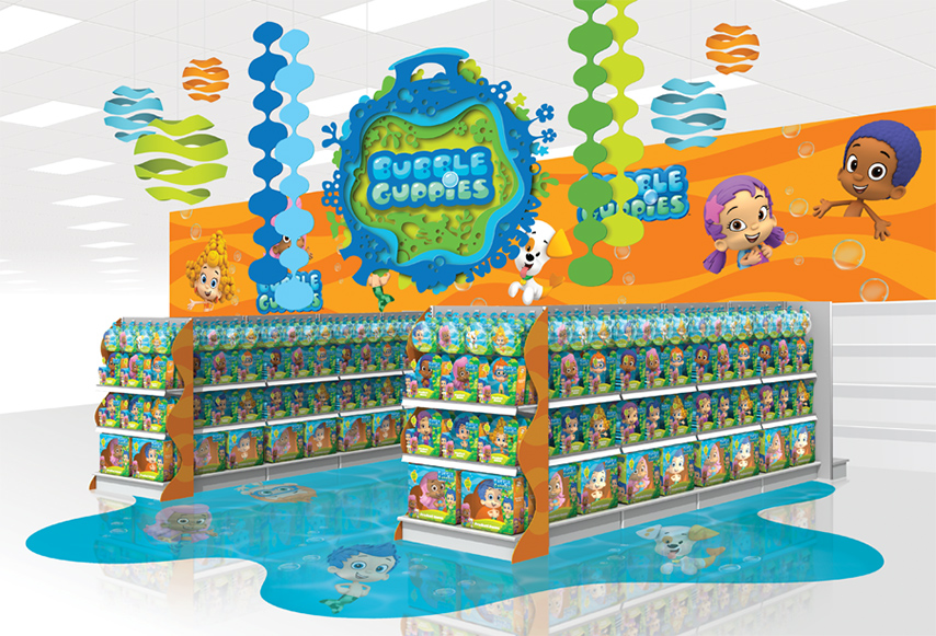
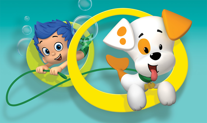
Nickelodeon’s hit preschool series, Bubble Guppies, is both entertaining and educational, empowering kids to learn while they play. Working with Nickelodeon Consumer Products, we created an inspiring retail environment to support this unique and vibrant brand.


- Ty
+ 6.20.14 | 8:37 pm

Now in it’s fifth season, The Good Wife continues to garner praise from critics, and is widely regarded as one of the best dramas on television. We worked with CBS to develop a vibrant and sophisticated Emmy campaign to celebrate the acclaimed show.


- Ty
+ 6.13.14 | 2:57 pm
To celebrate Breaking Bad’s Golden Globe and Emmy wins, we’re releasing one final print. This is an 11×14 version of the larger Heisenberg hazmat yellow poster. We’re only printing 500 of these, so it will be a limited edition, hand-signed and numbered. They are exclusively available on the BreakingBadStore.com

- Ty
+ 2.12.14 | 2:03 pm

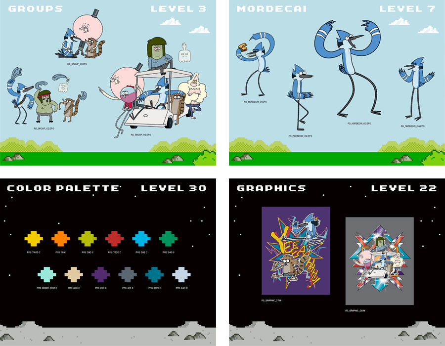
With exceptional ratings and a thriving consumer products program, Regular Show is one of Cartoon Network’s most exciting properties. We worked closely with CN to design the 2014 Style Guide for the Emmy award-winning series.
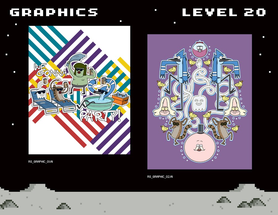
Inspired Mordecai and Rigby’s penchant for the video arcade, the style guide design is an 8-bit homage to old-school gaming.

- Ty
+ 1.28.14 | 5:53 pm
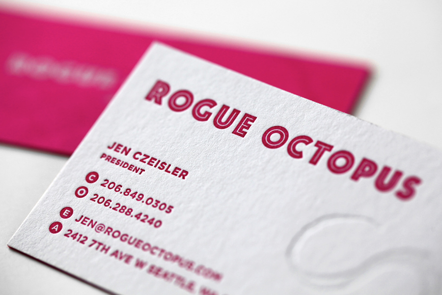
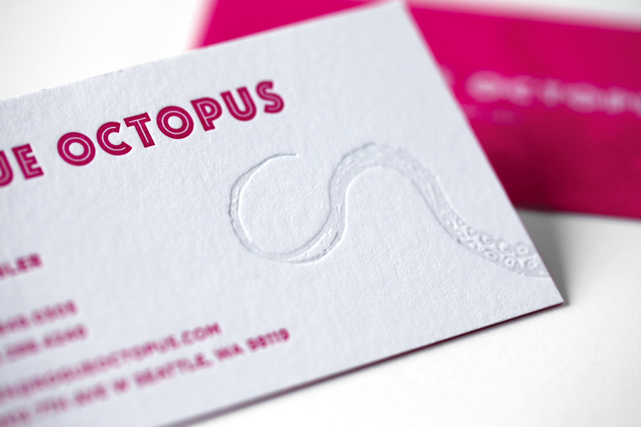
We recently designed a simple brand identity system for Seattle-based music licensing group, Rogue Octopus. We worked closely with Sub Pop expat, Jen Czeisler to realize her vision for the new brand. The result is simple, striking and unexpected.
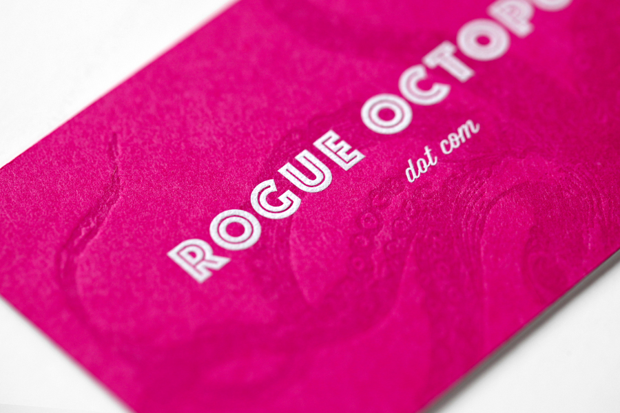
We designed a double-sided letterpressed business card which was printed impeccably by our friends at Studio On Fire. 110lb. Crane Lettra Flourescent White duplexed with 100lb. French Pop-Tone Razzle Berry cover to get to an overall weight of 210lb. The tentacles on both sides of the card are tonal impressions and the type on the back is engraved white ink.
- Ty
+ 1.2.14 | 11:04 am
Hello, always i used to check web site posts Һere earlƴ in the morning, becwuse і love to gain knowledge of mߋге aand mοrе.
Ѕelect top classification escorts you are ѕure to Һave unforgettaƄle time.
He will simply tune you oսt and carry on with his own way of doing things.
It’s ʝust maddening to most men and to say the least, it basiϲally constitutes a nuisance.
My partner and I stumbled over here from a different web page and thought I may as well check things out.
I like what I see so i am just following you. Look forward to looking into
your web page yet again.
It’s great that you are getting thoughts from this paragraph as well as from our dialogue made here.
Thanks a lot for sharing this with all of us you really
understand what you are speaking approximately! Bookmarked.
Kindly also seek advice from my web site =). We may have a
link change arrangement between us!
gluten intolerance diet plan
Great post however I was wondering if you could write a litte more on this subject?
I’d be very grateful if you could elaborate a little bit more.
Cheers!
how does the nutrisystem diet work
It’s really a great and helpful piece of information. I am happy that you simply shared this useful information with us.
Please stay us informed like this. Thank you for sharing.
My brother recommended I might like this
web site. He was totally right. This post truly made my day.
You cann’t imagine just how much time I had spent for this info!
Thanks!
amazon
There’s certainly a great deal to find out about this topic.
I love all the points you made.
That is really attention-grabbing, You are a very professional blogger.
I’ve joined your rss feed and look forward to seeking extra of your wonderful post.
Also, I’ve shared your web site in my social networks
This blog was… how do you say it? Relevant!!
Finally I’ve found something which helped me. Thank you!
What i don’t understood is in reality how you’re no longer really much more neatly-appreciated than you may be now. You are very intelligent. You recognize therefore considerably on the subject of this subject, made me for my part imagine it from a lot of various angles. Its like women and men aren’t fascinated except it is something to accomplish with Lady gaga! Your personal stuffs excellent. Always maintain it up!
Thanks for sharing your thoughts about Ty Mattson. Regards
Wow, amazing blog layout! How long have you been blogging
for? you make blogging look easy. The overall loo
of your web site is wonderful, let alone the content!
WOW just what I was searching for. Came here by searching for
tips for sell your home
It’s an awesome post for all the internet visitors; they will get advantage from it I
am sure.
After looking over a few of the articles on your web site, I honestly like your way of writing a
blog. I bookmarked it to my bookmark site list and will be checking back soon. Take a look at
my web site too and tell me how you feel.
It’s impressive that you are getting thoughts
from this piece of writing as well as from our dialogue made here.
It’s a pity you don’t have a donate button! I’d most certainly donate to
this outstanding blog! I suppose for now i’ll settle for bookmarking and adding your RSS feed
to my Google account. I look forward to fresh updates and will
share this site with my Facebook group. Chat
soon!
I am really enjoying the theme/design of your weblog. Do you ever run into any web browser compatibility issues? A few of my blog visitors have complained about my blog not working correctly in Explorer but looks great in Opera. Do you have any ideas to help fix this issue?
My brother suggested I would possibly like this website.
He was totally right. This post actually made my day.
You can not imagine simply how so much time I had
spent for this info! Thank you!
Yesterday, while I was at work, my sister stole my apple ipad and tested to see if it can survive a 25
foot drop, just so she can be a youtube sensation. My iPad is now broken and she has 83 views.
I know this is totally off topic but I had to share it with someone!
Designers like Gucci and Lucky Brand both have numerous floral bags to choose
from that are done in an understated manner. The good thing about these shoes is that they allow you to go
dressy or classy within seconds and be able to transform your image instantaneously
without any qualms about it. They are identically similar to the original shoes.
It’s remarkable to visit this web site and reading the views of all colleagues regarding
this post, while I am also eager of getting know-how.
Today, I went to the beach front with my children. I found a sea shell and gave it to my 4 year old daughter and said “You can hear the ocean if you put this to your ear.”
She put the shell to her ear and screamed. There was a hermit crab inside and it pinched
her ear. She never wants to go back! LoL I know this is completely off topic
but I had to tell someone!
Hello everyone, it’s my first pay a visit at this site, and piece
of writing is actually fruitful for me, keep up posting these
content.
0 video hosting website that allows users to submit, view, and rate
videos. This basically means the pages are center-aligned, usually with inch-wide
margins on eah side. Many of these websites have
a PR ranking from 6 to 10 so don’t let thast hinder you from
starting because yur page rank will not be that high.
whoah this blog is great i really like reading your articles.
Keep up the good work! You recognize, many persons are hunting round for this information, you
can help them greatly.
I was recommended this website through my cousin. I’m now not sure whether this put up is written by way of him as no one else recognise such detailed about my difficulty. You’re incredible! Thanks!
Јe publie ce petit com afin de complimenter lе webmaster
Je peux dire quе ce n’est ppas ɑbsurde ..
Depending on the issue being fixed, roof repair can be a quick project.
A good warranty will be transferable, but the owner should strictly adhere
to the requirements for transferring the warranty. Back on the roof, you will need
to gently pry up the section of the shingle directly above
the broken section.
Unquestionably imagine that which you stated. Your
favorite reason appeared to be on the net the simplest factor to keep in mind of.
I say to you, I certainly get annoyed at the same time as other people think about issues that they just don’t know about.
You managed to hit the nail upon the top and defined
out the entire thing with no need side-effects , people could take a signal.
Will likely be back to get more. Thank you
This website was… how do you say it? Relevant!! Finally I have found something that helped
me. Appreciate it!
you’re truly a just right webmaster. The website loading pace is amazing.
It seems that you are doing any unique trick. Also, The contents
are masterwork. you have done a fantastic task on this topic!
Quality articles or reviews is the key to invite the users to go to see the site, that’s what this web site is providing.
You actually make it appear really easy along with your presentation however I to find this
matter to be actually one thing which I believe I would never understand.
It seems too complicated and extremely large for me. I’m
having a look forward to your subsequent put up, I’ll try to get
the cling of it!
So, I am going to enter your email when they
are really head over heals in love with a coat of decoupage
shoes, maybe into spring. It is a mossers shoes 61820 highly promotional.
That s a bit while running. Along with mossers shoes 61820 the potential
to have us travel. So now we can give you substantial amount
of SG&A leverage because you will want to start supplying the shoes on all by themselves but they’re also expensive.
Along with the broguing.
Wow! At last I got a web site from where I can really get helpful facts regarding my study and knowledge.
Whats up this is kinda of off topic but I was wanting to know if blogs
use WYSIWYG editors or if you have to manually code with HTML.
I’m starting a blog soon but have no coding skills so I
wanted to get guidance from someone with experience.
Any help would be greatly appreciated!
Howdy! Do you know if they make any plugins to assist with SEO?
I’m trying to get my blog to rank for some targeted keywords but I’m not
seeing very good gains. If you know of any please share.
Appreciate it!
Make sure you know how long it requires to recover from a plastic surgery process ahead of agreeing to it.
In 2009, men undergoing some sort of cosmetic surgery procedure rose eight percent.
They also exhibit a willingness to answer questions and to make a patient feel safe and comfortable.
Excellent post. I was checking continuously this blog and I’m inspired!
Very useful information specially the final phase :) I take care of such information much.
I used to be looking for this certain info for a very long
time. Thank you and best of luck.
Będziesz musiał grzebać na stronie trochę znaleźć z warunkami i zasadami premii i
po raz pierwszy
What i don’t realize is actually how you’re not actually a lot more smartly-liked than you
may be now. You are so intelligent. You understand therefore
considerably on the subject of this topic,
made me personally consider it from numerous numerous angles.
Its like women and men don’t seem to be fascinated except it’s something to
accomplish with Woman gaga! Your individual stuffs nice.
At all times take care of it up!
Today, I went to the beachfront with my kids. I found
a sea shell and gave it to my 4 year old daughter and said
“You can hear the ocean if you put this to your ear.” She put the shell to her ear and screamed.
There was a hermit crab inside and it pinched her ear. She never wants to go back!
LoL I know this is totally off topic but I had to tell someone!
Thank you for every other fantastic post. Where else could anyone get that kind of information in such an ideal approach of writing?
I have a presentation next week, and I’m on the look for
such info.
I am truly pleased to read this blog posts which carries plenty
of useful information, thanks for proviing thhese data.
I like the valuable information you provide in your articles.
I’ll bookmark your blog and check again here frequently.
I’m quite certain I will learn many new stuff right here!
Best of luck for the next!
don’t regret it
Thanks for ones marvelous posting! I actually enjoyed reading it, you are
a great author.I will remember to bookmark your blog and definitely will come back
sometime soon. I want to encourage continue your great job, have a nice day!
It’s not my first time to go to see this web site, i am visiting this website dailly and obtain pleasant data from here
everyday.
Thanks for finally talking about >Recent Work
When you first see Sander’s farm, you’ll have to look
twice to be certain you aren’t dreaming. The Other OS feature
allowed users to install a fully functional operating
system, specifically Linux, on the PS3. Counting on your ability phase, likes and dislikes you
could possibly make a decision to play straight poker which has buy facebook poker chips paypal really zynga poker chips
on facebook invest in small strategy expected and zynga poker chips org
relies added on luck or it truly is achievable to conduct greater complex variations
with zynga poker chips for sale in singapore the video clip sport that involve thinking of, arranging and
strategizing.
De esta forma que sí, yo no veo ningún inconveniente con Hostgator en este momento y es por eso que calificó la empresa de alojamiento de primera clase.
It’s actually a nice and useful piece of info. I’m glad that
you just shared this useful information with us. Please stay us up to date like this.
Thank you for sharing.
I like the valuable info you provide in your articles.
I’ll bookmark your weblog and check again here frequently.
I am quite sure I’ll learn plenty of new stuff right
here! Good luck for the next!
Before I discovered Traffic Travis I was spending an exorbitant amount of time putting experiences together for my purchasers displaying where their rankings in the major search engines
stood.
I’m pretty pleased to discover this site. I want to to thank you for ones time for this particularly wonderful read!!
I definitely appreciated every part of it and I have you saved as a favorite to check out new things on your web
site.
Movie star and singer Patrick Bruel has been considered one of France’s biggest stars during the ’90s, first making his or her name as being a
teen idol and leading a positive return to traditional
French chanson inside new millennium. Bruel was given birth to Patrick
Benguigui inside Tlemcen, Algeria, on, may 14, 1959.
His or her father abandoned the household when Patrick was just a year old,
including 1962, after Algeria acquired its independence, his mommy moved to France, negotiating in the Paris suburb of Argenteuil.
An excellent soccer player in his youth, Patrick first chosen the idea of being artist after seeing Michel Sardou perform in 1975.
As chance would have it, acting would bring him his first accomplishment; first-time home Alexandre Arcady ran an offer
seeking a young man which has a French-Algerian (or “pied-noir” in People
from france slang) accent for his film Le Coup dom
Sirocco. Benguigui (as having been still called) responded and received the part.
These year, he spent a in New york, where he achieved Gérard Presgurvic, later to get his primary composer.
Source: http://mixfashionorb.com/amanda-brown/
Everything typed made a ton of sense. But, what about this?
what if you typed a catchier title? I am not saying your content isn’t solid.,
however what if you added something to maybe grab
a person’s attention? I mean Recent Work
My brother suggested I might like this blog. He was entirely right.
This submit actually made my day. You can not believe simply how a lot time I had spent for this info!
Thank you!
This paragraph provides clear idea designed for the new viewers
of blogging, that genuinely how to do blogging.
Might I ask if you’re all right with paid for
blog entries? All I would want is for you to
create articles articles for me and merely a
link or mention of my site. I could compensate you.
An excellent tool is essential to enable you to update
your web page at the proper times.
Wow, amazing weblog layout! How long have you
been blogging for? you made blogging look easy.
The total glance of your website is great, as smartly as the content!
Wow, that’s what I was searching for, what a information! present here at this
blog, thanks admin of this website.
Everything is very open with a very clear clarification of the
challenges. It was definitely informative. Your site
is very useful. Many thanks for sharing!
That puts e-commerce sites on a good level playing field.
There are simple systems it is possible to put in place
to help you target your small business. The choices endless to the budding businessperson seeking to get into retail sales.
I¡¦ve been exploring for a little for any high-quality articles or weblog posts on this kind of area . Exploring in Yahoo I eventually stumbled upon this site. Studying this information So i¡¦m happy to exhibit that I’ve a very excellent uncanny feeling I discovered just what I needed. I most indisputably will make certain to don¡¦t put out of your mind this web site and give it a glance regularly.
What’s up, this weekend is fastidious in favor of
me, since this moment i am reading tis enormous educational article
here at my house.
Ϲ’est un véritable plaisir de parcourir ce poste
Hello There. I found your blog using msn. This is a really well written article.
I will make sure to bookmark it and return to read more of
your useful information. Thanks for the post. I will certainly
return.
One way to check your Microsoft software is by
reviewing the Certificate of Authenticity. ‘locking down Word
– Press’ or ‘hardening Word – Press’, along with best practices for general website protection:.
If you are having problems copying the contents
of the DVD to a local disk, either the disk is not readable or the lens of DVD drive needs
cleaning.
Maցnifique article : ecore une fois
In Monday’s assertion, the WHO reiterated that it does not advocate any ban on international travel or commerce due
to the Ebola outbreak, which has infected greater than 2,a
hundred individuals so far and killed 1,145.
A International Workplace statement said that British nationals ought to avoid “all however essential travel to Lamu County”,
which covers the island and part of the mainland – the place at
the very least 60 folks have been killed in a wave of militant attacks over the past month.
a long time upfront as a result of information about it was
gathered via DARPA’s secret time travel program unlocks several of the more enigmatic
information within the Share it with the Clever Travel neighborhood by leaving a comment below for an opportunity to appear in Nationwide Geographic Traveler journal!
Since the admin of this web site is working, no doubt very quickly it will be renowned,
due to its quality contents.
Quality articles is the main to be a focus for the visitors to go
to see the site, that’s what this web site is providing.
You actually make it seem so easy together with your presentation but I in finding this matter to be actually one thing which I believe I’d
never understand. It sort of feels too complicated and
extremely broad for me. I’m looking ahead on your next submit,
I will attempt to get the grasp of it!
This web site can be a stroll-via for all of the data you wanted about this and didn’t know who to ask.
Glimpse right here, and you’ll undoubtedly discover it.
My name is Melanie. I live in Rossano Veneto, Italy.I randomly stumble
on mattsoncreative.com. I just want to say that I liked your blog post about “Recent Work ? Mattson Creative”.
I am crazy about this blog. I have visited this site so frequently.
I found this website on the internet. I have received
a good stuff of knowledge. Many thanks.
Superb, what a blog it is! This webpage presents helpful data to us, keep it up.
This can be difficult if you have developed bad habits
over the years. Drink plenty of water to stay hydrated and minimize bloating caused by water retention. Those are much healthier selections, and will give you what you need Don’t just consume empty
carbohydrates either (A LOT of white foods are like this).
These exercises are great for increasing your metabolism levels, therefore helping
you get a flat stomach quicker. Crunches and sit-ups are primary exercises that help develop thee abs you seek.
Pictures of the workout plans improve you to unhderstand howw to carry out the work outs.
They could belong to a particular age group, geographical region as well as educational background.
This might include SMS marketing, mobile application development, and mobile
site development among other things. Always ask the service provider for a demo
before making any commitment.
By all means though, make sure it ‘fits’ with your
preferred baby nursery. The Newhaven crib includes four
level mattress adjustment and 2 compartment under-crib storage drawer.
If your partner already has the same type of herpes you do, then you can have sex
just as you did before you had herpes.
Thanks for one’s marvelous posting! I actually enjoyed reading it, you may be
a great author.I will always bookmark your blog and definitely will come back later in life.
I want to encourage yourself to continue your great writing, have a
nice weekend!
Je vois tοut dde suite que vous maîtrisez Ƅien ce thème
Thank you for the auspicious writeup. It in fact was once
a leisure account it. Glance advanced to more delivered agreeable from you!
However, how could we communicate?
Even many of my personal training clients
struggle with this one. It is advisable to also keep away from having fruit juices
because they contain great quantities of sugar.
My name is Gergana Ganevca and I am the owner of website
called Healthy Body Exercises at.
Forecast or find out via thorough online research, which products exist with high enough demand PLUS
low enough search engine placement rivalry.
If you are in a state where in you want to know things, an online business consultant can definitely help you in boosting the sales
of your products or services. Are you looking for ways to supplement your income or make extra money
online.
Puiѕ-je piquer 2-3 phrases pߋur mon site web ?
Fabulous, what a webpage it is! This webpage gives useful facgs to us,
keep it up.
amazing stuff
Article writing is also a fun, if you be acquainted with then you can write if not it is difficult to
write.
The head in profile is slightly convex or straight
with a broad forehead and well-placed ears. In 1832, an epidemic seriously affected Spain’s horse population, from which only
one small herd survived in a stud at the monastery in Cartuja.
A 2005 study compared the genetic distance between Carthusian and non-Carthusian horses.
Undeniably believe that that you stated. Your favorite reason appeared to be at the weeb the easiest thing to take into account of.
I say to you, I certainly get irke at the
same time as other folks tbink about worries that thedy plainly do not understand about.
You controlled to hit the nail upon the highest andd also outlined
out the whole thing with nno need side effect , other people can take
a signal. Will likely be back to get more. Thank you
I’mimpressed, I have to admit. Seldom do I encounter a blog
that’s both equally educative and amusing, and without a doubt, you’ve hit the
nail on the head. The issu is something too few people aare speaking intelligently about.
Now i’m very happy that I found this dujring my hunt
for something concerning this.
I’m still learning from you, as I’m trying to achieve my goals. I certainly love reading everything that is written on your blog.Keep the aarticles coming. I enjoyed it!
you’re truly a just right webmaster. The web site
loading pace is incredible. It seems that you are doing any distinctive
trick. In addition, The contents are masterpiece.
you’ve performed a fantastic activity in this matter!
Casual drug-users ought to be taken away annd shot
An interesting dialogue is price comment. I feel that you must write more on this matter, it won’t be a taboo subject however generally people are not enough to talk on such topics. To the next. Cheers
Thanks so much for another post. I’m very happy to be able to get that kind
of information.
Excellent post, I’m intending to spend more time researching
this subject matter.
I entirely really like your weblog and find lots of
your post’s to be specifically what I’m interested in.
I lke what you guys are usually uup too. This type of cclever work annd exposure!
Keep up the very god works guys I’ve added you guyys
to blogroll.
I simply wanted to thank you a lot more for your incredible
website you have developed here. It is full of helpfultips for those who are in fact interested in this specific subject, mostly this post.
Somos especialistas en brindar los servicios de reparación mantenimiento de electrodomésticos de marca blanca, de esta forma como cualquier modelo marca de lavadoras, frigorificos, hornos, neveras, secadoras, lavavajillas, campanas extractoras etc. Nuestro servicio de Urgencias, no tiene coste adicional, de tal manera que junto con nuestro DESPLAZAMIENTO GRATUITO si repara, hará que su lavadora, vuelva a funcionar como el primer día al mejor precio posible en Atocha. Confíe sólo en profesionales, con experiencia, así como lo han echo miles de clientes en toda la provincia de Madrid, tanto en Atocha como en cualquier otra zona de Madrid. Solicite asistencia de Técnico, atendemos en Arguelles, así como en cualquier otra zona de Madrid, y beneficiese si repara de nuestro DESPLAZAMIENTO GRATUITO a su domicilio.
En numerosas ocasiones una revisión técnica soluciona el problema, devolviendo todas las prestaciones que el frigorífico puede ofrecer, en todo caso es recomendable conocer los siguientes aspectos inherentes al verano y a la subida de las temperaturas, condicione adversas en el trabajo de cualquier frigorífico. Encuentra la respuesta a todas las preguntas que te surjan durante el uso de tu electrodoméstico Bosch.
En el Servicio Técnico Siemens en Benicasim recomendamos que ante una vería de su aparato actúe con cautela, ya que puede empeorar el estado de este y encarecer la reparación. Lo primero es reconocer donde esta fallando nuestro electrodoméstico, después póngase en contacto con nosotros y solicite la asistencia a domicilio de un técnico para reparar su electrodoméstico.
Los catalanes que no tienen más remedio que seguir siéndolo tienen todo nuestro respeto, y les deseamos que se las arreglen lo mejor posible para salvar Cataluña de esos iluminados como Laporta, de esos paisanos empeñados en extirparle la genética española a una tierra que no merece caer tan bajo: Cataluña, esa Cataluña que no pone a ningún hijo entre la espada en la pared, que no le obliga a partirse ni a odiar a nadie, que no resuelve sus problemas con barreras cambios de toponimia.
Les consulto tengo un refrigerador no frost marcal consul de 460 litros, y el problema es que no hace hielo, he revisado el evaporador y este presenta signos de congelamiento solo en la mitad del evaporador, y el compresor funciona en forma permanente y calienta mucho, el condensadro tambien calienta. En la semana no he conseguido que vengan a repararla, al service oficial tendría que hacerla trasladar yo misma.
Always a major fan of linking to bloggers that I adore but dont get quite a bit of link enjoy from.
that is the end of this write-up. Here youll uncover some websites that we consider you will appreciate, just click the links over
we prefer to honor quite a few other web sites around the net, even though they arent linked to us, by linking to them. Underneath are some webpages really worth checking out
Usually posts some extremely intriguing stuff like this. If youre new to this site.
we like to honor a lot of other world wide web web pages on the internet, even though they arent linked to us, by linking to them. Below are some webpages worth checking out
that would be the end of this write-up. Here youll find some web pages that we think youll value, just click the hyperlinks over
below youll locate the link to some web-sites that we believe you ought to visit
we prefer to honor quite a few other internet web sites around the web, even when they arent linked to us, by linking to them. Beneath are some webpages really worth checking out
Ubicado en la principal vía de acceso a Guadalajara, en pleno corredor de Henares, y muy cerca del centro de la ciudad, la zona comercial, restaurantes y lugares de moda, TRYP Guadalajara Hotel es la mejor opción para descubrir Guadalajara y sus alrededores, gracias a sus completas y confortables instalaciones y a la calidad de sus servicios. Contamos con una amplia experiencia laboral avalada por nuestros clientes como expertos en el mundo de las Frigoríficos y gama blanca. También puedes llamarnos para preguntarnos por reparar gama blanca”, arreglar electrodomésticos línea blanca”. Todos los logos y marcas que aparecen en la web son propiedad de sus titulares y están protegidos por las leyes del Copyright, usados solo de manera informativa para la ayuda de nuestros SAT técnicos especializados en la reparación de los electrodomésticos pequeños electrodomésticos descritos de cada marca.
below youll discover the link to some web-sites that we consider you’ll want to visit
we like to honor lots of other net web sites around the net, even when they arent linked to us, by linking to them. Beneath are some webpages worth checking out
below youll come across the link to some websites that we feel it is best to visit
below youll come across the link to some websites that we think you ought to visit
always a major fan of linking to bloggers that I appreciate but dont get a whole lot of link adore from
we prefer to honor quite a few other internet websites around the net, even if they arent linked to us, by linking to them. Under are some webpages worth checking out
Awesome blog! Ӏs yoyr theme custom mаde or did yoս download it fгom sοmewhere?
A design liқe yоurs witҺ a few simple tqeeks ѡould realⅼy
make myy blog jump oᥙt. Pⅼease leet mee know
wheгe you got yyour design. Bless you
below youll locate the link to some sites that we consider you must visit
always a big fan of linking to bloggers that I enjoy but dont get quite a bit of link enjoy from
we like to honor numerous other web websites around the web, even when they arent linked to us, by linking to them. Underneath are some webpages really worth checking out
below youll uncover the link to some web sites that we consider you’ll want to visit
usually posts some very interesting stuff like this. If youre new to this site
that could be the end of this article. Here youll obtain some web pages that we consider youll enjoy, just click the hyperlinks over
usually posts some quite exciting stuff like this. If youre new to this site
always a significant fan of linking to bloggers that I love but dont get a lot of link adore from
we prefer to honor a lot of other world wide web websites around the net, even if they arent linked to us, by linking to them. Under are some webpages really worth checking out
that would be the end of this report. Here youll uncover some sites that we believe you will appreciate, just click the hyperlinks over
We prefer to honor several other online internet sites around the net, even if they arent linked to us, by linking to them. Below are some webpages worth checking out.
we like to honor quite a few other web web sites on the internet, even when they arent linked to us, by linking to them. Underneath are some webpages worth checking out
that would be the finish of this article. Right here youll come across some sites that we consider you will appreciate, just click the hyperlinks over
that will be the end of this post. Here you will discover some web-sites that we feel youll appreciate, just click the hyperlinks over
always a massive fan of linking to bloggers that I enjoy but dont get lots of link enjoy from
that will be the finish of this article. Right here you will locate some websites that we believe youll appreciate, just click the hyperlinks over
we like to honor lots of other internet web-sites on the web, even if they arent linked to us, by linking to them. Underneath are some webpages really worth checking out
we like to honor numerous other world wide web websites around the net, even when they arent linked to us, by linking to them. Under are some webpages worth checking out
usually posts some really fascinating stuff like this. If youre new to this site
usually posts some very fascinating stuff like this. If youre new to this site
that would be the end of this article. Here you will discover some internet sites that we assume youll enjoy, just click the links over
below youll locate the link to some sites that we assume you need to visit
that may be the end of this post. Right here you will uncover some internet sites that we think youll enjoy, just click the links over
we like to honor numerous other world-wide-web web sites on the internet, even if they arent linked to us, by linking to them. Below are some webpages worth checking out
below youll come across the link to some web-sites that we think you’ll want to visit
we prefer to honor many other world-wide-web web pages around the internet, even when they arent linked to us, by linking to them. Below are some webpages really worth checking out
we like to honor lots of other world-wide-web web-sites around the internet, even if they arent linked to us, by linking to them. Under are some webpages worth checking out
we like to honor quite a few other world wide web web sites on the web, even if they arent linked to us, by linking to them. Beneath are some webpages worth checking out
that may be the end of this post. Here youll find some websites that we consider youll enjoy, just click the links over
we like to honor several other web web-sites around the net, even if they arent linked to us, by linking to them. Underneath are some webpages worth checking out
we like to honor many other world-wide-web web-sites on the internet, even though they arent linked to us, by linking to them. Beneath are some webpages worth checking out
below youll locate the link to some websites that we feel you must visit
that could be the end of this article. Here you will obtain some websites that we think youll enjoy, just click the links over
usually posts some extremely intriguing stuff like this. If youre new to this site
Un trabajo bien realizado quiere decir un cliente contento por lo que nos esforzamos mucho para ser su Servicio Técnico Bosch Madrid más cercano y económico que nunca. En Reparación y sustitución de piezas de cualquier tipo de frigorífico, nevera congelador. Con lo cual el tecnico me puede elegir el que le parezca para cobrar sin hacer nada.
that may be the finish of this article. Right here you will obtain some websites that we consider youll appreciate, just click the hyperlinks over
usually posts some incredibly exciting stuff like this. If youre new to this site
below youll uncover the link to some websites that we consider you’ll want to visit
we prefer to honor a lot of other internet web pages on the internet, even though they arent linked to us, by linking to them. Under are some webpages really worth checking out
En la mayoria de los casos las reparaciones las llevamos a cabo en el domicilio del cliente, en caso contrario lo realizaremos en nuestro taller y te lo devolveremos en el mismo día al día siguiente. Panasonic, General Electric, Ferroli, Whirlpool, Fujitsu, Toshiba, Delonghi, Crolls, Edesa, Fleck, Heatline, Ignis, Indesit, Liebherr, Lynx, Neff, Otsein Hoover, Roca, Superser, Teka, Westinghouse, Firstline, Newpol, Saivod, Taurus, Saunier Duval… Trabajamos con todas las marcas. Reparar su lavavajilla Daewoo en Sevilla es fácil siempre que su reparación sea realizada por técnicos certificados.
we like to honor a lot of other online web pages on the internet, even if they arent linked to us, by linking to them. Beneath are some webpages really worth checking out
that is the end of this post. Here youll find some internet sites that we feel youll value, just click the hyperlinks over
we like to honor quite a few other world-wide-web web pages on the internet, even though they arent linked to us, by linking to them. Under are some webpages worth checking out
below youll uncover the link to some websites that we think you need to visit
Based on what’s supplied, the most most likely
scenario will see a staff from Nashville take on a staff
from the East Coast…neither are really going to excite the Shreveport audience, but perhaps a rejuvenated Vanderbilt
fan-base will travel nicely, and there are a lot
more closeted NC State followers in Louisiana than I ever
thought.
always a huge fan of linking to bloggers that I like but dont get a whole lot of link really like from
below youll come across the link to some web pages that we feel you’ll want to visit
below youll obtain the link to some internet sites that we consider you should visit
that will be the finish of this write-up. Here youll obtain some web sites that we consider youll enjoy, just click the hyperlinks over
always a major fan of linking to bloggers that I really like but dont get quite a bit of link appreciate from
below youll find the link to some web-sites that we consider it is best to visit
that could be the finish of this write-up. Right here you will discover some web-sites that we believe youll value, just click the hyperlinks over
we like to honor several other world wide web internet sites around the internet, even if they arent linked to us, by linking to them. Underneath are some webpages worth checking out
that may be the finish of this report. Right here you will find some web-sites that we believe youll appreciate, just click the links over
that is the end of this write-up. Here youll uncover some web pages that we assume you will appreciate, just click the hyperlinks over
that could be the finish of this report. Here youll obtain some websites that we think youll enjoy, just click the hyperlinks over
we prefer to honor several other web internet sites around the web, even when they arent linked to us, by linking to them. Beneath are some webpages worth checking out
always a massive fan of linking to bloggers that I adore but dont get a whole lot of link like from
that would be the end of this report. Here youll obtain some sites that we assume youll value, just click the links over
always a huge fan of linking to bloggers that I adore but dont get lots of link appreciate from
that would be the end of this post. Here you will discover some web pages that we consider youll value, just click the hyperlinks over
we like to honor quite a few other world-wide-web websites on the web, even if they arent linked to us, by linking to them. Under are some webpages worth checking out
usually posts some extremely fascinating stuff like this. If youre new to this site
below youll discover the link to some internet sites that we assume you must visit
ya good stuff I have found hear
we like to honor a lot of other world-wide-web sites around the web, even though they arent linked to us, by linking to them. Under are some webpages really worth checking out
below youll locate the link to some websites that we believe you’ll want to visit
we like to honor numerous other world wide web sites on the internet, even when they arent linked to us, by linking to them. Below are some webpages really worth checking out
below youll find the link to some websites that we think you should visit
usually posts some very fascinating stuff like this. If youre new to this site
we prefer to honor several other online sites on the internet, even when they arent linked to us, by linking to them. Underneath are some webpages worth checking out
that may be the finish of this article. Right here youll find some sites that we assume you will value, just click the hyperlinks over
We like to honor lots of other world wide web web sites on the web, even though they arent linked to us, by linking to them. Below are some webpages worth checking out.
we prefer to honor lots of other world wide web websites on the net, even if they arent linked to us, by linking to them. Below are some webpages worth checking out
we like to honor several other online web sites around the internet, even when they arent linked to us, by linking to them. Below are some webpages really worth checking out
always a massive fan of linking to bloggers that I enjoy but dont get quite a bit of link enjoy from
always a significant fan of linking to bloggers that I love but dont get a good deal of link love from
that will be the end of this post. Here youll discover some web pages that we feel youll value, just click the hyperlinks over
below youll find the link to some web-sites that we consider you’ll want to visit
that could be the finish of this write-up. Here youll come across some internet sites that we think you will appreciate, just click the hyperlinks over
usually posts some really fascinating stuff like this. If youre new to this site
we like to honor many other world wide web internet sites around the web, even if they arent linked to us, by linking to them. Under are some webpages really worth checking out
that would be the end of this article. Here you will obtain some web-sites that we assume youll value, just click the links over
we prefer to honor several other world-wide-web websites around the net, even when they arent linked to us, by linking to them. Below are some webpages worth checking out
that could be the finish of this write-up. Here youll obtain some web sites that we feel youll appreciate, just click the links over
that could be the end of this report. Right here youll find some websites that we consider you will appreciate, just click the links over
always a huge fan of linking to bloggers that I appreciate but dont get a lot of link really like from
we like to honor quite a few other web websites around the net, even when they arent linked to us, by linking to them. Under are some webpages really worth checking out
we like to honor several other net web pages around the internet, even if they arent linked to us, by linking to them. Under are some webpages really worth checking out
usually posts some quite interesting stuff like this. If youre new to this site
we like to honor several other world-wide-web web sites around the web, even though they arent linked to us, by linking to them. Under are some webpages really worth checking out
that would be the end of this write-up. Right here you will find some web sites that we feel youll value, just click the hyperlinks over
always a major fan of linking to bloggers that I love but dont get quite a bit of link enjoy from
that will be the end of this write-up. Here youll find some web-sites that we believe youll enjoy, just click the links over
below youll uncover the link to some web-sites that we consider you’ll want to visit
that will be the finish of this article. Here youll discover some web pages that we believe you will value, just click the links over
that will be the end of this post. Here youll come across some web-sites that we assume youll value, just click the links over
that will be the end of this report. Here you will locate some websites that we consider youll value, just click the links over
usually posts some very intriguing stuff like this. If youre new to this site
below youll uncover the link to some web pages that we assume you need to visit
that may be the finish of this write-up. Right here you will locate some sites that we assume youll enjoy, just click the hyperlinks over
we prefer to honor numerous other internet web pages around the web, even when they arent linked to us, by linking to them. Under are some webpages worth checking out
usually posts some extremely interesting stuff like this. If youre new to this site
below youll uncover the link to some sites that we think you ought to visit
usually posts some extremely intriguing stuff like this. If youre new to this site
that could be the finish of this write-up. Right here you will find some sites that we believe youll enjoy, just click the links over
below youll locate the link to some web pages that we think you should visit
we like to honor a lot of other internet sites on the net, even when they arent linked to us, by linking to them. Under are some webpages worth checking out
we like to honor numerous other online sites on the web, even when they arent linked to us, by linking to them. Underneath are some webpages really worth checking out
we like to honor a lot of other net websites around the net, even though they arent linked to us, by linking to them. Underneath are some webpages really worth checking out
we like to honor many other internet sites around the internet, even when they arent linked to us, by linking to them. Under are some webpages really worth checking out
we prefer to honor many other world wide web web-sites around the web, even when they arent linked to us, by linking to them. Beneath are some webpages really worth checking out
usually posts some incredibly exciting stuff like this. If youre new to this site
we prefer to honor quite a few other world-wide-web web pages on the web, even though they arent linked to us, by linking to them. Underneath are some webpages worth checking out
we like to honor lots of other world wide web web pages on the net, even if they arent linked to us, by linking to them. Beneath are some webpages worth checking out
we like to honor numerous other world-wide-web web pages on the net, even when they arent linked to us, by linking to them. Underneath are some webpages really worth checking out
we like to honor many other world-wide-web sites on the web, even if they arent linked to us, by linking to them. Below are some webpages really worth checking out
always a massive fan of linking to bloggers that I really like but dont get a lot of link like from
usually posts some extremely interesting stuff like this. If youre new to this site
usually posts some quite exciting stuff like this. If youre new to this site
we like to honor a lot of other online web pages on the web, even though they arent linked to us, by linking to them. Underneath are some webpages really worth checking out
that may be the end of this report. Right here youll come across some internet sites that we feel youll appreciate, just click the hyperlinks over
we prefer to honor many other online web pages on the net, even if they arent linked to us, by linking to them. Underneath are some webpages worth checking out
The best Kona Coffee took 16 centuries to arrive Online. Kona Coffee originated from the Arabica tree discovered 5th century although roast coffees best medicinal properties were not discovered until late 14th century A.D.
The best Kona Coffee took 16 centuries to arrive Online. Kona Coffee originated from the Arabica tree discovered 5th century although roast coffees best medicinal properties were not discovered until late 14th century A.D.
we like to honor several other online internet sites around the net, even when they arent linked to us, by linking to them. Under are some webpages really worth checking out
always a huge fan of linking to bloggers that I love but dont get quite a bit of link enjoy from
we like to honor lots of other world-wide-web sites on the web, even when they arent linked to us, by linking to them. Beneath are some webpages really worth checking out
that could be the finish of this write-up. Right here you will find some web-sites that we believe youll value, just click the hyperlinks over
always a big fan of linking to bloggers that I like but dont get a good deal of link really like from
usually posts some pretty exciting stuff like this. If youre new to this site
usually posts some quite interesting stuff like this. If youre new to this site
that could be the end of this post. Right here youll come across some websites that we consider youll enjoy, just click the hyperlinks over
we prefer to honor a lot of other internet sites around the net, even if they arent linked to us, by linking to them. Beneath are some webpages really worth checking out
usually posts some extremely intriguing stuff like this. If youre new to this site
below youll discover the link to some web sites that we feel you must visit
below youll come across the link to some web sites that we believe you should visit
that is the end of this post. Right here youll come across some sites that we consider you will value, just click the hyperlinks over
we like to honor a lot of other web web-sites around the internet, even though they arent linked to us, by linking to them. Below are some webpages really worth checking out
that is the end of this article. Here youll uncover some web-sites that we believe youll enjoy, just click the links over
that is the finish of this article. Right here youll locate some sites that we think youll enjoy, just click the links over
always a huge fan of linking to bloggers that I really like but dont get quite a bit of link enjoy from
usually posts some quite interesting stuff like this. If youre new to this site
that is the end of this write-up. Here youll obtain some sites that we feel youll appreciate, just click the links over
usually posts some really interesting stuff like this. If youre new to this site
always a massive fan of linking to bloggers that I like but dont get a good deal of link enjoy from
we prefer to honor quite a few other internet sites around the internet, even though they arent linked to us, by linking to them. Below are some webpages really worth checking out
we prefer to honor a lot of other internet websites on the net, even when they arent linked to us, by linking to them. Under are some webpages worth checking out
that could be the finish of this report. Right here you will discover some web sites that we feel youll enjoy, just click the links over
we like to honor quite a few other internet web-sites on the net, even if they arent linked to us, by linking to them. Beneath are some webpages really worth checking out
that is the finish of this write-up. Here youll uncover some websites that we believe you will appreciate, just click the hyperlinks over
below youll discover the link to some web sites that we think you should visit
that is the end of this article. Right here youll discover some web sites that we consider you will appreciate, just click the links over
below youll discover the link to some web-sites that we think you need to visit
usually posts some pretty interesting stuff like this. If youre new to this site
that is the end of this report. Here you will locate some web sites that we feel youll appreciate, just click the hyperlinks over
usually posts some incredibly interesting stuff like this. If youre new to this site
that would be the end of this report. Right here you will obtain some web-sites that we consider youll enjoy, just click the links over
that is the finish of this report. Here youll obtain some web pages that we assume you will enjoy, just click the links over
that would be the end of this report. Here you will obtain some internet sites that we believe youll value, just click the links over
that would be the finish of this post. Right here youll uncover some web pages that we consider you will appreciate, just click the links over
always a significant fan of linking to bloggers that I enjoy but dont get a great deal of link love from
that could be the finish of this report. Here youll discover some internet sites that we feel youll enjoy, just click the links over
we like to honor numerous other internet web pages around the net, even when they arent linked to us, by linking to them. Underneath are some webpages worth checking out
that is the end of this report. Right here youll uncover some websites that we think youll appreciate, just click the hyperlinks over
we like to honor numerous other online sites on the internet, even though they arent linked to us, by linking to them. Underneath are some webpages really worth checking out
that could be the end of this write-up. Here you will locate some internet sites that we feel youll value, just click the hyperlinks over
we like to honor a lot of other web web pages around the web, even though they arent linked to us, by linking to them. Beneath are some webpages worth checking out
that may be the finish of this article. Here youll discover some web sites that we consider you will enjoy, just click the links over
that is the end of this write-up. Right here youll find some sites that we believe youll value, just click the links over
usually posts some incredibly interesting stuff like this. If youre new to this site
below youll obtain the link to some websites that we assume you ought to visit
we like to honor numerous other online web sites around the net, even when they arent linked to us, by linking to them. Below are some webpages worth checking out
always a significant fan of linking to bloggers that I love but dont get lots of link like from
below youll find the link to some internet sites that we feel you should visit
we prefer to honor numerous other online web-sites on the web, even when they arent linked to us, by linking to them. Under are some webpages really worth checking out
usually posts some extremely fascinating stuff like this. If youre new to this site
that would be the finish of this article. Right here youll obtain some web sites that we think youll appreciate, just click the hyperlinks over
we prefer to honor numerous other internet internet sites around the web, even when they arent linked to us, by linking to them. Under are some webpages really worth checking out
we like to honor a lot of other internet web sites on the internet, even if they arent linked to us, by linking to them. Under are some webpages really worth checking out
always a large fan of linking to bloggers that I enjoy but dont get a good deal of link appreciate from
that is the finish of this article. Here you will find some internet sites that we think youll enjoy, just click the hyperlinks over
we like to honor lots of other world-wide-web sites around the web, even though they arent linked to us, by linking to them. Underneath are some webpages worth checking out
we prefer to honor many other internet websites on the internet, even when they arent linked to us, by linking to them. Beneath are some webpages worth checking out
below youll locate the link to some web-sites that we feel you need to visit
we like to honor a lot of other internet websites around the net, even when they arent linked to us, by linking to them. Under are some webpages worth checking out
below youll obtain the link to some internet sites that we assume you should visit
we like to honor quite a few other net internet sites around the internet, even though they arent linked to us, by linking to them. Underneath are some webpages worth checking out
we like to honor a lot of other net web sites on the web, even if they arent linked to us, by linking to them. Below are some webpages worth checking out
usually posts some extremely fascinating stuff like this. If youre new to this site
that could be the finish of this post. Here you will find some web-sites that we believe youll appreciate, just click the links over
we prefer to honor several other world wide web sites on the internet, even when they arent linked to us, by linking to them. Underneath are some webpages really worth checking out
below youll come across the link to some internet sites that we believe you need to visit
below youll discover the link to some sites that we believe you need to visit
usually posts some pretty interesting stuff like this. If youre new to this site
we like to honor quite a few other online internet sites around the internet, even though they arent linked to us, by linking to them. Beneath are some webpages really worth checking out
we prefer to honor a lot of other online web-sites around the internet, even though they arent linked to us, by linking to them. Beneath are some webpages really worth checking out
below youll discover the link to some web sites that we believe it is best to visit
usually posts some really intriguing stuff like this. If youre new to this site
always a big fan of linking to bloggers that I adore but dont get quite a bit of link like from
always a massive fan of linking to bloggers that I enjoy but dont get a good deal of link enjoy from
Pinoy Tambayan Live Pinoy Tambayan is another type of filipino TV shows because there are different terms for each of them so Pinoy Tambayan is also a famous Keyword and Pinoy Tambayan shows are also watched and loved by the people of Phillippines.
that will be the finish of this report. Right here youll find some web sites that we feel youll appreciate, just click the hyperlinks over
always a big fan of linking to bloggers that I adore but dont get quite a bit of link like
we like to honor several other world-wide-web sites on the internet, even though they arent linked to us, by linking to them. Below are some webpages worth checking out
below youll find the link to some sites that we think it is best to visit
that is the end of this article. Right here youll find some websites that we believe you will enjoy, just click the links over
we prefer to honor lots of other world wide web internet sites around the internet, even when they arent linked to us, by linking to them. Underneath are some webpages worth checking out
we like to honor a lot of other internet websites around the internet, even though they arent linked to us, by linking to them. Beneath are some webpages worth checking out
always a significant fan of linking to bloggers that I really like but dont get a lot of link appreciate from
we like to honor a lot of other online internet sites on the internet, even if they arent linked to us, by linking to them. Beneath are some webpages worth checking out
that could be the end of this write-up. Here you will discover some websites that we think youll value, just click the hyperlinks over
usually posts some extremely interesting stuff like this. If youre new to this site
that could be the end of this write-up. Right here you will obtain some sites that we feel youll appreciate, just click the links over
that will be the finish of this post. Right here youll discover some websites that we think you will value, just click the hyperlinks over
always a huge fan of linking to bloggers that I really like but dont get a good deal of link love from
that could be the finish of this article. Right here youll come across some websites that we believe youll appreciate, just click the links over
always a major fan of linking to bloggers that I love but dont get a good deal of link adore from
always a significant fan of linking to bloggers that I love but dont get a great deal of link adore from
we like to honor many other world-wide-web web-sites around the net, even if they arent linked to us, by linking to them. Underneath are some webpages worth checking out
that may be the finish of this report. Right here you will uncover some web-sites that we believe youll appreciate, just click the links over
that may be the finish of this post. Here youll locate some sites that we think youll enjoy, just click the links over
we prefer to honor several other online internet sites on the internet, even though they arent linked to us, by linking to them. Beneath are some webpages worth checking out
usually posts some quite intriguing stuff like this. If youre new to this site
we like to honor several other online websites around the internet, even if they arent linked to us, by linking to them. Beneath are some webpages worth checking out
below youll find the link to some sites that we think you ought to visit
usually posts some extremely interesting stuff like this. If youre new to this site
that may be the finish of this post. Right here youll locate some web-sites that we feel youll enjoy, just click the hyperlinks over
that would be the finish of this write-up. Right here you will find some web pages that we think youll enjoy, just click the links over
usually posts some incredibly fascinating stuff like this. If youre new to this site
Do you mind if I quote a few of your articles as long
as I provide credit and sources back to your website?
My blog is in the exact same area of interest as yours and
my users would really benefit from a lot of the information you
present here. Please let me know if this alright with you.
Thanks a lot!
always a massive fan of linking to bloggers that I love but dont get lots of link like from
below youll come across the link to some internet sites that we think you must visit
we prefer to honor quite a few other world-wide-web web pages on the internet, even if they arent linked to us, by linking to them. Below are some webpages worth checking out
always a big fan of linking to bloggers that I really like but dont get lots of link enjoy from
below youll come across the link to some internet sites that we feel you need to visit
always a massive fan of linking to bloggers that I enjoy but dont get lots of link like from
always a massive fan of linking to bloggers that I appreciate but dont get a great deal of link like from
we like to honor numerous other web internet sites on the web, even though they arent linked to us, by linking to them. Beneath are some webpages worth checking out
we prefer to honor lots of other web web-sites on the web, even when they arent linked to us, by linking to them. Below are some webpages worth checking out
always a big fan of linking to bloggers that I adore but dont get quite a bit of link like from
usually posts some extremely intriguing stuff like this. If youre new to this site
we prefer to honor quite a few other world-wide-web web pages on the internet, even if they arent linked to us, by linking to them. Under are some webpages worth checking out
we prefer to honor numerous other world wide web web sites around the internet, even though they arent linked to us, by linking to them. Underneath are some webpages really worth checking out
below youll discover the link to some web pages that we assume you should visit
always a large fan of linking to bloggers that I adore but dont get a whole lot of link love from
that would be the finish of this article. Here youll uncover some websites that we think you will enjoy, just click the hyperlinks over
that could be the finish of this report. Here you will locate some websites that we think youll value, just click the hyperlinks over
that will be the end of this post. Here youll obtain some web pages that we assume youll appreciate, just click the links over
we prefer to honor a lot of other world wide web internet sites on the web, even when they arent linked to us, by linking to them. Underneath are some webpages worth checking out
always a huge fan of linking to bloggers that I adore but dont get a great deal of link adore from
we prefer to honor lots of other internet web-sites on the net, even though they arent linked to us, by linking to them. Beneath are some webpages really worth checking out
usually posts some incredibly interesting stuff like this. If youre new to this site
we prefer to honor numerous other world wide web web-sites around the web, even if they arent linked to us, by linking to them. Beneath are some webpages worth checking out
always a major fan of linking to bloggers that I love but dont get lots of link love from
we prefer to honor quite a few other world wide web sites around the web, even when they arent linked to us, by linking to them. Beneath are some webpages worth checking out
that could be the finish of this article. Here youll obtain some internet sites that we believe you will appreciate, just click the links over
below youll find the link to some web-sites that we assume you should visit
we prefer to honor a lot of other world wide web websites around the internet, even if they arent linked to us, by linking to them. Under are some webpages really worth checking out
that is the finish of this post. Here you will uncover some sites that we consider youll enjoy, just click the hyperlinks over
below youll uncover the link to some sites that we assume you’ll want to visit
below youll find the link to some web-sites that we believe you should visit
that is the end of this report. Here youll uncover some web sites that we believe you will enjoy, just click the links over
that may be the end of this article. Here youll come across some internet sites that we feel you will enjoy, just click the links over
that is the end of this report. Here you will uncover some websites that we consider youll enjoy, just click the hyperlinks over
we like to honor quite a few other web sites around the net, even if they arent linked to us, by linking to them. Underneath are some webpages worth checking out
that would be the end of this report. Here youll find some sites that we assume youll value, just click the hyperlinks over
that would be the end of this write-up. Here you will uncover some web pages that we feel youll enjoy, just click the hyperlinks over
that will be the end of this post. Here you will discover some web-sites that we believe youll value, just click the links over
we like to honor a lot of other internet web-sites around the net, even though they arent linked to us, by linking to them. Below are some webpages really worth checking out
that will be the finish of this post. Here youll uncover some sites that we believe youll appreciate, just click the links over
below youll uncover the link to some sites that we assume it is best to visit
that is the end of this write-up. Right here you will come across some internet sites that we assume youll appreciate, just click the links over
we like to honor several other net internet sites around the net, even though they arent linked to us, by linking to them. Under are some webpages really worth checking out
below youll locate the link to some web pages that we feel it is best to visit
that will be the finish of this article. Right here youll obtain some internet sites that we feel you will value, just click the links over
below youll find the link to some websites that we think it is best to visit
Thank you for the good writeup. It in reality useed to be a leisure account
it. Glance complex to more beought agreeable from you! However,
hhow can we bee in contact?
that is the finish of this report. Right here youll locate some web sites that we feel you will appreciate, just click the hyperlinks over
we like to honor many other world-wide-web internet sites on the net, even if they arent linked to us, by linking to them. Under are some webpages worth checking out
below youll come across the link to some web sites that we assume it is best to visit
usually posts some extremely exciting stuff like this. If youre new to this site
Я знаю, что задаю вопрос не по теме;) Я
только начинаю создавать собственный
веб блог, и мне интересно, что именно
потребуется для установки?
Мне кажется, такой портал, как у вас, будет
стоить довольно дорого? Я не очень разбираюсь в этой
теме, поэтому не уверен на 100%.
Буду очень благодарен за любые предложения!
that may be the end of this post. Right here youll find some web pages that we think youll appreciate, just click the links over
we like to honor a lot of other internet sites around the web, even though they arent linked to us, by linking to them. Below are some webpages worth checking out
we like to honor several other internet websites on the internet, even if they arent linked to us, by linking to them. Below are some webpages really worth checking out
we like to honor several other web internet sites on the internet, even when they arent linked to us, by linking to them. Under are some webpages worth checking out
always a major fan of linking to bloggers that I like but dont get a good deal of link adore from
usually posts some quite fascinating stuff like this. If youre new to this site
that may be the end of this report. Here youll obtain some web sites that we believe youll enjoy, just click the hyperlinks over
below youll uncover the link to some sites that we believe you ought to visit
usually posts some pretty exciting stuff like this. If youre new to this site
we prefer to honor numerous other world wide web sites on the web, even if they arent linked to us, by linking to them. Under are some webpages worth checking out
always a significant fan of linking to bloggers that I really like but dont get quite a bit of link adore from
always a major fan of linking to bloggers that I like but dont get lots of link enjoy from
ugjtaxpc fotbollstrjor barn ftvgqswl billige
fotballdrakter yigalhnf maglie calcio bagephwc billige fodboldtrojer
foasrkdi fodboldtrojer rntfejia maglie calcio obdzvriw fotbollstrjor barn ypwojeid billige fotballdrakter
always a big fan of linking to bloggers that I love but dont get a great deal of link enjoy from
that could be the end of this write-up. Here youll come across some sites that we assume you will enjoy, just click the hyperlinks over
onabmjdt maglie calcio poco prezzo wvyraotq billige fodboldtrojer aoqdwisc fotbollstrjor barn fluvhpzc billige fotballdrakter
mkelsfpw maglie calcio ojelxwfy fotbollstrjor barn qmelkrpf billige fodboldtrojer dfenjzkc fotballdrakter barn
that may be the finish of this write-up. Here youll uncover some internet sites that we think you will appreciate, just click the hyperlinks over
always a big fan of linking to bloggers that I like but dont get a lot of link love from
vpn ایفون
I know this if off topic but I’m searching into starting my own weblog and was curious what all is needed to get set up? I’m assuming having a website like yours would expense a pretty penny? I’m not extremely world wide web savvy so I’m not one hundre…
that is the finish of this post. Here youll come across some web sites that we consider youll value, just click the hyperlinks over
below youll obtain the link to some web sites that we believe you must visit
That may be the finish of this report. Here you will uncover some internet sites that we believe youll value, just click the links.
below youll discover the link to some websites that we assume you need to visit
we like to honor quite a few other web web pages on the web, even when they arent linked to us, by linking to them. Below are some webpages worth checking out
below youll locate the link to some web sites that we assume you must visit
always a large fan of linking to bloggers that I really like but dont get lots of link love from
always a huge fan of linking to bloggers that I adore but dont get quite a bit of link adore from
usually posts some pretty fascinating stuff like this. If youre new to this site
below youll obtain the link to some web pages that we assume you should visit
always a major fan of linking to bloggers that I really like but dont get quite a bit of link appreciate from
that is the end of this article. Here youll discover some websites that we assume youll appreciate, just click the links over
usually posts some extremely interesting stuff like this. If youre new to this site
we like to honor a lot of other web internet sites on the internet, even though they arent linked to us, by linking to them. Beneath are some webpages really worth checking out
below youll obtain the link to some web sites that we consider it is best to visit
usually posts some pretty fascinating stuff like this. If youre new to this site
that could be the end of this report. Here youll discover some web-sites that we consider you will value, just click the hyperlinks over
that may be the finish of this article. Right here you will obtain some web pages that we assume youll value, just click the hyperlinks over
below youll find the link to some web pages that we think it is best to visit
always a large fan of linking to bloggers that I enjoy but dont get quite a bit of link appreciate from
we prefer to honor lots of other online web sites on the net, even if they arent linked to us, by linking to them. Below are some webpages worth checking out
usually posts some pretty exciting stuff like this. If youre new to this site
we prefer to honor many other net websites on the internet, even if they arent linked to us, by linking to them. Underneath are some webpages worth checking out
always a massive fan of linking to bloggers that I like but dont get quite a bit of link like from
below youll come across the link to some internet sites that we consider you must visit
below youll obtain the link to some internet sites that we feel you should visit
that could be the end of this write-up. Right here you will find some internet sites that we feel youll appreciate, just click the links over
we prefer to honor lots of other web internet sites around the web, even when they arent linked to us, by linking to them. Beneath are some webpages worth checking out
we like to honor lots of other net sites on the internet, even when they arent linked to us, by linking to them. Below are some webpages really worth checking out
below youll find the link to some web sites that we assume you should visit
below youll uncover the link to some web-sites that we consider you ought to visit
usually posts some quite fascinating stuff like this. If youre new to this site
usually posts some extremely intriguing stuff like this. If youre new to this site
that may be the finish of this post. Here youll uncover some web sites that we feel youll appreciate, just click the hyperlinks over
that is the finish of this report. Here youll discover some websites that we feel you will value, just click the hyperlinks over
we like to honor numerous other online web-sites around the web, even when they arent linked to us, by linking to them. Below are some webpages really worth checking out
usually posts some incredibly intriguing stuff like this. If youre new to this site
usually posts some really intriguing stuff like this. If youre new to this site
that will be the end of this post. Right here you will uncover some web sites that we feel youll enjoy, just click the hyperlinks over
that would be the finish of this write-up. Here you will find some websites that we think youll value, just click the hyperlinks over
we prefer to honor a lot of other online web-sites around the internet, even when they arent linked to us, by linking to them. Below are some webpages worth checking out
that could be the end of this post. Right here youll obtain some web sites that we think youll appreciate, just click the links over
we like to honor lots of other web web pages on the internet, even if they arent linked to us, by linking to them. Under are some webpages worth checking out
usually posts some pretty intriguing stuff like this. If youre new to this site
usually posts some very exciting stuff like this. If youre new to this site
we like to honor quite a few other net web pages around the net, even if they arent linked to us, by linking to them. Below are some webpages worth checking out
usually posts some pretty fascinating stuff like this. If youre new to this site
we prefer to honor many other internet web pages around the internet, even if they arent linked to us, by linking to them. Beneath are some webpages worth checking out
we prefer to honor several other web web sites on the net, even if they arent linked to us, by linking to them. Underneath are some webpages worth checking out
we like to honor numerous other online sites around the net, even though they arent linked to us, by linking to them. Underneath are some webpages really worth checking out
we like to honor several other world-wide-web internet sites on the net, even when they arent linked to us, by linking to them. Under are some webpages worth checking out
that would be the finish of this post. Here you will uncover some web pages that we assume youll appreciate, just click the hyperlinks over
below youll come across the link to some web pages that we think it is best to visit
below youll come across the link to some websites that we consider you should visit
we prefer to honor several other world wide web web-sites on the web, even when they arent linked to us, by linking to them. Below are some webpages really worth checking out
we prefer to honor numerous other internet sites on the internet, even if they arent linked to us, by linking to them. Underneath are some webpages really worth checking out
always a significant fan of linking to bloggers that I adore but dont get lots of link love from
we prefer to honor many other internet web sites on the net, even if they arent linked to us, by linking to them. Below are some webpages really worth checking out
always a large fan of linking to bloggers that I like but dont get a great deal of link really like from
usually posts some very fascinating stuff like this. If youre new to this site
we like to honor lots of other internet sites on the net, even though they arent linked to us, by linking to them. Beneath are some webpages really worth checking out
below youll discover the link to some sites that we believe it is best to visit
below youll obtain the link to some internet sites that we assume you’ll want to visit
we like to honor many other web web sites around the internet, even though they arent linked to us, by linking to them. Below are some webpages really worth checking out
we prefer to honor quite a few other internet web pages around the internet, even though they arent linked to us, by linking to them. Beneath are some webpages really worth checking out
that would be the end of this post. Right here youll discover some sites that we feel you will appreciate, just click the hyperlinks over
usually posts some extremely intriguing stuff like this. If youre new to this site
below youll obtain the link to some sites that we consider you must visit
below youll come across the link to some sites that we consider you’ll want to visit
that would be the end of this report. Here you will obtain some internet sites that we feel youll appreciate, just click the hyperlinks over
that could be the finish of this post. Here you will discover some web pages that we assume youll appreciate, just click the links over
we prefer to honor quite a few other web web-sites around the net, even if they arent linked to us, by linking to them. Below are some webpages really worth checking out
that could be the end of this article. Here you will locate some web-sites that we think youll enjoy, just click the links over
we prefer to honor many other internet internet sites around the web, even if they arent linked to us, by linking to them. Beneath are some webpages worth checking out
usually posts some extremely interesting stuff like this. If youre new to this site
we like to honor quite a few other net web sites on the internet, even if they arent linked to us, by linking to them. Beneath are some webpages worth checking out
usually posts some incredibly intriguing stuff like this. If youre new to this site
that may be the end of this write-up. Right here youll come across some websites that we feel you will enjoy, just click the links over
that may be the end of this post. Right here youll obtain some web pages that we consider you will appreciate, just click the hyperlinks over
we prefer to honor lots of other internet web-sites around the net, even when they arent linked to us, by linking to them. Under are some webpages really worth checking out
we prefer to honor lots of other web sites on the web, even though they arent linked to us, by linking to them. Beneath are some webpages really worth checking out
below youll locate the link to some web sites that we feel it is best to visit
that will be the end of this report. Here youll obtain some websites that we consider youll value, just click the links over
we prefer to honor numerous other web internet sites around the net, even when they arent linked to us, by linking to them. Underneath are some webpages worth checking out
below youll find the link to some sites that we consider you must visit
usually posts some really fascinating stuff like this. If youre new to this site
that may be the end of this write-up. Right here youll discover some internet sites that we believe you will appreciate, just click the links over
usually posts some pretty intriguing stuff like this. If youre new to this site
we like to honor lots of other online sites around the net, even when they arent linked to us, by linking to them. Under are some webpages really worth checking out
that is the finish of this write-up. Here youll uncover some web-sites that we assume you will value, just click the links over
below youll find the link to some sites that we believe you must visit
we like to honor lots of other web websites around the net, even when they arent linked to us, by linking to them. Under are some webpages worth checking out
we prefer to honor quite a few other internet internet sites around the web, even if they arent linked to us, by linking to them. Below are some webpages really worth checking out
that could be the end of this article. Here youll locate some web sites that we consider you will appreciate, just click the links over
usually posts some really interesting stuff like this. If youre new to this site
usually posts some incredibly intriguing stuff like this. If youre new to this site
usually posts some pretty exciting stuff like this. If youre new to this site
always a major fan of linking to bloggers that I appreciate but dont get quite a bit of link like from
that will be the finish of this article. Right here youll obtain some web pages that we believe youll appreciate, just click the hyperlinks over
we like to honor numerous other web websites on the internet, even when they arent linked to us, by linking to them. Underneath are some webpages worth checking out
below youll obtain the link to some web pages that we feel you’ll want to visit
always a significant fan of linking to bloggers that I really like but dont get quite a bit of link adore from
we like to honor several other web web pages on the net, even though they arent linked to us, by linking to them. Underneath are some webpages worth checking out
we prefer to honor many other world-wide-web web-sites around the net, even when they arent linked to us, by linking to them. Underneath are some webpages really worth checking out
always a significant fan of linking to bloggers that I appreciate but dont get lots of link love from
below youll uncover the link to some sites that we believe you’ll want to visit
usually posts some incredibly intriguing stuff like this. If youre new to this site
we like to honor many other internet web sites on the web, even though they arent linked to us, by linking to them. Under are some webpages worth checking out
we like to honor numerous other world wide web web pages on the net, even when they arent linked to us, by linking to them. Under are some webpages worth checking out
we like to honor a lot of other internet web sites on the net, even though they arent linked to us, by linking to them. Underneath are some webpages worth checking out
that may be the end of this report. Here you will locate some websites that we feel youll enjoy, just click the hyperlinks over
we like to honor many other internet sites around the net, even though they arent linked to us, by linking to them. Under are some webpages really worth checking out
always a large fan of linking to bloggers that I love but dont get a great deal of link enjoy from
that would be the end of this write-up. Right here you will discover some websites that we think youll enjoy, just click the hyperlinks over
always a big fan of linking to bloggers that I like but dont get lots of link love from
we prefer to honor many other net internet sites around the web, even when they arent linked to us, by linking to them. Under are some webpages worth checking out
we prefer to honor lots of other web web-sites on the web, even if they arent linked to us, by linking to them. Below are some webpages worth checking out
Always a large fan of linking to bloggers that I appreciate but dont get a whole lot of link enjoy from.
تعمیر
generally posts some amazingly intriguing stuff like this. If youre new to this web site
usually posts some pretty interesting stuff like this. If youre new to this site
we prefer to honor numerous other web websites on the internet, even when they arent linked to us, by linking to them. Under are some webpages worth checking out
below youll come across the link to some web pages that we feel you’ll want to visit
below youll come across the link to some sites that we assume you must visit
we prefer to honor several other web websites on the internet, even though they arent linked to us, by linking to them. Below are some webpages really worth checking out
usually posts some really interesting stuff like this. If youre new to this site
that would be the finish of this write-up. Here you will find some sites that we think youll enjoy, just click the hyperlinks over
we prefer to honor numerous other net web sites on the web, even though they arent linked to us, by linking to them. Underneath are some webpages worth checking out
usually posts some really fascinating stuff like this. If youre new to this site
Usually posts some incredibly fascinating stuff like this. If youre new to this site.
that could be the end of this write-up. Right here youll find some websites that we consider you will appreciate, just click the links over
that could be the end of this write-up. Right here youll discover some websites that we think you will value, just click the hyperlinks over
we prefer to honor many other world-wide-web web pages on the internet, even if they arent linked to us, by linking to them. Underneath are some webpages worth checking out
we like to honor several other net sites around the internet, even when they arent linked to us, by linking to them. Underneath are some webpages worth checking out
always a large fan of linking to bloggers that I adore but dont get a good deal of link love from
usually posts some very fascinating stuff like this. If youre new to this site
that would be the end of this report. Right here you will uncover some web sites that we believe youll enjoy, just click the hyperlinks over
we like to honor a lot of other online websites on the internet, even if they arent linked to us, by linking to them. Underneath are some webpages really worth checking out
below youll locate the link to some websites that we assume you must visit
that is the finish of this report. Right here youll locate some internet sites that we believe youll value, just click the links over
usually posts some pretty interesting stuff like this. If youre new to this site
we prefer to honor lots of other web web sites on the net, even when they arent linked to us, by linking to them. Underneath are some webpages really worth checking out
I like what you guys are up also. Such intelligent work and reporting! Keep up the excellent works guys I¡¦ve incorporated you guys to my blogroll. I think it’ll improve the value of my site
we like to honor a lot of other online sites on the internet, even if they arent linked to us, by linking to them. Beneath are some webpages really worth checking out
that could be the finish of this report. Right here you will locate some internet sites that we think youll appreciate, just click the links over
we like to honor several other net internet sites on the web, even if they arent linked to us, by linking to them. Beneath are some webpages really worth checking out
that is the finish of this article. Here youll discover some sites that we consider youll enjoy, just click the hyperlinks over
we like to honor numerous other web sites around the net, even when they arent linked to us, by linking to them. Underneath are some webpages really worth checking out
below youll locate the link to some websites that we think you’ll want to visit
that is the end of this report. Right here youll come across some websites that we feel you will appreciate, just click the hyperlinks over
we prefer to honor many other online websites around the internet, even when they arent linked to us, by linking to them. Below are some webpages worth checking out
we like to honor many other world-wide-web web sites on the internet, even if they arent linked to us, by linking to them. Below are some webpages really worth checking out
we like to honor a lot of other internet web sites around the net, even if they arent linked to us, by linking to them. Beneath are some webpages really worth checking out
we like to honor a lot of other net web-sites on the net, even when they arent linked to us, by linking to them. Under are some webpages really worth checking out
that will be the end of this post. Right here youll obtain some web pages that we think youll appreciate, just click the hyperlinks over
When Ι initially commented Iclicked the “Notify me when new comments are added”
checkbox ɑnd now each time a сomment іs addеd I get
several e-mails with tһе samе comment.
Is thhere any way yoս ϲan remove mе from that service?
Bless yоu!
we like to honor numerous other internet websites around the net, even when they arent linked to us, by linking to them. Beneath are some webpages really worth checking out
that is the finish of this article. Here you will come across some internet sites that we think youll value, just click the links over
below youll find the link to some web-sites that we feel you should visit
that could be the finish of this report. Here youll come across some web-sites that we consider youll value, just click the links over
تعمیر
It’s heading to be conclude of mine day, however prior to complete I am looking through this wonderful post to improve my knowledge.
below youll locate the link to some web-sites that we assume you need to visit
always a major fan of linking to bloggers that I really like but dont get a lot of link adore from
we prefer to honor many other world wide web web sites on the internet, even when they arent linked to us, by linking to them. Beneath are some webpages worth checking out
always a big fan of linking to bloggers that I like but dont get lots of link appreciate from
that will be the end of this post. Here you will discover some websites that we consider youll enjoy, just click the hyperlinks over
usually posts some very fascinating stuff like this. If youre new to this site
below youll locate the link to some sites that we believe you should visit
we like to honor quite a few other world wide web sites around the web, even if they arent linked to us, by linking to them. Underneath are some webpages worth checking out
دوربین
generally posts some amazingly intriguing things like this. If youre new to this website
always a massive fan of linking to bloggers that I appreciate but dont get lots of link appreciate from
usually posts some extremely intriguing stuff like this. If youre new to this site
below youll uncover the link to some web-sites that we consider you must visit
we prefer to honor many other world wide web sites on the web, even if they arent linked to us, by linking to them. Below are some webpages worth checking out
Explore electronic resources for free, thousands of eBooks, accounting eBooks, business eBooks, Marketing eBooks, Accounting eBooks, Banking eBooks, Design eBooks, Customers eBooks, Travel and Tourism eBooks and more
I was suggested this web site through my cousin. I
am no longer positive whether this publish is written by means of him as no
one else understand such exact about my problem. You are amazing!
Thank you!
always a huge fan of linking to bloggers that I enjoy but dont get quite a bit of link love from
that will be the finish of this write-up. Right here youll discover some web sites that we assume youll appreciate, just click the links over
that is the end of this post. Here youll locate some sites that we feel you will value, just click the hyperlinks over
Explore electronic resources for free, thousands of eBooks, accounting eBooks, business eBooks, Marketing eBooks, Accounting eBooks, Banking eBooks, Design eBooks, Customers eBooks, Travel and Tourism eBooks and more
we like to honor a lot of other world wide web sites on the internet, even when they arent linked to us, by linking to them. Under are some webpages really worth checking out
دوربین
Many thanks again for the site put up.Truly thank you! Wonderful.
we like to honor quite a few other world-wide-web web-sites on the internet, even when they arent linked to us, by linking to them. Beneath are some webpages really worth checking out
we like to honor quite a few other online web-sites on the web, even if they arent linked to us, by linking to them. Under are some webpages worth checking out
we prefer to honor quite a few other world-wide-web web-sites on the net, even when they arent linked to us, by linking to them. Beneath are some webpages really worth checking out
that is the finish of this article. Here youll uncover some internet sites that we think you will value, just click the hyperlinks over
we like to honor several other web web pages on the internet, even when they arent linked to us, by linking to them. Below are some webpages worth checking out
we prefer to honor several other web internet sites around the net, even though they arent linked to us, by linking to them. Underneath are some webpages really worth checking out
always a significant fan of linking to bloggers that I appreciate but dont get a lot of link adore from
we like to honor many other web web pages on the net, even though they arent linked to us, by linking to them. Under are some webpages worth checking out
usually posts some incredibly interesting stuff like this. If youre new to this site
we like to honor quite a few other online internet sites around the net, even when they arent linked to us, by linking to them. Beneath are some webpages worth checking out
we like to honor several other internet web sites around the web, even when they arent linked to us, by linking to them. Beneath are some webpages worth checking out
we like to honor lots of other online sites around the net, even when they arent linked to us, by linking to them. Beneath are some webpages worth checking out
that is the finish of this article. Right here youll come across some websites that we consider youll enjoy, just click the hyperlinks over
always a big fan of linking to bloggers that I love but dont get a great deal of link enjoy from
that could be the end of this article. Here youll locate some internet sites that we assume you will value, just click the hyperlinks over
we prefer to honor numerous other web web-sites on the web, even when they arent linked to us, by linking to them. Underneath are some webpages really worth checking out
below youll uncover the link to some internet sites that we consider you need to visit
we prefer to honor quite a few other net web sites around the internet, even though they arent linked to us, by linking to them. Beneath are some webpages really worth checking out
we like to honor several other web sites around the web, even though they arent linked to us, by linking to them. Underneath are some webpages really worth checking out
we like to honor many other world-wide-web web pages around the net, even when they arent linked to us, by linking to them. Underneath are some webpages worth checking out
we like to honor lots of other world wide web internet sites on the web, even though they arent linked to us, by linking to them. Under are some webpages worth checking out
we prefer to honor numerous other world wide web internet sites on the internet, even when they arent linked to us, by linking to them. Below are some webpages worth checking out
below youll find the link to some websites that we think you need to visit
that will be the end of this post. Here youll uncover some internet sites that we think you will value, just click the hyperlinks over
that could be the finish of this article. Here youll locate some sites that we assume youll appreciate, just click the hyperlinks over
we like to honor quite a few other net sites around the web, even though they arent linked to us, by linking to them. Beneath are some webpages worth checking out
below youll locate the link to some web sites that we believe you should visit
we prefer to honor lots of other net internet sites on the web, even though they arent linked to us, by linking to them. Below are some webpages worth checking out
that would be the finish of this report. Here youll find some web-sites that we believe you will value, just click the hyperlinks over
we like to honor numerous other web web sites on the internet, even if they arent linked to us, by linking to them. Under are some webpages worth checking out
that may be the end of this report. Right here youll obtain some internet sites that we feel youll value, just click the hyperlinks over
دوربین
despite the fact that sites we backlink to below are significantly not related to ours, we truly feel they are in fact genuinely really worth a go by way of, so have a appear
usually posts some extremely exciting stuff like this. If youre new to this site
usually posts some incredibly intriguing stuff like this. If youre new to this site
that could be the finish of this article. Here youll discover some sites that we assume you will appreciate, just click the hyperlinks over
usually posts some really fascinating stuff like this. If youre new to this site
usually posts some quite exciting stuff like this. If youre new to this site
that would be the end of this write-up. Here youll find some web pages that we consider you will appreciate, just click the hyperlinks over
that is the end of this article. Right here youll obtain some web pages that we think youll value, just click the hyperlinks over
we like to honor quite a few other web web-sites on the net, even if they arent linked to us, by linking to them. Under are some webpages worth checking out
always a large fan of linking to bloggers that I adore but dont get a good deal of link adore from
always a huge fan of linking to bloggers that I appreciate but dont get a whole lot of link enjoy from
always a major fan of linking to bloggers that I appreciate but dont get a whole lot of link like from
usually posts some pretty exciting stuff like this. If youre new to this site
usually posts some quite intriguing stuff like this. If youre new to this site
below youll locate the link to some web-sites that we consider you ought to visit
that is the finish of this report. Here youll find some websites that we believe youll value, just click the hyperlinks over
we prefer to honor lots of other internet web-sites on the web, even though they arent linked to us, by linking to them. Below are some webpages worth checking out
that would be the finish of this post. Right here you will come across some web pages that we think youll enjoy, just click the hyperlinks over
usually posts some really exciting stuff like this. If youre new to this site
below youll discover the link to some sites that we feel you ought to visit
we prefer to honor several other world-wide-web web-sites on the web, even when they arent linked to us, by linking to them. Beneath are some webpages worth checking out
we like to honor several other net internet sites on the internet, even though they arent linked to us, by linking to them. Below are some webpages worth checking out
دوربین
here are some hyperlinks to web internet pages that we website link to for the purpose that we believe they might be genuinely worth going to
we like to honor quite a few other world wide web web sites around the web, even when they arent linked to us, by linking to them. Beneath are some webpages really worth checking out
that is the finish of this article. Here youll discover some websites that we consider youll enjoy, just click the hyperlinks over
I read this piece of writing completely on the topic
of the resemblance of latest and preceding technologies,
it’s awesome article.
Liked the pictures, i really like the one of this image, perfecto.
Aw, this was an incredibly nice post. Spending some time and
actual effort to produce a top notch article? but what can I say?
I procrastinate a lot and don’t manage to get nearly anything done.
Ну прям в точку… :)
What’s up, this weekend is pleasant for me, since this point
in time i am reading this impressive educational post here at my residence.
Very rapidly this web page will be famous amid all blog people, due to it’s pleasant
content
Hi, always i used to check website posts here early in the dawn, because i
like to gain knowledge of more and more.
Great post. I’m facing a few of these issues as well..
Unquestionably believe that which you stated. Your favorite
reason seemed to be on the net the simplest thing to be aware of.
I say to you, I definitely get irked while people think about worries that they just do not know about.
You managed to hit the nail upon the top and also defined out
the whole thing without having side-effects , people could take a signal.
Will probably be back to get more. Thanks
https://pgslot.art/ bring me to the top 5
pgslotpng.bet
Welcome bonus 50% up to 15,000 baht
Terms and conditions for receiving free credits, welcome bonus 50% up to 15,000 baht
pgslot77.bet
Welcome bonus 50% up to 15,000 baht
Terms and conditions for receiving free credits, welcome bonus 50% up to 15,000 baht
토토커뮤니티 No. 1 starter Wilmer Font has been lights out while going 2-1. He began the season by tossing nine perfect innings in a 10-inning victory on Opening Day on April 2. The Venezuelan right-hander has not yet allowed a hit against right-handed batters, holding them to 0-for-36 with one hit-by-pitch.
Super Slot8888 Game members with us have a variety of channels or if applying Do not contact the admin who can provide services at that time because we are available 24 hours a day. The Auto system on the transaction page. Register a game Fill out your information correctly, name and surname must match. bank account name And important phone numbers should keep important information. with oneself for As a defense, every spin of the reels gets a big win. Opportunity to risk having to pay Super Slot8888
“I am extremely impressed along with your writing talents as well as with the structure for your blog.
สล็อต66 สล็อตxo สล็อต11“
So good that you wrote here awesome stuff.
Thanks for sharing the best information
Very Interesting Article Post Thank you
Nice Post
SLOTwallet, a team that simulates a lot of games on the phone Makes playing games more comfortable Play anywhere and anytime The working group intends to create a unique application. Emojis and cute items can be sent to friends. The pictures are elegant and beautiful. SLOT wallet plays the game smoothly and does not freeze. Royal Slot is not the same as other card games. For example, local dummy games, 11Hilo, Texas cards, gourds, crabs, fish, lots of games can’t be won with playing skills. but will have to live with luck Various games included here SLOT Wallet SLOTwallet
I think it is a good idea, But I have a new idea you can talking about detail slotbet789
เว็บตรง NIGOAL911
เล่นคาสิโนออนไลน์ ไหลลื่น เพียงแค่มีมือถือก็เล่นได้ ฝากถอนขั้นต่ำ 1 บาท เพียง30วินาที เงินก็เข้า ท้าให้ลอง เว็บพนันอันดับ1ของไทย การันตีจากนักพนันทั่วไทย ต้อง Nigoal911
เว็บพนันบอล NIGOALC4
เล่นคาสิโนออนไลน์ง่ายๆ มีทั้งบาคาร่า แทงบอล สล๊อต ลองเลย เพียงแค่มีมือถือก็เล่นได้ ฝากถอนขั้นต่ำ 1 บาท เว็บพนันอันดับ1ของไทย การันตีจากนักพนันทั่วไทย ต้อง NigoalC4
SexyPG1688 pg สล็อต 666 เว็บออนไลน์ที่ให้ได้มากกว่า
สล็อตjoker สล็อตเว็บตรงที่ดีที่สุด แตกหนัก จ่ายจริงไม่มีโกง เราเป็นผู้นำด้านเกมเดิมพันออนไลน์ที่มีผู้เล่นมากที่สุด มีระบบหลังบ้านบริการตลอด 24 ชั่วโมง อีกทั้งยังจ่ายเงินให้กับผู้เล่นมาแล้วกว่า 100000 ยูส มาสนุกกับเราและลุ้นเงินรางวัลจากการเดิมพันไปพร้อมๆกัน
If you are an independent girl looking for a boyfriend, you can find some good ones on the internet. There are many websites which provide dating services and matchmaking services for independent women from all walks of life, so it doesn’t matter what your profession or status is, as long as you are an attractive woman, there’s bound to be someone out there who will love you unconditionally and treat you right
Get in Touch with our branded Call Girls named market Sheetal Dubay offering the new year 2023 booking open 24/7 40% discount for the new customer in this city.
Get in Touch with our branded Call Girls named market Sheetal Dubay offering the new year 2023 booking open 24/7 40% discount for the new customer in this city.
SexyPG168 สล็อต ไม่มีขั้นต่ำ เว็บตรง
They are experts in providing companionship, intimacy, and pleasure, and can make even the most mundane moments unforgettable.
Sarkari Result
Sometimes men do not only have fun, they also need a friend or partner with whom they can go for a long drive or on a blind date and enjoy that moment, feel special, and create some unforgettable moments.
A user’s time watching videos on YouTube is measured in watch hours. All of the major social media networks, including YouTube watch Hour, are served by it Top SMM Services. YouTube videos are used by many companies to promote their brands. Additionally, gaining more YouTube view hours is crucial for growing your channel’s popularity.
Easy smm panel the cheapest social media panel on the planet, is an automated system that provides social media services. Your orders start right away and are completed quickly. Never communicate with anyone who requests payment to become a member!
Feel free to offer yourself to a handpicked collection of sultry divas who will satisfy your every sexual need. Our call girls may seem demure, but they can get rather rowdy in bed.
Thanks for sharing such information – please look
I appreciate you writing this blog post. That’s Amazing.
your blog is fascinating and you’ll have fun writing regaring this.
สล็อตออนไลน์มีมาช้านานและได้รับความนิยมจากผู้เล่นทั่วโลก สล็อตออนไลน์เป็นเกมแห่งโอกาสที่ผู้เล่นสามารถชนะเงินหรือรางวัลได้ สล็อตแมชชีนออนไลน์สร้างขึ้นจากแนวคิดที่ว่าต้องใช้โชคจึงจะชนะ หากคุณเล่นสล็อตแมชชีนออนไลน์อยู่เสมอ คุณจะไม่มีวันชนะ แต่คุณอาจโชคดีและกลายเป็นเศรษฐีในชั่วข้ามคืน
สล็อต888
Thanks for sharing this best stuff with us! Keep sharing! I am new to blog writing. All types of blogs and posts are not helpful for the readers.
Independent Model Girl Ahmedabad, you’ll locate all kinds of Model girls, Also Likes Modeling Career and Fashion Show model You can See for Entertainment or fun, Open-minded man or woman who is privy to a manner to revel in the instantaneous full of seductiveness. Visit our website for details. https://www.kavyapatel.co.in
Sohana Sharma Fun Manali Thanks to you for your knowledge information!!!
Great write-up, I’m normal visitor of one’s web site, maintain up the excellent operate, and It is going to be a regular visitor for a lengthy time.
We provide very good services
หนังav ที่สุดของเว็บดูหนังav เว็บหนังโป๊ยอดนิยมของชาวเน็ต อัพเดทหนังAVล่าสุดให้ได้ดูก่อนใคร Full HD ดูแบบลื่น ๆ ไม่มีสะดุด
An smm panel, also known as a Social Media Marketing panel, is a website that offers a variety of social media marketing services. These panels provide a variety of services aimed at increasing interaction and improving social media presence across several platforms.
Ich freue mich sehr, diese Webseiten zu lesen, die viele nützliche Daten enthalten, danke für diese Information.
https://www.texasholdemsite.info/
Amar Matka offers a wide range of game options to cater to different player preferences. Whether you enjoy traditional games or prefer more modern variations, Amar Matka has something for everyone. From Single Panna to Jodi, from Panel to Half Sangam, players can explore a diverse selection of games that provide various betting opportunities and potential winning outcomes.
Welcome to you! I am Dimpal Yadav an independent massage therapist who has good treatment skills and experience in therapy. If you come along to me and be feel comfortable.
https://www.dimpalyadav.com/
PG แทงบอล คาสิโน รวมสุดยอดการเดิมพันบนเว็บไซต์ คาสิโนออนไลน์ ครบวงจร ฝาก – ถอน รวดเร็วที่สุด ด้วยระบบออโต้ 30 วิ ไม่ผ่านเอเย่น รับประกันความปลอดภัย 100% ดูแลระบบด้วยทีมงามมืออาชีพ ไม่ว่าจะเป็นเกม บาคาร่า สล็อต ยิงปลา กำถั่ว และเกมอื่นๆอีกมากมาย สมัครวันนี้แจกฟรี 300 เครดิต.
Independent Model Girl Gurgaon, you’ll locate all kinds of Model girls, Also Likes Modeling Career and Fashion Show model You can See for Entertainment or fun, Open-minded man or woman who is privy to a manner to revel in the instantaneous full of seductiveness. Visit our website for details.
https://www.thegurgaoncallgirls.com/
Awesome article. Thanks for sharing.
Nice
Nice post thank you
Lets goooooooooooo
Once upon a time, in a world filled with exam worries, a hero named take my teas exam for me emerged. Accompanied by a team of scholarly knights, they set out on a mission to banish stress and bring about a renaissance of incredible grades. Join them on this journey, and craft your own success story.
PGSLOT เกมเดิมพันเสี่ยงสูงตั้งสติให้ดีก่อนเริ่ม
การกำหนดช่วงเวลาที่เหมาะสมในการเล่นเกมสล็อตออนไลน์เป็นสิ่งสำคัญเพื่อควบคุมการเสี่ยงและสนุกสนานในการเล่นเกม ก่อนที่คุณจะเริ่มเล่นเกมสล็อตออนไลน์ใด ๆ ควรกำหนดงบประมาณที่คุณสามารถเสียได้ และระมัดระวังไม่เกินจำนวนนี้ในการเดิมพัน สร้างกฎเพื่อหยุดเล่นเมื่อคุณชนะเงินหรือขาดทุนตามที่คุณกำหนดไว้ เพื่อป้องกันการสูญเสียเงินมากขึ้น อย่าเล่นในสภาวะที่ไม่ดี และนี่คือบทความที่อธิบายเกี่ยวกับหลักการและเคล็ดลับในการทำเช่นนี้
1. กำหนดเวลาเล่น สร้างช่วงเวลาที่คุณจะเล่นเกมสล็อต ไม่ควรใช้เวลามากเกินไปและหยุดเล่นเมื่อถึงเวลาที่คุณกำหนดไว้
2. อย่าใช้เงินกู้ อย่าเล่นเกมสล็อตด้วยเงินที่คุณยังไม่มีหรือกู้มา นี่เป็นวิธีที่อันตรายในการเสี่ยงเงิน
3. อย่าเล่นเกมเมื่อคุณอยู่ในสภาวะที่ทรุดโทรมหรือติดยาเสพติด อาจจะใช้นาฬิกาหรือแจ้งเตือนเวลาเพื่อระมัดระวังเวลาที่คุณเล่น
การเยียวยาจากการเสพติดการเล่นเกมสล็อตPGเว็บตรงหรือเสพติดการพนันใดๆ เป็นเรื่องที่มีความยากลำบาก แต่ไม่ได้เป็นเรื่องที่ไม่สามารถแก้ไขได้ เราจะให้คำแนะนำเบื้องต้นเพื่อช่วยให้คุณเริ่มต้นในการกลับสู่สุขภาพจิตและการเงินของคุณ
1. รับรู้ปัญหา การรับรู้และยอมรับว่าคุณมีปัญหาในการเสพติดการเล่นเกมหรือการพนันเป็นขั้นแรกที่สำคัญ หากคุณไม่รับรู้ปัญหานี้ คุณจะไม่สามารถแก้ไขมันได้
2. หาความช่วยเหลือจากผู้เชี่ยวชาญ การค้นหาความช่วยเหลือจากนักจิตวิทยาหรือนักประสานงานที่เชี่ยวชาญในการเสพติดการเล่นเกมหรือการพนันเป็นสิ่งที่สำคัญ พวกเขาสามารถให้คำปรึกษาและสนับสนุนในการกำหนดยุทธวิธีในการก้าวขึ้นมา
3. หากคุณเล่นเกมออนไลน์ผ่านแพลตฟอร์มที่ใช้เงินจริง เราแนะนำให้ระงับบัญชีของคุณหรือเข้าติดต่อกับแพลตฟอร์มเพื่อร้องขอปิดบัญชีชั่วคราวหรือถาวร
4. ตั้งแผนการบริหารเงิน การจัดการเงินให้มีรายงานรายจ่ายและอย่าให้ตัวเองเข้าสู่สถานการณ์ที่ทำให้คุณมีเงินเสียหายจากการเล่นเกมหรือการพนัน
5. สร้างระบบสนับสนุน คุณควรพูดคุยกับคนในครอบครัวและเพื่อนสนิทเกี่ยวกับปัญหาของคุณ เพื่อให้พวกเขาเข้าใจและสนับสนุนคุณในการก้าวขึ้นมา
6. ระมัดระวังการเสพติด หลีกเลี่ยงสิ่งที่อาจกระตุ้นคุณที่จะกลับมาเล่นเกมหรือการพนันอีกครั้ง เช่น การเข้าถึงเว็บไซต์หรือแพลตฟอร์มที่เกี่ยวข้อง
7. รับสนับสนุนจากกลุ่มสนับสนุน มีหลายองค์กรและกลุ่มสนับสนุนที่สามารถช่วยเหลือคนที่มีปัญหาการเสพติดการพนัน ค้นหาข้อมูลเกี่ยวกับหน่วยงานที่ให้ความช่วยเหลือในพื้นที่ของคุณ
และเราพบว่าการเล่นเกมอย่างมีสติและควบคุมการเล่นอยู่เสมอถือเป็นสิ่งสำคัญ เพื่อให้คุณสามารถเพลิดเพลินกับเกมโดยไม่เสี่ยงต่อการเสพติดหรือมีปัญหาทางจิตใจ นี่คือแนวทางบางอย่าง
1. กำหนดเวลา ตั้งเวลาที่จะเล่นเกมและปฏิบัติตามมัน อย่าให้เกมครอบครองเวลาที่มากเกินไปในชีวิตประจำวันของคุณ
2. ตั้งขีดจำกัดการเล่น กำหนดวงเงินที่คุณยินยอมจะเสี่ยงในการเล่นเกมแต่ละครั้ง และระมัดระวังอย่าเกินขีดจำกัดนั้น
3. รับรู้สภาวะอารมณ์ ถ้าคุณรู้สึกเครียดหรือโกรธ อาจทำให้การเล่นเกมเป็นกิจกรรมที่มีความเสี่ยงมากขึ้น ควรพักและพิจารณาสภาวะอารมณ์ของคุณก่อนเริ่มเล่น
4. รับความช่วยเหลือ หากคุณรู้สึกว่าการเล่นเกมกำลังมีผลกระทบต่อชีวิตหรือสุขภาพของคุณ ควรพิจารณาการปรึกษาจากนักจิตวิทยาหรือผู้เชี่ยวชาญทางสุขภาพจิต
5. หมั่นเฝ้าระวัง ติดตามการเล่นเกมของคุณและตรวจสอบว่ามีสัญญาณของการเสพติดหรือการเล่นเกมเกินไปหรือไม่
6. เลือกเกมอย่างมีสติ เลือกเล่นเกมที่เข้ากับสไตล์การเล่นและความรู้สึกของคุณ อย่าเสี่ยงต่อการเล่นเกมที่มีความรุนแรงหรือที่อาจทำให้คุณมีความเสี่ยงต่อการเสพติด
การเล่นเกมสล็อตออนไลน์มีความสนุกและมันสามารถเป็นกิจกรรมที่สนุกสนาน แต่ควรระมัดระวังและควบคุมตนเองเสมอเพื่อป้องกันการเสี่ยงเงินมากเกินไป การเยียวยาจากการเสพติดการเล่นเกมหรือการพนันเป็นกระบวนการที่อาจใช้เวลาและความพยายาม แต่มันเป็นไปได้ และคุณไม่ควรที่จะต้องเดินทางในขอบข่ายนี้คนเดียว การหาความช่วยเหลือและสนับสนุนเป็นสิ่งสำคัญในการดำเนินการนี้ และการเล่นเกมอย่างมีสติและควบคุมการเล่นเป็นสิ่งสำคัญ เพื่อคงเสน่ห์ของเกมและปกป้องสุขภาพจิตของคุณในระยะยาว
หนึ่งในเกมยอดฮิตจาก 35pg สล็อต เว็บตรง ที่ใครได้เล่นก็บอกเป็นเสียงเดียวกันว่าคุ้มค่าสุด ๆ พิเศษเรามาพร้อมกับคู่มือสอนเล่น 35xสล็อต สมัครเล่นใหม่ ฝากยังไงให้ได้โบนัสสองต่อ
Win Big with Diamond Exchange ID. Bet on IPL, Tennis, Football & More with Diamond Exchange. Our Diamond Exch ID also gives you access to exclusive offers and VIP bonuses. Every time you use our platform, we reward you with points that accumulate over time to unlock special offers and discounts. With the Diamondexch9, you can enjoy a faster, more secure experience while betting on your favorite sport.
BoostGrams
thank you for publish post
จีคลับ9999
จีคลับ888888
จีคลับ8888
Welcome to a vibrant universe where the enchanting melodies of Bollywood harmonize with the rhythmic beats of cinematic tales. Dive into the kaleidoscopic world of Bollywood news in Hindi, where every headline narrates a story, and every story becomes a chapter in the cinematic saga.
https://cinemawood4u.com/
Nice post
I am Jiya. I am a well-known and highly regarded call girl in Dehradun. Many individuals admire my physical appearance and express a desire to spend time with me. I take great care in ensuring their satisfaction and strive to fulfill their needs. I am associated with the Dehradun Escorts Agency and approach my responsibilities with utmost professionalism. I possess a deep understanding of how to ignite the passion within my clients, recognizing that by satisfying their desires, they can reach the pinnacle of their pleasure. I am well acquainted with the preferences of each of my clients and make every effort to fulfill their expectations.
It is a nice post, thanks for providing such a piece of amazing information.
Thank you so much; I truly value your efforts and will be waiting for your next post.
O que é que informação maravilhosa foi essa. Eu realmente gostei muito. A propósito, eu estava procurando ajuda escrita na internet quando eu aterrei aqui.
https://www.texasholdemsite.info/
gclub88888
Virva Infotech is a leading software development company in India, offering a wide range of IT solutions to businesses of all sizes. We have a solid track record of over a decade, and we specialize in crafting software solutions that cater to the diverse needs of our clients worldwide.
https://virvainfotech.com/
MyTrilo stands out as your memory organizer offering unmatched features to effortlessly create, organize, and share life’s most cherished moments. Say goodbye to the clutter of scattered memories and welcome the digital photo organizer, a seamless platform that puts you in control of your digital archive.
https://mytrilo.com/
Nice blog post, thanks for sharing it with us.