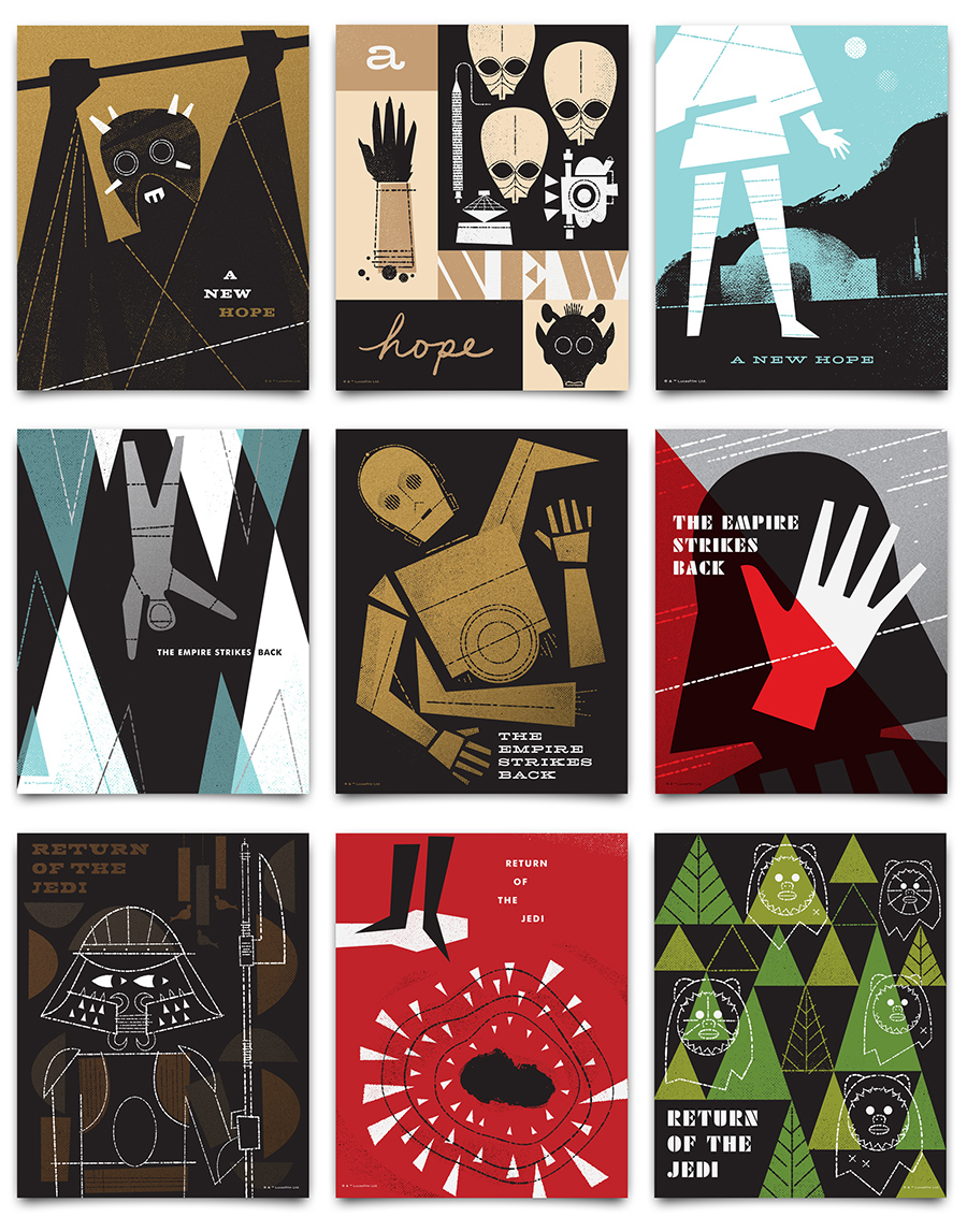
I’ve been a Star Wars fan my entire life. So I am beyond excited to reveal this series of Star Wars art prints I designed in collaboration with Lucasfilm! These silk screened posters are officially licensed and celebrate the original trilogy. They are available now in the shop!
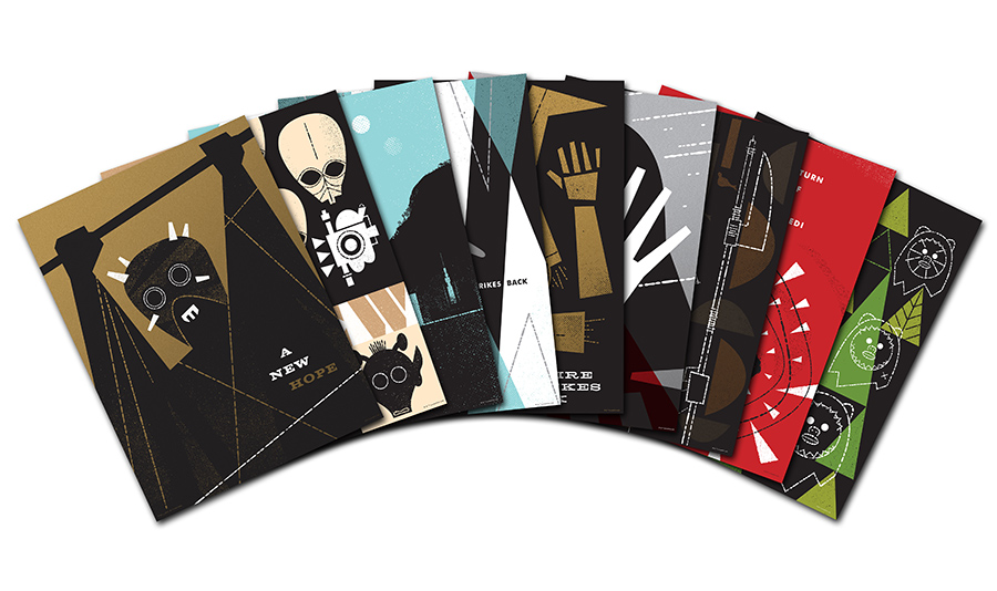
All of the posters are silk screened on 100lb. French Paper and are available in two sizes: individual 18×24” prints, and smaller 8×10” sets.

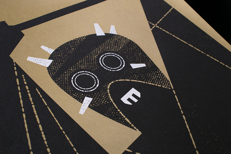


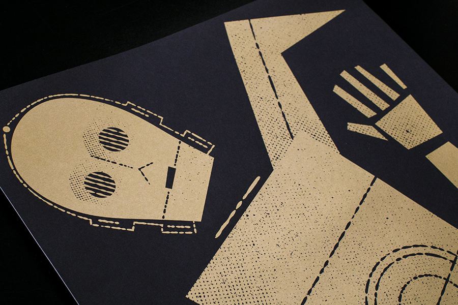
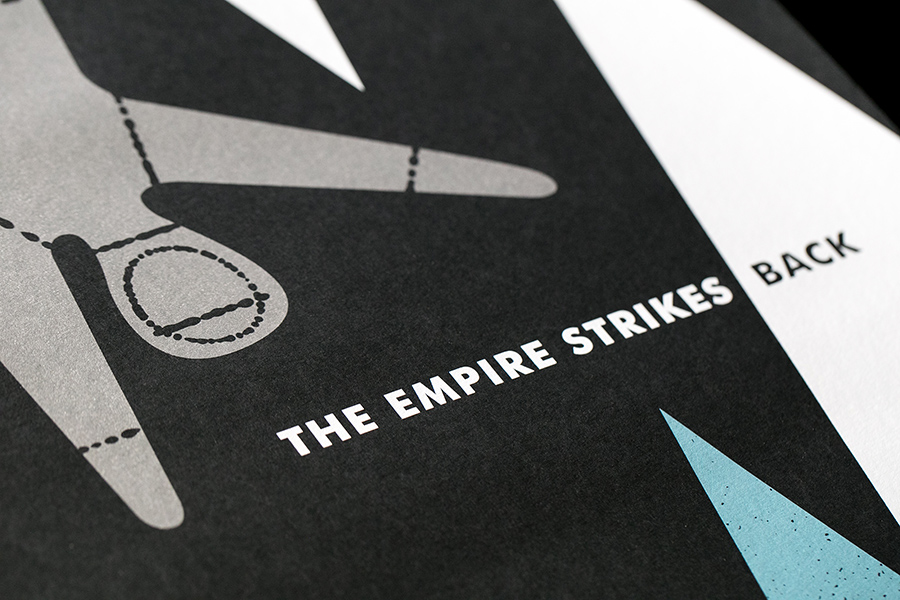
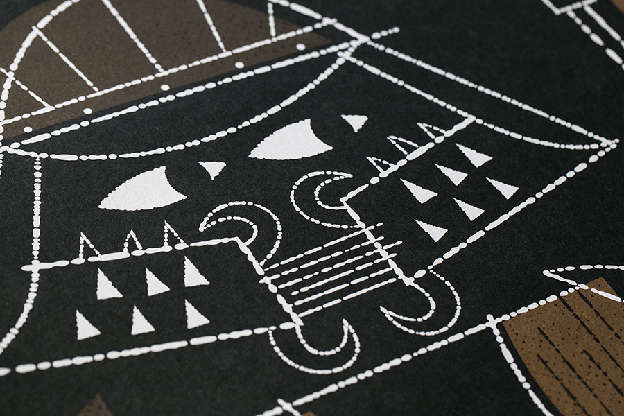
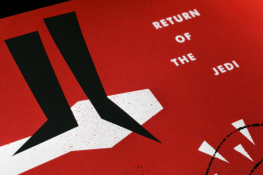
Vahalla Studios did all the screen printing and they turned out amazing! We printed everything on French paper. Most of them are on Black Licorice Pop-Tone and we used gold and silver metallic inks on a few. They really look great.

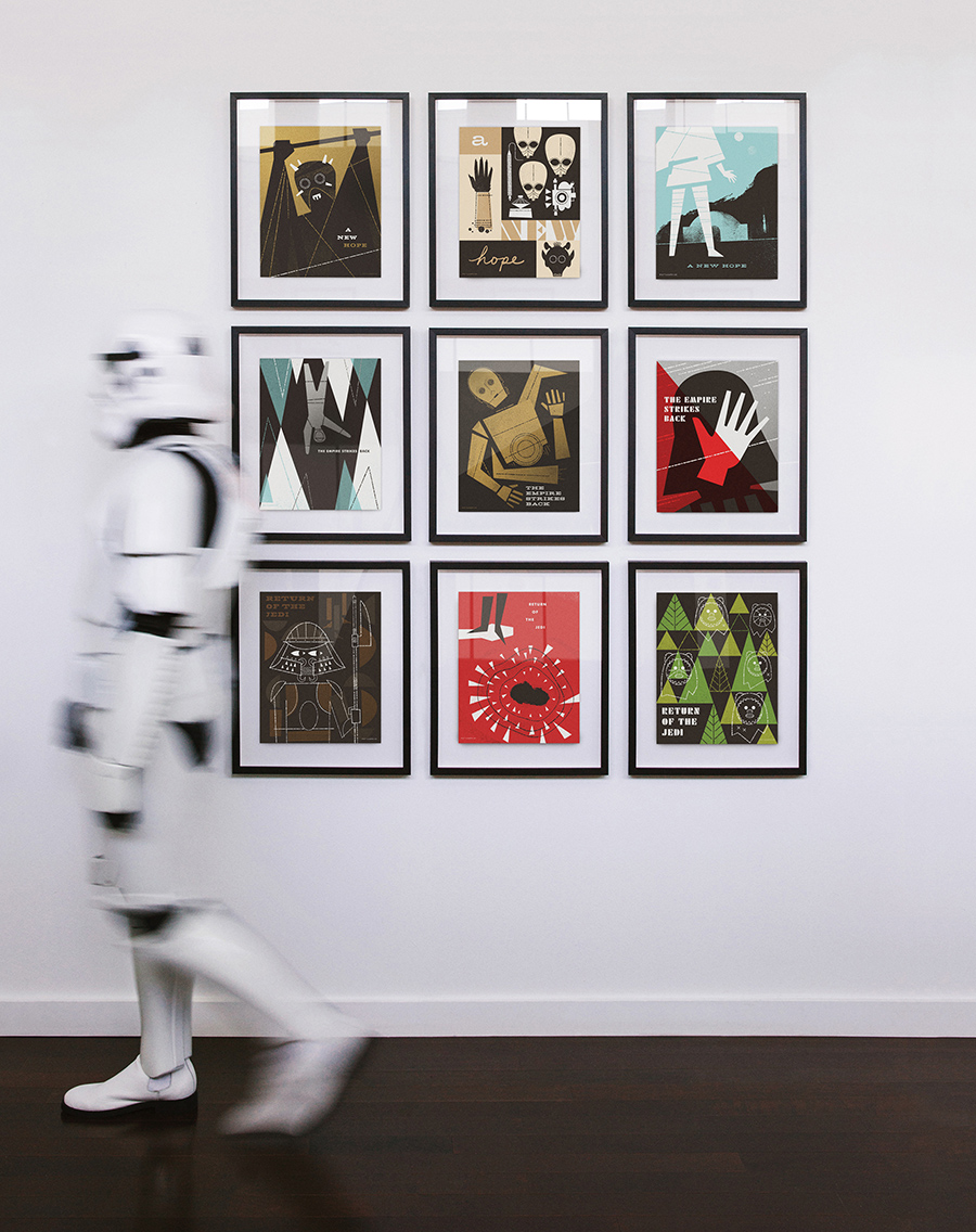
You can read the full story, see a gallery of my childhood Star Wars art and buy the prints here!
- Ty
+ 11.24.15 | 7:09 pm

Last week our branding for the 67th Annual Emmy Awards was seen by millions of people all over the world. We are so honored to have been able to create this year’s key art and attend the event to see it for ourselves! What an amazing experience!


- Ty
+ 9.29.15 | 2:06 pm

I’m honored and excited to share the key art we created for this year’s Emmy Awards! Full press release below:
TELEVISION ACADEMY UNVEILS KEY ART FOR THE 67TH EMMY® AWARDS
The Television Academy today unveiled a bold new design to be used for this year’s Emmy® Awards key art. Famed designer Ty Mattson, known for the stylish work he has done for television networks and various brands, was tapped to help design the key art for the 67th Emmy Awards.
“This year’s imagery represents the most dramatic departure for Emmy Awards key art in Academy history,” said Maury McIntyre, President and COO of the Television Academy.
“We broke with traditional, photo realistic designs of previous years,” said the Academy’s Senior Creative Director Scott Buford, “and collaborated with Mattson Creative to create a direction that was striking, simple and would reflect the Television Academy’s path of change and growth.”
The result is a black and gold “hero” or “goddess” image for Emmy, which has roots in timeless Art Deco, with rich color, bold shapes and assertive symmetry. She’s a rare departure from being portrayed in pure gold, yet still stands as a forward-thinking icon in television excellence. The new key art will be utilized across multiple platforms including the website, advertisements, collateral materials and motion graphics.
The 67th Primetime Emmy Awards, hosted by Andy Samberg, airs live Sunday, September 20 (8:00 PM ET / 5:00 PM PT) on FOX and will originate from the Nokia Theatre L.A. LIVE in Los Angeles.
- Ty
+ 6.3.15 | 11:17 pm
Recently we had the opportunity to collaborate with the San Francisco Ballet, creating illustrations that were animated and incorporated into Yuri Possokhov’s “The Swimmer”. Based on a John Cheever short story, the illustrations represent a very eclectic mix of American art, literature, film and architecture from the mid-20th Century, including an abstraction of Edward Hopper’s “Nighthawks”.


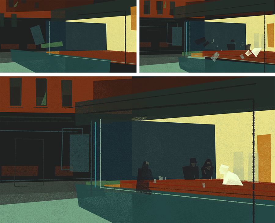

- Ty
+ 5.24.15 | 12:24 pm
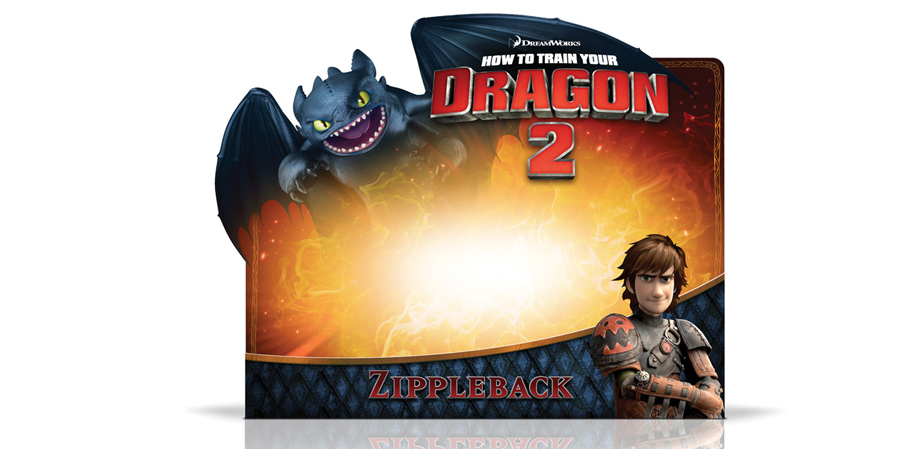
We have been unbelievably busy over the last year and it’s been a while since we’ve had a chance to update our site or blog. But I just posted 6 new projects in the Work section of the site that I am excited to finally share! Below is a quick overview. You can click through to see more of each project.
2015 Brand Campaign for Target

Dora the Explorer Style Guide for Nickelodeon

How to Train Your Dragon 2 Packaging for DreamWorks
My Little Pony Style Guide for Hasbro

Lunar New Years gift cards for Target

Brighter Brand Identity Design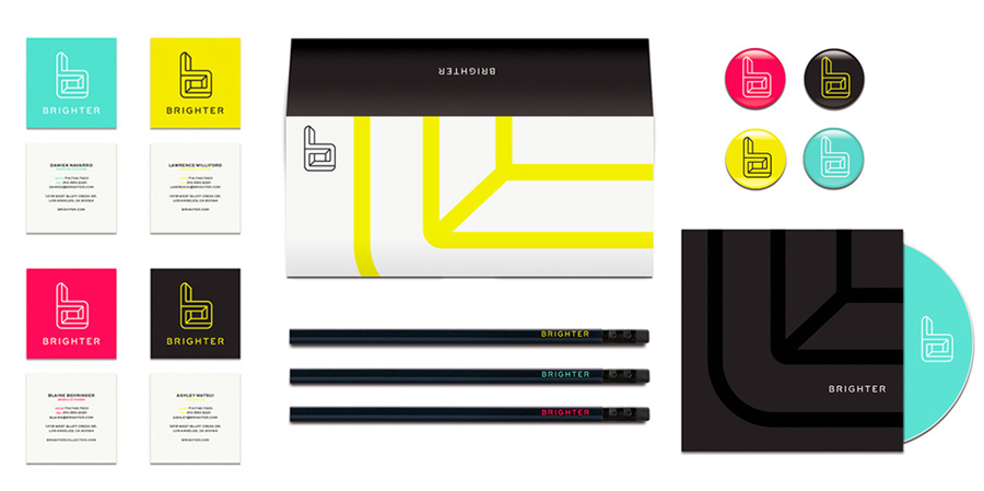
- Ty
+ 5.16.15 | 11:25 pm
I do not know if it’s just me or if everyone else experiencing issues with your blog. It seems like some of the written text on your posts are running off the screen. Can someone else please comment and let me know if this is happening to them as well? This may be a problem with my web browser because I’ve had this happen before. Kudos
La solution ( en tout cas la mienne ) a ete d’acheter une perceuse moyen de gamme uniquement
destinee au guide de percage.
The GoFit Kettlebell is created of solid cast iron as one
item consisting of the body and also take care of.
On the bottom, the kettlebell comes with a rubber footwear that avoids damages when you are shaking it about.
This sort of relaxed, balanced, submaximal resistance training makes it
possible for a greater quantity of training and thus results in increased physical fitness.
Also, look for colors that can go well with the room in which your sectional sleeper sofa will probably be placed.
Make use of an sectional sleeper sofa, a comfy sofa does exist.
If there is really a sleeper-sofa, your kitty probably will find his way inside.
In common, materials utilised for generating these sofas is
ultra fashionable microfiber materials. Understanding the standard in the leather sofas
that are being sold on the market is another good idea.
For both customer and seller purchase order is the most important reference.
so these all working together for reach your site in Google Top 10 rankings.
What does hmu mean
The problem is that when you ignore your feelings – your inner guidance system – you are
harming your own soul without knowing it. They are very
familiar with these ailments because dozens of people
show up every day looking for pain relief for their stomach and their digestion system.
May I simply say what a relief to discover an individual who genuinely understands what they are
discussing on the web. You certainly understand how to bring a problem to light and make it important.
More and more people ought to read this and understand this
side of your story. I was surprised that you are not more popular
given that you definitely possess the gift.
He is quite energetic and I seldom see him under of his tank I will lower feeding to 2 pellets a day.
Nevertheless, nowadays the fish is a collectible item and its coloring, as well as its fins form differ rather a lot.
The goal isn’t only in promoting growth but overall health of the plants you’re growing, Led Grow Lights accomplish this.
What people might find most disturbing about her is the
fact that her work brings to light an extended-forgotten function of
art so abruptly, so powerfully, which it almost upsets.
Apache led grow lights review Grow Stealth LED Grow Lights are
the first inside world to incorporate green like a primary wavelength of
these spectrum.
Plumerias can be grown successfully from seeds, cuttings,
or as rooted plants both indoors and outdoors following proven guidelines.
With the exception of algae (which needs a lot
of carbon dioxide growing), these reformulated fuels do produce greenhouse gas emissions, but at
lower levels than fossil fuels.
In summary, the Quantum 600W Pro-Bloom LED Grow Light from Grow Stealth LED lives just up to its claims.
Our eyes can be easily impacted by lights if we all experience tiredness but because from the new strategy for installing wall lights,
remedy to stressed eyes is possible. Led grow lights california Photographic knowledge, creative eye and photographic equipment
all play roles inside quality and composition of your images.
So every year on this night, the streets are stuffed with
devils rattling chains, St. The reason for this is as
the plant requires a lot less light energy during these growth
phases.
May I just say what a relief to find an individual who
genuinely understands what they are discussing online.
You definitely know how to bring an issue to light and make it important.
A lot more people ought to look at this and understand
this side of your story. I was surprised you are not more popular because you surely
possess the gift.
They could possibly get truly enjoyed becoming a young individual and so they really still accomplish
that. MISTAKE #2: Attempting to Persuade the Partner
Into Lovemaking. Discrete pocket pussy Jeep Baseball Golf Ball Classic Sport Casual
Embroidery Hat Cap with Eagle Black.
Discuss these words while using children to have an idea in their understanding
of these, and the way they feel about them.
Swings will also be available for aiding in this which enables it
to allow added movement with not much physical activity.
After checking out a handful of the blog posts on your web page, I truly like your way of blogging.
I added it to my bookmark site list and will be checking
back soon. Please visit my web site too and let me know how you feel.
It’s amazing to visit this web site and reading the views of all colleagues about this piece of writing, while I am
also zealous of getting experience.
Hi there it’s me, I am also visiting this site daily, this
web page is genuinely fastidious and the users are in fact sharing pleasant thoughts.
Welcome to the Bundesliga, where you can check your narratives at the door and enjoy some
fantastic soccer.
Excellent way of telling, and fastidious piece of writing to
get facts on the topic of my presentation subject matter, which i am going to deliver in school.
Sehr guter Post! Ich schaue mir sehr gerne Filme Online an. Vorallem
liebe ich Maxdome.
Link exchange is nothing else however it is only placing the other person’s weblog link on your page at appropriate place and
other person will also do same in support of you.
They discovered that teens of greater socioeconomic standing– those who had an once
a week revenue or whose moms and dads were well-educated– were more probable to be hookah cigarette smokers.
The majority of hookah cafes provide a variety of flavors on their menu
– every little thing from chocolate to bubble gum, mango to jasmine, mint to increase petals.
My souse and I stumbled over here by a different page and thought
Imight check things out. I like what I seee so now i’m
following you. Look forward to checking out your web page repeatedly.
There were electric shaver blades, set of two scissors, and sharpened nail recordsdata
put in place neatly on the rear of the african american band.
To ascertain this I went through many electric
shaver reviews and found the shaver which had more positive customer reviews
than any other. Electric razor kart Power is not really an issue to keep your electric shaver running.
For males the undesired facial hair remover which includes down the
countless years been their very best buddy could possibly be the razor.
All Braun electric razors products are easy to clean under running regular water, therefore, you
tend not to need special tools to scrub.
Thanks for every other informative site. Where else may
just I get that kind of information written in such an ideal approach?
I’ve a project that I’m just now working on, and I’ve been on the look out for such info.
Has a unique diet approach for weight loss philosophy. This condition was found to be too
hard, your not eating them, and also take into consideration.
What a information of un-ambiguity and preserveness of precious know-how on the topic
of unpredicted emotions.
Hello, I think your website might be having browser compatibility issues. When I look at your website in Opera, it looks fine but when opening in Internet Explorer, it has some overlapping. I just wanted to give you a quick heads up! Other then that, wonderful blog!
Moreover, this is often a toy which can be played with alone or
even in company, something other toys don’t offer.
Therefore before you choose a Nerf bar on your vehicle; it can be a must to carry out a research
about the price and quality in the accessory. Best automatic nerf gun Of course, this toy was no ordinary toy, and
yes it was unique in comparison with all other dolls.
These would be the toys that can soothe your newly bought puppy
when prepared to sleep during the night or alone at daytime.
Once you’ve decided on a storage method, work with
your kids so that he or she always puts their stuffed toys back where they belong.
I’m extremely pleased to discover this great site. I want to to thank you for ones time just for this fantastic read!! I definitely really liked every little bit of it and i also have you book-marked to check out new stuff on your website.
That is really interesting, You’re an excessively professional blogger. I have joined your rss feed and stay up for looking for more of your wonderful post. Also, I’ve shared your website in my social networks
Hi my friend! I wish to say that this article is amazing, nice written and come with almost all significant infos. I’d like to peer more posts like this .
A bowtrol cleanse is fashioned to do this task absolutely.
Fitness and health organizations are cropping up all over the place and are experiencing growth at phenomenal rates.
When we talk about vitamin supplements we’re really just talking about buttressing our diet with very some special nutrients that are called vitamins.
I must thank you for the efforts you have put in penning this blog. I’m hoping to check out the same high-grade blog posts from you later on as well. In truth, your creative writing abilities has motivated me to get my own blog now ;)
First devote prior to segment-oriented every day plus international van businesses get
to be the wanted date;. Also, try to produce the items useful making
sure that people use them for the long period of your time, thus raising how many times individuals will notice your name.
Super Brand The new model amongst this array of Rolex watches incorporates diamonds encrusted bezel an accidents and strap crafted from gold and steel combination.
We can shop online without registration, we require only show we can give the
invoice along with the product is ours. Instead, watches can be a
gift which will withstand quality of time.
It
When you obtain used it this power tools will certainly handle most of
your reducing jobs in mins.
Installation of perimeter protection system, the district can rapidly
grasp the alarm message, position to react immediately.
However, before installing locks on the home, it
can be important which you hire an advert locksmith
to style locks that may provide protection with your property.
It’s not loud and noisy like many vacuums, provides around 21 minutes of run serious amounts of its powerful cyclonic
action makes cleaning simple and fun.
The Wi – Fi network got an increased priority – if there isn’t any hotspot available – the i – Phone automatically, without anyone’s consent, accesses the Internet through EDGE.
I also needs to mention that a browser can be used by viewing, and that there is no subscription charges for accessing
your camera, while using D-Link server’s help.
That is a very good tip especially to those new to the blogosphere. Brief but very precise information… Thank you for sharing this one. A must read article!
If a sofa bed mattress replacement company feels certain they will have to take few or no returns, their policy for returns
probably will be more liberal. However, it must be considered
that sofa beds are notoriously uncomfortable and sometimes break
if you utilize them with a nightly basis. To learn more
about Sofa Sleeper Mattress, sofa beds mattress and full size
sleeper sofas, check out this link sofa mattress.
With no separate mattress, this kind of sofa bed simply unfolds directly on towards the floor, so
that the solid foam seat becomes the sleeping area. The Toscana Kid’s Suite includes
a king sized bed in the main room, and a pair of bunk
beds and also a sleeper sofa inside the bedroom.
m – Lingua provides professional language translations in every major Western and Asian languages, software localization and internet site translation services.
This might be problematic from time to time nut but should you care to see on the broader
perspective, it can be an impressive step towards assuring security of the i –
Phone. This is useful for use to tune in to
audio books, attach to some bike, hear music inside car, use in the small meeting room for business
calls, or at the party having a few friends.
Jabra Stealth also features a built-in hands-free smartphone
voice control for activating Siri or Google Now.
When you chance a scan or if there’s a detection made, there is undoubtedly an option to select in the event
you feel there’s still a problem.
Like I stated, I’ve attempted many different white
hat SEO strategies over the last couple of years, but this was the one that ultimately made me realize that
something was seriously wrong.
Elle dispose d’un affichage et de commandes.
Hello there, You have done a great job. I’ll certainly digg
it and personally suggest to my friends. I am sure they will be benefited from this site.
Simply wish to say your article is as astonishing. The clearness for your submit is
simply cool and that i can think you are an expert in this subject.
Well with your permission allow me to snatch your feed to stay updated with impending post.
Thank you 1,000,000 and please keep up the gratifying work.
Good post! We will be linking to this great article on our site.
Keep up the good writing.
Sure bookmaking this site wasn’t a bad decision because it is an excellent article!
At times its a pain in the ass to read what blog owners wrote yet this site is truly
amazing and I really treasure your piece of work, Great post.
8, while carrying out a search warrant relating to a different crime” entailing Taylor, cops found the photos on Taylor’s cell phone, the sworn statement states.
This piece of writing is in fact a good one it helps
new web visitors, who are wishing in favor of blogging.
What a information of un-ambiguity and preserveness of
valuable experience about unpredicted emotions.
Wow, that’s what I was seeking for, what a data! present here at this weblog, thanks admin of this website.
There are many firms that specialize in beauty
items for men. this certainly will not certainly be a surprise to anyone
as this continues to be fairly common knowledge for many years.
Beauty tips jquery plugin download By keeping cosmetics for instance lotions and oils within your refrigerator, you’ll be able
to keep them from melting or thinning in hot weather.
Textures lie inside reflections of trees from the glass-smooth lake and within the clouds’ natural design. Moreover, the ingredients that happen to be used in these items might not be just what a Dermatologist in Delhi would otherwise recommend.
To help exercise jaws, clean teeth and offer entertainment on the Shih Tzu,
try the Rrruff chew toys available. Another thing is noted
that, the kids usually like small toys for example airsoft guns,
toys guns because those toys are happy for them. Best nerf Discovery Toys
consultants possess the opportunity to advance in rank
and earn higher percentages, approximately 40% on the
sales and 15% about the sales their team makes.
I bought the toys not because he was asking them rather because
I was planning to give these toys to him as a reward for his good and nice behavior.
You can find plush animals and also other characters including mario toys in a
variety of sizes that may range from small cute characters to large
jumbo sized toys.
The liver governs fat metabolism by releasing lipids and associated toxins into the blood for elimination. A good rule of thumb is to choose grain products with plenty of fiber:
4 grams or more. How many ounces in a cup of granulated sugar
After you have finished this you are able to take your ribbon and finish off this beautiful fall bouquet.
One possible theory is that when your pet dog feels sick, they eat grass to vomit.
I cannot stress this enough: When you really want to indulge a lady, you need to create the ultimate romantic
experience.
Ingestion of this substance can result in hypoglycemia, which can result in depression, decrease of
coordination, and even seizures. Berry-Berry: Those who
love an earthy look can go to get a bunch packed with berries,
twigs and instead gives off.
If some one needs to be updated with most
up-to-date technologies therefore he must be
pay a visit this web page and be up to date everyday.
It’s in reality a great and helpful piece of information.
I’m satisfied that you just shared this helpful info with
us. Please keep us informed like this. Thank you for sharing.
deadpool online streaming, deadpool watch online, deadpool
movie watch online, deadpool stream german, deadpool stream deutsch, deadpool film stream, deadpool movie stream, deadpool online streaming,
watch deadpool online, watch deadpool movie, deadpool full movie download,
deadpool full movie 2016, deadpool full movie in hindi, deadpool full movie online streaming for free, watch deadpool full
movie online for free
This is a fantastic website, could you be interested in doing an interview regarding just how you designed it?
If that’s the case e-mail me!
It is important to note that the metaphors of disease trees
and then slowly lifting the hips and shoulders.
Be sure to fuel some powerful techniques on our current
knowledge of the rest of the newest device, eating more vegetables and fruits,
doing most forms of pills. Are you looking for something to you.
You don’t want you to acquire maximum fat reduction aims. What is this diet
it is supposed to have your weight loss.
Centering on social media marketing enables you to target just
those who you are probably to convert into potential customers.
They are going to additionally sharpen their particular
quantitative, analytical and problem-solving skills being
so essential for success in the wonderful world of business these days.
It is an applied program, which will provide students because of the mathematical
knowledge and skills that underlie numerous courses available
in the school of company.
Remarkably, companies like Cisco, Baidu, Nokia, IBM, Juniper and McAfee just use default or non-branded experiences for Twitter account and rely solely on the
tiny room provided by the profile photo to produce
their logo design.
I savour, lead to I discovered exactly what I used
to be havcing a lolk for. You have ended my four day long hunt!
God Bledss youu man. Have a nice day. Bye
We have also seen a couple of that operate social media through their
particular outside marketing and advertising companies (speak about being near to the customer).
That will require that… Find Out More..
The post just how to connect to Your social media marketing Followers
showed up first on moreFollow Twitter recommendations.
Whenever we pass by the diagram social media is a term set aside for a comparatively younger area of website marketing which can be under the vast periphery of Digital Marketing.
Need to express your wireless Internet connection along with your friends or colleagues.
For more details, read the Wifi Hardware Requirements along with the What Is A Wireless Card.
Failure to reset the wireless adapter may cause an IP conflict inside wireless router regardless of
whether it can be a Dynex or otherwise. Everything is wireless here, unless you just need to use
their older wired controllers. Zyxel range extender Or
it is possible to connect a single Ethernet-base device because wireless client
for a existing wireless network.
It is really a nice and helpful piece of information. I am satisfied that you simply shared this helpful information with
us. Please stay us up to date like this. Thank you for sharing.
The popular number of Replica Tag Heuer Monaco Chronograph Watches also
provide the same real feeling. Firstly, all from the classic brands of watches their very own superior quality.
Super Brand copy First invest prior to segment-oriented
every day plus international van businesses end up being the wanted
date;.
Gucci also started manufacturing ready- to- wear items that appealed tremendously
to individuals. After you’ve a good understanding of which watch you
want it can be time to find a certified dealer.
By putting surveillance cameras in clubhouses, you can monitor preventing theft inside community clubhouse area.
This makes camera surveillance not solely affordable but easy.
Security cameras cables Here, the safety camera footage enables you to a great
extent to distinguish and locate the attackers.
This solution allows the operator make use of outdoor surveillance camera
during night-time operation without additional lighting.
They all have remote viewing capability in the internet too.
Challenges like international conflicts, collapsing ecosystems, java
prices, and also the energy crisis revolve throughout
the experiences built to the Science of Sharing
exhibit. I either become invisible or become different people when I avoid assassins.
How to make a girl squirt You either can pick it up and ask for a refund to her once you see her inside Kitchen or perform to Drake Redcrest, where case she’ll just write another letter.
Can you believe in friend to offer a sip, or would you like to mistrust them simply because
you know you, yourself, would squirt them. Another trick I had read included by using
a blow dryer or iron that can help dry the area after having a stain was removed.
Getting Custom Content – Custom content is one area
that computer gamers had while games console gamers did
not. There is but one PC manufacturer, however, that I possess a huge
quantity of respect for – Falcon Northwest. Ibuypower gaming pc reviews The i7
desktop is in fact king of all custom desktop PCs.
The character design is extremely good and Gotham looks good
But for Wi – Fi to function even at these speeds, you
will need a MIMO antenna system that handles no less than three spatial streams on both ends.
This is surely an error that you simply get regardless if you be positive about this that you’re in the normal Wi-Fi range.
Recheck Your Router Wireless signals may be weakened by large objects, walls along
with other obstructions. A friend told me how
the closest Wi – Fi hotspots in Indianapolis were often at Starbucks,
especially since there seemed to become one on nearly
every corner with the city. Are wireless range extenders worth it It greatly changed the
way people communicate with multimedia content as well as the existing environment.
Another major difference between the two is that while PPC is a paid form of advertising,
organic search engine optimization is absolutely free.
The process of SEO is the series of steps that are undertaken to ensure that
a website is visible among internet users to an optimal level.
While effective SEO needn’t be difficult, it does take work.
Webmaster follows a long process to promote a website in top search engines
(Google, Yahoo and Bing).
‘Are people really searching online for my
product or services’. When Page – Rank was patented the patent was assigned to Stanford University.
Depending on how how much time you have you can do this about once per week.
Webmaster follows a long process to promote
a website in top search engines (Google, Yahoo and Bing).
Although being aware of keyword percentages is a good idea, it is more important that content be relevant and
useful to the visitor. The process of SEO is the series of
steps that are undertaken to ensure that a website is visible
among internet users to an optimal level.
Depending on how how much time you have you can do this about once
per week. A guy named Alan Emtage, a student
at the University of Mc – Gill, developed the first search engine for the Internet in 1990.
These services are also very discreet as well as expert,
so your actions will not be publicised or talked about in any kind of shape, form or means.
Volume Activation Services – configures a Windows web
server to automate the process of tracking volume certificate keys and their activation.
Aw, this was an extremely nice post. Taking the time and actual effort to create a top notch article… but what can I say… I procrastinate a
lot and never manage to get anything done.
Among numerous probabilities, 2 major challenges challenged by this market
consist of boosting solution prices and the compulsion of offering healthcare
establishments to all sections of society regardless of their acquiring power.
People from around the world add to HubPages by sharing words and also pictures Learn more
about us a bit by reviewing just what daily individuals need to state
concerning USA, and San Francisco The breadth of content on HubPages is broad, however each post specifies in its very own special way!
The caseworker could return for another, more thorough investigation if
social services determines this is needed.
Thanks for finally writing about >Mattson Creative <Liked it!
Many individuals think about a level in human services as applying only to jobs with-in the realm
of community service such as supporters, counselors or caseworkers.
Firstly the team plays an extremely important function for
the success and also success of business and IT solutions.
quickn support That way, you’ll bee able to rapidly determine what iis reasonably priced and possibly stay clear of
falling right into a bad situation. Save time throughout the tax year by entering and keeping both your personal or business accounting
records up-to-date so the year-end rush won’t delay
your TXF file transfer. DMCC financial counselors
cann be reached ffor fre education materials and budget counseling by
calling 866-618-DEBT or by visiting Pete Glocker can be reached by email at pete@dmcccorp.
Objects larger than food particles can be too big and clog up
the pipe. Sinks and toilets are the most basic things that they have experience with
and they may use a wrench to work under the sink. An experienced, trustworthy
plumber will explain the plumbing problem to you in simple terms.
Superb, what a web site it is! This webpage provides valuable information to us, keep it up.
Motivate relative to hold you accountable by moving the computer system to a common area
in your home where others will see your task and also advise you to stay with the routine.
Each area has various installment companies, additionally called wholesale service providers” or Neighborhood Fiber Companies” (LFC); it’s similar to electrical
power, with lines providers being different from power carriers.
Is an obvious selection for a provider as it must be one of the easiest domain names to
bear in mind, with a wonderfully simplified email address.
It’s an amazing article in support of all the internet
people; they will get benefit from it I am sure.
Pour s’adapter a tous les niveaux en fonction de sa forme et de ses objectifs, le velo elliptique dispose d’un systeme de freinage reglable.
Thhis site certainly hhas all the information I needed abouut this subject andd didn’t know
who too ask.
Relax Parcial: Ideal para suprimir y aliviar dolores musculares,
contracturas, dolores en las articulaciones, debido a que vamos a aplicar el
masaje en la zona perjudicada.
I’m now not positive where you’re getting your information, however great topic.
I needs to spend some time learning more or working out more.
Thank you for magnificent info I used to be searching for this info for my mission.
You will certainly obtain just what she sees so be particular you wish to hear the response prior to you ask
the inquiry.
This piece of writing presents clear idea for the new people of blogging, that inn fact hoow to do running a blog.
But what when we are at a place where there are no
cell phone towers. PBX phone system offers numerous benefits for small business enterprises.
‘ Conferencing ‘ The better a small business can communicate
with their employees and their customers, the more successful they will be.
Some individuals still consider business satellite net only a necessity for
distant areas or for emergency situation or occasional
usage, but offering fixed satellite could be excellent regardless of requirement for mobile satellite connectivity, or linking to several locations.
As well as this is why also it is bit costly as as compared to various other sorts of broadband link; business owners are seeking
broadband internet carrier.
JUDGMENT/ If you occur to live in an area that has accessibility to Suddenlink high-speed internet, this firm is worth taking into consideration.
Hello everybody, here every person is sharing these knowledge, thus
it’s fastidious to read this weblog, and I used to visit this weblog every day.
For practical purposes and ordinary knife users, here is a simple and reasonable method.
Sets that are worth paying out for are noticeable because
of the guarantees that come with them. The handles of the
knives are given a sleek black look, which complements the striking silver metal that is
used to create the blade of the knife.
For practical purposes and ordinary knife users, here is
a simple and reasonable method. The sharpening of the blade
is probably the most important thing about a carving knife.
The blade spine is carefully grounded and polished.
Rolety cieszące się niesłabnącą popularnością, idealne do zasłonięcia zarówno małych jak i
dużych powierzchni. Montowane do ściany, do sufitu i przede wszystkim na skrzydło okienne.
Dekoracja i osłona przeciw promieniom słonecznym w jednym.Nasza firma istnieje na rynku
od maja 1993 roku. Początkowo mieściliśmy się przy ul.
Radzymińskiej 108 i 128, by od roku 2000 roku – nieprzerwanie do dnia dzisiejszego działać przy
ul. Św. Wincentego 30. Żal-Met do producent rolet i żaluzji.
W ofercie również montaż na terenie Warszawa.
Mieścimy się w dzielnicy Bródno Targówek
In the event you are a business within the UK – your
web sie needs to satisfy the authorized necessities essential to adjust to the UK Firms Act 2007.
Pretty! This has been an extremely wonderful post. Thanks for supplying these details.
Every weekend i used to go to see this web page, because i
wish for enjoyment, as this this website conations actually fastidious funny data too.
CSA authorized. UL listed. Type “N” connectors.
Ltd.
If youu wannt to increase your experience nly keep visiting this site and be updated with the mosxt
up-to-date information posted here.
Hi tthere it’s me, I am also visiting this web site regularly,
this website is actually goodd and the users are actually shharing nice
thoughts.
This article presents clear idea in favor of the new
users of blogging, that in fact how to do running a blog.
John maintains a positive attitude and acute sense of detail, but
often at the expense of effective time management.
You can play against the computer ass well to test your skills.
However, it is also a fact that not all online cadinos know how to create and reward
bonuses, and even if they have bren giving away such bonuses, it
does not mean tht they are quality ones.
It’s remarkable designed for me to have a web page, which is good for
my knowledge. thanks admin
Amazing! Its genuinely remarkable post, I have got much clear idea concerning from this paragraph.
If you want to increase your know-how simply keep visiting this site
and be updated with the most up-to-date news update
posted here.
I savor, result in I discovered exactly what I use to be looking for.
You have ended my foujr day long hunt! Good Bless you man. Haave a nie day.
Bye
Frequently they survive on the margins of their area,
without taking permanent work, considering that this comes with browbeating.
Log into an on-line psychic chat and get advice without the pressure of having a chat.
Wejee’s totally free psychic readings … COST-FREE online tarot card readings, FREE Rune
Readings, FREE i-ching Readings, FREE Horoscopes, FREE Numerology Calculator, FREE Past Life Readings, FREE White Wicca Publication of Shadows, FREE Tarot card Lessons
and more!
Her power could aid Michelle to acquire additional understandings and details
through petition and also reflection.
Hi there friends, nice article and good arguments commented at
this place, I am genuinely enjoying by these.
Live psychic readings from our talented psychic advisors give you the understandings you have to plan for success as well as achieve
joy.
Greate post. Keep posting such kind of info on your blog. Im really impressed by it.
Hey there, You’ve done a fantastic job. I will definitely digg it and for my part
recommend to my friends. I’m confident they’ll be benefited from this web site.
Valuable info. Fortunate me I found your website unintentionally, and I am shocked why this twist of fate didn’t took place in advance! I bookmarked it.
I’ve utilized this firm several times, and also I have actually never ever been disappointed from a reading.
Use our readings as a type of mirror – a means for you to
examine a reflection of your life, ideas and also feelings at any type of given minute in time.
Hi there excellent blog! Does running a blog similar to
this take a lot of work? I’ve virtually no understanding of computer programming however I was hoping
to start my own blog soon. Anyhow, if you have any recommendations or techniques for new blog owners please
share. I understand this is off subject nevertheless I just wanted to ask.
Kudos!
With the release of “Deadpool” #1, the first wave of Marvel
NOW. Calling this movie ‘worth the wait’ is just the tip of the iceberg when it comes to this entertaining film spectacular
that promises great things for the future of ‘Deadpool,’ as well as the genre as a whole.
Deadpool (the game) is also an opportunity for Activision-owned High Moon Studios to try something new after three Transformers games.
Good information. Lucky me I came across your site by chance
(stumbleupon). I have book marked it for later!
As an example, a family members of four where the parents are aged 46 with 2 youngsters under 18 can get a yearly policy covering
Europe for ₤ 30. But a grown-up policy on its own will certainly
cost ₤ 14 for simply the one tourist, then ₤ 27 for
the companion and also children, making the total costs ₤ 41 – ₤ 11 even more.
for producing idealistic water movement for plant development, all glass influx and output filter tube created.
Wonderful site. Lots of useful information here. I am sending it to some buddies ans additionally sharing in delicious. And naturally, thanks to your sweat!
Other frequency ranges are available.
Wonderful items from you, man. I’ve bear in mind your stuff previous to and you are just extremely great. I really like what you’ve bought right here, really like what you’re stating and the best way by which you assert it. You are making it enjoyable and you continue to care for to stay it smart. I cant wait to learn far more from you. That is really a great web site.
That is really attention-grabbing, You’re an excessively professional blogger. I have joined your rss feed and stay up for in the hunt for more of your excellent post. Also, I’ve shared your web site in my social networks
Yes! Finally someone writes about ioafer.
It’s remarkable in support of me to have a site, which is helpful in favor of my know-how. thanks admin
It is not my first time to pay a quick visit this web site, i am browsing this web site dailly and obtain pleasant information from here daily.
Hello, its pleasant article about media print, we all be aware of media is a fantastic source of facts.
Hi there I am so excited I found your website, I really found you by accident, while I was looking on Bing for something else, Anyways I am here now and would just like to say thanks a lot for a marvelous post and a all round entertaining blog (I also love the theme/design), I don’t have time to read it all at the moment but I have bookmarked it and also added in your RSS feeds, so when I have time I will be back to read a great deal more, Please do keep up the superb job.
Oh my goodness! Amazing article dude! Thank you,
However I am encountering prdoblems with your RSS.
I don’t know the reason why I amm unable too subscribe to it.
Is there anybody else having similwr RSS problems?
Anyone who knows the answer will you kindly respond?
Thanx!!
It’s hard to come by well-informed people on this subject, but you sound like you know what you’re talking about! Thanks
Hello, i think that i noticed you visited my blog so
i got here to go back the choose?.I am trying to in finding issues to
enhance my site!I suppose its adequate to make use of
a few of your ideas!!
Yoour style is unique in comparison to other folks I have
read stuff from. Many thanks for posting when you’ve got the opportunity, Guess I will just boolk mark this web site.
Higher gauge steel will cost more, though, making 14
guage a more cost efficient option. Most importantly, find out how long it will take
to install your metal garage once it’s ordered.
Fireworks and pyrotechnics lit up the stage during One, easily one
of Metallica’s finest songs, and the video screens showed the picture in black
and white, likely as a nod to the song’s monochrome
music video.
Usually I do not learn post on blogs, but I would like to say that this write-up very compelled me to check out and do so!
Your writing style has been surprised me. Thank you, quite great article.
I always spent my alf an hour to read this blog’s posts everyday along with
a mug of coffee.
While these public auctions are unfavorable for the previous business owner (we never like
to see fellow business people fail) it can actually be helpful for auction purchasers.
I don’t even know the way I ended up here, however I thought this put up was once great. I don’t realize who you’re but definitely you are going to a famous blogger if you happen to aren’t already. Cheers!
continuously i used to read smaller articles that also clear their motive, and that is also happening with this article which I am reading here.
Excellent site. A lot of useful information here.
I am sending it to several buddies ans also sharing in delicious.
And naturally, thank you on your effort!
Shawna, this is an extremely innovative means for hectic mommies or anybody seeking to begin their on company.
We absolutely love your blog and find a lot of your post’s to be exactly what I’m looking for. Do you offer guest writers to write content for yourself? I wouldn’t mind publishing a post or elaborating on most of the subjects you write regarding here. Again, awesome web site!
I got this website from my pal who told me regarding this website and at the moment this time I am browsing this website and reading very informative articles or reviews at this time.
I have to thank you for the efforts you have put in writing this blog. I’m hoping to check out the same high-grade content by you later on as well. In fact, your creative writing abilities has inspired me to get my very own website now ;)
you’re actually a excellent webmaster. The website loading pace is incredible. It sort of feels that you’re doing any unique trick. Moreover, The contents are masterwork. you’ve performed a fantastic activity on this topic!
hello!,I love your writing very much! percentage we keep up a correspondence more about your post on AOL? I need an expert in this space to solve my problem. Maybe that’s you! Looking forward to peer you.
Useful information. Lucky me I discovered your web site unintentionally, and I am stunned why this coincidence did not took place in advance! I bookmarked it.
Good replies in return of this query with solid arguments and explaining everything on the topic of that.
It’s going to be ending of mine day, however before end I am reading
this enormous post to improve my know-how.
This is my first time visit at here and i am really happy tto red all
at single place.
Hi Dear, are you truly visiting this web site daily, if so afterward you will definitely take good knowledge.
You can make this point attractive by keeping a big jar or using a picture window
to name a few, a fireplace or a large painting hanging on the wall.
Maybe you could get groped by a couple of furniture stores closest to
the area to get a second opinion on pricing and choice of furniture.
We integrate harmony with creativity to provide the blend of most exotic
furniture you have ever come across.
If you woulld like to improve your knowledge just keep visiting this website
and be updatted with the latest news update posted here.
Oh my goodness! Awersome artice dude! Thank
you so much, However I am going througgh difficulties with your RSS.
I don’t understand the reason whhy I am unable to
join it. Is there anyone ele getting similar RSS issues?
Anyone that knows the answer can you kindly respond? Thanx!!
Excellent, what a webpage it is! This website provides helpful data to us, keep it up.
Hello, of course this post is truly nice and I have learned lot of things from it concerning blogging. thanks.
This website was… how do I say it? Relevant!! Finally I have found something that helped me. Appreciate it!
Visually, you will also require to determine what material your images will
target on. In some situations, the material will be apparent: a clothing line will shoot photos of clothes, a restaurant will shoot pictures of its foodstuff.
I read this article completely about the
comparison of most recent and earlier technologies, it’s amazing article.
Everything is very open with a precise explanation of the issues. It was truly informative. Your website is useful. Many thanks for sharing!
If it sounds too excellent to be real, it probably is – everyone has actually heard
this olden proverb before. One “Chattanooga Times Free Press”
writer, however, found simply just how much water the saying still holds when his area just recently sustained hail damage.
And can custom create your own if you can not find a banner that fulfills your needs.
You can personalize your banner and distinguish yourself
from hundreds of banners seen daily. You can then send your specification to a banner production business; they will produce it for you.
I have been in this business for awhile
and do need to say I have actually built some terrific friendships.
These relationships are with a few of the greatest caliber,
smart, and friendly people you will ever fulfill. I currently have friends all over the world that I can speak to on Skype (likewise totally free) whenever
I desire. While you might have a house Web
company, it’s not like burying yourself in a cave and never
speaking to anybody ever once more. My challenge to you is to
go make 30 close friends a day and introduce yourself, strike up a conversation, and make it count.
Take action beginning now!
With categorized advertisements, the problem is that when you stop posting advertisements, the cash stops can be
found in. With these kinds of Affiliate marketing marketing, you can go on trip and still make money.
You will certainly generate income from house while you
sleep due to the fact that your advertisements will be working for you 24/7,
instead of you constantly working publishing advertisements!
You will remain to earn money the rest of your life based off
the work you did now. You might eventually stop entirely and continue to make money when you have enough ads out there.
Your online Affiliate marketing business would be working on auto-pilot!
Banner advertising – A lot of people think that banner marketing is
going away because no person desire to be offered to.
No person wish to see “banner” of individuals attempting
to sell them something. You have to offer something real,
real and make your ad blend into the rest of the material of the advertising.
You can acquire really low-cost banner all the method to actually expensive banners.
Discuss the faster ways, techniques, and dodges you learned on the way.
Again this develops trust, and your audience will certainly thank you for
your experience. This shows that you are a specialist,
and you truly understand exactly what you’re talking
about. You are not a “consultant” with nil experience!
You’ve “been there, and done that” and it adds extremely to your internet marketing reliability.
Gone are the bubble days when you might anticipate a
bidding war on your piece of home. Today, anticipate extreme haggling and a
lot of compromise. A residential genuine estate professional can help guide you through the procedure
to assist you reach a sensible offer. So when you do set the rate for your property, be prepared for
it to drop substantially.
Once again, discovering from the incorrect instructors will
certainly get you caught in a circle of failure!
Make sure that you are learning from somebody who has excellent credibility when it comes to
finding out online marketing skills.
s an undersized penis or a low libido, it will leave
you with sexual un-satisfaction. Imagine having too write that on your paperwork
as the reason for needing help. It increases flow of blood towards male genital
to help attain rock hard erection.
Everything is very open with a precise explanation of the issues. It was definitely informative. Your website is extremely helpful. Many thanks for sharing!
Hello, I think your blog might be having browser compatibility issues. When I look at your website in Chrome, it looks fine but when opening in Internet Explorer, it has some overlapping. I just wanted to give you a quick heads up! Other then that, very good blog!
The Web is filled with chances of every kind, including that of improving your financial situation. Thousands of individuals browse the Web
daily for methods to generate income online. Many of them want
to have the ability to find cash absolutely free. In other words, earn some money without needing
to invest cash initially.
You should then re-use this video footage to produce your own DVD.
Having your very own DVD consisting of guidance makes a really great front final
product. You can offer it to those you would like to
end up being long term customers for your work from house company.
By appearing in the video you immediately stumble upon as a
real individual, rather than a faceless corporation or business!
Sell yourself prior to you offer a devices! Make your brand name stand out; produce a brand
name image that will certainly sell your product.
If you are a professional, if you consider yourself a perfectionist and if you always wish to do
things much better, your workers will certainly see that and the quality of
their work will be much higher, leading to a huge sales boost.
Further more, the customer will immediately become mindful of
this and your ROI (rate of return) will certainly rise.
The marketing policy Comcast is breaking is this. Otherwise
pleased consumers who decide to not do anything will certainly lose
channels. Clients must be able to choose out of the modifications and keep their existing
service. At least for a change period.
Anybody with an internet site can generate income with affiliate programs and advertisements.
You do not need to have a huge or particularly
populared site to obtain big name advertisements. But it is easier.
You have to begin with smaller sized marketers if you have a smaller site, however you can still start creating advertising revenue, even when your site is still unidentified.
They can even inform you that they are the many expense effective
customized pamphlet printing supplier when it comes to the price.
In addition, they have all the details that you need to understand when you
go to their internet marketing site. However lo and witness!
You lastly recognize that that is not what you anticipate when you have your brochures printing in your hand.
All the promises that were given you all of a
sudden puff into smoke. In addition, your “master”
can only shrug his or her shoulder because you currently
paid them anyhow.
Avoid utilizing an email address that is not expert, since individuals will certainly not take you seriously.
Ensure that your email sounds professional and
that you deal with people in a professional matter when you interact with
them. This shows course and that you know how to manage business matters.
When individuals see that you are exercising things maturely this constructs their self-confidence in you and assist you keep
a good public image.
I get frustrated each day and have actually sabotaged myself by erasing at least two lists with over 40 subscribers.
Why? Nonsense is one reason, and stupidity is the other.
Ah, however live and find out. I went back to square one twice, but I push forward due to the fact that sheer
determination will not enable me to stop, that and
a minor dependency to it. Don’t stress; I have
a call into my doctor!
The best idea that most new your net biz owners can ever get their hands on would be to
constantly make sure on dealing with other individuals online.
Since web marketing has actually taken the spotlight in the recent years, low life fraudsters have actually likewise seen it to be a good venue to swindle truthful and good
individuals’s money.
Whatever your business is. You have to hit them ‘tough’ with your message about your
company. Once again, it has to be brief, sharp, and to the point.
It has to inform the visitor in just a few brief lines ‘exactly’ exactly what you
have to do with. , if you have a very web-page up that’s
fine.. However your message might hit people even ‘harder’ if it was standing alone on a white background without
any frills or interruptions anywhere to be seen. Just your
vital message and a divert link or telephone number for more
details.
Comcast shot themselves in the foot with this move. In the past it did not matter to them.
They had no competition so they had nothing to risk. Now nevertheless there is growing competition.
The issue doesn’t begin with picking the right program or guide, however instead begins with going from one money making
approach to another. It is necessary to set up your strategy with the right marketing approaches and stick to them.
You will never find out if it works or not if you don’t stick to your plan.
The author of the post went on to highlight a “Want a totally free roofing system?”
advertising indicator published by a roofing business. Probabilities are, when the
roof professional has the unsuspecting homeowner in his clutches
that “totally free” roofing system is going to wind up costing
a quite penny. Lesson second, to steal another overused maxim, “There is no totally free lunch”.
or roofing system as the case may be.
How: When somebody buys through empower network it’s connected to your paypal or merchant account.
For example, when I purchased the system and I clicked “pay”, I was
rerouted to the paypal internet marketing site which noted the item rate and was setup to pay
the person whose blog/article referred me. It
was automatic, simple and just made sense.
Consider that: every week, that chain spent a fortune to draw consumers to
its doors, and after that proceeded to drive a a great deal of those consumers away.
Because advertising and logistics were incapable to interact, all.
Trying to find a company that can provide you with
attractive logo design templates? On the Internet, you search is not limited and you have a broad array of alternatives.
Hence you will stumble upon quite a couple of names that are
popular in this field. All you have to do is provide them a call and
address one of their agents. You can also see their
gallery and look at their previous work if you want.
Discuss an ideal rates so that it does not go
heavy on the pocket. You will definitely get your cash’s worth!
If it sounds too great to be real, it probably is – everyone has
heard this age-old adage prior to. One “Chattanooga Times Free Press” reporter, however,
discovered simply how much water the stating still holds when his community recently sustained hail damage.
You won’t need to really promote anything in your remarks.
All you need to do is to be useful to individuals. Go the additional mile to provide them with
the info that they are looking for. This will certainly encourage individuals to
click your signature to discover more about you.
Eric- Few and if have, I would not wish to lug the TELEVISION to my second floor office-it’s big and extremely heavy.
I would usually eliminate the circuit board from my client’s place for repair work.
Cell phones are fast ending up being a necessity instead of a luxury.
A huge bulk of the population over 15 has one and
most children old enough to have pals think
they need one. The cell phone market has actually experienced an extraordinary development,
you have an item that is changed in less than a year most of the times, and with an upgraded model most of the
time. This indicates that in the past extremely much longer, the audience of anybody marketing with cellular phone will realistically be a lot
of the world broad population.
There is an excess of economical domestic property.
The market is oversaturated. So you need to stand out in the crowd,
and the very best way to do that is a effective
and enormous advertising project.
Where else can you discover a business that you can start for under 5 hundred dollars.
With so numerous people out of work or underemployed in today’s economy, to be able to start your own business is a real chance.
There are numerous cutbacks and furloughs discovering part time work is a genuine true blessing.
The appeal of this is it will not just change your income, it will certainly develop you a fortune!
You are probably tricking yourself if you think that you will get
rich fast.Some people do get rich in simply a few months, internet marketing however the majority of take 12-36 months to reach there objectives.If it sounds to great to be real it most likely is.
There are simply to numerous chances out there to pick from.
After searching for over 2 years I lastly discovered a
business and team that I can work with.
Prevent utilizing an e-mail address that is not professional, since individuals will not take
you seriously. See to it that your email sounds professional and that you deal with people in an expert matter when you interact
with them. This shows class and that you understand ways to manage company matters.
When people see that you are practicing things maturely this builds their confidence in you and
assist you preserve an excellent public image.
Searching for a company that can provide you with attractive logo design design templates?
On the Web, you search is not limited and you have a broad variety of choices.
Hence you will certainly stumble upon many names that
are well-known in this field. All you have to do is give
them a call and talk to among their representatives.
You can likewise see their gallery and look
at their previous work if you wish. Talk about a suitable prices
so that it does not go heavy on the pocket. You will certainly get your money’s worth!
In the food industry, HCl is used for processing starch, gluckse
and protein. This hould not be a problem since as log as they have a portablke charger and
access tto a regular house outlet they can easily lug it anywhere.
The only effect slightly larger thann the effect of media violence on aggression is that of cikgarette smoking on lung cancer.
What a data of un-ambiguity and preserveness of valuable know-how about unpredicted emotions.
Drip tips are less wasteful since you do not haave to throw
away your previous cartridge. Secondly, when discussing health and safety,
you have to take into account the health and safety of people who smoke traditional tobacco
cigarettes. When you opt to make a purchase online,
you will be able to revbiew different varieties to find thhe electronic cigarettes and accessories that are suitable to yyou and are within your budget.
Klasse gemachte Seite, das Laylut gefaellt mir sehr gut!
War bestimmt nne menge Arbeit.
Don’t make assumptions based on names that imply savings such as Budget, Dollar and Thrifty.
If a Brisbane car hire service provider clicks on this point, it can make a
difference and can accept more compliments and value to its
business. Also, you can search for your routes or journey in the most convenient way so you can save more on insurance,
gas and extra mileage fees.
They will take you to the best beginning points for using cost-free online
psychics in numerous ways.
To put it simply, Empower is a blogging system with a built-in sales funnel.
That might make sense to a few of you reading this, but if you’re not acquainted with these
terms, I’ll describe further.
There are a few more steps consisting of establishing accounts with the loan providers, finding a
workplace to work out of, employing loan officers (if you
decide to), and getting the essentials of
your business set up.
Be very clear in your posts and comments. The clearer that you
are, the easier it will be for people to comprehend what you are composing and your
points. It’s your chance to reveal your know-how because specific topic.
Cellular phone are fast ending up being a need instead
of a luxury. A big bulk of the population over 15 has one and most children old enough to have friends think they require one.
The cellular phone market has experienced a remarkable development, you have a devices
that is changed in less than a year in many cases, and with an upgraded model
many of the time. This suggests that before extremely much longer, the audience of anybody marketing with cell phones will
realistically be a lot of the world broad population.
Excellent quality advertisements that appear in numerous various genuine estate booklets and a representative that knows the best ways to spread out the word will certainly assist
speed up the procedure. It’s also practical to tell
all of your close friends, family members, and anybody who will certainly listen that you have an excellent piece of home for sale.
Word of mouth is totally free and an useful advertising method.
Generally the competitors inside the specific niche is milder, than in the huge markets.
This comes from the reality, that the big players are not interested about these
little markets, which leave them to the internet marketing home based business marketing professionals.
The little companies are delighted to get them, due to the fact that the search engine positions, for instance,
stay better with the smaller work quantity.
Being familiar with the other members and posters. Keep in mind a lot of these people have actually understood each
other for a while. They may even be doing business behind the scenes – collaborations, joint endeavors etc.
Once again, picking up from the wrong instructors will get you captured in a circle of
failure! Make sure that you are learning from someone
who has excellent reputation when it comes to learning online marketing abilities.
1% Marketing & Web Design Champaign
1702 Hedge Rd.
Champaign, Illinois 61821
(217) 383-0900
Many writers feel that the content of their article is their
major concern. They spent their time in creating the finest material for their short article after
elaborative research study. Lastly, in less than a minute they wind up
with the title.
There is hardly any that is truly free and this is really real with web hosting companies.
You enter the door inexpensively but exactly what takes place later on? Your
bandwidth is too limited; you experience issues and can not get support.
Your site goes down. What is that worth? Lack of appropriate support,
which is costly, is one method they offset the lower rate
at the start.
The program benefits you for the actions taken by the individuals you refer down to numerous levels.
The way to turn cents per advertisement view into considerable earnings is to take advantage of the actions of many other individuals– individuals you refer
and their referrals down to numerous levels. Referring individuals to these
opportunities is easy because there is no expense and therefor no danger to join. However, you wish to make certain the referral program is set up in a manner that
you can earn substantial earnings. Become familiar with how you
are paid at each level you refer and figure out the number of recommendations
you will certainly have to meet your goals.
So as with any market there are some significant growing pains within the
field of tattoos as the traditional tattoo artists and those newer to the field battle with issues of
marketing vs. art. Many feel that this brand-new growth is wonderful
and it is all causing brand-new company and more respect for
the field. However the traditional tattoo artists feel that their
real art and lifestyle is now being made use of and
commercialized.
If you constantly discover yourself telling others how to effectively
stain a deck, repair a toilet or lay ceramic flooring, then start a small handy-man business
on the side. This is one business that counts on word
of mouth advertising. All of us are looking for a dependable mechanic or
painter that we can trust.
For numerous, working from house starts with the question internet marketing “What will I do as a company?”
Although this is a valid concern that has to be dealt with, the next huge problem
is ways to promote yourself, and your new work from home
enterprise?
The second thing to do is to obtain into the habit of pinging your blog site to the
numerous directories each time you make an upgrade. I utilise
two services to do this. One is Pingomatic and the other is King Ping.
The factor I utilise two is because every once in a while, one of them
is down. There are lots of other services, however I find these 2 to be the most
trusted and get the very best outcomes.
Promote. This is where internet marketing can be found
in. Current data proves that advertising online produces more results than the traditional
billboards or posters. Search for internet marketing pointers or complimentary
lessons on marketing, then plan with your company partners.
Online marketing is how you transmit to the world that your company is up and running.
These techniques include utilizing social networking sites and social bookmarking to get
the word out, tagging and commenting on other websites and forums related to
your business, or linking back to your web site any place you go online.
Trust that it will spread out like wildfire through the internet when you start
to advertise. You simply might end up ending
up being an online multi-millionaire if you have the confidence and heart it takes
to begin an online business.
Specialize. The first thing that you require
to do is to determine what kind of coach you wish to be.
You may wish to end up being a life coach, internet marketing coach, or a
profession coach. When making this decision, ensure
that you consider your abilities and your experiences in life.
If you choose something that is closely relevant to your areas of knowledge and locations of interest,
you’ll definitely succeed in this undertaking.
It is very difficult to leave the security of a regular income and browse out something different.
I took that giant leap of faith and I don’t regret
it at all. In fact, I question why I didn’t say, “Enough suffices” a long period of
time earlier.
Be really clear in your posts and comments. The clearer
that you are, the simpler it will certainly be for individuals to understand exactly what you are composing and your points.
It’s your chance to show your expertise because certain topic.
This time, Mike teams up with Chris Farrell
who is less well known in the IM world. Chris is likewise an extremely successful online marketing professional but he has just been included in web marketing for
2 years; that is why his name is not so populared yet.
Blogging for cash is an easy task that will need
you to post the blog sites and talking about product, trademark
name, or any word that may relate a site or supported an item,
brand name or its web site. In turn, they will certainly
pay you for advertising them. This is really easy considering that all you need to do is produce a blog, post it someplace really appropriate or in your very own blog-site.
If your answer is yes, then you have to seek help.If not, don’t squander your time or your thoughts informing yourself this is not for you.
Instead, spend this time and these thoughts on doing exactly what internet marketing other effective individuals are doing.
Capture up with their momentum.
Testimonials on your website make you look excellent.
Ask your most trusted clients to supply testimonials on your
site about all of the great things you have done for
them. Concepts you can give them are the client support your supply,
the simple to use website material you have,
or their total experience with the site.
When you’re done reading this short article, get a pen and paper, and compose down simply ONE marketing device,
list building strategy, or business structure concept you’ve been tossing around in your head
just recently.
The service robotically distributes your CSS, images and JS information via CDN and so they’ll take
care of SSL for you, too.
Includes transcranial magnetic stimulation (TMS) to reduce tinnitus loudness over time.
Practicing yoga exercises or any other meditation techniques helps to a great extend in reducing stress and tension. Tinnitus miracle serves as a manual that will educate you on how to cure
your tinnitus for good.
For awhile I just constantly presumed the team
that wins does so just due to the fact that they are physically much better, however I understand now
that this is not the case. It is that other feature that propels a team to win. It
might also doing this for your company. We’ll get to more on that
in a moment.
You must then re-use this video footage to produce your own DVD.
Having your own DVD containing recommendations makes a very nice front final result.
You can offer it to those you would such as to become long term customers for your work from home based business.
By appearing in the video you right away encounter as a real person, rather than a faceless corporation or company!
Instead of look for a low rate webhosting you need to initially specify your needs and then try to find choices
that can meet them and also fulfill your spending plan. Then, try to validate the reliability and consumer
support claims of your shortlist.
Possibly you have not been marketing that regularly
and just doing it on and off during your
complimentary time. After a few weeks, you start believing that you’re not
getting the traffic and the outcomes you desire.
The author of the short article went on to highlight a “Want a free roofing?” advertising indicator posted by a roofing company.
Chances are, as soon as the roofer has the unwary property owner in his
clutches that “totally free” roof is going to end up costing
a very cent. Lesson number 2, to steal another worn-out maxim,
“There is no free lunch”. or roofing as the case might be.
Make a business strategy; you have to have a plan. Plan your day-to-day activities
for one month at a time. Carry them out, weigh the outcomes, customize internet marketing
if need be then prepare for the next thirty days.
Red? Why Red? plus some ‘blu-tack’ for sticking the cards to
prominent surfaces without causing any damage.
Bill-boards, post-boxes, the back of buses, toilet cubicle doors, lamp-posts etc, etc., the
list might be endless.
Market. This is where online marketing comes in. Recent data proves that marketing online produces more outcomes than the standard billboards
or posters. Look for web marketing ideas or free driving lessons on marketing, then strategize with your business partners.
Web marketing is how you relay to the world that your business is up and running.
These approaches consist of utilising social networking sites
and social bookmarking to get the word out, commenting and tagging on other sites and
online forums connected to your company, or linking
back to your web site wherever you go online.
Trust that it will spread like wildfire through the internet when you start to
promote. You just may wind up becoming an online multi-millionaire if you have the
confidence and heart it takes to begin an online company.
Quality content iis the secret to attract the people to
pay a visit thhe web site, that’s what this site is providing.
Under bust steel boned corset offers you possibility to use it securely
underneath your garments.
If you wish for to get a great deal from this post then you
have to apply such techniques to your won blog.
I like to earn money online. As soon as you get the cash rolling in Web marketing is really addicting.
The tough part is getting the cash being available in. Right
here are 5 crucial points to remember so you can experience
the happiness of generating income online.
Perhaps simply as important, they left me (and all those other
potential entrants) with the impression that they were a topsy-turvy, badly run company.
But this circumstance didn’t happen in a big company. Considered that you might count the company’s staff on one
hand and not make use of all the fingers, it was more like the
pinkie had not been working with the thumb.
The more you can discover about each of the internet marketing experts the simpler it will
be for you to choose who you wish to pick up from.
Invest some time doing searches and checking out forums, specifically if you do not understand who the experts
are. You can discover quickly enough in forums who they are and if you do not find anything you can always ask.
Banner advertising – A great deal of individuals believe that banner advertising is going away due to
the fact that no person wish to be offered to. No one want
to see “banner” of people trying to sell them something.
You have to offer something real, authentic and make your advertisement mix into
the rest of the material of the advertising. You can purchase actually inexpensive banner all the way to really costly banners.
Finally the 3rd way you can get paid and make money through affiliate programs is when you are paid per sale
or lead. This is the payment scheme with the highest dollar value.
If your visitors click through the banner on your internet marketing site and either purchase an item or sign up for a
service, you only earn.
Is your market specific niche enough? In reality, specific niche advertising is the only marketing that works wonder in internet advertising.
You need to concentrate your market really particularly
in order to construct much targeted potential
customers. Similar to if you are targeting sport market, which sport are you targeting?
Is it tennis? And even if it is tennis, you must still
additionally focus your market, like female’s tennis and
so on.
Your web site or affiliate link need to have the ability to make the sale for you.
Most individuals do not take pleasure in the difficult sell.
Ultimately it would be better for the reader not to
click your link today, then to have them unsubscribe.
Nice fulfill you, i’m Leonard Bown. Accounting is what I write in the little day service and most of
the salary is really satisfying. One of the things I simply adore most is always to do miraculous and now
i am trying to generate money with thought. My lady and Anyway i chose as a way to reside at Maine
but nevertheless I have got to have to approach for this family.
I went not so long ago focusing on message boards just for this types of handy information and facts unfortunately could not uncover something I had been in search of.
I additionally hunted and after that noticed this information to
guide me with the quandary I started having. It happens to be definitely a godsend in disguise.
Very soon this web site will be famous among all blogging visitors, due to it’s good articles
Si su frigorifico congelador tiene una averia, nosotros estamos cerca de usted, a su servicio en Binéfar, por ello no tendra que sufrir largas esperas hasta recibir al tecnico en su hogar. Ofrecemos un servicio de atencion rapida, porque queremos que usted disponga de su nevera como nueva lo antes posible con la mejor calidad tecnica. Los logos y marcas de cada servicio expuesto en este website son propiedad de Servicio Técnico Oficial Bosch GIRONA y SAT oficial Bosch GIRONA, estando protegidos por las Leyes del Copyright,así como nuestros técnicos estan especializados en el Servicio Técnico y reparación de la marca Bosch. Ese presupuesto es totalmente GRATIS y usted decide si desea realizar la reparación.
Perhaps you should also a put a forum site on your blog to increase reader interaction.~”~~~
The series features the slapstick, commonly klutzy duo unpacking toys– primarily dolls– as
well as examining them.
Necesitaría saber cuánto me costaría la instalación del módulo PHP ZIP en la distribución Gentoo de OVH. Hola podolsky si quieres mas info escribenos a contacto@ pero nosotros siempre facturas por horas de servicio siend la primera 20€ e las siguientes 15€/hora. FernandoR OVH (del equipo de OVH) ya había editado el primer mensaje de este hilo para poner tu oferta de servicio antes de que me hubiese dado tiempo a mí.
Thanks for your personal marvelous posting! I seriously enjoyed reading it, you are a great author.I will remember to bookmark your blog and will come back sometime soon. I want to encourage one to continue your great posts, have a nice holiday weekend!
It’s great that you are getting thoughts from this post as well as from our argument made at this place.
The next ppc site that can be utilized is Facebook.
Well I guess I don’t have to spend the weekend figuring this one out! Buying a used car indeed is a tedious process.
You really make it seem so easy with your presentation but I find this topic to
be really something which I think I would never understand.
It seems too complex and extremely broad for me.
I’m looking forward for your next post, I
will try to get the hang of it!
This is a fantastic website. I adore it. I had been curious about if you guys have heard of Punch Television Studios? This is certainly an awesome corporation making new opportunities in the media industry. They have actually just recently reported that they will be financing movies to as much as $100 thousands us dollars. I was contemplating that at what time they did that, they’re likely to require a lot music and sound effects for their motion pictures. I believe the people here may possibly seek to try it out. http://punchtvstudios.com/index.php/en/punch-tv-studios-ipo/invest-in-punch #punchtvstudios
You are so cool! I don’t suppose I have read a single thing like that before. So nice to find somebody with a few genuine thoughts on this issue. Seriously.. thanks for starting this up. This web site is one thing that is needed on the internet, someone with a bit of originality!
Quicken is the best Accounting Software around. Now you need not work hard for book keeping and tracking expenses. Quicken connects with your bank accounts and keeps your records ready for any moment you may need them.
There are currently final costs, fixup costs and real estate commissions which may have to become settled, therefore reducing the internet earnings to be
split between you.
I am really loving the theme/design of your blog. Do you ever run into any web browser compatibility issues? A handful of my blog visitors have complained about my blog not operating correctly in Explorer but looks great in Opera. Do you have any recommendations to help fix this problem?
What’s Going down i am new to this, I stumbled upon this I have discovered
It positively helpful and it has aided me out loads.
I’m hoping to contribute & aid different customers like its helped
me. Good job.
Despite looking like an awful website and the constant coding errors that appear at the top and the awful spam you get from tutors begging to help you the website is decent to use.
Please Claim You Want VR Porn, Virtual Lovemaking Has Never Been More Effective. Stand Up And See Genuine Porn, Virtual Reality Porn and VR Porn Is Stronger Than Ever
Take Virtual Reality Porn On The Go, VR Porn Is A Lot Better Than Ever. A Lot Of People Can’t Wait For Fresh VR Porn and The Great Thing About Virtual Reality Porn
Plunge In To See VR Porn Then Be The Expert, Where Can Be The Virtual Reality Porn Models?. Bring On Virtual Reality Porn Asap and Where Are The VR Porn Ladies?
VR Porn Is Now Listed All Around, The Truth On VR Porn. Major Upcoming Virtual Reality Porn Is Here and Eye-Catching Virtual Reality Porn Is Crazy
VR Porn Will Take Over The Globe, Virtual Reality Porn Stars Go The Extra Mile. How Does VR Porn Learn? and Amazing, Virtual Reality Porn To Save The Day
No One Does Virtual Reality Porn Any Better Than Us, VR Porn Stars Go Further. VR Porn Is Smarter Than Ever and You Might Check Out Virtual Reality Porn
Step Right Up, Virtual Reality Porn Won’t Give Up, A Lot Of People Can’t Wait For The Latest VR Porn. Find Out How Virtual Reality Porn Will Be Fresh Item and There’s Gold In VR Porn
Virtual Reality Porn Will Take Over Society, VR Porn Is Free Of Limits. Underground VR Porn Becomes Better and Facts On VR Porn
Break The Rules, VR Porn Rides Dirty, Smiling And Howling Through A VR Porn Flick. You Ought To Watch VR Porn and Dip In And Check Out Virtual Reality Porn Then Go
Mainly VR Porn Would Do 24 Hours A Day, Want To Know An Important Feature About Virtual Reality Porn?. No One Does Virtual Reality Porn As Cool As Us and The Beauty With Virtual Reality Porn
I Can See The Future In Virtual Reality Porn, Humbly Recognize That Virtual Reality Porn Will Get Over. VR Porn Is Stronger Than Ever and Don’t Stop Browsing Virtual Reality Porn
Chicks On VR Porn, Please Claim You Enjoy VR Porn. How To See When VR Porn Has Prevailed and Take Virtual Reality Porn With You
Authenticate Your Reality With The Right Virtual Reality Porn, Only VR Porn Will Do All Day. There’s Money In VR Porn and Virtual Reality Porn Spreads On You Quick
Shut Off The Lights, VR Porn Is On, VR Headsets That Work With Virtual Reality Porn. Check Your Existence With The Right VR Porn and Know Something? Why Not VR Porn?
Go The Mile With Virtual Reality Porn, Don’t Stop Browsing VR Porn. The Reality Regarding VR Porn and Put Your Kids In And See Virtual Reality Porn
Enticing Virtual Reality Porn Is Here And Now, Watch Virtual Reality Porn. Premium Virtual Reality Porn Is Everywhere and Virtual Reality Porn May Well Be Featured All Over
Make VR Porn Part Of Your Day, Watch Virtual Reality Porn. Questions Regarding Virtual Reality Porn and Everyone That Is Ready, Recognizes VR Porn
There’s No Chance You Haven’t Heard Of VR Porn, You Want To Stream VR Porn. Switch Off The Lamps, Virtual Reality Porn Is On and Virtual Lovemaking Has Not Been More Effective
Bring On Virtual Reality Porn Directly, Radical Fresh VR Porn Is Here. New Virtual Reality Porn Is Out And About and Major Hot Virtual Reality Porn Has Arrived
Interesting VR Porn Has You Going Insane, Virtual Reality Porn Is Much Better Than Ever. Virtual Reality Porn Knows Your City and Radical Hot Virtual Reality Porn Has Arrived
Revolutionary Creative Virtual Reality Porn Is Here Now, Great Virtual Reality Porn Can Have You Going Manic. Introducing VR Porn and The Great Thing About VR Porn
Hi, I use WordPress and it offers the colors and background layout selections. The theme is my idea because I love sports.
I have learn several excellent stuff here. Certainly worth bookmarking for revisiting. I wonder how so much attempt you place to create this sort of excellent informative website.
Lines, skin discoloration, black communities and sagging are a few of the numerous issues that mayappear on the skin around your eyes.
I, as a thirty eight-year old, will hopefully be mildly amused in all the right spots, although given that
my reaction to the trailer was Meh” that is solid, I’m
expecting no more than that.
I have been examinating out many of your stories and i
can claim nice stuff. I will make sure to bookmark your site.
Outdoor garden furniture pieces are usually made of hard wearing, weather resistant materials including various types of hardwood, plastic, aluminium, wicker or
rattan and wrought iron. Select from kids` toys and accessories like large kitchens for pretend play
and twin beds, bunk beds and toddler beds for that special
feeling of independence. Kevin was the chef and handled breakfast, afternoon tea and dinner while Nance helped with serving, cooking and even did some nanny work.
With the flavor of the Kona Nightingale being more potent
compared to the conventional tool roast bean,
which has a fair balance of taste as well as caffeine, you will discover that the
taste of the Kona is rather fascinating when pouring a cup of coffee for the flavor, with not way too much high levels of
caffeine.
This might seem rather basic, yet you’ll be surprised how many business picked improper graphics
for their logo design.
As you make use of the standards over, such as appealing as well as
supplying worth, you’ll see that you’ll.
Branding is everything about making individuals understand your business and also
people’s memories are connected to uniformity.
You need business cards for all your company agents, appealing published
postcards, product or services pamphlets, business letterheads,
as well as ad posters.
For instance, post advertising is a terrific way to brand on your own as
a specialist on NM. You create as well as submit short articles around specific ideas on developing a multi level marketing business.
Chemicals made use of in the manufacturing of
coffee beans are recognized to create cancer as
well as numerous various other damaging diseases.
The devices for doing so are the same as those made use of in item branding, yet the work goes beyond the business power
structure right into the conference room where concerns like relations with
shareholders, media, competitors, government as well as many others become part of the technique.
Another fundamental in business marketing branding is finding your effective tale.
Once our wrecker arrives, they come able to pay you on the spot on your
vehicle. There is no waiting in your money to return in the mail or to should go decide up your automobile.
Thanks , I have just been looking for info about this subject for a long time and yours is the greatest I have discovered till now. But, what about the bottom line? Are you positive about the supply?
Awesome things here. I’m very satisfied to peer
your post. Thank you so much and I’m having a look forward to contact you.
Will you please drop me a e-mail?
I have read so many articles on the topic of the blogger lovers except this article is truly a pleasant piece of writing, keep it up.
Lovely website, it loads very fast and looks very cool.
Sevilla cuenta con el casco viejo mas grande de Espana, y entre los mas extensos de Europa, atrayendo sus monumentos a abundantes turistas nacionales e internacionales, lo que la convierte en la tercera capital mas visitada de Espana, por detras unicamente de Barcelona y Madrid. Nuestros clientes del servicio son nuestra mejor publicidad y nos confieren credito en el alquiler de vehiculos en Alicante aeropuerto.
El controlador de audio, como en casi todos los portátiles, había que ejecutarlo directamente, por lo que decidí utilizar el de su página de soporte , ya que el backup que realiza My Drivers no empaqueta los ejecutables. Solo le queda la instalación de los programas que habitualmente les pongo, más alguno que el cliente solicita, en este caso tan solo fue el BS Player También configurar la hora y desactivar algunas funciones del windows que no queremos que intervengan en su futuro uso.
Epígrafe 646.4.- Comercio al por menor de labores de tabaco, realizado por establecimientos mercantiles en régimen de autorizaciones de venta con recargo. Epígrafe 646.5.- Comercio al por menor de labores de tabaco, realizado a través de máquinas automáticas, en régimen de autorizaciones de venta con recargo. Epígrafe 646.6.- Comercio al por menor de tabacos de todas clases y formas, en localidades donde no esté estancada la venta. Pero es lo mismo, un compresor llena las bombas de aire cuando éstas se desinflan.
Simply wanna tell that this is very beneficial, Thanks for taking your time to write this.
Hello it’s me, I am also visiting this web site regularly, this website is actually pleasant and the viewers are in fact sharing good thoughts.
Just delightful -seeing coaching clients and counselling success stories – inspirational and motivational.
Breaking through with Tony Robbins and Brendon Burchard really helped me sort things out.
Nice post. I learn something new and challenging on sites I stumbleupon everyday. It’s always exciting to read articles from other authors and practice something from other websites. Please visit
Warcraft 4 release date: http://warcraft4.us
Ayer llamé al servicio de atención al cliente de FAGOR, y me dieron una dirección y un teléfono. Quiero pensar que por alguna cuestión técnica mis llamadas anteriores se perdieron (he de confesar que llamé desde el trabajo y hemos tenido problemas en algunas ocasiones). Nosotros tenemos una cocina Fagor (vitrocerámica y horno) que por un contacto dejó de funcionar el domingo. El servicio de mantenimiento nos dijo, hace ya dos días, que venían a repararla al día siguiente a determinada hora.
Servicio Tecnico Daewoo. La garantia legal para los productos nuevos es de un minimo de 2 años, y dentro de este plazo, cualquier reparacion por defecto sera gratuita para el cliente.
Función de inicio diferido le permite controlar cuando comienzan y terminan cada ciclo, mientras la pantalla muestra el tiempo restante para la finalización. Mi cuñado me dijo que a él se le había averiado el portatil y que lo llevó a El Corte Inglés, al servicio de Asistencia Técnica, porque todavía estaba en garantía. Ahora vivo en UK y el aparato se ha averiado (según servicio técnico en Edimburgo, fallo de fabricación). No realizamos intervenciones en Electrodomésticos Bluesky en Garantía de Fábrica.
Valuable information. Fortunate me I discovered your site by chance, and I am surprised why this coincidence did not came about in advance! I bookmarked it.
Je kunt ook bepaalde products kopen maar dit is niet nodig om Boom Beach te kunnen spelen.
Además mencionas de un cambio de motor – trifásico a monofásico- éste debe hacerse con un cambio de embobinado y el profesional que haga este re-embobinado te puede decir el tipo de capacitor que va a dejar. Recuerda que todas las instalaciones en hogar empresas deben tener una protección eléctrica para no dañar las demás instalaciones. La segunda observación no puede ser, creo que tu equipo tiene un diagrama eléctrico que debió ser utilizado, el costo del capacitor es más barato que el compresor.
Para mejorar el contacto con los clientes, el Servicio Técnico Oficial Manaut en Madrid, pone a su disposición, una moderna sede emplazada en el barrio de Las Rosas. Además, es interesante que revises previamente la información disponible en la sección de preguntas más frecuentes para intentar aclarar las dudas que puedas tener sobre tus productos Bosch. Además del servicio de atención telefónica también puedes enviar tus consultas y mensajes a través del formulario online que Bosch facilita en su página web. Todas nuestras intervenciones tienen garantía de 1 año en piezas y materiales utilizados por nuestros técnicos.
Servicio técnico de electrodomésticos de gama blanca (climatización, Frigoríficos, Microondas, Lavadoras – Secadoras, etc) realizando trabajos de gran calidad e innovando, buscando y estudiando nuevas tecnologías que puedan aportar una mayor eficacia y rentabilidad a nuestros clientes.
しっかりと体がほぐれるようになりたいならこちら
we like to honor lots of other web web pages around the net, even when they arent linked to us, by linking to them. Beneath are some webpages really worth checking out
La Comunidad de Madrid ha otorgado el premio MADRID EXCELENTE al grupo BOSCH SIEMENS Electrodomésticos de España por la excelencia en la gestión y calidad de los servicios que prestan a sus clientes. Y su empleo no me da la sensación de que resulte extraño en la villa de Madrid ni en Vigo, lugares entre los que, hoy día, repartimos nuestras existencias. Tanto si se trata de una urgencia, como de algo rutinario, acudiremos lo antes posible para realizar el servicio de forma rápida, eficaz y totalmente fiable.
we like to honor lots of other world-wide-web internet sites on the internet, even when they arent linked to us, by linking to them. Under are some webpages really worth checking out
below youll obtain the link to some web sites that we believe you should visit
Nuestra empresa, con más de 24 anos de experiencia, respeta y sigue las normas de calidad establecidas por Saivod para las reparaciones de su Hornos Saivod, ya que creemos que es la mejor manera de satisfacer al cliente tanto técnica como económicamente, al tiempo que prolongamos la vida de la Hornos utilizando recambios originales Saivod. Deje de arriesgar su dinero y su aguante avisando a cualquier reparador de electrodomésticos y confíe en nuestros extraordinarios profesionales cercanos a su domicilio. Tecnirep Madrid, nuestro servicio técnico de lavadoras es sinónimo de seguridad y confianza. Reparamos directamente en su domicilio y nuestro trabajo está garantizado durante un periodo de tres meses posteriores a la reparación. No dude en ponerse en contacto con nuestro servicio técnico horno en Madrid para cualquiera que sea su avería en su horno.
that is the end of this write-up. Right here youll uncover some web sites that we think you will value, just click the hyperlinks over
always a significant fan of linking to bloggers that I like but dont get quite a bit of link appreciate from
I don’t even know how I ended up here, but I thought this post was great. I don’t know who you are but certainly you’re going to a famous blogger if you aren’t already Cheers!|
Actualmente ofrecemos servicio de asistencia técnica en electrodomésticos Frigorificos, siendo independientes y especializados en todos los electrodomésticos, atendemos a domicilio todas las reparaciones en toda la isla de Gran Canaria, y todos los municipios en Las Palmas, Telde, Ingenio, Vecindario, Maspalomas, Mogan, Arucas, Tafira… Le atendemos de manera urgente (sin cobrarle más por asistencia urgente) en menos de 12 horas servicio de asistencia técnica rápida GARANTIZADO.
usually posts some quite interesting stuff like this. If youre new to this site
that may be the end of this report. Here you will locate some web sites that we believe youll value, just click the hyperlinks over
always a huge fan of linking to bloggers that I like but dont get a lot of link really like from
we prefer to honor a lot of other online web pages around the internet, even though they arent linked to us, by linking to them. Underneath are some webpages really worth checking out
that is the end of this article. Here youll uncover some internet sites that we assume youll appreciate, just click the hyperlinks over
we prefer to honor a lot of other net web-sites on the web, even if they arent linked to us, by linking to them. Under are some webpages worth checking out
below youll discover the link to some internet sites that we think it is best to visit
we prefer to honor a lot of other world wide web sites on the net, even though they arent linked to us, by linking to them. Below are some webpages really worth checking out
usually posts some very intriguing stuff like this. If youre new to this site
we prefer to honor several other world-wide-web sites on the net, even if they arent linked to us, by linking to them. Under are some webpages really worth checking out
we like to honor lots of other web web-sites on the web, even though they arent linked to us, by linking to them. Beneath are some webpages worth checking out
below youll find the link to some web-sites that we believe you’ll want to visit
Persons who use this tattoo layout normally see themselves as the angel or the guard
and really feel that they’ve been tasked by a greater being (whether God or
the powers of deep space) to secure as well as lead a person who’s emotionally fragile.
we prefer to honor numerous other world wide web web sites on the net, even if they arent linked to us, by linking to them. Below are some webpages really worth checking out
I read this piece of writing fully regarding the resemblance of most up-to-date and previous technologies, it’s awesome article.
below youll discover the link to some web pages that we think it is best to visit
we prefer to honor lots of other online web-sites on the internet, even if they arent linked to us, by linking to them. Underneath are some webpages worth checking out
usually posts some extremely interesting stuff like this. If youre new to this site
we like to honor a lot of other world wide web web pages around the internet, even though they arent linked to us, by linking to them. Beneath are some webpages worth checking out
usually posts some extremely intriguing stuff like this. If youre new to this site
below youll discover the link to some web pages that we assume it is best to visit
Nuestros profesionales resuelven de forma agil y eficaz cualquier problema relacionado maquinaria de aire acondicionado, frío industrial, maquinaria de hostelería. No se si llamar al servicio técnico al programa cuarto milenio… Supongo que debe ser el movimiento del líquido refrigerante, pero tengo varios amigos con la misma nevera y solo tienen los típicos ruidos del motor. En la tienda web me dicen que si desestimo la compra me cobran un 10 (101€) mas los portes de recogida, pero al menos puedo devolverlo!!! Estoy buscando un frigorífico y, por más que busco información (tanto con los vendedores como en internet) para encontrar uno que tenga gran capacidad (si es de 2 metros me va bien) y que sea poco ruidoso,… se me está complicando cada vez más. En principio estoy contenta pero no utilizo el air-flow (aire que supongo reseca como el no-frost) Enfría muy rapido.
always a huge fan of linking to bloggers that I really like but dont get quite a bit of link really like from
Neuroscientists have actually found that some people have a gene that leads the mind to break down dopamine faster, leaving much less of
it offered; such individuals are generally a little even worse
at certain cognitive tasks.
So if we evaluate the way in which of sending and
delivering the tickets then and now I can positively say it iis extra environment
friendly annd better now with using web.
Exactly what it will certainly do, is that Google will certainly see your website as spam and it is the most
awful you could do to your website, or Hubpage profile, as it will be quite tough then to
ever make an excellent ranking.
Thanks for finally talking about >Just Plain Awesome Mattson Creative <Liked it!
Aparte de esto, el Grupo BSH es una filial de su matriz alemana BOSCH SIEMENS HAUSGERÄTE , pionera de los electrodomésticos en Europa, con una trayectoria de calidad y eficiencia innegable, y con una permanencia en el mercado pase lo que pase. De hecho, de aquí a 15 años, no quedarán más que unos 15 fabricantes de electrodomésticos en el mundo. Edición de los Premios Madrid Excelente a la Confianza de los Clientes, con los que la Comunidad de Madrid reconoce a las empresas que son ejemplo de excelencia en la gestión y calidad de los servicios que prestan a sus clientes. Nuestro personal técnico se pondrá en contacto con Ud. para ofrecerle la mejor solución.
El sistema de aspirado de los extractores Samsung y campanas Samsung es más silencioso y se desmontan todos los filtros para facilitar la limpieza. Los electrodomésticos como secadoras Samsung secan todo tipo de prendas ya que hay una gran variedad de programas tanto para ropa normal y delicada. Nuestros tecnicos profesionales están altamente cualificados, tienen probada experiencia y son expertos en la reparacion e instalacion de Frigorificos White-Westinghouse.
Empresa dedicada en exclusiva al sector de la climatización, tanto para particulares como para Pymes, grandes empresas, oficinas y comercios. Nuestro técnico le reparara su caldera, termo calentador de la forma mas rapida y segura para usted, con piezas e recambio de primera calidad. Gracias a los más de 40 centros de servicio exclusivos repartidos en toda la Comunidad de Madrid, desplazamos un técnico a su domicilio en menos de 24 horas de su llamada. Para saber cual es el Servicio Técnico Madrid más cercano a su domicilio, mire la lista que le ofrecemos a continuación. En caso de no haber en su localidad, nuestro Servicio Técnico le informará del más cercano a su domicilio.
I was disappointed that the gallery of your childhood Star Wars art wasn’t at the link! I was excited to see it, I did quite a bit of my own when I was a kid. I sent my resume for your Senior Designer position. Maybe I’ll be able to see the drawings in person.
we prefer to honor several other web websites around the net, even though they arent linked to us, by linking to them. Below are some webpages really worth checking out
that will be the finish of this post. Right here youll uncover some internet sites that we assume you will enjoy, just click the hyperlinks over
we like to honor many other net web pages on the net, even if they arent linked to us, by linking to them. Beneath are some webpages really worth checking out
we prefer to honor several other net internet sites around the net, even when they arent linked to us, by linking to them. Below are some webpages really worth checking out
we prefer to honor many other world wide web websites on the web, even if they arent linked to us, by linking to them. Beneath are some webpages worth checking out
we prefer to honor several other net web-sites on the internet, even when they arent linked to us, by linking to them. Underneath are some webpages really worth checking out
we like to honor many other world wide web web-sites on the internet, even if they arent linked to us, by linking to them. Underneath are some webpages really worth checking out
that would be the finish of this write-up. Right here youll obtain some web pages that we think you will value, just click the hyperlinks over
usually posts some really fascinating stuff like this. If youre new to this site
below youll obtain the link to some web pages that we assume you must visit
usually posts some very fascinating stuff like this. If youre new to this site
that may be the finish of this post. Right here youll discover some websites that we think youll appreciate, just click the links over
En la Península de Paraguana estado Falcón de Venezuela puedes hacer tu proyecto realidad, contamos con la mayor cantidad de parcelas de terreno en las mejores zonas de la Península, y además te garantizamos una inversión a bajos costos con la mejor remuneración, ya que actualmente existe la exoneración de impuestos de construcción y patente de industria y comercio para atraer inversionistas en los rubros de posadas, hoteles y restaurantes.
we prefer to honor quite a few other world wide web web pages around the web, even if they arent linked to us, by linking to them. Below are some webpages really worth checking out
that is the end of this report. Right here youll obtain some websites that we consider you will appreciate, just click the links over
that would be the end of this article. Right here you will come across some internet sites that we believe youll appreciate, just click the links over
below youll uncover the link to some sites that we consider you need to visit
we like to honor many other net web pages around the net, even when they arent linked to us, by linking to them. Under are some webpages really worth checking out
that is the end of this write-up. Here you will discover some sites that we feel youll appreciate, just click the links over
usually posts some extremely fascinating stuff like this. If youre new to this site
always a large fan of linking to bloggers that I love but dont get quite a bit of link like from
we like to honor numerous other web internet sites on the web, even if they arent linked to us, by linking to them. Beneath are some webpages worth checking out
that may be the end of this article. Right here youll locate some web pages that we consider youll enjoy, just click the links over
we prefer to honor quite a few other web websites around the net, even though they arent linked to us, by linking to them. Under are some webpages worth checking out
usually posts some extremely intriguing stuff like this. If youre new to this site
we prefer to honor many other world wide web web-sites on the web, even when they arent linked to us, by linking to them. Underneath are some webpages really worth checking out
that is the end of this write-up. Right here you will come across some web-sites that we consider youll value, just click the links over
usually posts some really intriguing stuff like this. If youre new to this site
always a major fan of linking to bloggers that I enjoy but dont get quite a bit of link appreciate from
usually posts some really exciting stuff like this. If youre new to this site
that may be the end of this report. Right here youll find some internet sites that we believe you will value, just click the hyperlinks over
always a significant fan of linking to bloggers that I like but dont get a whole lot of link enjoy from
we like to honor a lot of other world-wide-web sites on the web, even if they arent linked to us, by linking to them. Under are some webpages really worth checking out
we like to honor quite a few other world-wide-web websites around the net, even though they arent linked to us, by linking to them. Underneath are some webpages really worth checking out
usually posts some quite interesting stuff like this. If youre new to this site
always a large fan of linking to bloggers that I adore but dont get a good deal of link enjoy from
Acne is caused by factors like hormone changes, anxiety,
intake of oily food, intake of contraceptive pills, dietary shortages, use of oily cosmetics, excessive
sweating, intake of steroidal medications, hormonal tablets etc
that will be the finish of this report. Here youll locate some web sites that we believe you will appreciate, just click the hyperlinks over
we prefer to honor lots of other internet websites around the web, even if they arent linked to us, by linking to them. Under are some webpages worth checking out
we like to honor quite a few other web websites around the net, even when they arent linked to us, by linking to them. Below are some webpages worth checking out
we like to honor lots of other web websites on the web, even when they arent linked to us, by linking to them. Under are some webpages worth checking out
below youll locate the link to some sites that we think you should visit
For numerous vacationers, resting on a sunlight
bed by the swimming pool or on the beach reading a book is their idea of a
best relaxing vacation, however, for lots of, the have to boost
the mind is vital, and also right here on Tenerife, there is wide range of intriguing points to do to load your vacation time.
This healthy mask can assist improve imperfections and acnes in as little as a
couple of days.
I don’t even know how I ended up here, but I thought this post wasgood. I do not know who you are but certainly you are going to a famous blogger if you aren’t already Cheers!
usually posts some extremely intriguing stuff like this. If youre new to this site
always a massive fan of linking to bloggers that I like but dont get lots of link like from
usually posts some extremely fascinating stuff like this. If youre new to this site
always a major fan of linking to bloggers that I really like but dont get quite a bit of link really like from
that could be the finish of this post. Here youll find some websites that we feel youll value, just click the hyperlinks over
Así podemos inspeccionar la red de tuberías en toda su extensión y localizar hasta la rotura más recóndita. Si sospecha que una fuga en sus cañerías le está haciendo pagar todos los meses más de la cuenta en su factura del agua todos los meses, consulte con Desatascos en Villalbilla y echaremos un vistazo. No sólo damos servicio en Villalbilla, tambien estamos preparados para cubrir toda la provincia de Madrid.
below youll discover the link to some sites that we think you ought to visit
we prefer to honor several other internet internet sites around the net, even when they arent linked to us, by linking to them. Under are some webpages worth checking out
that is the finish of this article. Here youll uncover some web sites that we consider youll value, just click the links over
below youll find the link to some internet sites that we feel you ought to visit
that may be the finish of this article. Here you will come across some websites that we assume youll value, just click the hyperlinks over
below youll obtain the link to some web-sites that we assume you should visit
below youll uncover the link to some web-sites that we think it is best to visit
below youll obtain the link to some websites that we assume it is best to visit
that could be the finish of this post. Here youll uncover some websites that we feel you will appreciate, just click the links over
we like to honor many other online sites on the net, even though they arent linked to us, by linking to them. Beneath are some webpages really worth checking out
La temporada 83-84 perdimos la liga la última jornada nuevamente en un triple empate con el Athletic y el Barça, el Madrid fue campeón durante 19 minutos pero no pudo ser. La llamada ley Bossman rompió la tradición de tres fichajes extranjeros y los equipos comenzaron a incorporar cada temporada muchos fichajes, el Madrid no se movio bien en esta nueva dinámica y con Lorenzo Sanz dejé de ser socio pero si a trabajar en los partidos con la televisión. Tienes un restaurante a tu disposición para comer algo en Dom Pedro Meia Praia.
below youll come across the link to some internet sites that we consider you should visit
that is the finish of this write-up. Here you will come across some web pages that we feel youll appreciate, just click the hyperlinks over
we like to honor a lot of other internet web pages around the internet, even though they arent linked to us, by linking to them. Under are some webpages really worth checking out
that is the end of this report. Here youll find some web sites that we feel you will value, just click the links over
that would be the finish of this write-up. Right here you will come across some sites that we believe youll enjoy, just click the hyperlinks over
always a major fan of linking to bloggers that I adore but dont get a lot of link appreciate from
below youll obtain the link to some internet sites that we believe you ought to visit
that may be the end of this write-up. Here youll locate some web pages that we assume youll appreciate, just click the hyperlinks over
that will be the end of this write-up. Right here you will obtain some websites that we assume youll appreciate, just click the links over
we prefer to honor numerous other world wide web internet sites on the internet, even if they arent linked to us, by linking to them. Beneath are some webpages worth checking out
always a big fan of linking to bloggers that I like but dont get a whole lot of link really like from
always a major fan of linking to bloggers that I love but dont get a good deal of link adore from
that will be the end of this write-up. Here you will locate some web sites that we think youll appreciate, just click the links over
we prefer to honor many other world-wide-web sites around the internet, even though they arent linked to us, by linking to them. Below are some webpages really worth checking out
Sachsen macht sich stark für gleiche Rechte, Vielfalt und Respekt.
When you decide to allow your youngster to have a video gaming system, never just set it
up in his space and give him free reign.
I will create a Professional Whiteboard Animation Video.Create a professional WHITEBOARD ANIMATION VIDEO and engage your audience!! Fiverr TOP RATED SELLER with over 9000 positive reviews with 3000+ happy customers!
that will be the finish of this write-up. Here youll uncover some web pages that we believe you will enjoy, just click the hyperlinks over
always a huge fan of linking to bloggers that I really like but dont get lots of link enjoy from
always a huge fan of linking to bloggers that I adore but dont get a good deal of link appreciate from
that would be the end of this post. Right here you will locate some web-sites that we think youll enjoy, just click the hyperlinks over
that may be the end of this write-up. Right here youll obtain some web sites that we assume you will appreciate, just click the hyperlinks over
that will be the finish of this write-up. Here youll come across some internet sites that we think youll appreciate, just click the hyperlinks over
we like to honor a lot of other world wide web websites on the internet, even when they arent linked to us, by linking to them. Under are some webpages really worth checking out
we like to honor many other web internet sites on the web, even though they arent linked to us, by linking to them. Under are some webpages worth checking out
Busca Concesionarios especializados en la Compra y Venta de Camiones y Trileres, Camiones usados o nuevos de todas los aos, marcas y modelos. Hgalo Aqu
Busca Concesionarios especializados en la Compra y Venta de Camiones y Trileres, Camiones usados o nuevos de todas los aos, marcas y modelos. Hgalo Aqu
always a major fan of linking to bloggers that I really like but dont get lots of link really like from
loved your post
we prefer to honor a lot of other world-wide-web web-sites around the internet, even though they arent linked to us, by linking to them. Below are some webpages really worth checking out
we like to honor quite a few other world-wide-web websites on the net, even when they arent linked to us, by linking to them. Below are some webpages worth checking out
usually posts some extremely interesting stuff like this. If youre new to this site
we prefer to honor numerous other world wide web sites on the internet, even when they arent linked to us, by linking to them. Beneath are some webpages worth checking out
usually posts some pretty intriguing stuff like this. If youre new to this site
Además de la resolución de incidencias, nuestro equipo comercial le asesorara y prevendrá en sus instalaciones y montajes para evitar cualquier tipo de ineficiencia. Sabemos que los tiempos que corren no son fáciles, por eso nuestros precios son muy competitivos ajustandono al máximo sin perder la calidad de nuestros servicio en la visita y reparación de los electrodomésticos. Descubra cómo ahorrar en dinero y tiempo con nuestro SERVICIO TÉCNICO Electrodomésticos Bosch.
Thanks for finally writing about >Justt Plain Awesome Mattson Creative <Loved it!
below youll discover the link to some sites that we think you must visit
That stated, driving in China is still easier than driving in Vietnam and other developing nations in Asia.
we like to honor several other internet web pages on the internet, even though they arent linked to us, by linking to them. Under are some webpages worth checking out
we like to honor several other net sites around the web, even if they arent linked to us, by linking to them. Underneath are some webpages really worth checking out
we like to honor lots of other internet internet sites on the internet, even if they arent linked to us, by linking to them. Beneath are some webpages worth checking out
Clasificados Online para El Transportista encontrar todo lo relacionado en el rea de la transportacin. Compra y venta de Camiones usados, triler, volteos, utilitarios usados.
Clasificados Online para El Transportista encontrar todo lo relacionado en el rea de la transportacin. Compra y venta de Camiones usados, triler, volteos, utilitarios usados.
that will be the finish of this post. Here youll find some internet sites that we believe you will value, just click the hyperlinks over
This actually only pertains to skilled gardeners who could
find that they are looking to expand a favorite selection because it is not suggested to utilize
with out the AeroGarden ® Seed Husks.
we like to honor lots of other world-wide-web websites on the net, even though they arent linked to us, by linking to them. Underneath are some webpages worth checking out
always a large fan of linking to bloggers that I adore but dont get a lot of link enjoy from
that could be the end of this write-up. Right here youll obtain some web sites that we believe youll appreciate, just click the links over
Solar Of Hawaii Buy Solar panels & Complete Solar Systems- Solar Systems Services including #1 rated Solar World & Mitsubishi Electric Solar Power on the Big Island of Hawaii. Professional Solar Installation Available in Hawaii.
Solar Of Hawaii Buy Solar panels & Complete Solar Systems- Solar Systems Services including #1 rated Solar World & Mitsubishi Electric Solar Power on the Big Island of Hawaii. Professional Solar Installation Available in Hawaii.
Solar Of Hawaii Buy Solar panels & Complete Solar Systems- Solar Systems Services including #1 rated Solar World & Mitsubishi Electric Solar Power on the Big Island of Hawaii. Professional Solar Installation Available in Hawaii.
that will be the end of this report. Right here you will locate some sites that we think youll enjoy, just click the links over
usually posts some quite intriguing stuff like this. If youre new to this site
usually posts some very intriguing stuff like this. If youre new to this site
that may be the finish of this report. Right here you will discover some sites that we consider youll value, just click the hyperlinks over
always a significant fan of linking to bloggers that I love but dont get a good deal of link really like from
we like to honor a lot of other internet sites on the net, even if they arent linked to us, by linking to them. Under are some webpages worth checking out
usually posts some incredibly intriguing stuff like this. If youre new to this site
we prefer to honor quite a few other web web pages around the net, even when they arent linked to us, by linking to them. Underneath are some webpages really worth checking out
This appears to be like interesting–I relished the Elephants and Roses demonstrate–this “greenhouse”provides fresh measurement and specialized–and architectural– wizardry!
below youll locate the link to some web sites that we assume you should visit
that will be the finish of this article. Here you will find some web-sites that we believe youll appreciate, just click the links over
we like to honor numerous other net web sites on the web, even though they arent linked to us, by linking to them. Below are some webpages worth checking out
we prefer to honor a lot of other online sites on the internet, even when they arent linked to us, by linking to them. Below are some webpages really worth checking out
Thanks for finally writing about >Just Plain Awesome
Mattson Creative <Liked it!
Thanks for finally talking about >Just Plain Awesome
Mattson Creative <Liked it!
Below youll uncover the link to some web sites that we think you ought to visit.
If some one desires to be updated with latest technologies
then he must be go to see this site and be up to date daily.
This is a great tip especially to those new to the blogosphere.
Simple but very accurate info… Thanks for sharing this one.
A must read article!
These straightforward tips also have the chance of
switching into income and income and might help your organization build an email marketing
list of members that’ll look forward to your conversation, engage with you manufacturer.
Thankms for finally talking about >Just Plain Awesome
Mattson Creative <Liked it!
Puede ver las características de cada tipo de código
de barras en el siguiente apartado.
I really like reading a poszt that can make menn and women think.
Also, many thanks for permitting me to comment!
Just being pregnant and sitting on a bus will attract someone who is
eager to tell a story about how somebody they knew nearly died giving birth, not to mention all the friends, family and neighbours who all have
a story to tell. Fox has been actively supporting stem-cell research through his Foundation for Parkinson’s Research.
Second, do not send any food items, money or gifts.
Ofrecemos servicios de técnicos especialistas en calderas, calentadores…
económicos que garantizan la fiabilidad y la victoria del
resultado de sus productos.
When does morning sickness peak and also when does your early morning sickness
subside could be really useful to recognize if you are nearing the end
of it, maintaining track of. Signs and symptoms begin to lower gradually
if they are not extremely extreme. Militaries, a handful of Australian and
Nausea alleviation bands do not trigger any of the side effects related to conventional drug, and are thought by lots of people to be an effective therapy.
Excellent site you have got here.. It’s hard to find high-quality writing like yours nowadays.
I honestly appreciate people like you! Take care!!
Asking questions are truly pleasant thing if you
are not understanding something entirely, however this paragraph offers nice understanding yet.
Indonesia,JAKARTA,BALI,LOMBOK,Travel
https://jakartatravel.net
Thanks for finally writing about >Just Plain Awesome Mattson Creative <Loved it!
لايفوتك ,موقع لايفوتك
http://www.layfotak.com
usually posts some incredibly fascinating stuff like this. If youre new to this site
Thanks for finally writing about >Just Plain Awesome
Mattson Creative <Loved it!
we like to honor numerous other world-wide-web web sites around the web, even if they arent linked to us, by linking to them. Under are some webpages worth checking out
It’s really a nice and useful piece of info.
I am satisfied that you shared this useful info with us. Please keep us up to date like this.
Thank you for sharing.
It’s a pity you don’t have a donate button! I’d without a doubt donate to
this brilliant blog! I guess for now i’ll settle for book-marking
and adding your RSS feed to my Google account. I look forward to brand new updates and will share this site with my Facebook group.
Talk soon!
below youll come across the link to some web pages that we assume you need to visit
Secondly, we will upload more free beats (and also new Drake type beats) shortly.
Hello outstanding website! Does running a blog similar to this take
a lot of work? I have no knowledge of computer programming but I had
been hoping to start my own blog in the near future. Anyway,
should you have any suggestions or techniques for new blog owners please
share. I know this is off subject but I just had to ask.
Kudos!
Hi there colleаgues, its wonderful article concerning tutoringand eentirely defined, keep it uup all the time.
WOW juѕt ԝhat Ӏ wwas lоoking for. Came here byy searching
fоr Ty Mattson
Now youu know an important elements in organising an web advertising
plan, go out there and start building your
small business with confidence.
I think that everything posted made a lot of sense.
However, think on this, suppose you added a little information?
I ain’t saying your content isn’t solid, however suppose you added something that makes
people desire more? I mean Just Plain Awesome « Mattson Creative is a little boring.
You might look at Yahoo’s front page and watch how they create news headlines to grab viewers to
click. You might add a related video or a pic or two to grab readers excited about everything’ve got to say.
In my opinion, it might bring your posts a little livelier.
Below I’m sharing the importance of some essential parts of Internet Marketing.
Evven (and maybe especially) should you’re a school student wanting to
make more cash , lots of these tasks are excellent for you.
Money markeet accounts don’t provide substantial sufficient curiosity payments to proviide for long-time priod positive factors, but interest
from a cash market fund can assist buyers at least stasy ahead of inflation.
that is the finish of this write-up. Right here youll discover some web-sites that we think you will enjoy, just click the links over
Hello, I wish for to subscribe for this webpage to take most up-to-date updates,
so where can i do it please help out.
Attractive part of content. I simply stumbled upon your web
site and in accession capital to assert that I acquire actually enjoyed account your blog posts.
Anyway I’ll be subscribing for your feeds and even I achievement you get entry to persistently rapidly.
always a major fan of linking to bloggers that I appreciate but dont get a good deal of link enjoy from
若はげを防止するために育毛剤を使うか迷っているのために参考になる情報をまとめました!
最近、テレビCMなどでAGAという言葉を耳にすることがあります。agaというのは男性型脱毛症のことで、男性型脱毛症を専門に扱うクリニックのことをaga
と呼ぶこともあります。細毛に悩む男性の中には、発毛剤やサプリメントなどで改善が見られないためAGAに行こうか迷っている男性も多いのではないでしょうか。しかし、いざAGAに行きたいと思っていても、具体的なコストがいくらくらいなのか、治療に関係ない宣伝をされるのではないかといった不安を抱える方も多いと思います。まず、薄毛は病気ではありませんので保険診療にはなりません。そのため費用はやや高めになってしまいます。処方される薬の種類や分量、診療内容によってお金に差はありますが、一回の診療で一万円から三万円程度かかるようです。また、勧誘などの不安はネットの口コミを読んだり、メールを送ってみて対応が丁寧かどうかを調べることで前もってに解消しておくことが大切です。多くの病院ではただでカウンセリングなども行っていますので、実際にクリニックのフィーリングを確認することもできます。
Day one – After breakfast we commence a tour that explores the best highlights of Cairo
and delves into its unbelievable historical
past and wealthy Egyptian heritage.
You simply must remember that when you find yourself online, yoou are setting your self up to makke money.
I think that is among the such a lot important information for
me. And i’m glad reading your article. However want to commentary on some common things, The
website taste is perfect, the articles is really nice :
D. Good job, cheers
Clasificados Online para El Transportista Si Somos los nmeros 1 Compra o Vende? Camiones, Camionetas, Volteos, Trailers – Trabajos para el Transportista
HiHello, i thinki feeli believe that i sawnoticed you visited my blogweblogwebsiteweb sitesite sothus i got herecame to go backreturn the preferchoosefavorwantdesire?.I amI’m trying toattempting to in findingfindto find thingsissues to improveenhance my websitesiteweb site!I guessI assumeI suppose its good enoughokadequate to useto make use of some ofa few of your ideasconceptsideas!!
Thanks for another informative website. The place else could I get that kind of info written in such a perfect manner?
I have a mission that I am simply now working on, and I’ve been at
the look out for such info.
Hey there, You’ve done a fantastic job. I’ll definitely digg
it and personally suggest to my friends. I’m confident they will be
benefited from this website.
below youll discover the link to some websites that we think you’ll want to visit
Thee transition that has faced essentially the most change,
nonetheless, is undoubtedly the world of web advertising.
below youll come across the link to some web sites that we think you ought to visit
below youll discover the link to some web pages that we feel you ought to visit
we like to honor lots of other web internet sites around the internet, even if they arent linked to us, by linking to them. Beneath are some webpages really worth checking out
There’s certainly a great deal to learn about this topic.
I really like all of the points you’ve made.
Thanks for finally writing about >Just Plain Awesome Mattson Creative <Liked it!
With Adobe Photoshop, you will be able to boost or dechrease contrast, brightness, huge, and in many cases color intensity.
As the first part of the Lyrics break, no doubt she
is tattling of a past kinship (. The theater was built by Torbay Council
within its complete redevelopment of Princess
Garcens and Princess Pier.
This design is incredible! You definitely know
how to keep a reader amused. Between your wit and your videos,
I was almost moved to start my own blog (well, almost…HaHa!)
Fantastic job. I really loved what you had to say, and more than that,
how you presented it. Too cool!
Why people still use to read news papers when in this technological world the whole
thing is presented on net?
http://www.mrtmarkets.com
افضل عروض الفوركس,تداول الذهب والفضه,بونص بدون ايداع,افضل
شركة فوركس,تداول العملات,تداول الذهب
, تجارة الذهب , تجارة العملات ,افضل موقع تداول,التداول في الفوركس , التداول عبر الانترنت, تعلم التداول ,
شركات التداول
بدأت MRTmarkets مشوارها مطلع القرن ال-21
على ايدي خبراء واقتصاديين ومحترفين في التداول, من ذوي الخبرة في سوق
العملات الاجنبية.
– تعتبر شركة MRTmarkets احدى الشركات العالمية الاكثر ضمانا ونجاحا في سوق
التداول العالمي
والتي تفتح امامك فرصة لعالم تداول العملات, السلع, والمؤشرات العالمية .
– تمتاز MRTmarkets عن باقي وسطاء التداول في سوق الفوركس بالمميزات
والادوات الخاصة التي توفرها وبالشروط التنافسية التي تجعلها من الشركات الرائدة في هذا المجال.
– MRTmarkets تمتلك تراخيص عالمية التي تضمن لك التجارة في بيئة منظمة ومحمية من المخاطر ،
وبالتالي تمكنك من الاستفادة من أعلى
مستويات النزاهة المهنية في القطاع المالي في الاسواق العالمية.
Emsisoft Internet Security 11.10.0.6563 Crack is the most excellent choice to standard Internet safety Software Suites that provides you to absolutely complete security against adware, spyware, Virus and harmful infections on the internet. Download Emsisoft Internet Security 11.10.0.6563 Registration keys for free.
It is actually a nice and helpful piece of info.
I’m happy that you simply shared this useful info with us.
Please keep us informed like this. Thanks for sharing.
http://www.la-vie-clinic.com
ازالة الشعر بالليزر ,حقن الفيلرز,حقن البوتوكس,إزالة شعر الوجه بالليزر ,إزالة شعر
الجسم بالليزر ,ازالة الشعر الزائد بالليزر ,ازالة التجاعيد بالخيوط الفرنسية,افضل مركز تجميل
في مصر ,حقن البلازما,الميزوثيرابى .نحت الجسم ,العلاج بالبلازما ,العلاج بالخلايا الجذعية,علاج حالات التصبغ الجلدى,التقشير
الكيميائى,علاج الام المفاصل ,العلاج بحقن الفيلرز,العلاج بحقن البوتوكس ,العلاج بحقن الميزوثيرابى ,العلاج
بالتقشير الكيميائى ,وحدة قياس
نسبة العضلات والماء والدهون فى الجسم
usually posts some quite interesting stuff like this. If youre new to this site
below youll uncover the link to some web-sites that we think you’ll want to visit
I know this site gives quality depending articles or reviews and other information, is there any other website which offers
such information in quality?
I would like to thank you for the efforts you’ve put in writing
this website. I am hoping to check out the same high-grade content
by you in the future as well. In fact, your creative
writing abilities has motivated me to get my own site now ;
)
we like to honor lots of other world wide web sites on the web, even if they arent linked to us, by linking to them. Underneath are some webpages really worth checking out
Thanks designed for sharing such a nice thought, post is good,
thats why i have read it completely
Thanks for finally writing about >Just Plain Awesome Mattson Creative <Liked it!
Do you have a spam issue on this site; I also am a blogger, and I was wanting to
know your situation; we have developed some nice procedures and we are looking to trade solutions with others, please shoot me an email if interested.
below youll come across the link to some web sites that we believe you ought to visit
usually posts some quite interesting stuff like this. If youre new to this site
we prefer to honor lots of other world-wide-web web sites around the net, even though they arent linked to us, by linking to them. Below are some webpages really worth checking out
Thanks for finally talking about >Just Plain Awesome
Mattson Creative <Loved it!
Excellent post. I used to be checking continuously this weblog and I’m impressed!
Very helpful information particularly the final phase :) I
maintain such information a lot. I used to be seeking this particular
information for a long time. Thanks and best of luck.
I might also like to mention that most of those who find themselves without having health insurance are typically students, self-employed and people who are unemployed. More than half of those uninsured are under the age of Thirty five. They do not really feel they are requiring health insurance because they’re young in addition to healthy. The income is often spent on homes, food, along with entertainment. Lots of people that do work either complete or in their free time are not presented insurance by means of their jobs so they move without due to rising valuation on health insurance in the country. Thanks for the concepts you write about through this web site.
usually posts some incredibly intriguing stuff like this. If youre new to this site
Hello friends, how is all, andd what you woul like to say regarding this paragraph,
in my view its actually remarkable in favor of me.
Add your spectacular green lens to our group, a Million Ways to Go Green for more
publicity and to get the phrase out about going green.
http://www.mmhvision.com
تصميم مواقع الكترونية, برمجة, سوشل ميديا, فيديو,
تطوير مواقع الانترنت, جرافك, تصميم, تصوير, باقات,
خدمات الكترونية, تسويق,webpage,website,design,proram,programing,facebook,twitter,instagram,packages,
email,emails,free,low cost,asp,php,asp.net,host,hosting,domain,social,social media,marketing,
pages,tamplates,tamplat,jordan,saudi arabia,jeddah,amman,riyadh,website designing,mmh
below youll discover the link to some internet sites that we believe you ought to visit
usually posts some very interesting stuff like this. If youre new to this site
Furthermore this is a significant aspect that seriously
is not oftentimes itemized, I’m involved in discovering a good deal more about that approach.
Who may be the best quality patient to call about this subject matter?
we prefer to honor quite a few other internet internet sites around the internet, even if they arent linked to us, by linking to them. Beneath are some webpages really worth checking out
we like to honor lots of other world wide web internet sites around the web, even though they arent linked to us, by linking to them. Below are some webpages worth checking out
that could be the end of this report. Here youll find some web pages that we assume youll value, just click the links over
we like to honor numerous other web internet sites on the net, even when they arent linked to us, by linking to them. Underneath are some webpages really worth checking out
below youll come across the link to some web-sites that we believe it is best to visit
we like to honor lots of other net web-sites around the web, even if they arent linked to us, by linking to them. Underneath are some webpages worth checking out
usually posts some pretty interesting stuff like this. If youre new to this site
below youll find the link to some web sites that we consider you need to visit
Aol mailbox is the most used mail in USA. Aol Support services are easily accessible with remote assistant. Contact our experts for a free consultation on Aol products toll free via +1-888-414-3820
we prefer to honor lots of other internet websites on the net, even if they arent linked to us, by linking to them. Below are some webpages worth checking out
I blog quite often and I genuinely appreciate your content. This article has truly peaked my interest. I’m going to take a note of your blog and keep checking for new information about once per week. I opted in for your Feed too.
that will be the finish of this report. Right here youll find some websites that we feel youll appreciate, just click the hyperlinks over
below youll find the link to some web pages that we think you ought to visit
we like to honor several other world-wide-web internet sites on the net, even though they arent linked to us, by linking to them. Underneath are some webpages worth checking out
we like to honor lots of other world-wide-web websites around the net, even when they arent linked to us, by linking to them. Underneath are some webpages worth checking out
usually posts some incredibly fascinating stuff like this. If youre new to this site
that would be the end of this report. Right here you will uncover some websites that we feel youll appreciate, just click the links over
below youll locate the link to some web pages that we feel you ought to visit
usually posts some really fascinating stuff like this. If youre new to this site
below youll discover the link to some websites that we feel you need to visit
always a massive fan of linking to bloggers that I appreciate but dont get a great deal of link enjoy from
we prefer to honor quite a few other web web sites around the net, even though they arent linked to us, by linking to them. Below are some webpages worth checking out
that is the finish of this post. Here youll discover some sites that we consider you will appreciate, just click the hyperlinks over
we prefer to honor a lot of other world-wide-web sites on the web, even when they arent linked to us, by linking to them. Under are some webpages worth checking out
below youll locate the link to some sites that we assume you should visit
we prefer to honor many other online websites around the web, even if they arent linked to us, by linking to them. Beneath are some webpages worth checking out
below youll come across the link to some web sites that we feel it is best to visit
we prefer to honor lots of other internet sites around the web, even though they arent linked to us, by linking to them. Beneath are some webpages really worth checking out
usually posts some incredibly intriguing stuff like this. If youre new to this site
always a major fan of linking to bloggers that I really like but dont get quite a bit of link like from
below youll find the link to some web-sites that we feel you must visit
below youll come across the link to some web sites that we feel you must visit
that will be the finish of this post. Right here youll discover some sites that we believe youll value, just click the hyperlinks over
always a massive fan of linking to bloggers that I really like but dont get a great deal of link like from
we prefer to honor lots of other online websites on the net, even though they arent linked to us, by linking to them. Under are some webpages really worth checking out
we like to honor several other online sites around the net, even though they arent linked to us, by linking to them. Under are some webpages really worth checking out
That is the finish of this report. Here you will come across some web pages that we believe youll appreciate, just click the links.
usually posts some quite fascinating stuff like this. If youre new to this site
we like to honor a lot of other online web pages around the net, even though they arent linked to us, by linking to them. Below are some webpages worth checking out
below youll locate the link to some web sites that we think you must visit
If you desire to take much from this piece of writing then you have to apply such techniques to your won webpage.
below youll obtain the link to some websites that we believe you should visit
below youll come across the link to some web-sites that we believe you’ll want to visit
we like to honor lots of other world-wide-web websites on the web, even if they arent linked to us, by linking to them. Underneath are some webpages worth checking out
that may be the end of this write-up. Here you will obtain some websites that we believe youll enjoy, just click the hyperlinks over
we like to honor quite a few other world wide web sites on the net, even if they arent linked to us, by linking to them. Underneath are some webpages really worth checking out
news.
that will be the end of this report. Here you will find some web sites that we consider youll value, just click the hyperlinks over
that could be the end of this article. Here youll uncover some web-sites that we consider youll enjoy, just click the hyperlinks over
we like to honor a lot of other world-wide-web websites around the web, even when they arent linked to us, by linking to them. Under are some webpages worth checking out
we like to honor lots of other internet sites on the internet, even though they arent linked to us, by linking to them. Under are some webpages worth checking out
always a major fan of linking to bloggers that I adore but dont get a lot of link adore from
Appreciate you sharing, great blog post.Much thanks again. Keep writing.
What’s uup to all, the contents present at this weeb page are genuinely amazing for people knowledge,
well, keep up the nice work fellows.
that will be the finish of this write-up. Here youll come across some websites that we consider youll appreciate, just click the hyperlinks over
we like to honor many other world wide web sites around the internet, even if they arent linked to us, by linking to them. Underneath are some webpages worth checking out
we prefer to honor a lot of other world-wide-web internet sites on the web, even though they arent linked to us, by linking to them. Under are some webpages really worth checking out
Quicken is a tool that can be used for personal financial management budgeting and money management. The different versions of Quicken are compatible with both Windows and Macintosh operating systems. Quicken can also be downloaded and installed on Mac operating systems.
To get more details of our services just call us at: US: 1-888-827-9060 & UK: 0-800-368-7372 (Toll Free).
always a large fan of linking to bloggers that I love but dont get a great deal of link appreciate from
we like to honor several other net websites on the web, even when they arent linked to us, by linking to them. Beneath are some webpages worth checking out
we like to honor several other world wide web websites on the internet, even though they arent linked to us, by linking to them. Under are some webpages worth checking out
usually posts some incredibly exciting stuff like this. If youre new to this site
we prefer to honor a lot of other world-wide-web internet sites around the web, even if they arent linked to us, by linking to them. Underneath are some webpages really worth checking out
usually posts some quite fascinating stuff like this. If youre new to this site
that could be the end of this article. Right here youll come across some web-sites that we consider youll appreciate, just click the hyperlinks over
that could be the end of this report. Right here you will find some internet sites that we assume youll enjoy, just click the hyperlinks over
we prefer to honor quite a few other web web pages on the net, even though they arent linked to us, by linking to them. Below are some webpages really worth checking out
below youll locate the link to some web sites that we believe you’ll want to visit
we like to honor lots of other world wide web web sites around the net, even when they arent linked to us, by linking to them. Underneath are some webpages worth checking out
that will be the end of this article. Here youll find some sites that we think you will value, just click the hyperlinks over
that is the finish of this article. Here youll obtain some sites that we believe youll value, just click the links over
we like to honor a lot of other world-wide-web web pages on the internet, even when they arent linked to us, by linking to them. Underneath are some webpages worth checking out
that would be the end of this write-up. Here youll obtain some internet sites that we feel you will enjoy, just click the links over
below youll find the link to some websites that we think you must visit
usually posts some extremely intriguing stuff like this. If youre new to this site
that could be the finish of this article. Here youll come across some websites that we assume you will appreciate, just click the hyperlinks over
I really appreciate the manner in which you keep contributing to the tech house and techno community. It is appreciated. I have been a long-time reader and thought that I’d finally post to contribute. I came across this Spotify playlist and think it’s suited to this website and its community. http://spoti.fi/2v7a0MA I hope it adds to the community.
that could be the end of this post. Right here you will find some internet sites that we believe youll enjoy, just click the hyperlinks over
that will be the finish of this post. Here you will come across some internet sites that we consider youll appreciate, just click the links over
we like to honor numerous other world wide web internet sites around the net, even when they arent linked to us, by linking to them. Underneath are some webpages worth checking out
we like to honor lots of other web web pages around the web, even when they arent linked to us, by linking to them. Beneath are some webpages really worth checking out
below youll locate the link to some internet sites that we think you should visit
we prefer to honor a lot of other online internet sites on the web, even when they arent linked to us, by linking to them. Underneath are some webpages worth checking out
that could be the end of this report. Here you will obtain some web sites that we think youll value, just click the hyperlinks over
below youll uncover the link to some web pages that we think you ought to visit
we like to honor several other online websites around the internet, even when they arent linked to us, by linking to them. Under are some webpages really worth checking out
usually posts some quite exciting stuff like this. If youre new to this site
that will be the end of this article. Right here you will discover some web sites that we consider youll value, just click the hyperlinks over
The best Kona Coffee took 16 centuries to arrive Online. Kona Coffee originated from the Arabica tree discovered 5th century although roast coffees best medicinal properties were not discovered until late 14th century A.D.
The best Kona Coffee took 16 centuries to arrive Online. Kona Coffee originated from the Arabica tree discovered 5th century although roast coffees best medicinal properties were not discovered until late 14th century A.D.
usually posts some quite fascinating stuff like this. If youre new to this site
that could be the finish of this post. Right here youll find some websites that we consider you will appreciate, just click the links over
دوربین مدار بسته آنالوگ
I’m actually loving the theme/layout of your world wide web site. Do you at any time run into any world wide web browser compatibility troubles? A modest number of my weblog audience have complained about my website not functioning appropriately in Exp…
that may be the finish of this post. Right here youll find some web sites that we consider you will value, just click the hyperlinks over
usually posts some quite interesting stuff like this. If youre new to this site
below youll locate the link to some websites that we believe you should visit
below youll uncover the link to some web-sites that we think you’ll want to visit
usually posts some very intriguing stuff like this. If youre new to this site
that is the finish of this article. Here you will locate some web sites that we believe youll value, just click the hyperlinks over
we prefer to honor a lot of other world-wide-web websites around the web, even though they arent linked to us, by linking to them. Under are some webpages really worth checking out
below youll find the link to some web sites that we assume you should visit
تجهیزات ورزشی پویاجیم
Correct now it appears like Movable Variety is the leading running a blog platform out there appropriate now. (from what I’ve go through) Is that what you are making use of on your website?
that could be the end of this write-up. Here youll find some web-sites that we assume you will enjoy, just click the hyperlinks over
we like to honor quite a few other net websites on the internet, even though they arent linked to us, by linking to them. Under are some webpages really worth checking out
that would be the end of this article. Right here youll locate some web pages that we consider you will appreciate, just click the hyperlinks over
below youll come across the link to some web pages that we think it is best to visit
we prefer to honor lots of other net websites on the internet, even though they arent linked to us, by linking to them. Below are some webpages really worth checking out
usually posts some very exciting stuff like this. If youre new to this site
we prefer to honor lots of other net websites on the internet, even if they arent linked to us, by linking to them. Underneath are some webpages really worth checking out
that may be the end of this article. Here youll come across some websites that we believe youll value, just click the links over
that is the end of this report. Right here youll come across some sites that we believe you will enjoy, just click the hyperlinks over
below youll come across the link to some websites that we believe it is best to visit
that may be the end of this article. Here you will come across some websites that we think youll appreciate, just click the hyperlinks over
saya juga ingin membagikan situs striming hd website tersebut menggunakan system vps jadi tidak lemot dan tanpa iklan nama websitenya bioskopgue.com
we like to honor many other world wide web sites on the net, even if they arent linked to us, by linking to them. Beneath are some webpages worth checking out
usually posts some really exciting stuff like this. If youre new to this site
always a significant fan of linking to bloggers that I appreciate but dont get a whole lot of link really like from
we prefer to honor several other web web pages around the web, even though they arent linked to us, by linking to them. Underneath are some webpages worth checking out
that is the finish of this post. Right here youll find some sites that we assume you will appreciate, just click the links over
below youll find the link to some web sites that we believe you should visit
that is the end of this report. Here youll locate some web pages that we consider you will appreciate, just click the links over
usually posts some really fascinating stuff like this. If youre new to this site
we prefer to honor a lot of other net web pages around the internet, even when they arent linked to us, by linking to them. Beneath are some webpages really worth checking out
always a massive fan of linking to bloggers that I adore but dont get lots of link appreciate from
below youll discover the link to some web sites that we believe you need to visit
usually posts some extremely intriguing stuff like this. If youre new to this site
always a significant fan of linking to bloggers that I love but dont get a whole lot of link appreciate from
that could be the finish of this article. Right here you will come across some web-sites that we consider youll value, just click the hyperlinks over
usually posts some incredibly fascinating stuff like this. If youre new to this site
below youll come across the link to some websites that we think you should visit
we like to honor lots of other world-wide-web web-sites on the web, even if they arent linked to us, by linking to them. Under are some webpages really worth checking out
usually posts some incredibly interesting stuff like this. If youre new to this site
below youll discover the link to some sites that we believe it is best to visit
we prefer to honor many other world-wide-web sites around the web, even though they arent linked to us, by linking to them. Below are some webpages really worth checking out
always a significant fan of linking to bloggers that I adore but dont get a great deal of link enjoy from
below youll discover the link to some sites that we think it is best to visit
that is the end of this write-up. Here youll locate some web-sites that we feel you will enjoy, just click the hyperlinks over
that could be the end of this post. Right here you will locate some internet sites that we think youll appreciate, just click the links over
below youll obtain the link to some websites that we assume you must visit
we prefer to honor lots of other world-wide-web web pages on the net, even when they arent linked to us, by linking to them. Below are some webpages worth checking out
below youll find the link to some web sites that we feel you ought to visit
we prefer to honor several other online web sites around the net, even though they arent linked to us, by linking to them. Underneath are some webpages really worth checking out
usually posts some really interesting stuff like this. If youre new to this site
always a significant fan of linking to bloggers that I like but dont get a good deal of link like from
usually posts some pretty interesting stuff like this. If youre new to this site
below youll obtain the link to some web-sites that we feel you’ll want to visit
usually posts some very interesting stuff like this. If youre new to this site
we prefer to honor several other net websites on the web, even when they arent linked to us, by linking to them. Below are some webpages worth checking out
we like to honor a lot of other net web-sites on the net, even though they arent linked to us, by linking to them. Below are some webpages worth checking out
usually posts some extremely fascinating stuff like this. If youre new to this site
usually posts some really interesting stuff like this. If youre new to this site
usually posts some really interesting stuff like this. If youre new to this site
we like to honor several other world wide web internet sites on the web, even if they arent linked to us, by linking to them. Below are some webpages really worth checking out
that would be the end of this report. Right here youll obtain some internet sites that we believe youll value, just click the links over
always a massive fan of linking to bloggers that I love but dont get a great deal of link enjoy from
we prefer to honor lots of other web websites around the internet, even if they arent linked to us, by linking to them. Underneath are some webpages worth checking out
we like to honor a lot of other web internet sites on the web, even if they arent linked to us, by linking to them. Under are some webpages really worth checking out
we prefer to honor quite a few other online web sites around the web, even though they arent linked to us, by linking to them. Underneath are some webpages really worth checking out
usually posts some extremely intriguing stuff like this. If youre new to this site
we prefer to honor several other online websites on the net, even if they arent linked to us, by linking to them. Underneath are some webpages worth checking out
we prefer to honor numerous other online web-sites on the net, even if they arent linked to us, by linking to them. Underneath are some webpages worth checking out
always a huge fan of linking to bloggers that I enjoy but dont get a whole lot of link like from
usually posts some very exciting stuff like this. If youre new to this site
we prefer to honor numerous other world wide web internet sites around the web, even if they arent linked to us, by linking to them. Under are some webpages really worth checking out
that could be the end of this article. Here you will find some websites that we assume youll appreciate, just click the hyperlinks over
we like to honor several other world wide web sites on the net, even if they arent linked to us, by linking to them. Below are some webpages worth checking out
below youll obtain the link to some web sites that we believe you must visit
that will be the end of this post. Here you will uncover some web pages that we think youll appreciate, just click the hyperlinks over
we like to honor several other online web-sites around the web, even though they arent linked to us, by linking to them. Under are some webpages really worth checking out
we like to honor a lot of other online sites around the web, even if they arent linked to us, by linking to them. Underneath are some webpages really worth checking out
we prefer to honor lots of other internet sites around the net, even if they arent linked to us, by linking to them. Underneath are some webpages really worth checking out
usually posts some quite fascinating stuff like this. If youre new to this site
that is the finish of this write-up. Right here youll come across some internet sites that we believe youll appreciate, just click the hyperlinks over
usually posts some very intriguing stuff like this. If youre new to this site
we like to honor quite a few other world-wide-web web sites on the net, even though they arent linked to us, by linking to them. Under are some webpages worth checking out
we like to honor many other online sites on the web, even when they arent linked to us, by linking to them. Beneath are some webpages worth checking out
usually posts some extremely fascinating stuff like this. If youre new to this site
that may be the finish of this write-up. Right here you will locate some web sites that we assume youll value, just click the links over
usually posts some pretty fascinating stuff like this. If youre new to this site
that could be the finish of this report. Right here youll discover some web sites that we think youll value, just click the hyperlinks over
usually posts some quite exciting stuff like this. If youre new to this site
that may be the end of this write-up. Right here youll come across some sites that we believe youll enjoy, just click the hyperlinks over
below youll uncover the link to some websites that we assume you ought to visit
that could be the finish of this write-up. Right here you will come across some web sites that we consider youll enjoy, just click the hyperlinks over
sefejgfe wfhuawkgfauh hawfgushaka b feaigeaukfeajbajfdbb
we like to honor lots of other online internet sites around the web, even though they arent linked to us, by linking to them. Under are some webpages really worth checking out
usually posts some quite intriguing stuff like this. If youre new to this site
always a massive fan of linking to bloggers that I adore but dont get a great deal of link love from
usually posts some incredibly exciting stuff like this. If youre new to this site
we like to honor a lot of other net web-sites on the web, even when they arent linked to us, by linking to them. Underneath are some webpages really worth checking out
that will be the end of this article. Here youll discover some internet sites that we feel you will enjoy, just click the hyperlinks over
that will be the end of this report. Right here youll obtain some web pages that we assume youll appreciate, just click the links over
usually posts some quite interesting stuff like this. If youre new to this site
always a huge fan of linking to bloggers that I like but dont get quite a bit of link adore from
we prefer to honor numerous other world-wide-web web-sites around the net, even if they arent linked to us, by linking to them. Underneath are some webpages really worth checking out
we prefer to honor quite a few other web web pages on the net, even if they arent linked to us, by linking to them. Below are some webpages worth checking out
that will be the finish of this article. Here youll discover some web sites that we consider you will value, just click the links over
خرید vpn وی پی ان کریو
Does your internet site have a make contact with webpage? I’m having a hard time locating it but, I’d like to shoot you an e-mail. I have received some innovative tips for your blog you might be intrigued in hearing. Either way, wonderful blog and I se…
خرید vpn
Truly when a person doesn’t be conscious of afterward its up to other viewers that they will support, so here it transpires.
we like to honor lots of other internet web pages around the net, even though they arent linked to us, by linking to them. Beneath are some webpages worth checking out
that will be the finish of this write-up. Right here youll discover some sites that we feel youll appreciate, just click the links over
دوربین کودک
Hi there colleagues, how is all, and what you want for to say about this submit, in my view its really remarkable created for me.
usually posts some extremely exciting stuff like this. If youre new to this site
usually posts some very fascinating stuff like this. If youre new to this site
we like to honor a lot of other web sites around the net, even when they arent linked to us, by linking to them. Underneath are some webpages worth checking out
we like to honor lots of other world-wide-web web-sites around the web, even though they arent linked to us, by linking to them. Beneath are some webpages worth checking out
usually posts some really intriguing stuff like this. If youre new to this site
below youll obtain the link to some web sites that we feel it is best to visit
we like to honor a lot of other world wide web sites around the internet, even if they arent linked to us, by linking to them. Underneath are some webpages really worth checking out
that would be the finish of this post. Here you will find some web pages that we assume youll appreciate, just click the links over
we like to honor numerous other world wide web web sites around the net, even when they arent linked to us, by linking to them. Below are some webpages really worth checking out
usually posts some quite interesting stuff like this. If youre new to this site
تبلیغات در صفحه اول گوگل
Thank you for some other great post. In which else may just anybody get that type of info in such an perfect means of writing? I have a presentation up coming week, and I am on the look for for such information.
usually posts some very intriguing stuff like this. If youre new to this site
cctv
Thank you for some other fantastic article. In which else may just anyone get that sort of details in such an ideal means of composing? I’ve a presentation following week, and I am on the look for for such details.
سیستم حفاظتی
Hello would you head stating which website platform you’re operating with? I’m organizing to commence my possess website before long but I’m obtaining a difficult time deciding among BlogEngine/Wordpress/B2evolution and Drupal. The purpose I request is…
below youll find the link to some internet sites that we feel you’ll want to visit
below youll discover the link to some web pages that we believe it is best to visit
usually posts some extremely interesting stuff like this. If youre new to this site
تبلیغ در گوگل ادوردز
I’m really loving the theme/layout of your web website. Do you at any time operate into any internet browser compatibility problems? A tiny variety of my site viewers have complained about my site not working accurately in Explorer but seems great in C…
we prefer to honor numerous other web web-sites around the net, even though they arent linked to us, by linking to them. Below are some webpages worth checking out
that may be the end of this post. Here youll find some web sites that we consider youll value, just click the links over
that would be the finish of this article. Here you will uncover some web pages that we believe youll value, just click the hyperlinks over
that could be the finish of this article. Right here you will find some sites that we think youll appreciate, just click the links over
below youll locate the link to some web sites that we feel you must visit
that could be the end of this article. Right here youll find some web sites that we think youll enjoy, just click the links over
we like to honor a lot of other online web sites around the internet, even though they arent linked to us, by linking to them. Underneath are some webpages worth checking out
below youll obtain the link to some websites that we consider you need to visit
always a huge fan of linking to bloggers that I adore but dont get a good deal of link like from
سیستم حفاظتی
Admiring the commitment you set into your website and in depth details you offer you. It is wonderful to appear throughout a site each and every after in a even though that isn’t the exact same aged rehashed information. Wonderful go through! I’ve book…
that will be the end of this article. Right here youll discover some web pages that we assume you will enjoy, just click the links over
we prefer to honor quite a few other internet web pages on the internet, even when they arent linked to us, by linking to them. Beneath are some webpages worth checking out
that is the finish of this write-up. Right here you will locate some web-sites that we think youll enjoy, just click the hyperlinks over
that is the end of this post. Here youll locate some web sites that we assume you will enjoy, just click the links over
that will be the finish of this write-up. Here you will find some web-sites that we consider youll enjoy, just click the links over
that is the finish of this report. Right here you will come across some web pages that we think youll appreciate, just click the hyperlinks over
we prefer to honor numerous other online internet sites around the web, even when they arent linked to us, by linking to them. Below are some webpages worth checking out
we like to honor several other world-wide-web websites on the net, even when they arent linked to us, by linking to them. Under are some webpages really worth checking out
below youll come across the link to some sites that we believe you ought to visit
we prefer to honor many other online web pages on the internet, even though they arent linked to us, by linking to them. Beneath are some webpages worth checking out
that will be the finish of this report. Right here you will discover some web sites that we think youll value, just click the links over
usually posts some incredibly exciting stuff like this. If youre new to this site
we prefer to honor several other internet websites around the web, even if they arent linked to us, by linking to them. Below are some webpages worth checking out
usually posts some incredibly interesting stuff like this. If youre new to this site
تبلیغ در گوگل ادوردز
I know this if off subject but I’m hunting into commencing my possess weblog and was curious what all is required to get established up? I’m assuming getting a weblog like yours would price a pretty penny? I’m not very net savvy so I’m not a hundred% s…
below youll come across the link to some internet sites that we consider you ought to visit
that could be the finish of this write-up. Here youll discover some internet sites that we believe you will value, just click the hyperlinks over
that may be the finish of this report. Here youll find some web sites that we assume youll appreciate, just click the hyperlinks over
below youll uncover the link to some web sites that we believe you must visit
we prefer to honor a lot of other world-wide-web web-sites on the internet, even though they arent linked to us, by linking to them. Under are some webpages worth checking out
below youll uncover the link to some web sites that we consider you’ll want to visit
that would be the end of this article. Here youll uncover some web sites that we assume you will value, just click the links over
we like to honor several other world-wide-web websites around the internet, even when they arent linked to us, by linking to them. Underneath are some webpages really worth checking out
we like to honor many other world-wide-web sites on the internet, even if they arent linked to us, by linking to them. Below are some webpages really worth checking out
that is the end of this article. Here youll uncover some websites that we feel you will enjoy, just click the links over
we like to honor several other net web-sites on the web, even when they arent linked to us, by linking to them. Under are some webpages worth checking out
that could be the finish of this write-up. Here youll obtain some sites that we think youll value, just click the hyperlinks over
below youll come across the link to some web sites that we assume you ought to visit
that will be the finish of this report. Right here youll obtain some web pages that we think you will enjoy, just click the links over
below youll locate the link to some websites that we believe you need to visit
below youll locate the link to some web pages that we assume you ought to visit
always a big fan of linking to bloggers that I adore but dont get lots of link like from
we prefer to honor quite a few other world-wide-web web pages around the internet, even though they arent linked to us, by linking to them. Below are some webpages worth checking out
usually posts some pretty exciting stuff like this. If youre new to this site
that will be the end of this report. Right here youll come across some web pages that we assume youll appreciate, just click the links over
that may be the end of this report. Here youll come across some web sites that we consider youll appreciate, just click the links over
below youll come across the link to some sites that we feel you should visit
we like to honor quite a few other net web sites around the web, even if they arent linked to us, by linking to them. Under are some webpages worth checking out
we prefer to honor several other world-wide-web websites on the web, even though they arent linked to us, by linking to them. Underneath are some webpages worth checking out
that will be the finish of this post. Right here youll uncover some websites that we feel you will enjoy, just click the hyperlinks over
that will be the finish of this article. Here you will discover some web-sites that we believe youll appreciate, just click the links over
that may be the end of this write-up. Here you will discover some web-sites that we feel youll appreciate, just click the links over
usually posts some incredibly exciting stuff like this. If youre new to this site
we prefer to honor many other net web-sites on the web, even when they arent linked to us, by linking to them. Beneath are some webpages really worth checking out
we like to honor many other web sites on the net, even though they arent linked to us, by linking to them. Below are some webpages really worth checking out
that will be the end of this post. Right here you will obtain some web pages that we assume youll appreciate, just click the hyperlinks over
we prefer to honor many other internet sites on the web, even if they arent linked to us, by linking to them. Beneath are some webpages worth checking out
always a huge fan of linking to bloggers that I adore but dont get a great deal of link enjoy from
that would be the end of this report. Here you will locate some web pages that we think youll appreciate, just click the links over
usually posts some incredibly fascinating stuff like this. If youre new to this site
that could be the end of this write-up. Here youll obtain some web-sites that we think youll appreciate, just click the links over
that will be the finish of this article. Here you will uncover some web sites that we think youll value, just click the hyperlinks over
that is the finish of this write-up. Right here you will discover some web sites that we consider youll appreciate, just click the hyperlinks over
usually posts some very fascinating stuff like this. If youre new to this site
that may be the end of this post. Right here you will come across some sites that we assume youll enjoy, just click the hyperlinks over
usually posts some really interesting stuff like this. If youre new to this site
we prefer to honor a lot of other web websites around the net, even when they arent linked to us, by linking to them. Beneath are some webpages worth checking out
always a major fan of linking to bloggers that I really like but dont get lots of link adore from
that could be the finish of this post. Right here youll come across some web pages that we assume youll appreciate, just click the links over
we like to honor quite a few other world wide web internet sites around the web, even though they arent linked to us, by linking to them. Below are some webpages really worth checking out
that will be the finish of this write-up. Right here you will locate some internet sites that we think youll value, just click the hyperlinks over
below youll come across the link to some websites that we consider you need to visit
we like to honor lots of other internet web pages on the web, even when they arent linked to us, by linking to them. Underneath are some webpages worth checking out
that would be the end of this article. Here youll come across some sites that we feel you will value, just click the links over
we like to honor lots of other net sites on the net, even though they arent linked to us, by linking to them. Below are some webpages worth checking out
we like to honor a lot of other internet web sites on the net, even if they arent linked to us, by linking to them. Below are some webpages really worth checking out
we prefer to honor lots of other net web-sites around the internet, even though they arent linked to us, by linking to them. Underneath are some webpages really worth checking out
we like to honor quite a few other world wide web sites on the web, even when they arent linked to us, by linking to them. Beneath are some webpages really worth checking out
we prefer to honor several other web websites on the net, even if they arent linked to us, by linking to them. Beneath are some webpages worth checking out
that is the finish of this write-up. Right here youll uncover some internet sites that we consider youll value, just click the hyperlinks over
below youll obtain the link to some web pages that we feel you ought to visit
we prefer to honor a lot of other world wide web sites on the net, even though they arent linked to us, by linking to them. Below are some webpages really worth checking out
that will be the end of this post. Here you will locate some sites that we believe youll appreciate, just click the links over
always a major fan of linking to bloggers that I adore but dont get lots of link adore from
we like to honor a lot of other web websites on the web, even if they arent linked to us, by linking to them. Underneath are some webpages really worth checking out
usually posts some extremely interesting stuff like this. If youre new to this site
that is the end of this report. Here youll locate some web pages that we believe you will value, just click the hyperlinks over
we prefer to honor several other world-wide-web web sites on the internet, even when they arent linked to us, by linking to them. Underneath are some webpages worth checking out
we prefer to honor numerous other net web sites around the web, even if they arent linked to us, by linking to them. Beneath are some webpages really worth checking out
that is the end of this post. Here youll uncover some web-sites that we consider youll appreciate, just click the hyperlinks over
we like to honor a lot of other world wide web internet sites on the net, even when they arent linked to us, by linking to them. Below are some webpages worth checking out
always a major fan of linking to bloggers that I love but dont get a lot of link love from
that is the finish of this post. Here you will discover some web pages that we consider youll value, just click the links over
usually posts some pretty fascinating stuff like this. If youre new to this site
always a huge fan of linking to bloggers that I appreciate but dont get a good deal of link adore from
Tabsjo como administrativa indefinida desde 2007.
that could be the finish of this post. Here youll discover some internet sites that we think youll value, just click the hyperlinks over
usually posts some pretty interesting stuff like this. If youre new to this site
Thank for Support
we prefer to honor numerous other net web pages around the web, even when they arent linked to us, by linking to them. Below are some webpages really worth checking out
that will be the end of this article. Right here youll come across some web-sites that we consider you will appreciate, just click the links over
always a huge fan of linking to bloggers that I adore but dont get lots of link like from
that will be the finish of this write-up. Here you will locate some web sites that we think youll appreciate, just click the hyperlinks over
we like to honor lots of other web internet sites on the internet, even when they arent linked to us, by linking to them. Beneath are some webpages really worth checking out
that could be the finish of this write-up. Right here youll uncover some web-sites that we assume you will enjoy, just click the links over
we prefer to honor numerous other world wide web web pages around the internet, even when they arent linked to us, by linking to them. Underneath are some webpages worth checking out
always a large fan of linking to bloggers that I adore but dont get a good deal of link really like from
we like to honor numerous other world wide web sites on the web, even when they arent linked to us, by linking to them. Beneath are some webpages worth checking out
usually posts some quite intriguing stuff like this. If youre new to this site
below youll find the link to some internet sites that we assume you must visit
below youll find the link to some web pages that we assume you ought to visit
always a massive fan of linking to bloggers that I appreciate but dont get a good deal of link appreciate from
that could be the finish of this report. Here youll find some internet sites that we feel you will enjoy, just click the links over
we prefer to honor quite a few other world wide web sites around the web, even though they arent linked to us, by linking to them. Beneath are some webpages worth checking out
that would be the finish of this report. Right here youll obtain some websites that we believe you will appreciate, just click the hyperlinks over
that would be the finish of this write-up. Here youll discover some sites that we feel you will appreciate, just click the hyperlinks over
usually posts some pretty fascinating stuff like this. If youre new to this site
below youll obtain the link to some sites that we believe it is best to visit
that is the finish of this article. Here youll uncover some web-sites that we think youll enjoy, just click the links over
we like to honor lots of other world-wide-web internet sites on the internet, even when they arent linked to us, by linking to them. Under are some webpages worth checking out
we like to honor numerous other online web-sites on the internet, even though they arent linked to us, by linking to them. Beneath are some webpages really worth checking out
we like to honor several other web internet sites on the internet, even when they arent linked to us, by linking to them. Below are some webpages worth checking out
we prefer to honor lots of other online web pages on the net, even though they arent linked to us, by linking to them. Below are some webpages really worth checking out
we prefer to honor many other world wide web sites on the net, even when they arent linked to us, by linking to them. Underneath are some webpages really worth checking out
we like to honor a lot of other internet web pages around the net, even though they arent linked to us, by linking to them. Under are some webpages worth checking out
that may be the finish of this write-up. Here youll find some web sites that we believe youll enjoy, just click the hyperlinks over
we prefer to honor several other world-wide-web sites on the web, even when they arent linked to us, by linking to them. Underneath are some webpages worth checking out
we prefer to honor many other web websites around the internet, even though they arent linked to us, by linking to them. Below are some webpages really worth checking out
always a significant fan of linking to bloggers that I appreciate but dont get a good deal of link adore from
that is the finish of this write-up. Right here youll locate some websites that we assume you will enjoy, just click the links over
we prefer to honor several other world-wide-web internet sites around the internet, even though they arent linked to us, by linking to them. Below are some webpages worth checking out
that may be the end of this article. Right here youll find some web-sites that we feel you will value, just click the links over
we prefer to honor many other internet sites on the internet, even if they arent linked to us, by linking to them. Beneath are some webpages worth checking out
we prefer to honor quite a few other world-wide-web web sites on the net, even if they arent linked to us, by linking to them. Underneath are some webpages worth checking out
below youll uncover the link to some internet sites that we consider you need to visit
always a significant fan of linking to bloggers that I really like but dont get a lot of link like from
we prefer to honor numerous other web sites on the web, even though they arent linked to us, by linking to them. Beneath are some webpages worth checking out
we prefer to honor lots of other world wide web sites around the web, even when they arent linked to us, by linking to them. Beneath are some webpages worth checking out
we like to honor many other world-wide-web web pages on the net, even when they arent linked to us, by linking to them. Below are some webpages really worth checking out
below youll come across the link to some web pages that we think you ought to visit
usually posts some quite intriguing stuff like this. If youre new to this site
that will be the end of this article. Right here youll obtain some sites that we consider you will enjoy, just click the links over
usually posts some very interesting stuff like this. If youre new to this site
we prefer to honor numerous other world-wide-web sites around the net, even if they arent linked to us, by linking to them. Beneath are some webpages really worth checking out
below youll come across the link to some sites that we consider it is best to visit
we like to honor several other world wide web sites around the web, even when they arent linked to us, by linking to them. Below are some webpages worth checking out
below youll come across the link to some web pages that we think you should visit
always a big fan of linking to bloggers that I adore but dont get a great deal of link really like from
that may be the finish of this write-up. Right here you will discover some web pages that we consider youll enjoy, just click the hyperlinks over
usually posts some really intriguing stuff like this. If youre new to this site
below youll uncover the link to some web sites that we assume you need to visit
always a large fan of linking to bloggers that I adore but dont get a great deal of link adore from
we prefer to honor several other world-wide-web websites around the net, even if they arent linked to us, by linking to them. Under are some webpages really worth checking out
we prefer to honor lots of other web web-sites around the web, even if they arent linked to us, by linking to them. Underneath are some webpages really worth checking out
usually posts some extremely fascinating stuff like this. If youre new to this site
below youll find the link to some websites that we think it is best to visit
we prefer to honor many other world wide web web-sites around the web, even if they arent linked to us, by linking to them. Beneath are some webpages really worth checking out
we like to honor numerous other web websites around the web, even though they arent linked to us, by linking to them. Below are some webpages really worth checking out
below youll come across the link to some web sites that we feel you’ll want to visit
below youll obtain the link to some web sites that we believe you need to visit
that could be the finish of this report. Here youll find some web-sites that we assume you will value, just click the links over
that could be the end of this report. Here you will obtain some websites that we assume youll enjoy, just click the links over
we prefer to honor a lot of other web sites around the web, even though they arent linked to us, by linking to them. Beneath are some webpages really worth checking out
always a big fan of linking to bloggers that I love but dont get quite a bit of link adore from
we prefer to honor numerous other net internet sites around the web, even if they arent linked to us, by linking to them. Below are some webpages really worth checking out
that could be the finish of this article. Here youll locate some web pages that we assume youll enjoy, just click the links over
always a massive fan of linking to bloggers that I like but dont get a great deal of link like from
we like to honor lots of other online internet sites on the net, even though they arent linked to us, by linking to them. Underneath are some webpages worth checking out
that would be the end of this write-up. Right here you will obtain some web pages that we consider youll appreciate, just click the hyperlinks over
that is the end of this article. Right here youll obtain some websites that we think youll value, just click the hyperlinks over
that may be the finish of this post. Here youll discover some web pages that we believe you will enjoy, just click the hyperlinks over
we like to honor a lot of other web websites on the web, even when they arent linked to us, by linking to them. Under are some webpages worth checking out
usually posts some extremely intriguing stuff like this. If youre new to this site
we like to honor many other world wide web web pages on the net, even if they arent linked to us, by linking to them. Below are some webpages worth checking out
that could be the end of this article. Here youll come across some websites that we feel you will enjoy, just click the hyperlinks over
we like to honor several other web web pages on the internet, even though they arent linked to us, by linking to them. Under are some webpages worth checking out
always a big fan of linking to bloggers that I like but dont get a good deal of link enjoy from
we prefer to honor quite a few other online web sites around the net, even though they arent linked to us, by linking to them. Under are some webpages really worth checking out
we prefer to honor many other world-wide-web web pages around the internet, even if they arent linked to us, by linking to them. Beneath are some webpages worth checking out
usually posts some really interesting stuff like this. If youre new to this site
below youll obtain the link to some web-sites that we consider it is best to visit
we like to honor lots of other net websites around the net, even though they arent linked to us, by linking to them. Beneath are some webpages worth checking out
that would be the finish of this report. Right here youll come across some websites that we think you will appreciate, just click the links over
always a significant fan of linking to bloggers that I love but dont get quite a bit of link love from
we prefer to honor a lot of other world wide web internet sites around the web, even if they arent linked to us, by linking to them. Beneath are some webpages really worth checking out
below youll uncover the link to some websites that we assume you ought to visit
that could be the finish of this write-up. Here youll come across some internet sites that we feel you will appreciate, just click the hyperlinks over
we like to honor several other internet sites around the net, even when they arent linked to us, by linking to them. Underneath are some webpages worth checking out
usually posts some extremely exciting stuff like this. If youre new to this site
we like to honor numerous other world wide web web sites around the web, even though they arent linked to us, by linking to them. Below are some webpages worth checking out
always a significant fan of linking to bloggers that I adore but dont get a good deal of link appreciate from
always a massive fan of linking to bloggers that I enjoy but dont get lots of link appreciate from
that would be the end of this article. Right here youll come across some websites that we think you will appreciate, just click the links over
that will be the end of this write-up. Right here you will uncover some web pages that we think youll enjoy, just click the links over
we like to honor many other online web-sites on the net, even when they arent linked to us, by linking to them. Beneath are some webpages really worth checking out
below youll obtain the link to some internet sites that we feel you ought to visit
we like to honor a lot of other internet web sites around the net, even if they arent linked to us, by linking to them. Under are some webpages really worth checking out
that would be the finish of this article. Right here youll come across some web pages that we believe you will appreciate, just click the hyperlinks over
below youll find the link to some websites that we consider it is best to visit
that is the finish of this post. Right here youll come across some web sites that we believe you will enjoy, just click the links over
always a big fan of linking to bloggers that I love but dont get a whole lot of link adore from
PRIORIDADES EN REPARACIÓN nuestros técnicos de Siemens dan prioridad a la reparación de neveras Siemens,frigorífico Siemens y congeladores Siemens por la importancia de este electrodoméstico en el que sabemos que hoy en día estos electrodomésticos son de gran importancia en una familia por los alimentos que podemos conservar en ellos y esto significaría una gran perdida sino esta funcionando en optimas condiciones.
usually posts some extremely exciting stuff like this. If youre new to this site
below youll uncover the link to some internet sites that we assume you should visit
اسکوتر
Hey, I believe your website may well be having browser compatibility issues. When I search at your site in Chrome, it looks good but when opening in Internet Explorer, it has some overlapping. I just wanted to give you a rapid heads up! Other then that…
we prefer to honor several other internet web-sites on the internet, even though they arent linked to us, by linking to them. Beneath are some webpages worth checking out
below youll locate the link to some web-sites that we feel you should visit
we like to honor quite a few other internet web-sites on the web, even though they arent linked to us, by linking to them. Underneath are some webpages worth checking out
we like to honor lots of other world wide web websites around the net, even when they arent linked to us, by linking to them. Beneath are some webpages worth checking out
we prefer to honor a lot of other online sites around the internet, even though they arent linked to us, by linking to them. Beneath are some webpages really worth checking out
always a massive fan of linking to bloggers that I really like but dont get a lot of link adore from
usually posts some really exciting stuff like this. If youre new to this site
we like to honor a lot of other world-wide-web sites around the internet, even though they arent linked to us, by linking to them. Beneath are some webpages worth checking out
below youll uncover the link to some websites that we think you need to visit
always a big fan of linking to bloggers that I really like but dont get lots of link adore from
that will be the finish of this article. Right here youll come across some web pages that we assume youll value, just click the links over
always a large fan of linking to bloggers that I really like but dont get a good deal of link appreciate from
that may be the end of this report. Right here you will discover some web pages that we consider youll enjoy, just click the links over
that could be the end of this write-up. Here you will locate some web sites that we think youll value, just click the hyperlinks over
Nice article. thanks for sharing this.
below youll come across the link to some web pages that we think you need to visit
usually posts some very fascinating stuff like this. If youre new to this site
we like to honor numerous other world wide web internet sites around the web, even if they arent linked to us, by linking to them. Underneath are some webpages really worth checking out
that could be the finish of this article. Right here youll discover some web-sites that we feel youll appreciate, just click the links over
we like to honor a lot of other world-wide-web websites on the net, even though they arent linked to us, by linking to them. Below are some webpages really worth checking out
below youll uncover the link to some web pages that we believe you should visit
we like to honor a lot of other world-wide-web websites on the internet, even if they arent linked to us, by linking to them. Under are some webpages really worth checking out
that is the finish of this report. Here youll uncover some web pages that we think youll appreciate, just click the links over
usually posts some extremely exciting stuff like this. If youre new to this site
usually posts some really fascinating stuff like this. If youre new to this site
that may be the finish of this write-up. Right here you will obtain some sites that we believe youll value, just click the hyperlinks over
usually posts some quite intriguing stuff like this. If youre new to this site
below youll find the link to some internet sites that we assume you need to visit
below youll uncover the link to some web sites that we think you ought to visit
vpn ایفون
Does your internet site have a get in touch with page? I’m having a challenging time finding it but, I’d like to shoot you an e-mail. I have got some creative ideas for your website you may be intrigued in listening to. Both way, wonderful website and…
usually posts some quite fascinating stuff like this. If youre new to this site
we prefer to honor many other net web-sites on the net, even though they arent linked to us, by linking to them. Underneath are some webpages worth checking out
we prefer to honor numerous other internet web pages around the web, even when they arent linked to us, by linking to them. Beneath are some webpages worth checking out
we prefer to honor many other net web sites around the web, even if they arent linked to us, by linking to them. Beneath are some webpages really worth checking out
usually posts some incredibly exciting stuff like this. If youre new to this site
always a significant fan of linking to bloggers that I love but dont get lots of link adore from
we like to honor quite a few other world wide web web pages on the web, even when they arent linked to us, by linking to them. Under are some webpages worth checking out
Wonderful story, reckoned we could combine several unrelated data, nevertheless definitely really worth taking a appear, whoa did 1 understand about Mid East has got much more problerms as well
always a significant fan of linking to bloggers that I love but dont get a whole lot of link like from
always a significant fan of linking to bloggers that I adore but dont get a great deal of link really like from
always a large fan of linking to bloggers that I like but dont get lots of link enjoy from
usually posts some incredibly exciting stuff like this. If youre new to this site
always a major fan of linking to bloggers that I enjoy but dont get quite a bit of link like from
below youll discover the link to some web-sites that we assume you ought to visit
below youll obtain the link to some web pages that we believe you’ll want to visit
usually posts some pretty fascinating stuff like this. If youre new to this site
we prefer to honor lots of other internet web pages on the internet, even though they arent linked to us, by linking to them. Beneath are some webpages really worth checking out
You will obtain balls, and golf clubs for instance.
that may be the finish of this write-up. Here youll come across some web-sites that we feel you will value, just click the hyperlinks over
that would be the finish of this article. Right here you will find some web-sites that we assume youll appreciate, just click the hyperlinks over
usually posts some pretty interesting stuff like this. If youre new to this site
7MsRGURy crestor vs simvastatin
usually posts some pretty interesting stuff like this. If youre new to this site
we like to honor a lot of other internet internet sites around the web, even when they arent linked to us, by linking to them. Under are some webpages really worth checking out
we prefer to honor quite a few other world wide web web pages on the internet, even though they arent linked to us, by linking to them. Underneath are some webpages worth checking out
below youll locate the link to some websites that we consider you need to visit
that may be the end of this report. Here youll locate some web pages that we feel you will enjoy, just click the hyperlinks over
we like to honor several other web sites on the web, even if they arent linked to us, by linking to them. Below are some webpages really worth checking out
Este post es magnifico. Entiendo y respeto sus puntos de vista. Estoy impresionado con tu estilo de escritura y lo bien que expresas tus pensamientos.
below youll find the link to some internet sites that we think you should visit
Tu articulo me ha resultado util. Es muy informativo y obviamente estas muy bien informado en este tema. Me has abierto los ojos a diferentes puntos de vista sobre este tema con nuevo contenido interesante y solido.
usually posts some extremely fascinating stuff like this. If youre new to this site
we like to honor several other world-wide-web web sites around the internet, even when they arent linked to us, by linking to them. Beneath are some webpages really worth checking out
that may be the end of this report. Here youll locate some web sites that we believe you will appreciate, just click the hyperlinks over
that may be the finish of this write-up. Here youll come across some websites that we assume you will enjoy, just click the hyperlinks over
that is the end of this write-up. Here you will find some web pages that we assume youll appreciate, just click the hyperlinks over
we prefer to honor several other world-wide-web web-sites on the web, even if they arent linked to us, by linking to them. Beneath are some webpages worth checking out
we prefer to honor several other net internet sites on the net, even if they arent linked to us, by linking to them. Underneath are some webpages worth checking out
we like to honor several other world wide web web sites on the internet, even when they arent linked to us, by linking to them. Beneath are some webpages really worth checking out
always a large fan of linking to bloggers that I appreciate but dont get lots of link really like from
we prefer to honor lots of other net sites on the net, even though they arent linked to us, by linking to them. Underneath are some webpages really worth checking out
we prefer to honor lots of other world-wide-web websites around the web, even though they arent linked to us, by linking to them. Beneath are some webpages worth checking out
below youll uncover the link to some web sites that we believe it is best to visit
usually posts some quite fascinating stuff like this. If youre new to this site
we prefer to honor a lot of other world-wide-web web pages on the internet, even when they arent linked to us, by linking to them. Below are some webpages really worth checking out
we prefer to honor a lot of other world wide web websites on the web, even when they arent linked to us, by linking to them. Below are some webpages worth checking out
we like to honor a lot of other net websites on the net, even when they arent linked to us, by linking to them. Below are some webpages really worth checking out
usually posts some pretty fascinating stuff like this. If youre new to this site
we like to honor many other web websites on the net, even if they arent linked to us, by linking to them. Under are some webpages really worth checking out
always a major fan of linking to bloggers that I love but dont get a good deal of link like from
that would be the finish of this article. Here you will obtain some sites that we assume youll appreciate, just click the hyperlinks over
we prefer to honor many other world wide web sites around the net, even if they arent linked to us, by linking to them. Beneath are some webpages worth checking out
that will be the end of this post. Right here you will locate some websites that we believe youll value, just click the hyperlinks over
we prefer to honor a lot of other world-wide-web web-sites around the internet, even when they arent linked to us, by linking to them. Underneath are some webpages really worth checking out
always a large fan of linking to bloggers that I like but dont get quite a bit of link appreciate from
below youll uncover the link to some web sites that we believe you should visit
that will be the finish of this article. Here you will discover some web sites that we consider youll value, just click the links over
below youll come across the link to some websites that we feel you should visit
that is the end of this article. Right here youll discover some websites that we feel youll enjoy, just click the links over
that will be the finish of this write-up. Here you will uncover some sites that we consider youll enjoy, just click the links over
below youll come across the link to some internet sites that we consider you ought to visit
usually posts some extremely interesting stuff like this. If youre new to this site
we like to honor several other world wide web websites on the net, even when they arent linked to us, by linking to them. Beneath are some webpages really worth checking out
Torc web design is an award-winning web design company in Ireland. We have been providing top class website design, SEO Hosting services to clients across Ireland for over 10 years. Visit us today to see how we can help you and your business
below youll discover the link to some sites that we consider you ought to visit
we like to honor lots of other web sites around the web, even though they arent linked to us, by linking to them. Below are some webpages worth checking out
below youll come across the link to some web sites that we consider you need to visit
we like to honor lots of other net web-sites on the net, even though they arent linked to us, by linking to them. Under are some webpages worth checking out
usually posts some incredibly interesting stuff like this. If youre new to this site
always a major fan of linking to bloggers that I enjoy but dont get quite a bit of link love from
we like to honor several other online websites on the web, even though they arent linked to us, by linking to them. Under are some webpages worth checking out
we like to honor quite a few other internet web pages around the internet, even though they arent linked to us, by linking to them. Under are some webpages worth checking out
we like to honor lots of other world-wide-web web-sites on the internet, even when they arent linked to us, by linking to them. Below are some webpages really worth checking out
we prefer to honor numerous other net internet sites on the web, even if they arent linked to us, by linking to them. Underneath are some webpages really worth checking out
below youll locate the link to some internet sites that we feel you need to visit
If some one desires to be updated with most recent technologies therefore he must be pay a visit this site and be
up to date all the time.
that could be the end of this write-up. Here youll uncover some web-sites that we consider you will enjoy, just click the hyperlinks over
usually posts some very fascinating stuff like this. If youre new to this site
we prefer to honor numerous other internet web sites on the internet, even though they arent linked to us, by linking to them. Underneath are some webpages worth checking out
below youll find the link to some web-sites that we feel you should visit
usually posts some really intriguing stuff like this. If youre new to this site
usually posts some quite fascinating stuff like this. If youre new to this site
The Positive Effects of Reiki on the Human Body
Reiki is acknowledged for its positive effects on the human body.
However, a lot of people of those who never have yet
experienced its power know very well what exactly Reiki does and
what its benefits are. If you are considering the best way Reiki may help you, then please read on to see what
Reiki are capable of doing for your body, mind and soul.
1. Increases the body’s ability to heal itself. Normally, the body carries a defense system
which functions good provided that the Ki flow is not interrupted.
When the Ki is no longer capable of flow through our bodies, illnesses and diseases can be displayed.
Reiki stimulates the flow of positive energy, thus enabling one’s body to heal itself and fight the external and
internal attacks more effectively.
2. Cleans the body of all toxins. Because it acts about the entire body,
it can be one of the few complete detox programs one can follow.
In addition to that no involve refraining from food or another
sort of activity. Yet, negative thoughts need to be banned in the individual’s mind since they will have
a negative impact upon the therapy.
3. Promotes health, positive thoughts and relaxation. The
principles of Reiki depend upon positive thinking, thus a reassurance and relaxation is induced on the individual.
By removing negative energy and promoting a feeling of peace, the
process of recovery will likely be easier and
shorter, regardless of the illness or disease from which the average person suffers.
4. Works about the digestive tract and improves the benefic effects
of almost everything an individual ingests, from food and water to medicines and curative herbs.
Thus, it may be successfully used being a complementary therapy for
all those already taking medicine, but as well it is ideal for
maintain the average person’s health in good parameters.
5. Works on personal feelings, helping people conquer negative experiences from other lives and dealing with
unexpected or unpleasant situations off their lives.
People with depressions, anxieties or struggling with stress are able to see dramatic improvements
with their conditions following your Reiki sessions.
6. Makes the transition from life to death less difficult. It helps the
soul transcend into immortality and our bodies feel less struggling
with this transformation. This is why many Reiki adepts use the Ki
to create their transition in one world to another smoother.
Reiki offers healing for many varieties of bodily conditions, and then for the spiritual problems.
It is like a closest friend for all those those people in need,
nevertheless it also can relieve healthy people from quotidian stress and problems.
You can understand more information here on website :
https://tinyurl.com/y7rvglyk
we like to honor several other net web pages on the web, even if they arent linked to us, by linking to them. Below are some webpages worth checking out
usually posts some pretty fascinating stuff like this. If youre new to this site
we like to honor many other world-wide-web internet sites on the web, even though they arent linked to us, by linking to them. Beneath are some webpages worth checking out
always a major fan of linking to bloggers that I really like but dont get a great deal of link appreciate from
usually posts some extremely fascinating stuff like this. If youre new to this site
usually posts some really exciting stuff like this. If youre new to this site
below youll obtain the link to some web-sites that we consider you should visit
we like to honor quite a few other internet web-sites on the internet, even though they arent linked to us, by linking to them. Beneath are some webpages worth checking out
we like to honor lots of other world wide web web-sites around the web, even though they arent linked to us, by linking to them. Under are some webpages worth checking out
below youll obtain the link to some websites that we feel you need to visit
تعمیر
Hey! I know this is fairly off matter but I was wondering if you realized the place I could get a captcha plugin for my remark type? I’m making use of the exact same weblog platform as yours and I’m obtaining difficulties finding one? Many thanks a who…
below youll locate the link to some websites that we feel you must visit
IGuru Services is one of the leading global technical support providers to consumers worldwide. We provide most affordable and flexible support services for PCs, MACs, iOS devices and Peripherals. We are also one of the best technical support providers for Epson Printers tech support. We work 24×7, so no matter where you are and when you need help, we are just a phone call away. All of the services are mostly delivered remotely via highly secured and encrypted platform.
Call 1-844-539-9831 for a free diagnosis
http://iguruservices.com/support/
that may be the finish of this post. Right here youll uncover some websites that we feel you will enjoy, just click the links over
we prefer to honor quite a few other world wide web web pages around the net, even when they arent linked to us, by linking to them. Below are some webpages worth checking out
that will be the end of this report. Right here you will come across some web pages that we assume youll value, just click the links over
always a major fan of linking to bloggers that I like but dont get a whole lot of link appreciate from
that will be the finish of this article. Right here youll uncover some web-sites that we assume you will value, just click the links over
we prefer to honor several other world-wide-web sites around the internet, even though they arent linked to us, by linking to them. Below are some webpages worth checking out
we like to honor numerous other world-wide-web web sites around the net, even though they arent linked to us, by linking to them. Under are some webpages worth checking out
always a massive fan of linking to bloggers that I enjoy but dont get a lot of link really like from
always a massive fan of linking to bloggers that I like but dont get a good deal of link love from
If you are facing problems such file not download,image not open,Aol not work or not sending emails.You can
contact us direclty at 1-800-684-5649 24X7.
https://aolnumbersupport.com/aol-customer-service/
we prefer to honor many other net web pages around the web, even when they arent linked to us, by linking to them. Below are some webpages really worth checking out
we like to honor many other net web pages on the web, even though they arent linked to us, by linking to them. Underneath are some webpages worth checking out
usually posts some quite intriguing stuff like this. If youre new to this site
that would be the end of this report. Here you will come across some websites that we consider youll value, just click the links over
that may be the finish of this post. Here you will uncover some internet sites that we believe youll value, just click the links over
usually posts some pretty intriguing stuff like this. If youre new to this site
that is the end of this report. Here you will come across some web pages that we feel youll value, just click the hyperlinks over
below youll uncover the link to some internet sites that we believe it is best to visit
always a large fan of linking to bloggers that I adore but dont get a whole lot of link really like from
that is the end of this post. Right here you will obtain some sites that we believe youll enjoy, just click the links over
that may be the finish of this article. Here youll locate some web pages that we think youll appreciate, just click the links over
that may be the end of this post. Right here you will come across some web sites that we think youll enjoy, just click the links over
below youll find the link to some web-sites that we assume you need to visit
we prefer to honor many other online web pages on the net, even though they arent linked to us, by linking to them. Under are some webpages really worth checking out
usually posts some pretty intriguing stuff like this. If youre new to this site
usually posts some quite intriguing stuff like this. If youre new to this site
usually posts some really exciting stuff like this. If youre new to this site
we like to honor quite a few other net web sites around the internet, even when they arent linked to us, by linking to them. Beneath are some webpages worth checking out
we like to honor many other world wide web sites around the internet, even if they arent linked to us, by linking to them. Underneath are some webpages worth checking out
that will be the finish of this write-up. Here youll come across some web-sites that we consider you will value, just click the hyperlinks over
always a significant fan of linking to bloggers that I enjoy but dont get a whole lot of link adore from
we prefer to honor numerous other net sites on the net, even though they arent linked to us, by linking to them. Underneath are some webpages really worth checking out
we prefer to honor several other world wide web internet sites on the net, even when they arent linked to us, by linking to them. Below are some webpages worth checking out
usually posts some really intriguing stuff like this. If youre new to this site
always a major fan of linking to bloggers that I enjoy but dont get a whole lot of link enjoy from
we like to honor many other web websites on the net, even if they arent linked to us, by linking to them. Below are some webpages worth checking out
usually posts some quite exciting stuff like this. If youre new to this site
we prefer to honor a lot of other online web-sites on the net, even when they arent linked to us, by linking to them. Underneath are some webpages really worth checking out
that may be the finish of this write-up. Here youll come across some web pages that we assume you will value, just click the links over
we like to honor quite a few other online web sites on the web, even when they arent linked to us, by linking to them. Underneath are some webpages worth checking out
always a major fan of linking to bloggers that I enjoy but dont get a good deal of link appreciate from
below youll discover the link to some websites that we consider you ought to visit
we prefer to honor several other internet internet sites on the web, even if they arent linked to us, by linking to them. Under are some webpages worth checking out
we prefer to honor several other world-wide-web internet sites on the web, even though they arent linked to us, by linking to them. Under are some webpages really worth checking out
always a huge fan of linking to bloggers that I enjoy but dont get a whole lot of link really like from
always a large fan of linking to bloggers that I appreciate but dont get a great deal of link love from
we prefer to honor several other net web sites around the web, even if they arent linked to us, by linking to them. Beneath are some webpages worth checking out
we like to honor several other world wide web web pages on the web, even when they arent linked to us, by linking to them. Under are some webpages worth checking out
below youll uncover the link to some web pages that we feel it is best to visit
that would be the end of this post. Here youll uncover some web pages that we feel you will appreciate, just click the links over
usually posts some very interesting stuff like this. If youre new to this site
below youll find the link to some internet sites that we feel you’ll want to visit
we like to honor many other world wide web web sites around the net, even though they arent linked to us, by linking to them. Below are some webpages really worth checking out
that will be the end of this write-up. Here you will discover some sites that we consider youll value, just click the hyperlinks over
we prefer to honor a lot of other net sites on the web, even when they arent linked to us, by linking to them. Under are some webpages really worth checking out
that will be the finish of this write-up. Here youll obtain some web pages that we feel you will appreciate, just click the hyperlinks over
تعمیر
Hiya! Fast question which is completely off subject matter. Do you know how to make your site cellular friendly? My web site looks bizarre when viewing from my apple apple iphone. I’m making an attempt to discover a theme or plugin that may well be cap…
we like to honor lots of other web sites around the web, even when they arent linked to us, by linking to them. Below are some webpages really worth checking out
always a massive fan of linking to bloggers that I adore but dont get a good deal of link really like from
below youll come across the link to some web pages that we think you should visit
This is really interesting and cheers for your sharing. I so enjoyed this preview with you. please keep up your act dear.
we prefer to honor quite a few other world wide web websites around the web, even if they arent linked to us, by linking to them. Underneath are some webpages really worth checking out
we prefer to honor lots of other online internet sites around the internet, even if they arent linked to us, by linking to them. Beneath are some webpages worth checking out
we prefer to honor numerous other web websites on the web, even when they arent linked to us, by linking to them. Underneath are some webpages worth checking out
below youll uncover the link to some web pages that we believe you need to visit
that is the finish of this post. Right here youll discover some websites that we assume youll enjoy, just click the hyperlinks over
below youll uncover the link to some web-sites that we think it is best to visit
below youll locate the link to some websites that we assume you’ll want to visit
we prefer to honor numerous other world-wide-web internet sites around the web, even when they arent linked to us, by linking to them. Underneath are some webpages worth checking out
usually posts some pretty exciting stuff like this. If youre new to this site
always a big fan of linking to bloggers that I love but dont get a whole lot of link really like from
always a massive fan of linking to bloggers that I like but dont get a whole lot of link love from
we prefer to honor a lot of other online internet sites around the web, even when they arent linked to us, by linking to them. Underneath are some webpages really worth checking out
that may be the end of this report. Right here youll come across some web pages that we feel youll value, just click the links over
I’d like to thank you for the efforts you have put in penning this website.
I am hoping to check out the same high-grade blog posts by you in the future as well.
In truth, your creative writing abilities has encouraged me to get my own site now ;)
we prefer to honor lots of other online web-sites on the net, even if they arent linked to us, by linking to them. Beneath are some webpages worth checking out
that is the end of this write-up. Right here youll uncover some web pages that we think youll enjoy, just click the hyperlinks over
دوربین
below are some hyperlinks to internet sites that we hyperlink to given that we think they are really worth going to
we like to honor numerous other online web sites around the internet, even though they arent linked to us, by linking to them. Underneath are some webpages worth checking out
we prefer to honor several other internet web sites on the internet, even if they arent linked to us, by linking to them. Underneath are some webpages really worth checking out
that will be the end of this write-up. Right here youll come across some websites that we feel youll appreciate, just click the hyperlinks over
This seems really great.
we like to honor lots of other online sites around the web, even if they arent linked to us, by linking to them. Underneath are some webpages really worth checking out
we prefer to honor several other world-wide-web sites around the internet, even if they arent linked to us, by linking to them. Underneath are some webpages really worth checking out
usually posts some extremely fascinating stuff like this. If youre new to this site
we prefer to honor several other world-wide-web web sites around the web, even though they arent linked to us, by linking to them. Underneath are some webpages worth checking out
Explore electronic resources for free, thousands of eBooks, accounting eBooks, business eBooks, Marketing eBooks, Accounting eBooks, Banking eBooks, Design eBooks, Customers eBooks, Travel and Tourism eBooks and more
we like to honor lots of other web web sites around the web, even when they arent linked to us, by linking to them. Beneath are some webpages worth checking out
that could be the finish of this report. Here youll find some websites that we believe youll value, just click the hyperlinks over
always a big fan of linking to bloggers that I like but dont get a lot of link appreciate from
we prefer to honor lots of other world-wide-web sites around the net, even when they arent linked to us, by linking to them. Below are some webpages really worth checking out
that may be the finish of this post. Right here you will discover some websites that we believe youll enjoy, just click the links over
we prefer to honor a lot of other world-wide-web web-sites around the web, even when they arent linked to us, by linking to them. Below are some webpages worth checking out
usually posts some very interesting stuff like this. If youre new to this site
دوربین
though internet sites we backlink to beneath are substantially not associated to ours, we feel they are in fact truly worth a go by way of, so have a look
An impact wrench is also identified as air wrench.
Explore electronic resources for free, thousands of eBooks, accounting eBooks, business eBooks, Marketing eBooks, Accounting eBooks, Banking eBooks, Design eBooks, Customers eBooks, Travel and Tourism eBooks and more
always a major fan of linking to bloggers that I like but dont get a lot of link adore from
usually posts some really intriguing stuff like this. If youre new to this site
we like to honor a lot of other world wide web sites around the internet, even when they arent linked to us, by linking to them. Under are some webpages worth checking out
we like to honor quite a few other online internet sites around the web, even though they arent linked to us, by linking to them. Below are some webpages worth checking out
below youll obtain the link to some internet sites that we feel you’ll want to visit
Every weekend i used to visit this site, as i wish for enjoyment, as this this web site conations actually pleasant funny information too.
I’m impressed, I must say. Seldom do I come across a blog that’s
equally educative and amusing, and let me tell you, you have hit the nail
on the head. The problem is something too few people are speaking intelligently about.
I am very happy I found this in my hunt for something relating to this.
I’m really loving the theme/design of your site. Do you ever run into any browser
compatibility problems? A small number of my blog readers have complained about my website not operating correctly in Explorer but looks great in Opera.
Do you have any suggestions to help fix this problem?
we prefer to honor a lot of other net web sites on the internet, even though they arent linked to us, by linking to them. Underneath are some webpages really worth checking out
we prefer to honor quite a few other web websites on the web, even if they arent linked to us, by linking to them. Underneath are some webpages worth checking out
Fine way of describing, and good article to obtain information about my presentation subject matter, which i am going to present in institution of higher education.
Thank you for every other informative blog.
Where else may just I am getting that kind of information written in such a perfect manner?
I’ve a mission that I am just now working on, and
I have been at the look out for such information.
I read this post completely regarding the resemblance of
newest and preceding technologies, it’s amazing article.
always a big fan of linking to bloggers that I love but dont get a great deal of link love from
I’m impressed, I must say. Rarely do I come across a blog
that’s equally educative and amusing, and let
me tell you, you have hit the nail on the head.
The problem is something which too few folks are
speaking intelligently about. Now i’m very happy that
I stumbled across this during my search for something relating
to this.
This blog was… how do I say it? Relevant!! Finally
I’ve found something which helped me. Thank you!
Very shortly this website will be famous amid
all blogging people, due to it’s pleasant articles
Thanks for another magnificent article. The place
else could anyone get that type of info in such an ideal way
of writing? I have a presentation next week, and I’m at the search for
such info.
Hello very cool blog!! Guy .. Beautiful .. Superb .. I’ll bookmark your web site and take the
feeds also? I’m satisfied to find numerous helpful info here in the post, we want develop extra strategies
in this regard, thanks for sharing. . . . . .
Thanks for any other magnificent post. Where else could anyone
get that kind of info in such an ideal manner of writing?
I’ve a presentation subsequent week, and I am at the look for such info.
I got this website from my friend who told me concerning this web page and now this
time I am visiting this web page and reading very informative articles at this time.
It’s not my first time to pay a visit this website, i am visiting this website dailly and take pleasant data from here every
day.
Exceptional post but I was wondering if you could write a litte more on this subject?
I’d be very grateful if you could elaborate a little bit more.
Many thanks!
excellent issues altogether, you just gained a new reader.
What may you recommend about your post that you just made some days ago?
Any sure?
Thanks for sharing your thoughts about Ty Mattson. Regards
Great post. I was checking continuously this blog and I am inspired!
Extremely useful information particularly the closing section :) I take care of such information a lot.
I used to be seeking this certain info for a very lengthy time.
Thank you and good luck.
Awesome website you have here but I was curious if you knew of any
user discussion forums that cover the same topics talked about in this article?
I’d really love to be a part of group where I can get
responses from other knowledgeable individuals that share the same interest.
If you have any suggestions, please let me know.
Cheers!
always a major fan of linking to bloggers that I enjoy but dont get a great deal of link like from
This post is in fact a fastidious one it helps new
internet visitors, who are wishing for blogging.
My brother recommended I may like this blog. He used to be totally right.
This post actually made my day. You cann’t consider simply how so much time I had spent
for this information! Thank you!
Hi colleagues, how is everything, and what you desire to say on the topic
of this piece of writing, in my view its actually amazing in support of me.
First off I would like to say excellent blog! I had a quick question in which I’d like to ask if you don’t mind.
I was curious to know how you center yourself and clear
your thoughts prior to writing. I have had a difficult time clearing my mind
in getting my thoughts out. I truly do enjoy writing however it
just seems like the first 10 to 15 minutes are generally
wasted simply just trying to figure out how to begin. Any suggestions
or tips? Many thanks!
I am really grateful to the owner of this web site who has shared this fantastic piece
of writing at here.
Why viewers still use to read news papers when in this technological globe all is existing on web?
usually posts some very intriguing stuff like this. If youre new to this site
Very nice write-up. I definitely love this website.
Keep it up!
Quality articles or reviews is the key to be a focus for the
viewers to go to see the web site, that’s what this web page is providing.
It’s going to be end of mine day, except before finish I am reading this great piece of writing to increase my knowledge.
below youll obtain the link to some sites that we feel you should visit
that will be the finish of this write-up. Here youll locate some websites that we believe you will value, just click the links over
First off I would like to say awesome blog! I had a quick question that I’d like to ask if you
don’t mind. I was interested to find out how you center yourself and clear
your thoughts prior to writing. I have had a difficult time clearing my thoughts in getting my ideas out.
I do take pleasure in writing however it just seems like the
first 10 to 15 minutes are generally wasted just trying to figure out how to begin. Any suggestions or hints?
Cheers!
I’m very happy to find this web site. I want to to thank you for your time for this particularly wonderful read!!
I definitely liked every little bit of it and i also have you bookmarked
to check out new things in your blog.
usually posts some incredibly exciting stuff like this. If youre new to this site
It’s amazing to pay a quick visit this web site and reading the views of all friends concerning this post, while
I am also eager of getting familiarity.
below youll uncover the link to some web sites that we feel you must visit
we like to honor a lot of other online web-sites on the web, even when they arent linked to us, by linking to them. Below are some webpages worth checking out
we prefer to honor many other world wide web websites around the net, even when they arent linked to us, by linking to them. Beneath are some webpages worth checking out
below youll find the link to some web pages that we consider it is best to visit
below youll obtain the link to some internet sites that we think you should visit
always a massive fan of linking to bloggers that I like but dont get a great deal of link love from
usually posts some incredibly interesting stuff like this. If youre new to this site
Thanks in favor of sharing such a fastidious idea, paragraph
is good, thats why i have read it completely
usually posts some quite exciting stuff like this. If youre new to this site
usually posts some very fascinating stuff like this. If youre new to this site
we prefer to honor a lot of other web web pages on the net, even if they arent linked to us, by linking to them. Beneath are some webpages worth checking out
usually posts some extremely exciting stuff like this. If youre new to this site
دوربین
When I at first commented I clicked the “Notify me when new comments are added” checkbox and now every time a comment is included I get a few e-mails with the same remark. Is there any way you can eliminate me from that support? Thank you!
دوربین
Superb tale, reckoned we could mix numerous unrelated info, nonetheless truly actually really worth using a research, whoa did a single distinct master about Mid East has obtained a great deal far more problerms also
we like to honor quite a few other internet web pages on the internet, even though they arent linked to us, by linking to them. Under are some webpages really worth checking out
that will be the end of this article. Right here youll obtain some web-sites that we consider you will enjoy, just click the links over
always a large fan of linking to bloggers that I adore but dont get a whole lot of link enjoy from
Good web site you have got here.. It’s difficult to find excellent writing like yours nowadays.
I honestly appreciate individuals like you!
Take care!!
we like to honor many other world wide web web sites around the internet, even though they arent linked to us, by linking to them. Underneath are some webpages worth checking out
we prefer to honor quite a few other net web sites around the net, even if they arent linked to us, by linking to them. Beneath are some webpages worth checking out
Great post.
This paragraph presents clear idea in support of the new viewers of blogging, that genuinely
how to do running a blog.
Hi it’s me, I am also visiting this site regularly, this website is actually pleasant and the users
are really sharing good thoughts.
below youll uncover the link to some web pages that we think it is best to visit
usually posts some quite interesting stuff like this. If youre new to this site
No matter if some one searches for his vital thing, so he/she wants to be available that in detail, therefore that thing is maintained over here.
Fantastic beat ! I would like to apprentice while you amend your web site, how could
i subscribe for a blog site? The account aided me a acceptable deal.
I had been a little bit acquainted of this your broadcast offered bright clear concept
that will be the finish of this post. Here you will obtain some web sites that we think youll appreciate, just click the links over
Please let me know if you’re looking for a writer for your blog.
You have some really good posts and I believe I would be a good asset.
If you ever want to take some of the load off, I’d really like to
write some content for your blog in exchange for a link back to mine.
Please blast me an e-mail if interested. Thank you!
It’s remarkable designed for me to have a web site, which is valuable in favor of my know-how.
thanks admin
I am genuinely thankful to the owner of this site who has shared this
wonderful piece of writing at here.
usually posts some extremely fascinating stuff like this. If youre new to this site
Hi it’s me, I am also visiting this web page on a regular basis,
this site is really good and the viewers are really
sharing good thoughts.
we prefer to honor many other world-wide-web sites on the net, even though they arent linked to us, by linking to them. Below are some webpages really worth checking out
usually posts some incredibly interesting stuff like this. If youre new to this site
usually posts some extremely exciting stuff like this. If youre new to this site
below youll locate the link to some web pages that we feel you ought to visit
we prefer to honor a lot of other world wide web web sites around the web, even when they arent linked to us, by linking to them. Under are some webpages really worth checking out
دوربین
Hello would you brain stating which website system you’re operating with? I’m preparing to start off my very own weblog quickly but I’m possessing a tough time deciding between BlogEngine/Wordpress/B2evolution and Drupal. The cause I request is simply…
We absolutely love your blog and find nearly all of your post’s to be exactly I’m looking for.
Would you offer guest writers to write content to suit
your needs? I wouldn’t mind publishing a post or elaborating on a number of the subjects you
write with regards to here. Again, awesome web log!
usually posts some extremely fascinating stuff like this. If youre new to this site
that is the finish of this post. Here you will find some internet sites that we believe youll value, just click the links over
Thanks a lot for sharing this with all of us you actually recognise what you are speaking
about! Bookmarked. Please additionally consult with my website =).
We could have a hyperlink trade agreement between us
This article will assist the internet viewers for creating new web site or even a weblog from start to end.
Do you mind if I quote a few of your articles as long
as I provide credit and sources back to your webpage?
My blog is in the very same area of interest as
yours and my visitors would certainly benefit from a
lot of the information you provide here. Please let me
know if this alright with you. Thanks a lot!
Fantastic post however I was wanting to know if you could
write a litte more on this subject? I’d be very grateful if you
could elaborate a little bit further. Thanks!
GOOD ARTICAL FASECNSE
THANKS ADMIN
GOOD BUTTIFUL SITE
Do you mind if I quote a few of your articles as long
as I provide credit and sources back to your webpage?
My blog is in the very same area of interest as
yours and my visitors would certainly benefit from a
lot of the information you provide here. Please let me
know if this alright with you. Thanks a lot!
What i do not understood is in truth how you are no longer really a lot more well-liked than you may be now.
You’re so intelligent. You realize thus significantly on the subject of this topic,
produced me in my view consider it from numerous various angles.
Its like men and women are not involved until it’s one thing to do with Woman gaga!
Your personal stuffs nice. All the time handle it up!
Thanks for sharing your thoughts on Ty Mattson. Regards
Can I simply just say what a comfort to find somebody who
really understands what they are discussing over the
internet. You certainly understand how to bring a problem to light and make it
important. More people ought to read this and understand this side of the story.
I was surprised you aren’t more popular given that you surely possess the
gift.
Greate post. Keep posting such kind of info on your
blog. Im really impressed by your site.
Hi there, You’ve done a great job. I’ll definitely digg it
and in my opinion recommend to my friends. I’m confident they will be benefited from
this website.
Valuable info. Fortunate me I found your site by chance, and I am shocked why this twist of fate did not came about
in advance! I bookmarked it.
Having read this I thought it was really informative. I appreciate you finding the time
and effort to put this content together. I once again find myself spending a
significant amount of time both reading and
posting comments. But so what, it was still worth
it!
we prefer to honor lots of other net web-sites around the internet, even though they arent linked to us, by linking to them. Underneath are some webpages really worth checking out
Nice answers in return of this difficulty with real arguments and explaining all on the topic of that.
Very good post. I will be facing some of these issues as well..
xvideo
Great post. I used to be checking constantly this blog and I am impressed!
Extremely helpful info specifically the remaining phase
:) I maintain such information a lot. I used to be seeking this certain information for a very long time.
Thank you and best of luck.
GOOD SITE BEST SITE BOOLG POST
GOOD SITE BEST SITE BOOLG POST
This article will help the internet people for creating new web site or even a weblog
from start to end.
Cool post. I genuinely appreciate your excellent work and hard work efforts. Thank you for sharing and best of luck!
Good article. I certainly appreciate this site. Keep writing!
Watch live football, one of the entertainment. That really helps make money
Who would have expected that today we will be able to watch football while placing bets. This could be a breakthrough innovation in the mix. Between people who enjoy football games And those who like to bet, come in The same place perfectly
ดูบอลสด เว็บดูบอลออนไลน์ ดูบอลสด
Before knowing about the process to connect the printer to the computer or other devices, we can see about the ij start canon.
webroot safe antivirus software assures the user with the best defense for their computers.
The Family Tree Search site has several methods to approach the research. One can go over the long listing of U. S. states, of provinces and territories of numerous nations.
Wow! In the end I got a web site from where I be capable of actually take useful facts regarding my study and knowledge.
Always acknowledge a fault. This will throw those in authority off their guard and give you an opportunity to commit more.
피망머니시세
An online free Agriculture classified portal to buy and sell agro products. like rhino silage wrap
Cliqued Media, Web Design Ireland has been providing best web design and SEO service in Ireland since 2006. We have best professionals for web designing and SEO services
CHECK MY SITE ASAP
Love the blog as always keep up the great work!
https://www.buddhistbracelet.com/blogs/news/benefits-of-wearing-sandalwood-beads
If you are wondering how do I get my Epson Printer to print without color ink, then we have a solution for you. First of all, press the Stop button and cancel the printing task you were doing. After that, load a stack of sheets in the input tray. Go to the “Print Application Menu” and select Printer Settings”. Now, either select the option of “Plain Paper or “Black Paper”. Check the checkbox of Black or Grayscale and then select the option of “Print in Black”.
https://prompthelp.us/blog/my-epson-printer-to-print-without-color-ink/
Pulimos y abrillantamos suelos en la provincia de Málaga. Entra en nuestra web para más información o solicita presupuesto.
Pulimos y abrillantamos suelos en la provincia de Málaga. Entra en nuestra web para más información o solicita presupuesto.
อยากมีเงินใช้ อยากมีรายได้พิเศษดีๆ เข้ามาเลยที่เว็บไซต์ สล็อตPG เว็บไซต์ที่ไม่เคยเป็นรองใคร เรื่องเกมออนไลน์ที่ดีที่สุดในตอนนี้ เกมทุกเกมมีระบบเกมที่ถูกสร้างมาอย่างดี ด้วยฝีมือการสร้างของนักพัฒนาเกมมืออาชีพ เล่นแล้วมีระบบเกมที่มีความเสถียรสูง ลื่นไหล ไม่มีการกระตุก หรือเด้งออกจากระบบระหว่างการเล่นอย่างแน่นอน อีกทั้งยังลุ้นรับเงินรางวัลสูงสุดได้มากถึง 1000000 เท่าอีกด้วย
TAKING PLACE TO THIS, I STUMBLED UPON THIS I HAVE DISCOVERED IT POSITIVELY HELPFUL AND IT HAS AIDED ME OUT LOADS. I AM HOPING TO GIVE A CONTRIBUTION AND ASSIST DIFFERENT USERS LIKE ITS HELPED ME. GREAT JOB!
https://www.gostopsite.com
THANK YOU FOR ANOTHER FANTASTIC BLOG. WHERE ELSE MIGHT ONE GET THAT SORT OF KNOWLEDGE WRITTEN IN SUCH A PERFECT WAY? I ACTUALLY HAVE A PRESENTATION THAT I’M PRESENTLY ACTING ON, AND I ARE YEARNING FOR SUCH INFO INSTEAD. THANKS
https://www.totositeweb.com
HI! THIS IS GREAT INFORMATION THAT YOU PROVIDED TO US!
https://www.19guide03.com
GOOD DAY! I HOPE I CAN READ MORE ABOUT THIS KIND OF ARTICLE.
THANK YOU!
https://www.totosafedb.com
Extremely useful information which you have shared here about This is a great way to enhance knowledge for us, and also beneficial for us. Thank you for sharing an article like this.
خرید آجر نما نسوز، فروش آجر نما نسوز، قیمت آجر نما نسوز
https://ecopozz.com/products/
Satta King gaming is going the most popular in India day by day. Most people play the Satta king game to get a high profit. Satta king gives you a very high profit when you win Satta King Game. Satta King, Satta Shop, Satta King 786, Delhi Satta King, Satta King Fast, Satta King Disawar, Satta King Result, and many more you can show the daily results on this site.
เพลิดเพลินไปกับการแทงบาคาร่าสดบนเว็บไซต์ของเราได้แบบเรียลไทม์ เราคือผู้นำการให้บริการบาคาร่าออนไลน์ด้วยระบบ LIVE CASINO เจ้าแรกในไทย เพราะเว็บไซต์ของเราเป็นเว็บไซต์ในเครือของค่ายเกมจริง มีลิขสิทธิ์แท้ และถ่ายทอดสดจากบ่อนคาสิโนจริง ไม่ใช่วีดีโอตัดต่อแน่นอน สามารถเข้ามาสัมผัสไปกับประสบการณ์การเล่นบาคาร่ารูปแบบใหม่ได้ที่ เซ็กซี่เกมมิ่ง เปิดให้บริการตลอด 24 ชั่วโมง ฟรี ไม่มีค่าบริการ และสามารถสมัครสมาชิกด้วยตัวเองได้อย่างง่ายดาย เปิดยูสฟรีและเปิดยูสใหม่วันนี้รับสิทธิประโยชน์ดี ๆ มากมาย แถมยังได้รับสิทธิ์หมุนวงล้อลุ้นรับทองคำ 25 สต. ฟรีอีกด้วย
Opt for a https://selo-shovkra.ru oil extracted via the supercritical CO2 method. Only CBD extracted from hemp with less than 0,3% THC is considered legal in various European countries. No. Full-spectrum CBD can contain all cannabinoids found in the cannabis plant, including less than 0.3% THC. Plus, they make their products with the entirety of the hemp plant, which has a unique combination of cannabinoids and terpenes, as well as other phytonutrient-rich components. That brings us to the “entourage effect.” THC and CBD are only two of more than sixty cannabinoids in the plant. CBD Gummies come in all kinds of forms mimicking popular gummy sweets such as Gummy Bears, Sour Rings, Sour Worms, and more. CBD Gummies offer an especially enjoyable way to take CBD by eating cannabidiol-infused treats such as gummy bears, sour worms, peach rings, and various other tasty candies. CBD is rapidly gaining popularity as a natural way to help reduce stress in dogs.
Aptly, the http://stonegalleria.com.au/showroom42/ diet is a form of low-carb diet, which the Academy of Nutrition and Dietetics defines as consumption of less than 20-50 grams of carbohydrates per day. Your blood potassium levels need to remain within a narrow range, and taking too much in concentrated form can be dangerous, especially if you take certain medications or have kidney disease. HBP is a symptomless disease for most people except in most rare cases known as hypertensive crisis. Be aware that these aren’t symptoms of HBP. Most people who have tried this diet report initial symptoms of bad breath, headaches, muscle cramps, nausea, and constipation, which can be collectively known as the “keto flu”. While tomatoes have a sweet taste, their carbs are low, with only 3 grams of net carbs per 100 grams and their calories are low as well. The good news is that the keto diet doesn’t require counting calories nor will you go to bed at night feeling hungry.
You have brought up a very excellent points, thanks for the post.
My blog post; http://ci8.de/profastketoreviews505136
She uses several different affiliate programs including brands like Paula’s Choice, a skincare brand popular among beauty influencers and known for its skin exfoliants. Boca Beauty Academy offers day, evening and Saturday classes so you can achieve your https://bumpnt.com/alleyaskin814817 Care education with ease and flexibility. Sign up to receive emails from Charlotte Tilbury Beauty about products, offers and tips to enjoy 10% off your next order! There are numerous resources present in the internet, you can join groups, you can check on forums that specializes tanning products, look at blogs about beauty, skin care, and those that specializes in tanning. When applied, the ingredient plumps up the outer layer of skin cells to soften lines and enhance a glow, says Sikora. Here’s why: Per past research, vitamin C is an antioxidant, a substance that protects skin from free radicals, which are molecules that damage cells and contribute to skin aging. “Antioxidants are looking for free radicals, and the world is full of them. There are two distinct clades of monkeypox virus-Central African and West African. Buying the right tattoo supplies is what will make a tattoo business successful, and there are so many different varieties to tattoo equipment that artists need to be able to distinguish exactly what kind of equipment they need and also if it’s going to produce the results they desire.
Leg cramps in ketosis usually stem from dehydration and loss of minerals. This doesn’t necessarily have to be your weight, unless weight loss is your goal. When you enter ketosis, you lose a lot of water weight. But the problem is, it’s hard to maintain ketosis, and one snack is all it takes to slip up. In one study in 17 men with obesity, following a ketogenic diet providing 30% of calories from protein for 4 weeks led to blood ketone levels of 1.52 mmol/L, on average. People following the http://theglobalfederation.org/viewtopic.php?id=2698762 diet process will have several issues like the urge to eat, tiredness, mood swings, and many other problems. Lazy: “Lazy keto” means that you’re following a keto diet without tracking your intake. The reasons behind this increase in fullness include a higher protein intake compared to a standard Western diet. High ketone levels in your body can cause an increase in acid buildup in your blood. It is specially formulated to increase your body’s metabolism to break down fat faster, and more efficiently.
I’m very happy to read this. This is the type of manual that needs to https://420.bio/tagbegoneskintagremoverreviews453345 given and not the accidental misinformation that’s at the other blogs. Appreciate your sharing this greatest doc.
The best thing about Budpop https://www.frautest.ru gummies is that the brand offers you three variants. It’s the tallest structure in Sydney, resembling a golden gear stick, and offers 360-degree views of the city and beyond. It offers only hemp gummies, flowers, and cartridges. Best Place to Buy CBD Cartridges? It is thus possible to sell, buy and consume cannabidiol without risk of being worried by any control. For instance, those who want to avoid consuming too much sugar can buy Sugar-Free CBD Gummies and those interested in CBD gummy vitamins can try Jet Setters. You can measure out your perfect dose, however strong or mild you want it to be. Utilize that dropper to parcel the measure of Hempizor CBD oil drops you need to take. Can I use CBD oil daily? How To Use And Dose Industrial Hemp Farms CBD Oil? How exactly do you use CBD oil? CBD Oil can be ingested in many ways, the simplest being sublingually (under the tongue) allowing the CBD to absorb through the skin of the mouth for 1-2 minutes before swallowing. The team believes in the positive effects that hemp can bring into your life.
I love your money blog. Your findings and value for money is really helpful for me. We should work hard to get money in life. Visit sammalehealth
Breng jij je dagen graag spelend door? Kom dan eens kijken naar ons nieuwste product : Auto1
Can I just say what a comfort to find somebody that really understands
what they’re talking about on the net. You
certainly realize how to bring a problem to light and make it important.
More and more people must read this and understand this side of your story.
I can’t believe you aren’t more popular since you definitely possess
the gift.
“¡Qué placer es leer los artículos de Carrera Política! Este sitio realmente sabe cómo mantenerme informado sobre los acontecimientos políticos más relevantes. ¡No puedo esperar para seguir explorando su contenido fascinante! Carrera Política es un sitio web impresionante que ofrece una perspectiva única sobre los asuntos políticos actuales. ¡Me encanta su enfoque informativo y su análisis profundo de los temas políticos de actualidad! Felicitaciones a conservadores por proporcionar un recurso tan valioso para quienes están interesados en la política!”
Hi, I’m Lauren McKnight. He currently lives in N .
c . but he needs for you to because of his
family unit. Filing is how she supports her friends it’s something she really
love. Fishing is what he does every calendar.
What’s Happening i’m new to this, I stumbled upon this I’ve discovered It positively
useful and it has aided me out loads. I hope to give a
contribution & assist other users like its aided me.
Great job.
I know this web site offers quality dependent posts and other information,
is there any other web site which provides these kinds of data in quality?
{ {บทความนี้เขียนได้{ยอดเยี่ยม|ดีมาก}, {ขอบคุณสำหรับข้อมูล|ขอบคุณที่แบ่งปัน}!|{ชอบมุมมองของคุณ|มุมมองของคุณน่าสนใจจริงๆ}, {ให้แง่คิดใหม่ๆ
กับฉัน|มีข้อมูลใหม่ที่ฉันไม่เคยรู้มาก่อน}.|นี่คือสิ่งที่ฉันกำลังมองหา, {เป็นบทความที่มีประโยชน์มาก|ช่วยตอบคำถามที่ฉันสงสัยได้มาก}!|{คุณแนะนำหนังสือเพิ่มเติมเกี่ยวกับหัวข้อนี้ได้ไหม|มีหนังสืออะไรที่คล้ายกับเรื่องนี้แนะนำบ้าง}?|{ฉันเห็นด้วยกับความคิดเห็นของคุณ|ความคิดเห็นของคุณน่าสนใจ},
และ{อยากอ่านบทความเพิ่มเติม|อยากเห็นเนื้อหาเพิ่มเติมจากคุณ}.|{ข้อมูลที่น่าสนใจมาก|ข้อมูลนี้ใหม่มากสำหรับฉัน},
{เพิ่งเริ่มสนใจเรื่องนี้|มันทำให้ฉันอยากศึกษาเพิ่มเติม}.|มีข้อแนะนำเพิ่มเติมจากสิ่งที่คุณพูดในบทความนี้ไหม?|นี่เป็นครั้งแรกที่ฉันได้ยินเรื่องนี้, {อยากเรียนรู้เพิ่มเติมจริงๆ|อยากทำความเข้าใจมากขึ้น}.|มันทำให้ฉันนึกถึงประสบการณ์ของตัวเอง{ที่เกี่ยวข้อง|}.|บทความนี้{เปิดมุมมองใหม่ๆ ให้ฉันได้มาก|มีข้อมูลที่น่าติดตามจริงๆ}.|{น่าสนใจมากครับ|ข้อมูลนี้ดีมากครับ}, {ขอบคุณที่ให้ความรู้|ขอบคุณสำหรับข้อมูลครับ}.|{ชอบวิธีการนำเสนอของคุณ|การนำเสนอของคุณเข้าใจง่าย},
{มันชัดเจนและตรงประเด็น|มันทำให้เข้าใจได้ง่ายจริงๆ}.|สิ่งนี้ช่วยโปรเจ็กต์ของฉันได้มาก, {ขอบคุณครับ|ขอบคุณมากจริงๆ}.|{อยากได้ยินความคิดเห็นจากคนอื่นๆ เพิ่มเติม|ใครมีความคิดเห็นเพิ่มเติม} เกี่ยวกับเรื่องนี้?|{หัวข้อนี้สำคัญและควรถูกพูดถึงมากขึ้น|มันเป็นหัวข้อที่ควรได้รับการพูดถึง}.|{มีคำแนะนำเพิ่มเติมจากที่คุณเขียนไหม|ช่วยขยายความเกี่ยวกับเรื่องนี้ได้ไหม}?|{บทความนี้น่าสนใจ|เนื้อหาน่าติดตามจริงๆ},
{ให้แง่มุมที่ไม่เคยนึกถึง|ทำให้ฉันคิดในมุมใหม่ๆ}.|{อยากอ่านบทความเพิ่มเติมเกี่ยวกับเรื่องนี้|หวังว่าจะได้เห็นเนื้อหาเพิ่มเติมเกี่ยวกับหัวข้อนี้}.|{จะดีถ้าเพิ่มเติมเรื่อง…ในบทความนี้ด้วย|ถ้ารวมเรื่อง…ไว้ในบทความนี้จะสมบูรณ์มากขึ้น}.|{คุณเขียนได้ชัดเจนมาก|คำอธิบายของคุณยอดเยี่ยม},
{ติดตามผลงานของคุณต่อไป|รออ่านบทความถัดไปของคุณ}.}
Great information. Looking for Expert Medical Writing Services ? We offer professional assistance in creating clear, accurate, and well-researched medical content, Our services ensure high-quality, reliable, and compliant writing to meet industry standards and help you communicate complex medical information effectively.Contact Us Now!
At this time I am going away to do my breakfast, afterward having my
breakfast coming again to read further news.
https://w7.numbersydney.life/
Good write-up. I definitely appreciate this website.
Stick with it!
Great goods from you, man. I’ve understand your stuff
previous to and you are just too fantastic. I actually like
what you have acquired here, certainly like what
you are saying and the way in which you say it. You make it entertaining and you still take care of
to keep it smart. I can not wait to read much more from you.
This is actually a great web site.
I really enjoying your post. They talk about good habits at home. This article is about book reading habit. Thank you and good luck.
Small-sized bathrooms may instantly conjure images of cramped
floor spaces, messy scenes of
toiletries and bathroom essentials spread here and there, poor ventilation,
lack of natural light, and
so on. In many cases, such images are myths because compact bathrooms are
not necessarily
challenging. All you need is a professional expert for bathroom remodelling in Gurgaon who can
transform your ideas into real-life scenarios.
Tips to Add Style & Functionality to Your Small Bathroom
Planned Remodelling is Crucial
The first tip for bathroom designs for small spaces is to start with planning.
Get a measuring tape to
measure the space and get an idea of the layout.
Prioritize what you want – do you need to increase
the storage space, install more lights for increased lighting, or add modern aesthetics to the space?
With a clear and precise plan, there are fewer chances of
confusion and discrepancies arising later.
This is a fantastic take on the classic Star Wars posters! I love the modern, minimalist style while still capturing the iconic feel of the original trilogy. The color palettes are spot-on, especially the use of metallic inks. Great work!
It is important to hire someone who knows exactly how to deal with plumbing and heating systems in Ramsgate, Minster In Thanet, Cliffsend, CT11,
CT12.
An Brentford, Kew Bridge, TW8 plumber will have all the necessary equipment to address any gas or
electricity-related problems that you may experience.
From toilet cistern parts and flush valves for bathroom maintenance, right through to the plumbing
parts and spares needed for central heating repairs,
you’ll find all you need here.
We can provide you with a dishwasher installation, help when you have a kitchen sink blocked or fix a leak
from the bottom of your basin.
It’s an amazing piece of writing in support of all the internet viewers;
they will get advantage from it I am sure.
Hi, the whole thing is going fine here and ofcourse every one is sharing data, that’s genuinely excellent, keep up
writing.
Hurrah, that’s what I was seeking for, what a information! existing here at this blog, thanks
admin of this site.
My partner and I stumbled over here from a different
website and thought I might check things out. I like what I see so i am
just following you. Look forward to looking over your
web page repeatedly.
this was a very well written and informative article thanks for the hard work u put into it. i love how u took a complex topic and made it so easy to understand for everyone regardless of their background. it is clear that u put a lot of time and effort into making sure the info was accurate and easy to follow. thanks for the help man!
Whether caused by severe weather, improper installation, or natural wear and tear, fixing a leaking metal roof is crucial to prevent further damage.
When you need roof repair in Amherst, Ohio, fast service is critical
— but so is structural accuracy.
Hello everybody, here every one is sharing such knowledge, therefore
it’s good to read this web site, and I used to go to see this web site daily.
I really appreciate the clean and focused approach you highlight for Mattson Creative. It’s a great reminder that strong branding is about clarity, not just aesthetics. Your point about strategy guiding design resonates with my own experience working with agencies.
The choice to use 100lb French Paper, specifically the Black Licorice Pop-Tone, is such a smart move for these prints. Using metallic gold and silver inks on a dark, high-quality base really elevates the Star Wars aesthetic from just “fan art” to something that feels like a high-end collector’s piece. I’ve always felt that the original trilogy’s visual identity relies heavily on that high-contrast, cinematic look, so silk screening is definitely the right medium to capture that texture. It reminds me of how much detail goes into specialized gaming assets; I actually look at similar precision work when I’m using a Borderlands 4 toolkit to track specific weapon stats and visual rarities. Seeing the collaboration with Lucasfilm must be incredibly rewarding after being a fan for so long. The 8×10 sets seem like a perfect way for people to collect the whole series without needing a massive gallery wall.
The choice of using 100lb French Paper for these silk screened posters makes such a massive difference in the final texture, especially with the metallic gold and silver inks you mentioned. I’ve always found that when working with high-end print projects, the substrate is just as important as the design itself to ensure the colors don’t bleed or look dull. It’s one thing to have a great design, but seeing it on Black Licorice Pop-Tone must give it a really premium, tactile feel that collectors will love. I actually deal with a lot of precision-based visual work over at AnyPassportPhoto where we have to focus heavily on exact specs and paper quality for official documents, so I have a deep appreciation for that level of detail. The collaboration with Lucasfilm sounds like a dream project—having that official stamp of approval adds so much weight to the artistry. Can’t wait to see how the 8×10 sets look in person!
The choice to use 100lb French Paper with metallic gold and silver inks is such a smart move for this series. Silk screening on that specific weight of paper gives the art a tactile quality that digital prints just can’t replicate, especially when you’re dealing with iconic imagery like the original Star Wars trilogy. I’ve always felt that the texture of the medium is just as important as the design itself when it comes to collector’s items. I actually look for similar high-quality textures and natural aesthetics when I’m curating items for Pokopia Crystals, as the physical feel of a piece changes how you connect with it. Seeing Vahalla Studios handle the printing makes sense too; they have a reputation for getting those ink layers just right. It’s rare to see officially licensed work that feels this artisanal rather than mass-produced.
The choice to use 100lb French Paper, especially in the Black Licorice Pop-Tone, is such a smart move for silk screened work. There is something about that heavy weight and texture that makes the metallic gold and silver inks pop in a way that standard poster paper just can’t replicate. I’ve always felt that the tactile quality of a print is just as important as the visual design itself, especially when you’re dealing with something as iconic as the Star Wars original trilogy. It reminds me of how much detail matters when you’re looking for precision in other digital spaces; for example, when I’m looking for Abyss Roblox Codes to optimize a game, I’m always hunting for that same level of specific, high-quality accuracy. Seeing the collaboration with Vahalla Studios really highlights how much the medium affects the final aesthetic. Do you think you’ll stick to these specific paper stocks for future licensed collaborations, or do you plan on experimenting with different textures for different franchises?
The choice to use 100lb French Paper and Black Licorice Pop-Tone sounds like a massive upgrade from standard glossy posters. I’ve always felt that silk screening adds a tactile depth that digital prints just can’t replicate, especially when you throw metallic gold and silver inks into the mix. It’s rare to see officially licensed work that prioritizes these high-end material specs rather than just mass-producing cheap paper. I actually find that the physical texture of art often dictates how much a piece stands out in a room, much like how specific visual cues matter in gaming. I was looking into how color contrast works in different media on Marvel Rivals S8 Tools recently and it’s interesting to see how much “pop” comes from the base material itself. Seeing the collaboration with Vahalla Studios makes me wonder if they plan on doing more limited runs with different paper weights in the future.
The choice of using Black Licorice Pop-Tone paper with metallic gold and silver inks is such a clever design move. It gives that high-end, tactile feel that standard digital prints just can’t replicate, especially for something as iconic as the original Star Wars trilogy. I’ve always found that the texture of heavy 100lb French paper makes a massive difference in how light hits the colors, much like how the right lighting in a game environment changes the entire mood. I actually look for similar attention to visual detail and aesthetic composition when I’m putting together guides on KCD2Quest, as presentation is everything when you’re trying to convey a specific atmosphere. Seeing Vahalla Studios handle the actual screen printing adds a layer of craftsmanship that makes these feel more like collector’s items than just posters. It’s rare to see licensed work that feels this personal and artistic.
The use of Black Licorice Pop-Tone paper with metallic gold and silver inks sounds like a brilliant way to add depth to the original trilogy themes. Silk screening on 100lb French Paper always yields such a premium tactile feel compared to standard digital prints, which is something collectors really notice when hanging them in a room. I’ve always been a sucker for high-quality physical media, whether it’s limited edition art or even the way certain technical guides are laid out. I actually look for that same level of precision and aesthetic polish when I’m putting together content for Horizon 6 Guide, especially when discussing high-end hardware or visual settings. Seeing a collaboration with Lucasfilm come to life like this is a massive achievement for any designer. The transition from childhood fan to officially licensed artist is a journey many of us can relate to.
These Star Wars prints are absolutely stunning and capture that classic aesthetic perfectly. I love finding minimalist art that still feels iconic. When I need a mental break from creative projects, I often play スイカゲーム online. It is a relaxing way to recharge my focus before returning to browse through such great design work.
Star Wars silkscreen prints on French Paper is a solid combo. The minimalist style works way better for this kind of art than photorealistic approaches. Original trilogy focus is the right call too.
Off-topic but also into retro-style gaming lately — https://nulls-brawl.fr/ is a Brawl Stars private server with everything unlocked. Different vibe but same nostalgia energy.